#✂challenges-feedback
1 messages · Page 90 of 1
Very nice business card, @eternal mica! The mouth in the O's place was a very creative idea. The only suggestion I have would be to fine-tune the We go where... text. Right now it's a little hard to read, I believe that decreasing the brightness of the background in this area would already help with that. Well done, Ted!
@digital pike this is super cool, Gerard! I loved the dramatic look that the colors added to the business card. The typeface and the logo also have that creepy atmosphere and complement each other very nicely. Good job!
@blazing quail it's looking amazing! I loved that you build a portal with the shape. The colors and the glow also give that magical and paranormal context to the business card! The texture in the background is looking very good as well, and I like the stylized text that you added, it really creates a great visual interest in the composition. Awesome job!
I am still new to photoshop, so I decided to dig into my wheelhouse and create a clean and minimalist design 😃
love that fog you added and the sky change @blissful wolf
@coral stone I made a couple of changes. Have a fun & safe Halloween weekend! 👻
Very good work @dusky wave. You manages the text contrast very nicely, and I like the font that you chose for the business card. My only points of feedback would be to center alight the informations of the backside, and increase the size of the name, and place the icon on top of it. If everything looks bigger, you might decrease the number and email size a bit. This will help you to establish a hierarchy for the design. Well done!
Looks great @sacred field! You too 🎃 🕸️
This is looking very nice @young karma! I loved the contrast of the text and the way that you displayed the informations, placing the Call Us near the telephone number, proximity is a design concept that helps grouping informations that are related to each other, enhancing the understanding from the viewers. The texture on the background is looking good too. Very well done!
@silk moon I loved the subtle texture that you applied to the letters and the logo, they resulted in a great combination. The contrast and the typeface are looking very on point. The only minor nitpick I have would be to place the text a little higher, so it might be closer to the logo, without having that large space between both. This will bring a little more balance allowing the reading flow to be more comfortable. Awesome job!
@sweet fern Lovely color choice, Ron! I like how the logo snd the word sizes are really on point. My only suggestion would be to place the word Slayers a little closer to the Monster Hunters, and if you want to separate them, you might add some circle and or a little divider. This way the viewer's eyes will always be under the logo and the text areas. Nicely done!
@spare badge I loved the mockup that you included. The business card is looking very well balanced and I like the subtle logo that you placed behind the texts, that was a great way to bring consistency. The textures are looking really good too. Excellent job!
I was pondering about the shadow. Thanks @coral stone
Gave +1 Creative Carma to @coral stone
Nice logo, @wary swan! I like the way that you played with the shapes. The RW on top was also a nice place for them. Also, the edges of the mouth is looking cool as well, especially because of the organic look. Well done!
@coral stone Thank you for your feedback. I never created logo n business card in Photoshop. I always use AI. This was fun. Enjoying photoshop challenges n learning new things.
Gave +1 Creative Carma to @coral stone
@bleak fossil Can you give me an idea on this logo, any and all pros and cons?
@coral stone thanks for the feedback, I was think about variant of Mr Walkers ring.
Gave +1 Creative Carma to @coral stone
DCC - Day 2 - Logo
This took a while so would love feedback on what worked and especially what did not work. Below is v1 and v2.
@fresh swallow , thank you!
Gave +1 Creative Carma to @fresh swallow
No problem! @blissful wolf
Reposting after a minor change. Thanks @coral stone that made a significant difference.
Gave +1 Creative Carma to @coral stone
Business Card For Victoria M. the hunter
PSDCC with VooDoo Val - Day 4 Business Card
DCC Day 3 - photo edit
What did you cool cats do on a Friday night? I was on my computer and wearing a dino onesie. hahaha
In other news, added a iris blur at 4px. not sure if i like the blur at all. Thoughts?
Thank you @coral stone
Gave +1 Creative Carma to @coral stone
Day #2 All critique welcome
card
@heavy ruin Really cool set of images with your mood board! I like the sort or light high key images with the bits of color. The color palette seems a bit removed from the images but still seems like they have a certain harmony together. I like the variety in the fonts too, nice job!
@ruby panther I love it! The black card and minimalist design gives this a great feel. It also makes the red color pop off the card really well. The font works really well too, looking good!
@lucid plover Looks good Fery! The background texture on the business card fits nicely with the logo and theme. Nice work!
Thank you @bleak fossil
Gave +1 Creative Carma to @bleak fossil
@elfin marten Very nice, simple and effective. I like the dimension you got on the logo shape with the embossed look. Nice job!
@mortal crescent Very cool, I like the texture you added, especially the coffee/cup ring in the top right. The faded coloration of the image helps push that aged feel nicely. Looks good 👍
@vestal flare I like the way you used the green color throughout this card to tie the design together. The logo is looking good too!
@heavy ruin Very nice, the texture in this design is looking good! The text is balanced very nicely and the value difference makes it all read very well. I could see this easily being applied to the business card challenge too. Nicely done!
@sacred field I like how you used the fire effect for the logo on Challenge 4, it gives the whole design a nice contrast to it! I really like the font type on this too, it seems to fit the theme nicely. 👍
@safe flint This looks great, I really like the contrast between the gold and the black in this design. The texture adds a really nice dimension to the image too. The logo looks great and the font fits really well with the theme of the design!
@haughty estuary Nice work on the logo and texture in this business card design! I feel like for the purpose of a business card which is printed quite small you could probably even scale up the logo and texture a touch more to give it a clear read at a glance. Looks good!
@eternal mica Great texture and look to this, Ted! The negative on the background photo works nicely for the sort of creepy/supernatural feel. I think a couple things that could help the text read a bit more clearly at a glance would be to make the center of the top and bottom text filled in with a bit of a lighter or darker tone to separate it from the background, and maybe the center of the middle green text being filled in with white to match the stroke would give the center of the text a bit more clear definition. Very nice work!
@digital pike Hah, I like the logo design for this business card! Makes me think of the Marvel character Red Skull. The eyes are looking cool. The text style fits nicely for this as well!
@blazing quail Really cool concept for this design! The spider definitely adds a creepy feel to the image. I feel like increasing the contrast of the crystal, specifically deepening the dark tones would help it pop a bit more and fit more naturally with the spider. Great textures in this design!
@dusky wave I like the clean and simple design of this business card! The font style adds some nice interest and both logos are looking really solid. Though I wonder if the curved font around the logo might read a bit better at such a small size if it was filled in rather than just the stroke. Either way, really nice job!
@young karma Really nice work with the shapes and texture in this business card design! Though I wonder if brightening the backing shape of the center logo, or even giving it a bit of a lighter stroke might help it pop a bit more. Currently the scroll at the bottom contrasts a lot but both the blue and lighter brown are somewhat close in value to the dark background. Just an idea. Nice job!
@indigo crane Really cool look to this Day 3 challenge, it really makes the sky pop and gives it a dramatic look! I think the blur seems really subtle which I think is usually better than making it too dramatic and overt where it can become a bit unnatural looking. Great style 👍
The Day 2 challenge is looking solid as well! I like the sense of depth with the overlapping shapes. The only thought I have is giving it a thicker line weight on the outside contour lines might help give it a more solid logo-like look.
@pliant comet I like how you used two separate but related images for the front and back of this card to give it a nice unified look. The font is looking good too, nice job!
@dusky swallow Nice job, the back texture has a cool effect and look to it! The logo is looking good, having a bit of color and related font style along with it.
@sweet fern The gold against the black background has a really nice look to it! The font is looking really good for that minimal/professional look. I like the touch of texture to the card's surface too, nice job!
@glacial minnow Cool effect with the sort of double exposure look on the leaf! I really like how the design on the leaf and the background texture both have a sort of illustrated feel to them. It could be interesting to see the text with the same color as the leaf to give it a bit more pop and tie the colors together, but that's totally personal preference. Very nice work!
@jolly kite I really like the bold black shapes and text against the much lighter background. The texture contrast between the logo and background works very well too. Great design, I can definitely picture this being for some sort of makeup or beauty product brand, or even clothing with the style you got. Looks good!
Business Card
Challenge 4 - Business Card
Thank you @coral stone I keep trying to push it! 😄
Gave +1 Creative Carma to @coral stone
Thank you @bleak fossil for the feed back!
@bleak fossil @coral stone Guys, you are amazing! Always giving positive vibes and feedbacks to make improvements. I really appriciate it! 🥰
Thanks @bleak fossil
Gave +1 Creative Carma to @bleak fossil
Challenge #2
@bleak fossil Thanks, Sam!! Have a great weekend! 👻💀
Gave +1 Creative Carma to @bleak fossil
I made this logo using simple shapes so I think it can be a part of challenge:
https://www.behance.net/gallery/107020451/Logo-of-a-digital-wallet-app

@bleak fossil thank you for your feedback
Gave +1 Creative Carma to @bleak fossil
@bleak fossil thank you😍
Gave +1 Creative Carma to @bleak fossil
Business Card for Day 4
@shy bobcat: Great card. Love the duotone image. Golden frame and text fit well too👍
@vocal berry : Love your dramatic mountain! Subtle blur effect on the foreground is good and your sky replacement is well done.
Storm is coming! Date marking is realistic too... Great take!👌
@oak mist : I'll keepyour card if I could need it next summer to clean my swimming pool🤪
Nicely done👍
DCC - Day 4 Business Card
My ACC 3 contribution. The only way I could upload this img with the correct colors to Discord (without discord changing the colors completely) was taking a screenshot of it inside of photoshop and uploadig it as a JPEG. Tried to upload it directly from photoshop as JPEG / PNG but Discord changes the image colors to a more grey version. If anyone know a better solution of this problem please tell me. Hugs! Thanks @jolly quest for the awesome tips and tricks! Happy Halloween everyone! // From sweden.
My Challenge 4, I've done 2 versions of the business cards
Operation Kapture Kraken
@oak mist I love this! The design is simple with clean lines but the design as a whole is VERY eye catching!
Business Card
@woeful light @queen aspen how did yall do the creases in your photo for the day 2 challenge?
day4
Challenge #4
Thanks @bleak fossil I will give it a go
Gave +1 Creative Carma to @bleak fossil
@indigo crane I have a library of textures I’ve been building for 15 years 🙂 I grabbed a couple of my crinkled paper textures, put them on separate layers and played around with the blend modes.
Gave +1 Creative Carma to @hollow yarrow
@hollow yarrow thank you for your comment 😃
Happy Halloween! 🍬
DCC - Day 4 - Business Card
Age a photo challenge
@indigo crane - If you mean Aged Photo it is just a texture
Here's my revised Challenge 3 based on feedback.
Challenge #4
You achieved a great balance in your business card, @vocal berry! Loved how the elements have a nice hierarchy allowing my eyes to travel around them very comfortably. Awesome job!
@whole flame it's looking very good! I like the repetition of the M stroke scaling down, it makes the logo to have a nice flow and movement. The crown overlapping the right gives that asymmetrical look for it, adding a cool visual interest. Well done!
@chilly hawk super cool photo, Cecilia! I like how the warm tones are very consistent throughout the areas and the low saturation also helps to sell the aged look. My only suggestion would be to add a bit more noise to the blurred areas on the top and especially on the bottom since noise tends to appear more under the shadows area, for that you can use the Noise panel under the Tilt-Shift workspace and then choose Grain as a type and increase a little bit. Let me know if you need any help. 🙂
@indigo crane the texture is looking amazing! I loved how it matches very nicely with the graphic that you chose. You also did a super cool job by playing with some font contrast. The alignment feels very balanced too. Excellent work!
@plain sable great job managing the contrast! The colors of the symbol and the texts are standing out very nicely against the dark background. I also like that you included a mockup and a textured background to present your work. Nicely done!
Very balanced logo, @fluid wharf! I like how the center alignment is strong and the elements that you included in the two corners. The text hierarchy is looking very on point as well. Great job!
Thanks @coral stone
Gave +1 Creative Carma to @coral stone
Reposting after some minor changes, what do you think?
@coral stone thank you for your feedback. This is my first DCC. Each opinion is very important to me
Gave +1 Creative Carma to @coral stone
I updated my business cards on a template
Challenge 4
Day 4 Business Card
Open for business. Discreet travel arrangements.
@coral stone @bleak fossil Thank you for your input. I took the advice and made the changes you each suggested.
Gave +1 Creative Carma to @coral stone
@lethal mesa Try the Export As option, shrinking down the image size. Your original may be too large for Discord.
Thank you, @bleak fossil ! The background is actually opposite ends of a panorama. 🙂
Gave +1 Creative Carma to @bleak fossil
heres my day 4 https://www.behance.net/gallery/107097821/103020-Photoshop-Daily-Creative-Challenge-Day-4

Behance
Day 4 - Business Card. Design a business card by customizing an existing typeface within a simple text layout. I made a business card for my monster hunter group.
Day 2 - Design a Logo
Day 2 - Design a Logo (logotype)
Day 3 - Age a Photo
Original image (From Pixabay)
Day 3 - Age a Photo
Day 4 - Business Card
@jagged tinsel Hah, I really like your little monster logo with this business card design! The background texture adds a lot of interest and gives the text and logo some really nice contrast. Nice job!
@hollow yarrow Loving these designs! I especially like the logo and how well the detail of the wraps draw focus to the eye in the center. The big bold lines and shapes work really well in the logo. I love the dramatic look of the Day 3 challenge and the mockup for the Day 4 challenge is looking really solid too 👍
@neat shale This logo is looking really solid! Really nice design. The color contrast is great and the sort of cutout look works really well. The text is really cool too, almost gives me a sort of alien-like feel like I could see it being used for some UFO hunters too, hah. The textures add a nice realistic look to the designs, nicely done!
@arctic rover The color scheme on this business card is working really well. There's some nice contrast and the logo gives it a sort of elegant/professional feel. Very nice work!
@thorn geyser Really great designs on the Day 4 design, I like the little border elements! The logo is looking really solid too. The only suggestion I would have would be to keep the color scheme simple. Usually it's a good idea to just stick to a few colors that you repeat for a more cohesive work. Currently you have yellow, blue, red, and green, I would try maybe removing one of those and trying to keep the colored text consistent. Just an idea. Nice job!
@bleak fossil Thanks for the feedback! I have made all the text black now, and it looks much cleaner! I think I got a bit carried away with the colours when using my inspiration board! 😄
Gave +1 Creative Carma to @bleak fossil
@bleak fossil thanks Sam 😁😁😁
Gave +1 Creative Carma to @bleak fossil
@bleak fossil thank you so much for the feedback!!!
Gave +1 Creative Carma to @bleak fossil
@hollow yarrow I love the subtle hieroglyphics texture in the background of your business card to match your mummy monster logo. Really made it stand out as I was scrolling!
@young dome : thanks for your comments. I appreciate!
Gave +1 Creative Carma to @young dome
@magic wagon Really like how the blue stands out among the dark background, even the dark tone. The textures and the diagonal lines also give the whole design a cool look. I also like that you included a white square for the QR code. Depending on the kind of paper, if the code were white and placed on a dark background, the risk of the paint to fill those small squares would be high, so the phone wouldn't be able to read it. Well done! 🙂
Went more by the book with this one. While bringing back my logo.
@coral stone really appreciate the feed back. nice inputs on the colours.💯
Nice work blending the poster to the scene, @elfin marten! I loved the subtle textures the way you managed the contrast allowing the text and the color of the logo to stand out. Awesome font choice as well. My suggestions would be to reduce the amount of blur of the left is just a touch, so it will match a little more the sharp areas where it is positioned. You might also position the bottom left handle of the skew transformation a little lower as well, 👇 so it can follow even more the perspective lines of the bricks. Great job! 🙂
@night maple these textures turned out awesome! I like the way you added a frame and gave some irregular edges for the photo. It really helps with the aged effect. Nicely done!
Day 4 Business Card Full Mockup
😮
@coral stone thanks!
Gave +1 Creative Carma to @coral stone
@magic wagon Really like the simplicity of your card and the addition of the QR. The bright blue really pops off of the black! @clever latch your age a photo challenge turned out neat! It's giving me spooky Pride Rock vibes. @indigo crane Awesome logo/business card! The tag line is great. Not sure if you meant to but the card mockup texture is giving me a tattoo on skin/leather feeling which definitely adds to the creepy! @livid badger Can't wait to see what creature is going to be popping out of that tree o.O
@young karma oooo it almost looks like your poster is a cement plaque built into the wall. Neat effect.
@young dome this is amazing! I loved the colors and the mockup. I can see it printed as a Spot UV 😄 I can feel it haha! The textures turned out awesome as well. My only nitpick would be to increase the size of the script font just a bit, since script font has some different strokes than we're used to, a small size would make the readability a little difficult. I like how the number and the name have a subtle scale difference allowing a great hierarchy for the design. Excellent job!
Very nice work, @young karma! The textures and the typeface worked out really well on the poster! I also like the way that you managed the perspective. Well done!
My entry for Day 5
PSDCC with VooDoo Val - Day 5 Advertisement Mock-up
Edited Day 4 v2.. Took some feedback and went for a more readable back font. Also ended up adding some more information.
@blazing quail I loved your font choice for the poster, It combines very well with the texture from the wall. The texture and the colors are standing out very nicely too! My only suggestion would be that since the area of the wall where the left edge of the poster is placed looks sharper, so you might remove the blur from this area and maybe apply it to the right edge, where it looks like there is a subtle amount of blur on the wall. This will help you to increase the realistic look of the composition. Cool work with the subtle drop shadow! 🙂
@young dome thanks for the feedback! your Bcard is looking awesome!!!!
Gave +1 Creative Carma to @young dome
@pliant comet this is looking very cool! I loved the way that you managed the position of the poster, it really helps to fit more on the scene. The text and the graphics are looking very well balanced. Great job!
@digital pike wow! I loved the way that you changed the time of the day and even created a vignette to make the poster stand out! The typeface and the background color are looking amazing as well. The only feedback I have would be to increase the spread of the blur, maybe making it start on the W from Beware and the Y from your line and then increase as it goes to the left. This will help you to match the original blur from the wall, increasing the realistic look of it 🙂 Awesome work!
Update @coral stone
Challenge 5. Smart Object text perspective didn't work on my Mac ... just did it manually.
PS DCC ADVERTISEMENT_MocUP
Challenge #5
PS DCC #05 - Poster Mockup
DCC Day 5,I know it is not on the wall,but I apply some of the techniques from the live stream
Here is my advertisement mockup
Day 5 Watch out for the kitties!!!
Day 5
Todays challenge - Advertisement Lockup
DCC16 05 201102 Advertisement Mockup
advertising mockup challenge 5- for Monster Hunter
Thank you, @coral stone !
Gave +1 Creative Carma to @coral stone
Day 4 - Business card: This is a couple days late, I had computer issues 😅
Day 5 🙂
I loved the red balloon that you added, @sacred field! I get some It vibes from it 🤡 hahah. The poster and the perspective look very on point as well. My only suggestion would be to increase the spread of the blur just a bit more, maybe making it start on the C from Curfew and gradually increase as it goes to the left. You can use the blur on the wall as a reference. Well done! 🙂
Very nice poster, @magic wagon! I like the hierarchy of the text and colors and the blood drippings overlapping the yellow rectangle looks super cool! If you want the poster to make it even more realistic, you might increase the brightness just a touch to match the tones of the wall and apply the tilt-shift to the left areas placed on the wall. I loved the Job Vacancy Open font, it looks awesome!
You did a great job positioning the informations on the poster, @silk moon! I loved how the texts have a nice sense of hierarchy and the textures are looking pretty nice. The only thought I have would be to position the lower-left point of the Skew transformation a little lower, so it can follow even more the perspective from the lines of the bricks. Nicely done! 🙂
That's a super cool poster, @dusky wave! I like how the textures on the edges look like it was painted on the wall. My suggestion would be to place the blur in the left area so it can match a little more than the ones from the wall. You can also fine-tune the skew using the lines from the bricks as a reference, maybe positioning the lower-left point a little higher will help. The typeface looks amazing!
@lucid plover wow that looks amazing! I loved the way that you managed the perspective of the text. Great job with the readability and the animation. The green tones look very consistent with your previous works as well, that really helps to make the whole project to tell a story. 💯
@oak mist that's amazing! I loved how the typeface combines very well with the illustration style. The drop shadow, the blur, and the perspective are looking super cool as well! 🙂
Loved how you made the poster with some curved edges, @bold valley! It really adds that cool poster look. I like the texture and the subtle shadow that you applied. My only suggestion would be that the textures look a little bit off the shape of the poster, you can easily correct that by placing the texture layer above the poster's and create a clipping mask (ctrl+alt+G) this way the texture will be visible just where the poster is 🙂 Well done!
Awesome work @young dome! I loved the textures from the fonts at the top. The overlaps also add that cool and interesting look for the poster. Also, great job establishing a hierarchy for the composition as well. 💯
@sweet fern this is super cool! I loved how the colors are very consistent throughout the poster. The photo that you added also looks very scary adding that creepy mood. My only suggestion would be to brighten the overall poster just a touch, so it will match even more the brightness of the wall. Great job, Ron! 🙂
Day 5 Poster
DCC Day 5 - Perspective mockup.
Setting hard deadlines for myself on this, so would like to do more, but can't work forever on it 😅
I loved that you built a composite, @queen aspen! The color correction that you applied to the assets, the green tones really help them to fit in the scene. The place where you positioned the house was a great idea to make the trees guide the eyes, it works really well as a secondary focal point. Well done!
@eternal mica Wow! Amazing work matching the amount of blur throughout the posters, I also like that you applied some paint splashes to them and the wall to help to sell the effect and unifying the scene. I loved that you changed the whole atmosphere of the composition bringing more red to add that dangerous mood. Fantastic work!
Hello, everyone!
Advertisement Mockup.
@eager shale it's looking super cool! Loved the edits you made, it really looks like part of the scene. The textures and fonts also worked out amazingly. The shapes of the people look very scary. 💯
@coral stone oh wow, thank you. 😊😊😊. I used Luminosity BM on VDVs bg picture to change the color palette. Then I used screen overlay on my poster so that the brick wall textures would show through.
Gave +1 Creative Carma to @coral stone
@coral stone oh,and I added a colored vignette using the red from the bricks.
My poster for day 5.
@coral stone Hope this is better!
ACC 4. late but a more colorfull and not so scary buiness card 🙂
Here's my ad. Thanks in advance for your feedback!
@young dome thank you! I was going for a skin look and of course you got it, i used a leather texture. 🙂
Gave +1 Creative Carma to @young dome
@coral stone thank you!
@bleak fossil Thank you for the constructive feedback for the logo. Enhanced the line weight and it really made a pop.
Gave +1 Creative Carma to @coral stone
@coral stone Thanks I guess I didn't clip it after I did the warp for the edges.
Gave +1 Creative Carma to @coral stone
thank you @coral stone
Gave +1 Creative Carma to @coral stone
what i have so far, i need feedback first
@coral stone My today's challenge review is pending so, posted again.
Any tips to make this more realistic?
DDC - Day 5 - Marketing
Hi , here is my CURFEW.
My curfew
I arranged.
Day 5
Thank you, @coral stone
Gave +1 Creative Carma to @coral stone
Day 4, Business Card. This is meant to lure people to her lair 🕷️
Day 5, Advertisement Mockup
@lucid plover Great work on your day 5 challenge!
I made this before watching the Challenge 5 video. Ver 2 "Cerfuw" Is on the way.😂
@magic wagon Looking good! The way the smoothness of the logo contrasts with the nice textured background gives it some nice pop. The uniform colors of the whole design are working really well to give it a cohesive look. The mockup looks really solid too, very nicely done!
@elfin marten Nicely done, the perspective is helping it fit in the scene very well. I think a few things might help sell the realism of this mockup a bit more. One would be to make the far edge of the poster a bit less blurry so it fits the focus of the scene more. Another would be seeing a very subtle drop shadow under the poster on the right side may help it look more believably on the way. Not much since it's just a piece of paper, but basically an occlusion shadow we'd mostly see in the grout between the bricks. Lastly increasing the contrast, specifically boosting the dark tones to match the high contrast of the background image might help it fit in the scene more. The design is looking good!
@weary palm Loving this design! Awesome work getting that finely detailed elegant feel. Even the shapes of the dagger graphic have a nice refined look to match the rest of the design. The texture and mockup image add a great additional touch as well. Impressive work!
@safe flint This is looking great! The bold contrast of the orange eyes against the dark background makes for a really strong focal point. The texture on the paper looks really nice and the way you seemed to have added a subtle shadow under the poster on the wall really helps set it in the scene. Well done!
@eager shale Great idea for the Day 5 challenge! I really like how you made it fit that sort of old timey look of the photo. The color grading is working really well. I love the ghostly figures in this, it definitely gives it a sort of surreal look. Though I wonder if giving the edges of the figure a very slight blur might push that effect more? Though it really depends what you're going for. Excellent work!
@neat shale Looking good, I'm really liking the logo for this one. The title font is working really well, though I wonder if the smaller font in the center looks a little too playful with the softer edges? It might also help not to crop the design so that the text is so close to the edges of the frame. Just a couple thoughts, though overall I think this is looking really solid. The background texture is looking good too, and the whole thing has some really nice contrast, nice work!
@night maple Oooh, great effect! I love the coloration in this Day 3 challenge, and the sky replacement adds a lot of mood to the scene as well. The texture is an excellent touch, and the blur/grain are looking good. My only thought is I think the blur effect is a bit too abrupt. Giving it a more gradual transition from in focus to blurred might look more natural. Great job!
@young dome I love the shiny black text and logo on the matte black card! It definitely seems fitting for the business card of a monster hunter. The logo is looking great too, I love how well it conveys the monster with how simple it is. My only thought (and this is a nitpick) is that the "Monster Hunter" text and phone number almost looks slightly out of perspective? Like it could be pushed a touch more. Overall the design and mockup is looking great!
@young karma Looking good, very nice job on the poster mockup! The design is looking solid and it seems to sit convincingly on the wall. My only nitpick would be that I think the transition between the blur and in focus area could be a bit more gradual to fit more with the background photo. Nice work!
@blazing quail Very cool, this fits in very nicely with the background photo. Even the colors seem to match nicely which helps push that effect, as well as really making the red text pop. Good job!
@pliant comet Hah, very nice, this is looking good! I like the way you varied the text too, there's a nice contrast between the thin and thicker text and it still all fits together nicely. Well done!
@jagged tinsel Nice job on the design, the contrast between the text/image and background give it a strong read. I like the way you added a blur to the scene to really add some nice focus to the poster, though I think making the transition between the blurred area and the focused area a little more gradual might give it a more natural look. I think you could probably also make the drop shadow under the poster a bit shorter so it doesn't look like the poster is hovering off the wall. Nice work with this mockup and design!
@severe flame Very nice work with the perspective and blur effect in this image! The poster looks good, and the bit of drop shadow helps it fit nicely in the scene. I like the bit of texture you added on the poster as well, looking good!
@ruby panther Great idea for the mockup! This is looking really solid, and the way you kept the seams in the glass really helps set it convincingly in the scene. If you wanted to push it even further I wonder if making it a bit brighter at the top to match the lighting of the scene might sell that effect even more. Great design and very nice work with the mock up 👍
@left abyss Very nice work on these designs! The mockup is looking good too, I like the direction you went with this one. I notice the light in the scene is fairly dramatic and from the left, I feel like if you added a bit more shadow to the paper where it's connected to and behind the railing it might giving it a bit more realistic look since it wouldn't be getting it with as much light as the rest of the paper. Looking good!
Thank you @bleak fossil Funny you mentioned the brightness. I went the other way around and put a black gradient on the bottom trying to get that effect. Maybe I should have tried a white gradient on the top and used a blending mode???😄
Gave +1 Creative Carma to @bleak fossil
Thank you, @bleak fossil !
Gave +1 Creative Carma to @bleak fossil
@coral stone @bleak fossil thanks for the awesome inputs and feedback 👀👍
Gave +1 Creative Carma to @coral stone
Hi @spare badge thanks for letting me know 😀
The font and the image are combining very well to bring that creepy context. Great sense of hierarchy throughout the text and the image too. My only suggestion would be to to increase the amount of blur on the left just a touch more, you can use the wall behind as a reference. Well done 😀
Gave +1 Creative Carma to @spare badge
My challenge 5
Wolf photo credit: Virginia Johnson, virginia-johnson-zo_YtvTx4yI-unsplash.jpg, on Unsplash
advertisement mockup
Ver 2 of the "Cerfuw" poster. 😂
@neat shale : looks good. Nice contrast and fonts fit well with your design. Only one point: you should keep a safe zone around you design. Elements are really too close of the edges. Great shot!👍
@thorn geyser Nice! Really nice! Love the overall design of your poster. I could nitpick and ask you add a light tilt blur on the left edge of your poster and try to match more the highlights of your design with the wall image (a light agua blue/green tint) but it would be very nitpick🤐
I love the torn paper effect! Solid work!👍
@whole flame :Awesome. I love your poster design. Great work on the edges. Overall color matching of the two images is really impressive.👍
Brightened poster and added a grungy, parchment look. I am still struggling a bit with matching elements in a composite. Thanks for the advice @coral stone.
Gave +1 Creative Carma to @coral stone
@coral stone Thank you for your feedback! Got it, Will adjust the blur accordingly. 👍
Gave +1 Creative Carma to @coral stone
Today is election day in America. To all the American participants in the chat, please make sure, if you havent already, to go out and VOTE. America is counting on you. Your vote counts.
@indigo crane looooooooove the wigglebutts hahaha. If you haven't already, maybe try the subtle drop shadow on the poster and upping the left blur to match the wall...maybe play with the lighting to match the scene colors a little more? I definitely struggled with the "realism" part too. I ended up "tearing" some of my paper edges so the edges weren't so perfect.
@distant musk Great job matching the blur amount throughout the poster! Loved your colors and font choice, they bring a super cool look to the composition allowing the text and the frame to stand out. Also, the shadows are looking very on point. Nicely done!
@mortal crescent very nice job, Key! The textures and the elements are looking very on point. My suggestion would be to position the lower-left handle (when skewing) a little higher, just to match the perspective even. You can use the lines of the bricks as a reference. Also, you might brighten the poster just a touch more to match the lightness of the original wall. Well done! 🙂
This is looking great, @whole flame! I loved the stylized type that you added, it stands out very nicely and it has that 3D look as well. The perspective looks very solid, and I like how the subtle shadow and the color edits help it to fit in the scene. Great job!
@ruby panther haha YES! Awesome job with the color correction and the perspective. I also like the irregular edges of the poster. It helps to make it fit even more on the scene. 💯
Thank you @coral stone !
Gave +1 Creative Carma to @coral stone
@elfin thorn very cool work, Phil! Loved that you included the monster! it helps the composition to tell a story, like Why does he look upset? haha! Great job applying the perspective and managing the hierarchy of the texts. My suggestion would be to apply a subtle shadow to the poster, so it might feel a little more realistic on the scene also make sure that the lines of the bricks also gets the blur as it goes to the left. Lastly, you might position the monster a little bit more to the front, so he can stand on a sharper area, and to make it more realistic you can hide his feet with the bottom edge. Just some ideas. 🙂 Great job!
@hollow yarrow Thanks for the feedback, much appreciated! I did add a tilt shift to it already but maybe it was too subtle! I will definitely try and match the highlights more 😀
Gave +1 Creative Carma to @hollow yarrow
@vestal flare Awesome colors in this one! It has that party mood! The knockout effect on the Monster and the frames add that cool personality to it. Great job managing the perspective as well 🙂
No problem, @sweet fern! It definitely fits more to the scene. Maybe reducing the spread of the drop shadow, would make it look like it's more glued to the wall. You might also boost the contrast of the poster up to combine with the values of the background. You can do that by using a Levels adjustment layer and bring the first and third slider a little closer 🙂
Thanks @coral stone I've made those changes. Does this look better? 😀
Gave +1 Creative Carma to @coral stone
Yes! The edges are more consistent according to the perspective now 🙂 Great job @mortal crescent
My variant is a little darker mode of Challenge #3 Age a Photo.
The sky is own photo, that I imported to Sky Replacement in Photoshop 2021.
It's really important that we get out to vote today!
@hollow yarrow thank you for the feedback! normally i do but im not actually printing it out so i didnt bother this time 🤣
Gave +1 Creative Carma to @hollow yarrow
@bleak fossil thanks for the feedback sam!
Updated my blur a bit
Day 5 - Ad Mockup: "Beware of those who live among us. Your vigilance is imperative."
PS DCC #06 - wolf challenge
DCC Day 6,a mysterious man
PSDCC Cover, still coming out of MAX fog, didn't realize there was a new challenge, catching up.
Poster
Day 6, I thought I saw something?
PS DCC_Shadows
Day 5
Decided to forgo the shadow and just place a real wolf in the photo.
Older design. Wall calendar based off classic horror films. The vector images behind the dates are shadows of the monsters/killers from different films. I tried coordinating each monster or killer with the month the movie came out but couldn't do that with all of them because some of the movie came out the same month.
DCC16 06 201103 Shadows and motion blur
Are they putting up posters... OR removing them??? (just noticed I wrote sundown to sunset. Woops. Guess its 24/7, lol)
Shadows Challenge ... "Even a man who is pure of heart and says his prayers by night may become a wolf when the wolfbane blooms and the autumn moon is bright." - The Wolf Man (1941)
Shadow challenge - A man came to visit old castle and somehow turned into monster.
Inspiration Board PSDCC Day 1
Dark shadows
I hope it is not too late to join... 🙂
Day 3 - aging photo (I'll add logo later)
day 5 - advertisement mockup
I am a day late on my challenges. The sign is for her office. The building manager insisted on labeling all the businesses, sigh....Lily likes to hide from people in her office, not many come there. That is ok with her. So long as she has someone seeking help just often enough to pay the bills.
PSDCC Day 2 Logo
ACC 5 poster challenge.
Day 6 Shadows. A megaladon sighting in Antarctica!🦈
Repost of PS DCC #05
Here's my mockup for Day 5 🙂
day2 - logo challenge
Day 6 - Shadows
day 5
Day 5 - Catching up....
@simple idol that looks super scary haha! Loved the skeleton that you brought, my only suggestion would be to bring more warm tones to the left area as well, just to help the monsters to feel even more part of the scene, or if you want a night atmosphere you might add more cool tones (blue and cyan) to the yellow areas. You might also position the date more to the corner, so it won’t take away the attention from the subjects. Great work, Biola!
Hey @proud swift thanks for sharing your work! The color palette looks amazing, especially the blood splashes and the grey tone that you brought to create some contrast and keep consistency at the same time! Amazing work!
Gave +1 Creative Carma to @proud swift
@eternal mica super cool works, Ted! I love how the powers guide the viewers eyes to the monster, the overlaps between the creature of the right and the trees also adds a nice depth to the composition. Just a few points, you might remove or reduce the drop shadows opacity just to help selling even more the effect. You might also make the blur of the monster more to the horizontal direction to enhance that sense of movement, and if you want to unify the whole assets, you might bring some of the textures from the background to the creatures as well. Well done!
The eyes in the shadows are looking pretty scary, @digital pike! The position of the birds helps to guide the viewers eyes to the robot and the shadows. The only suggestion I hav would be to remove the blur from the sky areas just to match the sharpness of the bird and the robot, and if you want, you might use a soft round brush to mask the lower area of the robot to create the effect that the is watching from the clouds haha, just some ideas. Well done!
@woeful light Awesome job bringing a mockup, Deezie! I like how the shadow of the poster makes it look like it’s bend, matching the horizontal wavy format. I also like how the text is blending to the paper helping it to sell the effect. If you want, you might play with some blend modes and opacity to make the photo blend even more to the paper. If you don’t have any visible results, you can also add a stock texture image similar to the ones that you have on the photo. That's just a very small nitpick, of course 😄 Amazing job!
@coral stone Thank you Valdair. I forgot about adding the noise that i added to the BG. I'll work on the shadows.
Gave +1 Creative Carma to @coral stone
@sweet fern this is super cool, Ron! I loved the blue tones that you brought to the image. The blur also worked out very nicely for the wolf. My only thought would be to reduce the opacity of the texture, so the eyes in the shadows might stand out a little bit more and won’t look as if they were part of the texture. Great job!
Oh that’s a great story, @spare badge! It makes me curious to find on how he turned into a monster. I’ll buy a ticket for the movie 😄 Speaking of story, I loved how the silhouette really makes me wonder who is the monster waiting for, it was a great place to position it. The textures and the warm tones combines super well the context of the scene. Well done!
@queen aspen you did a super cool job placing the textures to the wolf as well, this really helps it to be part of the scene. The only suggestion I have would be to place the red dot more to the left, just to match the anatomy of the wolf even more! The eyes hidden in the shadows are looking great as well. Nicely done!
@queen aspen you did a super cool job placing the textures to the wolf as well, this really helps it to be part of the scene. The only suggestion I have would be to place the red dot more to the left, just to match the anatomy of the wolf even more! The eyes hidden in the shadows are looking great as well. Nicely done!
Of course not @sonic saddle! Welcome in! You got some great designs here! Super cool job with the mood board, I think you really captured the essence of the images throughout the colors and fonts. The color grading on day 3 looks very consistent too, the sky replacement and the noise worked out very nicely for the aged look. Day 5 turned out great! I loved how you managed the perspective, especially how the wall looks a little trickier since there are no lines on them to use as a guide. Keep it up!
@night maple great job with day 5! I loved how the bricks are showing through the sign, it was a great idea for making it blend to the scene, did you use blend if for that? It looks amazing! The colors and the texts worked out very nicely as well, and I like how they have enough amount of contrast to make it stand out. Excellent job!
@safe linden loved the font that you chose for the logo! The colors and the warped text worked out very nicely for some balance. My only suggestion would be to try placing the SmW more to the lower area, so the rocket might be able to appear a touch making the text a bit more as a secondary for the logo. Great job maintaining consistency with the moodboard. 🙂
@lethal mesa wow really cool approach! I loved the 3D effect of the letters, the perspective looks very consistent as well. My only suggestion would be to add the tilt-shift effect just to match the blurred areas from the wall increasing the realistic look of the poster. Awesome job!
@thorn geyser this is beautiful! I loved how the blur turned out in your image! The water splashes and the silhouette look very solid as well. Great job!
@dusky wave very nice update! I really like that you included a picture and made it blend to the texture. My only suggestion would be to bring the blur even more to the right just to match the gradual transition from the wall. You can also replicate it using the wall as a reference for the left area as well. You can use the tilt-shift so you can create as many points for blur as you want. Let me know if you need any help. 🙂
You did a great job bringing balance to your poster, @deep mango! Loved the hierarchy that the size and the colors established. My only suggestion would be that since the wall looks sharp through all the areas, the poster would be sharper as well, so you might reduce or remove the blur on the right, just to add that realistic touch 😉 Well done!
@blissful wolf Super cool textures on your business card! I loved how you kept the B and N with capital letters, that adds a nice personality touch to the card. The colors are looking great as well and I like the nice amount of contrast that you achieved. My only minor nitpick would be to position the name and the job title a little bit lower, positioning it in the very center of the card. The poster is looking very solid as well, if you want, you might add a levels adjustment layer just to boost the contrast and brighten it a little bit more, this will help you to match even more the light values from the background. Nicely done!
@sonic saddle just saw your day 2! Amazing job with the colors, I like that gold look from the logo and how it combines with the textures and the dark background. The circular text was also a great touch for it, I can’t wait to see the business card with it applied. 🙂
@weary palm wooow that looks very creepy! Loved how you made th subject blend on the scene, especially with the texture and the contrast edits, making it really look like it’s a ghost or some supernatural creature. The splatters of the blur also added that cool touch to the composition. Excellent work!
Very nice poster, @fluid wharf! I loved the way that you played with scale for the monsters. The only minor nitpick would be to decrease the amount of blur just a touch on the left since where the left edge is positioned, the wall still looks sharper, so the poster would look as well. Great job! 🙂
@coral stone , thank you! I will try those changes
Gave +1 Creative Carma to @coral stone
Great updates, @blissful wolf! The business card looks very balanced and the poster looks even more part of the scene now. 🙂
@coral stone , thank you for your feedback, really appreciate it....
Gave +1 Creative Carma to @coral stone
@coral stone 😆😆 Thanks for the appreciation!
Gave +1 Creative Carma to @coral stone
Day 6 - all caught up...
Challenge 6- shadows for Monster hunters
updated
Day 6 Shadows
PSDCC with VooDoo Val - Day 6 Shadows
"I think I saw a ... a ... fishdog?"
@coral stone Thanks, I used a blend mode and a displacement map of the wall to achieve the look I was going for.
Gave +1 Creative Carma to @coral stone
Day #6 Shadows.
Day 6, Shadow. I feel like maybe it needs more motion blur behind the falls? Adding more seemed to make the shape less defined though. 🤔
shadowing adjustments added to mockup thanks @bleak fossil 🙂
Gave +1 Creative Carma to @bleak fossil
@left abyss Very nice, the lighting definitely gives it a more realistic look! For the spider, perhaps giving the silhouette a bit of texture and inconsistency to make it look like there's streaks of water passing in front of it like you see in these photos might add a more realistic effect? Nice work!
@thorn geyser Ooh, very cool, kind of reminds me of those classic Loch Ness monster style pictures, hah. Very nice job with the motion blur. These are both minor nitpicks but I think giving the dark figure a subtle gradient, and adding just a subtle touch of blur to the right side so the edge isn't so perfectly sharp might help give it an added bit of realism. The aged photo effect looks great!
@plain sable Very nice texture effect with the text and hand! The subtle shadow around the edge really gives the text a sense of depth and weight. I feel like a bit of a increase in contrast to further separate the value of the text from the background could be nice to give the design a bit more pop. Well done!
@simple idol Hah, the mockup for this design is looking great! You handled the blur effect on the design very nicely to make it match the background image. The perspective is looking solid too!
@weary palm Excellent job masking this behind the lantern and really making it feel like a part of the scene! The design looks great and the perspective and lighting fits very nicely. 👍
@dusky wave Very nice work with the silhouette and motion blur effect! The glowing eyes are a nice touch, though I think you could probably push the glow even more, and maybe making them a touch smaller and fitting between the trees rather than overlapping might give it a more convincing look. Just depends what you're going for though. Nice work!
@lucid plover Ooh, this is really cool. It's got an interesting style to it in the way the figure looks sort of realistic and stylized at the same time. Really nice job creating a cast shadow under the figure to make it feel like part of the scene. Great, dramatic look to this image!
@safe linden Hah, welcome back in! Definitely a lot of excitement from MAX. This is looking really cool! Great image. Though I wonder if a color for the text with a bit more brightness might help it read a bit more easily, especially with the smaller, thinner text. Maybe a really bright yellow tone color picked from the brightest part of the astronaut or space shuttle? It might also give the design a nice cohesive feel. Nice job 👍
@jagged tinsel Really nice look to the sky and texture in the Day 6 challenge! Definitely gives it an interesting mood and feel!
@zenith mulch These figures fit in with the photo very nicely! The dramatic dark tones and contrast in the image match with the silhouettes and gives the design a really spooky feel. Looks good!
You're right about the blur @coral stone, I removed it 🙂
Challenge 6. Monster mockup.
Day #4 Business Card
card mockup
Shadows
thank you @bleak fossil
Gave +1 Creative Carma to @bleak fossil
@coral stone, thank you!
Gave +1 Creative Carma to @coral stone
My challenge 6
Advertisement Mockup (Day # 05)
Photoshop Daily Creative Challenge Day 3 - Age a Photo
need feedback on this mockup before i upload
Day 4 business card
Thanks @bleak fossil
Gave +1 Creative Carma to @bleak fossil
@simple idol that looks super scary haha! Loved the skeleton that you brought, my only suggestion would be to bring more warm tones to the left area as well, just to help the monsters to feel even more part of the scene, or if you want a night atmosphere you might add more cool tones (blue and cyan) to the yellow areas. You might also position the date more to the corner, so it won’t take away the attention from the subjects. Great work, Biola!
@coral stone thank you! Will do! I appreciate you
Shadows (Day # 06)
@coral stone Hard to see it, I've been staring too long. Is this more cohesive?
@simple idol I believe that brightening the dark areas with a levels adjustment layer would help with the visibility! You can also try to unify the atmosphere with a color lookup adjustment layer, maybe nightfromday, HorrorBlue or foggynight presets would help 🙂
@ruby panther Great job with the monster, Shawn! I like how the shadows and the perspective make it really look like it belongs to the scene. The color grading worked out very nice too. Well done 🙂
Thank you @coral stone !
Gave +1 Creative Carma to @coral stone
@vestal flare awesome work, Alexander! I loved the great movement sense that you created with the blur. The color grading is looking great as well. The only suggestion I have would be to decrease the opacity of the splatter texture just a touch, so the eyes in the shadows might be able to stand out a little more and not look like part of the texture. Great job!
@glacial minnow super cool business card, Sue! I loved how you achieved a nice sense of balance with the design. My only suggestions would be to place the logo a bit higher and maybe brighten the background just a touch to make it stand out a little more. Nicely done!
Lovely mockup, @jolly kite! I loved that the typeface matches that mood created by the leave and the colors. The whole design feels very balanced, and I like the different format for the card. It helps to catch more attention from the viewers. Great job!
First my monster, I kind of like him.
Awesome job bringing a creepy atmosphere, @whole flame! I loved how the glitch effect and the lighting build a whole mood for the composition. The subtle cyan and red were a great idea for bringing more color to the scene without making it look busy. Excellent job!
@mortal crescent I loved that you brought some fog to add more of a creepy context. The blur also worked out very nicely. I like how it brings more movement to the wolves. Great job!
This looks amazing, @covert loom! I loved how you blended the poster into the scene, especially with the shadows and the blur on the left. The textures, the image, and the text are looking awesome as well!
My monster flying over the swamp lands.
@coral stone thank you as always 😉
Gave +1 Creative Carma to @coral stone
@coral stone thanks for the advice!👍
Gave +1 Creative Carma to @coral stone
@coral stone thank you! I could see that some things were off but I ran out of time to try to figure out solutions for them. GREAT suggestions, i'll def give them a try.
Gave +1 Creative Carma to @coral stone
#3 age a photo
I like your cut G👋
@coral stone thank you!
Gave +1 Creative Carma to @coral stone
@simple idol I believe that brightening the dark areas with a levels adjustment layer would help with the visibility! You can also try to unify the atmosphere with a color lookup adjustment layer, maybe nightfromday, HorrorBlue or foggynight presets would help 🙂
@coral stone great idea!
Old mystic stereoscopic photo.
Information Card. First time I've used the Style Transfer Neural Filter. I like it!
Day 6 with mysterious monster added.
DCC Day 7,Information sheet
My entry for todays challenge
Here's my entry for today's challenge
Challenge 7. We're wolves. 🐶
Day 5 - Advertisement Mockup
Very late on this one but very busy week at job for me!!!🥵
original image
Day 7 - Information Card
A little bit outside of the box but it's an information card😉
PSDCC with VooDoo Val - Day 7 - Info card
day 7
PS Creative challenge 4 Nov
DCC16 07 201104 Information Card
@weary palm you didn't forget! I definitely saw it before in this chat 🙂 Super cool piece!
@young dome thank you!! I was starting to think I'd lost it😅
Gave +1 Creative Carma to @young dome
#PSdailychallenge Age a Photo-Oct 29
Day 7
Todays challenge...Information Card.
Recruiting sign on the wall
Gave +1 Creative Carma to @coral stone
@coral stone does this look better? Thanks for feedback
Day #5 Advertisement Mockup
Day 6 - Decided to change de beast😀
challenge #6
PS DCC #07 - Information card
Took me three tries to make something that worked. So I'm seriously behind. I'll try to catch up tomorrow.
Welp! Alas, I have tweaked too much. I'm lost🤣 Those this look cray @coral stone?
This ethereal Monster casts a very dark shadow...
Day 7
Dragons Info...
@simple idol it looks to me like your Monster is peeking into another dimension, looking for its prey. I like it!
Day 7 - Information Card: The Serpent Bearer
@lone roost @distant musk @neat sparrow @bold valley @heavy ruin @lucid plover @blazing quail @mortal crescent @sacred field @hollow yarrow @digital pike @pliant comet @fluid wharf and @rocky kite Adam Bird and myself reviewed your challenges on stream today if anyone missed it and is interested. Around the 1:31:00 mark https://www.behance.net/live/videos/8943/Transform-the-Ordinary-into-Something-Magical-with-Adam-Bird-1-of-2?tracking_source=to_replay&from_row=Photography
Thank you, @bleak fossil
Gave +1 Creative Carma to @bleak fossil
@eternal mica Looking good Ted! I really like how well the color palette fits together between the background and photo image. The background texture adds a lot of interest too. The type variety between the title and body text work really well. Great design!
@young karma I really like the touches of handwritten notes and the post-it on your werewolf design! The only thing that looks a bit off to me is the smudges/blurring around the top and bottom of the wolf's neck. I'm not sure if that's supposed to be a finger smudge effect but it looks a bit out of place. It might also help to brighten up the wolf image a touch to balance it with the rest of the image. Really nice design!
@bleak fossil Sam, thank you. I appreciate your critique. Im trying to stick to the monotone color palette that I picked at the start of the DCC. Ive never done that before.
Gave +1 Creative Carma to @bleak fossil
And I have to rework my challenge about shadows (or at least +additional work) in order to be consistent with Info (about dragons, not wolfs):
Day 7 Information Card 🦈
It was a dark lonely highway, and suddenly PSDCC Day 6 Shadows
day 6 - I am finally catching up! 😁
Reason: Mass mention
Day 6 - Information Card
@simple idol now that's a mood hahah! Remember that Opacity is our best friend when we tweak too much haha. I like that you unified all the colors, and I agree with Deezie, that really looks like there is another dimension. I think you might brighten the shadows areas just a touch more and maybe reduce the opacity of the color lookup or even play with blend modes 😄
@primal lagoon The way you handled the blur effect adds a lot of focus to the path in the center of the image. It gives the image a lot of mood too. The date is a nice touch as well, looks good!
@blissful wolf Very nice job, I really like the image you used. I like how you filled in the text with actual werewolf info. The yellow/purple color contrast in the photo works really well, though I wonder if the background might work a bit better if it was more of a yellow/parchment color rather than green. It might tie together well with the photo. Nice work!
@sweet fern Looking good Ron, loving the aged parchment texture for the background, it fits the theme nicely. The text and font type is looking good as well. The edges on the wolf look a little rough, and you might have some good luck with the Refine Edge Brush tool, or the new Refine Hair button that was released at Adobe MAX. Both of which can be found in the Select and Mask workspace. Solid design!
@safe linden Nice job fitting this design into a mockup, it fits really nicely into the background image. The only small detail I think would help would be to add a subtle tilt shift blur like Val did to get the far end of the poster to be a bit less in focus than the rest. Great design!
@glacial minnow Really nice job with the business card, the logo design looks great! I like the pop of color that the orange gives it. The texture is a nice touch to give it a sense of dimension too. The Day 5 challenge is looking solid too, the perspective and blur is working well!
@blissful wolf I love the day 6 challenge with the werewolf, very cool! I think increasing the contrast of the werewolf could really make it pop. I'd try to get the dark tones of the werewolf at least as dark as the background to make it look like it fits in the scene. You could even add a subtle haze behind the werewolf to make it pop off the background a bit more too. Looking good!
Day #6 The Wolf Monster
Hi, this is my first challenge, so see you around. 😋
Thanks @bleak fossil I was in the chat for the review. I was very busy so could not watch all the stream... I will probably watch the replay later. Adam is a great artist and his pieces are very inspirational... THanks for the comments and you were right (🧐) I used my old scarecrow poster in the Day 5 challenge.👍
Gave +1 Creative Carma to @bleak fossil
I'm catching up - Day 5: cUrfew poster
@bleak fossil , thank you for your feedback! I will try that!
Gave +1 Creative Carma to @bleak fossil
@bleak fossil , thank you! I will make those changes. I was trying to use my pallette, I may correct that instead. ..
Day 6: Shadows
Day 7 information card challenge.
@night maple beautiful layout, Leslie! I loved how the paper texture combines really well with the script font. The texture edges on the title are also looking very cool. My only suggestion would be to refine the layer mask on the area of the legs and the tail, you can easily do that by using the brush tool with white as foreground color and paint over these areas to recover the details from the layer mask. Great job! 🙂
This is looking very cool @wary swan! I really like the dramatic look of the wolf, the eyes in the shadows are looking nice and I like how they build a whole atmosphere for the composition. My thoughts would be to position the shadow from the back paws where they are touching the ground and maybe blur the front area of it a little more since the paws are a little far from the ground, you might bring it a little closer to the wolf since it is a predominant cloudy scene. Also, you might fine-tune the fur area just a touch more with the refine edge tool or try the new Refine Hair button over the Select & Mask workspace, so you can hide the original background even more. Let me know if you need any help. Great composition 🙂
@sonic saddle I knew the logo would turn out into amazing business cards 😄 Excellent job with the application, I also like how you gave a large scale for the QR code which avoids any problems with the readability by the phone. I can even see it printed using hot stamping. About the mockup, one nice tip that might help you with the perspective would be to take advantage of the original lines over the surface and place the card following these lines. Also to increase the realistic look, you might add a very subtle drop shadow to be a contact shadow between the card and the surface of the table, you can use the vase as a reference for light direction. Lastly, you might add a tilt-shift to match the blur for the original table. Day 6 is looking super cool, I loved the way that you distributed the eyes in the shadows, the angle that the photo was taken also makes it look very scary. Awesome works, Zuzana!
@dusky wave Great job with the card! I loved that you made the image to look like it really belongs to the paper, the texture really helps to give that impression. The hierarchy of the texts is looking very good as well. Nicely done!
@safe flint the blur gave a nice sense of movement to the creature. The composition also tells a nice story especially because of its position makes me wonder if it is leaving the castle to find a hostage or because it is hungry haha. Great job!
If I see this monster I can’t imagine what would be my reaction, @woeful light haha! Great treatment for the image, I loved the ethereal effect and how it turns the monster into a very interesting element for the composition. You also achieved a great sense of balance for the information card, I loved the sense of hierarchy and the frame with the ornaments that you used. Excellent works!
Super cute work, @young karma! I loved the stylized font and how the different heights for the letters add that Letter to Santa context. Great idea bringing the lines as a background as well, it makes the whole composition to look cohesive. Well done!
This tuned out really amazing, @queen aspen! I loved your attention to the details, making the first letters of each paragraph different colors. All the elements look very consistent, especially with the textured paper to the ornaments for the frames. Amazing work! Edit: just saw your shadows challenge, the blur looks really nice, I like how it gives a nice sense of movement to the wings, one small suggestion would be to increase the contrast of the monster just a touch, so it might match the contrast values from the background image, 😉
Great layouts, @young dome the texts look very balanced and I like how you wrapped them according to the edges of the images, it brings a cool and interesting look to the composition. Nice sense of hierarchy as well, I like the big sized title and how the font is thicker, distributing the first attention to the titles and the images. Awesome job!
@weary palm wow beautiful design! I loved the image that you chose and how the textures and the colors really give that old look to the paper. The drop caps were also a cool idea to enhance the effect. Great job!
@thorn geyser, super cool work! I like the font that you chose for the text and how you played with the layout of the page. My only suggestion would be to try a different alignment for the text, maybe the left alignment would avoid some lines of having a large space among the words. If you want to take a step further, you might try a different alignment using text wrap and maybe play with the scale of the images. Here’s a quick video on how to do that: https://www.youtube.com/watch?v=fCFEDVMw9q4 Just an idea, Well done! 🙂

Easily Wrap Text Around Any Object, Image, or Shape with Photoshop! Learn how to draw a custom path using the pen tool and confine the text within.
Hope this tutorial helps. Thank you for watching :)
► DOWNLOADS:
- Sample Image: http://bit.ly/2E7K4aD
► HELP US CREATE MORE ...
@elfin thorn this is looking very nice! I like the different color that you chose for the text and how it looks very consistent with the color from the wolf. The contrast is looking very on point and the stroke on the drop cap and the title was a nice touch as well. Great job!
I loved how your composition tells a story, @safe linden! The color that you chose for the light looks super cool, and I like how you managed the blending of the creature to make it look like it’s really inside the glow and still visible on the scene. The frame with irregular edges was a nice touch for it too. Awesome work!
@spare badge very nice work, Daxa! I loved the way that you played with the frame on the monster image. The texture of the paper is looking super cool as well. You achieved a nice sense of hierarchy by making the Warning higher and a different color, this helps the viewer to understand what the message is about even without reading the text first. Well done!
Very nice updates, @glacial minnow! The logo definitely stands out even more and looks even more balanced! Day 6 turned out great! I loved how the textures unify the blurred areas and the movement that the blur created on the monster. The only small suggestion I have would be to make the shadow a little more closer to the creature and maybe a bit darker, since it’s a cloudy day the shadow wouldn’t have a large spread and not so well defined. Great works!
Hey @cloud light! Welcome to the community, it’s great to have you here! Loved how the color grading makes the whole image look cohesive. The blur also worked out amazingly and it really makes the wolf look like it is moving. Keep it up!
Alrighty, here is my day 7 challenge. All feedback is appreciated. Thank you
Got pulled into another project during this challenge so I'm just now getting going...
@coral stone Thank you very much!
Gave +1 Creative Carma to @coral stone
@coral stone thanks
Gave +1 Creative Carma to @coral stone
#PSdailychallenge Design a Logo (October 28, 2020)
Trying to catch up and improve!
Day 7 Information Card
@coral stone thank you🙂
Gave +1 Creative Carma to @coral stone
Aged Photo Challenge.
@simple idol I love the texture you put on the paper!
i ended up uploading anyways bc i got no feedback on my mockup 😦 i hope it looks realistic https://www.behance.net/gallery/107287345/11220-Photoshop-Daily-Creative-Challenge-Day-5

Behance
Day 5 - Advertisement Mockup. Create a simple advertisement and then mock it up on a wall by editing the perspective.
Thank you, @coral stone!
Gave +1 Creative Carma to @coral stone
@sweet fern Looking good Ron, loving the aged parchment texture for the background, it fits the theme nicely. The text and font type is looking good as well. The edges on the wolf look a little rough, and you might have some good luck with the Refine Edge Brush tool, or the new Refine Hair button that was released at Adobe MAX. Both of which can be found in the Select and Mask workspace. Solid design!
@safe linden Nice job fitting this design into a mockup, it fits really nicely into the background image. The only small detail I think would help would be to add a subtle tilt shift blur like Val did to get the far end of the poster to be a bit less in focus than the rest. Great design!
@glacial minnow Really nice job with the business card, the logo design looks great! I like the pop of color that the orange gives it. The texture is a nice touch to give it a sense of dimension too. The Day 5 challenge is looking solid too, the perspective and blur is working well!
@blissful wolf I love the day 6 challenge with the werewolf, very cool! I think increasing the contrast of the werewolf could really make it pop. I'd try to get the dark tones of the werewolf at least as dark as the background to make it look like it fits in the scene. You could even add a subtle haze behind the werewolf to make it pop off the background a bit more too. Looking good!
@night maple Great design, I love the creature you chose! Did you composite this together yourself or did you find this somewhere? Either way it makes for a great creature for this challenge, hah. The background texture looks great and the text style for the body text is working really well too. Nice work!
@simple idol I really like the way you colorized this whole image, everything has a uniform color and tint to it. I like the composition and visual balance between the text and image too. Really great font for the title text, looking good!
@fringe sun Great logo, there's some excellent texture and contrast in this design! The texture within the text works really well and the drop shadow adds some really nice depth. The light tan color contrasts very well with the background too, well done!
@zenith mulch Very cool, I like the illustration you chose for this vampire design. It fits nicely with that sort of aged document look. The font choice and text is working very well too, nice job!
@primal lagoon I like how you handled the text in this logo design! The text arch is looking really nice. The beveled effects in this design add a nice element of dimension as well. I like the pop of red in this logo, though I'm not sure the shape reads clearly in terms of what it's supposed to be. I think a shape or graphic that plays off the eye motif, or represents the "squared" part of the logo might be nice? Just depends on what you're going for, of course. Very nice work!
@dusky swallow Great style to this, I really like the color grading and style you gave to the wolf image to really make it fit in with the old parchment look. The coloring makes everything fit together very nicely. The text and title font are looking good as well 👍
Thanks for the feedback @coral stone I will try out your tips.
Gave +1 Creative Carma to @coral stone
@neat shale Very nice to see this design applied to a mock up, it's looking good! I like the coloration of the whole image, it seems to fit the theme nicely. My only suggestion on the mockup would be that I think the design looks a bit bright in this particular scene. I wonder if giving it a bit more of a blue/green tint and/or darkening it down slightly might make the white text appear like it fits in the environment a bit more? At the same time I think the contrast really looks good to make it pop, but maybe a touch darker if you wanted to push for a more realistic feel. Just depends on what you prefer. Looks good!
@wary swan I really like the red tint to the wolf in this Day 6 design! It definitely gives it a sort of creepy and evil look to it. The size of the wolf on the image adds a strong visual impact too. If I had any nitpicks it would be to maybe clean up the light area we see at the bottom and top of the wolf's body on the fur around the middle. And maybe a slight blur on the areas could add a bit more of a motion effect. Nicely done!
@sonic saddle I really like the subtle texture on the backing of this business card design! It contrasts very nicely with the gold text, which along with the style of text gives it a really nice, elegant look. The bright lighting of the mockup image works really well too, to give the card a lot of contrast. Though I think in such a bright lighting the black of the card would be a bit lighter. Even black objects in bright light are a bit of a lighter value, it might make it look a little more natural in the scene. Great work!
@dusky wave Nice job making everything fit together nicely in this Day 7 design! The texture and text style is looking really good 👍
@safe flint Really cool design on this castle image! I assume you did a sky replacement on this one? It definitely adds a great mood and color contrast to the sort of bleak landscape. Great feel to this image. The blur effect directs the eye nicely and the dragon/creature in the sky looks great. Really nice job handling the contrast!
@bleak fossil Yes did sky replacement and I really like this new function. I used a bat image I found on unsplash that had some motion blurring on it but took the blurring up some more, added blue to the shadow and used a brush. I’m glad I figured out how to use my theme with the image.
whats the challenge ??
I got the shadow closer to what I envisioned, Thanks @bleak fossil used different blending modes for the overlaying waterfall mask and used Stagger instead of motion
Gave +1 Creative Carma to @bleak fossil
Day 7, Information card. A very simplified "monster manual" page!
nice
challenge 6 version2
Origin scan from 40 year old positive photo whit a destroyed sky for Age a photo
Age a photo result after Sky replacement, color lookup and channel mixer
Gave +1 Creative Carma to @bleak fossil
@bleak fossil Thanks a lot for the feedback again. I sure agree to your point. I will keep working on this and get this better! 🙂
#PSdailychallenge Advertisement Mockup (November 2, 2020)
Before
After
i should have put the fish layer before the others i know but i fogot
#✂challenges-feedback Photoshop Daily Creative Challenge - Shadows
@simple idol I love the texture you put on the paper!
@pliant comet Thank you! Took a few layers but I like where it landed.
@ruby panther The book mock up is very well done. I especially like that you used an antique book as the mock up base. 💯
I give you my information card for Day 7 🙂
PS DCC_InformationCard
Thanks for reviewing my challenge on your stream. Here is my updated version - I've tried to blend/blur the edge of the wolf's neck in more so it's the edge isn't so harsh.
#✂challenges-feedback Information Card
@eternal mica Thank you so much!
Gave +1 Creative Carma to @eternal mica
The colororr and cocontract is done well @neat shale ! I would eliminate the background on the text box completely
color and contrast @neat shale my keyboard is being cray today
Challenge 1 - Inspiration Board
Moodboard challenge... I just found out about the daily challenge, trying to play catchup. I started learning adobe this year & im looking forward to learning as much as I can from you guys.
I believe this was the 3rd challenge.. aging picture and adding tilt filter
I know the current challenge finishes tomorrow but when will the next one start?
Hey @young karma! A new set will start next Monday (November 9th)
@coral stone Sweet! For photoshop again?
Yep, there will be also sets for Premiere, XD and Illustrator.
Yeaaaaaaaaas cool thanks 🙂
Thank you for your input @bleak fossil I looked at it and hopefully now it is better 🙂
Gave +1 Creative Carma to @bleak fossil
Information Card (Day # 07)
Thats cool @covert loom I love the wolf
@vestal flare great work, Alexander! I like how the layer mask is looking very cohesive. The text wrap around the zombie also added that cool visual interest for the composition. Also, the all caps body for the copy text also gives that tension mood to the whole design. Well done!
@left abyss super cool Information Card! I like how you played with the position of the texts and the overlaps give the composition an interesting look. The only suggestion I have would be to brighten the background just a touch, so the black text might stand out a little more with contrast. Great job!
@wary swan challenge 6 is looking great, very nice update! 🙂 Loved the aged photo as well especially because the yellow tones and the shadows a bit brighter are looking cohesive to the effect. The sky replacement worked out amazingly too. 💯
Loved the way that you managed the perspective, @primal lagoon! The poster has a great sense of hierarchy and the background texture is looking very nice. The only suggestion I have would be to make the blur a little more gradual, just to match the blur values from the wall, you might also choose the shadow a little more blurred and sharper, without the noise. This will help you to make the poster look even more realistic. The Shadows challenge is looking super creepy, awesome job!
Very cool composition, @sonic ermine! I like the splatters and the glow around them, it makes the whole image even more interesting. My only suggestion would be to increase the contrast of the middle area of the fishes just a touch more, this will help you to separate the fishes among the other elements, just like the original. 🙂 Great job!
@bleak fossil thank you for the feedback i really needed it! i knew it looked bad but i couldnt figure it out
Gave +1 Creative Carma to @bleak fossil
@ruby panther Loved the way that you masked the rounded rectangle, Shawn! These details help the information card to look even more interesting for the viewers. Sheila and Bob are looking awesome on the mockup as well. My only suggestion would be to reduce the opacity of the original text of the book, so the information cards might appear a little more over the paper. I believe that with Content-Aware Fill and a new layer as output might be able to give you a nice result. Amazing work, as always! 🙂
Very nice design, @deep mango! I like the low saturated yellow for the paper texture, and how it allows the text to stand out, especially on the right. The hierarchy is looking very nice as well, my only minor nitpick would be to increase the leading just a bit, so the lines might have more space between them, especially for the ascenders and descenders of the letters don't overlap. Great work!
@torpid forum thank you for the feedback!
Thank you @coral stone ! You caught me again... I was trying to match the thin paper in the old book. I should have flipped the book so the words would be backwards. I didn't think anyone would catch it. You ole eagle eye! 🙃
Gave +1 Creative Carma to @coral stone
@bleak fossil Thanks. I composited the monster myself from my own photographs, I love hiking and kayaking the swamp preserves here......work with what you know
Gave +1 Creative Carma to @bleak fossil
Thanks @coral stone, I made some corrections, I believe this is what you meant?
Gave +1 Creative Carma to @coral stone
Business Card for Monster Hunters
feedback pls? 🥺
a litle late
My entry for Day 8
Challenge 8. Pixel Sorting.
Thanks for feedback @coral stone The age photo I photography then I was young but I scanned it yesterday from a dia photo .
Gave +1 Creative Carma to @coral stone
PSDCC Day 7
Been missing DCC this was FUN....😉
DCC Day 9,Crying Girl,Pixel Sort Effect
The eye of Fenrir
Day 8 - Filters and Effects
original images used
Day 8 - Filters and effects
final image. (More pixel sorting than neural filters)
I left all my spooky mood in last weeks Voodoo Val challenges...
I feel more "Mummy Hunter" for now
Street Advertising
@deep mango I like the spacing that you gave to the paragraphs, I actually meant the space between each line, you can adjust that by selecting the text, and fine-tune this option 👇 under the properties panel 🙂
PS DCC #08 Challenge
I got you @coral stone 🙂 It's fixed now
Here's my pager on werewolves 🐺
So here is my information card 🙃
cool
I missed the 9:00 tutorial and just watched it and was like... heyyyyy, that's my artwork 😃 ! Thank you for the mention @jolly quest
Gave +1 Creative Carma to @jolly quest
HA! Me too @coral stone . I hope we never see that day! Thank you so much for the kind words. They are very, very much appreciated. This challenge has been such fun!
Gave +1 Creative Carma to @coral stone
Todays Challenge...Filters and Effects (and GIFs.)
Day 8
DCC16 08 201105 Filters and Effects
@young dome @young karma @hollow yarrow @mortal crescent @lucid plover @short mica @safe linden @sacred field @blazing quail @coral cloak @neat shale @fringe sun @deep mango @covert loom @sonic saddle Adam Bird and myself reviewed your challenges on stream today if anyone missed it and is interested. Around the 1:28:00 mark https://www.behance.net/live/videos/8951/Transform-the-Ordinary-into-Something-Magical-with-Adam-Bird-2-of-2?tracking_source=to_replay&from_row=Photography
@fringe sun Very nice design and mockup! The design itself has a great color and value contrast with the environment to really stand out. My only suggestion would be to lessen the blur effect on the left side of the poster. I think a very subtle blur might work to match the focus of the image, but the poster seems more out of focus than the background image in that area. Nice work!
@dusky wave Great texture on the Day 8 challenge! I really like the color contrast you have between the green background and sort of red inner paper shape. Perhaps boosting the contrast of the rock, mostly in the bright tones, and darkening down the yellow area behind the text just a touch would give a bit of a stronger focus to the rock. Nicely done, this is looking good!
@silk moon Great texture! I really like the stylized effect you added to the wolf. It gives it a really nice illustrated feel. The text wrapping around the image is a really nice touch too. Solid work!
@sonic saddle I love the effect you got with the images of the wolves! It works really well to make it look like an old pen or pencil drawing which works really nicely with the theme of this challenge. The parchment texture is looking really good as well. Looks good!
Here is my power stone. Thank you in advance for all feedback 🙂
The Power Stone Skull of Banishment PSDCC Day 8 - Filters and Effects
@bleak fossil thanks for the critique, will try out your suggestions. 👍
Gave +1 Creative Carma to @bleak fossil
@coral stone Thanks for the feedback and helpful video! I have now amended the text alignment, and wrapped some text around the shark 🙂
Gave +1 Creative Carma to @coral stone
Tweaked the shadow challenge a little more.
ACC 7 Postercard. Realised that I didn't follow the instructions from the challengen but i was happy with the result anyway xD. no space for information or images. The name in lightgreen are sea monster names.
Day 8: The Rock of Ruthlessness
Great textures in your design, @digital pike! I loved that you played with the bold text to emphasize the word Life. The colors are looking very solid nice as well and I like the balance between the background and the card color. The wind effect produced a nice and subtle sense of motion to the gem, looks great. 💯
@sweet fern woow awesome idea creating a Gif for the glow, Ron! It really gives that magical mood for the gem. The textures and the color are looking very well balanced. The only suggestion I have, it's just a minor nitpick, but if you want, you might reduce the opacity of the text just a touch to make the textures from the background to appear a little bit, helping all the elements to blend even more 🙂 Amazing work, Ron!
Loved the image that you chose for the background, @thorn geyser! It really adds that nice context for the composition, the colors are also looking very nice. The glow of the gem is looking very nice as well, and I loved how it emphasizes that magical look. Loved the results of the text wrap. Excellent job!
Really cool work with the monochromatic palette, @eternal mica! I like the way you managed the readability of the text by applying a white stroke on it, and the subtle texture adds that cool touch too. The only suggestion I have would be that if you want the gem to have more of that magical look, you might soften a more the edges of the glow just a touch more, of course, if that’s the look you’re going for 😄 Great work!
Very creative, @spare badge! I loved that the wind effect makes the creature to look like it’s rushing to the gem 😄 The stone looks great as well, I like that the low contrast of it feels very cohesive to the card and the background. Great job making some textures appear through the text too. Nicely done!
Awesome results, @shy bobcat! I loved how you matched the perspective of the poster. The design is looking great as well, I loved how the red stroke really enhances that monster context of it. The only minor detail that I’d suggest would be to increase a little bit more the gradual transition of the blur. Judging by the wall area where the poster is positioned, it would start where the F or E line (from Curfew) is placed. It begins very subtlety and gradually increases as it goes to the left. The shadows challenge is looking amazing! I loved the way that you masked the monster to make it look like it’s really on the bridge. Great works, Pam! 🙂
@simple idol I loved the ornaments in the corners, it adds a great visual interest to the composition. I also loved the halftone and the other textures that you applied to the background. The gem and the golden text are looking awesome as well. I loved the update for the Shadow challenge, the silhouettes of the trees are definitely appearing more now, enhancing that creepy atmosphere. Great job!
Day 7. I wanted to use this for day six but putting a serpent on the water wasn't working.
This turned out amazing, @safe linden! Loved that neon stroke from the skull! Great job with the refections as well, it really adds that cool consistency looks for the whole composition. The textures are looking awesome as well. Fantastic work!
The assets came out great, @queen aspen! I loved that you used the glow and some flares to create that magical look. The mask and the warped text turned out really awesome as well. This is just an idea that came to my mind, but you might try placing the stone and the staff a little lower and position the lighting hitting the very top of the stone container, and even adding a flare where it’s hitting. Again, this is just an idea that you can try to see if you like, it’s already looking awesome! 💯 Great job!
@lethal mesa wow awesome work, Buster! I loved the way that you played with the overlaps between the waves and the text. The blending turned out very interesting as well. Excellent work!
@compact pecan loved the textures that you applied to the design, it really matches the debossed look of the text. Loved the colorful look of the gem as well, and how there is a highlight on it as well, helping the whole design to have even more depth. Nicely done!
@safe flint Super cool work, Rosario! The whole design feels very balanced and I loved the text wrap and the font that you chose for the body copy. The subtle textures are looking very nice as well. Well done!
@coral stone thank you again for your feedback, I will work on the blur problem 😃
Gave +1 Creative Carma to @coral stone
@coral stone thank you
Gave +1 Creative Carma to @coral stone
Thank you so much for your feedback!!
@coral stone Thank you very much!🙏
Gave +1 Creative Carma to @coral stone
@sweet fern :Nice colors and great idea to animate your stone. Well done
@thorn geyser : Love your eye of the Krakens. Great font choice. Concrete texture adds contrast and gives a strong focal point on your stone. GReat background image too. "VanGogh" neural filter? looks like water distorsion. Nice job!👍
@spare badge : your arrow head is very cool. Love the contrast between yellow and green background. Colors fit well with your magic stone.
@compact pecan : Awesome result! Bright colors really pop. Your drop shadow match with highlights of your stone. I like the cracked ground texture too. Well done👌
@safe flint : Your Leviathan information card is cool! I especially like how the head of your snake seems to come out of the round shape. This adds a nice effect of depth. Nice shot!👏
Information card, challenge 7. Monster Hunter
PSDCC with VooDoo Val - Day 8 - Filters and Effects
Day #7 Information Card
@hollow yarrow Thank you for your feedback!!
Gave +1 Creative Carma to @hollow yarrow
@bleak fossil aaaaaaa what a nice surprise thank you so much for the feedback!!! 😊
Gave +1 Creative Carma to @bleak fossil
Day 8-The Stone of Strength
@bleak fossil here's the updated version w/ ur advice, does it look good 👀
Filters and Effects number8 - Dcc Monster Humter
My crystal challenge, not sure i like this will play with it more on the morrow. 12:30am here, time for sleep
Original
Day #8 The Stone of Fire
Thank you @coral stone. I added the lightning just as a separation line between stone and staff. But your idea is great and I'm going to try to accomplish it. Also now I saw some small "imperfections" in my composition - the fresh eye is the fresh eye - I saw them now but not yesterday when I was working on it. And... do you mean the lightning goes from the staff and strikes the box? Thanks again for your feedback.
Gave +1 Creative Carma to @coral stone
Day 8, Filters and effects. Magical spider web 🕸️
@safe linden Great take on the Day 8 challenge! I really love the look and style of this skull, the texture looks very cool and the outer glow makes for an interesting look. My only suggestion is that giving the reflection a subtle blur might give it a bit more of a realistic look. The plaque is a nice touch!
@simple idol I love how you handled the colors in this power stone design! The yellow and green really give it a unified look, and the yellow background gives the stone some really nice contrast. Great textures and the border elements add a nice elegant look to it!
@jagged tinsel Oooh, great effects with the fire and wrinkled page texture. It adds some nice dimension to the design. The image and figure at the bottom definitely give it a really creepy feel. I like how you handled the text on this as well, there's a nice balance on it. Though it would be nice to see a slightly larger version of this image to get a better look at the details. Nice job!
@glacial minnow Looking good, you got some really nice contrast going on in the stone and the texture with the red creeping into the background has a really nice effect. Nice work!
@night maple Really cool take on this challenge and great colors! Really nice job getting the reflection of the glass in the table, the blur and everything looks very real. My only suggestion is I think the brightness of the glass could be toned down just a hair, it almost seems a bit too bright to match the rest of the scene. Or maybe even just adding a bit more shadow to the left side of the glass. This is looking really good!
This is just ridiculous! 🙃 Challenge 8. Went off the deep end on this one.
Original.
Hahaha I love it @ruby panther it’s a testament of our present times
@queen aspen no problem 😄 I meant the lighting comes from the sky and hits the top of the box 🙂
@pliant comet : Awesome filter effect! Love the rainbow colors and the grainy texture of your stone. Great shot!👍
@glacial minnow : Wow! I really love this one! I'm a big fan of grunge effect... Great overall effect, love the " dirty rust" feeling... Very impressive result!!!👍 👌
Thank you @young karma Soo true...
Gave +1 Creative Carma to @stray nimbus
Here's my mockup of a business card for Day4
And front and back designs without mockup 🙂
PS DCC_Filters & Effects
@safe linden Great take on the Day 8 challenge! I really love the look and style of this skull, the texture looks very cool and the outer glow makes for an interesting look. My only suggestion is that giving the reflection a subtle blur might give it a bit more of a realistic look. The plaque is a nice touch!
@bleak fossil In that case I guess it would be a "less subtle" blur. I did apply a gaussian blur, but maybe it's too subtle, here is a little less subtle.
@bleak fossil Thanks. I used color burn to darken the shadow side, and the bottom of the crystal a little more and then used the color match tool. I think it toned down a bit without loosing too much luminosity.
Thank you, @hollow yarrow
Gave +1 Creative Carma to @hollow yarrow
Filters and Effects (Challenge # 8)
The stone has been activated...
@ruby panther I'm laughing so hard right now. Love it.
Thanks @woeful light
Gave +1 Creative Carma to @woeful light
I like the werewolves that I've used in the challenges but I realised that I haven't used the changeling from my title card at all. So here are my alternate versions for Challenges 6 and 7
@simple idol your stone is so pretty. Did you put an image of the ocean in it?
Sorry, reposting as I've just changed the brightness and contrast in places and defined the body more
Refined text to give it more texture. Thanks @coral stone .
Gave +1 Creative Carma to @coral stone
Hey everyone, I've made two versions of an aged photo for Day 3 but couldn't decide which one is better so I'm posting them both. This is version 1
And version 2
Monster Hunt challeng 4 Business card
Day 8.
Here's my entry for today's challenge. Thank you VooDoo Val for your valuable feedback, I just sent you warm greetings from Romania, you can't see them but they're there! 😂 🙂
DCC Day 9,Crying Girl GIF
Information Card
I added a lightning strike to the stone box, but I think it is too much. What do you think, people? Is the first one better?
This is the first version...
Both are absolutely amazing. I would buy a game with an interface like this, I like this style a lot. 🤩
Thanks, @young karma
Gave +1 Creative Carma to @plush raven
Thanks @hollow yarrow really appreciate it
Gave +1 Creative Carma to @hollow yarrow
Also thanks to @coral stone and @bleak fossil for all their recommendations on how to make your work pop. You guys are awesome at what you do for everyone.
Gave +1 Creative Carma to @coral stone
@queen aspen both are great, but I think the 2nd is my favourite. Awesome work
I went back out tho that forest path and suddenly I saw this thing coming out of the forest!! What the Hell is that??? 🙀
@lucid plover well done! your pixel sorting really looks like waterfalls👍
thank you @hollow yarrow
Gave +1 Creative Carma to @hollow yarrow
@fringe sun great effect. Looks real!!!!😱
Harry Potterish, and the photo I started with, neural filters are awesome PSDCC Day 9
and the photo I started with
@safe linden : Well done! I like the way you add old paper texture. It adds an old poster effect👍 Animation is convincing. Great job!
@young karma : your stone is awesome! I like the light burst and the colored spots. It looks like light leaks. To be nitpick you could add a vignetting effect on the top of your image (as the bottom). It could enhance the focal point on your stone! Great image!👍
@bleak fossil I was unsure of the dimensions to upload 😅 guess I compressed it to much
@safe flint Your dragon egg is AWESOME!!! I love colors and how you used filters to applied them on your scales texture👌
That you very much for your feedback! This is my first week in Photoshop ever and your feedbacks are MUCH appreciated! 😍
@hollow yarrow Thank you. I got so stuck on the dragon theme i have no idea how to finish day 9.
Gave +1 Creative Carma to @hollow yarrow
🌚
@safe flint : make a dragon flapping its wings😉
@hollow yarrow I would need a free image that would work. I guess I would use puppet warp and create all the frames?
Todays DCC...Animated Poster. I'm not sure that was the best image for this.
My Dragon-chameleon
@hollow yarrow I would need a free image that would work. I guess I would use puppet warp and create all the frames?
@safe flint : you can google "dragon png" you will get a lot of png file ( be sure that they are copyright free for use... There are a lot). If you choose one with wings wide open it will be easy to animate with puppet warp... Good luck!
@sweet fern : I'm not sure but I think this filter try to find some reference images on the web to generate transformations so actually I'm not sure there are a lot of werewolf reference images. However, the result is still impressive. Great job👍
@zenith mulch: Nice moving hairdo😆 More seriously your animation is great. I love your redblood background too... Fits well with the theme.👍
@ruby panther haha this is great, Shawn! I loved how the pixel sorting turned out, starting almost white and as it increases the spread, it gets more saturated to the right corner. The masking of the Lemur is looking very solid, I like how you managed the separation between the fur edges and the background, and that you brought some colors to the black & white image too, especially for the trumpet. 💯
A stab at the challenge😀
Super cool design, @vestal flare! Loved your choice of colors and how the highlights gives the gem more depth. The textures of the background are looking very nice and the bright area of the top left corner was a great touch as well! Great job!
Day 9: Animation and I are still not getting along, so instead I practiced and played around with a glitch effect. Monster description credit: Edgar Allen Poe.
Great business cards, @deep mango! I loved how the colors really gives that sophisticated and mysterious look especially by the minimalism from the back. The wavy gives a nice personality touch for the whole design as well. Nicely done!
I like how the shadow gave the gem a nice sense of depth and makes it pop from the card, @magic wagon! Its colors and highlights also contributes very nicely for this effect. Great work with the textures as well. The only suggestion I'd have would be brighten the shadows on the bottom right corner just a touch, so you might be able to recover some textures on this area but still preserving that hight contrast look. Great job!
Very nice work, @elfin thorn! I loved the colors that you chose and the golden 3D look that you gave to the letters. My only suggestion would be that if you want, you might add some shadow for the gem as well, just to enhance the sense of depth for the whole composition. Good job! 🙂
Super creative approach for the challenge, @weary palm! I loved that you brought a box to enhance that magical context. My only suggestion would be to bring more pink tones to the highlights and midtones of the image, just to enhance the glow that comes from the gem. You can easily do that with a Color Balance adjustment layer and increase the magenta for each luminosity range on the drop-down menu. Loved the lighting edits that you applied. Awesome job!
Challenge 7 - Information Card
@covert loom Super cool work! The colors are looking very cohesive throughout the background, the card, and the gem. The only thought I have would be to reduce the strength of the shadow just a touch, so it might be a little more subtle giving more balance for the composition but still allowing the gem to stand out. Nicely done!
@woeful light this turned out really awesome! The way you blended the stone with the image is looking amazing! Especially with the glow on the hands and the rays around it, this really helps the image to have that magical context. The texture of the gem is looking very on point as well. 💯
This looks very scary, @mortal crescent! The blue atmosphere and the monster face really contribute to that creepy look. Day 7 is looking very nice as well, my only suggestion would be to increase the size of the text just a touch more, so it might be a little easier to read and also make it stand out more from the texture. Keep it up!
@deep mango you nailed the aged photo challenge! I really like how other versions are looking. The first one has that dark atmosphere because of the cinematic colors, although the textures on the second version really give that aged look. So if you're going for a more damaged and worn-out look, I believe version two will be a nice option. Great works, Dorina! 🙂
@sonic ermine You can open this video in Photoshop and go to File > Export > Save for Web. Choose GIF-128 (you can try both Dither options to see what looks better) as a preset and then increase the amount of colors all the way to 256, then you just need to click on Save. 🙂
@wary swan this is very cool! I like the warp that you applied to the texts, it makes it look very balanced. The line above really helps to guide the viewer’s eyes to the logo and the other elements above. My only minor nitpick would be to lower the Monster Hunter text a touch, so there could be a larger space between it and the edge giving more of breathing room for the design. Great job!
Great textures in this one, @safe flint! The colors are looking very well balanced and I like the consistent contrast that the composition has among the background, the card, and the text! I also like how the shadows and the metallic colors make the egg stand out and helps the first look to be 100% at it. Nicely done!
Very nice color edits @young karma! I loved the flare that you applied to the gems, it really enhanced the magical and powerful atmosphere from the image! I also like that you brought some grayscale and added some colors to create a subtle contrast. Well done!
@lucid plover wow this is amazing! Combining the challenges was a great idea! The colors and the pixel sorting are looking very consistent and I loved that you added some glow movement around the subject, allowing the animation not relying just on the eyes. Awesome work and challenges too! 🙂
@coral cloak very nice design! I loved the textures that you applied to the background. The wolf is looking super cool as well, did you used a filter gallery for that look? The hierarchy of the texts are very on point as well, the only suggestion I have would be to reduce its opacity just a touch (kind of 90-95% would be fine) just to make the textures from the background to pop a little more through it. Awesome work!
@coral stone I think it was just the poor quality of the photo because reviewing my psd file I didn’t do anything to it. I didn’t have a lot of time to capture the image, the wolf was moving quickly. Thanks for the critique.
Gave +1 Creative Carma to @coral stone
ahaha no problem, @coral cloak I asked that because it really looked like the Glass effect with the Crystalize filter. Even with the poor quality, it looks great. 🙂
Hi
Challenge 8 - Filters and Effects
@shy bobcat Really nice textures and colors in this design, Pam! Each element has a nice contrast against the background behind it. The bold colors of the stone really make it pop too. I'm not sure if using a different blending mode on the stone might show a little more of the lighting information underneath it, but getting a touch more lighting information could give it some more sense of dimension. I often even like using multiply and color dodge layers for this. Maybe something like this?
For best quality click the image then click "Open Original"
@bleak fossil Thank you for your feedback, I will try to do something as you suggested but it looks a bit advanced for my capability we will have to see what I can accomplish - it is a challenge isn't it.😀
Gave +1 Creative Carma to @bleak fossil
@shy bobcat Definitely just a suggestion if you so choose. Which is why I was wonder if a different blending mode might do the trick which very well could be the case. But I figured I should also mention I use a soft brush when using the multiply and color dodge layers as a clipping mask.
@sweet fern Great effect with the animated glow! That adds a lot of live to this design. Colors are looking really good too, I like the sort of illustrated look to the stone. 👍
@deep mango These are great, really nice varieties between the two aged photos. I really like the look of the first one, it almost gives off a sort of storybook feeling for some reason, great colors. The second one definitely has a strong aged look with the sepia tones. The texture adds a nice aged look too, though I think lowering the opacity so it's not quite as heavy might look more natural. Nice work on these!
@wary swan Nice job with the logo and graphic elements here. The text warping effects are looking good as well. I'd suggest trying to limit your color palette to slightly less colors for a more unified design. Usually having just a few colors that are repeated around the design help create a nice cohesive feel. Maybe even just changing the RW text to yellow? Looks good!
@safe flint I like your take on the Day 8 challenge! The texture and color on the dragon egg looks great. I love the paper texture effect you got with this and the shadows under the paper and egg create some nice depth. The font choice and contrast works really well!
@young karma Really interesting texture and color style in this design! it definitely gives it a strong sort of fantasy atmosphere which I think works well. I like how you kept the color scheme consistent with the text color and the shine effect looks great!
@lucid plover Really cool idea for this design! The animation is a great touch and the sort of waterfall effect is working really well. Very nice effect, would be really cool to see this loop seamlessly, though that could be a bit tricky. Kind of reminds me of those animated backgrounds you see on YouTube Chillstep style music videos, hah. Looks good!
@coral cloak Really interesting style to the painted wolf on the left, very cool sort of painted look! It might look good to play around with the blending mode on the wolf image to see if you can get a bit of the texture from the background paper to show through a little to really make it look like it's on the surface of the paper. Nice work!
Thank you @bleak fossil I tried to make it looping,but to make it looping,there is a lot of work specially on the pixel sort layers
Thanks @bleak fossil
@queen aspen Cool idea! I really love the effect you got in the glass box with the sort of blue wispy look. I like the lightning in the first one, how it sort of adds a bit of narrative to the connection between the stone and the wand. I don't get that connection as much in the second one and feel like it distracts from the objects a bit. The colors and glow of the stone are looking awesome as well, very nice job!
@fringe sun Hah, very cool, I like the sort of ambiguous shape of the creature which gives it a mysterious look. My only suggestion is I feel like the blur effect on the sides could be adjusted to have a bit of a smoother and more gradual transition. It might give it a more natural look. The texture in the image is looking really nice too!
@safe linden Really cool, I like the almost stop motion effect it has! This is a good photo to use. The design of the poster and coloration on the photo is working very well, great job!
PSDCC with VooDoo Val Day 9 Animated Poster
I'm sure that the Adobe Engineers are working round the clock to fix this oversight, but the neural filters do not recognize cat faces. So I did a little Frankenstein-ing. I also learned that one cannot build an animation timeline in a Smart Object and have it animate in the larger file.
Last challenge - Animated Poster
@woeful light Excellent colors and effects in this stone design! I love the little wispy arched shapes around the image. The color and value contrast on the stone works really well to give the image some great impact. Great job!
@sonic ermine Very nice design! There's a nice hierarchy with the text in this one. I like how the more muted colors of the image seem to fit in nicely with the colors of the paper and text, it all has a nice uniformity to it. The animation is a really cool addition as well, well done!
Thanks Really Appreciate it
@young karma Ooooh, really cool effect, I like how you masked it for a bit of a consistent look too. Though I think giving the portrait image a background that matches the color of the poster, or even a similar, maybe darker color might make for a nice frame that fits this image a bit more than the white background. Very nice work!
@compact pecan Great effect with the raven figure, I like how it kind of looks like it was captured from a security camera or something. This is totally just personal preference, but I feel like it could be interesting to try to repeat a color from the image elsewhere in the poster to give the design a bit more unity. Maybe the white border could instead be the dark red from below the Raven's head? Just an idea. Very nice work!
@digital pike Really cool, nice work with the rotation effect! It could be cool to see the very top of the head move a bit with each frame too but that's a bit of a nitpick. Looking good!
@pliant comet Hah, very nice! You didn't disappoint with the animated cat challenge. I like the bouncy, circular motion you got on the head with this animation, nice job xD
@spare badge Really nice work with all the different frames in this animated poster challenge! I like how you got some animation both with the bobbing up and down as well as the looking left to right. The Neural Filters effect seems to have worked nicely on this image. The head tilt looks really natural. It could be nice to see the yellow color repeated to unify the color scheme a bit. Maybe with the logo, or within the logo? Just an idea. Nice job!
@zenith mulch Ooh, I like the stark contrast between the animated image and the red background. Though it could be nice to see a bit darker of a grey behind the portrait to make it pop a bit more since the values are currently so similar. The animation is looking really solid, nice job on the head rotation. The text is looking great too, well done!
Thanks for the feedback @bleak fossil and @coral stone 🙂
Gave +1 Creative Carma to @bleak fossil
Thank you, @bleak fossil
Gave +1 Creative Carma to @bleak fossil
thanks @coral stone for the feedback
Gave +1 Creative Carma to @coral stone
Version 2
nice creative
Thanks @bleak fossil for the feedback on version 1 of business card
Gave +1 Creative Carma to @bleak fossil
Challenge 9. I went for the aging filter.
Thank you for the feedback @coral stone Have a good weekend!
Gave +1 Creative Carma to @coral stone
Challenge 9 - I played with the neural filters but decided not to use them and just animated it the standard way 🐉
@mortal crescent this is amazing! Loved the animation for the dragon! The textures of the background and the text are looking awesome too, and the out-of-bounds effect for the fire adds that great depth for the composition. 💯
@bleak fossil Thank you for your valuable feedback. Thanks for reminder,actully I have to adjust the color with previous challenges so, it will look more cohesive with other challenges. 🙂
Gave +1 Creative Carma to @bleak fossil
day 9
@ruby panther: well done! Love how you kept the head stable!👌
@mortal crescent : Great idea and such a good animation! your fire shot is awesome!👍
@spare badge :I like how you interpreted the theme in your own way. Refreshing and well done!🥳 (I support!)
@hollow yarrow Thank you very much!🙂
Gave +1 Creative Carma to @hollow yarrow
Thank you @hollow yarrow
Gave +1 Creative Carma to @hollow yarrow
@pliant comet : You are probably right. I'm sure they are working on this new feature since they released it as a "beta" filter. I take this like a starting point and don't use it for now because it looks like more a gadget than a real professional tool (for the moment)... (It's just my opinion) I'm looking forward next updates...
By the way: your poster is really cool!👍
Day 9 Animation
@thorn geyser : We are lucky! Your octopus is too big. It can not pass through the grid 😅 . Love how you simulate gravity effect with bending parts. Great animation!👍
ACC 8
@fluid wharf Love textures and colors in both designs👍 . Great idea to make 2 different stones. Patterns used fit well with the names of your stones. To nitpick you could add more depth to your stones. Maybe adding highlights with a light color on the top (blend mode screen) and adding shadows with darker color on the bottom (layer blend mode Multiply) ... or maybe try other blend modes ... It could give you something like this?
Shadow Challenge
Stone of Strength
@fluid wharf : Oups! I think my instructions were not clear.
To add depth you will need to add 2 layers above your stone. The first in "Screen" mode to paint with a soft brush of very light color (white) the highlights of the upper left side of your stone. On the second layer in "Multiply" mode paint the shadows on the opposite side of your stone with a dark color (close to black). I advise you to test the different blending modes ... We can sometimes make some nice surprises. You'll find an animation below to explain the process... Hope it will help.
DCC16 09 201106 I apologize for the bg jumping around so much. I didnt do exactly what VDV did. I had to transform the image each frame to make it fit the rectangle and lining up the image would have taken just way too much time.
Here is the link to my Behance profile. Please take a moment to stop in and visit. I appreciate your comments. Thanks to @jolly quest @bleak fossil @coral stone for their efforts in this DCC. As always Im sincerely appreciative of their time and awesome efforts. Im especially appreciative this DCC. It was a tremendous relief for me to get away from the stress of the US elections this week by working on the challenges. And to all the phenomenally talented participants for your creative posts, thank you so much for sharing. https://www.behance.net/gallery/106736783/Photoshop-DCC-16-VooDooVal-Oct-26-Nov-6-2020

Behance
Photoshop DCC 16 VooDooVal Oct 26 - Nov 6, 2020
Gave +1 Creative Carma to @jolly quest
Thanks for the really awesome comment @coral stone
Gave +1 Creative Carma to @coral stone
@simple idol your stone is so pretty. Did you put an image of the ocean in it?
@woeful light thank you so much. Yeah, I did put the ocean in it. Great eye. 😘
Here is my complete PS DCC project on Behance https://www.behance.net/gallery/107465777/PS-DCC-26-Oct-6-Nov-2020

Thanks @jolly quest for another great challenge, and to @bleak fossil and @coral stone for their feedback - much appreciated
Gave +1 Creative Carma to @jolly quest
Not a poster yet but quick one animation... Cross-eyed Mummy🤪
Animated Poster (Challenge # 09) Thanks @jolly quest
Gave +1 Creative Carma to @jolly quest
My finished Behance project https://www.behance.net/gallery/106900383/Monster-Hunters-PhotoShop-Daily-Creative-Challenge

Behance
Monster Hunters PhotoShop Daily Creative Challenge
Here is my complete project on behance. Thank you to all mentors for your valuable feedback! https://www.behance.net/gallery/106763591/PS-DCC

Fly Away BarkWing. 🙂
@woeful light Great idea for the animation! I really like the direction you took this design. Very clever, and nice job with masking the portrait frame to give design a really nice sense of depth. The color/texture is looking great and the border design is a really nice touch. Looks great, and I love the colors and effects on the flying dog. Impressive work!
@spare badge Great work on all of these Daxa! Very nice presentation in your Behance project and nice job with all the various techniques in these challenges. I especially like the mood and style you got with the "age a photo" challenge. Well done!
@jagged tinsel These animations are looking great! Really nice take on the Stone of power challenge with the power sort of growing in the hand. The effect with the skull face paint sort of turning into a real skull is a great touch too. Very cool!
@thorn geyser Great collection of challenges! There's a really nice variety of techniques and styles in this project. I missed a few of these such as the Day 5 mockup, the Day 8 Stone, and the Day 9 animation. They're all looking really solid, and I especially love what you did with the animation! The way the tentacles move around is an excellent touch, well done!
@covert loom Cool effect with the animated poster! The animated filter with the Neural Filters is looking really cool and creepy too. Nice job with getting a sense of depth on the soccer ball. My only suggestion would be perhaps putting a bit of text to give it a bit stronger of a theme in terms of being a wanted poster. Nice job!
@bleak fossil Thank you!😊
Gave +1 Creative Carma to @bleak fossil
Thank You @bleak fossil
Gave +1 Creative Carma to @bleak fossil
HI..
Day 9 - Animated poster
Ancient Egypt Poster 😉
@hollow yarrow Thanks! 👍
Gave +1 Creative Carma to @hollow yarrow
@hollow yarrow Love the blink on your Day 9. Great work!
@ruby panther : Thanks... In those ancient times when papyrus was missing they engraved their posters in stone 😉
Gave +1 Creative Carma to @ruby panther
Not a 100% animation but here are my Challenge #9 Monster Hunter
same animation but in mp4 format
Day 8
Here is the cover of my future Behance project.
Very busy last week so I'm late. I will try to finish my Behance project today.⏰
Another challenge to complete 🥵
@bleak fossil thank you so much!!! 😊! I was having major issues getting the neural filter to work right on the photo I choose. It kept removing half the guys face when I turned his head more than 20 degrees in either direction. So.... had to think of something else to do before I pulled all my hair out.
Gave +1 Creative Carma to @bleak fossil
@hollow yarrow I am obsessed with your poster! It's SO SO SO great.
@woeful light : Thank you so much! I appreciate.😉
Gave +1 Creative Carma to @woeful light
👍
day9
Hello to all
DCC with Jesus Ramirez Cover
@bleak fossil I reduced the opacity, what do you think? 🙂
day 9 was really a challenge for me... I usually don't make animations
and the quality is awful 🙈
@sonic saddle: did you set numbers of colors to "256" in save for web window?
The flame/glow animation looks good but the GIF quality highly depends of colors numbers used. Set to the max (256) should give you a better result.
@hollow yarrow: yes, I did set it up with 256 colours... I'll try to play with it more and see what I'll come up with
@sonic saddle : you should maybe reduce the backround colors... I think there'is too many levels of "green and yellows". Try to keep the maximum of colors used in your foreground subject. (I know it's more easy to say than to do)
@lucid plover : great cover. I like the colors and the added blur on your space shuttles give a realistic field blur effect. Well done👍
this looks much better...
Hey guys... just posted on my Behance the last 2 weeks challenges that i manage to complete from @jolly quest . Go check it out, feel free to drop 👍🏾 https://www.behance.net/gallery/107549963/PS-DAILY-CREATIVE-CHALLENGE
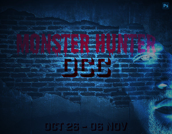
thank you @hollow yarrow
Gave +1 Creative Carma to @hollow yarrow
@sonic saddle : I'm curious how did you fix your quality problem? The result is really AWESOME!👌
@deep mango Looks good! Nice work
@hollow yarrow Haha, you're killing it with the Day 9 mummy animation! The eyes look great and the blinking effect is an excellent touch. Really nice sense of lighting and color too. I like how the green of the eyes really pops against the orange color palette. The masking and depth of the image is looking really solid too!
@wary swan Really cool effect with the animation! Kind of reminds me of those old Animorph book cover designs, hah. My only suggestion is I think it might help to get a cleaner edge on the initial mask. I often like to use the quick selection tool/select subject for this, but the Refine Edge Brush tool can often help clean up the edges if need be. Nice job of the rest of the poster design too 👍
@sonic saddle Very well done! This is looking great. The magic effect is working really well and the lighting effect you added to the hand sells the realism nicely. Impressive work!
Edit: oh man, just saw the animation, that’s so cool!
@fluid wharf Very nice, the gradual rotation on the head is looking really convincing! If anything you could always clean up the artifacting around the head for the later frames to touch it up but the effect came out nicely 😄
@lucid plover Very cool! I love the style of this! Kind of reminds me of some of the Adobe Live graphics. I really like the colorful gradient in the rocket exhaust.
@magic wagon These are great! Really nice job on these designs, there's a nice variety of techniques and effects going on here which is really cool. If I had any suggestions it might be to blur the far end of the poster in the Advertisement Mockup like Val did to get the focus/blur to match the scene. Really loving the logo and business card design you did, nice work!
@mortal crescent Awesome job on all of these challenges! Really nice work the past two weeks. I didn't see your animation challenge before, but it's looking great. Very nice job on the animation of the fire! I also really like the advert mockup and information cards. Nicely done!
@eternal mica Really great job on all of these challenges Ted! Always glad to see you joining us. I especially like the aged photo challenge that you did. The animation is looking great too, hah. I really like the way you gave some good wing flapping and roaring movement to both creatures. Nicely done!
Thanks @bleak fossil for the feedback animation is put together of 32 frames , 2pictuers +background for each frame
Gave +1 Creative Carma to @bleak fossil
@bleak fossil Thank you Sam. Its always good to get a critique from you. I appreciate that you took the time to review my portfolio. I had fun doing it.
Gave +1 Creative Carma to @bleak fossil
thank you @bleak fossil
Gave +1 Creative Carma to @bleak fossil
Day 6 - Shadows
Late but done!
Stock used
Here is the link to my personnal Behance project.
https://www.behance.net/gallery/107493941/PSDCC-Oct26-Nov26

Behance
Daily Creative Challenge 2020 October 26 - November 06. 9 challenges in 9 days driven by VooDoo Val. Unleash the power of photoshop and use different kind of effect each day to transform an image. Master tools, patterns,filters and other features to modif…
@bleak fossil thanks. Will do. 🙂👍🏽
Gave +1 Creative Carma to @bleak fossil
@hollow yarrow Digging the theme you've been going with! Nice work with the cast shadow and motion blur effect. Getting some Scooby Doo vibes from this design, hah. Nicely done!
@coral cloak Great colors and textures on the Stone of Strength! I like the font you used for this too. If I had any nitpick it might be to bump up the contrast of the stone so it's not overpowered by the value contrast of the pink shape behind the text. I think boosting both the dark tones and brights (but particularly the brights) could look good. Nice job!
@chilly hawk Ooh, very creepy. Nice work on the motion blur! Though I wonder if seeing just a touch of it in the swinging front arm might match it up with the rest of the creature a bit more? It could also be nice to see a touch more of a cast shadow under the feet. Looking good!
@hollow yarrow I took your advice and reduced background colours with filters - posterize>gaussian blur>median (all as a smart filter) and then I played with settings in export for web window... that's it
@sonic saddle : thanks for your reply! Great job!👍
Gave +1 Creative Carma to @sonic saddle
Nice wi
Refine a Portrait (Challenge # 1)
hopefully this entire week is not using neural, I cannot upgrade my software... 😟
@sturdy bison No. we will cover other 2021 features as well.
My final result for DCC #1
Watch the replay here:
https://www.behance.net/live/videos/9031/Photoshop-Daily-Creative-Challenge-Refine-a-Portrait

Challenge: Refine and alter a portrait using Neural Filters.Get the starter file here: https://bit.ly/psdcc11-9-1Join your host each morning at 9:00am PT to learn how to approach each challenge using Photoshop. Complete 9 challenges by Friday, November 20th and you’ll be on yo...
my refine portrait image - very little from the original
Day 1. I used frequency separation technique that Earth Oliver taught on MAX. The Neural Filters are great but I've been blown away by the "Oliver effect." What do you think? I'm still perfecting my technique.
The link to the starter file isn’t working for me when I click on the link in the video, or when I click “Get Started” from the challenge page. I tried both safari and chrome 😕
DCC Day 1,Refine a portrait,sharpening eyes,add a lipstick and dodging and burning,and some color grading
stock
DCC #1 , did some color grading and used the tool to make her look older, made her skin smooth, and her hair thicker
thank you sam for feedback
@lethal mural
DCC17 01 201110 Refine a Portrait A Great American Hero
@lethal mural
what i have so far for day 1. played around with expressions, gaze, head direction, and light direction. probably the best outcome i've got so far using neural filters! now i'm going to be playing around by adding hair using neural filters
@neat shale exactly this how neural filter helps for Pro and serious works
this how i recoverd hair,jawline, skin texture details
Young (left), Now (center), Old (right). Found reducing "Retain unique details" allowed for extreme old man look. God help me if I look that bad in 20 years.
Day 1, a double-chin retoucher!
Not so much of the face smoothing, but 5 different style transfers in different blending modes and selections.... I like the stylized look... I used to do portraits like this manually with my tablet or iPad - this is such a time saver!!! Thoughts, anyone?
Day 1, a double-chin retoucher!
@blazing quail Not bad.. to really help reduce the double chin, you need to refine where her actual jaw line is and remove the deeper shadows of the "double" area. Will have to be done subtly, or the effect will be a bit jarring. It's definitely a good starting point though!
here's my photo for today's challenge.
Day #1 - I did skin smoothening and added a little smile... I also added an extra step with dual tones
Updated to add a solid color layer with a color BM
Day #1 - I did skin smoothening as well as added a smile.
Day 1 11/10 PS DCC_Refine a Portrait Before
PS DCC_Refine a Portrait After Neural filter and Photo filter
PS DCC_Refine a Portrait
day1