Awesome job combining the tombstones, @arctic rover, I really like the way that it adds that creepy mood. If you want the skull and the lower areas to blend a little bit more to the scene, here are some tips that might be helpful: You might lower the contrast just a bit, especially from the bright areas, you can do that by creating a levels adjustment layer and on the lower sliders drag the white point to the left. The original base area looks a bit blurred, you can blur the skull and its base as well by converting the layer into a Smart Object and apply a subtle Gaussian Blur, be careful not to lose the details, a subtle amount will be enough. Lastly, to combine with the grey tones from the other tombstones, you might decrease the saturation just a touch, this will bring some of the gray tones to the image. Let me know if you have any questions. Great job!
#✂challenges-feedback
1 messages · Page 88 of 1
Day 7 worked out great, @forest aspen! Loved the way that you blended the tombstone to the grass, it really helps to sell the effect. Excellent work!
@fresh swallow Great to see you’re back! Loved how the distortions and the motion blur turned out in your image! The texture adds a nice personality as well. This is totally a personal preference, but if you want, you might darken the background just a bit, so the neon tones will stand out more. Keep it up!
@calm jay super cool work with the retro effect! I like how the textures and the noise aren't distracting but they are still able to give that look for the image. Well done!
That is terrifying, @shy bobcat! Great job adding the watcher, the glow, and the green tones are looking very balance and I like how they stand out throughout the night scene. My only suggestion would be to bring more of that dark blues to the birds as well, just to make them fit more in the scene. Nicely done!
@coral stone Thanks, it's good to be back! I think you might be on to something with the darkened background.
Gave +1 Creative Carma to @coral stone
Tombstone 🪦 🏴☠️
Can you imagine how terrifying it could be if suddenly the subway lights were cut off and this creature appears? Hahah @fresh swallow
Yes indeed
I was thinking of using this document for the flickering lights challenge
Great idea!
@coral stone Thank you for the feedback, I think I managed to do it. Turning 80 tomorrow and family are arriving so am struggling to keep up to date at the moment. Might be busy after they have gone home😁
Gave +1 Creative Carma to @coral stone
Day 7: Tombstone. I ran out of time to get the "3D" effect going.
added lighter areas, it does separate them better. Thanks @jolly quest 🙂
Gave +1 Creative Carma to @jolly quest
Really nice! Happy Birthday @shy bobcat! My best wishes to you! 🎂 🥳
PSDCC Day 7 with VooDoo Val - Tombstone
@coral stone DCC15 07 201007 V2 I changed the grass.
Day 7 - Tombstone
Flickering Lights GIF in Photoshop with @jolly quest Thank you!
@shy bobcat Happy Birthday and many many more. Stay Safe. Stay healthy
DCC15 07 2011007 V3 One more try
Challenge #7 Tombstone (Background image and textures by Chris Barbalis, Frantisek G. and Tim Mossholder on UnSplash.) Is my tombstone looking too dark? Every time I tried to ‘lighten’ it up, it looked like it didn’t belong in the scene.
@eternal mica Thank you for your birthday wishes you stay safe too.
Gave +1 Creative Carma to @eternal mica
@fallow bough The 3D effect is looking really good, nice job with the lighting and texture. The grass overlapping the tombstone at the bottom is a nice touch. All the engraving looks really solid and clear too, great job with this design!
@pliant forum The smoke is looking excellent! The way the smoke seems to be illuminating the rest of the smoke works really well. The way you softened some of the edges of the text so it blends seamlessly with the wispy smoke really sells the effect too. Looks great!
@left abyss Really cool design, the yellow of the window stands out really nicely. The glow on the bushes from the window is. Really nice touch to give the lighting a bit more realism. The animation is looking good too. Really nice work!
@left abyss I think it’s standing out quite nicely, and the really warped feel of the text gives it a spooky look. It has a bit of an effect like a flashlight is being pointed at it around the bottom right corner which is really cool. Looking good!
@compact pecan Really cool texture on this one! I think the 3D effect is working quite well around the border and with the text. If you wanted to push it further in the skull I think increasing the dark tones in the eye sockets and nose area would help. Nice work 👍
@shy bobcat That’s great, happy birthday! This challenge is looking good, the bold green color works really well with the desaturated creepy background. The grim reaper works really well as a silhouette too. Nice work with the lighting and glow effect!
@jolly quest @coral stone @bleak fossil Thank you for the comments and tips. I really appreciate that. Cheers...
Gave +1 Creative Carma to @jolly quest
Had to play around with the layers, and made sure the Grim Reaper is not completely black. Set the back light to Vivid Light. 👻
Day #2 Let me know what you guys think
Here's my crystal ball for Day 3 🙂
Actually the hand looked a bit too ordinary so I gave it some color 🙂
@young karma Very nice, I like how subtle the figure in the window is. Kind of gives it an additional layer of creepiness that you don't see at first glance. If I had any suggestion it might be to be careful about the green fog effect, the way it washes out the bushes on the left of the house looks a bit unnatural. I'd try to control the effect a bit more deliberately depending on what you're going for, whether that's a layer of fog on the ground floor, or specifically fog coming from the window or something. Even getting some stock images of clouds/smoke/fog and colorizing it and masking it out in a controlled way might give a nice effect as well. Really nice work in this image, great creepy look to the whole thing!
@bleak fossil thank you so much for the advice Sam! Will keep it in mind~
Tombstones
@bleak fossil Thank you for your feedback and birthday wishes.😊
Gave +1 Creative Carma to @bleak fossil
Day 6 - Flickering Lights
@fallen talon Really cool colors in this Watcher in Window design! The red window and silhouette stand out really nicely too. I like the sort of old western town theme on this one. Very cool!
@bleak fossil Thank you!
Challenge 3
The lights are on... and off... and on...and off....
tombstone challenge, would like to have some advice to improve 🥰
Catching up again. This is my Watcher in the Window. Would appreciate feedback. Thanks! 😄
@pliant forum Very cool works, Joachim! The gradual glow feels very consistent, and I like the way that you blended the watcher with the shadows, allowing it to appear as the glow gets more intense. Nicely done!
@glacial minnow the magic potion challenge is looking great! I loved the way that you managed the transparency of the glass and added that flare on the top left. The subtle smoke and the liquid's texture also enhances that magical context for the composition. Great job!
Flickering lights
@elfin thorn The tombstone is looking really good, Phil! Loved the way that you managed the carving and how the textures turned out. The shadow cast by the cat also adds that consistent look through the light direction. Great job with the fog and dark atmosphere that you added around as well. My only suggestion would be to reduce the opacity of the fog that is in front of the left area of the tombstone, so its contour and shape will be able to appear a little more. Well done! 🙂
@deep mango super cool work, Dorina! I like the way how the shape of the crystal ball is very well defined, the fog in the background and the highlights really help in that. My only thought would be that if you want the hand to look a little more realistic, you might recover some of the original skin colors of the hand, especially on the highlights and the midtones. To add those magenta tones, I usually like to create a color balance, they are very handy for these kinds of edits. 🙂 Great work!
@ruby panther woow great job adding a context to the tombstone, Shawn! I loved the way that the carving is looking, and how the textures are realistic. My only suggestion would be to add a little bit more of a contrast to the tombstone on the mockup, just to match the values from the areas around. You can use a Black & White adjustment layer to check the luminosity values, this way you can be even more precise on the edits. Awesome work! 🙂
This is looking pretty great, @cold oyster! I loved the way that you combined the challenges, it was a great idea for adding some context to the tombstones. My only suggestion would be to bring that cool tones of the house to the tombstones as well, this will help you to unify all of them in the scene, adding that realistic touch. Excellent work!
@shy bobcat wow! Loved the way that you distributed the lights in your image. The glow around the watcher's window also turned out excellent. Great job!
Thanks @coral stone Great tip! This is one of the few times I didn't do that and got nailed for it. 🙃
Gave +1 Creative Carma to @coral stone
Challenge 3 [Crystal Ball]: how did we get this way

This project archives my contributions to the Adobe community Photoshop Challenge activities.[https://www.behance.net/challenge/photoshop]
No problem, @ruby panther! You did an awesome job! 🙂
Challenge #7 Tombstone (Background image and textures by Chris Barbalis, Frantisek G. and Tim Mossholder on UnSplash.) Is my tombstone looking too dark? Every time I tried to ‘lighten’ it up, it looked like it didn’t belong in the scene.
@winter tinsel Totally creepy! But you might be right about the tombstone being too dark - maybe lighten it up with the light colored fog? Just a thought.
Tombstone completed. Finally caught up!
Text distortions worked out really nicely in your image, @dusky swallow! I like how there is a nice amount of contrast between the smoke and the letters. The extended ascender in the D looks super cool. Well done!
Great job with the flickering lights, @fringe sun! I loved how you made the glow gradually increasing as it gets more intense. The tombstone also is looking very on point, and I like that you preserved some textures for the word. Very nice job!
@coral stone Loaded the brushes but there was no grass brush in the special effects group. Used a soft brush to clone in some grass and leaves from other areas onto the lower left. At the same time, I used a small low opacity brush to slightly blur all the tombstone edges. The edges just seemed too sharp to look realistic.
@fallow bough thanks for letting me know, sorry about that. The Grass Brush is under the Defaults group, I don't know why I thought it was part of the Special Effects Group. Either way, you did a great job blending the base area, since the grass is a little thin, the soft round brush did the job very nicely. 🙂
Gave +1 Creative Carma to @fallow bough
Tombstone Challenge! This tombstone was inspired by a a headstone I saw once in a cemetery as a kid
Thanks for the awesome suggestion @coral stone 🙂
Gave +1 Creative Carma to @coral stone
playing around a little more with this
still haven't had any time but thought I would share some ani I made back in 2004 and 2005
fountain is all from scratch from an old tutorial
Here is my day 7, tombstone challenge.
Better @coral stone ?
Great, @cold oyster! The tombstones definitely look even more part of the scene now. 🙂
DCC,Day 8,Eerie Skies,
Since today's session hit the reset button, I took the time to play with a combined challenge 6&7 effort. Flickering lights on a tombstone with lettering that vanishes at night.
@primal fulcrum your fountain is so cool
This is the original image I used
and before this challenge I had already changed it to an evening scene.
So I tried to change it up a bit making it look like and eerie foggy night.
Thats fire
I can't see the full Eerie Skies video. It's only 13 minutes and it cuts off when Val is removing the pole. Is there another link somewhere? @sterile bane , @uncut ginkgo , or @pastel spade
Hey ! link is not working I guess. I found on YouTube. @untold crown
Here's the link for the Part 2 of today's challenge! 🙂
https://www.youtube.com/watch?v=-GjgHrc5-tU

Challenge: Make the night sky more dramatic and eerie with color adjustments and layers.
Get the starter file here: https://bit.ly/psdcc9-28-8
Join your host each morning at 9:00am PT to learn how to approach each challenge using Photoshop. Complete 9 challenges by Friday, Oc...
@untold crown
There might also be a re-recording of today's challenge. If so we'll make sure to update you with it here as well.
Thanks for the shoutout this morning for my Spongebob tombstone, @jolly quest! :P!! 💜 Happy to have made your morning! 😆
Gave +1 Creative Carma to @jolly quest
@young karma Very nice work, cool to see you incorporating some illustrated elements into this design! The engraving effect is looking really good. The texture adds a nice convincing stone effect as well. I think the back shape/edge adds a nice 3D effect though I work if brightening the top area with a soft brush and even adding a bit of a darker gradient around the bottom of the front face of the stone might give it a more realistic look. maybe something like this?
@whole tangle Very cool! Great texture and lighting in this. The engraving effect is looking really solid. The 3D effect with the backing shape is working really well too, though if I had to nitpick I think that the perspective of that backing shape is off a bit. I think we wouldn't quite see so much of the top sticking out with the angle on the right side due to where the camera placement and horizon line seem to be. Not sure if that makes sense, but here's a rough paint-over that may explain it better. Really nice job compositing all these elements together, there's a great sense of color and mood in this!
@lucid plover Really nice seeing how far you took this image! The sky definitely has a dramatic feel and all the elements fit together very nicely in terms of color and contrast. I like the addition of the pumpkin and how it mirrors the warm colors of the house. Though I think since the pumpkin is in the foreground increasing its contrast even more might be a nice touch. My only other suggestion might be to soften/fade the top part of the shadow of the tree as it gets further away from the base, especially since moonlight isn't as intense as sunlight. You kind of see that effect in this tree image attached here. Very nice work, really great job adding in a strong foreground, midground, and background, it adds a lot of depth!
@deep mango Really liking the color and contrast in the crystal ball! It makes for a really nice focal point. The shine and reflection gives the crystal ball a really nice effect too. Looking good!
@plain sable Very cool! I wonder if matching the contrast of the silhouette to the house image could help a bit? You could do this either by brightening up the silhouette slightly so it matches the value of the dark trees in the environment, or increase the contrast of the environment so the dark tones match the value of the silhouette. It might help them look like they belong together a bit more, though the way you have it now definitely draws a lot of attention and contrast to the figure in the window. Nice work!
thank you @bleak fossil
Gave +1 Creative Carma to @bleak fossil
@primal fulcrum Looks good, Sig! Cool to see how you handled the water fountain effect, water seems like a tricky one to pull off. Very cool 👍
@cold oyster Looking good! I love the subtlety of the silhouettes in the window and the tombstones fit in very nicely with the scene.
Night Sky Challenge completed
PSDCC Day 7 with VooDoo Val - Tombstone
I fiddled with a gradient on the front of the tombstone.
Ad libbing. Challenge 8, Eerie Sky.
PS DCC #08 - Eerie Skies
@bleak fossil Thanks, Sam! I thought there was something weird going on there! Thank you for helping me see it better, I will do some more work on it!
Gave +1 Creative Carma to @bleak fossil
Only the moon and some clouds...
Challenge 7 - Tombstone
Here's my eerie sky for Day 8 🙂
Eerie Skies
@fringe sun very nice! those planets are super ominous because they seem to be so CLOSE. i wonder what that does to the ocean tides?! I think the background image you chose is pretty nice, although the light sources are different for your "planets" and your BG. Matching the light source for both planets and sky will help bring the design to the next level. thanks for posting :)
@pliant comet HA. Love it. Did you also add the slight shadow in the grass? or maybe that's just the photo you chose..
@sacred field nice! i love the yellow-tinged sky and moon compared to the purple-y house. It's a great color combo. I think you could allow a little more room at the top so that the moon doesnt feel like it's squished between the house and the top of the canvas.. and I might choose a portion of the design to focus attention on and brighten up a bit. I'm not saying you need to make it a light and cheery image, but maybe add some brighter highlights to a certain area (like the moon, maybe?) to ensure that your design has highlights as well as midtones and shadow (which you already nailed). hope that helps!
@dusky wave woah! so many textures. This composition has a lot of movement thanks to the lightning and complex clouds in the sky. I recommend keeping the moon a little bit brighter in the sky. If you imagine a full-moon, it's usually the brightest thing you can see and right now it feels a bit flat. thanks for posting!
Gave +1 Creative Carma to @fringe sun
@queen aspen this is a great example of keeping the moon bright without letting it overshadow the main event: the spooky windows! Nice job. Keep posting your awesome work!
@fallow bough the lighting feels pretty spot on with this composition! The right side of the house is a little bright when you think about the light source (moon) being on the left... but that's a small nit-pick 🙂
@sterile bane 👍
@untold ice cool! can't wait to see what you do next. i like how you left some "air space" at the top of this composition to let the eye wander.
@oak mist the limited palette focusing on red tones is really cool. The moon and the red window offer two strong places for the viewer to rest their eyes while they explore around the canvas. really nicely done
@shell laurel wow! i like this take on eerie skies. keep it up!
Thanks, @sterile bane
Gave +1 Creative Carma to @sterile bane
@eternal mica nice, ted! i like the addition of the ghosts - they fill the sky nicely without being too overwhelming. However I might change the scale of the moon or maybe move it a bit. Right now it competes with the largest, central moon
@sterile bane Thanks. I darkened that side but accidently turned off the gradient layer.
Gave +1 Creative Carma to @sterile bane
@young karma thanks for posting! i like the dark, flat sky - but I'd love to see a little depth! Maybe you could bring a photo of a starry or cloudy sky in and lay it over your flat background? looking forward to seeing your future posts!
Gave +1 Creative Carma to @stuck harness
@fallow bough boom!
Day 8 Eerie Sky 🦇 🌕
@thorn geyser WOAHHHHHHHHHHHHH
Day 8: Eerie Sky. I'm not sure that this is what Val had in mind - as the video stopped 1/2 way through.
I knew my moon pictures would come in handy.
@forest aspen You got it! You can catch the other half of the show on the Creative Cloud youtube channel here: https://www.youtube.com/watch?v=-GjgHrc5-tU Loving the witch silhouette on the moon
Challenge: Make the night sky more dramatic and eerie with color adjustments and layers.
Get the starter file here: https://bit.ly/psdcc9-28-8
Join your host each morning at 9:00am PT to learn how to approach each challenge using Photoshop. Complete 9 challenges by Friday, Oc...
@sweet fern there you go!
I am catching up on a few this week, as I fell behind. Here is my Crystal Ball Challenge. First, following along with @jolly quest and the other using one of my photos. It was tough to get the very straight horizon line of the sunset to curve the perfectly. I just tried to keep finessing it with the warp tool.
Adding some elements to another house
Day 8
@eternal mica nice, ted! i like the addition of the ghosts - they fill the sky nicely without being too overwhelming. However I might change the scale of the moon or maybe move it a bit. Right now it competes with the largest, central moon
@sterile bane Thank you @sterile bane. I appreciate your comment. I believe you meant the moon competes with the central ghost image. I wasnt sure. To cover both bases, I moved the ghosts and transformed them down a bit, and moved the moon and transformed it up a bit.
super appreciate the feedback @coral stone ... yes, it needed more love. this is what happened.
@sterile bane More sky & highlights.
Tombstone challenge
Went back to the Bates Motel for the eerie sky effect. (I can hear @coral stone whispering in my ear - the roofline isn't straight. But, the ground line IS straight. So a dilemma. I figured ground ruled over a sagging roof. 😆 )
Day 8: a "not so"- eerie sky
@arctic rover have you ever gone to Universal Studios? The actual motel is still there. But right behind it, and obviously visible, is "the Grinch" set of Whoville. Very odd combination...
Day 8 - Eerie Skies. My first ever sky replacement, not very eerie.
@thorn geyser this is super cool! I loved how all assets came out really well creating that dark atmosphere for your image. The blending of the bats and the layer mask are looking very on point as well. My only minor nitpick would be to position the moon to the right, so it will match the light direction suggested by the building. Well done!
@fallow bough : well done! I like your creepy moon!👍
@oak mist : Nice red blood sky! I like the soft red ambient light on the roof. It adds lot of realism. Great shot!
@deep mango : Good idea! Wolf eyes add a great scary feeling. Maybe you could harmonize colors of the foreground with your red sky (Hue and saturation filter or gradient map...?)
@eternal mica : You are really going your own way on this challenge. Very original approach. I like the "retro" colors.👍
@vague shuttle : CheerS! Well done!
Really nice work, @forest aspen! I loved the small witch that you added, it creates a nice visual interest when compared to the size of the moon. Size contrast is a great strategy for that. The fog and the sky full of stars are looking great. Nicely done!
@sweet fern Oh this came out really interesting, Ron! I like the different color that you applied to the windows, it really stands out amongst the blue tones. My only suggestion would be to fine-tune the midtones, maybe brightening them up a touch would recover some details, especially on the trees and the entrance of the house. If you used a Gradient Map, you can easily fine-tune by adjusting the position of the sliders and brightening the colors. Very good job, Ron!
Lovely works, @spark ledge! I loved how the crystal balls came out together in both versions. The highlights and the warp distortions are looking awesome. Congrats for the beautiful photo and work. 🙂
@loud mist this is very nice, Stephanie! I really like the glow and the light values that you added to the subject. If you want, you might choose an element to be the main focal point. If you choose the subject, you might manage the brightness and contrast of the other assets in order to make them as a secondary element on the scene. You can also take advantage of blurring the background just a touch to establish a depth of field. Right now the moon and the subject are competing for attention, since the moon is a far from where the subject is positioned, you might blend it to the sky, just to add more balance. For that you might create a hue/saturation adjustment layer clipped to the moon's layer and reduce the saturation of the reds, then with a color balance layer you can add more cyan and blues to the highlights, midtones, and shadows, creating an invasion of color because of the atmosphere, lastly, you can create a levels layer just to manage the contrast, lowering it. Just some ideas, let me know if you need any help. Well done!
@slow stirrup what a great choice of colors for the image! I loved how the warm highlights contrast really well to the other tones from the image. The masking worked out amazing as well, especially on the roof because of the details. The only nitpick I have, would be to recover the area on the left wall, you can easily do that with the polygonal lasso tool and the layer mask. Excellent work! :)
@eternal mica this is very cool, Ted! I like that you added some green and purple fog and made the ghosts look like they were coming from the dark areas of the trees. Well done!
@coral stone, thanks. I'll fix it tomorrow, ok?
Gave +1 Creative Carma to @coral stone
Of course, @slow stirrup 😉
This turned out really great @vague shuttle! I loved the hand that you added to the scene, creating the impression that the subject just picked the glass. My only minor nitpick, is that there is an area missing on the index finger, right now it’s appearing just on the left. But we are talking about magical context, so maybe the subject is using an invisibility ring. 😉 Great job!
@coral stone Thank you. Since Val sort of hinted that we would be tying all the images together tomorrow I've kept the color palette consistent throughout.
Gave +1 Creative Carma to @coral stone
@sacred field this is super cool Marc! The top of the trees are looking very cohesive and I loved the way that you managed the moon contrast. My only thought would be to bring more of the tones of the house to the sky or vice versa, just to unify all the elements helping to sell even more the effect. Awesome job, Marc!
my little work at the challenge
Great job with the textures @left abyss! I loved the way that the carving turned out as well. If you want to blend even more the grass on the base of the tombstone, you might darken it with a levels adjustment layer, so it will match even more the values of the areas around. Nicely done!
Haha, @arctic rover, you definitely know me 😄 . You did a great choice making the ground straight, it really helps the composition to feel more balanced. The sky also enhances that mysterious and creepy atmosphere to the scene, created by the subjects and the car. The only nitpick I have would be that some areas of the original image are appearing on the Motel's roof edges, you can easily adjust that with the layer mask and the polygonal lasso tool. Great job as always, Jude! 🙂
This is looking really great, @compact pecan! I loved the way that you blended the moon adding cyan tones and some noise as well, making it look very cohesive to the sky and the other elements. The contrast is looking very solid as well. Very well done!
@coral cloak this turned out awesome! I like the way that you blended the moon and added the glow on the hill, it definitely helps to sell the effect. The blending of the grass on the tombstone is looking very cohesive, my only suggestion would be to maybe lower the shape that is behind, just a bit, reducing the thickness of the top area, this will help you to match even more the perspective of the tombstone. Great work!
@hidden oak This is looking super cool! I loved the textures that you applied and the traces of blood on the entrance. The silhouettes were a great way to enhance that creepy mood to the image. Great job!
DCC#8 - Eerie Skies. I went with an image with hardly no skies, I guess the issue for me was more color matching the red house especially with how much editing I had to do around it. I will post the original image so people can compare the difference. I wanted to work more on color matching and finding images that may not match in coloring so I could work more on trying to match them together.
Image Credits:
House - Luke Stackpoole on Unsplash
Skies = Ianah Nel on Unsplash
Hand - Ian (@ greystorm) on Unsplash
Texture = Sydney Rae on Unsplash
Crack Texture - Ramin Khatibi on Unsplash
And In case anyone wants to see the original image:
@coral cloak this turned out awesome! I like the way that you blended the moon and added the glow on the hill, it definitely helps to sell the effect. The blending of the grass on the tombstone is looking very cohesive, my only suggestion would be to maybe lower the shape that is behind, just a bit, reducing the thickness of the top area, this will help you to match even more the perspective of the tombstone. Great work!
@coral stone Way better, Thank you!!
This is very cool @quick wolf! I loved the color grading and how the high contrast of the sky matches really well with the light values from the ground, making it look like a storm is coming. Excellent job!
Thank you so much for the feedback @coral stone
Gave +1 Creative Carma to @coral stone
Eerie skies purple night 🌌
Day 8 - Eerie Skies
Stock used
Day 8 - Eerie Skies
Not sure I left enough space on this for tomorrow challenge🤪
Challenge #7 Tombstone (Revised) Thank you @arctic rover for the suggestion! I added more fog behind the stone and it’s definitely better.
Gave +1 Creative Carma to @arctic rover
Catching up again this week. Done till Watcher in the Window. Would appreciate some advice and feedback please. 😅 https://www.behance.net/gallery/105398137/Photoshop-Daily-Creative-Challenge-September-28

Photoshop Daily Creative Challenge September 28
PSDCC Day 7 with VooDoo Val - Eerie Skies
Don't worry, I didn't forget the cats!
@coral cloak Looking good! The sky and moon is looking good. Very nice job on the tombstone as well. The engraving effect reads nicely, and the texture and 3D effect are working well. My only suggestion might be to try and fit the lighting of the tombstone to the image more. I imaging the the light of the moon behind the tombstone might be shining more on the top and side of it with the front a bit more in shadow. Maybe something like this? I used a multiply layer for the shadow and color dodge layer for the lighting.
@eternal mica Really cool! I like how dramatically the lighting and colors of the scene change. The animation is looking really nice as well. This is just personal preference, but I feel like holding the daylight image might give the animation more interesting timing and give us more time to read the tombstone. As if the viewer is reading the tombstone in a calm daylight setting, then all of a sudden we get the faster changing frames with the dramatic light changes. Might be a nice contrast. Looks great!
@fringe sun Hah, very nice. The tombstone is looking really good! The cracked texture and general texture of the rock came out nicely. One thing to keep in mind is matching the perspective of the images. I think since we don't really see much of the top of the sign on the left it means the camera angle is fairly low, so I don't think we'd see much of the top of the tombstone, but that's just a minor thing to note. The beveled effect for the engraved text is looking good and reads well too, nice work!
@fringe sun Really cool! Great sense of texture and 3D effect to the spheres in the sky. The sky replacement has a really interesting look and feel to the scene too, I like the pop of color it adds. My only suggestions about the spheres in the sky is it might help to match the more monochromatic look of the scene a bit more by toning down their saturation a bit. The red one is also creating a bit of a tangent with the edge of the house, I'd try either putting it more obviously in front of, or behind the house to create a more clear sense of depth. Well done!
@mortal moss Really cool style to the Day 3 challenge! I really like the focal and color contrast we get in the crystal ball, it draws the eye nicely. The magic potion effect is looking really good too, I love the glowing on the hands. It could be nice to see even more of a glowing effect in the bottom of the glass to better match the lighting that appears to be on the hands. Looking good!
@winter tinsel Really cool mood and atmosphere to this design! The texture and 3D effect of the tombstone is looking really good and the engraving effect is working well. I think you could push a little of the background haze even further to make the raven stand out just a tad more and give it a clearer silhouette. Really nice work!
Tombstone challenge
@hollow yarrow Such a cool effect with the silhouette in the window. I love the dramatic look and effect of the sky in the background and how that light seems to be mirrored in the window. The color palette gives the whole image a really interesting feel. Great mood and contrast in this image!
@untold ice The sky is looking good and definitely has a dramatic look and feel to it! I like how some of the clouds are passing in front of the moon too, it adds some nice depth. I feel like a bit of the dark contrast in the foreground has been washed out a touch. I like the fog effect, but even with that due to atmospheric perspective the foreground elements tend to have the deepest darks. That might add a bit more depth. Very cool image!
@zenith mulch Really cool idea with the green sky! It contrasts nicely with the red window as well. A few suggestions would be to mask off the green sky around the house so its not on top of it, darken down the tombstones a little to better fit the lighting of the scene, and give the edge of the fog in the foreground a bit more of gradual fade. Nice job with all these different elements!
@stone wigeon Super cool! Really excellent work turning this day image into night, the sky replacement really helps sell that effect as well. One small suggestion might be to darken down the silhouette just a touch, it might help push it forward in the scene a touch more. Looks good!
@coral stone worked on the text as per your suggestions to look little bit debossed on the stone. how about now?
@bleak fossil Thank you Sam. Im really appeciative of that comment. I actually did do what you suggested for the exact reason you suggested. I made the daylight frame 1 sec and each nighttime frame 0.5 sec. I'll increase the daylight to either 1.5 or 2.0.
Gave +1 Creative Carma to @bleak fossil
@bleak fossil thanks, Ill give that a try. Worked out great, makes a big difference.
Gave +1 Creative Carma to @bleak fossil
@hollow yarrow Franck, this looks great I have one question, if I may The window lighting is almost the same color and brightness as the moon lighting. Its a bit confusing. It looks like the moon is shining through the house. Would the image look better if the window lighting was slightly dimmer and a slightly different tone?
@hollow yarrow Oh, and I just saw your shout out. Thank you so much. You know how much I value your opinions and critiques.
Gave +1 Creative Carma to @hollow yarrow
Tombstone DCC! With a grim scene surrounding said 'stone. This ain't just Boot Hill, son. This here's the end ... but which way you gonna go out? Standing up, or swingin' at the end of that rope back there? Either way -- your Tombstone is READY.
@slow stirrup I really like the work you did on the sky and the lighting. I wish you used a spookier house. It looks too new and luxurious to be spooky.
Challenge #7 Tombstone (Revised) Thank you @arctic rover for the suggestion! I added more fog behind the stone and it’s definitely better.
@winter tinsel Nice one Mia! Spoooooooky!
Gave +1 Creative Carma to @arctic rover
Tombstone , something fish , color matching not well?
Flickering Lights (Day # 06) Thanks @jolly quest
Gave +1 Creative Carma to @jolly quest
Hi! Erie Skies Challenge
@dusty vapor Very nice! I think the color matches quite nicely, though the tombstone lacks a bit of value contrast against the background. Value is often even more important than color in fitting an image into a scene. I'd try to separate the tombstone from the background in terms of value one way or another. Basically it just comes down to a light shape on a dark background or a dark shape on a light background. Maybe something like this helps a bit? Nice work with this design 👍
@chilly hawk Really nice look and texture to the tombstone challenge! I like the shape you chose for this design. My only suggestion is if you could find a stock image of some thin blades of grass that fits this image to place at the bottom of the tombstone for a more natural covered look. Nice job!
@spare badge Nice job with this tombstone challenge. Very creepy background. The text and shape of the tombstone are looking really good, my only suggestion would be to maybe darken down the left side a little bit to strengthen the 3D effect and separate the side plane from the front of the tombstone. Looks good!
@bleak fossil thanks yea now its looking better
Gave +1 Creative Carma to @bleak fossil
@coral stone Thanks for the feedback. I did try putting the moon at the other side, but I didn't think the composition looked as good. However, I have tried to balance out the empty sky where the moon was by moving a bat as well. Does this work?
Gave +1 Creative Carma to @coral stone
@hollow yarrow I added some color to the foreground as you suggested 🙂
Tombstone challenge
Tombstone (Day # 07)
@eternal mica, I chose this house on purpose, because it's supposed to look like a normal scene, but the sky is different than what you'd expect.
Ver 2: I just noticed when I exported the 1st ver, Ps made a white line on the bottom. Don't know why...
Eerie Skies, is what this image was missing! also blended in the tombstone a little better.
@thorn geyser very nice! It really helped to balance the composition. Changing the position of the bats was a great way to distribute the elements. The bat on the right is looking a bit brighter than the others, it was an amazing way to keep the lightings consistent through the composition. Excellent work!
Challenge 7, tombstones
Thank you for your suggestions! @bleak fossil Got your point.will do it.
Gave +1 Creative Carma to @bleak fossil
@hollow yarrow Beautiful Eerie image
@plush spoke : Thank you so much!👍
@eternal mica : thanks for your comment! You're 100% right... I will try to fix it before the next stream! Thanks again!
Challenge 8 eerie skies
@hollow yarrow 😊 😊 😊
@eternal mica Really cool! I like how dramatically the lighting and colors of the scene change. The animation is looking really nice as well. This is just personal preference, but I feel like holding the daylight image might give the animation more interesting timing and give us more time to read the tombstone. As if the viewer is reading the tombstone in a calm daylight setting, then all of a sudden we get the faster changing frames with the dramatic light changes. Might be a nice contrast. Looks great!
@bleak fossil OK, I made the daylight 3 sec, the flashes .5 sec, and the tri flash 1.5 sec. I think it has a good variation and rhythym now. Your thoughts?
@eternal mica, I chose this house on purpose, because it's supposed to look like a normal scene, but the sky is different than what you'd expect.
@slow stirrup Humor me and try the same exact image with a "spooky" house.
@thorn geyser : your first shot was great but the second is really awesome! Great improvement 👍
@slow stirrup I think it works much better. What do you think?
@slow stirrup I would transform the house about 50% larger
That's awesome, @pliant comet! You combined so many elements!!! And thank you for remembering the cats, as always
Gave +1 Creative Carma to @pliant comet
Replace Sky PSDCC Day 8
Very nice job on the tombstone, @chilly hawk! I like the results you achieved with the bevel and emboss, suggesting a metallic and/or a reflective surface because of the strong highlights. The carving and the textures are looking good as well. Nicely done!
@covert loom this is super cool! The way that you matched the yellow tones brought some color consistency throughout the composition, which is great for the visual balance. If you want the textures to appear a little more throughout the letters you might select the text layer and reduce the fill slider on the layers panel. Great work! 🙂
The extensions turned out really cool in your composition, @ruby panther! I loved how you managed the contrast between the sky and the top of the trees. Great job! 💯
Very nice job, @left abyss! I loved the color that you applied to the sky, especially how it enhances that darkness and thriller mood of the composition. Nicely done!
Thank you @coral stone !
Gave +1 Creative Carma to @coral stone
I loved the typeface that you chose for the tombstones, @mortal crescent! It really matches the dark atmosphere of the image. My only suggestion would be to position the shadow of the tombstone from the right, to the right instead of the left, judging by the light source the left area wouldn't have a shadow cast. Day 8 worked out amazing! The light on the sky suggests something supernatural might be coming, it really helps the scene to tell a story. If you want, you might bring some of the sky and house colors to the fog that you applied to the bottom area, just for bringing more consistency. Well done!
Thank You Boss @coral stone
Gave +1 Creative Carma to @coral stone
I decided to take another shot at the eerie skies. Not perfect but I like it better.
Day 8 - Eerie Skies (updated)
@eternal mica : Greenish tint makes blood on the window pop! Thanks for your help.
Here is the link to my behance project: https://www.behance.net/gallery/105648161/PSDCC-Sept-Oct-2020
Gave +1 Creative Carma to @eternal mica
I'm days behind but here is my day 4 https://www.behance.net/gallery/105781817/10220-Photoshop-Daily-Creative-Challenge-Day-4

Day 4 - Smoky Words. Give type a glowing smoke effect using Blending Modes, Filters and the Text tool.
@arctic rover have you ever gone to Universal Studios? The actual motel is still there. But right behind it, and obviously visible, is "the Grinch" set of Whoville. Very odd combination...
@compact pecan No..haven't been. But I had to edit out a "SANTA" neon sign & some weird orbs that looked like giant wasp nests. Yes, very odd indeed!
@mortal moss Really cool style to the Day 3 challenge! I really like the focal and color contrast we get in the crystal ball, it draws the eye nicely. The magic potion effect is looking really good too, I love the glowing on the hands. It could be nice to see even more of a glowing effect in the bottom of the glass to better match the lighting that appears to be on the hands. Looking good!
@bleak fossil Thanks for the feedback, @bleak fossil! I pick up what you're puttin' down, man. ☮️ ✌️
Eerie Skies (Day # 08)
Challenge #8 Scary Skies (Photos by Taylor Simpson and David Menidrey on UnSplash.)
my farm manor composition @jolly quest - thank you
Gave +1 Creative Carma to @jolly quest
final image PSDCC Day 9
Watcher image from unsplash by @storm quartzolfazf-shaker-E6.
my first entry on this assignment 😅 glad to be back after exams
I had already been adding some of the elements as I went so I tried to switch it up a little on this one.
@oak mist Thank you!
Gave +1 Creative Carma to @oak mist
Day 7 tombstone revised. I think I fixed the perspective issue. Is this better?
Day 9: Compilation of Creepy. Background Village & photographer - Pixabay, moon - my photo, overall fog & tombstone created from scratch, the scroll - GraphicAuthority, black cat - Aldus Canvas clipart, Witch - adaptation of an image from MorgueFile, Ghost and street fog - AdobeStock
@bleak fossilThank you for suggestion. here is the revised version. added some darkness around the image to look tombstone sides more 3D. how about now?
I've revised my Challenge 7 as I wasn't happy with the background - and I forgot to add in a cat. I'm much happier with this version
Revised Challenge 8 - I've changed the colour of the fog so that it ties in with the colour of the sky
I took this photo 3 years ago in a tiny town in West Texas - amazing but very ramshackle house on the prairie (actually in the Chihuahuan Desert). It's been dressing it up and inviting a ghost couple to live in it!
Thanks for your suggestions @coral stone
Gave +1 Creative Carma to @coral stone
Challenge 9. Haunted Manor.
Day 9
@lucid plover wow well done. your style reminds me of this video.
I like how this guy does this composite. Everything just pops

In this final #halloween video, I'm showing you the #photoshop process of my latest creation: ''hagrid's Hut''. It's based on #harrypotter and the Prisoner of Azkaban.
I hope you've learned something new today!
Thanks for watching this video!
Music in this video:
Lucas King...
PSDCC Day 9 with VooDoo Val - Haunted House Composite
thank you @compact cove
Gave +1 Creative Carma to @compact cove
DCC15 09 201009 Hillside Manor
Challenge #6 assets
Challenge #9 asset - download from nasa.org
More assets shot by me
Challenge 7, 8 & 9 ...
My body of work from this DCC https://www.behance.net/gallery/105248847/Photoshop-DCC-September-28-October-9

Here is my Behance project for my DCC15. I enjoyed this immensely. I created things I've never challenged myself to do before. Thanks to @jolly quest for her spirited leadership and creative efforts. Thanks to my mainstays, @coral stone and @bleak fossil. My admiration for you grows and grows. And thanks to all the incredibly creative participants for showing me what is possible. (I'll post my movie for this DCC on Sunday night.) https://www.behance.net/gallery/105334809/Ps-DCC15-Sep-28-Oct-9-2020-VooDoo-Val

Gave +1 Creative Carma to @jolly quest
Welcome to Hillside Manor. Would you like to stay for the night?
Great job @eternal mica
@plain sable Susan, thank you. Your opinion means a great deal to me.
Gave +1 Creative Carma to @plain sable
Day 9 Hillside Manor
Day 9, Hillside Manor! What a fun theme this was, thanks @jolly quest!
Gave +1 Creative Carma to @jolly quest
@oak mist this would definitely be a great intro for a TV show! I loved the way that you balanced the elements together. The smoky word and the others has a great reading flow and the red glow from the crystal ball stands out really nicely against the background! Fantastic job!
Thank you @coral stone!!
Gave +1 Creative Carma to @coral stone
@thorn geyser what a beautiful work! I loved the way that you blended all the assets, especially the cat with the red eyes, it looks super creepy. Everything looks very well balanced. My only suggestion would be to darken the tombstones just to match more the luminosity values from the nearby areas. For that, you might create a Curves adjustment layer and decrease the top right point. Awesome job and challenges!
This gives me chills @spare badge! Hah Great job bringing a purple/blue atmosphere for the composition. I like the way that you added the hand and the shadows look very consistent according to the light source. Great job with the masking as well and the extensions. 👍
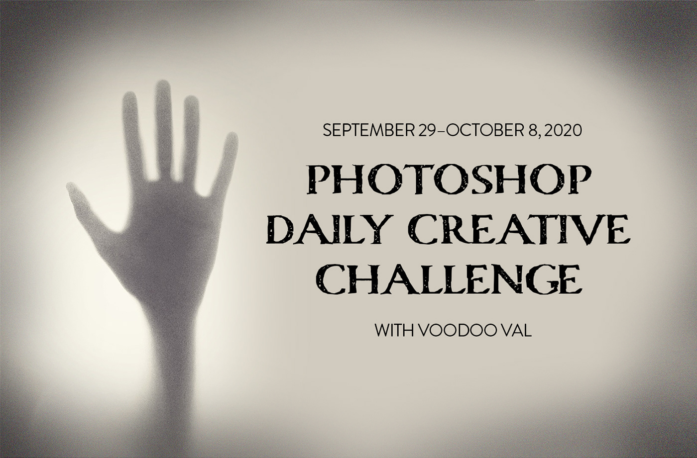
Photoshop Daily Creative Challenge Sept 29 to Oct 9
Gave +1 Creative Carma to @coral stone
@coral stone Thank you for your feedback!Appreciate a lot.
Day 9: Composition
@eternal mica Thank you so much for the kind words, Ted! You did a super cool challenge! Day 9 is looking very nice, I like the combinations of the assets, my suggestion would be to fine-tune the background image, it looks a little bit pixelated, you might try to reduce the scale or maybe find another asset, this way it will be easier to sell the effect even more. Also, it might look even cooler, if you give the tombstones a bit of texture, just add some depth to the composition. Loved the way that you made the smoky text and the occlusion shadow below the house are looking very nice! Great works this past two weeks! 🙂
Gave +1 Creative Carma to @eternal mica
@plain sable Awesome works, Susan! I loved how you combined the day 6 assets managing the color matching. The way that you blended the pumpkin graphic to the actual pumpkin is awesome. Day 9 is looking really nice as well. My only suggestion would be that if you want to add a realistic touch you might apply the same blue tones to the sky, this way, the halos of the tress will blend a little bit more and the overall image will have a consistent color tone through the assets. Excellent work!
This turned out really cool, @pliant comet! I loved the glow in the sky and the spotlight that you applied to the tombstone! I encountered nine cats eyes, did I miss one? Haha. My only suggestion is just a personal preference, but if you want to unify the assets, you might consider adding some noise to the other assets, just to match the sky's. It’s a subtle edit but makes a nice difference. Loved the green tones that you applied. Awesome work!
I’m pretty sure I’ll be in a great company, but I won’t be able to stay for the night, I forgot the oven turned on haha. @sweet fern Great work with the challenges, Ron! I really like how everything came together nicely. This is totally optional but If you want to unify the color tones of all the assets, you might play with a color lookup or photo filter adjustment layer, just to add that color mood. Well done!
Day 9: Composite. I added my tombstone, extra sky above, extra part on the right, then put the "creepy birds" in from the crystal ball image and then some fog to top it all off.
@lucid plover Great works these past two weeks! Day 9 turned out excellent, Fery! I like how the assets are very well balanced with lights and colors, and how you added that noise texture to make all assets consistent. Fantastic work! 💯
Thank you @coral stone
Gave +1 Creative Carma to @coral stone
@fallow bough Excellent job managing the assets, Ken! The contrast levels are looking very solid and I like the way that you brought that dark atmosphere to the assets. Managing assets with strong lights and hard shadows can be very tricky, but even so, you did amazing work! My only suggestion would be that, since they are stock images, some of them come with some noise, and when you make some light edits it gets more noticeable, like the tree and some tombstones. You might balance that by adding some to the sky, the ground, and the house as well. Great job with the extensions. 💯
@coral stone You're welcome. You deserve the praise. Thank you for the review. I'll play a bit with your suggestions.
Gave +1 Creative Carma to @coral stone
@sacred field really cool work, Marc! I loved how you made the warm tones predominant through your composition, especially in the sky and the house. It might help to look even more consistent if you added these warm tones to the tress and the ground, it doesn’t need to be too much, just a touch will already help. Also, this is totally a personal preference, but I wonder if positioning the witch in front of the moon would make her stand out more and catch more attention, again, just a personal preference. Awesome work, Marc! 🙂
Awesome work with the update, @loud mist! The composition definitely has a strong focal point now, straight to the subjects. I loved the glitch effect that you added to the man, It creates kind of a hologram effect. Super cool work!
Oh, and congrats for the beautiful photo!
Thanks @coral stone I added a bit more blue to the sky, does it need more?
Gave +1 Creative Carma to @coral stone
Great improvements, @willow ore! I loved how you made the light on the tombstones consistent and the cat that you added. Perhaps brightening the cat a bit more would make it stand out and match the luminosity values from the surrounding areas. Challenge 8 looks amazing!
@plain sable no problem! Perheaps a little bit more to the shadows and midtones would unify even more. 🙂
@coral stone i’ve shut down for today, but I’ll see what I can do tomorrow! Have a great weekend, Valdair!! 👍
Had another thought added some grain & brought the blue to 100 opacity
Thank you, @sacred field! You too 🙂
Gave +1 Creative Carma to @sacred field
I like the high contrast for the background now, @plain sable! It really enhances the spooky context.
@coral stone can you tell I finished my homework 8 symmetrical thumbnails 🙂 added levels...
Oh now that's a dramatic effect haha, @plain sable! Maybe recovering the details of the super dark areas of the sky would make it look more consistent, you can use the layer of the same level to brighten it a touch. Also, for the halos, you can use the Minimum filter, here's a quick video that Jesús shows how to use it. You can use it on the layer mask. If you don't have a layer mask, you might use the Maximum filter for the layer itself. 🙂 https://youtu.be/Z8kUpM2Qaqo?t=178

Learn these three amazing techniques to create better masks for your composites in Photoshop.
🎯 SUBSCRIBE to get more amazing Photoshop tutorials!
► https://www.youtube.com/user/photoshoptrainingch?sub_confirmation=1
00:00 - Introduction
00:12 - 01 - Channel Based Masks Inst...
This came together really great, @forest aspen! I loved the ghost that you added and how you managed the transparency! The tombstone is blending really nicely to the ground. Great work and a great challenge!
@whole tangle this is excellent! Great improvement! I really like the atmosphere and how the bevel & emboss worked out on the tombstone.
@coral stone Thank you very much! 🙂
Gave +1 Creative Carma to @coral stone
Very cool work @cold oyster! The overlaps and the blending on the tree are looking very interesting. I also like how the fog helps the tombstones to blend into the scene. My only suggestion would be to bring some of the colors from the house and the trees to the tombstones, this would help to sell even more the effect. Nicely done!
Day 9 - Hilltop Manor
@young karma great to see you’re back! Nice job adding that magical atmosphere, the red glow on the witch helps her to have a contrast and stand out more to the scene. Looking forward to seeing your next works! Keep it up!
@coral stone I went back and added grain to the layers without. Is this looking more cohesive? And let's see, there are 8 glowing eye cats, 2 cat silhouettes in windows, 1 smoke cat, and 1 cat billowing out of the chimney! Oh, and the headstone, but that one is stone so I didn't count him... 😉 (I feel like I should add that I do not personally have this many cats.)
That's great @pliant comet! The elements are blending together even more now. Loved the cats ahah! I don't have any, just three dogs. 😄 I hope to adopt one very soon 🙂
DCC#9: Hillside Manor. I just added small details to what I had edited yesterday. Since I felt like I didn't nail the silhouette/glowing window for the previous challenge I wanted to incorporate it here. I felt like the challenges this week were a lot of fun and I learned a lot.
Forgot to put the link to my personal behance project: https://www.behance.net/gallery/105806933/Photoshop-Daily-Creative-Challenge-929-10082020
Photoshop Daily Creative Challenge 9.29-10.08.2020
Hi everyone! Here is the link to my personal behance project.
https://www.behance.net/gallery/105648161/PSDCC-Sept-Oct-2020
Any comments and/or appreciation are welcome.
Thanks @jolly quest! I enjoyed these two weeks of creepy spooky challenges...
Thanks @bleak fossil and @coral stone for your great feedbacks.
Thanks all members...Great community!!!
Cool tips.

The first 1000 people to use the link will get a free trial of Skillshare Premium Membership: https://skl.sh/nemanjasekulic10201
Check out the Ghost Castle photo manipulation. You will learn some cool tricks in this episode.
Enjoy!
____________________________________________...
The link to my work for this challenge: https://www.behance.net/gallery/105254875/Its-creepy?tracking_source=for_you_feed_user_published

Hillside Manor (Day # 09)
Hillside Manor composite
My finished project: https://www.behance.net/gallery/105814651/PhotoShop-DCC-29-September-to-9-October-2020

PhotoShop Daily Creative Challenge from 29th September 2020 to 9th October 2020. Spooky effects and haunted houses.
@young karma great to see you’re back! Nice job adding that magical atmosphere, the red glow on the witch helps her to have a contrast and stand out more to the scene. Looking forward to seeing your next works! Keep it up!
@coral stone thanks 😁
hellow ! its my first time posting ! Hillside Manor my finished work ! your feedbacks please 😁
My complete project on Behancehttps://www.behance.net/gallery/105395481/PHOTOSHOP-DCC-October-2020

Haunting of HIll House
Challenge 6, I´ve loved timeline! I didn´t know this was possible in photoshop. Looking forward to creating more motion images. Thank you
Super cool animations, @dusky swallow! I loved the way that you managed the time and how the glow gets more intense in a gradual way. This is just an optional step that you might take if you want, you might add some red glow to the areas nearby the window and animate them as well, enhancing the effect that the red light is producing some glow. 🙂 Great job!
This turned out great, @arctic rover! I loved how you added some light to each window in a sequence, making the eyes follow the light direction. This is a great way to create visual interest for the viewers. The lighting and the dark atmosphere are looking very on point as well. Excellent job!
Hey, @ionic atlas! Welcome to the community! That is an awesome job! I really like that you played with the scale of the moon. The way that you preserved the curtains and the elements present on the original windows added that cool consistency, helping you to sell the effect in a great way. My only suggestion would be to darken the tombstones just a touch, so it will match the contrast from the surrounding areas, for that, you can create a levels adjustment layer and with the white slider (the one on the right side of the sliders on the lower area) drag it to the left. This will help the image look even more realistic. Amazing work!
@coral stone oo yeah I see I will try to make it more better with the advices that you told me thank you so much 😁
Gave +1 Creative Carma to @coral stone
@coral stone V.2 Hope this is better! 👻
Lizzie Borden bed and breakfast/museum, might have a bit too much glow from the windows?
A few corrections and changes to bring things together. Thanks for the input @coral stone.
Gave +1 Creative Carma to @coral stone
thank you @coral stone for your advices ! here is it with some more modifications 🙂 !
Gave +1 Creative Carma to @coral stone
👍
Daily Challenge 201009 - Spooky Composite Hillside Manor
Hillside Manor Composite Challenge
Challenge 9
I've revised my challenge 9 slightly. The fog was slightly dominating the scene so I've changed the opacity so it isn't so bright and taking over
I cannot get the starter file for next challenge, the website doesn´t open.... and the video is only 13 minutes long, it doesn´t seem to finish the work, am I having some problem???
@dusky swallow Is that the eerie skies one? At the top of Discord is a pin icon. Click on it and the rest of the video is available on YouTube - there were issues with streaming that day
@dusky swallow Is that the eerie skies one? At the top of Discord is a pin icon. Click on it and the rest of the video is available on YouTube - there were issues with streaming that day
@mortal crescent Thank you so much key!

Challenge 7, I made and old Basque tombstone, I hope you like it....
Challenge 8 Manor house, eerie skies
I made a second version with the moon...
My project on Behance
https://www.behance.net/gallery/105868893/Photoshop-Creative-Challenge

Here's my Behance project https://www.behance.net/gallery/105873121/The-Haunting-of-Hilltop-Manor Thanks @crystal aurora for a fantastic set of challenges, and to @bleak fossil and @coral stone for their feedback, much appreciated 😀

Gave +1 Creative Carma to @crystal aurora
Two weeks later and I can say I did it! My .gif is created with 31 frames, 30+ image composites, patience ~ but most of all Inspiration from VooDoo Val and all of you incredible, fantastic artists here in Discord! Upon his arrival home, Skully observes his mate place a fresh Lime Cranial cocktail and a slice of Worm pie on the table. Spooks has a fondness for Worm pie, as well. Ebony continues to play with Orb. If you see somthing amiss, please let me know.
wow
Here is day 8, eerie skies challenge.
@dusky swallow The texture on the tombstone is looking great! I really like the addition of the design as well. My only suggestion is I think the contrast and values of the tombstone could be a bit deeper, specifically the difference in value between the front and side of the tombstone. The values seem very close together currently and make it look a little flat. Perhaps using the small tombstone in shadow behind it might be a good guide on how to light it? Maybe something like this? I like to use Multiply layers for shadow and Color Dodge layers for lighting with a soft round brush. Nice work!
@whole tangle Very nice job on the sky replacement, it makes such a big impact on the mood and look of the image. The way the shadows on the roof match the lighting is a really nice touch. Looks good!
@tropic knoll Very cool! Really nice job with how far you took this animation. All the attention to detail in the small animated elements like the worm, the blinking cat, the skull’s eyes, and the floating piece in the drink all add a lot of life to the image. I really like the little warp effect in the crystal ball as well. Impressive work with this animation, very nice work!
@mortal crescent These are all looking really good! Great job these past 2 weeks. I especially like the potion challenge with the great color contrast and lighting of the pumpkins behind in. Great work!
@slow stirrup Great work on all these challenges the past 2 weeks! I didn’t see your sky replacement image before but it adds a great dramatic feel to the image and I really like the bold color contrast of it. Really nice job with all these different techniques and designs!
@dusky swallow The addition of the moon is a nice bold change to the image! The sky replacement looks really good and does a nice job of pushing that night time feel. The color grading is looking really good as well, nice job!
@bleak fossil Thanks, Sam!
Gave +1 Creative Carma to @bleak fossil
Thank you @bleak fossil. I worked super hard on this and enjoyed every minute. My skill level climbs slowly. Thanks for inspiring me and all of us to continue. I wish you the best in your endeavors, as well!
Gave +1 Creative Carma to @bleak fossil
@cold oyster Great work on all these challenges! They're all looking really good and have a great sense of contrast and lighting to them. Very nicely done!
@shy bobcat Really nice job on these challenges for Day 7-9! The tombstone texture and 3D effect is looking really nice and fits in with the rest of the scene very well. The sky replacement for the other challenges came out nicely and definitely gives the image a dramatic effect with the stormy clouds and bold color. Well done!
@chilly hawk Really cool! Great shapes and style to these tombstones. I like the tiered base you gave them. My only suggestion would be to maybe overlay a more realistic stone type of texture to make them match more with the heavily textured look of the rest of the image. I might help them all fit together more. The animated challenge is looking really solid too, nice work!
@young karma The spooky Hillside Manor image is looking really good! Really nice job with the composition in this one. The image has a solid midground, foreground, and background as well as focal point and nice framing elements with the trees. The color contrast adds a lot of interest to the image as well, very nice!
@zenith mulch Nice job adding all these different elements together! I like how red is acting as an accent color throughout this whole design. One suggestion is if you want to get some visual variety in the zombies you could always flip it horizontally or even tweak the pose a touch with the Puppet Warp tool to give it a more natural look. The sky replacement is looking really good as well in this design, nice work!
@coral stone Thanks. Along with the noise, I added the person in the foreground and applied different LUTs to give it some tension. Not sure which I prefer. 1) Futuristic Bleak 2) Bleach or 3) Orange-Teal
Gave +1 Creative Carma to @coral stone
@young karma The spooky Hillside Manor image is looking really good! Really nice job with the composition in this one. The image has a solid midground, foreground, and background as well as focal point and nice framing elements with the trees. The color contrast adds a lot of interest to the image as well, very nice!
@bleak fossil -- Thanks for the favorable feedback!
Cover 🙂
Had to give the crystal ball shot thanks to inspiration from @crystal aurora
Gave +1 Creative Carma to @crystal aurora
@bleak fossil Thank you for your feedback, I rushed the last three challenges as I was so far behind.
Gave +1 Creative Carma to @bleak fossil
Here is the link to my video of my DCC15. https://1drv.ms/v/s!AuyL-ykZbl8igqMRDxU_-0PpnXMeew?e=XRIe4f

MOV File
@slow stirrup Nice job on your portfolio
@oak mist Very nice portfolio
Day 1 . i have some easter egg in this image
Challenge 8- Eerie Skies
@coral stone I reworked DCC15 09, as you suggested, 1. I changed the bg image; 2. I added texture to the tombstones and the tombstone text. But then, I decided to make the image much more ethereal as in challenge 1. I made all the objects ghost images. What do you think??
Thanks so much, @eternal mica!!
Gave +1 Creative Carma to @eternal mica
I know the tomb stone shadow is wrong side , but i followed the tree shadow, 👀
Super cool work with the assets, @dusty vapor! I like the way that you unified the elements on the scene and blended the shadows of the tombstones to the grass. The colors are looking very consistent as well. If you want to enhance the dark atmosphere, you might darken the overall image just a touch, but this is just a personal preference. 😉 Great job!
@eternal mica great improvement, Ted! The house definitely is fitting better with the scene with the new background image especially because of the ethereal effect, it was a great idea to make everything come together. Nicely done!
@eager shale this is super cool! I like the way that you managed the colors, giving it kind of a neon effect to the highlights. The birds and the witch also help to tell a story, making it look like the witch just left the spooky house. Well done!
I figured what the heck - I'd bring ALL the challenges together (except the flickering lights - I'm still a little scarred over that one). haha
@lone roost this turned out amazing! Really like the way that the assets are blending to the scene. The fog and the colors are looking very consistent throughout the image. Fantastic work!
@vague shuttle very nice work! I really like the way that you blended the assets. My suggestion would be that if you want to add more of a magical context to the scene, you might consider adding some glow to the crystal ball, it doesn’t need to be a lot, just a touch will already help, and maybe recover some details of the background inside the crystal ball, and then add some distortions. Just some ideas. Great job! 🙂
Awesome cover, @ionic atlas! Loved the way that you played with some overlaps between the trees and the text. The subject in the middle also helps to add that spooky context to the scene, especially when combined with the eyes on the background. It looks like an army of creatures is coming after me 😄 Amazing work!
Great job with the flickering lights, @storm hound! Really like how the red stands out among the colors of the image. The subject disappearing was a great idea to make the image to tell a story as well. Nicely done!
haha, @compact pecan this is great! Maybe a flickering light inside the crystal ball showing a different reality 🤔 ok this is just an idea hah. 😆 This came together really nicely. My only suggestion would be to bring more cyan tones to the hand. You can do that using a color balance adjustment layer, and add these color tones, especially to the midtones and shadows. Awesome challenge, Hugh!
@coral stone Thanks Valdair. Your suggestion got me started.
Gave +1 Creative Carma to @coral stone
My First Challenge Result
Final Challenge, Thank you to the adobe creative team, and specially to @jolly quest I have had lots of fun during this couple of weeks.
Gave +1 Creative Carma to @jolly quest
Thanks, @coral stone! Once you pointed it out, the hand was obviously not the right color. I tried your suggested method of color balance, but I thought the results made the hand look like it was DEAD (a good result for this challenge, but not what I was going for), so I used a curves layer adjustment, then alt-clicked the auto button and changed the highlights/shadows/midtones colors. That method just works better for me, I guess. Anyway, I figured I'd use this for my Behance cover image. (oh, and the flickering lights just in the lens ball idea is awesome!! Let me get the "regular" flickering lights image to work first!! haha)
Gave +1 Creative Carma to @coral stone
Here's my Day 4 smoky words 🙂
Gave +1 Creative Carma to @jolly quest
2nd challenge attempted
I use Adobe Photoshop and would like to increase the pixels to at least 5MB saving the photo in JPG format for Shuttlestock to accept the photo. Does anyone on chat know how this can be done?
And this is my tombstone for Day 7
Soo I may have gotten a “head” start on the first pre-MAX challenge lol
@fallow bough Great design! Out of the 3 I like the increased contrast of the second 2 designs. I feel like they have a bit more of a dramatic look to them. Though for the 3rd design I feel like bumping up the brightness just a touch on the running figure might help him pop a bit more. The green tint on that one adds a lot to the creepy feel too I think. Looks good!
@storm hound Nice job with the animation! I like the way the silhouette disappears after the initial flickering of the light, it adds a nice element of suspense. The glowing window effect is looking good too 👍
@ionic atlas Very cool! I really like how the center figure makes for a strong focal point but the glowing eyes are mirrored in the background. Super creepy design and really great color contrast between the glowing red and orange and the more neutral background.
@eternal mica Really cool idea putting this into a video format for the finished product! I love the song choice with Thriller too, hah. Really solid work throughout the past two weeks, nice job!
@lone roost Looking really good! Very nice work compositing all these different elements together, the color and lighting all seem to match very well. My only nitpick is I feel like the dark tones of the foreground such as the bench look a little less deep than the background, and due to atmospheric perspective the foreground tends to have the area with the deepest dark tones. Super minor detail but figured I'd mention it. Nicely done!
@eager shale Nice job with all the silhouettes in the sky! The size variation adds a nice sense of depth and I like the bold blue lighting of the environment. Definitely gives it a bit of a ghostly look 👍
@bleak fossil thank you because i use to many retouching and darker to this image, i dont use Hue and Colour Balance.
Gave +1 Creative Carma to @bleak fossil
Create New Profile Picture😋
@bleak fossil Thank you Sam. For the past number of DCCs I've enjoyed making up a video to exhibit my portfolio. Your input helped me throughout. Sincerely appreciated.
Gave +1 Creative Carma to @bleak fossil
Day #3 Crystal Ball
@visual summit very nice designs, Lynn! The masking of the trees and the house is looking very consistent. Also, the textures for the tombstones are looking very on point as well. My only suggestion would be to make the shadow sharper, you can use the ones cast by the trees as a reference, this will help you to sell even more the effect. Great job with the carvings. 🙂
@civic sphinx Haha that's awesome! Loved the way that you managed the shape of the head and texture of the edges. The colors also have a great amount of contrast to stand out from the black background. Great work!
@covert loom this turned out super cool, Mahedi! Really like the repetition and the color that you applied. The cuts are very consistent, and I like the way that the middle is more visible, this helps the viewers to identify easily the subject without creating any confusing look. Nicely done!
Very nice @glacial minnow! I really like the way that you managed the distortions inside the crystal ball. The contrast looks very good as well, and I like the small particles that you added, kind of connecting the crystal ball to the hand. Great job with the layer mask as well!
Custom Promo for my side gig...
PS Daily Challenge. Hope to add lightening 😀
Challenge #9...Since my images didn't quite fit into one manor image, I made them into a newspaper. 🙃 I have several gifs within the image, is there any way to make this file size smaller without making the overall image any smaller?
Better late than never 😅
what do y'all think?
Very nice, the gradient gives it a feel of fire and energy.
challenge #1 getting ready for MAX 2020
updated sorceress' image within this mystic sphere as per @bleak fossil's great input(s). removed distracting hair, and adjusted both Vibrance and Hue/Sat... better?
Here's my Max avatar.
MAX redo ... bit of the ol' "Irradiate" brush works every time!
MAX photo profile
my profile pic is updated! 😁 👍🏼
@neat shale Nice job!
The colors really fit the photo, and the detail on the necklace also haven't gone unnoticed 🤩 💎
@nimble talon thank you!
Gave +1 Creative Carma to @nimble talon
@lucid plover Really cool!
The outlined camera shows very clearly what you do as a professional! I would however have used the effect a little less on the background, so that the effect stands out even more. Really nice colors though!
@dense slate Your hair is electrifyingly cool! ⚡
The contrast between the background and face is awesome too, very grungy!
My Max Avatar
And here's my avatar as well 🙂
MAX2020 01 Self Portrait
new profile pic! 🙂
Kady Profile. I had problems downloading brush, couldnt fiqure out where Kathleens brush went.
@blissful geyser That's unfortunate :(
You've still managed to get an awesome result though!
@sour ingot Niceee!
The colors with the white and black of the photo looks great!
The face paint really completes this one! 👏
To the MAX.
@dusky monolith Loving the bubblegum colors! 😃
I like that the colors coming through the photo isn't overdone at the bottom. Really a great job!
@pastel thistle have you tried the export as function? you can specify how large the save file will be. Just keep bringing down the image size until it fits the MB criteria youre looking to achieve.
@brisk abyss ..and beyond! Nice work dude 👍
I would maybe reduce the distance of the effect, but other than that great work :)
@eternal mica Haven't seen one like this one yet, super cool! Love the neon effect around the face 😎
@deep mango Awwwesome!
I really like your spin on making the background a dark green and match the gradient of the effect!
@nimble talon Thanks Mate! tried the purple indian style!!
Gave +1 Creative Carma to @nimble talon
Thanks @nimble talon 🙂
Gave +1 Creative Carma to @nimble talon
@vague shuttle I like it! The contrast draws attention to the face very nicely.
@neat shale Awesome texture and I really like the colors gradient. The illustrated lines and necklace detail are a nice touch. I think you could probably even thicken the lines up a bit and maybe add some more on the left side around the glasses and hair to put a little extra visual weight on the left side to balance out the right side. That might also make the lines read a bit more clear at a glance from a more zoomed out view that you'd typically see a profile picture from. Looks good!
@lucid plover Very cool, the color contrast definitely gives the image a bold look. I think you could probably go even brighter with the illustrated elements around the face to give it more contrast around the focal point of the eyes. Nice job 👍
Not loving it but need to move on.
@bleak fossil thank you for the feedback!!! i was sooo picky with the brush size i swear every time i went bigger i hatedddddd it but you're right probably would look better when it's zoomed out
Gave +1 Creative Carma to @bleak fossil
@deep mango Really nice texture effect with the brushwork around the edges! This is a tiny detail but it could even be cool to see some of the blue/green coming through the glasses on the very left side. Nice work!
@spare badge Nice job Daxa, and the bright and bold colors really add a strong contrast to the image. My only suggestion is that a bit more variation in the width/weight of the lines between the start and end might give them a slightly more natural look, if that makes sense. Looks good!
@eternal mica Great effects Ted! I like the bold sort of neon glow and the cloudy effect on the right hand side gives it a really cool smoke-like look. Definitely adds a lot of boldness to the profile picture.
@dusky monolith Very nice! The color adds a lot of boldness and there's a really nice visual balance of the color across the whole image. Looking good!
@bleak fossil that's actually a good idea, here's the avatar with some brush strokes through the glasses 🙂
Thank you for your feedback !! @bleak fossil you mean to say inner lines or outer shape?
Gave +1 Creative Carma to @bleak fossil
@deep mango Ooh, interesting. I was actually referring specifically to the dark section of the glasses on the left hand side where the glasses are overlapping the dark background, so instead of seeing a dark shape we'd see the blue of the background through that corner of the lens, but that's a really cool effect too! hah
@spare badge The inner lines on the hair specifically.
That's cool @bleak fossil I added more color to the dark left side 🙂
@deep mango Looks good!
Thanks @bleak fossil 🙂
Gave +1 Creative Carma to @bleak fossil
@bleak fossil Thanks Sam. Anything I can do to dress up a "self" portrait is sorely needed!!!! 🤪 🤪 🤪
Gave +1 Creative Carma to @bleak fossil
@blissful geyser Nice job! Were you ever able to install it or are you saying you couldn't find where it downloaded to on your computer? I imagine it would be in your downloads folder but you should be able to do a search for the file name if you can't find it. This looks good. It might look nice to push the color difference in the gradient to be a more obvious transition. Nice job!
@sour ingot Hah, I think this is working really well! The color gradient effect strengthens the impact of the profile nicely, and the graphic on the cheek is a nice touch that balances the color on the left side a bit. Nicely done!
Max Profile Pic
Robert Wennerberg Max Profile Pic
@bleak fossil thanks for your feedback :) the brush preset (shared) didn't work for me so that lead to this brush usage. The cheek paint is really the last bit of touch. 😁
Gave +1 Creative Carma to @bleak fossil
thanks @bleak fossil I ttried a search, but couldn't find anything on my computer for the brush.
Gave +1 Creative Carma to @bleak fossil
😍 @jolly pond Excellent choice of picture
@sour ingot thank you!
Gave +1 Creative Carma to @sour ingot
@blissful geyser I was having problems with it too, until I dragged and dropped from the browser straight into Ps. Once there, select the brush and add it to your brushes panel.
Thank you @jolly pond, I will try it.
Gave +1 Creative Carma to @jolly pond
Profile Picture
I made an attempt as well! Not as good as all of yours, but couldn't go wrong representing XD's colors 🙃 😈
@bleak fossil Here, is the updated one. how about now?
@thorn geyser Nice one!
Colors are really powerful! You could have tried to make the photo smaller or the background larger, to have more space around the image itself to play around with the effect. Just an idea :)
fun doodling with background😃
@spare badge Ooh that looks great, very nice change IMO!
LOOK AT ALL OF THESE AWESOME AVATARS!
@bleak fossil Thank you😊!!
Gave +1 Creative Carma to @bleak fossil
@sterile bane You started it!
@cerulean steppe Woah! How cool is that! 😯
I can't figure out how you did that, haha!
My Max profile pic
@blazing quail Awesome 4-way colors! I really like the brush you've used, too!
@fallow bough that's very good, Ken! I like how the mask looks very consistent, especially on the hair and beard areas. The noisy texture also adds a nice touch to the overall composition. Well done! 🙂
@jolly pond great job with the effect, Amber! I loved how you took advantage of the hairlines for the brush strokes, it's was a great idea to direct the viewer's eyes. The textures and the colors are looking very on point as well. My only suggestion would be that if you want the brush strokes to stand out a little more, especially on the left bottom area, you might consider darkening the background just a touch. This, of course, depends on the effect you're going for. Excellent work!
Hey, @wary swan, great to see you! Very nice work, I like the way that the radial gradient creates kind of a vignette to the composition. My only point of feedback would be to smooth the edges just a touch. You can easily do the by entering on the Select & Mask workspace (Select > Select & Mask) and then increase the smooth slider a touch. This will help the top edges and the beard to blend a little bit more. Nicely done!
@thorn geyser the splatter brushes are always a great choice, I love to use them for creating some textures or even some customized backgrounds. Great colors choice as well 🙂
Oh, this is super cool @nimble talon! Loved that you added the brush strokes according to the light direction and the way that you managed the luminosity, making the top area slightly darker. Awesome colors choice as well 💯 😉
Loved the way that the colors are blending to the subject, @cerulean steppe! Especially for that low saturated look. The contrast between the subject, the colors, and the background is looking very nice as well. Great job!
Here's my new avatar! 😃
Very cool work @blazing quail! The brush strokes are looking great, especially on the edges. The colors and the textures for the background turned out very nice as well. 🙂
@untold ice Excellent work! The splatters and the colors among the brush strokes are looking really great. 💯
@coral stone You noticed the lighting direction, nice haha!
My work...
@queen aspen LOVE the sunny orange gradient with your hair and the scarf color! it's a great palette.
Thanks, @sterile bane
Gave +1 Creative Carma to @sterile bane
one more version of my profile pic
Thank you @bleak fossil
Gave +1 Creative Carma to @bleak fossil
My attempt nr 1, will have to go back to the selection to make it cleaner. So excited for Adobe MAX 😁
Get Ready for Adobe Max with Kathleen Martin - New Behance Profile Picture
The Final Manor Composite Challenge completed (although I would like to add more but my Mac is screaming for mercy!) Had to bring it down in size a lot to get it to finalize. Doesn't seem to hold up well in here but if you click through to the "Original" it looks better. 😁 Spooky fun Voodoo Val! Thanks!
Getting ready for Adobe Max profile picture.
My Adobe MAX profile pic.
I went with several layers, copied and shifted, and shifted the colors in the gradient. Put a Feather on it, but I think it looks too blurry in the final image. And I downscaled the image in the export, which seems to have made some interference garbage of some of the bright blue.
What do you think?
Portrait & color
Great use of the brushes and the colors @restive moth! I like how the temperature and brightness of the colors are increasing as they come near the subject. The subtle brush strokes on the hair worked out great too. Nicely done!
@pliant comet this turned out super cool, I like how the areas around the hair have a nice texturem kind of completing the circular shape that you applied on the bottom of the picture. Well done!
Loved the gradual glow on the window, @fringe sun! The eyes hidden on the branches were a great idea to enhance that spooky mood of the image. Nice job blending the tombstones to the scene as well. 🙂
Day 6
Challenge #9...Since my images didn't quite fit into one manor image, I made them into a newspaper. 🙃 I have several gifs within the image, is there any way to make this file size smaller without making the overall image any smaller?
@winter tinsel when exporting for the web you might play with the number of colors and Dither under the Save For Web workspace. If the file size is still big, you might try an online gif compressor to optimize the size. I usually use this one: https://ezgif.com/
Guys, I think all these profiles are super awesome, I gotta say!!!
@coral stone Thank you! I’ll try the compressor!
Gave +1 Creative Carma to @coral stone
A different approach to the self portrait.
Awesome job combining the effects, @safe flint! I loved the halftone pattern that you applied to the hair edges. The textures on the background are looking great as well. 💯
@uncut lichen I believe that the bright blue of the circles is the Discord compressing the image because when I click on Open original it appears fine, without any bright blue areas around the circles. You did a great job playing with some overlaps between the picture and the shapes. I like how they feel very balanced in contrast and the outline on the right was a very nice touch for the composition. Excellent work!
I like the minimalistic style of your work, @lime meadow! Especially how the gradient stands out with the subtle outline on the right. The spaces around the subject also enhances that style. Nicely done!
I'm real self-conscious, but here goes
Also, I naturally did one of my dog, who takes better photos than me.
thank you @nimble talon
Gave +1 Creative Carma to @nimble talon
My new avatar! 😀
thought i'd do mine too, haven't been doing a challenge in a while 😀
My New Profile🖌️
Avatar Adobe max Challenge
Goodnight all, this is my first time using photoshop and my third attempt at this challenge. My brush strokes are all over the place 😄, will really like to know what I could do differently.
Made a second try, wasn't getting a solid background colour to work so this was my outcome.
My Adobe Max Avatar
@brisk abyss The gradient and texture in the background is looking really solid! It might help to clean up the mask a bit on the left side of the face so it isn't cut off by the background color. Nice work!
@dense slate Hah, very cool! Great contrast between the hair, face, and the background. The texture is looking good and definitely gives it an interesting style. 👍
@untold crown Very nice! The background gradient and texture came out really well. I also like the clean curves and taper of the brush strokes on the hair, it really makes them fit in the image well. Nice job!
@zenith mulch Nice work with the bold colors and textures in this! I like how the design has the most contrast as a sort of outline around the figure. I feel like you could probably even brighten the portrait a bit via a levels or curves adjustment just to give it a bit more pop and contrast. Well done!
@fast moth The texture and curves of the brushstrokes are looking very controlled and intentional here, very nice! Really great contrast in the image overall.
@pliant comet Hah, maybe there's a secret cat engraving in the jacket button we can't see. This is looking good, really nice job masking the hair. My only suggestion would perhaps be to give the colored edge around the jacket a slightly texture edge to match the look and feel of the area near the hair, though honestly that just depends what you're going for and is totally up to preference. Really nice color and contrast to this whole image!
Adobe Max - Fire Selfie
@queen dew Great colors and textures in this profile picture! The backing shape of the portrait makes for some nice contrast and interest. My only suggestion is I feel like the portrait could pop a lot more if you shifted the hue a bit more to make the color contrast more. Everything is very orange at the moment, so perhaps if you shifted the portrait/skin a bit more towards red it would contrast more and still look quite natural. I also think giving the portrait a boost to contrast via the dark tones specifically might help it pop a bit more as well. Really nice work with this design!
@fallow bough Great colors and effects in the background! I especially like the more vibrant glow we see around the back edge of the portrait. My only suggestion is I feel like using a levels/curves adjustment to brighten up the portrait overall might help give it a bit more pop and contrast. It seems a touch dark overall. Nice work! (this was in regards to the first design)
@bleak fossil thanks for the feedback 👍
Gave +1 Creative Carma to @bleak fossil
@naive bear Really nice job compositing these images together! I like the color contrast of the house and window. I think it might help to brighten up the sky a bit so the stars are a little more apparent. It might also help to try to establish a focal point by either brightening up the light in the window, or even giving the cat some slightly glowing eyes. Just depending on what you want the focus of the image to be on. Nice work!
@lime meadow This came out great! I really like the clean shape and directional changes of the color on the right side, it definitely adds some nice interest to the portrait. The gradient looks good!
@zinc prawn Very nice Dee! Were you trying a colored version of the same background before? I think it's looking good, though perhaps increasing the contrast/brightening up the image a bit might give the whole thing a bit more pop. Nice work 👍
@winter tinsel I really like what you did with the colors around the hand on this one! It gives it an interesting effect and nice color contrast with the rest of the image. This colored shapes add a lot of interest to the profile picture!
Avatar
Just going over the top a bit. 🙃
What do y'all think?
@bleak fossil I was trying to get a solid coloured bg for my second attempt but nothing was holding. However for my first picture I wanted a dark bg. Thanks for the feedback, will work on increasing the contrast and brightening it up.
Gave +1 Creative Carma to @bleak fossil
i hope i did a decent job 😅
@coral stone thanks. I’m going to try turning the fan to color as well.
Gave +1 Creative Carma to @coral stone
@bleak fossil tried the contrast and brightness, this is what I came up with. Seeing a bit of difference my picture quality could just be a bit better.
@hollow yarrow that's neat!!
Made a few tweaks from yesterdays @bleak fossil
@oak mist : Thanks I appreciate.
Gave +1 Creative Carma to @oak mist
@shy bobcat great work with the profile picture! I loved how the brush strokes on the hair turned out allowing the effect to be subtle but still noticeable. My only suggestion would be that if you want the colors and the subject stand out a little bit more, you might add a levels adjustment layers and bring the first and the third slider closer, this will a bit more contrast to the image. Again, just an optional step 😉 Nicely done, Pam!
@ruby panther this turned out awesome, Shawn! I loved the shape of the brush stroke. The way that you connected to your picture to it added that movement touch for the scene. The colors and the edits on the background are looking great as well. Excellent job!
@rich swan very nice work! Loved the colors that you chose for the gradient! The edges and the details on the hair are looking great as well. Very nice job!
Thank you @coral stone 🏄♂️
Gave +1 Creative Carma to @coral stone
Yes you did @night venture! 😄 Great idea bringing a brush texture for the background, it really helps adding a context to the scene without making it look busy. The gradient colors and the hair selection are looking very good, my only minor nitpick would be to fine tune the Decontaminate Colors slider under the Select & Mask workspace, this will help you to hide the subtle white edges around the hair. Well done!
@winter tinsel Great concept - leaves us wanting more! 🙂
Went back and reworked my MAX selfie with a clearer mind. 😂
What do you think?
This is looking super cool, @fringe sun! The layer mask is very consistent, especially on the edges of the hair allowing the subject to stand out without any distractions. The contrast and the gradient are very on point as well. Nicely done!
@sand kernel this could be an awesome album cover! I loved the style that you applied to the brush strokes and how you repeated some elements around the corners. It's a great way to bring consistency to the composition. Excellent work!
@sand kernel this could be an awesome album cover! I loved the style that you applied to the brush strokes and how you repeated some elements around the corners. It's a great way to bring consistency to the composition. Excellent work!
@coral stone Thank you. Am learning from the best! Thank you for the tutorials!
Hi! This is my profile pic for Behance. Do you think I should make any changes, like darken my profile so it stands out more from the gradient?
Hi! This is my profile pic for Behance. Do you think I should make any changes, like darken my profile so it stands out more from the gradient?
@merry shoal Yes, I think you should darken your profile so that it stands out better in a small pic.
@untold crown Ok thank you
Gave +1 Creative Carma to @untold crown
@dense slate Thank you but “more” would require my putting on makeup and that’s asking a lot of me. Lol
Gave +1 Creative Carma to @dense slate
@winter tinsel that's why I went with the crazy blue cartoon hair! Distracts from the wrinkles! 😉
Here's one of my attempts for the poster a day challenge btw 
@merry shoal I would crop that a lot closer to your head. Keep focus on the idea of a photo of you for an icon for chats and discord, etc., and that's way too much space above you!
Oooh I wanna do this too. Are you guys planning on using your new profile pics during max? Like everyone being part of the tribe. 👌
How do I import the files from the poster a day into my Ps?
@dense slate I know it doesn't look like that on my behance. Its just how I saved the file.
By the way, I updated my photo, what do you think now?
Looking forward to my first Adobe Max!
@eternal mica Once you click on Add assets to library, you can either import them into your CC Library or just follow the original one. Both ways should appear in your libraries panel. 🙂
@coral stone Ahh, I see it gets saved to my CC library. Is that where all the images will now be saved instead in the Ps library panel? How do I import any of those items into the particular project I want to work on today?
Gradient avatar. Wasn't too sure about the amount of curves editing for contrast in the B/W. Thoughts?
Yes. If your project is inside of the Adobe softwares you can just let the library panel opened and then play with the assets from there. You can also access your libraries using your CC app. Just click on Your Work at the top bar, and find the library you want. If you select the image inside of this library, some options on the right side will appear including the Export a Copy, which allows you to make a copy of the image to of your computer. I'm not sure if that's possible with brushes as well. @eternal mica
@simple dagger I think that's so awesome and fun!
@coral stone I didnt get a right panel option, but if I right clicked the image, Export a Copy was an option, and I was able to copy it to my MAX2020 folder on my desktop. Im still trying to add the brush so it can be used in the exercise.
@eternal mica For the brush, you might try right clicking and choose the Move To option, then you can move the brush to your MAX2020 library if you have one created 🙂 About the desktop folder, I'm not sure if that's possible.
Made minor tweaks and then uploaded as my avatar. Face looked dark when shrunk to small avatar so increased exposure a tiny bit.
Profiile picture, first edit i finished on my I pad
Challenge #2 Posteraday
Poster a day #1 !
@oak mist thanks 🙂
Gave +1 Creative Carma to @oak mist
Getting ready for Adobe Max 2020
Poster Day One, Challenge 2
challenge 2
I didnt notice that CC added folders to my library panel. I had to click back up a level or two to see the folders. Once Im in the folder, than I just click and drag to access any of the assets.
I found a nice picture and I put myself in the poster 😀
Really looking forward to my first experience at Adobe MAX
Here is my first entry for the Poster a day for MAX
late again... but hopefully this qualifies as 'spooky type' Boo
New profile image from "Create a New Profile Picture with Kathleen Martin"
Challenge 2 Accepted. What do you think?
Challenge 2!
The pattern is very subtle, but it's a very light-blue leather pattern on the Nike swoosh :)
poster for Max
@rare rose Nice one!
Would be nice to see more of the bright colors coming through 🙂
So nice to know Adobe is giving plenty of free assets in stock.
@safe flint Awesome colors!
I see you've really used the brushes well in combination with your shapes 😁
@nimble talon thank you
Gave +1 Creative Carma to @nimble talon
@spare badge The background gave me a strong "Spongebob" vibe, haha! 🧽🍍
The colors match very well together, well done!
Thank you!! 😆 @nimble talon
Gave +1 Creative Carma to @nimble talon
@sand kernel Smoooth! 😎
The colors really match the photo, which makes this so much better! I also really like how you've used some 3d perspective by letting the brush strokes come out of the shape, but cover it with the photo! 👌
@nimble talon yeah i will try to do it. Actually I don't know that much of photoshop 😅
@rare rose I bet you know more about it than you did yesterday ;) I had a hard time with the first day's challenge too 😇
@fast moth Super dope!
The brush swirl around the arm is done perfectly! And all I saw at first was tennis balls flying around 😁
The lighting on the photo on the right is kind of off, which is unfortunate :(
@nimble talon haha yeah could be little bit 😅 hard time..... But you are amazing designer 💯
@rare rose Aww, thanks! So are you, I've seen your work! 👏
Gave +1 Creative Carma to @rare rose
Thanks @nimble talon
Gave +1 Creative Carma to @nimble talon
@oblique anvil I like that you've kept the blue colors in the photo, it really blends in perfectly with the blue/green gradient 👍
I actually think the brushes you've used fit the pattern on the blouse really well, haha!
Here's my poster for the Max Challenge:
@low garnet Three-color gradients are difficult to master, but you surely did! I love the dark pink with orange and a hint of teal 🤩
The colors are coming through the photo, but just subtle enough not to be over the top. Very nice!
@untold crown I've got the perfect modern art title for this: "Woman dancing in rain puddle".
It's really unusual, but really stands out 😃
Used one of my flower photos - my customary subject matter. Fun adding these elements!
What do you think Kathleens todays challenge
@sand kernel Smoooth! 😎
The colors really match the photo, which makes this so much better! I also really like how you've used some 3d perspective by letting the brush strokes come out of the shape, but cover it with the photo! 👌
@nimble talon Thanks a lot.
@prisma ridge Really cool! Love the whole idea of creating a story within the picture 👏
Beautiful @prisma ridge
Reworked my profile pic from yesterday. Played with the brushes. Got a nice smoky effect going on now.
Been away for a minute. Here is my avatar. All feedback appreciated. Thank you in advance.
Get Ready for Adobe MAX with Kathleen Martin - Day 2
I do pretty much whatever this cat asks me to do.
@queen dew this turned out really cool, Paul! I loved the way that you played with the shapes and how the light and the explosion creates that cool sense of movement. The warm colors are looking very consistent as well.
@young karma great colors on both days! I also like the way you made the colors of the brush stroke and the background consistent. Challenge 2 is looking very nice as well, I loved how colorful version 2 is and how the shapes are overlapping the subject. Nicely done!
@rocky kite this turned out super cool! I loved how your poster has a nice sense of movement. The textures are looking amazing and the way that you brought some 3D to the text was a very nice touch. Awesome work!
Poster challenge 1. I had wanted the dots to each have a gradient like the big green circle, but it appears the dots are only showing a part of a full screen gradient behind them, and I'm pretty sure I made them the same way as the circle🤨 . Is there a way to make each dot have a gradient too?
@wraith hedge great works, Stephen! I like the brush strokes that you applied to the hair and the clothes, it really gives that cool style to the profile picture, great color choice as well. Challenge 2 is looking very solid as well, especially the subtle shadow that you applied to the subject, helping him to separate among the background and the shapes and adding that sense of depth. Excellent job!
It’s looking great, @oak mist! I like how the subject’s edges are looking very cohesive especially how there aren’t any inconsistencies between the edges and the colors present in the background. Great work blending the other graphics as well.
@lucid plover wow loved how your poster turned out, especially with the pixel stretch effect. It adds a great sense of movement to the poster. Also, I like the way that the elements are interaction like subject looking at the circle and the shape behind him kind of pointing in the same direction. That’s a great strategy to control the viewer’s eyes. Nicely done!
Thank you @coral stone
Gave +1 Creative Carma to @coral stone
@dusky monolith awesome work, Anaissa! I like how the colors and the shapes are looking very well balanced. The diagonal shapes also help to add that cool sense of movement to the poster as well. My only very minor nitpick would be to position the shape a little bit to the left or right, so the line of the foot won’t be the same direction as the shape, avoiding a tangent, which is a tension area created by different edges that are touching. Again, just a minor nitpick, you did an amazing poster 💯
Very nice work, @eternal mica! I loved your typeface choice for the text, it really gives that technology context to the poster. This is just a personal preference, but if you want to make the subject stand out a little more, you might make the colorful background a bit more subtle, you can easily do that with the opacity sliders, or even playing with some different positions. This way the image will have a stronger focal point and hierarchy. Great job with the overlaps and the repetitions of the text! 🙂
@blazing quail this is looking great, Ant! I loved how the shape behind the subject has that metallic glow effect, the details of the lines adds a super cool touch to the scene as well. Nicely done!
Super cool distortions, @vague shuttle! I like the 3D extrusion of the text and how it reads really well. The textures and the background colors are looking very nice as well. Great job!
Cheers @coral stone
Here's our profile pics, my husband also wanted one, and I also made one for his daughter. What do you guys think? 🙏
Very nice work, @eternal mica! I loved your typeface choice for the text, it really gives that technology context to the poster. This is just a personal preference, but if you want to make the subject stand out a little more, you might make the colorful background a bit more subtle, you can easily do that with the opacity sliders, or even playing with some different positions. This way the image will have a stronger focal point and hierarchy. Great job with the overlaps and the repetitions of the text! 🙂
@coral stone OK. I lowered opacity and added an outer glow to the main subject. Is that better?
Poster-A-Day challenge - Day 1
I went with a session poster for the MAX Session LB5020 - Graphic Design: From Blank Screen to Brilliant (10/21)
Pulled photos from the speaker profiles, made them all B/W, Clipped them into the shapes provided. Not sure I'm loving the blue.
That’s great @eternal mica! Definitely helps the subject stand out! Well done
@coral stone Thank you for your advice.
Gave +1 Creative Carma to @coral stone
Here is my poster
Poster for Adobe MAX!
Poster_Day1
First ever challenge completed what do you think
Get Ready for Adobe MAX with Kathleen Martin - Poster
Same poster, different colors.
PosterAday1
Watermelon
@tribal pasture I think the peacock goes great with the subtle background colors!
@tribal pasture I think the peacock goes great with the subtle background colors!
@pliant comet Thank you 🙏🙏🙏
MAX poster.
Poster 1
Get Ready for Adobe MAX with Kathleen Martin - Poster version 2
Get Ready for Adobe MAX with Kathleen Martin - Poster version 1
@queen dew this turned out really cool, Paul! I loved the way that you played with the shapes and how the light and the explosion creates that cool sense of movement. The warm colors are looking very consistent as well.
@coral stone Thanks for the feedback
Day 2 of a poster a day
Hello dear community, Day 2 Poster a day...😀
Update
@winged shore nice job on the two works, Malki! I like the way that the brush stroke extended the areas of the hair in the profile image. The edges are looking very spot-on as well. The masking on the poster is very nice as well, my only suggestion would be to fine-tune the white areas of the hair edges with the Decontaminate Colors under the select & mask workspaceand maybe twaking with the Refine Edge tool in case you need 🙂 . This will help the subjects to look even more consistent no matter which color the background is. Nicely done!
Great color choice, @drifting compass! I loved how the combines very well together. The whole design looks very consistent, especially how the background color has the same color as her hat. The patterns and the other elements are looking great too. Well done!
@blazing quail, this is very cool! I loved the way that you played with the shadow. The low saturated green for the background gives that balanced look to the poster and contrasts really well against the vibrant shapes from the foreground. Great job!
@merry stream this turned out great! I loved the way that you overlapped the subjects and the letters, this was a great idea to bring more visual interest to the composition. The thin lines and the elements of the background also look great, especially how they are not competing for attention, letting the subject to be the main focal point. Excellent job!
Super cool work, @wary swan! I like your color choice and the way that you managed the gradient in the background. Also, I like how on version 2 the subject seems to be overlapping the shape a little more. My only suggestion would be to position the subject a little lower or higher, this way the bottom edges of his jacket won't be creating a tangent between the edges of the shape behind. But that's just a minor detail. 😉 Well done!
Thank's @coral stone I like the version 2 most so I'm happy for you suggestions. I tried to get it look get the subject to jump out of the been shape.
Thanks @sand kernel
Gave +1 Creative Carma to @sand kernel
@shy bobcat great job with the poster! I like that the shadows added that 3D sense to the composition. The colors and the image from the background are looking very nice as well. 🙂
Adobe Max Poster 1 (Photo Credit to Sour Moha on UnSplash.) How's the location of the typography?
Great job on your poster, @ruby panther! I loved how you established a hierarchy to the texts and the other elements, especially the way that you played with opacity of the 2020 and the text in the front. The subtle lines from the background also help to enhance the focal point to go straight to the megaphone in the middle. Excellent work!
Thank you @coral stone This was fun to make!
Gave +1 Creative Carma to @coral stone
This is a challage for me not to go to far.
@winter tinsel this is looking super cool! I like the typeface that you chose for the poster, it adds that cool personality touch. I wonder if positioning the subject and the circle a little bit to the right, and maybe reducing the scale of the cactus a touch would increase the readability of the text, so you would still have the overlaps but the text would read better. Just some ideas, great job! 🙂
I wanted less pastel
Here's my poster! Love being able to work on challenges that have the same design aesthetic that I got 🤗 https://www.behance.net/gallery/106122321/Poster-1

Challenge #2 of the get ready for MAX 2020 challenge series. Challenge #1 is my profile picture.
Adobe Max Poster 1 (Revised) @coral stone I tweaked it as you suggested. It looks good! Is the readability better?
It really is, @winter tinsel! I like that the last 0 is appearing more and cactus is a little more subtle. Great job! 🙂
Another poster I made for the challenge
@covert loom glad you're enjoying the stop-motion tutorial that Kendall designed!
Challenge #2 Poster a day, so much fun again
Poster 1
Hi all! This is my second poster from the "poster-a-day" challenge from yesterday!
Here is my Poster A Day Day 2
Trying out the avatar challenge
Get Ready for Adobe MAX with Kathleen Martin - Poster version 3
I think adding colors to your glasses frames was an excellent touch, @rancid steeple ;)!
Thanks @oak mist they are actually that color - bright pink. ❤️
Gave +1 Creative Carma to @oak mist
@queen aspen Love all the different colors, gradients and effects going on! The pattern in the orange background really caught my eye, and then the bright pink grabs my attention and takes me on a rollercoaster throughout the whole thing 😁 Awesome!
Thanks, @nimble talon
Gave +1 Creative Carma to @nimble talon
Getting Ready for MAX Challenge #3
Just a short video I took notes on and thought I would have a go. I didn't have much time so a little rushed but hope you like it. My first time properly using Fresco too!
thanks for the feedback @coral stone
Gave +1 Creative Carma to @coral stone
@simple idol Great texture, and the pop of color adds some nice interest. This is a small note of personal preference, but the line of color into the face seems a bit out of place. I feel like it could be a cool design element that looks more intentional if you repeated it once or twice. Maybe an additional stroke like this? Nice design!
@queen dew Nice work with the graphic elements in this design! The splattered texture is a nice touch too. The dark "glow" outline around the figure creates some nice contrast to make the portrait pop. One small nitpick might be to make the text only one line so it's longer horizontally and make the size a bit bigger to make it more easily readable. And perhaps shift the text to the color of blue stripe below to keep the color palette more uniform. Looking good!
@civic sphinx Love it! Really strong color palette to this design. The color contrast of the yellow against the blue gives her a really strong read and the backing shape and designs add a lot of interest. It could be nice to make the little blue sphere at the bottom a slightly different color to separate it from the background more. Perhaps shifting the blue slightly more towards purple could give it a subtle hue contrast? Great work on this!
@bleak fossil Brilliant advice as ever! Will do, thank you
Gave +1 Creative Carma to @bleak fossil
@winter tinsel Very nice! This poster is looking good. Nice job with the composition and graphic shapes. My only real suggestion is that the figure is both a similar value and color to the background, which makes the blue bottom shape and red circle stand out the most. I'd try separating the values of the figure and the background more with an adjustment layer, or shifting the figure's hue's either towards the red/purple range more or shifting the background to be more towards the red/purple range and the figure more towards the yellow range. Just some thoughts that might visually balance the image more. Nice work!
thanks for the feedback @bleak fossil 👍
Gave +1 Creative Carma to @bleak fossil
@neat shale Nice visual balance to this design! The color contrast of the center shapes makes for a nice, strong focal point. Looks good!
@rancid steeple I really like color contrast on the glasses in this image! The sort of embossed effect within the little background bubbles is a nice touch to add a design without it being too contrasting. My only suggestion is I feel like the portrait could benefit from being brightened up just a touch with a levels or curves adjustment. Nice job!
Lettering Challenge
Thank you @bleak fossil I'll play with that aspect some more! I appreciate the feedback. The design in the bubbles is one of my fabric prints. I wanted to bring in some of my drawings.
Gave +1 Creative Carma to @bleak fossil
@wary swan Really nice use of colors and textures in this poster design! The shapes and graphics are looking good. The only thing that looks a bit odd to me in the really colorful shape in the middle. I often think it's good to repeat design elements (like you did with the circles and brushstrokes in the top and left) but if you're going to do a single shape/element it might work better as something big like the background bean shape. The colors and textures are really cool, I just wonder if it might work in smaller repeated shapes like the circles at the top because currently it draws a lot of visual attention away from the figure. Just a thought. Really nice work on this!
@eternal mica Cool idea for the poster! Really nice mix of textures and styles. I kind of wonder if a flat color or gradient behind the circle and Adobe logo (such as the light blue we already see there) might do a nice job of giving the image a place for the eye to rest since the rest of the image has a lot of texture and design going on. Really a minor idea, but maybe it could help. Looking good!
@oak mist Very cool! Really nice compositional balance here, and I like what you did with the gradient across the 2. It adds some really nice focus and depth to the image. Nice use of color as well!
@lime meadow Great design! I really like the clean read of the figure against the graphic background. The sort of pearlescent shape is a really cool look too. My only suggestion is I think it might look better to mask out the pavement below the skateboard so we get a clean read of the figure. It might also be worthwhile to clean up the mask around the areas like the fingers and between his over-shirt and legs. Very nice work!
@bleak fossil thank you sam! 🤗
Gave +1 Creative Carma to @bleak fossil
@rancid steeple Nice work! Thinking about bicycles, mhm? 😇
I really like that the gradient is coming through the frame of the glasses! It looks like it's the original color 😁
@nimble talon lol I am a triathlete so - pretty much always somewhere in my mind. Also - those are my actual glasses! PINK! ❤️
@eternal mica Cool idea for the poster! Really nice mix of textures and styles. I kind of wonder if a flat color or gradient behind the circle and Adobe logo (such as the light blue we already see there) might do a nice job of giving the image a place for the eye to rest since the rest of the image has a lot of texture and design going on. Really a minor idea, but maybe it could help. Looking good!
@bleak fossil Thanks Sam. Question ... just behind the Adobe logo or take away the sunburst all together and go with a flat background? I sort of like the sunburst/halftone bg.
Max2020 Note Taking
@wraith hedge Great work for a first time!
The orange and yellow text might not be as legible because of the brush of the orange text and yellow is a bit too light on top of the white background. Other than that, great notes!
@oak mist Lovely work!
Great work on the lighting! 👍 I like how the middle of the image has the same lighting on the number 2 and the fish, and slowly gets darker at the top and bottom!
@queen dew To the max, yeah! 🤘
There are a lot of different colors and effects going on, I think you could improve this by reducing the amount of different effects and keeping things a bit more consistent. It is really eye-catching though 😁
@civic sphinx Niice!
The blue and yellow in combination with the gradient looks so good! I wouldn't change a thing!
Updated. Thank you @bleak fossil
Gave +1 Creative Carma to @bleak fossil
thanks for the feedback @nimble talon
Gave +1 Creative Carma to @nimble talon
@neat shale Fantastic piece of art! 👏
All the colors match perfectly, and the iconic "half statue head" (is there a term for this that I don't know about?) fits really really well in here! I would maybe suggest to mask it within the red/yellow shape though, so the shape is nicely rounded at the bottom and holds the statue head inside.
The circular negative shape also comes out really strong with the darker blue and red! And it's not too big that it dominates the whole image :)
@night maple This is so cute 😻
The colors, shapes and textures match so well together, lovely work!
@nimble talon thank you so much! honestly yeah normally with other posters i make like this i do mask the subject within the background shape or i was thinking of lining up the bottom curve with the curve of the shape behind it but I was like nah lemme make it a bit loose and make it the main focus lol
Gave +1 Creative Carma to @nimble talon
Adobe MAX Poster 1 (Re-Revised) @bleak fossil Thank you for your suggestions! Definitely pops more. I put a Yellow Boost adjustment on my subject and changed the gradient on the sky.
Gave +1 Creative Carma to @bleak fossil
I really am going to have to study how to videos for Fresco
second attempt on poster
Ilustrated Notes -Tried in Photoshop with mouse. Doesn't look cool but don't have other option 🙁
Flower poster #2
Day 7
My strange attempt at a Tombstone for PCC 7... just playin' around.
@nimble talon Thanks, My new puppy, Bella 😍
Gave +1 Creative Carma to @nimble talon
I'm loving this community and I decided to give these challenges a shot. Here's the first challenge hosted by voodoo val. I tried using the patch tool to remove the reflections but I couldn't anything I liked -or anything close to what val accomplished- so I just focused on the subject. Is their any specific technique I could follow to remove the reflections like val?
New avatar for max2020
Poster a Day #1
Working on that NEW avatar challenge for Adobe MAX 2020 with Kathleen Martin. Whatcha' think? @sterile bane 😊
Poster 2
Poster 1 for Max 2020
@storm hound Very nice! The color and texture fits really nicely with the environment. The deep shadow on the side of tombstone gives it some nice realistic depth, nice job matching the direction of the lighting 👍
@zenith mulch Really nice colors and shapes here! The background graphics look good and the smooth gradients have a nice contrast against the background. This is really just personal preference, but the big shapes at the bottom almost seem to be at a bit of a perspective, almost like a ground plane. It might give it a nice sense of depth and consistency to give the smaller circles the same look. In this case it would really just be making them shorter than they are wide. Nice work!
@vague shuttle Really cool take on this challenge! Some sort of sci-fi looking version. I assume this is supposed to be floating in space or something like that? If so it might help to darken down the bottom of the front a bit with a slight gradient to separate it further from the bright background. Really neat idea, the texture and logo on the front are looking solid.
@loud mist The color scheme is looking really good and consistent in the flower poster design! I like the colors and textures of the pearlescent shape. My only suggestion is that if you want the flower to stand out more or be the focal point it would help to increase the contrast quite a bit and even maybe shift the hue away from the hue of the background, so perhaps more towards the red range. Deepening the dark tones and brightening the light tones with a levels or curves adjustment should really help push that contrast. Nice job!
@spare badge Oh wow, that's impressive work with a mouse! Mine wouldn't even be legible, hah. These are both looking really nice! Great strong shapes on the poster design, all the elements have a nice contrast with each other. My only suggestion would be if you're going to go with the illustrated line elements it might help to repeat them a couple more times for a cohesive look. Even breaking up those lines into slightly smaller segments might look good too. Great work on these challenges!
@fluid sequoia This is awesome! Really nice drawing and great style to it. Really nice incorporation of the colored shapes on the side. The balance of hard and soft edges on the blue areas gives it a really cool effect. Impressive work!
@fringe sun Really cool! I like the graphic shapes you added around the figure, the circle shape masked in front of the figure adds some nice depth too. The yellow shirt makes for a nice color contrast and focal point, looks good!
@eager shale Cool style to this avatar drawing! The heavily textured background has a nice contrast against the portrait. Nicely done 👍
@soft shale Great to hear, welcome in! I believe Val just cropped her image to get a tighter shot without the reflections. But if you wanted to try and remove them it might be worth trying Content Aware Fill. That can get quite good results, but you may have to use other tools to clean it up from there. Such as the spot healing brush, the clone stamp, more content aware fill, selecting off areas to edit manually, etc. Really cool effect by the way, it definitely has a bit of a ghostly look and the blue makes for a strong focal point.
@winter tinsel Very nice, I feel like the color contrast adds a bit more focus to the image, nice job!
@night maple Hah, it's easy to get carried away in these designs for sure. Nice work with the different shapes and graphics here! The dog head being the biggest element gives it a nice focus, and blue backing to the dog head gives it some nice color contrast. Looking good 👍
@queen aspen Really nice combination of shapes and color in these designs! I like the way you added some nice depth with the bevel and emboss effect along with the shadow on the inside of the shapes. On the second design I think it might pop and bit more if you separate the figure by making it unaffected by the background texture, as well as giving it a bit of a brightness boost with a levels or curves layer. Nice work!
@wraith hedge Very cool! This is looking good. The larger orange title text creates some nice organization and the hatching texture looks really nice!
@lucid plover Nice work, there's some really nice color contrast between the texture and background with the lettering challenge. I think keeping the opacity at 100% throughout all the letters might help give it a more consistent look, and I wonder if a bit of a drop shadow on the text layer might add some nice depth? Nicely done!
@eternal mica Hah, very nice. You're braver than I am writing with the mouse like that. I'd have given up after a couple works xD I'm too used to my tablet.
@safe flint Very nice! Fresco is a lot of fun, it definitely has some great brushes and effects. I feel like this whole design might have a bit more pop or life to it with some sort of toned/colored background. Nothing too crazy so the text still reads clearly, but something other than a white background might be nice. Good work!
thank you @bleak fossil
Gave +1 Creative Carma to @bleak fossil
@shy bobcat Looks great Pam! I really like the bold colors and the blue/orange contrast. The figure stands out very nicely against the background. Nice work the shapes and brush strokes!
@eager shale Looking good, nice job with the graphics in this design! The dancers being masked both in front of and behind the star bust design adds some nice depth. I feel like if you shifted the hue of the text to more of a blue-green color it would give it some nice, stronger contrast against the background shape. Well done!
@bleak fossil Thank you for your feedback
Gave +1 Creative Carma to @bleak fossil
@coral stone Thank you for your feedback on my 1st Poster.
@bleak fossil Thank you for your feedback
Gave +1 Creative Carma to @bleak fossil
My first and probably my last try at Fresco
That's great, @shy bobcat! I loved your color choice for each topic and how they match really well with the textures and color from the background. The overall design has a nice reading flow as well. Keep it up! 🙂
@coral stone Thank you for your kind words.😇
Gave +1 Creative Carma to @coral stone
Excellent work bringing movement to the poster, @reef comet! Especially with the wavy lines and the diagonal and subtle words of the background. I loved how the color you chose for the background as well. it helps the subject, and the colorful shapes stand out. Nicely done!
Gave +1 Creative Carma to @coral stone
@coral stone thanks for ur feedback 🙌🙌
Thank you for your feedback!! @bleak fossil
Gave +1 Creative Carma to @bleak fossil
@bleak fossil LOL. Maybe one day I'll splurge and get a tablet. For now, I just upgraded and bought a new desktop with top line graphics functionality. So note taking is not in my future. 😜😜😜
Day 3 of a Poster a day
@bleak fossil Appreciate your encouraging feedback, and thank you for taking time to look at everyone's work, not only mine - Really makes a difference! SuperStarStatus 🌟 👊
Gave +1 Creative Carma to @bleak fossil
vector poster
Adobe MAX Poster 2 (Photo credit goes to Nicolas Ladino on UnSplash.)
a quick poster after feeling inspired by kathleen's poster challenge!
Thanks for the feedback @bleak fossil I just changed the color of the blending overlay for the flower. It is so much fun to add wild colors to flowers because my usual work is to make identification photos of wildflowers as natural, detailed and realistic as possible! This flower is naturally a clear yellow.
Gave +1 Creative Carma to @bleak fossil
a little mock-up of my poster. Trying to build my portfolio. Any thoughts on this mockup? Thank you in advance.
Cute poster @blazing quail ! The expression made me laugh. I love the warm colors you used, they work nicely with the photo and add a nice fall feel. The textured white lines overtop remind me of reflections of light coming through a window.
@lone roost I like how the silhouette at the center of your poster mixes with the plants. You might consider adding a few more plants to the bottom of your poster to help balance the top, and lead your eye around the poster.
Day 3, poster a day challenge
It's too difficult to write with a mouse... hehe
Added a ground color. I got the program to link with Photoshop so YAY!
This turned out really cool @winter tinsel! The overall poster feels very balanced and I like the stylized vertical text that you added. The lines from the shapes also help to guide the viewers' eyes. Great job!
@glossy junco you did a great job with the colors! The shape in the background gradually fading as it goes to the bottom really brings more balance to the poster avoiding it to look busy. The subtle noise was a lovely touch for the image clipped as well. Nicely done!
Awesome idea using a mockup, @simple idol! It's always a great way to show the work. My only minor detail would be that the width of the poster seems to be a little larger than the mockup's, to adjust that you might center the poster or just mask that extra area of the poster out. And if you want to look even more realistic, you might add a little bit of noise, just to match the ones from the handles. Well done, Biola 🙂
This is looking very good @loud mist! I loved the color palette and that you chose for the poster. The outline for the flowers also gives a nice personality to the design. Great job!
Notes Adobe MAX!
haha, that's true @queen aspen. Fresco has a smoothing option if you're using a mouse, which allows the brush strokes to be smoother as you write or draw with the brush. You can control the amount by touching in this icon 👇. Great job with the notes, I like how the texture from the background matches very nicely with the ones from the brush. My only suggestion would be to darken the color of the text from item number two, so it will have more contrast against the background improving its readability. If you used a separate layer you might use the Paint Bucket, and under its options choose to preserve the transparency and increase the range of colors. Let me know if you need any help. 🙂 Well done!
@glossy junco you did a great job with the colors! The shape in the background gradually fading as it goes to the bottom really brings more balance to the poster avoiding it to look busy. The subtle noise was a lovely touch for the image clipped as well. Nicely done!
@coral stone thanks so much for the feedback! i really appreciate it 🙂
@coral stone appreciate your mentorship so much. Thank you. Will do!
Gave +1 Creative Carma to @coral stone
Thanks, @coral stone
Gave +1 Creative Carma to @coral stone
i just dont know what is this
@stone wigeon Those notes are 130% true! (scientifically proven 🧑🔬)
I would suggest keeping the background a solid (and calm) color, so that it's more comfortable to read what's on there :) Also try to make sure your contrast is high enough between text and background, so it's easy to read back on your notes later. This, for example, is not very easy to read:
Adobe Max Note 📝 Templet ...after I take my notes, my template is a hot mess. I’m not feeling my tablet yet because it always looks like I wrote with my feet!
@safe flint I need help too! With deciphering these notes 😄
The notes may be a little messy, but I absolutely love the colors you've used!
@nimble talon LOL I don't own a fancy pencil. Only a set of cheap stylus. Maybe someday when i have an iPad pro.
@winter tinsel A hot mess indeed 😆 But I think the problem is the template. There are too many bold lines with little space in between, and too many colors on the background. If you're going for a template, why not find one with a softer background and lighter lines? That way the notes will stand out, and not the notepad itself ;)
@queen aspen Writing with the mouse is kind of difficult, yeah 😋
I really like the sandy background! Be careful not to use colors that aren't very legible on such backgrounds, like the cyan text:
Design a Poster a Day day 3
thanks for the advice @nimble talon 😃
Gave +1 Creative Carma to @nimble talon
Adobe Max poster-a-day challenge. 🙂
Thanks, @nimble talon. I understood it!
Gave +1 Creative Carma to @nimble talon
getting ready for max #2
@winter tinsel ugh writing on a tablet is difficult to get used to! i'm still not used to it and it has been a VERY LONG time lol. love the template layout, regardless
@stone wigeon your notes are simple, engaging and TO THE POINT! love it
@queen aspen haha! thanks for putting in the effort even when writing with a mouse is torture. you rock
Gave +1 Creative Carma to @queen aspen
I read all the comment and made some corrections. I was so "concentrate" into creating this "masterpiece" that I forgot about the grid into the assets for this challenge and put all things in one layer 😂, but I succeed to correct it! Somehow...
Hi all, this is my attempt to the poster challenge. Tried my best to make the picture the focus, but I think I over did the shapes. Will appreciate all feedback, thanks.
@zinc prawn Awesome background! It really gives off a summer/surfy vibe 😇
decided to be a bit extra with my post, using the beta motion feature for mine
@nimble talon 😄 thank you
Gave +1 Creative Carma to @nimble talon
My take on the notetaking....all feedback appreciated.
Did this in Photoshop instead for practice. I'm doing another in spark as soon as I can. I want to go back and play with the font.
@wraith hedge You guys are faaast!
I don't think I've ever seen a brighter red than this, this really catches everyone's attention :)
Gave +1 Creative Carma to @nimble talon
This one made on web
and this one - on the phone. It's interesting but on the phone, there isn't a secondary style - maybe I can't find it?
Awesome idea using a mockup, @simple idol! It's always a great way to show the work. My only minor detail would be that the width of the poster seems to be a little larger than the mockup's, to adjust that you might center the poster or just mask that extra area of the poster out. And if you want to look even more realistic, you might add a little bit of noise, just to match the ones from the handles. Well done, Biola 🙂
@coral stone Would you mind explaining how and where to add that noise?
Couldn't really think of a quote, in the moment, lol.
Spark was fun.
@simple idol no problem :D
Create a new layer above the poster layer > clip it to the Poster layer (you can press Ctrl+alt+G) > then fill the layer with 50% Gray, (to do that, you can go to Edit > Fill > then choose 50% gray under the contents drop-down menu) > convert this layer into a Smart Object (this step is only if you want to change the noise values later) > then set the blend mode of the layer to Overlay or Soft Light. Then go to Filter > Noise > Add Noise, then you just need to choose a value that matches the noise from the handles. I believe a subtle amount will be enough 🙂 Let me know if you have any questions.
This was a bit frustrating, the app is cool thou have to keep playing with it so I can get accustom.
@zinc prawn don't give up, dee! lmk if i can help
@safe flint ha! i love this quote and had no idea she felt that way 😆 thanks for joining!
Gave +1 Creative Carma to @safe flint
@sterile bane surely, I will keep at it. Thanks for the encouragement.
Gave +1 Creative Carma to @sterile bane