@eternal mica Ooh, you know what Ted, that's my mistake. My response was to the first version you posted, I didn't realize you had an updated one where you changed the format. I think you pretty much solved all the issues I mentioned with your format change since there was less overlapping of various colors and shapes and a cleaner overall read. I think the previous version looks really good too! Really just depends which background color you prefer at this point. I think both work.
#✂challenges-feedback
1 messages · Page 82 of 1
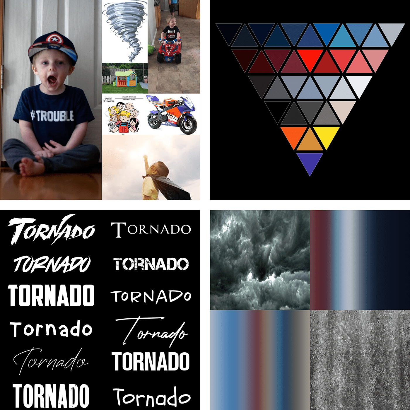
Daily Challenge 200827 - Superhero Want Ad
@bleak fossil I like the additional drop shadow you suggested, and I think making the bg a bit darker did help make the kids stand out even more and make the colors look even brighter. I think I'll stick with the last version. And as always, I appreciate your time and attention.
@bleak fossil Thank you for your feedback! I tried to push the glow and was not happy with the results I was getting. Did you paint in the glow and use a blending mode? Love what you did with it!
Gave +1 Creative Carma to @bleak fossil
@bleak fossil Thank for the nice comments, Sam
Gave +1 Creative Carma to @bleak fossil
Day 8 Continued.
@bleak fossil trust your opinion and your feedback is much appreciated. Thank you
Gave +1 Creative Carma to @bleak fossil
Thanks for the Link @coral stone. Here is the adjusted version showing some of the fake rim lighting techniques applied. I had to apply several other tweeks to get some "better" results from the current state of the imagery.
Gave +1 Creative Carma to @coral stone
@bleak fossil Thanks. Will make the necessary changes. Thank you. 😀
Gave +1 Creative Carma to @bleak fossil
Challenge 8. Going real for my Villain Poster.
Day 8 - Promotional Image
@bleak fossil, what do you think?
Challenge 8 - I wanted to go for an old, torn & faded look for my wanted poster. I couldn't find a way to get rid of the black around the torn edges as I had so many layers applied
@hollow yarrow Super cool Franck! The classic Wanted power text is looking really good, and the bold color draws nice focus to the Scarecrow. I really like the way you made the rope and scythe break the frame of the circle. Very nicely done!
Thanks @bleak fossil for your good comments!
@bleak fossil I've increased the brightness for the logos - is this any better? Thanks 😀
Gave +1 Creative Carma to @bleak fossil
Daily Challenge 200827 - Superhero Want Ad
@young karma : Great job! I love the halftone texture effect. It gives a nice "comic book" feeling. Great piece for a great message... I'm definitely joining the book parade.
@bleak fossil Here is my revised challenge 7 with brightness increased and I've tried to increase the areas around the eyes of the woman and bird
@young karma : Great job! I love the halftone texture effect. It gives a nice "comic book" feeling. Great piece for a great message... I'm definitely joining the book parade.
@hollow yarrow 😁
@slow stirrup Great improvement! New font gives a nice academic look that fits well with your poster. Just to be picky: you maybe could try to enhance the contrast of the bottles picture to better match it with your text... It looks a little bit too light (does it in "multiply" blending mode?)
Also you could add a layer mask on your text and mask some parts with a "grunge brush" to fit with the old paper look... Just a suggestion😇 ...
Nice jo!👍
Day 8 Promotional Image - Poison Ivy
@hollow yarrow, thank you! I put another layer of the purchment, and blended with "color".
Wanted Poster
Loved the way that you added a drawing style and positioned the elements, @ruby panther! The virus and the twitter logo with less opacity, were a super cool way to acheive some consistency and balance!
Thanks @coral stone Can't say this was fun. Just real....
Gave +1 Creative Carma to @coral stone
Very nice job, @shy bobcat! Really like the textures and the colors on your poster. My only suggestion would be to reduce the shadows' opacity from the text ofthe bottom, so it can be read a bit easier, especially on the word Missed. Well done!
Super cool work @mortal crescent! I like how you played with the edges of the poster. I wonder if you could increase the contrast of the subject just a bit, so it will be more visible. Just another nitpick 😄 you might darken the D from Wanted, so it can read better as well. To remove the black from the edges, you might use tools like color range to select the blacks and then apply a layer mask to recover additional areas that might have been hidden together, by painting with the white brush. Here's an overview on how the tool works: https://www.youtube.com/watch?v=UpLAEoMZVPc Let me know if you need any help. Great job!

Custom Luminosity Masks with Color Range in Photoshop
Luminosity Masks are all the rage these days it seems and rightfully so, they are extremely powerful. A Luminosity Mask is nothing more than a selection of the luminance range in your image. Think of it like separating ...
@safe linden Really cool lighting in this Day 7 challenge! I like the effect for her super power, kind of like she's wielding a staff of energy or something. I like the blue light you added onto her face, though I think adding a little along the right side of her body might look good too. I often like to use a screen layer for this. It might help balance out the contrast between her and shield as well. Maybe something like this? Though it doesn't need to be as heavy handed.
(Click "Open Original" for best quality)
@bleak fossil
@bleak fossil I need more practice, yours still looks better, mine is too subtle.
Challenge8 Created my own monster
@hollow yarrow, thank you! I put another layer of the purchment, and blended with "color".
@slow stirrup :Great! More homogeneous... To be more picky (after that... I swear, I'll stop bothering you), you could boost contrast with a little curves Adjustment layer ...
Day 8 re-do. I thought a hand-drawn-looking picture of Slippery Pete would have been more realistic back in the Wild West.
Challenge 8. My intent is to thank the fire-fighters. There are so many fires in the western region of the USA. I suppose the message can be taken multiple ways. Thank you for this opportunity!
day 8
DCC Day 9,Poster
Day 8 Challenge
PS DCC #8 Promotional Image
@bleak fossil Thanks for the kind words! @forest aspen This is great! I really love the styling of this, and the red color of the virus against the tan background really gives it a nice contrast. The bullet holes are a nice touch, and I like how they even have a sort of cartoony look that fits in with the rest of the design. The mockup is a great addition too, hah. These came out great!
Gave +1 Creative Carma to @bleak fossil
Day 4 version 2: this is the first time this week I've had time to work on the second version that I promised. This is a mix stock images from AdobeStock, Pixabay & PixelSquid plus some pen drawn shapes and lots of Photoshop Composite Magic 🙂
Challenge 8. Help Wanted in the City of Perplexia.
DCC12 09 200828 My poster for today
DCC12 Results My updated moodboard from Challenge 1 with a panel for Results
Poster Heros and Villians = 2020. Learning how to build composites
Day 9 and final challenge for this 2 weeks! This turned out to be a blast!
@sweet fern Really cute image, but I believe both texts are too dark to read. Maybe a light stroke? Change the text color? As Sam would say, thats just me.
PS DCC #9 Poster Design
My moodboard for the week. This has been so much fun and I learnt so much! Thank you @crystal aurora, @bleak fossil, @coral stone! You all rock!
Gave +1 Creative Carma to @bleak fossil
@bleak fossil, what do you think?
@slow stirrup I like this version better than the latest version! And yes...sign me up for Potions 101!
Gave +1 Creative Carma to @crystal aurora

@crystal aurora I want to thank you for a fun learning experience. The DCC was awesome. Your energy and enthusiasim this two weeks was shining through the monitor. I thoroughly enjoyed it. As usual, I thank @bleak fossil and @coral stone , Amazing again. I sound like a broken record but you guys are there day after day image after image. Beginner to super expert, you nudge us along at an appropriate pace. Youre the best. Here's my portflio. I hope you have time to view it. Any and all comments are welcome.
Gave +1 Creative Carma to @crystal aurora
"SuperDad the Movie" - Already playing at a household near you.
Day 9 Movie-ish Poster
@coral stone Thank you for your feedback again, I knew it wasn't right but didn't know what was really wrong. Anyway I got rid of the drop shadow and put on a stroke instead it stands out much better now.
Gave +1 Creative Carma to @coral stone
A day late ...PCC 9 a villainess . Too much?
I LOVE comic books. I love street-level characters even more. I had to participate in this daily creative challenge to show some love for all the C list characters who don't get their cinematic fair shot next to big names; The Avengers, on their next big mission.
This project is a celebration for all those characters. I hope you enjoy viewing it as much as I enjoyed creating it.
Special thanks to @jolly quest for giving me the chance to participate in this challenge.
I would like to thank everyone who helped with their feedback.
Thanks everyone!
Here's the full project:
https://www.behance.net/gallery/103285069/PSDCC-August-2O2O

Gave +1 Creative Carma to @jolly quest
Calling Card Challenge
Great job on the textures @hot thicket! Really like the way that they and the colors worked out on the background. If you want, you might hide the bottom edges of the subject with some other branches or even position her a little lower and then playing with some clipping mask. Just some ideas, of course! Very well done!
This turned out really cool @cold oyster! Loved how there are some textures on the text from above! The black rectangle and the white text were a super cool choice to create more visual interest. Great job!
@simple idol I think that the typeface that you chose for the poster fits very well! I also like how the monster has some dark spots enhancing the scary message that you wanted to pass when you created it. Day 9 is looking amazing! I like how you used the 2020 rectangle to divide the composition and the fire seems to be connecting both realities. Nicely done!
@tropic knoll great job, CK! I like how the italic look of the font adds some movement to the poster, matching really well the hero context. My only suggestion would be to adjust the wings contrast, so it might stand out a little more. You can achieve that by darkening the background might, but be careful for the texts don’t lose too much contrast. 😉
Whoa! Means a lot, man. Thanks for your feedback!!
This is very cool @abstract parcel I like that you chose a red tone dor the text. I wonder if creating some shadows where she is standing would make it look a bit more cohesive. And just a minor nitpick, you might extend the sky area and shift the text a little higher, so the As night… won’t be placed in front of the castle, improving the readability
You did an amazing job with the text @safe linden! Loved the way that you played with the Horsewoman shape, it adds a super cool look for the poster. Also, the color for the Protector has a great amount of contrast against the background. Awesome work!
Good job @fluid wharf! I like how you added some edges for the poster, if you want the text to blend a little more to the background, you might reduce its opacity a bit, so the textures will be able to appear through it as well 😉
@lucid plover super cool work, Fery! Really like the way that you played with the perspective. My only nitpick would be to move this point a little bit up and to the right, so the horizontal lines of the paper might be able to have the same direction enhancing the perspective effect 😉
Loved the style that you chose for the word Wanted @gilded flame! The textures worked out really well and I like how you gave the white background, where the subject is, some organic edges. Great job!
@tacit condor wooow this looks amazing! The way that you managed the hierarchy of the texts and pictures turned out into a very well balanced design. Day 9 is looking great as well! I like the glows that you added and the stroke of the word Antihero. Fantastic work!
@untold iron this came together really nicely! I like that you played with the scale of the emblem and the metallic look of the text. Great challenge 👍
Loved the way that you let some textures appear through her face, @prime temple! This is just a personal preference but you might darken the blue tones of the Jaenelle Angeline just a bit, so it can match even more the dark atmosphere of your poster 😉
Lovely work @forest aspen! I like that you created a shadow for the subject. If you want, you might add a mask to the subject’s layer and with a very small brush, paint black over the front area of her shoes, to reveal some grass, this will enhance the effect that she is really standing on the grass, just an idea. The textures on day 9 are looking amazing;) Great job!
I like how the background image adds a nice sense of speed to the poster, @fringe sunt! The way that you played with the frame and the yellow strokes turned out really cool. Well done!
Ooh this is looking super cool, @sacred field! I like that you played with some effects, enhancing the shadows area, how did you do that? Is that the threshold effect? I like how the elements in the background have some colors, making them more subtle at the same time that it’s creating a very interesting contrast for the effect. Awesome work!
@eternal mica Thanks for the kind words, Ted! 😃 your poster is looking very nice. I would just be careful with the overlaps, Superman is hiding almost the first half of the word American, this might be a little difficult for the viewers to read, you might adjust that by making the same as you made with Robin and the word Truth 🙂 Well done!
Gave +1 Creative Carma to @eternal mica
Nice job distributing the elements @sweet fern! Loved the way that you added the purple shadow for the Underdog, creating kind of a negative effect. 👍
@compact pecan great font choice, Hugh! Really like the way that you added the colors for the Super Dad! The elements are looking on point as well. Nicely done!
@vague shuttle this is looking very nice, Abraham! This is just an optional step, but if you want, you might add some textures on the gradient of the background as well, it can be the noise one from the subject, just to see how it turns out 😄 Nice work!
@coral stone You're welcome. You deserve the accolades. I wasn't worried about the letters in America, as I felt the phrase and word are very recognizable and known.
Thanks, Valdair! Yes, I used Threshold on 3 photos and then just placed the color image in the bkgd. It was a pretty quick project! 👍
Poster Design
Day #7, what do you think?
Superpower Challenge
Thank you @coral stone
Gave +1 Creative Carma to @coral stone
Daily Challenge 200828 - Superhero Poster - edit-- Added another version at 10:57 with a few tweaks.
Challenge No8 Had fun with this one, not quite a poster, but in a time of supper heroes why would you print it on paper 👹
Day 8 - Promotional Image
Challenge 9. Went clean and simple for this one.
supervillain poster challenge no 8
Challenge 9 poster, not 100% sure I'm completely happy with it so any feedback appreciated.
Day 9 Challenge
@coral stone Thanks for the link, that"s a great tool! 😃 I've cleaned up most of it except at the top where one of my textures is causing issues, so will keep working on that part
Gave +1 Creative Carma to @coral stone
Challenge 9 -Superhero Poster
Final Mood Board - Finished Challenges

Everyone! I thank you for helping me with every challenges of the day! Each mentor like @coral stone , @jolly quest, @bleak fossil and @hearty terrace . I am thanking you for helping with my challenges. And giving new suggestion and new given feedback. It helps me to move on.
Thank you
thanks @coral stone and @jolly quest
Gave +1 Creative Carma to @coral stone
Day 6 Challenge
Challenge No9 the poster
Daily Challenge 200828 - Superhero Poster - Version 2 - made a few tweaks..
Day 7 Challenge
day9
Ok, I've revised Challenge 8 again - basically started from scratch with the layering and I think it looks realistic
Star Flight Poster. Challenge #9
@inland kiln beautiful work! Loved the technological mood of your work and the cyan/blue colors and the transparency were a great choice to enhance it. Well done!
Very nice @sand crag! Really like your font choice, especially because of the contrast of its strokes. If you want, you might reduce the opacity of the texts just a bit, so the textures might be able to appear a little more from them 🙂
Awesome textures, @ruby panther! I like that you added some flares to the top area of the Heroes! I think it adds a very nice touch for the poster. Great job!
...and the final Mood Board. Now off to create my Behance presentation (with some additional tweaks I am sure...). Thank you @coral stone @bleak fossil and @jolly quest for a fun filled and educational two weeks!
Gave +1 Creative Carma to @coral stone
@hollow yarrow, like this?
(when it comes to improving my work, you can bother me as much as possible, just bare in mind, that I won't always listen to you...) 😂
@mortal crescent Very cool! The desaturated photo with a sort of sepia look is working well. It’d be interesting to see the edges of the photo maybe faded with a soft brush, or textured with a textured brush? It might also be nice to see a bit of texture showing through on the text so it doesn’t quite look too perfect and clean. Maybe have it on a multiply layer with slightly lower opacity? Just some thoughts. Nice work!
@fluid wharf This text came out really well for the Day 9 challenge! Really great sense of form and metallic look with the beveled effect. Both of these elements stand out really nicely against the dark background. Nicely done!
@gilded flame Really great sense of form and lighting in this one! The logo against the rippling background looks extremely convincing and natural. The red first creates a lot of contrast and makes for a good focal point too. Really nicely done!
@slow stirrup Ooh, great shift in style with this! I think the more elegant feel of the font and border really help push it more towards the style you seemed to be going for. The texture on the text really helps make it look more like it’s part of poster as well. I think this is looking really solid!
@fringe sun Really excellent work throughout the past 2 weeks! I really like the styling of the Day 9 challenge. The repetition of the blue and yellow in the text and hero give it a nice consistency. I feel like maybe the yellow/gold in the center of the text could be a bit brighter to better match the lighting, but that’s a minor nitpick suggestion. I like how you added the super power effect in the background too. Very cool!
@young karma This is looking excellent Vickey! The lighting looks great and really sets a nice mood for the whole image. The mask on the face looks extremely natural as well. Overall a really great balance of contrast and composition. The composition of all these elements and perspective of the emblem all came out really well. Impressive work!
@inland kiln Super cool! Really nice bold colors to this. I love the way the yellow tones are balanced throughout the image in the text and mask. It draws the focus really nicely to the eyes. The red makes for a nice pop of color as well. If I had any nitpick I'd say the red text at the bottom doesn't quite fit the mood and feel of the image, it almost looks a bit more like a typewriter. Maybe something a bit sharper would look good. Just a minor nitpick. This came out great!
@gilded flame Day 6 is looking good! I like the sort of cracked leaking light effect in the background. There's a nice bold read to all these shapes and colors. If you're going for a spray painted look it might help to choose a blending mode that shows the texture of the wall underneath. Very nice!
@abstract parcel Really great work on these Cheethu! The Day 9 superhero poster is looking good! The mask and text has some really nice contrast against the background. It's been great seeing all your designs throughout the past 2 weeks. Nice job!
@rare herald Really cool! I love the gritty metal texture on this design. The green color gives it a cool feel and the red eye makes for a great contrast. My only suggestion is I think masking out the bottom left and right edge with a soft brush to fade the portrait seamlessly with the background might be a more natural look. The white text has a really nice read against the background too, nice work!
@young karma This is looking excellent Vickey! The lighting looks great and really sets a nice mood for the whole image. The mask on the face looks extremely natural as well. Overall a really great balance of contrast and composition. The composition of all these elements and perspective of the emblem all came out really well. Impressive work!
@bleak fossil Thank you !!
Thank you sam for feedback
Thanks for adobe team hosts and mentors great job
Best thanks for voodoo,Valdair and Sam
Promotional Image Challenge
Awesome 7 @gilded flame
Day 9 - Poster Design
@hollow yarrow, like this?
(when it comes to improving my work, you can bother me as much as possible, just bare in mind, that I won't always listen to you...) 😂
@slow stirrup: I took notes😂 ... nothing to add except... well done!😆
@cold oyster Very impressive portfolio. Thak you for posting
@inland kiln I love that DCC9 poster. So much to like about it. I had one small comment, The I and V in Viva are so close togetehr its not readily readable as two letters. Maybe space them out a bit???

Challenge 9, any feedback appreciated
@eternal mica @bleak fossil Thanks for the comments here's the finished project for the week https://www.behance.net/gallery/103008473/Photoshop-daily-creative-challenge-17-28-August-2020

Behance
Photoshop daily creative challenge 17-28 August 2020
Gave +1 Creative Carma to @eternal mica
Thanks @jolly quest
Gave +1 Creative Carma to @jolly quest
@bleak fossil Thanks for your advice, I've amended my design with the changes suggested.
Gave +1 Creative Carma to @bleak fossil
Thank you @bleak fossil for the feedbacks 🙂
Gave +1 Creative Carma to @bleak fossil
Day 6 Challenge updated
@coral stone Thanks for your feedback! Have a good weekend.😆
Gave +1 Creative Carma to @coral stone

Poster Design Challenge
Poster Design
@plain sable Hah, very cool! I like the contrast in the poster image and the color scheme with the yellow/black works really well with the pops of color in the bear. The portal image has a really cool style to it. The gradients and texture add some nice depth!
@young karma Really great image! The color, lighting, and contrast all looks really cohesive and natural. Really great sense of depth with the size variation of the books and the atmospheric perspective in the image. It makes for a great focal point with the girl and bull too. Excellent work!
@slow stirrup Ooh, I love the lighting and reflection on the potion bottles! Really nice contrast. I wonder if a subtle texture across the text might help give it a bit more of an aged and natural look. Also, if you’re having an issue getting the mask around the twine nice and clean the Refine Edge Tool should be able to do a pretty good job with that if you hadn’t tried it already. Looks good!
@mortal crescent Looks good! I think a bit more contrast to the text of her name might look good to make it stand out and match the “Wanted” text a bit more. Nice work!
@covert loom Really nice job with all these designs! I like the different mask variations. The last design with the city looks great too, I really like how the colors from the mask are present in the city, it gives it a really nice uniform feel. I wonder if a bit of a gradient effect that darkens down the bottom of the image and fades away towards the top and middle might help draw a little more focus towards the face and away from the bright white area around the bottom right? Just a thought. Great work with these!
@shy bobcat Hah, very cool idea Pam. The figures stand out really nicely against the lighter desaturated background. It could be nice to see the red of the text taken from the bold red of Superman’s cape to give it a bit more pop and tie the look in with the rest of the image. Though that’s just personal preference really. Nicely done!
@bleak fossil Good advice, Thanks.
Gave +1 Creative Carma to @bleak fossil
Wow! I like all the designs.
Ps I'm not an expert. Just a beginner. Ask @bleak fossil, @coral stone, or Kathleen or @jolly quest
Just in case ya didn't know
@brittle slate Special Thanks
Gave +1 Creative Carma to @brittle slate
Gave +1 Creative Carma to @jolly quest
Thank you @crystal aurora for a fantastic challenge, and @coral stone and @bleak fossil for your feedback and advice. I've loved this challenge. Here is my complete Behance project https://www.behance.net/gallery/103404173/PS-Daily-Challenge-18-28th-August-2020

Gave +1 Creative Carma to @crystal aurora
Thank you @eternal mica
Gave +1 Creative Carma to @eternal mica
Beautiful work @glacial minnow! I like that you added some flares, giving the mask a metallic look! The textures and the shapes worked out very nicely as well!
Loved the way that the texts came out in your poster @chilly hawk!The metallic stroke was a very clever choice to maintain contrast, especially on the N and S. The textures on the subject are matching pretty well the context of the whole composition. Well done!
@young karma beautifully themed and executed portfolio. Thank you for sharing it
Gave +1 Creative Carma to @warm oasis
@young karma beautifully themed and executed portfolio. Thank you for sharing it
@eternal mica - - Thank you...
Hey Guys, My name is Shalom! I've just started the behance photoshop challenge and wanted to post some off my work to get feedback. I might be on the wrong chat, so please just direct me to the right one. Thanks! 😀
Hi @sand void welcome. "other design" should be in the "design-other" channel for feedback 🙂
@plain sable okay cool! Thank you
Gave +1 Creative Carma to @plain sable
👍
I updated my poster!
@bleak fossil, this kind of texture?
@slow stirrup Oooh, cool, kind of a snake skin texture almost. I just meant a general sort of gritty or worn texture, maybe like this. But I didn't have anything specific in mind. The snake skin look kind of fits that potion motif in a way. Makes me think of a witch adding different crazy ingredients to a cauldron, hah. Totally just depends what you're going for. Looks good!
Grand Canyon
@bleak fossil, how is this?
@slow stirrup Hmmm, I think I might prefer the previous. It has a bit more depth with the deeper value range and the texture stands out a bit better from the background texture. Up to you of course!
@bleak fossil, yea, i think so too.
Pune Farms Daily Challenge
I used pano1
DCC Day 1,Dramatic Landscape,this is the photo which I took when I was in Jogjakarta,Indonesia the exact location was the Jogjakarta Keraton square
Daily creative challenge day 4 photo compositing from last week. Went down Villain "alien" route because my girlfriend hates snails. 😆
Dramatic landscape
Dramatic Photo Grand Canyon
Dramatic landscape. Poinsett Bridge in SC, taken a couple weeks ago
Dramatic Landscape - Grand Canyon
A panorama with photos taken in 2012 in Monaco. This worked so much better than the software I used in 2012! 😂
it looks like a James Bond movie @pliant comet
Hjohnny#2794 #PSDCC Day 1 Patagonia HDR
The before and after for Dramatic Landscape HDR.
My complete challenge on Behance
https://www.behance.net/gallery/103428653/Photoshop-Creative-Challenge-Super-Character
before and after hdr
Before & After! This was taken at Chateau Montalena.
Day 1 Dramatic Landscape_ Southern Hills in Idaho
Daily Creative Challenge #1 DRAMATIC LANDSCAPE [before] 📷 sunset MAPUTO-MOZAMBIQUE🇲🇿
Daily Creative Challenge #1 DRAMATIC LANDSCAPE [AFTER] 
 👍🏾
👍🏾
Smugglers Cove, Nova Scotia
After editing and blending with original and a lavender background layer
#1 Dramatic Landscape: Egypt, Norway and Canada mixed in one pic 😉
Dramatic Landscape Original
@cold oyster You need scary background music for the After!
Before
After
Which then led to playing around with layering the effects...of course. Its real easy to get carried away with HRD...
Before
The Watchtower on the South Rim of the Grand Canyon. Unedited and Edited. I always hear Jimi Hendrix when I look at this photo.
The HDR of the Devils Bridge.
The Talimena Scenic Skyway in southern Oklahoma. Great motorcyle run of about 60 miles with vista stops every 300 yards or so.
The lake in Bulgaria HDR Toning - Before
The lake in Bulgaria HDR Toning - After
HDR Pro...
Panorama (Bulgaria)
Dramatic landscape
Added some HDR to the panorama image
Devils Bridge
Black and White Canyon
Soft Grand Canyon
Photoshop Challenge using HDR filter and some additional tweaks.
DCC13 01 200831 Pano HDR
Could have used this HDR for Val's villain challenge.
current challenge , day -1 😅
@young karma ha! I was about to say: "where's the after"? I think you really helped the delpth of this photo by deepening the shadows and adding some vibrancy to the sky. nice job!
@young karma ha! I was about to say: "where's the after"? I think you really helped the delpth of this photo by deepening the shadows and adding some vibrancy to the sky. nice job!
@sterile bane thanks 😁
@marble sentinel wow - you really got a great depth of field here. the sky feels a bit distracting because it's flat compared to the landscape. I might try to add some "highs" and "lows" (shadows and highlights, like cloud cover or fog). hope that helps! keep up the great work
@ember crown wow! you really added some drama to this with those highlights. my eye is definitely drawn to the landscape. if i had to change anything, i might decrease the "grey" effect juuust a tad in the sky
@modern halo very nice! this looks like it could be an advertisement with some words in the sky. maybe for Jeep?
@lucid plover thanks for posting! the colors are looking nice here.
@young karma hopefully she appreciates your creativity and doesn't get too upset about the mutant snail! 🤣 in all seriousness, i really like how the shell color ties in with the sky
@lime meadow nice vibrant edits! the canyon in the far distance has some really nice atmospheric perspective going on with the slight grey/blue tinting
@untold iron great job! although the sky is still interesting to look at, the lack of contrast there really helps the viewer focus on the landscape.
@ruby void lovely photo 😮 I like how the shadows in the tunnel have a green hue. it helps this photo feel very verdant and fantasy-like
@regal ermine wow! nice - my eye goes straight down to the canyon with that bright yellow ground. the sky is nicely "toned down" to help the viewer know where to look
Gave +1 Creative Carma to @marble sentinel
@pliant comet haha! so glad to hear it
@safe linden very nice - did you do some editing to the clouds? they almost look painted.
@cold oyster that certainly IS dramatic! i feel like i'm in a dreamscape. the slight glow gives a cool surreal effect. this might make a great background for a fantasy composite
@obtuse plover great job - the vibrancy works really well for this image since it focuses on the flowers. keep it up!
@hot thicket wow what a lovely photo. did you edit the yellows to be more vibrant? it really helps the viewer know where to look!
@magic wagon look at that dramatic sunset - very nice!
@loud mist wow - that edit really adds some ambiance to this already beautiful landscape
@queen dew hah i almost didnt notice the mountains in the BG. very subtle - nice! the different tones in the sand are mixed well. nice job!
@arctic rover great job! love the warmth that you pulled out in the wood
@sweet fern ha! that IS The Watchtower. the warmth of the Devil's Bridge looks really nice with the green of the foliage in the BG
@queen aspen love the details that came out in the sky in your edit. great job
@spare badge looking good - that water is unreal (in a good way)
@eternal mica look at all of those DETAILS you pulled out in your edit! nice. I feel like this would feel post-apocalyptic if it were black and white or maybe sepia...
@fringe sun nice - everything has so much detail i'm not sure where to look!
@sterile bane Thank you. In which one of the 3 that I posted?
Gave +1 Creative Carma to @sterile bane
Challenge Day1
I used the "surrealistic" option in HDR toning for this. I'm not sure when I'd actually use any of these effects, but they are fun playing around with.
original image SOC
HDR and Original.
@sterile bane I wasnt sure which image you meant should be B&W and which sepia. I made one in each.
@marble sentinel I like how the details are looking in your photo! I agree with Kathleen, maybe bringing more contrast and recovering some details on the sky might help the image look even more consistent. Well done!
@ember crown woow that's a dramatic effect! I like the saturated tones from the mountains, and how the clouds are looking as well. Perhaps you might decrease the brightness of that white glow, just to recover some details, for that, I believe that fine-tuning the glow and the highlights sliders might be enough. Great job!
Thank you @sterile bane
Gave +1 Creative Carma to @sterile bane
@modern halo super cool edits, Willi! I like the results that the HDR toning produced, especially on the branches. Nicely done!
Hey @lucid plover! I didn't see the original photo, but I assume that you made some adjustments to the sky and the saturation of the other areas. They are looking pretty awesome! I like how the dark greens of the trees and the cyan tones of the sky are looking. Also, the yellows of the ground combine very well together with the other tones. Great job!
@young karma super cool composition. I like that you played with some overlaps and the rain. My only suggestion would be to apply some light to the top blue areas of the snail. Since the light is coming from the sky, this part would be affected, just like the shell 🙂 Nicely done!
Good job, @lime meadow! I like how you brought life with the saturated greens! Also, the warm colors coming from the rocks are looking very consistent. Well done!
You did a very nice job with the HDR toning, @untold iron! I like how the adjustments brought some details on the rocks that are far away! The clouds on the sky are looking super cool, as well. Great job!
Cool edits @ruby void! I like how the adjustments brought some cyan tones to the water and the bridge, I think that, even though they are subtle, it makes the whole image even more interesting. Excellent work!
This is looking very nice @regal ermine! I like how subtle the adjustments were on your image. The dark areas of the bottom right make my eyes to go straight to the middle of the composition. 😉 Awesome work with the focal point!
Great to see you’re back for this set @pliant comet! I loved how the lights and colors are looking. My only minor nitpick would be to adjust these areas on the bottom right, 👇 creating more of a smoother transition. For that, you can use the patch tool, just like Paul did on the stream. Let me know if you need any help 🙂 About the HDR toning, I loved how you brought back some subtle details from the wall. The gray tones of the sky really enhanced the rainy day of the scene. Amazing job 💯
The adjustments worked out really great on your image, @safe linden! I like how the details are looking, from the mountains of the foreground to the background. The ripples on the water are looking very on point. 👍
@cold oyster very cool work! I like how the purples and yellows when combined with the haze, created kind of a dreamy look for the image. Nicely done!
@sterile bane sepia of pano HDR
This turned out really nicely @obtuse plover! Loved the way that the saturation adjustment gave more life to the flower on the left. I like how the image has more light and you were able to bring more details of the rock. Well done!
@marble sentinel Really nice! I like how both the focus in the foreground and desaturated color in the background draw the eye into the center of the image. It would be interesting to see the "before" image to get a better idea of the changes you made. Nice job!
@ember crown Nicely done! Really nice bold contrast in this image, and the colors definitely give it a lot of interesting 👍
@modern halo Really interesting style with the intense contrast of the landscape. Though it looks as though you lost the sky in the process. I think it might be nice to mask the sky out to bring in back and keep that nice blue contrast with the landscape. Nice work!
@lucid plover Very cool to see you using your own photo! There seems to be some really nice contrast in this image, and I like the blue/yellow color contrast of the sky and grass. Though I feel like the image is a bit dark overall. I think a boost to the brights with a levels adjustment might be a nice look. Looking good!
Beautiful work @hot thicket! Loved the way that the details of the sand are standing out! I also like how you kept the colors subtle, this was a great choice to give the whole image a natural look. Awesome work!
This is looking amazing @magic wagon I like how you were able to enhance the details of the water. The way that you introduced more warm tones to the sky made it look super cool, especially how it contrasts with the cool tones from the water. Very well done!
Wow very good job adding more contrast to the scene, @loud mist! The details are looking very sharp. I like the new purple tones that you added, they create a very interesting look to the image. Awesome work!
Very creative work, @queen dew! Loved the way that you blended the images! My tip would be to add a color balance adjustment layer clipped to the mountains on the background and give a bit more of yellow to them, so they will be closer in color value, it doesn’t need to be strong, just a touch is enough. If you want, you might do the same for the sand in the foreground (for this, you might need to add more red along with the yellows, since they have a subtle orange tone). The surrealistic composition is looking amazing! 🙂
@young karma Ooh, really interesting direction with this one! I love the intense surreal colors, it definitely has a bit of a dangerous otherworldly feel. My only suggestion is that it might help to adjust the contrast of the snail to match the scene a bit more. The dark tones of the snails body could be darkened a bit to match with the dark contrast of the foreground of the landscape. It might also be nice to tone down the contrast of the background a bit since it's currently deeper than the snail, when realistically it would likely be a bit less due to atmospheric perspective. It might be subtle but it could give the image a bit more balance possibly. Very cool design!
@lime meadow Looking good Fani! The colors definitely have a bold saturated look to them. I feel like the value contrast could be pushed in this by brightening up the brightest tones a bit with a levels adjustment, but it really just depends on the look you're going for. Nice work 👍
@untold iron Really cool, sharp contrast in this image! The colors have a rich bold look to them as well, nicely done!
@arctic rover I totally agree, Jude hah! Loved the adjustments you made, especially on the Pepsi Cola image, the way that they added sharpness to the windows turned out really cool. Amazing job!
@sweet fern what a spectacular work you’ve done! Loved how the edits brought more life to the images, especially to the first one. Fantastic work!
@ruby void This is great. Always nice to see people use their own photography, nice composition in this one! The colors and lighting have a really nice sharp contrast to them without appearing unnatural. I love the lighting on the bridge, really nice work!
@regal ermine Very nice! I really like the bold color contrast between the yellow in the landscape and the blue sky. Good job!
@pliant comet Hah, it's always nice to have something to make the process easier. This is super cool, great to see you using your own photo! Really great warm lighting in this photo. Really nice contrast too, the warm buildings of the landscape create a really nice contrast with the blue sky. Very cool!
@coral stone Sam and Valdair with the tag-team feedback
This turned out really cool @queen aspen! I like how you were able to bring back some details from the shadows by brightening them, on both images from Bulgaria. Also, the clouds have a very interesting look, feels like a painting. Good job!
Thank you @bleak fossil
Gave +1 Creative Carma to @bleak fossil
@spare badge wow really like the dreamy look of your image, Daxa! The color of the lake feels very cohesive to the trees. Well done!
Woooow amazing versions @eternal mica! Loved the enhanced tones of the first image, especially the cyan ones from the mountains. The second is looking great as well, I loved how the effect turned out on the grass. Excellent work!
thanks for the feed back @coral stone @sterile bane 💯 👍🏾
Gave +1 Creative Carma to @coral stone
@coral stone Thank you Valdair. Really appreciated
Gave +1 Creative Carma to @coral stone
Beautiful work @gaunt gulch! Loved the panorama image and the Devil’s Bridge, the colors are looking very interesting. My only suggestion would be to recover some details of the clouds on the black & white version. You can try bringing down the shadows slider and fine-tune with the other ones, you can also create multiple versions, so if some area loses details because of the adjustments, you can use to recover them. Very nice work!
Great to see you’re back for this series @fringe sun! Loved the effects on the image, giving more of a painted look, especially when I look at the mountains and the clouds. Great job!
Loved the animation that you added for the Before and After, @young karma! The blue sky created a super cool mood to the image. Very well done!
@young karma very nice work, Selma! I like how you made the mountains in the foreground in grayscale! The gradual change of tones from the mountains from the front way to the horizon created an amazing effect. Excellent work!
@compact pecan very dramatic effect, Hugh! Loved the results, especially how the details are standing out from the trees and the houses. Well done!
@neat sparrow Woow very creative approach, Anastasia! I like how the colorful area in the middle added some contrast with the black & white ones, playing very nicely together. Well done!
Thank you @coral stone 👍
Gave +1 Creative Carma to @coral stone
My edited version of the Grand Canyon pic
The unedited version
Think I may have overdone the colours a bit
@proven patio i like very much your edited version of the Grand Cranyon pic
@coral stone Thank you for the feedback.
Gave +1 Creative Carma to @coral stone
@coral stone thank you very much. My first true love is photography.
Gave +1 Creative Carma to @coral stone
Daily Challenge 200831 - Add drama to mundane landscape - Grand Canyon
thank you @coral stone
Gave +1 Creative Carma to @coral stone
a friend of mine in hawaii takes beautiful pictures. here is a before
hawaii road
and an after
hawaii road edit
I made it a little brighter than before,thanks for the suggestion @bleak fossil
@marble sentinel Really nice! I like how both the focus in the foreground and desaturated color in the background draw the eye into the center of the image. It would be interesting to see the "before" image to get a better idea of the changes you made. Nice job!
@bleak fossil
Thank you! The sky was really drab that day, as it is most days in India summers. Brown hazy skys.
PS Creative Challenge 28 Sept- Dramatic Landscapes
PS Creative Challenge 28 Aug - Dramatic Landscapes
31 Aug PS creative challenge- Dramatic Panorama
DCC13 01 200831 Judean Desert Variations on a theme
Day1 - Dramatic Landscape
Cuba - Varadero sunset
Before
After
Day 1 - HDR Toning...
A little bit out of bounds but HDR toning works well not only on landscapes...😉
Day 1 - Panaorama
NYC Night panorama from Brooklyn
(Lot of blur... Sorry but pictures taken by night without stand)
The Narrows in Zion National Park in Utah
This one started as an underexposed and an overexposed shot merged in Lightroom.Then I used Photoshop's HDR toning to get this color weirdness.
This is the result of Lightroom's "Merge to HDR" before adding Photoshop's HDR Toning.
The two originals. I had better luck with two exposures than with the three.
@shy bobcat Looking good Pam! It adds a lot of nice sharpness and contrast to the image to give it a nice pop. Overall the white balance of the image looks a bit warm to me with the water and the sky. I wonder if adjusting that to get some more cool tones could look good? Unless of course that's the actual tint of the water and environment. The image of the rocks really adds some nice life into the colors too. Nice work!
@oblique anvil Oh wow, really interesting effect! I really like how you included all the original images for reference. It really gives the image a sort of unique surreal feeling. I especially love the colors in the roots and shadow area of the foreground tree. Very cool!
@fleet pecan Very nice! There's some great contrast and sharpness in this image. Cool perspective too. It might be interesting to see what the text looks like if you use a brighter tone, if you sampled from the bright center mountain for example, but that's really just personal preference. Nice job!
@sharp quail Really nice sharpness and colors in this one! The time of day makes for a nice look and feel to the image. The contrast is looking good!
@hollow yarrow Oh for sure, night photography can be tough without a tripod. Really cool to see you using your own panorama for this challenge! Really nice contrast in this image, I especially like the area of color in the water and sky. Awesome vibrancy and contrast to the other two images too. Really nice to see how much of a difference those adjustments can make. Looking good!
@unique flume Looking good! Really great to see how the adjustments can do so much to make the color pop and separate out the various trees and bushes from the areas of shadow behind them. The bold color really seems to make the depth of field focus more apparent too. Very nice!
@eternal mica Very nice Ted, it's cool to see 4 distinctly different looks to the same photo. I think the top left definitely has a captivating feel with the strong contrast and separation of foreground and background shapes. Nicely done!
@rocky kite Really cool image with the panorama! The extreme colors give it a sort of surreal, almost otherworldly feel, and really push the contrast between the blue, orange, and green. Nice work!
@vale pumice Ooh, really interesting effects with the colors on this bike image! Really nice color contrast between the bike and background on the second one too, makes for a strong focal point. 👍
@digital ruin Very interesting look to this design with the cool green/blue tones! It really transforms the look and feel of the original image. Overall it might be nice to have a bit more bold contrast since both darks and light looks like they could be pushed a bit further, but it really depends on what you're going for. Nice work!
@kind ibex Nice job with the object removal in this image! I really love the effect these adjustments had on the trees too, totally changes the look and feel of the image. I noticed it seems like you masked out the trees but the white areas between the leaves remain. I'm not sure if you tried it but the Refine Edge Brush tool usually does a great job of masking those complex areas. Great colors in this design!
@wicked abyss Loving these colors! Really great photo. It's always fun how much of the original colors Photoshop can bring out and push as far as you like. Really nice overall contrast to this photo!
@young karma Really cool Vickey! I like the pinks in the sky and purples in the background mountains. Really nice enhancement of the original photo to give it some extra pop 👍
@proven patio Really great enhancement to the colors in this photo! I especially like how much it brings out the various layers, shapes, and colors of the background mountains. Nice work!
@feral oak Really nice! Is this your own image? The adjustments create some nice clarity in the midground plants, and I love how much it enhances the warm bounced light on the right side of the dog's face. Cool colors and contrast in this, nice work!
Yes, from December 2017 with my dog, Ziggy Stardust. Thank You!
The before & After
@bleak fossil Thank you for your feedback, the water in the original has that yellow tinge and I couldn't seem to cool it down. This is the best I can do.
Gave +1 Creative Carma to @bleak fossil
Day 1
Challenge #1 Dramatic landscapes. It is a photo I took a few years ago.
@hollow yarrow I love your photo and the little bits of purple/pinks are a great contract to the dark tones.

does any body know how to save high quality image in a smaller file ??
this project was 48 MB
@lean badger I have a tool called jpeg mini pro. It does a exellent job of compressing jpeg without comprmising quality. If you need to compress your pics, DM me I will send you the compressed version
moreover setting export quality to 8 to 10 might help in some cases
@weak bolt thank you i will try it
Gave +1 Creative Carma to @weak bolt
@hollow yarrow I love your photo and the little bits of purple/pinks are a great contract to the dark tones.
@cold oyster : Thank you!
I made the sky little lighter and less gray and cropped the image
Fiume Arno, Florence. The original photo, I took with my Iphone 6. Overall are dark and lack of detail.
Then I tuned with photorealistic low contrast to pop up the dark zone, and kept the image smooth. Thanks for the lovely tutorial and tool. Can't wait the new one. #✂challenges-feedback
Panaromic
@coral stone Thanks for your feedback, I will change the BG colours a little bit👍
Gave +1 Creative Carma to @coral stone
@sterile bane Thans for your feedback, much appreciated👌
@ruby panther Loved the way that you recovered the super dark areas of the building, especially that the dark green tones are now appearing. The plants in the front are looking amazing as well 💯
This feels like a painting @slow stirrup! I like how the HDR toning created a consistent saturated look on your image, the sharpness turned out very well, especially on the areas of the waterfall. 🙂
Thanks @coral stone 🙃 Love the feedback!
Gave +1 Creative Carma to @coral stone
@solar rover beautiful work! I like the predominant blue tones of your image. It could be nice to increase the shadow slider just a touch, so the super dark areas might have some details appearing 😉 Very well done!
Oh, that's a dramatic effect, @topaz bone! I like how the clouds and the sky are looking. Maybe you could brighten the shadows just a bit more on the bottom right, so the dark areas won't be blending. Nicely done!
Really like the results of your edits, @lean badger! Especially how the greens are looking more vivid, also, the blue tones on the mountains of the background are looking pretty neat. Great job!
@fluid wharf awesome results! I like how you made the sky with less saturation, allowing the attention to go straight to the mountains. Nice work!
This feels very dreamy @abstract parcel! I loved the warm tones coming from the sky and reflecting on the mountains. 💯
@oblique anvil this is looking pretty cool, Colleen! I like how the saturation feels very consistent throughout all the elements. The sharpness worked out really well, especially on the ripples of the water.
Great job @steep yew. Loved the way that the adjustments made the image look natural. The details on the shadow areas are looking amazing. Well done!
@coral stone, thanks.
Gave +1 Creative Carma to @coral stone
thnk you valdair for feedback
Challenge 1 HDR. Way too much! I'd never do this but fun to learn.
@ruby panther Great dark areas recovery! Great job!
@hollow yarrow Thanks. It's easy when you shoot RAW. 😄
Gave +1 Creative Carma to @hollow yarrow
Thanks @coral stone
Gave +1 Creative Carma to @coral stone
Thank you @coral stone for the feedback!
Gave +1 Creative Carma to @coral stone
Thank you @bleak fossil !
Thanks, @coral stone
Gave +1 Creative Carma to @coral stone
Shot this panorama this AM of construction in Midtown Atlanta with 5 portrait images
Panorama with HDR toning - love this process!
I love it @loud mist !
Great to see you’re back for this series @fringe sun! Loved the effects on the image, giving more of a painted look, especially when I look at the mountains and the clouds. Great job!
@coral stone thanks for the feedback 😁
Gave +1 Creative Carma to @fringe sun
Ilean Donan Castle in Scotland
@pliant geyser Good work! There can be only one!
@ruby panther Close! Think way back to the first "Highlander" movie with Sean Connery....
@pliant geyser Brain fart, so I edited it.😂
Picture of De Peel with HDR adjustment for day 1 challenge. What do you think?
Picture of De Peel with HDR adjustment for day 1 challenge. What do you think?
@safe linden very nice - did you do some editing to the clouds? they almost look painted.
@sterile bane no editing, as shot. A very surreal place, Patagonia.
@safe linden, I just used the HDR adjustment photo-realistic.
thanks for the feedback! @coral stone 🙂
Gave +1 Creative Carma to @coral stone
DCC Day 2,Dog and Cat
Passport Book
so i used an old photo i took whilst visiting some friends in BC. i just loved this lighthouse! used the HDR toning - thanks for the tips. it was fun to play with and a great new tool to add to my toolbox
2 of my drives aren't showing yet so I only have the last couple of shots I took available to me. This tree and the one next to it had a bunch of branches that hooked like this. I'd never seen anything like it.
after HDR
DCC Day 2,Dog and Cat with text version
PS Creative Challenge 1st September - Passport
DCC - Day 2 - Passport
I found that I did take 3 photos of this flower so used them for the combine. then couldn't resist a bit more play in CR. then added a 5 point field blur to bring the focus to the main blossom.
applied a "Halloween" preset in CR. Too much fun
pretty frustrated - the vector challege only had the crow image, not the statue. what happened?
Here is the original pic and my version with the HDR Toning. I used the Scott5 setting, for my day 1 challenge.
ok, I didn't have a jpeg of the original, so here's the altered pic for day 1.
Day 2 vector and raster
Sorry, here's the original photo for above.
#PSDCC Day 2 Vector and Raster The Passport.
Passport cover
Day 2 of the challenge. Photoshop Daily Creative Challenge - Vector & Raster. Love this sunset by the lake image that Paul included. Added a vector compass shape I created in Illustrator. Played around with outer glow effects on the eclipse. Still need to tweak the arrows.
for @brittle slate who asked is it hand lettering or a font,I wrote the text manually with hand lettering technique
I think I made a postcard
That is great @pliant comet !!! I love the icons at the bottom! And how you brought out the blue!
grand canyon part two
Day 2 Challenge
@brittle slate Day 1 Challenge - Grand Canyon 😆
@brittle slate Day 1 Challenge - Grand Canyon 😆
@brittle slate Day 1 Challenge - Grand Canyon - Panorama HDR Toning Experiments
@brittle slate Day 1 Challenge - Grand Canyon Panorama - HDR Toning Experiments ☺️
Only one - shape Grime 6 1: Hogwarts
DCC13 02 200901 Passport from Adobeland
Day 1 HDR
Passport Berlin.
my passport composition
background was a scan of an original painting I made, then played with in PS starting with the HDR toning. Then I added the vector shapes. Edited the nodes on the girl to alter her arm and hand. Added tons of FX to both shapes. Created layers from FX and used masks and blending modes.
Original photo on my back to Texas from Mount Rushmore.
Day2 -Passport
Thanks @sterile bane and @coral stone. @arctic rover after you said that and I look at the image now I do see how it has an eerie feel to it.
Gave +1 Creative Carma to @sterile bane
Psd PassPort
PS Daily Challenge Day 2_Passport_Redesigned.
Day 2 - Vector & Raster
@cold oyster Another strong effort.
Day 2 Vector & Raster
Day 2 Challenge - Vector & Raster ☺️ @brittle slate
@lucid plover really nice vector/raster combo! the vectors work very well as simple silhouettes
@sturdy vault nice job! the effects arent too heavy handed, it still feels natural.
@sinful parrot i love the HDR effect with this type of lighting! really helps to bring out the subject against the dark sky
@primal fulcrum nice! what an interesting tree. it's like the tree is saying "come hither" haha
@rocky kite love how the vector design frames the bird. feels almost ethereal
@untold iron king crow indeed! i wish we all had custom passports like this..
@hot thicket cool! i like how subtle the music notes are. they blend well with the BG even though it's raster
@whole tangle that's a really vivid edit! wow
@safe linden i really like how you applied the texture over the entire image - looks pretty realistic!
@slow stirrup awesome - did you change the blend mode of the vector shapes to help them blend into the BG? or did you decrease the opacity? always so many different ways to achieve your goals in PS!
@torn flint wow, getting fancy with the masking! love how the beak breaks the edge of the compass. right now the very top of the beak is meeting with the edge of the compass and it's drawing my eye - i might try repositioning the bird a tad higher
@simple idol nice! you've got the compositing on LOCK.
@low garnet love how you described your process - it's a great way for others to learn. can't wait to see the finished result
@safe ledge wow, what a change. the warmth of the foreground works well against the coolness of the background. if you were going to tweak it more, i'd recommend toning down the saturation of the background just a bit - the redness of the rocks on the left start to compete with the foreground rocks. great job!
@sterile bane blend mode
@dusk lance love seeing fresco! keep up the great work
@gilded flame great job, nadia. the circular shape behind the statue helps it to stand out against the sky
@dapper basin wow! lots of experimenting going on here. i'm excited to see what you make from your findings
@queen aspen wow! love the liquid effect you achieved with the outer glow. i think the text on the bottom works REALLY well because it's on a darker background. The outer glow in the top text feels a little heavy - i might try to make it more subtle or use a darker glow instead of a lighter one (i guess a darker glow would be a shadow 🤣 )
@slow stirrup very nice
Passport
@sterile bane Thanks, it is pretty vivid, but I think it’s really interesting to see what the computer decides to create. Added an adjustment layer to tone it down a bit. Maybe should do more. Thanks again!
Gave +1 Creative Carma to @sterile bane
Another Passport
Thanks 🙂 @sterile bane
Gave +1 Creative Carma to @sterile bane
@eternal mica great halftone texture! the subtle gradient is a nice touch. the text starts to become difficult to read at the bottom since it's competing with the halftone
@wet thistle very nice! the texture in the grass and clouds work well together
@bold valley awesome shot!
@sacred field sweet! my only critique is that the text in "PASSPORT" becomes difficult to read once it overlaps the world. I might try adding a subtle stroke or try bending the text over the world instead of into it
@dusky wave wow! love the reflection effect. I think the font choice is a little too difficult to read - you could try adding some space between the letters (kerning) or exploring other font styles
@primal fulcrum really cool to see your painting used as a texture in the background!
@sweet fern awesome passport. did you really drive a motorcycle all that way???
@spare badge clean design! keep it up
@fleet pecan love seeing the rose overlapping the circle - it helps to give the design some depth.
@cold oyster ha! i like the idea here - very surreal and a little nihilistic! the moody vibe matches with the content
@obtuse plover great job with your raster/vector combo. i prefer option 1 - the background has more contrast with the vector graphics on top of it
@wicked abyss wow very cool. it looks like you even color-graded the crow to match with the purple/blue hues of the background?
@dapper basin nice job with your vector & raster design! very clean
@ember crown wahoo! nice job. I think the icons on the left and right deserve a liiiiittttle more breathing room. maybe they could be shrunk down just a tad so they're not bumping into the edge of the canvas?
@ember crown love your statue design. great job adding the warm highlights from the circle
@sterile bane Thank you for your critique. I sensed that problem with the smaller text. Id like to keep the same effects as the larger text. Maybe it just wont work. I'll play with it some more.
Gave +1 Creative Carma to @sterile bane
@ember crown love your statue design. great job adding the warm highlights from the circle
@sterile bane Yeah that was pure serendipity lol
An Ancient love story for time travelling minds?
@sterile bane Thanks, Kathleen! That sounds like it’ll be easy enough to fix! 🙃
Gave +1 Creative Carma to @sterile bane
@sterile bane How about this???
@sterile bane Thank you!
Gave +1 Creative Carma to @sterile bane
Thank you @sterile bane
Gave +1 Creative Carma to @sterile bane
@sterile bane Thank you. I did match the crow colors to the background. 🙂
Gave +1 Creative Carma to @sterile bane
This is looking super cool, @dusk lance! I like that you made 1984 a little faded, so it contrasts really well with 2020 without making the whole image look busy. You did an excellent use of textures as well!
@pliant comet nice blue tones in this one! Loved that you added a subtle glow to the text, this helps it stand out without creating any competition with the other elements. Well done!
I loved the mixture of colors in the Part 2 @safe ledge! The details of the mountains and the branches are looking very on point! You did a very good job bringing back the colors of the Grand Canyon as well 🙂
Nice font choice, @gilded flame! What’s the name of it? I like that it has those details which add a nice personality to the composition! The blending is looking very on point as well, my only consideration would be to lighten the dark tones of the bottom area, so they won’t occupy a lot of space and the transition would be a little smoother 🙂
You did a really great job in your composition @queen aspen! Loved the way that the white glow worked out amazingly with the dark green tones. The stylized font was a very good touch as well. 💯
You achieved a great balance in this one @eternal mica! I like how your image has a great hierarchy, and the halftone pattern worked out great with the colorful logo and the playful letters. Excellent job!
Great to see you’re back @wet thistle! Loved the results that you achieved, especially by the sharpness of the plants and the contrast of the clouds. Excellent work!
Nice results on day 1, @bold valley! I like that even though the image looks sharper, the depth of field was preserved, you can see that by the subtle blur on the plant in the foreground. Great job!
Super cool work @sacred field! I like that the background image adds a nice sense of movement to the image. Very nice improvement, I like how the text is readable and the whole composition feels more balanced 😉 Well done!
@dusky wave oh this is looking pretty cool! I like that you applied some orange tones to the waterfalls. My only suggestion would be to adjust the contrast of the compass shape, if you want, you might make it more visible by scaling down and position on a strategic area, where it could have a nice amount of contrast against the background, like the left or right top areas. This will help you to control the focal point for the composition to go straight to the orange tones and the text. Well done! 👍
@coral stone Thank you Valdair. So appreciative of your comment. I'm really trying to up my creativity and take more risks in my work. Did you see the last version of what I posted? With the text box around the lower text?
Gave +1 Creative Carma to @coral stone
@coral stone Thanks, Valdair! 👍
Gave +1 Creative Carma to @coral stone
This will give an awesome wallpaper, @primal fulcrum! Thank you so much for sharing the process. I think it all worked out great, especially how they resulted in an abstract composition at first sight, and then when I identify the first element, I can’t stop looking at the other ones until I identify all of them 😄 That’s an incredible effect. 💯
Gave +1 Creative Carma to @primal fulcrum
Day 2 (and a little HDR from Day 1)
Day 2 challenge
Yep @eternal mica! Loved the new addition, it brings even more balance to the image. Taking risks is being totally worth it! Keep it up the amazing work!
@sweet fern these textures came out great! I like that you added some subtle shadow to the shapes I can see that they also have kind of a 3D look, did you used a bevel and emboss? It’s looking awesome. Another super cool job, Ron!
@coral stone 👍 👍 👍
@spare badge oh this is looking very nice, Daxa! I loved the way that you made the statues subtly! This is just something that you might try to see if you like, you might flip the ellipse shape vertically so the bright areas would be closer to the statue (matching the faded look even more) and the dark areas, closer to the to top edge. Good job!
Nice job with the neon, @fleet pecan! It’s great to see you’re back for the challenges! Loved the overlaps that you created between the shape and the rose. My only suggestion would be to darken the rose with a levels adjustment layer just a bit, so the N and the top areas of the compass might be able to stand out. The edit can be subtle, so the rose will still have enough contrast against the black background. If you see that it has lost a lot of contrast, you might take advantage of the layer mask using a soft round brush and black as the foreground color to remove the darkness of some areas. 🙂 Great job!
Super cool work, @simple idol! The transition of the texture is looking very nice as well. The only minor nitpick that I have would be to lighten the bridge just a bit more, so some details of the bottom areas might be able to appear more, it doesn’t need to be a strong edit. I loved the color palette that you chose 🙂
@cold oyster I loved the effect that the stairs are leading to the text, this is an amazing strategy to guide the viewer’s eyes. Besides that, it also adds a cool sense of movement to the whole image. If that was a book cover, it totally would catch my attention. Awesome work!
Nice work, @obtuse plover! Loved how you played with some blend modes on of the shapes and the text. My only suggestion would be that, if you want, you might darken the background of option two, so the shape might be able to stand out a little more. Loved the neon color that you chose for option one, especially on the bottom areas, very nicely done! 💯
Thank you for the feedback @coral stone I’ll lighten!
Gave +1 Creative Carma to @coral stone
Beautiful work @wicked abyss! I like that the colorful waves are subtle and how they add a nice movement to the composition. My only suggestion would be to apply some feather to the bird’s layer mask, so the edges might look a bit smoother. For that, you can select the layer mask on the layers panel > under the properties panel increase the Feather slider just a touch. 👇 Feel free to tag if you have any doubt 🙂
Super cool work @dapper basin! I like that you played with some shadows, creating a very clean composition. The yellow stroke with glow is looking nice as well. This is totally optional, but if you want to hide the shape overlapping the animal areas, you might click on the thumbnail of these layers with ctrl (PC) or cmd (Mac) to create a selection > select the layer of the shape on the background > click on the layer mask icon. If you get the inverted result, just select the mask and press Ctrl+i 🙂 Well done!
Very nice job, @ember crown! I like how you added a glow to the statues as well, increasing the reality effect of it. Awesome work!
Loved the results of the HDR toning @blissful wolf! Especially how it enhanced each tone present on the images. The panorama is looking very nice as well, my only thought would be to adjust the Tone and Details sliders, just to remove the gray tones from the clouds 🙂 Well done!
@coral stone , thank you! I will look at that
Very nice font choice @regal ermine! The way that you added a subtle stroke for the Passport and a drop shadow was a great decision for maintaining contrast. My only nitpick would be to darken a bit the background area where the “a love story…” is, so it won’t blend to the highlights of the statue, preserving the contrast. 😉
Gave +1 Creative Carma to @coral stone
@brittle slate Challenge #2 vector&raster [Sculpture]
@brittle slate Challenge #2 vector&raster [LAKEFISH]
@brittle slate Challenge #2 vector&raster[CROWPASSPORT]
@fluid wharf this turned out really cool, Abudalla! Loved that you applied some blur to the reflections on the water. The sun is looking very on point! Well done!
thank you Valdair
@coral stone Thank you! I was wondering a way to do that!
Gave +1 Creative Carma to @coral stone
Thank you so much @sterile bane and @coral stone for the feedback.
Gave +1 Creative Carma to @sterile bane
Hi, Im new here, just completed Challenge 1
this has nothing to do with the challenge but I want to share with all you beutiful people my illustration
Lightened up the Brooklyn Bridge a tad. @coral stone is that light enough. I'm on my laptop today and can't see clearly. 😫
This is my Day 2
@spiral shadow Ooh, this is a really interesting effect! I like the high key look of the values in this image, and the strong contrast gives it a nice balance. Really cool effect with how perfectly mirrored the land and sky is in the water!
@lucid plover Really cool idea for the Day 2 challenge. Very nice clear silhouette of the dog and cat, these came out really well!
@sturdy vault These came out great! Really nice job, the adjustments add a lot of great contrast and clarity to both images. I especially like how much detail and information it brings out in the clouds and mountains in both images. Looking good!
@sinful parrot I love this photo! Really fantastic colors and lighting with this. I haven't seen the original but it would be interesting to see how much contrast these adjustments added. The bold color contrast between the warm colors in the sky and buildings and blue of the sky looks great!
thank you @bleak fossil
Gave +1 Creative Carma to @bleak fossil
@primal fulcrum Really nice work Sig! That is a really interesting branch indeed. I like how the adjustments increase the contrast to further visually separate the dark branch from the light background to make it even more eye catching. Really changes the feel of the image 👍
@rocky kite Very nice! I like the strong graphic read of the graphic against the dark background. The blurred background gives the image a great focus on the crow and graphic too. Nice work!
@untold iron Great design, I love how this graphic interacts with the crow in this image! I like the subtle gradient across the graphic too. The golden/yellow tones of the graphic contrast really nicely against the blue of the sky. Very nice work!
@whole tangle Oh wow, really interesting colors in this Day 1 image! I love all the different warm and cool tones working together in this image. Especially the purple of the shadow on the house. It kind of gives a whimsical feel to the whole picture. Really cool!
@hot thicket Cool idea for the Day 2 challenge! I like how it fits with the colors and values of the original photo. Nicely done!
@safe linden Great idea for the Day 2 design! The texture really sells that passport feel. Especially how you made it show through in both the image and text/graphic at the top in a realistic way. Looks great!
@slow stirrup I love how you did a series of these! Really nice colors in these designs, especially in the New York Image. I like how cohesive the colors look with that orange text. I think making the "Paris" text a bit brighter and closer to the light blue/white of the clouds in the sky might give it a bit of a stronger read at a glance and a bit more pop to the whole design. Nice job!
@torn flint Ooh, cool effect with this Day 2 design! I like how you masked the raven's head for that extra sense of depth. The green has a super bold look against that dark background. I like the slightly glow the graphic seems to have. Nice work!
Thanks so much @bleak fossil for the feedback. I had never used the HDR toning before, had fun with it! 🙂
@simple idol Cool take on the Day 2 design! I really like the aged look you got with this design. The color of the text works really well with that look, even without any texture on it. Very nice!
@low garnet Nice work on the Day 2 design! I like the hand drawn style of the compass in the center. Really nice photo to go along with this design too. I think the opacity of the ring shape could be turned up a bit just so it contrasts the dark trees and hills in the background image a bit more. Looking good!
Gave +1 Creative Carma to @bleak fossil
@safe ledge Wow, what a difference this makes to the look and feel of the image with the color change. I really like the orange contrast against the purples and blues of the background. I like that you did some object removal with the railing too. Loving the colors and sort of surreal feeling to the part 2 image as well. Very nice!
@dusk lance Really interesting design! I think it could be cool to see a bit more contrast in the center area of the eye for a nice balance between the photo and text elements. Cool effect!
@pliant comet Wow, very nice edits in the postcard image! It really brings out the blues in the image and enhances that icy feel. The text fits very nicely with that as well. Looks good!
@simple idol Great Design Biola! The texture and fade to the illustrated elements fits nicely with the aged look of the photo. I love the pop of color with the pink too. I feel like even with the aged look, it could maybe use a bit of a boost in brightness with a levels adjustment. Very nice!
@wicked nexus Super cool Dama! Really great colors in this illustration and I like how you used the overlapping shapes. It creates some really interesting negative space with the blue water too. Nice job!
Thank you @coral stone , yes it is a Bevel and Emboss.
Gave +1 Creative Carma to @coral stone
@coral stone excellent point about the secondary text line. Statue color and font color are too similar. Using vector shapes to create the texture on the water. That was a first for me. So much good is coming from these little challenges! Thank u! Again can’t wait for tomorrow.
Gave +1 Creative Carma to @coral stone
Grand Canyon Challenge
@sleek loom Awesome, welcome in! Glad you're joining us. Really nice colors and lighting here. The darker sky kind of makes it look like a long exposure short shortly after or before the sun went down. Really interesting effect!
@compact pecan Great design! Really nice balance of the overlapping shapes here. The mockup looks great, that navy blue background to the book gives it a nice official look. I like the slightly subdued brightness of this design to give it a more realistic look as if it was printed on a sort of leather-like material, but even then I feel like the eagle could use a bit more contrast. Both an increase in the darks and brights might help it read a bit better. Even a slight boost to the overall design might look good. Really nice job!
@magic wagon These are great! I really like the various techniques and styles you tried with the different images! I think the first (sculpture) design could look good if you increase the brightness a bit, and in the brightest areas (the graphic lines and lighter areas of the statue) shifted it more towards a teal color to warm up the blues a bit. Might give it a bit more pop overall. Just a thought. Nice work!
@blissful wolf I love the colors in this image! The bold colors of the background contrast really nicely with the more neutral tones of the statues. The radiating lines feel really in place with the color of the statue as well. My only suggestion is I think the contrast of the compass rose in the center could be increased. It's almost lost against the background a bit. It might look good on a multiply layer. Really nice design!
@stiff flax Really great graphic design behind the raven in this! I like the softer blues tones you used to really make the raven and text the dominant focal point. The gradient across the graphic adds a nice sense of depth too. The little bit of orange around the horizon line adds a nice little pop of color. Very cool!
@jagged falcon Really nice work on the Day 2 challenge! The graphic elements are looking really good. Really cool texture in the compass rose design too. I think the text and graphic at the bottom could be increased in contrast a bit to read better at a glance. Maybe making it a bit brighter by sampling the blue from the sky could give it a bit more pop? If that's not bright enough maybe closer to the horizon line where the sky gets a bit more white. Just a thought, nice job on this!
Dramatic Landscape Challenge
Day 1
@bleak fossil , Thank you very much! I will try that!
Gave +1 Creative Carma to @bleak fossil
Challenge #2
Challenge 2
@sterile bane yes I did. I ride a bike as much as possible, although the heat is to oppressive right now in south Texas. BTW, I really appreciate the Daily Challenges you have hosted.
Dramatic Landscape_before and after
Daily Challenge 200901 - Vector with Raster
@sturdy vault Great work with Colorado ...especially the dimensionality added to the sky, and those colors pop the entire shot from 2D to 3D!
@torn flint Nice job getting the crow's head through the compass!
@sterile bane @coral stone @bleak fossil thanks guys!
Gave +1 Creative Carma to @sterile bane
@simple idol Nice work on 'Brooklyn' ...the contrast and minimal color palette are outstanding!
I really enjoyed this challenge. Thank you.
@cold oyster Wow! Your 'Passport' cover is phenomenal!
@unique flume. Thanks.
Gave +1 Creative Carma to @unique flume
@young karma Woahh I love!
@simple idol ...just my preference, but I liked the original 'Brooklyn' with the higher contrast.
- Added vibrance & exposure adjustments to Ocean
- Remove bg from crow, add effects gradient overlay, inner glow, bevel & emboss
- Add 3 layers of text, 2 drop shadow adjustment
- Open totem symbol png file, remove bg, select all, copy
- Make new layer in raster, paste, drop shadow adjustment
@unique flume thank you so much! I appreciate your feedback! I like the higher contrast too. I’ll fiddle with it a bit more and see where it ends. 🙏🏽
Gave +1 Creative Carma to @unique flume
@bleak fossil I appreciate your insightful comments about many of the submissions. You have a strong analytical style based on solid concepts. Keep it up.
Day 2 of Photoshop challenge. I tried to add color overlay of the blue onto the bird but also trying to not make it too dark.
@marble sentinel ...your composite has a very dreamlike appearance. Nice work!
@cold oyster Awesome effort.
@young karma Outstanding job! I like the symmetry and those transparent eye sockets!
i was kind of going for an underworld vibe. 😅
Passport in hand and I am ready to travel!
Day 2 Ps Daily Challenge - I can't get the text to show up. Some layers above the image show with a red banner. Not sure what that means. Any ideas?
Gave +1 Creative Carma to @unique flume
@cloud edge Do you have a screen shot of the issue? The only thing I can think of is if the layer is in "quick mask mode" which can be toggled on and off by pressing "Q". This is looking good by the way! It might be nice to see a bit more contrast in the middle area of the compass rose to give it a bit more of an even read, but it just depends what you're going for. Really nice colors!
@fringe sun Really cool graphic in this design! I like the varying positions and shapes around the circle, really interesting look to it. I wonder if a bolder/thicker text might read a little bit more clearly over the photo background, but it just depends on the look you're going for. Looking good!
@kind ibex Ooh, I like it. I think you definitely nailed that vibe with the deep red and dark blue colors. Though it might help to give the text a more clear red by making it a bit brighter and/or shifting the hue either more towards purple or orange just to further separate it from the red of the statue. Really cool feel to this one!
@heavy ruin Looking good! I like the strong graphic shapes of the design, text, and background. The color of the text and graphic make for a nice unified feel, and the raven has a really nice contrast. Nice work!
@marble sentinel Great colors in this! I like the high key contrast and subtle blues and yellows in this image, it makes for a nice balance and gives the image a really dream like quality. The way it fades into a sort of watercolor paper type texture works really well!
Photoshop #challenge 2
I did my best and also added some effects to it. 🙂
suggestions and corrections to be made are welcome!
passport
rastor
Passport
Day 2 - Vector & Raster
@atomic echo Yes, and this morning I opened the file and got a message, 'some text needs to be updated' so I updated it and it's visible now. I added contrast to the center with a darker blend mode. Could go to the lighter side of the spectrum for a different look, too. Thanks for the feedback!
Gave +1 Creative Carma to @atomic echo
My updated version with more contrast on the compass and the text visible.
Beautiful work @shy bobcat! Really like how the textures are looking and the way that you gave the texts a warp. Great job masking the airplane as well. 👍
@coral stone Thank you again for your feedback, I'm starting to get more confidence with Photoshop and am experimenting more thanks to all the help.
Gave +1 Creative Carma to @coral stone
Passport Berlin v.2.5
@feral oak very nie work, Brenda! I like that you added a stroke to the text, it helps it stand out a little more with contrast. The only nitpick I have, would be to alight the elements more to the center of the globe, right now they look a liiitle bit to the right. This will make the design look even more balanced 😉 Nicely done!
Cool work @cerulean shoal! I like how the colors are popping in your composition. My only suggestion would be to reduce a little bit the amount of detail, especially for the sky area, since it's looking sharper than the trees and buildings. For that, you might duplicate the original image and then apply different amounts between the copies and blend them with a layer mask. Let me know if you need any help. Well done 🙂
Great work @topaz bone! Loved the way that the bird's edges are looking, you did an amazing job masking it. The dark atmosphere and the color palette are looking very on point. About the first version, my only suggestion would be to work on the yellow areas clipped to the letters of the compass, right now they seem to make it lose a bit of contrast against the background, especially on the letter E. 👇 Nicely done!
Day 1
Hey guys, decided to give this challenge a go 😁
Hi @coral stone , thank you for the feedback, The font is "Robota-NonCommercial" 🙂 . I made some update, I don't know if it is better and enough as a transition 🤔 (I used levels adjustment layer )
Gave +1 Creative Carma to @coral stone
Thank you @sterile bane for your feedback 🙂
Hey @gilded flame very nice, thanks for sharing! The transition will depend on the amount of imformations that exists through the pixels. Depending on the resolution of the image, sometimes it's difficult to recover them. In this case, you might scale up the image a bit more so the dark areas will be smaller 🙂
Gave +1 Creative Carma to @gilded flame
@fringe sun Really cool graphic in this design! I like the varying positions and shapes around the circle, really interesting look to it. I wonder if a bolder/thicker text might read a little bit more clearly over the photo background, but it just depends on the look you're going for. Looking good!
@bleak fossil Yeah I feel ya Sam. I'm getting the same vibe... been mulling it over all night... there will be an adjustment of some sort prior to my Behãnce presentation. Thanks! 🙂
Thank you @eternal mica , @unique flume , @coral stone and thank you @sterile bane is was your comment on day 1 that gave me the idea for my underlying theme this challenge.
Gave +1 Creative Carma to @eternal mica
I love that purple hue, @gilded flame
Day 02 - Vector & Raster
@north galleon nice! thanks for posting. really digging the HDR effect on those stones and clouds.
@cerulean shoal yes! keep the anime content coming! 🙂 i might try moving him up or down just a tad. right now his hair is hitting right on the edge of the globe icon and it draws your eye there
@hollow yarrow Wow, GREAT texture! it really helps to mesh the raster and vector assets
@abstract parcel nice! keep it up!
Gave +1 Creative Carma to @north galleon
thanks 🙂 @bleak fossil !
Gave +1 Creative Carma to @bleak fossil
@abstract parcel i would change the colours a bit imo you can barely see the compas 😄 otherwise its nice
Thanks ! @bleak fossil I'm starting with challenges and ill try new things, kind of taking more risks, and more fun too. We will see 🌞
Gave +1 Creative Carma to @bleak fossil
@bleak fossil thank you!
Gave +1 Creative Carma to @bleak fossil
Thanks @coral stone
Gave +1 Creative Carma to @coral stone
Thanks @sterile bane
Dramatic Landscape using a Faux HDR technique from pictures taken today in Prague.
Photo merging of 5 photos too to create a panorama, then applying HDR. Couldn't get it quite right I think.🧐
Costa Rica
@cerulean shoal yes! keep the anime content coming! 🙂 i might try moving him up or down just a tad. right now his hair is hitting right on the edge of the globe icon and it draws your eye there
@sterile bane Thank You so much. Plan to keep the anime theme hopefully:)
Day 2 vector shapes
Day 2 Photoshop Passport
Here's another example. The History Brush with short strokes.
thank to Paul Trani for the class
Day3 with HDR, Shape, and Painting. Just playing. See anything interesting?
@abstract parcel nice!
@young karma love reading about your workflow. i think it turned out pretty well! love the highlights/shadows on the trees especially
@loud mist thanks for posting! blurring out the BG is a nice way to bring focus to the foreground
@swift tinsel thanks for posting! the pink and blue is a nice combo. i find the black bar behind the statue to be a big distracting - i wonder what it would be like if it were just white?
@dusky wave beautiful watercolor texture in the BG!
@bold valley nice - the blurred background really helps to focus on the rose
Gave +1 Creative Carma to @abstract parcel
DCC Day 3,Paint Effect,The Image which I used was my friend's sweet seventeen birthday photo
Day 3
Challenge 3- Painting Effects 🙂
Editing Travel and Portrait with Lizzie
@sterile bane Thanks, Kathleen.
Gave +1 Creative Carma to @sterile bane
I tried to use the Oil Paint effect, for my daily challenge, and this is what I get...
DCC - Day 3 - Paint Effects
#PSDCC Day 3 Paint Effects, or well, painting on a photo effects
Thanks @bleak fossil for the thoughtful comments and great ideas regarding my Day 2 submission! 😊✨
Gave +1 Creative Carma to @bleak fossil
manipulation
Passport Challenge
Day 3
Day 3, Painterly Effects.
I tried to use the Oil Paint effect, for my daily challenge, and this is what I get...
@slow stirrup -- here are some things you might want to check.
@young karma, yea, I looked into these, but I can't enable the OpenCL option...
Painting Effects, Day 3
Day 3- Painteffect
Challenge 3 Stork - Painting
Challenge 3, Paint Effects
Challenge 3
Hi all, bit late to this week's challenges but finally got round to Challenge 1. Here's my finished version - love the tip to blend the original image into the HDR version
This was the original
another photo manipulation - practice & practice
Day 3 paint effect
Brush work
Pixel Painting!
My paint effect. Clinton Hill, Brooklyn
Day 3: Paint Effects. Thanks to Paul for the already-cut-out-flowers! I should have included a couple skulls to complete the ensemble.
@blissful wolf I loved the color that you chose for the background, it helps the flowers and the birds to stand out without creating any competition among them. Great job!
@topaz bone I like how the colors that you chose for the background play very nicely with each other. The texture of the text is looking very good as well. Nicely done!
I like how the flare is looking on your photo, @proud fjord! If you can, please share with us the original photo, so we can take a look at what was edited 😉
DCC - Day 1 - Dramatic Landscapes
Nice job blending the effect, @untold iron! The subtle color for text on the bottom left is looking very nice, I like how it’s not catching the attention when I first look at the image. Well done!
Super cool work @safe linden! I loved how the brush strokes turned out in your image, especially the spiral ones from the sun. I also like the 3D look that you applied to the text and how you added a shadow on the branch. Well done!
thanks 🙂 @coral stone!
Gave +1 Creative Carma to @coral stone
Very nice job @bronze bluff! I like how the yellow contrasts really well against the black background. The warped text and the font worked out very nicely as well! 👍
You did a pretty nice job, @cold oyster! I like the surrealistic look of your composition, especially how you managed the blending of the assets, playing with the scale of the subjects. I feel like every time I look at the image, I have a different interpretation. Fantastic work! 🙂
Day 3 Paint Effects
Loved the tropical look of your composition, @sacred field! Especially how you made some of the yellow tones appear through the A. The brush strokes are looking very on point! Nicely done!
This turned out great, @wet thistle! Loved how you added a splash in the background and how the flower helps to drag the attention straight to the center. Amazing work!
Cool job, @loud mist! I like how colorful the images are. This is just an optional step, but if you want, you might unify all the images, by applying the same effect in all of them, this will help to blend them and give the impression that all belong together. 😉 Nice job!
You did a very impressive work blending the images, @spark wedge! The way that you managed the contrast, lights, and colors turned out into a great composition. Awesome job!
Lovely work @spare badge! I like that you played with different colors for the background and how sharp the brush strokes are looking, especially on the feathers of the bird and on Costa Rica. Beautiful job!
@sturdy vault the brush strokes turned out super cool in your image, Pam! Loved how those on the plants from the background have a consistent direction, the same with the water. Very nice work!
Nice texture in this one @oak mist I like how your image has a nice amount of contrast, it creates a cool look for the flowers and the leaves behind. If you want the brush strokes to appear a little more, you might reduce the texture's opacity just a touch. This is just a personal preference, of course 😉 Good job!
@coral stone Thank you, sir! 👍🙂
Gave +1 Creative Carma to @coral stone
@sweet fern I like how that you added some subtle brush texture to the text on the first image. The strokes worked out very nicely on the dog's fur on the second. This is just personal preference, but if you want to make the Harley with more contrast, you might pick a cyan or light green from the top left and apply it to the text as a fill. This will help the whole composition look more consistent as well. Great job!
@obtuse plover beautiful work, Jacquie! Loved the colors that you added and how the text is blending to the background. Nicely done!
Good to see you're back for this set @mortal crescent! I like that you made the whole image be more vivid without oversaturating it, especially with the water and the tree from the center. Awesome work!
This turned out really cool @dusky wave! Loved that the background brings a movement feel for the composition. My only suggestion would be to fine-tune the top text contrast, making it more visible, after that if you want, you might play with some overlaps with the statue and the ellipse 😉 Great work!
Nice work @hot thicket! Loved that you added a drop shadow to the text to preserve the contrast The textures on the background and the brush strokes are feeling very on point. Well done!
Oh this is looking super cool @arctic rover! I like how the brush strokes turned out in your image, especially on the trunk and on the feathers. The colors for the text worked out very amazingly. 💯
@harsh helm glad you had fun with this one, Marluxia! The noise applied to the images was a very nice touch. The masking is looking very on point as well. I’m wondering if you might scale the shapes up just a bit more, so it will fill more the empty top area of the composition, it doesn’t need to be that much, just a bit, so the edges will still have a breathing space 😉 Nicely done!
@simple idol wooow, outstanding work, Biola! Loved that you played with some overlaps between the flowers and the text! The colors are looking great as well! 💯
Beautiful work, @compact pecan! The brush strokes worked out very nicely through the bird's feathers. This is just a personal preference, but I wonder if you could make the shadows a little bit more subtle, especially the one from the flowers, so they could still be able to separate the images from the background without being distractive. 🙂 Well done!
@v@coral stone , thank you very much!
Gave +1 Creative Carma to @coral stone
Day 1 is looking very nice @untold iron! The way that you brought more blue to the water made it look like a beautiful summer day. If you want, you might use the straighten tool to align the horizon line of the image. Here's a quick video that shows how the tool works 🙂 https://www.youtube.com/watch?v=jRw78ovMq0E

Use these tips to to quickly straighten or rotate images in Photoshop.
For more in-depth tutorials, training, techniques and shortcuts for working with Adobe Photoshop and Lightroom, check out Julieanne’s blog at https://blogs.adobe.com/jkost.
Get Photoshop CC: http://adobe...
Lovely composition @wicked abyss! The way that the paint is looking very consistent throught the elements made it look super cool. If you want, you might use a levels adjustment layer to brighten the areas on the right, if that's the effect you're going for, of course 😉 Nicely done!
thanks 🙂 @coral stone.
Gave +1 Creative Carma to @coral stone
Paint Effects- I think I over did it a bit. I couldn't help myself though
Gave +1 Creative Carma to @coral stone
Thank you! @coral stone
Gave +1 Creative Carma to @coral stone
Here's an update! Thanks for the video it helped 🙂 @coral stone
Gave +1 Creative Carma to @coral stone
@coral stone is this what you had in mind for the shadows being a little more subtle? I lowered the opacity and also messed with the blending modes to try and get just enough without over-doing it.
Yes @compact pecan! Very nice! I like how the shadows are looking more uniform on this version 🙂
Added some light
@coral stone Thanks for the compliment. I try.
Gave +1 Creative Carma to @coral stone
@young karma Very cool! These are your own photos? They look excellent. I especially like the first one you posted, the extent to which you pushed the HDR effect is great. It really pushes the colors and contrast a lot but still looks believable. It's a nice balance. These are great, nice work!
@loud mist Really cool use of the vector shapes! The photos within them work really well being brighter than the background image. The blur really helps to draw focus to them as well. I like the geometric looking shapes. Nice job!
@swift tinsel Really great style and pattern to that background circle! The nice job with the overlapping shapes of the rectangles and the statue. This is really just a nitpick, but it might look nice to sample a really dark blue from the water instead of straight black for the bars in the center. Really nice balance to this design!
@dusky wave Great colors! The orange of the bird and warm colors of the flowers stand out really nicely against the cooler colors of the background. I also really like the heavily stylized texture you got, but still maintained the crisp edge. Very nice!
@bold valley Really cool texture on the flower! I like the bold pop of yellow/orange against the cool background. That along with the blurred background creates a really strong focal point. Looks good!
@lucid plover Really cool combination of styles here! The bold colors along with the paper cut-out looking butterflies and stylized background give this a really fairy tale type of feel. Kind of makes me think of Alice in Wonderland too for some reason, hah. Really nice texture overall!
Thank you @bleak fossil
Gave +1 Creative Carma to @bleak fossil
@topaz bone Really cool colors! The whole piece definitely has a lot of pop and boldness to it. I like how you handled the text which fits that bold feeling nicely. I wonder if it might look nice to tone down the texture on the text a bit to further separate it from the texture of the flowers and the rest of the image. It might give everything a slightly more clear read. Really nice work on this!
@proud fjord Nice work Pamela, it could be nice to see the original image as well to get a better idea of the edits made. It could be nice to increase the contrast with a levels or curves adjustment on Lizzie a bit to make her a stronger focal point and reduce a bit of the glare. Nice job 👍
@untold iron Great colors and pattern in the background of this design! I really like the sort of swirly pattern. There's a really nice balance between warm and cool colors in this design too. The lime green for the text was a really nice choice. I really like the style!
@safe linden Great contrast of the bird against the background with that orange/blue combination! The bold colors of the flowers stand out really nicely too. I like the shadow effect you did with the text, but it might help to give the shadow a slight blur, and lower the opacity just a bit. It might give it a more natural feel. Nice work!
@fluid wharf Looking good! I like the softness the mixer brush creates in the feather. I really like the second design with the patterned background and more leaves. I think the extra flowers and leaves give the image a nice balance of shapes and the background adds some nice interest to the design. Nice job!
@ember crown Really interesting effect! Very heavily textured, almost an embossed look to it. Looks like it would have a bumpy texture to the touch. Really liking the colors here, the red and green contrast nicely. My only suggestion is I think it might help if the front face of the text was a bright color as opposed to the sides of it. I think the read of the text against the dark background could be a bit more clear at a glance. Nice work with these effects!
@compact pecan This looks great! I think the shadow adjustments help balance everything out a bit more. Really great colors and composition. Very nice focus on the eagle 👍
Sam, this is an unedited pic. I loaded it for an opportunity to have Lizzie edit it during tomorrow’s Photo editing class.
@proud fjord Ahh yes, I see. I think I misunderstood when reading it initially!
@wicked abyss The patterned background is looking really nice! The only thing is I feel like the bird could be a bit brighter to pop out more from the slightly darker background. I think since they both have a lot of yellow separating them via value would be your best bet. I noticed the bird has a bit of a faded tail and wings, I'm not sure if this was a stylistic choice or if you had issues with selecting the edges cleanly, but the Refine Edge Brush tool is great for complex edges like that if you haven't tried it. Nice job on this design!
@neat sparrow Really cool idea with the transition effect! I especially love the color and pattern the effect created in the tail of the second bird. The texture of the birds contrast really well against the smooth gradient of the background. Looks good!
Had fun - thanks Mr Paul Trani for an amazing and interesting tutorial
DCC13 03 200802 Macaw pic by Roi Dimor on Unsplash; Flowers courtesy of Paul Trani
@bleak fossil Thanks for the nice comments.
Gave +1 Creative Carma to @bleak fossil
@loud mist Beautiful effort
@simple idol Nice job with the masking of the text behind the bird, it adds some nice depth. This is totally just personal preference, but I wonder if making the red a bit darker and therefore more subdued might make it compete a bit less with the bird. Though I see what you were going for with mirroring the color from the bird's wing and flowers. Really nice style to this, looks good!
@haughty gale Ooh, really interesting to see a version with more subdued colors! They kind of make me think about the more neutral colors of dried/pressed flowers. I really like the texture difference between the background and the rest of the image. It makes for a nice contrast 👍
@eternal mica Very cool style to this one Ted! The seamless texture and soft contrast between the background and flowers kind of gives me a sort of mural on a wall feel. This is an odd nitpick, but I feel like the feet and deep dark areas beneath the branch break away a bit from that high key painted look of the rest of the image, and as a result compete with the rest of the image for attention. Perhaps lowering the contrast in that area would give the parrot's faces a bit more pull and focus. Really nice work with this, great colors!
Thank you @bleak fossil ! You think I need to put some flowers on the side fir some symmetry ?
Gave +1 Creative Carma to @bleak fossil
@arctic rover Great image to use for this challenge! I love the colors in this one. I really like how you used colors from the scene in the text, the design has a really nice cohesive feel. The textures really add to that "dream land" type of feel too. Looking good!
@spark wedge Really great compositing of these images! The water effect turned out great and the color grading really ties it all together 👍
@simple idol I think a little might do well to balance the visual weight a bit more. But you could keep it asymmetrical still, maybe just enough to give it a bit more balance.
@bronze bluff Really strong visual read to this design! I like the overlapping of the shapes here. I feel like the compass rose in the bottom right could even be a bit bigger to balance out the heavy visual weight of the left side. Though I suppose you could get in danger of making the bottom shapes too crowded if scaled too much, just a minor thought. Really cool look to this design!
@cold oyster Nice job! Really cool combination of images. The whole thing has a sort of dreamlike feel to it. I love the strong contrast and the sort of monochromatic color scheme gives it a really interesting feel. Nice work!
@sacred field Great job marc! I really like the contrast between the background and bird/flowers in terms of texture. It separates them nicely. The bold colors are reading really well together too. I like the sort of swirl effect in the background 👍
@wet thistle I like the style of this one! Really interesting take on the colors. They still have a really nice contrast against the background without being extremely bold. They have a really nice harmony together and the textured background gives the whole image a bit of grit. Really cool!
@loud mist Really nice combination of images! The birds have a nice balance together. Really nice job with the texture and painterly effect in this one. Overall I feel like the image could be a bit brighter using a levels or curves adjustment just to boost the light tones a bit. Great colors!
@spare badge Nice job with the painterly texture effect! Really nice composition and balance of shapes here. The design reads really clearly against the background. Really nice gradient style to the background as well. Looking good!
@sturdy vault Oooh, I love the effect on the water in the foreground! You really pushed that impressionistic painterly feel with that part, very nice. Really great effect and texture to this whole image. The direction of the brush strokes really helps add to the painted look. Nice work!
@oak mist Cool texture to this one! I really like the heavily painted/illustrated feel of the flowers in the background. I feel like the bird seems a bit dark compared to the background, I feel like it could use a bit of a boost to the bright tones with a levels adjustment. Maybe even darkening down the background ever so slightly if needed as well? Just a thought, looks good!
@sweet fern Really cool to see multiple designs for this challenge! I really like the sort of watercolor style effect in the backgrounds. Both of these turned out very well. My only nitpick is the saturation of the bright red text seems a little overpowering. Maybe decreasing the saturation just a touch might give everything a better balance? Nice work!
@bleak fossil Thanks for the compliment. I really liked the way pixels moved with the brushes I used.
Gave +1 Creative Carma to @bleak fossil
Paint Effects. This lizard posed for me happily. I added the daisies and green branches. I hope you feel they work. Thank you all for this opportunity!
Challenge #2 Vector and Raster ....Photo credit goes to Kal Visuals on UnSplash.
Maybe too much flowers 😬 still I like how the bird seems to go outside of the background
Day 3 - Paint Effects
@coral stone Thank you for the compliment! 🙂
Gave +1 Creative Carma to @coral stone
Day 3 - Paint Effects
"My Contry is not a contry. My contry is Winter"
Not a big fan of paint filters but I did it.
(Owl in a snowstorm - Personnal picture took last winter)
@bleak fossil thanks for the feedback! I'll modify it and will send again... 🙂
Gave +1 Creative Carma to @bleak fossil
I toned down the red of the text a bit and added a little flower on the edge. Better?
here is the modified one #challenge 3
pls let me know if this is okay or any corrections to be done.... :)
@bleak fossil
@bleak fossil Thanks, Sam! Yeah, this was a new effect for me and I enjoyed making it! I used a color wheel for the background, but the blending mode of the text changed it up a little! 👍
Gave +1 Creative Carma to @bleak fossil
vector and raster challenge
Just tried another one (Challenge 3) 🙂
suggestions and corrections to be made are welcome!
Just wanted to Oil Paint the tree.
@spark wedge the compositing and the effects you have made is awesome! 👌 😃
@bleak fossil Thank you for your kind feedback and yes my own photos ☺️.
Gave +1 Creative Carma to @bleak fossil
I can sit for hours playing with composites and painting.
Day 3, sadly oil paints arent workin for me so i did this 😄 (its 3 pictures put together and edited one by one) 😁 Its not actually the name of the mountain(mount kailash) but dont know what the real name is so i put there dirst one i had in mind 😄
Challenge 3
Day #2 Passport cover
Thank you @bleak fossil
Gave +1 Creative Carma to @bleak fossil
thank you Sam for feedback
Thank you @coral stone
Gave +1 Creative Carma to @coral stone
Thank you so much! @bleak fossil
Gave +1 Creative Carma to @bleak fossil
@eternal mica I loved the paint effect on your image, especially the nice thexture that it created. I believe you applied the stroke layer style to the text and when you masked to create the overlapy, the stroke became the same shape as the mask, especially on the S 👇
You can esasily fix it, by opening the Blending Options and check this option here:
@coral stone Thank you. I realized that. I'll definitely go back and check that box.
Gave +1 Creative Carma to @coral stone
@coral stone I checked that box, redid the mask, and changed the BM on the text. Now the flowers show through. I like it better. Thanks for your input.
Gave +1 Creative Carma to @coral stone
Daily Challenge 200902 – Paint effect
Loved how the effect turned out on your day 2 @glacial minnow! The colors of the compass are looking super cool as well. My only suggestion would be to even the stroke thickness throughout all the shapes, so the whole cover might look even more consistent 😉 Well done!
Really cool work with the distortions @left abyss! I also like how you made the vector shape subtle and used a present color to add the glow.Good job!
@hollow yarrow the owl is beautiful. as always, your attention to detail is great. The bright white in the owl and the blurred dark BG are powerful together
Lovely work @modern halo! I like how the watercolor effect turned out. The colors are looking very interesting, the way that the orange and yellow tones of the bird stand out from the background, made it look very cool!
Thought this might be a bit more subtle on the text @bleak fossil @coral stone
Day 3: Paint Effects. I decided to represent my home state with our state bird and state flower. I really struggled with arranging the flower behind the butterfly, so any feedback is welcome. 😀
PS Creative Challenge - Paint Effects
Day 3 - Paint Effects
This little guy tried to sell insurance to me at the San Diego Zoo in 2015.
oh very nice @simple idol! The O and N has a very nice bleding with the background, and the colors are now looking very balanced as well 🙂
Thank you so much @coral stone!
Gave +1 Creative Carma to @coral stone
Day 3 Challenge
Hi @coral stone Thanks for the tip. I did scale the image, I think it's much better :). What do you think?
Gave +1 Creative Carma to @coral stone
original stock photo
My sources images (below). At least three of these were taken with my iPhone. The bird and the tall white blossoms were taken with my Canon. I'm wondering if the white lily in the foreground should be toned down a little.
@pliant comet Did he save you 15%????
@eternal mica Alas, he did not. 😞
Challenge 2 raster and vector
after playing in camera raw instead of paint effect
Petra-fied
DCC Day 4,Camera Raw Filter,I use the actual raw file photo and all of this are edited version
current challenge day 3, camera raw😁
After Paul showed how to play with the individual colors in the curves adjust, I went back and added that to what I had. I like this version with a bit less blue better. On both I had used the individual color sliders but only this one had the color curves adjustment
Hello from Denver!
My Camera Raw Challenge
day-03
Day 3
@slow stirrup I see you got the Ps to work. Nice interpretation
Another camera Raw Challenge Photo
@eternal mica, it's not the Oil Paint effect, like I wanted. it's the History Art Brush. I believe this qualifies as well, since it was demonstrated on the video...
Day 4
I started with the HDR toning and then went into CR. it turned the bright spot of the sky a greenish color and I couldn't seem to get rid of it in CR. So I masked it out of the effect and then painted in a yellow. And i didn't think there was enough blue in the water so I painted it in too
added a LUT. I like them both
Adjusted The Passport cover and completed Day 3 Challenge. Now to work on day four...
After Valley Forge
Before George Washington Room
Glass Maker out doors
Before wrong setting on camera
Thanks @bleak fossil
Gave +1 Creative Carma to @bleak fossil
Challenge 4
I usually edit in Lightroom but for this exercise I chose 2 unedited photos and combined images (for a more dramatic sky)
Composite image with Camera Raw Filter. The actual color of the trees is more like the original but I kept the orange as more dramatic. Location Fort Davis Texas
Petra Camera Raw & other effects
Camera Raw ~ Petra, Jordon ~ Move-In-Ready!
#PSDCC Day 4 Camera Raw Filter - Before and after Camera Raw. removed a few security/streetlights, adjusted lighting. Also adjusted perspective to correct leaning tower syndrome. Shot from last night.
PS Challenge - Raster Image
And just for fun the Bladerunner 2049 version
Challenge 4 - Camera Raw - with this exercise I started to how it works much better! Thanks to @brittle slate
Gave +1 Creative Carma to @brittle slate
nicely done @queen aspen !!
Thanks @uncut ginkgo
Gave +1 Creative Carma to @uncut ginkgo
Challenge #3 Paint Effect 🎨 (Photo credit goes to Laura College on UnSplash.)
Thank you @coral stone and @bleak fossil
Gave +1 Creative Carma to @coral stone
Day 4 - Camera Raw Filter
I met this kitten in Kotor, Montenegro in 2012
Camera Raw. Cliff, dehaze.