#✂challenges-feedback
1 messages · Page 75 of 1
Gave +1 Creative Carma to @bronze thorn
@ruby panther That's a very nice work, Shawn! One thing that you might try is to paint with a small brush on the areas around the eye and the eye as well, just to sell even more the effect. Well done! 😉
@bronze thorn woow this looks very impressive! Thanks for sharing the process! I Loved the color adjustents and how they created a very interesting mood to your cover. Awesome job!
Gave +1 Creative Carma to @bronze thorn
Thanks @coral stone I'll give it a try.
Gave +1 Creative Carma to @coral stone
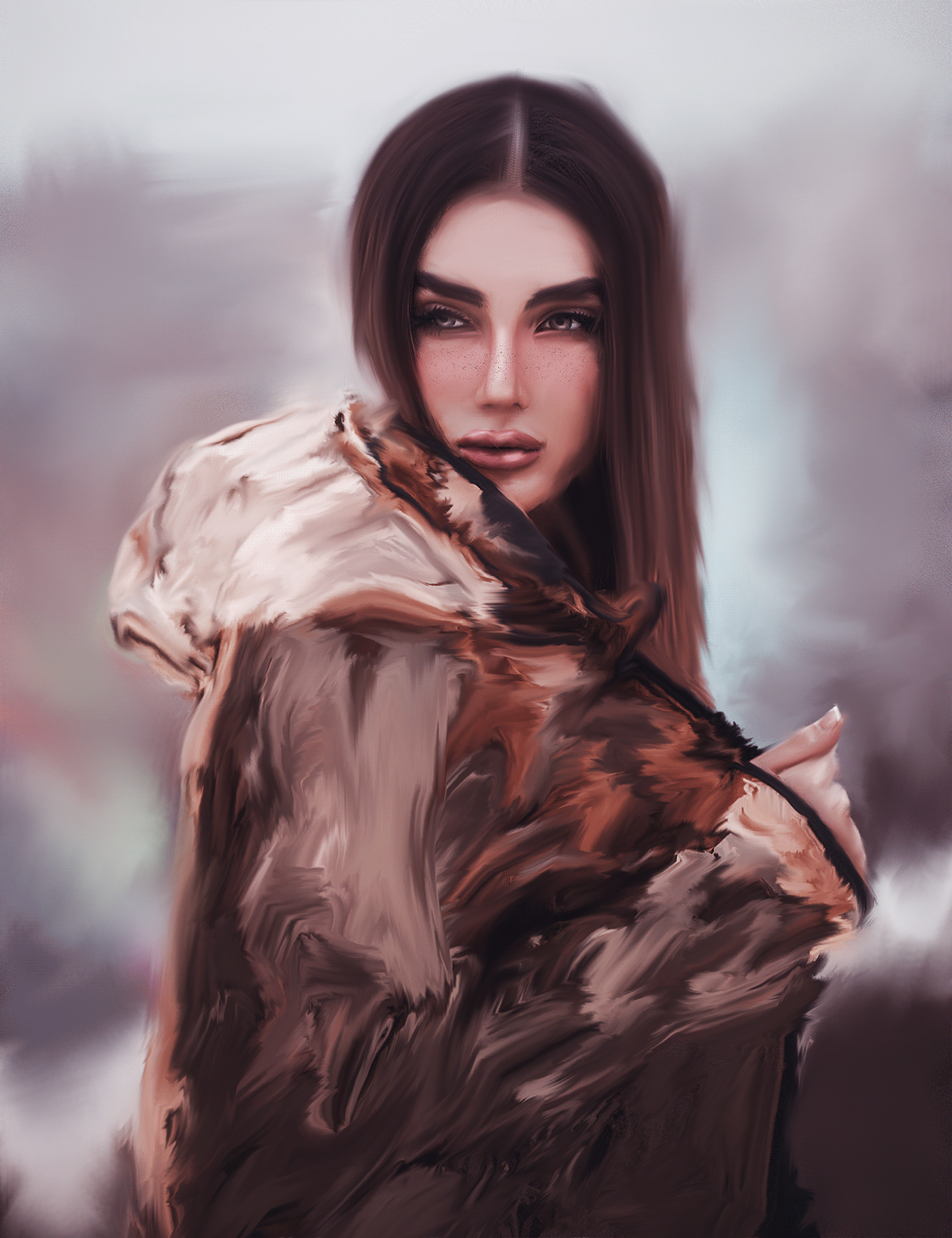
The effort was totally worth it @valid jasper! Loved the details on the hair. About the forehead to the ear area, sometimes when doing these kind of works, taking breaks is a nice way to see the compositions with refresh eyes, you might try that and I'm sure you'll find some spots that you can adjust. It already looks great 😉
@sharp niche very cool work! I like the dramatic contrast from the before/after. This is totally optional, but if you want, you might try to recover even more some of the skin texture on the left side, just to enhance the effect, if you see some unwanted spots you can try the spot healing brush tool or the clone stamp tool to remove it. Great job, Phoenix!
@tranquil moth I'm loving the watercolor effect results in your image! Awesome job!
@young karma, Great job, Artur! Loved that you added some textures on the cover. The color palette looks great as well!
@bleak fossil thank you Sam, that's exactly what I was going for
Gave +1 Creative Carma to @bleak fossil
here's mine! now only if i could paint like this forreal tho 😂 https://www.behance.net/gallery/100423741/7920-Photoshop-Daily-Creative-Challenge-Day-3
Behance
Photoshop Daily Creative Challenge - Photo to Painting.
Thank you @bleak fossil. I learned quite alot with this challenge. It took me several tries with different brushes and text colors but I got the look I was hoping for. Thanks for your ongoing support.
Gave +1 Creative Carma to @bleak fossil
@coral stone, thank you for your feedback. Yes, I have to try more. I can’t get the arms and hands right.
Gave +1 Creative Carma to @coral stone
PS DCC #3 Photo to Painting
DCC 2
i started late but let me know what you think I had difficulty removing the acne spots on my forehead
day 3 challenge, combining different painting techniques
I never get people to look good doing this in PS. But here it is.
Day - 2 (Distorting Text)
I'll ask this in ask a question but here too.... I am trying to combine images and when I drag one into the existing image and try to transform (make smaller) the original image stays there as well so I have two pictures on one layer and I can't get the old one to go away... this is since "new photoshoP" did I miss something.
@safe ledge I had to uninstall the new one. It was too clitchy for me. I had many problems all with layers. Shutting off layers and they were still visible and effecting others if I changed a blend mode. Double images on layers. it was just a mess and unusable. Have you tried a reinstall? I had a deadline so didn't have time to play around with that and haven't tried a reinstall yet. I was hoping they'd have a new one by now.
here's mine! now only if i could paint like this forreal tho 😂 https://www.behance.net/gallery/100423741/7920-Photoshop-Daily-Creative-Challenge-Day-3
@neat shale You don't neeed to give a link to behance. (it takes up a lot more room here and time to look at) When you post here, by clicking on the image you will see it larger and from there you are given the option to see it full sized.
Behance
Photoshop Daily Creative Challenge - Photo to Painting.
@primal fulcrum u told me once before and im still going to do it 🙂
@neat shale your choice but I think fewer people will see your image if you link. I know I don't have the time to load another page to look. Just a thought
Shapes and Colors oh my!
Day 4
@coral stone Thanks for the kind feedback. I'll keep working on it, and I do know that about stepping back, taking a break. Sigh, was just anxious to get it done, and working through the night on it.
Gave +1 Creative Carma to @coral stone
Day 4- Frankenstein cover. I enjoyed making this cover since I just recently read the novel. 😁
feedback plz
Day 1! Here we go ...👨🎨 

@coral stone Thank you for the suggestion, I warmed it up a little with a hue adjustment because she was looking a little green to me. Hopefully this is better.
Gave +1 Creative Carma to @coral stone
Day 4, Frankenstein by Mary Shelley book cover.
Day 3 Challenge
DCC09 04 200710 Background is Lon Chaney
⚡ Day 4 ⚡
Painting with different brushes
Day 4,
I can only recommend this book because it is really nice and very "avant-garde" (I don't know if it is said in English) for the time when it was written,
and sorry if the ship don't match too much, i'm not verry good at drawning and speaking english ^^
i take my inspiration in this cover
feedback plz
I am 4 days behind on the 9 day challenge. Having not worked with Photoshop for at least 10 years, I am drowning trying to keep up. (I was not that good with it 10 years ago) Paul goes way to fast for me, doesn't explain his steps well for a beginner, and assumes everyone knows what he is describing. Watching his screen (YouTube, can't watch live) it is obvious that he has customized his workspace, so when he, for instance goes to the gradient screen, (back to the 1st challenge) all I get when I click the same location is history. I then have to hunt for what he is talking about, (thank god for pause). When I finally get to the point he is making, he then says, never mind you don't need that. I am really having a good time trying to learn, but it is very frustrating, especially when you see the fabulous work posted here. I want my stuff to look like what is posted. Help! Is there a beginner challenge? I am a teacher and I want to use this for the media group I mentor. I'm trying to learn so I can at least try to help explain things to them.
PS DCC #4 Shapes and Colors
day 2 LOL
@coral stone Worked on it some more after getting some sleep, it's getting there, still could use more work, but it's already a lot smoother. Doesn't so much look pasty and like a bad make up job. Shadows and highlights are more blended. Right arm looks like it belongs to her now.
DAY 2 improved legibility 👍 🎨
I am 4 days behind on the 9 day challenge. Having not worked with Photoshop for at least 10 years, I am drowning trying to keep up. (I was not that good with it 10 years ago) Paul goes way to fast for me, doesn't explain his steps well for a beginner, and assumes everyone knows what he is describing. Watching his screen (YouTube, can't watch live) it is obvious that he has customized his workspace, so when he, for instance goes to the gradient screen, (back to the 1st challenge) all I get when I click the same location is history. I then have to hunt for what he is talking about, (thank god for pause). When I finally get to the point he is making, he then says, never mind you don't need that. I am really having a good time trying to learn, but it is very frustrating, especially when you see the fabulous work posted here. I want my stuff to look like what is posted. Help! Is there a beginner challenge? I am a teacher and I want to use this for the media group I mentor. I'm trying to learn so I can at least try to help explain things to them.
@wide surge I'm sorry for that. Kathleen made a challenge last month covering some basics of Ps, here's the link for it: https://www.behance.net/challenge/photoshop/5ede5a7892bec
Also, feel free to always ask questions here in Discord whenever you need, I'll be more than happy to help you 🙂

Daily Creative Challenge
You're doing great @valid jasper! 💯
Challenge Day 4-Shapes and Colors "Frankenstein". Thought I would try and stretch a little today and add a mock up. I know there is probably a better faster way, but I made it work.
• Day 3 •
Challenge 4. This was fun. I found that when using the Direct Selection tool to make a selection, pressing the Cmd J makes a copy of that selection. :D. This was an interesting challenge. Thank you to all who made it possible!
I am 4 days behind on the 9 day challenge. Having not worked with Photoshop for at least 10 years, I am drowning trying to keep up. (I was not that good with it 10 years ago) Paul goes way to fast for me, doesn't explain his steps well for a beginner, and assumes everyone knows what he is describing. Watching his screen (YouTube, can't watch live) it is obvious that he has customized his workspace, so when he, for instance goes to the gradient screen, (back to the 1st challenge) all I get when I click the same location is history. I then have to hunt for what he is talking about, (thank god for pause). When I finally get to the point he is making, he then says, never mind you don't need that. I am really having a good time trying to learn, but it is very frustrating, especially when you see the fabulous work posted here. I want my stuff to look like what is posted. Help! Is there a beginner challenge? I am a teacher and I want to use this for the media group I mentor. I'm trying to learn so I can at least try to help explain things to them.
@wide surge I feel your pain. A few months ago I started out with very little of a Ps background. My first tutorial was with Jesus. I thought id never understand what he was doing. He was going so fast. I watched the video 10 seconds at a time. Over and over. Ps is not intuitive. But its fantastic. And the DCC series is better than anything around. It took me a week before I was willing to post my work. I look back on it now and laugh. (Some people Im sure laugh at what I did today!!!) Watch the video over and over. Make sure every step of the way your screen matches what is on the leader's screen. Post your work. Look for critiques. Ask for help. The group here is incredibly friendly and non judgmental. Dont give up. In a week or two, your confidence will grow, and so will your enjoyment.
@wide surge One other point, some of the people in this chat are so talented and creative I marvel at what they come up with. Follow Discord carefully. Pick out a few favorite posters and follow therir work. Read all the critiques by @coral stone and @atomic echo . I learn so much from what they point out. And, they too are incredibly supportive.
Originally published as Jane Eyre: An Autobiography - I like that title. Also originally published under the pen-name "Currer Bell" - but no-one would recognize that. Strong personality with a harsh upbringing, she deserves this face I think - but would never have worn such a skimpy dress - so I embellished it a bit.
Thanks, I am getting a better understanding, but I feel like a lost Easter egg in May. I am working on the 1st challenge now and after watching multiple times it is slowly making more sense.
@tribal fiber I like the sky, the clouds and way masked in the figure. I think the text is too hard to read. Maybe a different mask image? Your not bound to use only Paul's assets.
@wide surge I understand your pain. I'm a teacher, too, teach PS and AI, and hard to keep up with the changes from one version to the next. I moved up from 2015 to 2018 in class this last year, and am spending my summer figuring out 2020 as they are upgrading our PS in schools now. One suggestion, go back through the Adobe Live recordings in YT, Terry White just did a stream on the changes to Photoshop. Also, use the Help Menu and the Learn Panel to see what is new. That was all helpful to me. I also watch @brittle slate and then go back and rewatch later so I can pause the video and see what he is talking about, watch on TV and have laptop in front of me. I used some of his PS DCC with my students this spring, middle school, and they were able to follow along.
XD though is a totally new animal to me, and that's coming from a web-based coder than has used DW for years.
@pure wigeon super cool covers! Loved the shadows effect on the first one. My only suggestion on it would be to align the shadow a little bit closer to the text, the effect won't lose its beauty and you’ll win a bit more contrast against the background especially on the Lathe word. You did an amazing job with the texture of the painting challenge. 💯
@tribal fiber I like it. I would suggest moving the text off of the corner of model's mouth. Its distracting.
@somber token nice effect, Josh! Loved the color edits on the clipped image. Well done!
@vestal lantern loved how you played with the shapes, the way that they help to guide the eyes is great. Nice job with the colors on the subject as well!!
@weary frigate very impressive job! Loved the details that you created with the shapes and how they seem to blend very well with the subject. Also, the serif font was a great choice as a secondary typeface, it matches the cover's context of it pretty well! Nicely done!
@tribal fiber very creative job blending the subject to the clouds. In addition to @eternal mica’s feedback, you might try to lighten the distorted text just a bit so it can increase the contrast it has against the background, improving even more the readability. 😉
@dim frost this is looking very cool! Loved how the brush strokes have a nice flow according to the lines from the original photos. Just a nitpick, you might darken a bit the area where the author’s name is positioned, since it's white and the background area has a lighter tone, the text seems to be blending to the background making it a little hard to read. Great job! 🙂
The header is looking awesome @somber crow! Loved how the subtle drop shadow makes the logo and the words stand out from the background. Can’t wait to see your next works! 😉
@warm marlin I loved the way that you combined the images resulting in kind of a double exposure effect. This book would definitely catch my attention. My only point of feedback would be to brighten the text just a bit, it will stand out a little more without creating any distractions. 😉 Awesome work!
@sacred field cool job, Marc! Loved how you added the red color to the cover, it helps to build an interesting story making people want to read the book just for seeing its cover. The blue tone that you chose for the author’s name makes the composition look very consistent. Well done!
@gilded flame these colors are looking awesome! Loved how they create a mood for the cover and how you enhanced the depth of field through the painting. Great job!
@coral stone Thanks, Valdair! Have a great weekend!
Gave +1 Creative Carma to @coral stone
You too @sacred field 🙂
@neat sparrow This is looking great, Anastasia! Loved the predominance of the red tones on your cover. I also like how you played with the shape of his head in the background. Well done!
I am so far behind as I had some client work that cropped up, but here is yesterday's cover - Jane Eyre. I had done a painting class from Creative Live with Jack Davis so went with that technique here. I am afraid I hurried it a bit so it's not the best. The image came from Aquilina on Deviant Art.
@eternal mica great colors on this one, Ted! I like how these tones create a 70’s/80’s book cover style. My suggestion would be to apply a lighter tone the words a bit, so they can stand out a bit more from the cover. Also, you might position the title and the elements of it a little lower so the viewers would be able to identify the visuals hierarchy of the cover (Frankenstein > Title > Author). Cool work, Ted! 🙂
Another great job with the font @thorn geyser! Loved your choice especially for the Mary Shelley. The colors and the elements are looking great as well. The green eye on the right top creates a nice relation to Frankenstein on the lower left and the lighting that guides the viewers eyes was a great choice. Awesome job!
@sweet fern fantastic work, Ron! I like how you managed the elements creating a well-balanced cover. The color of the text also looks very nice. Super cool job!
@coral stone Thank you for the critique. I'll make both changes tomorrow night and repost. I just shut my computer down. Have a wonderful weekend.
Gave +1 Creative Carma to @coral stone
Thanks @eternal mica! You too 🙂
Gave +1 Creative Carma to @eternal mica
What a beautiful cover @cerulean steppe! I loved the colors and how you created some details with the painting, especially on the hat. The text overlapping the subject adds a great depth to the cover. Excellent job!
This one is a wee bit late - but a few books and word ideas later I finally got one I liked enough to finish and post! I've read some classic novels but its the psych books that really peak my interest.
These daily challenges have helped me creatively already and I love being able to see what everyone else comes up with. Happy weekend!
Haha no problem @whole flame! Thanks for sharing the inspiration. The cover looks great, my only suggestion would be to place the text on the lower part and to enhance the hierarchy you might increase its size just a bit. If the waves are getting in the way, you can reposition them as well. Great job, Maji!
Gave +1 Creative Carma to @whole flame
@tacit condor Loved how you played with the font, the green background on the mockup looks great as well. Also, I like how you played with the image giving it a red eye though the main subject! Well done!
Super cool work @tropic haven. Loved how you played with some texture on the background. Just a personal suggestion that you might try if you want, of course: You can scale the Frankenstein image up so the edges on the side can touch the cover edges creating a natural look. Also, since it will create more space in the chest area, you might position the name of the book and the author on this part (the bottom area). Just an idea 😉 Great job
Hi @hasty oracle, here’s one thing that you might try for the mockup. You can position the cover on it and then try to fill the empty areas with the Content-Aware Fill (Edit > Content-Aware Fill), It might give you some nice results. Awesome cover! I loved the details on the Frankenstein
@young karma I just saw your recent works :D
Very nice job improving the legibility on day 2, the text is absolutely more readable. My only suggestion is that if you want you might play with the mixer brush on the face as well, just to see the results. Loved the day 3, the colors are looking great!
@tropic knoll thanks for sharing the tip, CK! I loved your cover, the noise texture on the background is a great touch for it! 💯
Gave +1 Creative Carma to @tropic knoll
Hah nice edits @loud mist! I like the consistent colors that you applied to the text, especially for the Jane Eyre. Well done!
No problem @wide surge. We're here to help 🙂
@wide surge you might want to look at older daily challenges. Look for ones by Kaldi or Voodoo val. Or just find an episode you would like to try. Post your results under "past-challenge" and you will still get feedback but you can pick and choose one that suits your level.
Not exactly sure how I got this, but it's a start.
Day 4 Challenge
Got Frankenstein done as well today. Made a shape of "the creation" hands from the Sistine Chapel. Have a great weekend everyone.
@coral stone @bleak fossil
shapes and colors challenge
This might seem a silly question but where do you find the Ps logo that Paul used in the header on the welcome day??
@coral stone, thank you for the constructive feedback, I’ll definitely try it during the weekend.🤓
Gave +1 Creative Carma to @coral stone
Challenge #4 Shapes and Effects...I’m still working on this but I can’t decide if it’s got too much going on...? 🤔
Day 4 - Shapes And Colors
A little bit outside the box but there is shapes and colors 😉... I could not resist to do something with one of my favorite teenage book.
Daily Challenge 200710 - Shapes and Colors - Frankenstein - Boris Karloff public from Wikimedia
@coral stone thank you very much for you feed back. This week is the first time diving into what photoshop can and it has been fun but a steep curve.
Gave +1 Creative Carma to @coral stone
Hi,Here is my challenge!!
@severe flame looks great, I like the cracked effect more.
@queen dew I like the framing of this image! The way the bigger “brush strokes” frame the more detailed portrait works really well. Nice texture in this design!
@primal fulcrum Very cool, I like the big strokes in the hair! I think this technique definitely has a ton of room for different stylistic looks. I think with something this open ended it could even be good to have reference for actual paintings to mimic the look. I think a few bigger noticeable brush strokes in the hair to match the hair could help tie it together. Nice work 👍
@covert loom Really nice work with the text effects in this one! The masking of “Heaven” is a nice touch too. Looks good!
@pure wigeon The painted effect came out great! Really convincing effect and really uniform and consistent throughout. The text looks great too. The Lathe of Heaven looks good too, I really like the drop shadow effect. The font style kind of makes me think of an album cover. Nice work on these!
@somber token Very cool, the double exposure look came out nicely. I think boosting the contrast (especially the darks) of the silhouette shape might give it a bit more impact against the background. Nice job 😄
@vestal lantern I really like how the overlay shapes came out! It seems to fit the shape of the face nicely too, and the way it highlights the eye works really well. Looks great!
@weary frigate I really like what you did with the sort of graveyard effect on his shoulders, the transparent areas of the face work really well too. Really dramatic graphic read to this 👍
@tribal fiber Very nice! The blueish text is a nice contrast to the background. The warped text effect is looking good too. The only suggestion would be to maybe clean up the yellow areas between the arms on the figure silhouette. Nice job!
@dim frost The painterly effect came out well for the Day 3 challenge! I like how the background is a bit more abstract too which helps draw attention to the face. The only suggestion I'd have is I feel like the brightness could be boosted up, or at least maybe a bit in the face to make it pop a bit more. Sometimes I like to do this with a masked levels adjustment layer and a soft round brush. Just a thought. Nice work with the mixer brush!
@young karma I really like your take on this challenge! The shapes and colors give this imagery a really interesting twist, kind of a modern art type of look. Nice texture in this design as well!
@fluid wharf I like the two different versions, always cool to see how much color can affect the mood of an image. It could be interesting to see the cold version with the warm colored moon, and maybe even that same warm tint in the text. Just a thought. Nice job, I like the graphic look of this design 👍
@hollow yarrow Very nice, I like the really graphic blocky look of this design! Nice work with the graphic elements of the flames and book. The subtle drop shadow under the flame design gives it some really nice depth. Great color and texture too!
@severe flame Really cool! There's a very nice balance between the contrast of the background graphic image and the white outlined graphic images. It reads nicely. The white stroke and font style almost give it a sort of playful feel which is really interesting. Nice design 😄
Thanks @bleak fossil
Gave +1 Creative Carma to @bleak fossil
Thanks @bleak fossil for the feed back.
Gave +1 Creative Carma to @bleak fossil
@coral stone thank you
Gave +1 Creative Carma to @coral stone
Thank you @coral stone 🙂
Gave +1 Creative Carma to @coral stone
Shapes and Effects (Day-4) @brittle slate Thanks👍
Day 4 - Shapes and Colors (take 2)
Sorry, just one shape... But several colors 😉
This is looking beautiful @sudden hawk! Loved the font that you chose and how it matches the context of the cover in a great way. Very impressive work! 💯
Day 4 Challenge
@covert loom very nice job, Mahedi! I like how you played with the shapes and the image. My only suggestion would be to scale up the shapes a bit more, so the titles will be able to have more empty space horizontally without touching the shapes, like a breathing space 😉 Well done!
@hollow yarrow I loved how you played with the colors on this one. The subtle cool/warm contrast creates a great interesting mood to the composition. I also like the stylized title for Dr. Frankenstein. Great work, Franck!
@gilded flame loved the opacity work, Nadia! I like the effect that the woods, the shape, and the Frankenstein image cause when combined. Nicely done!
Gave +1 Creative Carma to @coral stone
Thank you @coral stone 🙂
@coral stone Thanks for your amazing feedback! ♥
Gave +1 Creative Carma to @coral stone
Day 3, Photo to Painting, comments welcome.
@south adder Great job adding a frame, Neil! I also like the textures you applied to it. The brush strokes give a nice realistic painting effect on the image. Awesome job!
Cool job @young karma! Loved the details and the images combinations. The effect on version 1 is way more dramatic and creates creates an nice mood to the cover. I also like how in the version 2, the face is more visible allowing the viewer to make kind of an eye contact to the subject. Well done!
Day 4 is looking very nice @young karma! My only suggestion would be to align the words to the center of the cover and maybe position the Frankenstein word in the very top, so his shape in the background will be able to catch more attention. 😉
Day3 - Photo to Painting
#4, shapes and effects, comments welcome..
@young karma I really like your take on this challenge! The shapes and colors give this imagery a really interesting twist, kind of a modern art type of look. Nice texture in this design as well!
@bleak fossil -- your comments are much appreciated.
@coral stone Thanks for your nice advice. Your advice helps make my work more beautiful.
Gave +1 Creative Carma to @coral stone
Day 3 - Photo to Painting. Umm?
Thank you @coral stone!
Gave +1 Creative Carma to @coral stone
Super behind! But here we go!
Here is my entry for Shapes and Color Challenge. I changed left leg, created hat from 2 shapes and added walking stick.. I hope this meets the challenge.
Here it is as a book cover. I had to lighten because the angle of the book and mock up template made the cover too dark.
@buoyant nova I like the brushstrokes in your image. It looks and feels like a painting.
Gave +1 Creative Carma to @sturdy vault
@sturdy vault Thanks very much for the feedback, it is appreciated 🙂
DCC 4

Took the challenge a step further - DCC4
sooo niceeeee
Shapes and colors #✂challenges-feedback #4
OK, last one... #✂challenges-feedback
Day 4 - Shapes and Colours
Very inexperienced with vector graphics. Quite a challenge just to cut this guy up!
@coral stone Worked on improving the mock up, a very good learning experience.
what do you think of the multiple text?
Day 4
what do you think of the multiple text?
@cerulean steppe -- Your design and elements are eye-catching. As for feedback to your question, the title is a little confusing due to the distance between the words and the edginess of the very different fonts.
Day 1 attempt. Trying to catch up before new videos next week
@coral stone Thank you for the feedback on the Frankenstein cover. I wanted to get away from the white... looks like I went to far. Thank you for taking the time to give so many people feedback!
Gave +1 Creative Carma to @coral stone
@rocky reef Thoroughly enjoyed your extra step further! Especially liked how you did the lightning effect. Learning how to do that is definitely on my list.
It is becoming somewhat better. Thank Heaven for the pause button.
Shapes and Effect challenge
That’s really good @chilly hawk !!
Here's my Photo painting for Day 3 🙂
Challenge 4 with my own spin.
@young karma thank you for the feedback.
Gave +1 Creative Carma to @warm oasis
finally managed day one. Found this really tricky will need to keep working or not try and age up a 14 year old next time.
@queen dew I like the framing of this image! The way the bigger “brush strokes” frame the more detailed portrait works really well. Nice texture in this design!
@bleak fossil thanks for the feedback👍
That’s the spirit @queen dew! I like the way that you played with the distortions and the frame in the day 2, my only suggestion would be to enhance the contrast of the text a little bit more especially on the Explore and Create. One thing that might work is to lighten the images clipped to the text, if it doesn’t work for the word Create you can play with the position of the image. For day 3, I absolutely loved the watercolor effect and how you managed the brush strokes in a super way, the textures on the version two are looking awesome as well. Keep creating Paul!
@coral stone thanks for the feedback @coral stone much appreciated, think i'm gonna start all over again with challenge nr 2.
I was aiming for a more minimalist vibe for this challenge. Also I can't believe I JUST learned there's corner control on rectangles??? That's going to be very helpful for the future 😂 https://www.behance.net/gallery/100531431/71020-Photoshop-Daily-Creative-Challenge-Day-4

Behance
Photoshop Daily Creative Challenge - Shapes and Colors. Design a book cover using vector shapes, text, colors, gradients and layer effects.
PSdcc #3 Horror👻
@warm marlin Thanks! and its not too complicated. You should check out the dcc that Voodoo Val did a few months back for animation. That should help you get started https://www.youtube.com/watch?v=NeZIEix5de0&t=1462s
Challenge: Use the Ps Timeline to animate a plant sprouting or vegetable growing.
Get the starter file here: https://bit.ly/psdcc3-30-6
Join your host each morning at 9:00am PT to learn how to approach each challenge using Photoshop. Complete 9 challenges by Friday, April 10t...
Gave +1 Creative Carma to @warm marlin
Day 4 shapes and colors
@south adder Really cool! Loving that image of Frankenstein. Really great illustrated feel to this. I'd recommend increasing the contrast on Frankenstein (specifically the dark tones) and lowering it on the bats so they're not so stark black, and match the dark tones of Frankenstein a bit more. They have more of a realistic look and not overpower the focal point of Frankenstein that way. Looks good!
@plain sable Hah, love the idea for Frankenbear! The color grading is looking really good and I like the texture in the design too. Indian Jones is looking good too! Though I feel like perhaps it could use a bit of a levels boost in the light tones? Nice work!
@hot thicket Nice work John, I like the simple color scheme here! I think darkening the background blue color could give it a more dark/dramatic Frankenstein feel and also provide more contrast for the face to really pop. Nice job 👍
@cerulean beacon Really nice graphic shapes and gradients in the Day 3 challenge! The color and size variation between the faces look good. The painterly effect on Day 4 is looking convincing too. There's a nice uniform texture to the whole thing. Looks good 😄
Thanks @bleak fossil Question for you? I'm not sure what you mean about the "levels boost in the light tones"
Gave +1 Creative Carma to @bleak fossil
@plain sable A Levels Adjustment, but specifically the lighter tones, which would be the slider on the right side. Whereas the left slider adjusts the darker tones.
Ah okay thanks @bleak fossil
@plain sable No problem! Basically I just meant to brighten it up a bit.
How about this @atomic echo
Yeah, I think that extra little pop is nice, personally 👍 @plain sable
A second attempt ...your opinion appreciated!
Bit slow in getting started with this challenge
Thanks @bleak fossil
Gave +1 Creative Carma to @bleak fossil
If you haven't read the novel...try and make time to read it. Its an elegant exploration of two lives forever locked in despair. One because obsession ruined his life. The other because he had no past. No childhood. He was only now as he had ever been.
Hi all, not sure if this is a new feature in Adobe Fonts but I've just noticed that you can drill down using tags if you're looking for a specific type of typeface eg Horror - hope this helps someone 🙂 - Attempting my Frankenstine cover today.
Missing the 'i' in raiders... Final version
Day 1... I had a big issue with blending the wrinkle layers in. It's hard to tell in the final copy so I'm adding a picture of just the "old" version of me. The forehead gave me the most trouble.
Day 4 - Pauls images + public domain rawpixel anatomy image. Did have a lovely shape in there too 'Grime Vector shape' but ditched it last thing as it was just making the image far too complex. Lookupcolor 'teal blue' - Typeface Carta Marina. Let me know what you think.
Day 2
New approach to Day 4
Good morning everyone ! Frankenstein's head stitches look better in white or black ?⚡
Good morning everyone ! Frankenstein's head stitches look better in white or black ? ⚡
@tranquil moth nice work - I think the black stitches look best.
@bronze thorn Thank you Rhonda ☺️
Gave +1 Creative Carma to @bronze thorn
@tranquil moth I also like the black stitches, they look more consistent to Frankenstein. Just one suggestion: you might lighten the background just a bit, so Frankestein's shape will be able to appear more. I made a quick demonstration to show what I mean 🙂 Awesome work, Mayan!
My go at the Frankenstein cover, self portrait with a difference
@inland kiln this is very creative Pat! Loved how you blended the images together. Also, the lightings were a great choice to guide the viewer's eyes. Well done!
These colors are looking great @north ridge! Really like how you played with the positions of the texts! Loved how you blended the words in the day 1 as well! Great job!
Amazing work @bronze thorn! I loved the colors and the typeface you chose. Nice job blending the images as well! 💯
@wide surge awesome painting effect! I like how you managed the colors on the background. Also, the details on the subject are excellent! Great job!
@haughty cape it good. I like the leak on the text and the dark matching colours
Thanks @weak bolt
Gave +1 Creative Carma to @weak bolt
Challenge #4 Shapes and Effects (Revised) Okay, after playing with this a bit more it feels more cohesive. I’m still playing...
@rocky reef Thanks for the video I'll definitely be checking it out 🙂
Gave +1 Creative Carma to @rocky reef
Design 1
Day 5
Day-5 (Glitch Effects)
I enjoyed this challenge.
Glitch Effect
Glitch Effect 😁
DCC 5
Day 5 - Technology Distortions
feedback?
@quiet swan I think you did good but I cant really tell what the thing in the back is. I know its cameras because I had the same thing i would just say take the glitch down a little
Challenge #4 Shapes and Effects (Revised) Okay, after playing with this a bit more it feels more cohesive. I’m still playing...
@winter tinsel Very nice work!
@young karma that looks nice especially that little thing around the 1984 numbers
Here is my Day 5
Challenge day 5
1984 George Orwell
Great techniques - thanks
Day 5 - Glitch Effects
Challenge 5. There is much to learn here. I am fascinated with all of the distorting techniques, blending modes and changing the R,G,B's. Familiarizing myself with these techniques is going to keep me quite busy. Thank for this opportunity!
Challenge #5 added a halftone 🙂 Might be a bit dark...
@blissful wolf Your color scheme is nice. Thanks for sharing.
Gave +1 Creative Carma to @blissful wolf
@tropic knoll , thank you!
Gave +1 Creative Carma to @tropic knoll
glitch effect
Challenge 5_ Glitch Effects. I threw a little bit of everything at this, hope its not too much.
@rocky reef Very cool!!
Day 5 Glitch effects
Glitching time
@coral stone Thank you so much! im so happy for this advice, its really lokks better!
Gave +1 Creative Carma to @coral stone
Day 5
How does it look with skintone bg?
Day 5 - Glitch Effects (Animated Version)
Challenge #5
#psdcc #3 Painting photos
1984 George Orwell and EileenOrwell...
Some say she gave him the idea for the book...
What's scarier than Big Brother? The innocent eyes of Little Sister. (This is the Stephen King reboot of the original 1984!)
psdcc #4 COLORS AND SHAPES
@somber token super cool effect, Josh! I like the magenta and green tones. Perhaps you might consider duplicating the titles just to see if it helps to stand out from the background a little more, especially one the Orwell word. Great job!
@covert loom beautiful colors, Mahedi! Loved how you managed the fill of the text as well bringing more consistency to the image. My only suggestion would be to darken the background area just a bit where the word George is in front of, just to see if it has more contrast, like the Orwell area. Awesome work!
@exotic osprey very nice, Dani! Just an optional step, if you want, you might make the bottom left text white or choose a lighter tone, so it will stand out a little more from the background, just a thought, well done!
These colors are beautiful @split robin. Loved the effect that the halftone pattern created on the title. Good job!
@quiet swan very nice effect! The b&w on the title is looking cool, maybe reducing the glitch just a bit will increase the readability of it. Just an optional step, if you want, you might try a subtle halftone pattern just to see how it looks, it will enhance the glitch effect even more. Just a personal suggestion, of course 😉
Fantastic work @rocky reef! Loved how the circles direct the eyes straight to the title. Also, the glitchy shadow effect on the text gives way more interesting look to the cover. Excellent job!
Challenge #5. Loved messing around with these filters. I've not used them before, for some odd reason, but I will in the future. Thanks for the great lesson. Images from Unsplash.
Good job combining the images @young karma! I like the frame that you put behind the text as well.
@tribal fiber very nice cover! My only point of feedback would be to align the words to the center of the cover, so the composition will look even more balanced and the hands will help to drag the attention to the text. Nicely done!
@winged terrace well done, Danielle! I like how you managed the glitch effect very well, without losing the context of the elements!
@blissful wolf very creative job applying the cameras on number 4. My only suggestion is just an optional step. If you want, you might apply a brighter tone (or even white) to the author’s name. If you lose contrast on the George area you can also apply a subtle drop shadow to it. Well done, Bea!
@weary frigate great effects! I loved how you preserved the contrast on the titles. The colors are looking cool as well! 😉
@coral stone , thank you very much! I will try that!
Gave +1 Creative Carma to @coral stone
@sacred field super cool, Marc! Loved that you brought the day 4 image to the background. My only suggestion would be to darken a bit the background area where the word George is, increasing the contrast a bit and improving the readability. Great job, Marc!
Loved the metallic look on 1984, @loud mist! I also like how the distortions created a nice movement to your composition as well. Nicely done!
Here is my version of Challenge 5, glitches and technology distortions. I remember the days of rabbit ears, and standing in a certain way in front of the TV so that your body could help act as an antenna, getting distortions, horizontal flips, and ghosted images. We've come a long way! I remember having to read this when I was in high school about the time this was to take place. It was very bizarre.
@hollow yarrow great results, Franck! Loved your color choice and how the author’s name with stroke and no fill produced a very interesting effect and a nice hierarchy of information. The shapes on the corners also add a cool context to the cover. Amazing job as usual! 💯
@thorn geyser woow super cool work! Loved how you placed the words allowing a nice reading flow to the cover. Great job!
@plain sable very nice job! I agree with you, the second version looks a bit dark, you might increase the brightness a bit so the text can be able to pop a little more, especially on the “Big Brother” area. Great work! 🙂
@coral stone Thanks, Valdair!
Gave +1 Creative Carma to @coral stone
@tropic knoll loved how the diagonal pattern matches the distortions so nicely. My only suggestion would be to darken the “98” area just a bit of the image clipped, so the text can be even more readable, like the 1 and the 4, you might also try on the bottom part of the author’s name. I made a quick adjustment to show what I mean 🙂 . Nicely done!
Another great cover @sudden hawk! Loved the frame and the typeface you chose, their colors are looking very consistent with the image as well. My only suggestion would be to place the title just a bit higher, so the L and D won’t be occupying the image area. If the space looks too tight you might try to reduce the tracking (space among the lines). Just select the text and reduce the number in this icon 👇 under the properties panel 😉
Really like the mysterious look of your cover @ancient lark! About day 5, my only suggestion would be to recover some of the contrast on the author’s name, especially on George so it can increase the readability of it. Great job! 🙂
Super cool effects @hasty oracle! I like the consistent red tones of your cover. Nicely done!
Loved the foggy/metallic look of the title @neat sparrow! Also, the glitch effect produced great results, I like the effect on the sky area. Well done!
any tips?
@cold oyster great works! Loved how the text distorted drags the attention straight to the middle. The brush strokes on Day 3 is looking great as well, loved how you preserved the details even with the painting effect. Good job!
@tacit condor cool job in both versions! Loved how the glitch effect stood out on version 2. The background color and the vignette also adds a nice context to the cover, great for social media! 💯
@hot thicket the yellow/blue tones look very nice! I like the way you placed the title in perspective on the building. Great job!
Thank you @coral stone
Gave +1 Creative Carma to @coral stone
@sweet fern nice edits, Ron! My only suggestion would be to scale up the author's name a little more, so it can be more legible. 😉 Well done!
@slow stirrup wow awesome approach to the challenge. The glitch effect on the eye looks great. I also like how you played with the fill of the text. Awesome job!
@outer spire. Loved the cyan tones, Hugh! The frame around the 1984 is a great touch for the cover as well! 💯
@safe linden Nice brush strokes! I also like the font that you chose for Jane Eyre, what’s the name of it? Looks awesome!
@wraith sierra loved the effect that the halftone produced on the first version! My only suggestion would be to increase the contrast in the “George” area, just to improve the readability of it. I also like the duotone effect on version 2, the pattern worked out great!
Very nice image combinations @prime temple! I like how you played with the blend modes creating an interesting effect on the models area.
@arctic rover. Super creative approach of the challenge, Jude! The eyes create a great context for the cover. I also like the subtle glitch effect on the 1984. Awesome work!
Here is my Day 2
Daily Challenge 200713 - Glitch on 1984
a good year 🙂
I haven't done a DCC in a while... Time away from Photoshop is not good!!
Gave +1 Creative Carma to @coral stone
Challenge 5 Re-Do. Thank you @coral stone! I appreciate the insights! I tried to imitate what you did.
Gave +1 Creative Carma to @coral stone
Day 5 Glitch Effects - Subject was offering such a lot of scope for creativity... could have played around with this all day. Some lovely looking covers being created by everyone.
@coral stone Thank you for your comments on my Frankenstein cover - really appreciate your feedback.
Gave +1 Creative Carma to @coral stone
@coral stone Thanks for the nice advice.
Gave +1 Creative Carma to @coral stone
Thanks for the nice advice. @coral stone
Gave +1 Creative Carma to @coral stone
Need some assistance with this one. I don't like the sharp edges on the image in the lower left corner. I would like them blended in, but not sure how to accomplish the task.
@wide surge You could do it a few different ways. If the hard edge is the edge of a different image you could create a layer mask, and blend out the edges with a soft round brush. If you use a fairly large brush with a low flow (20% or somewhere in that ballpark) you can get a nice gradual blend. If there's not enough excess room to do that without masking out the castle and moon, you could try extending the top of that image using content aware fill which could give you enough leeway to mask it out and a create a soft blend. Just an idea.
I'm a little late on Challenge 4 - Had problems breaking apart the shapes in Photoshop, there's no Shape Builder Tool like there is in Illustrator, ended up rasterizing my shapes and using the lasso tool to cut up the pieces for my monster the way I wanted them. Tried to make stitching lines on the monster. Had an idea for sort of a double exposure look inside Dr. Frankenstein's mind. Looked for another photo of a man instead of the one in the file. Liked the one I found because of the eyes. Photo by Derek Story at Unsplash.com.
@winter tinsel I like the stark contrast in this design! The foreground shapes stand out well against the fainter background graphic. The yellow title is a great contrast too!
@somber token Looking good! I like the purple/green color scheme! Gives it a really interesting feel. Making the title text a bit brighter might give the image some nice contrast and make for a strong focal point to the image. Looking good!
@covert loom Really nice work on this effect! The yellow in the image adds a nice pop. The title text contrasts really nicely against the background too. I like the texture!
@exotic osprey Very cool! I like the colors in this design. I feel like the text in the bottom left might work a little better if it was a lighter tone or color rather than black. I like the title text blending mode effect!
@split robin The colors and horizontal line effect are looking good! I was going to suggest boosting the contrast a bit to the image overall but the slightly dimmer color gives it a really interesting bleak look which seems fitting for this book. Nice work 😄
@quiet swan Really interesting direction with the glitch effect in this one! The chopped up image and effect on the title definitely gives that glitchy feel. Looks good 👍
@rocky reef Interesting direction on this one! Almost a sort of 80s vibe with the colors. I’m really liking the colors and pattern/texture of this background, nice work!
@young karma Really interesting bevel texture with the title here! Almost makes me think of an ad for a concert or something like that for some reason. Cool textures in the background!
@tribal fiber Ahh, this is a great idea! Really adds to that mysterious, spooky vibe of the cover. This is a really minor suggestion, but it might help to boost the contrast of the face at the top, and reduce the darkness of the shape at the bottom a bit. It might help to make the head a stronger focal point. The eye in the title is a nice touch too!
@winged terrace I like the warped look to this glitch effect! The color shift is looking good too, nicely done 👍
@bronze thorn Really effective color scheme in this one! The stark red against the cooler neutral background gives this a really powerful effect. The eye in the title looks excellent and the glitch effect within it is a nice touch. Really nice texture contrast in this design as well!
@bleak fossil Thanks
Gave +1 Creative Carma to @bleak fossil
@tropic knoll Nice work on the color offset and warped effect on the challenge 5 re-do! It gives the image a bit of a disorienting feeling. It’d be interesting to see the author’s name in the same color/style of the title, I wonder if that might give the whole design a bit more of a bold contrasting look. Just a thought. Really great job with the effects and texture in this!
@tropic haven Very nice! The title pops out really nicely from the background, and the halftone adds some nice texture. The glitch effect is looking good as well, I like the intensity of the blue and red against the darkness of the rest of the picture. Pushes that dystopian feeling nicely. 👍
@plain sable Really cool concept to this one! The glitchy effect on the people at the bottom really adds a lot of mood to this design. Great texture too. I kind of wonder if a slight blue or blue-green tint to this whole image might work well with the imagery, though that's really just personal preference. Very cool!
@compact pecan It always takes a little time to shake the rust off, hah. This looks good! I like the concept of this one. I kind of wonder if fitting the title into the bottom monitor could look good conceptually and compositionally. Currently the image almost seems kind of divided into a square with 4 sections of the monitors and the title. But moving the title to the bottom screen (maybe darken it down with a lighter text title saying 1984) might be a more interesting composition. The current title also seems a bit cheery looking for the concept of the book, but it just depends on what you're going for. Just an idea. Nice job with all the glitch effects and masking of the screens!
@vague swift I think the bold red text works really well for this one! Gives the design a really strong/simple color scheme while implying a sense of danger. The offset color effect is working well!
@valid jasper Nicely done! I like the blue color grading of the portrait with the green of the title text reflected in his eyes. The green elements definitely add a nice bold accent to the design. I wonder if applying a bit of an out glow effect to the human shape might bridge the look between the solid white figure and the subtle green glow behind it? Something to add a bit more of a glow directly around the edges of the figure to make the whole gradient of the glow a bit more gradual. Nice design!
@young karma This is great! Really nice compositional balance between the text, camera, and background. The pattern within the camera as well as the glitch effect both work really well to sell that dangerous feeling. The intense red background helps a lot with that as well. Really liking the pattern of the title text too. Great job with the glitch effects in this, they're all looking really solid!
@blissful wolf The text effects are looking good! I kind of wonder if making the title text a dark blue/green like the dark shape at the bottom might be a nice way to mirror that color towards the top of the design and give a nice cohesive balance to the color scheme. I really like the faded effect with the silhouette of the figure!
@tribal fiber The glitch effect on the 1984 camera image is looking really good! I love the texture and look of the title text, it just seems like maybe it doesn't contrast as cleanly/clearly against the background as it could. I also feel like a gradient across the background to maybe darken down the top a bit could look nice to balance out the mood/color of the title a bit while also adding a bit of a dark/more dramatic look to the image. Just some thoughts. Nice work!
@sacred field Really cool design! I like the addition of the horizontal lines. My only thought is that the lighting/brightness of the cameras almost feel a bit out of place in this really dark scene. Perhaps darkening down the underside of them, maybe even with a blue/green tone could help them fit the lighting and color scheme of the rest of the image, as well as push that dark dramatic mood more. Maybe lighten up the area of the background at the top of "19" too so it reads more against the sky. Here's an example using a multiply layer for the shadows. Nice job!
@bleak fossil Thanks, I tried to add an green inner glow to the white character but it didn't add it even though my preview of the style showed it in there. I've added a gradient overlay. It shouldn't have been a solid white figure as it had a bit of an inner shadow to give it some depth and shading. Here's the edited version.
Gave +1 Creative Carma to @bleak fossil
I built the cliff on the left using Kyle's brushes, over a pen tooled base. And used the pen tool to create the castle.
Ah nice! I like it, the green works well. The glow effect seems more apparent too. 👍
Thank you @bleak fossil 😀
Gave +1 Creative Carma to @bleak fossil
@coral stone, thank you. What did you think about the background color, is it better in white, or in skintone color?
Gave +1 Creative Carma to @coral stone
Glitch Effects attempt, ended up using puppet warp to get the distortions, it kind of turned out how I envisioned. Love the "Monster Pack" of fonts!
Challenge 5. Glitch.
day #5 challenge, there's so much to do in one piece of artwork, sometimes it can be too much, so I'll keep it like it is and try the other exercises later on. @brittle slate thanks for opening up the box of PS tricks 👍
Gave +1 Creative Carma to @brittle slate
@queen dew @whole flame @pure wigeon great work guys , these are totally giving a modern vibe to the classic book
@edgy pagoda Thanks for the feedback👍
Gave +1 Creative Carma to @edgy pagoda
@queen dew @whole flame @pure wigeon great work guys , these are totally giving a modern vibe to the classic book
@edgy pagoda thanks
Gave +1 Creative Carma to @queen dew
@edgy pagoda thanks you
Gave +1 Creative Carma to @edgy pagoda
Glitch Effects
A very relevant book in todays surveillance society
Day 5 Glitch Effects
@young karma This is great! Really nice compositional balance between the text, camera, and background. The pattern within the camera as well as the glitch effect both work really well to sell that dangerous feeling. The intense red background helps a lot with that as well. Really liking the pattern of the title text too. Great job with the glitch effects in this, they're all looking really solid!
@bleak fossil -- 😃 Thanks
!rank
 Steinkampf, that command is disabled in this channel.
'rank'
My second attempt at the 1984 glitch cover.
@pure wigeon, they both look great! I think, on the first one, the blue title is a bit too big..
@pure wigeon, they both look great! I think, on the first one, the blue title is a bit too big..
@slow stirrup Thank you, looking back I agree I will try and edit that later and see how it looks.
👀 They watching you
I think i like it better because the title not taking to much space...
@tranquil moth I actually like the 1st one better...
#5 just another one
Thank you @slow stirrup 💖 Don't you think its take to much space ?
Gave +1 Creative Carma to @slow stirrup
@tranquil moth for me, the thin type is too thin. If you think it's taking too much space, try reducing the size.
I guess it was because of the blend modes but for some reason the mask that I made to cover his ear, kept showing up as a hole later.
I ended up doing a lot of comp layers and editing those down to get what I wanted.
Challenge Glitch
@queen dew I think, for the second one, you might want to try a thicker type or a brighter color. Looks good.
@slow stirrup Thanks for the feedback, gonna try a brighter colour👍
Gave +1 Creative Carma to @slow stirrup
@slow stirrup The version with the skin colors adds a nice context to the cover. 😉
@coral stone Ok. Thanks.
Gave +1 Creative Carma to @coral stone
Very nice combinations of images, @primal fulcrum! I also like the colors that you used for the text and the background making Frankenstein's highlights look very consistent. Good job!
@sturdy vault I loved the effect on the text. The color palette and the halftone pattern are looking great as well. Nicely done!
Day 5 Challenge
The glitch effect worked our great in your image, @gilded flame! Loved it, especially on the 1984! I also like the adjustments on the background, it allows the text to have a great focal point!
Gave +1 Creative Carma to @coral stone
Thanks @coral stone 😊
@slow stirrup tried the brightness, what do you think?
@bleak fossil Thanks, Sam! Hope this is what you had in mind!
Gave +1 Creative Carma to @bleak fossil
@queen dew yea, it looks better. It's much more readable now.

So I'm having issues with Daily Creative Challenge #2. I'm just curious why my font isn't linked to adobe fonts?
@naive mural I think there is a font limit that you can import. I am not sure.
But Instead of using the creative cloud import, I do search in google fonts. If I don't get there, then I import from CC. Pls do try to use Google fonts website.
@weak bolt the question isn't getting new fonts, it's in the video he's able to search san serif vs serif and it linked him to adobe. i'm just curious what settings I'm missing.
@coral stone @sturdy vault Thanks guys!
Gave +1 Creative Carma to @coral stone
@naive mural sorry then, I am not sure☹️
@weak bolt me either lol 😄
@sacred field I admire your patriotism!!
Is there a limit on how many fonts we can use from Adobe fonts
@sacred field I wish the background were microsoft and google who keeps track of our data 😂
@naive mural I think you are looking in the wrong place. Try this.
@slow stirrup I don't feel particularly patriotic in light of what's going on in our country right now. I just like playing with my flag! 👀
@primal fulcrum well, that's not how he did it in the video, but it fixes my issue 😄 @primal fulcrum Thanks!!!
Gave +1 Creative Carma to @primal fulcrum
@naive mural was he perhaps on the ipad then? It works differently. This is how they showed it done in previous DCCs on a desktop/laptop PS version
@naive mural oh, I see you had the move tool activated. It might work through properties if you have the Text tool active instead. It is like when working with shapes, you have to have a shape tool active before you can do things with the shape or path. The move tool won't get you there.
@safe linden Nice brush strokes! I also like the font that you chose for Jane Eyre, what’s the name of it? Looks awesome!
@coral stone it's font called Poor Richard (to look like the Almanac).
Red/Blue Channels Version...
Or Purple hue version? Wich one do you prefer???
Some animations... Just for fun
@coral stone thanks
Gave +1 Creative Carma to @coral stone
Very cool @hollow yarrow !!!
Thanks @bleak fossil for the suggestion, I added a TealOrange color lookup 🙂
Gave +1 Creative Carma to @bleak fossil
Very cool @hollow yarrow !!!
Thank you @brittle slate
Challenge #5
So far behind
Love in the Time of Cholera by Gabriel García Márquez
Nice job @brittle slate
Something simple, but I follow a same theme on my insta
#PSDCC number 5
@safe linden I like the circuitry clipped to the title
Glitch Effect Challenge
Day 6 - Floral Portrait
Love In The Time of Cholera Cover
Day 4
This one without the black...
Bringing in elements of painting with the brush to create the bottom half over the book cover
DDC 5
small kerning adjustment
I realy don't know how to use the beveling and stamping tool 😆
Challenge Day 6- Floral Portrait. This got a little bit messy, but I got there in a round about kind of way. I think I will watch the video a few more times to see if I can catch on to some of the keyboard shortcuts because Paul goes way fast.
Day 5
Floral portrait
Day 6 Floral Portrait 🦋
Still way behind but working through the challenges. What do you think? Photo by Nathaniel Vala - Unsplash
Day 6 Flora Portrait
Challenge day 6
Overly romantic for my taste but fun with flowers!
DCC 6
Decided to mess with another title. Still in the scifi sort of mode from earlier this week. Image from Unsplash.
#✂challenges-feedback day 2 text
@haughty cape awesome work! I like how you played with the glitch effect and how it combined with the noise style of the glow. Also, the subtle drop shadow on day 6 was a great way to maintain the text’s contrast. Well done
@hollow yarrow Awesome variations Franck! I think the first one is my favorite! 😄 Just a suggestion in this one, if you want, you might lighten the author's name a bit to appear a little more. The animations are fantastic!
@teal lynx great job! I like how you played with the text, the glitch effect on the image helps to add some interesting mood to the composition! 😉
@fluid wharf this turned out great! I like how the text seems to be blending to the background without losing any contrast. Also, the gradual distortions in the animations are a great effect. Nicely done!
@narrow dust super cool effects! I like the warm colors that you chose for the cover. The details, like the wires, are looking great as well. Good job!
No problem @wooden forum! I like the "empty" effect of the text, it really adds a cool visual interest to the cover interacting nicely with the subject in the front. Well done!
@bleak fossil cheers, thank you!
Gave +1 Creative Carma to @bleak fossil
@safe linden great colors on day 5! The image clipped ads a nice context to the background image, especially because the glitch effect already has that "electronic" style. Nicely done!
@chilly hawk nice work, Cecilia! I like the colors that you applied and how you positioned the cameras. My only suggestion would be to reduce the opacity of the black glow around 1984, so it can be more subtle, especially on the 1 and 9 areas. Great job! 🙂
@young karma this is looking very nice, Artur! My only point of feedback would be that, since you have a dark background, you might lighten the author's name, so it can appear more on the cover increasing the readability of it. 😉
@prime temple loved the colors on the background! My only suggestion would be to lighten the author's name a bit so it will have more contrast against the background. Great job!
This is looking super cool @somber crow! I like the typeface that you used and how it matches the tech style and the overall glitch effect! Awesome job!
@cold oyster wow great job playing with the subjects, I like how the cover contrasts the two realities and how the lighting seems to be dividing it. My only suggestion would be to apply a lighter tone to the titles and, just in case, if you lose contrast on the “Ein” area, you might apply a very subtle drop shadow on it. Loved the glitch effect cover on day 5 and the way that you combined the images as well. Nicely done!
@ancient lark Beautiful work, Andrew! Loved how you positioned the text and how the waves involve the subject creating a nice flow on the cover. Great job!
@pseudo current the glitch effect worked out great in your cover! My only point of feedback would be to try some brighter tones on the title and the author’s name, I believe that even white might work, so it will be able to have more contrast against the background. If you want, you might apply the glitch effect on it as well just to see if you like 😉 Nicely done!
@whole flame loved the consistency of your work! Bevel and Emboss might be tricky, it’s a lot of fine-tuning processes hah, but feel free to ask if you need any help. Just a few suggestions: You might remove the “lid” of the area where you made the effect, so the flowers can have more attention and the viewers won’t be distracted. You can also position the texts a little lower and to the left giving even more space for the flowers. Keep creating, Maji, you’re doing great! 💯
@hasty oracle very nice job placing the elements! I also like how you positioned the flowers around the subject. If you have any questions on the keyboard shortcuts feel free to tag me on the #❓ask-a-question channel! 😉
These colors are great @wraith sierra! Loved how the elements are blending on the top and the bottom of the cover. Cool job!
Great job placing the elements @thorn geyser! I like how you managed the distribution of them creating a well-balanced hierarchy. My only suggestion would be to brighten the background area where the author’s name is, so the text will pop a little more with contrast. Nicely done!
@tropic haven very nice work, Jessie! I like the color that you chose for the title, it matches really well the gradient in the background. Good job!
Cool blending @glacial minnow! I like the way that the text is interacting with the background. Just an optional step, If you want more contrast, you might try to duplicate the text’s layer, it will make the blending effect stronger, if it’s too much, the layer’s opacity is your friend 😄 Well done, Sue!
Lovely cover @hot thicket! I like how the butterflies on the top look like a drawing. The typeface that you chose for the title is looking great as well. Perhaps you might lighten the image clipped to the word “love” I believe this will give it a little bit more contrast. Great job!
@sweet fern loved how you placed the butterflies around the subject, this is a nice way to create a focal point. Nicely done! 💯
Loved how colorful your cover is @weary frigate! The way that you managed the contrast of the text made it work great! Awesome job!
Very creative @loud mist! Loved how you used the heart as a frame for the couple. The flowers around it enhance the romantic mood of the cover. Great job!
Very nice approach @rocky reef! I like how you used the flowers to mask some areas of the subject. Excellent job! 💯
Super cool work @solemn pike! Loved how you played with the title, my only nitpick would be to align it to the center, this will create even more balance to the cover. Well done! 😉
Great distortions @granite forum! I like the warm tone image that you clipped to the word heaven and the subject as well. 🙂
These colors are great @wraith sierra! Loved how the elements are blending on the top and the bottom of the cover. Cool job!
@coral stone Thank you very much! :)
Challenge 6. This was an intense challenge. Looked easy enough. I even made a 'convert to smart object' keyboard shortcut today. Thank you for these incredible opportunities!
@coral stone thank you!! You guys are amazing - able to identify even the little details!
Gave +1 Creative Carma to @coral stone
Challenge 5 Re-Re-Do. Thank you @bleak fossil. Yes, doing a clipping mask with the city for the author's name does seem to tie in better with the title.
Gave +1 Creative Carma to @bleak fossil
Creative Challenge Day 5
@brittle slate makes it seem so easy doesn't he??
Thank you valdair I appreciate your feedback
@hasty oracle https://tinyurl.com/y8uptf6v
@hasty oracle https://tinyurl.com/y74vpe5q Google is your friend 🙂
Use keyboard shortcuts to become more productive while using Adobe Photoshop.
this one is current as of Feb this year and is on Adobe's site. The other one is a graphic and from another site
@hollow yarrow Awesome variations Franck! I think the first one is my favorite! 😄 Just a suggestion in this one, if you want, you might lighten the author's name a bit to appear a little more. The animations are fantastic!
@coral stone : Thanks for your comment... I'll try to lighten George Orowell... if I find time😉. I agree with you, it is a little bit unreadable...
Too many versions... I think I focussed on 1984 rendering... I needed your expert eyes... Thanks again!
@tropic knoll Nice! There’s a really nice unity to it now in my opinion. Looks good 😄
@somber crow Really awesome mood and feel to this one.! The colors and lighting of everything feels very cohesive. The shape and composition of the whole thing is working really well, I like the organic look mixed with the sort of structured look of the vertical sides of the design. Impressive work!
@charred oasis Loving the texture in this design, especially in the title text! The color scheme is working really well. It looks really cohesive and those red areas make for nice accents. The cameras are composited very well into the image too, the color and texture fits nicely. Well done!
@bleak fossil Thank you very much 😊
Gave +1 Creative Carma to @bleak fossil
@tropic knoll I love it! Challenge 6 is looking great. I really like the high key lighting and contrast in this design with all the bright colors. My only suggestion would be to add a little shadow from the plants onto her shoulders and face. I typically Like to do this with a multiply layer using a soft round brush and a very desaturated purple/blue tone. Just a little subtle soft shadow under the plants can go a long way. Impressive work!
@granite forum Nice design for Day 2! The warp effects on the text are looking really good. I also like the pop of the orange figure and text for “Heaven”. Though I think perhaps the brightness could be boosted up a bit in “Heaven” to help it read a bit stronger and fit a bit more with the white title text above it. Nice job!
@fluid wharf Day 6 is looking good! Really cool to see how much the lighting and colors can change the mood and feel of a design. For the old version I think you might have a little more luck with the “select subject” function and Refine Edge Brush tool within the Quick Selection tool when it comes to masking. It might help you refine the edge the person without getting the white areas. The Refine Edge Brush tool is also great for cleaning up the white areas between the butterflies quickly and easily. These are looking great! I really like the texture and mood of the older version, but I think brightening up the girl to pop her off the darker background a bit more would look good. Nice work 😄
@cold oyster Really liking this Day 5 design! The gray/blue tones of the background accented by the intense reds really help give this design a sort of bleak/dangerous look which I think works really well with the subject matter of the book. The grainy texture is a nice touch to reinforce that as well! 👍
@hollow yarrow These animations are so cool! Really great to see you playing with multiple glitch effects on those. They work together nicely and the timing of the animations is great too. Really loving how far you pushed the glitch effects and textures of the still design too. I feel like perhaps the author’s name could be a bit brighter, but that just depends on how eye catching you want it to be. Really fantastic work!
@haughty cape Really great combination of glitch effects in this! The warp effect along with the displaced shape segments of the title text works really well. I really like the sort of bleak greys/blues/greens in this as well. Nice work!
Thanks @bleak fossil 😄
Gave +1 Creative Carma to @bleak fossil
@fluid wharf The animation for Day 5 looks great! Really liking how it shifts along those glitchy horizontal lines. Very cool!
@coral stone and @bleak fossil : Thank you so much for your good comments and your constructive feedbacks... You are doing a fantastic job💯 💯
Gave +1 Creative Carma to @coral stone
Day 6 - Floral Portrait - Always love a chance to play with some botanicals - thankyou @brittle slate - Cherub, Parrot and background image courtesy of Rawpixel public domain - typeface is Attic Antique. Do you think i should switch the top two images (bird) and flower for balance?
Here's option two with bird on right - which do you prefer?
guess I forgot to post this!
Challenge 6
Daily Challenge 200714 - floral design, Love in the Time of Cholera
@narrow dust The color grading for Challenge 5 is looking great! I really like the laying you got in this image too. I think the two tones of the foreground shape is a bit busy and might look better if it was simplified into a single graphic shape with the poles and wires all together. But instead of completely black, maybe the really dark red from the bottom of the image could look good. Just some thoughts. This looks great!
@bronze thorn This is really cool! It has a really nice illustrated feel and cohesive color palette. It could be interesting to see a version with those elements flipped, though it’s hard to envision without actually seeing it. It might be nice to add a subtle shadow under the leaves up top overhanging the yellow title backing to give it a little more dimension. Very strong theme to this design!
@unkempt field I really like the colorful butterflies mirrored in the text, great effect. The bright colors and high key contrast of this design give it a nice, soft, upbeat feeling. The background gradient is working well 👍
@primal fulcrum Really cool sort of cyberpunk/tech look to this one! I really like how well the bottom light and graphic blends into the rest of the background. The style and coloration of each object in this design works really well together. Nice visual balance to the whole image as well!
@sturdy vault The flora elements and butterflies are looking so good! Really great collage to that part. My only suggestion is that I think the portrait could use a levels adjustment to boost the bright tones to give her face a bit more of that bright high key look to match the flowers. They almost look a bit mismatched lighting-wise at the moment. Other than that it’s looking great, the background and title color as well as the floral elements all work really well together!
@north ridge Really nice work on the Day 3 designs! The painterly effect came out really well for these and they seem to have a really nice consistency throughout the design in terms of the brush strokes. The title contrasts the more painterly look of the image nicely as well. My only thought, and this is totally just personal preference, is that the background of the second one might look good if it was varied up a bit and not such a uniform repetitive texture from top to bottom. Looks good!
@wooden forum Nice blend between the portrait and title in this design! They both read quite clearly. The white in the title and portrait work well to give this design consistency and contrast very well against the dark textured background. Very nice!
@safe linden Ooh, really loving the color scheme and lighting in this design! That yellow/red combination contrasts really well and gives the design a really foreboding feel. The eye in the sky and the texture of the title text are really great touches too. Impressive work!
Challenge #6
@chilly hawk Really cool take on the color scheme for the glitch effect challenge! I like how there’s some almost 80s/90s neon colors but it still has a somewhat dark and dangerous mood and atmosphere to it. The red cameras definitely add a nice element of a dangerous feeling too. Nice work with the glitch effect in this design!
@young karma Really nice work with the floral collage in the Day 6 design! The elements over her mouth add a really interesting effect, almost looks like face paint or something. Really liking the texture overlay in the title text, it mirrors the top floral element nicely!
@prime temple This came out great! The gradient color and smooth texture of the background really helps all the texture and detail of the portrait pop. I really like how you made the flow of the floral elements follow her hair. This looks great, really nice balance and color scheme to the design!
@young karma This is a great idea! I really like how you made the portrait into an illustrated looking style to match the illustrated look of all the floral elements. The sort of parchment color of the background really allows the colors and darker tones to pop out nicely. The repeating of the green tones throughout the design gives this a great cohesive feel too. Great design!
@compact pecan Hah, he’s definitely got the pro skills. I really like the bold colors in this design! It gives it a really nice upbeat almost hippie-like feel. I think you could push this even further if you added a bit of shadow on the girl from the leaves around her head and shoulders. I like to do this with a multiply layer and a soft brush. I typically use a very desaturated blue/purple tone for it. It’s pretty subtle but might help to push it that extra step. Looking good!
@plain sable Ooh, I like the cool color in the background! Gives the whole thing a slightly cold feel, and makes for a really nice contrast with the warmer skin tones of the portrait. Really makes her a strong focal point. I like the varying levels of contrast with the background elements, the whole thing has a really nice visual hierarchy to it, well done!
thanks @bleak fossil
Gave +1 Creative Carma to @bleak fossil
@bleak fossil Hi Sam - thanks for your feedback - Here's the version with the bird on the opposite side.. Have added shading to the elements that overhang the yellow box as your suggestion. Have also changed the text arrangement quite a bit. If you get time please let me know what you think - always appreciate your feedback. Thanks Rhonda
Gave +1 Creative Carma to @bleak fossil
Floral Portrait
Used my favorite girl for the subject in this one, and tried to make it look like she was wearing a crown of flowers, trying to get in some of her favorites. I know the image is kind of pixelated and low res. It was what I had in my Photos on my phone. I couldn't find the raw files from my camera. I think that file is in a photo shoot folder on my big Mac that is currently down for a bit. Kept trying to mess with the font to get the colors so the text could be read.
Challenge 6. Thanks for the assets @brittle slate
Gave +1 Creative Carma to @brittle slate
Day 6
Great work @left abyss! I really like how you played with the butterflies in the background creating some depth to the image. Just an optional step, if you want, you can use a legacy brush to create some details on the edges of the cat in the layer mask, to make it look even more like fur. I'll give you the link for a tutorial from Photoshop Training Channel where Jesús teaches how to do that (It starts in: 12:10) https://www.youtube.com/watch?v=IebGy4H07iw&t=561s Well done!
In this Photoshop tutorial, you will learn 10 Photoshop masking tips, tricks, and hacks for better cuts outs that you probably don't know.
LINKS:
MSI Prestige Laptop
► https://amzn.to/2U3ZggC
MSI & Wacom Limited Time Offer :
► https://us.msi.com/Promotion/wacom_special_202...
This is pretty nice @valid jasper! My only suggestion would be to lighten the author's name just a bit, especially on the Gabriel area. The flowers are looking awesome 💯 Good job!
Super cool work @ruby panther! I loved the gradient colors and how the subject seems to be blending to the flowers. Great job positioning the butterflies as well!
Floral Portrait @brittle slate Thanks
Gave +1 Creative Carma to @brittle slate
@young karma This is a great idea! I really like how you made the portrait into an illustrated looking style to match the illustrated look of all the floral elements. The sort of parchment color of the background really allows the colors and darker tones to pop out nicely. The repeating of the green tones throughout the design gives this a great cohesive feel too. Great design!
@bleak fossil -- 😃
Loved how your cover tell a story @slow stirrup! My only suggestion would be to darken this area a bit 👇 to see if it recovers some details, so it will show a little bit more of the page she is holding. Great job! 🙂
@coral stone, is this better?
Also, I lowered the title a bit. What do you think?
Awesome @slow stirrup! I like how the text of the page is showing now as well! 💯
Flower Portrait, Day 6.
@coral stone Thank you so much! This was much fun.
Gave +1 Creative Carma to @coral stone
@bleak fossil thanks. I didn't even notice her face. (My only suggestion is that I think the portrait could use a levels adjustment to boost the bright tones to give her face a bit more of that bright high key look to match the flowers. They almost look a bit mismatched lighting-wise at the moment.)
Gave +1 Creative Carma to @bleak fossil
Thanks @coral stone , I was not liking the edges and it looks much softer now.
Gave +1 Creative Carma to @coral stone
Second version
@slow stirrup I really like your image. When I look at it I feel the girl being sucked into the flowers.
Thanks, @sturdy vault 😄. Yours looks like she's celebrating life!!
Gave +1 Creative Carma to @sturdy vault
@plain sable I love the cool colors of the image and the varying degrees of shades giving wonderful depth. One thing that bothers me is the color of the Author's name. When I look at the image the name is the first thing my eye is drawn to. Then I see the rest of the beautiful image.
@left abyss The second one seems to fit better with the vibe of the story... 👻
@young karma Wow. I really like your image. It looks very elegant. I live the technique used on the model.
Hello there! Here is my Day 6
@blissful wolf Great job! I love how you did the flowers in her hair, and the gradient background, which breaks up the space in the back! I would suggest maybe adding a faded forest in the background instead of the gradient, which may help her fit in better.
Revised version
@slow stirrup thanks.
Gave +1 Creative Carma to @slow stirrup
@plain sable I love the cool colors of the image and the varying degrees of shades giving wonderful depth. One thing that bothers me is the color of the Author's name. When I look at the image the name is the first thing my eye is drawn to. Then I see the rest of the beautiful image.
@sturdy vault What do you this of this change to the authors name?
Thanks @sturdy vault
Gave +1 Creative Carma to @sturdy vault
@plain sable i like this one better. My eye saw her first.
i decided to jusy submit it here, not sure about it....😔
@young karma Wow. I really like your image. It looks very elegant. I live the technique used on the model.
@sturdy vault - Glad you like it. Here are the steps -- Copy background layer and change copy to smart object
Add hue/sat adj. layer and desat – do not clip
Change blending mode on copy to color dodge
Invert copy with Ctrl+I – should see only white
Use gaussian blur filter on copy to create sketch effect
To tweak you can use levels on copy layer
Also you can make an extra copy of the background layer and hide it, make a stamped layer of the sketch effect (Ctrl+Alt+Shift+E) layers, make background visible and use overlay mode on stamped sketch layer and adjust opacity to your liking.
Have fun!
PS DCC #6 Floral Portrait
Floral Portrait...comments welcome
challenge 6 floral portrait
DCC6
@coral stone @bleak fossil
flora portrait

@narrow dust , thank you!
Gave +1 Creative Carma to @narrow dust
This is my first attempt at a Behance/Photoshop challenge 😅
Bending Pixels.
Day 6 Challenge
@trail field 😯
thankyou @tranquil moth
Day 4
Challenge #6 Floral Portrait. How’s the background working with this image?
@young karma thanks for the technique. I will have to try it.
Gave +1 Creative Carma to @warm oasis
@sturdy vault Ah, thanks perfect! The change looks great
Gave +1 Creative Carma to @sturdy vault
Challenge 7 - Bending Pixels
Great job @whole flame !!!
@brittle slate thank you 😉
Gave +1 Creative Carma to @brittle slate
PS DCC #7 Bending Pixels
Nice Cover Art :O
Bending Pixels. Invisible Man.
@sacred field I just love the effects on the title, awesome !!!!
@minor bolt Awesome job!
Day 7 - Bending Pixels
@whole flame Thanks, Maji! 😀
Gave +1 Creative Carma to @whole flame
Great technique - thanks so much.
any feedback
Day 7 Invisible Man
Spent way to much time on this, but I'm pretty happy with it. Kind of afraid of the effects, always concerned with doing to much. #📣creative-challenges #✂challenges-feedback
Day 7 Bending Pixels
Mockup
Challenge Day 7_ Bending Pixels. This challenge was in fact very challenging. Bump Maps are a total new concept for me.
Lovely cover @young bridge! I like the saturated colors of the flowers on her hair. Well done!
soo I'm super behind but here is Monday's project (looking to start Tuesday's now)
And the .gif portion because I thought it looked cool and the static image isn't super 'glitchy'
I loved the dark tones of your cover @south adder! The glow on the text matches the cover’s context very nicely! I also like the highlights you added to her hair, creating kind of a light source. Great job
@tranquil moth nice approach Mayan! You can always submit the work here, even if you’re not sure about it, we’re here to help 😉
I like your cover. Here are some ideas that you might try to see if you like it: You can reduce the opacity of the subject in the background just a bit, so the attention can go straight to the subject in the water and the butterflies, you can also make it smaller and recover the top area, so the crop will feel more natural.
The object in the right area is a little hard to read, you can either remove it or play a little bit more with its visibility.
If you want more ideas, you can try to search on the web for some references of some covers, posters, artworks that might be related to the effect you want to create. This will give you more ideas on how to combine the images. Keep creating and don’t give up.
My projects for DCC 09 Day 5. This book is a great fiction read on mind control in North Korea.
@midnight whale welcome! Great to have you here with us! Loved the b&w and colorful elements combination on your cover! Nice job placing the butterflies as well, they were a great way to direct the viewers’ eyes, especially the yellow one directed to the title. Great job!
DCC09 05 200713 This needs no introduction ... so I wont give it one.
@pseudo current I loved how you blended the flowers to her skin. It looks very impressive. Well done!
DCC09 06 200714
Awesome work @sudden hawk! I loved the warm tones of your cover. My only suggestion would be to change the script font into lowercase preserving the first letters. Script fonts tend to connect to each other even more when in lowercase, providing a nice reading flow through the letters. It’s just a personal suggestion, of course 😉
Very nice work @safe linden! The typeface that you chose for the author’s name works really well with the cover. My only suggestion would be to recover some of the areas of the subject's head, (you can try to fine-tune with the filters from the filter gallery like Paul did on the stream) so the viewers might be able to identify him easier. Well done!
Cool color adjustments @tacit condor! The effect works out great on the subject and the text as well. The name of the author next to the word man was a great place to position it. Great job!
@sacred field the effect turned out great in your cover, Marc! I like the cyan/red contrast that you applied to it, this adds a great context making the viewers have a way more clear idea of the story just for seeing the cover at the bookstore. Nicely done!
@coral stone Thanks, Valdair!
Gave +1 Creative Carma to @coral stone
Nice job, @sweet fern! I like how subtle the effect is on your cover. My only point of feedback would be to fine-tune with the content-aware a little more, especially to the bottom area, you can combine it with the patch tool and the clone stamp tool (both of them can be used to refine the content-aware results). Well done, Ron!
@young karma very interesting approach, Artur! I like how the subject has that plastic look enhanced, this was a nice way to create more contrast to the cover. The text just with stroke acts like a great complementary element to the overall context. Great job!
A slightly different take on the Invisible Man challenge. I'm not sure if it's obvious or if it just looks like garbled flames. But once you see it, you can't unsee it...
@cold oyster Great job! I loved the colors that you used for day 6 especially the gradient from the background. Day 7 is looking awesome as well, I really loved the effect that you created with the text, with the stroke offsetting a bit the letters. Amazing job! 💯
@weary frigate wow! Awesome work! Loved the color grading of the image! The effect on the subject looks awesome, I like how you kept the subject's shape and still were able to create the invisible effect. Excellent work! 💯
@eternal mica - I'm re-reading that book right now. I really like the distortion!
Glad you liked @loud mist, hope you had fun creating it! Really like how you were able to preserve the details on the subject. The background showing through him is not distracting which makes the effect work great. Well done!
@tribal fiber very nice, Dangelo! I like how you flipped the subject giving the idea like it was the back of the cover or a book jacket. I wonder if you could make the text white just to enhance the dramatic effect of it and add more contrast against the background 😉 Good job!
@thorn geyser super cool effect! I like how the background image is showing through the subject! The font for the title is looking great as well. Nicely done!
@dim frost WOW! This is fantastic! I absolutely loved your cover! The titles, the graphics, and the author’s name are super well placed. Loved the mockup as well. The books would definitely catch my attention at the bookstore. Very impressive work! 💯
@hot thicket cool work, John! The fading effect on the subject is looking very nice! I also like what you did to the title, this would work great with Spot UV if it was printed. My only suggestion would be to position the texts to the left side of the book, it will balance even more the cover since they are aligned to the left already. Nicely done!
@haughty cape super cool work! I loved the results that the effect gave, especially on the text. I also like the details that you added to his face, preserving the invisibility effect at the same time as the background is showing through. Well done!
@tropic haven this is looking very nice, Jessie! I like how the text has a subtle “stroke” with the effect around it. My only suggestion would be that if you want, you might fine-tune the subject a little more to make the effect be more visible. You can try the filters from the Filter Gallery like Paul did on the stream. Also, make sure that it won’t make the text lose contrast against the background. Just a personal preference, of course 😉
@north ridge beautiful covers! I don’t know which one is my favorite haha, both of them look great! I like the colors of the first version at the same time I like the clean look of the second. Great job!
Loved that you played with some distortions on the text, @hasty oracle! This is a nice and subtle detail that makes a great difference. I like the effect that the IN is a little less visible, it was a very creative way to give the cover more context. Great job!
@compact pecan Orphan Master? I loved it. Such a unique story and written so well. I've been recommending it since it was published. Thanks for the props on my project.
Gave +1 Creative Carma to @compact pecan
@eternal mica loved cover from The Shining! The pattern fill is kind of an optical illusion that would help the book to get a lot of attention on the bookshelf. Day 6 is looking nice as well, I like how you played with opacity on the background and how you positioned the flowers. Well done!
Wooow loved the fire effect @compact pecan! The way that you played with the shape made it look way more interesting! My only suggestion would be to adjust the contrast of the text just a bit more, so it will be more readable. Great job, Hugh!
Thanks @coral stone ! It was a neat project!
Gave +1 Creative Carma to @coral stone
@coral stone , thank you for your feedback, I think you're right, perhaps I should pick a style for the subject that is more obvious.
Gave +1 Creative Carma to @coral stone
blending pixels
No problem @tropic haven 🙂
Challenge 6 Bending Pixels - It's summer, the waves are up, water's warm and inviting, and I like that even the Invisible Man stops to check his watch to see if he can spare the time to catch some waves. This was a fun challenge.
Day 7 - wow this was really tricky to get the idea of invisibility but still retain an obvious image and text legibility also. Thinking I might be one of Pauls 'new designers' "throwing way too much at my design" ..oops/ouch
I tried 2 different results with the challenge today, love to work with the content fill aware tool! 😲
Daily Challenge 200715 - Bending pixels - Liquify - Invisible Man
@young karma really nice work with the rain and water splashing off him.
Selective catch-up: day 2 Distorting Text, Day 4 Shapes and Effects, and Intro Banner
Day 5 Glitch Effects
@tacit condor Really nice idea with the mockup! The design is looking great too, really liking the bright, soft color palette in this! Great mix between graphics and photo elements!
@young karma The invisibility effect came out great! Really impressive work on the water effects. The water bouncing off of him and rolling down the side of the face really fit this into the scene and gives it some great dimension. Really nice composition and contrast to this design as well!
@deft shadow Wow, loving the first version of the invisible man design! Really cool effect, it kind of looks like reality is being warped or a previous disguise or form of himself is being wiped away to reveal his true form. I feel like the darker tones could be boosted up to increase the overall contrast just a touch. The second design is looking good too. Really cool effects!
@bronze thorn Nicely done! I think designs can often be a balancing act in that way. I’m not sure if I quite get an invisibility effect from this design, but I think it’s a really cool effect regardless. Maybe an invisibility look would be a bit darker, have a more uniform level of transparency, and not have such a strong color tint to it. Just some thoughts. But I think this effect looks really interesting and there’s a nice color contrast and balance to the whole design. I like what you did with the title text too! 👍
@valid jasper Very cool, this effect turned out really well! I especially like how you kept the glasses unaffected. It makes for a strong focal point to bring attention to the face. I like how you sort of mirrored the effect with the title text as well, looks good!
@sudden hawk Ooh, really nice! I like the sort of magical energy type of look with the swirling shapes in his arms, chest and face. The muted gray and green tones also give this a really strong mood and feel. My only suggestion is a levels adjustment, especially to deepen the dark tones might look nice to give this some additional contrast. Nice work 😄
@gaunt wagon Looking good! These came out nicely. I especially like the Day 2 challenge. The background colors and textures are looking really nice, and the red text has a really strong contrast against it. The warp effects came out nicely as well!
@pure wigeon Very nice work! I really like the color grading of this whole image. The symmetry of the frame you made with the floral elements is working really well. Nice job on the masking too, this is all looking really solid!
@midnight whale Awesome, welcome in! Glad you joined us. I really like the way you used color to draw attention to the different floral elements. The tattoo looking effect is a great touch too. Nicely done!
@whole flame Really great effect! I really like how you kept the glasses and suit and only applied the effect to his face. The way you distorted the parts of the glasses behind his head and ears is a really nice touch too. Well done!
@trail field Very nice, these all have a really strong movie poster feel to them. Though it could be cool to see the invisibility effect applied to one of them. Nice work 👍
@gilded flame Nice work with the collaging of the floral elements in this! I really like the soft pinkish color grading and lighting in this. I like how the face and floral elements have the most contrast to draw the eye, but I think it might look good to really subtlety add a bit of soft fade to the bottom of the floral headpiece to make the transition from the soft contrast of the body into the strong contrast of the head. That also might help separate the dark green text from the dark brown floral pieces. Just a thought. Really nice job!
@north ridge The double exposure effect in the Day 4 challenge came out nicely! I like how the face is the primary read and the figure behind him is a secondary read. I kind of feel like a pop of color (red, green, yellow, whatever looks good to you) on the eye could act as a nice color accent to really make the face an even stronger focal point. The effect on the title text is a nice touch too!
@winter tinsel The illustrated elements are working really nicely here! The blurred focus of the background does a nice job of separating those elements too. I like the masked element over the text!
@unkempt field The invisibility effect came out really nicely! I think a few general adjustments could help make this photo look a bit more cinematic. Perhaps an iris blur applied only to the background so the elements further back get further out of focus. I also think a little color grading and a levels adjustment to boost the brightness and contrast of the image could go a long way. Nice work!
@bleak fossil Thanks Sam - you're right I didn't really nail the invisibility look but I also kind of like how it turned out.. perhaps if i could change one thing I would tone down the blue strip on his face. - as always appreciate your feedback.
Gave +1 Creative Carma to @bleak fossil
Looking For Your Feedback !
invisible man
Day 7
@coral stone Thank you Valdair. I had fun with the Day 5 challenge. Day 6 was hard, a lot of work. I had only a vague idea where I was going until I got there, used the Blending Mode, and it all seemed to come together.
Gave +1 Creative Carma to @coral stone
Challenge 7. I may have picked the wrong photo to use for this....
@ruby panther it actually looks good. I like it!!
Thank you @slow stirrup
Gave +1 Creative Carma to @slow stirrup
Challenge number 6
It's my first time using this filter, so i'm happy with the result, if you have any improvment be sure it will welcome warmly !😍
Hi Everyone. I wanted to try the "invisible" challenge on a different background, so I tryed it with a pattern. I'm not really satisfied of the result but I post it anyway to let you see and comment if you feel to. Have a nice creative day! 🙂
@young karma really nice work with the rain and water splashing off him.
@bronze thorn --😃
@young karma The invisibility effect came out great! Really impressive work on the water effects. The water bouncing off of him and rolling down the side of the face really fit this into the scene and gives it some great dimension. Really nice composition and contrast to this design as well!
@bleak fossil -- 😃
@coral stone Thanks again for your feedback and encouraging words.
Gave +1 Creative Carma to @coral stone
DCC09 07 200715
PSdcc #7 Invisible Man, by now I have quiet a reading list for this summer 😉
Very nice work on the glitch challenge @ashen compass! I loved how you played with the effect on the image without losing details of it! Great job!
@fluid wharf awesome cover! Loved how the invisible effect matches the background image very well! My only suggestion would be to position the subject a little lower, so this line from the bottom won't be visible and the crop will feel more natural. 😉 Nicely done!
@slow stirrup i love your glass Slipper. It looks very real. I like the entire image. The depth of field blur with the footstool and slipper is great.
Thanks, @sturdy vault
Gave +1 Creative Carma to @sturdy vault
@haughty brook I like your challenge 7. With the invisibility, you still got the texture of the hair and details that are wonderful. Good job.
This is awesomeee @slow stirrup! Loved how you combined the assets and played with the invisible effect. This added a great context to the cover. Excellent job!
I like your image choice, @ruby panther! The effect looks very interesting, especially on the edges. If possible, you might reduce the amount of blur in the background, just to recover some details of it. This will add more context to the composition. Well done!
@coral stone Thanks, again! The original image had that much blur. That's why I thought I may have picked the wrong image.
Gave +1 Creative Carma to @coral stone
No problem @ruby panther 🙂
Loved your font choice for day 6 @inland kiln! The flowers and the textures on the background are working really well with the other elements. Great job 💯
Great job playing with the details @tranquil moth! Loved how you brought back the expression on his face, adding an interesting mood to the cover. Well done!
This is a tricky one...much to learn about what works best and what surely doesn't!
Hi Everyone. I wanted to try the "invisible" challenge on a different background, so I tryed it with a pattern. I'm not really satisfied of the result but I post it anyway to let you see and comment if you feel to. Have a nice creative day! 🙂
@covert ridge I struggled with the background part as well! Didn't want to go soft and blurry... this technique is very tricky!
Will need to work on a different image later. This is straight from the lesson.
@sturdy vault I think it's amazing. He's invisible, but I can still see the features of his face.
Hi Everyone. I wanted to try the "invisible" challenge on a different background, so I tryed it with a pattern. I'm not really satisfied of the result but I post it anyway to let you see and comment if you feel to. Have a nice creative day! 🙂
@covert ridge Paul recommended a background with a lot of verticals in it to really show off the effect 🙂
Challenge 7. After several attempts, I finally was succesful in getting the entire image of the man invisible. I kept getting a gradient look. That looked neat, too. I cut, paste and masked his eyes in. There is a tiny bit of liquify around his shoulders. Thank you for the opportunity!
2nd try... much creepier after adjusting the blend mode
I could not get the displacement to not skew, no matter what I did. I even tried starting from scratch after i thought i messed up, but no matter what i do, when it places the bump image in displacement, it skews the image. Regardless, i kept it and tried to work with it. Not super happy with it but for the sake of trying to learn, here is my Invisible Man challenge.
@coral stone Thank you for posting the 10 Amazing Photoshop MASKING Secrets, Tips and Tricks. That was amazing!
Gave +1 Creative Carma to @coral stone
Day 6 - Floral Portrait
Gave +1 Creative Carma to @coral stone
@coral stone Thank you 🙂 I want to be able do it like Paul, the invisable filter is perfact
@arctic rover> @covert ridge Paul recommended a background with a lot of verticals in it to really show off the effect 🙂
@primal fulcrum @arctic rover yes, I heard it, and that’s why I choose a pattern with many crossing straight lines. I wanted to see the result of the displacement on that pattern. That’s interesting, no matter the result, I’ve learn new tricks and thanks Paul to share all what he knows with us. Thanks you for the comment!👍🏻
Gave +1 Creative Carma to @arctic rover
Bending Pixels..Invisible Man.., comments welcome.
Hi @fluid wharf you can use the crop tool to adjust the line 🙂
I could not get the displacement to not skew, no matter what I did. I even tried starting from scratch after i thought i messed up, but no matter what i do, when it places the bump image in displacement, it skews the image. Regardless, i kept it and tried to work with it. Not super happy with it but for the sake of trying to learn, here is my Invisible Man challenge.
@exotic osprey -- I ran into the same problem and the solution I found was to flatten the the image I wanted as the bump map before saving it as a PSD.
Smoke and Flames!
My attempt at Invisible Man.
Challenge 6 Re-Do. Hello @bleak fossil. Thank you for your helpful tips. You mentioned a multiply layer for shadow effects. Will you explain that further, please? After I applied a separate layer of a blueish/purple with a gaussian blur underneath the leaves and flowers, the image seemed to come to life. Thanks again!
Gave +1 Creative Carma to @bleak fossil
@coral stone Thank you for posting the 10 Amazing Photoshop MASKING Secrets, Tips and Tricks. That was amazing!
@tropic knoll @coral stone where was this posted? Thanks!!
Gave +1 Creative Carma to @coral stone
@arctic rover scroll up a ways. not to far but a ways.
@tropic knoll I'll do a quick example to show you what I mean. I'm also not sure if you were able to catch my mentor Discord session on Shadows during the week Adobe had off, but I should hopefully get that uploaded soon, which talks a lot about how I use shadows with multiply layers. I'll let you know when I get that uploaded.
@bleak fossil Thank you. I would like to watch that session when you get it uploaded. Creating shadows is puzzling for me.
Gave +1 Creative Carma to @bleak fossil
Challenge 7. The image above does not have the title. My apologies. Yes, lesson learned. Check all details before posting.
@tropic knoll Upon closer look this particular image really doesn't need it much and works well without it, but I often like to add a little bit of shadows with a multiply layer when compositing images together anytime one object is on top of or overlapping another just to match the lighting. Design is looking great CK 😄
Man, the colors turned out so bad in that Gif, hah
Here's a still image, though the change is super subtle
Thanks @bleak fossil. I see what you mean. The shadows add a depth. I can feel the difference.
Gave +1 Creative Carma to @bleak fossil
(photoshop is acting really glitchy today for me after windows update, anyone else?)
The Invisible Man
WIP
thank you
Awesome work @hollow yarrow !
Awesome work @hollow yarrow !
@brittle slate Thanks!
Smoke & Flames. The Long Tomorrow.
Thank you @brittle slate for the class! 🤨
Gave +1 Creative Carma to @brittle slate
Day 7 - Bending Pixels
@brittle slate Brazil HERE
I don't know how to feel about this one, i hope it's easy enough to understand that his wings are burning but i think it's a bit messy, the catchphrase come from a song i like (Good News by Apashe)😉
Day 7
Thanks so much for another great class.
Day 8
Day 8
Day 8 The Long Tomorrow 🔥
Just wanted to keep it simple.
Thanks @bleak fossil for your feedback. Here are some modifications 🙂
Gave +1 Creative Carma to @bleak fossil
Hi @arctic rover. Here's the link for Jesús' tutorial about masking https://www.youtube.com/watch?v=IebGy4H07iw 🙂
In this Photoshop tutorial, you will learn 10 Photoshop masking tips, tricks, and hacks for better cuts outs that you probably don't know.
LINKS:
MSI Prestige Laptop
► https://amzn.to/2U3ZggC
MSI & Wacom Limited Time Offer :
► https://us.msi.com/Promotion/wacom_special_202...
Hi @arctic rover. Here's the link for Jesús' tutorial about masking https://www.youtube.com/watch?v=IebGy4H07iw 🙂
@coral stone Thank you! @lethal mural is the great explainer!
In this Photoshop tutorial, you will learn 10 Photoshop masking tips, tricks, and hacks for better cuts outs that you probably don't know.
LINKS:
MSI Prestige Laptop
► https://amzn.to/2U3ZggC
MSI & Wacom Limited Time Offer :
► https://us.msi.com/Promotion/wacom_special_202...
Thought I'd give animation a try
Kind of drmatic i'd say😋
DCC09 08 200716 Subtitled John Paul Vann and America in Viet Nam
@tranquil moth Imagine that!!! The nuclear attack is fictional. Growing up in the Viet Nam era was very very real and shaped my life.
Challenge Day 8- Smoke and flames. I had a little glitch with my photo shop working on the Rendering filter, so I did my flames the 'old fashioned' way just to get this done. Smoke brushes worked great! Two boys image courtesy of Christopher Campbell at Unsplash.
This is looking great @sacred field! I like how the silhouette of the subject and the ground enhances the dramatic mood of the cover. My only suggestion would be to adjust this area from the fire on the top removing the “line crop” of it. This will help you to sell even more the effect 😉 Well done!
@turbid wedge loved how you blended the images. The textures are looking awesome! I also like the effect on the titles. My only point of feedback would be to darken the “Orwell” a bit, just to have more contrast against the background. Nicely done, Danny!
@coral stone Thanks, Valdair! I've got to start proofing my work a little better! I appreciate it!
Gave +1 Creative Carma to @coral stone
@buoyant nova this is looking very nice, Susan! Loved how you added some details on the head and arm areas, this creates a very interesting effect on the composition. Just a nitpick, you might increase the brightness of the author's name just a bit more, so it will appear more from the background. Well done! 🙂
Thanks @coral stone will give that a go :)
Gave +1 Creative Carma to @coral stone
Thank you @coral stone it's my first time to use fire and tree filter
Gave +1 Creative Carma to @coral stone
No problem, Marc! It happens 😉
@coral stone 👍
This is great @wooden sundial! Loved the fill on the "Jojo Moyes". The way that you placed the fire was amazing! It adds so much more interest to the cover, making the viewers more curious about the story. Excellent job! 💯
Olá @fierce fiber hah! Loved how you adjusted the colors of the image to match the fire look. The text was positioned in a great place, allowing the viewers to see it with more clearness. Bom trabalho! 😉
@coral stone tks so much!
@coral stone i just found your amazing videos and I'm very grateful for your tips 🙂
@whole flame this is very creative! I like the idea of the wings on fire. If you’re not sure about it, I suggest you to take a look at some fire images as a reference and then come back to the work with fresh eyes. One thing that you can do, is to play with the opacity of the fire, not to reducing it through the whole wings, but creating some areas where the fire seems to be stronger and some where it’s not. You can do that by adding a layer mask to the fire layer, and painting black with a soft round brush using a low amount of flow, so it can give you more control over it.
I loved the details on the smoke 🙂
@wooden sundial oh I believe you are referring to Paul, not me 😄
@coral stone thank you for your advices 😉
Gave +1 Creative Carma to @coral stone
This is very nice @blissful wolf! I loved the background image. My only suggestion is just a personal preference: if you want, you might try to add more details to the subject’s shape, so it will be easier for the viewers to identify it. For that, you can fine-tune the displace values and combine it with some filters from the Filter Gallery. Again, this is totally a personal preference 😉Great job!
Challenge 8. The image is mine taken a few days ago. The flames don't work. I tried every one and ever which way and decided to go with the smaller crest of flames. Learned alot. This bump map technique is going to be fun once I get the hang of it. Thank you for this opportunity!
@loud mist wow this looks awesome! Loved how you played with the effect and the combinations of the images, the way that you made the background image more subtle, and the high contrast on the foreground ones is looking pretty nice. I also like the overlap you made between the fire and the author’s name. Awesome job!
@cold oyster this is great! Loved the colors and the combination of the images. The book title is looking awesome with the clipped image, I can imagine the book printed with some emboss applied to it. Nicely done!
@weary frigate that’s a very dramatic cover, super cool job! I like the fire showing the city, it was a great combination of images. Well done!
@dim frost loved your font choice! Serifs are a great way to show some classic, premium, refined look, which matches the love context of your cover really nice. My only suggestion would be to align the author’s name to the center of the black rectangle or reduce the top part of the rectangle so it will feel more balanced. Well done!
@thorn geyser super cool cover! Loved the yellow tones of it. My only suggestion would be to create some reflections of the fire on the water, just to give more realism to it. You can search the web for some reference images, this will help you to have a starting point for it. Very nice job! 🙂
@sweet fern good job on the cover Ron. My only suggestion is just an optional step. You might give the Mushroom cloud a subtle amount of blur, just to match the area where it is located. You might also try to darken it a bit, just to blend it even more to the sunset style. Well done! 🙂
@somber crow beautiful cover! Loved the thin typeface that you chose for it. What’s the name of it? I like the way that some areas seem to be missing without compromising the readability of the words. Great job!
@gritty violet woooow this is amazing! I can imagine this in Social Media, it would be a great way to promote the book. Very impressive work! 💯
@somber crow beautiful cover! Loved the thin typeface that you chose for it. What’s the name of it? I like the way that some areas seem to be missing without compromising the readability of the words. Great job!
@coral stone thanks! This is a great font that I found called Presa Ultralight
Awesome @somber crow. Thanks for sharing!
Gave +1 Creative Carma to @somber crow
@tranquil moth very nice cover! I like the way that you applied the image in the mushroom cloud, this gives an impression like it was this village that is on fire now. This was a great way to tell a story through the cover. Well done!
Don't you just love playing with fire?
Daily Challenge 200716 - The Long Tomorrow
Cool cover @eternal mica! I like how you positioned the elements, especially the warplanes flying in the text direction. My only suggestion would be to align the blue text to the center of the cover and maybe fine-tune the readability of it, you might try some brighter tones or adjust the way that it is blending to the background. This will help the viewers to have a nice reading flow through the cover. Nice job!
@hasty oracle this is super cool! I like the way that you played with the images. My only thought would be to lighten the words a bit, especially on the author’s name, so it will be able to catch more attention. 😉 Nicely done!
@arctic rover very impressive work, Jude! I loved how the fire follows the road in a great and consistent way! Also, I like how you masked the subject’s head, this adds a great depth to the cover! Awesome job!
Don’t worry @tropic knoll! The secret is always the practice, the more you do, the more you become good at it. I really like your cover. Just an optional step that you might try and see if you like it: you can use the dark blue of the water on the title and the author’s name. It will add more contrast at the same time that it brings more consistency of the tones that are present on the image 😉 Great work!
@young karma that’s amazing! Loved the way that you blended the images! The title on the right top part was a great place to position it as well! I also like how the fire is dividing the images on the bottom part. Awesome job!
@coral stone Thank you for the critique. I went back into the layers that have the text and have a problem. I am not able to convert two of the layers back into text so I can apply the changes you suggested. Im not sure what I did to them or how to undo it.
Gave +1 Creative Carma to @coral stone
I believe you rasterized the layer or merged the text to another layer, Ted. The text is no longer editable. To prevent this in the future, I recommend you to convert the text into a smart object, this way you can always double click it and edit it or convert it back into text layer @eternal mica
@coral stone , thank you very much. I will try the fine tune, but honestly the filters didn't look well for this particular picture. Its a question of fine tune other options to make it more noticeable.... thank you!
Gave +1 Creative Carma to @coral stone
No problem @blissful wolf 🙂
Not real happy with this one, but it gives me something to practice!
@coral stone
Smoke & Flames
Floral Portrait challenge
Finally getting to this one. Was so much fun. I had two images to mess with and couldn't decide. This one I threw together from images on Unsplash. Thanks for the education on displacement. I haven't used it very much.
Here's the second image I had. This one was already composited and I found it on Pixabay.
The windows update is giving my computer fits but finally got this one done. I had no idea how hard working with flowers is.
this is a bronze statue
Here is my Challenge 8, Fire and Smoke
@dim frost what a wonderful illustration. I like Love being on the vertical. The flowers are fun almost looking like a tatoo on her body.
@young karma that’s amazing! Loved the way that you blended the images! The title on the right top part was a great place to position it as well! I also like how the fire is dividing the images on the bottom part. Awesome job!
@coral stone -- 😃 thx
Fire & Smoke Challenge
Day 6 challenge, Floral portrait
Challenge 8 Re-Do. Thank you @coral stone. You are too kind. I appreciate the sentiment. I tried a clipping mask of the water for the text. And experimented more with the flames. I believe this is one image where fire isn't suitable. Lesson learned. 😄
Gave +1 Creative Carma to @coral stone
Challenge 8 - Smoke & flames
Wasn't that happy with my original take on this challenge, so had a further play
Day 8
Challenge 8.
Thanks @bleak fossil for your feedback. Here are some modifications 🙂
@gilded flame Really nice composition!
Gave +1 Creative Carma to @bleak fossil
Gave +1 Creative Carma to @coral stone
Day 8 - Smoke and Flames
One brush, one filter and one gradient.
PS DCC #8 Smoke and Flames
Happy Friday everyone! Hope you are having a great day! 🙂
@tacit condor I loved the way that you made the fire interact with the subject! You mockups are always consistent to the theme of the cover, amazing job!
Super cool work @haughty cape! Loved how the shadow is making the title standout even with an image with great impact! My only suggestion would be to increase the size of the author's name a bit, so it will be able to appear more through the black background. Very nice job!
Great! Thanks @coral stone
Gave +1 Creative Carma to @coral stone
I give up. After 2 days and uninstall and reinstalling a previous version, this is all Displace does. Doesn't matter the bump map used or settings. This is all it does.
@neat sparrow I loved how you played with the title's opacity, Anastasia! I also like the dark tones from the background image, they help the elements from the front stand out more. Nicely done!
@whole flame WOW! Spectacular work! Loved how the new wings has a nice shape crearting kind of a movement impression on the cover. Amaaazing!
@buoyant nova beautiful work! I like how his head helps to direct the viewer's eyes to the fire on his feet. Very impressive how he looks so calm with his feet on fire hah, just kidding. Well done, Susan! 😉
PSdcc #8 Never know where it ends, always surprised by the results, didn't even used fire flames or smoke.
Thanks @coral stone much appreciated 😃
Gave +1 Creative Carma to @coral stone
@primal fulcrum have you tried increasing the scales?
@haughty cape I love your Long Tomorrow cover! I think it looks great.
Thank you @exotic osprey !
Gave +1 Creative Carma to @exotic osprey
@slow stirrup yup all the way from 10 to 200 and it still looks the same. All the number does is increase how wide that weird area is. i even tried doing it in Corel and while that displaced all over, it didn't give me the person's shape - it just sort of swirled everything.
Windows just updated so maybe that has something to do with it. The last couple of updates messed with my defaults.
I finished editing my floral portrait challenge. I'm happy with the way it finished; I've subtly added plants and flowers to the background so it fits the theme without distracting the eye, plus I've cleaned up my editing. Please let me know your thoughts! 🙂
@primal fulcrum Paul said that the more details on the bg, the more it would show, so maybe that's the thing. Personally, it didn't work much for me, either, and I ended up using only the filters that he showed 😏
@coral stone , rearranged the text and lightened it all a bit. I think this definitely works better. Thanks for your input. Most helpful!
Gave +1 Creative Carma to @coral stone
@ruby panther this looks great! I loved the fire details on the trees. Teh title of the book is looking great as well especially in the way that you applied the colors to it. Super cool job!
Thanks, @coral stone This was fun!
Gave +1 Creative Carma to @coral stone
My pleasure @hasty oracle! 🙂
Is there a problem with the download of today's assets? Chrome is blocking the download.
I was able to access the files using edge, but chrome is blocking the files. Anyone else having a problem?
@slow stirrup this is looking pretty cool! I like the way that the title uses the fire as a fill. Just an optional step that you might try to see if you like it. You can create some fire coming from the dragon's mouth, it will help to drag the eyes to the titles even more. Also you can lighten the dragon a bit more, so it will have more contrast against the dark background. Just some ideas, it looks great!
@coral stone thanks. Will give it a try.
Gave +1 Creative Carma to @coral stone
@eternal mica it's working in my mozilla browser
@inland kiln beautiful cover, Pat! I like the effect on the background area that is showing through the subject! The fog and the warm colors are looking great as well!
Smoke & Flames..comments welcome..
Thank you everyon!
its awesome
@bleak fossil also wanted to say thanks! for pushing me through the shadow hoops. I look forward to your shadow session.
Gave +1 Creative Carma to @bleak fossil
My attempt at book cover challenge. Is it too simple? Is the swirlyness too much? Cheers y’all