#✂challenges-feedback
1 messages · Page 71 of 1
@oblique sinew here on discord you can just upload the image. Not the link to your behance. We can click on the image to see it bigger and if we want it full size, there is an option to see original. We can't do that if you post the link. I don't know about others, but I rarely take the time to follow links to see one image.
@hollow yarrow thanks Franck
Gave +1 Creative Carma to @hollow yarrow
i haven't only play with the colors but i ve transform everything except from the texture
Day 4 - Technicolor Postcard. What do you all think?
Challenge 3 Monogram Re-Do. Thank you @bleak fossil. Although the changes are subtle, they do have an impact. Thank you for your insights. I learned today in Kathleen's class how to add more effective shadows. I'll work on that, too.
Gave +1 Creative Carma to @bleak fossil
Day 4, getting the shadows and the perspective is a little bit of a challenge, thanks guys
Day 4
Challenge Day 4-Technicolor Postcard. Too hard on the eyes maybe?
Day 4: Technicolor Postcard. Pushpin is from PixelSquid, forest is from AdobeStock, the textures are watercolored paper.
Just thinking about all the things I'm going to do with you! 💚
Day 4 - Postcard
Day 4 Challenge
What do you think of the colours?
Hi @sterile bane - your palette is very hypercolour!
@barren ice, very nice Sally! I really like how you played some warm and cool tones on the gradient. My only point of feedback would be in the text. You can try a brighter tone or even white on it, so it can have a nice contrast against the colors from the background and increase the readability. Good job, Sally!
That’s very colorful @eternal mica! I like how they look like a heat map haha. Just some suggestions, you might try to darken the background a bit so the text will be able to pop a little more, you can also reduce the map’s opacity just for the background to be more subtle and the text gets the main attention. If you see that the New Jersey text is losing some contrast you can try to lighten up a bit, because it is in a dark area of the image clipped. Again just some ideas that you might try 😉
@short mica this is very creative! I like how you played with the lighting colors on the top right of the first version. Also, great job masking the target and the pin, it looks pretty good!
@oblique sinew oh this happens haha sometimes the link is from the project editor not from the project itself, that might be the cause. I loved the subtlety of your work and how you played with your name on the first letters. Nicely done!
@buoyant nova The monogram effect turned out great, Susan. It’s very nice to see how the text is blending thought the different areas from the less saturated yellow to the blue. Great job!
Day4 for Challange
\
@verbal dirge cool font choice. What font did you use for the D?
@eternal mica it's called "Continuo" downloaded from one of the font packs
This is looking pretty nice @whole flame! The colors are very cohesive, I loved the combination of the orange and the dark grey. My only suggestions would be to remove or reduce the opacity of the shadow on the right of the pin, this will help the focal point to be straight to the text and the pin. Also, you might place the your own destiny text a little bit more to the bottom, so it can be centered in the middle of the rectangle. Sometimes the ascenders and descenders of the letters give an illusion that the text is really in the center so we have to make these optical adjustments, it’s very subtle but makes a total difference. Great job Maji!
Great job @wicked orchid! I loved the combination of the colors and the negative low contrast effect you applied to the main subject and the text. The texture and the subtle shadow adds a very nice depth to the composition. Well done!
Beautiful effect @halcyon trail! Loved that you used the Wisconsin shape as a frame, this is super creative. I also like how your colors' choice for the background, it looks very cohesive compared to the other elements of the postcard. (The stripes are a great touch for it as well).
Shadows are a lot of fine-tuning processes,@hot thicket, it always helps to search for references on images that are similar to the one you want to apply them. It’s looking very nice, if you want, you can apply a contact shadow, between the ground and the support, it’s darker than the drop shadow since it’s a little bit harder for the light get there. Keep creating 🙂
@wicked orchid VW buses are so cool, I love their aesthetic (but I've heard they're a pain to keep up). Your colors are fun and contrast well and I dig your font. Not sure about the composition tho
@kindred kernel, loved how you played with some additional elements on the text. The textures and colors are looking great as well. Nicely done!
@verbal dirge thank you
Gave +1 Creative Carma to @verbal dirge
@hasty oracle I like the effect that you made on the pin to make like it’s really pinned to the map. You might work a little bit more on the colors, maybe finding some tones that might look more comfortable for the eyes like you said. I’ll give you a link for the Adobe Color website, there you’ll find a lot of inspirations for them, especially on the explore menu 😉 https://color.adobe.com/
@tropic knoll I'm a big fan of bright colors on black backgrounds. It's super cool how you have the little C going through one of the holes in the big C. Well done all around.
These textures are great @forest aspen! I like how you played with the shadows as well. Good job!
Challenge 4 complete!
@sacred field if you need any help on how to spend it I would love to help you haha. I guess the beach mood of the postcard suggests a great trip haha. Loved what you did to the text, it looks like it has some the knockout effect with the rectangle. The colors that you chose for the text and rectangles brings a great consistency look as well. Another great job, Marc!
You achieved a very interesting effect combining the colors and the triangles @cold oyster! I’m a big fan of your typeface choice the sharpness and the metallic looks have a great context with the lion, like braveness, fierceness… Fantastic work!
Thanks @coral stone!
Gave +1 Creative Carma to @coral stone
Thanks, @verbal dirge
Very nice variation of colors and the topographic map @plain sable! The texture you applied to the sea area feels great. I also like how you kept the strokes of the cities areas. Great job!
@small ibex very nice colors! I like the smooth transition in the sea area and the tones you applied to the heart island. Today is Valentine’s day here, that would make a super cool gift. Well done!
@tropic haven super cool. I really like the texture and the icons that you used. Also, the rust effect on the banjo feels very interesting. Good job!
@astral hedge this is looking very nice! My only suggestion would be to lighten up the text just a bit, so it can have more contrast against the rectangles. Well done 🙂
Nice effect @stable ravine! Your colors choice feels pretty balanced and the white text and the red flag is a nice way to preserve the contrast against the blue background.
Hello! I'm new here! I think I took today's challenge quite literally haha
Thank you @coral stone I appreciate the feedback!
Gave +1 Creative Carma to @coral stone
@proven coyote woah I love it! Looks 3D!
@coral stone Thank you for the positive feedback, very much appreciated 🙂
Gave +1 Creative Carma to @coral stone
Welcome @proven coyote! Wooww loved the background, did you use liquify to achieve that effect? It's looking great! I also like your fonts choice and your attention to the details like the subtle drop shadow and the glow. Can't wait to see your next works 😉
@coral stone Im not sure i understood exactly what you meant. I lowered the opacity and the fill on both the gradient layer and the map layer to about 50%.
Thanks @coral stone
Gave +1 Creative Carma to @coral stone
Got the right aspect ratio this time 😄
@small ibex Thank you very much! ❤️
Gave +1 Creative Carma to @small ibex
Thank you @coral stone I will keep that in mind
Gave +1 Creative Carma to @coral stone
@eternal mica oh I'm sorry Ted. This is exactly what I meant, you undesrtood right 😄 the subtlety of the background is allowing the text to appear more. Awesome improvements 💯
@coral stone Thanks for the feedback! It's actually a picture of a bubble I zoomed into and added some gradient layers 😊
Gave +1 Creative Carma to @coral stone
@coral stone thank you. I guess I took @sterile bane too literally when she named the Challenge. I focused on "technicolor" instead of "postcard". 😊 😊 😊 . Oh, one other thing. Since you pointed it out this morning, Ive been playing with the Capture tool for a while. So much fun. Very addictive. Great tip!!! Thank you. Have a great weekend. See you Monday.
Gave +1 Creative Carma to @coral stone
No problem @eternal mica. Glad you’re having fun, the app always amazes me especially for extracting colors and patterns haha. Have a great weekend too 😎
@coral stone Thanks, all nice to hear... Have a good safe weekend thanks again for your time and feedback!
Gave +1 Creative Carma to @coral stone
Day 4 - Technicolor card
what type of texture/background is this called that was in the introductory video? I don't have adobe stock so I was unable to use the original photos. Does anyone know what type of background with the lines is called?
Day 4 with added texture
Attempt 2. I changed the text to white. It stands out much better now. Thank you @coral stone
Gave +1 Creative Carma to @coral stone
Sorry, I'm late... I'll do Challenge 4 tomorrow. (It's 23:43 in Germany... I need some sleep)
@gritty violet ooo very nice shadow! how did you achieve that?
@stable ravine super bold color palette and type choice. love it!
Here's my project, i kept it similar to the original but altered some things. What do you think?
DCC 4
@sterile bane I copied the dart and made a black and white adjustment layer and decreased the opacity
Challenge #1 - cover image. I added a gradient to the background text, and a little texture to the solid colour background.
Challenge #2 - Mood Board. On a wet, windy day, a few memories of Summer at home, complete with the obligatory mug of tea!
 Bigredviking, that command is disabled in this channel.
Challenge #3 - Monogram. An accidental alignment of the letters here! The type I converted to shapes so I could remove the serif from the b and keep it within the line of the j. I used a mask to limit the Blend Mode (Saturation) to just where the j and b meet.
Then I got carried away and added a Gradient map to the text, which is a colloquial friendly greeting from my neck of the woods. More playing with a Drop Shadow to produce a faux, chalk outline around all the letters... And now I'm tired and need some sleep. 😴
Day 4
@misty jewel Super colours , and your pin is amazing. @gritty violet that is a great shadow 🙂 and lovely blending from green to yellow
Continuing my tropical/island theme! I came up with my palette first and then did color adjustments on a bunch of the photos to match.
Challenge #3 - Monogram
Ok here it is after playing. Please tell me what you think? Are the pins too Bright?
@grave apex They're not too bright and I love your design. If anything I would make the nearer pin a little bigger than the farther one to emphasize the distance. It has a charming retro style to it, almost like an old railway holiday poster.
day 4 techicolor postcard
For those of us who did the last set of daily challenges and this set of challenges
Challenge #1 - cover image. late better then never .what you think?
@sturdy vault. hello. I really like your moon pieces. personally, I enjoy the first one better without texture in the air. to me, that symbolizes peace. good luck in all you do!
Thank you, @verbal dirge! I really appreciate your kind words!
Gave +1 Creative Carma to @verbal dirge
Day 3 Monograms
@coral stone I tried toning down the colors using a scheme I found through the link. I think this is looking a lot better. The blend modes are kind of blowing my mind because they do such funky stuff, but the more I play around with them, the easier it seems to be getting.
No problem @hasty oracle! Very nice improvement, the readability got so much better. I also like that you adjusted the color of the pin, it made the postcard look even more consitent. Great job!
@coral stone It's a deal! I’ll let you know when it comes! The colors I used were sampled from or based on the stimulus check. Thanks!!
Gave +1 Creative Carma to @coral stone
What do you think of the palette?
@sterile bane I am so in love with the "sunset colors" right now, from orange to red to purple. I once had my hair dyed like that. I'm thinking this is going to be a great trend, and you are on fleek with it! I have made some cool gradient swatches in my library of these colors. I love it!
Wow, actually went outside of the provided items & learned a lot today!
Challenge day 4. Please give me your feedbacks about my works. Thanks
I'm a lil late to the challenges (so I'll have to catch up) but here is my first one of the day. Please give honest feedback
I found some old pictures of little bat shaped cut outs and decided I wanted to make a fun postcard for Transylvania because I feel like the vampires get a pretty bad rap sometimes 🧛
PS Daily Challenge 6.11
Catching up on the daily challenges 🍑
learnt a lot of new things in todays challenge....please let me know what u guys think :p
Nice job @blissful moon! I like the energetic colors that you have chosen! The texture blending throughout the text is really an interesting effect.
@vocal cairn I like the abstract look of your postcard, the geometric font is also looking very well. I like the effect that the gradient created on the sunglasses too. Well done!
Another super cool work @sturdy vault! I loved how you made the ribbon and the text overlaps with the moon. My only suggestion would be to take advantage of this empty space of the bottom 👇 , and place the texts a little lower so it won’t be on the clouds area and your postcard will look even more balanced. Great job!
No problem @young karma you can take the challenges at your own time 😉 I loved your colors choice, they look very cohesive and the background has a great clean style that allows the texts pop. I also like how the font has a nice contrast between its transitions and has a movement feeling which works great.
Day 3 monogram
@young karma Thats a great idea! Thank you! Here's with the note applied.
Gave +1 Creative Carma to @tame gorge
Here's my postcard- stay home and stay safe! 🙂 drawings done by me. I kind of started straying away from the abstract and started doing something spacey! What do you guys think of the composition? a struggled a bit with the placement of the planets and the figures and trying to figure out if they were too far down on the page- thoughts?
@coarse juniper Love the oil spill moment you have happening in the corner! I'm wondering if you can use some of that brighter blue color from there to brighten up the text and make it pop a little more. Love the color choice and the dynamic lines of the buildings and bridge!
day four!
@blazing granite really enjoying the mood in this one, strong peachy tones! I would love to be able to read the text you have in the lower right hand frame a little better, maybe up the contrast? @young karma Really enjoying contrast of black and white with that bright pop of pink for the pin for your postcard. I think the lettering is also really great choice. And I just came across your monogram from yesterday- DANG! really cool, I love how 3D and just different it is. Really awesome lettering on the S- I have no idea how you did that, I am a photoshop baby. @somber crow I really like the use of the hand and it's juxtaposition with that typeface/font. Not knowing where that finger is really pointing makes it fun too- to the center? of what? an acid trip!? love it. @iron dove That subtle background texture is awesome! Very clean and clear piece over all, really nice.
Day 4 with wording lowered.
@coral stone Thanks. I also changed the wording to be a little different.
Gave +1 Creative Carma to @coral stone
Day 4: On the fence about the font. Any suggestions? Does the pin color work?
Hello! Monogram Challenge
@vernal ice I like the pin color
I'm a lil late to the challenges (so I'll have to catch up) but here is my first one of the day. Please give honest feedback
@stable mist I think your ratio is off. The part of the cover that will show is 808px wide by 632px high. I really like what you did, but when you put it up on Behance, it will be cut off
@ember lake not sure what that is. To upload to Discord go to file/export/save for web then jpg. That will get you a small kb file without you having to resize (unless you made a really big image). And we will all be able to see it. If it is still over 2M, then in that same window, you can resize it there and it will not change your original - just the jpg version
@icy heart thanks for the feedback! 😊 I’ll surely try playing with the blue some more...
Your postcard looks awesome....really like the composition and also the pencil sketching! 👍👍
Gave +1 Creative Carma to @icy heart
too much fun. I couldn't resist a bit of slice and dice from @brittle slate Masterclass today. BTW legacy is not an option on my menu. My PS is weird.
My favorite place on earth (other than home with my kids). First project using PS. What do you think?
Day 4, feedback is most welcome 😁
So my day 4 challenge got a little bit out of control... was looking for a nice pattern for the background and stumbled upon this tutorial https://www.behance.net/gallery/52339457/Colorows-Simple-Tutorial - super cool thats how I created my background image, then imported from Illustrator to ps.. Then it just got a little crazy with filters and fish and masks and warped text. Hope you like it.. it's sort of got a message too 🙂

@young karma Both of these are looking excellent! I love the pattern in the day 1 challenge, there's some really interesting visuals happening with the overlapping pattern and the colors/details of these shapes have a really nice balance. The shadows on the overlapping shapes are a great touch too.
Really great masking on the Day 3 challenge, it adds some really nice depth to the image. The colorful pattern and shape on the S is very cool, did you create this shape from scratch or start with a text letter? My only suggestion would be to darken down the text at the bottom (and maybe even scale it up slightly or use a bolder font) to give it a clearer read at a glance. Both of these challenges are looking awesome!
@agile briar Looks good! I really like how it kind of looks like topographic lines over an actual image of the landscape below. Really nice colors. It could look good to change the color of the pin or a warmer tone. Maybe something more orange to match the text shapes down below? Might look good to stand out against the cool blueish background. Though currently the colors draw a lot of the attention to the text which might be what you want. Nice work!
@slim plume Loving these colors! The bold yellow pin against the more purple background looks great. Really liking the look of the gradient as well. Nice job 😄
@autumn granite Really cool and interesting look with the colors! Almost has a bit of an icy feel to it. I like the gradient you have going on in the background. I think it might look nice to boost the overall contrast (specifically the dark tones) of your son with a levels adjustment. Might help him draw a bit more attention as the focal point of the image. Great image!
@haughty cape I don't think it's too intense at all! I think there's a really nice amount of contrast here, and a really nice visual balance with the composition. I'm loving the gradient across the lines too! This looks great, really nice cohesive design 👍
@silk socket uf섭이🇰🇷🇳🇬#0413 Very nice! There's some cool texture going on in this image. I wonder if making your name in the bottom right corner white like the other text might give the design a bit more of a consistent look? If it competes for attention too much you could always make it a bit smaller. Just an idea. I think the smaller pin edit really helped, good job!
@vocal drift Oooh, loving the colors here! The orange text and graphics work really well over the background and give this piece a nice cohesive feel. This design has a nice composition and balance to it. I also like how you themed this to fit your name and avatar. Very cool!
I feel like there was so much trial and error creating this that some of the things I made, im not exactly sure how i did it, or if i could replicate it again, but im just hoping I can put all that down to being new and a few hours or regular practice and challenges like this will make it all a bit clearer to me
@zinc elbow Hah, for sure, there's always so many details and options to play with. Really cool style different between the letters. Since so much of these letters are overlapping I wonder if another blend mode or opacity setting might help to show more contrast between where they overlap. Since it's all so dark right now a lot of the A seems to be lost, something with a nice contrast between the letters where they overlap might give it a more clear read. Great job with the texture and design on the Day 4 challenge too!
@covert loom Really cool texture on the Day 4 challenge! The contrast of the smooth orange graphics and text against the textured background make them stand out really nicely too. I like the color in this one 😄
@barren ice Loving the gradient on this Day 4 challenge! Looks really cool across the landscape. My only minor suggestion would be to maybe darken down the bottom area of the background so to increase the contrast against the text a bit. Might help it read a bit easier at a glance. Looking good!
Day 3 Monograms
@kindred vessel they are inspiring!
@hearty quest I love the color and texture of the planet in this design! And for sure, I think if you're new to this all the steps can be a bit overwhelming and I can definitely relate to that feeling when learning new software. But I think after you do a handful of designs the techniques start to become more familiar and make a lot more sense. Definitely a mileage thing. This looks great though, really loving that background, very interesting texture without competing for visual attention with the other elements. Really nice balance to this design!
@bronze thorn This turned out excellent! Really cool to see you adding some different techniques into it too. I love the background image and texture in this, it also contrasts really nicely with the fish image. The text work looks really nice too, lots of great visuals here!
@swift whale Great textures in this image! Really liking the simple color scheme and the graphic read of the white cursor. Nice work 😄
@edgy fox Looking good Tracy! I really like the bold colors on the top and bottom, I think it really fits that Disney feel nicely. I wonder if it could look nice to see the lines a bit more on the castle photo to really tie everything together, but I think it's looking really nice either way. I like the text choice too, nice work!
@primal fulcrum Loving the textures and linework throughout this design! It fits really well with the style of the text too. I like the balance of the different graphic elements and the whole design has a nice cohesive illustrated feel!
@chilly hawk Very nice, really liking that balance between the letter's arrangement. Really cool graphic in the corner too, did you create that as well? Nice job, really liking the texture in this one!
@vernal ice I think the pin color works great, it really provides some nice contrast against the rest of the image. It might be nice to see text colors blue to repeat the blue of the pin to unify the color scheme a bit more as well as draw a bit more attention. Really loving that shadow effect, nice work!
@north ridge Whoa, look at you go! hah, these are great! I love the variety in color schemes you got with all these different versions. It definitely changes the mood of each image quite a bit. I especially like the color scheme in the "dreaming of you" image. Really nice variety in these designs!
@sturdy vault The changes with the lowered text look really good, it gives the design a lot more balance I think. Really nice work with this design, the gradient and texture are looking really cool. Nice work!
@young karma Hah, really cool graphic style to this one! I really like the hard edged geometric look. The only suggestion I have is that making the red indicator a contrasting color to separate it from the background a bit more might give it a clearer read? Maybe green to repeat the color below it and tie them together? If the green makes it too intense you could always scale it down slightly to balance it out. Just a thought. Really great style!
@icy heart Oooh nice! Very cool to see you incorporate your own drawings into this design, I like it! I'm always a bit fan of getting a solid visual hierarchy through varying the sizes of the shapes. Typically going for a primary focal point, secondary, and tertiary shape through the design in terms of largest to smallest. It could be nice to make one of the elements noticeably the largest to be the focal point of the image. Doing things this way often gives a great sense of depth and perspective to the image too. Really cool direction with this design!
My attempt at "Technicolor" - or have I missed the plot?
@silk socket uf섭이🇰🇷🇳🇬#0413 Very nice! There's some cool texture going on in this image. I wonder if making your name in the bottom right corner white like the other text might give the design a bit more of a consistent look? If it competes for attention too much you could always make it a bit smaller. Just an idea. I think the smaller pin edit really helped, good job!
@bleak fossil Thank You
Thanks so much @sterile bane !
Gave +1 Creative Carma to @sterile bane
@brisk flower I’m into it!

Behance
Photoshop Daily Creative Challenge : June 8 - June 19
@bronze thorn I love this! Something about it says 1950’s offbeat horror movie vibe, but for 2020. Are the background green and pink a gradient and the forefront yellow an added brush?
Day 3: Monogram Letters DM
Kinda love some scripts just for their flair 😍
always one step behind 😅 here's the monogram
Day 4 - Technicolor
No problem @young karma you can take the challenges at your own time 😉 I loved your colors choice, they look very cohesive and the background has a great clean style that allows the texts pop. I also like how the font has a nice contrast between its transitions and has a movement feeling which works great.
@coral stone Thank you! I often see a bot giving Carma to people. How can I do that?
Hi @young karma By tagging the person with the Thank You, thanks.... I believe that it doesn't apply when you quote, just for regular messages.
Gave +1 Creative Carma to @somber loom
Trying to still use this to push myself to illustrate new things. Looked at technicolor film posters for color inspiration.
I'm not exactly sure if I hit the technicolor effect, but I am satisfied with the result. Reading "wish you were here" alone was inspiration enough. Sometimes it doesn't need much.
@young karma this makes me sad just looking at it....... its really cool and i love it!!
@vocal drift Yes it does a bit. Had a loss in the family recently so I guess this is my way of dealing with it.
im so sorry about your loss, this is a good way to deal with it... in my opinion.
I made it!😆
@rotund flint Noice!😉 👌
Day 4 Technicolour Postcard. I did a total makeover with my own background and drawing pin to avoid watermarks. Is the gradient on the top of the texture too much?
@brisk flower That’s a nice abstract look, Matt! One thing that you can do is to brighten up the super dark areas of the subject just to see if it recover some details. This is totally a personal choice, great job!
@unborn prism wow that’s a super cool look, Sunil! Loved how you played with the colors and some geometric shapes. Awesome job!
This turned out great @oblique sinew! I loved the color palette of your postcard and how you managed the pin’s shadow. The text looks great as well. Fantastic job!
Little late but here is my entry. What are your views? 😀
@sage verge Loved the script font overlapping the M, it creates a great interaction for the monogram. I also like how you aligned the Create More text to the M’s width creating a balanced look to it. Great job!
Very nice @ruby panther! I like how the abstract shapes have kind of a paper cut effect. I also like the white text on the Version 2, it has more contrast against the saturated background. Well done 🙂
@young karma I loved the font that you used for the “the sky was dark…” what’s the name of it? The variations of the weight on the letters creates a great personality to your composition. I also like that you added a frame making it look like a poster. Great job!
@young karma, very nice effect, Artur! The vignette effect makes a total difference establishing a focal point to the image! I also like the consistent colors and the repetition of the orange thought the lines, pin, and the rectangles. Awesome job!
What a beautiful illustration @verbal dirge! I absolutely love the colors and textures you applied. My only nitpick would be to place the text a little bit to the left or reduce its scale. So it will avoid that it touches the strokes of the illustration, creating a tangent (like a conflict area). Amazing job with the illustration, Dani!
Great mood in this one @young karma! I like how the gradient creates a dramatic almost vintage look to the postcard, matching really well the the wish you were here text. Nicely done!
@coral stone thank you very much for the feedback, the font name is barriecito 🙂
Gave +1 Creative Carma to @coral stone
@young karma Inspired me to do this, this morning. I hope all of you Enjoy this😉
Does anybody know if their is a discord like this for illustrator?
@clever charm yes, here's the invite 🙂 https://discord.gg/5C7uYb
Sorry I was late but here is my entry. What do you think?
now I'm even 🤟 day 4 - technicolor postcard
My attempt for bright and cheerful moodboard for these troubled times.
One of my happy places. How would you feel if you received this postcard.
Finally caught up with the daily challenges. Here I played with blending modes, wanting a pastel outcome.
PS Daily Challenge 6.12
PSDCC #4 Technicolor Postcard
DAY #4
Goodness getting so into a zone! Had to stop felt like there were a few more adjustments to make but didn't want to ruin what I had. 😆 Grateful for your thoughts!
@young karma not sure if you meant "here" or "her" but might want to check that 😅
@verbal dirge wonderful illustration 😍
The text doesn't live up to it though, try finding a font that exhibits the same feel as where these rock formations are. Please not Papyrus lol
@sage verge I really meant her, I know the difference 🙂
@civic lily you had fun! It looks really good! Guess if i had to nitpick something it would be that i feel like the L parts have been etched on while the S is laid on top of it, for this reason I think seeing through the S to see the lines of the L even though it looks like it should be solid because of the 3d bevel.
@sage verge I really meant her, I know the difference 🙂
@young karma
Lol ok 😅 hope you don't send that postcard 🤣
@sage verge no i don't think i'll send it, it would be mean 😂
Thank you 😊 @sage verge I did 😆. So what do you suggest in repairing for those spots? I don’t think I fully understood that part of your message.
Gave +1 Creative Carma to @sage verge
Maybe like how i did mine, it's up in the chat somewhere lol. Mask those parts of overlapping lines. I'm not sure what your layers look like but if you group the L together and make a selection of the S and hide the overlapping parts it might work. It's hard to exllain without seekng the set up.😅
I love these challenges. I'm learning so much that I hope to be able to use when I get back to setting up my 4th grade classroom in the fall. @sterile bane
Wish You Were Here
@sage verge Loved the script font overlapping the M, it creates a great interaction for the monogram. I also like how you aligned the Create More text to the M’s width creating a balanced look to it. Great job!
@coral stone thanks 😁
Some advice please folks. Do I go with no color lookup (main) or 2 Strip, 3 Strip, Edgy Amber or Teal and Orange plus contrast?
Thanks @bleak fossil
Gave +1 Creative Carma to @bleak fossil
@young karma Inspired me to do this, this morning. I hope all of you Enjoy this😉
@vocal drift Great composition and I like how the black environment makes for a nice border.
@brisk flower It's a really cool concept, but I think you need to blend the faces more. Without zooming in a LOT, I couldn't tell that there are multiple faces in each flower. I have no idea how to fix it though as I'm very new lol. As for color, I like the main one!
Day 3. Had fun with some ocean wave textures.
Daily Challenge 200612 - Technicolor postcard
Good Afternoon, Here is my Day 3 Monogram
@young karma I love the texture on your postcard, is that the surface of the moon?
@civic lily I love the monogram you did, the only suggestion I have is maybe pull some of the lines on the L forward and have the decorative lines kind of wrap around it.
Thanks @young karma
Gave +1 Creative Carma to @warm oasis
I changed the opacity. I think I like it better. What do you think?
technicolor postcard, after many hours of sweating...
What a beautiful illustration @verbal dirge! I absolutely love the colors and textures you applied. My only nitpick would be to place the text a little bit to the left or reduce its scale. So it will avoid that it touches the strokes of the illustration, creating a tangent (like a conflict area). Amazing job with the illustration, Dani!
@coral stone Thank you for the tip! I appreciate the feedback and I'll pay closer attention next time 🙂
@verbal dirge wonderful illustration 😍
The text doesn't live up to it though, try finding a font that exhibits the same feel as where these rock formations are. Please not Papyrus lol
@sage verge haha I wouldn't use Papyrus. I felt that BalboaPlus (the font I used) had that classic post card feel to it. I'll go through the font catalogs and see if I can find one better. I don't want to upshow the illustration though with the text. Also...I'm not super good with typography so if you had a suggestion I'd be happy to hear it
@young karma I love the texture on your postcard, is that the surface of the moon?
@cold oyster It is.. from NASA
@young karma I like how the colors for both of your submissions work well together. I bet in your behance profile they would look great together. I love the background for your monogram, but I think it overshadows your type. I'm not a typography master by any means, and I do like your font...I think it just needs to pop out a bit more. Also, it should say "Let the sun brighten your day." Beautiful work!
@young karma I really hope it's meant to be "her" because that would be great 👌 Great colors. Did you take the photo yourself?
Any suggested tweaks for this?
Well gradient didn't convert well when exported so here is a second try
@exotic slate I think there are too many colors that are conflicting in the image. You could have pulled the blue from the sky or a bit of that orange from the fur for your text so that they look like they go together. Also, a brighter color for the t4ext would help it stand out from the dark gradient at the bottom. Perhaps it would be cool if you kept the right photo and blew it up to be the entire post card size, then did a faint montana map overlay so that it feels more cohesive.
@exotic slate Also, not sure if this is really you or anything, but if it were it would be great to add a link to your site or something. A bit of personal promotion bc the photos are beautiful
technicolor... whats bad ... whats good? thank you for any critics
@verbal dirge Good idea with the text. It didn't feel right but your suggestion makes sense. I'm hesitant to make the map an overlay since I did so much work making it 3D to get the perspective right. Yes a friend took the picture of me shooting, and I shot the left photo. Stay tuned...
Taking @verbal dirge excellent advice with this version!
@vestal glen I like it a lot, especially the bright colors and painting, just the white spot in her eye I would color
@soft arch thank you... thanks for spotting ... idea was that her eyes are close and then suddenly she lurks with one eye... but than you.
Gave +1 Creative Carma to @soft arch
While you were presenting the Moodboard, I was at the reopening of our wonderful local zoo. Watched the video the next day and it inspired this
Thank you... sorry for a typo @soft arch
just a few upload problems 🙂 try again.
@young karma I really hope it's meant to be "her" because that would be great 👌 Great colors. Did you take the photo yourself?
@verbal dirge yes it's meant to be her, I wanted to represent a sad but common feeling/situation. Glad you like it and thanks for the feedback 🙂 I took the photo from a great plugin called StockSolo that uses the databases of unsplash, pexels, etc
update my last challenge
Very nice effect @vague swift! I really like the effect that the lines created on the sand and the sea. I also like the little hand on the bottom right of the postcard, it's a nice element to direct the eyes. The halftones are looking great as well, did you use the Color Halftone effect for that? Well done!
Super cool update @young karma! The mockup is looking awesome, I love how the shadows seem to interact with the postcard. Also, the colors of the background aren't distracting and they match really well the context of the postcard. Great job!
or should I rather do it like this, so the colours go more through the inside of the prism? but it is less bright then..
Technicolor challenge
@vague swift I love the beach added in!!! Looks great!
I wanted to add more bee's but couldn't figure out how to copy the bee...I tried copy and paste but it changed what the entire image looked like. Is there a way or do you just have to add the original image then add all of the editing again on top? Also feed back welcome 🙂 - EDIT: Figured it out! I wasn't selecting all of the layers of the bee and copying. More buzz boys!! YAY!
Day 4 - Missing in person gaming - Postcard
Bee Happy 2.0 - LOL!
Day 3 challenge
Hi Everyone. Here is my Day 4 challenge. Before and after.
Challenge #4
@sage verge haha I wouldn't use Papyrus. I felt that BalboaPlus (the font I used) had that classic post card feel to it. I'll go through the font catalogs and see if I can find one better. I don't want to upshow the illustration though with the text. Also...I'm not super good with typography so if you had a suggestion I'd be happy to hear it
@verbal dirge 😁 I believe that visuals and typography should complement each other when you do something like this, otherwise it looks disjointed and placed randomly without though. No fault to you because I would probably be asking you to create the illustration and I would have designed my type around it 😁 since I don't have that skill. Anyway I took a quick look through some of my font library and came across "Jellyka Delicious" I think it is a reboot of a popular font a few years back. I liked it because it had a little whimsical and adventurous tone to it. Hope you dont mind but i dropped it in to see how it could look.
I could definitely see this with a different quote/title or even if used as a location postcard you could include where the formations are...even if it's made up 😁 I am seriously inspired by your illustration, it's nostalgic to me for some reason.
@scenic anchor you did a great job with the 3Dness of that location pin. Also, love that you used the more modern location thing as opposed to the push pin -- just makes you stand out. I'm planning a road trip up to Alaska as soon as all these travel restrictions are lifted.
@sage verge I really like that font! I do think it looks better. I would collab with someone who's better at that stuff as well haha Thanks for the help 🙂
Gave +1 Creative Carma to @sage verge
@north ridge: Thank for the feedback, totally agree with you. Is this an improvement?
Gave +1 Creative Carma to @north ridge
I m a bit late but thank you for your advice @coral stone
Gave +1 Creative Carma to @coral stone
@brisk flower the red one is the most obvious, but the others still blend together to me. Maybe try one large flower instead of 3?
@scenic anchor I like your 3D red pin. Did you make it? Can you make Juneau stand out a bit more like you did with Sitka?
@primal fulcrum Loving the textures and linework throughout this design! It fits really well with the style of the text too. I like the balance of the different graphic elements and the whole design has a nice cohesive illustrated feel!
@bleak fossil Thanks Sam! I finally used the tablet and added light shading so the gradient map had something to work with. That is a fun font, it has several dfferent inline styles, a solid and an outline. I stacked a solid, inline, and outline then added different FX to them.
My attempt at "Technicolor" - or have I missed the plot?
@brisk flower Did you watch the video? The color came from applying a gradient map to the image. If you did that, then you got the point 🙂
#4 really missing the exchange projects to the Rijksmuseum with my friends from DC and Toronto...
@brisk flower you don't have to use a LUT as is, you can change the blend modes or add more on top or add other adjustment layers too. They can be just a starting point. In the challenge she used a gradient map to color.
@exotic slate I like it but the challenge was to use a gradient map not a gradient on a map LOL
@soft arch great postcard! The look has the Pink Floyd feel which goes with the wish you were here phrase.
This is like a postcard type of image, but anyway can i get some tips?🤔
@young karma Beautiful monogram. What is the name of the font you used?
@young karma Beautiful monogram. What is the name of the font you used?
@eternal mica Thank you 🙂 the font I used for the monogram is "authentic photograph" and for the writings part "barriecito"
Thank you. I really like your effort. Im working on making a monogram for my daughter. Id like to show her your work.
@eternal mica you're welcome! it would be great if you'd show her 😊 if you do please let me know wether she liked it or not
@vocal drift I think that the picture and the idea are great! Have you thought about some oil painting effect for the image? And maybe I'd place the writing not in the same line, one top e one bottom? What do you think?
@sage verge @verbal dirge awesome job working together. Dani's piece is great to start, and you two working together is only making it better. This Discord chat is incredible.
I love this lonely tree in the phantastic landscape @vocal drift , maybe you can create a path to put the text on it, so it goes with a line on the landscape? Or let the "Hello" shine through the sky?
Thank you so Much for the tips i really enjoy the different ideas!😋
@vocal drift I would color the text, and also, I might look for a more exotic bolder font. To me the image far outweighs the white color and the simplicity of the font. But, as @bleak fossil always says, "Thats just personal, it may be the look youre looking for."
thank you @cold oyster we have tickets for the Australian Pink Floyd show and this is shifted to next year, I took a photo of those tickets, but ended up with this😃
Gave +1 Creative Carma to @cold oyster
daily challenge 1: Corver Image
Day 4 Technicolour Postcard. I did a total makeover with my own background and drawing pin to avoid watermarks. Is the gradient on the top of the texture too much?
@young karma No...I like the gradient on top of the texture. Makes me want to reach out and touch it.
Life is pink 🌸 🦩 🐖 🦑 🧠 🩰 😜
@vocal drift I think that the picture and the idea are great! Have you thought about some oil painting effect for the image? And maybe I'd place the writing not in the same line, one top e one bottom? What do you think?
@young karma @vocal drift
If I may add to the comment. Try to get inspired by some classic poscards, a large "Hello from the Serengeti" across the top (I think specific locations make it more authentic, Arfica is a giant continent😅 ) and below a handwritten style font, "wish you were here" to make it feel personalized.
@sage verge yes I agree, I made an entire project on behance about postcards from Italy (where I'm from) and I used these ideas 🙂
@young karma your postcard presentation is a really nice touch 👍
Just a thought since you played with the location of the pin, maybe try playing the pin closer to the qord "here" it gives ths notion that it is wherever "here" is, that person should be there. i think where it is now, the 📌 gets lost in the pinkish orange.
Not being able to travel is hard...
Thank you @verbal dirge and @young karma. I did not make the location pin. I just wanted to do something different. Sitka is my happy place. Which is why Juneau is smaller. Since it is the Capital, I probably shouldn't have done that. dani-bananny if you get a chance to go to Sitka you should go. It was the capital of the Russian North American Province before they sold it to USA. It was called New Archangel. Lots of history and sights to see.
Gave +1 Creative Carma to @verbal dirge
Day 4 - Technicolour Postcard
How do the leaves in the background fit??? 
Field Theory...is now Wish You Were Here. Just used a tutorial from Paul Trani using spiral shapes and then the overlays from Kathleen. Field Theory is a physical theory that predicts how one or more physical fields interact with matter through field equations. Electromagnitism and gravitation. Just mixing it up. No meaning here.
I changed it. You couldn't really tell that it was a gradient before. The blue and green are more fitting, I think?
Hi everyone, here are my Challenges #1 & 3. I regret to not be able to follow the lives of Kathleen, I'm at work. Her challenges are so helpful for my first steps on Ps ...
I think this is the last one. But I like this the best.
Wish You Were Here
@prime temple wow I love this!!! It looks like it's inspired by the last challenge with @brittle slate . Gorgeous!
Daily Challenge 200612 - Technicolor postcard
@young karma whoa I love this!!!!
@young karma your postcard is brilliant!!!
@young karma I love your psychedellic designs! Those colors are poptastic.
I feel like there was so much trial and error creating this that some of the things I made, im not exactly sure how i did it, or if i could replicate it again, but im just hoping I can put all that down to being new and a few hours or regular practice and challenges like this will make it all a bit clearer to me
@hearty quest I really like this. The background is super cool too!
Day 4 - Technicolor Postcard. What do you all think?
@wicked orchid i love the colors!
Thanks @mint vigil. I really like the layout/colors of your postcard too!
Gave +1 Creative Carma to @mint vigil
Very nice update @scenic anchor! Loved the textures in this one and the serif font with high contrast transitions gives a classic look to it. Just one thing that you can try, using the Sitka and Junea text in white instead of black, I believe they will stand out even more in the map. You can try this with the Wish I were here... as well just to see how it looks. Just an idea 😉
Loved the neon look of the challenge 1 @vagrant rapids! The textures on the monogram are looking great and I loved how the script font gives a nice balance and contrast against the serif from the C and R. Great job!
Oh thank you @coral stone !
Gave +1 Creative Carma to @coral stone
Made a few tweaks to my day 4
Very nice update as well @plain sable! Really like the frame and the text on top that you added. The frame is a super cool touch for it, well done! 🙂
Super cool work @cerulean steppe! Loved the stylised pin. I also like the font that you used, it has kind of rough edges and looks like it is hand written. Good job!
Thank you @verbal dirge and @young karma. I did not make the location pin. I just wanted to do something different. Sitka is my happy place. Which is why Juneau is smaller. Since it is the Capital, I probably shouldn't have done that. dani-bananny if you get a chance to go to Sitka you should go. It was the capital of the Russian North American Province before they sold it to USA. It was called New Archangel. Lots of history and sights to see.
@scenic anchor Thanks for the tip! I'll make a point to go 🙂
@young karma Super cool graphic! Love it!
Hello everyone!! What do you think of this???😍 Maybe the lines are confusing??
Hi again, here is my Challenge #2 - just discovered the photo filter and I already love it !!!! It's amazing to give an harmony to colors.
@vagrant rapids Really nice!! Love it!!!
Rejuvenating with water...Is the color tone appropriate?
Thank you @normal sapphire !
Gave +1 Creative Carma to @normal sapphire
Been trying to catch up. New to Discord so I hope the upload works. Day 1. Do the dashed lines on the arrow help to integrate it?
Day 2 has me thinking about a SciFi project I need to get back to. I wanted a feeling of mystery in the Mood Board is it creating an emotion.
Day 3 is showing my love of music. Does the piano keyboard in the background distract in the composition?
Day 4 and I am ready for some Deep Dish Chicago Pizza. Very pastel for a Chicago image. Reminds me of the 80's. Should I go for a bolder color theme?
@normal sapphire I think the lines draw a clear path towards the focal point in the center. For clarity and contrast, I would get rid of the patterns on the lantern so that it looks less confusing with the background. The "wish you were here" text doesn't match the image -- where do you wish they were? Where is the lantern?
@civic yew Day 1: I think you did a very nice job. I like how the arrow line matches the background font with the dashes. Nice touch.
Day 2: Great Sci-Fi mood board! I dig the black background, the variety of sizes and shapes, and how the colors guide the eye from one side to the color (the pinks/blues in the left face and the pinks/blues in the right ship/space picture. Well done
Day 3: I personally would have liked you to continue with the sci-fi theme for the whole project...but I get it lol The background is faint enough that you don't really notice it at first. I like how it pops in the music note
Day 4: Great colors and shapes on top of the city scene. Very nice!
@tardy heart Love this!
@plain sable Love your day 4 and I feel you. Did a map of my hometown, can't wait till we can see and hug people again!
Day 4 Revised: Feeling so much better about this. Thank you @grave apex for the support, @bleak fossil for the advice, and @sterile bane this concrete texture is really quite something, it adds so much.
Gave +1 Creative Carma to @grave apex
Monogram
@young karma whoa I love this!!!!
@mint vigil - thank you
Thank @tardy heart
Gave +1 Creative Carma to @tardy heart
thanks @coral stone
@cerulean steppe Your colour tone is appropriate. If you reduce the opacity of the three floral pictures in the circles just a tad it might stop me from looking at them first. Just an idea.
Hi everyone, here is my Challenge #4 - the technicolor postcard !
#4 Technicolor
My attempt
@verbal dirge Thanks !! Good points!! Your comment is actually really helpful!! I will work on it!!!
Gave +1 Creative Carma to @verbal dirge
You are a Genius @coral stone Thank you. I love how it all ties together now. I have a question for you ... When I tried to "export as"... all the colors changed. So I used, "save as" instead and it worked fine. I tried changing the settings in the "export as" but it didn't help. What might I be doing wrong. Thank you again. I am really happy with it now. I am also learning to accept the fact that done is not always done and that is ok. Tweaks are fun. 🙂
Gave +1 Creative Carma to @coral stone
Day 4: Technicolor Postcard
I want to see the aurora again.
This one I challenged myself to have some vibrant colors as the challenge name suggests. It was hard to figure out what I wanted to do though. Any feedback is appreciated.
Just another flatlay mockup 😅
Challenge #4 Technicolor Post Card.
My postcard for day 4! I'm really enjoying this beachy theme I've got going. I've decided that Horii Katsumi Project is the unofficial band of my challenge set. (Check out their album covers and you'll see what I mean!)
@sage verge I think it's beautiful. I wanna touch it. the flat lay is great
Thanks @verbal dirge for the kind comment - Your piece for this challenge was really eye-catching and really pulled me back to take a second look. I am no expert but to me it looks like artistry!
Gave +1 Creative Carma to @verbal dirge
Hmm ... oops! I think that ... sorry ... it's a bit out of touch, but I try to have fun on the editing, effects ... I recognize; I'm not staying simple ... but I share all the same! 😅 ...
What do you think of the colours?
@glacial minnow I thik the colours suit & i like how you have applied the texture to the lettering - all hangs together and fits with the message.
@normal sapphire My choice would be the Tokyo lanterns version simply because, for me, it anchors the narrative of the piece. With that version i 'get' the design and i liike it.
@young karma Thank you very much!! I'll go with the Tokyo Lanterns!!! 😍
Gave +1 Creative Carma to @tame gorge
Would be glad to hear your thoughts, are the blending modes to much?
^This was for the technicolor postcard BTW
Bit late but better late than never. Hello from Ireland
@ember dagger i like it! Just a tip as i nearly forgot to do it myself, if you click the eye icon on the layer with the square guidelines, then it will remove the white box frame 🙂
Hi @scenic anchor that's odd. Try to see if the convert to sRGB is enabled when exporting. You can try both of these options to see if it works 🙂
In this I tried to get a reflection in the water with the words. Please give me some tips id love it! Thank you😉 🙃
@young karma are ya in Merca?
@vocal drift not to Merca ...😆
@young karma ya got the American flags?🤔
@vocal drift for your photo montage; perhaps by giving a ripple and blur effect in the text
- perspective ...
@vocal drift for your photo montage; perhaps by giving a ripple and blur effect in the text
😉
lol i hit enter by mistake 😄
Also could try putting the text right up against the reflection text that way it looks like the words are resting on the water. Use the effects Ripple and maybe even a little touch of Wind to try to match the movement that the eagle's reflection has. It might take some tinkering but it would be worth the exploration 😁
@glacial minnow the low saturated colors were a great choice for the monogram! I like how they matches really well against the serif font, giving it like a classical look! The texture are looking awesome as well!
@normal sapphire I agree with @young karma! I also think that the textured text matches more the concept of the postcard. Great job!
This is looking super cool @left gull! If you want, you might try to apply a darker tone to the text, maybe one from the blue areas of the stripes. You can also separate the text among the three vertical rectangles that you have, so each word could be in each rectangle form the middle, or just put the three words in the middle one, so the proximity would allow the text to be connected even more. Just some ideas that you can try 😉 Nicely done!
@ember dagger very nice contrast in this one! My only suggestion would be to make the text fit into the guidelines, so it won't be cropped when you upload to Behance. You can adjust that by reducing the scale a little bit. And also don't forget to turn the guidelines off when exporting like @small ibex said 😉
Gave 1 Creative Carma to ooliD (current: #236 - 2)
How to you do the ripple effect to an object on ?
Hi @vocal drift Here's a super cool video, it combines a lot of filters (like blur on the water, displacement maps...) that will help you to understand the concepts and apply them on your work. https://www.youtube.com/watch?v=0MvjWH8opK0

Photoshop Tutorial : in this video i will show you how to make water reflections from scratch, with realistic reflections and ripples.
Download PSD file : http://photoshopdesire.com/how-to-create-add-realistic-water-reflections-with-ripples-waves-in-photoshop-tutorial-psd/
che...
Thank you sosososo much ive been wanting to learn this for weeks now and i could not find it. Again thank you sooo much!😆
wow this video makes it look fun and easy Thank you so much!😉
A bit late but here's my Technicolor postcard. Let me know what you guys think
this is my first time trying to add a water ripple. What do you think?🤔
Im starting to like and enjoy way more then i do Ai
Realized I wanted to finish my thought....
this is my first time trying to add a water ripple. What do you think?🤔
@vocal drift Dude!!! Me too! Our season was cut short-short!!! And good water ripple although it looks like the boarder is over a pond...
Hmm ... oops! I think that ... sorry ... it's a bit out of touch, but I try to have fun on the editing, effects ... I recognize; I'm not staying simple ... but I share all the same! 😅 ...
@young karma breizh?... Well Done👍
@coral stone Here is a screen shot. I have tried checking and unchecking in every combo I could think of.
adjusted some sizing of elements and text after getting feedback- What do you all think? I tried using a little more varied scale to create more depth. Could I push that even more?
@hollow yarrow that's right ! you found 😉
@hollow yarrow that's right ! you found 😉
@young karma Trop facile pour moi 😜
That's very odd @scenic anchor. I made some research and found an article with a similar issue and a video tutorial where it's taught how to convert, assign profiles and color spaces. Maybe this can help you 🙂 https://www.youtube.com/watch?v=mtIJLIM0uy0 https://community.adobe.com/t5/photoshop/why-is-ps-showing-different-colors-when-exporting/td-p/9396907?page=1
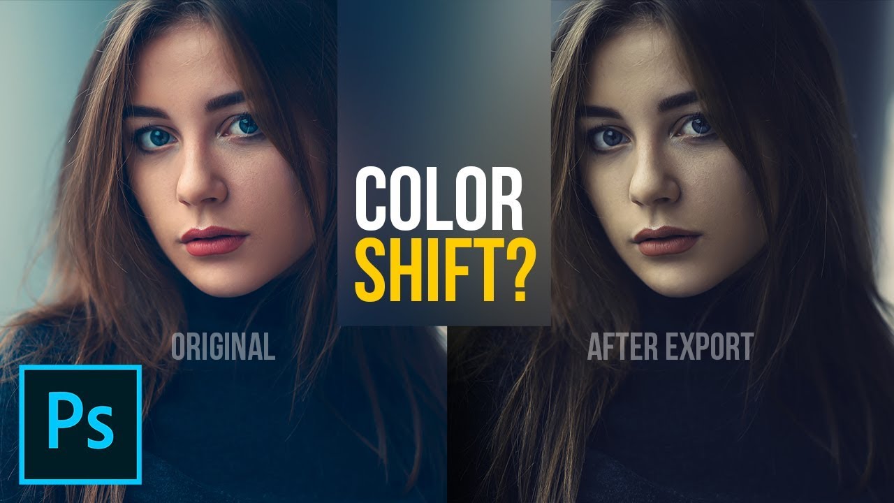
Fix Color Shifting After Export in Photoshop! Learn why the color changes using the concept of Color Spaces or Profiles. In this tutorial, we will discuss the different color spaces like sRGB, AdobeRGB, and ProPhoto RGB and how it influences our images.
I hope this tutorial h...
https://community.adobe.com
Here is a screenshot of the Export dialog, which colors shifted to warmer / red in comparison with the TIFF file opened in PS (visible in the background here) This is before I even save the JPEG file. How can I make PS use the right colors when saving to JPEG ? Thanks for any...
My monogram. Had a hard time find a fitting theme that accepted "ö" in the design haha. What do you think about the dots on the side?
Day 4 - Technicolor Postcard
I really like them @raw quest it's a nice details for the postcar! One thing that I would suggest, is that you might apply a darker tone on the red tones from the box and the Thinking about... text. just to enhance the contrast between it and the background. This is just personal preference 😉 Like this:
Gave +1 Creative Carma to @coral stone
Thank you @coral stone
@arctic rover great job, Jude! I really like the contrast of the realities of your postcard. This is totally an optional suggestion you can apply a darker tone of blue instead of the black on the bottom part, just for the colors to be more consistent on the whole postcard 😉 I loved the pink/blue effect on the buildings 🙂
do you think the hierarchy of the planets is working? or should i simplify it
Coolio 100%
Thank you @coral stone for the resources. I will be checking it out. Have a great day
Gave +1 Creative Carma to @coral stone
Is there a preferred method for Vertical text to be displayed, the way shown on the left (When the moon) or on the right (and Jupiter)?
Good day!
@eternal mica love it! I prefer like it is on the right side, personally.
Thank you, I learned so much as always. 🙌

@somber crow Thank you for your comment. Ive never learned any design, so Im not sure which is the preferred alignment, if there is one. It seems as if the Ps default is that on the right.
Gave +1 Creative Carma to @somber crow
@eternal mica I think its a personal preference, for me I prefer as on the right side in this case because its more legible, and also maintains the same visual weight as the text at the top and bottom
Challenge #4 of the Photoshop DCC
Today's collage challenge. I used the custom shape tool to create the background pattern. What do you think? Too much?
@small ibex How did you do it?!?!?!
I LOVE IT I LOVE IT I LOVE IT I LOVE IT!!!!!!!!!!!!!!!!!!!!!!!!!!!😱
@vocal drift it's just layering of different stock images 😄 and then I chose the flowers from the custom tool then overlayed it all with a multicoloured geometric background/texture
dang
You are a Genius @coral stone Thank you. I love how it all ties together now. I have a question for you ... When I tried to "export as"... all the colors changed. So I used, "save as" instead and it worked fine. I tried changing the settings in the "export as" but it didn't help. What might I be doing wrong. Thank you again. I am really happy with it now. I am also learning to accept the fact that done is not always done and that is ok. Tweaks are fun. 🙂
@scenic anchor were you working in sRGB? the colors shouldn't have changed unless you were trying to save as a GIF instead of a jpg. jpg has all the colors, gif is limited to a set of 256 colors
Gave +1 Creative Carma to @coral stone
@coral stone Here is a screen shot. I have tried checking and unchecking in every combo I could think of.
@scenic anchor change it to jpg you don't need PNG since there is no transparency. jpg is a compressed format and is smaller. Set compression to 50% - medium
DCC7 05 200615 I think I'll go with the Ps default.
@young karma cute. Since the giraffe's neck is not flat but rather rounded, it should bulge around the building and not be cut off stright and hard like that. Great idea and I love the perspective on the head.
Day 5! Do the colors on the seashells look OK?
@eternal mica Really cool Ted! As with most elements of design I don't think there's a proper way really, just depends on the look and style you're going for which can completely depend on the goal of the image. Personally I like the way it's shown on the left as it almost looks more intentional by design. I like the size variation you got in the different planets and shapes in this design! I would just be careful about the image getting too busy with all the text, shapes, and textured background. Sometimes pushing some elements back in terms of contrast and pulling just a few forward can give a nice read to the whole design. Really nice work 😄
@somber crow I like the playful style of text in this one! Nice work with the shapes, textures, and gradients!
@young karma Hah, great idea! Really nice work on the masking. I like what you did with the top part of the neck on the left side, how it isn't completely flush with the edge of the building and sticks out a bit which gives it a more believable effect that it's wrapping around the building. Could be nice to do that to the three remaining edges below it. I feel like perhaps using the blue of the sky instead of black for the text might be a nice look and ties well into the image. Just some thoughts, very nice work!
@ocean pine Very cool! I like the rough texture to the gradient. The drop shadow does a nice job of separating the shapes from the background. I wonder if flipping the gradient on the continent shapes might also give it some nice color contrast to make it pop out even more. Just a thought, looking good!
@small ibex Wow, loving it, really impressive work and great style to this! I suppose the image does get slightly busy with all the details and textures involved, though perhaps separating the main designs from the background could help. You could do this by separating the values further since they're somewhat similar, or maybe even giving the background image a slight blur? Either way I think it's looking really nice. Well done 😄
Ohh great idea @bleak fossil thank you I will try that
Gave +1 Creative Carma to @bleak fossil
@hollow yarrow Really great style to this! The bright colored gradient and the text at the top work really well thematically. Really liking that texture too, ties it all together nicely. 👍
@vocal drift Looking really good! The displacement type effect of the reflection in the way turned out very well. Looks like he's stopping just short of a pond. A couple of minor thoughts are that it might be nice to have a little more space at the top of the image, it looks a little cramped against the snowboarder's head and text. The text might also look nice if it were a dark blueish tone rather than black. I also think giving the image a brightness boost with a levels adjustment layer, and maybe using a photo filter layer to give it a stronger color tint in one direction (cool or warm) might help push the look a bit more. Just some thoughts. Good job!
@arctic rover Really nice design Jude! I like the colors. The top part of the design is very similar in terms of colors and value, I think perhaps you could separate them a bit in terms of contrast to give the shapes a stronger read against the background. Perhaps brightening up the water background could do that? Nice work 😄
@velvet kelp Really cool color contrast between the warm and cool tones here! Very nice style to the whole design. This is just a personal preference thing, but I wonder if making the pin and pink box behind the text at the bottom a orange/yellow type color like we see at the top of the image might be a nice way to make the whole design feel really unified. Repeating the color from the top down below in that way might be a nice look. Just a thought. Really nice work, I like the theme behind the map in the car, gives the design a nice element of adventure.
@left gull Very nice! I really like the color gradient and soft feel to the image, it gives it a really interesting mood. I do think it might be nice to pick one or two elements to increase the contrast of (just slightly) to make them a stronger focal point. Whether that be the image of the girl at the top, the text, or both. Currently everything is so soft that nothing really stands out enough to really catch the eye. Great style to this design!
@bleak fossil I couldn't work out how to blur it, so I created a white rectangle with the transparency turned down and overlayed on the flowers, what do you think?
Awesome, thanks so much for the feedback @bleak fossil I'll give it a try 😁
Gave +1 Creative Carma to @bleak fossil
Day 5
@small ibex Ooh, I was actually referring to the background image of the trees, but honestly that change kind of achieves the same thing. It creates a bit more of a visual hierarchy to the image which helps it read more clearly instead of everything competing equally for attention. I like it!
Doing an Ai Monogram on Photoshop LOL
@bleak fossil ahh thank you!
Gave +1 Creative Carma to @bleak fossil
Again, starting behind #PSDCC 1
Day 5 a little tweak with the planets shading #tomuchtimeonmyhands
Planets
Day 5 Keep looking up
Here is my attempt at the challenge today.
I think I've finally figured out this discord thing. I wanted to have the shapes stand out, but not take away from the message of the photo. Anything that I could have done better here?
PS Daily Challenge, Smart shapes. Day 5. 👽
I dont know why @indigo monolith but this image makes me sad!🤣 you did a really good job and i LOVE it
I dont know why @indigo monolith but this image makes me sad!🤣 you did a really good job and i LOVE it
@vocal drift I understand. It could be all that we see going on around us, but the hope is that we can figure it out on earth, and not in outer space somewhere
🤣
I dont get it! we know more about SPACE then we do about the very very bottom depths of the ocean!
I dont get it! we know more about SPACE then we do about the very very bottom depths of the ocean!
@vocal drift true!!

@vocal drift As long as you have the gun, it's whatever you want it to be! 😉
@sacred field 👌
Hi everyone, here is challenge #6 - Collage illustration
I just created something that came to my head, The first thing that came to my head was Jurassic Park!🦖 🦕
@hollow yarrow Really great style to this! The bright colored gradient and the text at the top work really well thematically. Really liking that texture too, ties it all together nicely. 👍
Thanks a lot @bleak fossil ... I always appreciate your comments ☺️
@bleak fossil Sam, thanks for the critique. I switched the font alignment to the PS default. There is a lot going on, especially with the amount of text. I'll play with the some of the layers' opacity to see about toning it down.
Gave +1 Creative Carma to @bleak fossil
I was having trouble trying to import Custom shapes or else I would have aded a crescent moon.
Day 4 😀
PSDCC #5 Collage Illustration
@indigo monolith. Hi. Nice job. This is just me, but have you considered adding a starry background. And perhaps overlay the planet behind the hands as earth (in the same hues as you have created). Maybe cast light from a close star. We can play forever, huh? Congrats on your creation.
Day 5 🪐
Here's my collage! What do you think? @sterile bane
PSDCC Day 2 mood
@thorn geyser Wow! Amazing work. I think textures on the planets and the general color correction are both soo coool! Maybe I may say your text is too close to its black background's edges. I think if you make it a bit smaller it will look more breathing.
@worn yew Thanks for the feedback! 😄 I did tweak the position of the text several times as I couldn't quite decide how close to the edge it should be! That's a good idea, I will try making it smaller!
Gave +1 Creative Carma to @worn yew
@blissful moon I think your strong colors catch the eye so easily. Maybe I can say your hanging objects need to be aligned in middle together. And I don't know what others think but I loved your black textbox and your script font on it. It gives really cool vibes 👍
Day 5 v2 with smaller text!
It wouldn't let me import more shapes to get a moon, but I think it looks okay. I cut out an image of a moon instead. What do you think?
@vagrant rapids Magnifique! This makes me feel sooo warm and nostalgic about my childhood summers! The colors and fonts you use are the best choice for this composition. Your waves, your palm, your hanging objects and the moon! Parfait 👍
Thank you @worn yew! I'm also nostalgic about those moments ...
Gave +1 Creative Carma to @worn yew
@slim plume Why it wouldn't let you? If you share the error with me I can help 👍🏻But in any case I'm really impressed by your pastel colors and low vibrance balance in this artwork. Great job!
@sacred field Wow! Glowy glows :) You know exactly where it needs to pop and made a perfect ratio of glow. And I got the joy of being there when I look at your person's silhouette. Calm, cool and alone... Just as a very personal suggestion, I'm confused with those 2 flying objects. Are they UFOs or flying stars?
Challenge Day 5-Collage Illustration with "Smart Shapes"
@worn yew Thanks for the kind words! The two objects look like shooting stars, but that doesn't necessarily mean they are. I did put an alien emoticon with my text ... 😉
Gave +1 Creative Carma to @worn yew
My original made the raptors look like a bunch of terds so i changed it to this. In this new version i wanted the raptors to kinda blend in with there environment.
@floral frigate Oh that was a great idea haha! I loved the connection between the letters and the thick stroke. Also great job with the colors. 💯
@plain sable great job! I loved that you added a frame on the composition. Just a suggestion, you might use the airship as an element that helps to direct the eyes. For that, you might position it to the right and maybe tilt a little bit, just to look like it is pointing to the galaxy, like the telescope. Just an idea, you made an awesome job!
Thanks @coral stone I'll give that a try
No problem @safe linden, Very nice job combining the colors, I really like the Orange/Blue combination. Keep going you’re doing great! 😉
Wow @silk hatch this is looking super cool! My only point of feedback would be to try a darker tone for the vignette instead of a bright one, this will help to enhance the space context even more, and also the focal point of the collage. Nicely done, Mark!
@hot thicket that's a beautiful collage, John! My only suggestion would be to brighten the planet, the telescope, and the text, so they can have more contrast against the background and that pop effect that really stands out. Great job!
Postcards
Loved the subtle wall on the background @autumn granite! Just a personal preference, you can reduce the stroke width only a bit and give it a butt or a square cap. For that you can click on the stroke options here 👇 Great job, Matt!
@young karma wooow, loved the colors and the shapes you used, Artur! Did you use the Polar Coordinates effect for the circle on the background? It looks amazing. Well done!
what do you think about my hanging objects?
@indigo monolith great collage. I loved how you built a strong message. I think @tropic knoll has some super cool suggestions. Amazing work!
Gave 1 Creative Carma to CK (current: #75 - 8)
Loved the silhouette effect @sacred field and great job with the focal points! The stars and the telescope are great elements that help to direct the eyes. 💯
@vagrant rapids this is looking beautiful. I loved the colors and your font's choice. The brighter moon was a great idea, if you want, you might flip it horizontally just for the eyes keep being directed on the other collage’s elements, this is just personal preference. I have just another nitpick, that would be to brighten or darken the main planet (the big one), just to enhance the contrast against the background, like the other two. Amazing work, Christelle!
@worn yew Thank you!! When I click import shapes, a bunch of folders pop up and the custom shapes one is selected but it wont let me click open.
Gave +1 Creative Carma to @worn yew
@worn yew Thanks for the feedback. Yeah, looking back over the collage, I can see what you mean about my objects being too high.
@coral stone Thanks, Valdair! I enjoyed watching it come together! ✌️
Collage Illustration - Here's Looking At You
@coral stone Thanks for your feedback ! Totally agree on both advices : of course, the moon should be turned, and I'll darken the big planet. And then, I'll be ready to post it on my portfolio 🙂 !!!!
Gave +1 Creative Carma to @coral stone
Todays challenge for Day 5. I had a hard time finding new shapes so I had to create my own moon. I tried to import more shapes but I didn't see any files to import. I need to figure out how to find more.
Hi @blissful moon, Loved the texture you applied to the background. Sorry you had trouble with the Custom Shapes, is there anything that I can help? 🙂
Day 5 more tweaking... Thanks @coral stone
Gave +1 Creative Carma to @coral stone
DCC 5
@heavy ruin Your moon is so cute 😁
Thank you @sage verge
Gave +1 Creative Carma to @sage verge
Very nice @kindred kernel! The colors that you applied are looking pretty cool! 🙂
@thorn geyser I like that you incorporated an actual sky and landscape image in the background. As well as the different textures for each shape. Good work.
Lovely colors @tacit condor! Loved the planet with the spiral and the rings of the one on the right. Awesome work!
Work Harder...
@slim plume The color palette is amazing! Loved the consistency that you achieved with the colors of the planets and the rectangles behind the text. Just a personal preference, you might tweak the position of the moon and the other planets or just flip it horizontally, so you can achieve, even more, a balanced focal point on the collage, think of these elements like an opportunity to direct the viewer's eyes. 🙂 Fantastic work!
I forgot to bend something!!! - I guess that's what happens when the imagination kicks in. A 1960s post pandemic (...just imagine they had one, OK) advertising flier with sinister undertones. Does it work at all?
@hasty oracle super cool work! I really like the gradient on the background suggesting that there is more light on the bottom. Well done!
@young karma this is amazing and very creative as well! Loved the geometric look and the shading on the shapes giving it a 3D look. You font choice was amazing, really like the green color and how it reminds me of the Atari’s screens. Impressive job!
Day 5: Collage Illustration
Another Space theme for me, I'm diggin' it!👾 👾 👾
Challenge 5!
I don't understand why my telescope isnt moving?
Hi @blissful geyser I answered you on #❓ask-a-question 🙂
@blissful geyser If you cut out---ope valdair answered 👍
Day four; I changed the wording and type face, but couldn't get rid of the old lettering and rectangles.
Changed the font and color, but couldn't get rid of the underlaying font and rectangles.
@lime meadow loved the 3d look of the map! My only suggestion would be to position the text on the left side of the map, so you won't lose contrast on the black areas where it is positioned. You can even try to centralize or right align it and put the were on the second line just as the here just to balance it even more 🙂
Day5: whimsical card for a young graduate -- Personalization would probably help.
They are looking super cute @cerulean steppe! If you want, you might brighten the telescope a little bit more, just to avoid it blending with the background a pop a little more with contrast. Great job!
This is very creative @arctic rover! Loved the distorted Earth on the microscope! Great job!
Day 5 Collage
My collage. I could have made a better selection of the telescope. Now I don't know how to go back and refine it. lol
@indigo monolith. Hi. Nice job. This is just me, but have you considered adding a starry background. And perhaps overlay the planet behind the hands as earth (in the same hues as you have created). Maybe cast light from a close star. We can play forever, huh? Congrats on your creation.
@tropic knoll thank you. Those are some great ideas that I can try to further enhance it.
@indigo monolith great collage. I loved how you built a strong message. I think @tropic knoll has some super cool suggestions. Amazing work!
@coral stone Thank you. I’m going to play around with those ideas and see what it turns in too
Hi @heavy ruin I believe the moon is part of the Legacy Shapes. To import them you can open the shapes panel (Window > Shapes) and click on the lines icon at the right top and choose Legacy Shapes and more. Ps will restore all the legacy shapes from previous versions. The moon shape is under this path, you just need to open the groups: Legacy Shapes and More > All Legacy Default Shapes group > Shapes. 🙂
@coral stone Thanks for the feedback. Been using the brick on others things so kept the theme going. Made a change to the dashes. Thx
Gave +1 Creative Carma to @coral stone
@coral stone Thanks for the encouragement. I struggle with photoshop, so it really helps to know when I have done something right. 🙂
Gave +1 Creative Carma to @coral stone
@safe linden, your color sceme is so unified. Very pleasing to look at. The placment of the images is great as well.
@torpid rose You used the contour lines perfectly. Theme and presentation is solid.
@verbal dirge Your tecnicolor illustration has so much depth and life. When you look it seems like something might move so it keeps the viewers eyes active.
Alright, so I made two because the first one wasn't collage-y enough, haah! What do you guys think?
I made this one because the first one didnt have enough collage , what do you guys think about the inconsistent overlapping? I like that it creates a some depth but I'm not sure if it reads cleanly.
Day 5 Collage Illustration challenge - used shape tool on the eye. Had some fun with images sources from Raw Pixel. What do you think ... too dark and a little ominous looking for the message?
@icy heart really loving both collages .
@heavy ruin I really struggled with the custom shape tool too then did one of Paul Trani's PS challenges last week at about 8.40mins in Paul talks about using the custom shape tool which really helped me a lot.. especially making sure the tool is still selected if you want to change it.
https://www.behance.net/live/videos/6271/Photoshop-Daily-Creative-Challenge-Abstract-Geometry

Challenge: Create a design that focuses on abstract geometry using Vector tools and Clipping Masks.Get the starter file here: https://bit.ly/psdcc5-25-8Join your host each morning at 9:00am PT to learn how to approach each challenge using Photoshop. Complete 9 challenges by Fr...
@plain sable beautiful submission. lots of really exciting elements to please the eye.
@prime temple It looks like you worked really hard on this!!! I really like the figure you created and the glowing scepter in his hand. Very nice touch.
@velvet kelp Really cool color contrast between the warm and cool tones here! Very nice style to the whole design. This is just a personal preference thing, but I wonder if making the pin and pink box behind the text at the bottom a orange/yellow type color like we see at the top of the image might be a nice way to make the whole design feel really unified. Repeating the color from the top down below in that way might be a nice look. Just a thought. Really nice work, I like the theme behind the map in the car, gives the design a nice element of adventure.
@bleak fossil thank you for your feedback.
@brisk flower Matt, I think youve been home alone for too long. Put on your mask and take a walk around the block!!! LOL. What does it all mean? Im lost.
Thanks @eternal mica
Gave +1 Creative Carma to @eternal mica
@sage verge Another really fine effort. The bands of light are very effective
@young karma Did you borrow that whale from Paul's animation? 😊 😊 I like the pen drawing look.
I played around with the background ...alot
@eternal mica i actually didn't! it looks really similar, right??! yeah, i always enjoy sketchy looks!
This was so much fun. There are so many possible solutions.
Daily Challenge 200615 - combine photos and shapes to create a collage illustration using Smart Shapes
Day 5 - Collage Illustration
Shapes, shapes, shapes...🌕 🚀
Hey All! I added some different effects for the challenge today. Please let me know what you like about it and how I can make it better!
@hollow yarrow I really like the shadow and colors you used here! Great job Franck!
Day 5! Feedback please 🙂
Mother and daughter fur babies I lost many years ago ... Thoughts?
@exotic slate Sorry for your losses!! I think make Elvira & Tigger a little more opaque so it brings them forward a little. They’re gorgeous kitties!
@hollow yarrow I LOVE IT! The paper and layers look so great
@hollow yarrow Nice use of the paper cutout technique for this challenge. Reminds me of childhood 😋
Thank you @upper crag good tip, I like this better
Gave +1 Creative Carma to @upper crag
@icy heart both of your pieces are great. I really like the minimalist approach on the first one. Then the second one is reminiscent of the Son of Man painting
not so good but got it done
Not sure if this counts...but it is space themed. Started as watercolor and then went over it in photoshop. How is the composition and contrast? Does it feel spacey?
@misty jewel Love it! I think the little white brush mark by the orange planet is a bit distracting. Aside from that I think it's great
Daily Creative Challenge
@gritty violet I think the telescope looks a little crooked which makes it look like it's spinning into the vortex in the center. So, if would probably use Kathleen's method of moving the telescope from that hinge joint.
@tame jacinth You have a great concept! I'd like the face to be bigger so it's more of a focal point. Or even take a bunch of grad photos and collage them over the planets would be cool, since it's for the graduating class. The yellow planet stick out and becomes the focal point which I don't think makes sense. So, I would either add more yellow in the background or elsewhere, or make it more blue.
I appreciate your suggestions, thanks. The yellow planet is Earth.
@thorn geyser I like that you incorporated an actual sky and landscape image in the background. As well as the different textures for each shape. Good work.
@heavy ruin Thank you! 🙂
Gave +1 Creative Carma to @coral stone
@verbal dirge really loving your art 😍
The techniques used are great, I am just wondering if what I am thinking is a space age firearm pointed at/towards the people? Even if it were pointed in a different direction it feel kind of menacing...and that may be the point. I am just unsure why because without it is seems like such a peaceful moment.
I am pretty inspired by this always wanted to do a ray or other animal in space 😁
Collage Illustration_day 5 - https://www.behance.net/gallery/98694437/Daily-Creative-Challenge-June-09
Day 5 _ Collage
Added the parachute on a serene landscape and used custom shapes to create a floral pattern on the left. Please let me know what you guys think....
@brisk flower Matt, I think youve been home alone for too long. Put on your mask and take a walk around the block!!! LOL. What does it all mean? Im lost.
@eternal mica Not sure myself, just the need to get away but then there is the inherent fear associated with being outside the "safe zone".
@verbal dirge really loving your art 😍
The techniques used are great, I am just wondering if what I am thinking is a space age firearm pointed at/towards the people? Even if it were pointed in a different direction it feel kind of menacing...and that may be the point. I am just unsure why because without it is seems like such a peaceful moment.
I am pretty inspired by this always wanted to do a ray or other animal in space 😁
@sage verge It's supposed to be a ship about to dock at the station. I can see what youre saying tho...need to work on my vehicle rendering lol but thank you!!
@unborn prism This is so pretty! Love the little doodley planets and the colors go so well together
@coarse juniper Those custom shapes turned out really well and I think they go well with the rest of the piece. The color gradients work really well together
Challenge 5, Ver.2
Day 5 - Collage Illustration. Do you think there is too much orange?
@buoyant nova The only place i'd question it is where the crescent overlaps the moon, wondering if that needs a bit of shadow or something to show separation. Other than that the amount of orange is not overpowering, looks good against the blue, and theres some nice shapes n textures there so it is not flat blocks of colour.
@young karma Good idea, will give that a try. Thanks
Gave +1 Creative Carma to @tame gorge
@ruby panther Thats a captivating piece of work.
@young karma Thanks.👍
Thanks @young karma it looks much better
Gave +1 Creative Carma to @tame gorge
@buoyant nova Yes, it helps but have you gone too far? How about slim it down a touch an reduce opacity so we can still see your moon through the shadow? Ha! Listen to me pontificating like I know something! lol Am no expert, just ideas, Susan. Its a good piece.
Thanks @young karma will give that a go 🙂
Gave +1 Creative Carma to @tame gorge
Brave!
@young karma Hope this looks better, thanks 🙂
Gave +1 Creative Carma to @tame gorge
To me it does @buoyant nova subtle and effective.
@young karma Thanks, appreciate the help 🙂
Lots of software updates this morning, Photoshop and both Lighrooms
@silk hatch 🆒
@heavy ruin I really struggled with the custom shape tool too then did one of Paul Trani's PS challenges last week at about 8.40mins in Paul talks about using the custom shape tool which really helped me a lot.. especially making sure the tool is still selected if you want to change it.
https://www.behance.net/live/videos/6271/Photoshop-Daily-Creative-Challenge-Abstract-Geometry
@bronze thorn thank you ive bookmarked it to check it out!
Challenge: Create a design that focuses on abstract geometry using Vector tools and Clipping Masks.Get the starter file here: https://bit.ly/psdcc5-25-8Join your host each morning at 9:00am PT to learn how to approach each challenge using Photoshop. Complete 9 challenges by Fr...
Gave +1 Creative Carma to @heavy ruin
@hearty quest Yes, that was a good challenge, got a lot from it too.
Thank you so much@misty jewel , @upper crag and @sage verge for your comments. I appreciate!☺️
Gave +1 Creative Carma to @misty jewel
@ruby panther "breathe" not "breath"
@eternal mica ah, crap....
@young karma Beautiful effort. Suggestion: change the word Upward. Its awkward usage. Maybe Skyward. or To the Sky. To the Heavens.
@hollow yarrow Awesome. The 3d paper look is great. Your attention to detail is incredible. Shadows on some but not others is really cool
@young karma Beautiful effort. Suggestion: change the word Upward. Its awkward usage. Maybe Skyward. or To the Sky. To the Heavens.
@eternal mica Thanks for the suggestion - .. the phrase is from a Plato quote.
@verbal dirge It definitely looks spacey. A lot to like about it. Im not sure the purpose of the stingray and what ever that other very small object on the right is. To me theyre distracting. I would suggest either other objects or no object at all.
@young karma With an "s" at the end. "Astronomy compels the soul to look upwards and leads us from this world to another"
@young karma With an "s" at the end. "Astronomy compels the soul to look upwards and leads us from this world to another"
@eternal mica - I used this one, "Astronomy compels the soul to look upward, and leads us from this world to another." Plato
@unborn prism i love this piece. Doodles are great effect
@buoyant nova I agree with @young karma that the crescent needs separation. However, the shadow didnt help. Maybe an aura around the crescent similar to what you have around the pink orb.
Gave +1 Creative Carma to @eternal mica
Thanks for the suggestion @eternal mica
@young karma 👍 👍
Day 5: Collage Illustration - Is the order of heirarchy easy to see?
Collage Illustration
Thanks @eternal mica what do you think to this?
Gave +1 Creative Carma to @eternal mica
Hello everyone ! I have a great need to free my head (simplified, simplified ...). I await your opinions : do not hesitate ...
@young karma Ilike it! Was wndering if the ball and chain should be actually attached to the man? or maybe slightly smaller in size?
@young karma shapes, composites, textures & are those brushes for the cracks? It has a 20s charm to it or a 'Pythonesque' something that appeals to me. The creams and pastels are a nice choice. If I was to suggest anything then maybe the proportion of little person to ball and chain has the ball a bit too big... but then that might be the point!
@young karma and @grave apex ; I designed the texture, with Kyle's brushes (it's really great! there is everything! 💯 ). For the chain and the ball, it's true for the size ... I wanted to detach it, as it was taking off ... thank you for the opinions! (I will make a small correction ...)
Gave +1 Creative Carma to @tame gorge
@young karma Love the colours
thanks @buoyant nova ! some small corrections ; what do you think ? @young karma and @grave apex
Gave +1 Creative Carma to @buoyant nova
@young karma back on the chain gang! I think the balance is better with a smaller ball.
Very nice piece!
I don't know ... I hesitate ... 😆 ... at the same time it can be a big ball! 🙄 I fear that we will see more ... come on ! .. let's be crazy! I shrink it a little more ...
@young karma my eye goes to the 🌙 more than to where the telescope seems to be directing, which is the empty circle. Maybe enlarging the one you want to be the focus will help give some visual hierarchy.
@buoyant nova much much better, dont you think??
I don't know ... I hesitate ... 😆 ... at the same time it can be a big ball! 🙄 I fear that we will see more ... come on ! .. let's be crazy! I shrink it a little more ...
@young karma
I actually like this size better for an abstract collage. [Gonna get my artist beret! Lol] I think the makes it more meaningful especially with your message of free your mind. There are so many things that weigh us down...and they seem so large at times but we sometimes need to let go and be carried away :) jusg my two cents
@eternal mica Totally agree much better. Looks like a tangerine that I want to eat 😂
@young karma Not to drive you nuts, but, I thought the whole point of the "unchained ball" was to be "set free"?? It doesnt make sense to me to have it attached. I do agree with the other comments that, attached or unattached, the little man should be more prominent than the ball and chain.
@buoyant nova ooooh love tangerines. Dig in!!!
@eternal mica think about the idea of perspective in a surreal collage. I could argue that the little parachute is flying away, you see the ball larger because it's closer to the ground than him, which then i would make the parachute smaller 😉
haha! We now have to go to the public vote!
Lol, art is totally subjective. People debate on meanings all the time.
Im not saying anyone is wrong though. Just sharing different ideas and perspective
@sage verge yes, i know... I am joking!
@sage verge I greatly respect your opinion. In this case, Im not so sure I agree. @young karma And I love the "discourse in Discord".
@eternal mica likewise! 😄
@young karma not trying to add to the nuts, and I have to say I really like your piece, but what if the ball just couldn't hang on and the chain breaks freeing the mind, just thinking aloud
If I change again ... I think the character will really go away ... I agree with you @sage verge 👍
Oh you broke the chain I like it!
still works for me!
@young karma Its your piece, do it your way. im with @plain sable I like this last one the best.
@young karma and thank you for a piece that stimulated a nice discussion
Gave +1 Creative Carma to @shadow crypt
Thanks @eternal mica and @plain sable 😉
Gave +1 Creative Carma to @eternal mica
Yes Thanks @young karma and great job, love the background texture... I'm a texturaholic... 🙂
Gave +1 Creative Carma to @shadow crypt
so far... I think, I need to work on that grid, but as I created it in AI and transported it to PS, I had many problems. Does anyone have experience with grids?
Oh! I like that @soft arch
for me, it's always a pleasure to have opinions, another look to make some changes ... we can always improve. I thank everyone!
thank you @young karma 😃
Gave +1 Creative Carma to @tame gorge
#5 rough , not sure about the texture and shadow on left planet?
Wooow @soft arch this is looking great! I think the grid is pretty well wrapped on the ellipse, I also like how you played with the text and the lights. Just a personal preference, you might position the text a little higher so it can be closer to the ellipse, the proximity will enhance the context of your image. Awesome work!
I went for vintage adventure. I'm not sure about the amount of planets, but at the same time I like them all and don't want to take them away.
@young karma I reaaally like your retouch with the broken chain ! It made a nice effect for to the free you mind.
@raw quest I return the compliment to you, I love your composition, colors, textures ... really nice ! 💯
@raw quest I like the 50s poster vibe to this. Keep the planets!
@queen dew it's looking very nice. One thing that you can do with the left planet is to recover some details of the white left side of it. Just like the one from the right, it has the light coming from the left but the details are still visible. 🙂
Wow. I don't know what I accidently did but I meant to click control T and whatever I hit changed the colors on screen drastically. Nothing looked like it did and I couldn't seem to undo whatever it was. So I continued on. Now the jpg version has the background colors like I had but everything I added later
is way more color intense than what I am now seeing. What could I have done? How do I undo it? I sure hope it only affects this image! Watercolor brushes, watercolor texture (some planets) LOTS of layers. shapes that I rasterized and manipulated, and I kept getting can not render - layer is not editable when I tried to add a flame. So I did my flame in another program. (tail is a tattoo shape stretched and path blur)
Oh and that is a Red Dwarf reference
@coral stone thanks for your feedback👍 I ‘ll try and make the texture more realistic.
Gave +1 Creative Carma to @coral stone
Challenge 5. The filtered images of the sun and the telescope are mine, all taken 201111 . Never look directly at the sun especially through cameras or telescopes! In the first and third image the dot is Mercury in transit across the sun. Note the solar flare in the center image. The flares occured after the transit. Reminder: the sun is approx. 93 million miles from Earth. Think how big that flare must be for a tiny camera to capture it. I marvel at this stuff! This was difficult for me to get. I hope the enchantment of the setting shows. Thank you for this opportunity!
Challenge 4 technicolor postcard 🤩 @sterile bane
hello @coral stone thank you, I still see so many things to correct, don't you think, the grid need texture and metal look? and less shaow on the left?
Gave +1 Creative Carma to @coral stone
@soft arch you can brighten the shadows areas a bit on the left. I like the look of the grid, you can fine-tune with gradients for that metallic look and even some textures images that you can apply with clipping mask, just some tweaks that you can try to see if you like or not. 😉
Day 5 Collage critters by Lisa Glanz
@icy heart I love both versions of your collage! I really like how delicate the first one feels. For the second collage, I like the layout a lot. Great job!
cant wait for the challenge artwork @sterile bane
what do you think of the silhouette? is it too busy?
100% Dank
whoooop
DCC 6
That was fast
@rocky reef woah loooove the blurred edge at the neck. that's a great solution since these portraits can sometimes have a stark edge where the head is "cut off" haha
Not just fast, good too!
@sterile bane Thanks! I know what you mean 😄
Gave +1 Creative Carma to @sterile bane
Never done a double exposure before. Do not have any self portraits, so decided to use my son again.
Challenge 5 - some imaginary Space
DAY 6 - Double Exposure. Have I done this correctly?
What do you guys think?? 😊
Here is my thang for challenge #6
PSDCC Day 3
Floating aquarium
Woohoo managed to catch up! Ok guys should I add more to this image?or is it ok being simple?
Here is my challege 6
sample 😅
...and Vadim created Bardot. Any good?
@brisk flower good green 👍
Challenge #5 - Thanks for your advices!!!! Looks really better now!
DCC7 06 200616 Im not happy with this, but .....
had fun doing this double exposure of my kiddos
Now when I review my creation I notice that the "banners" may be a little off. The right one has a bigger margin to the siluette than the left... Hum, i don't know.
I used a picture of my dog. She's my daily reminder to never give up on dreams and I wanted to share it forward to u!
My project photo was very dark, so I stayed with that theme.
Can I submit more than 1 challenge ?
@desert lantern yes! 🙂
yay great!
Too much contrast? My portrait didn't have much dark contrast, but I think the effect of the double exposure turned out nicely.
@desert lantern Thank you for your encouragement.
Gave +1 Creative Carma to @desert lantern
@blissful moon I love it but can u soften the edges a bit ?
@eternal mica You're Welcome mate 🙂
kept with the cameo feel. I have late summer hiking on my mind. What do you all think of the texture/shapes i added in the background? does it make it too busy?
Challenge Day 6- Double Exposure.....wondering if I wanted to license the images I used before adding them to my Behance, is there an easy way to do that at this point, or should I have done it in the beginning?
Day 5 Composite Postcard. Telescopre from PixelSquid.
Day 6 hope this would be enough for a double of exposure. I was more interested in a composite thanks
Day 6 Double Exposure Postcard. Fireworks from Pixabay, woman's profile from AdobStock
I had to erase some of the trees that were showing in the background. Then continued erasing to show more of the neck.
Collage Illustration
@somber crow your use of foliage for hair and beard is great, and I like how you used the break in earth/sky at the natural division of the head and neck is fantastic
composite on desktop
@somber crow your use of foliage for hair and beard is great, and I like how you used the break in earth/sky at the natural division of the head and neck is fantastic
@pastel spade thanks it took me a few tries to find some images that worked and then this lucky combination
Collage of pictures and clear paint
Challenge 5
Double, Double.
Feedback on the reflection please.
Day 6. Decided to make it a postcard to stick with the theme!
Love the colours! Fierce looking bird.
@cold snow very Elise Swopes inspired 😄 Great job!
or better with a slightly different bg colour?
@sage verge thank you! yes it was!
Gave +1 Creative Carma to @sage verge
@young karma I'm not entirely sure what it is. To me it has the shape of like a violin maybe...but I can't tell what's inside
@young karma Also, while I normally am a blue person, I think the warmer toned picture was better since there are warm tones in the center picture
@sacred field This is super cool! The way the darks and the colors sort of meld together from feeling realistic to being the tree leaves is great
@brisk flower Both beautiful1 The green and pink one is my favorite between the two
@verbal dirge Thanks, Dani! I appreciate it! 👍
Gave +1 Creative Carma to @verbal dirge
😩 Compositing with Kate Moss and 520 Five Hundred Twenty(not a self portrait)
@young karma I'm not entirely sure what it is. To me it has the shape of like a violin maybe...but I can't tell what's inside
@verbal dirge Thanks for the feedback, genuinely appreciated - I think i have pushed the 'subtlety' of my self-portrait somewhat too far - back to the drawing board, literally. My head is the shape of maybe a violin 🤣 , yep, too much photoshoppin'
@hasty oracle if you did not razterize the adobe stock image you should be able to. If not I think you can not licence a rasterized image (must be a smart object)
@verbal dirge Thanks for the feedback, genuinely appreciated - I think i have pushed the 'subtlety' of my self-portrait somewhat too far - back to the drawing board, literally. My head is the shape of maybe a violin 🤣 , yep, too much photoshoppin'
@young karma I'm sorry! 😂 😖
Not at all, you're bang on! @verbal dirge
Any suggestions or something and more on instagram
Ok, version 3 - new background... and kidding aside, I really appreciate the feedback
A bit late but here's Challenge 5, collage with images and shapes, I named it 'Sacred' 😊 I think that cloud on top of the left wing is quite distracting but I don't know how to fix it without underexposing the background, if anyone knows pls let me know ❤️
@young karma That's much better!
@proven coyote I think there's a tool in photoshop that lets you select it and it matches the surround background to fill it in...I see ads for it all the tine
@proven coyote Use the quick select tool on that layer, then go to edit > content aware fill and it should get rid of the cloud for you. May need to do a bit of editing
@verbal dirge I will try it! thank you so much ❤️
Gave +1 Creative Carma to @verbal dirge
@young karma That's much better!
@verbal dirge Thank you
I think I'm still stuck in technicolor post card mode....
@hollow yarrow Thanks for helping. I used the files Kathleen sent. Do I need to go straight to Adobe and get the files from them instead?
Gave +1 Creative Carma to @hollow yarrow
@arctic rover Thats REALLY technicolour too!
@arctic rover Thats REALLY technicolour too!
@young karma I know....right? And I'm not much of a color person!
But then I created Creepy Tree Guy. "Oh never go down to the withering woods. The creatures that live there are up to no good."
Double exposure challenge for Pride Month!
kept with the cameo feel. I have late summer hiking on my mind. What do you all think of the texture/shapes i added in the background? does it make it too busy?
@icy heart I really like the additions, if you feel like they make it too busy, try taking down the opacity, I tried that on an asteroid piece a few weeks back and it did just the trick.
Not a self portrait, but what do you think?
Double exposure challenge for Pride Month!
@cold snow I love how happy the colors make me feel! That orange is awesome, but it makes the font a little hard to read, maybe add a glow or an outline just to make the first part of the "p" stand out. At least that's what I would do instead of changing that awesome orange.
Gave +1 Creative Carma to @cold snow
Beautiful work @brisk flower! Loved the color palette on the first version. Also, the texture and the image on the skin turned out great! Well done!
Great improvements @vagrant rapids! Loved the glow you added to the moon and how the first planet has a super cool contrast against the background. Nicely done!
@eternal mica, oh this happens, Ted. Sometimes you just need to play with the blend modes, position, scale... just to see what looks better and what doesn't. Some tiny details that might help you:
- Try to position her on the center of the white background just to balance even more the frame.
- Maybe a very subtle background, like a low saturated color and some texture might change the look of your image completely.
Keep creating Ted, you're doing great!
Here is my double exposure, I am not super into anything on a white, and I wanted to try a self portrait so I went with a black.
@desert lantern woww, loved the colors on this one. How did you create the dispersion on the subject? It looks pretty nice, the effect and the color palette, and the fact that her face is not showing create a super cool mysterious mood on the image. Awesome work! 🙂
Oh how cute @halcyon trail! Loved how you played with the effect and how you positioned the kids very well directing the eyes perfectly from left to right. My only suggestion would be to darken the text juuuuust a bit. You can use a brighter blue tone from the kids or even the pink ones from the heart. Fantastic work!
@heady stirrup how about this? A little bevel and emboss.....
@raw quest woow dogs are amazing, I love them, I have three haha! Loved the colors that you used for the banners, I think it contrasts really well against the dark background. Here's one thing that you can try: reducing the forest's opacity just a bit kind of 95-90% so the dog will be able to appear more. Loved the flipped forest on the head. Great job!
Loved the dark theme @sacred field! Red and blue colors and the high contrast created a very interesting look to your image. I like the second version as well, it has a nice transition from the saturated blue on top to the brown in the bottom. Super cool work!
@torpid rose I love the colors! Its super fun and fresh, for half a second there I thought that said Thawed entertainment. I was very confused. 😆
Loved the colors and the effect @blissful moon! I believe that smoothing the edges as @desert lantern said would give a nice touch for the image, especially on the right bottom part where it seems to have a cut. Great job!
Gave 1 Creative Carma to Ziaddkhaledd (current: #236 - 2)
@cold snow Its a lot easier to read now. And I like the little tilt you put on it, it matches the free spirit of the gradient and picture you used.
@coral stone thanks for the feedback I created using displace for an image I created with glitch filter on photoshop
Gave +1 Creative Carma to @coral stone
@thorn geyser well done on this loved the contrast and everything except the font maybe you should experiment with more fonts except that amazing job loved it!
@icy heart I don't think so. These details worked great with the composition, the technique that @heady stirrup suggested is great if you still think it's busy. Just a nitpick, you can crop this empty part on the bottom, just to have even more consistency and create that continuity effect.
@heady stirrup well done Loved it maybe soften the edges a bit
@sacred field well done on this
Hi @hasty oracle if the preview image is linked to a cc library you can license it from Ps itself. If not, you need to download the license from Adobe Stock, in this case, I think you’ll have to adjust the image manually, but what you did with the preview can be a nice guide for you. About your image, I loved the faded look, my only suggestion would be to increase the contrast on this top area of the head to separate the subject to the background. You can bright it just like the bottom part. Great job!
@prime temple I keep getting drawn to this! Love it!
Beautiful collage @forest aspen! I loved the fill you added on the planets, and the Stay Curious font looks amazing! Well done! 😉
@coral stone Thanks, Valdair! I really appreciate your feedback! 😀
Gave +1 Creative Carma to @coral stone
@cold snow amazing!
Very creative use of the effect @hot thicket. I loved how the horse on the hat is subtle, and how it created a super cool context to the subject’s expression and the overall image.
@somber crow amazing!!! Loved it very creative!
Very creative use of the effect @hot thicket. I loved how the horse on the hat is subtle, and how it created a super cool context to the subject’s expression and the overall image.
Very nice collage @chilly hawk! Loved the subtle glow you added to the planets and the separation of the clouds, the trees, and the telescope! Great job!
What do you think? Too simple? What could have I added to the background colour?
Nice color grading on the composite @cold snow! Loved the giraffes and the city and how the clouds/fog seems to tie it all together. Well done!
@heady stirrup well done Loved it maybe soften the edges a bit
@desert lantern Absolutely right, I went back and messed with the masks a bit more and I like the result better
@real swan loved the blending effect of the shapes to the building. If you want to unify a mood to it you can try different color lookup presets. This is just a personal opinion, of course 😉
@wet thistle I think this turned out great, Carry. I loved the color palette and how consistent they are. I also loved what you did to the letters. Awesome job!
Frankfurt/Main main station a willow and my friend 😃
@soft arch perfect placement for the hair!
@glacial minnow super cool job, Sue! Loved the consistency with the type and the red tones. About the reflections, I believe it looks even more like a shadow than a reflection which I really like because it gives the impression that the text is not touching the shallow water but still casting a shadow. If you want to enhance the reflection effect you can make its edges a little bit sharper. It would be great to search for some references with similar pictures just for inspiration. Well done!
thank you @sterile bane 😃
Gave +1 Creative Carma to @sterile bane
@thorn geyser I’m loving the concept of this series. The colors have kind of a technological/modern look which matches really well your fonts choice. Loved the effect in the eagle’s eyes grabbing even more attention. Great job!
@prime temple WOW! This turned out amazing! Loved the effect and how you played with the circle on the background. You should really print this as a poster. Fantastic!
Very nice effect @pastel dagger! My only suggestion would be to apply the same teal colors from the left on the butterflies' glow around it (just like the top right one), just to enhance the effect that the light and the colors are coming from them. Well done!
@proven coyote I loved the color palette, and how they match the peaceful context of the composition. Loved the shapes as well! The technique that @verbal dirge suggested is what I’d suggest. Nicely done!
Gave 1 Creative Carma to dani-bananny (current: #75 - 8)
@young karma super cool improvements! The background adjustment brought even more consistency to the effect. One thing that you might do, and this is just if the image allows, would be to recover some details from the nose/mouth/beard area, maybe brightening just a bit. Great job, Ioan! 🙂
@coral stone thank you for the feedback! will definitely learn how to use that technique, thanks again!
Gave +1 Creative Carma to @coral stone
Haha no problem @arctic rover! Loved the summer colors and how the sunglasses enhances that vacation look of the postcard. Well done! 💯
@proven coyote if you need any help feel free to tag me on #❓ask-a-question channel 🙂
Double Exposure
@torpid rose lovely colors! Really like the effect on the subject edges. Nice job!
@small ibex try to soften the edges and add maybe another image to this well done
Thanks @desert lantern i will try that 😄
Gave +1 Creative Carma to @desert lantern
Challenge 5 Re-Do. Thank you!
@heady stirrup @coral stone Awesome, thanks guys! I dropped the opacity and moved the cameo down for more continuity and I like it a lot more, thanks again for the feedback!
Gave +1 Creative Carma to @heady stirrup
My silhouette ... wanted this to feel like when I look into the sky and make shapes out of the cloud formations combined with my love of flying. I figured out how to add custom textures to the texture overlay, but not for the faint of heart, and not easy finding the textures. Does Adobe Stock have textures that can be purchased or is there another source?
@exotic slate love the idea behind this. stock definitely has tons of photos of clouds or textures. if you want to morph the shapes to your whims, you might try looking for images of clouds that have transparent backgrounds (PNGs). hope that helps!
@gritty violet it's cool to see all of the assets come together in the final image! I feel like that road needs a cool harley roaring down it...
@tropic haven lovely. the face stays very legible while the richness of the colorful leaves fill out the hair
@tame jacinth woah! so much good texture going on here
@sterile bane , thank you for your feedback, really appreciated.
Gave +1 Creative Carma to @sterile bane
DCC7 06 200616 V2 @coral stone I walked away for a few hours, came back and saw your comment of motivation. I went back to work, Im much happier with this effort. Thank you for pushing me to get it done. "do or not do; there is no try."
Gave +1 Creative Carma to @coral stone
Night cats.
Day 6 - Double Exposure
Day 6 - Double Exposure
Daily Challenge 200616 - Double Exposure
i kind of took a different approach than katherine did, but all the same, i think it turned out okay!
@sterile bane Motorcycles added
I enjoyed this one. Any ideas of what I could do to enhance it further?
Day 6 Double Exposure - not sure if my cow fits the brief - which do you prefer top or bottom?
@young karma I'm liking the alternate versions on this one! The first one with the radial texture is a really nice effect, though I think if you brightened up the background even more you might get some nice contrast to give the whole image a stronger read. Nice work!
@neat sparrow Really cool idea! I like the warm and cool color contrast between the cats and the background. It could be nice to reveal a bit more of the opacity of the cats around the eye areas. Currently it looks like the highest point of contrast is the tree branches around the middle and right section, but increasing the contrast for the cat eyes might make for a nice focal point. Really nice image!
@proven coyote I love it, great contrast against the background! Really nice warm/cool contrast. To adjust the cloud you'd just have to edit the background image with some general compositing techniques. You could possibly tweak it with a curves or levels adjustment to affect the lightest tones and darken them down a bit to not compete with the wings. Or even masking off that area of the background and using a multiply layer, or even a darken layer (by choosing a color lighter than the sky but darker than the cloud). Should be a quick way to darken it down slightly to attract less attention than the wings. A subtle light boost to the face via a color dodge layer or masked levels adjustment might also look good. Great image!
@rocky reef Nice effect! I like the balance between the two images in this one. The color gradient on the portrait contrasts nicely against the background gradient as well. Looks good!
@autumn granite Cool to see you use this image in different ways! I like how the pop of yellow color in this is around the way, makes for a nice focal point. I wonder if flipping the background gradient would create even more contrast round the face if the background was darker there. Nice job 👍
@young karma Loving the textures and colors in this one! Some really great contrast with the clouds against the dark background too. This is really just personal preference, but it might be a nice balance to the image to lower the text a bit, move to more towards the right and make it a bit bigger to give it a more clear read at a glance. Might give the image a nice flow. Really nice work!
@zinc elbow Really interesting effect with this one! You're doing it right, though there's a lot of directions you can go with the double exposure effect so it's pretty open ended depending on the effect you want. This is totally personal preference, but everything currently looks a bit cold with all the blue tones, a warm gradient across the portrait might help give it more of a summer vibe to match the title and also contrast nicely against the background. Just a thought. Really nice textures in this!
@normal sapphire Nice job with the geometric shapes in this one! I like how you repeated colors in this design, it gives it a nice cohesive look. And the warms of the foreground contrast against the cool background well. Looks good!
@vocal drift This horse is a great image for the double exposure effect! One minor suggestion would be to use the Refine Edge Brush tool a bit on the horse's mane and tail to get a bit more of a natural edge on the hair. Nice effect!
@safe linden Nice work! I like the shine and gradient of the circular shape in the middle. Not sure if you created this from scratch or if it's an existing image but it's a nice effect either way. Currently the image seems fairly dark overall, I think a boost to the light tones with a levels layer might look nice. Maybe even a photo filter to give the image a little bit of tint of color, specifically on the gray of the circle shape. Just some thoughts!
@night shale Cool effect! Kind of makes it look like a graphic on the balloon. Really liking all the bold colors in this one 👍
@west nest Very nice! Hmm, I think it's nice being more simple, but perhaps increasing the contrast around here eyes and maybe even mouth and nose could be a nice way to balance the two images? It almost might give it a little more pop against the bright white background. Looks good!
@tardy ridge Very cool stark contrast both texture, value, and color wise between these two images! Gives it a really interesting dramatic effect. I like how the bits of intense color in the city scene sort of mirror the bold colors of the background. I wonder if this image might be more effective in a vertical format? Just depends on what you're going for I suppose. Really nice work!
@fluid wharf Great take on this challenge with the animated elements! The movement of the background and animated shapes make for a great effect. Well done 😄
@weak wave Very interesting direction for this challenge! I really like the sort of traditional art look that this one has in its color and texture. I like the light contrast of the skin in this, but I wonder if a little bit more texture around the front of the neck/jaw area might help pop the portrait out even more, kind of like we see on the back part. It doesn't need to be much, but a little might strengthen the read even more. Super cool effect on this design!
Daily Challenge 200616 - Double Exposure #2
@neat sparrow Really cool idea! I like the warm and cool color contrast between the cats and the background. It could be nice to reveal a bit more of the opacity of the cats around the eye areas. Currently it looks like the highest point of contrast is the tree branches around the middle and right section, but increasing the contrast for the cat eyes might make for a nice focal point. Really nice image!
@bleak fossil Thank you!
Double Exposure
Humans and concrete vs nature with hues of pink and purple...Let me know what you think...:p
@coarse juniper That looks cool
@bleak fossil Hi!! Thank you a lot for the feedback, I appreciate it. I've struggled with the content aware tool as a rookie, since the edges of the clouds aren't really defined, so I'll try all your suggestions and see if I can fix it. Thanks again . ❤️
Gave +1 Creative Carma to @bleak fossil
I just took a selfie and decided to do the challenge and add some cool stuff i learned. PS its 4 in the nightime and finally i can go to sleep
@young karma well done !!
Appreciate the feedback! Day 4 Technicolor Postcard
Decided to go in a different direction from my first draft
@rapid silo thank you! Yours looks cool too.. and organic 👍
Gave +1 Creative Carma to @rapid silo
@young karma that looks so surreal...Really nice colour scheme and love the burnt edges...is that a dispersion effect?
@young karma that looks so surreal...Really nice colour scheme and love the burnt edges...is that a dispersion effect?
@coarse juniper - Yes, a dispersion effect was my goal - not sure how well it worked but I like the image as a whole.
@young karma yup looks good and comes across really nice with the image.
2nd Me. Different verse ...
Day 6 - Double Exposure
FLY AWAY - Drama Movie
Day 6 - Double Exposure
STREETS of the CITY
@hollow yarrow Really like how you've used the technique for a poster - obvious when you see it but then... you saw it! The paper folds are a nice touch. Both work really well. I'll go and see the second one when its out!
I am going to play with this quote some more. I think I will send this with my cousin's graduation gift 😁
Challenge no 6 Double Exposure.... i dont how it's look like.?? i try something better let'see
@hollow yarrow Those look great. I would just adjust some of the text (very minor) Like in the second one, "of" creates a weird gap in the middle, try just right aligning it. The first one, this may be nitpicky, move the "a film by..." under the title of "Fly Away"...just to see how it reads. But overall awesome job! 💯
@young karma Your multi-exposure is beautiful, great job! If I had to give any feedback maybe have some more of the edges of her falling off so it's as formed to the body. Hard to explain but to see even less of the line of her body where it is falling into leaves.
DCC7 06 200616 V2 @coral stone I walked away for a few hours, came back and saw your comment of motivation. I went back to work, Im much happier with this effort. Thank you for pushing me to get it done. "do or not do; there is no try."
@eternal mica I thought I saw a previous version without the pattern was much nicer but using the way you have the girl and sunset. It had great color and contrast when I saw it on white. 🤔
Gave +1 Creative Carma to @coral stone
@hollow yarrow These are killer! Really cool to see you taking this in the movie poster direction! Really loving the colors of the Fly Away image, the clean simplicity of the style works really well. Great variety between the two posters as well. I kind of wonder if the Streets of the City might work better on a different background. Maybe some kind of gradient? The color/value could vary quite a bit depending on the mood you’re going for. Just a thought. Fantastic work on these!
@sage verge Really cool! It might look nice to make the text the same blueish tone that we see around the sky/hair area of the image. Might be a nice element to tie the image together a bit more. Really nice design!
@errant moat Really great clean design to this! This image has some great texture and the colored gradient adds a nice touch of life to the image. Nice work!
@sacred field Really interesting effect on this one. The really dark lighting and tones of this one kind of make the other image become a sort of abstract texture which gives it an interesting feel. I think you could get a lot more visual image and double exposure information with a lighter image, but this definitely has a cool effect too. Liking the colors as well 👍
@exotic slate Ahh, I like the idea behind this one! Are you going for a portrait in the clouds? It could be interesting to push it even further to get slightly more details and shape of the face. Though the more subtle look is probably more realistic. Cool idea!
@civic lily Really liking the colors and textures in this! The brighter red rock against the blue/purple background is looking really cool. I kind of feel like the dark horizontal mountain range across the middle of the image is a bit heavy contrast wise and pulls attention away from the tall mountain in the center. Might be nice to lighten that area’s contrast up slightly? The text has a great read against the dark background too, nicely done!
@rapid silo Really interesting effect! I like how the face is kind of split in two between the rock and face images. Currently the greatest point of contrast appears to be around the lower right point of the image, it might be nice to increase the contrast around the eyes/face area and have it fade to be less as it goes down towards the shirt and jacket. I often do this with a masked levels adjustment and a soft round brush. Really nice image!
@coarse juniper I love the colors in this image! Very cool. The combination of the three of these images works really well too, I really like the city combined with the mountain range. It could be nice to increase the darkness/contrast of the portrait to give that a little more focus and balance it with the rest of the image. Maybe around the top of the head and eyes and have it fade to be lighter like it currently is down below that. Just something to emphasize the top of the head a bit more might look nice. Just a thought. Really great job!
@unkempt field This image fits within the portrait really nicely. There’s a really balance of shapes going on. The color grading is a really nice touch as well. Well done!
@young karma This is looking awesome! Really great blending of the images here. The whole design has a really nice balance to it with a nice focal point contrast wise within the portrait. Really loving how you faded out the background too. Loving the guitar double exposure design as well. Great work!
@bronze thorn These are looking great! I really like the yellow one, it really gives off that flower field on a sunny day type of vibe. Really liking the illustrated look of the cow and flower pattern on it. Nice job!
Day 5: Collage w/photos, shapes and perspective. Do the umbrella shadows look correct? Any thoughts on the sun? On the fence about the brush strokes as sun rays, feel a bit harsh.
@indigo monolith The blending between these two images is looking great! I really like how the sunset image is replacing the darker tones, really cool effect. I think perhaps just an overall increase in contrast might look nice. Maybe just a simple levels adjustment to boost the dark tones a bit? Very cool!
@gritty violet Hah, very nice. The textures seem to fit really well on these images! The only minor suggestion would be to clean up the white space in between the feathers on the wing of the eagle. Really liking the colors in this image 😄
@young karma Really liking the crispy clean edges on this design! The gradient within the portrait looks really good. 👍
@exotic slate Cool to see you using your own image for this! Adobe stock definitely has textures you can license. You can also find free stock images at Unsplash and Pexels. This is looking very cool! It might be nice to show a portrait of the face to get that double exposure effect. I think perhaps revealing the area around the eyes and front of the face could be a really nice blend between the two images. Nice job!
thank you @bleak fossil your words a too kind 😀
Gave +1 Creative Carma to @bleak fossil
@vernal ice Really great sort of canvas texture on this! It ties all the elements together nicely. I personally like the sun rays, it creates a nice directional graphic element and adds some interesting and "movement" to the image. The shadows look quite good. My only minor nitpicks are that they could be blurred evvvver so slightly to be a touch less crisp, the shadow of the middle one seems like it could be slightly smaller, and that the direction of the poles of the shadow should all be pointing the same way, and the one on the right seems to be pointing a slightly different direction. But again, all minor nitpicks. Nice design and textures on the different materials!
here's what I made for challenge 5 https://www.behance.net/gallery/98642485/Photoshop-Daily-Creative-Challenge-June-8-June-19

Behance
Photoshop Daily Creative Challenge : June 8 - June 19
Double Exposure_Day6 - https://www.behance.net/gallery/98694437/Daily-Creative-Challenge-June-09
Hello everybody ! I dumped a bucket of paint on my portrait ... (it's completely experimental ... probably inconsistencies
... no mastery ...🙄 break for me, time with my family, I'm coming back on Friday.)
@young karma ya jacksonpollocked it! 😛
@ruby panther It is a very fine line between the two - both very well done - I think the gradients are a little smoother in the second version and overall it is a tiny bit smoother. Not much in it tho.
Double Exposure, maybe a little too busy? Had some straight lines I didn't like a attempted smoothing it out, still looks slightly odd
Double Exposure 2, tried some of the simple techniques. I wanted them to blend more without harsh edges
@young karma Thanks for the feedback!
Gave +1 Creative Carma to @tame gorge
Combined a stock image with my photography to create the Day 6 Challenge double exposure.