#✂challenges-feedback
1 messages · Page 67 of 1
a little smirk...
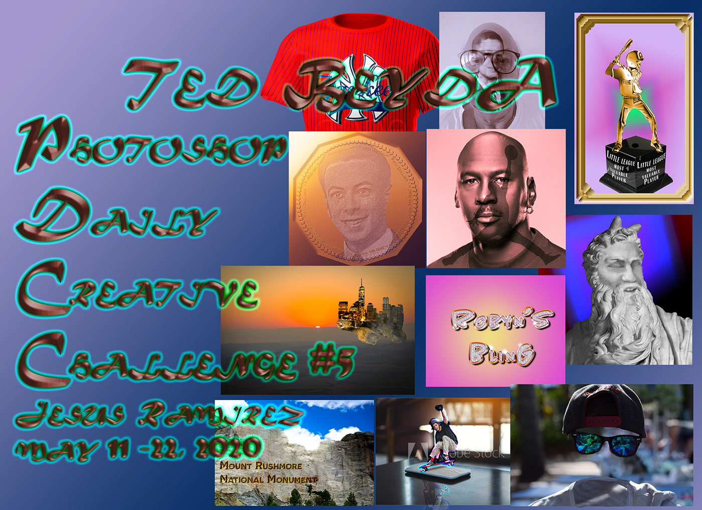
Challenge 5!
Here is my Day 7 challenge - instead of a jersey, I wrapped my Jeep in my team color and logos.
i can't find todays challenge could some one please link me the vid

Challenge: Turn a self-portrait into a Roman bust using Layer Masks, Adjustment Layers, and Stock images.Get the starter file here: https://bit.ly/psdcc5-11-8Join your host each morning at 9:00am PT to learn how to approach each challenge using Photoshop. Complete 9 challenges...
thx
i can't find todays challenge could some one please link me the vid
@full violet Do you mean the starter file? They are always posted at 8am here in Discord. Go to the side panel at the top where it says announcements/read only and then creative challenge.
Here is my Day 7 challenge - instead of a jersey, I wrapped my Jeep in my team color and logos.
@fallen pebble except for the red windows it looks pretty good.
Day 8 statue
Custom Currency challenge Audrey Hepburn ver1
Custom Currency challenge Audrey Hepburn ver2
@plain sable Very subtle changes. Nice. The bust almost looks like Lucy before you started. How did you find that??? Did you try using Lucy's eyes also? Her eyes were always electric.
thanks @eternal mica the bust was from Amazon https://www.amazon.com/Design-Toscano-Michelangelos-David-Statue/dp/B00BB54BQW and I tried the eyes but they didn't really work and using the bust eyes really changed the emotion of Lucy's picture smile
Gave +1 Creative Carma to @eternal mica
@junior nymph I see your work, its impressive, and you obviously worked hard on each one. Suggestion: Since youre catching up, how about labeling each post with which challenge the post is supposed to be for.
Every time I want to move my image on the sport-jersey, the move tool takes the layer instead of the image. What is going wrong?
@primal fulcrum When they wrap vehicles, they often cover the side windows as well. Thanks for the feedback!
Gave +1 Creative Carma to @primal fulcrum
Every time I want to move my image on the sport-jersey, the move tool takes the layer instead of the image. What is going wrong?
@young karma
Happens to me, too! I get so mad. Then I exhale and hit Ctrl-Z and try again.
daily Challenge 8
I've never looked better. (Had to crop the image because Discord didn't like her naked boobie!)
Custom Currency..catching up😅
#7 Adobe Ps UK channel uniform 🙂
@eternal mica @young karma you can disable the Auto Select when using the move tool. Ps will move only the layers that are selected from your layers panel 😉
The blending is looking very nice, @dim brook, I like how the colors and the tones are matching. My only suggestion would be to increase the scale of the new face just a bit. Right now, it looks a little small compared to the head. Nicely done, Ceci!
@chilly hawk very nice job with the Bevel & Emboss!
@forest aspen both of them are looking great! My only point of feedback is that you can fine-tune the graphic's texture and the highlights on the blue version. I believe if you just reduce the opacity a bit, you'll be able to have a nice blending already. 😉 Well done!
@primal fulcrum that's a super cool design, Sig! My only suggestion would be to darken the "I Play" tones to match even more the ones from the surface of the T-Shirt. Another great job, Sig!
Wow! @brittle widget This turned out great! I loved how the shadows and the highlights are so consistent on the t-shirt. Just a nitpick: you might fine-tune a little more the displace effect to match the peaks and valleys of the surface, or you can use liquify just to create the subtle folds. Awesome job!
@cold snow great job matching the lights and the color tones!
@floral frigate I loved the fancy style and how you placed the money with a low opacity preventing it to create distractions. Well done!
@thorn geyser amazing job, you're killing it! Loved how the lights and the tones are matching, and the adjustments on the eyes are looking great as well!
@green loom wow! I loved the shiny metallic look of your coins. The details around the edges and the serif font really adds a fancy style to the coins.
#PSdaileychallenge. Little behind.
@eternal mica @young karma you can disable the Auto Select when using the move tool. Ps will move only the layers that are selected from your layers panel 😉
@coral stone Thank you! This works for me!
Gave +1 Creative Carma to @eternal mica
Final try - more highlights
@eternal mica thanks for sharing the assets Ted! I like the work on the background, also nice job matching the angle of the subject and the statue. My only suggestion would be fine-tuning these dots, you can mask them or reduce the opacity on some that are on highlight areas, like the ones from the mouth, you can see that they look very dark compared to the surface where they are. Great work, Ted! 🙂
Gave +1 Creative Carma to @eternal mica
Super cool job @plain sable! I loved how you matched both images and how this changed the expression of your composition. Impressive work!
@young bridge very nice blending! If you want, you can share the originals for us to see the difference. 🙂
@daring dock Amazing work, Shuja! My only suggestion is that you might darken the face just a bit to make the blending even more realistic since the original statue looks a bit darker on the face area. Kind like this: :)
@young karma I loved your expression hah. Great job blending the highlights and the shadows! 💯
@coral stone Thanks!
Gave +1 Creative Carma to @coral stone
Very nice job @young karma The image and the other graphics looks great! If you want, you can apply some noise to create some texture on the fabric. Well done!
(Loved the update, it created even more depth to the t-shirts)
@arctic rover super cool blending, Jude! I like how the facial expression and the statue's position creates a very nice concept to the whole composition!
Thanks
@coral stone for your suggestion i will do this right now.
Gave +1 Creative Carma to @coral stone
Interesting shape @cerulean steppe! As a coin collector, I love the coins with different formats. My point of feedback is to apply some gradient on the gold part, to match the lights of the silver one. And also, position the silver circle and the text a little lower, so the text can have a good space between the coin’s edges. Nicely done!
These graphics are looking fantastic @cerulean beacon! If you want, you can mask them from the collar, this will help it to look even more realistic.
Very nice @soft maple. The texture looks super interesting, how did you made it? Great job!
Wow @mild solar this turned out great! I loved how you managed the eyes and the overall blending very well. Amazing job!
Thanks @coral stone
Gave +1 Creative Carma to @coral stone
#psdailychallenge #trophy
@coral stone I will thank you 😊
Gave +1 Creative Carma to @coral stone
@forest aspen I have a same problem with the coin 😭
Daily Challenge 200521 - Roman Sculpture - Sophia Loren
@eternal mica thanks for sharing the assets Ted! I like the work on the background, also nice job matching the angle of the subject and the statue. My only suggestion would be fine-tuning these dots, you can mask them or reduce the opacity on some that are on highlight areas, like the ones from the mouth, you can see that they look very dark compared to the surface where they are. Great work, Ted! 🙂
@coral stone I changed the last gray mask by creating a new dots layer and darkining the shade of grey on the layer inder the face mask layer. I think it looks siginificantly better. Thank you again MMV 😁 😁 😁
In shrinking the file size down to fit Discord, the gradient mask moved. sorry about that.
I could not stop. placing this sculpture somewhere. I thought Loreley or a strange wood would fit.😅
I had to reduce it, was too big 🤔
eyes need a bit work but here's day 8!
I choked on the eyes and I don't have a pic w/o a beard. Tried anyway!
maybe. i feel like i need to fix something though, but this is so addictive. 😃
Challenge 8. Not an easy one.
Catching up today.. Here's my homage the the mighty South Sydney Rabbitohs - this is not what their game day jersey looks like at all.
should also have credited ...Photo by Andrea Piacquadio from Pexels
Lady McBeth Poser-Challenge 8
Day 8 - Roman Sculpture
Roman Sculpture
Challenge #8 Asset
@cunning needle This looks great! Really loving the texture of the coin, and the beetle came out super well. Really convincing gold look and great contrast. Definitely a fun effect, well done!
@stable ravine There’s definitely a lot of nuances to this one for sure to really sell that statue effect. I think the main thing that could help this would be to increase the dark values in the facial features to closer match the deep darks in the hair and under the chin. I think a masked levels adjustment layer or even the burn tool could help with that. Really nice work, the colors and blend between the two images is looking solid!
@wooden gate Nice work, I really like the addition of the logo and text on this too! The gold effect came out really nicely on the statue. It’s subtle, but I think a soft cast shadow/reflection from the statue on the base below could look really nice. Good job!
@sacred field I think the eyes came out really well! I was wondering how facial hair would affect this technique, but I think it has a pretty convincing stone look. The only minor thing I notice is the cheeks near the nose seem to have fairly different levels of texture on each side. The contrast between the two images fits really nicely, well done!
@hollow yarrow Haha, this is perfect, you nailed it! Really love the expression and addition of the butterfly. Really makes for an interesting color contrast too. The contrast and texture of the face matches the statue extremely well, great work!
Thanks @bleak fossil will give it a try in the morning.
Gave +1 Creative Carma to @bleak fossil
@bleak fossil THANK YOU FOR CHECKING! Making a portfolio right now. 🙂
Gave +1 Creative Carma to @bleak fossil
@neat flicker Awesome job with the color matching, it's looking really well integrated into the statue! My only suggestion would be to boost the darks in the face just a bit with a masked levels adjustment or the burn tool to see some of those deep shadows we see in other areas of the statue into the facial features a bit more. Great blending of these images!
@regal mica Really nice work Rhonda, I like that you added a background graphic too this one too! The displacement effect worked very well, the stripes look extremely natural. My only suggestion would be to maybe tone down the saturation of the red of the shirt just a touch, it almost looks a bit unnaturally vibrant. This is looking really good!
@young karma Really nice work, hah, these are great. I think the eyes might look better if the areas around the eyelids were darker and the centers a bit lighter to really give it that 3D form. It might also help to increase the contrast just a bit on the face, so you get a bit of the deeper darks in the facial features like we see in the hair.
@soft arch Ooh, interesting effect with this sort of double exposure look. The face of the statue is looking really good, nice to see all these different versions you made, well done!
@dry spruce The texture and proportions of this face is looking good! I think the color could be correct a bit near the eyes, eyebrows, and mouth. They have a bit of a blue tint to them instead of the more yellow/orange color of the statue. Also, increasing their contrast, specifically the darks a with a masked levels adjustment or the burn tool to see some of those deep shadows we see in other areas of the statue might help it match more. Nice work!
@cunning needle Really interesting textures in all these different metal effects, really nice work! The text came out nicely as well, I really like the top one, there's a nice separation between the stroke and interior texture. Looks good!
@eternal mica Looking good Ted! I like the statue you chose, fitting a face into one with such a crazy beard is a nice challenge. I think you could go even darker in the facial features with this one, in the way you see some deep contrast in the shadows of the hair and beard. Especially in areas like the edges of the eyelids, under the nose, and in the mouth. Maybe something like this? I used a masked levels adjustment and the burn tool. Nice work!
Challenge #8
@bleak fossil thank you x2! >I really like the top one, there's a nice separation between the stroke and interior texture. = Probably, you mean, the sexy part? 🙂 wash my rice.
Gave +1 Creative Carma to @bleak fossil
The eyes were really hard.. had to add some noise which really helped it blend it much better. Original photo thanks to Ruvim @ pexels.
Before Pic.. actually found matching my face to the same shape pretty challenging also.
Oh thank you so much @bleak fossil reduced the saturations as you suggested and now it's much better.😀
Gave +1 Creative Carma to @bleak fossil
DAY 8 - Roman Sculpture. Oh man, it took me ages to get the lighting effect for the plaster indentations. I was so close to giving up but then clicked some of the other layer visibilities on and off and then it worked.
Challenge 8. Could not render the lighting fx. It was grayed out. Not sure why???
My starter photos.
This challenge was very inspiring. I had difficulties to work with the blue channel though. I chose to add a photo with hand. This is the result. I
I also tried to keep the eyes, and I like it more actually.
@bleak fossil Thanks, Sam! I tried smoothing the texture with the blur, tool on this one. I cut out a lot of my photo. I don't have a goatee, it's a full beard. I cut out more on the right side as opposed to the left, where my skin texture showed up! I appreciate your input!
Gave +1 Creative Carma to @bleak fossil
Not very creative here, but saw the opportunity to start a design for a corporate t-shirt for myself. Resource: T-Shirt freebie I built upon the tutorial. Reeeeaaaally have to work more on the design, but at least I got to get the technique
Hi @ruby panther The lighting effects works just on 8 Bits/Channel, you can check that on Image > Mode. Other thing that might be causing that, is if the Use Graphics Processor is unchecked, you can find it under Preferences > Performance.
@coral stone Thanks for your help. It's 16 bit, so that's the problem.
Gave +1 Creative Carma to @coral stone
#gildedobjects
#gildedobjects
Here is Nik. My brain got pretty fried between 17 & 24 minutes, I may try it again.
Statue of Charlie Chaplin modified...and then plonked amongst a load of other stuff to hide the fact that I didn't do a particularly good job!
Last night I felt that something was going wrong with my sculpture but impossible to find what. After a night of sleep I think I found and fixed it
Day 8 - Roman Sculpture (Final version)
@atomic echo Sam I tried to type you a reply 3 X but discord keeps telling me Im typing a word that is not allowed. Anyway, Thank you very much for your critique.
Gave +1 Creative Carma to @atomic echo
Challenge #8 turned a coworker into a statue!
@mild solar Well Done. Looks really great ... The eyes are awesome!👌
@hollow yarrow You are soooo good at this. But please, dont lose sleep over this. HAHAHA
@young karma
Happens to me, too! I get so mad. Then I exhale and hit Ctrl-Z and try again.
@fallen pebble If you are using the newest version, look up at the top and notice a button that says auto-select and then you have a choice of all layers or just layer. See if you didn't get that turned on. I just recently saw that button when I was having an issue. It is VERY handy to turn that off and on and all or just one layer. Play around with it.
Challenge #8 turned a coworker into a statue!
@mild solar nicely done!
I had to reduce it, was too big 🤔
@soft arch Be sure when you export, you are using the export/save for web legacy. After I started using that, I didn't have any more trouble with file size. And if it is still over 2M (look to the left to see the compressed size), you can just make a little bit smaller right in that window and check the file size again.
@coral stone thanks! yeah I was having trouble with getting the design to show. Either I couldn't get the shirt color dark or I couldn't get the design to show on top. My problem was in the highlight - screen layer but I couldn't figure out what I did wrong. But when it was turned on, I lost the shirt color. Turning it off, made the shirt look flat. I may have to revisit the video again.
Gave +1 Creative Carma to @coral stone
@wooden gate looks good but is he wearing a chastity belt?
Catching up today.. Here's my homage the the mighty South Sydney Rabbitohs - this is not what their game day jersey looks like at all.
@regal mica looks really good. Nice job on the folds and working around the laptop
@primal fulcrum Thanks for the heads up on that pesky checkbox.
Gave +1 Creative Carma to @primal fulcrum
PSDCC #8 Sculpture
Day 8 - I really wanted to try and make my eyes look like stone while they were open like the original image, but I just couldn't get it.
Original
thank you @primal fulcrum I never used this 😀
Gave +1 Creative Carma to @primal fulcrum
Day 7 Sports Jersey. The jersey had the white stripes on the sleeves, how could I have removed them? Tried cloning but it and content-aware fill but both had messy results.
Day 8 challenge, I'm not saying things are not all they should be but...
this isn't exactly what I was going for, but while playing with the blend modes, this came up and it was just too funny so I went with this.
the shadows on the eyes on the original statue were so harsh, it always looked "off" when I blended so I retouched the statue itself to make the shadows softer
@mighty linden The statue is looking pretty nice! I like how you made the subtle texture is a super cool touch for it
@regal mica great job matching the angle of both images! The noise texture looks really great!
@zinc elbow very nice job matching the proportions of the new face!
@haughty brook great job blending the images! I loved how you managed the color adjustments really well! 💯
@wraith sierra great job! I loved the color adjustments you made. My only suggestion is that if you want to make it even more realistic, you can crop the area where the hand starts to fade so it will create the impression that the hand "continues" on the picture, kind like this 👇 Nicely done, Marianna!
@sand lichen Very nice job on your day 6 and 8! I like how you kept the textures on the coins and how the colors are looking consistent.
@young karma that's great! Once you understand the concepts you tend to refine them as you keep practicing. Cool work! 💯
@jolly kite great job on the blending! I love how the shadows and the highlights are very cohesive compared to the statue!
@south pine nicely done! I loved the less saturated tone you used on the motorcycle!
@calm bane I loved the expressions hah well done!
Very nice job adding a context to the statue @brisk flower! I also like how you recovered the super dark tones from the original photo 💯
@hollow yarrow Great improvement, Franck! Taking breaks really helps us to look at the work with fresh eyes 🙂
@covert loom nice job! My only nitpick would be to refine the layer mask on the bottom and right edges of the shirt to hide the original background completely.
Great image choice @tacit condor! If you want, you might test on adding some noise to the face area, just to enhance the texture 🙂
@cold oyster the color adjustments look very consistent on both images, nicely done!
@hollow yarrow Great improvement, Franck! Taking breaks really helps us to look at the work with fresh eyes 🙂
@coral stone Thanks... I agree with you... I should take more breaks... Now I have excuses 😜
Have a nice week-end Valdair!
You too @hollow yarrow 😃
Etta4President Challenge8
Gave +1 Creative Carma to @primal fulcrum
@primal fulcrum thank you for taking the time to answer it! Does the carma add up to anything for the people I give it to? Makes me wanna say thank you 3x!
@primal fulcrum really, thanks again...
@primal fulcrum thank you for taking the time to answer it! Does the carma add up to anything for the people I give it to? Makes me wanna say thank you 3x!
@south pine I haven't noticed any difference but you can check here https://yagpdb.xyz/public/547473772727238676/reputation/leaderboard
Yet Another General Purpose Discord Bot
Souls in the Reflections (surreal portrait)
Alright, so that's my take on surreal image and I'm hoping my caption excuses me from finishing up the reflections.... I don't know if this counts cause I kinda strayed a bit.... That being said, tips for improvements welcome I would like to do more of these.
#✂challenges-feedback #💎past-challenge #surrealportrait
@primal fulcrum super thank you sig, you rock 🙂
Gave +1 Creative Carma to @primal fulcrum
@coral stone✌️🤘
Thank you! Theses challenges are awesome!
Well, here is my #PSDailyChallenge #8 - I will definitely try this one again. Glasses are tough, will do one without glasses on my next attempt.
Day 9 Challenge
everytime I download the stock images and try to relink them they all come posted together and won't separate. IF they come in separated I can't transform because the "smart object is missing" what do I need to do?
Catching up with the challenges - here's my Day 6 'Fancy' Text
@keen tulip I answered your question on #❓ask-a-question 🙂
@fallen pebble Hah, I really like the interesting caricature of this one! Really nice blending of the images together and getting the stone texture on the face. A couple suggestions I think could possibly look good would be to increase the contrast of the facial features just a bit via a masked adjustment layer or the burn tool to really mimic those deep darks statues often get, to get a bit more of that warm faint orange tint in the statue into the facial features, and to add a little shadow around the edges of the eyes to make them look more round. Maybe something like this? Nice work on the stone look to this one, and really great contrast against the background. 👍
@frigid oasis Very nice! The diamond texture is looking really good and I like how it even looks like you added a bit of shadow on the diamonds around the border of the gold stroke of the text. It adds some nice depth! I feel like the contrast of the gradient could be pushed even further with the depth of the darks and highlights to really get that shiny gold feel, but it's looking really solid either way. Great contrast again the background!
@haughty cape Looking great! Really nice sense of atmospheric perspective on this one, and really nice shift in the warming of the colors too! I feel like perhaps the vibrancy of the green grass on the mountain could be toned down just a touch, usually that's a noticeable result of atmospheric perspective too. But that's quite a minor detail. Nice work 😄
@south pine Are these reflections from the original photo or did you add them in? Either way they look great. The blends on these faces are looking on point! Very impressive. I'm looking to see if there's anything I can suggest, but it's looking great, so if I had to nitpick I feel like the face of the owl doesn't quite match the cat 100%. I think it might be that overall brightness of the owl face could be brought down just a touch, and that the soft edges of the owl face look a little light and washed out compared to the areas of the cat around them. Maybe darkening down those owl edges slightly would help blend them a bit more. Just some thought, but again, this is looking really nice. Well done!
#PS challenge 1
@bleak fossil Thannnk you!!!!!! The reflections are from the original, but stitched up the cats from individual pictures.
yes, the owl face not blending in was something I didn't know how to make better... thank you o much for taking the time, really appreciate it. gonna try your suggestions now.
Gave +1 Creative Carma to @bleak fossil
@bleak fossil thanks for the pointers! That does make a huge difference!
Gave +1 Creative Carma to @bleak fossil
Challenge #9
Here is the redo with the amazing advice of @bleak fossil gonna post the originals of my lil owl & raccoon 🙂
Thanks to Yannick Menard for sharing their work on Unsplash (raccoon)
Thanks to https://www.pexels.com/@jvdm (owl)
it's another one of schatze the fluffy cat from this series
Day late and a dollar short...... here's my roman sculpture tryout. I did two of them, a B&W and a sort of colorized one..... let me know what you think. Peace out.
B&W version
original face, lol.
We have some very creative people in this group! I am impressed every day with what you guys and gals come up with!
Today's Challenge #9 Floating Island
PSDCC #9 Floating Island
Assets Photo by Charlie Hammond on Unsplashed Photo by Tom Barrett on Unsplash & Juxtapoz - Artist Jim Kazanjian
Challenge #9
#9 Floating Island
@tame breach Your fancy text turned out great! I loved how the inner shadow created a nice sense of depth between the stroke and the image. Also cool job on your day 6. Here's just an optional step: If you want to create some whiskers, you can select the channel that you duplicated for the lighting effects, and with a very small brush and low opacity you can draw some whiskers using the original ones as a reference. (It might be helpful to play a little bit with the Smoothing option of your brush) > then you can apply the lighting effects again. This will give the impression that the whiskers don't end on the cat's edges 😉 Amazing job!
@wraith sierra great job on the background! I really like how you preserved the horse’s details as well 💯
Day 9
Spotted the floating Island from the flight😀
DCC5 09 200522 Thank you Jesus for a totally enlightening two weeks. So many awesome techniques. Thank you all of your for your amazing posts and comments. An incredibly talented group. Thanks to @coral stone MMV and @bleak fossil Super Sam.
Gave +1 Creative Carma to @coral stone
Challenge #9 Manhattan is truly a Floating Island
Here we go...
PS Daily Challenge, Day 9. Floating Island. Thanks, Jesus!!
This was fun. Added some additional blur and some minor clouds.
Some gorgeous work today! Well done all!
Day 9
@mild solar looks great, Brady! Loved your color adjustments. If you want, you can play with some bevel & emboss on the Hogwarts text, maybe to give a silver or gold look 🙂
#✂challenges-feedback #floatingisland
@twilit shore very nice! Loved how you blended both images. If you want to make them even more realistic you can add some noise (Filter > Noise > Add Noise) on to the face layer. You can convert it into a smart object to make it non destructive 🙂
@unkempt field Nice edits! The colors and highlights are looking very good!
@coral stone Thank you so much for checking out and commenting on my work. It is always greatly appreciated. I had tried doing the steps Jesus showed us in the video but whenever I got to the step to add lighting effects, it was always greyed out. I'll try just adding noise and see what happens. Kudos.
Gave +1 Creative Carma to @coral stone
No problem @twilit shore 🙂
The lighting effects only work on 8 Bit/Channel images, you can check it on Image > Mode. If it's on 16 Bit/Channel just click on the 8 Bit/Channel and you'll be good to go. Also make sure that you have the Use Graphics Processor checked on Preferences > Performance.
Great job on masking the images @tacit condor I also like the magenta/purple tones you applied on the clouds.
Very nice @plain sable! the B&W adds a cool drama mood to the composition. I also like how you managed the light direction nicely on the assets.
@dull cliff wow great job on the metallic look of the gold!
@cerulean beacon beautiful work, Jane! My only suggestion is to recover some contrast of the island since it's not so far from the viewer. Nice job on the color adjustments 🙂
The island castle in the clouds
@nova swan hah it shouldn't, you made a great job! I loved how the texture and the splatters gave a nice realistic look to the statue. My only point of feedback would be to lighten up the right eye to match even more the nearby areas. Awesome work!
That's a super cool blending @full violet! I love how you matched the light values of both images really well. Great job!
Lovely work @soft arch! Loved the colors that you used to enhance the effect, nicely done!
Woowwww @honest glade this turned out great! I loved how the clouds are looking like cotton candy. The floating island, the little birds and the grain create an amazing fantasy look in your work. Fantastic! 💯
Roman Sculpture - I adjusted level, hue etc, then add texture on the face but does it look natural overall? 🤔 I wanna make it better what else can do ?
@cerulean steppe very creative work! If you want to enhance the effect like the photo was taken from a window, you can add a lens flare to your work. Jesús teaches how to do that on Day 5. You can place it on the top right of the image where the light is coming from. Also, you might refine the layer mask just a bit in this faded area to make it look even more realistic. Great job!
Gave +1 Creative Carma to @coral stone
Thanks @coral stone I think I have too much time on my hands, decided to try a sepia-ish version... And now I'm gonna go tie dye some tee shirts, yup shelter in place is making me a little crazy 🙂
Thank you so much for the words @eternal mica, it means a lot :)
Nice job on the challenge 9, the warm tones applied on the rocks look pretty nice. Just an optional step, you can use Color Lookup, Gradient Map, or Photo Filter adjustment layers, to create a global adjustment on the lights and colors of the composition. There are a lot presets on them, it's worth the adventure 😄
Gave +1 Creative Carma to @eternal mica
day nine! thanks for this rotation's challenges!
Great to see different interpretations of the challenges, @young karma! Super well done! If you want, you can create a light source coming from the right to the left, to reinforce even more the light tones on the castle. Once you have the light source, you can brighten the left side of the ground as well. 😉
That looks great, @plain sable !
Daily Challenge 200522 - Floating Island
Day behind- Challenge 8!
Challenge 9. Thanks @lethal mural for a great two weeks!
Gave +1 Creative Carma to @lethal mural
Custom Currency
Photoshop Daily Creative Challenge - Floating Island
Great to see different interpretations of the challenges, @young karma! Super well done! If you want, you can create a light source coming from the right to the left, to reinforce even more the light tones on the castle. Once you have the light source, you can brighten the left side of the ground as well. 😉
@coral stone Thankyou for the feedback and ideas, I'll definitely play about with it some more and see what I can do with light, you're right - it does beg the question 'Where's the light coming from?'. I've enjoyed the challenges and look forward to the next set and to digging into the past for some other entertaining past ones. Thanks to @lethal mural for his work planning and presenting the set.
Day 9 v2. Added some more cloud and improved the lighting on the ruins to better match the mountain.
Testing. #romansculpture.
Thanks @coral stone for the tips..not sure if i executed🙂 it right
Gave +1 Creative Carma to @coral stone
Challenge 9. Had a tough time pulling this one together.
@ruby panther it did come together!
@young karma Thank you.👍
Gave +1 Creative Carma to @tame gorge
flying castle 🪂 u can jump from there ...
Very creative job @sterile galleon! I loved how it looks like she is really taking a picture of the floating island 💯!
Challenge 9, Floating Island
Challenge 9, another version of Floating Islands, comments welcome.
challenge 9, floating island
trying to catch up, would love some feedback to make these jersey better https://www.behance.net/gallery/97192227/Photoshop-Daily-Creative-Challenge

Thanks @quaint badge
Gave +1 Creative Carma to @quaint badge
Getting better, may make "adequate" with a lot more practice!
ps doc #9 not the final yet, awesome challenge thx @fierce valley
Gave +1 Creative Carma to @fierce valley
Finally I finished it! Hope you'll like guys 🙂 Ch-9 Floating Island.
@cerulean beacon beautiful work, Jane! My only suggestion is to recover some contrast of the island since it's not so far from the viewer. Nice job on the color adjustments 🙂
Hi@coral stone Thank you, I felt the same the island is a bit too blurred. I re-adjusted the island mask opaque level with more transparency, but the general atmosphere and colour is faded with a much clear clouds 😞. Maybe there is a way that I could keep the clouds as that of before?
The problem with islands is that they rarely look natural.
Does this even show up for you guys? 🙈
Hi @cerulean beacon! I believe that to recover the edits of the clouds you’ll need to reapply the adjustments. If you converted the clouds layer into a smart object and applied the Camera Raw Filter, you can double click where it says camera raw filter below the clouds layer, then make the edits them again.
In general, I like the improvements you made to the island, it helps to match even more the atmospheric perspective 😉
@south pine Impressive work! Loved the animation you made, the island moving behind the cloud creates a very nice depth effect. Amazing work!
Lovely images choice, @wet thistle! I like how the lights and the colors of the island make it look like it is a sunny cloudy day. I also like the "clouds above the clouds" effect, it creates an interesting look to the composition. Nicely done!
Very creative work @delicate flint! My only suggestion is that you might try to soften this transition a little bit. I believe it will help the blending effect in both images. Well done! 🙂
Woww @worn yew! You nailed the effect. The rocks around the bottom part of the island are looking amazing. Fantastic work, and challenges as well! 💯
Thank you @coral stone !
Gave +1 Creative Carma to @coral stone
I used some of my licenses to grab these images and followed along with Jesus. I am pretty happy with this one. I will also experiment with some other images later this weekend! This was fun!
DAY 9 - Floating Island. The UK's equivalent landmark which you can find in Cornwall (South West Corner). The National Trust look after this beautiful treasure, St Michaels Mount. Had a fantastic time on this latest challenge, Jesús is an amazing font of knowledge and I learned a lot. 😃
I found a decent photo I took of Quebec City and used the Chateau Frontenac as the Flying Castle! Should I have blurred the castle a little?
Gave +1 Creative Carma to @coral stone
My final Behance project for this set of challenges 🙂 : https://www.behance.net/gallery/97267387/Photoshop-DCC-11th-22nd-May-2020

Behance
Photoshop Daily Creative Challenge 11th May to 22nd May 2020
Photo by Magda Ehlers from Pexels--Clouds Image
Photo by Peter de Vink from Pexels-Castle
Photo by Krivec Ales from Pexels--Mountains
Hello! Catching up 😅 I love football, I'm Mexican and this has a traditional print adapted to the National jersey.
I didn't know if I could use the watermark images! I heard Sam say in the video it was okay because we are practicing. I struggled a bit with the right lighting effects but here is my work....
Hogwarts inspired challenge! ⚡
@rain bear Great attempt! Love it. Hogwarts and it’s grounds could use some colour correction to make it suit the sky it’s in, and I’d also suggest another image of Hogwarts as the perspective is off with the other images provided to sell the manipulation. Great though!
Thank you @tidal bloom for the feedback. Was tough to find a Hogwarts picture!
Gave +1 Creative Carma to @tidal bloom
@rain bear Id suggest then always trying to find other images to suit your main focal point then... in this case Hogwarts - as perspective as well as colour must be matched to fool our eyes in to believing it could be real! But.... as it’s for fun right now and you’re learning, I’ll give you 10/10 🙂 hehe. Have a good day mate.
Challenge #8 Statue Image
@rain bear Ooh, nice, great idea! Really nice work compositing these different images together. Some really nice warm/cool contrast going on with the orange and blue tones. I think you could probably ease off the darks a bit in the castle and underside of the island just to give it a touch of atmospheric perspective, and I think it might look good to boost the lights of the image a bit to give it a touch more brightness. The jersey is looking great too, well done!
@neat flicker Definitely! Using the watermarked images is fairly common for these challenges. Of course if you're wanting to build a portfolio it's good to license them or find free stock photos from sites like Pexels or Unsplash, but for practice the watermarks are totally fine. This is looking really good! The colors match nicely and there's a nice sense of atmospheric perspective. I think the shadows on the right side of the castle could be just a touch darker to more closely match the contrast of the mountain, but that's a minor note. Looking good!
@solemn spear Very cool! Nice work compositing these together. I think you could increase the contrast of the entire floating island a bit more to better match the background image. It seems to have less contrast than the clouds behind it which makes it feel a bit out of place or overly faded. Nice work 😄
@cerulean beacon Very nice! I like the color intensity with the sunset in this! For the first an last image I think you could go quite a bit darker with the shadows of the floating island. You want to be careful not to make it too light compared to the background image. You'll see that the clouds behind the island have even deeper shadows than the island itself which wouldn't be the case because 1) they're further away and atmospheric perspective will affect their shadows more, and 2) they're a lighter color (white) than the mountain and would have lighter shadows due to that. Just a thought. Really nice job compositing these together, really loving the bright warm feel of these images!
@fallen pebble Great idea, that makes for a really interesting looking castle for the one with the image from Quebec City! I don't think you necessarily need to blur it, but I think the castle could be matched to the island a bit more. Right now the castle seems to have more contrast with deeper darks and more saturated colors. I think if you decrease the deepest tones of the castle to push the atmospheric perspective effect, and increase the contrast (dark tones) of the island it would make them match a bit more. And maybe even put another warm pass over both of them since right now the green of the trees doesn't seem affected enough by that really warm sunset light. Just some thoughts, nice work!
@weak wave Ooh, really interesting mood to this one with the green lighting. Makes me think of the Wizard of Oz, somewhere between the Emerald City and the Wicked Witch, hah. I think currently the castle image and the floating island image seem a bit disconnected. The castle seems a bit overexposed in it's brightness and saturation, and the island seems to be much darker and have less contrast. I think adjusting those to meet closer in the middle might help. Good job!
@zinc elbow Really cool! I really like all the trees in this one. Very cool kind of forest/jungle vibe to it. I think the coloration is spot on, but the contrast between the mountain island and the trees/castle don't quite match. I think you could boost the darks of the top trees/castle to closer match the contrast of the underside island, and you could probably even ease off the darks for the underside a bit juust a touch to push that atmospheric perspective effect some more. Lighting and colors are looking great, nice work!
@thorn geyser Excellent work! Really great to see these all together, looks like I missed a few. Great job on all these different techniques. Awesome to see all the elements you composited together for challenge 9, you did a really nice job unifying them with color and contrast. Really nice depth too with the foreground, midground and background. I think for challenge 8 you could probably increase the contrast of the facial features just a bit to get it to closer match the original and the level of darkness we see in the snake headband and other the chin. I usually like to do this with a masked levels adjustment or the burn tool. Maybe something like this? You nailed the color matching on this one. Really great job on all these, impressive work!
@kind ibex Loving the process GIF! Really cool to see your approach with this one. Great job with the shadows and matching the lighting. This is totally personal preference, but it might be nice to see a little warm light catching the top of the castle, to match the lighting of the sky and really draw the eye to that area as a focal point. Here's a quick example of what I mean using a color dodge layer. Impressive work!
@winter tinsel Really cool idea! I like the addition of the glass case. My only suggestion is that I think the contrast and brightness of the face could be tweaked to match the light of the original image just a bit. Here's an example adjustment I did with a masked levels adjustment, a color dodge layer, and a bit of the burn tool. Just to match that strong overhead lighting a bit more. Really nice work on this!
@kind ibex Loving the process GIF! Really cool to see your approach with this one. Great job with the shadows and matching the lighting. This is totally personal preference, but it might be nice to see a little warm light catching the top of the castle, to match the lighting of the sky and really draw the eye to that area as a focal point. Here's a quick example of what I mean using a color dodge layer. Impressive work!
@bleak fossil oooo I like! Thanks for the tip 👍
No problem! I personally always love that effect when I see it on mountains or buildings around sunset, hah.
Revised version - Thanks again for the tip - it really does draw the eye more. @bleak fossil
Gave +1 Creative Carma to @bleak fossil
Love it!
No problem! I personally always love that effect when I see it on mountains or buildings around sunset, hah.
@bleak fossil yup one of my fav things too
Challenge 9. Floating Island. I like books, owls and the Neuschwanstein Castle so I tried to integrate them together. Curves and levels is tricky for me. Practice and more practice. Onward I go! Thank you for the fun opportunity!
Challenge #8 (Revised) @bleak fossil I added a Curves Adjustment layer to the face and threw in some Burning in the shadows. I think it’s closer! I’m trying to get the lighting balanced because it’s much softer lighting in my glass case background than on the statue image. That lighting is harsh....still tweaking it. Thank you for your advice!
Gave +1 Creative Carma to @bleak fossil
floating island I've always wanted to do one of these. It was fun
Hello all! First time posting in here. Took on the island in the sky challenge. Would love any feedback on how to make the castle and upside down mountain blend even better with the background image. Thanks!
@bleak fossil Thanks for the feedback! I have increased the contrast now and it looks better 🙂
Gave +1 Creative Carma to @bleak fossil
@tidal bloom Great feedback on some of the work here! Makes us think twice, keep it coming, thank you
Gave +1 Creative Carma to @tidal bloom
@coral stone thank you for the feedback!
Hello all! First time posting in here. Took on the island in the sky challenge. Would love any feedback on how to make the castle and upside down mountain blend even better with the background image. Thanks!
@cosmic jolt Loved it! Had to look really hard to find anything (keep in mind I am an utter newbie as well. I notice the light on the mountains is coming from the right... I had the same problem and fixed it by playing around with filter>render>lighting effects (maybe?) but beautiful from the selection of the images that fit right together to the blue hue on everything 🙂
Gave +1 Creative Carma to @cosmic jolt
#✂challenges-feedback message
Wow @jolly kite
Here's what I made for the custom currency https://www.behance.net/gallery/97192227/Photoshop-Daily-Creative-Challenge

how can I make the surface of the coin more realistic? Now it just appears flat even though I added texture
@oblique sinew emboss & bevel
Last Challenge
Challenge 9. I'm so far behind that I only pick the challenges I like. This is the first one. The mountain and scenery is from Unsplash (Samsommer and David Marcu), the Abbey is my own picture.
@thorn geyser beautiful work. The total portfolio comes together beautifully.
@eternal mica Thank you! 😄
Gave +1 Creative Carma to @eternal mica
Day 9
My portfolio for my PsDCC#5. Thank you to @lethal mural for leading a wonderful group of tutorials. https://www.behance.net/portfolio/editor?project_id=96913235
Gave +1 Creative Carma to @lethal mural
Ooops, I did it wrong again. This is the correct link
https://www.behance.net/gallery/96913235/Ps-DCC5-0511-182020-Jesus-Ramirez
Still playing catch up... PSDailyChallenge Day 6 - Custom Currency. Not really happy with the realism on this project, but I learned a lot of new things along the way.
I add some depth. I think, this is better
Here is my day 9 challenge. I kinda feel like there's too much blur on the house, among other things. I was trying hard to get everything to match and blend well. It feels awkward blurring the focal point. Thoughts?
Challenge 9 Re-Do. The cloud photo is one I took. Seems to work ok. I introduced fog and then hugged the castle with the cloud. Throughout I toyed with Curves and Levels. I hope it comes across that Barn Owl is departing the castle while the Snow Owl approaches while watching Barn Owl. I tried. Loads of fun. Thank you!!
Day 9 - Floating Island
Hi@bleak fossil Thank you so much for the great feedback ! 🙂
Gave +1 Creative Carma to @bleak fossil
As Imagination Fades.... Beach chairs in the sky (Austria) and Eilean Donnan Castle (Scotland) photos by me. Mountain by Andrea Ledda on Unsplash... Thoughts anyones?
Playing catch up with Daily Challenge #7 - Sports Jersey. This is an overly elaborate concept shirt based on the colours and logo of my local tennis club. I’m going to have a lot of fun creating jerseys in the future!
😆
Challenge 6!
@cosmic jolt Loved it! Had to look really hard to find anything (keep in mind I am an utter newbie as well. I notice the light on the mountains is coming from the right... I had the same problem and fixed it by playing around with filter>render>lighting effects (maybe?) but beautiful from the selection of the images that fit right together to the blue hue on everything 🙂
@south pine That suggestion made a big difference. Thanks for that!
@paper chasm very nice my friend. Love it.
Sundowner fantasy floating island
Here's my attempt of the gilded object challenge
Very creative approach @fierce arrow! If you want to enhance the glow of the people, you can darken the background juuust a bit. Well done!
@arctic rover beautiful work, Jude! If you want to introduce more warm tones to the Island, you can create a Color Balance adjustment layer, and under Shadows and Midtones, add more yellow and a little bit of red. It will match even more the tones of the background. Another great challenge, Jude! Can't wait to see your works on the next one 🙂
@pliant geyser I think there should be a distinct separation between the snow and the clouds. And theres plenty of sky you can use for the clouds.
@eternal mica the snow and clouds are totally untouched from the original photo. The clouds came right up to the edge of the cliff I was standing by. It was so surreal!
@eternal mica the snow and clouds are totally untouched from the original photo. The clouds came right up to the edge of the cliff I was standing by. It was so surreal!
@pliant geyser Thats amazing. Great Photo. And your work on the castle is really good. But for the purpose of the Challenge, maybe move the island higher up in the sky to make the distinction more pronounced. Maybe move it further to the right so you can make it look further away.
I finally got the LR presets to load into CR, so I added a preset to this to unify it a bit better and I did a selection and then filter/average and put it over the top of the island to give it a bit of atmosphere. Or that was the idea anyway
I finally got the LR presets to load into CR, so I added a preset to this to unify it a bit better and I did a selection and then filter/average and put it over the top of the island to give it a bit of atmosphere. Or that was the idea anyway
@primal fulcrum - I have wanted to do this, is there an easy method?
thank you for everything, especially @lethal mural and @coral stone
Gave +1 Creative Carma to @lethal mural
@tropic knoll Very cool, I like all the thought you brought into this piece. I think the first one could use a little more color matching so all the elements look consistent with that warm sunset light. The mountain/island for example looks much cooler in color temperature than the owls. But I think the colors look nice and consistent for the second image. My only thought on the second one is the way the clouds almost completely obscure the floating island part, but then there’s a hard line around the top edge that isn’t affected at all looks a little unnatural. Maybe a little more gradual fade between the foggy/non-foggy parts could look more natural, or even just having “chunks” of clouds passing in front of certain parts could look good? Just a thought. Really nice job with the narrative in this image, and compositing these all together. Looks good!
@primal fulcrum This is great Sig! I really like the foreground character too. Really nice job matching the color of this image, it all looks like it belongs together in the scene. I think perhaps the left side of the building could have a bit stronger lighting on it since the sunset looks pretty intense, but that’s more just personal preference. I often like to use a color dodge for this effect. Also, perhaps have the figure on the left a little more to the right so they’re not so cramped to left side of the frame might give the image a little more breathing room and balance. Again, both minor suggestions, but just my initial thoughts. Really great work on the compositing and color matching 😄
@jolly kite Really impressive work! This turned out great. Great sense of depth and atmospheric perspective, the contrast of the lighthouse and island really draws the eye and makes for a great focal point. Really nice underwater effect, and how it splits between above and below the surface. All very nicely done. Would be cool to see how many source images you used to make this. Great work!
@cosmic jolt Very cool, welcome on in! Glad you could join us. This looks really nice! I think they fit quite well in the scene, though I think perhaps allowing just a touch more of their original color might help? I like the color matching and blue fade that atmospheric perspective gives, but the castle seems a little too blue unless that’s it’s normal color. I think a little warmth on the castle might also help it stand out as a focal point a bit more too. The lighting looks pretty intense on the mountains between the light and shadow side, perhaps increasing the brights on the light side of the castle might help it closer match the contrast of the background scene. Really nice work on matching the lighting direction though. Lastly I think it might look nice to increase the size of the castle and island just to make it a more dominant focal point, but that’s just personal preference. Really nice work!
@oblique sinew The texture is looking nice! I think a bit of a sheen across the surface of the coin could help that metallic effect. You could try setting a gradient layer to different blending modes, or even using a multiply and color dodge layer to darken and lighten it to create a gradient. I think oftentimes that contrast creates a nice metal looking sheen which helps that effect. Great work on all these challenges these past two weeks!
@young karma I used LR classic to do it. Add to profiles and then they just showed up in CR. Not at all like the YouTube videos said. I didn't have to do anything else. Just LRC puts them in an unnamed folder so I had to rename it for each group I imported. CR kept the names I gave the groups.
@bleak fossil thanks for your suggestions! I did put two layers of light on the island. I was having a hard time getting it bright enough. I guess I had the person so far over to try to get the line of sight right since it looks like they are looking in that direction. But yeah, moving it a bit might be good. 🙂
Gave +1 Creative Carma to @bleak fossil
Day 9 - Floating Island
This is the invisible item challenge. I found it easier to take two images. One with the person in the frame and one without. Then I combined both and masked the subject out. Using layer styles with stroke is a great way to create the missing portion of the collar. I'm definitely getting started. Thanks for the lesson @lethal mural
Final Day! Thank you @lethal mural for a challenging few weeks!
Gave +1 Creative Carma to @lethal mural
@young karma I used LR classic to do it. Add to profiles and then they just showed up in CR. Not at all like the YouTube videos said. I didn't have to do anything else. Just LRC puts them in an unnamed folder so I had to rename it for each group I imported. CR kept the names I gave the groups.
@primal fulcrum Thank you, will give it a try.
@jolly kite Really impressive work! This turned out great. Great sense of depth and atmospheric perspective, the contrast of the lighthouse and island really draws the eye and makes for a great focal point. Really nice underwater effect, and how it splits between above and below the surface. All very nicely done. Would be cool to see how many source images you used to make this. Great work!
@bleak fossil
@inland kiln This looks so good! You nailed it. The colors and lighting match really well, and the composition is very nice too. I love those waterfalls. Nice job with the overlapping shapes and atmospheric perspective in this design, really adds a lot of depth and great sense of scale. Well done!
@paper chasm Great images for this one! Really nice sense of depth and atmospheric perspective with the various layers of foreground, mid ground, and background. Really nice job on the island! My only suggestion would be to increase the overall contrast on the abbey. I think it could use a bit of a boost in the darks to closer match the contrast of the floating island, but also in the light tones so it matches that hard light of the peaks below it. Just a thought. Nicely done!
@young karma Very cool Mina! The coloration in this is looking great. I love the foreground figure too, the flowy robes add a lot of interest. I think the warm light catching the island looks really cool and creates some nice color contrast to draw the eye, though it might look nice to repeat that on the left side of the castle, as if it’s catching some of the rooftops. Might help the effect look more consistent and help strengthen the castle as the focal point. Or if you’re not wanting that effect at all you could probably get rid of it on the floating island with a hue/saturation layer to neutralize the color and darken it down a touch with a masked levels adjustment or multiply layer. This came out great!
@young karma Very cool! I like the idea of looking out a plane window for this one. Really gives an intense sense of scale for how high that house and island is, hah. I think matching the lighting of the scene a bit more could really help this one. I originally typed a comment on adding some shadow to the island and flipping the house so the lighting matches, but it looks like you did that, very nice! Also sharpening up the soft edges on the left and right side of the house/island may look a bit more natural too. Really nice concept for this one, looking good!
Challenge#9 Floating Island - Many thanks to @lethal mural learnt so much from you doing all of the challenges. There's been some great work done by everyone, so great to be a part of it. My ref photos above are all my own - lighthouse image was taken in Tasmania Australia.
Gave +1 Creative Carma to @lethal mural
this is my floating Island
@paper chasm Great images for this one! Really nice sense of depth and atmospheric perspective with the various layers of foreground, mid ground, and background. Really nice job on the island! My only suggestion would be to increase the overall contrast on the abbey. I think it could use a bit of a boost in the darks to closer match the contrast of the floating island, but also in the light tones so it matches that hard light of the peaks below it. Just a thought. Nicely done!
@bleak fossil thanks! I couldn’t figure out wat I was missing, but it totally makes sense! Just a short question. How do I turn the smart object (the island) back so i can adjust only the abbey?
Waiting for the next challenge I had another doodle...
In late! Challenge 9 from last week! Floating Island with my photos
invisible person
@regal mica The pine cone is such a unique twist. Very creative
@paper chasm hope this helps you. I made the island part a smart object. The tower a smart object then I selected both layers with shift and then made those into a smart object. Now to edit, I just double click on the smart object icon in the lower right of the thumbnail in the layers panel. This opens up a new window. Note how the file name changes to something like *.pub? Be sure to save this when done editing (control S). Then close it. You changes will show in your original image
In late! Challenge 9 from last week! Floating Island with my photos
@young karma nice to add in the bridge but wouldn't the two horizon lines need to match? The bottom pic is tilted a lot but the island is straight on.
@primal fulcrum right!!! I didn't think about that.... thanks!
Gave +1 Creative Carma to @primal fulcrum
no creative challenge this week?
@delicate flint tomorrow will be the day 1. Today is a holiday in the USA that's why we don't have the welcome stream 🙂
ok ty
late to the party but I turned this sculpture into mr. bean and I think it's hilarious
That's super cool work .@scenic swift Loved it
I'm new here, Hi!
Floating (on water) island
3 photos composite from Google 🤓
That's super cool work .@scenic swift Loved it
@coral stone thank you!
play with perspective (still trying to do all tasks)😀
Challenge #8 (Do-Over) I realize how important it is to find compatible images when compositing. It just makes your work easier. I went in a different direction with this version.
@primal fulcrum thanks for your feedback- appreciate it 😀
Gave +1 Creative Carma to @primal fulcrum
custom currency
Challenge #9 Floating Castle. How’s the lighting? I’m still playing with it...
Didn't realise that it was a holiday in the US - have a great day off 😀 . Added frame and poem 😂 to my floating island. frame from Photo by tom balabaud from Pexels.
@soft arch Looks great Monika! Really nice job matching the colors of all these elements. Really cool to see how many images you combined too. Very cool idea, I like the hanging grass/moss. My only suggestion is I think the brights of the castle could be boosted a bit to better match the lighting of the scene, it currently seems a little faded. Just a minor thought. Really great work!
@hollow yarrow Love it! Really fantastic job of compositing these images together, and the framing of the plane windows adds a really interesting element. Really nice unity to this image with the colors and contrast as well. Very cool!
@fierce arrow That’s definitely a great idea when you’re taking your own pictures. Having a clean background makes that a lot easier, good idea. The shirt collar and sleeve look great, the colors and shadow turned out well. Nice job on this!
@vernal ice Very cool Melis! Really loving this background image with the intense sunset. I think even with atmospheric perspective, in this lighting the floating island would have decently deep shadows. Not quite as deep as the rest of the image because it would be catching more light, but I think clipping a multiply layer to the island and adding some deeper shadow on the right side with a soft brush could be a nice effect. Looking good!
@regal mica This is great! Always cool to see people using their own images in these challenges, very nice work. I really like the “seam” in the clouds where it separates the lighthouse from the pinecone. Really cool effect!
@trail field Very cool, I really like the way you layered the images in this, it adds some nice depth. I think you could possibly fade the darks in these images just a touch, and the mountain more than the castle, just to push that sense of atmospheric perspective a bit more. And maybe have the clouds overlap the straight edge of the bottom of the left side of the castle layer like you did on the right to give it a more natural transition. The colors seem to fit quite well, nice work!
@young karma Really interesting shape to the island! The rounded look makes it feel more man made which is really cool. I think sharpening the edges of the island so they're not so soft might look good. The faded look you got with the clouds overlapping it looks great!
@young karma Great depth and sense of perspective with the bridge leading into the foreground. Really gives the image a strong focal point and leads the eye through the piece. The only thing I notice is the background image has a sort of "Dutch tilt" effect with the slanted horizon, but the floating island doesn't, which would mean the floating island is tilted a bit. It might look more realistic/consistent to line it up with the tilt of the background image's horizon line.
@soft arch The invisible person effect is looking nice, great job matching the colors! Fits really well. I think you could boost the darks a bit in the clothing so the deep shadow/black cloth tones closer match the deepness of the darks we see in the background image. Might help them look like they fit together a bit more. Very nice!
@tame breach Very nice work with the atmospheric perspective effect! The colors and masking in this image are looking very nice as well!
Hi All I'm new to the channel, I've started with some tutorials and youtube PTC channel among other ones out there. I've decided to enter the challenge, Here is my Flying Island Castle. All feedback is welcome! Thanks!
Images used for the challenge
Thanks for the feedback @bleak fossil. 👍 I'll try taking away the blur on the top half as you suggest - I was uncertain about this as my blown up photo of the blood moon (lower half) was quite blurred once isolated and used. Here to experiment after all.
Gave +1 Creative Carma to @bleak fossil
@bleak fossil Thank you!! I kept adding a shadow, taking it off, toning it down, adding it back...thought it looked right, but wasn’t sure if that would take away from the elusive dreamy aspect.
Gave +1 Creative Carma to @bleak fossil
Roman Sculpture
updated with suggested edits...
Hi All I'm new to the channel, I've started with some tutorials and youtube PTC channel among other ones out there. I've decided to enter the challenge, Here is my Flying Island Castle. All feedback is welcome! Thanks!
@amber carbon I love it! Awesome! The clouds was that a separate picture in this lightsetting or did you manipulate a 'daytime' cloud picture?
Gave +1 Creative Carma to @amber carbon
@bleak fossil Re: Shadow advice- This looks so much better, thank you! Added more highlights too.
Gave +1 Creative Carma to @bleak fossil
@paper chasm Ups, I forgot to include the clouds pic on the "pics reference", Yes, it was a separate picture but I retouch to look more "sunset" style, Burn a bit the clouds to have more dramatic fx and add a flare. Thanks for the feedback!
Gave +1 Creative Carma to @paper chasm
@bleak fossil thanks for your comment, yes, I think you are right I am going to change the horizon. 🙂
Gave +1 Creative Carma to @bleak fossil
#psdailychallenge I'm improving with these challenges. Looking forward to picking some of my own images to work with. 👏
thank you @bleak fossil yes, there are many fotos and also treerenderings 😄 , a big several nights work... In fact I turned the light of the castle hundred times up and down and could not decide, I will check again. Thanks a lot. There is nobody here, who gives me some advice.
Gave +1 Creative Carma to @bleak fossil
too much?
I had many problems with this tool, it did not erase the hair from the clothes, and although it showed the right pixels, they did not appear..??? (and it was on content)
finally I painted with the brush 😲
@soft arch The patch tool works well most of the time. Sometimes you need to switch between normal and content for it to work. Also make sure Source is checked and not destination.
ok. thank you @ruby panther
Gave +1 Creative Carma to @ruby panther
Hi everyone, here is the link to my Behance project. It wraps up the last challenges session.
Thank you @lethal mural for these 9 challenges in 9 days.
https://www.behance.net/gallery/97719401/Photoshop-Daily-Creative-Challenges-May-11-May-22

Behance
9 Photoshop challenges in 9 days.#PSDAILYCHALLENGE
Gave +1 Creative Carma to @lethal mural
@primal fulcrum @bleak fossil should be better like this, isn't it?
I signed up for the current challenge that's supposed to start today - does anyone know when in the day the challenges are posted?
over about an hour i think
yeah
awesome! Thanks!
@potent ember files are posted here in Discord at 8am Pacific time. Go to the left side at the top where it says announcements/read only and then creative-challenge
thanks!
@young karma yes, having them agree is much better 🙂
so, today's challenge is like a recap or smth like that?
@viscid agate Paul will be live in about 40 minutes for the day 1 stream, he'll show the techniques and how to get started for the challenge. You can watch on https://www.behance.net/live 🙂

Join us right now to get inspired by leading creatives. Get your questions answered and share your work with the community.
@coral stone oh alright, thanks for the heads-up
Gave +1 Creative Carma to @coral stone
You're welcome 🙂
I think it's going to be a pretty fun week! I hope you all enjoy it!
@amber carbon Awesome, welcome on in! Glad you joined us. Really fantastic job matching the color and lighting in this one, really fits into the background well. Very cool blue-orange color contrast in this one. Great sense of scale as well!
Thank you @bleak fossil. Your kind words are inspiring. I have much to obsorb. 😄
Gave +1 Creative Carma to @bleak fossil
Here's the final from day 1. Hope you like it!
Thanks! What it needs is more of a highlight on top of the skull and darker near the bottom. 🙂
Here's another one just for fun.
Here is my attempt at today's Touch-Ups Challenge... Skull Island at Night
Probably could've spent more time on it. May revisit and work on the day-to-night effect later on.
I love it @sterile berry !!!!
Thanks @brittle slate - That skull was screaming for a dark and mysterious night theme. 🙂
Gave +1 Creative Carma to @brittle slate
I know! I like the addition of the moon and the use of the LUT!
Thanks!
@vernal ice That's awesome, really great improvement! Fits into the scene really nicely now. 👍
I told my mom there was something in that lake 🤨
@young karma Nice, it seems to match well now, looks good!
Coastline. Hi boss @brittle slate . Next will give a good tip of Moon and Sun.
Day 1 first attempt
Day1. I tried using all elements
My entry for challenge 1
@hollow yarrow Wonderful portfolio. I enjoy admiring your work.
@cold oyster nice tweaks! a simple but dramatic effect.
@runic wing is that a ghost ship?! 😮
I tried to make it look like a ghost ship yes!
Day1. Second test.
@hollow yarrow Wonderful portfolio. I enjoy admiring your work.
@eternal mica Thank You!
hi
Played around a bit more with today's challenge and tweaked a couple things... "Yarrrr."
Time to get out of your skull
Drucador is preparing his next dinner!
first rough with PSdcc #1 playing with colors and clair-obscur, please advice and comments are very welcome👍
Incomin
Day 1 Challenge - Simple Sailboat
Is there a good way to blend the areas we removed the people from?
@queen dew that is awesome! Those colors bring it to life!
I did just the skull coming out of the sand. This was good practice for some of my photos of #OldQuebecCity that I post on my website.
Here's my Day 1 Challenge. Ol' Skeley is just taking a little nap.
Not how I wanted it to look like, but as I don't know too much of photoshop I guess it turned out great, but it feels too artificial to me
Touch-ups challange
@fallen pebble thx for the comment, will try to change the color of the stones around the skull
Gave +1 Creative Carma to @fallen pebble
Make a wish!🌪DAY1
Playing around
First time on a challenge. Fun!
DCC6 01 200526 I made two versions and couldnt decide which I liked better. Open to hear your opinions.
PS Daily Challenge, Day 1, with Paul Trani. Skull Island.
Hi guys!
Day 1 - Kept it simple
hey everyone!
Finally got off work and was able to watch the video - here's what I did as I followed along, will probably try to do some other stuff myself with some personal pictures.
Day 1 Retouch Challenge
PS Daily Challenge 5.26
@haughty cape very nice job with the edits! About your question, if you are using Camera Raw Filter, you can try to use the feather option to see if it helps with the blending. If you are using the Spot Healing Brush, you can try to use a low number on the hardness of your brush. 🙂
I loved how you brought life to your work with the colors @buoyant stream! About the turtle, my suggestion would be to decrease the opacity of it just a bit to blend it even more to the water also you might refine your layer mask a little more to remove this white halo around it. Feel free to tag me if you need any help 😉
@fallen pebble great job on the skull's reflection! I also like the lighting adjustments you made, well done!
That's super creative @thorny mica! One thing that you can do is to brighten the shadows of the skeleton just a bit, you can use the ones from the mountains as a reference, this will increase even more the realistic look your work! 💯
That's a great start @dawn otter! I loved the warm tones you have applied to the image. Since the sun is on the right side of the spaceship, you might position the shadow in the same direction of it, more like an elliptical look coming from the center to the left. Awesome job!
That would be a great sci-fi/pirate/action movie @young karma! I like the dark mood you applied. My suggestion would be to lower the saturation of the blue tones on the right top of the image, so it will make it even more like it is a night scene. 🙂
That's super creative @viral mirage! I loved how you played with the Genie's opacity! If you want, you can use the Puppet Warp tool to position the beginning part of the smoke closer to the lamp. Feel free to tag me if you need any help with the tool 😉
@swift harbor very nice job! I really like how you played with the skull's reflections on the water!
Looking great @loud mist I like how the adjustments enhanced the highlight on the top part of the skull. My only suggestion would be to reduce its contrast to enhance the look that it is really far away. (if that's the look you are going for, of course 🙂 ) You can do that by using a levels adjustment layer. Also, very interesting effect on the sand area, how did you do that? Looks super cool!
@eternal mica amazing job Ted! I loved both versions. My only suggestion would be to darken the boat just a bit on your blue version. This will help the focus point to be on the skull and the moon even more. Well done!
Lovely edits @heavy ruin! Great job masking the boat on the water! If you want, you might reduce its scale juuuust a bit so it can match even more proportions of the image. 😉 Great job!
@sacred field wow! Loved how the elements on the scene created a nice context. If you want, you can use a layer mask to create some overlaps with the skeleton and the stones. Nicely done 🙂
@neat flicker Great job playing with perspective and scale! My suggestions would be to lower the opacity of the skull's shadow on the sand or maybe create a gradual fade, so it can have a nice separation from the areas that are on the sea and the areas that are on the sand. You can also position it a little bit to the left to match even more the light direction. Well done, Jeannie! 🙂
Great stuff, Valdair! Thanks - I did struggle with the skull shadow! I will repost when complete! You're the best!
@thorn geyser I loved the new tones you applied to the overall image. I also like the lighting adjustments you made on the skull. 💯
@young karma I loved the references of the past challenge. Great job on the blue tones on the water, it really enhanced the bright and beautiful day that the original already had. 🙂
@languid obsidian lovely edits, Stephanie! The subtlety of your edits and the boat on the horizon turned out great!
@tacit condor very nice edits! Well done on the reflections, just an optional step: if you want, you can use the healing tools to remove these objects of the image so the focal point can be straight to the subject.
Impressive work on the reflection @hasty osprey! I also like how the boat really looks like it’s placed on the horizon, well done!
@coral stone Thanks, Valdair! I'll play around with a layer mask and see if I can do it! 🙂
Gave +1 Creative Carma to @coral stone
Hi! Here is my Day 1 🙂
I really need to improve my PS skills, and I am hoping these challenges can help. This image only needed minor touch ups, so I added some ducks.
@snow crown very nice color edits! I like how subtle they are and how they made a difference! My only suggestion would be to place the skull's reflection closer to it, so it can fade gradually on the sea as it goes further to the sand direction. Well done!
a bit dramatic Touch up
Great job @potent ember! I loved the how you enhanced the color tones on the image. I see that you exported as a .gif, unfortunately this format has some limitations on the colors, it might be helpftl to export it as a .png or .jpeg so the colors won't get compressed as the .gif format 🙂
@coral stone I hadnt' realized it went out as a .gif... let me re-export it and see if it look sbetter
No problem @potent ember 😉
here it is as a jpeg... not sure there's too much difference at this resolution? But thanks for pointing it out!
Challenge 1. Spirit Howls. The background image is mine. Spirit howls at the lose of a loved one. The sky takes on the color of the beach where death lay but only for an instant. Spirit wastes no time and guides Soul home. So it is. Quite the challenge for me. Thank you.
Gave +1 Creative Carma to @coral stone
@coral stone Thank you so much. Thats a wonderful critique. It makes me very happy.
@arctic rover Glad to see you are back for this new set! I loved how the elements created a nice visual context to the scene. Well done 🙂
Thanks @bleak fossil for the feedback on my floating Island.. Just about to start todays challenge.
Gave +1 Creative Carma to @bleak fossil
@coral stone Thanks for the advice, Valdair! I lightened him up a bit, too. 🙂
Gave +1 Creative Carma to @coral stone
Great improvements @sacred field 💯
@coral stone Thanks, much!!
day one!
Valdair, I think I made it worse - I looked a pictures of shadows on the sand and they are dark, water shadows seemed lighter. Tried so many things. Perhaps you can give me some more suggestions?
Hello! Coastline challenge
@neat flicker oh no problem 😀
Try this: create a layer mask on the shadow layer > choose a soft round brush with a size a bit bigger that the shadow > on the top bar put the flow value really low, like 1% - 5% > start painting on the shadow that is on the sand.
This will create a soft transition of the shadow.
If it is too strong you can play with the opacity of your brush and the layer’s as well.
As the shadow spreads on the surface it tends to be softer and less intense.
Valdair, great -- I will give it try and repost. I a so appreciative of the help. Thanks!
Day one.
Hey all! Happy to join you for my first PS challenge! I usually just use it to touch up photos, but I want to do more compositing, so I liked the extra challenge in this one. I was inspired by "The Pines of Rome" from Fantasia 2000.
Hey everyone! One just really simple, trying to match some more of the fuzziness with the rocks.
Challenge #1
I wanted to add a pirate ship but I couldn't figure out how to get the area between the masts and all the ropes to go away without losing the masts and ropes also. So I put a plane instead.
Journey through Photoshop Daily Challenge 1
Daily Challenge 200526 - Touch Up
Coastline Challenge
Challenge 1. Welcome back @brittle slate !
PS Challenge#1 Touch Ups - all my own photos.
My Day 1 Challenge
@coral stone thanks alot 🙏🏼😊
Gave +1 Creative Carma to @coral stone
@gritty violet I love the shell in the skull!
@heady stirrup Hah, I like the subtlety of this one. Nice work on the reflection, looks really good! I'm not sure if you added a shadow underneath the tentacle, but I think it could use a little bit more to really set it in the scene. Nice job!
@hollow yarrow Really impressive work yet again Franck! Very nice. I didn't see those two tennis images. Really like the outline idea on the second one, and the blurring of the background on the first one creates some really great focus and contrast. Impressive work!
@wooden bloom Looking good! Really nice job matching the lighting in this one, really good sense of atmospheric perspective and depth too! My only suggestion is I think the darks of the underside of the island could be boosted up just a little bit to better match the contrast of the castle on top and clouds below, though that's a fairly subtle detail. Nicely done!
@covert loom Very nice! The color matching is looking really good on the sculpture. I think you could increase the contrast of the facial features a bit to better match the darkness of the shadows you see around the hair and under the chin. I think the burn tool works really well to achieve this effect easily.
@jolly kite Nice work with all these different elements! The splashing water effect in front of the ship looks really good. My only suggestion would be sharpening up the left hand edge of the rock on the right side where it gets a little soft edged at the top. This looks great!
@thorn moth Whoa, really cool sense of scale on this image! The ship and figure really give these skulls a massive sense of scale. The lighting on the top of the skulls makes it fit quite nicely as well. Nicely done!
@regal mica Very cool! These are great photos. The bird really makes the iguana seem quite huge, hah. I think the iguana could have a bit more contrast to it to match the contrast of the other images. I think boosting the contrast a bit, specifically the dark tones with a levels adjustment layer could help match them together more and give the iguana a bit more punch.
@stable ravine Really nice job matching the colors in this! The water effect where the skull meets the surface of the water and the reflection of the skull are looking really good. Well done!
@chilly hawk Nice job fitting all these elements together! I think the reflections of the water and even the shadow of the bottle could be blurred slightly (the shadow more than the reflections) and faded around the ends using a mask and a soft brush. Might help them look a bit more natural. Really cool image!
@young karma Very cool! Really nice job with the lighting, I really like how you matched it on the edge of the sail with both colors and values. The water effect on both the edge of the boat and dolphins is looking really nice too!
@next notch Hah, really cool effect with the floating sun skull! You did a nice job of making it look like it's glowing or emitting light. My only advice would be to soften/vary some of the water texture near the skull up a bit. Some of those larger water particles almost sort of read as a halftone effect with how large and uniform they are. Just a thought. Nice work with the lighting in this image!
@gritty violet This is looking really cool! I think for a complex ship like that a decent amount of refining with the quick selection tool, magic wand tool, and/or some manual selecting might be necessary. Really cool skull, great image. I think matching the lighting between the skull and plane a bit more might help, since they're both being lit from the same direction, but one is in shadow and the other is well lit. Just a happy medium to unify them a bit might help. Nice work!
@soft maple Really nice work with the submerged skull effect. The lighting and colors of all these elements are looking good too! I think the reflection of the skull in the water and sand might look good if it was blurred just a touch to give it a more natural reflection in those surfaces. Looks good!
@fickle garden I really like the sense of atmospheric perspective you got on this one! Though I think the darks of the skull could still be boosted just a touch. The colors and lighting are looking good!
@stark loom Nice work, I like the subtle lighting in the water, looks really natural. The lighting and colors seem to match nicely as well. Good job!
@vernal herald Awesome, welcome on in, glad you could join us! Loving the colors in this one, it really gives the image a whimsical feel. The purple sky looks great. Really nice lighting on the whales too. Though I think the whale on the right looks a bit washed out compared to the whale way off in the background. It might look nice to boost the darks of the one on the right, and fade the darks of the background one a bit more to give it that sense of atmospheric perspective a tiny bit, and maybe make them feel more unified in the scene. Great image!
@tacit oyster Looking good Sofi! The boats seem to match with the lighting nicely, though perhaps their sails could be a touch brighter to look like they're being affected by the bright sun? This is looking good 👍
@soft arch Oooh, really cool effects with that green material and the water splashing off the skull! These are looking really good. My only suggestion would be to darken the left side of the skull and splashing water down a bit using a clipped multiply layer or something, to make that whole left side appear a bit more in shadow since the light is coming from the right side. Really cool effect!
Thank you. Your suggestion will be very useful to me. I express my special gratitude to you @bleak fossil
Gave +1 Creative Carma to @bleak fossil
@bleak fossil Thanks for the advice,, I when back into PS and found that I'd saved a flattened version overtop of my layered file ... grrrrrr. will keep this in mind for next challenge. 😀
Gave +1 Creative Carma to @bleak fossil
PS Daily Challenge #1 Touch Ups
cjjkp[]
Valdair, They say, 'three times is a charm' - here's hoping I got lucky
This is a photo I took last year during a trip to Animal Kingdom. Honestly, I didn't want to mess with it too much but the colors definitely needed some saturation. I've removed some of the weeds using the RAW technique @brittle slate discussed. My next iteration, I'd like to add some type of surrealism to the left side, perhaps something evoking someone reading a book about giraffes.
Original Photo
Day 1 challenge, skull and boat. Tried to make the boat look realistic.
As I was going from object to object, changing small things, the layers kept losing their 'smart filters' and I could no longer access the edits I had made using Camera Raw Filter. Also, Photoshop prompted me to Rasterize the layers a couple of times as well, taking away the advantages of having made them Smart Objects in the first place. Can someone explain what's going on here?
Day1: "The Titanic heading for another disaster"
D1...the doomed shore..!
Modified after a good night's sleep...
Put a big shipwreck in the bay
PS Daily Challenge #1 Touch Ups / First interpretation
My First contribution on Discord and First participation to the Daily Challenge. On the process, I tried to take care to match highlights color and shadows over the global scene, adding some life with birds around the skull and bones, keeping a dramatic feel... I hope you appreciate. All comments are welcome (bad and good) to improve my work. Thanks!
This is my take on an image I took at Cradle Mountain, Tasmania in January 2020. There is a smoke haze over the lake. I turned the image t0 BW and added the skull.
PS Daily Challenge #1 Touch Ups / Second interpretation
My First contribution on Discord and First participation to the Daily Challenge. On the process, I tried to take care to match highlights color and shadows over the global scene, adding some life with birds around the skull and bones, keeping a dramatic feel... I hope you appreciate. All comments are welcome (bad and good) to improve my work. Thanks!
The original photo
@hollow yarrow Really impressive work yet again Franck! Very nice. I didn't see those two tennis images. Really like the outline idea on the second one, and the blurring of the background on the first one creates some really great focus and contrast. Impressive work!
@bleak fossil : Thanks for your comments. Happy that you like my images... I really enjoy PSDCC and appreciate all the feedbacks (yours and anyone else) so I will try my best to keep the rythm.🥵
this is my version of a Touch up 😀
challenge 1 dead island
@young karma Very cool! Really nice job with the lighting, I really like how you matched it on the edge of the sail with both colors and values. The water effect on both the edge of the boat and dolphins is looking really nice too!
@bleak fossil Thank you
Here's my Day 1 Challenge.
good idea@bleak fossil I will try, if I can make it. Thank you
Gave +1 Creative Carma to @bleak fossil
Day 1 - Touch Ups
Images Used
Day 1 - Touch Ups
Work In Progress animation
Day 1 - Touch Ups
My Final Version
Touchup with a bit of extra
touch-up with shadow
This is my first time using Photoshop. 👍
My first participation to the Daily Challenge 😁
Thoughts?
@shut ivy The luminance values are really looking good. And also I loved the way you place your objects. Wondering your next submissions 🙂 Good job.
My dudes how do you do this!?!?😱
@vocal drift If it's your first time using Photoshop I think you've met with your soulmate software 🙂 You made a really good job!
@vivid parcel I think it's really well done and good idea. Also I liked your blending job. Maybe I may suggest you to reduce the Vibrance or Saturation a bit. But overall it's a good before-after 🙂
Thanks!😉 👍
@pliant geyser Dude that's amazing, noice job
@hollow yarrow It's amazing! I've just loved your work!
Is anyone else having trouble logging into Adobe? I can't get into Behance or update or anything. I get a message that login is unavailable. ???
Yes having same issue here.
I can't sign in either.
whew, at least it isn't something on my end
Didnt follow the shadow, flipping part... but have learnt a lot. 😁
That's a great start @dawn otter! I loved the warm tones you have applied to the image. Since the sun is on the right side of the spaceship, you might position the shadow in the same direction of it, more like an elliptical look coming from the center to the left. Awesome job!
I tried my best, I didnt like it at all, casting shadows is harder than it looks , is there any daily challenge about casting shadows?
DCC Day 1
@pliant geyser Dude that's amazing, noice job
@vocal drift Thanks bud! Appreciate it.
@ocean pine I like the concept. Just looks odd how the galaxy comes right down to the horizon line. If you look at ocean photos, you'll see that there's usually a lighter area along the waterline, which gets progessively less opaque the higher altitude it gets. Good job!
Is anyone else having trouble logging into Adobe? I can't get into Behance or update or anything. I get a message that login is unavailable. ???
@primal fulcrum Yep, thought it was just my work vpn blocking or my internet failing me 😅
Very helpful feedback- Thanks @pliant geyser
Gave +1 Creative Carma to @pliant geyser
@worn yew Thanks dude! 🙂
Gave +1 Creative Carma to @worn yew
@hollow yarrow It's amazing! I've just loved your work!
Thank you so much@worn yew, I appreciate!
What's a Creative Carma?
@vocal drift It's like a "level" The more you comment/give feedbacks the more your creative carma will grow... That's it.
oh....... Coolio!😉
@tame jacinth very impressive work! Loved how the skull seems to be blending with the sky and how the colors and the background image created a nice dramatic mood.
@dawn otter The problem with your shadow is the perspective. Here's a suggestion on how to figure out the approximate direction of the cast shadow. I would also suggest doing some "burns" in the middle of the shadow area of the sphere. It's on the far side of the sun, and therefore should be the darkest.
@tired flame very nice Joel! The intensity of the colors makes the image pop more on the eyes. My only suggestion is that you can use the straighten tool on the horizon line, like Paul did on the stream 🙂
@left abyss The subtle adjustment on the lights and the colors gave an interesting look to your image. I also like how subtle the skeleton and the skull are, great job!
Awesome improvements @neat flicker, looks great!
@void hornet the color adjustments are looking great! Loved how you brought back the yellow tones of the giraffe and the green on the trees. Nicely done!
Well done masking the skeleton on the sand @inland comet! My only suggestion would be to darken it a bit more to make it even more realistic 🙂
@young karma great job on the light and colors edits!
@potent finch that's odd. When Ps asked you to rasterize what edits were you trying to make? Oh and amazing job on the boat, it's looking great! 🙂
Very nice @young karma! Loved how the Titanic's contrast seems to match really well according to where it is positioned on the sea! 💯
Lovely colors and light asjustments @ruby panther! I like the light source that you created. One thing that you can try is to give the area where the skull touches the water a sharper look just to see if it helps with the blending 🙂 Well done, Shawn!
Got inspired by all the great artwork. Used color-lookup for final result.
@potent finch that's odd. When Ps asked you to rasterize what edits were you trying to make? Oh and amazing job on the boat, it's looking great! 🙂
@coral stone Thanks for your feedback 🙂 It would happen when switching back to a layer and a pop up would appear. It may be that I am not used to the workflow, I'll keep an eye on it to see if it happens again and then try to describe it better. Thanks
Very nice job @brisk flower! I like how the bottom has a rim light around the edges! My only suggestion is that since the sun is a little higher, there would be rim light on the bottle cap as well. Nicely done, Matt!
Here is my Day 1 challenge hope the perspective look right for you guys thanks so much.
Day 1 Challenge Touch up Pirate Island coastline view ☠️
@inland kiln Its official that you took it tooo far in Awesomeness
#1 Mid Summer night
Day 1, Touch ups. A Viking Invasion, comments welcome.
10 minutes to go and I now get the sign in boxes at least but after the password and "continue", I'm back to adobe log in is not available for the request. Still the same for everyone?
Challenge #1 Touch Ups A big thank you to Life of Wu for the beach shot on Pexels and Katherine McCormack on UnSplash for the ship!
Revised challenge after the critique from last night stream with VooDoo Val and Brandon Groce
@primal fulcrum - Same. Still can't sign in to Creative Cloud.
Challenge 1 Re-Do. Spirit Howls. I made the skeleton's shadow more visible. Added another gradient. Creating a shadow is tricky for me. Thank you!
@tropic knoll - Perhaps add some blur to the shadow. Filter > Blur > Gaussian Blur to that layer.
@primal fulcrum @sterile berry We're having same issue. I've sent a report and they replied as "Hi there!
Sorry for the trouble here - the team is investigating the issue with our login service and we'll hopefully have a resolution soon. We'll be in touch when things are back up and running. Thank you for your patience!"
Gave +1 Creative Carma to @primal fulcrum
@worn yew - Yeah. Their tech people are on it. They don't want users complaining about the service. They'll fix it. 😀
thank you @sterile berry. appreciate the feedback.
Gave +1 Creative Carma to @sterile berry
@south adder that's so kool
So... can't log in can't watch live, I'll go eat and catch it later. Like a lot of photoshop things, there are always options 😉
In DCC Chat, some people was mentioning about same log in problem. Some Adobe servers are down for the moment.
Seems so. Someone took the plug out to vaccum the office.
Seems so. Someone took the plug out to vaccum the office.
@young karma LOL
@cerulean steppe The details on the boat and the skull are a great touch for the image, well done!
My quick attempt to make a fun caricature. Good?
wazzup
Here is a quick attempt at using the techniques from today's challenge... "Trail Jumper" 😀
First attempt, will try a frontal one too
@vocal drift Thanks it was fun 🙂
Gave +1 Creative Carma to @vocal drift
Your welcome.😉 🙃
A little more work on my piece to make it look more like an illustration. My apologies in advance to @brittle slate 😅
let's dive in
Having fun with Caricatures
Challenge #1 With sailboat
Challenge #1 without sailboat, so to sail or not to sail...
first daily creative challenge
PSDCC #2 Caricature Art
Whats with the Monkey arms?😂 Great job EMx
Caricature Arts @brittle slate Sorry Boss (Your Picture)
Nice challange!
@safe ledge Really cool, I like how the skull almost appears as if it's floating or on some unseen island. Really cool graphic look to it. I think perhaps a different blending mode for the reflection might look good? Something that darkens down the water a bit as if its casting a shadowed reflection, kind of like this picture. Nice work!
@young karma Hah, very nice! The values between the head and body match quite well, and the blend between them looks great! I think if anything, the contrast of the face could be boosted up just a touch to more closely match the intense contrast in the lighting of the body, but that's super minor. Looking really good!
@sterile berry Ooh, loving that illustrated effect! What filter did you use for the body and face? My only thought is I think the background could be separated from the figure a bit more. I think the blur works well, but they're both quite bright and saturated. Maybe desaturating the background slightly, shifting its color temperature to be cooler, or even darkening it down a bit or adding a vignette (some way to separate them a bit bit more) could be nice. Though I think the original has a really nice texture and focus separation. This looks great!
@compact forge Hah, really nice job on the caricature effects. I like the outline too, almost makes it look like a sticker or something. The colors seem to fit together really nicely too. I think it might help to edit out the kicked up sand since it doesn't seem to fit with this image. Though editing in a splash image into the water below could look really cool. Well done!
@plain sable Ooh, this looks good! Really nice color and lighting on the skull, it matches the scene really well. I think the sail boat could use a subtle shadow in the water directly below it, though that's a small detail. Nice job!
@heavy ruin Very cool! Nice work. This is fairly subtle, but I think matching the lighting on this a bit more could help push the effect even further. Here's a quick example that might be easier to show. I used a color dodge layer to add a little more light around the sides and top, a levels adjustment on the head to boost the light tones over all, and a hue/saturation layer to tone down the saturation to match the body a bit more. It's subtle, but I think it helps since lighting is such a big factor in making images match. Really nice work!
Thank you @bleak fossil I was trying to figure out how to adjust the lighting on the face.
@bleak fossil - Thanks for the feedback. I didn't spend a lot of time thinking about it. It was more just quickly mocking it up to see if it would work. If I had more time, I would do a much better just matching things up.
My entry for challenge 2
Ch-2
Also, I still can't get into my Creative Cloud so I'm dealing with that and trying to transfer files through my GoogleDrive for work. If I have more time later, I'll do another version.
Challenge #2 I could use a better quality selfie but oh well! 😂
Learned a ton, thank you!
@bleak fossil thanks for feedback
Gave +1 Creative Carma to @bleak fossil
this is my version 😆
@young karma Noice
Photo Credit: FlorS
Thanks @bleak fossil I wasn't happy with the sailboat maybe a shadow would help me like it...
Gave +1 Creative Carma to @bleak fossil
It was this or a My Little Pony bag..... Thoughts? Bent the arms and legs a bit, warped the bag, etc. Just a quick one overall. Sorry Paul. 😉
i got some looks at work while doing this👀
Day 2!
Hey!
@bleak fossil thank you! I'll try that I was trying to figure out a good blend mode but ran out of time.
Gave +1 Creative Carma to @bleak fossil
Day 2 - Caricature
You guys have taken Paul Trani's face to the next level🤣
Definitely NOT the Boss!
Challenge #1 V2 with sailboat updates
#2 US Open
Tried to follow along doing these challenges for the first time! Left the skull out on this one.
@brittle slate Thank you for the feed back. PS is definitely a challenge, but fun.
Gave +1 Creative Carma to @brittle slate
Before
After
Not much but I tried using the techniques shows! I haven't used the raw filter for ages...my old computer was to slow to support it and I am super happy to see I can reuse it! 🙂
the originals
I see now that the water line looks fake but that is the way it looked in my photo. I had bones and skulls on the beach but ended up taking them back out. The CR preset was pretty intense to I tried to back it down a bit.
@fallen pebble great job on the skull's reflection! I also like the lighting adjustments you made, well done!
@coral stone Thank you!
Touch up. Added the ship from different photo and threw my incomplete bust - sculpture in the surf. (from a previous challenge I did not get a chance to finish yet.) I'll probably be missing some of the challenges again but will try do them as I have time.
What a lovely Paul you made @pliant geyser haha. I loved the ears distortions and the red nose haha. If you want, you can apply some sparkles with outer glow to give it more a magical look. ✨
Please don't get fired, @warm breach 😂. I like that you added some shadow on the bottom part of the head to separate it from the body and create some depth. Well done!
@thorn geyser very nice job playing with the scale of the head and the eyes! My only suggestion would be to brighten up the head and apply some contrast to match even more the light values of the background. You can do that with Curves/Levels or Brightness and Contrast adjustment layers. If the colors get too saturated, you can put the blend mode of the adjustment layer on luminosity 😉
Hah super cool @hasty osprey! Loved the face expression and your image choice for the background, nicely done!
@cold oyster wooww the illustration style is looking great! Perhaps you might try to apply the effect on the other parts of the background just to see how it looks 😉 Well done!
@young karma haha very very nice. I like the tilted head and the eyebrows style, maybe this could be a trend for 2021 😂
@cerulean beacon haha great promotional poster. It would take a lot of hair gel for the hair to look like that haha. Just an optional step, if you want, you can paint a shadow below the feet. You can use your original image as a reference, and paint it with the brush. Very nice job!
@young karma I loved the warm tones you applied on the image! Great job on the reflection of the hand as well! 💯
Day 2, Caricature Art. ( I wouldn't go so far as to call this art, but I couldn't stop!)
@sacred field I understand the cheesie... But maybe a baby soother would have been more appropriate? Hehehe.
@pliant geyser I agree! 👍
Superstar😂
@sacred field and don't forget the clown shoes! And a McDonald's Happy meal in the outstretched hand ... 😆
@pliant geyser 😂
Day 2 - Caricature
@vocal drift Thank you 🙂
Gave +1 Creative Carma to @vocal drift
@coral stone Thank you 🙂 . Shadow!! Great idea!! I have added shadow in.
@coral stone Thanks for the feedback! I have brightened and increased contrast on the head now! 😄
Gave +1 Creative Carma to @coral stone
@vocal drift Hah, having fun with it is the way to go. I think photos with illustrated elements can look really cool. I think fitting in one or two more illustrated elements into it could really unify the whole photo/illustration feel. Nice work 👍
@low flint Very nice, welcome on in! Glad you could join us. The submerged skull and reflection are looking really good. And the bones off to the left fit the lighting perfectly. Nice work on the shadows!
@tacit condor Love it 😂 Nice work with the stretching of the proportions, I like the curve of the waist and hips as well, hah. I think adding a warm bounced light effect in the left side of the face could look good. I often like to do this with a color dodge or screen layer. Something maybe to closer resemble the bounced light we see from the sand in the underside of the arms and legs. Looks good!
@covert loom Hah, I like how extreme you went with these effects. Nice color grading too! U'd just suggest editing out the space between his legs so we see the blue of the sky behind him. Nice job!
@young karma Nice job Hendrik! Really liking those warping effects with the stretched limbs. The face and eyes look good too, hah. I think you could really help match these images better with a simple levels adjustment on the face to make it closer match the brightness of the body. Looks good!
@young karma Really cool! The color grading definitely changes the feel of the scene with that sunset time of day feeling. The hand and reflection also blends seamlessly into the background image, and the lighting matches very well. Nicely done!
The Liqufied man!
@uneven vessel Awesome, welcome in! The object removal is looking really clean and seamless, nice work!
@cerulean beacon The head positioning is looking good on this one! I like the really stylized shapes to the hair too, hah, kind of looks like crazy hair gel. I think you could possibly brighten up the body or darken down the face a bit to match the lighting on the skin a touch more. Nice work 😄
@young karma Hah, very nice, I like how the lighting and colors seem to match well on this, looks good! My only suggestion would be to maybe try cleaning up the jagged edges around the hair a bit, I often have good results with the refine edge brush tool within the quick selection tool. Good job!
@cold oyster Hah, I like how her head covers up the instructor’s head completely, really nice caricature look to it! The stylized filter does a nice job of unifying it all together too. 👍
Hello, everybody. My name is Yoshiko. Nice to meet you all. 🙂
@coral stone Well.... you asked for it....

Hi@bleak fossil, thank you! I brighten up the body colour a bit to have better match with face.🙂
Gave +1 Creative Carma to @bleak fossil
#1 Mid Summer night
challenge 2 on caricature art
A lot of fun!🤣
@tacit heath these poses are great hah. If you want, you can play with his facial expression on each one, just to have some variations 😄 Great job!
@young bridge The drawing look is very nice, I also loved that you played with a different color! If you want you can apply some shadows on him, you can use the one from the palm tree as a reference, if that's the effect you are going for, of course 😄
Amazing job on the skull's splashes @cunning needle! I loved how you played with the skeleton and the small skull as well, very creative 💯
@ocean pine The effect helped on the face and body blending very well! The hair and the way you played with the scale of the shoes and hands made it look great. 🙂
Enjoyed playing with liquify. Took a picture of my dog instead of myself.
@zealous halo it would take ages to get the muscle like those haha. Very nice job playing with the nose, eyes and chin. I like what you did with the text, how did you create the textures on it? Well done!
Here is another of my attempts at today's challenge: Caricature Art... Again, with apologies to @brittle slate 😅
That's great @sterile berry !!! Love the coloring!
Yours is hilarious @tacit heath!!!
@brittle slate - Thanks! I was going for something between photography and illustrative.
Gave +1 Creative Carma to @brittle slate
thank you @coral stone! and thank you @brittle slate for providing sexy bones. Felt like Black Jack. 🙂
Gave +1 Creative Carma to @coral stone
thanks @coral stone
Gave +1 Creative Carma to @coral stone
thank you @coral stone. i will try it
Gave +1 Creative Carma to @coral stone
touch up, journey 1 with @brittle slate . does the composite looks enough coherent?
Paul as a messed up Popeye The Sailor Man
@loud mist super cute dog  I loved how the illustration style makes the images and the caricature effect look very consistent! Amazing work!
@jaunty pilot wowww great job on the studio ones and the outside work! I loved how you played with his head's scale without losing consistency, like preserving the neck and the shadow area. Very impressive, Mark! 💯
Very nice @young karma! The reflections are looking good, my only suggestion would be to match the blur values on the areas where each flower is positioned, especially on these from the front, they are looking very sharp compared to the water area where they are on. (You can convert the flower layer into a smart object, so that, when you apply the gaussian blur filter, you can always go back and edit it) Well done!
hah loved the Popeye look, @modern halo! If you want, you can use the brush tool on a new layer and make Popeye's tattoo in one arm ⛵ 😉
@young karma fantastic work on masking the hair, looks amazing! 💯
@coral stone Yea Popeye is messed up, one arm is regular big upper arm and smaller forearm and long fingers and the other is all three opposite.
@coral stone Yea Popeye is messed up, one arm is regular big upper arm and smaller forearm and long fingers and the other is all three opposite.
@modern halo no problem, Willi, that’s the beauty of the caricature effect 😉
oh boy
This was a lot of fun and I learned a lot!
here's my challenge 1 and 2... mashed together. fun times. (sorry paul, btw... yarrrrh! 😉 )
Thanks @bleak fossil both the heads were close together to begin with on the original photo. @coral stone this is how it looks without the mask on the edges.
Gave +1 Creative Carma to @bleak fossil
Really struggled with this one due to the speed of the video, even after rewinding parts multiple times, but I certainly learned a few things, and that's probably what matters - not really the quality of this pic (cause it ain't great). Besides, my head on that dude's body just doesn't look that great! 😛
The idea and background is from Schwaighofer Art, Austria. I worked on head, arm, screen, look and caterpillar. I am sorry, @brittle slate . My histogram does not like the depth. How can I work on it? I could not find a solution.
I mean the idea of the background of course...
Day 1 - Touch Ups
My Final Version
@hollow yarrow Your imagination and execution are awesome. One small point, shouldnt the rocks be a little brighter, especially the one on the right?
@pliant geyser very well done
Challenge 1 Re-Re-Do. @sterile berry I have applied the Gaussian Blur 2.0. Yes, it makes a big difference. Thanks for the tip!
Gave +1 Creative Carma to @sterile berry
@south adder awesome piece. I love it. Coloring really works. Winter is Coming!!!
@plain sable Not to sail. I think the boat is out of place unnecessary
@coral stone Thanks for the feedback . I used Bevel Emboss>Inner Shadow>Inner Glow>Satin>Grdient Overlay>Pattern Overlay>Drop Shadow. Sometimes Ps is frustrating became you think it suppose to do something than, it doesn't. Maybe it's because I'm new to it.
Gave +1 Creative Carma to @coral stone
Not a Caricature but used the Puppet Warp and Liquify to make it
@pliant geyser All you need is a Yellow Brick Road, and youre off to see the Wizard. There's no way Paul expected this when he said "have fun. lets see what you guys come up with." Adorable
Challenge 2. This was fun.
Donny Boy Trump. Caricature. Day 2, Take 2.
Challenge 2. Thanks, @brittle slate for so much fun. This technique will be great for creating holiday cards.
Gave +1 Creative Carma to @brittle slate
first DCC i like the result
Daily Challenge 200527 - Caricature
@hollow yarrow Your imagination and execution are awesome. One small point, shouldnt the rocks be a little brighter, especially the one on the right?
@eternal mica : Thanks for your feedback... You are probably right... I will check and update that later if I have time... Maybe before posting my Behance project. Thanks again, I appreciate"
Day 2 - Caricature Art
There is so many good stuff on this challenge! Congratulations everyone!
@brittle slate You Rock!!!
This one was fun.
Caricature Good Idea @brittle slate Thanks
Gave +1 Creative Carma to @brittle slate
wazzupppp
@hasty osprey Really nice job! The caricature effects with the eyes and rest of the face look great, hah. The lighting of the face and body match really well. If you really wanted to push it even further, getting a slight rim light on the left side of the face to match the body could be really cool. Might be a tricky effect, but I often like to use a color dodge layer for that. Looks good!
@thorn geyser Loving the eyes on this one, hah! Really nice work with the caricature effect on this. I’d just suggest brightening up the face a bit with a levels adjustment to match the brightness and lighting of the body a bit more. I also think using the refine edge brush tool might help get a more natural edge on the hair. Here’s a quick video if you’re not familiar with that. Nice work! https://youtu.be/c2I7X92IVGk
@warm breach Hah, very nice! The lighting and colors match really nicely here. Nice job touching up the edges of the hair as well. Looks good!
@pliant geyser Hah, I love how far you took this one. Elf Paul looks at home prancing among the sunflowers. Nice work with the pointed ears and facial features. The delicate two finger holding of the bag is a great touch too. 😂
(edit: Just saw the update, hah, very nice touch)
@blazing quail Ooh, I like the animation, hah, nice effect. I think the puppet warp tool gives some really nice opportunities for that. The face color and lighting matches really well too!
@eternal mica Really cool to see how far you pushed this pose! Has a lot of movement and character to it, hah. I think it starts to look a little odd with the pointy bits around the right knee and left side of the arm, it may help to use less points when warping it to avoid that, unless of course that’s what you were going for. Really nice job on the masking!
@soft maple Hah, nice work! Makes me think of the classic big head mode from video games. Nice job 😄
@young karma Looking good! The boats match the lighting really nicely, and the water effect on the boats looks great. My only suggestion is that the skeleton on the shore looks like it could use a subtle shadow or dark reflection in the water to really set it in the scene. Nicely done!
@loud rapids The surface water effect overlapping the boat and the reflections in the water for the boat and the skull are looking really good! The lighting and colors are looking solid too, nice work!m
@wheat marten Awesome, glad to hear it! This is looking really nice. The lighting and colors are on point! The yellow light hitting the top of the skull and top sections of the skeleton really set it in the scene nicely. I think perhaps the boat could be darkened down overall just a bit to give more of that backlit look, but that’s a fairly minor detail. Great work!
@worn yew Hah, really liking how far you pushed the proportions of the face in this, very nice! The color and lighting of the figure and background fit together perfectly too. Looks good!
@devout totem Really nice job with the puppet warping effect! I think perhaps the contrast could be increased in the face a bit too boost the darks to more closely match the contrast of the body, and the bright tones could help too. Might help them fit together even more. Nice work!
@jolly kite Really clean looking edits for this face warps! Makes it seem like a realistically rendered 3D version of a cartoon character, hah. Really nice job 👍
@covert loom Really nice job with the size warping, hah. Some nice looking effects! I think the face could be brightened up just a tad with a levels adjustment, though that's a pretty minor note. This is looking really good!
@gritty violet Very nice! The lighting matches really nice with these two images. The warmed bounced light into the face seems to fit the background image and lighting quite well. All these edits are looking good, nice work!
@hollow yarrow Nice Franck, this kind of makes me think of 90s commercials for Sunny D or Gushers or something. The warp effects are looking good and nice job with the edges of the hair. The paper effect with that shadow looks really solid too, nice work!
My cat wanted to skate board out here (that's the Salt Lake, right?) Then the rest of the family cats came for moral support.
Challenge #2 Caricature
Challenge #📣creative-challenges Day 1 Coastline. I enjoyed playing around making my own adjustments. Added a Lens Flare and darkened the image to give it atmosphere. Keen to find a Pirate Ship
Caricature 😉 UFO😂
Day 2 Challenge
Caricatures are super fun!
Caricature taken to the next level
Like being a kid again, mixing legs and bodies!
@atomic echo Thank you for the tip, Sam. I think you're right. I need more practice with Liquify. I wanted to turn the perspective on the face to be facing forward more but couldn't quite get it. Any tip how to do that?
Gave +1 Creative Carma to @atomic echo
@eternal mica so cool 😍
Day 1 Coastline 🙂
feel free to laugh.!!
@young karma Thank you. Your comment means a lot to me.
Gave +1 Creative Carma to @gritty dust
Challenge 2! Lots of fun
TKS @coral stone, took your advice , and composite works much better
thanks, i mean @coral stone
Gave +1 Creative Carma to @coral stone
as usual a day or two late, Photo Touch Up Challenge
@brittle slate Parkour new star
Am I next generation of IBRA?🤨🤸🏻♂️⚽️#Day2
Here's my day 2.
I'm still trying to work on challenge one. Maybe picking a photo with more need of retouching this time... skeletons seem to be a theme here so I just went with that.
Day 2, Caricature