#✂challenges-feedback
1 messages · Page 64 of 1
@bleak fossil You're right about the car, Sam! I ended up doing the actual Challenge like Paul, did! Thanks!
Gave +1 Creative Carma to @bleak fossil
Blur effect challange, shape was made by me 🙂
@serene fog I love this one! Great idea and well done!👍
@hollow yarrow thank you so much 😉
Gave +1 Creative Carma to @hollow yarrow
Challenges 7 & 8 - Done!
hello all - here is my destructor-duck!
@bleak fossil Thank-you!
blur effect! cyberpunk city is pretty cool haha
Challenge 8. This was fun!
@young karma and @calm bane LOVE your tilt-shift challenge pieces! Sooo good!
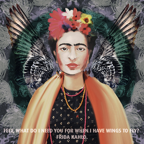
Frida Kahlo Glitch
@pastel spadethanks
too much fun. I had to do another
@primal fulcrum nice work 👌
did the symmetry challenge of today
Symmettrical Design - maybe a little off piste? #✂challenges-feedback
@pastel spade Thanks
Gave +1 Creative Carma to @pastel spade
Here's my day 7 challenge. I chose to use the "crisp warm" color lookup layer.
symmetry with distort and watercolor
Day4 Distorting Type
Gave +1 Creative Carma to @coral stone
Gave +1 Creative Carma to @brittle slate
Gave +1 Creative Carma to @bleak fossil
@young karma smart!
@light cipher Thank you my Dear 😍
@young karma Very nice picture!
Challenge #8: Symmetrical Design
@dim brook that’s awesome - wonder how it would look with the wings in front of the triangle. Love the Coco Chanel quote
Gave +1 Creative Carma to @dim brook
Oooh I'll try that @light cipher
Mandala symmetry tool, made with texture brushes and a radial gradient background layer
Redo with One Wing Behind...
Day 7 - Blur Effect
@dim brook love it 😍
fast one. Not much time today. I tried out spiral, and wave and something else with just random large brushes. Then the 4 way with a crochet brush. Masked it to the colors. rasterized and then moved the ovals together. Did a mandala and added a grass shape - dup'd and fliped. butterfly on top
DAY 8 - Symmetrical Design
@thorn pond thank you so much 😊 🙏🏻
Gave +1 Creative Carma to @thorn pond
@young karma Thanks 🙂
Gave +1 Creative Carma to @gritty dust
@young karma cheers deer 🦌
@light cipher it look so pretty, just a suggestion if I may, increase the orange layer from the camera row after make whole work smart object 👍🏼😉😃
@young karma much appreciated will give that a go!
Challenge #8
daily creative Challenge 8
hey @calm bane. i really love your challenge but if you blend the edges of the main subject with the desert the it may look more creative. but the project is gonna be the most favorite of mine from the first day i join the community till now.
Here's my final. It's also on my IG: ptrani
Inspired by Banksy's Valentine Day art in Bristol.
Original from the genius himself!
@brittle slate looks awesome. I have completely forgot how to get the type to go round the shape in Photoshop - I’m just getting back into photoshop after a hiatus 🙃
Day 8. Kept it simple in the end, tried to add more elements but didn't really work with the design
Blur
Challenge #6 Glitch effect
Day6 GlitchEffect
nice
@winter tinsel Great job compositing those together. I love your choices of starter images and the old TVs. One suggestion you might try is to unify the use of color on the images you have on the screen. You can Colorize the one black and white one or make them all BW. Personally I like the splash of color so I'd add a Hue & Saturation adj layer and make sure Colorize is checked.
Challenge #8
@light cipher We just did this a couple of days ago in Paul's tutorial on May 1, Distorting type.
I did that that tutorial - I thought it focussed on warps and liquify. I will rewatch and see if I can link it in to toe path or Is it just arc warping?! Will watch. Thanks @eternal mica
Gave +1 Creative Carma to @eternal mica
@marble prawnuja liked the background
yours welcome @calm bane
Challenge 8- SymetricalDesign
Day 8 Symmetry. Angel from Pixabay (half of a pair), bouquet and headdress from Kladi Vergine in an earlier challenge, feathers from Enchanted Watercolor Adobe template. flower symmetry layers made from a flower Paul Trani provided -- I think it's also from Enchanted Watercolor. I did a lot of recoloring on the angel: dress lips, eyes, nails & wings.
Demon Goddess in Training
Symmetrical Challenge
I'm a little behind on challenges. I decided to use one of my photos from our annual trip to Pigeon Forge/Gatlinburg, TN last year. Especially missing being able to go this year.
Day 7 - Blur Effect
DCC4 08 200507 Symmetrical design
@eternal mica Nicely done! I like the squarish yellow frame and concentric colours after that....
@pliant geyser AWESOME!!!! Sincerely appreciated. Getting an "nicely done" from you is a huge step forward for me. I used Paul's technique from today's tutorial. I made a circle and a rectangle, adding a stroke to each, dropping fill to 0% . I copied the rectangle and rotated the copy and transform>distort to move the corner points to make it a square. I grouped them and brought down the opacity to let the underlying colors filter through.
Gave +1 Creative Carma to @bleak fossil
@eternal mica So good that you're advancing in your skills. Glad to see you're pushing your limits and moving on up!
@bleak fossil Thank you, working on the highlights now! I should have noted these with mannequins, so the faces were a bit muted from the start. Liking the faceless aspect too, but can’t take credit for it, happy accident!
Gave +1 Creative Carma to @bleak fossil
Day 8
@mighty linden Very nice color choice, I also like the geometric look of your work. Nicely done!
@dim brook Awesome colors! I loved how you played with the flowers putting some in the front and some in the back. Wonderful job!
@buoyant nova I loved the cyan and yellow tones, looks pretty cool!
@primal fulcrum very nice job! I like how subtle your work looks, if you want you might play with some texture to see how it looks, nicely done!
@zinc elbow The circular shape of your work looks pretty cool! My only suggestion is to darken a bit the color from the text, so it can have a nice contrast against the background and stand out more. Lovely work!
@random sinew cool work, Cj! I like the overlaps between the shapes, if you want you can play a little more with the background, maybe adding some small flowers or filling it with a color or gradient… the sky is the limit haha. 
@sacred field Very nice work with the symmetry tool, Marc! I I like how the colors work really well, my only thought is that you can apply some colors on the background, you can try a solid or a gradient fill, maybe some from the pastel or cloud groups so it can maintain the beauty of the colors and the elements in the front, just a suggestion 🙂 Good job!
@daring dock WOW! You nailed! Spectacular work, I loved it 💙
@shadow barn I loved how you put the flower behind the painting! The red tone contrasts very well against the light tones from the wall, the painting and the flower. Awesome work!
@thorn geyser I absolutely loved the color palette, it has that kind of neon look against the dark background which I think it’s awesome! Just a shot in the dark 😂: you can try to apply outer glow to see if it creates a cool neon effect, since the colors have this nice feel. Great job 💯
@lime meadow I loved the ladybug, super cute! My only suggestion is that you can apply different levels of blur to the buildings in the back starting with low values and gradually increasing. It will enhance the depth effect on your composition. Super cool job, Fani! 😉
@green loom The colors and the glich effect created a super cool mood for your composition, well done!
I am trying to catch up. Day 6
@plain sable very nice effect. The hand drawing lines look very cool also I loved how they have kind of a texture! My only suggestion is that you might play with visual hierarchy, maybe taking a bit off the attention from the background and make the flower and the lines stand out more. Nicely done 😉
Beautiful composition @calm bane! The magical look from the image is super cool! If you want, you can play with some subtle gradients on the background to match even more the magical look. Good job, Nadia 🙂
@calm jay very nice displace effect! I like how the high contrast makes it look dramatic. My only suggestion is brighten up just a bit (maintaining the dramatic effect) the dark areas, especially on these parts so we can see the text hidden on the black area a little more. Well done 🙂
@forest aspen what a lovely work! Nice job on masking the elements and putting all together on the image! The way that you managed the colors of the angel, the feathers and the wings made it look very consistent. Great job!
@ripe peak Great job, Julio! The blue triangle has a nice color contrast to the other colors and the overlaps gave a special touch for them. The subtle flowers on the background helps the elements in the front get more attention without competing against each other. Impressive work!
@arctic rover, very nice job, Jude! I love the blue and red colors that you used 😀
Beautiful work @chilly hawk! The faded shapes in the background helps the elements in the front stand out more creating an interesting depth and look to your image, nicely done!
@azure barn cool glitch effect, Phill! About your day 7 I loved the color grading you applied, great job!
No problem @quaint badge! That’s a beautiful photo. I like how the butterfly makes it look how it was the perfect moment for taking a photo. Good job!
@wispy compass I like the subtle blur you applied on the swans in the front. My only thought is on this one 👇, since the area where he is standing is a tiny bit blurred he should be receiving the same amount of blur. It will help to create a natural look for it. Great job 😉
Very nice and consistent work also great job on the shapes effect @eternal mica!
@forest aspen beautiful piece. An angelic look to the whole thing
@coral stone Thank you for your input. I look forward to and appreciate your critiques.
Gave +1 Creative Carma to @coral stone
Thank you @coral stone !!!
Gave +1 Creative Carma to @coral stone
Glitch Effect
@bitter zodiac Love it! You could do something cool with sky replacement
Thanks @coral stone 🙂
Gave +1 Creative Carma to @coral stone
@ripe peak Great job, Julio! The blue triangle has a nice color contrast to the other colors and the overlaps gave a special touch for them. The subtle flowers on the background helps the elements in the front get more attention without competing against each other. Impressive work!
@coral stone Thanks. 😃
@coral stone ...thank you fir the feedback...I will adjust the image and include a blur to the egret ...👍
Challenge 8
@coral stone I hope this isn't too heavy handed, but I kind of like the way it turned out ...
Playing catch-up, Day 7. Blur Effects. The butterfly attack moves to NY, but the birds of the city are here to save the day. It's Bugs vs. Birds with what I think is a cool color lookup. Thoughts?
@coral stone , thank you! 🙂
Gave +1 Creative Carma to @coral stone
@coral stoneThanks I plan to do some more.
Challenge 8 complete!
Challenge #6 (Revised) I tweaked the color a bit amongst other things. Thank you @pastel spade
Gave +1 Creative Carma to @pastel spade
Challenge #7 Symmetrical design Initially I left the background white, but it seemed too empty that way. So ended up adding a gradient with pattern fill.
Another fun tool and project. I usually use it to make mandalas...but this was another way i learn to use it. Really cool to learn how to make your own brushes😄 . What you guys think of the end result?
Challenge 7
@coral stone thanks. I did think about adding a texture, just really short on time today. Didn't help that PS crashed in the middle. 🙂
Gave +1 Creative Carma to @coral stone
Thanks @coral stone played around a bit here are two more versions
Gave +1 Creative Carma to @coral stone
I might be a little late for this one lol
@coral stonethanks for your feedback ☘️
@desert raven These are looking great! Really nice depth in the butterfly image and the colors and designs in the Day 8 image area awesome! Really liking that contrast between the very colorful graphic background and the grayscale figure design, reads really well!
@floral frigate This came together really well, the masking and focus is on point and really helps sell this image! The concept is really cool and the paint is well executed. The lighting and color looks great and everything fits together really naturally, very well done 😄
@fathom sail Looking good! I really love the pop of red in the lips and how it mirrors the red from the flowers, very eye-catching! All these elements look really nice and balanced and I like the way you masked the triangle around the circle. The only tiny nitpick it there's some unmasked white on the right wing where it overlaps the circle. This came out really nicely!
@shy nimbus I think the gradient looks nice! If you lightened it a touch it might give the design even more contrast or pop but that's really personal preference. I really like the warm/cool contrast you have in this image! It really makes those pink and red tones stand out against the cooler blue background tones. Looks good!
@winter tinsel You did a really nice job of fitting these effects on the screen in a natural way, and the pops of color really make them stand out. Very cool!
@stable ravine Really cool! Really liking the symmetry in this design! The bright grayscale look of the figure against the darker colorful background stands out really well. It might look nice to make the text white, it would mirror the white tones of the background at the bottom and might give the image a nice cohesive balance. Nice work!
@untold gust Haha, really liking the concept for this! Really nice blue/orange color scheme going on as well. My only suggestion would be to try and separate some of these elements from the background a bit more, especially with the butterflies. Both the background and butterflies are quite dark and don't read as well as they could. I think brightening the butterflies up, and even making their colors a bit more vibrant could help them pop against the background. Very nice!
@sacred field Looking good! I like all the color in this. The warmth of the circle really makes an impact against all the cool blues of the background. It could be nice to brighten up the girl and wings a bit to make a bit stronger of a focal point. Really nice job with all the design elements with this!
@modern halo Nice use of the symmetry tool with this Day 8 challenge! I feel like adding in a couple graphic shapes along with the more hand drawn stuff could be a nice balance of elements. Kind of tying in the structure of the photos with the more organic look of the illustrated elements. Nice work 😄
@bitter zodiac Nice work, I like the extreme color and offset effects on this glitch challenge. The photo does a nice job of leading the eye up to the focal point of the face too. Really cool!
@tropic haven Looking good! I like the elegant shapes and soft colors of this design, gives it a really calm feeling. Nice work with the symmetry!
@plain sable Very cool Sno! Nice work with the symmetry tool, I like the mix between photo and illustrated designs in this. The image with the butterflies is looking nice too. I think it might help to make the focal shift between sharp and blurry a bit more gradual, and perhaps make the foreground butterflies a bit more out of focus to match the focus of the rest of the image. It draws the eye nicely to the center butterfly, looks good!
@hearty wharf Haha, I love it, this duck image looks great! It fits in the scene really well and has a great sense of scale. The shadow under the duck seems to do a nice job of setting it in the scene. I wonder if it might help to add a slight cooling filter to the duck to match the cool night blue tones of the rest of the image. Great work 😄
@primal fulcrum These focus images are great Sig! I really like how conceptual you're going with these ideas, really great use of the technique! I especially like the butterfly image, great sense of scale!
@green loom Really nice work on the Day 4 design! The warp effect works nicely with the texture and directional swirl of the paint background. Really makes the design feel cohesive, well done!
@whole tangle The shift effects on the Day 7 challenges turned out well! I really like the strong sense of foreground and background you got with the different butterflies. The color grading really gives the image an interesting warm feeling, and makes for some nice contrast against the cooler colors. Looks good!
@dim brook Challenge 8 turned out really well! I really like the cohesive color palette with the pink and green. The texture in the background and the round shape really give this design a solid feel, like this could be an actual object. I like it, nice work!
Symmetrical Design
I'm now a few days behind but this is my typography portrait challenge. was fun once I worked out what I was doing lol
thankyou @coral stone
challenge 8, not really sure if I want to add anymore. I liked learning how to make shape brushes
thank you so much for feedback @bleak fossil - always great to read - yes, i'll try the blue filter! 😅
Gave +1 Creative Carma to @bleak fossil
@eternal mica great work on your day8!! love the pattern!
hhee thank you @coral stone .. kee going 😁
Gave +1 Creative Carma to @coral stone
Wasn't entirely happy with my first go at the day 6 challenge so tweaked it a bit
@inland kiln It look nice, first of all I saw in the first expression there are two sources of light which make a confused for the eyes, you need to decrease the light in the back of the girls. The butterfly is so bright, for the focus point I think it should be the girls, and you have the last one out of focus. I hope it will help you. Regards.
Most of challenges included😆
@young karma It look nice, for me I prefer B&W, I love that art, if you add the light of the stripe neon on the hand and fathering out, it will be more realistic 😍
Challenge#8
I used a vacation photo of disney world, paired with a brush I made from a vacation photo of a palm tree.
My effort for Challenge 8
hello everyone, this is my today's work
My Day 8 challenge complete
Thanks for the feedback, @bleak fossil . Looking at the exported version again, I see what you mean about the darkness, especially on the butterflies. Since the original was a lot bigger in Photoshop, it's easier to make them out on my large monitor than it is with the reduced size version in Discord. I have some ideas about moving the bird/bug layers around to add some brightness or color to make those stand out more. Will repost that after I update it.
Gave +1 Creative Carma to @bleak fossil
@floral frigate very nice blur project. I like the color matching of all the shades of pink in the image
@bleak fossil Good morning, Sam! I lightened the wings, but burnished the dark part of the them. Also lightened the model, hopefully not too much! Thanks for your feedback! ~ Marc
Gave +1 Creative Carma to @bleak fossil
@plain sable the first revision is beautiful. the dark shading in the center makes the other coloring stand out even more.
@stable ravine I really like your symmetry image. suggestion: is the bottom half of the image overweighted compared to the top half of the image? The top half may be too empty
@hearty wharf thank you for your comment. I really appreciate your acknowledgement. I enjoy your work. Youre one of my favorite designers in this chat.
Gave +1 Creative Carma to @hearty wharf
@bleak fossil ,thank you for your feedback, I appreciate your comments . Although I sent quite late yesterday , you still give feedback. 👍
@bleak fossil Thank you very much for the feedback! It is really helpful and much appreciated!
Gave +1 Creative Carma to @bleak fossil
Take 2 on Day 7, based on feedback from @bleak fossil . Moved all the birds and bugs to the top and played with curves, levels and gradients to make them stand out more.
Decided to redo this with new source images - would welcome feedback #✂challenges-feedback
With just he boy
My Day 8 challenge 😀
@light cipher that's so nice, I prefer the first one, if you do more effort in the light and shadow, it will be unbelievable. Now I see the girl in the focus also ! however, the idea is so nice but it need more time 😉
@light cipher I think it works better with just the boy. The girl looks like she's jumped all the way up into the clouds, which has her kind of floating with nothing but water below her. Maybe if the same girl was in a standing/walking position, where you could but her behind the bridge to have her walking towards the boy from the far end.
@young karma Ya I'll try thank you
Gave +1 Creative Carma to @gritty dust
Challenge #7 Symmetrical design Initially I left the background white, but it seemed too empty that way. So ended up adding a gradient with pattern fill.
@shy nimbus Awesome artwork!👍
@light cipher Very good job. Great concept. One thing, it looks as if the girl is jumping on the Tower of London. If you blurred her more it would look like she was on the other side of the bridge.
Day 8 - Symmetrical Design
Modern Vitruvio women... Inspired by DaVinci 😉
Day 8 DCC. Symmetrical Design
@young karma thanks that is really helpful 😄
Gave +1 Creative Carma to @gritty dust
@untold gust thanks for the feedback - I was struggling to get the girl to look like she was integrated
@haughty brook thanks for the feedback - I will give that a go 😄
@light cipher the idea from @haughty brook might work well. There is more variety with two figures, but the jump makes it feel off somehow. Blurring her would give you that added person but fit her more into the rest of the image.
Gave +1 Creative Carma to @untold gust
@untold gust thanks - it is tricky - part of me thinks it just works better with the boy on his own 😄
Beautiful work @young karma ! I loved both of them, I agree with @young karma. Adding some influence of the glow on the hand will really help to be more realistic. Great job 😄
@willow valve I loved how you played with the symmmetry tool. The background tones are subtle and the pendulums in the front helps to build a very cool focal point to the subject in the middle. Awesome job!
Very nice @nocturne shuttle I like the effect that the type created on the colors of your image, well done!
@left abyss super cute! I loved the paws in the background 🙂
@inland kiln woww awesome! I like sense of depth created with the blur and scale on the butterflys. Impressive work!
@viral mirage very nice work! I like the combinations of the different challenges. Well done
The colors look great @young karma, I like the glow you added on the circle as well. Nicely done 🙂
@uneven flume great job masking the castle! The colorful background looks nice as well!
One more variation on day 7. I tilted the hawk a bit more and moved the Monarch Butterfly up higher in the sky to give more contrast against that right wing.
@brisk flower The gradient in the background looks great! My only consideration is to filp vertically the text so it can be easier to read. You can keep it on the bottom part. Well done, Matt 🙂
Not sure if this is any better?
Very nice @chilly ore! If you want, you can mask the bottom part of the woman to create the effect that she is inside the ellipse, it will help it to give more a natural look. 😉
Nice work @barren ice! My feedback would be maybe create some elements on the bottom part of the woman to hide the straight edges, maybe using some flowers, clouds or whatever you want, so it can give the impression of continuity 🙂
@cold oyster The abstract look of your day 8 looks very nice! On your second version the colors are amazing, the intensity of them creates an interesting contrast against the dark background, well done!
@light cipher I loved the attention to the details, the splashes and the reflection helps to build a realistic look to your composition. How did you applied the splash? Is that a brush? In addition to what Shawn and Scott said, I think you can apply a color lookup adjustment layer as a final color adjustment, to equalize the color tones of the boy and the city, it doesn't need to be a heavy adjustment, you can always use the opacity and blend modes to see how it looks 😉 Great job, Mary 💯
@young karma Very nice geometric look! I loved the subtle gradient you applied on the background. Good job!
WOW @hollow yarrow! Great job. The way that you used all the elements (squares, the blur, basckground....) created a super well balance to the composition. You did an amazing job!
@ocean pine the warm thones and the colorful backgrouns are really cool! Great job 🙂
Thanks @bleak fossil I played with the blur on the butterfly's... And added some words.
Gave +1 Creative Carma to @bleak fossil
Thanks @coral stone I selected the splash elements and reflection separately out of the original image and layered them - then used the eraser at different opacites to blend 😃
Gave +1 Creative Carma to @coral stone
Challenge-8 (Symmetrical Design)
@coral stone Thanks for all your feedbacks... I appreciate. You all are doing a very valuable work for us.👍 👌
Gave +1 Creative Carma to @coral stone
@coral stone here it is with some colour adjustment 🙂
Day 8 - Symmetrical Design
This is all done with symmetry and a brush I made from those templates Paul showed. I am so excited. I never knew we could paint with two brushes at one time! I had a lot of fun trying out different combinations and love the effect.
DCC4 07 200507
@eternal mica I like the effect on the back of the city. Did you use Dissolve? very neat
Day 8 - Symmetrical Design
@buoyant nova love the colors you chose!
Thanks @sterile jackal 🙂
Gave +1 Creative Carma to @sterile jackal
Challenge 8, Symmetrical Design, comments welcome.
Challenge 8, Symmetrical Design, comments welcome.
@south adder Great job! I love particularly the texture. I looks like a paint! Very nice👍
@hollow yarrow thank you
Gave +1 Creative Carma to @hollow yarrow
Challenge 8. This challenge was quite insightful and loads of FUN. Thank you!!
This is all done with symmetry and a brush I made from those templates Paul showed. I am so excited. I never knew we could paint with two brushes at one time! I had a lot of fun trying out different combinations and love the effect.
@primal fulcrum Well done and nice colors! judicious and calming.
Day 8 - Symmetrical Design
@buoyant nova Great Mandala effect. If I can say something : the straight cut at the bottom is disturbing (in my point of view).
Some people used the triangle or the circle outline to fix that issue... Maybe you could use a soft brush to soften the edge...
It's just an idea... Great job!
@hollow yarrow Thanks Franck, great idea. Will try that 🙂
Gave +1 Creative Carma to @hollow yarrow
Day 8 DCC. Symmetrical Design
@ocean pine African mood. I love it! Nice symmetrical pattern around this "WildLife"circle👍
@hollow yarrow Thanks Franck, great idea. Will try that 🙂
@buoyant nova As you want... You might even use one of the mandala brushes for masking. The effect could be nice with the background.
hello all - here is challenge 8!
oh, thanks so much @eternal mica - what a lovely thing to say!!
Gave +1 Creative Carma to @eternal mica
good morning, guys. this is blur effect
@primal fulcrum i actually used a filter gallery (graphic pen) and then a color lookup on the city. hank you for the compliment greatly appreciate
A few days behind but here's my VE day inspirec Churchill from Day 6
@brittle slate Thank you for terrific 2 week block. you chose awesome techniques. I had a ton of fun and learned a great deal. Stay safe
Gave +1 Creative Carma to @brittle slate
@golden badge That looks great 🙂
I did some changes suggested by @hollow yarrow Thank you 🙂
Gave +1 Creative Carma to @hollow yarrow
@bleak fossil Can you help me with the challenge? For some reson I was not able to apply the "define brush" to the layer.
Challenge #9: Play With Fire
I am so sad. Couldn't do the last two challenges because of my Photoshop version. Everyones work looks so awesome!
Purple Queen
Still catching up!! DCC #6 glitch effect
This is my first ever participation challenge
This is my first ever participation challenge
@heady sable nice in my opinion wings should be little big and slide other it looks great
@heady sable nice in my opinion wings should be little big and slide other it looks great
@open kettle thanks I'll try
@heady sable what do you think of mine? and suggestion ?
here is yesterday's version 2 - can't stop playing around with it!
@hearty wharf I love the way you blend the wings it's perfect wow
Was going to do a full sugar skull but don't have the time available for something that complex right now... sigh...
@heady sable what do you think of mine? and suggestion ?
@open kettle nice too, you could maybe change the color of the text and try another shape "not rectangular"in the big circle
thanks so much @open kettle - i like the shapes you've created! maybe the text could be a bit bigger?
Gave +1 Creative Carma to @open kettle
@pliant geyser Looks great in white background but play with background color how it's looks nice
Enjoyed learning several new things with this one.
Daily Challenge - Symmetrical Design Art
Day 8 Challenge
trying to catch up with all the challenges, learned so much about PS the last two weeks, thx @brittle slate
Gave +1 Creative Carma to @brittle slate
You’re welcome @queen dew !!!
SymmetricalDesign - These are my friend's dogs. What do you think?
oooh trees and fire - so many options!
Challenge 9
@stable ravine Really cool! Really liking the symmetry in this design! The bright grayscale look of the figure against the darker colorful background stands out really well. It might look nice to make the text white, it would mirror the white tones of the background at the bottom and might give the image a nice cohesive balance. Nice work!
@bleak fossil Thanks! I agree white is a much better look.
Day 9, PS Daily Challenge. Play With Fire. (forgot I had to mow the yard. came back in and my laptop had shut off? anyone using the 16" macbook pro having any problems?)
and finally - here is my project on behance ... please check it out if you have a moment - thanks and a lovely weekend to you all! 😃 https://www.behance.net/gallery/96776867/Photoshop-DCC-May-2020
Day 9 🔥
very cool @marble prawnuja and @thorn geyser
@bleak fossil This is Marc from the Ps Challenge, this should be the right one.
What an amazing 2 weeks with Paul. Awesome projects every single day. Im so excited about what ive learned.
@open kettle I loved the Purple Queen! My only suggestion is to give the text a brighter tone so it can have a nice contrast against the background and increase the readability of it. Great job, Amar!
@strong lake very nice use of the flames and trees. If you want you can create a overlap using the letter J and the toucan. You achieve that by makin one part of the letter and put behind the toucan and then make the other part and put in the front. Well done!
@balmy summit Day 6 looking super cool, Wendy! I like how you applied a subtle shadow on the text to create a contrast against the background 🙂
@heady sable Very cool composition, I like how the triangle directs the eyes to Frida. I also like how you played with the text, nicely done!
@pliant geyser nailed it! Awesome use of the symmetry tool. Great job!
@sturdy vault lovely work! I loved the music theme. Just a nitpick hah, you might increase the width of the blue circle so the text can have a little more space. Well done 🙂
@young karma Wowww, the effect that you applied on the city looks very impressive. I loved how you created a nice balance among the elements, great job!
@pastel spade I loved the perspective of the trees! Amazing
Awnn @green loom, I loved your friend’s dogs! I also like the color palette that you used on the flowers. Nicely done!
Thanks @coral stone
Gave +1 Creative Carma to @coral stone
I loved the blue tones of your work, @modern halo! Seems like you have a cut on the top part, you can delete the layer and try to make another path and render the effect again, so the flames can have a continuity around all the path. Good job Willi 🙂
@sacred field Sorry to hear that! Your day 9 looks pretty nice I like how you played with different kinds of flames. You made a great challenge, Marc 😉
@hearty wharf another impressive challenge, Tan! I loved the trees and fire combination, the colors that you used are great! Have a great weekend you too!
@coral stone Thanks so much! Have a great weekend! 🙂
Gave +1 Creative Carma to @coral stone
Very nice @daring dock. If you want you might enhance the effect by creating a vignette around the image and make the cool tones warmer. You can it with several methods, here's one using Camera Raw: To create the warmer look you can use the temperature slider that is under the Basic tab, and for the Vignette, you can find it under the Fx tab. Here’s a super quick adjustment I made to illustrate what I mean using these sliders, you can go way beyond that 😉
Oh, since the gif format has a limitation of colors it creates this banding, but you got the idea 😂
@thorn geyser amazing use of the effect! The variation of the width makes the effect look super cool, especially on the wings! I loved how you played with the text as well. Great job!
@coral stone - Thanks - for the city effect, made a copy, used the "find edges" filter , set it to "difference" and played with the hue sat adjustment.
Gave +1 Creative Carma to @coral stone
@eternal mica I loved the fireworks! My only suggestion is to use lowercase when it is a script font, so the text can have a nice reading flow since the script fonts tend to connect with each other when in lowercase. Good job, Ted 🙂
@young karma Awesome job! Thanks for sharing the process, have a great weekend 💯
Gave +1 Creative Carma to @warm oasis
im new here how do i find out what the challenge is and what youre supposed to be doing ???
Hi @hallow sluice welcome! We have a brand new challenge starting on Monday, you can register for it on this link: https://www.behance.net/challenge/photoshop. If you want to check and participate on the past challenges you can use this same link and scroll down the page. Feel free to tag me if you have any question. It's great to have you on the community 🙂
@val@coral stone thanks. I agree.
Gave +1 Creative Carma to @coral stone
@coral stone thank you im gonna go have a look around
Gave +1 Creative Carma to @coral stone
@pliant geyser your symmetry piece is amazing. I have no idea where you dream up these ideas. And the execution is so crisp
@hearty wharf your work with shading and coloring in the symmetry piece is top notch.
I know the text is hard to read, but once I figured out that I had to make paths to render the trees, I just stuck with what I started with. Learned something new!!!
@coral stone thanks again. You're critiques are spot on. I assume I can change that font and it won't impact the fire path. I'll give it a try. It might not work exactly with the mask of the fire.
Gave +1 Creative Carma to @coral stone
Day 9 - Fire
@coral stone Thanks. I messed up the last thank you. I appreciate all the time you put into this.
Gave +1 Creative Carma to @coral stone
My Day 7 Blur Challenge
Challenge 9. It has been another fun two weeks! Thanks @brittle slate
Gave +1 Creative Carma to @brittle slate
day 6, found this one really fun!
Daily Challenge 200508 Playing with Fire
Had another go at the same photo for a slightly different look
Careful when you play with fire!
@coral stone thanks i always look same type of feedbacks in my projects to make more improvements and learn something new
Gave +1 Creative Carma to @coral stone
Everyday is Halloween 🎃
another take on day6
@heady sable Very cool composition, I like how the triangle directs the eyes to Frida. I also like how you played with the text, nicely done!
@coral stone thanks 🙂
Daily challenge new game release
Challenge#9 Fire
hello @coral stone - thank you so much for your feedback, really means a lot! and congratulations for being featured in the new 'creative challenge' gallery ... how cool is that?
Gave +1 Creative Carma to @coral stone
thank you so much for your comment @eternal mica - hope you are having a great weekend!
Gave +1 Creative Carma to @eternal mica
 Shawn, this command is disabled in this channel
@hearty wharf Thank you so much Tan, I loved the new gallery 😍
Gave +1 Creative Carma to @hearty wharf
DAY 9 - Rendering Fire. Learned a lot the last 2 weeks and had so much fun. Thanks everyone in the chat that sent me encouragement (meant a lot).
Catching up again. Day 8 with a posterized Frida and a different wing quote.
@untold gust I like the second set of wings and the color! Good work.
hello
Daily Challenge 200508 - Fire version 2
A female Ghost Rider Emerging!!!! As they say, "Hell Hath No Fury as a Woman Scorned!" 😆
Challenge 9, play with fire, comments welcome.
Challenge #9
That was a lot of fire. So HOT !!!
Day 9 - Play with Fire
Day 9 - fire drinking with big eyes! Thanks you to @brittle slate and @coral stone for the past couple of weeks - it has been fun!
Gave +1 Creative Carma to @brittle slate
last one, appreciate advice, opinion, critic 😉
@brisk flower Thank you so much for participating, Matt, you made a wonderful challenge! Can't wait to see your works for the next one 😃
Gave +1 Creative Carma to @brisk flower
La Joconde with the eyes, the headress and the arms of Frida Kalho. Super long arms, I know!
@median quarry Very cool! I like the plain background against the intricate design of the cabinet and chair, it has a really nice look and balance of detail. I feel like the red text is a bit hard to read. The text at the bottom is a bit tough to read at a glance, but I think the title could work quite well if maybe you added a subtle drop shadow or something, might give it that extra pop of readability. Nicely done!
@open kettle Very cool, really digging the colors in the purple image! My only thought is that the yellow triangle and green leaves seem to be the most eye catching due to their color contrast against the purple image. If you gave the girl a warm tint of yellow instead of purple it would really make her an eye catching focal point. Though if you want to keep her purple perhaps raising the brightness a bit overall might give her some more value contrast? Looks good, nice job with the symmetry!
@strong lake Nice work with the fire effects, looks really interesting! I like how it looks like you warmed up the colors of the bird as well to fit. It seems like perhaps the bird lot a bit of it's contrast? Increasing the contrast with a levels adjustment might help the bird a bit, but that's a bit of a nitpick. Nice work 😄
@balmy summit I love it! The color shifts look great and the offsetting of the image really helps sell this effect especially well along with the horizontal lines. Really dramatic feel to this image, well done!
@heady sable Awesome to hear that, welcome in and I'm glad you could join us! Really nice work with the symmetry, and I like the touch of asymmetry that the text gives. My only suggestion is that it could be nice to increase the contrast of her face by using a levels adjustment to boost the dark tones. Currently the deep darks of the wings and the shape at the bottom overpower her contrast a bit and draw the eye a bit more. Just a thought. Really nice work!
@hearty wharf Ooh nice, I like the use of the painting along with the illustrative looking elements of the background! Really nice contrast on the figure against the background too, makes for a strong focal point. Nice work with the symmetrical designs!
@pliant geyser Really cool! I like the spray-like texture you added into the background. The whole thing has a really strong tattoo design type feel and look to it. The white-red combo gives it a really bold look as well. Nice work with the symmetry in this!
@queen dew That's awesome to hear! The more of these challenges you do the more fluid the whole process becomes. I like the almost abstract look of the symmetry design and the butterflies with the blur is looking good. Nice work 😄
@green loom Very cool! I really like the high-key bright look of this design. Gives it a soft friendly feel. Nice work with the symmetry in this. I feel like perhaps the text could be a bit more bold, or bigger to read a bit better at a glance, but that's really just personal preference. It also might help to have the black dog overlapping the feet of the white dog, might look a bit more realistic. This looks great, the cast shadow from the dogs is a great touch!
@buoyant nova appreciate your work it looks good but i think the heart layer needs to be blend with the other fire layer to look more batter. The reflection of light on the body is excellent.
@daring dock Okay, thank you, will give that a go 🙂
Gave +1 Creative Carma to @daring dock
Glitch effect..trying to catch up
@modern halo Nice willi! I like the cool colors of the flames. The only suggestion I would have would be to fix that top area of the flame where it gets cut off a bit unnaturally with the hard edge. Good job!
@young karma Haha, super cute. Really nice masking on the cat! Nice work with the symmetry in this one. My only suggestion would be that the white between the feathers of the wing could use some cleaning up, and maybe a radial gradient that darkens down the outside of the image, kind of like a vignette might look good since all these bright eye catching tones kind of pull the eye off the page. Nice work on this! XD
@sacred field That's great to hear! Really cool effects in this design. I like how the thin look of this text mirrors the thin look of the branches. Really great effect with them wrapping around the letter T as well. The mirroring effect with the roots came out really nicely too!
@cold oyster The fire effect is looking good! I like the lighting effect on her sides and under the face to really fit with where the fire is. Could be nice to see it a bit more under her arms, though that might be tricky with the deep shadow there. Really eye catching color contrast in this, well done! 👍
@oblique anvil Great concept with this Day 7 challenge! Really nice work on the blur effects on this one. The focus on the parrots draws the eye really well. It might help to sharpen the face of the one on the right to read a bit more clearly, unless that's the level of focus of the original image. The masking looks good too, nicely done!
@bleak fossil Thanks for the encouragement, Sam! I will definitely practice the Rendering some more! I'm looking forward to the next Challenge! 😊
Gave +1 Creative Carma to @bleak fossil
Day 9 - Play with Fire
@heady sable Awesome to hear that, welcome in and I'm glad you could join us! Really nice work with the symmetry, and I like the touch of asymmetry that the text gives. My only suggestion is that it could be nice to increase the contrast of her face by using a levels adjustment to boost the dark tones. Currently the deep darks of the wings and the shape at the bottom overpower her contrast a bit and draw the eye a bit more. Just a thought. Really nice work!
@bleak fossil Thank you for your feedback, I'll try this 🙂
Something simple, I did the composite awhile ago with photographs of fire... and change it just with the render fire option 🙂
play with fire i think
Challenge #9
#✂challenges-feedback. I combined a few of the lessons from Friday into whatever this is. 🤪 any feedback would be greatly appreciated. I am currently working on photographing all the plants, flowers, bugs etc I can find to create a large inventory of cut out composite elements.
decided to throw together a mother's day card! thanks for the awesome challenges this time, i enjoyed them! <3
I want to thank all of you for a wonderful DCC this past 2 weeks. I enjoyed seeing all your incredible posts. I learned so much from paul and from your comments and posts. I look forward to seeing you all in next week's DCC. My portfolio for this past 2 weeks is at behance.net/tedbeyda1 Id love for you to view it and give me your comments.
@chilly hawk your second fire image is very well done. the blending of the horse's mane and the fire is great.
play with water challenge #happy-mother-day ... everyone
one challenge behind
Just kinda went with it. Just played with a couple of different things in the render panel
@whole lotus nice picture, now I won't be able to sleep at night 😂 😔
thank you very much for feedback @bleak fossil - so pleased you like it! yes, i couldn't resist painting frida ... everybody tries at some point i suppose!
Gave +1 Creative Carma to @bleak fossil
Day 9. This was created out of my memories of the Australian bush fire damage that I saw in February this year in the Blue Mountains. So much devastation yet the trees were starting to recover. Just a long way off supporting wildlife.
Hey you guys...
This is my try for the PlaywithFire Challenge.
It was fun!
Cheers from Norway
@daring dock Does this look better?
hey @buoyant nova
i appreciate your efforts. remove the white highlighted area and join the blue highlighted area of heart to the purple highlighted area. which may look more batter.
one challenge behind
@whole lotus Funny!
Here is the link to my Behance Project. Thank you to everyone who helped me, much appreciated https://www.behance.net/gallery/96105461/PSDaily-Creative-Challenge-Paul-Trani-April-May-2020

I noticed I misposted the link to my Behance page where my portfolio is.. https://www.behance.net/tedbeyda1

Behance
Final Challenge, thank you so much @brittle slate & @lethal mural and all mentors which engage with us during this challenges 😍 😍
Gave +1 Creative Carma to @brittle slate
Folks, Here's the link to my project for these challenges. I have so enjoyed seeing everyone's work. Thank you. https://www.behance.net/gallery/96217965/Daily-Creative-Challenge-28-April-to-8-May-2020

Here is a link to my work for this challenge, all good fun thanks @brittle slate https://www.behance.net/portfolio/editor?project_id=96118535
Gave +1 Creative Carma to @brittle slate
Hi, Here's my link to my works, it was fun, I Iearn a lot! Thanks @brittle slate 😋 https://www.behance.net/gallery/96856867/Daily-Creative-Challenge-28th-April-8th-May

Gave +1 Creative Carma to @brittle slate
@plain sable Hi, the link doesn't seem to be working
BLUR
cool fire effect #challenge last
@bleak fossil Thank you, Sam. I almost gave up on it. The bird on the right has good focus, so I'll work on reducing that blur.
Gave +1 Creative Carma to @bleak fossil
Thanks @buoyant nova here is a working link to the current challenge... https://www.behance.net/gallery/96118535/Photoshop-Daily-Creative-Challenge-Apr-27-May-1

Behance
Photoshop Daily Creative Challenge April 27th to May 1st
Gave +1 Creative Carma to @buoyant nova
symmetrical design challenge 🙂 @brittle slate
Finally got some time to catch up on day 2! I may have blended more than 2 images together for this!
@sterile tinsel Very cool! You definitely pulled off that huge butterfly effect in this one. The lower angle of the photo makes the butterflies appear even more towering. Currently both of the butterflies appear slightly out of focus, I think that works for the butterfly on the right as it appears to be in the foreground, but it might help to sharpen up on the left butterfly's body/face area to give the image a sharp focal point. Could still look nice to have the tip of it's wing shift out of focus slightly to push that effect. Nice work!
@strong lake Cool looking water color effect with this Mother's Day design, looks good!
@brazen egret Very cool! I really like how the blue flame effect works with the lighting coloration around his body, really matches the image well! It could be nice to give the flame effect a bit of a glow to really make it look like it's emitting light. Oftentimes I like doing this with a color dodge or screen blending mode. Well done!
@sturdy briar These are excellent! I really like the variety of looks and styles you got with all these different challenges. Nice job on all of these designs!
@barren ice Awesome to see all your challenges together! Really nice work on all of these and great to see the variety of techniques you used. I especially like the dog painting image. I really love the tree branch/root effect across the "Let them grow" text, though I wonder how it might look on something like white text. The white might contrast against the background more, as well as really show off the wrapping branch effect with more contrast as well. Just a thought. Really nice work on all of these!
@young karma This is great, I really like how the flower designs seem to wrap around the graphic elements of the triangle and circle! The colors are really harmonious and work together well. I like how you masked the wings behind the circle shape, giving it some nice depth. Really nice work on this design!
@safe ledge Very cool! Hah, I like the title for your Mothra image. Really liking that glowing butterfly effect for the one on the bridge in the background, really cool effect. Great texture and watercolor effect in the second one as well. Looks good!
@young karma Really great graphic elements in this skateboard design! Adds a lot of movement and interest to the piece, nice job on the masking with that effect too! Looking good!
@young karma This came out really nicely! I like the subtle use of blur on the left butterfly, it gives it a bit of movement and draws the eye nicely towards the center butterfly. The quote is a nice touch on this image, nicely done!
@young karma Really nice work on the symmetry challenge! The selective coloring effect on her lips, necklace, flowers, and shirt gives the image a really cool look. This whole design seems to have a nice cohesive color palette too with the reds and blues. Good job 😄
@buoyant nova Really cool fire effects in this challenge! I like the shifting in the color of the flames. My only suggestion is the masking around the fire and the fingers could use a little cleaning up. I often have some really nice results with the quick selection too and the refine edge brush tool within it when doing precise selection work. Very cool!
@acoustic hare Looks great! I really love the glowing blue ring effect around the hand, gives it a really interesting almost sci-fi feel. The flame effect is looking really nice, though it could look good to mask the flame out where the pinky finger overlaps it, and even extend it past the other side of the finger to give the image a bit more depth. Currently there’s a bit of a tangent between the flame and the finger and it’s hard to tell which part is overlapping which. Very nice work!
@whole lotus Hah, this is crazy looking, really great job! I like the balance between symmetry and asymmetry on this one. Really awesome job of compositing the head and neck with the potted plant, looks great! Impressive work!
@storm pine Really cool to see you trying some complicated effects with this challenge! I really like the swoop of flame across the front of the face, it gives the design a nice dynamic feel. Really interesting to see that more geometric sphere effect in flames too. I think it could look good to composite in some more natural looking wispy flames over some of those more digital looking edges, like in the top right or bottom left, but that’s just a nitpick really. Nice work on this one!
@thorn geyser Super cool! Really nice job fitting these images together. Even down to the way you matched the lighting on the different chains to the scene, looks great! I feel like the lighting of the floating cliffs and the front of the building don't quite match though. The sun is around the back side a bit, even then it could be feasible that it's hitting the cliff in that way. If so it might help to add some of that front lighting on the building. I often like to use a color dodge layer for that kind of effect. Maybe something like this?
Day 9 - Play With Fire
Image made with fire rendering and blending modes only.
I know, it is nothing really original but I had a lot of fun playing with this tool!
@bleak fossil Thanks for the feedback! I will give that a go!
Gave +1 Creative Carma to @bleak fossil
My version of twisted B&W ..😃
i just design some blending stuff need comments and feedback's
Ok I'm done messing around with this challenge but I think I have the shadow on the water backwards (and I am sure there's some easy way to do that?) is it backwards? I just rotated the image
#✂challenges-feedback fire on the water?
@hollow yarrow so great work, I found it is so pretty editing and so elegant, my friend, simplicity have a big value and hard to reach it, you did that. well done.👍
@bleak fossil thank you so much 👍
Gave +1 Creative Carma to @bleak fossil
@hollow yarrow so great work, I found it is so pretty editing and so elegant, my friend, simplicity have a big value and hard to reach it, you did that. well done.👍
Thank you so much@young karma! I appreciate ☺️
Here is the link to my Behance Project. much appreciated your visiting my project and let me know please if you have any question, opinion or Advice, warm regards from Switzerland:
https://www.behance.net/gallery/96867883/Photoshop-Daily-Creative-Challenge-Made-each-artwork-i

Behance
Photoshop Daily Creative Challenge: Made each artwork i
super work @young karma - great to see it all together! 😃
@hearty wharf thank you so much 😊 I appreciate your visit, you have also so wonderful, elegant work, I was in your gallery 📍but I did not see you 😉
Gave +1 Creative Carma to @hearty wharf
aah - thank you so much for the kind comment and appreciations @young karma 😃
Gave +1 Creative Carma to @gritty dust
@young karma Looks great 🙂
@bleak fossil Thanks for the tips. Will give it another go when I get chance 🙂
Gave +1 Creative Carma to @bleak fossil
Updated version. The original was a light painting with phosphorescent dye (non-toxic) from a while back, just minor lightroom adjustments #✂challenges-feedback
@young karma powerful image for the final challenge. i look forward to seeing your work in coming challenges
@plain sable Thank you for sharing your portfolio. Your work is 🌟 🌟 🌟 🌟 🌟 . I love seeing what you post each day. The creativity and execution are merged beautifully. I am too much of an amateur to appreciate all youve put into the images, but to paraphrase Potter Stewart, I may not know how to define good design, but I know it when I see it. I hope to see you in the coming DCCs.
Gave +1 Creative Carma to @plain sable
Hello
Gave +1 Creative Carma to @brittle slate
Paly with Fire. I felt like "Have enough courage to start and enough heart to finish" - Jessica N. S. Yourko. Thank you so much @brittle slate! We will get the idea.
@hollow yarrow IDK, Franck that logo looks oddly familiar. I wonder where Ive seen it?? Looks great
and also thank you to @coral stone and @bleak fossil. I've learned how to make portfolio on behance from you guys. thank you so much!! Thank you so much everybody! See you next time.
https://www.behance.net/yoshikoeastvilleage/projects

Behance
Gave +1 Creative Carma to @coral stone
@young karma Awesome portfolio
Thank you so much for participating @cunning needle! Can’t want to see your next works. 💙
Gave +1 Creative Carma to @cunning needle
#7 Blur Effects Kept going back to this filter, felt like a desert vibe, but is it too washed out? Feels like something is missing.
@hollow yarrow IDK, Franck that logo looks oddly familiar. I wonder where Ive seen it?? Looks great
@eternal mica Thanks
@brittle slate Thank you so much for the past few weeks! Whimsy doesn't come naturally to me, so these projects have been a really fun challenge!
Gave +1 Creative Carma to @brittle slate
Here is the Link to my Behance wrap-up page of the last PSDCC
Thanks @brittle slate for these great session and thanks @coral stone @bleak fossil for the feedbacks!
https://www.behance.net/gallery/96765325/Photoshop-Daily-Creative-Challenges-April-27-May-8

Behance
9 challenges in 9 days driven by Paul Trani.#PSDAILYCHALLENGE
Gave +1 Creative Carma to @brittle slate
Finshing up last weeks challenge
Loved learning how to use this tool
Symmetrical design
Paper Pitcher Plants. Typography Challenge
I noticed I misposted the link to my Behance page where my portfolio is.. https://www.behance.net/tedbeyda1
@eternal mica worked for me

Behance
I combined both of Paul's classes on Friday. PS crashed after I rendered the fire (last step) and when it reopened it had flattened the image so I couldn't make it go in front and behind. So this is a take 2.
Challenge #7 Blur Effects
another desperate attempt.....to plan this trip lol 😜
@buoyant nova thank you 🙏🏻 so much😀
Gave +1 Creative Carma to @buoyant nova
the shadow is my problem LOL
My completed project on Behance! Really enjoyed this set of challenges and learnt so much! Thanks @brittle slate https://www.behance.net/gallery/96863793/Photoshop-DCC-28-April-to-8-May-2020

Behance
Photoshop Daily Creative Challenge from 28 April to 8 May 2020
Gave +1 Creative Carma to @brittle slate
@hollow yarrow Thank you for sharing your Portfolio, just amazing 🙂
Gave +1 Creative Carma to @hollow yarrow
Is there a live stream at 9am?
Anyone awake?
Finally caught up for day 9. Back to my comic book inspirations, most people know Johnny Storm, the Fantastic Four's Human Torch. But many don't know that he had a female counterpart named Frankie Raye in the 80s. Since I think Frankie's better looking than Johnny, I used a model from Adobe Stock to portray Frankie and applied Paul's lessons to create her flaming powers and features.
My Behance cover for the Daily Challenge with @lethal mural
@ruby prawn Yes, it will be a "Welcome" stream
Daily Creative Challenge #9 @brittle slate Thanks Paul. Although I'm asleep when you are live I am having so much fun and learning so much .
Gave +1 Creative Carma to @brittle slate
@hollow yarrow Thank you for sharing your Portfolio, just amazing 🙂
Thank you so much@buoyant nova!
Here's my Porfolio if anyone wants to have a peekaboo. Bunch of different projects I've worked on in the past. If you just want to see my PS stuff, click on the space jellyfish pic - that's where my personal photos and assorted manipulations are... Apologies in advance if my profile photo damages your monitors... https://www.behance.net/timkohlmetz

Behance
SYMMETRY
@brazen mango very creative work! 💯
@untold gust cool work, Scott! I like how you played with the highlights, my suggestion is to mask the fire with some parts of the hand. This will enhance the impression that she is really holding it. Nicely done!
@wooden bloom very nice, Rose. I like the abstract elements of your composition. My only thought is to reduce a little bit the scale so the left and right edges can have more space like the top part. You can also do this by increasing the canvas size 🙂
@sterile tinsel very nice use of the symmetry tool! I like how you combined different symmetrical elements to build the background! Nicely done 🙂
Revised Day 7 Challenge from last week.
@untold gust cool work, Scott! I like how you played with the highlights, my suggestion is to mask the fire with some parts of the hand. This will enhance the impression that she is really holding it. Nicely done!
Thanks, @coral stone -- here it is with more of her hand.
Before the new DCC starts, I wanted to post my completed project on Behance. Thanks for a lot of innovative and inspiring ideas, @brittle slate!!! https://www.behance.net/gallery/96238191/Photoshop-Daily-Creative-Challenge-Apr-28-May-8

Behance
Photoshop Daily Creative Challenge Apr 28 - May 8
Gave +1 Creative Carma to @brittle slate
@hollow yarrow Awesome portfolio. Also, by adding in the assets, it only makes me admire your talent even more. I keep viewing the projects over and over, and with the assets there, I can try to think along with what you created. Thank you so much for posting it in such an open and sharing way.
Gave +1 Creative Carma to @hollow yarrow
@eternal mica Thank you so much 😍
Gave +1 Creative Carma to @eternal mica
Last Challenge great fun playing with the flames
question here, about the creative challenge are you supposed to post every challenge as a new project on Behance?
@shy nimbus you can post all days into one project only 🙂 You can create the project and as you are finishing each day you edit it
@bleak fossil I took your suggestion and added a little bit of the fire under her arms and a little more to the side of her face.
Thanks @coral stone could you check if I've done it correctly?
Gave +1 Creative Carma to @coral stone
@shy nimbus of course. Please send me the link for your portfólio 🙂
@hollow yarrow Awesome portfolio. Also, by adding in the assets, it only makes me admire your talent even more. I keep viewing the projects over and over, and with the assets there, I can try to think along with what you created. Thank you so much for posting it in such an open and sharing way.
Thank you so much@eternal mica I appreciate!!!👍 Always Happy to share with other people.😉
can i still submit mines, or should register to the new 9 challenges?
Oops already posted on Behance but not here for feedback!
@shy nimbus Awesome Uma! Loving the bold colors in this. The blue glitch area is really well balanced and I really love how the biggest area of it is on the eyes which creates a great focal point. The variation in the lines and shapes of the glitch sells the effect very well!
@serene fog Very cool! Is this for challenge 6? Really interesting graphic shapes to this one, especially against the white background. Really loving the animated color shifts, kind of gives it a neon/cyberpunk feel. If you want to push the glitchy feeling of it even further it could look good to add in some thin strips/horizontal lines throughout the design a bit. Really nice work!
@inland kiln Great color and value contrast in this! Gives the design a really strong focal point. Awesome job with the flame effect, I love the variation you got in the texture and shape of the flames on different areas of the headdress, works very well! The repeating the flame in the eyes in a great touch as well, impressive work!
@untold gust Awesome work Scott, very nicely done! Really nice variety of styles and techniques in this project. I especially like the monochromatic look of the symmetry challenge. Well done!
@sterile tinsel Great to see how far you took the symmetry tool with the patterning on this one! Nice work with the different elements of layering. It's always fun to see how quickly and easily the symmetry tool can be used to create patterns and designs. Good job!
@ruby panther Ooh, love the colors and textures in this! Really cool work with the glow effects, Could be cool to use a color dodge layer on a clipping mask on the girl and get a bit of yellow light on her left side as if that beam of light is giving her some glow. Excited to see what everyone creates of this DCC! Looks good 😄
@thorn geyser Awesome work on all of these! I especially like the Day 3 lizard image and the Day 6 glitch effect. Really nice work!
@stiff grove These 5 posters are looking awesome, you're killing it! Really liking the variety of styles and techniques you're playing with. If I had any critique at all it would be just to be conscious of where you want the viewer's eye to go. Where the focal point is, and then try to create the most contrast (whether that's value, color, size, texture, etc) in that area. I only mention it because a few of these have a lot of bright or bold areas that compete a bit for attention. Though others, like the last two (Sabrina and Stephen Hawking) have a very clear visual hierarchy and read. These are great!
@winter tinsel Haha, I love the use of the pigeons for this challenge, fit's really well with that city theme 😄 My only suggestion would be that I think the contrast between the left and middle pigeon could be adjusted to match the scene a bit better. The left pigeon looks like it could use a bit of a boost on the darks, and the middle one has some deeper contrast in the darks around the bottom left area, but the head area looks a bit washed out. I like the idea of having an atmospheric effect by keeping the deepest contrast in the foreground, but I think the middle pigeon could be a bit more consistent across the whole bird. If you were adding lighting effects and that caused the washed out look try another blending mode (I often like color dodge for that) or perhaps just add a masked levels adjustment after to even it out. Hopefully that makes sense. This looks great, I love the pigeon on the right looking right at us, hah. 👍
@primal fulcrum These are great Sig! Nice work with all the different techniques. I especially love the warped figure from Paul's masterclass, really cool stylization and sense of perspective. Great work on all these designs!
Challenge 8!
Hi there, Sorry for the newb question, but anyone know where I can find the prompt for today's design challenge?
@shy nimbus Thank you!
Gave +1 Creative Carma to @shy nimbus
@sour thunder ur welcome, i'm new too 😋
Can anyone help me? In the last part of the challenge, I went to add the initial. @brittle slate said to "make work path from selection". The selection in "Path" was greyed out. Is there a resolution or am I doing something wrong? ANy assistance would help.
@zealous halo Try this: Open your Paths Panel (Window > Paths) > With the selection active click on this button 👇 It should create a path from your selection 🙂
That's my issue that box is greyed out and I don't know why.I've done all the challenges and that's the only one that I am having an issue with. I am new to all of this, so I apologixe for the rookie questions.
No problem @zealous halo let me move the question to the #❓ask-a-question 🙂
Ok thanks. Where would I go to fing the #ask a question?
I tagged you there, it's on the left bar under the Advice group. You can also click here 👉 #❓ask-a-question
Thanks @eternal mica
Gave +1 Creative Carma to @eternal mica
Hi, im a little late but i will be joining you guys for these next challenges!!
Welcome to the community @regal scarab, looking forward to see your works 😃
My cover page for @brittle slate 's past challenge. I used my "flame thrower" and the symmetry tool. Not sure if I'll have time to complete those last two challenges, so I used the tools here.
Looking forward to another DCC with @lethal mural
Hey does anyone know where the Behance Photoshop challenge airs and what time EST? It doesn't say on the Behance page. Thanks!
@keen ravine you can do any challenge at any time but need to post them to past-challenge. This space is only for the current challenge that runs May 11 to 22.
Hey does anyone know where the Behance Photoshop challenge airs and what time EST? It doesn't say on the Behance page. Thanks!
@formal ravine I’d be interested in this answer as I’m finding Behance and Photoshop discord a little overwhelming at the moment.
Gave +1 Creative Carma to @formal ravine
Daily Ps challenge is at 9am Pacific time. Please see the left hand side at the top where it says announcments/read only. Go to creative-challenge to always get the info and links
Here is my new project cover. I used to do gold text all the time in Corel but can't quite seem to get it right in PS. Hoping to get some insight from Jesus tomorrow.
DCC Cover V2
Cramming in my last Challenges from the last 2 weeks in here before the cover for this next DCC.
@winter tinsel Hah, very nice! Nice work with the masking on this one!
@primal fulcrum Really digging that gold text and sort of art deco style, they fit together nicely. I think Jesús may have done a challenge like that previously with a sort of metallic text look in another DCC if I recall correctly. Nice contrast against the background as well!
@plain sable Really nice use of color gradients and texture in this cover! I feel like perhaps the text could be a touch brighter to give it a bit more pop against the background? Looks good!
@calm jay Really nice work with the blur challenge! The blur gives the foreground butterfly a nice sense of movement and draws the eye to the center butterfly really well. Nice job with the subtle blur on the top of the center butterfly's wing, adds some nice depth!
@oblique anvil Very cool to see you use techniques from two of the challenges this way! That flame effect works really nicely with the symmetry tool. Almost a sort of star burst look. Very nice!
@young karma Very nicely done! I like the "wispy" soft edges you got on this effect, I think it really makes the fire look more natural. Great job!
@floral frigate Looking good Mzev! I like the warm yellow pop of color against the blue background! The faded contrast of the background works well to keep the focus on the lion. I almost feel like the background could use a slight darkened gradient or vignette via a multiply layer just to add a little more dimension to the image, but that's just personal preference really. Very nice work!
@brazen mango Loooving the concept with this image, you did a great job seamlessly blending these images together. Great idea and really solid execution!
@lime cedar Oh wow, really interesting use of this challenge! At first glance I didn't even realize it was text and just thought it had an interesting texture. I like the way you separated the background text for the plant, very cool!
@azure barn Really great job on these three challenges! These have a nice sense of focus to them, and the techniques are all looking really solid. Nice work Phill!
@hollow yarrow No problem! This is truly an impressive project, you nailed these challenges. I especially love the first challenge, excellent stuff!
@bleak fossil Thank you for the feedback! You're always spot on.
Gave +1 Creative Carma to @bleak fossil
@bleak fossil Thank you so much for the feedback... I will surely work on that & will come up with something new very soon.
Gave +1 Creative Carma to @bleak fossil
@hollow yarrow No problem! This is truly an impressive project, you nailed these challenges. I especially love the first challenge, excellent stuff!
Thank you so much @bleak fossil !
What time does the next challenge start, in GMT?
@lost zenith I believe the live stream will air at 4pm GMT
Thank you!
@formal ravine @tidal bloom The live stream starts at 12pm (Noon) EST.
@pliant geyser I understand that. What I don’t get is what challenge. Where is the challenge. Where do I post to? It’s very confusing this discord thing. That was the point, and my question. Not when or where is the stream. After all that’s what brought me here in the first place...
@tidal bloom The challenges aren't revealed until a couple hours before the challenge video stream begins. At that point you can download the starter file they supply, and the live stream from the instructor begins at 12pm noon. Follow along with it. Then, when you're done your challenge using the supplied files or your own images, you simply upload a JPEG to this forum -- simply drag and drop it into your window. But, FYI, the JPEG must be under 8mb in size or it will get rejected as being too large. You've picked a good time to start - Jesus has been my favourite instructor so far - very well spoken and easy to follow. The Challenge video stream / file is located here: https://www.behance.net/challenge/photoshop.
@pliant geyser Thanks. Seems simple enough. 👍🏻👍🏻
Gave +1 Creative Carma to @pliant geyser
Gave +1 Creative Carma to @bleak fossil
Thanks For the input Sam
Cover for Jesus's Challenges
@buoyant nova Loved the gold effect, Susan! My only suggestion is to resize it so it won't occur any cropping when posting on behance. The cover minimum dimension is 808 x 632 🙂
@coral stone Okay, thanks
Gave +1 Creative Carma to @coral stone
Bit of fun for the day...
If I have never used Photoshop before, will I be able to do this challenge or does it assume at least a beginner level of knowledge?
Hi @molten trail, you can try to take the challenge following the steps and if you need any guidance or help, feel free to tag me on #❓ask-a-question 😃
Ok, thanks @coral stone! So Jesus will cover everything I need to know?
Gave +1 Creative Carma to @coral stone
Yes @molten trail. And you can use his started file to easily follow the steps. The link is on #📣creative-challenges
And you can also watch the stream replay many times as you want 😀
can’t wait for the next 9 challenges👍 😋
@molten trail It may take a little bit to get used to the interface and tools, but the challenges are good for beginners since they tend to cover 1-2 techniques for each challenge. It may be a bit tricky at first if you've never used it, but after a few challenges you'll likely start getting a feel for it. And like Valdair said feel free to tag either one of us if you're stuck in the #❓ask-a-question section. Glad you're thinking of joining us!
Awesome, thanks a ton @bleak fossil !
Gave +1 Creative Carma to @bleak fossil
Golden banana
@fathom holly So that's what the Banana icon does.
@fathom holly You followed that live stream so quickly and banana looks great!
Anyone any idea why i have a red question mark on my 'runner' layer after downloading?
@molten trail these people here are amazing, helpfull, creative, generous and wonderful teachers. Jump on the boat! baby steps for me too.
@molten trail these people here are amazing, helpfull, creative, generous and wonderful teachers. Jump on the boat! baby steps for me too.
@young karma Thanks Lori!
Star Wars and Legos = happy place
@lost zenith Had the same thing, still worked fine, but I appreciate that's not really a solution
Challenge #01
Challenge 1. Saw a mistake so had to repost it. Thanks!
PSDCC - Day 1
Day 1!
@gloomy orchid
@lost zenith Had the same thing, still worked fine, but I appreciate that's not really a solution
@gloomy orchid if you click on the layer drop down menu and 'rasterise' the image, the question mark goes away. No idea what that does, but it worked....complete fluke!!
"golden girl"
Todays DCC
First Day, 40 min 🙂 thank you @lethal mural
Gave +1 Creative Carma to @lethal mural
Decided to join this challenge. Cool effect!
Golden Tiger _ DCC01
Along the right lines?
OK here goes 😊 The remove background took too much away so had to use the magic wand. Got there though. Thanks enjoyed that and was easy to follow in replay. ♥️
Hope you'll like my Behance cover @lethal mural 🙂
Hi all where can i see the video for day 1 challenge please?

Daily Creative Challenge
@still blade it looks nice!!
Gilded Yarn
DAY 1 - Gilded Objects. Sorry i missed the stream. Just caught the reply and OMG I am so impressed with this effect. Can't believe I've been using Photoshop for ages and never knew this technique existed. Can't wait for the other challenges.
Boris Eltsine in Ekaterinbourg Eltsin Museum Golden Challeng
Hope you'll like my Behance cover @lethal mural 🙂
@worn yew looks great, hilarious reference ☺️ Might want to change to the 22nd not 22th though 😄
Here is a creative image that I took of some Ruby Players and used some of the technique that Jesus taught us today. This my first post in awhile thank-you
Me in Siena on holiday. So enchanted by the place that I get gold! 😄
Challenge 1. Gold Crow. Under Image, Apply Image - I applied that five times. The crow eventually took on the metal look. This technique will be fun to explore. Thank you for the opportunity!
Completed my first PS challenge!!!!
Gilded Crunch
second attempt
DCC5 01 200512
I saved the layer after 1x with apply image and liked it better. 2x was just too much. But then I dropped the opacity of the 2x one and really liked it then.
took a bit since I had to set up my light box to photo my statue. I have been wanting to photo him to add to my zoom anyway so good excuse today.
@buoyant nova The cover needs to be roughly 810px by 635px for Behance. That looks like the wrong ratio

@primal fulcrum Thanks, will change it before I put it on Behance
Gave +1 Creative Carma to @primal fulcrum
@fathom holly BANANA! Love it
@gloomy orchid this latest update seems glitchy. I've had weird problems since I updated last week.
my daughter doing her dance performance 🙂
Tooo Infinity and beyond!
@lavish venture you can then go into select and mask and refine it. Pretty typical. You could also have used any of the selection tools. as is adds, holding down alt subracts. I had to do that with mine too.
@orchid dragon very interesting. At first I thought it was hair. Would be cool for the Rapunzel story
@sharp spruce Great job but a bit yellow. You might want to turn down the saturation a tad. I think the color is right, just a bit strong.
@tropic knoll Since crows are black without much other contrast, that was why it didn't work as fast for you. The first image I tried didn't turn out and I'm sure it was because it had large areas that became just black with no details. Upping the contrast really helped, but I found it easiest to use an image with less large areas of just black.
ty for the challenge my first picture.
Day 1 challenge
Today's metal challenge
#pschallenge metallic shoes with golden color and silver color,,,,,,,,,,,,,,,,,,,,,,,,,,,,,,,,,,,,,,,,,,,,,
Gold of L.A.!!! 🏀
@bleak fossil Glad you did. This looks like an actual trophy. Excellent job. I love how it didn't lose any of the muscle features. Kudos.
@steep cobalt Beautiful execution. It looks just like a golden camera. Keep up the great work.
#✂challenges-feedback Gilded Acrobat 1 - used a photo of my daughter from an acrobatics competition to turn her into a trophy.😜
This is my image. I hope you'll like it. 🙂 #✂challenges-feedback
Chrome Harley Cow Skull Challenge Day 1
@still blade Superb job! Looks like it could be used for a music award.
Day 1 🎸
here it is a trophy for all the designers out there!! Challenege 1
I enjoyed this challenge!😃
Day 1 - Gilded Objects
@lavish venture you can then go into select and mask and refine it. Pretty typical. You could also have used any of the selection tools. as is adds, holding down alt subracts. I had to do that with mine too.
@primal fulcrum you're the best! ❤️
Thanks so much and for your help on the live. I'll give it a go tomorrow. Gone 8pm here and in chill out mode.
Day 1. 🙊
#pschallenge metallic shoes with golden color and silver color,,,,,,,,,,,,,,,,,,,,,,,,,,,,,,,,,,,,,,,,,,,,,
My gilded object as a dog trophy. Do you have any suggestions on how to make the lettering look more realistic like it's actually in the shape of the trophy base? I tried transform, warp, puppet warp - none of them gave me the effect I needed to make it look realistic. I feel like I have it about 50% of the way.
and the stock photos
Ps Daily Creative challenge #1
@compact pecan Excellent work. I tried doing my dog in gold and it didn't work out that great. The lettering looks good, I would just schooch it over a tiny bit to the left to center it better. Did you try warped text? That might help you get that curve in there to match the base curve. Just a thought.
gold effect challenge
Took an action photo and turned it into gold! #PSDailyChallenge
#✂challenges-feedback Found 30 minutes to work on this challenge during my break from data entry 🤯 .. It needs a bit of refinement. I could have cut this guy out a bit better and made the grass blend with the box a touch more seamless.
Photoshop Daily Challenge, Day 1. Gilded Statue. I made a statue out of a statue ... 😕 Probably not the best subject matter.
My original photo.
Here is the gilded duo on the field.
Challenge 1, photo from Pexel
challenge 1. Feedbacks are most welcome 🙂
DCC Day1 (Unsplash image)
also, I upload these on Behance
https://www.behance.net/gallery/96992893/Photoshop-Daily-Challenge-May-2020

One of the most unfortunate characters in the Star Wars universe, next to Darth Vader himself... Thoughts?
@pliant geyser really like it! 🙂
@pliant geyser really like it! 🙂
@twilit cove Thanks very much! Did a bunch of extra shading manually, but the neck collar still looks off... think maybe it needs more shadow on the left side.
Challenge #1
Here's mine. I liked the way it came out except her right hand. It softened a little after I did the image apply one time too many. Not sure why the right side didn't also. I did the body equal amounts, did a few more image applys to clothing to make them match the body luminescence.
Here's mine. I followed the tutorial - wish I'd done a little more with the background but it was a challenge to get the model to behave for the shot!
day 1
Day 1 - Glided Objects
Challenge 1. I added some blur.
@buoyant nova that’s so nice 👍🏼
Day 1 - Gilded objects. Reminded me a lot of the Bond girls 🤩
god touch
My challenge #1
Creative Challenge 1
gilded with @lethal mural
gilded with @lethal mural .Strugling with Bori´s fur, any clue?
Day 1
@primal fulcrum Voodoo val did a terrific tutorial in a past challenge on gold type. I cant remember exactly when. I 'll look back when I have time and see if I can find it.
@stable ravine Nicely done! Only thing I might suggest as an alteration is to change the blurs a bit - right now they are all going in exactly the same direction, which makes the runner feel a bit "static". Might I suggest you apply motion blurs to different parts of the body separately, and maybe warp them into curves? Overall though, I like it!
First challenge for this week 😉
@honest gorge Good stuff! Only thing I could nitpick is maybe lightening the platform a bit - right now the guitar is super shiny, which indicates a strong light source, but the platform doesn't have that... But, pretty sweet!
first challenge 😀
Challenge 1
@young karma wow, really complex concept for today's starter challenge. It looks like you went "whole kitchen sink" effect. Good job.
A modified Greek golden trophy
A terrifying Minnie Mouse statuette.
A gilded cat... all cats consider themselves golden.
@eternal mica thank you so much, I made it for my son and it was so quick work 😄
Gave +1 Creative Carma to @eternal mica
Gilded Challenge
@young karma Thank you very much 😃
Gave +1 Creative Carma to @gritty dust
First challange done
First Challenge. Shenlong from DBZ.
it looks kind of melted but day one!
@pliant geyser thanks for the feedback, I think it's really better to change the pedestal to one with a closer light
Gave +1 Creative Carma to @pliant geyser
Fun challenge. Didn't have much time today so this one was perfect to practice some new things in a short amount of time.
Challenge #1
Fun project. Lucky I had this statue of Smoky in my camera roll.
My challenge #1
So many great submissions to look at, very fun challenge.
@pliant geyser I think theres something off about the lighting, but Im not sure I can pinpoint it. The left eye looks in shadow and the right eye is bright. But the left neck is bright. I think its difficult to figure out where you have the light comine from. For me this would be excellent. But for your standard, I know you'll raise it another few notches before youre satisfied
Challenge #1 Is there a way to play with the contrast to make clothing and other deeper textures smoother? Just curious.
@wispy compass I like it
@chilly hawk really pretty. But can a gilded bird fly?? 😋 😋 😋
On a second thought..why not have all them three!
@quaint harness nice shadow effect. it adds a lot to the image. shouldnt the base also have a shadow? Im not sure if its there or not.
Day 1 Challenge
PS Daily Challenge 5.11
My dog y'all. He's an exhibitionist for realz  😁
😁
Day1 challenge- I use Penguins photo. I saw them at zoo and they were adorable🐧 🐧
ok trying again, my big boy didn't turn gold
@tame jacinth I loved the effect on the flower and also how you played with the background. Impressive work!
@muted coral Loved the intense golden tones of the model. Great job on the mask as well 💯
@lime cedar Very nice effect, I like that the model has some noise on the top area, you might applying on the shorts and legs areas as well so the whole body can have the same amount enhancing the realistic look 🙂 .
Very nice @sacred field I like how the light you made on the top left area created a dramatic look with the dark background! Nicely done!
Cool composition @fallen pebble I like how the people on the background are looking to the golden players, it creates a nice visual interest to the image. Nice job!
Great job preserving the details of the basketball player @blazing quail! I also like the flare you added to enhance the gold effect. Nicely done!
@twilit cove great job positioning the model. I also like how the shadow creates a nice sense of depth to your composition separating the model and the background.
@ocean pine I like your image choice, Tracy, very creative!
@foggy iris vert nice effect! If you want you can apply a little bit more contrast on the subject! You can easily do this by creating a Brightness/Contrast adjustment layer. Good job!
@pliant geyser WOW, amazing effect! The textures and the metallic effect look awesome!
@coral stone Thank you, sir! 🙂
Gave +1 Creative Carma to @coral stone
I loved the background you applied @sand lichen I also liked how you preserved the fur on the head areas. My only point of feedback is to fine tune the effect a little bit so it can have a consistent look, especially on this area. I know it’s a little tricky, but it will be worth it 😄 Good job, Jillian!
Lovely Kitten @rapid pier ! Loved how you preserved the contours. Well done, Lindsay!
@ornate echo Nice job playing with different colors. One thing that you can do is to separate the hand from the body and apply the effects on them separately to see how it looks. Nice job, Merrie!
@young karma how cuteeee! I loved it!
@heavy pumice Super cool effect! Loved how you preserved the details, especially on the hat and the face. Well done!
@wispy compass, nice effect! I like how your work gives an abstract impression. It looks like a super cool wallpaper for the phone. Nicely done!
@stable ravine WOW! Loved the motion blur you applied to create the movement impression. Awesome job!
@rich swan Niceeee! My only point of feedback is to refine a little bit more the layer mask, especially on these areas so it can enhance the realistic feel. Well done!
@serene fog loved the silver effect and how the dark background creates more drama feel to it. My only point of feedback is that you might fine tune a little on the camera raw values or the times you applied the apply image, so the hands could be easier to identify. Well done!
Wow @midnight sinew Very creative job on the platform! Loved how you player with it. My only nitpick is to work a little bit on this area of the mask, since you have a straight edge, you can easily recover using the polygonal lasso tool 🙂 Awesome job, Hadi!
@ornate coral I loved how you preserved the details on the face. Nicely done!
@daring dock well done Shuja! Loved how you preserved the shots and the accessories of the athlete. Great job masking them! 💯
@coral stone thank you...will look into that
Gave +1 Creative Carma to @coral stone
@young karma very creative work, Lori! I loved Bori, 😍 I know that the fur is a little bit tricky to adjust :D, my suggestion is that you can create some different duplicates of the layer and apply different camera raw sliders values and the apply image in them to see which looks better. And you can always create some masking and blend the effect on the different variations 😉 Good job!
@young karma lovely job! I like the desaturated look of your work. My only suggestion you might recover some details on the model fine tuning the values of the Camera Raw, especially on the pants and the face, this will enhance even more the effect. Well done, Hendrix!
@young karma Love the subtlety of your work. The texture looks awesome. If you want, just my personal taste 😄 you can create a levels adjustment layer and increase the contrast so the highlights could shine a little more. Nicely done 💯
@modern halo very nice effect Willi! If you want you can play with a solid color or a gradient fill adjustment layer for the background to create more balance to the composition. Well done 🙂
@cerulean steppe loved the subtle gradient you applied on the background. My only suggestion is to work a little bit on the edges, you can do this by contracting the layer mask especially on these areas, so you won’t get this effect on the edges. There is a quick way of doing this using the minimum filter here’s a link for a super cool tutorial from Jesús. https://www.youtube.com/watch?v=60GysIWun2s 🙂 the variety of tones on your second version looks great!
Haha Very nice @arctic rover. I loved the Minnie Mouse statuette and the cat as well. The effect on his fur looks great, especially on the top 🙂
@chilly hawk, beautiful work. I loved how you played with the contrast so the hummingbird could pop more against the background. Nicely done, Cecilia!
@rapid hatch vert nice effect! If you want you can enhance the effect by applying more golden tones on the flowers, especially on the midtones and the shadows. Or, just a shot, you can use a hue/saturation adjustment layer and play with different colors on them 🙂
Wow @quaint harness, beautiful effect. Great job!
Nice effect @young karma! I like how there is a noise effect especially on the shadows, and how you the details on the center look very consistent. Good job!
I loved the subtlety of your work @zealous stratus! Nicely done!
@random sinew very creative work, CJ! Loved the different tones you applied on the clothes and the shoes. Great job!
@honest gorge I loved how you preserved the details on the guitar, nicely done!
Day 1: Gilding. Horse Show trophy: Horse - AdobeStock, trophy base - PixelSquid, Wall niche - Pixabay. Shoe shopping trophy: Shoes - AdobeStock, trophy base - PixelSquid, background created in PS with Bittbox subtle wood brush.
Photoshop Daily Challenge Day 1
@coral stone thanks man!!
Gave +1 Creative Carma to @coral stone
I only applied "Apply image" once on my first try. Here's my second attempt. I think it looks more metallic now. Hope you like. Peace.
@forest aspen Excellent job on both pieces. The way you matched them makes it look like they're two pictures of actual trophies. Kudos.
Added our dog to my wife's bracelet
So very much enjoyed day one @lethal mural here’s my first attempt it’s the creativity to take it to another level or develop the idea I struggle with.... looking at all the work here this evening, today’s challenge has certainly inspired...
@coral stone Thanks 😊
Gave +1 Creative Carma to @coral stone
The GOLDEN Gate Bridge
This has been very interesting, I like the first one best but I have played around with a few
@safe ledge you probably just have to move your hue slider until it gets a yellow-ish color and then up the saturation to get the gold color. You got the metal look for sure! (There is also a woman in Big Boy’s menu! I just noticed that.)
First time here, I really enjoyed this challenge! The picture is from a statue I saw while visiting Washington DC a couple years back.
my first experience with photoshop 😀
Tried my black dog, not sure if the colour of subject matters.
Challenge # 1, turning an object into a golden statue. First I did the starter file statue. Then I did a statue from an Adobe Stock photo of a robot that I had previously licensed.
Daily Challenge 200512 - Gilded Statue
@eternal mica Alrighty then.. you called me out, so I had to pick up the gauntlet! Hope this makes it more readable for you!
@coral stone thanks for the feedback
Gave +1 Creative Carma to @coral stone
@pliant geyser WOW, you nailed it. The shading is considerably more vibrant, higher contrast and more scary. The reds are richer, the blacks and shadows are more impactful, and the gold is shinier. I knew my faith wasnt misplaced. Great job.
@eternal mica Well, thanks for the comments! Finished it on the iPad... and unfortunately I lost the PSD file! ACK! Just the jpeg for now.. oh well, what can ya do.
Gave +1 Creative Carma to @eternal mica
@coral stone ...thank you...it’s actually a picture I took of a giant sequoia tree...the bark of the tree. 😋
@eternal mica thank you , it’s the bark of a giant sequoia tree...😋
Gave +1 Creative Carma to @eternal mica
I redid my challenge after seeing a previous lesson to get before/after.
@young karma really nice job. I like the splashing of the feet, the blur of the runner. question: should there be blur off the front hand and foot also? it seems a bit distracting not to have any.
@pliant geyser Are you kidding?? All that work. A least you have the end product. Oldest rule in tech is SAVE SAVE SAVE.
@eternal mica I know.. .I know... I have the PSD from earlier when I sent my original image... worked on it on the iPad, and I guess I didn't wait long enough for the final PSD to save to the cloud etc. Such is life. At least now I know how to proceed in the future - still getting used to working on the iPad.
Thank you, @primal fulcrum. Of course I picked a difficult image for my first try. :D. I didn't know that at the time though. Learned a great lesson.
Gave +1 Creative Carma to @primal fulcrum
@pliant geyser that is amazing! Nicely done!
Photoshop Daily Challenge Day 1
@pale grail Thanks so much!
Gave +1 Creative Carma to @pale grail
@eternal mica - You are so right, the advice is appreciated.
@coral stone thanks for the feedback
Gave +1 Creative Carma to @coral stone
Gilded (Tari)
@hard narwhal I love that red gold combo, very regal looking. Kind of makes me feel like this could be a menu for an upscale restaurant, hah. Really great job on the golden effect, came out really well, and the text matches it nicely!
@young karma Very cool to see this effect applied to a more complex image like this! Was this one image collage of Ronaldo or did you fit various images of him together? Really nice composition to the image with that strong triangle shape. The text fits the image really well too, very nice!
@brisk flower Ooh nice! I like that of the gold silver and bronze effects! Really great technique to create trophies or medals. I feel like perhaps the silver one could use a levels adjustment to boost the dark tones just a touch, but that's more of a nitpick. Great idea!
@thorny spruce Really great gold effect on today's challenge! The color came out very nicely. I feel like a slight gradient in the background might look nice to add a little more dimension to the image. Looking good!
@vale sandal Looking good Keith! Very cool to see this effect specifically on a portrait. That golden metal effect is looking good and there's some nice contrast in the face. The whole design really pops against that black background!
@azure barn Hah, very nice, looks like it could be some kind of motivational poster for working out. Great contrast against the dark background too, really liking how the metal effect came out on the hair. Nice work!
@lost zenith Awesome Aidy! Really glad you joined us, this came out really well! I like the reddish tones you got in this, it really gives it a rich golden look. Well done and welcome in!
@tropic knoll Looking good CK! Yeah, it's definitely a really interesting technique that would be fun to experiment with on different images. Nice work on this, I think the post the crow is sitting on has some nice dark points which really sell that metal effect, but I feel like the dark tones could be boosted in the raven. A simple levels adjustment so it matches the darks of the post could work quite nicely and easily. Good job!
@young karma Very cool to see you using your own photo for this! At a glance it almost looks like an augmented reality image or something like that, hah. Nice work with this metal effect, really cool to see it used with a surrounding environment too!
@hot thicket Glad you joined us again John! Really nice work on the masking, gives it a nice clean graphic look. I think if you used something like a levels adjustment to boost the contrast, specifically the lights it might increase that sort of reflective metal look. Nice work!
@sharp spruce This turned out great! Really awesome to see the golden effect applied to a figure in an environment. This effect worked really well on this image, definitely gives it a solid golden statue sort of feel. If you really wanted to push this the extra mile giving that slight reflection of his feet and legs on the floor a bit of a golden tint could really help push that effect. Great work on the masking in this one too!
@zinc elbow For sure! This was definitely a fun effect, I had to do one myself. This looks really nice! I like your choice of color for the background, it really makes the color of the figure pop. The whole thing has a nice bronze statue look to it, nicely done!
@orchid dragon Great idea! The golden effect came out nicely while still retaining the texture and strands of the yarn. If I had any suggestion I think the dark tones could be boosted a bit via a levels adjustment, but that's really just personal preference. Looks good!
@lavish venture Awesome, glad to hear that! Typically I have to clean up my edit and mask when I use remove background, but it does an awesome job of getting the bulk of it. The masking on this is looking great, and the metal effect works really well! Really liking that more rose color in your design. The sharp edges of your flower really help reinforce that metal effect as well, looks good!
@worn yew Hah, the banana cover is perfect. Love the combination of the banana with the clean graphic elements 😄
@plain sable Right? This one is a really fun effect. This turned out really nicely! Great image for it. I think you could probably even boost the brights a bit higher to really push that shiny metal effect. Really nice work, masking looks great!
Hi All here's my homage to the amazing Black Caviar - have used a photo I took of her statue at Nagambie last year, which may be why she's a bit flat in places.
@steep cobalt Very cool! I like how you even added a little base for the camera to sit on, really gives it that convincing trophy look. The golden metal effect turned out really nicely on this, well done!
@eternal mica Great effect Ted, this looks good! The base you chose really sells the trophy effect well and fits the perspective of the player very nicely! Good job 👍
@primal fulcrum Perfect! This turned out great, I really like the texture it has too, gives it a bit more of a gritty metal statue look. Looks really believable, great shine to the whole thing!
@short mica Looking good! Really nice job masking these out, looks nice and clean. I think this could even use a bit more of a boost to the bright tones via an adjustment layer to really push that shiny metal look. Very nice 😄
Just here to learn - fun tool!
@patent timber So cool! The deep contrast between the lights and darks in the image really help sell this effect, I especially like how the hair turned out in this one! The whole thing looks very solid and 3D, nice work!
@daring dock Really cool idea! Love how you masked out the various pieces of clothing. Kind of make makes me think of the T-1000 from Terminator if he was made of gold, hah. The effect came out really nicely!
@midnight sinew Very cool idea for this challenge! I like how you separated the material color wise for the statue and the base as well. This turned out nicely!
@pliant geyser Love it! I like how the effect is subtle enough that it still works as a creature design and retains a lot of the interesting texture but really changes the look of him. It adds some really nice contrast as well. Looks great!
@fiery dagger Looks great! This effect came out really nicely and the backdrop does a nice job of contrasting the pineapple. My only suggestion would be to clean up the soft wispy edges around the right not, not sure if that's a selection issue? Either way, this came out really nicely, well done!
@jolly kite Nice job Div! The metal effect on this turned out very well, nicely done!
@thorn zealot Very nice, I like the monochromatic of this design!I feel like the metallic design and the circle behind it are a bit close in value and some additional contrast might help. Not sure if darkening or lightening the circle behind it could help to separate it, but maybe even a subtle drop shadow could help? Nice work with this challenge!
@uneven osprey Awesome, nice work Timoteo! This is looking really nice, really good contrast and color helps really sell that effect. 👍
@hollow yarrow You're a machine, awesome concept! Really impressive concept and execution on this one. The whole thing works really well with the gold effect, looks like this could be an actual shoe ad. Awesome to see you joining another DCC!
@fringe hearth Very cool, it's great to see you trying this out on multiple images! You got some really nice metallic effects with these. I think in the second image perhaps the face could use a second pass to push the contrast and reflective look a bit. The hair/headwrap area really has the effect working well, but the face looks a bit soft and matte in comparison. Great work on these!
Whoever think they deserve a golden statue 🤣
thx to ramirez for this creative challenge and for @bleak fossil for supporting the ppl
Gave +1 Creative Carma to @bleak fossil
Challenge-1, Gilded, Thanks @lethal mural
Gave +1 Creative Carma to @lethal mural
Just did my first creative challenge! I'm so happy I found these challenges and this awesome community! Thanks to @lethal mural for the excellent and easy to follow tutorial 🙂 - Here's my gilded object - Metal Air Jordan, let me know what you think!
Gave +1 Creative Carma to @lethal mural
@bleak fossil thanks for the feedback, I really appreciate it and love the drop shadow idea!
Gave +1 Creative Carma to @bleak fossil
@lavish venture Awesome, glad to hear that! Typically I have to clean up my edit and mask when I use remove background, but it does an awesome job of getting the bulk of it. The masking on this is looking great, and the metal effect works really well! Really liking that more rose color in your design. The sharp edges of your flower really help reinforce that metal effect as well, looks good!
@bleak fossil cool. Thanks for that. I'm going to try it again with the horse. My poor thoroughbred turned into a one earred, half a jaw, 3 legged nag in just one click 😂 even was over selecting with the magic wand too. Why I went with the rose.
Question/clarification: is the remove background vs magic tool, non destructive vs destructive or what is the difference? Also why would I choose one over the other? I always used the magic wand until I discovered the remove background last week but then again, I never really used Ps, just followed tutorials (some very crappy ones) on YouTube where I often got stuck and had to look for another tutorial.
Tried my black dog, not sure if the colour of subject matters.
@tropic haven what @bleak fossil said to me on the live was using photos with contrast. Why some dog photos are working. Smoother surfaces allows for better light and shade rather than the colour of image. Choosing the best type of photo definitely helps. I'm a beginner to Ps so I'm sure there's lots more others can add to help ❤️
PSdailycreativechallenge - Gilded objects
Thank you so much @bleak fossil , I use a images from Google and that's what take a lot of time because the Highest Resolution.
Images, Brush (make it big), Gradient, two shape. so simple. I am so happy, that you will participate with us in this challenge 👍 😆
Gave +1 Creative Carma to @bleak fossil
@rich swan so great work, I love it, just suggestion: what do you think if you decrease the saturation of the short and T-shirt, now the red color couch the eyes in the first exploration and the target is the body of the model. so great job, wish you a creative Time 👍
@golden badge so nice work 😍
PSdailycreativechalenge - gilded objects
@golden badge Looks great 🙂
DCC - here is my try on day 1 challenge. The hardest part was finding the right image to work with 😄 But anyway it was a lot of fun!
This was my first challenge on here 🙂 Really fun! Thanks Jesus I'll definitely be joining more
My take at the first challenge
Day 1 Gilded objects, comments welcome.
@coral stone Thanks for the feedback. Here the upgrade 😉
This is my quick first attempt at the Gilded Objects Challenge - a little golden bust of Manchester United & England footballer Marcus Rashford. It is certainly a challenge using a person as the source image because once detail is lost in the face it's hard to recognise them at all, but I suppose that's what happens with these trophies in real life - often the face of the statue doesn't look like it's human either!
I played around with applying different 'Apply Image' effects to the face only, trying to keep him recognisable. In the end I decided to add a quick little plinth and name plate to help!
Tips, comments, feedback welcome.
Hi, here is my participation for the 1st day of the challenge 🙂
Day 1 Gilded. First time posting here. Very new to photoshop and I am loving it so far, even though it can be frustrating when you don't know what you are doing. I can see the faults but had trouble doing the shadows so gave up. Maybe someone can help me out with that.
Hi everyone! This is my first challenge and very excited to join you all here 🙂 Thanks to David Hofmann and his photo of a ballerina from Unsplash .
Day 1 - Golden
I actually had made two...but accidentally deleted one...
is there a way of watching the live video again? I never seem to catch them when they're on 😦
is there a way of watching the live video again? I never seem to catch them when they're on 😦
@subtle crypt Hi go here https://www.behance.net/challenge/photoshop select the challenge you want and click the watch video button

Daily Creative Challenge
@inland kiln thanks, although that link just leads me back to discord 😦 am I missing something here? I have all the channels but I can't seem to find a watch video button
Gave +1 Creative Carma to @inland kiln
face palm sorry @inland kiln I didn't scroll down!
#1 PSDCC , the best result I could get in CS6 so far, my first analogue camera ever📷
Day 1 challenge. Took a blanket, guitar and hat and played. Was fun.
Challenge # 1, turning an object into a golden statue. First I did the starter file statue. Then I did a statue from an Adobe Stock photo of a robot that I had previously licensed.
@limber birch Your Robot is awesome! All that's missing is a drop shadow (maybe) Great work!👌
@golden badge Looks great 🙂
@buoyant nova Many thnaks 🙂
@hollow yarrow You're a machine, awesome concept! Really impressive concept and execution on this one. The whole thing works really well with the gold effect, looks like this could be an actual shoe ad. Awesome to see you joining another DCC!
Thanks@bleak fossil ... It's a really pleasure joining DCC every day (as I can). Something positive about the pandemic: I discovered Daily creative challenges!
Great team! Great community!👍
@golden badge so nice work 😍
@young karma Many thanks 🙂
First day challenge 😋
@calm bane wonderful Idea 💡 and nice work 💪🏻👍🏼
@worthy salmon great work and I like the typeface, I think 💭 just the background is not so fit, maybe darker color like Gray color will work better, however nice artwork