#✂challenges-feedback
1 messages · Page 63 of 1
Gave +1 Creative Carma to @daring slate
Font Challenge - accent on the Challenge. PS and I were not on speaking terms by the time this was finished.
On a happier note.... Does anyone know...if it possible to control a dropshadow on the font by pixels? In web work, I'd take this font and add a 2 px drop shadow to make it stand out a little more, but can't seem to duplicate that effect in PS.
first day - sorry I put them late and a bit one after the other
day 2 - moutain plastic
Just one more...
cat as a Flemish aristocrat (first attempt)
George Washington the Dog and George Washington the founding father meet
@arctic rover i love your tagline very much.
@coral stone Thank you for the shout out. It was a little complicating to warp the text after I had it all lined up on the white stripes of the flag. I think the idea worked even with the warp.
Gave +1 Creative Carma to @coral stone
@south adder very nice piece. great concept and execution
@floral frigate Not at all funny
@cinder sigil Wow, a whole art gallery!!!! Theyre all really really good
@cinder sigil You dont quit !!!!🤣 🤣 If theyre going to keep being this good, keep them coming. Out of all of them, which do you like best??
Word wrapping
@arctic rover, "On a happier note.... Does anyone know...if it possible to control a dropshadow on the font by pixels? In web work, I'd take this font and add a 2 px drop shadow to make it stand out a little more, but can't seem to duplicate that effect in PS.".
To do this you can go to the bottom of the layers panel (make sure you are on the correct layer for said drop shadow, in this case the text layer) and select "FX" and drop shadow, and from there, you should be able to control the blend modes, angle, and below that are distance, spread, size, and the contour. You can also access this by double-clicking on that layer. (not mask or image thumbnail)
Check video below:
https://www.youtube.com/watch?v=mwTEAdYY4Hw
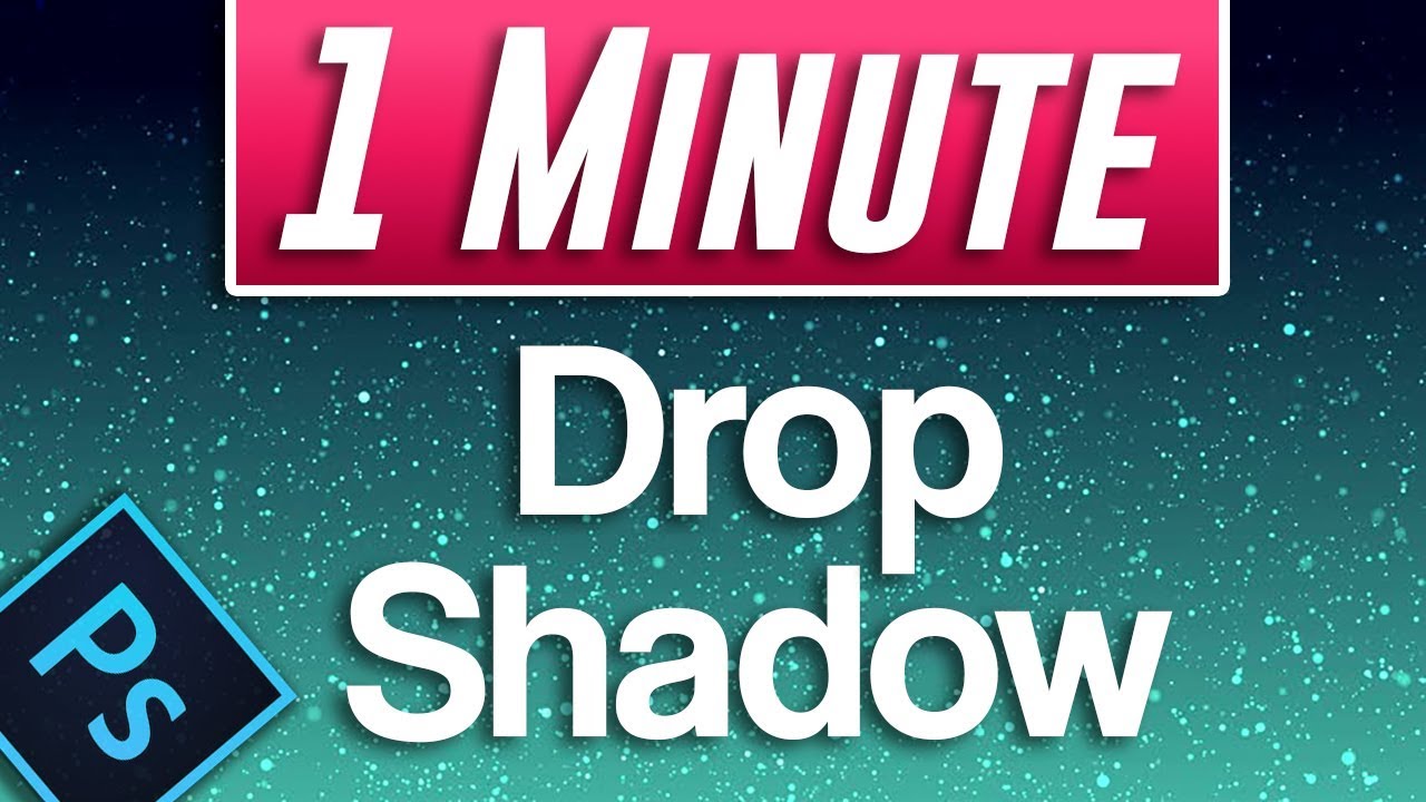
A tutorial on how to add a drop shadow to image and text in Photoshop CC 2019.
This is Willa and I added her paws.
super late
Hi all, @sturdy vault put up a video by Jesus Ramirez on how to do a bottle - was really inspired to try this so here's the result of my bottle blend project. Let me know what you think. Still learning.
https://www.youtube.com/watch?v=n3NniavNOIM

In this Photoshop tutorial, you will learn how to extract glass from a white background using blending modes.
This video will teach you the best way to select and mask glass (or transparent objects) in Photoshop. We will work non-destructively and all your adjustmetns will be...
An attempt to bring in a number of the elements that Paul has been showing - is it convincing as a film poster?
My cat May - still looks a bit too 'cut out' but appreciate the tips re matching curves
distorting type
My cat May - still looks a bit too 'cut out' but appreciate the tips re matching curves
@delicate relic wow wwwwwwwwwwwow so cute cate
Chocolate 🤤
@ivory garden i love hazal nuuti cocolate and u
I don't know the types ,I like , like dairymilk soft , smooth, mealty ...
@ivory garden my i have the honrou to flow on behnace,
@ivory garden it is web site where artist put there work its caleed https://www.behance.net/

Projects featured today by our curators
Actually I am 3d artist ,I really use Photoshop.
Yesterday I used Photoshop for composited.
My 3d art
@ivory garden do u have wet site or instagram oo i can ee your work
this is improved version ,to make this,turn text into smart object 2) click collocate texture 3) apply liuqifi filter to text , 4) apply drop shadow 4) apply bevel and emboss
Just one more...
@cinder sigil so cuteeeeeeeeeeeeeeeeeeeeeeeeee
Great edits @azure barn I loved the tones you used on the text, they are similar to the ones you have on the picture which helps to build a nice consistent look without losing any contrast! Well done!
How cute is Willa @desert raven nice job! If you want you can mask the ears to enhance the impression that she is really wearing it.
@fleet elm Super cool edits especially on the color adjustments, good job!
@mighty linden The lion one feels like a movie poster or a book cover, well done! I also like how the text of your second work is melting matches the style of the background! 💯
@unborn grail very creative work! I like how you played with type, well done!
Nice one @brisk flower! The Hollywood distortion looks really nice. Overall it seems to be an outdoor promoting a movie 😉
@delicate relic wowww! Super cute! I like the texture effect you applied, great job!
@mild spruce very nice colors and texture, I believe you missed an "h" between the c and o 🙂 . If you want you can use liquify to give the melting impression on the botom of the other chocolate letters.
@prime haven I loved how you played with the text in the bottle preserving the highlights and giving the impression that the text is really inside it. Great job!
Day 4 - Distorting Type
"My left🤚"
Day 4 - Distroting Type
Are barcodes considered as Types? 😉
@regal mica. You did a good job. Hope you enjoyed it.
@hollow yarrow WOW you took to the next level! Amazing job 💯
amazing!
@hollow yarrow Excellent! You consistently put out top notch work. Always look forward to see what you come up with and how I can top it! Unfortunately, that hasn't happened yet! 👍 👍 👍
Thanks to @coral stone and @pliant geyser for your comments. I really appreciate. 👍
Gave +1 Creative Carma to @coral stone
typography
I am bit behind, I was trying to make challenge #2 with the file provided and I was not able to do clip mask between the iceberg and the plastic bag. Anyone had the same issue? Anyone know how to fix it?
Here's my challenge 4
Forget it, done! hahaha
Tula the turtle was made from things washed up on shore by an artist in Bandon, Oregon. Maybe I should add a shadow?
Super cool, @hollow yarrow
Thanks @wise crypt!
Gave +1 Creative Carma to @wise crypt
A little behind, trying to catch up. Challenge 2
👍
Day 4
Not sure I understood the challenge but here you go.
Thank-you Valdair Leonardo! I put the hat over Willa's ears.
PSDCC #4 Distorting Type
@hollow yarrow your work is incredible. So imaginative. So well executed. I love seeing it.
@pliant geyser you have nothing to be ashamed of!!! your work aint mashed potatoes!!! Uniformly great stuff.
@hollow yarrow, great work and as mentioned by @pliant geyser, top-notch dude! I gave you a follow on Behance!
Awesome in creating visual space and still being able to create the contour of the hand in the first design. It also reminded me of this gif, captioned, "When my hand falls asleep", lol.
https://media.giphy.com/media/WJ4spk7UbsUDu/giphy.gif
Your design in 2nd graphic works well, and I see you using the displace from a previous lesson, kudos!
In terms of wording, It sounds or flows better if it were to state, "A Human Being Is Not A", instead of "Human Being Is Not A"...but then again, you would have to deal with one more added element, and all the other words would have to be squeezed in closer, or the overall design stretched more...or maybe its because its me, and what the schools have made me read things as...
In the end, if you're content, then hey, I'm happy too.

@bleak fossil Thank you, Sam.
Gave +1 Creative Carma to @bleak fossil
Here is my Pet Portrait, Day 3 Challenge plus the original images. It was fun. I experimented with Puppet Warp on some fur texture near the collar, but ended up just Free Transforming and masking.
@coral stone I am not sure if I am getting this, I did you want you said. I thin kmaybe I was truing to blend in before and dulling out and now I am not sure if it stand out too much? 🙃
Challenge 3 ✨
i have hit a wall on bending challange . some how i have removed pixels from my original and cant reverse the action.when i go to undo my brush stokes the image has been removed from my layer
i have destroyed the original layer and cant find my undo options
@hollow yarrow, great work and as mentioned by @pliant geyser, top-notch dude! I gave you a follow on Behance!
Awesome in creating visual space and still being able to create the contour of the hand in the first design. It also reminded me of this gif, captioned, "When my hand falls asleep", lol.
https://media.giphy.com/media/WJ4spk7UbsUDu/giphy.gif
Your design in 2nd graphic works well, and I see you using the displace from a previous lesson, kudos!
In terms of wording, It sounds or flows better if it were to state, "A Human Being Is Not A", instead of "Human Being Is Not A"...but then again, you would have to deal with one more added element, and all the other words would have to be squeezed in closer, or the overall design stretched more...or maybe its because its me, and what the schools have made me read things as...
In the end, if you're content, then hey, I'm happy too.
@patent estuary : Thank for your comments.
For the wording issue the main problem (I think) is: English is not my native language so you are probably right and I can not challenge you on this point 😉 ... I wanted to say: the human being as an entity is not a number... I don't know what's the right sentence but it should fit above "NUMBER" typo.👍
@hollow yarrow that is fabulous!
@light cipher Thank you!
Gave +1 Creative Carma to @light cipher
@light cipher The contrast looks very nice, you can flip the dog's head so it will have the same light direction as the person. You can use also the curves trick that Paul used to match the colors. If they become too saturated you can create a clipped hue/saturation layer and decrease the saturation a bit 🙂
Day 4 Distorting Type
@light cipher Here's a super quick adjustment with those layers that I said. 🙂
Finally found time to do it.
This is a quick attempt to distort type. I definitely need to play with this a bit more.
@hollow yarrow, no worries. English was my second language when I was in school, and the English language can be weird, as with any language..but I still got your message across.
I can see this design also going as a message against human trafficking as well.
Still great work.
@chrome current "famouse" ROFL
@patent estuary Thanks man!
You remind me I have a Behance page...Old stuff there... Need to update it 🤪
Gave +1 Creative Carma to @patent estuary
@crystal stream if you are talking the last one, the idea was to warp the text in some way. Lots of ways to do it but Paul showed using the liquefy filter on it.
@atomic lion sounds like you were on your layer and not the mask. Be sure to see the white outline over the mask before you paint.
@coral stone thank you! You are a star ⭐️
Gave +1 Creative Carma to @coral stone
Challenge 4 ☮️
@patent estuary Thank you for that comment about dropshadow! It doesn't give me the level of control I'm used to , but it certainly does the trick! Thx again!
Gave +1 Creative Carma to @patent estuary
Good stuff @cunning needle !!!
Good work @tacit condor ! You can always rotate the text to go the direction of the limbs. Then use Liquify and pinch/bulge to give it depth. But it's really good! Both of them!
Hey @atomic lion. if you painted on the original layer and can't undo then it might be destroyed. Just download the file again.
Ended up going with a black and white version. Text seems to stand out more.
@arctic rover
https://media.giphy.com/media/LeYFkniJST8wo/giphy.gif

@brittle slate If i have a photo of a page of of Hebrew text, how do I convert it into the text field to start the project?
@cunning needle love these quotes! Thanks for sharing!
Gave +1 Creative Carma to @cunning needle
First part of today's challenge! When I displace the text it gets really hard to read, even at 5-10 on the vertical & horizontal scales. It's probably because the quality of my image is not that high, will try again later with another image! Crazy to see how much more comfortable I feel with the software and making stuff after just one week of practicing!
^also used an affirmation today, felt like I needed it: "I trust my intuition"
Challenge #5 Typography Portrait. I duplicated the portrait layer, screen blend at low opacity. I painted in opacity on the top layer. Displace and liquify filters were applied to type.
My DCC day 5. I like it better not clipped. Please let me know what you think of it.
Day 5 Challenge - this was fun!
@coral stone thank uuuuu for feed back
Gave +1 Creative Carma to @coral stone
DAY 5 - Typography Portrait
Challenge Day 5
Experimenting - B&W or colour?
Not what I expected!
Here's the colour
1st attempt
Challenge 3.. Done!
Michelangelo's Moses wrapped in a page of the Talmud
Brene Brown with Teddy's "The Man in the Arena" quote
Day 5
this happens with the text file after I use Filter + distort + displace! Do I need to use another font to get the right effect? Any suggestions ? I use PS in CS6
this happens with the text file after I use Filter + distort + displace! Do I need to use another font to get the right effect? Any suggestions ? I use PS in CS6
@queen dew This was happening to me too and it was sooo frustrating. I don't know why or how, but know you are not alone!
I can't remember if Smart Objects were in CS6 or not. If not, that may be the problem.
@haughty cape and @queen dew you might try to Rasterize your text layer before you apply the Displacement Map (duplicate the Type layer first before you rasterize it and turn the visibility off, then target the rasterized text layer and apply the Displace filter)
@pastel spade I think that helped! I don't know exactly what to attribute it to, but I rasterized the text first and also added more of a blur.
hello all - hope you are well! here is my day 5!
Hello, this is my challenge for today
Hello
This is not as easy as Paul make it look. I tried a couple different ways and still end up with splotches.
Day 5 - Distorting Type
@rain dew I really like the image you created however when I first glanced at it, it kind of creeped me out for some reason.
@rain dew I really like the image you created however when I first glanced at it, it kind of creeped me out for some reason.
@sturdy vault hahaha which image?
The one with the goat head reading to the young lady.
Typography Portrait. I think this was harder for me than it should have been ... "Everyone is a moon, and has a dark side which he never shows to anybody."
Challenge -5 😆
used liquify, wrap text and fx
Brene Brown with Teddy's "The Man in the Arena" quote
@pastel spade Awesome!
Is it ok that I only did a minor amount of liquifying? I wanted this to remain respectful while being creative. Thoughts about the artwork? (regardless of which team you route for, please!) #typographyportrait #psdailycreativechallenge
Not too bad for initial try at this. I have learned from doing this, things I wish I had learned years ago. But, I have the knowledge now, and can use it going forward!
@cloud edge Good job. RIP Don! What a great man!
Why is my text “stuck” to the transformation box? If I try to manually drag the box down to make it larger, the text expands with it and vice-versa?
First time posting - decided to go with a passage from HP Lovecraft "The Book" 1938 and a portrait of Ash from Evil Dead 😈
Day 5. Not too happy with how this turned out. PhotoShop was very slow at rendering the smart filters and it took me an hour to realise that Liquify was so slow as it wasn't using the Graphics Processor!
haha, shop smart, shop S-Mart @tawdry shadow
Hi @compact pecan Try to click on this icon on the top or press enter to commit the changes.
@brittle slate u are the best teacher of mine in photoshop. 😍 💯 😍 😘
@coral stone Valdair I tried that but the text still won’t edit with the spacing in-between letters (I’m using the VA sliders). The only way I can get the text to “compress” a little is to change the bounding box.
@compact pecan I believe that's because you converted the text into a smart object. Try to double click on the layer thumbnail to access your editable text
@coral stone Same thing with the SO. I actually created the SO on purpose thinking that would solve my problem.
Gregory Alan Isakov
@strong lake the portrait you asked, there are two different pics, one is duplicated, the one on top, the duplicate has a distort motion effect, the pic in the back has the blending mode color with only blue selected and the main pic same blending mode but in red only. That is it.
I see. I believe you'll have to place the text again, then select all of it clicking quickly 4 times in a word or press ctrl+A and then try to adjust the VA sliders @compact pecan
@coral stone still no dice - I set the slider all the way to -1000 and nothing. The text size slider works, however.
Walt Disney: Always an inspiration.
@quaint badge a bit of adjustment with levels would help bring details in face edges
Also less spaces between letters will also help bring out details
Thanks, @quasi swan !
Gave +1 Creative Carma to @quasi swan
Also interesting thing you could do is use radial gradients of dark blue and yellowish-white
I'm thinking of making glowing neon face typography 😄
@hearty wharf I loved the subtlety of the effect especially on the eye area, it helps to maintain the readability of the text! Nicely done!
@zealous cradle Loved your font choice! If you want you can brighten those dark areas to reduce the vignetting and giving more room to the text appear, but that’s just my personal taste 😆. Amazing job!
@uncut grove Wowww Great job matching the arc of the cup! I also loved how you preserved the contrast with a border and made some coffee spots on the text. 💯
Cool effect @sturdy vault! I like the way that you chose a light tones image, I know it’s not easy to find a right amount of scale, but playing with distort is this, you are always fine tuning and choosing the best value that has less splotches, your are doing great! 💙
Can't say I'm happy with how this first attempt turned out. I'll try again later with one that does not have a background that is this busy.
@haughty cape very nice effect! I like both versions. My only suggestion is to brighten up just a bit on the hair area so the text doesn’t blend with it. Great job 💯 .
@sacred field The text is blending nicely to the image. My only suggestion is that you might play a little more with the displace values and/or the liquify filter to enhance the distortions effect. Well done, Marc! 😉
@ripe peak Very nice effect, Julio!
@lime meadow I loved your portrait work and how it has a sense of movement, awesome work! The displace effect has a nice drama mood with black and white images, If you want, you might adjust the leading (space between the lines) of your text just to fill more the empty areas 😉 Nice job, Fani!
@cloud edge very creative use of the effect! There’s no problem on doing less liquifying, I like how you kept the readability of the text, very well done!
@strong lake I loved how you made the effect subtle almost blending with the skin! 🙂 About your day 4, the red font really reinforces the “fear” message that the quote transmits, if you want you can play with some background color or an image. Great job!
Nice one @sullen willow! If you want to give the impression that the text continues on the edges you can crop on the right side and the bottom, good job!
@quasi swan , I tried the radial gradient with those colors and didn't care for it, so I went back to black and white. LoL.
@odd spear that’s spirit! Nicely done 🙂
Great effect, @thorn geyser! I like how the text has different direction on the hair 💯 My only suggestion is to brighten up your composition so the text and the image can appear a little more. Well done 😉
Text I find the most difficult to work with
Which font is that ,?
@coral stone thanks a lot for your great comment. I love it and so happy
Gave +1 Creative Carma to @coral stone
Ran out of time but it's getting there.
I'll post in ask a question but how do you copy and paste text into the photo shop ? I was putting it into a word document and then dragging to photoshop but that didn't work well. In the tutorial Paul said "add your own cut and paste" but didn't say how to do that. step by step would be helpful!!!
DCC Typography Portrait Day 5.
@coral stone Thanks. I need to work on this technique some. Sometimes it's about patience I don't always have. The image is my mom's graduation picture from the 30s. Turned to black and white and played with color channels. Thanks for the compliment.
Gave +1 Creative Carma to @coral stone
@safe ledge I believe @brittle slate suggested that sometimes when we find our text online, we are also copying the format as well. When you have your text:
- highlight it, and (this is for windows, and for mac, I believe there is no "Ctrl", but a "Cmd") you can press "Ctrl" + C (copy) and when you have Word open, do a paste, ("Ctrl + V")
- You may have copied the original formatting over, so if there needs to be tweaks, do so to your fitting.
- Highlight that text, and copy (same as above) (ctrl +c)
- Go to Photoshop select your Text Tool (T)
- Press the Text tool on the area you want your text
- Now paste (ctrl+v)
Hi, I'm challenging myself to remake this movie poster. I'm having trouble with the text. Can you help me
? thanks
Challenge 5. I am impressed that anyone can do this in 15 minutes!! This was loads of fun. I have much practicing to do. Thank you for this opportunity!
@forest pelican, it is possible in Photoshop, but for text I recommend Illustrator for that.
https://youtu.be/VEjdEZbM-Mw?t=608

Challenge: Create stylized text effects using 3D rotation, textures and masks.
Get the starter file here: http://bit.ly/aidcc4-27-2
Join your host each morning at 11:30am PT to learn how to approach each challenge using Adobe Illustrator. Complete 9 challenges by Friday, May ...
@forest pelican @patent estuary You can do the text in PS without issue - just make sure you turn it into a smart object so it's scaleable without loss of quality - it will stay vector format as long as you don't rasterize it.
@forest pelican,
- In Photoshop, once you created your text, convert it to a Smart Object. (this is for Windows)
- Hit Ctrl + T (shortcut for Free Transform)
- Right click, Skew, and also Rotate.
- You will have to adjust and play around.
@pliant geyser, yes, you beat me to it. I was a bit slow on typing, and gathering my bearings. Tired today.
https://media.giphy.com/media/lJnAXeJO8tE7E37mxq/giphy.gif

@patent estuary Personally, I'd probably do the photo editing in PS, then the movie title and funky text in AI, and slap it all together in InDesign...
@pliant geyser, I totally agree! Photoshop for pixel base work, AI for Vector/Type, and InDesign to put it all together. It took me awhile to understand their uses, and am doing my best to get better at Illustrator and InDesign myself. Photoshop is wonderful that it is well rounded.
https://media.giphy.com/media/kfXJTsTzz0hx6zDfBn/giphy.gif

@patent estuary I'm a graphic artist by trade, and have worked on many, many different projects over the years (I'm an old bugger by nowadays' standards). Everything from the flyers you get in the mail from hardware chains (about 50 different pricing zones per flyer) to childrens' books and more. You learn really quickly what app is appropriate for what.
@pliant geyser, I'm 38, and am ALWAYS open-minded and willing to learn. I like staying mentally and physically active, and never tire at learning, especially if its creative. I also enjoy learning from young and old as well, but that's me. Striving to be a better version of myself, than yesterday.
Anywho, yes, the right tool, for the right job, as the saying goes.
@patent estuary Ah to be 38 again! Learning is good, yes... It's amazing how photoshop has evolved in the 20 years I've been using it! Pretty cool to see how Adobe is constantly engineering new features and stuff.
@pliant geyser, I'm in no rush to age. I spend more time laughing, less stressing, and focus on things I can control. Other than that, not worth my time or energy...as it can be put towards other things.
@storm wasp good job! B&W images work very well with the displace effect creating a nice dramatic feel! My only thought is that I believe the displace file that you selected might have moved just a bit, creating this effect kind of a halo. You can adjust this by using the save as option like Paul did, if it’s that what you want, of course 😉
Awesome use of the effect on the mouth @ocean pine! Did you made that with liquify? Looks like a book that I’d definitely buy judging by its cover 😂 📖
@tropic knoll super cool job, CK! I like how the distortion preserved the readability very nicely through the peaks and valleys!
getting there thanks @patent estuary @pliant geyser
Gave +1 Creative Carma to @patent estuary
@coral stone Here you go ... I don't know if it's better or worse, but it's different! Thanks for your help! 😉
Gave +1 Creative Carma to @coral stone
Typography Portrait - Challenge #5
No problem @sacred field this effect can be very tricky on the values sometimes it's a lot of trial and error, but it's definitely worth it. You did a great job 😉
Challenge 2
And then I did this. It's not perfect but I was too lazy to make it better 😆
@coral stone Thanks! I do like that it's a bit lighter and more colorful than my first one!
Gave +1 Creative Carma to @coral stone
Challenge 5 - Typography Portrait of Chester Bennington
@safe ledge. On a PC I usually copy and paste into Word all the quotes I want . If I need to I can then clear formatting. I then copy and paste the quotes into Photoshop text.
@forest pelican,
https://media.giphy.com/media/xTiTnf6DUW2JC1heMw/giphy.gif

@ionic maple, nicely done! The text flows over Chester well! And lyrics right? I do miss him, and his music. I will play, "My December " for him.
https://media.giphy.com/media/xTQXENNW77nUsNVmV4/giphy.gif

@young karma I love your pet portrait. The colors, patterns, composition all work nicely together. I’m drawn into the story and not distracted by effects or technique. Nice job.
Just managed Day 4 .... "Just Be Kind!"
@patent estuary Yep I have “Leave Out All The Rest” on that photo. I will always miss him. 😦
Although I'm still not happy with the results, I am definitely getting better and picking up new tricks.
Looks great @tired solstice maybe use a levels adjustment layer to bump up the contrast on the image layer
Challenge 5
Typography
@rain dew What a great job with the challenge 3 goat image! You really did a fantastic job of matching the color and lighting quality of the painting with this image. The whole thing fits in really naturally, really matches the softness of the rest of the painting. If you wanted to push it even further it could look nice to mimic the rim light from the window that we see on the lady's face and both their clothes onto the goats face. I often like to use a color dodge layer for this effect. Maybe something like this?
@sullen willow Very nice! This came out well. Really nice dramatic feel to the image. I think there's a bit of excessive warping around the nose area which causes a bit of a break in the uniformity of the image, but other than that the displacement effect looks really solid. Nice work!
@brisk flower These are great! I especially like the effect on the painting image. The one where it's masked on his skin makes for a super interesting effect. The pop of bright orange hair against the dark effect is really eye-catching. I think the effect works really well when it's that light text against a really dark background. Really nice work on these!
@random sinew Challenge 5 is looking good! I like the blended shift from orange to red between the portrait and background. Gives it an interesting transition with the text. The effect turned out nicely!
@zinc elbow This is really cool! I like the font you used for this. Kind of makes it look like handwritten journaling or something. Makes it feel like it could be the cover of a book or something, very nice!
@young karma Love this one! Challenge 3 is looking really solid! I really like how the colors of the giraffe match the dress so well. I think that perhaps the contrast of the giraffe could use a slight boost, specifically in the darks to better match the painting. Really great work!
@eternal mica Looks good Ted! I like how subtle the effect in this design is. Gives it an interesting balance between the text and the image, very nice work!
@pastel spade Really strong displacement effect with this one, seems to have worked really nicely. Very cool!
@haughty cape Day 5 is looking good! The tightly placed text really shows off the image well in this design. It could be nice to brighten the face areas and maybe even add in a subtle vignette to push a little more focus and contrast into the faces. Just a thought. This effect turned out really well!
@hearty wharf Looking good Tan! The black background draws some nice focus to the effect. The edges of the statue seem a bit rough, I think using the quick selection tool could help you get a pretty clean edge. Good job!
@sturdy vault I think the images and values/lighting of it can make a big difference, and since the effect is fairly automated it can be tricky to find something that works well. But I think this came out nicely! I like how the text/background looks like a book, definitely gives the image some nice theming in that way. The colors add a lot of interest too!
@bleak fossil Thanks for the positive feedback.
Gave +1 Creative Carma to @bleak fossil
@bleak fossil Thank you Sam. I appreciate the encouragement. I feel the gauzian blur of the statue made the whole piece come together really nicely. And the Hebrew R>L text is also eye catching.
Gave +1 Creative Carma to @bleak fossil
@eternal mica For sure, it definitely adds some interest. The slight blur seems to be a trick to making this challenge work well.
@bleak fossil ive learned over these past weeks I've been doing the DCC, in every challenge it seems there's a little click that is the lynch pin to bringing together a powerful effect. I need to watch the heart of the video several times to make sure I don't miss a single step.
I admit defeat. No matter what image or text I use, nothing distorts. I rewatched the video and nothing. I had better results on the first day and they weren't good.
Challenge 5 in the books!
Day 5 - Typography Portrait
" Where is my mind?"
Photo: OliverRagfelt - Unsplash
@stable ravine I love it so much
thanks! @nova swan
Gave +1 Creative Carma to @nova swan
Day 1 - Spectacular Selfies, having my #photoshop #students take the challenge! Created this as an example for them in #Photopea for those that don't have PS.
Day 2 - Blending Images - plastic bag and ocean challenge, created this as an example for my #students, using #photoshop this time.
Daily Challenge #5 Typography 5/4/20
Thanks @bleak fossil
Gave +1 Creative Carma to @bleak fossil
Hi All, not really loving this idea, but anyways here's my challenge#5 Typography Portrait.
@cloud edge You got a really nice displacement effect with this image! It warps around the face quite nicely. The background gradient does a really nice job of separating the portrait and text effect and drawing focus to them too!
@strong lake This looks great! The slightly lighter color of the text almost makes this look like it's written on his skin. Really cool effect, balances the portrait and the text effect nicely!
@ionic maple Solid work! This came out nicely. I really like the way the coloration of the tattoos works with this image. I feel like I could imagine this being part of a magazine article about him. Nicely done!
@restive wyvern Both of these challenge 2 designs came out really well! You did a really nice job of getting that darker under water feeling with both of these. The contrast between the bag in and out of the water with the gold fish image works really well. Also the effect with the bag against the surface of the water looks really good!
@tame jacinth Nice work! Challenge 5 is looking really good. Kind of looks like it could be an album cover or something. Could be a neat stylistic effect to brighten the glasses to make it look like they have a bit of sheen, or even lighting the face area to give it more of a focal point could look good. Nice work!
@zealous cradle Nice work Jenni! The displacement effect is looking good, looks like it's showing some nice form with this image. It might be nice to brighten the whole thing up a touch, but that's really just personal preference. Solid work!
@modern halo Nice work on Challenge 5 Willi! The contrast between the two colors is looking good. I think you might get better results with the painting reading more clearly if you used smaller text, but this has an interesting effect too. Looks good!
@young karma Interesting graphic shapes created from the different sections of color on this image! Well done 😄
@tired solstice Really cool to see how all the text makes up the different sections of this image, looks good! I think it could help to increase contrast on this image with a levels adjustment or something similar. Both the brights and darks could be boosted. Might even help to try and draw more contrast into the portrait by darkening down the entire background so there’s less contrast between the red text and background, could help draw more attention to the face. Nice work 👍
Challenge 5, in my Ruby the Hatchet shirt using the lyrics to one of my favorite songs. I decided a blank background was less distracting
thanks @bleak fossil
Gave +1 Creative Carma to @bleak fossil
@golden badge The warped text effect is looking good! The overlapping of shapes adds some nice depth as well. Nice work!
@unkempt field The displacement effect came out really nicely on this one! Gives the whole image a dice sense of dimension. I think it could help to maybe boost up the brightness of the image overall, but this is looking really good!
@wise crypt Really nice concept, I like the style of this text and how you implemented it. Works well! The whole design has a nice uniform look to it, nicely done!
@tacit condor I really like the thought and concepts you put behind the warped text! Taking into consideration the concept and aesthetic shape of the text when doing warping definitely helps the final result. Making the background a slightly different hue (even just towards green-blue a bit more or something subtle) might help give the whole design a bit more contrast. Very nice!
@oblique anvil This came out really well! Very nice job making the dog fit the color and lighting of the painting so well. The masking job is looking really solid too, well done!
thanks @coral stone
Gave +1 Creative Carma to @coral stone
@wispy compass You got some really nice displacement on this one, the text seems to be showing the form of the image fairly nicely. I think sometimes this effect tends to show a bit more detail of the photo when the text is a bit smaller. It might also help to brighten up the center portrait area just a touch to make it stand out more as a focal point. Looking good!
@lime meadow Nice work on these 3 challenges Fani! These are looking good, I really like the effect in the red image, the whole image has a lot of mood to it. The dog/painting image is looking good too! I think it might help to lower the contrast just a bit. I think the lights are looking pretty good, but if you lessened the deepest darks on the dog it might help it match the painting a bit more. You might notice that the deepest darks on the dog go noticeable deeper than the deepest darks on the painting. Really good work on all of these!
@tropic knoll This is definitely one of those challenges I think you could spend awhile tweaking different things to get different results. This turned out really nicely! The displacement effect seems to be working quite well, and the size of the text seems to be nicely balanced with the image. Nice work!
@ocean pine Both of these Day 5 designs are working really nicely! The darker image has some really nice contrast between the face and background, and I especially love the lighter image. The warping of the text into the mouth is really cool. Almost looks like stretched clear plastic. Really great effect and focus to this image, very eye catching! Almost looks like it could be a movie poster or something.
@haughty cape This technique can definitely be tricky! These turned out nicely! Both the color and grayscale image have some really nice contrast. Nice job!
@stable ravine Really cool effect on Challenge 5! The way you places the text on the arms kind of gives it a tattoo type of look. I Really like your use of red in this image, looks good!
@hollow yarrow Really great use of this effect for the Day 5 challenge! I love the graphic element you added, and the separation of the text from the background circle adds a really interesting level of contrast. Nice results with the displacement effect as well!
Challenge #5 Quotes on the rocks
@bleak fossil thanks for the feedback 😊
Gave +1 Creative Carma to @bleak fossil
Sorry for being political. Couldn't resist.
Hi , here is my post. today's challenge is amazing !! moreover I think need to adjust type size and liquid expression.
Gave +1 Creative Carma to @coral stone
@golden badge The warped text effect is looking good! The overlapping of shapes adds some nice depth as well. Nice work!
@bleak fossil thats so kind of you to take the time to look at my effort... thank you for your words I find them dry encouraging 👍
Hi everyone, here is my Challenge typographie portrait !
and another one ... Like so much both of them !
Last month I did a self cosplay photoshoot of Annie Lennox in the Eurythmics music video for "Sweet Dreams are Made of This (1983)". I took an outtake from that shoot and paired it with the lyrics from the song. Each segment is colored with just a two toned gradient map of the base image. I really feel like I really got an appreciation for layer masks with this project.
Awesome use of the effect on the mouth @ocean pine! Did you made that with liquify? Looks like a book that I’d definitely buy judging by its cover 😂 📖
@coral stone Thank you so much. Yes i did use the Liquify - although it took some time to make sure it didn't just look like a hot mess ☺️ .
@ocean pine Both of these Day 5 designs are working really nicely! The darker image has some really nice contrast between the face and background, and I especially love the lighter image. The warping of the text into the mouth is really cool. Almost looks like stretched clear plastic. Really great effect and focus to this image, very eye catching! Almost looks like it could be a movie poster or something.
@bleak fossil Thanks so much for the feedback, really appreciate it! 👍
Me with The Beatles 😀 I am quite pleased I managed this, I spend most of my time in illustrator and indesign - so these challenges are great for pushing me out of my comfort zone! #✂challenges-feedback
Thanks @coral stone !
Gave +1 Creative Carma to @coral stone
@uneven flume👍
anyone got stock pics to editted
My entry for challenge 5
here is my entry 🙂
Thank you for the feedback@bleak fossil
Gave +1 Creative Carma to @bleak fossil
@blazing quail mega cool mate
Here is Day 5.
Day 5 Typography portrait, comments welcome
PS #5 challenge, the best result (sofar) in CS6. Trying to find out how to activate the liquify tool in the final. @pastel spade thanks for the help, rasterizing the text layer was the solution👍
Gave +1 Creative Carma to @pastel spade
Some variations on the same theme - not sure which I prefer...opinions?
thanks so much for feedback @bleak fossil - yes, i did rather roughly paint over the edges with a too big paint brush, hah 😂
Gave +1 Creative Carma to @bleak fossil
hello @coral stone - thank you ever so much for your comment, you are doing a fab job with feedback 😀
Gave +1 Creative Carma to @coral stone
Thank you so much @hearty wharf it means a lot 😀
Gave +1 Creative Carma to @hearty wharf
I think the best quote was from @brittle slate when he said "You can do this in 15 minutes!" I think what he MEANT to say was 15 HOURS!! Seriously, though, great tutorial - it'll just take a bit more practice. Thanks, Paul!
Gave +1 Creative Carma to @brittle slate
@brisk flower I like them all but I think the first is my fav
@compact pecan i could not agree more, I'm still working on mine, and decided at 10 last night to start over. I think yours is cool.
@cloud edge nice job. never liked him but always respected him.
@brisk flower Goldilocks solution --- 1. center -- just right!!; 2. right -- coloring looks real and background is muted nicely; 3. left -- too much red in face and background
@bleak fossil Thanks
Gave +1 Creative Carma to @bleak fossil
@severe flame nice font choice, it matches really well to the image on the background!
Very nice @viral mirage I like how you applied the tect in the background as a texture! If you want you might play with liquify to enhance the displace effect! Great job 🙂
@vagrant rapids amazing use of the shadows and the hightligts of the images. I like how the text and the displace effect create a nice visual interest on both!
@coral stone thanks! I'll arrange a part of next image with this font.
Gave +1 Creative Carma to @coral stone
@uneven flume amazing job! Loved the colors and the effect as well!
Great job @light cipher I loved the duotone you applied to the image 💯
Very nice displace effect @calm bane I like how you played with the colors as well, if you want you might brighten the shadows area just a bit, especially on the hair and neck areas 🙂
Loved the glitch effect and the displacement mix @desert lantern My only suggestion is to brighten up a bit the shadows area so the text could appear more, well done! 🙂
@blazing quail Awesome colors, Text flows nicely through the image! 
@barren ice nice job, Sally! My only suggestion is to increase a bit the leading of the text (space between the lines) so the lines can flow more naturally 😉
@south adder good job, Neil! Textured text used with the sketch is a vey nice combination! 🙂
@queen dew well done, Paul! I like how subtle the text is, my only suggestion is that you might brighten up the shadow area just a bit, especially on the neck, so the text can appear more. 🙂
@brisk flower good job on the three of them. I loved the colors on number 1 and the effect on the number 3. Awesome work, Matt! 💯
@buoyant nova great job! I like how the peaks and valleys of the text, especially on the hair area!
@orchid steeple Well done! The distortion of the text is subtle allowing it to have a nice flow around the face 🙂
@coral stone Thank you, Here is my day 5 with the leading increased.
Gave +1 Creative Carma to @coral stone
I tried another one, remembered to Gaussian Blur. changed leading. I only used one text layer on this. I understand it a little better then my first one.
@bleak fossil I've tried for hours using different text and different pictures but the same thing happens each time. Instead of distorting, it merely shifts the text up and to the side by the 20px. Text is shifting as a unit. I've tried using the starter file and same thing happens. It just won't distort. Ideas?
@rain dew What a great job with the challenge 3 goat image! You really did a fantastic job of matching the color and lighting quality of the painting with this image. The whole thing fits in really naturally, really matches the softness of the rest of the painting. If you wanted to push it even further it could look nice to mimic the rim light from the window that we see on the lady's face and both their clothes onto the goats face. I often like to use a color dodge layer for this effect. Maybe something like this?
@bleak fossil Thanks for the feedback!! Sure this effect really puts more realism on the project! Thanks also for taking the time to apply it 🙂
Challenge #5 V2 updated some texture & title text because it nagged at me in my dreams 🙂
Weird now two of my favorite brushes that I made are missing. The two latest brushes I made are there but not the ones I made before these. I wonder if I need to uninstall and reinstall. support said to wipe out preferences earlier and I did But wondering if it needs something more severe.
daily creative challenge 5
Weird for me too @primal fulcrum several of my brushes are missing. Had a lot of Kyle Webster brushes, all gone
In keeping with my comic book theme from Day 4, here is Stan "The Man" Lee, with @brittle slate quotes clipped to the various parts of Stan's features and clothing.
thanks @coral stone 😄
Gave +1 Creative Carma to @coral stone
Day 5 Typography Portrait, this was challenging, but I did it and I had fun!🙂
Challenge 4 - Done!
@bleak fossil and @pastel spade Thanks for the input and suggestions ! I changed the background to grey and fiddled with contrast, brightness and few other settings to try to tweak the image more. Over all these challenges and tutorials are teaching me new skills and improving old ones. Who said you can't teach an old dog new tricks !
Gave +1 Creative Carma to @bleak fossil
@bleak fossil and @coral stone Thank you for your words of encouragement. This particular technique seems to have awakened my imagination. One of my goals is to do a portrait in 15 minutes!!
Gave +1 Creative Carma to @bleak fossil
@coral stoneThanks again,😀 yes, I agree with you
@bleak fossil ...thank you for your feedback....I struggle with text generally...the paragraph option to cover the entire surface was grayed out and would not allow me to click on it ...I will attempt to resize and adjust the light...😋...
Day 5 challenge inspired by a T S Eliot poem
@safe ledge I believe @brittle slate suggested that sometimes when we find our text online, we are also copying the format as well. When you have your text:
- highlight it, and (this is for windows, and for mac, I believe there is no "Ctrl", but a "Cmd") you can press "Ctrl" + C (copy) and when you have Word open, do a paste, ("Ctrl + V")
- You may have copied the original formatting over, so if there needs to be tweaks, do so to your fitting.
- Highlight that text, and copy (same as above) (ctrl +c)
- Go to Photoshop select your Text Tool (T)
- Press the Text tool on the area you want your text
- Now paste (ctrl+v)
NOT working. it runs off the page and the spacing is off.
@safe ledge I assume you will have to manually go in there and adjust them, as mentioned in #2.
"2. You may have copied the original formatting over, so if there needs to be tweaks, do so to your fitting.".
You can always try and bring it into a text editor, but it may bring it into one line/sentence, and you will still have to manual go in there, and manual space them out and/or hit return/enter, to place it on another line.
Sorry it didn't work out.
https://media.giphy.com/media/RFDXes97gboYg/giphy.gif

Day 6, Glitch Effect. Comments welcome
@safe ledge Hi The trick is to format the text in word before copying and pasting in to photoshop take out all the line spaces and consolidate until you have more of a solid block of text then you can adjust the font size and leading in photoshop
Day 6. For Revenge of the Fifth...
DAY 6 - Glitch Effect
Day 6 - Glitch Effect
My take on challenge 5 starting from a small crop of a photo I shot in 2017, i love this technique
Challenge #6. My favorite singer of all time - Justin Hayward of the Moody Blues. Didn't have a chance to do yesterday's challenge, so I threw some text on him and really like how the filter effects played with the text.
@brittle slate ..Tried with Arabic letters quotes but failed to reduce the size of the letters
Day 6. For Revenge of the Fifth...
@zealous cradle very cool
I still don't understand WHY anyone would want to do this, but it was fun to play with. I uninstalled and reinstalled PS and still the distort does nothing. But all the ones from today's challenge worked like they were supposed to.
3D Box Effect #✂challenges-feedback
5.5.2020 PS Creative Challenge.
Typography challenge
here's my glitch entry from today's challenge!
Glitch challenge. Did not the wave effect is so usefull
DCC day 6 Glitch challenge.
The Heavenly Glitch - Day 6 - By Vandam Dezigner | 10 Years old
@cerulean steppe L 👀 K Nice, change the typeface of Arabic it will appear 😉
thanks so much @young karma - maybe still a bit subtle ...
Gave +1 Creative Carma to @gritty dust
@arctic mountain so nice, I worked with image a lot 😆
@hearty wharf that's what made it simplistic and elegant 😍
ha ha - @young karma you are too kind!! 😃
Day 6, Photoshop Daily Challenge. Glitch Effect. (and glitch in making this! : )
Great job @sacred field !!!
@brittle slate Thanks, Paul!
Gave +1 Creative Carma to @brittle slate
@arctic mountain I really like yours too!
What I created today. Scaled back some of the effects.
This one uses the Mirror Elements Free Template to make it look like fractals/shatteredglass.
This was done reaaaal quick. Because I was asleep during the challenge
@brittle slate your image is just amazing, the effect of the mirror give a nice and fancy effect 👍
thanks @hearty wharf 😉
Gave +1 Creative Carma to @hearty wharf
Typography Portrait - I tired to distinguish between background, face, eyes etc. I wanted to make more clear for face's parts though. The text I used lyrics that is Anne-Marie' song, Perfect to Me.
thanks a bunch @brittle slate 🙂
Gave +1 Creative Carma to @brittle slate
TypoPortrate had a go at adding gradient and gradient map also so three images ... feedback would be apprieciated, thank you in advance peeps 🙂
@young karma you nailed it
Catching up-Challenge #4. Is there a way to make a brush design larger? I was trying to make the texture on the text highlight look like fishnets.
Photo I took of my GF while out on a bike ride in this new normal
@primal fulcrum wow i feel for you. is there anything more frustrating than failing to have technology behave in its expected manner.
Hello. Cool effect. Thanks
glitch effect
daily creative Challenge6
Word wrapping,
Think I like this one more #inthematrix
Finally got the color glitch working. Should I remove the halftone lines from the boy?
Hello there! I just started today, I'm super excited. what you think? 😇
NOT working. it runs off the page and the spacing is off.
@safe ledge Two options to try, instead paste it with Word or another text editor with format options, try to paste it into the notepad (windows) not sure what will do on mac, that will take out all the format from the text, then you copy it from there to Photoshop.
Option 2: in Word, there's a tool to delete all format, is in the Home tab, on the group Font, and is an A with an eraser. Then you can copy it from there to Photoshop.
I hope it helps...
Day 6. Had alot of fun with this one!
I apologize in advance. I just couldnt pass this up. I'll post a glitch photo of myself later today or tonight
A little behind because work was demanding last week. Here's DCC #4 "Distorting Type"
And here's why you need to spell check 😑
My type portrait, Challenge 5 I think.
First time doing the DCC. I like how it came out
I think I actually had this TV as a kid. And I was the remote control - my dad would tell me to change the channel, and I would stand there turning the dial until one of the 3 channels had something on people wanted to watch. Also - This is my Day 3 "bending pixels" image on the screen. Do I get extra credit for that?
Day 6 Challenge
I Felt thought my photo needed a tile
distortion 2.0 PS challenge #6 so much fun, gone start all over again tomorrow 👍 have a nice day guys
Here's my Glitch self portrait. The picture is waaaaay old!!! 😜 😜 😜
These typography portraits are creepy!
@cold oyster nice concept. nice execution
Just what 2020 was missing...a cat with a glitch
@cold oyster old portraits low key freak me out. with added glitch it's just.... 👻
Hello there! I just started today, I'm super excited. what you think? 😇
@sturdy briar great image Em 👍
My entry for challenge 6
Can you critique me on this picture please? I'm trying to develop the perfect image of my daughter as a present for her mother on Mother's Day.
I'm fairly certain the weirdness that is me and my husband is definitely scramble-channel worthy.
@thorn pond Looks really good to me. But maybe make the font a little bit bigger?? But I love it
Thank you @storm pine Let me see if I can make that text bigger
Gave +1 Creative Carma to @storm pine
@thorn pond one man's opinion, for an image like this, less is more. Simplicity. The text overlay is very distracting to such a beautiful little girl. You may want to try some effects like vignette or feathering to highlight the face. Maybe the face/hair in color and the rest in B&W.
Thanks @eternal mica
Gave +1 Creative Carma to @eternal mica
I wasn't happy with my Day 5 of Stan Lee, so I went back to the drawing "board". Thoughts on the revised version?
@untold gust If you can really get some sharp contrast in the levels on the B&W file, that will make the lettering distort a little more.
@thorn pond but if her mother likes the text, who am I to say otherwise.
I made the background text with less opacity and lightened the words on her face. @eternal mica
Glitch Effect - Challenge #6 Rod Serling
DCC Day #6 - Glitch Effect
Ok I had a very difficult time with this.First, getting the text onto PS. I think I finally kind of got that but then it became this goopy mess. Perhaps my text wasn't large enough. This is supposed to be a horse. I thought he got a bit to fast in the middle..? how do you have the black and white and the other image showing (12:21)and then TOTALLY lost around 14:03... text goes somewhere and then it comes back? Hey please explain steps cause some of us have NFI what you are doing...
awful
no I don't think so I will see
DM me and I can do my best to help
so this is moving with a clipping mask, but you can't read the type and it's just not so great...
Looks super cool tho
thanks. but I thought the idea was reading the text. maybe I missed that. shall try again later. I appreciate your help!
Why is my text “stuck” to the transformation box? If I try to manually drag the box down to make it larger, the text expands with it and vice-versa?
@compact pecan were you able to convert to paragraph text? doing so might fix that issue.
Maybe a tad overworked?
@golden badge I loved how the gradients effects gave a great color mood to your works, well done!
@vernal ice you can use the [ ] keys to adjust the brush size, also here’s a nice tip: if you want to create a straight line with your brush, click with it on the canvas > place the brush in another area > click while pressing the shift key. Photoshop will create a straight line between these points. You can use this tip to create the fishnets and later apply the liquify for some distortions. Nice job on your day 4! 😉
@nova swan Very creative use of the glitch effect, amazing!
@daring dock awesome glitch effect, Shuja! I loved how you mixed the colors without losing the context, it created a nice interest on the composition making me want to know who is he? What’s his history?… Well done!
@azure barn I like how this font reminds of those aged papers with the letters written by hand, if you want, you might play with an image or just a solid color on the background and give some paper textures to it, it will help to enhance the aged mood 😉
@normal yew The binary code creates a nice technological Matrix feel on the image 😄 , My only point of feedback is that you might play with the text’s contrast, since this is a busy background, the text tend to blend with it, especially on the bright areas. You can either try to play with the position/scale or darken a little bit on the area that the text is placed on the background especially on the left. Nicely done, Michael 🙂
Hey @coral stone i used most of my assets in my edits are from pexels.com
You are doing a wonderful challenge @daring dock 🙂
@sturdy vault This quote is beautiful! Nice job on the glitch effect, I thing you should keep the halftone lines from the boy also, if you want, you can apply the glitch effect on him using a different color form the girl’s too see how it looks. Good job 🙂
That’s a great start @sturdy briar! Can’t wait to see your next challenges
@thorn geyser those colors are awesome! The extrude effect creates a nice movement to your composition. Well done 💯
@balmy summit Loved your shark and how the background creates a great context for it. If you want, you might play with some solid colors or gradients on the text (shark) layer, great job!
@oblique anvil The wavy text on the background is awesome, also great job on the gradient choice for it it's very subtle and doesn't compete with the subject! Nicely done!
YES @compact pecan! Great job mocking up on the TV and also for the combination of the day 3 challenge. 💯
Thanks @coral stone for appreciating my work
Gave +1 Creative Carma to @coral stone
@golden badge I loved how the gradients effects gave a great color mood to your works, well done!
@coral stone many thanks for the positive words it’s so encouraging to receive such...
@storm wasp loved how you blended the effect to the skin, very nice job!
@storm pine very nice, Travis! The color palette that you used created an interesting effect to the image, nicely done!
@cold oyster WOW! I loved the animation and the other compositions as well, amazing job! 💯
@queen dew I like the colourful rectangle contrasting the black and white image, it creates a nice focal point for it 😉
@eternal mica I like the squares glitches of your image and the texture as well, did you use the wind effect to make it? Good job, Ted 🙂
@cloud edge yes, I was able to convert it but I still had something else going on with the text. I ended up starting over from scratch and everything worked as expected then. Thanks!!👍
@arctic rover, now we’re ready for 2021 😂 Loved your glitchy cat. About your day 5, if you want a general special color touch, you can play with Gradient Maps or Color Lookup, they will create whatever mood that you want for the image. Great job, Jude!
@quasi swan nice glitch effect! Loved the way you extended the reflections and how it looks really great with the texture! Well done!
@blazing quail nice job showing the before and after of your image. I like how you played with the wave effect, very nice job!
@thorn pond very create use of the text! The way you played with the positions of the words gives a special look to it, great job!
glitchy avocado anyone?
@hearty wharf OMG I MEAN Fantabulous!
@tame jacinth Nicely done! The distorted text feels really great with the composition 😉
@ocean pine awesome pattern combination, great job!
@livid jewel I loved that you used the Photoshop interface in your composition! Great job distributing the colors as well! 💯
@coral stone Oh wow, THANK YOU for that shout out. That really makes me feel great. Actually, I used the filter gallery>graphic pen>right diagonal to create the overall texture. Then I used the RGB boxes to create separate color models and moved the images before forming a group. Then I used the wave filter set on square @5 generators, wavelength min/max both at 325.
Gave +1 Creative Carma to @coral stone
Awesome job @eternal mica thank you so much for sharing 🙂
Gave +1 Creative Carma to @eternal mica
My rough day5 to Detoirt Become Human
The challenge from Yesterday
Challenge 6
Thanks for the tip, @quaint badge. Will report after I play with the levels on the BW file.
Gave +1 Creative Carma to @quaint badge
DCC #5 I think I'm going to try a different version with plain text next. The original photo was already black & white so I added a bit of color to her with gradients.
glitch
Changed the levels on my BW file as suggested by @quaint badge. You can see more distortion on the face, the shirt, the jacket. On to the next challenge now.
had some trouble with the layers, i wish i could show all of them xd
@coral stone thanks for the feed back. I removed the the lines and added different effect. Gives it a different feel. On the first one I was going for her the misfit and het the "normal". I think I like the two different types of misfits.
Gave +1 Creative Carma to @coral stone
Second copy with a different glitch.
@balmy summit I really like your DCC#5. I like the feel the gradient gives the portrait. I really like the different size of the letters and different positions. I don't know if you planned it but I like the location of gentle above her eyes. Good job.
@mighty linden your glitch makes my head want to twitch. lol
Tried out the distorting type challenge today with one of my grandpa's favorite quotes! Would love any feedback you all have.
@untold gust , looks good! 😄
@sterile jackal I really like your quote grandpa's quote and your treatment of it. I can't quite read the line above TODAY. It just be my monitor or maybe that one line could be a bit darker to contrast with the background. I love the textures and the arrows. Nice.
@coral stone Thank you for the feedback. In the process of making that background, I figured out that the option key would make the twirl go in the opposite direction.
Gave +1 Creative Carma to @coral stone
@cold oyster I love that you used vintage photos. I have a bunch that I've collected and plan to use for one of these challenges if not this one. Your images are haunting and your animation creates mystery. Very cool.
@arctic rover I agree, creepy. 👀
@sturdy briar Nice job. You did a nice job incorporating the background images.
Just finshed challenge 3
glitched
Daily Challenge - Glitch effect
@thorn pond very create use of the text! The way you played with the positions of the words gives a special look to it, great job!
@coral stone Thank you very much!!!
Challenge #5 ✨
Type Manipulation challenge from last Friday.
Day 6 - Glitch Effect
Flying Dog
Photos: Elia Pellegrini & Connie Kwan - Unsplash
Challenge 4 Distorting Type
Challenge #4 Distorting Type. Thoughts on the overall legibility? I’m not finished with it yet but I’m falling behind. 😊
Challege 6. Baby Squirrel. I waited forever today for the twin of this baby squirrel to return. This one proved to be quite curious.
Challege 6. Baby Squirrel with the WIND Filter. I tried different filters but liked this one the best. Thanks for the introduction to these Filters!
Hi! Typography Portrait Challenge
Challenge 6
Typography Portrait - Enter The Dragon
@inland kiln Aww, super cool! I don't think I've seen anyone do a cat yet, I was kind of curious how this effect would work with fluffy fur like that. Nice contrast between the cat and background too. This looks really good!
@young karma Nice work! The variation in text and size between the hair and the face makes for a really interesting graphic look to this image. Almost has a sort of newspaper look on the hair. The displacement effect looks like it worked well, nice job
@south adder Really nice! The horizontal lines and color shift definitely makes this effect work. I'd recommend maybe making a few areas where a thinner and longer segment is shifted out of place a bit further, I think that can often add nicely to this type of look. Well done, the colors give it a bit of an aged 90s movie look too!
@pallid wave Really cool, this looks great! I think the green and red give it an almost spooky look in addition to creating some really nice contrast. I love the wispyness of the second design too, great effect!
@zealous cradle Ooh, I love this. The glitch effect in this sort of context is really strong, breaks up the uniformity and creates a really nice focal point. A bit of narrative too, like that one clone soldier in a sea of many that looks just like them is somehow different. Nice work!
@zinc elbow Nicely done! The blue does a nice job of breaking the image up in a balanced way. The red done creates an almost creepy mood in this image too, adds a dramatic feel. Great font choice for this one too!
@odd spear That sort of dissolve looking effect is really interesting. That along with the colors gives it a less uniform looking glitch effect which is really interesting. Almost like the color is leaving him. Looks good!
@young karma This turned out really nicely! Some great sense form with the displacement effect in the face. This is more just personal preference, but it could be nice to give the portrait a bit more contrast through brightening it up a bit. I like how it's already separating a bit color temperature wise. Solid work!
@dim brook Very cool Ceci! Interesting to see this effect both with and without the text. The colors in the glitch effect work nicely! It might look nice to separate the portrait from the background in the text challenge. Maybe if the letters on the background were darkened down a bit it would draw more attention to the silhouette of the portrait? Just a thought. Nice work on these!
@cerulean steppe Very cool! This turned out really well. Some great sense of form in the nose, mustache, and face area. I think this effect seems to work well with smaller text like this. Looks great!
@chilly hawk This came out great! I really like the color gradient and texture in this! The displacement effect looks like it worked quite well also. Really nice contrast and composition to the whole image, nice job!
@daring slate Really interesting effect with these two combined! The way the lighting is placed almost makes this image look embossed. It could be interesting to separate the figure from the background with more of a hue or value contrast to make it stand out more, but that really just depends on the look you’re going for. This has a really cool look!
@tropic knoll Very cool to see you using your own photo! That’s always fun to do. The wind filter is really interesting in this design, definitely gives it a bit of a sense of movement but also almost a sort of painted look. Really liking this lighting in this photo. Very nice!
@winter tinsel Very cool! I especially love the text cocoon on the word “over”, it has a really nice sense of form. The black text seems a little out of place, I wonder if a dark purple might fit the color scheme of this image a bit more by mirroring the purple in the butterfly? Might contrast against the yellow background nicely as well. Really nice work with the text effects in this!
@teal hawk Looking good Kathy! I like the concept with this type challenge, the contrast between the name and the quote works well. Nice job!
@hollow yarrow Super cool! It could be nice to see the original photos to get an idea of the before and after. This came out great! The dog face, graphic elements around it, and texture all work really well together. I think the text style and placement fits really nicely as well. My only thought, and this is minor, is a touch of increased brightness around the head region might help strengthen the focal point. Great stuff!
@pastel spade Awesome to see you doing all these, looking good! Really liking that texture on the text along with the purple backing, really cool effect!
@tropic haven Ooh, really creepy effect with the red eyes and the mouth! Nice glitch looking effect on the black a white image. It could look cool to give the blue/green back image a little bit of the glitch effect with some horizontal lines. Might reinforce that glitch look while still contrasting the look of the front image nicely. Just a thought, looks good!
@rain dew Challenge 5 looks great! I really like what you did with the color gradient, and the background contrasts the portrait nicely. The greatest contrast with the text is definitely on the face which gives this whole image some really nice focus. Nicely done!
@young karma Nice work with the glitch effect! I like how the background has a sort of digital look too. I think the effect is looking solid, but it might help push that look even further if a few key areas are offset even more, or perhaps even some thinner lines that are further offset might look good. It might help push that glitch look more at a glance. Texture is looking good too!
Hey @fathom sail b&w sure 😉 look 👀 great
@mighty linden Hah, I like the theming of this! Works really well for this effect. The colors seem to fit that look and feel nicely too. Looks good!
@lime meadow I like the offset image effect in this glitch challenge! The way you faded out the red lines balances the image nicely and does a nice job of pulling focus to the face!
@fathom sail Very cool! I think they both look good though the grayscale one has a bit more of a retro look to it. I think the glitch effect on the one with the bright colors seems less noticeable because all the colors in the image are quite bold, though it's kind of a look look on it's own. To push the glitch effect on the colorful one perhaps adding in offset horizontal lines throughout the image might help. Nice work on these designs!
@clever stump This came out really well! I really like how there's a lot more contrast on the figure, and though the background still has the text effect it doesn't draw the eye nearly as much. Really great stylized look to this, and the text turned out nicely!
@hollow ridge Oooh, perfect use for this challenge, great idea! The green/blue color works really well with this, and gives the red and blue effect some really nice contrast. Great work with the text as well, it really helps push that gitchy digital look. Very nicely done, this turned out great!
Keeping with my last few projects using comic book related media, Marvel Comics wouldn't be where it is today without the creative genius of Jack "King" Kirby. Here's my Day 6, a Kirby portrait with glitches inspired by one of Kirby's most colorful creations, The Incredible Hulk.
Challenge 6. Ver 1.
My first attempt with glitch effect please let me know your thoughts. (Challenge 6)
Day6
Challenge 6
3 versions with a fly picture i took in the backyard. Let me know which one you like best.
Challenge 6. Ver. 2. Not fully happy with this one. I'll keep trying...
@ruby panthersuper 👌
Thank you @calm bane
Gave +1 Creative Carma to @calm bane
challange 5.. huft i'm late 😕
GIF from Nadia
@coral stone thank uuuuuuuuuuuuuuuuuuuuuuuu u are truly gury
Gave +1 Creative Carma to @coral stone
My Day 6. Scary Shark
How's my glitch? - I also added a "light leak" that I heard about watching Voodoo Val a bit yesterday (https://www.behance.net/live/videos/5973/Star-Wars-Inspired-Illustrations-with-VooDoo-Val-2-of-2?tracking_source=to_replay about 50 minutes in) which gives a great background

Join digital artist VooDoo Val on Adobe Live as she celebrates May the Fourth and Revenge of the Fifth! Exploring the light and dark sides, Val will create persona characters of a hero and villain inspired by Star Wars. Val will incorporate community feedback and participation...
@oblique anvil Thank you for the feedback! 🙂
Gave +1 Creative Carma to @oblique anvil
Day 6 - Glitch Effect
GIF from Nadia
Thank you Paul I enjoyed doing this challenge
@Paul Trani thanks,it was full of fun for me
Glitch version 2.0
thanks so much for your comment @golden badge !! 😃
Gave +1 Creative Carma to @golden badge
@odd gull im enjoying the colors on yours, you can really see where it splits apart! good work!
@quasi swan Great Glitch Effect!
A little behind because work was demanding last week. Here's DCC #4 "Distorting Type"
@balmy summit Well Done and I love the distorted background!
Challenge 6
@left abyss Great work!
@bleak fossil Thank you
Gave +1 Creative Carma to @bleak fossil
why .png can't be opened with Ps ? (This display me that ICC profil is invalid)
@bleak fossil Have a question - the colorization accomplished by turning off channels in the layer styles panel is not working for me. Is there something I might be missing?
At the race track... 100mph, knee on the deck - woohoo!!!
Spent an hour on this only to come back to the one I did in the first 10 minutes! 😆 C'est la vie.
@crystal stream That's the way it goes sometimes... Sometimes quick and easy is better than agonizing and overworking things.
Thanks @eternal mica , @balmy summit and @oblique anvil the glitch makes me think of all the creepy movies that use that I figured I try it.
Gave +1 Creative Carma to @eternal mica
@hollow yarrow Super cool! It could be nice to see the original photos to get an idea of the before and after. This came out great! The dog face, graphic elements around it, and texture all work really well together. I think the text style and placement fits really nicely as well. My only thought, and this is minor, is a touch of increased brightness around the head region might help strengthen the focal point. Great stuff!
@bleak fossil : Thank you for the feedbak. Here are the images used and the artwork updated according your suggestion
@coral stone Thank you, I like it but it's not where I want it to be yet either. It's been so long since I've really used the animation aspects of Photoshop so for now I relied on the onionskin.
Gave +1 Creative Carma to @brittle slate
@jaunty jewel very nice! I like the variations of the wave effect you applied 🙂
@untold gust good image choice, Scott! The colors really stand out nicely from the background, also the halftone pattern worked very well!
@ruby panther I loved your image, she looks so stressed out that started glitching haha great job! Nice dispersion effect on the V2 as well, if you want you might apply the glitch on the dispersion to see how it comes out 😄
Very well done, @abstract tulip. I like that you used more than one channel to build the glitch effect along the small rectangles!
Nicely done @tardy ridge If you want, you might use a little bit more colors to enhance the effect. They will match really well with the color mood of your image 🙂
@left abyss very creative use of the effect, Nicole! It came out great 🙂
@paper chasm awesome work, Michel! Which one is your favorite?. Great job putting it in the TV mockup 🙂
Unnerving and cool work@flint pecan 👌
@mellow crypt no worries, keep going 😄 I loved how subtle the displace effect is on the text and how it works very well with the typeface that you used!
@calm bane Awesome job creating a GIF 💯 I loved the variations of the glitch effect that you created especially on the second version!
@barren ice the scary shark looks very nice! If you want, you might play with some textures to enhance more the effect, good job!
@coral stone Thanks for the feedback! I'll play with that.
Gave +1 Creative Carma to @coral stone
Color me pink
@brisk flower I loved the combinations of the challenges, great job! My only suggestion is to reduce the opacity on the light that is covering the head, it will help you to create more depth to your composition. 🙂
@buoyant nova nicely done, Susan! I like the square shapes that you used on the composition and how the glich is working very well!
@quartz prairie Good job on your day 5. I like how the displace effect worked really well especially on the hair. If you want, you might brighten up the image just a bit to enhance even more the effect 🙂
@uneven flume Nice job combining the image to the glitch effect! They created an awesome context for your composition!
@odd gull great job, Helena! You might use the scale option when you are exporting to increase the size of your image or choose at least 800px, on your canvas size. It will help you to increase the overall size of the image 🙂
I loved the distortions @young karma! If you want, you can apply more of the glitch effect on the edges of the statue and/or on the other elements, so it can have this nice movement that the distortion created, good job!
@coral stone Thank you
Gave +1 Creative Carma to @coral stone
@coral stone COol, thanks
Gave +1 Creative Carma to @coral stone
@coral stone Thank You!
Gave +1 Creative Carma to @coral stone
Day 6 ! This one was kinda hard for me
@honest glade It was worth it. I really like the way it turned out. I like the larger color glitch.
My Day 6 Glitch Effect
@chilly hawk your portrait is quite lovely. The cool coler gradient adds to the peacefulness of the image. You did a great job on the text effect on the lady. Good job!
Day 6 ✨
My Day4 animated with Glitch effect...
"Progress is around when a MP4 is lighter thanAnimated GIF 😆"
Animation capabilities of photoshop could be a topic for a challenge
@fathom sail I prefer the black and white.
@hollow yarrow awesome
I had so much fun doing this!! Thanks @brittle slate for another great challenge 😄
Gave +1 Creative Carma to @brittle slate
@hollow yarrow awesome
Thanks@serene fog
My Day 6 Glitch Effect
@oblique anvil : Great job. The golden wind band gives some punch and fit perfectly with the distortion effect
how do i change a smart object to smart filter .?
@atomic lion A Smart filter is what you apply to a Smart Layer. Does that make sense?
@serene fog Awesome ghostly effect! Well done!
@hollow yarrow great example , super creative, I think you knocked it out of the ballpark
@hollow yarrow thank you 🙂
Gave +1 Creative Carma to @hollow yarrow
@hollow yarrow great example , super creative, I think you knocked it out of the ballpark
@nova swan Thanks!
Challenge #4 Revision! Thank you @bleak fossil always with the best suggestions. I changed the text color to dark purple. Much better! Thank you!
Gave +1 Creative Carma to @bleak fossil
how can poeple get creative carma ?
Challenge 6 Glitch effect 🙂
Thanks for the feedback @bleak fossil it's been a good exercise for me to fully participate.
Gave +1 Creative Carma to @bleak fossil
PS challenge #6
@coral stonethanks 😊
@hollow yarrow Thanks. I learned that in @crystal aurora 's last DCC.
Gave +1 Creative Carma to @hollow yarrow
Less than 30 min 😀 💪
@coral stone Thanks
@coral stone Ok...thank you
Here's my final. With the correct Willis Tower. 🙂
Here's some nice depth of field from Dimension.
And then you can control that blur in Ps. Here's my video on how it's done: https://www.youtube.com/watch?v=8Msox8DIDR4

In this episode of #PHOMO, Paul Trani shares the latest and greatest in Photoshop on desktop and iPad. Watch this video for helpful tips and tricks to end those feelings of #PHOMO when it comes to design.
SUBSCRIBE to our channel for more tutorial content from Photoshop exper...
Blur effect Behance challenge, comments welcome.
Oh man i can't wait to start editing this one today!
I am not very sure that this respect the theme but...
I am french and my english is bad
@south adder Is there any chance you can make the blur a bit smoother? the upper part of the ellipse is pretty visible on the left side of the image. Love the colors!
ok... so, blur would mean smooth ??
My attempt at day 6 challenge
@chilly hawk Really nice work on the typography portrait.
Here is my attempt to do a "Glitch" distortion photo for yesterday's challenge. I missed most of today's life feed, but will look at that later and try to work on a blur project after.
Day 6 - Glitch Effect
@winter tinsel Nice! The change looks good!
Glitch - 2nd Attempt
My attempt at the blur challenge, I think I went a little off-brief but enjoyed doing it and that's the main thing! 🙂
@coral stone don’t know which one i like best. The BW is for the effect the best. The color one for the detail. The tv is too small for me regarding detail, but is the most fun due to the setting... haha so don’t know what to use for my behance.
blur effects,,,,,, #challenge done.................................
@flint pecan No, blur means that it's not sharp 🙂
@brazen egret nicely done! The mountains are always an interesting decor i find! Just one tip if you don't mind, check the hair of the model on the left. Masking isn't completly done overthere 🙂
I had this photo I took that felt kind of post-apocalyptic so thought it would work with the glitch effect. Going for the eerie "found footage" look... what do you guys think?
I apologize, i will try to submit the challenges as soon as i finish them, Challenge 2 😩
I had fun learning to work with the blur effects. what you guys think of the end result?
Playing catch-up I think my PS/computer has become possessed. This isn't quite what I wanted but before my computer explodes, I'm gonna post what I have and try to see what in the heck is going on.
DAY 7 - Blur Effects
DAY 7 - Blur Effects. Oops, wrong one. I amended the text to make smaller and have the name on a separate row
@fathom sail - love the rich colours
Photoshop Daily Challenge, Day 7. Blur effect using motion and spin blur tools.
Background image.
Get down, go fast car ...
@sterile jackal I really like your quote grandpa's quote and your treatment of it. I can't quite read the line above TODAY. It just be my monitor or maybe that one line could be a bit darker to contrast with the background. I love the textures and the arrows. Nice.
@oblique anvil I was worried about that! Turned out I needed to walk away and come back to it. Thank you!
@sterile jackal it would be in my opinion look more good visually if you put the today in a center box
Like not coming from right side
Cause tomorrow and yesterday are already both coming from different sides
To show visual contrast and difference for today I feel if you place it in a center box
The viewers eyes will immediately distinguished the hierarchy
@sacred field in the first photo that you made you could add some shadows under the car just like the porche one... would look better
@quasi swan ooo yes, I'll try it out!
@agile saffron Thanks, I will add some more!
Gave +1 Creative Carma to @agile saffron
Challenge #7: Blur Effect
if i could rate them i would say : Image : 9.99../10 and quote on top : 10/10
@sterile jackal It's looks great. You're welcom.
@agile saffron Here's the image with more shadows under the car.
daily Creative Challenge 7
Quarantine with a 20 month old and a 6 week old = Day 2 challenge on Day 7 lol
Distorting Text
challange day 3/4 i dont remember 🙂
Magnetman Saves Chicago (well, most of it)
Challenge 7
Challenge Day 6
Challenge #4 Fixed typo, no brain and fat fingers this week I guess 😦
Godzilla v Mothra over Napoli. Need more practice with the blur tools but this was certainly entertaining.
original pict of rose -distort and blur effect
@hollow yarrow VoodooVal did an animation project about three or four weeks ago.03/30-04/10 #6
@young karma beautiful, again
PSDCC #6 Glitch Effect
@zinc elbow very nice coloring. well done
@serene fog very nice job; color gradient really works well.
@strong lake oooooooo so nice
Another challenge that could use something. Should the front butterfly be darkened?
Thanks @eternal mica
Gave +1 Creative Carma to @eternal mica
Day 7 🦋
@tacit condor PSDCC#5.....is Super DOPE!
PSDCC #7 Blur Effect
Challenge #5
Hi everyone, I took one of my photo this time! Here are the "Gorges de la Jonque" in South of France for Challenge #7 ... not satisfied at all, Ps is so difficult for me !
@fathom sail I like the subtle transition on the butterfly’s wings on the middle. I also like you created a shadow for the text stand out more. Nicely done!
@pale grail I loved the texture you applied on the halftone pattern, did you use the Dissolve blend mode? Looks amazing!
@zinc elbow these colors are awesome, great job! I also like the subtle color transition you made on the text from white to a blue-green tone. My only suggestion is that you might increase the transition from the sharp to blur areas to enhance the effect. Well done Angie 💯
@dim brook nice effect, Ceci! I like the high contrast lights on your image! My only point of feedback is to brighten up the dark tones so you can recover some light information on those areas. Good job! 🙂
@daring dock very nice job. I like the the mood of the colors of your image and how you played with scale on the butterflies creating the effect that some are near and other far away! Nicely done!
Haha, no problem @red moat! Your day 2 is really great. My only suggestion is to give the plastic bag more cyan/blue tones. You can do that in many ways, one of them is with color balance. Create a color balance adjustment layer and use the sliders to add colors on the highlights, midtones and shadows. Well done, Mike 🙂 .
@bitter zodiac Looks very good, MJ! 😎 I like the warm tones on your composition. If you want you can play with some warp styles on the text. To do that you need to select the text and go to this icon:
If it is a rasterised or a smart object player you just need to press ctrl + T and click on this icon:
And from the Warp drop down on the top bar you can choose a preset and fine tune the effect 😉
@serene fog Loved the combinations of the challenges. Great job on the texture and the color, I like how it goes from colourful on the top to kind of grayscale on the bottom. Nicely done!
@brisk flower I loved the Magnetman haha 🦸♂️, very nice hair masking, Matt! Also I like how you played with the sky to help the image tell a story. If you want, you can create some shadows on his feet to give more realism to the composition.
@modern halo I like the creative use of the blur! If you want, you can use the smart filter layer mask to create a quick transition from sharp to blur on the image. You can achieve that by using a soft round brush with black as foreground color and paint on the mask 🙂
@random sinew Nice contrast on the image, I also like how you used different colors to create the glitch effect, good job!
@plain sable I like the font combination and how the serif one has a nice texture that works really well with the background you used. Nicely done 💯
@arctic rover, very nice job, Jude! My only suggestion is: since Godzila is very sharp, the area where he is should look sharp as well, you can use the blur on the buildings on the valley in the background to create the depth of field effect!
@strong lake this is very creative, the colors are awesome! Well done 😉
@tacit condor nice glitch effect! I love the cyan tones on your day 7 and how you applied a shadow on the spider helping to be even more realistic, great job!
Very good job @sturdy vault! I like the light values on the butterfly in the front. If you want, you might give a subtle amount of path or motion blur on the butterfly in the back, it will enhance the impression that it is flying. Well done!
@thorn geyser loved the night scene and how you played with the scale of the butterflies!
This is very creative @shadow barn! I like that you applied a shadow where the dog is standing. Very well done! You can use the path or motion blur to enhance the movement on the butterfly 🙂
@winter tinsel awesome work! I loved the work with the brushes and the texture you applied on the background as well. My only suggestion is to increase the canvas size a little more on the top side, so all the pencils could show. Very well done!
@vagrant rapids, beautiful photo! My suggestion is that you might decrease the amount of blur on the background to give it more natural feel. Also great job on applying noise, don’t give up, you’re doing great!
@coral stone thanks. I will work on it. I think I looked at it too much. Cut out spider, butterfly and tried two different dragonflies that didn't make the cut. Someday I will figure out the masking tool. All of the instructors make it look easy.
Gave +1 Creative Carma to @coral stone
OK maybe I am not understanding this.. I try using my own photos and following along (as it is really easy to use the photos in the challenge) so my blur effect went no where. I had to cut a butterfly out and that didn't work and when he started cutting and pasting (OK how do you do that????) well that was it for me.
@sturdy vault No problem 😄 Taking breaks is an awesome technique, it helps you brain to rest and makes you look differently at the image when you come back
Thank you @coral stone !
Gave +1 Creative Carma to @coral stone
so I was trying to cut out the butterfly in white and then use it, and cut and paste. didn't work the monarch is a photo I took but theres that odd line around it. so I gave up
it's easy to do this when you use the stock photos but you never go back to basics and say hey here's how you do this if you have your own pics and need to modify them.
I end up with this mess not that it's somehting I would use but I like to understand technique.
@safe ledge sorry to hear that. Sometimes these white edges happen on the layer mask due to the file size that you used, and then when you applied the blur it appears more. You can paint black on the layer mask to remove these areas then create a smart object with it. It will "apply in a non destructive way" your layer mask. Feel free to DM me if you need any help 🙂
I'm taking a break. I don't understand many of the basics in these challenges (which I use every day) for these wierd composites. maybe someone could do let's take parts from a photo and recreate it rather then having them seperate. that butterfly is a painting on a white back ground its not a mask and yep I will PM tomorrow. thanks!!
Day 5: Typography Portrait. Images and text provided by Paul Trani.
Day 6: Glitch effect. This hurts my eyes . . . 🙂
Day 7 - Blur effects. The lighthouse image is made with only my own photographs: Tricenntennial State Park & light in downtown Detroit, and some Tiger Swallowtail butterflies from the Coneflower patch out side my office window.
Day 7 - - More blur effects. I did a couple of other blur effect images. Detroit's Tiger Stadium from Pixabay with Paul's butterflies (slightly modified) is on the left; and the downtown Detroit skyline taken from Windsor (Pixabay) on the right, again, with Paul's butterflies.
oh my god. 😱 what's going on !? everybody is making fun stuff! let's figure it out 🙂
Fixed back butterfly.
@coral stone thanks, once again. I added blur to the back butterfly and removed line remnants from the mask I missed.
Gave +1 Creative Carma to @coral stone
Challenge #7
Challenge 7 Before. Twins are fighting. The one of the left knocked the food out of its sibling's paws. This photo is straight off my camera today.
Challenge 7. Twins Fighting. On this image, I tried out the Iris Blur. Then I applied the HorrorBlue under Color Lookup. That is a great find! Thank you for the introduction!
Challenge 7 - Using Fresno, and Birds
Decided to update day 6 challenge. I like this better.
Day 7 challenge. Had to do Seattle.
@hollow yarrow VoodooVal did an animation project about three or four weeks ago.03/30-04/10 #6
@eternal mica Thanks... I start watching DCC 2 weeks ago 🙂
Catching up, Day 5: Text on drape with Madame Gres. Any notes? More distortion? Are the brushed shadows needed?
Catching up, Day 6. Selfie distortion is oddly very therapeutic. Permission for lack of perfection, something along those lines.
Thanks @coral stone
Gave +1 Creative Carma to @coral stone
Day 6 - Glitch Efect
What day Is it today?
My entry with alternative_elements
Butterflies Flutter By ~ Day 7. Photoshop Daily Challenge. Blur effects.
@coral stone Thanks for the feedback! I've been having some trouble getting the exact color I'm looking for with the Hue/Saturation adjustment, but I hadn't tried a Color Balance adjustment yet. Just tried upping the Cyan and Blue, which got me this far.
Gave +1 Creative Carma to @coral stone
Challenge #5 (Revised) Thank you @coral stone for your kind words and for suggesting I put more room above the brushes. Definitely better. 😊
Gave +1 Creative Carma to @coral stone
Daily Challenge Blur Effect 200506
DCC4 07 200507
@safe ledge dont get too frustrated. When I first started these challenges a few weeks ago, I was overwhelmed. Go back to the video and watch it in mini clips of just one step at a time, if necessary, and follow along with your own file. Make sure youre in full screen so you can see which options and tools the instructor is using. Watch which layer the instructor is working on, which tool, which option. if you cant follow a step, bring it up here. The moderators are fantastic and will help you.
@safe ledge which tool are you using to select the object you want to cut out?
@dusky stream didnt Hitchcock make a movie about that????? 😋 😋 😋
@floral frigate love it. wonderful concept. wonderful execution
Oreo Mountain Dog - Typography Portrait
It looks dark, and had a hard time lightening it up. But here it is
These are all looking awesome everyone! Really great work, you're all killing it! There's a lot of submissions each day, and if anyone specifically wants feedback and feels like they're not getting any feel free to tag me and I'll check it out! 👍
@flint pecan Looks good! It might help to mask off a bit of that texture from the road that's overlapping the wolf's feet, as that seems a bit odd looking. Might help the wolf look more on top of the road. 👍
@south adder Looking good Neil! I like the faded contrast you have on the butterfly further back, really helps give that sense of atmospheric perspective. I agree with DiverFloris, it might help to make the blur further back a bit more gradual between the blurred area and the focused area for a more natural look. Very nicely done!
@young karma Really interesting! The darkened look gives the red butterfly a lot of color and value contrast and really makes it pop. Also gives the whole image a sort of dangerous look. Nice job on the blur for the foreground butterfly. Though it might be nice to give it just a little more brightness so it reads a bit more clear? Really nice focus to this design!
@sterile tinsel Really interesting effect to this one! Definitely has a sort of trippy digital look with the horizontal lines and the offset color effect. Really cool style to it!
@queen dew Nice to see you trying out different versions of this effect! The horizontal lines are looking really good, and the green over the eyes is a really cool effect. It could look nice to put a few broken away green rectangles around the piece so the effect over the eyes has a bit of context but keeps the majority of focus on the eyes like you have it now, if that makes sense. Though that's really just personal preference. Well done 😄
@ripe peak This looks great! The geometric shapes and color contrast give this image a really interesting effect! Some great contrast with the background as well. Well done!
@inland kiln Oooh, really interesting mix of effects and images on the Day 6 challenge! I really like the contrast of the ancient statue with the futuristic looking background and modern face. The glitched look along with those elements almost makes me think of some sort of time traveling effect. great color contrast between the figure and background as well!
@young karma The text effect came out really nicely! Really nice contrast against the dark background as well. It might be nice to brighten the area around the face to control the contrast and make it more of a focal point. I often do this with a combination of a color dodge and multiply layer or a masked levels adjustment. Nice job on this effect!
@tired solstice Very cool! I really like the effect of the face warping off to the side, kind of looks ghost-like. That along with the horizontal lines make the effect work very nicely. I like how you added the previous challenge as well. A bit of a cast shadow behind the painting might set it in the scene a bit more. I often like to do this with a multiply layer. This turned out well!
@white pebble The colored offsets on this are looking really nice! The bold colors kind of give it a sort of abstract art type of look. Adding some horizontal lines or offset shapes could push that glitch look more, but this is a cool effect on it's own too. Looks good!
@cold oyster Haha, wow! You went above and beyond with this one. Really amazing job fitting all the different styles of glitch effects not to mention editing them together like that. This turned out great!
@subtle crypt Definitely! These challenges are really just here to give ideas, instruction, and inspire. Taking them and running with them is always great. Really nice depth with the background, draws the eye very nicely to the butterfly. Nice touch with the shadow beneath it as well!
@brazen egret Very cool! The blur effect is looking really nice, really pulls focus to the center. The only nitpick I have is that there's a little white background remaining on the left side of her hair which draws the eye a bit, it could help clean it up by removing that. Nice work 😄
@flint lintel For sure! I definitely get that vibe from it. The glitch effect looks good! I think it could possibly be pushed a bit further if you added some grain, or horizontal lines or something like that. Currently the sort of sepia tone gives it a bit of an aged look but I think the grain or lines could help reinforce that. Nice work!
@keen ravine No problem! You're welcome to submit any of them over the two week duration. This looks good! The lighting and values of it look on point to give it that underwater look. Nice blending of the two images!
@haughty cape These are looking really nice! Nice work with the difference in focus on the butterfly image. The glitch effect looks good! I think you could possibly push the effect even further by pushing that red/blue offset effect a bit more. Nicely done!
@young karma Very nice! Digging those bold neon colors against the grayscale background, really makes for a strong effect. The static horizontal lines are a nice touch as well!
@fathom sail Glad to hear it, you can definitely get some nice focal effects with the blurs. This looks good, the butterfly in the middle draws the focus nicely compared to the blur of the one in the foreground. My only nitpick is that the focal shift in the background on the left side looks really dramatic between the sky that's really out of focus, and the land which is really sharp. A more gradual transition between that focus might look more natural. Good job! 👍
@pale grail Oh no! I hope it's okay. Nice work with this offset effect! It might help push that effect to add in some thinner strips that are even further offset. Or even perhaps just a general vertical line texture to hint at that idea, though not sure if that would clash with the horizontal text looking texture you have. Either way this is looking good!
@zinc elbow Really great visual hierarchy to this! The 3 butterflies with varying sizes gives this some nice composition and depth. The blur effect is looking nice as well!
@sacred field Very cool use of the blur effect! The radial blur effect on the wheels really helps sell this one compared to the original background image. It’s minor, but I think it might help to make the shadow under the car a bit darker to really set it in place visually. Nice job on this effect!
@plain sable Looking good! The way you used the distort text effect works really well for this quote. Great texture on this image too! It might be nice to brighten up the text just a touch for stronger readability, but that’s just personal preference. Very nice work!
@vagrant rapids Always great to see people using their own photos, very nice! I think it might help to make the shifts in focus a little more gradual to make them feel natural. Currently it only seems to have 2 extreme levels of focus which makes it feel a bit off, if that makes sense. I like the almost spiral focal effect on the butterfly, nice work with this 😄
@forest aspen Awesome to see all these challenges together. These are looking great! Really loving that vintage photograph with all the text, gives it a really mysterious look. Loving all the butterfly image designs too! On the first butterfly image it could be really cool to add a bit of a cast shadow on the one with the light house to make it clear that it's physically on the light house rather than flying in front of it in the foreground. Great work with the focal effects too!
@sturdy vault Oooh, I like the addition of the spider! The variety of positions of the butterflies is looking good too. Judging by the level of focus on the buildings around the spider it could look good to keep the body in focus more, and blur the highest legs a bit. Might also help to use a multiply layer or something to darken the bottom of the body a bit to match the lighting in the scene. Nice work on this one!
@random sinew You did a really nice job of creating a focal point with that center butterfly in the background! This image reads nicely. My only suggestion is that the shift in focus on the leftmost butterfly looks a bit unnaturally abrupt. Giving the butterfly a bit more uniform focus might look more realistic. Nice job with this design!
@desert raven Loving the gradient on this! Really draws focus into the face really well. I also like how the text is kind of a secondary read, gives it a bit of a mysterious feeling. Well done!
@tropic knoll Hah, nice to see both of them this time! It's really cool to see how much color can change the look and feel of an image. Nice job!
@dusky stream Loving the variety of levels of blur and blur effects on this! It's working really well. My only slight nitpick is that it could be cool to make the ravens body area completely sharp and in focus like the buildings right next to it, but keep that blur on its wings because it gives it that sense of being huge with the different levels of focus. The way you handled the flying bird's wing blur looks awesome!
@pastel spade Killing it! Really enjoying seeing all these. Great depth in the butterfly image.
Blur Effect
@vernal ice Oh wow, loving the text effect! I really like how the text is big enough that no details of the face show, it kind of gives it this faceless automaton type of feel. I think it could be nice to brighten up the focal points you want as everything is currently sort of a uniform level of dark. Maybe a masked levels adjustment with a soft brush or something like that. Very cool! Glitch effect is looking good too, very creepy 👍
@safe ledge I'm not sure if I fully understand the issue you're having, but it sounds like you're having trouble with selecting and masking. The butterfly with the white background should be pretty straight forward, you could likely just magic wand that one. Most of the time I use the quick selection tool, and the refine edge brush within the quick selection tool for soft/tricky edges. Once you get a selection you're happy with you can mask out the background. The hope is after doing these techniques enough times they become more comfortable and second nature. Definitely feel free to post in #❓ask-a-question and tag me directly annny time you'd like. I'm always here and would be happy to help if you're having issues with any specific technique.
Are they giant flowers? or small helicopters? I'm not sure.
Did something different. Feedback is welcomed
Challenge 7: I like to shoot with a shallow depth of field normally, but I managed to come up with a plan. Played with distorting the legs a little bit. This is not how a crab spider sits on flowers, lol.
"Miniature" Ferry Dock
Challenge 7. This was fun.
Urban Hoopoes
this is my version of blur effects
Hello everyone, This is my today's challenge 😀
This is my Day 7 result.
DCC Day 7 - Blur effects. Stock images from Unsplash
Day 7
It looks dark, and had a hard time lightening it up. But here it is
@bitter zodiac I had a similar problem with the image being to light when I used a white background. It got much better when I used a grey background color. I'm sure the image will lighten up quite a bit if you try changing the background color from black to gray or other mid range color.
Many thanks for your feedback @coral stone @bleak fossil ! Here is my improvement with a more natural effect ... I understand what you meant both of you and now I have to practice practice practice ...
Gave +1 Creative Carma to @coral stone
@bleak fossil lol yeah all I applied was the straight lines and this kept happening. It wouldn’t change thickness, just kept looking more distorted. When I tried doing the text wrap previous challenge neon colored shapes and weirdness kept happening. Fingers crossed this mornings update fixed whatever was happening because it’s never done that before. Technology!! Lol
Thank you 😊@bleak fossil my problem was I liked the different glitch looks individually but not mashed up all in one so I figured give this a try. Plus I think it came out better than the last one.
Gave +1 Creative Carma to @bleak fossil
@bleak fossil Thanks for the suggestions. Something I will work on.
Gave +1 Creative Carma to @bleak fossil
@young karma The blur on the text is a little tough for me, like the blur on the candy in the background.
@thorn pond normally effects that destroy, like this one, are erased from the face. It's up to you but I am not sure it is the most flattering way to portray her. And the message is one of innocence shattered. is that the message you were going for?
hi do i just post the jpeg here?
@shy nimbus simply drag and drop into the discord window.
Challenge 7. Butterflies in Nashville! Thoughts?
I haven't changed a lot, just added a shadow underneath the center butterfly and darkened the other two with level brightness/contrast and vibrance adjustments and one with a change in color lookup and lightning
@shy nimbus click the + icon to the left of this dialog box, a window will open for you to select your image and add text if youd like.
Blur Effect
Blur Effect Challege #✂challenges-feedback
Could not get perspective right on that second butterfly.
This was fun. The hardest part was deciding on the image to use.
This is my Day 4 Challenge. Couldn't bring myself to distort the type and had a hard time creating a liquified background that I liked. The kids are scanned from a 35 mm transparency. I'd like to clean them up a little more, but I haven't mastered the content aware fill workspace retouching thingy. I just love their smiles.
@coral stone Excellent suggestion...you are totally right. Godzilla and his building should be sharp! Thank you
Gave +1 Creative Carma to @coral stone
Blur effect challange, shape was made by me 🙂
@bleak fossil Thank you so much and I like your advice, I feel you spend a time to concentrate on the Artwork and try to improve the work.... Thanks a lot, I will do that a tag you 🙂
Gave +1 Creative Carma to @bleak fossil
@whole lotus very creative use of the effect! I like how you masked some parts of the helicopter on the flowers, it helps to create even more depth to the composition. Also good job on the blur, the blurred flowers on th back makes the front part stand out really well!
Good job @young karma! My only suggestion is that if you want to enhance the effect that the chocolates on the back are falling, you can apply a subtle motion blur in 90° angle. Super well done!
@left abyss I loved the high contrast mood of your image, nice job with the distortion as well!
@uneven flume Good job, Elle! My only suggestion is to make this area of the blur 👇 more gradual, so it can enhance the natural look of your composition. 🙂
@ruby panther I loved the Hummingbird in the back . Great job on creating an interaction for scene! 💯
@young karma I loved the subtle transitions from sharp to blur you made.The warm tones on the birds look really nice, if you want you might apply a subtle motion or path blur on the one that is flying. Great job!
Nice job @trail field. My point of feedback is since the butterfly on the left side is standing on a blur area, the blur should be the same on the butterfly. Since it is a high amount of blur you might place this butterfly on a sharper area and play with the scale a little bit, it will increase the depth of your composition. Well done! 😉
@chilly ore these colors are amazing! Great job 💯
Nicely done @barren ice! If you want, you can play with motion blur on the butterflies that are flying 😉
@ocean pine beautiful effect, Tracy! The colors are looking very nice, well done!
@inland kiln loved your day 7! The depth created and the colors adjustments are looking amazing! 💯
@cloud edge The intensity of the colors are looking very nice, I also like the gradual blur that you applied 😉
@shy nimbus very nice colors! I like how the color lookup gave the composition a dramatic mood, well done!
@cold oyster Very nice image choice I like how the effect of the colors with the blur, well done 🙂
Lovely work @light cipher! I like the blur effect on the left butterfly, it looks like it is actually flying during the moment that the picture was taken. If you want, you can use the motion blur with a very subtle amount to enhance this effect. 😉
@coral stone Thank you!
Gave +1 Creative Carma to @coral stone
Thanks @coral stone your feedback is always so helpful.