#✂challenges-feedback
1 messages · Page 58 of 1
Challenge 8
Challenge #8
And so glad to be done with my last entry for this Challenge #9 🙂 Had a blast and can´t wait until Monday 🙂
Challenge9- Compositing
Challege#9
Challenge #9 Added logo
@bleak fossil Thank you for your feedback! 😀
Gave +1 Creative Carma to @bleak fossil
Day 4, feeling like a child trying to color with the track pad
Challange #8 I created a more realistic dimension, with the brush technique! I hope you like it . Thank You 🙂
Challenge 8 😊
PSDCC #9 Compositing
had a great time with these challenges, never did "illustrating" before till now always just took pictures. did some learning, thanks!
Challenge 9
@ruby panther I love the piece. (but check your spelling)
Threw in the kitchen sink for the final project. Icons to Animation. Thank you @jolly quest ! I learned a lot and I'm a bottom rung beginner!
Gave +1 Creative Carma to @jolly quest
Here is my entry for Day 7 Challenge. Two more to go !
Here is my entry for Challenge 8
@eternal mica Thanks and the spelling is just how I wanted it. Good job looking that close.😂
Gave +1 Creative Carma to @eternal mica
Finally, it is the entry for Day 9 Challenge. I start to find PS is not a monster. Thank @crystal aurora for teaching and sharing with us.
Gave +1 Creative Carma to @crystal aurora
@jolly quest Let's earn some money 🙂 All challenges done!
challenge 9
@umbral sandal I feel someone is self voting 🙂 Just kidding. Nice job.
@worn yew thanks ^^
Gave +1 Creative Carma to @worn yew
here is day 3 filters it took me a while but is done friend you can find me in instagram/ @fullmetalangel
process
Challenge #7 Textures We're here again, home again, let the TP flow again...
Finally finished challenge 9, I did most of it Friday but wasn't quite satisfied. Still think it could be better, but adding some more highlights to the stone and adjusting the blending layers got it close enough. Decided to make an entry sign for my park using the logo we made at the beginning of the challenge.
@worn yew Love all the depth on your farm stand! All the veggies are amazing, but especially the artichokes.
@vernal ice Thank you for review
Gave +1 Creative Carma to @vernal ice
Bird teapot icon. Did not go well. Every time I hit clipping mask the layer would vanish. Plus other things didn't work either. ** think I figured out the clipping mask problem.
@polar heath Loving the style and texture you got for Challenge 5, it all fits together really well! Nice job compositing these together, everything looks very cohesive and the texture adds a nice rough feel. 👍
@umbral sandal Really nice work with the texture on Challenge 8! Both the cap and the spray mist are looking good! If you wanted to add even more depth to it I think a bit of a gradient to the bottle could look nice. Looks good!
@unkempt field Really great colors for Challenge 9! Gives it a really nice sunset sort of look. The only nitpick I would have is the orange stand and background area really similar colors and values. Separating it value or hue wise could help pop the stand out a bit more. Though the blurred background does a nice job of that. Nice work!
@primal fulcrum Really great work throughout all these challenges Sig! I really like the more realistic approach you got on this stand for the #9 challenge. My only suggestion would be to mask out the area of shadow where it overlaps the sky so it only shows on the actual stand and objects themselves. Very cool!
@vernal ice Hah, very nice. You got 3 distinct textures in this challenge, very nice! Really helps separate the objects and makes the materials much more apparent. If I had to suggest anything I think perhaps you could do a levels adjustment to boost the darks on the metal roll holder, usually metal gets some decently dark areas and that contrast might help it match the cardboard roll a bit more. Though that’s definitely a minor nitpick. Really nice work!
@pulsar walrus Really great texture and dimension on this, very nicely done!
@wicked nexus Ooh, Day 3 turned out great! I really love the composition all these elements make! There’s a really nice balance to the colors in this as well, the green of the plant and the blue of the water draw attention nicely. Great job with the masking too!
@young karma The orange stand is looking really nice! Really nice job on these different elements, they all have a believable texture and shading. The blurred background really helps draw focus to the stand and separate it from the background too 👍
@chrome current The egg stand for challenge 9 turned out great! I really love the effect you got with the logo on the wood, very convincing looking. The chickens, basket, and sign are all a really nice touch too, brings a bit more life to the whole thing with those details. This design really pops off the dark background too, nicely done!
@bleak fossil Here for the nitpicks! Thank you for all your feedback!
Gave +1 Creative Carma to @bleak fossil
@bleak fossil thank you ☺️ I learned a lot from @sterile bane and @lethal mural about masking.
Gave +1 Creative Carma to @bleak fossil
@umbral sandal This turned out really well! I really like how you gave this scene some nice depth by placing the animals at different distances away. The lighting seems to fit them all quite evenly too, very well done!
@bright sage This is great Eric! I really like how you matched the stones from the sign to the background environment, it really makes it look like it belongs there. The logo on the sign works really well too. The blurred background really helps make the sign read, great work 👍
@worn yew You nailed this one! Fantastic job of making all these elements fit together, the whole thing has an extremely cohesive style. I definitely think this looks like it could be in a game or something. I really like the sign idea too, great depth to it and great work all around!
Challenge #8 Manhattan
My Challenge 8, 😀
@bleak fossil thank you 😊
Gave +1 Creative Carma to @bleak fossil
@bleak fossil Thank you for your review 🙂
Gave +1 Creative Carma to @bleak fossil
Challenge #7 Textures We're here again, home again, let the TP flow again...
@vernal ice Nice shading game
This is my final result for challenge #8 icon!!!...i made an hour glass as tool that could be a little helper during the harvesting, pruning or the blooming..what you think!!??
challenge 5
@shut trout The colors and textures with light reflections looking so realistic I really liked your design. Maybe the only I think you can work is shadow density. Because when you compare the shadows on your object with whole composition's light, it's looking too black.
Cover for PS Daily Challenge with @sterile bane
@worn yew Tnx for the tips!!.. I will do!!
Photoshoop Challenge - Environment light control, i hope you like it ! Thank you 🙂
@sterile bane  Have a nice week!
@bleak fossil thanks. I knew it didn't look "right" but I couldn't figure out what the shadow would be doing there. Shows me I don't pay enough attention, or my brain compensates so well, I never see what is really there. Getting it to look like the sun was in front/overhead was a challenge for sure.
Gave +1 Creative Carma to @bleak fossil
What time do the emails come in every day?
hello all - here is the whole last challenge on my behance ... please take a look if you've got time, thanks so much! https://www.behance.net/gallery/94788249/Photoshop-DCC-with-VoodooVal-042020

here is day 4 Brushes, and yes its a green crow!
Hi everybody. I’ m new here !
@bleak totem Welcome !!
Thank you
I forgot to put Noise so here it is!
@hearty wharf Omg I remember the stream when voodoo val show your proyect, really cool. 
@bleak totem hello

Instagram
Imagine Studios shared a photo on Instagram: “2020 - A Film by Imagine Studio. Was it Planned? Attack against the World. Coming Soon in Theatres…” • See 56 photos and videos on their profile.
Hello~ I'm new for photoshop challenge. This is the first time I've visited here.
@fierce galleon @dark oxide cool but this is where we post the things from the CURRENT daily challenge which starts in a few minutes. Intros and chat and porfolios have their own place. Just look on the side and pick the right place to post!
After 10 minutes, will it start a new challenge?
@golden pulsar yes, at 9 the introductory session begins. see you there.
Thanks @bleak fossil for your feedback, I will take a closer look at the background. I appreciate your input it helps me improve my skills!!!
Gave +1 Creative Carma to @bleak fossil
thanks so much for looking @wicked nexus - lovely characters on your behance btw!
Gave +1 Creative Carma to @wicked nexus
this was meant to be put in last week but I forgot
Looking forward to another Photoshop Daily Creative Challenge!
@dim brook yeaaah that cover image is blinged out!
Hi - I've just joined. What should I do first ?
@shell geyser great to have you! tomorrow we will be working through the first challenge together - please join us at 9am (pacific time) at www.be.net/live if you can! for now, you can scroll to the bottom of this page and choose any of the past projects to play with 🙂 https://www.behance.net/challenge/photoshop

Daily Creative Challenge
Hi Everyone! I am 100% new to using photoshop but excited to begin this challenge. I am well versed in adobe lightroom. Does anyone have any tips or advice for photoshop and where I should start to learn?
@vital zinc awesome to have you! we'll be starting the challenges tomorrow morning - it would make a good place to start since we'll be learning together for the next two weeks 😄
@sterile bane this is exciting. Do I have to be tuned in specifically at that time? Or is this something I could go back later to read/watch? #essentialworkerstatus
@vital zinc you can totally go back and watch them later! the recordings and starter files will be here for you whenever you're available: https://www.behance.net/challenge/photoshop
Daily Creative Challenge
Challenge 4 - Roberto 😁
Day 0 with Kathleen. Not really a challenge, but what else am I going to do with my time?
@compact pecan VERY ominous but i appreciate the creative spirit 🤣
This is my photo for the Daily Creative Challlenge. How does it look?
@wicked nexus hello
cover image for Creative Challenge
@night moat awesome texture! very legible too
@uneven kindle looks good! i enjoy the greens in the background. the text gets a little difficult to read when it's on top of the hexagon pattern in the bg
Is this weeks daily challenge continuation from the last challenge,or is for beginers?
@rapid silo it's a new challenge! beginner friendly but advanced users can always modify the challenge to meet their skill level 🙂
Oh okay got it
I am both a beginer and a little skilled so i will definatly check it out
Ready!
cover
I used a brush all over randomly, then played with blend modes. Seemed too plain, so I dupped the layer a bunch of times and rotated each one randomly. Still wasn't impressed so I took a few into render/fiber (my new fave toy) and changed the blend modes on each one. You can still see some of the random brush layers.
Cover for the challenge. Gotta get used to making shapes in Photoshop. Not used to it!
Decided to start with a "playful" cover piece for this next PS DCC.
Here is my cover photo.
Here is my cover photo.
@modern halo here i can find the video ? can you please send the link
Join your host each morning at 9:00am PT to learn how to approach each challenge using Photoshop. Complete 9 challenges by Friday, April 24th and you’ll be on your way to sharpening your skills. Get your questions answered, see what the community is creating and get feedback o...
Thank You!
your welcome
My cover graphic!
Looking forward to the Photoshop DCC with @sterile bane Cover
Being Single! Desperate to have a girl friend! 100-200 days of isolation! May lead to this. 😄 🤪 #vixps
@tame jacinth awesome! glad to have you.
@sudden hawk fun! how did you achieve that marble pattern?
@primal fulcrum thanks for sharing your workflow 😄 it's always fun to keep editing and editing until your end result doesn't resemble your initial design.
@ionic maple i'm glad you're pushing outside of your comfort zone. the script font matched with the classy san serif makes this project feel very high fashion :)
@pulsar walrus cool composite! what's the story behind the tshirt?
@true holly nice! definitely feels playful. the type gets a liiiiitle hard to read when it's smaller because of the texture within and how close the letters are together
@modern halo interesting color palette! i like the typeface you chose. some of the texture makes the words difficult to read (esp @ Home). maybe you could try playing with the placement of the background texture?
@split jolt very nice, how did you achieve that background texture? i like the subtle diagonal shape to encompass the title
@arctic rover nice! did you use the tree render tool to make the "P"?
@sour ingot cool color palette!
@civic creek the second version definitely has more contrast with the type.. but both are nice! the secondary type is a liiiiitttle small to actually read in the thumbnail, but as a banner it might work. also, your home/@ sign is SO cool
Reason: Mass mention
DCC 3 title page
I have a question about Behance - how can I add my image for this challenge here?
@civic creek thats not where you add your work to Behance. First create a profile in Behance.net. Then create a project in Behance. Here in Discord you can display your work by clicking the + key to the left here to add your work here in Discord
@civic creek thats not where you add your work to Behance. First create a profile in Behance.net. Then create a project in Behance. Here in Discord you can display your work by clicking the + key to the left here to add your work here in Discord
@eternal mica Ok, thank you. So if I'm already have account, published my project and image here - that's all? I'm done for today?
@sterile bane thanks, t-shirt look simple so I add some displacement and a logo
Gave +1 Creative Carma to @sterile bane
My first creative challenge. Looking forward to developing my Photoshop skills!
@civic creek Today isn’t really a challenge. More of an introduction. Basically to make the cover page for your Behance Project.
This is my first challenge. I'm excited to see everyone's work! 😁
@civic creek Today isn’t really a challenge. More of an introduction. Basically to make the cover page for your Behance Project.
@ionic maple Ok, thank you!
Here is my post. I made Today's item as a behance project cover.
Hi, I'm new to Behance (and Discord). Is this where I ask why the image we created at 2000x800 pixels doesn't upload to Behance without the sides being cropped off?
@sterile bane Thank you! I made background with very thin lines, duplicated it and then rotated it 45 degrees and changed the blending mode! Thank you for your words on blending modes today. I wouldn't have thought to use that!
Gave +1 Creative Carma to @sterile bane
Welcome
@civic creek That area is where the challenges for each day are going to appear. You’ll see the first one tomorrow. You can make a project on your own Behance profile to put all your designs in for the 2 week set of challenges. And of course you can share each challenge in this Discord as you complete them.
PDCC Cover
Hi @tropic haven nice choice of font. Can you share the name of it.
@sour ingot ,the font is Remedy OT.
@civic creek clean design, awesome colours. Cheers
I wish I could know a lot more about you. Your teaching style is different @sterile bane
@compact pecan Hah, very cool. Great colors, and I love that really textured look everything has. Like a heavily textured paper or even a sort of felt look. Very nice!
@young karma This is looking good! You got some nice depth with the shadow in this, and the way you arranged them has a nice organic look which suits the bird very well. There's some nice distinction in the texture and materials too, with the shine of the beak, vs the texture of the background. Makes everything read nicely!
@uneven kindle Very nice! The graphic background shapes are really interesting. Maybe adding a white stroke to the text or something like that could help unify the different colors/styles of text a bit, while making them read against the background a bit more?
@dim brook Nice CeCi! Looking forward to this new set of challenges for sure. Really liking that title texture, very cool flair, makes me think of The Great Gatsby for some reason, hah.
@trail field Nice work Kirsty! You got some really interesting textures going on with the background, the light colors allow the text to read very clearly too, look good!
@wicked nexus Really liking the various textures of your raven design challenge! I like how the bow breaks the frame a bit too, that adds some nice dimension. Nice job!
@hearty wharf Great work Tan! I really like the consistent style and look you got throughout all these challenges. They all fit together very nicely. The animation on the watering can works really well too, and the masking adds some really nice depth. Really nice job on all of these!
@worn yew That tennis ball image turned out great! Really natural lighting and compositing on the tennis ball and stem. The background is a great choice for the theme and the way the sharpness, saturation, and lighting all is the strongest on the tennis ball makes it a very strong focal point. 👍
@young karma Very nice work on all the lighting changes! That really helps it fit the environments nicely. Though the first one seems like it might benefit from being a bit darker and cooler, away from the yellow/green range? Looks good!
@ruby panther Really cool Shawn, is this the effect from the previous set of challenges? Nice work 😄
@covert loom The fruit stand looks good! I really like the dramatic lighting of the background and the texture is really interesting too. Well done!
@peak sentinel Nice work Drew, the style is looking solid and really helps all these elements fit together nicely. The only nitpick I have is that some of the hat near the top right side looks like it artifacted out a bit. Filling in those spots might make it look a bit more natural. Nicely done!
@shut trout Challenge 8 looks awesome, I really like how far you took this! The shadow and shine on the glass give it some nice dimension, and the texture on the frame really adds a nice realistic feel. Great texture all around, has a realistic aged type of look to it. Well done!
@split pier I really like the soft edge you got on the top surface of the water for Challenge 8! Looks really good and kind of looks like it’s heating or bubbling. I also like the soft lighting you have on the glass, really gives it some natural, subtle form. I wonder if a specula highlight might push that glass feeling a bit more. The background designs and platform add some great context to the design too!
@vernal ice Very cool! Challenge 8 looks good, I like the transparency effect you got in the glass! Could be cool to add that element with the napkin showing through the bottom a bit. A little highlight on the rim of the glass could be a nice finishing touch too, very nice work!
@bleak fossil Thanks. And yes it is. I use a piece from the previous challenge as a cover for the current challenge.
Gave +1 Creative Carma to @bleak fossil
My banner tried something different
@bleak fossil thanks so much for your comment!! I really appreciate!!.. I leaned few new things from this challenges!! This is really useful lessons!! I love it!!Tnx Guys!!
Gave +1 Creative Carma to @bleak fossil
@young karma Looks Great,especially the colorful texture.
@rapid silo thanx👍
No problem
@indigo harbor Love the font with blue background
thanks @rapid silo
Gave +1 Creative Carma to @rapid silo
thank you so much for having a look @bleak fossil reading your feedback is always motivating! 😃
Gave +1 Creative Carma to @bleak fossil
is live today?
Hi - I've just joined. i show Compositing in Adobe Photoshop with Aaron Nace from Phlearn.how i can find starter files?
@fiery anchor Adobe Stock.
this is on my creative challenge portfolio https://www.behance.net/gallery/95302899/Daily-Creative-challenge

Day zero🙋♀️
thanks @bleak fossil for the feedback
Gave +1 Creative Carma to @bleak fossil
Day 0: Cover image.
first project in behance.. 😁 thank you @sterile bane
Gave +1 Creative Carma to @sterile bane
Cover Image
Hi everyone ! 🙂
cover
Day 1 - Cover #✂challenges-feedback @sterile bane 🙂 Feedback from experts highly appreciated. Thank you! 🙂
Gave +1 Creative Carma to @sterile bane
Day one i believe, hello everyone
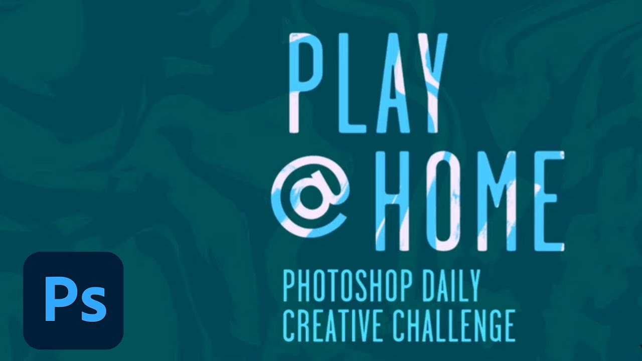
Play @ Home, starter for new DCC
hello all - here is my title!
Cover: Playing around!
@young karma love the colours
@digital niche I like how you did that. One small suggestion is to change the kerning on the Y. There is more space between the A and Y than any other letters. That often happens with A's. Just snug it up a bit.
Thank You!!!! Yep thats true, did not pay attention . better to fix
@hearty wharf That is a clever use of textures and great concept!
can some one help me out i am a bit lost , i did this as april13 when is going to be number 2 n i see that now in to minutes there will be another challange day 1
i am confiued coz both are Kathleen
@digital niche Yesterday was an introductory day. The challenges actually start today with Challenge Number 1
oh okay , coz there is billions of lessons already )))difficult to follow up)) cool then , so excited
This was my creation! First time using brushes, still a newbie!
where is the chat at??for live?
hiya @digital niche - it's on behance.net/live
cant see that (( a watch the live
@digital niche https://www.behance.net/live/adobelive

Join us right now to get inspired by leading creatives. Get your questions answered and share your work with the community.
thank you so much @cloud kernel - it's an old illustration i've used, i thought it kind of worked! 😃
Gave +1 Creative Carma to @cloud kernel
thatnks ))) got it
Here's my day 1 challenge! i also used some outerglow to give the text a neon effect 🙂
Here is my finished challenge from Monday
Just cos...
how do I get to the unlock page for this challenge?
I'll check back later for answers... have to go pick up my dogs from the mani/pedi shop
@twilit shore https://www.behance.net/challenge/photoshop 🙂

Daily Creative Challenge
@restive shoal nice! did you add the moon?
@split swift cool cover! i'm betting you used the spatter brushes from kyle webster 😄
Yess I did
@jade plover the letter placement in "play" is VERY playful - nice job.
@tranquil locust wow there's a lot of texture going on here, both subtle and loud. i like it! esp. the really light texture on the actual letters
First attempt blending! It was really fun to play around with😀
This is my first time doing a challenge. I saw this from the livestream today. I hope you all like this photo like I did making it!
Thank you so much 😘 😘 it was awesome 🙃
This is my intro picture. I haven't fully figured out what I want to say but I'm getting there with inspiration from Karen Hallion.
First time doing something like this and it is a lot of fun
Final
Creative challenge nu. 8 (privet project with photo I took couple of days before while compositing my friend on the beach near my house) Enjoy 🙂
@sour ingot Thank you!
Gave +1 Creative Carma to @sour ingot
Today's Challenge
This was a cool, quick challenge. ^^ Very fun!
Challenge 1
Challenge Nr.1 // used a private picture and added just two colors...any improvements I could do? 🙂
Using the Hue blend
my entry to challenge #1
my Sister's first photoshop work. #Varshaheer
Thank you Kathleen
Day 1 project -- my favorite place to play
Challenge 1
Day 1 Challenge
Here is my Chalenge 1
DCC Blend Layers Day 1
Hello ..
Hello everyone, here is my Day 1 challenge, any feedback is appreciated.
@urban berry Very interesting hiding the water mark. Also placing the @ to double for the o as well. Awesome job
y'all are killin' it!!!
Hello Creative Challenge Guys/Gals
Let's start 🙂
Daily blend
Rte 66 using star filter. Overlay blend. Orange gradient w/Darker Color blend. Some erasing on gradient layer.
I missed yesterday, but was able to be here today. Great work everyone!
Here is an updated version of my cover Photo
I actually revisited based on some comments from my husband. I wanted to pop some colors out a little more. So please use this version to critique.
DCC - my try on day 1 challenge
there are a lots of layer 😀
Here is my late cover image. 🙂
Here is my project for the first day of this series of challenges. The blending modes are a lot of fun to play around with.
Day One ya'll
Challenge #1 - Blend Modes
Day 1!
@young karma really nice work, I just think that you could try making text pop a bit more(outer glow or white stroke around text could work) because it's a little hard to read right now
DCC3 Project 1 The Oculus NYC All lit up for the holidays
@final pike really simple but I love the way you put it in every day life.
@sacred field Beautiful picture, beautiful effect.
My First Daily Creative Challenge #1 on This Community - Blend Modes
First effort using starter file and assests 😄
@eternal mica Love it! I miss going to the Oculus.
Pretty simple! Took a picture of my cat, Silas! (This looked like an album cover to me, so I added the Parental Advisory sticker lol) #BlendModes #Day1
@young karma Thank you. Im happy for any encouragement I can get. I never shared my work before starting the DCCs. This is my 3rd session and Im loving seeing people's work and hearing their comments about mine.
Gave +1 Creative Carma to @shadow tinsel
Day 1 feeling too colorful 😃
hello everybody - here is my day1 ... my eyes have gone a bit funny now ...
Day 1 - Blend Modes. I used two blend modes
@obtuse topaz Nice!! Looks like something Chillhop/Lofi channels would use.
DAY 1 Blends
Did another one with some of my old images. Did some clipping masks, gradient background, and of course, some layer shading with today's tutorial, and created new words for Stay-at-Home orders...
Day 1
Done a bit quick, cos I was being harassed by my gorgeous boy Escher here, who is fed up with playing at home an wants to go to the pub where everyone fusses him.
I have never used any blend mode except Multiply (for transparency), this was fascinating and fun! Thanks!
Day 1, Is this good?😀
Thanks for getting me creating!
Day 1, first time I participate in this challenges... thanks for helping us work on our creativity 🙂
Day 1, Trying to participate! Thanks for the lessons!
@lucid anvil thanks for being here! nice choice of photo with all of the neon 🙂
Gave +1 Creative Carma to @lucid anvil
@full warren it's super cool to see your process - i appreciate the little detail of adding the distorted text in the water as a reflection
hi
@sterile bane thanks!
Gave +1 Creative Carma to @sterile bane
everyone
Day 1 Challenge
DCC Day 1 & 2 w/ @somber moth
I cannot get this cyberpunk theme out of my head! I tried! 🤣
@wicked nexus thank you!!
Gave +1 Creative Carma to @wicked nexus
Day 1 🙂
Here is my first Photoshop challenge. I used the Lighten Blended mode and some pink at the bottom on Overlay.
Blend mode
Hey! My day one PS challenge entry ...
Hi there - this is mine. Am I the only one who hasn't got the adobe stock subscription?
Challenge #1: Blend Modes
Hello Day #1
PS challenge 1
Day 1 Challenge
Hello!! #Day 1 ☺️
day 1 :)
day 1 😊
Day 1 Challenge Complete... 🤪
4/14/2020
PS DCC #1: Here is you're PSA for the day.
Blending Challenge
Enjoyed having a play with this - great tutorial - thank you! This is the 'hue' blend mode; also tried with 'colour'.
Day 1 Challenge: Kept mine pretty simple
Day 1 Challenge - kept it simple.
Challenge 1
YP_CC_Day-1
Hi, This is the very 1st time for me to join.. Nice to meet you all and have a great day. Thanks! @sterile bane
Gave +1 Creative Carma to @sterile bane
Try something with a picture of a freeway near to Rouen in France
@thin raptor Wow!! That's super dope!
Blend Challenge
Here's my attempt!
Hi there!! here is my challenge#1.
Hey guys!! Here is my project 🙅♀️
Day one ✅
I couldn't figure out how to get the text back to white
Hi there!! here is my challenge#1.
@severe flame Crazy good
Day1 Challenge😊
First time doing this - figured I'd try to keep my Photoshop fingers going. 4th week of being laid off and isolated! Thanks for keeping my company and giving me work to do.
Challenge 1 Blend Modes
I couldn't figure out how to get the text back to white
@limpid egret Click on the eyeball next to the "PLAY @ HOME color" layer
I recently started exploring photoshop as a means of doing something productive during our country lockdown. Well I tried. Do lemme know how I can improve as I am just a beginner.😄
as a little detail I put my sons drawing or you guys think its too much
@limpid egret Click on the eyeball next to the "PLAY @ HOME color" layer
@cloud kernel I was doing that repeatedly... I must've accidentally messed up the settings
Challenge #1 Blending modes - Photo by Casey Horner on Unsplash
these are soo cool
Challenge 1, went with stock image because personal pictures didn't com out the way I wanted. Definitely gonna practice on my own.
Blending Challenge #1
Day 1! 🙂
Great job @plain sable! What's the name of the font you used? 😍
DCC Cover Image
Decided to go with photo of these swallowtail caterpillars playing in their fennel garden/home
hey @coral stone i 🤔 @plain sable used Braton Composer from @jolly quest past challenges
Thanks @coral stone the font is Barton Composer...
Gave +1 Creative Carma to @coral stone
@peak sentinel thanks I didn't see you already answered.
And yes a favorite of @jolly quest I think
and now you favorite too 😄
Day 1
Thank you so much @peak sentinel and @plain sable! It's a beautiful font 😃
Gave +1 Creative Carma to @peak sentinel
Yes @peak sentinel that and Blenny 🙂
@coral stone & @peak sentinel Barton kinda maks you smile
@plain sable Barton with those round edges 😍 I almost used it last week haha
Gave 1 Creative Carma to sno.e (current: #45 - 11)
here's mine for day 1! once I did the color, I realized it looked vintage-y, so I added some filters too. I use PS a lot but never really played with coloring images this way so I ended up doing a few other ones as well lol (the photo is by Max Bender on unsplash)
this is literally my first time using photoshop! i like how this turned out! ((:
@plain sable I like your lettering 😉
@wicked nexus it's a new favorite
DCC Play at Home Cover Art.
@rain dew I absolutely love the colors. It makes me miss city life at night
Playing with blue and orange colors. Photo: Mitch Nicklas Photography
Hi everyone! here's my final edit of today's challenge.
I loved the color of the water @hollow falcon, great job!
@coral stone Thank you!
Gave +1 Creative Carma to @coral stone
Day1 Banner with Blending of colors.
Playing with Blend Mode using soft light. Photo taken by me in Chiang Mai
Day 1 - Blend Modes
I used a blue color layer with a lighten blending mode over the entire image, then the text has a yellow layer and pattern layer with pin light blending mode, and then the sky is painted red with a vivid light blending mode. Kinda looks like the world got gassed.
PS daily creative challenge april 2020 cover
My very 1st post of a Daily Challenge.
Challenge 1: Gary at the Bowl. Love this effect.
Challenge 1 - Under the EL Tracks
@sterile bane Thank you for the overview this morning! The Blending modes and nav notes were so helpful!
#PSdailychallenge Cover image
Day 1 creative challenge!
#PSdailychallenge Day1
glad to be giving old photos new light! excited for the new challenges to come. thank you!
@rain dew I absolutely love the colors. It makes me miss city life at night
@haughty moth Thanks 🥰
@mint vigil 😍 Love the design really playful
😌 I want to make it personal to my little ones
Great job @wicked nexus
@civic creek your design inspired me to do my!
Late to the challene and rookie to Photoshop, but here is my day 1
Day 1 challenge! Photo by Matthew T Rader on Unsplash
Help me fix this.
Second version of the challenge ✨
@crystal stream Are you struggling with the masking on this image? The quick selection tool is often your best bet. You can do “select and mask” at the top when you select it. The refine edge brush tool within that section is great for getting natural soft edges on things like hair. Perhaps this quick video will show you what I mean. https://youtu.be/c2I7X92IVGk

Isolate a detailed subject from its background and create a new composition. Featured artist: Temi Coker. Check out more of his work here: https://www.temicoker.co/
Start from scratch, or download practice files [https://learndownload.adobe.com/pub/learn/photoshop/complex-sel...
#creative-challange
Its my 1st time here, too much exited! have a great day guys!😊
You too!
Day 1 Entry!
Challenge 1 complete
Day 1 entry
Maybe I was too wild with the blend modes.
#✂challenges-feedback I really like what the blend modes can do! https://www.behance.net/gallery/95396489/PlayHome-City

Behance
Photoshop Daily Creative Challenge April 13 - April 24https://www.behance.net/live/videos/5145/Photoshop-Daily-Creative-Challenge-Blend-Modes
Day 1 challenge completed! #✂challenges-feedback
Daily
DCC Challenge #1 Using the stock photos @sterile bane gave us.
@cosmic cradle Really love the strong perspective in this design and how it leads the eye to the text. Really nice colors too, creates some nice contrast!
@weary wharf Very cool! Really liking the soft colors of this your Day 1 design. Did you composite several images together or is this a single image that you colored? Either way it looks good!
@potent gazelle This looks nice! I like the color gradient, and the white of the text looks really clean and contrasts really nicely. 👍
@clear moat Hah, it’s always fun to play with to see what kind of effects you can get. I like colors on this! The color text works really well too. I think it might be nice to give the color gradient shifts a softer more natural transition, but that’s a bit of a nitpick. Nice work!
@magic hedge Great mood in this image! The text and glow really fits the scene nicely. Reminds me of the opening graphics for a late night talk show or something, hah. If you wanted to push it even further a slight reflection of the text in the wet pavement would be a really cool effect. Well done!
Challenge 1 - I am doing the illustrator challenge too and have combined the challenges 🙂
@frail glen Welcome in, glad you could join us for this set of challenges! Cool bold colors and style to this, I really like that text pattern!
@somber hull Really cool concept for this design, definitely has a strong mood to it. I like the way you mirrored the color from the sky in the text down below, looks good!
@dusk quest Looking good Raj, nice work with the colors!
@obsidian osprey Really nice work separating out all these colors, gives the whole thing a really interesting and kind of festive feel. I think it might help the readability if the letter in the center was all brightened up a little bit to separate it even more from the buildings. Nice job with this challenge!
@snow abyss Ah, great idea! These graphics work really well with the photo. That little blue back splash behind the logo gives it some nice clear readability too. Looks really good!
@winter tinsel I love how well the text matches the color and lighting of the scene, and it contrasts really well there at the top against the night sky. Really great cohesive design!
@hardy heart Really color effect with the colors in this first challenge! It almost seems as if it's riding the line between gradual soft gradients between the colors, or geometric hard edge shifts between different colors in a sort of mosaic effect. I think it could be interesting to push one of the two a bit more to give it a solid read. Looking cool!
@thorny spruce I really like the subdued colors and contrast in this design! The lighter tone you chose for the text instead of a really dark color really helps fit that mood well. Really nice feel to this design. 👍
@sleek shoal I like the different color moods and tones you got with these two different images for challenge 1! Makes for a nice variety. The blue image almost looks like some blue light or haze coming through the trees, cool effect and nice work with the masking!
This was my first attempt - loved playing with the colour blending
Here are my submission for Daily Creative Challenge. I hope the folks will like it. 😃
Challenge #1 - Blend Modes
2.0 - STAY @ HOME
day 1 challenge
1st attempt! Everyone's came out great!
My "Backstage"😄
dayonefinal #PsDailyChallenge. thank you @sterile bane
Gave +1 Creative Carma to @sterile bane
My Challenge 1, I used a few photos I took the other day of a friend while we were out taking care of our horses. In addition to using the blending mode I used filters, pixelate, and a few other techniques. I want the composite to show why we are playing at home...., our world has changed, (at least for the moment). I wonder if I should lighten the image some...., I was going for the white hair and the face mask standing out. Thanks for any comments.
Play@home challenge so nobody’s on the road😭 better late than never
Hello! This is my second DCC series. I am excited to learn and grow with y'all this fortight.
I have played with layer styles before, but I have never used it to recolor before. I am really pleased with the result and excited to be able to use this feature on other projects
Here's my challenge 1 entry
Not part of the current challenge. Just a quick show of respect for our NHS
My challenge work from PS for ipad
I know I didn't. However, I am constantly trying.
Playing with the dogs
Challenge1
fantasy of girl
#PSdailychallenge Day 1 challenge completed! Photo by REX WAY on Unsplash.
First challenge completed!
Day 1 Challenge: Blend Modes
Hi, this is my challenge#1 attempt. I used the hard mix blend mode on this one which created a cool effect
I've had Photoshop for years but never really used it, instead concentrating on Lightroom for photography and editing. I've only followed a couple of the Live Streams so far but they've been hugely helpful and I've already learned a lot! The image was taken with one of my clients on the walking tours I take around Drumnadrochit looking towards Loch Ness.
Hi from Australia... The live streams are on at 2am here, but I enjoy catching up during the day. Photo is from our front yard. I really struggle with choosing fonts so any advice welcome!
What a great time to find this. I'm in a similar situation to @flat creek and have never really used photoshop, just LR. So I'm using the extra time I have in lock down to learn and have fun with it.
Look cooler than reality.😅 #challenge
Loved the mood of your work @twilit eagle!
@high holly That looks really good! It's simple yet very effective 🙂
Thank a lot @umbral snow I use Ps a few.this is a good chance to improve my skill. Appreciate😃🙏
Gave +1 Creative Carma to @umbral snow
Hi! I didn't know this tool, but I really like it... So many options🙃
@split pier I think this looks good, I really like the geometric background texture. If it were me I'd simplify it, the second horse rider gets lost behind the text so maybe take it out?
@somber hull I really like the colors you chose. The text "alone" made me sad especially the placement.
@young karma looks great are you sure this is your first time using photoshop? 😀
@turbid charm you have caterpillars already? it snowed here yesterday 😦 I'd bump up your text size it's hard to see IMO
@crystal stream Are you struggling with the masking on this image? The quick selection tool is often your best bet. You can do “select and mask” at the top when you select it. The refine edge brush tool within that section is great for getting natural soft edges on things like hair. Perhaps this quick video will show you what I mean. https://youtu.be/c2I7X92IVGk
@bleak fossil Thank you!!!
Isolate a detailed subject from its background and create a new composition. Featured artist: Temi Coker. Check out more of his work here: https://www.temicoker.co/
Start from scratch, or download practice files [https://learndownload.adobe.com/pub/learn/photoshop/complex-sel...
@wind trellis I like the photo and the colors you chose. I think the font could be darker or bigger?
@twilit eagle wow it's looks like an album cover great work
@nova swan thanks! yeah it is haha i appreciate the kind words!
Gave +1 Creative Carma to @nova swan
Good morning everyone. As I look through everyone's work, I get more and more inspired. You all are making me realize I need to push my own boundaries more. Creativity is why we are here. Thanks for the opportunity to have fun and make something here.
@nova swan @coral stone Thanks. My wife also said it reminded her of an 80s album cover 😄
Gave +1 Creative Carma to @nova swan
Here is my Play @ Home Challenge 1.
One of my attempts at yesterday's project
My Challenge #1
Chellenge 1 ! Thanks!
Hello everyone, I share my first task done. What do you think?
@somber stump I really love it 🥰
@burnt turtle thank you! ☺️
Gave +1 Creative Carma to @burnt turtle
PSDCC #1 Blend Modes
Hey folks, It's so inspiring and very funny to take part at these daily challenges! So, I choose 2 pictures among my personal photos and I created 4 version of them. Actually I can't choose which one is the best 🙂
Challenge day 1 from me!
Tried to give a romantic look to this photo of me, using 2-3 layers with gradient and blending modes.
I wish a nice challenge week to anyone and learn many from it 😘
Woodland steps
hi
yes
Thanks for the demo, Kathleen. Looking forward to playing around in PS after my Cleaning chores are done with the family. 🙂 Can't wait to see everyone's work!
Still a work in progress but vast improvement thanks to @bleak fossil
Gave +1 Creative Carma to @bleak fossil
Ahhh nice! Really great improvement @crystal stream With some practice you can get some pretty awesome results with that tool. Looks really good!
just trying to think about what to use for my original image, if sticking with the theme 'stuck in doors'... what will be my mountains?... ahh, the ironing basket... watch this space!
I have a question:
How i can use these adobe stock images that we can download from dropbox for each challenge?
When i open in my PS there is the Adoeb Stock logo in the middle 😢
Challenge for Play at Home - Kept me busy for a while!
Daily challenge 1
@sonic bobcat correct. you have to pay in order to get the images without the watermark. Just look for similar images on one of the many free sites or use your own photos if you don't want the watermark. Or pay the fee 🙂
its more fun to use your own anyway. 🙂 think of it as part of the creative process 😄
Day 2
I decided to forego the text this time - this was a fun one!
Ok guys I need some advice. I know the purple is a little funky, but I had a really hard time with the outer glow. This was my first time using it, and I don't know how to make it look smoother than this. Any tips for me? Also loving these tutorials! Im so happy to be here!
@thorny spruce try fiddling with the spread and size of the outer glow! then once you get it nice and smooth, convert it to a smart object before you resize it
Ok that makes sense, will do! I will tinker with it today and may post an updated version later today, thanks for the help!
Good luck, hope that works - I'm not an expert by any means!
Thank you! I appreciate all the help I can get!
#PSdailychallenge Day 1 challenge completed! Photo by REX WAY on Unsplash.
@honest glade amazzinnngggg paryyy!😍
Continuing with my red sun of contamination.
Kept her pretty simple for my very first Adobe photoshop challenge, blend modes. Fun tool to learn!
Here's my entry for Challenge 1.. I made two since I quite liked how both ended up looking. which one do you guys like?
I personally like this one more but both were fun!
Nice sunset at #palawan now enhanced. Thanks to Adobe 9 Days Challenge and @sterile bane . I am very happy with this!
Gave +1 Creative Carma to @sterile bane
Using the same layer with differents fusion mods
Challenge 2
Challenge 1
PSDCC #2 Layers
Hello
someone kwons where there is the fist class (the introducction one)
Ps/challenge/2
someone kwons where there is the fist class (the introducction one)
@devout totem I am new here, but I think this could be the first one : https://www.behance.net/live/videos/5145/Photoshop-Daily-Creative-Challenge-Blend-Modes?tracking_source=to_replay
Challenge: Explore blend modes to apply color to a cityscape.Get the starter file here: https://bit.ly/psdcc4-13-1Join your host each morning at 9:00am PT to learn how to approach each challenge using Photoshop. Complete 9 challenges by Friday, April 24th and you’ll be on your...
Layers, with some color blending
4/15/2020
thxs
DAY 2 - Layers
Day 2 - Layers
Day 2 Layers - I'm working with images I photographed last year. Not sure why I decided to put circles in the foreground... thinking about putting some behind the buildings instead.
I tried to use the selection tools to select the sky or the hill and trees but couldn't get a clean selection. Do you think that the subject was too complex? (I completed the challenge just using the same techniques as on day one.)
Layers challange
@tropic haven This is great, I really like what you did with the color contrast in this design! The pop of warm pink against the cool blue creates some great contrast and a clear read. The masking looks really nice and natural too! If you wanted to push the effect even further a little reflected pink in the water could be a nice touch.
@lone hare I like what you did with the graphics in this one Ryan! The font style adds some interest too by breaking up the clean edges of the rest of the graphics. Looks good!
@obsidian hamlet You got some really interesting effects in this one Marie, I like the colors! I'm not sure what blending mode you used for the colors but I think a blending mode with a bit more transparency might look good and show more of the underlying image. Maybe something like screen, overlay, hard light, soft light, overlay, or color dodge would give you a nice effect. Could be nice to make all the text white to unify the look a bit further. Nice work with the soft gradients!
@ionic maple Great color effects on Challenge 2! I like how strong the color contrast is on that sun shape, really draws the eye, The masking of the text and graphic shapes look really nice and add some nice depth too!
@devout totem I love it, you got some really great effects and graphic shapes that all work really well together and add a lot of interest! The colors are all quite cohesive and the text of the images ties them all together as well. Really solid work!
@restive shoal Very cool, nice job with the masking of the text! Adds some nice depth. My only suggestion is that making the transition on the mountains between the purple and the black a bit more gradual might look more natural, currently it reads as a hard line which is somewhat eye catching. Nice job on this!
DCC Challenge Day Two.
@vernal hinge Very interesting! The difference is somewhat subtle, but I kind of like how the offset effect is pushed a bit further in the first one, though the cool/warm contrast is a bit stronger in the second one which is really nice. I like how you chose a dark grey tone rather than black for the text, it fits the image well.
@celest pollen Great job, really nice mood to this image! I like the softness of the whole thing. Even the light beams maintain that feel and don't seem too overpowering or anything. Blend modes are definitely great for lighting effects like that. Nice work!
@compact pecan Very cool! Really ominous feel to this design, hah. The red sun is a cool effect. One thought I have is the value and color of the sun kind of blends into the similar value of the hill sides, and all the values in this design are fairly similar. It could help to give the sun a bit more contrast and make it a stronger focal point. I think there’s two ways you could do this. Make the sun brighter than the surrounding sky, or tone the sky a cooler color like a blue or cool gray to give the sun a strong hue contrast. These two pictures are good examples of both.
@thorny spruce Really glad you're joining us for these Jenni! Nice job masking this behind the trees, looks good! I think it depends what you're going for, if by "smoother" you mean you'd like the gradation to be smooth you should be able to adjust the outer glow to make it bigger and the transition more gradual. If by smoother you mean look more natural then I think it might not look like it fits in place because the rest of the scene doesn't seem to be affected by a purple sun because everything else (including the light coming through the edge of the trees) is being affected by a warm yellow light. It might also help to make the inner part of the sun brighter, since glows are typically brightest in the center. Here’s a rough example of me trying to get the purple to affect the rest of the scene. Though I’m not sure if this is what you meant?
Here's a better quality image
DS day 2
Hello .. another try
Here's my go 🙂
Went with some dark blues for a moody look. My 2 year old keeps me busy so I didn't have time to use one of my own photos but I will try to put more effort into future challenges!
Here it is.... Drum roll...... Day 2
@sterile bane
@worn yew Awesome and total mindf**k
Thanks for the tutorial!
My banner tried something different
@young karma Really liking that depth effect
@young karma How'd did you make that cool splatter effect for the BG?
Used a landscape I took up in Glacier National Park this year.
And my Layers panel:
Day 1 - Blend Modes - #QuarantineSourdoughBread
Day 2 Challenge!
Challenge 2_Layers
PSdailychallenge Day 2 Layers! 🙂
Play at home
👍
Challenge 1. I had a lot of fun making this! Love to hear feedback.
day 2!
Day 2 😝
Day 1 - Play at Home
Good afternoon. My Daily challenge #2
Hello all !
hello all - here is my day 2 - love the idea of keeping the type in the same place all the time!
@lofty gorge wow amazing - my sourdough bread looks nothing like that! 😂
Hi all- newbie at this but learning lots so far and having fun! Day 1 project.
Playing catch-up -- here is my day 1 project for Blend Mode
Play at home - what i concocted from watching today's behance challenge on layers.
Challenge 1_layers. I forgot how much fun was just to play and try random things... this is bringing me back to my early times on PS just learning by trying...
Day 2 - Layers 🤣
@sand patrol That's a great shot! Is it yours? I like the tension the severe angle creates.
Challenge 2 Layers
Challenge 2 - Layers
@grave nova Thx! Yes, I took that one a few months ago in Downtown Detroit.
Day 2 - Layers
Ok this is my round 2 of this morning's project. Thanks for the tips to get my light source to look a bit smoother.
@somber stump I love your post. Definitely drew me in.
@primal fulcrum as usual, your work is terrific. So complex. You motivate me to try more things, stretch my imagination, my limits. Thank you for your participation.
Gave +1 Creative Carma to @primal fulcrum
@young karma I vote for #2
Challenge #2: Meute plays The Roxy with fireworks.
Day 2 - Adding Depth
Challenge 2
this is challenge two! i kind of messed around with it a little bit, i need to update adobe oops
Challenge #2
this is challenge two! i kind of messed around with it a little bit, i need to update adobe oops
@young karma very nice!
Well, I have two versions. Which one do you like more?
Well, I have two versions. Which one do you like more?
@civic creek For this version I was inspired by flat figure at the beginning of the video by @sterile bane 👍
Lockdown holiday fantasy with my gf and daughter, but watch out for the little Covid peeping over that cloud..
Layers
Layers challenge ...
@civic creek thanks!!
Daily Challenge #2
Tried to use the moon 🌖 as the source of light 💫
Added the moon on a separate layer after selecting out Mount Fitz Roy. I then followed with a color layer which was blended in
Using layers and blend mode. Photo taken by me
I combined a dark misty mountain scene with a gorgeous sunset scene
Challenge 2!
day 2, Challenge#2
challenge 1
Challenge 2
Entry Day 2!
Day 2!
phone Home!
day two 🙂 i made a little house because there was empty space there that bugged me
My Challenge 2
Here's my layers project for day 2!
Day 2 Challenge
@bleak fossil , thank you for your suggestion, yes, I'd never thought about add a reflection in the water. that would be really nice. I'll try it later when I get to know how.
Gave +1 Creative Carma to @bleak fossil
Day 2 Challenge: Layers
Everyone did such a fun take on the project. So glad I joined the discord, its giving me motivation! 😋
@bleak fossil Thanks for the help and advice. I think this shows a bit more contrasting colors. Although I'm still not happy with this one. Today's challenge just wasn't one of my best for sure.
Gave +1 Creative Carma to @bleak fossil
original
@eternal mica thanks so much for your kind words!
Gave +1 Creative Carma to @eternal mica
#2 layers. I had a hard time deciding what to do for this one. I finally decided on a radio active calf! As simple as this is I found out that even if it doesn't have any back ground when you make a selection and then make it a layer, you get a MESS. No matter what I tried, I could not just select out my calf. Finally shut off all layers but that one with the mask (the mask worked but not for a selection) then had to export as png and bring it back in. I won't make that mistake with masks again.
original images. Hope everyone knows you can click on the images here and see them bigger, then after that, you are given the option to "see original" and if you click that, you see them at full size in another window
My second attempt ever at doing the DCC. Starting to get the feel of it.
Here is what the stupid mask looked like. It worked to mask out the calf but as you can guess, there was NO way I could get a selection out of that mess. live and learn
Day 2, take 2. _ Layers.
Day 2 - Layers : "Back to Basics"
Thanks @bleak fossil Here is the revised one)
Gave +1 Creative Carma to @bleak fossil
Challenge 2 😊
Layer (Challenge 2)
Challenge 2 Layers
Blending modes challenge #1
Here's mine
Day 2. Tried both a spherical and a 'painted' lightsource. Also tried some day 1 techniques on the sky
Original pic
Photoshop Daily Creative Challenge - Social Distancing #2
@potent gazelle Looks good, I like the effect on the sky! It might look good to make the transition between the yellow and purple in the sky a bit more gradual as there almost seems to be a bit of a seam between the two colors. I like how cleanly the text reads against the sand, nice job!
@cosmic cradle Very cool to see all the images used for this! Really nice exercise in masking, it all looks nice and clean. I really like the effect you got with the waterfall scene and how the water break the frame 👍
@dapper oyster Really interesting effect with the offset image and colors! I like how you matched a color from the scene into the next, looks good!
@ornate echo Ooh, great effect with the masked shape and glow! I like how you had it cast some light onto the hill side. The strong contrast between the light and environment gives it a nice strong impact too. Nicely done!
@strong furnace Hah, really interesting compositing here, I like it! The lighting of the building seems to fit in nicely with the rest of the image, and the masking of the text adds some nice depth! Very nice!
@mint vigil Really nice blend between photo and graphic elements in this! The colors work really well, and the text color was a nice choice to get some really solid contrast. I really like how you handled the background texture too, gives it a really interesting feel without being overpowering. Solid work!
@grave nova Really nice job with the masking! Edges of trees and hair and the like can be quite tricky, so nice work. I like the sun effect too! Though making the center area the brightest for the sun might sell the effect a bit more. 👍
Challenge 2, a favorite place to hike that is close to home
Challenge 2
Challenge day 1
Day 2 Challenge
Day 2 Challenge
A photo I took a few years ago.. tried to be subtle but it got out of hand! 🤪
Day two (Also building off of day one fundamentals)
sorry !!!last challenge of the previous one!!! i couldn t miss to post it !!..looking forward to start the new one!!..cheers !!!thank @jolly quest for your teaching!!..you are great!!!
Challenge 2: Not entirely sure what I was trying to achieve here but it was useful to play around with what we'd been shown and see what I could come up with in between work and cat wrangling 😀
Exported with out saving the psd file, should have put the text between the hills on the left.😩 ….Oh well! really enjoying these quick challenges.😁
@somber hull I really like B. interesting idea and well done.
Thanks @tender crane ! I've got no patience for this kind of stuff so I was happy to produce something.
Gave +1 Creative Carma to @tender crane
@frosty anvil Thanks
Gave +1 Creative Carma to @frosty anvil
,I hope you keep creating!
@ruby panther very good idea, but I think the image needs to be lightened up along the tree line. Especially in the thumbnail, its hard to make out the detail of the bear.
I thought I would make this more of a album cover.
This is for daily creative challenge 2.
Adding depth to images.
I didn't use camera raw...use selective clor instead for color grading it look good to me. What's about you?
Any suggestions? please 😊😊😊 glad to hear that
@dark oxide I'd definitely add a lighthouse at the end of the groyne. 🙂
@worn yew yes,there is a lighthouse at the end...it is not much visible.....zoom to see it...
@dark oxide Haha it's just a light without a house I think 🙂
@worn yew yes....😁😁😁it is full house but it is looking weird due to compersion...
how is that!??!..that s a picture taken from me!!..i thought would be good for the occasion!!
DCC Layer Challenge Hate my sun...ran out of time.
Day 2 Layer Challenge!
DCC - my try on day 2 challenge
@obtuse topaz Well Done!
challenge nr 2 🙂
This is for daily creative challenge 2.
Adding depth to images.
I didn't use camera raw...use selective clor instead for color grading it look good to me. What's about you?
Any suggestions? please 😊😊😊 glad to hear that
@dark oxide Beautiful picture I love that place
Day 2 Challenge - hahahaha - if you don't stay at home the scary horse will get you. This turned out weirder than I thought!
Challenge 2 , any suggestion would be highly appreciated 😀
Day 2
Day 2
hello all - here is my day 2 - love the idea of keeping the type in the same place all the time!
@hearty wharf Nice!
#✂challenges-feedback Creative Challenge - Day 2
@bleak fossil thanks a tonne for appreciating it. I wasn't really sure of the blue tones which I wanted to focus so I ended up making one ever so slightly lighter, but yeah, thank you again!
Gave +1 Creative Carma to @bleak fossil
Day 2 Challenge - layers and blending - this creepy night monster could also convince you to stay at home 🤪
Hey, not easy this one ! This is some pictures that I took in Insland and Egypt few years ago. What do you think? 🙂
day2 hope u like it 😊
Challenge 2
Hi, Here is my post. DAY2.
Challenge 3
#PSdailychallenge, day 2 layers
DCC Day2 - Layers
DCC3 Challenge 2 Freedom Tower
Day 2 - Layers
Challenge 2 - Create depth in a landscape using layers.
@unkempt field Im not so sure the mixing of those two fonts works. Id pick one or the other
Challenge 2 - Create depth in a landscape using layers.
weird moon @worn yew but nice effect.👍
Play Day 2
I am a bit behind! This was from day 1
@slow helm cool! do you have a favorite? I enjoy how you integrated texture into the text.. the birds feel a little bit "placed" to me since they're a bit clumped - maybe you could try placing a few strategically to add some movement throughout the sky
I used my own image taken in Iceland. I've used layering to put the sun/glow in and to brush some low clouds behind the smaller hill in the foreground to put some depth between it and the mountain behind it. I also darkened the sky on the right.
Challenge 2
@sterile bane Thank you so much ^^
Gave +1 Creative Carma to @sterile bane
I've tried this variation
Really late with this. My first effort with blending.
Here is my attempt at Challenge 2 😄
Updated version
chalenge 2
This nebula I created in PS has me questioning my reality. 😆
day 3! is the text legible? or should i move the background elements?
Amazing
looking good!
Wonderful
Im amazed how easy you guys make it look to create the most beautiful photos. The DCC is fantastic.
@eternal mica we love simple workflows with big results 😄
also, i'm looking now and the right side of her arm is looking a little rough.. i'll have to go back and edit that
there we go - cleaned up the right side of her arm a bit
since we talked about it in the live today, here is my workspace. And I colored the menu items I use all the time too.
This is my daily challenge for April 16
@primal fulcrum woah that little custom panel/toolbar in the bottom left is neat!
@harsh anvil the dark warm values of the background look nice with the black and white figure! you did a good job of selecting her, too (with a little rough area on her arm - i had trouble there as well!) did you use "select subject"?
@sterile bane thanks! I got tired of always trying to find those tools since I use them ALL the time. I tried a fly out on the right, but it got in the way and I'd undock it on accident so just doubled up the defaults and then added mine underneath. more compact that way 🙂
Gave +1 Creative Carma to @sterile bane
@sterile bane Thank you! I did select and then select and mask like you did on the livestream. I then just clicked over like one spot on her arm and it got the arm plus that extra spot.
Gave +1 Creative Carma to @sterile bane
YO, took some liberties today and used a fancy cloud brush I made with Aaron Nace's photo compositing tutorial! Massively recommend it!
Challenge 3 - Use Adjustment Layers to change hues within a portrait.
hello all - i've used the other stock photo and painted over it - but kept the water mark! great fun challenge, thanks @sterile bane
Gave +1 Creative Carma to @sterile bane
Subject is from a Kodachrome slide I took in the 1970s. Miss you, Vicky.
thanks so much @hollow yarrow - your upside down image is great too!
Gave +1 Creative Carma to @hollow yarrow
oh, lovely pic @mighty coral - great way of combining original slides and the digital world! my whole childhood is on slides somewhere ...
day challenge 3, I used the old film textures and I used blue and brown colors for gradients for my first time, I think it's good 😀
use 4 to 5 adjustment layer, this is my #challenge,,,,,,,,,,,,,,,,,,,,,,,,,,,,,
Before and after -- good idea.
DAY 3 Adjustment Layers
@hearty wharf lovely - i'd love to know more about your paint-over technique!
@mighty coral wow! analog and digital.
@tranquil locust the mixture of soft grainy browns and that neon green is super cool. this seems like it could be an album cover
here is my day 3!
@tranquil locust Respect!!! 💯
day 3, tell me what do u think 😃
@sterile bane oh thanks - it is a bit of a cheat, taking a picture into fresco and oil-painting over it ... and then i did a gradient map mixed with blend modes in ps!
Gave +1 Creative Carma to @sterile bane
My take on challenge 3
DS day 3
Day 3!
Day 3
Day 3 / trippppaaayyyy
Day Three Adjustment layers
This coronavrius-free Day 3 image is dedicated to my son who is missing his senior year of h.s. baseball 😦
@desert lake I dig the baseball masking.
Day three adjustment layers fixed the puggo back
Asked a friend if I could use the photo I took of her a while ago... She liked the selection of colours although I'm not totally convinced yet....
Any help with behance? I don't know how to make the 3x3 grid, mine goes one below the other... and the last one smaller even when I exported them the same size...
thanks...
Challenge 3
thanks so much @hollow yarrow - your upside down image is great too!
Thanks@hearty wharf !
challenge 3
@crystal craterI line your choice of colours, very dramatic!
challenge 2
@young karma I like the subtle gradient on her, looks really nice!
challenge 3 - once more time + pattern 🙂
Challenge #3: Adjustment Layers - Off to lunch and to play ball!
Day 3, Adjustment Layers. I don't think I used the Gradient mask right, but here's my entry. 😷
@tender crane thank you very much 🙂
Gave +1 Creative Carma to @tender crane
Photoshop Daily Creative Challenge #3
Here's my Day 3 Challenge. Used one of the other starter graphics and a slightly different purple/pink gradient with a variation on the angle.
I really like how graphic this turned out
Posterize seemed to work well for him.
Challenge 1 Used a photo from a while back 🙂
day 2 -- anyone know why that hard line formed? I couldn't clone stamp it out either
@tender crane when you hover below where you want to add the grid select the icon to the far right
@tender crane the grid will be the # of images you upload
@plain sable oh, so I need to upload them all at once? Thanks I'll try tomorrow 🙂
Gave +1 Creative Carma to @plain sable
You can upload them one at a time the grid will change as you add images. Reach out to me if you need help
I added spacers to my grids to keep the the 3 grid view
@plain sable thanks I will 😊
👍
I was inspired by all the dogs I saw in this channel 😄 🐶
@young karma that's so cute!
my second picture...3 day challenge
Challenge 3 - Made an album cover with todays challenge.
part II of challenge 3
Combined days 1 and 2. It makes sense to have the light source behind a dog, because dogs are the center of the universe, right? I haven't seen Day 3 tutorial yet but all the pup photos prove my theory.
A day late......but here's my try at the Day 2 Challenge.
Day 3
day 2 -- 3 lightsources and a mask layer
First time trying these challenges! Masked out the subject, duplicated it & added a gradient on each duplicated mask. I was going for a video game vibe. Did I succeed? What else should I have added?
@pulsar walrus Haha😁... same stock. I like how you ditched the beach.
My attempt at Challenge Day - 3, Too harsh or crazy wild?
Had some fun with this challenge and some photos of me post-shut in phase. Here is the finished product.
Here is the original
@desert lake I feel for all the people who are having experiences of their lives cut away by this awful pandemic, never to be recovered . But safe is as safe does. There will be experiences in the future. Nice job with the photo!! The contrast in color is very "baseball"-esque.
@sudden hawk I love your color choice for that theme. Both so breezy and cool.
@eternal mica
Thanks! 💙
Gave +1 Creative Carma to @eternal mica
@pulsar walrus Beautiful. I love it.
heya :)) hope you are all healthy and creative :)) this is my take on the challenge today... ive always had a very peculiar relationship induced with anxiety and fear with photoshop and have always just used the camera raw and basic edit.. so here is what ive tried to do 🙂
@twilit shore I love it!! So cool and retro. I could see this as a poster
Day 3
@haughty moth Thank you so much for checking out and commenting on my work. It really means a lot!
Gave +1 Creative Carma to @haughty moth
@haughty moth yours came out awesome. I looks like an album cover. It also reminded me that I forgot to put Play @ home in my work, lol, oops.
@rare radish Lovely colors. These look like album covers (or whatever those are called these days).
@cloud kernel whaaat... this made me blush! i am really unhappy with them, bc my way of work has always been more towards natural light and analogue so this is so new for me... thank you for saying this wow!
Gave +1 Creative Carma to @cloud kernel
I am definitely doing this again. Just feeling like scratching the surface!!
Original
Can someone tell me how to reorder the display of my photos within the Behance project?
click edit grid (top left) -> then just drag the photos left and right of each other
Lanikai Beach Sunrise - Day 2 - Layers
don;t judge too hard. I'm pretty new at all of this and was just trying something out. I think it looks alright though...
Playing catch-up.
Kinda feels like an indie album cover lol
Day 3
day three - had some trouble adjusting the shadows - it might've just been the gradient i picked but any tips are appreciated!
Challenge 3
Challenge 2 no edit.
I'm a day behind... Challenge from Day 2
Challenge 2 edit
PS DCC #3: I really like how this one turned out. I ended up incorporating elements from many of the different challenges over the past month. What do you think?
Challenge 2, using layers to make a flat image have depth
Challenge 3