#✂challenges-feedback
1 messages · Page 53 of 1
@zinc ice @young karma both of you did a wonderful job with your subject removal! I know that's not always easy. In mine, I had to build a new background behind my subject because there were so many distractions the healing brush simply wasn't enough! lol
@orchid aspen thank you
Gave +1 Creative Carma to Oluwaseun
👍
@young karma thank you
Day 2 Challenge 1 - Retouching - Desert. First time used LR and it was super fun. Appreciate a feedback from the host and experts. Thanks! 😊
This is the original image
DCC Day 1 Retouching
it's not only changed to color but also the image's mood.
so interesting 😆
hello! my fellow photoshop mate. here's my PSchallenge today.
cover I couldn't find a way to add a drop shadow with FX, so I added a black ellipse and then blurred it.
Here is my altered desert scene. I updated LR last night but got a message that there was an update when I opened it this morning. huh?
Before. Pic from freeimages.com
Day 1 DCC
Kladi Ch 1 feel free to use!
Sorry it's so far down the chat and not sure you'll see this Coris, but your psdaylychallenge 1 is amazing! It's so beautiful and game like.
Daily challenge 1, retouching
@fresh tendon
Looks like you have a drawing tablet???
@orchid aspen lol yeah I'm working on a surface pro 4!
@unreal spear I like the colors!
@fathom moon I like how you kept the integrity of the contrast with the blacks in yours, it's easy to allow stuff to get washed out when retouching!
@pallid radish Design looks good Scotty! I really like how the highest point of contrast is the light circle around the tiger head, really nice focal point!
@low whale Hah, nice work Paul! I think the portrait looks a bit low contrast at the moment. It could be nice to deepen the darks for the portrait specifically, so make it a bit of a stronger focal point compared to the rest. I think deepening the darks even just a bit with give it an easier read. Nicely done!
@trail field These look really cool, I really like the dreamlike feel of the purple image. The black panther and white cloud make a great contrast and focal point. The pyramid image looks really solid too! My only suggestion would be to soften up the hard line between the sky and brown color on the right hand side. Softening it up might turn it into a more natural gradient. Nice work!
@dire glacier Color adjustments look good! Definitely gives it a surreal/dreamy feel, especially in those clouds. 👍
Here is my day 2 dreamscape challenge. I stuck pretty close to the plan. Do I need to adjust the color of the trees?
@bleak fossil Thank you!
Gave +1 Creative Carma to SamPetersonArt
@whole tangle it looks fantastic! yes go ahead and colorize the trees like you did for the pyramids !
@mint rapids Ooh, that dramatic sky color shift really adds an interesting stylized look. Could be kind of cool to add a contrasting color gradient to the land, but as is it kind of creates an interesting contrast between the realism and stylized. Very nice!
@whole tangle I think it could be nice to maybe shift the trees a little bit more towards the cool to match the cool tones of the rest of the image, but it doesn't seem to out of place as is. A slight shift might look good. It might also help reinforce that surreal look the more you push it. I really like the contrast of the pink sky against the other colors, nice work!
@proven heath Really Interesting to see this approach done on a more man made subject matter. The transition looks really nice and clean, well done!
Day 1 challenge
Day 2 Dream Land @agile ruin
@agile ruin @bleak fossil Thank you both! I will do that and play with the tree color.
Gave +1 Creative Carma to Kladi Printmysoul
Day 2 DreamLand @agile ruin
Day 2 - Object Selection
please where is the video for day 2 ?
@young karma https://www.youtube.com/watch?v=iRoB4Ruv2MA

Challenge: Create a fantasy world by combining images with Object Selection, masks and Blend Modes.
Get the starter file here: http://bit.ly/psdcc3-2-2
Join your host each morning at 9:00am PT to learn how to approach each challenge using Photoshop. Complete 9 challenges by F...
Day 2 challnege
Hey ya'll, I felt my cover needed improvement. Does this image work?
Challenge 2
Challenge2_in the clouds
It is actually hard following since I'm using ps cc 2018
I thought the challenge was something else...im sorry first time here. trying to get used to it!
Aaaah dreamland! Well I did a couple. I don't have the quick selection tool yet, but managed to find a way around it. Spent most of my time trying to clone the Adobe watermark off the stock pics.
Adding the image created for challenge 2 to the photo used for challenge 1. 🤣
Here's my Challenge 2 result! This was fun. From Portland, OR by the way!
Dreamland 1... a fantasy called tomorrow
Challenge 1 - a little behind and new to this. I think I'm uploading and posting correctly. 🙂
trying to upload items into my library - it says my network is the issue.. any one have an idea? thx
okay, wasn't satisfied with Dreamland 1. Felt this scape deserved more, so I put this together... is it an improvement?
@vague shuttle Didn't see your other one but love this one!
means a lot coming' from u @cold cedar super thank you! was entertaining
Gave +1 Creative Carma to ValentinePierce
My concept of a dreamland. I used object selection to select the skyline and the contrails.
pretty sure I failed this challenge too, lol
My theme this challenge seems to be creepy wooded areas, now featuring mythic giant cats. The image is mine, excluding giant cat, which was provided by Meaghan Cafferty. I did try the noise reduction on this one, but i didn't like the result so I removed it.
My finished challenge
@plain beacon @agile ruin This is for challenge 2 - Dreamland. It is a work in progress that needs at least one more moon and an animal sidekick.
Challenge #2
my dreamscape. This was a lot of fun. At least after I finally got PS, LR, and BR to update. Took 3 tries and rebooting twice but they finally all updated.
Cover - 2nd try
Started out innocently enough with the idea of a ghost camel in the desert; a little selecting, a bit of rendering, some blend layers and well, this is what it became. Even the clouds are pulling double duty as the dark sand at the bottom. Too much? Probably but Photoshop is so perfect for over-the top fun, right? Share your thoughts and recommendations.
Not sure what this is but it was fun learning how to select and mask objects use blend modes and layers.
@cedar terrace I think the only thing that really fails are hard drives and external drives. Everything else is experimenting, right?🤪 LOL.
Day 2 Challenge
Challenge Day 02
Challenge day 2!
My practice dreamland. I know I am a harsh critic on myself but I am quite pleased with this practice one from today. I went step by step and struggled a little bit as I was using ps 2019 til I realised and switched over to the latest one and I am very impressed with the level of knowledge I have got out of this. Thanks for the lessons.
If you can't tell I like the color blue
challenge Day 2- dreamland- this was a picture of my cat looking at birds in the sky, I tried to work with his dreamy look. Sometimes I think animals can see fairies- at least thats how they appear when chasing things i can not see.
JANE Challenge D2
Day 3 Challenge 2 - Object Selection - Since I have used a lot of candies I will call it my DREAM CANDYLAND #✂challenges-feedback. Feedback appreciated. Thanks @agile ruin It was amazing 🙂
I didn't follow the instructions about the color palette. The pastels were killing me. The stars are generated from a fractal.
My floating Eltz. This was fun. Thanks @agile ruin
Gave +1 Creative Carma to Kladi Printmysoul
Challenge 2 completed. My own images taken in South America, and one of the moon taken from home.
@hidden pendant great job. The ethereal moon is amazing.
@young karma Your land is so dreamy and subtle !nice work
@unreal spear thank you. I'm looking forward to see your work too.
Gave +1 Creative Carma to JANE
Challenge 2
@sudden hawk great work.
@young karma
Thanks^^
Had way too much fun with the object selection tool. Also learned a bit about blend modes, and I thought, although it's meant to be a "dreamland", a bridge might help make going there an actual possibility. 😉
@thorny comet I would like to visit your dreamland. It looks fun in there.
Hi guys, working on yesterday's challenge and for some reason when I choose gradient fill mine stays greyscale on the layer panel, while in the video is colored, and also I noticed a little extra sign on the layer. I have no idea why is mine different. anyone can help please.
my panel
Any thoughts on the adjustments? Aiming for a surreal look as a basis for the next challege.
Preparation for surreal landscape challenge
Thanks @young karma. Yours looks superb. Loving the whale. 🙂
Gave +1 Creative Carma to metrying
I am late starting this weeks challenge and just watched 3rd March challenge. Where do I find the project top cover?
I have just attempted my first retouching project which I will try to upload in a minute
@sick kernel here is the link for the welcome stream where Kladi teches how to make the cover 🙂 https://www.behance.net/live/videos/4825/Photoshop-Daily-Creative-Challenge-Welcome?tracking_source=to_replay
Join your host each morning at 9:00am PT to learn how to approach each challenge using Photoshop. Complete 9 challenges by Friday, March 13th and you’ll be on your way to sharpening your skills. Get your questions answered, see what the community is creating and get feedback o...
thanks, as a complete new user to Behance can I add something in later or do i need it to use for the project cover at the start?
@sick kernel You can do it in your own time 🙂
thanks just looking at project cover now
the extra element that i added goes to the original artist through an internet search. I wanted to add skaters since i also named mine dreamland and where i am from there is a skating ring named dreamland.
Challenge 2
PSDCC02 - dreamscape
Here's my dreamland! (featuring Jupiter, my cat <3)
Challenge 2: dream land
@mint rapids I had to laugh because of the kitties! My cat sleeps like that all the time and I hear that if they do that in front of you then they have complete trust in you. I love your design!
my day 2 challage need your coments how can i imporve its.love your comensts
#Photoshop Daily Creative Challenge - Object Selection
I went to 36daysoftype- the participate, submission guide and calendar tab was inactive. Anyone able to access this?
Is the layer properties panel only on ipad or is it under something else on pc?
oh wait never mind it is just on ipad as its own section, but layer properties are still there
Glad you found it 🙂
sketch thru Fresco
36 days of type - B
follow me on IG: @summer ferry.dsignz for more of my 36 days of type 🤙
Yesterday's challenge
@agile ruin miss u have give palet of color, there are primaray color and secondry colors ,where shoud be use primary and secodry color
Day 2 Challenge.
I'm a little off topic, Mine is more like a Dream Dystopia... 😅
Sorry im late againg
why cant i find the object selection tool?
Sorry for the watermarks, i didn't look for different pictures
Dreamland 1. What improvements are needed?
Okay, I finally feel good about this piece. I call it 'Bast and her followers'.
challenge #3- type
Day 03 - Brushes. Experimented with lots of brushes and somehow ended up this way. Won't be able to replicate this again (intentionally) 😂
@storm horizon I know what you mean!
#36daysoftype challenge 3
this is my version of the creative challenge
#📣creative-challenges #❗new-in-photoshop #✨inspiration #Kladi Vergine
Here's my letter B! 💗
Day 3 Brushes
36 Days of Type "B"
Just found a very important step in my workflow. I'm thinking I should have exported my dreamland as a psd file rather than a flattened jpeg, so that I could remove elements and make way for the B.
Whats everyones view on the Procreate app for ipad?
Here is my challenge 3 - B, with Mr. Bee
Challenge 3
A little bug because i can't always wel seen the good tool to use.. In French the name a also different and the automatic translator is not so good
Challenge 3
My other version - with cat!
Howdy! I'm a little late in the challenges; I can't watch the challenges because I'm working, but here are some exercises, please give me your opinions
@young karma thank you.
Gave +1 Creative Carma to metrying
Day 3 challenge
Gave +1 Creative Carma to Kladi Printmysoul
#✂challenges-feedback #📣creative-challenges #psd#Challenge 3#Kladi Vergine
Day 3 - Brushes
It might be a bit messy, but I'm a complete novice at this. (I'm only here to learn what the tools do), and thanks to Adobe Live and @agile ruin I've learnt more in 3 days than ever I have in 3 years of photoshop ownership. 🙂
Gave +1 Creative Carma to Kladi Printmysoul
PsDCC 5mr20 "B" happy.
Challenge #3.. . The object selection tool is AMAZING!
Day 2
I used my PS DCC skills and inspiration today to make this birthday card for my daughter.
Working on the day 3 challenge made me want to go back to Day 2 and make changes
"Planet B" #3 Challenge and #36daysoftype07
Project Cover
@cedar terrace Really like the styling on your "B."
I hope this is allowed. Was applying what I learned in Photoshop to Procreate. Also, more my idea of dreamland, lol.
@fast moth Cool look! I like how the red sort of enhances that natural warm feel of a desert photo. Definitely gives it a dramatic mood.
@pallid radish For sure! Masking, selections, and blend modes are a huuge part of editing and compositing in photoshop. Definitely great to practice, nice job!
@cold cedar Hah, exactly. I like the camel squad. Really liking the dream-like camels up top. The blend mode along with the transparency looks really cool. Does the PDM have some significance I’m missing?
@cedar terrace The cover is looking good Donna! I like the gradual size change in the circles, it gives it a nice dynamic feel. Nice work 😄
@hidden pendant The colors adjustment is looking good on Challenge 1! It could be nice to vary the values a bit more since everything seems to be in a very similar range. Maybe a levels adjustment, or even a gradient on a multiply layer or something to darker down the foreground and have it lighter as it moves up. Could add a bit more interest and give it a dynamic feel. Looks good!
@unkempt field Really cool colors in this, and great contrast of the design against the background! Really liking the stars/particle effects in the background too, really adds to the dreamy feel. It could be nice to make the palm trees on the left side more purple for consistency’s sake, but that’s just a minor thought. Looking good!
@primal fulcrum Ooh, really liking those background clouds and sky. Great colors for this image. The starry effect in the center clouds is a really nice touch as well. Very nicely done!
@magic hedge Really liking the arrangement of all these shapes, composition looks really good! Great colors too, and I like the way you blended the clouds into the image. Looks really soft and natural. Solid work!
@void hornet Ooh, very cool! I love the dramatic size of the moon compared to the structure at the top of the hill. Really gives the whole thing some nice scale. This is a super minor nitpick, but I wonder if shifting the color of the clouds to something cooler (more towards a subtle blue or purple) might help it match the cool temperature of the rest of the scene. Just a thought. Nice work 😄
@heady stirrup Very nice work masking/blending the cat naturally onto the ground! Looks really good. The colors definitely give it more of a surreal feel. If I had any suggestion it would be to maybe try adjusting and controlling the contrast in a way that focuses the eye a bit more where you want the focal point to me. I often do this with multiply layers for shadows, masked levels adjustment layer, or screen/color dodge for lights. But I noticed that the deepest darks seem to be in the background which is reverse of how atmospheric perspective usually makes things appear. It could be nice to also maybe focus a bit more contrast and lighting on the cat. Just some thoughts. Really cool image!
@cedar terrace Not at all! It looks good, I like the color scheme of the whole thing. The only small suggestion I might have would be to have the background sand be consistent. Either kind of fade off in a soft edge like on the left side, or keep it hard and maybe frame it a bit more with clouds on the right side. But either way I think this looks nice, well done!
@compact pecan Nice work putting all these elements together! This definitely has an interesting feel. Kind of a dangerous foreboding feel almost. I feel like it might be a bit easier to just mask out those areas of trees in the background. They almost seem slightly out of place in their current arrangement. Could also be cool to see a color gradient across this image to give it a little bit more variation, but that really just depends on the mood and feel you’re going for. Nice work!
Challenge 3
Thanks @bleak fossil. No, the taller letters was just an attempt to simulate humps or sand hills or ... well, I guess that was a miss. LOL
Gave +1 Creative Carma to SamPetersonArt
@thorny comet Yes, I have found it helps in these challenges to keep all layers and save as a psd file.
@bleak fossil that is an interesting comment. I might have to pull it up again tomorrow and puzzle over it a bit longer. Like I've always said, No piece of artwork is ever complete - simply set aside for later.
Challenge #3
attempt on Ipad.. I was quite thrown at how to export it to the camera roll to send in. Not the final copy as I am still learning these skills.
these ones i have done on laptop. Really amazed.. my autistic son thinks its a snake.. lol
Day 2 - Dreamland 🦩
Not mastering the blending 🤔 @bleak fossil @glacial path should I add more clouds?
Challenge no 3 done.
And here we have a space between dreams, where all this pink sand encroaches on my green and red forests.
2nd attempt at Challenge 2, darkened the bottom a bit and also changed the hue and saturation on the mountain. Actually happier with the change to the mountain as the temple in front of if is a bit clearer. It was the Temple of the Moon in Peru, so could not resist adding the moon when I first did it.
I got messy🙃
composite dream travel
Oh... I'm way behind... but maybe/hope I'll catch up? The next challenges look super fun!
😬

also a way behind, but I like it 😍
Hiya everyone, I just found out about this whole daily photoshop challenge and thought I'd join. I started with the first one and I'm going to catch up (hopefully ha). This is my image for 'Challenege 1 - Retouching', that I edited in Lightroom and then Photoshop...
Challenge 2 - Object selection 'Dreamland' :
@hollow horizon your "brush" daily challenge is great. I love its color.
Challenge_3 "letter B"
HI, Im new to the Daily Challenge, I will do my best 🤷♀️
@young karma with lots of swear words lmao, there is a tutorial I followed with a few deviations on my part, would you like the link?
@dusky zenith please 😉 I would try them.
@young karma here's the link for you 🙂 http://www.alfoart.com/glittert-text-1.html
Good Photoshop tutorials, flash tutorials, digital art, web design, photography
Finally got my cover done. Kept it simple.
... challenge #3 - brushes
My dreamland isn't complete unless my dogs are with me.
Challenge 3 Brushes using the letter “B”. I wasn’t happy with my first version so here’s my do-over!
My B shape into a piano by the emboss but wishing i could keep this B and play with it more 😆
Challenge 2
Quick Challenge #4
Hello everyone! It´s my first challenge ☺️ I´m a bit late but this is my Cover for this challenge. Thank you for your opinion! 😍
PSDCC #2 Object Selection (playing catch-up)
So bumbed that I can't do the Kladi led challenges. Love her work but I'm travelling with a laptop that can barely open Ps. The pieces I've seen are so creative. Great work all.
@tight prawn Looking really good! I really like how the color of the B contrasts against the background. The whole image seems a bit dark, I think a levels adjustment, or even just brightening up the letter to give it more contrast could help focus the attention towards the center. Maybe something like this?
@dusky tusk Everything is looking really good! Really liking those saturated purple shadows. You definitely nailed that dream-like quality. 👍
@cedar terrace Nice Donna! I really love the consistent color and contrast you got on this Dreamland image. Everything fits that cool pastel feel which gives the whole design a very dreamy and cohesive feel. Looks good!
@desert raven I really like how you balanced the warm colors against the cool colors to get the shapes to contrast nicely. Currently everything is really saturated, I might balance it out so the portrait has the most saturated colors so not everything reads equally strong, but that's really just personal preference. Really cool texture too!
@young karma Haha, liking that cat face 😄 I really like how you handled the letter B’s texture. The colors and shapes separate nicely to give it a clear but textured read. Very nice!
@cedar terrace The letter design is looking great too! It could be nice to increase the contrast on the B so it matches the deeper contrast of the panther. It might help it stand out a bit stronger next to the palm trees too. Nicely done!
@plain sable Very cool Sno! I like how the clouds frame the design nicely, but how the bigger structure breaks the frame a bit there. It adds some nice depth. Nice work 😄
@oblique anvil Nicely done! I like the colors you used in this birthday card. I also like the way you kept the greatest contrast for her and the dog in the foreground, makes for a nice focal point. Masking looks really solid too!
@zenith wave Ooh, very cool! I really like the clouds in this one. There’s a nice focus on the people and the landscape to the right due to the contrast in sharpness, looks good!
@timber peak Haha, I'm glad you think so. It's always awesome when you can find a new tool you really like. Really nice job on the masking in this design, it's looking solid. Trees like that can be tricky. Nicely done!
Thanks @bleak fossil
Gave +1 Creative Carma to SamPetersonArt
@cold cedar Really cool texture on the letter B in this design! That red/pink gives it a nice pop too. It could be nice to see that pink in the sky fade up a bit more gradually to give it a more natural look. Might also make for some nice contrast against the panther that way. Nice work!
@thorny comet That's awesome! Really glad to hear it. If you do enough of these challenges you inevitably end up picking up a ton of tips, tricks, and techniques for sure. Really cool texture on the B! I like how the B has the strongest contrast, makes it read nicely. The panther has basically become a black silhouette, it could be cool to brighten the eyes up so they almost look like they're glowing. Might be a cool pop of contrast. A masked levels adjustment or a color dodge or screen layer could be an easy way to do it. Really nice job!
@wispy compass Really liking that texture on the B! Really great contrast against the background. The over-exposed look of the background makes for a really interesting texture without overpowering the letter. Nicely done!
@fast moth Nice job putting these different elements together! I like the masking of the clouds in front of the letter. It could be nice to brighten up the center of the B to give it that extra pop of contrast. The pink trees add a nice color contrast too, looks good!
@timber peak Looking good! Nice work with all the shapes. I think currently it's a little lacking in contrast in the dark areas. It could be nice to do a levels adjustment layer to boost up the darks and give the portrait a clearer read. Just a thought. Well done!
@void hornet Ohh, really liking the colors in this! The blue-green in the blue gives it a nice pop. Nice job masking it behind the hill as well, adds some nice depth!
I couldnt figure out how to hide the original B. Brush Layers were attached to the layer when I masked the brushes.
@bleak fossil you must mention the Murdoch! He cannot stand not being the center of attention. 🤪 Seriously though, thank you. I actually staggered the image 3 times to get the foreground and also to change the sky and get the clouds. They were a happy accident. Thank you @agile ruin for showcasing the ability to select areas much easier with Object Selection Tool
Gave +1 Creative Carma to SamPetersonArt
@agile ruin Hi kladi. please give me some feed back on challenge 2. Gotta be honest, I was confused about the clouds. and how we layer them.
This one was inspired by blending, brush marks paint, composites, and DREAMS. flux
Thanks @bleak fossil. I so appreciate your comments and ideas. I'll give the sky another go.
Gave +1 Creative Carma to SamPetersonArt
Here is my letter B day 3 challenge. Sorry it is late!
Just a start but, feedback is welcome.
Brushes -2: Tried to enhance the pink gradient and added some green to the palm trees.
@proven heath My brain went straight to Nina Simone's "Feeling Good" when I saw "It's A New Day." Thanks!
Gave +1 Creative Carma to Markeis
Thanks @bleak fossil It's smashing to get feedback, encouragement and tips. I hadn't even thought about brightening the pumas eyes, but may well have a go. Cheers.
Gave +1 Creative Carma to SamPetersonArt
Day 4 - Character styles
Thank you @bleak fossil. The masking went pretty well, but I still have a hard time getting my layers/mask in the right order. But it's definitely improving. And she loved the card. 🙂
Gave +1 Creative Carma to SamPetersonArt
Character Styles
PSDCC #3 Brushes
hi, I'm new in the challenge, I'm trying to catch up. For the second challenge I used my own retouched images from my trip to Rome, visiting the ancient city was one on dream since I was a child so I thought they were perfect for this challenge
DCC #1
Mostly extrusion, a little painting
Object selectioning awaaaaaay... super thank you @agile ruin for the assets and color palette. couldn't resist playin' with the cat. feedback about color and selections welcome. does it work?
Gave +1 Creative Carma to Kladi Printmysoul
#1 Retouching of HDR Pano made from 6 images, color changes in Lr, patch tool and masked density changes, light touchups in Ps
PSDCC #4 Graphic Design
Well I did it. Challenge 4. Please any feedback is helpful.
30daysoftype. I had a lot of fun discovering the different brushes. Thank you for the inspiration!
Thanks for your critique and comments @bleak fossil
Gave +1 Creative Carma to SamPetersonArt
Beautiful work @tropic knoll!
Dreamscape 2 anyone?
@unkempt field That looks so calm and restful! Love it.
In for a wild ride @vague shuttle.
@vague shuttle TY Abraham I like yours too
Gave +1 Creative Carma to Abraham (aka Wordsmith Hero)
Thanks @vague shuttle
Gave +1 Creative Carma to Abraham (aka Wordsmith Hero)
Playing Catchup - Looking over my place from a window. Day2
Day 3 brushes - letter B
Day3 - B with Brishes
Day 4 - character style
Brushes 36 days of Type
@nova swan I love this!
@cold cedar TY Valentine
Gave +1 Creative Carma to ValentinePierce
Day4 Challenge
dailyPSMar6
2nd picture: Retouch! Getting there! 💪 I love that iphones are taking such nice quality snap shots! Couldn't see it pixelating that much when I zoomed in! I'm not sure if the colors had to be more pastel in the 🌆 for the purpose of this challenge! 🤔 I guess I'll find out when I see the next video! 😅
My Day 1 Challenge - Sorry i'm late to the game and im just strictly following the videos thus far! i will start getting creative from Day 3 challenge onwards as i have been enjoying all the creative work everyone has done thus far! Let's have fun!
Day 2 Challenge
Challenge 4 - Graphic Design
Design a print advertisement using character styles, paragraph styles and custom library assets.
My Day 3 Challenge
watching the video- the mic sounds distorted- is that what happened?
b by my way)
@young karma how didi you change the color , did you use seletive color adjesment layaer
my challenge,
wow your look amazing @agile ruin
Here is the work straight off the lesson- I missed how to make them individual jpg's if anyone got that can you please let me know. thanks. Was very hard to follow as got sensitive ears but managed to get thru it. Sorry it's late but it's 12am here in Aus.
Hi @mild spruce , no, I just used Gradient map from Adjustment layers. 🙂
@gilded blaze Under file pull down menu, select Export As. You can size each one and choose file type.
Challenge 4 Ver 1.
@ruby panther thanks so much i will give that a go.
Gave +1 Creative Carma to Shawn K
Challenge 3
Challenge #2
Day 4 Challenge 3 - Brushes - Letter B @agile ruin #✂challenges-feedback. Feedback from experts highly appreciated. Thank you! 🙂
Gave +1 Creative Carma to Kladi Printmysoul
Finally managed to get the time to do this task. 😀
Day 5 Challenge 4 - Graphic Design - Character Styles - Advertisement #✂challenges-feedback
Day 5 Challenge. I suck at Graphic Design 😂 . Made two versions since we were working on two workspaces. any suggest to improve will be welcome. Also, sorry for being late! happy weekend!
@vague shuttle Really cool clouds in the sky! It makes them look like cotton candy. The haziness around the ride definitely adds to the dream like feel. Very nice!
@unkempt field I really love the consistent color scheme in these! I especially love how the image extends throughout the entire design on the bottom one. The text integrates really well into the sky. My only suggestion is maybe brightening the “Dreamland” text could help it read a bit better at a glance. Really nice work!
@tropic knoll Ohh really cool texture and pattern on the letter. The arrangement of size and shapes in the scene looks good too. My only thought is that it might help the B be an even stronger focal point if there was a color or value contrast against the background. Right now it’s the same hue and a similar value. Maybe shifting the color temperature a bit could help? I only suggest that because right now the palm trees are one of the highest sources of contrast due to them being such a different color. Really cool design, definitely has that dream like feel!
@modern halo Nice work Willi! If I had to make some suggestions the first would be to try to stick with a more cohesive color palette. I see many different colors in this design and sometimes it can be better to stick with just two or three. Sometimes it can get a bit busy and disjointed when there’s too many colors going on. Another suggestion is having a bit more visual hierarchy in your shapes, right now the text all kind of becomes one shape because it seems to make up a big square block of text. Breaking these shapes up a bit into a variety of sections of different sizes and giving a bit more breathing room can often give the design a bit more balance and interest. Just some thoughts. Nice work!
@tacit condor Looking good! I like the variety of sizes going on in the text of #4 and the color palette in the design down below has some really great contrast and you really nailed that dreamy feeling. Nicely done!
@mighty linden oh wow I really love how big of an impact those color changes have in that photo. Especially the leaves in the scene, it completely changes the mood of the whole thing. But at the same time the edits don’t look implausible or artificial at all. Really great edits and direction you took this photo in, very nicely done!
@toxic pendant Nice job and the color edits look good! It definitely gives it a slightly otherworldly feel without looking fake or too bizarre. Very cool!
@young karma Very cool, welcome on in! These are looking solid. The design with the B has a really nice cohesive color palette. It’s awesome to see you using your own photos too. My only suggestion in that design would be maybe to tone down the red at the bottom, it’s really intense and distracts a bit from the rest of the design. It might also be nice to separate the text from the images behind it value wise to give it a bit of a stronger read. Just some thoughts. Nice work!
@sudden hawk really nice atmosphere and feel to this design! I really like how you controlled the pops of color in those red areas, it gives it a nice impact. My only suggestion is that everything looks a little bit faded which I think can be a cool effect, but it might be nice to pick an area you want to be a stronger focal point and increase the contrast a bit. Whether that be the image is down below or the text, whatever you want to bring focus to. Looks really good!
@bronze helm Nice work Sai 😄 I like the patterning within the B, interesting textures. Currently the B has a similar value and color to the background, it could be nice to try and separate it by shifting the hue or brightness/darkness a bit. Just a thought to give it a bit more pop/contrast. Nice work putting these elements together!
@wispy compass I like the soft colors of this piece! The style of the B looks nice too. This is a minor suggestion, but I feel like a little more room between the text and the birds might balance out the image a bit. Maybe just by moving the bird down a bit. Currently it’s a bit visually heavy at the bottom portion with all the contrast of the birds, and it also seems to crowd the text a bit. Moving it down a little might help give the whole design a bit more balance. Nice work!
@gilded harness Nice work, really loving those purple desert colors! Just a thought, but right now the green of the branch the panther is on almost feels a little out of place. Shifting it to something like a yellow, or even orange/reddish tone might match the dreamlike quality of the rest of the image while repeating the yellow/oranges of the pyramids which might ties those elements together nicely. Just a thought. Nice work on this design!
@proven heath Nice Don, looking solid! I really like the glow effect, but feel like you could push it even brighter which I think might help sell the glow a bit more. The light on the ground almost doesn’t look bright enough to register as light being cast on the ground. It might also give the text an even stronger impact with the added contrast. Looks good!
I wasn't able to do different layers for the brushes as it would only let me do a layer mask on one layer, not sure where I was going wrong
Just trying to catch up over the weekend. Just done the cover from day 1 but cannot decide which text colours to go for so after some advice. Thankyou
Also would you go with the purple elements or cream?
@jovial moss I like your second cover without purple color, and with less decorative typeface.
Hello from South Africa.Busy catch up. Made a cover.
Challenge 1. Unfortunately my version of Adobe Lightroom Classic doesn't have the same functions like the Lightroom from Kladi's video. I spent few hours looking for a solution. In the end I managed to make all in Photoshop using Camera Raw Filter.
@narrow willow Thankyou for the feedback. I love the circles and wavy lines. Excellent work, look forward to seeing your next pieces.
@bleak fossil Thanks for the feedback!
Gave +1 Creative Carma to SamPetersonArt
Challenge #4
PS daily Challenge 1 to 3
The videos have been really helpful.
Seeing someone who knows how to use a tool correctly shows me how I should be working.
After retouching
Thanks @bleak fossil , I really appreciate your feedback. Is this better?
Gave +1 Creative Carma to SamPetersonArt
Thank you @bleak fossil :)
Here my revision a bit more contrasty
Gave +1 Creative Carma to SamPetersonArt
Challenge 4 completed, really struggled with the Character Style, it just did not seem to want to work. Two different designs.
por acá dejo mi diseño de cover!! espero que les guste. muy contento con hacer parte de este challenge
Challenge #2 pienso que esta herramienta es fenomenal y ayuda mucho a que el flujo de trabajo se mas rapido
Challenge #3 este tipo de reto hacen que mi creatividad se ponga a prueba y a que descubra nuevas formas de comunicar. Espero que les guste el resultado
My attempt at CC 2
Challenge #4 me pareciu superutil esta forma de utilizar mascara y pinceles. te permite lograr cosas nuevas
CC 3 - Im behind down under so D it is
My 2nd go at Challenge 2, using stock photos i selected myself.
This is my challenge 1. Adjusted in Lr then further edited in Ps. I tried to make the focus more on the waterfall and water through the edits. I din't add a vignette as this image is used in the composite for Challenge 3 and that would not work. Any comments to improve welcome. Thanks
@zealous eagle I love your colour choice and the way you have added shadows. 🙂
@young karma well done I especially love the letter D. I am playing catchup too!
@neon bay loving the cover
Had to play catch up but here is challenge 4! Its really cool (and helpful) building on each day 's work and using the same assets. https://www.behance.net/gallery/93425665/PS-Daily-Creative-Challenge-March-2020

Behance
March 2020 PS Daily Creative Challenge with Kladi. Outer space theme.
also doing the mood board at the beginning really helped me visualize my composite from day 2 which always gives me trouble in challenges. Super helpful @agile ruin !
How can I make sure my text is exactly in the middle of the file?
@young karma if you select the text with the move tool, you can use your keyboard shortcuts or the vertical and horizontal align buttons in at the top of PS
@young karma
You can also use the align menu if you open that in the window
Thank-you! Thank-you! SamPetersonArt
Here's day 4, paragraph and character styles. Had some issues, of course, but got through it. I always seem to mess up the programmed styles and end up writing new ones sometimes because I can't reconcile them.
Here is my Day 4 challenge. I got a bit behind with college work but everything is submitted and I'm owning my Sunday. I hope you all like my changes to the initial dreamland art.
After a rockey start earlier this week finally managed challenge 2 . Only my second attempt at anything with photoshop.
here's my challenge 4, any feedback would be appreciated. I've seen great works around, keep it up!
Challenge 3
Challenge 2.... I don't think this took me 5 minutes, as @flat geyseradi said it could be done... 😅 Maybe when I'm 1/4 as skilled as her, it will take that long! 😝 But it sure was fun!!!! My dreamland was inspired on my, also like Kladi, Italian son... Massimo, who loves construction and builds amazing things.
@solid knot Wow! I love how fluffy and warm everything looks 😄 . Especially the clouds in the foreground. Just be careful not to overexpose the image. Some of the highlights are dangerously close to being overexposed
I like how you have used textured brushes to mask out the layers. This brush looks a bit to textured for those soft clouds.
Instead I would suggest using the clouds brushes from the Kyle Webster Concept Pack
Was my last message sent? I don’t see it posted!
I don't think so
Oh! Maybe not! I said thank you Tim!!! I didn’t realize that I had overexposed my clouds! Thank you so much!!! You are so right on that! And I struggled so much with the brushes.... until I realized it was in dissolve mode, but these kyle brushes are sooo much better!
Thank you very much for such great feedback, Tim!
Haha, you're welcome 🙂
Yes, the Kyle Brushes are 💯
@dusty pond very neat and tidy design - straight to the point! The version you shared is a bit small to see all the details. If you share the next design, try to set the dimensions to about 1000x1000 px 🙂
@young karma (thank you for sharing such a large version - it makes my job easier 😉 ) - You did a fantastic job with the placement of the individual elements and the typography in the background. I would add a bit of color to the topmost "dreamland" title. You could even fill it with a solid color, just to help it stand out
I would also adjust the chromaticity of the clouds until they match the overall magenta and purple hue of the image 🙂
your second design is very clean and I like the reduced composition behind the text. It helps with the legibility a lot! I would only adjust the tracking of the upper title to remove the tangents.
One last thing, if you look at the edge of the text, you can see the individual pixels. Usually this is caused by setting the aliasing to "none"
You can change it in the options bar, while selecting the type tool
notice the difference
I'm waaaay behind, but here are my Intro/Cover Image, Challenge 1 & Challenge 2 submissions...
Intro/Cover Image
Challenge 1
Challenge 2
I am a bit behind on Challenge four but I was honestly stumped on what to do until today.
@sick kernel Nicely done 😄 The magenta-cyan color scheme really shines when you combine it with the clouds! I would just recommend using a high resolution image for the cityscape behind the clouds. Perhaps you can also brighten it a touch to match the overall lighting of the scene 🙂
@fast moth This looks fantastic! I'd love to see some blending at the base of the tree. Something like this
and don't forget to center the title 😉
your second submission dedicates a healthy amount of space to text. I would perhaps use a thinner font. The bold font choice decreases legibility 🙂
@void hornet What a great design 🙂 - the soft colors and gentle textures really tie the whole design together! I do like the second version a bit more, because it looks like the sky is covering the entire background. It isn't quite seamless - perhaps you could blend the seam by picking a slightly darker color for the gradient and adding a layer mask to blur the edge
@whole tangle beautiful work 😄 - the sky is absolutely seamless and the pastel colors are perfect for this design! The vertical spacing of the title in the second version is slightly off, I believe. I would move it down a touch to center it vertically between the edge of the card and the paragraph 🙂
@glacial path I was thinking that too, but work/school got in the way and I wanted to post something prior to this next week starting. What I'd like to do is seam the bottom and see what it looks like with the stars fading into a transparency behind.
@honest gorge Haha, who doesn't like unicorns 😛 , especially if they're pink, fluffy unicorns dancing through clouds 😁 . First of all, I like how you have mirrored the image of the horse to add another one, which is pointing in the opposite direction. It adds some balance to the design. The space background is also a great way to fill the empty void behind the foreground. I just wish you didn't cut off the top of the Hogwarts tower. It would be great to include it in the final design 🙂 . The clouds look a bit too bright in my opinion. The center is pretty much 100% white.
Try adding some shadows using the Kyle Webster Concept brushes
(you can reduce the opacity even more than I did)
@glacial path Thanks so much! I will address the type issue. 🙂
Gave +1 Creative Carma to evil
@honest gorge I really like the font with the drop shadow from Day 4! One of the few occasions, where a script font like this totally works 😄
@young karma instead of the Align panel, you can also use the smart guides in Photoshop
they should appear if your text is centered
if you don't see them, you can enable them here
@gritty pine beautiful typesetting work! The background is very organic and the added planets look great. I would just remove the stars, which are shining through the planets/moons 😉 - usually, you should not be able to see them
@jovial moss thank you for adding descriptions next to the steps 🙂 ! Your edits look very natural and I probably couldn't tell somebody changed the image if I didn't have the original file. Some of the ripples in the bottom right do look like they're duplicates of one ripple, but that's about it! Great work 😄
Gave +1 Creative Carma to Claire-Louise
This is another attempt. I do like the first one better. It's lighter and, to me, is easier to look at. Perhaps I misunderstood what was being requested. Thanks again for the insight and inspiration!
my fantasy world for day 2
Dreamland Tours Graphic Design round 1... anyone for a desert tour adventure style? 😎
challenge day 4, multiple adverts, setting paragraph and character styles
challenge #4 other version
Day 3 Brushes! I used Kyle Brushes and some Bokeh in the back. Added a Butterfly on the Pyramid. @agile ruin
@glacial path hahaha really unicorns are incredible, impossible not to love them, 🦄 😍 thanks for the feedback, i will make the adjustments 😉
Gave +1 Creative Carma to evil
@glacial path thanks a lot for the feedback, very helpfull tips you gave me!👍
new versions here: https://www.behance.net/gallery/93451783/Dreamland-print-advertisement

Behance
Project created for the daily creative challenge 4. Design a print advertisement using character styles, paragraph styles and custom library assets
Gave +1 Creative Carma to evil
Challenge 4 Character Styles 🤔
A little late to the party but here is my attempt at Challenge 4 🙂
@mild spruce Thanks 😉
Gave +1 Creative Carma to israr
Challenge 4
Hi, this is challenge 2. "My dreamland" I would be really grateful for your feedback! Thank you in advance. ♥️
I struggled with this. Listened to Kladi several times. Had a lot of fun!
Perhaps the cat is more visible in this one. Lesson learned. Thank you! I will continue to practice. (big smile)
@young karma I love that fish!
@plain swan looking good, I would add a layer of stars just to anchor the planets in a space but I dig it otherwise
@winter tinsel you have turtles you win🐢
@heady stirrup Thank you! 😊🐢
Gave +1 Creative Carma to Sceven
Challenge 5.
Day 4 Challenge
Third challenge, but how do I change the colour of the effects from the brushes?
Day 5 Clipping Masks.
faut que tu regardes le challenge 4 et 5 !!!
Challenge 5 was definitely the most challenging but also the most rewarding 🙂
Challenge 5 Clipping Masks
PSDCC-05. One of those rare moments where it worked out surprisingly well.
original : https://unsplash.com/photos/2W3bDp7K1oQ

Download this photo by Rhema Kallianpur on Unsplash
Day 5 challenge
Challenge 5
DreamLand Ad Comp 1 with revised design... Does it work? All constructive feedback is super welcome. Y'all ROCK 😎
sweet mock-up @ruby panther
Photoshop DCC Challenge 1 Day 1
Thx @vague shuttle
Gave +1 Creative Carma to Abraham (aka Wordsmith Hero)
🤘
PSDCC #5 Clipping Masks
way 2 bring the dreams @tacit condor
Playing catch-up, as usual... I used a poster from my on-line graphic novel just for fun. 😉
Here is day 5 challenge. Had a bit of trouble but it's fixed now for the most part. Was a little afraid to do too much warp tool edits, so it may be a bit wonky.
Found a wood pic, found a magazine, Made white page and added gradient. Followed Kladi. She shares a lot of info in such a short time!
Challenge 5. A shoutout to any other Yinzers doing the PS Daily Creative Challenge.
@glacial path Ah thank you! I did not think to edit the background so I could keep the blend mode edit on the planet later 🤯
Gave +1 Creative Carma to evil
Followed advice from SamPeterson Art and kept the portrait bright and toned down the rest. Thanks!
Challenge #5 Found this magazine on Unsplash, hopefully it looks realistic)Original image
And the mockup
Day 5
Challenge 4
@tepid pebble Thank you for submitting your work 😄 ! I would suggest changing just two things to elevate your design to the next level: The cyan color of the title clashes with the magenta of the gradient right at the top. Perhaps you can pick a less vibrant color for the text because I actually like the saturation of the magenta in the background. The second thing would be the blending of the image with the gradient. You can still see the transition between the image and the added colors. Perhaps you can use a layer mask to smooth out the line 🙂 - nice work overall
Gave +1 Creative Carma to Asheartology
@honest gorge What a great mockup! Your design looks totally natural. The perspective is right, the colors match and the aspect ratio is on point! Nicely done 🙂
@magic hedge You did a fantastic job matching the slightly warped look of the page 🙂 ! It looks like you even added some of the original shadows, but I think they could be even more pronounced. Here is a quick mockup of my suggestion
I'm sure you can do a better job than me, since you have access to the original files 🙂
@glacial path Thanks 😊
Gave +1 Creative Carma to evil
@desert raven yeees! I always love to see a half-tone pattern 😄 - I always love to see a half-tone pattern! Especially when it is a central element of the design. My suggestion would be to use a different color for the leaves. Red leaves on a red half-tone pattern ensure low color contrast, which isn't a bad thing by default, but it decreases the visual complexity. Such work can look like the design lacks depth. How about a darker or brighter color, or an entirely different hue? 🙂
@compact pecan Man, it's so great to see a completely different color scheme 😉 ! The left edge doesn't look quite right, I believe you could use a layer mask to put your design behind the rolled-up magazine on the left.
I would also recommend adding a reflection to add some realistic lighting to the design. Black (#000000) is almost never truly black in the real world 🙂
Thank you @glacial path! Here is the one with stronger shadows, it looks like it has more "volume" this way. Thanks for suggestion)
Gave +1 Creative Carma to evil

@proper cave I like the two different versions of the mockup - especially the one with the white border. The perspective is very natural and the color matching is well-executed. I would suggest picking a different color for the text. The color contrast is very low, making it hard to read the text. 🙂
perhaps you can use a brighter color
@novel rampart Love what you did with the shadow! I would tone down the intensity to match the natural lighting situation in the scene 🙂
Gave +1 Creative Carma to evil
@glacial path thank you! I agree :)
@young karma Well done and thank you for submitting your design! Your placement looks very natural, but I can see some artifacts around the magazine. try to remove those using layer masks 🙂 . There also seems to be a blank spot in the bottom left corner, perhaps you can fill that with the design 👍
Gave +1 Creative Carma to coris
@whole tangle great job all around! The colors look really rich and vibrant, the perspective matches the mockup and the lighting is very natural. Well done 🙂
@glacial path Thanks again! I still didn’t get the type alignment on the one fixed yet. I will get to it soon! Thank you! 🙂
Gave +1 Creative Carma to evil
Gave +1 Creative Carma to evil
@glacial path Thanks for the advice. Does this work better?
@merry pelican yes 👍 - thanks for updating
Gave +1 Creative Carma to Skye
@glacial path Decrease shadow strength. Actually took longer than I thought it would. Gradient layer is beneath, top layer in Multiply blend mode.Then I remembered the RAW filter. Thanks for the input.
Gave +1 Creative Carma to evil
@novel rampart noice! yeah, sometimes it takes a moment to wrap your head around a workflow in Photoshop and you did a great job! The Camera Raw is one of my favorite tools in Photoshop! 😄

Design Challenge 5
Through this Clipping mask challenge have learned two things.
Layer Comps
.psdt
Thank You 🙂
@turbid folio.. Yes! And I have to add, holding CMD in free transform :)
@glacial path I can't believe I didn't catch the left edge. 😕 That was the easy one... I gave it my best shot on a reflection using a gradient layer and masking out the hard edges -- thinking it would be less pronounced on a flat page than the curved one. Is this what you were thinking?
@compact pecan yes! nice one 😄
Challenge 5. Thank you for the teachings. They're incredible! I'm having a great time.
My Attempt on DCC Day 2 Challenge
A little behind but here is my character styles. I had to re-install Ps to get them to work.
@modern halo Nice work, really liking the soft colors of your Dreamland design! The mockup looks solid too. Though if you wanted to clean it up a bit I think you could transform the design in a few key areas to avoid those bits of white on the bottom left and bottom right, it also looks like the design overlaps the folded page at the bottom, but those are all minor clean up things. Nice job!
@sick kernel Nice work with challenge 3! I’m not sure exactly what you mean of the color of the effects from the brushes, but you can change the brush color just by selecting the color you want from the color picker, and you can also use various blending modes on the layer you use the brush on to give it different effects. Playing with these two options should allow you to get the look you want.
@winter tinsel Looking good, both these designs are nicely incorporated into the mockup! Nice work on the clipping masks.
@storm horizon Hah, glad to hear it. This looks really good! The pop of color for the design really makes it stand out, and the shadow on the page really sells the effect. Nicely done!
@plain swan Ooh, very nice. This definitely looks like it could be challenging one with the curve of the pages. Really nicely done! The curvature of the design and shadow/lighting on the page really make the mock up look natural. The background gives some nice color contrast too!
@royal minnow Nice job with this mock up! Looks like the design is nicely lines up with the magazine. Looks good!
@cold cedar Really great color palette! The color of the text ties in nicely with the ground color. The whole design has a nice cool/warm contrast going on. Nice text choice too!
@sacred abyss Looking good Ravi! My only suggestion is that if your ever get a bit of a ring around an object like the dark ring around the moon you can go to select to expand or contrast your selection as many pixels as you need. That can often help clean that up in a quick way. Nice work compositing these together!
@tropic knoll The mockup looks really good! It makes for a really nice pop of color against the background too. Nice design, really liking those colors!
@turbid folio Glad to hear it! Always useful tips to pick up. Really nice job on the mockup, looks really cleanly done. Looks good!
@novel rampart Nice to see multiple designs in a mock up to see how they both read in that context. I like the gradient of the top one a lot! The only suggestion I have would be to clean up the mockup template a bit around the top so that brighter orange area directly above the magazine isn’t so apparent. Nice work on these!
Challenge 5 mockups done. I don't know if it is my Photoshop or new hard drive but had trouble with this one. After about 2 hours of frustration I finally figured out I had to control Z three times to get back to original background.
2nd design
Day 6 Challenge 5 - Clipping Masks - Mockup @agile ruin #✂challenges-feedback. Would appreciate a feedback from experts, if any improvement is required. Thanks!
Gave +1 Creative Carma to Kladi Printmysoul
Updated with suggestion. Can I upload it to behance? @bleak fossil
Thanks @bleak fossil. I used the colors of the image to define my color choices and auditions quite a few fonts.
Gave +1 Creative Carma to SamPetersonArt
hi
Hi everybody, here's my challenge 5. I went for a for a two pages magazine to show all the previous designs we worked on
Starter file fell free to use
hi
@bleak fossil Thank you 😊 I feel more comfortable with every challenge. I’m learning so much here!
Gave +1 Creative Carma to SamPetersonArt
Hi, here is my post. Challenge #6.
Clipping Mask
Niiiiiiice presentation @young karma
Challenge 6
Day 6 challenge
Catching up. Using a free Ps template. Share your critiques.
@cold cedar love the mock-up that you have taken
I tried this challenge mind me if you can see any white space
Thanks @young karma
Gave +1 Creative Carma to elroy
Challenge#6: Using Camera Raw to update to my "DreamLand" Color Scheme
Catching up. Challenge 2
Before and After for Challenge 6
Challenge 6 keeping with the dreamy etherial feel
Challenge 6 part 2. This was my first time using camera raw and I found it difficult making colors pop as much as I wanted them to. I was going for more of a glowing feel.
alternative mockup...playing around w BW. Thoughts about this presentation vs colour?
that's an awesomely well done colour grade @dim brook
Camera RAW adjusted image
Day 2 challenge. It's more I'm running behind on posting -- only one day behind on challenges, until today 😉 Boat and rocky shoreline from Pixabay;
clouds from AdobeStock and Pixabay; rendered palm trees; lots of pastel gradients.
Day 3: The letter "B" brought to you by cREEations Photography & Design. Gradients galore! Shoreline from Pixabay; hibiscus is my image from a Hawaiian vacation last month; brushes from Aaron Blaise foliage set. I've added drop shadows and one small stroke to help the elements stand out from the background.
Day 4: Dreamy tropical shoreline: Boat and rocky shoreline from Pixabay;
clouds from AdobeStock and Pixabay; rendered palm trees; lots of pastel gradients.
does this mockup work? can you tell I'm practicing?
Muy contento con todo el conocimiento adquirido
Camera Raw experiments. Photo by Alex Powell, Pexels.
una segunda opción, basicamente porque me gustó mucho el ejercicio.
Day 5: Magazine advertisment
Day 6: This is a panorama of Mauna Kea on the Island of Hawaii, taken with a physically small camera from my balcony last month. I took the baby camera to save room in my luggage, but really missed my dSLR when I started processing images. There's a lot of noise in most of the photos.
color and sunshine in the air
Day 6 Camera Raw. I used my own picture,it got twisty so i have to make a compose picture to fill some corners and sides, i think is nice, happy with the results. (with some imperfections but i'm happy 😆 )
I had a lot of trouble. PS decided AGAIN to delete and turn off all keyboard shortcuts. Why does it do that? Even the normal windows ones like control C and control V were missing.
Second issue I had was every time I added a window like paragraph style, as soon as I clicked away, it disappeared and I would have to go up to the toolbar and select it again. I finally gave up and docked them all and then they stayed. At first I docked them to another tool bar on accident and I couldn't get them to separate. I had to delete them all and reset my workspace and try again. How do you separate them when you accidentally hook them together? And why do they disappear if I click away and they aren't docked? Shouldn't they stay?
ya me puse al día. acá mi challenge #6
OK - I couldn't resist dropping in one of my Poser ladies - Arawen.. I added a reflection and shadow on separate layers. This is with no color grading. Anyway here's Today's challenge FWIW...
And this is after a bit of color grading using one of the purple / pink gradients that comes with PS. I used a layer mask to bring back the lights in the background just a bit. I also added some purple-ish stars to the sky - just for you, @agile ruin . LOL
Forgot to mention I used Camera Raw to punch up the BG image a bit, and also fixed the slight amount of tilt. 😉
@novel flare
Hi everybody, here's my challenge 5. I went for a for a two pages magazine to show all the previous designs we worked on
@young karma looks awesome! What is your process for making the lighting on your magazine look so great in three dimensions? I know Adobe Dimension is great for mock ups - any tricks for PS users?
This one had more of a curve and I couldn't seem to get the distort to not make the text look weird. Maybe puppet warp would be better? I tried but it didn't do what I wanted at all. I need more practice with it. PS turned off my keyboard shortcuts yet again. This is really getting annoying. I turned them back on but they are still off.
I love how the adjustment layer and the distort only had to be done once! That is so cool. Obvious I need more practice but this was really cool.
I did it! Thank you, Kladi. I look forward to using the Camera Raw feature in more projects! What a powerful tool!
challenge 6
@primal fulcrum there is page on adobe help about shortcuts did you check it already? https://helpx.adobe.com/photoshop/kb/keyboard-shortcuts-stop-photoshop-mac.html
Solutions for restoring keyboard shortcuts in Adobe Photoshop.
Day 6 using Camera Raw filter for my Dreamland & staying consistent with my previous challenges.
@plucky basin Well done 😄 ! I like how you totally transformed the colors of the entire image and bathed it in a gentle magenta color. I believe, you could however add one contrasting color in the shadows or highlights to break up the all-pink color scheme 🙂
@compact pecan Nicely done! This almost has a sepia look, but with hints of greens and yellows in it, colors you wouldn't expect to see in a scene like this (which is refreshing 🙂 ). So great work
@primal fulcrum make sure your blend modes (or any other menus) aren't selected 🙂 . hit ESC or Enter to deselect the menu.
@rustic linden That's a really beautiful design. However, it looks like the perspective isn't quite right. If you undo the transformation, you can see how the design really looks.
I'm not entirely sure, why that's happening, but try to place the text first, convert the entire design to a smart object and place it in the file as one layer
@graceful flare fantastic work 👍 ! Your design feels very balanced and the legibility is great. The mockup could use a bit of shading though. I would add a shadow on the left and a highlight on the right. Something like this
on the left you can see the unshaded version and on the right I used the dodge and burn tools to shape the light. The right version should feel more realistic... hopefully 😉
@modern halo wow, those colors are really rich and vibrant. Just be careful not to oversaturate the image, or you can lose detail. Instead you should always try the vibrance slider first 🙂
@desert raven yes! Love the blue 😄 - and I also am a big fan of the recolored mockup you used. The blue background complements the design beautifully 🙂 . The added particles are a great way to add some almost magical elements to the design (all while filling the empty sky with a bit of texture). Great work 🙂
@proper cave Well done 👍 ! Love the rich blue in the foreground and the deep magenta in the background. All in all a solid color grade - if you like, you should totally try out different version with other colors or looks 🙂
@glacial path Thank you. I wasn't sure if I had added too much shadows to contrast with the lighting, so I felt like perhaps the lighting or highlights weren't strong enough. I'll take your advice though and experiment with different colors.
Gave +1 Creative Carma to evil
@primal fulcrum there is page on adobe help about shortcuts did you check it already? https://helpx.adobe.com/photoshop/kb/keyboard-shortcuts-stop-photoshop-mac.html
@nova swan Thanks I'll look at that. They disappeared on me AGAIN. Getting so frustrated.
Solutions for restoring keyboard shortcuts in Adobe Photoshop.
before pic
after the camera raw
I really enjoy these challenges, but very rarely get any feedback... 😪
@timid pasture Feel free to tag me or one of the mods if you’re looking for feedback! I go through the challenges at certain points in the day but the timing may not always align for us to see your posts. That being said the color grading challenge is looking really good! The lighting from the figure and the scene seem to match really nicely and the lighting looks natural and consistent which can often be tricky to do with integrated 3D elements. I also really like how it unifies the purple tones and makes the whole thing look really cohesive. Really nice work on the reflection too, looks solid all around!
@fast moth Very nice! It could be nice to see the before image as well to compare the changes. I feel like everything looks fairly natural right now if this was just a color correction. If you were going for that more surreal/dream-like feeling I think you could push the colors even further. Really nice work 😄
@hollow vigil Challenge 6 is looking good! I really like this pink/blue color you pushed in this image. Definitely gives it an interesting mood and cohesive color palette.
@sudden hawk I still really like the softness of this design 😄 Was this the right image for the clipping mask challenge? It would be nice to see this design is a mockup setting for sure. Looking good 👍
@primal fulcrum Really nice work here Sig! You did a really nice job transforming this image and turning it to night, really changes the impact. It could be nice to see a little more information in the foreground but at the same time silhouetting them really draws focus to the tower. Nice color contrast as well!
@unkempt field Nice work on challenges 5 and 6! The color grading is really interesting. I think when you tone the colors to be more monochromatic like this it kind of gives it a different mood, a little more bleak and serious, if that’s what you’re going for. Kind of reminds me of something like The Matrix or The Dark Knight. If that’s what you’re going for it could be nice to do a levels adjustment and push the darks and shadows a bit more to add some dramatic contrast. Otherwise it could be nice to push the colors to be a bit more pronounced and contrast more. A warm/cool contrast or complimentary colors always has quite an impact. Like taking the yellow of the lighting on the buildings and pushing the cool tones to maybe even be more purple. Just some thoughts. These are looking good!
@cold cedar This is looking really nice! The design seems to fit the curvature of the magazine in a convincing way. I really like the choice of text on the bottom right too. Kind of gives the whole mockup some context. Nicely done!
@young karma The mock up is looking really solid to me! Nice work. I wonder if there might be a little white around the bottom of the right side, but it’s hard to tell at the posted resolution. But everything is looking good to me, the mockup looks very natural. Nice design as well!
@hidden pendant Nice job, these are looking good! Nice work on both designs, really nice color schemes. There’s a little clean up that could be done on the right side of the pages at the top and bottom to adjust the design slightly to better align with the page, and a little in the bottom left where the other page folds, but those are just if you wanted to clean it up even more. They’re not as noticeable unless you’re zoomed in. Nice work on these!
@rose salmon I really like the color and style of this whole mockup! Really nice job fitting the design on the page, it looks nice and clean. If you wanted to push it even further it could be nice to edit the side panel of the book to match the content of the cover. Nicely done!
@mint vigil Very nice job fitting this design into the mockup! It looks nice and clean. My only thought which is a minor detail is the flat white of the top part of the page looks a little out of place with the rest of the scene. Using something like a multiply layer and soft round brush to get a subtle gradient across the page to mimic a more natural lighting might help it closer match the seemingly white page to the left which is noticeably darker. Might help push the whole mock up a step further. Nice work on this!
@bleak fossil Hey, Thanks, Sam! I'll keep that in mind. Looking forward to the next one! 👍
Gave +1 Creative Carma to SamPetersonArt
Challenge 1, Late to the party but wanted to try and get to these. 🙂
Challenge 2 Dreamland
Challenge 2 makes me think of a psychedelic album cover, lol well guess the more I do things like this the better I will get.
Here is the before and after for Challenge 6. My own image from Antarctica on Seymour Island. Would have liked to be able to move the Vignette a little to the right, but could not see any way to do so.
Also make a local adjustment to Iceberg in the back, it was still distracting from the penguins.
Day 7 Challenge 6 - Camera Raw - Color Grading #✂challenges-feedback. Feedback from experts appreciated. Thanks! 🙂
This is the original file
Nice try @Tim Möbest
I liked this blue tree i saw in Denver and tried working with the raw filters to bring out it's blueness and green leaves.
Thanks @bleak fossil for the feedback. I am trying to select the side section with the Perspective Warp tool with the mockup original image layer active, but it gives me an error saying "Could not use the perspective crop tool because the image contains unsupported layers types". How do I select and do the needful on the side section now. Can you please advise. Thanks!
Gave +1 Creative Carma to SamPetersonArt
I'm not entirely sure, why that's happening, but try to place the text first, convert the entire design to a smart object and place it in the file as one layer
@glacial path when the Masters speak. But believe me certainty here is critical. Thank you.
Gave +1 Creative Carma to evil
Day 7 Challenge 6 - Camera Raw - Color Grading 2 #✂challenges-feedback 🙂
challenge 3 brushes
Day ^^6 Challenge
@bleak fossil
Thanks a lot🌸
No, it wasn't . I got mixed up , really sorry
Gave +1 Creative Carma to SamPetersonArt
when i apply local adjustment get things like this ,there is white cloud like thing out side. how to fix it
challenge 2
Hi, this is challenge 2. "My dreamland" I would be really grateful for your feedback! Thank you in advance. ♥️
@young karma Amazing
Gave +1 Creative Carma to Klara
@mild spruce I believe this is the mask. Make sure this checkbox is unchecked
hi @mint vigil, I just downloaded this and applyed the same procedure as the tutorial
Challenge 6
@bleak fossil Thank you for the feedback!!
Gave +1 Creative Carma to SamPetersonArt
@hidden pendant great job. I saw the peguins on on both first.
Day 06. Couldn't find a better image to use for edit 🙃
Thanks! @bleak fossil.
Gave +1 Creative Carma to SamPetersonArt
@young karma Your magazine layout looks so open and easy to read! Nice job with the text over the face because the text is still legible.
@mild spruce When you hover over the local adjustment indicator (the center dot) PS shows your mask. You have the Outside checked (near the bottom of the panel). The Inside box needs to be checked (if you want to adjust the inside) and the white part will be on the inside. Hope this helps.
@vague shuttle Thank you.
Gave +1 Creative Carma to Abraham (aka Wordsmith Hero)
ve
@young karma Thank you! 🥰
Gave +1 Creative Carma to Valentina Taneva
Free to use for Challenge 7
I did a little more hard work...🙂
Here's my day 6 challenge. I was going for more purple shadows and a warmer pink. Wondering if the targeted edit is strong enough?
Sliced images in explorer window
Slices are also commonly used on web to make hi quality images rernder faster by dividing them.
I had to go back to work, and so have fallen a bit behind with the challenge. Here's my clipping mask attempt. Thank you @agile ruin, I've thoroughly enjoyed my first attempt at the challenges so far, and learnt so much about using the tools in PS. 🙂
Gave +1 Creative Carma to Kladi Printmysoul
Good ! I am very glad you practiced it and enjoyed it!👍 💯
Here's my sliced image uploaded to my instagram account
Waiting for review on my Challenge 4 attempt - 1 @agile ruin
Waiting for review on my Challenge 4 attempt - 2 @agile ruin
@sacred abyss if you tag Kladiprintmysoul into it , or sampetersonart by putting the @ in front of their names, I'm sure they'll oblige.
@sacred abyss if you tag Kladiprintmysoul into it , or sampetersonart by putting the @ in front of their names, I'm sure they'll oblige.
@thorny comet Thanks for suggestion, I will edit now
s@ruby panther Very nice! The color edit looks really good, both images look very natural and believable but have totally different moods which is really cool to see. If your dreamland color scheme is different than this it could be cool to see one more consistent with that as well. Either way nicely done!
@severe flame Nice work! It’s always cool to see how much you can change the feel of an image with color adjustments. Personally I feel like the original had a bit more contrast. Perhaps increasing the contrast with a levels adjustment and maybe even getting a bit more of a contrasting color in the ground area might make this pop a bit more. Just a thought. Good job!
@buoyant nova Very nice Susan, both these designs and mock ups are looking really solid. Nice work!
@young karma The two page mock up looks great! Really fantastic job of masking the pages and transforming to fit the curve of the magazine. It all looks really clean and natural. Really great color scheme and contrast to the designs too!
@unreal spear The mockups are looking good! It looks like you added a little shadow under the leaves in the bottom one which looks solid, though I wonder if the top one could have a bit more to make it look a bit more natural. It might also help to use a mock up template that doesn’t obscure the design so much to really help showcase it a bit more. Just some thoughts. Really nice designs and nice job fitting them into the scenes!
@bleak fossil Thanks Sam
Gave +1 Creative Carma to SamPetersonArt
@bleak fossil thank you for reply. I'll challenge color adjustments.
Gave +1 Creative Carma to SamPetersonArt
Day 7 challenge
9 Slice - Thanks Kladi
hey everyone! Where could you find a library of PNG images
High quality transparent background PNG cliparts in HiClipart, all are free & unlimited download and easy-to-use for designers
thank you!
Challenge 7 I edited one of the images I took in Alaska in Camera Raw and then applied the slice tool
Still catching up @agile ruin! Camera Raw turns out to act a lot like Lightroom. I have a before and after shot of the place I've used for the whole project so far. - Still loving content aware fill. 🙂
Here is my image for slices (screen shot)
challenge 4
challenge 5
@plain sable amazing ❤️
@plain sable amazing ❤️
@coral stone thank you
Gave +1 Creative Carma to sno.e
Thanks @coral stone
Gave +1 Creative Carma to Valdair Leonardo
Thanks @young karma
awesome piece @fast moth
Challenge 7. While in the Save for Web window, I was unable to Shift and Click to view the slices. Also, I had to change each slice to a .jpg. Some were .png or .gif. All else worked great! In my image here, I feel the line through the butterflies resting on the moon doesn't work, at least for me. Lesson learned. Thanks for the teachings!!
challenge 6
@young karma Well done! I would just recommend straightening the horizon line by rotating it clockwise by 2 degrees or so 🙂
@young karma the submission for day 5 of the challenge, seems to be very squished. Unfortunately you can't transform a landscape design into a portrait aspect ratio without either cropping the image or squishing the content. The Content Aware Scale feature in Photoshop can help a bit, but only if you don't scale the image too much. My advice would be to start with a fresh portrait design and insert the elements from your landscape design into that new document. 🙂
Here's my Challenge 3 Brushes
Day 7 Slice tool. Done today - my image. Here is a link to a tutorial I did 6 years ago to create the center image. Because it was so long ago, some things will look different -- PS now has the features of Guide Guide -- but it all still works. https://vimeo.com/manage/87363358/general
Join the web’s most supportive community of creators and get high-quality tools for hosting, sharing, and streaming videos in gorgeous HD with no ads.
Done a while ago - my image.
A template I created from a sliced image
@forest aspen wow, that's actually a cool way to present your work using the slice tool 😄 - much more engaging than the instagram grid! Great idea 👍
@bitter cradle nicely done! I love how colorful the entire image is 😄 My suggestion would be to bring some texture back into the lower half of the image. You could use a cloud brush from the Kyle Webster pack or an actual image of a cloud. Anyway, the B looks B...eautiful! The star trails probably shouldn't be visible in front of the dunes... but who knows 😉 - maybe they're actually ancient spores from the trees on that strange, strange planet 😛
apologies for not getting in no. 6&7 images as yet- had hospital trips with my 7yo with severe asthma. I will get to it sometime tonight and try and attempt all the remaining on Friday.. Im sorry again for not getting to the other challenges yet.
Yay! Finished Challenge 4, I know there are areas I can work on more of course but with more practice that will happen! 🙂
@unreal spear The mockups are looking good! It looks like you added a little shadow under the leaves in the bottom one which looks solid, though I wonder if the top one could have a bit more to make it look a bit more natural. It might also help to use a mock up template that doesn’t obscure the design so much to really help showcase it a bit more. Just some thoughts. Really nice designs and nice job fitting them into the scenes!
@bleak fossil Yeah! I got a feedback!Thank you so much! So I got the original pic from unsplash and the background of the book is not pure black&white, for that I had a hard time to make the natural shadow to come to surface by using blending mode, then I decide to draw some shadow by myself which I was so afraid to make it look so heavy😅Anyway I found that I learn so much by this challenge since doing mockup is always a big topic in my mind!! And thanks to your feeback again !
@young karma this is just my observation,the dreamland page does not look it belongs to the magazine. Try using the wrap tool to cover the white edges
I have a problem after exporting some of the slices are .gif and only one is .jpg? I follow the video but I still get the same result. Can anyone help?
@young karma I have the exact same problem.
OMG
Here is Challenge 7 using my photo from yesterdays challenge.
@agile ruin How is my Challenge 3 Attempt?
Me too @young karma. I can't work out why, and then when I try to upload to insta, it goes as 6 separate pics rather than a grid. Maybe @agile ruin can help?
camera raw challenge 6
@zealous eagle I love your colour choice and the way you have added shadows. 🙂
@green oriole Thanks for your comments! appreciate it!
Thank you @bleak fossil
Gave +1 Creative Carma to SamPetersonArt
Little More Effort on Day 3 Challenge @bleak fossil
I have a problem after exporting some of the slices are .gif and only one is .jpg? I follow the video but I still get the same result. Can anyone help?
@young karma @hidden pendant When clicked: export to the web. Then in that window you zoom out and select all slices, then to the right of that window you click: "JPEG" and which quality and then it will apply to all the slices. When you do it like in the video it will only apply to the selected slice. I hope this is understandable and helpfull 🙂
Challenge #7 Not quite right, will have another go when I have more time
all done
My own dreamlandscape in
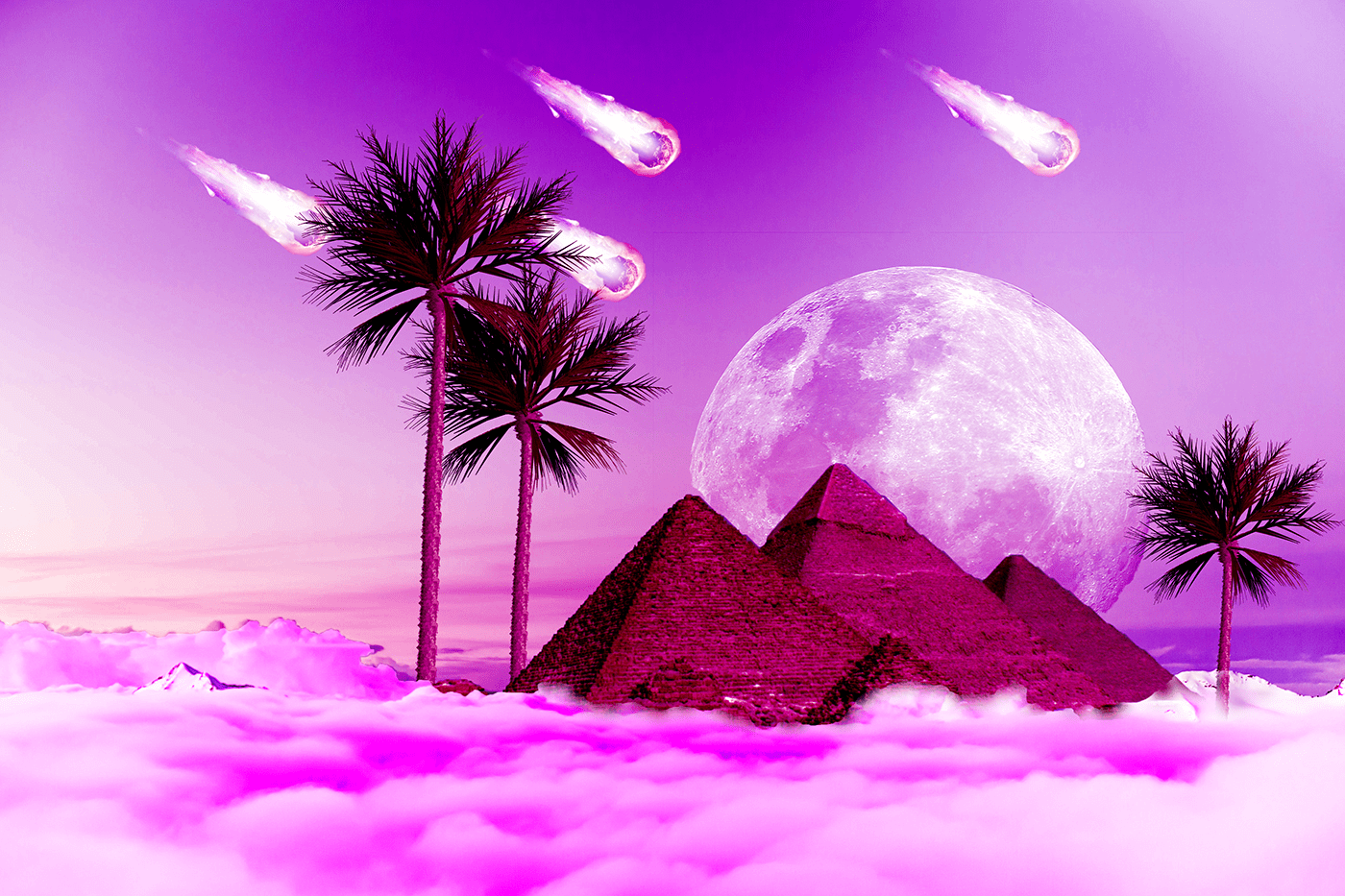

At last did this after facing small errors
@meager mason Thank you for the help it worked!
Gave +1 Creative Carma to Evil-Knijntje
n
https://www.behance.net/gallery/93662519/Typeface-Design?
@sacred abyss should I post it on Instagram
sliced and diced
hola, alguien sabe como entro a la cominidad #adobe_illustrator
This is my final and I look forward to see yours! Remember Jason Levine will review them at the end of his stream 🙂
Hi, does anyone know how I enter the community #adobe_illustrator
Challenge 7. While in the Save for Web window, I was unable to Shift and Click to view the slices. Also, I had to change each slice to a .jpg. Some were .png or .gif. All else worked great! In my image here, I feel the line through the butterflies resting on the moon doesn't work, at least for me. Lesson learned. Thanks for the teachings!!
@tropic knoll I had the same problem with saving. They were all gif but one and then I couldn't go back and select them all the way she showed. It was a bit of a pain. I don't understand why it isn't smart enough to pick the same type (gif, png, jpg) for all of them if we select "all slices"
Gave +1 Creative Carma to CK
@thorny comet yeah, that threw me too. But just do it and then go back to your front page thingy and it will be in the grid and in the right order if you labeled the slices and then uploaded in the order she said.
I had some fun with the current events and this is my last day of being quarantined! Challenge 8.
here's my challenge 7, Grid. I was a bit familiar with this one, I like to use it for my panoramic pics in instagram, even if you upload all the pics in one post you could see the panoramic pic by scrolling sideways, just pay atention to the order you upload them 🙂
Challenge 7
Still behind, but managed to complete the slices. Now for challenge 8. 😉
I have a problem after exporting some of the slices are .gif and only one is .jpg? I follow the video but I still get the same result. Can anyone help?
@young karma It is not white edges is pages
Challenge #8
@young karma hello! Make sure you go in to File > Export > Save for Web (Legacy)
then select Jpeg from the drop down menu of the saving window
and finally select all slices when saving
Hope this helps!
@young karma hello! Make sure you go in to File > Export > Save for Web (Legacy)
@agile ruin thanks
Shapes
challenge 8
Challenge #7: Instagram Post (had to use Adobe Spark to create the separations)
Challenge #8: Love the Curvature Pen Tool!
Not quite my thing, (I'm a lot more about photo re touching than graphic design), but I've enjoyed this series, and at least I've caught up. 🙂
Challenge 8
Day 8 - web site mock-up
Challenge #8
Challenge #5
I am a little behind, planning on catching up later tonight but here is my challenge #5 result, my advert was originally designed as an 11 x 17 tabloid poster, so I decided to make a different kind of mock up but here is the result
Valentina Taneva Today at 11:23 AM
I have a problem after exporting some of the slices are .gif and only one is .jpg? I follow the video but I still get the same result. Can anyone help?
and here is the second version because I am in love with gradient map
Hi Valentina. I had the same problem. When you Export, zoom out so you can see all the tiles. Then you need to Click on each tile even if it is shaded. Notice that the single tile may change to a .gif or .png, etc. I had the same problem. So I selected .jpg for each one. The button at the bottom All slices didn't work for me. Hope this helps you.
Hi Valentina. Actually the All slices did work as it exported all of the slices and not just the one highlighted. However, the exported slices were not all .jpgs as I expected. That's when I realized I had to click on each slice (even if it is shaded) and select .jpg or whichever extension you want individually.
I just read it was supposed to be monochrome. Opps. Glad to see I'm not the only one that missed that part. I like this anyway. The bent pinkish part was a mistake but I liked it and so left it in. I was trying to soften the edge by using a gradient on the mask but when it did weird things I realized I didn't have the black/clear gradient but the black/white one. So I hit undo a few times and well, this happened and I liked it so left it at this point.
Challenge 6
Challenge #6 my Snail Citizens of my Mythic Animal preserve.
Day 7 - Slices
Day 8 - I got caught up!
Challenge 7 I'm not understanding how to send the image with the gaps in between
@dusty pond you would export the individual slices like Kladi did and arrange them on a new document. you can also upload them to instagram instead and take a screenshot 🙂
Challenge 8. The thrill of these challenges is liken to riding on the downward slope of a roller coaster from the moon to earth. Loads of fun! Thank you!
This is so much challenging! 😁 😀
Challenge #8
Challenge 8
@glacial path OK, thank you. I did export them separately I just didn't know how to put in the grid w/o them snapping back together.
Gave +1 Creative Carma to evil
#Kladie i know there is a dropper icon in camera raw but i think its for white balance- is that correct or can that determine colour changing other then using the sliders?
I love the shade of purple i got in this one. I thinkim slightly out on the straightened image.
@agile ruin I know there is a eye dropper in ps camera raw- is this just for white balance correction or can this be like a colour changer as well like the swatches in ps
Day 8 - web site mock-up
@forest aspen very beautiful
Hello everyone, I am a little late as I took a bit to catch up. I am new to the Daily Creative Challenges and Discord. I would appreciate as much feedback as possible if you can.
I decided to do my cover image a little different. I decided to go "cat dreamland" inspired by my little buddy.
@severe flame Really interesting colors on this! It could be nice to boost the darks a bit with a levels adjustment and push that contrast to get a stronger sense of form, depending on the look you're going for. Nice work, definitely changes the impact of the image!
@fast moth This is definitely an interesting image for this challenge! Really loving all the colors. This image lends itself really nicely to a sort of surreal dream-like look. Nice cohesive look with with the color pallette too, mostly purples and reds with accents of yellow. Very nice!
@plucky basin Nicely done! This is all looking really good. I like the depth that the receding pyramids add!