#✂challenges-feedback
1 messages · Page 43 of 1
Gave +1 Creative Carma to imitating
Photoshop crashed, forgot to save my file 😬 at least I have the image which I can use for further editing....stupid me!
Water
@wet thistle - well done
Latest entry
I am a little behind but I made this a few days ago. feel free to give feedback, trying to implement things I can use at work too.
original images
Hi @high wharf , is this better you think? Thanks @fathom moon !
@wet thistle looks cool, maybe drop the opacity on the rain so its just barely noticeable, just to add something mysterious going on in the Darkness leaving rhe coolness of the bird as the main focus.
Thanks @high wharf , I will do that 😀
Gave +1 Creative Carma to Jesse S.
@wet thistle Crashed on your amazing hummingbird? That has to hurt.
@wet thistle Do you have a Behance page? I'd like to see more of your work.
Finally managed to work it out, here's a cougar in the rain, my entry for Day 3 🙂
Day 3: I must admit that, to save time, I've modified a previous composite image from Pixel Fight Club Continues by adding the splashes. I also removed the magnificent curled feather tail, beak rings and tattoo to make this a regular cardinal again instead of the punk cardinal of the original 😉 The birdbath image had some rain, but I created more. The cardinal with the sad tails is from MorgueFile; the birdbath is from Pixabay; 2 splashes are from iStock and the other two from PixelSquid. I was surprised at how much the splashes added to the impact of this image.
@forest aspen Very cool! As far as I can tell, this absolutely looks like a regular cardinal 🙂 The water splashes are perhaps a bit too bright; you could reduce the opacity slightly and maybe even add some distortion to the background behind the water splashes. The rain looks pretty natural but the droplets are rather small compared to the real ones. that is okay for the background but I would mask out the part in front of the birdbath
@deep mango Beautiful! The rain looks nice and the water splashes are well-placed. I think you could make them slightly larger, right now they are all separate objects and I think it would look more natural if they sort of flow into each other (I hope you know what I mean 😄 )
could be a curve like this
@wet thistle WOW! Not sure if you even need the rain, if you ask me 😮 - the wings look stunning, almost like glass 😄 ... great work, honestly!
@sharp shadow (lol, your avatar 🤣 ) Yes, love the hue shift and the pattern in the background 😄 . I think you could sharpen the edge here. the transition looks rather soft.
And perhaps you can also shift purple shadows to a more blue tone to increase the color contrast between the orange background and the shadows 🙂
you could also reduce the saturation for a more natural look
the desaturated version results in a much warmer and more pleasing color composition in my opinion 🙂
Day 1 - Challenge
Day 2 Challenge - Glass Effect
All Catch up - Day 3 Water Effect
@young karma haha yeeees! epic composition 🙂 I'm going to briefly mention a small detail (since everything else in your work is A+, if you ask me). I think the perspective is slightly off. If you carefully trace the perspective lines to find the vanishing point (and with it, the horizon line), you can see how they're not the same. To be fair, this is very difficult to pull off, so I don't blame you. Having a matching horizon line will greatly increase the realism and believability in your work. Unfortunately you can't really fix it for this example. Jesús Ramirez showed the same technique during his live stream on Adobe Live (a few weeks ago), where he worked on a Spiderman composition.
@mint sorrel beautiful photo! But the reflection is way too perfect 😉 the water surface is pretty rough, so I would add some distortion to the reflection like this
if you play with the blend if sliders, you can even fade out the layer, where the water is darker
Thanks @glacial path I tried to do something with the reflection but didn't know what exactly! Now I know! 😄
Gave +1 Creative Carma to evil
you can use the liquify filter to mess it up a bit ^^
this is how the layer looks without the water
@fast moth Oooh, that's a pretty difficult composition 😮 , not easy to pull off! I think you are very close, just make sure to correctly match the lighting of the subject with the background. IMO the person is a bit too far on the bright side.
perhaps you can also use a different color for the water 🙂 - water looks pretty transparent, unless it's in really large quantities (like in oceans or lakes)
@unkempt field day one looks great! The pattern in the backgroun isn't too "in-your-face" - I like that 🙂 . Your submission for day 2 looks great, I would just spruce up the background a bit, possibly with a gradient, vignette, texture or pattern 👍
And regarding day three, you could just add some motion blur to the rain to smooth out the edges a bit ^^
well done overall and thank you for catching up 😄
@young karma Nice, Illustrations aren't too common during these challenges 🙂 - the added bubbles certainly look nice and I love the more vibrant eyes 😄
@young karma Your animation with the water is super nice. Do you know how to use the animation feature in Photoshop? It would make a really cute gif. With the character slightly bobbing, and the rain falling in a loop. Awesome job, love that style.⭐ ⭐ ⭐
Its a screenshot, but i really want to participate! 😩
What takes Jesus 20 minutes takes me hours lol But still learning
Here's my rain work
#psdailychallenge w/ Jesus Ramirez - Water Splash
Thank you @glacial path The rain was indeed a little too much. I lowered down the opacity on the rain and will put the 2 versions on my Behance page.
Gave +1 Creative Carma to evil
Thanks @fallow bough I am not that good though 😆 but if you would like to see more of my work, you can look me up under my name Carry Jacobszoon.
Gave +1 Creative Carma to Ken Cawley
Here is my post. Day2. 😂 really difficult.
@night sapphire Hey, I love the shapes you're using. Are you making them in photoshop or in another program and just dropping them into Ps?
@subtle plume Whatsup! So im using Cinema4D to make the shapes and background. Once i render a quick JPG, I then apply the water splashes in PS. These challenges are dope! 🌉
@night sapphire Very cool!
@rare solar Ah, good idea to combine the two challenges for Day 2! I like the idea. Could be cool to see a couple more shards of glass thrown in, maybe one at the bottom area. Since the image is so dark in a lot of places maybe all the glass segments could be a touch lighter than the rest, might almost look like a little bit of glare on them and help the effect stand out better. Looks good!
@fast moth Looking good Camilo! Liking the displacement effect of the glass. Could be cool to see that pushed a bit more in the hands so the shape is broken up a bit by shifting it left or right. Could also be nice to have the glass not so neatly within the frame, but add a little sense of depth by having some of the shards being cropped by the edge of the image. I like the color shift of the glass images too, looks good!
@summer grove Looking good Oscar! Hah, that’s a good image for this challenge. It could be nice to see the broken glass effect extend into the bottom right corner as well. It’s almost a little visually confusing why there doesn’t seem to be any glass there at the bonnet. Doing the same thing you see in the top left would help a lot I think. Nice work, the glass fits well into the image!
@glossy dove Nice work Tanya, the color scheme is working really well! I like that subdued color in the background and the more bold contrast of the figure. I think the masking of the figure could use a little more refinement. I think often times you can get really nice selections with the Quick Selection Tool, and the “refine edge” sub tool can really help clean up those tricky edges. Here’s a quick video to explain, but that should help with getting more consistent selections. Nice job! https://youtu.be/c2I7X92IVGk
@young karma Very nice Kristin! I like the reflection effect in the glass and how it darkens the colors just a bit. Looks good! I think you could add a little more glass effect that extends out to the edges a bit more, just to push that feeling that they’re flying through a pane of glass. Nice work on this!
@long robin Nice, It’s looking solid! I really like the purple/orange color scheme you currently have. My only suggestion would be to move the text a little bit to the left or right to avoid the tangent it’s currently making with her neck. I think moving it over to the right a few notches could look good, but even having it overlap her neck slightly if that’s where you want it might look a bit better. Looking good!
@fathom moon Very nice! The dark edges really stand out nicely against the sky. I like the sort of shifted reflection effect you have. It could even be cool to break up the shapes and push that displacement effect by shifting the areas in the glass more in a few key areas. Though the reflection effect does this a bit which is nice. This is something that might be more effective in the clown image by really being able to break up the shape and emphasize certain areas of the face. Looks good!
@austere shoal Ooh, this image works really well with the broken glass effect! I like how you really magnified those areas to add some more intensity to the effect. It could be nice to have a couple small pieces of glass, even if they’re only overlapping the background a not the face, just to add a little more context to the image and sell the effect that there’s glass shattering in front of him. Really nice work!
@unreal crescent Very nice! I really like how the more subdued saturation of the man contrasts with the intensity of the background saturation. Looks good!
@maiden barn These broken glass challenges are looking good! It definitely gives the Halloween one a bit of a creepy feel too. My only suggestion would be the area on the first image on the right side below her hand. It looks like there’s a hard edge on the background that could be cleaned up a bit. Nice work on these!
@sullen lion The glass effect is looking really good! I especially like the inner effect of the cracked glass/hole. It focuses the attention towards the center of the face nicely. I’m not really good when it comes to fonts, but I wonder if another font might fit a little better thematically. The current text almost seems to look a little out of place with how clean and bright it is. Maybe even just toning it down to not be full white could help. Just a light gray maybe. Nice work!
@paper tiger Whoa, love the way you used this challenge and effect to enhance the creepiness of this image. It really gives it an extra impact. I’d suggest making the edges of the glass a bit more sharp. That really sharp edge is a bit part of what sells it as glass, and that seems to have been softened a bit on these pieces, especially the top one. It might even be a good idea to add a third piece of glass coming out from the right edge of the frame just to give more context that this is indeed shards of glass. Really love the dramatic effect of this image!
@formal sage Really love the concept behind this image! The way you fit the young and old images of the portrait together works really well. You got a great balance of the two images. The color shift between the two really helps as well. It’s a small suggestion, but I think the red background behind the mirror in the corners might do better as a slightly darker cooler color. Maybe something more towards the purple, blue, or blue-green range. That might help the center red pop more, while drawing less attention and contrast to the edges of the frame. Really nice job on this one!
@young karma I see what you did there 😄 Very cool effect with the broken glass! Great work, I especially love he motion blur and increase in size for the shards flying out around the edges. Really gives it some nice depth and sense of motion. I feel like the red “It’s” text seems a bit strange. It seems like it should be repeated elsewhere in the image (maybe the eyes?) to be more of a cohesive effect, or even just change the “Child’s Play” text to also be red. Really great feel to this image!
@fallow bough Really great work Ken! It looks great as an avatar too. The displacement effect works extremely well, I really like how face you pushed some of it, especially with the eyes on the far left and right. The way the glass all points to the center is a nice effect to strengthen the focal point as well. There’s a lot of busyness with all the shapes, so I wonder if creating a bit of a vignette could help focus more of the attention towards the center of the image and fade away some of the detail around the edges. Just a thought. Really nice work!
Nice work Linda, on the road with Android and can't comment at your picture, so I give you a clap this way
Day 3 v 2
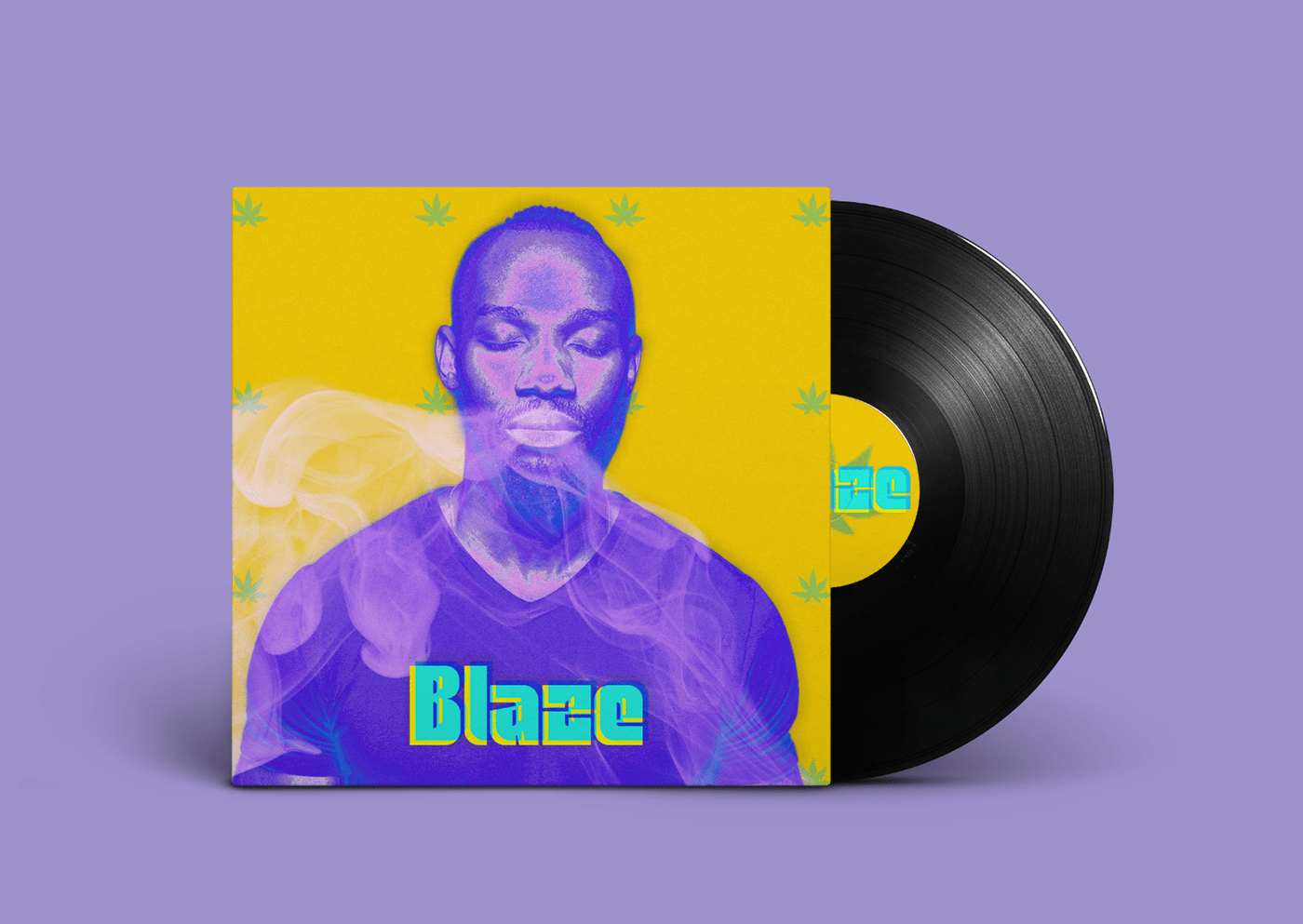
#✂challenges-feedback Day 2 - Glass. For this challenge, I created the second concept/sequel album for my imaginary band. I used the image of the woman which was provided and also things I created from scratch. I drew all my elements as doodles and imported them into my Library with my Adobe capture, I used the same logo from the first album, which I created out of sticks in my backyard and photographed. I invented the song titles and band name as well. last week was Stephen King, and now I'm having a blast doing these kind of things. It is what I do. I hope you guys like it. Feedback is much appreciated. I'm currently fixing and making a few tweeks before it goes live on Behance.
Back
Mock up
source images
Challenge #3 - Water Effect
Gave +1 Creative Carma to SamPetersonArt
@bleak fossil Thanks a lot. I appreciate teh feedback.
I took your suggestion @glacial path you're right, it looksa lot better to me with the splashes in the shape of a curvature 🙂
Also with that head @deep mango i'm sure you could place some splash behind to add more depht for the composition with some mask
@vivid dew something like that?
I was thinking about splash behind the head, like the ears
But that's a good add for the back
Photoshop daily challenge#1 a little bit late cause of school homework , welcome any criticism 
@high wharf unfortunately i don t know animation but i ll give it a try. Thanks for your feedback
Gave +1 Creative Carma to Jesse S.
Here's some splash added behind the ears @vivid dew 🙂
Or more like behind and a bit around the ears
That's a nice touch 👌
That's awesome, thanks for all the feedback and suggestions on how to improve it @vivid dew 🙂
Gave +1 Creative Carma to Allester
I'll show you a piece of what i'm doing @deep mango for the example
As you can see, with playing a little bit with masking, i can add some depht by placing the splash in front "AND" behind the subject
@high wharf Those doodles are great again! I like how the "normal" model is on the shattered glass with "succubus" model breaking through from behind. It's a good juxtaposition. Not sure if it was intended, but there is one piece of glass behind the arm of the succubus and it looks a little out of place when all the rest is in front.
Running behind Challenge 1 Album Cover
I didn't get particularly creative with this glass effect challenge as I'm a bit behind, but the use of smart objects and the ability to change out the subject with minimal fuss is something that's really cool to know. I've used smart objects before, but not in this way, so it gave me a better understanding of their usage.
Day #3 - Water wave (Updated)
I added the shadow for the splash water, fluid texture for the bridge to make the rain more realistic, and add a pastel effect for both splash and water background (and adapt the rain angle with the pastel effect)
Maybe i added too many effect ? But that's seems fine for me ⛈
Comparaison with the first submission
Here's my piece for the water effect challenge. I had a little more fun with this one.
I decided to go for an advertisement look partly because Jesús said he got the idea for the challenge from a product photo and partly because of the product photography retouching tutorial that followed the daily challenge.
I used the rain effect to create the look of steam/mist along with a smoke brush I made previously to create some fog in the background of the piece and colourized it to match the product. I tried colouring the water but it seemed to work better without the colour for this particular image.
@subtle plume thank you. That piece is meant to be there almost like her fist came right up through it and is coming out of the picture like the shards., Same with her other fist, there's a piece behind that one as well. kind of like if the original picture was sitting there and the spooky one is smashing through the veil of reality.
Gave +1 Creative Carma to The Elephant In The Room
@barren stream WOW! Your evolve guy is really well done. I love how it goes through his head. Pretty awesome stuff.
@fathom moon That looks incredible. It almost looks like an illustration from a graphic novel or something!
@barren stream It's an amazing art !
@fathom moon The realism of your work amaze me ! The rain and splash water work perfectly together !
@barren stream Really awesome job! Great colours and patterns and a nice balance of light and shade, too.
@granite carbon LOVE your challenge 3, uplifting and great colours! Blue & yellow are my faves. Would love this as an uplifting print in my workspace! 🙂
@young karma definitely check out the animation function in Photoshop. It's pretty straight forward and easy to grasp for making something like a looped gif. I know they have covered how to use it in past challenges or there's a ton of great tutorials on YouTube. You'll be good to go in 20 minutes, and if you enjoy making cartoony style art, it is something that will fill you with joy and pride to see your drawings come to life.📽
@subtle plume Your water wrapped perfectly the product, i just wonder if there is not too much water, but it seems good like that.
@subtle plume yes, less is more in this case. Looks fantastic. How much is a bottle?🤑
Challenge 2 Broken Glass... had some fun with this one 🙂 I used the Command J option suggested by someone at the end of the video to duplicate my glass pieces instead of rasterizing and creating a mask to get my pieces without loosing the original file, as this seemed to be much quicker. Did I still need to rasterize each piece after doing the command J? I didn't do this, but didn't seem to have any issues continuing the project, although would be helpful to know for the future if I should have done this step?
@bleak fossil Thanks for the feedback. I have moved the text slightly to the right and tweaked where it crosses the shoulder (I did want it to overlap the neckline/shoulder as I wanted it to have a slightly jarring feel). 😁
Gave +1 Creative Carma to SamPetersonArt
@fathom moon Wow. The water effects look great.
@high wharf @vivid dew @subtle plume Thanks for that but i can still add a little touch but then due to school's stuff i cant really continue anymore😫
Gave +1 Creative Carma to The Elephant In The Room
Sadly, I got hung up on the glass challenge within a few minutes of the video. I couldn't follow the order for creating the floating glass piece from the full image. Is it 1) copy image to keep the original, 2) lasso a piece of glass, 3) apply a mask, 4) rasterize the layer... or was it 3) rasterize the layer and then 4) apply the mask???
Challenge #2 Mirror Mirror LET ME OUT! I can admit this was a struggle for me but I did what I could between a rush project and my teething baby lol
Hi guys. Happy halloween to Everyone.
@young karma the video is on the Adobe YouTube channel. You can go back and rewatch it as many times as you want. Do each step then as Jesus explains it and pause the video until you are ready for the next step. You can't go wrong.
Challenge #3 Oh the fun I had with this one! @lethal mural amazing tut!!!
@young karma you can make a selection, command j to become a layer, than mask
Challenge #3 Mockup I was thinking maybe a lighter background. Let me know your thought 😀
@maiden barn - thank you - happy to hear
Gave +1 Creative Carma to bryannicholson
Water splash challenge. Feedback very much appreciated
@high wharf - I did exactly that. Still no luck. Jesús had to remind himself of the order which confused me even more!
Day 3: water splash/rain effect with a halloween twist
@keen granite I love the concept to change the rain and splash into another color, it worked really well with your subject !
@bleak fossil Thanks for the feedback. The vignette suggestion definitely helps focus.
Gave +1 Creative Carma to SamPetersonArt
Autumn
@vivid dew thanks!
Gave +1 Creative Carma to Allester
@vivid dew - thank you!
Gave +1 Creative Carma to Allester
@subtle plume - thank you - nice to hear!
Just now getting to these challenges so here's day 1. I can't really put my finger on what is missing but I feel like there is, so please let me know if you see something. Also, does anyone have any way of making the ripples look more realistic? Thanks!
@formal sage OMG! Your witch is amazing.
thanks @high wharf really seemed fitting for the holiday, the splashes are a bit forced (the hat on is dead on) and def would need to spend more time blending her into with the BG and the melting...yet it def gets the pointe across, really appreciate the props man, youre good people for sure.
Gave +1 Creative Carma to Jesse S.
I'm a little behind. Challenge #2
Challenge #4: Halloween ...when your parents are a witch and a vampire.
Wink wink
Still have to work on the blend between foreground background and arm highlights
My halloween Pic
This is my Halloween image
Very cool! @still quail
@keen granite Thank you very much. This is my first challenge and i never experience a halloween before so doing this image was fun.
Gave +1 Creative Carma to LeahMichelle
Hello, Thank you Jesus for the coaching, it's was fun to make this challenge Day 3, water effect. Thank you for watching and your advice.😀
Here's day 2. I just used a stock photo from the last challenge. I had trouble with moving the reflections to look believable but I think it turned out pretty well for my first try. I am open to any and all criticism or comments.
Updated with input from live stream.
After this, ....... I am not sure if I am ok 🤔 😳 👻
@young karma completely disturbing, well done 👏🏼
@still quail you’ve never experienced a Halloween before?!! That’s crazy! I hope you are enjoying one today. 🎃 👻
@young karma i had to look at this for a long while.. love it. lol
@edgy idol sure having it here.. thanks same to you
Gave +1 Creative Carma to imitating
Did more work to color match arms to other Dead. Also blurred hands to reduce feel of popping out from image. Both subtle but helped blend foreground-background more.
@edgy idol Thank you 👻
Gave +1 Creative Carma to imitating
@still quail 😆 I wanted create something different but I did not expect such great result .... Thanks
Gave +1 Creative Carma to v2rservices
Photoshop Challenge 4 Halloween
PSDaily Creative Challenge #3 with Jesus Ramirez (Water Effect)
@kindred gate very nice myself need take that challenge as soon as i leave work. I really like this
@maiden barn this is a vampire hulkish girl...lol I love how you did it with a close mouth wanted to try that but scare it wouldnt work. This inspire me to try it too
Happy Halloween ! He's really scary. So cool this challenge Thank you Jesus for coaching.
@still quail There were just enough teeth for me to be able to do it. I tried with a different picture first and it didn't work out. Thanks for the kind words. Can't wait to see what you come up with.
Gave +1 Creative Carma to v2rservices
PS DCC #2 Water Effect
PSDCC 3 Water Effect. I think I like a pink frame 😊
Todays Challenge
Please let me know if there are any improvements that can be made
@glossy dove her fangs look real good to me
Day 3 Rain Effect - Left is the original photo that happily already had some rain drops on the leaves and petals, next to my full on rainy version on the right. Also used some rain drop overlays that I already had with some different combinations of blending modes and opacity; tried to use every technique in the video apart from the fibres filter as that was kind of confusing and too many steps! Wanted to try the Kyle Webster rain brushes, but couldn't find them even though I'm sure I have them. Is there a way to search through your brushes by name? it's really hard to find the ones you want just scrolling through!
@long robin Holy smokes, that rose looks gorgeous. Every detail is A++. Amazing.
💯
rain effect challenge, hard to make look realistic, comic's etc... would be great effect for.
@vague swift Well done! The walrus looks pretty realistic 🙂 The overall image could be a bit brighter though and I would perhaps make the mask of the city a bit tighter
the rain effect is well-executed, if you like you could add some motion blur to soften the droplets
My head on left hand zombie.
@long robin they're probably in the concept brush pack 🙂 - I am very impressed with your submission. Already having some water droplets on the petals goes a long way and saves so much time; same with lighting 👍 . I love the clouds you have added, they're not super realistic but they add a lot of character to the composition 😄
I would just remove these circles here. the background doesn't have any light sources to produce the bokeh naturally and the opacity is very low anyway 🙂
@glossy dove A+, very disturbing 😄 Love the teeth and the blood! I think the scars on the left (her right) side are a bit too dark - maybe you can reduce the shadows 🙂 - I like how the text isn't pure white and red, it could be a bit brighter though. Just enough to match the brightness of the photo
@kindred gate Ooooh I like the cyan-ish water splashes! The go well with the tinted shadows and the textured frame, nice complementary colors 👍
@tacit condor Haha yes! Looks like fun 😄 I would only mask out the lines here. the water splashes look very realistic 👍 . Perhaps you can also add some smaller rain drops to add some depth to the rain 🙂
@young karma 😱 That's a solid 11/10 on the spook-o-meter! the missing mouth and eyes are just something else - great fuel for my nightmares 👍
I would probably tweak the mask near the forehead a bit, just to include all the details 🙂
@kindred gate just saw the teal version and I'm more drawn to that one actually 😄 It almost looks like the water is emerging from the frame 🙂
@glacial path I like both, I did the pink frame because the water was emerging from the frame, Thanks
Gave +1 Creative Carma to evil
@maiden barn ha, nice! I think you could add a subtle glow effect around the iris and the blood could be slightly darker to blend in with the natural lighting 🙂 . You've already nailed the lighting with the scar, so this one should be not terribly difficult to fix (if you're not sure how to fix it though, I'm here to help) 🙂
Love the hue shift of the skin by the way! Nice and undead
@fallow bough how... just how‽ You're Photoshop skills are on another level 😄 The lighting matches the scene perfectly and the colors are on point! The shadows could be a touch darker, but honestly that's the only thing I would improve. Fantastic work!
@young karma what the.... no. 😱 just no. AAAAaah 😵 ! this is wrong on so many levels! nightmare fuel right there 🙈 (well done I guess 😛 )
but honestly, great work! the edits look very natural and I almost can't tell which part was in the original painting and which of the spooky elements come from your imagination
@late current very artsy, I like it 🙂 The reflections look actually pretty believable and the subtle variation in brightness really sells the illusion 👍 ! I would perhaps clean the mask up a bit
the edge is a bit soft 🙂
@glacial path Thanks. Spent ridiculous amount of time on getting color to match.
Gave +1 Creative Carma to evil
Challenge #4
@magic hedge this is awesome... look so real
@still quail thanks!I was trying to keep it creepy but realistic...
Day #2 - Glass
I can not rasterize a layer after I use the lasso to select my piece of glass. Rasterize Layer is greyed out.
Think I scared myself working on this one! 👻

Instagram
32 Likes, 6 Comments - Imagine Studios (@imaginestudioofficial) on Instagram: “Shadows mutter, mist replies; darkness purrs as midnight sighs. 🎃🎃👻👻 Happy Halloween 🎃👻🧟♂️ Edited…”
Happy Halloween All🎃🎃👻👻
Been busy this week but here's Challenge #1!
Water + Cover Challenge
@glacial path I didn't like the eye blood anyways so I got rid of that, added a glow to the eyes and bite marks on the neck.
When I download the assets they are not linked so I can t used them?
going to coloring with PS
Challenge #4 "Hangry Is A Dangerous Thing". @sterile bane I changed my direction, prior I was going to have it be about Vampire Dental Care 😆
Day 4 challenge
Have a great day!
@candid chasm I like your Challenge #2. Since you added color to her lips on one of the shards you may consider doing that in all the places where her lips are.
@keen granite good point haha. I'll fix it! Thank u ☺️☺️
Gave +1 Creative Carma to LeahMichelle
@young karma Woow! The blood seems pretty real! Great job... btw wasn't sure if I am ok because of my halloween picture but now I know I'm not the only one 😂 ✌ 👻
@glacial path Thank you! 😄 I appreciate it. That means I'm creepy enough 😆
Gave +1 Creative Carma to evil
@glacial path Thanks for the feedback! Yes it was probably a bit of a cheat using a photo with water droplets and great lighting, but I knew I did not have much time to work on this one, so had to give myself the best head start possible 😉 Managed to remove the circles finally without changing the rest of the image; was harder than it should have been as mistakenly used a bokeh brush in a destructive way on one of my masked overlay layers, so took more than just simply deleting a layer or using eraser!
Gave +1 Creative Carma to evil
hi everyone. Sorry, was bussy alot with the work. here's my PSDCC entry day#1 Please comment feedback. I would really appreciate and love to learn with you people.
Assets that I used.
TADA!!! added in a mockup? How's it?
@young karma Ha, thanks, likewise you did a great job, your image was super creepy, especially the hand-foot thing! Definitely nightmare material.
Gave +1 Creative Carma to kristin
day#2 PSDCC Breaking Glasses Effect. Please Do comment feedback. I would really love to hear tips about typography. i find it bit hard to work with the fonts. Which one to choose when working... That's always challenging part for me.
Assets used.
Day#3 Water Effect. Here's my entry. I redesigned this add banner of Ocean. Please comment on, Feedback. i need you. Please suggest the tips on the Fonts/typography. Thanks.
Assets used.
https://www.behance.net/gallery/87479023/PSDCC
please check me and do show some love or feedback. Thank u so much.

Hello, I'm trying to catch up. These are my Day1 -2 -3.
It's vacation for the kids but the mom has to keep them buzy :-)
Day1
Day2
Day3
And here is may Day 4.
@young karma Wow! Really amazing ideas for day 2 and 3! Very realistic designs. 👍
@supple geyser Very nice mockup and i like how you used blend modes.
@shell chasm Very elegant design, but I think the text is a bit unreadable, make it smaller and maybe change the color.
@errant moon Very nice style, but the text needs to stand out more. 😉
@kindred gate I like the pink frame too, but I suggest making the water pink for consistency. 🙂
so simple 🙂
PS DCC #4 Halloween
Challenge #5
@silver trench Thanks
Gave +1 Creative Carma to Vandam Dezigner
Here is my Day 5
My Challenge 5. Social Banner
Challenge #5: Social Banner - just a quick draft, used the pen tool for this one
@young karma The color palette in that background image make me happy 🙂 I like your color choice for the text, and the smooth lines you got are superb 👍
@long void I love how the bottom swirl/swish/flourish (not sure what to call it?) looks 3D with how the striped version touches the edges of the solid version... I wish the top half had the same effect - rather than appearing to be just nudged over several pixels and disconnected. I hope that makes sense?
still doing this one😫
Just trying what i have learned.✌
@edgy idol Thanks
Gave +1 Creative Carma to imitating
Hope you like. I'm still playing around with it.
Day 5: since I don't vlog, I used the curvature pen tool to reshape the "v" into "b" in Ramirez's design. I can see where making logos with a color layer and a pen tool could take hours of meticulous adjusting to get just the right outline. I ended up putting the logo over a screen shot of my blog page to replace the current text. The shape alone looked too flat so I added a small drop shadow and bevel and emboss fx..
Here's the other one.
@glacial path You were so right about my rainy cardinal birdbath. I lowered the opacity of the splashes, made the rain drops bigger and lowered its opacity as well, and masked out much of the rain on the bowl of the bath, It looks much more realistic. Thank you!
Gave +1 Creative Carma to evil
I just tried the water effect i dont like it but i still wonna share it guys.
Add some exposure to it.
@still quail The bluish hue on the figure doesn't match with the background. With a little color correcting and some brighter highlights, you could make look more like he belongs in the environment. On the other hand, the bluish tone makes him look a little bit like he is part of the water. Maybe that was your intention. 😀
Challenge 4.
@granite carbon Thanks for the feedback i know something was wrong but just getting a hang of it
Gave +1 Creative Carma to LindaCline
I know i'm late, but since I had so much fun making this, here is my Day 3 Challenge Result (sorry for the low quality tho, the pictures i ended up using were so small.. #whoops) :
@spare spindle I personally like the blend mode on the 2nd one better. One thing that I feel should be corrected is the horizon.
Day 5
Great job @young karma the cellphone pool is fantastic. A+ and I feel you regarding the kids, mine will not let me do anything this week. I'm playing catch up as well.
My next move
@supple geyser your mountain mood design is cool, I like how the main circle overlaps into his shirt. I would put his forehead back together though, it looks a bit odd and in my opinion not necessary. Your mock up... Record sleeves are usually square, so I'm guessing it was an afterthought. I'd raise the height of your canvas size in your original working file to match the width so you don't loose what you've already done and then play around, add something simple to fill the space. Also, the shadows you added to the mock-up are not needed, the template you used should already have one. I hope that helps you. 🥂
I love the creativity that everone is posting. I am following or at least trying to follow Jesus Ramirez. I love the freedom quote , "Artistic Abilities." Here is my challenge, 5 - attempt with Social Media banner.
I wasn't too crazy about Challenge #4, but It isn't alway about me. (HeHe) Here is my fangs and bruises.
Fangs and bruises
@edgy idol This better.
No idea how a hen got in there, mad. 😜 Have a good weekend all.
@spare spindle much better... it’s still a little slanted, but much better. Sometimes I find pulling down a guide helps when trying to line up a horizon.
@spare spindle have you tried reversing the gradient? The text might stand out more if the orange was over the water, and dark blue over the sunset. Great job on lettering 👍
@high wharf
Halloween
@high wharf Thanks for writing me. Really appreciated your time and Feed.
Gave +1 Creative Carma to Jesse S.
Created hand lettering and added over previous challenge. Need honest feedback please. Has this style lettering become a cool retro style, or am I just showing my age by doing something that might have been trendy 50 years or so ago? Is the word easily legible in a circle? Would it look better in this style (or a different style) written in one line in the grass area? Thanks!
@granite carbon I'm probably not a good judge of what is trendy or "in" but I think the lettering is super cool. It is, however, difficult to read. I'm not sure where to start the word.
Day 5
@granite carbon I agree with Brian. It's super cool, I wish I could come up with something that nice, but, it is difficult to read. I'm assuming that it says dream, but it could also be Dr Ame . If it was a logo for something like "Dream Foundation" it could work if you had "Dream Foundation" in a nice font along side it or under it, if that where the case, then it's ace as it stands. And as far as trendy goes, I don't know what these crazy kids think is cool anymore. Get off my lawn!
@spare spindle cool stuff, the reversed gradient definitely makes it stand out and pop, I'd still play around with the color palette and ditch the drop shadow. Maybe play with a hue and saturation adjustment layer or gradient map adjustment layer over the background image, make that picture a bit for dynamic, and then match your text colours accordingly.
@high wharf Tell what you think of this.
Just decided to try it on my own picture. Any feedback?🙃
@spare spindle very nice, good job buddy 👍
Lol
Running sooooo behind, Challenge 2 Glass Effect. Bit of a struggle and not entirely happy.
@placid trout Very nice! I like the combination of effects for Day 3! It could be cool to see a little more water splash around the front of the board /bottom wheel as if it were kicking up water as it’s hitting the surface. Day 2 is looking solid too, really liking the reflections!
@keen granite Loving that broken mirror effect for Challenge #2! I really like the texture and dark edges/shadows around the edges of the blue mirror. I really makes her look like she’s behind the glass and contained. I think the image is a great, but I think maybe the presentation could be tweaked to match it a bit more. Maybe scale up the frame in the image so it has a bigger impact, even if the text overlaps it a bit I think it could work as long as the contrast of the text still reads. The background also might be more suited to have a gradient that starts a bit darker at the bottom and gets lighter towards the top. Even a little texture on the background might look good. Might give the whole image a more thematic look. The reflections on the broken pieces of glass are a great touch too!
@keen granite Really loving how much you transformed the image for challenge #3! The purple water is a super cool effect as well. I think the figure in the center could maybe be brightened up a bit to match the lighting of the water as well as pop them out from the background more. The album cover mock up looks great. Really nice work!
@tropic breach Ooh, really neat effect with this. I think it could be great to get a larger splash effect (like Jesus used) towards the top of the apple and then have the rest be the smaller droplets you have now. It could break up the busyness of all the little shapes and add a little more visual hierarchy and a more solid focal point. It might also help to brighten up the apple a bit more to separate the overall shape from the background. Really nice effect!
@formal sage Hah, very nice on the Day 3 challenge! Nice work on the rain effect! It could be cool to have a couple thinner drips in addition to the larger ones by using a smaller brush. I also like what you did with the soft edges on the left side of the dress on the ground to make it look like it’s melting into a puddle. Could be nice to see that a bit more on the right side of the dress with that back edge. Really great idea for this one!
@frank granite Wow, great work with the rain and water splash effect! Looking really good. I like the detail of making the rain diagonal, it fits the idea of the rain being really strong nicely. The image has a great focal point as well with that white mushroom. Good job!
@late current Very cool! I like the concept behind this one. Hmmm, hard to say what it might be missing. As far as ripples go I’d try finding a really nice photo straight downward of water ripples and apply it to your background on a blending mode that works best. It could even be cool to try and unify the two sides of the image by showing the ripples on the right side as well, but keeping them black and white. Might ties the whole thing together while still keeping that divided feel. Nice work 😄
@candid chasm Nice work on the broken glass effect, Meer! I really like the black and white photo with a hint of red, gives it a dramatic feel. It’s a small suggestion, but I think making the mouth/lower face image a bit smaller could help. It seems a little out of place with the rest of the image with how large it is, and making it a touch smaller might help strengthen the eyes as more of the focal point. Really nice work with the image displacement overall!
@edgy idol Haha, very cool! I really like the depth blur effect. I think the skin color looks really cool, but it seems a bit out of place with the rest of the image. Maybe adding a photo filter layer to color grade the whole thing might unify the colors together a bit more? Could also give it an interesting cinematic look overall and you can just tweak the intensity or opacity to suit your liking. Nicely done!
@shell chasm (Tima Aflitunov)#7189 Oooh, creepy. Liking the animation aspect, hah. It’s a subtle suggestion, but I think airbrushing a bit more of a shadow to the corners of the white of the forehead eye via a multiply layer might give it a more realistic rounded appearance and fit the tone of the original eyes a bit more. Really nice job!
@fallow bough Haha, love it Ken, great work! My only suggestions would be to desaturate your face a bit to get that greyish tone all the other zombies have in the hair and shadows of their face, and maybe use a multiply layer and soft brush to push more of a shadowed on the lower part of your beard like the bearded fellow in the background has. You’re killing these challenges, very cool!
@keen granite Looking good! I like the effects you have going for Day 4! Did you use a color layer for the skin? If so, I think it could be interesting to try a hue or color balance adjustment. The only thing I don’t like about color layers for recoloring skin is that is gets rid of all the natural hue variation we see. Skin has a lot of variation, but also any object has hue shifts between the shadow and light tones, and a flat color on a color layer loses those variations. If you keep it this way, it could be cool to a slightly more red tone in the eye areas. Just some thoughts. Really nice work, loving that creepy background!
@viscid kayak Very cool! Loving that face paint. I think you could probably even scale the portrait up more for a stronger focal point and visual impact. It might also be nice to continue the clouds to the right of the face a bit so it’s more of a natural looking shift to black. Really nice work!
@still quail Ooh, creepy. I like how you made the blood follow the contours of his face. It gives it a more convincing look. The texture is a really creepy touch too. Nice work!
@bleak fossil Thank you very much
Gave +1 Creative Carma to SamPetersonArt
@young karma Very nice work! The rain and water effect look great. I’d suggest giving the image a subtle cooling Photo filter, and adding a vignette or darkening gradient in the background via multiply layer to give the background more of a realistic feel. Looking good!
@late current The broken glass effect is looking really solid! The displacement is strong enough in the right areas to really sell the effect. Really nicely done!
@young karma Whoa, very creepy and very well done! This is all extremely well composited together, I’m impressed. Every fits very naturally together, and the scars and eyes look great. Would be really cool to see the original images to see how you put it all together. Awesome work!
@supple geyser Very nice! Your Day 1 challenge is looking really nice! I really like the warm-cool color balance between the red and blues in the image. Mockup looks great too! Though maybe a closer crop and evvvver so slightly lighter cast shadow for the mockup image? Well done!
Day 2 look solid as well! Typography isn’t my strong suit either but these font choices seem to work well with the theme of this image.
@pallid summit Very nice Collin! Really love that illustrated feel you gave the image with the line work, very nicely done. It could be nice to continue that line work throughout the body to give the entire figure a cohesive illustrated feel. Great job with this one!
@young karma These are great! Really nice work on all 3 challenges. Really liking the bold color contrast on Day 1, and he water effect on Day 3 works very well. The glass and distortion effect on Day 2 looks awesome, very nice work! I like the idea of doing it with a phone screen, really cool use of the effect. Though I wonder if the background might feel more in black with a slightly darker, desaturated blue. Maybe even a light texture. Might match the mood of the whole image a bit more. Also I kind of like the textured edge of the selection on the Day 1 challenge, but if you’re having issues getting a clean selection I find that this video on the quick selection tool along with the refine edge tool really helps with those tricky selections. https://youtu.be/c2I7X92IVGk
@devout onyx Very cool! So the first image was done previously before the Day 4 challenge? The new image is super creepy, that skin effect is great. Looks like you stepped it up a notch. Really nice job!
@young karma Day 4 is looking really solid too! I’d just see if maybe you could blur the fangs and bottom area of blood a bit just to match the focus of the image in those areas. There might be other ways to do it, but I’d just duplicate them and make a blurred version that fits those areas on the photo, the mask off the effect with a soft round brush as they get closer to the area of focus. Very cool!
@bleak fossil thank your, I really appreciate your comments
Gave +1 Creative Carma to SamPetersonArt
#✂challenges-feedback Day # 4 Now available at Walmart. My sister and I on my wedding day. Couple of spots to touch up around the ears and elsewhere, but...Time to go to sleep 😴
Thanks for your feedback @high wharf . I really appreciate it.
Gave +1 Creative Carma to Jesse S.
@bleak fossil Thanks for your feedback, I really appreciate. I Will try this and report the results this weekend.
Gave +1 Creative Carma to SamPetersonArt
Challenge #4 - Halloween
... user picture
Here are my adaptations after feedback of @bleak fossil
Day 1 : I was very bold on the selection, ideed. Here I took my time to refine it
Day2 - Darker, desaturated blue background. It fits better with the whole image, thanks @bleak fossil
Day 4 : Blur on fangs and blood to match the blur of the image
Day2 : Perhaps is this color even better
@fathom moon amazing 😱
Challenge 3 finished.
@glacial path Thanks. I have followed your instructions and I like it more like that
Gave +1 Creative Carma to evil
@bleak fossil thanks for the comments. Love you.
Gave +1 Creative Carma to SamPetersonArt
@edgy idol thank you for your suggestion. I have modified it and I show you the origin images
Gave +1 Creative Carma to imitating
@lucid beacon Loved your 4thday Entry. She's beautiful.
@coral stone - thank you!
Gave +1 Creative Carma to Valdair Leonardo
Gave +1 Creative Carma to SamPetersonArt
Challenge #5 - Social Banner
@bleak fossil thank you so much for your suggestions. I really appreciate it.
Gave +1 Creative Carma to SamPetersonArt
I made updates to my Challenge #2. I like it much more this way. It's kind of like her picture is falling down a wall.
@bleak fossil you were so right about lightening up the jacket portion. That made all the difference!
Challenge #4 update. @bleak fossil So true about the colored layers. Yes that was the technique I used and I was wondering how to avoid that issue. Thanks for the suggestions. I will definitely keep working on this technique.
Gave +1 Creative Carma to SamPetersonArt
psdailychallenge
@bleak fossil Well that's a little disappointing to hear since I did a photographic toning gradient map in an effort to accomplish just that. I guess I did not choose wisely.
@bleak fossil That was actually a picture I took a week before Halloween at a Zombie Crawl. There were a few people dressed in zombie riot team gear. I was thinking that it would be a fun picture with the person in uniform. I had a little white makeup and some contacts in. I thought this would be a cool picture to use for what we learned this week. Make myself look a little more like a rotted zombie. Thank you!
Gave +1 Creative Carma to SamPetersonArt
@devout onyx it's mega cool bro 😈
It took a while but Day 4 version of me is finally ready 🙂
And bellow is the original me 😄
Thanks @bleak fossil I'll fix it :)
Gave +1 Creative Carma to SamPetersonArt
Challenge #5 not sure which one I like most. What do you all think?
version 2
version 3
@keen granite version 3 hands down for me.
Thanks @high wharf
Gave +1 Creative Carma to Jesse S.
Hey all! Happy Saturday 😀 I had a great time doing this week's challenges and have add my work on Behance if you want to check if out. https://www.behance.net/gallery/87578439/PS-DCC-Oct-28th-Nov-1st
@high wharf I love your wedding design for Day4 🙂 I've tried to make my face white in my design but didn't managed to figure out how to do it, maybe you could give me ome tips?
Finished Day 4, about half way through I thought of the twilight series. Had a few images I was going to play with but quite happy with how this turned out.
Original Image by abeer_alabdullah on Pixabay
... hi everyone 🙂
I have add my work on Behance if you want to check if out.
https://www.behance.net/gallery/87541085/PS-DCC-with-Jesus-Ramirez
Feedback and suggestions are always welcome.

Day#4 Halloween Challenge. Running slow. Sorry
https://www.behance.net/gallery/87479023/PSDCC-psdailychallenge
Plase Appreciate/Comment Feed. Love u. Thank .
@deep mango thank you, I applied a black and white adjustment layer to the whole image and played with the settings untt the skin tone was to my liking ignoring everything in the picture but the skin. When I was happy, I filled the adjustment layer's mask with black so the black and white effect was 100% hidden, then I slowly brushed in the mask with white at 10-20% opacity over the skin until I was happy. You can do the same thing other ways, with hue and saturation layers as well.
Gave +1 Creative Carma to Dorina Boneva
@keen granite I prefer version 1. I think because of the depth in it. 👍
@fathom moon great work on your Behance page, the black background kind of takes away from your work though and makes it hard to read and focus on the actual work you made, especially with the darker images. If you love the black background, maybe add a small white boarder to your work so it stands out against the background, but, maybe my eyes are getting old, because reading small white and dark red text over black on a mobile device is a bit hard.
Thanks @willow nebula
Gave +1 Creative Carma to Hilde
Challenge Day 4 halloween. Struggled a bit with this one! Came up with this... like certain elements and not others. Was cool to learn how to use effects on brush layers to do the scars!
Used a vintage photo creator to see what else I could do with it and came up with this...
day 2
@long robin that vintage one looks pretty awesome.
@pulsar sparrow Cool glass effect 😄 - I think you did a great job with the reflections and the overlay. Just one thing to improve: The image looks awfully stretched. You don't have to fill the entire screen with the person 🙂 Instead I would leave the person intact and just expand the green background to keep the correct proportions.
I think this looks more natural
@wet thistle Yeeees! So good 😄 The colors match nicely and the glass looks awesome! The framing is a bit off though, I would either crop the image slightly to focus more on the main subject or make her bigger 🙂
@long robin Turning an image into a black and white version is a great trick to instantly add believability to your composition since you only have to worry about the brightness 🙂 I would perhaps scale down the blue eye and make it slightly darker overall
@supple geyser Haha nice, very creepy 😄 I would go with a slightly darker red for the blood and the text. When you're using a super bright color, it often looks more cartoonish than creepy. You can use a Hue/Saturation adjustment layer (while targeting the only the reds) or the camera raw filter
A+ pun by the way 😉
@hidden pendant great transformation! I would soften the lips until they match the natural blur in the photo 🙂 Maybe also add some hightlights to simulate a faux 3d effect? Well done 😄
@keen granite IMO this one is the visually most interesting one because of the black&white city and the punchy pink color of the text 🙂
I would add some more space around the logo though. The corners are almost touching the frame 🙂
@deep mango oh my... the eyes... 😱 fantastic work! If you really want to crank the creepy-factor to 11, go with black blood 😄
as always, thank you so much for participating @deep mango 😄
Gave +1 Creative Carma to Dorina Boneva
@frank granite Lovely script (-font?) 🙂 I dig the background with the colorful swirls - just be careful not to overdo it. If the background is too busy, it becomes more difficult to read the script. Thank you for submitting your work 😄
Gave +1 Creative Carma to andré
@keen granite just saw the updated version of the guy with the blue shirt! Awesome work, now the shirt isn't too saturated and the focus is back on the creepy teeth, the eyes and the blood 😄
Challenge #4 I really struggled on creativity with this one.
@maiden barn I think this could be a great opportunity for a colorful gradient overlay 🙂 I would probably put the text up in the sky and use some warm colors to augment the sunset
@keen granite do I have to pick one? I think all three would look good as a tryptych (sp?)
I'm still struggling with my brush challenge from Kathleen's week. Please tell me what I can do to improve this.
option two
@nova swan the first picture stands stronger, try changing the text to black, or a very very dark red so it is bold and stands out strong. And on the shape of the plane, maybe connect the line on the bottom of the fuselage so that the wing pointing down is it's own triangle shape since perspective wise that is how it would appear from the angle we are looking at it from. Or make the plane completely black. My thoughts, hope they help.
Gave +1 Creative Carma to evil
Thank you @glacial path...this looks much better!
Thanks @glacial path 🙂 That's interesting, I didn't think of a black blood but it does look more creepy this way 😄
Gave +1 Creative Carma to evil
Challenge 4 with a couple of slight changes. Lens blur applied to lips and a few highlights to the lips.
@glacial path lam 😉 really thankful for your feedback and so happy for your help
I've edited the blood, here is the new version @glacial path 😄
@nova swan 😀 that's a good idea. Thanks!
Gave +1 Creative Carma to Patti McCoven
Ok so... It's reallllllly late, but i got inspired today to finish it ^^
Day #5 - Vlog
@high wharf - sorry for the late reply.
... thank you for your detailed comments on my Behance project.
And yes, I love the black background and small fonts.
You're certainly right, I should think again about the presentation of my work - a slightly larger font and a thin, bright line to separate the individual works from the background certainly doesn't hurt.
Again THANK YOU for your suggestions.
Gave +1 Creative Carma to Jesse S.
@vivid dew your vlog record looks amazing bro. I'm loving that purple colour scheme. That's some next level stuff.🏆
PS DCC #5 Social Banner
Thanks @high wharf ! I always love the blue/pink neon style, and i wanted to give it a try for this cover, glad you like it 🙂
Gave +1 Creative Carma to Jesse S.
Playing with my Day 4 image while watching Adobe MAX streams.
I've decided to hand draw a text of my own which later scanned and imported into Photoshop, so here's my entry for Day 5 🙂
Challenge #2 Glass Effect--two brothers, two different lives, to different upbringings, two enemies.
better late than never - had a quick go at the social banner for day 5. Would need to spend longer to come up with something more exciting!
@serene fog Looking good! The yellow is a really nice pop against the background. There’s some nice contrast in the sharpness of the images too!
@long robin Very cool! I really like the depth and dimension you get in the text with the shadow and sort of bevel effect. The only issue is the whole image seems to have a very similar value range which doesn't allow it to stand out as well as it could. Maybe brightening the background a bit could help it pop. Even blurring the background a touch to focus on the letters more, and warming it to more of a yellow to contrast the cooler greens of the text. Maybe something like this? Though the overall mood/brightness might not be what you're going for.
@green dove Very cool concept on Challenge 2! The glass effect is looking really good. Overall I'd suggest trying to play a bit more with contrast (specifically size and value) to draw attention to 1 or 2 focal points. I'd try making one or two of the faces larger and more contrasted than the rest to really create a strong focal point. Currently all the pieces seem to draw attention about the same amount. Really nice work on the class effect, I like how abstracted the image becomes!
Version 500 with real plane an darker eye brush. It's looking better. should the plane be bigger? I really miss the challenges. Was not aware how much they made my day.
should I ditch the plane? which is better?
@nova swan now we're talking. They both look great, why not do a front and back cover if you're torn between the two?
@nova swan I like the idea from Jesse to make the front and back cover with your design.
Also, about the first proposition with the plane, it feel a bit weird because the plane feels out of the place. I mean you may need to work it a bit, like adding smoke / cloud [Ok no, you added cloud behind, but maybe something behind the plane, to add some movement], or change the color like the eye from the second cover.
It's like when you are adding a person but forgot about the shadow or the lightning, it became strange
#✂challenges-feedback -Day 3-Rain and water. I invented an Artist, and a bunch of song titles for this one. I used a picture of some puddles I took this morning, and 2 pictures of this sculpture thing I had laying around. I threw a few real drops on to it before taking the picture and added those stock splashes here and there from the download file. I did the rain with a pattern, and used some brushes and all that for the rest. There's a T I have have to fix in the tracklist, and I'll touch up a few things before it's a final, but I'm really happy with how it turned out.
back
mock up
source images
@honest gorge very nice, love the golf ball idea for the broken glass challenge
@bleak fossil Thanks for the feedback. Yes, I agree, I really like the colour scheme and the quite moody feel of the dark colours all of a similar range, but my main issue was trying to get it to stand out more from the background! Had a play around with it - is this any better? Added a pink fill layer at the bottom and then lowered the transparency slightly of the photo to get more of the pinky purple tones in the succulents to contrast the green in the lettering. Added some blur, but didn't want to loose all of the image so tied to blur more just under the letting and keep the edges clearer. Not sure if it works all in all, but I think the lettering does stand out a bit better. 🤔 🙂
Gave +1 Creative Carma to SamPetersonArt
wanted to try it out with a less busy background, so this is my 2nd attempt!
Amazing @honest gorge Loved your day 2, very creative!
Published my first Behance project! https://www.behance.net/gallery/87533949/PHOTOSHOP-DAILY-CHALLENGE-1

Behance
Work created following Adobe Live tutorials over 5 days and the guidelines set out in the 'Photoshop Daily Challenge' (28/10/19 - 01/11/19).
@maiden barn @coral stone Thanks 😉
Gave +1 Creative Carma to Valdair Leonardo
lol i guess since my name is farthest from the "thanks" i don't get any carma
@maiden barn Thanks. That should do it.
Gave +1 Creative Carma to bryannicholson
haha thanks @fallow bough
Challenge #5
@wet thistle wow, what a super cool concept.
Thank you @high wharf 😀
Gave +1 Creative Carma to Jesse S.
Still catching up with last week, but took me a few days to find this photo i took last year. I knew which one i wanted
Hi @high wharf I really like your day 3 Rain and Water a lot. Nice you use your own photos. Did you personalize the font for Amanda Brynmore yourself? Beautiful!
Finally caught up on the previous weeks challenges - 2) bROKEN gLASS
- Water
- Halloween
and I lied I haven't done the fifth one!
Great job on your halloween work @jovial moss! The eyes look amazing 🙂
@wet thistle Thank you. Yes, I customized the font to give it a little something more than just a straight up font. I used some leafy shape things from the shape library, and merged them into the letters. As a "Metal" guy, it was fun to try to pull off a Contemporary Female artist overall feel and look. I wasn't too sure if the name and song titles where cheesey or fitting.
Gave +1 Creative Carma to Carry
You are really inventive @high wharf, I never would have thought of using the shape library for this. To me name and song titles fits perfectly, great job 👏
@wet thistle Thanks again 😘
Gave +1 Creative Carma to Carry
Hi guys, I was really busy past week but still managed to finish last challenge. If anyone wanna check it out its here:

...great job tho, everyone!
#✂challenges-feedback Day#5 - tracing hand drawn lettering. I've been staring at this one for days, not knowing what else to do so I guess that means it's done for now. I took a bunch of pictures from the skate park near my house, and made some kind of skater/punk album. The skater guy, punk girl, and radio, I traced and painted from some real pictures on google using my Adobe Capture and brushes etc to use in my design. The song titles I invented and hand drew them to get that street look, and then imported them again using Adobe Capture. The part that makes me the most happy (even though it's barely noticeable) is the fake scotch tape I made with a custom brush, to tape on the song titles. I don't know why it makes me happy, but it does LOL. Time to move on. I'll probably go back and change a few things before finalizing my new Behance project for this set of challenges. hope y'all like it. 😁
Back
Mock Up
source images
Thank you @coral stone 👍
Gave +1 Creative Carma to Valdair Leonardo
You are a great artist 👩🎨 @high wharf , again amazing!
@wet thistle Big thank you. I look around Behance at all these other people's projects and think to myself "man, I wish I could do this or that" but then I remind myself that I just got to keep doing my own thing and stop comparing myself to others. We all have to do that, just be ourselves. Everyone here is so amazing in their own unique ways, and we all learn from eachother, that's why this place is so fantastic.
Gave +1 Creative Carma to Carry
I agree @high wharf I am sooooo glad I found this place
My cover is ready for @gloomy flare upcoming DCC! Can't wait!

@nova swan I like the variety of the two different covers! It could be cool to even somehow try and add a reflection of the plane within the eye image. Maybe even add some shine effect on the eye to sell that reflective feel. I really like the red and white color on this, give it a very dramatic feel.
@high wharf Nice work Jesse! I really like the strong red/white color scheme and contrast for Day 3. It ties the designs together nicely and gives it some solid visual contrast. The textures are really cool too!
@honest gorge Wow, look at you go! These all turned out really well Carla, very nice! I really like the variety between all the different pieces as well. One suggestion I think could be nice would be to add a little more of a noticeable shine on the bubble in the water splash picture. Might help sell that bubble effect a bit more. Great work on these!
@long robin These both look great! I think the added contrast definitely helps, but you still maintained the same mood and feel of the first one, very nice. The second one adds some great variety. The only thing is the shadow seems a little rough in some places on that one. Well done 😄
@high wharf Really great work on the Day 5 challenge! Impressive to see all the different methods you used and the original images that went along with them. I really like the combination of the gritty photos and the stencil style Adobe Capture elements! I wonder if you could scale the skater on the front cover up a bit (maybe his head could ever overlap the ER ever so slightly?) and even change the “Shove It Hard” font to match the style of the song titles on the back. I might unify the overall designs a bit more. Really nice job!
@ebon sparrow Really fantastic work! Each design has a really solid visual direction to it. I really like the simple color schemes you used for each design, as well as the visual variety between them. The mockups all look great too. Very nicely done!
@jovial moss Awesome! Nice work on these challenges. I think this week acted as some nice extra time for catch up work. Really nice job on the vampire fangs! I think maybe fading the scars/veins a little bit at the edges could give it a more natural looking transition. Nice work on the glass effect too, I really like the double reflection around the face.
@dim dagger Really nice work with the text! I really like the 3D effect and the variation in text time. Great contrast and overall cohesive color scheme with the white text and red/black background. Looks good!
@night maple Hah, very nice job with the broken glass challenge! This image works really well with it, and I like how the shards of glass seem to point into the center of his face for a nice focal point. The displacement effect looks really good too!
@willow nebula Really great work on all these challenges! Always great to see them all together! I think perhaps the Pet Sematary and Bermuda Triangle images could maybe use a little bit of a levels adjustment to add a little more contrast, pop, and lightness to it overall. Though that’s a small personal preference. Very nicely done!
@ruby panther Looking good! It's cool to see this effect used in a way that looks more serene and calm rather than chaotic. Really nice work with the displacement reflections in the glass!
@wet thistle What a great image! I really like all the different techniques you put together for Challenge #5. You got some really nice contrast between the different elements and they all seem to have a nice balance together. The masking on the person is a nice touch too!
@long robin Really impressive work on the Behance project! I especially like the rose image with the water splash and rain elements. It's always awesome to see all the challenges together, well done!
@deep mango Very cool! was Day 5 done with Adobe Capture or with a scanner? It's always interesting to see hand drawn lettering incorporated into designs. The hard cast shadow looks good too!
@bleak fossil thank you for the feedback. I Already increased the skaters size last night to make him more prominent, but I'll overlap it on the text and see how it looks. I'll also change the title. Thanks again.
Gave +1 Creative Carma to SamPetersonArt
stone photo using Photoshop on an iPad Pro 9.7 and its built in camera.
Thanks @bleak fossil 🙂 I drew the lettering by hand, then used a scanner and imported it in Photoshop
Gave +1 Creative Carma to SamPetersonArt
@bleak fossil Here is the updated version as you suggested. I also added a bit more white to the girl. It's looking better?
Thank you @bleak fossil
Gave +1 Creative Carma to SamPetersonArt
@bleak fossil Thanks for the feedback! 😊
Gave +1 Creative Carma to SamPetersonArt
Work with what one has. The end. {by pirate} #CaféConversations
iPad Pro 9.7 with internal camera and iPad installed Photoshop. #stonePhoto Spark.Adobe.com
lettering challenge from Kathleen's book series
Jesus day 3 water challenge. The picture from unsplash was really amazing.
Thank you. @bleak fossil
Gave +1 Creative Carma to SamPetersonArt
Challenge #1: Photo Editing ...just a few of my favorite airplane shots from Lightroom ✈️
Farmers' Market - Dubuque
Before and After
Day 1 Learned a lot about LR Classic like Collections, Export with Presets, Editing.
Day 1 Importing and exporting Images from Lightroom Classic
Day 1 Editing an image on Lightroom
From Lady of the lakes Ren fair 11.10.19
The edited in LIghtroom version
it has a blue tint for final photoshop edit
final edit
#psdailychallenge fairly easy challenge..but what could I have done better?..plane looks a little yellow now that i'm lookiing ..lol
Lightroom classic 🥴
@bleak fossil I will add more glow to the bubble, thanks for feedback
Gave +1 Creative Carma to SamPetersonArt
Day 1 - Before and After
Got a late start today, but here is the Day 1 Challenge completed. I should edit something more fun, but this was a good quick intro to Lightroom which I never use.
Did a bit of resizing. Not that happy with the moon. Enlargement apparent.
Day 1 Before and After! I used Color Channels in Photoshop to select the sky and sea so I could adjust the colour without darkening the foreground.
Same moon and airplane enlargement as above with texture decreased and glow behind moon. Seems to help large moon blend better.
@night maple Looks great! The Lightroom edits add a lot to the image! Loving that background edit for the Photoshop edit as well. Really nice masking. It could be interesting to see a version with another cooling photo filter added to the face and skin tones to push that cool lighting even more to fit in with the environment. Great work!
@pulsar walrus very nice! That coloration and lighting on the truck looks great! Maybe you could push the brights up on the truck just a bit around the top portion where the light is hitting more, and softening the edge on the clouds overlapping the tire could help sell that soft cloud effect a bit more. Really nicely done!
@ruby panther Looks nice! You're lucky it seems like you got a really nice color in the water to begin with, the slight gradation from the blue is lovely.
@forest hare Great touches with the plane track + the sun. I like the switch to the filed setting as well. Are you using stock images for these?
@flat pasture lovely colors!
@thorn geyser Really smart move to bring what's out at sea back into focus! Lovely touch
@azure crystal I think it's pretty solid! I would just be careful of getting too much "texture" in the sky while cropping in. Any way to smooth it out a bit without losing too much sharpness in the plane/moon?
@autumn acorn Really stunning, great tones in the shadows to bring out the details!
@fast moth hey, great to have you for another challenge 😄 - So you have removed the tourists from the photo and adjusted the shadows and colors. I think you did a great job with the people! There are almost no visible artifacts and as far as I can tell (the image is rather small) the textures look natural. I also like how you have added a subtle green color wash to the shadows! The green and the red of the walls harmonize beautifully! Just be careful when drawing in the shadows: you have accidentally colored in part of the frame on the right 😉 . To raise your image to a new level you could perhaps add some adjustments to the sky. Either add a subtle blue gradient for a natural look or go with green for a more stylized look. Awesome work, I can't wait to see more of your submissions 🙂
@fallow bough 👏 👏 👏 You're the master of editing 😄 - with the adjustments, the plane looks much more natural 🙂 . The glow behind the moon absolutely helps to blend it in.
@thorn geyser No way! This looks like a completely new image, seriously! First of all, thank you for taking the time to remove the lens distortion and vignette 😄 This doesn't really matter for a landscape but it is generally considered as good practice. The sky obviously looks epic 👍 - and I didn't even notice the ocean in the first image. The colors pop and all the details are much clearer. There are some things you could do to improve the image even more: You could perhaps remove the two birds. If there was a whole flock of birds I would certainly keep it, but the birds look more like dust on the lens than actual birds 😄 (and I know I'm probably overanalyzing your work but there also is a sensor spot here 😉 )
Gave +1 Creative Carma to Vylaris
Those three spots should be easy enough to remove using the spot healing brush 🙂 . One last thing, if I were to guess how you brought back the colors and details I would probably suspect you have used either clarity or dehaze. One thing to keep in mind with those two sliders: they are super useful and they produce wonderful results. However, you should be careful not to crank the sliders to 11 because you will either see unnatural results or glowing artifacts.
you can avoid this by dialing back the sliders or masking out the risky transitions
Overall I am very happy with your submission! You have helped to breathe new life into the otherwise flat sky
@forest hare Well done! The new background looks very natural and you did a great job matching the colors 🙂 . The sizing and placement of the person is on point and you have nailed the color grading of the foreground 😄
@ruby panther ha, that's interesting! You have actually solved a (minor) problem with the original shot by scaling the bird. The framing of the original shot left a lot of empty room above the main subject. Now, the birds and the rocks are filling the frame nicely 🙂 . The scaling looks very natural. It is very difficult to see any trace of the original bird since you have also scaled the reflection and the rock behind it. Great job 😄
@flat pasture Yeees! Great job with the colors - if possible, try to also share the original file so we can better judge the improvements 🙂 . Perhaps you can crop out the shadow here - it is pretty dark compared to the rest of the image
Challenge #1
@magic hedge Great job balancing out the levels here and cropping out the fingers/bottom right! Did you use sliders for this? I love the warmer tones in the sky as well. One thing I'd consider is dulling out the blown out highlights in the clouds a bit more so that they're less of a true white. I think it'd help the eye appreciate the bottom of the frame more and lessen the eye's tendency to jump to that spot first. Looks really solid overall!
After, editing Lightroom/photoshop. I already had this image and had already done a lot of adjustments in lightroom. After tutorial I made a couple more from things I learnt, and took it to photoshop to enlarge the balloon. Have forgotten if I can turn off all previous adjustments in lightroom or not. So I might go back later and start LR editing again.
Before today, was already adjusted a bit, but a couple more made today.
Thanks @thorn narwhal !I did use sliders and that makes it harder to fix the sky, since it changes the whole picture. I took that picture early in the morning so the sharp angle of sunlight creates too much contrast in the beginning. Might have to fix that in Photoshop, can’t tell that I like Lightroom that much...
Gave +1 Creative Carma to hungryboy
Before and after from Lightroom and Photoshop. Added some elements, of course. Going to need to work in Lightroom some more before comfortable. But all the photo edits were done there. Used photoshop to move the plane.
@glacial path Thanks
Gave +1 Creative Carma to evil
Day 1 - First time I have ever used Lightroom. Adjustments made in Lightroom, and then brought into Photoshop to put some blue in the sky. Wish I had a better camera.
original image
Challenge #1 Used LightroomC and Photoshop 🌉
Take 2. I wanted to add some color. Is the shadow too much?
My Day 1 - PS daily creative challenge submission. Thanks to Jason Blackeye on Unsplash for the background photo.
😀
@glacial path Thanks for the feedback! I had removed a bird or 2 but hadn't noticed those ones 🙂, and I guess my camera sensor needs cleaning. I did crank the Dehaze and Clarity slider way beyond 11 😂 but I will try some of your suggestions to remove the artifacts!
@hidden pendant Looks nice! In the new edit, I would just be careful of getting too much noise discoloration in the sky, that colored grain you can see especially around the balloon. I see in the original it is slightly there (though hard to tell), so would just be careful in your edits that pronounce that even further. I think the enlarged balloon is a nice touch, but would consider moving it a bit further away from the peak of the building just so the eye has room to move around the frame a bit more freely!
@magic hedge Lightroom is definitely a new way of editing especially when you're just getting used to it, but with what you did I think you have a pretty great handle on it! A simple way to lessen the blown out highlights is to pull the "Whites" slider down, which will darken the value of the whitest parts of your image. It might darken the image overall, which you can combat by pulling the other sliders up more (usually I focus on shadows). Quick screenshot from Lightroom Classic.
@austere root I dig the plane placement! Great way to create an entirely new composition with a simple crop.
@granite carbon Solid crop and nice touch on the sky. I would just watch adjust the blue tones in the overhang on the top right of the image -- I think it looks a bit unnatural compared to the rest of the scene. Can you adjust that part of the image so the shadows match the more neutral blacks/dark tones in the rest of the image? Will help make your new sky read more natural as well.
@night sapphire Nice use of symmetry! I'd just consider straightening out that horizon line 🙂
@ruby panther I think the shadow looks good, actually. Did you use Lightroom for this?
@kindred kernel Lovely! Do you have a before pic you are able to share as well?
@shadow cradle Nice subtle edits. I wonder if you can brighten the neutral tones even more while keeping the darkness of the sky to create even more separation between them?
@thorn narwhal Not for the coloring (PS) but all my photos (42k+) start in Lightroom. Thank you though!
Gave +1 Creative Carma to hungryboy
@glacial path Day 1 v 2
#daily-creative-challenge #lightroom-Photoshop #📣creative-challenges #photo-editing #✂challenges-feedback CHALLENGE #1 got this image from pexels, it's a site that allows you to use their images for free .This was my first time using light room and Photoshop for photo editing
Challenge #2: Crop Tool
Hello guys! today i used Lightroom to crop the image from my holidays at Tenerife.
Crop Tool
Lightroom classic
better late than never..I removes some person, and some dirt, Also changed the color of the mountains in the back
this is the original photo
Hey guys! This is one of my most beautiful edits that really means alot to me so i would really like a honest feedback on this work! The quote that goes with this is:"Sometimes the strength of motherhood is greater than natural laws."
https://www.instagram.com/p/BvMa-4rnmtd/?igshid=1g48b4fz9qchm

Instagram
149 Likes, 9 Comments - Visual Artist (@bozvisuals) on Instagram: “"Sometimes the strength of motherhood is greater than natural laws."”
https://instagram.com/raynaldograndy review little art pls
Welcome back to Instagram. Sign in to check out what your friends, family & interests have been capturing & sharing around the world.
😀
Bogota
led lighting
review some of my post pls, love u calop!! 😂 https://www.instagram.com/raynaldograndy/
Welcome back to Instagram. Sign in to check out what your friends, family & interests have been capturing & sharing around the world.
first final edit, was mentioned the flower was a bit dull.
second of the final edit, with flower edit
tried to keep some of the petal detail.
^ It looks great, Leslie!
Day 2 Originally this was cropped to straighten the horizon, then I extended it in PhotoShop using Content Aware fill
And before:
@thorn geyser Love those purple tones. Looks great
@high wharf Thanks! I used a Color Lookup layer to add the purple!
Gave +1 Creative Carma to Jesse S.
@fathom moon Pops nicely! I wonder if you can challenge yourself to achieve the same effect with Lightroom 🙂
@fast moth I like this edit. Your horizon line looks a tad crooked to me here, wondering if you can also use the same image for today's challenge?
@edgy idol I actually think content aware worked nicely on the clouds here! They are probably the most forgiving subject for this 🙂 It looks particularly smooth when zoomed into the image. It's nice to give that plane some breathing room on the below. Good job!
@young karma Smart crop! Love the figure to the right of the frame, which allows the eye to travel nicely from the left slope to the rest of the image now.
@kindred kernel Funny how a slight crop can make it look like a totally different frame! The horizon line seems a tad crooked to me, but other than that I like the crop.
@silk hatch Looks nice! I wonder what would happen adding some more vertical space above the structure using the Content Aware tool to give the structure some breathing room?
@thorn geyser wow! Good touch removing the figures as well. Where was this taken?
@thorn narwhal Thanks! It was taken in Vik, Iceland.
Gave +1 Creative Carma to hungryboy
thank you @thorn narwhal
Gave +1 Creative Carma to hungryboy
Day 1 - a couple of adjustment layers on the awning on the right thanks to the suggestion by @thorn narwhal, and changed out the sky with one I thought fit the scene better.
Gave +1 Creative Carma to hungryboy
Day 2
Before and after
@honest gorge that photo turned out amazing
Thanks @nova swan 😄
Gave +1 Creative Carma to Patti McCoven
#dio#0273 Great job on Water and sky, but , please straighten the horizon.
Day 1 Challenge: taken with my cell phone. I thought this cluster of maple seeds looked interesting, especially the unusual colors. I'm showing both the original and finished edit (with vignette)
Day 2: I took this night long exposure of a local museum on a trip through PS from LR Classic. There are three images in this set: the original before any adjustments (middle); the mid-point after adjustments (basic and upright) ready to send to PS for content aware fill and HSL adjustments with some healing (top); and the final copy (bottom).
Thank you @thorn narwhal
Gave +1 Creative Carma to hungryboy
@honest gorge nicely done! Now this is ready for social media! Your crop also helped to rebalance the shot. The main focus was mostly on the right in the before-version. Now the main two elements, the bridge and the boat, are both placed in a more pleasing way
The subtle saturation boost certainly adds some warmth to the bridge, but I wouldn't go too far. The planks should probably not glow bright orange so this is about as far as you should go 🙂
Not sure if you have used this trick, but it always is a good idea to try out the vibrance slider first. It usually produces more natural looking colors since it ignores skin tones and the colors which are already very saturated. This prevents them from becoming oversaturated and therefore clipping
@forest aspen That's the thing I love about the Lightroom app, you can (depending on your smartphone model) take RAW photos using your smartphone and produce amazing results especially if you don't have a dedicated camera on hand. For your first image, I wouldn recommend keeping the rotation. Having the light source below the subject usually looks off since the sun never really has that position. However it can also be used for artistic purposes to deliberately mess with the "normal" light conditions. If that's what you're going for, then keep it - if not, don't 😄 The vignette looks great, perhaps you can soften it slightly to make it slightly less prominent. The new lighting looks very dramatic 🙂 Well done
@forest aspen the second shot is very impressive! you have totally saved this one from being "just another snapshot" 😄 To really bring your design to the next level, try to rework the cloned area on the left. With some clever transforming you can bring back the window.
I think this looks much more natural than the default content aware result 🙂
You did a great job with the color cast removal on the right 👍 ! Just be careful with the mask, I think you got part of the sky there:
@glacial path both versions of my CC Lightroom are incompatible with my crappy set up, but Lightroom web is. Is this like a separate application in itself? Or an add on of sorts? Also, the phone app, is itba stand alone or another complimentary app to go with the desktop versions?
someone want to send me a nature picture, along with a challenge to photoshop im in the mood for a quick challenge
so something like this @forest aspen
@high wharf the web version is pretty much the same as the desktop version and the phone/tablet app. they're just running in different environments but the features should be the same
if you have access to one, you should also have access to all the other versions
@glacial path Lightroom and Lightroom Classic are incompatible. I'm currently running on Windows 8.? Sadly. I'm going to go try and bring up this Lightroom Web and see what's up with that. Thanks.
Gave +1 Creative Carma to evil
@granite carbon yes! The colors in the sky are vibrant and the cropped version ties the whole composition together 🙂 I think you could even go a bit darker (I'm using a curves adjustment layer) to bring back even more of the saturation
@high wharf are you on a 32 bit system?
here are the system requirements for Lightroom
@glacial path It's all cool, just launched the Lightroom Web version, it's taking a while to render the test raw jpeg I uploaded, but it seems to be working.
Thanks @thorn narwhal I agree about the grain, I noticed it with the edit and tried a soft mask to blend into sky a bit more. Intend to come back at a later time, and take back to original Image without any lightroom edits, and re-edit from there.
Gave +1 Creative Carma to hungryboy
Took your advice @glacial path and added a curves adjustment. Also added a color balance layer to add some blues to the shadows.
A day late, but NOT a dollar short! 😉
@wispy compass I like the vertical crop! One thing I'd watch out for now is that in B&W, the greys in the dress kind of match the field tones, so it's blending in together a bit to me.
@granite carbon Looks great! I definitely prefer this version 🙂 Good edits!
@forest aspen Love how flipping the image vertical totally gives it a new composition in that first image. Really lovely colors in the shadows as well!
@visual viper Yes, very magical! One thing I'd consider is editing out that pole in the bottom left corner that Content Aware didn't quite get right. I don't think it's too noticeable at a quick glance, but I'd suggest removing it with either the patch tool or spot removal tool if you can!
@nova swan Such nice purple tones added! Really dig it. I wonder what kind of crops you can play around with now to make the bird pattern even more pronounced?
Todays cropping challenge, love the photoshop trick, not much room to play with in lightroom once the image was straightened.
My starting image for crop challenge #2.
Finished image.
Adjusted with content aware crop. It did not do a good job and I had to clone out added objects. I do not like this crop...
@hidden pendant I love seeing all these options and your process! Personally biggest fan of the bottom left.
@ruby panther This image is great, cropped and otherwise! It doesn't appear as if you were trying to extend the frame on any of the sides, which is why using content aware might have been confused and not done the best job if you were only cropping in without adding any additional space to the image?
@fast moth I like the vertical decision! Helps put focus on that front facade. I wonder if you could use sliders in Lightroom or in Photoshop to darken some of the highlights in the background now? Would help the main part of the image stand out even more so it has less to compete with.
@thorn narwhal Thank you. I did add some to the top for an instagram post. PS added part of the bird and flower instead of just black.
Gave +1 Creative Carma to hungryboy
Straightened, cropped, added grain, B&W filter Finished with distressed photo overlay.
Original
Love is Everywhere. Day 2 Cropping: I imported this heart-shaped leaf photo into Lightroom on iPadPro. Used healing tool to remove trash from gravel path and boost the yellow tones of leaf, and vignette edges. Finished editing in Photoshop on MacbookPro to drop back the background tones a bit without affecting leaf. Exported final from Lightroom on MacbookPro because I could not change dimension settings manually to 1080p in Lightroom on iPadPro.
Straightened, cropped and used camera raw to add a bit of texture and vibrancy.
Original
Wow! Love seeing everyone's work. So great!
hi
can you make it better? don't know how...
Can You Make Geometry Adjustment?
Day 3 Challenge. This lacy dress is an example of the unusual 3-D sculpting from artist Lisa Hermesmeyer in St. Clair. I took photos with my phone of her solo exhibition at the Art Center in order to make a slide show for SCAA's display TV. The bottom image is straight out of the camera. The. image on the top is after LR Classic adjustments, including guided transform. It fixed the display boards, but now the torso looks crooked. Yikes!
Day 3: Using Geometry Adjustments
@thorn narwhal thank you for your feedback...I agree 100% about the grey...my challenge is editing in black and white...actually editing in color as well...that piece is still a mystery to me. So many options...🥴
Gave +1 Creative Carma to hungryboy
i posted this on my instagram... @verma_harshil
its my one of the popular photo😅 @verma_harshil
i fixed the bg...in black
Old composite for feedback!
Same three guides (2 left, 1 right) failed in Ps with "Invalid guide selection" but worked on Lr.

Instagram
41 Likes, 6 Comments - ALDO yang konon katanya MANIS (@raynaldograndy) on Instagram: “Dia mungkin di sisimu, tapi aku yang mengawasimu. . . . @prilaga #lightroommasters #lighteffects…”
this is the original from the raw file. I do not do much building or street photography, i prefer candid portraits or wildlife photograph. I love the honesty of a moment as appose to a pose. 🙂 I did go to reflective photography meet up a couple months back and the photos are from that.
this photo me wants to be black and white, still a work in progress, but i used the crop, content aware fill and geometry tools.
original
This one the auto was better.
Challenge #3: Geometry Adjustments
😀
A day behind but this is my crop challenge. I'm trying to get back my design mojo so that's why I'm "fancying" up the final image.
before...
after...
after...
before....
before...
after...
before...
after...
before...
after...
before and after
this is my version
this is the before image
Day 3 Challenge Geometry
Work in Progress: Composite made while watching Calob. All using Adobe Stock and on iPadPro in Photoshop.
The space my work
my work
@trail field I love the black and white to color effect in this, giving more emphasis on the house in the front. I'm not sure about the water fowl. It seems disproportionate to the rest of the image and feels very separate.
Challenge 3 - Just a photo of my city's downtown taken with my cellphone. If I had time I would remove the traffic light which is way too prominent.
Day 3. I had no idea this tool even existed, despite using Lightroom for years! Very useful for all the wonky photos of Greek ruins I have! I may do further object removal on this one at some point.
Before:
pretty new to this. made this in 2 hours :P
@thorn geyser such a great hidden feature, right? Your edit looks great here. Love the burnt in highlights and sky. I think the blues might be a tad too saturated, but it definitely does give that “picture perfect” vibe off nicely overall.
@ivory void I like your approach adding contrast with darkening everything up! The two things just jump out most to me is the almost radial pattern now in the sky and how much the buildings on the left side are warping. Just two things I’d consider reapproaching.
@austere root crazy how you can warp an image from that angle to appear as if it was shot straight on! This looks pretty good. I’m noticing a bit of warping down on the top right/side of the right building and outward on the left one, but it’s an impressive result from the original and I’m sure very hard to get perfect without a more manual approach. Solid job!
@mighty adder at first I thought you flipped this image horizontally! Good job altering the perspectives. I’d just try straightening up that left side a tad more where the chimney is, it almost seems as if it’s leaning too far to the right. Almost feels like I’m zooming by the structure on a boat or something 😅
@fathom moon great edits, bother very natural and sophisticated and look solid all around. I love on the image with the paintings in the square that the lines in the sky kind of mirror the surrounding building perspectives!
@night maple love the b&w approach! I think it’s really smart to have cropped where you did in the window at the dark part, it is “reflected” nicely by the added vignette. The verticals lines in the background are a little crooked but the main window lines are perfect and that’s what’s important here I think!
@edgy idol looks solid! I would consider using content aware from yesterday’s challenge to add more to the bottom of the frame so we don’t lose as much of the grass.
@glacial path
I used the camera raw effect and then I used curves, but I thought it had become too saturated and lessens the opacity to look smoother, next time I'll use the vibration slider to not pop the colors thanks for the feedback 😉
Gave +1 Creative Carma to evil
@thorn narwhal haha... I totally started there... but the boat and last building got a little freaky 😝 My photoshoping skills are not quite at the level to fix what content-aware offered in PS, so I took the easy way out and cropped. 🤷🏼♀️
@edgy idol fair enough! You will get there 😉
@thorn narwhal hopefully one day!
@thorn narwhal I think the warping happened when I tried to level the ground. Need to remember to go back and check the angles when making changes.
@granite carbon nice adjustments! I like the pop of red. I’d just be careful of the blues in your shadows at the top of the building if you want a more natural look.
good point! Like @thorn narwhal said, you could perhaps remove the violets. In Photoshop you can add a new layer, set the blending mode to color and draw with a brown-ish color over the desired areas (try sampling that color from the bottom of the building). Your result can look something like this
subtle, but an improvement. The perspective transformation is on point though 😄 @granite carbon
#✂challenges-feedback Day 1+2 combined. I put the 2 days together because... life. I took a picture of my kid in the park and cropped it to 1080 x 1350 PX for an Instagram upload. I also added the metadata (I think). I used the plane from day 1. I painted the sky using some gradients, star brushes, cloud brushes, and a moon brush. the skyline I created using shapes and some dots. I used the Batman logo to make my Bat signal.
source images and brushes
@fast moth Great job! I like the brighter shadows and the (now) upright buildings 😄
@high wharf " because... life", I feel ya! So the colors and the lighting looks very natural. The mask around the hair is clean and the perspective is also believable. I would only get rid of the white reflections of the bark (using the spot healing brush) and perhaps I would desaturate it slightly so it doesn't draw the attention away from the main subject
@ocean moss wow! This composition is really magical 😄 Just bring back some of the details in the foreground (otherwise it is quite hard to make out any details) 🙂
@glacial path Thank you. How is it looking now? I also re cropped it to the specs Terry stated would upload to Instagram without any loss of image, the 10-8. Live now on Instagram @ designed_in_darkness
@high wharf your kid must think you are the coolest dad in the world 🦸♂️
@granite carbon I thought exactly the same 😄. Congrats @high wharf you did an awesome job!
@granite carbon Hahahaha thanks. Yeah, they're going to have some interesting childhood photos to look back on one day lol.
Gave +1 Creative Carma to LindaCline
Thanks @coral stone
Gave +1 Creative Carma to Valdair Leonardo
Day 2 (cropping) and Day 3 (geometry) combined.
@high wharf looks awesome. My friends kid is currently running around with a cape, and wants to get into cartooning. Am working on some photos I took with Capture (hence extra frustration when Capture not working properly) and going to apply the technique learnt a few challenges ago for Christmas.
@thorn narwhal Thanks for the feedback hungryboy! Is this better?
Gave +1 Creative Carma to hungryboy
Original photo I took years ago of Taj in India. Not the image I had in mind when looking through photos but it was more suited to this challenge.
After photo, I think I changed time of day by accident. May have another shot at this as well one day. Happy with result though except cant get rid of the haze.
Just Straightened and Adj with PS
@hungryboy Thanks! I do like the slightly over saturated look in my photos 😄
Great job @ruby panther the new sky looks great, especially in the trees, it helps the composition to be more realistic. Did you use blend if to do that?
#psdailychallenge - Geometric Adjustments and a litttle bit of compositing.
Thanks @hidden pendant yes, it's always fun to do stuff like that for friends and family.
Gave +1 Creative Carma to TrishCampbell
Loved the new warm tones you added to the image @short phoenix
Gave +1 Creative Carma to Valdair Leonardo
Thank you @coral stone I used color select and inverted the mask. I turned the trees into B&W to remove any left over color haze and masked out the lower part. A few other adjustments and than color look-up to tie it together.
Amazing @ruby panther!
@thorn narwhal thank you
Gave +1 Creative Carma to hungryboy
@visual viper Looks great!
@short phoenix I really dig the new sky here and the greenish bits but also warm tones. The water reflects the tones really nicely.
@young karma Really like your approach dulling down the greens here to draw even more focus to the subject along with the crop. Did you consider making it a 1:1 crop or even having the butterfly more on the left side of the frame with a bit of a wider ratio? I think there's a lot of flexibility here for it to look good in many formats.
@ruby panther Wow! Where is this?
@bold valley Solid! I'd consider trying a crop with the fountain more on the left of the frame and a bit more of the back building visible, I think both might fill the frame nicely. With the way you have the vertical now and the tiny bit of the building peeking in, I think it's a bit distracting to the fountain. But with both of them in the frame, it really gives context and contrast to how cool the fountain looks. Hope this makes sense!
@nova swan Nice adjustments! Did you try getting those horizontal lines perfectly adjusted as well? I'm sure it might be really tricky since there are SO many lines going on in this image, but just curious if it'd work 🙂
Gave +1 Creative Carma to skunkie
Ok @austere root thank you for the tip I wil take that on board
@thorn narwhal Bucharest, Romania. 2nd largest building in the world behind the Pentagon.
@short phoenix great job! What made you go for this look? it gives me fall viibes!
@young karma Wow this is very impressive! The crop is very nice and puts the focus even more on the butterfly. I also love the color adjustment and how you made the butterfly and the flower vibrant! It's beautiful!
@ruby panther WOW Where is this? This is something I'd definitely frame in my house. I love the Day 3 shot! The clouds really came out for this one. I also love how on Day 3 the horizontal lines are more horizontal which gives the feeling of great perspective!
@hidden pendant Very nice! IIt's fun to straighten with photoshop huh? It's one of my favorite tools because I don't always get it straight right out of camera on the first try
Gave +1 Creative Carma to Temi Coker
Thank you @lyric dome It's in Bucharest.
@ruby panther so beautiful. Amazing shot!
So today's challenge is turning your images to BW using LR or Photoshop!
I can't wait to see what you guys do!
Here's one I did previously!
I made this in Lightroom. I made a custom BW LR Black and White filter I made in the past. I then tweaked it to fit thiis image
@lyric dome Cool concept!
@ruby panther Thank you! Can't wait to see yours!
Gave +1 Creative Carma to Shawn K
@thorn narwhal Thanks. I'll do that today after today's video.
Gave +1 Creative Carma to hungryboy
Moved the fountain right and did a little vertical perspective..
@ruby panther this is magnificent, well done! 👏🏼
Thank you @edgy idol
Gave +1 Creative Carma to imitating
Hey , Is lighteoom really essential or should I underestimate it.🤔
Day 4 - Convert to Black and White in Photoshop
Day 4 -
Here is my B&W conversion for Day 4. I used Photoshop to do the conversion and also adjusted the perspective. I used content aware fill to complete the triangles left after the perspective adjustments. Photoshop's AI did a brilliant job!
Used Camera Raw to bring out clouds with Dehaze and added some detail with Clarity and Texture. Finished with BW adjustment layer to bring out mountains in distance.
Original
Challenge #4: Black & White Photo
Challenge #4: Black & White Photo ...another one, black and white is fun, just not something I normally do
@fathom moon LOVE THIS! What was your approach? I love that even when you made it BW, no detail was lost on the ship or water or sky!
@edgy idol I love the BW on both of them. My favorite is the first one! I love the details on the ship. Did you make it BW in Photoshop or LR?
Thank you @lyric dome I made it black and white in LR. 🙂
Gave +1 Creative Carma to Temi Coker
@edgy idol So cool!
Day 4 - the original
black & white
with a gradient map (because I love color and couldn't help it)
@granite carbon I was sooo tempted to do the same thing! It looks great
@tacit condor 👏🏼The content-aware fill crop is great and I love the color correction on this.... but not gonna lie, I thought there was three arms at first glance 😂
@lyric dome - thank you!
I make it in Photoshop with the adjustment layer and some individual color corrections.
Gave +1 Creative Carma to Temi Coker
@thorn narwhal - thank you for your feedback to my challenge #3!
PSDCC #4 - Black & White Photo
Day 4 B&W: Did everything on iPadPro Lightroom for color and cropping & Photoshop to remove background objects.
original
Day 4: Black and white
@thorn geyser These are gorgeous! 🙌🏼
@edgy idol Thanks! 😀
Gave +1 Creative Carma to imitating
I can't get enough of black & white 😛 In this one I applied a little bit of noise on the image. Original: