#✂challenges-feedback
1 messages · Page 39 of 1
ok ty
Day 2 Challenge - Apple IIGS (my family's second computer) Tie-Dye Edition, signed by The Woz.
Here's challenge four! Having fun with these 😄
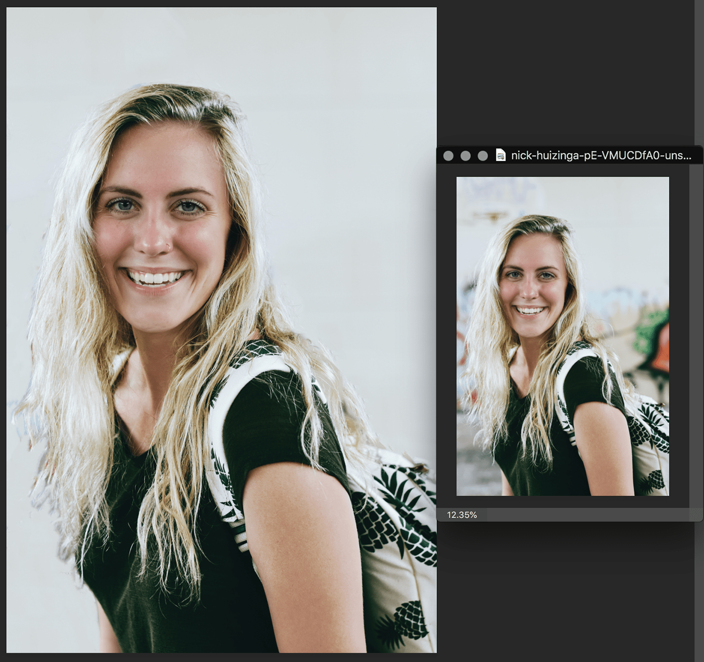
Proccess images on the right !
eskitit
Catching up, Challenge 3 completed. Nearly forgot to add shadow.
@young karma Best I can come up with
it is fine ty for doing it though someone else did it for me xD sorry ❤ love it though
Feel free to use it if you change your mind. There's some rough edges in the one your using that I was able to avoid.
ok ty I changed it to yours ty ❤
Challenge 4 - Compositing
@bleak fossil Thanks for the valuable feedback - I will definitely look into that and if I repost, I'll tag you in it. Thank you!
Gave +1 Creative Carma to SamPetersonArt
wow great image @slender kraken
@jolly stirrup awesome compositing
Here's mines!!!
Here's mine. Challenge3 Content Aware entry. 🙂 Hows this? First one is original i picked up from Google images
Thank you @jolly quest I have already made the changes you indicated. It's better! ☺
Gave +1 Creative Carma to VooDoo_Val
Thank you @bleak fossil I made the changes and add a palette as the background of the texts. Better!
Gave +1 Creative Carma to SamPetersonArt
Challenge 4 Compositing. Had fun with this one and an opportunity to use some images I had tucked away with ideas to use.
This is my entry for the Composing challenge. You can see what I did here and the images I used for the project!
Image Used
Thanks so much @trail field .
Gave +1 Creative Carma to kirstysfantastic
Composite with Full moon
@unreal crescent love the candy corns was thinking of doing something similar
Fantastic @broken gorge!
after
Gave +1 Creative Carma to Val
@coral stone Thanks for the nice comment!
#4 Compositing
@broken gorge your composition is truly awesome. love it
@broken gorge - great job! 👏
Thanks for the nice comments! ❤
Composition & files used
Apologies for being a bit late, tried to improvise and adapt
@young karma really like the 3d
... my Challenge #4 - Composing
Combine and edit images to create a surreal landscape
... images used
By the way, here's the photo I started with
@fast moth your SciFi composition is truly unique and stands out. A+++ makes me think of 50s era advertising.
@young karma OMG I love the colors you went with. Very nice. That sky...😍
@high wharf Thanks
Gave +1 Creative Carma to Jesse S.
Day 1 patch tool
Day 2 - replace color - quick and easy
Day 3 content aware fill
Day 3 Original Picture
Made some updates, thanks for the suggestions @glacial path
Gave +1 Creative Carma to evil
@plain sable lovely!
thanks!
Not really sure what this has to do with anything other than I kinda like it.
@keen granite WOW! Your version #2 for DCC#4 is perfectly amazing. Awesome stuff!
My day 4 entry for the compositing challenge, before images and after.
The assets used are following. :
This is my entry for the challenge 4. Composite/surreal. Sorry i skipped the landscape/space thing but created this, which comes in my mind. HOw you liked it guys? I still bit confused about this Composite Challenge. What it really means. But This is what i understand. Correct me someone if you'd like.
Nicely done @young karma ! It has a spooky feel to it. A few minor remarks: you missed an E in halloween and when looking at the image without text my eye draws to the top where there are 3 lightened spots, but nothing is happening there. So I think either have something going on up there or darken them a bit so it does not stick out. In my opinion enough already is happening in the alley :)I am talking about the 2 windows and some kind of metal thingy on the building in the top left corner.
@tulip fern 😂 😬 Thanks for comment and feedback. Sorry for spell. Will sure work on it. The enlightend! you mean the window Right?
Gave +1 Creative Carma to unicaNL
Hello everybody. Before 😉
And after. I'm beginner in photoshop and i need your help. Thank you all.
@young karma amazing one ,,keep it up
Thank you aliazaz
i'm waiting for DCC#5!!!!!!!!
another composition for day 4
@young karma You're off to a great start. I really like it.
@magic hedge I like your composite. Is that a blue overlay?
@high wharf Thank you!
Gave +1 Creative Carma to Jesse S.
@keen granite Thank you!
Gave +1 Creative Carma to LeahMichelle
@nova swan thank you!It’s a combination of things I did, some parts have the overlay too.
#challenge4 😍
hello all - hope you've had a good weekend! i've added a little retro slide frame to my composition ...
Compositing. Taste of the City.
Thanks for the feedback @bleak fossil - I thought about adding the pumpkin-sun-thing after I had the candy corn in place, and then I never got back to doing shadows. I think it looks better now - and I flipped the candies on the right on a horizontal to have the shadows pointing in the right direction. @nova swan thanks for the feedback. I'd love to see your take. 😀
Gave +1 Creative Carma to SamPetersonArt
oops - and then I noticed that, with the new shadowing, "Pumpkinhead" kid was too shiny! Last upload.🙃
@young karma Great job! The landscape looks super cool! I would just check the reflection in the water. You can see the bright sky and the trees instead of the house. This might be rather tricky to fix, but you can check out this tutorial 🙂 https://www.youtube.com/watch?v=pZO0dFfCoiQ
Photoshop CC 2015.5 tutorial showing how to create the most realistic water reflections from any photo. The technique shown here is even more nuanced and rea...
@young karma if you want, you can also try adding the halo around the moon by using the blending mode screen
@unreal crescent Thank you for posting the updated version 😄 The pumpkin looks nice and spooky 😉
Gave +1 Creative Carma to Chris Allinotte
@pale lichen I have so many questions 😅 ... First of all, that's a wild color combination! I like the hue shift on your face and the abstract background. The tongue could probably be more vibrant (like the real tongue behind it) and you could probably blend the left side into the real tongue. The font works well and I like the placement 🙂
@hearty wharf Yeees! The slide frame really sets the mood 😄 I love everything about this! You could maybe try to remove the blue sky here by using the color range selection
Challenge 3 (Content Aware Fill) Finally done, not going to be able to catch up in time 😦
@long void great color effect! The resolution of the dome in the upper left seems a bit low. If possible, try to work with larger files 🙂
Maybe you can also add some imperfections to the edge of the reflection and the reflected tower 🙂
https://www.youtube.com/watch?v=pZO0dFfCoiQ @long void check out this tutorial. you don't have to add such a strong effect 😉
Photoshop CC 2015.5 tutorial showing how to create the most realistic water reflections from any photo. The technique shown here is even more nuanced and rea...
Here is my composite scene.
DAY 1
Blurred out the jellyfish and added nebulae to them to make them blend in more; added assets used.
@blissful badge That is beautiful!
@blissful badge Wow this looks epic 😄 My only advice would be not to make the planets too bright or you will loose the texture and all the details
DAY 3
@glacial path thanks so much tim, yes - you are quite right, i can see it now that you've mentioned it!! will go back and refine ... 😃
Gave +1 Creative Carma to evil
@crimson storm Wonderful! Just make sure to check for imperfections when working on the mask 🙂
Ups!! And I checked it out, haha.
haha yeah. It isn't a big deal for this challenge - but if this was a real client... 😉
also, I think you could add a subtle shadow below the shoes, just to give her something to stand on
Thanks @glacial path I added more detail in the planets.
Gave +1 Creative Carma to evil
I've added some elements to the composition
#✂challenges-feedback my 80s retro composition. I will put some more time into this. had fun. I used some space brushes, lots of gradients, and the picture above.
@keen granite sweet. 🙂
@glacial path Here is corrected 😛
👌
@jolly quest Thanks for the shout out on today's video. Made my day!😍
Gave +1 Creative Carma to VooDoo_Val
Thanks for the shout out in today lifestream @jolly quest. The orange in the city was a (bad ?) choice to highlight the city and create tension
Gave +1 Creative Carma to VooDoo_Val
Challenge 5 - wish I had a hint of colour though like VooDoo Val has in hers
Feeling punny today...
Challenge #5
Day 4 - late entry because of busy busy busy weekend - Images used come first
And the result
Background is the planet provided by VooDoo_Val and a painted moon
#challenge5
Quick movie poster using layer masks (and blending modes)
Tongue corrected…
Double Exposure Design Challenge #5 Final Edit 😀
Day 5 Challenge
nice Camilo
Beautiful colors @half musk!
Thanks Valdair - I was fortunate to get an stock image with good color and contrast to start.
You did a great job! 🙂
nice lee!
This is my entry for the Day 5 challenge : Double exposure
Day 4 - Finally done the surreal composite
did it for a local band here in my city as a tribute
Added a gradient overlay for the colour. what do people think?
😀
beautiful
@candid chasm At first I was like, What? Oh hell no. But then I was like, hold up. Huh? Oh, ok. 😉 Seriously though, beautiful work.
@honest gorge If you turn that into a book, I'll have to get my dog to read it. Twice.
Hahaha thanks @keen pendant and @half musk 😊
Gave +1 Creative Carma to Taxation Is Theft
@keen pendant hahaha me too 🐶
ha ha - saw that there are a few dogs here already ... well, here is mine!
lovely dog @honest gorge
Up all night editing video for Adobe Terminator trailer contest so stuck in Terminator mood.
Layer masks
Layer Masks
😵
Thanks @hearty wharf 😊
Gave +1 Creative Carma to Tan_2019
@fallow bough dude! Darkfate! Be sure to leave a link to your trailer. You part of unit6? Upside down 6?🤖
Great work everyone!
This thread is such a good place for learning and its fun to have a challenge to push yourself to do something creative and different. Here's my day 5 challenge. I'll post some proccess stuff later.
Cheers!
@candid chasm I really like it, I want to do one like that with the ears coming out of the persons head 🙂
@hearty wharf what a cutie puppy!
@jolly stirrup Niiiice!
Challenge #5: Layer Masks
Challenge 5: Layer Masking. Final on the left, elements on the right.
@nova swan yeeesss, do it!!! And then show it.. 😍😍😍
@honest badger I loved the mood! Also great job on the text overlap
@honest gorge wow, super cute! I like the way you preserved the details of both images in a very creative way. Especially the dog's eyes 😍
@young karma the cool colors really suits the composition, well done!
aahw, thank you @nova swan she’s my brave hound!
Gave +1 Creative Carma to Patti McCoven
This is a little derivative of the "Hill House" poster from last year, but as an exercise, I think it works. 👻 😬 😃
@neon kestrel I really love this.
@high wharf It's now posted on Behance. https://www.behance.net/gallery/86503549/Adobe-Terminator-Dark-Fate-Movie-Trailer-Challenge. I choose to do a 1950s SciFi style trailer.

Behance
Adobe Terminator : Dark Fate Movie Trailer Challenge
@unreal crescent Wow this is really creeping me out 😮 - nicely done! I think you could maybe remove the sky so it looks more like a complete head 🙂 Good job on the dramatic effect
@honest badger You did a great job, the whole poster has a nice layout and the type design is elegant 🙂 I would probably remove the brand name of the backpack - it is not significant for the poster
Here is my SECOND challenge entry for today.
@coral stone Thanks 😊
Gave +1 Creative Carma to Valdair Leonardo
@plain sable I like the patterns on the elephant 🙂 But I think you have inverted the effect. Usually the second landscape appears inside the object and the background is pretty much one color. If you have some time on your hand, you should totally try to invert the effect ^^
@edgy idol ha, I bet this mask wasn't easy to create with all the soft and furry hair. I think you did a fantastic job 😄 (looks like you have painted in the hair manually. try to use a slightly softer brush or blur the area slightly)
@jolly stirrup This poster makes me want to buy the mixtape 😄 ! You nailed the colors and patterns. I especially like the rose in his head 👍 Can't wait to see more of your work and thank you for being a part of this community!
Gave +1 Creative Carma to Sweet_QP
Here comes my entry for Day 5 🙂 I'm sure there's plenty to be desired, double exposure is still kind of foreign for me 😄
Challenge 3: content aware
@young karma Lovely! I like the tilted horizon and the birds - both add a lot to the image 🙂 I think you can probably remove this text here from the shirt. It almost looks like a watermark 😉
My entry for day 5! And my first challenge ever! 😬 Photos taken by me from my trip to Glacier National Park ☺
DailyChallenge #5 Layer Masks
Challenge #5 (first time ever trying masking) was not easy but after trying 7 different times I finally figured it out, mostly...
@vagrant sorrel i really liked your entry for DCC#5
Challenge #5 Really liked the poster that @jolly quest did, so it inspired me to do a very similar one😍
Hello everyone, here is my Day 1 challenge. Any feedback is welcome
Hmmm, perhaps my layer masking got a bit out of hand during the scary season.
@young karma Thank you
Gave +1 Creative Carma to sivadthapa.93
@young karma Lovely!
A day behind since I've been under the weather. I didn't do too much when it came to compositing but I didn't want to fall too behind! Here's Day 4.
Here are the images I used.
Beautiful @granite carbon loved this piece. 😋
PsDCC5 Layer Masks Updated.
Here is my Day#5 . Not sure how I feel about it.
#✂challenges-feedback - day 5- layer masks. Here is my double exposure piece. This is definitely a technique I will be exploring further. I used a picture of my wife's grandfather, the 2019 coin, and a picture from Juno beach.
@jovial moss Lookin good! I think if you want a hint of color you can always just tone down the saturation a touch rather than completely desaturating it. Photoshop gives you a lot of control over that kind of thing so you should be able to tweak it to have just as much color as you like. It may also help the portrait pop if you tone down the opacity a bit of the background so the part within the shape of the head has more dramatic contrast. Nice work!
@dense spade Ooh, really cool texture in the dogs face. Interesting effect for sure. Kudos on all the puns, hah. Nicely done!
@left island Challenge #5 is looking really cool! The bright glowing seam down the middle of the portrait is a really nice effect. I wonder if it might help if the text had a bit more contrast? If the text is already white then maybe using a multiply layer to add a slightly darker gradient to the top of the sky might help? Wouldn’t need to be too much. Well done!
Edit: The text in your second post seems to pop more, looks good!
@glass gale Very cool! Is that Counter Strike? I like what you did with the double exposure, but I think you could increase the contrast even more in the figure. Currently the highest point of contrast is the hillside at the bottom (deepest darks and brightest brights) so it could help to tone that down a touch and increase the contrast in the figure so that it becomes a stronger focal point. Nice work, I like how the texture of the building works within the character’s silhouette!
@neon kestrel Looks great! Really love that monochromatic look to it, and the strong silhouette of the hair. The only suggestion I have would be to tone down the contrast/opacity of the grass at the bottom. Currently it’s a very strong shape and competes with the portrait a bit. By toning it down it would still read but would better let the silhouette of the portrait pop out. Well done!
@half musk Love the balance between the city skyline and the portrait. The skyline works as a great secondary read without overpowering the read of the face. Love the color balance too! This is the tiniest nitpick, but maybe mask off the blue brushwork on the right side that overlaps her jaw? It’s subtle but might work better without it. Really nice job on this one, definitely has a strong poster feel and great silhouette!
@placid trout Ooh, some really cool shapes going on in this one. I really like the B&W scheme too, seems to suit the image well. Really liking that sort of soft edges ghostly feel of the portrait too, gives it a cool ethereal feel. Very nice!
@fast moth Love the color scheme of this one! Really cool shapes and contrast created by the red areas. The whole image has a nice balance to it as well. My only nitpick is that maybe the birds in the top corner could be spread out/scattered a bit more? This turned out really nicely, great work!
@willow nebula Very cool! It’s great to see how far the final image came from the original images you used. Really cool effects with the roads. My only suggestions would be to maybe brighten up the character on the bike since the road seems to have really intense lighting but the character seems to be pretty dark. It could also be cool to darken down the underside of the purple road since it kind of seems like the underside of a ribbon shape, unless that’s a hill? Either way some shadow gradients might help so everything isn’t a uniform lightness in the road area. Might add some depth.Maybe something like this? Very cool image!
@pale lichen Oh man, hah, that’s creepy. I wonder if moving the city up a bit would help the composition to the eye moves around the piece more in a sort of “C” shape, rather than directly from left to right? Could also help to use a multiply layer to get a little shadow on the tongue where it enters his mouth. I’m sure you wanted it that way because of the title, but just something to consider for future compositions.Maybe something like this? Nice work!
I made a movie poster for Rebel Without A Cause for the Layer Masks Creative Challenge. This one really kicked my butt.
@bleak fossil thank you!
Gave +1 Creative Carma to SamPetersonArt
challenge #5 - poster using layer masks and blending modes
#5 Layer Masks
@bleak fossil Thank you! Yes, you are right. In the end, I merged everything and added a lightning effect from the upper right to justify the shadow of the bike. Which apparently was not the best idea 🙃 I'll adjust ASAP!
Gave +1 Creative Carma to SamPetersonArt
Ingredients for #5
C#5 Layer Masks 😜
@glacial path Thank you, proud you appreciate the job and i will take your advice
Gave +1 Creative Carma to evil
Challenge 4, I adjusted the reflection in the water!
Adjusted challenge 4 - I could go on forever, but time is not on my side. Thanks @bleak fossil
Gave +1 Creative Carma to SamPetersonArt
challenge #5 - poster using layer masks and blending modes
Beautiful @neat ingot It looks like disneyCastle.
@river venture Loved it. nicely done.
Here's mine. Challenge #5 entry. Layer Masking/Double Exposure. This look like more of Book Cover than some movie Poster. 'm sorry. Andd added this Quote of mine. 🙂 Cool? How you liked it guys?
The Assets Are....
@bleak fossil Thank you!
Gave +1 Creative Carma to SamPetersonArt
@wet thistle nice. Liked it. Beautiful
@forest ivy your Mad Men poster turned out great
Hey every one! I'm a bit of a history buff and wanted to show my day 5 entry. This is a movie poster i came up with using Layer masks
@young karma your "Book Cover" is pretty badass. I think it looks top notch. It would make a cool t-shirt aswell. Very well done. A+++ 🎖
Day 5 Challenge, took me a while to get the right images to get concept to work. My own images in Rajasthan India.
Images used
@hidden pendant Beautiful. Loved it and huge respect for this Friendship
@high wharf Love you for the comment. Such a nice compliment. you made my day. really i meant it.
@siva Thank you.
@high wharf i loved your piece too. It's a beautiful tribute to the memory of the person, what you created .
Thank you @young karma 😀
Gave +1 Creative Carma to sivadthapa.93
Challenge 5. Used a picture of me and my friends and the sundown in Ibiza this summer.
And the originals
Just catching up, here's my day 1. Used @jolly quest 's selfie as she looks better in a photo than I do!
My day 2 colour replacing
Day 3 content aware fill
here are the originals
@glacial path Thanks for the feedback - I was sort of following along directly with the tutorial, but you've reminded me that ultimately, the finished piece needs to be what it needs to be. I think it looks even better now!
Gave +1 Creative Carma to evil
Here is my challenge #5 entry
I reworked it to let the lion pop a little more
Day 5 Challenge
My Layer Mast
Day 5 - Layer masks
love the concept @mighty quest
didn't hear about this Adobe Caputre thing. Looks Cool App. Jus got to watch videos/reviews on YOutube. Excited for thi DCC#6
What's the Time?
DCC Day 5. What do you think? Feedback appreciated. Thanks
@blissful badge I like how you've lined the fish eye up with the bear eye, nice!
Thanks @magic rampart That is my favorite part too!
Gave +1 Creative Carma to Jmada
@high wharf @young karma @honest gorge @magic rampart - thanks for the props, appreciated 😊
Gave +1 Creative Carma to Jesse S.
PS Daily Challenge #5 Layer Masks
Here is my action promo from today's challenge!
Cool Work. @jolly quest Thanks for today's Challenge
Gave +1 Creative Carma to VooDoo_Val
Here is my attempt at the Layer masking
challenge 5 - layer masks - double exposure
challenge 5, layers
Day 5 Challenge Entry - a bit late as struggled with this, below is my 4th or 5th attempt!
Feedback please 😊🙏
Thanks for sharing @pulsar sparrow ! did you do the original eye/ocean composite as well? It's such a cool concept. You did well matching the color between those two images - the final result might be even stronger without the 'camera' or 'ddc5'!
Gave +1 Creative Carma to Asmaa El Kateb
By Lee Dezigner --- 8 Years old
Comic Style Art --- By Vandam Dezigner 10 Years old
@silver trench so cute!
My profile pic is in this style. I'll find something to make another though.
My Day 6 entry!
Challenge #5 - Layers. Any suggestions are welcomed, Thanks #photoshopdailychallenge
@rich hinge Beautiful work! Gorgeous.
@uncut ginkgo This is my image after editing
Day 5: Top Image -- the background scene is from Pixabay - a Finnish sunrise. The woman is from AdobeStock. The font is Zaphino and the shapes are probably from Graphic Authority.
It's funny (odd) sometimes how compositing works in Photoshop. I've tried several of these double exposures this afternoon, but I still like the first one best. The second favorite is on the bottom. It's an AdobeStock model with my photo of a Kentucky hillside for the scenery.
Having a real struggle with challenge #5 Revision 4
yesss - kids' birthday party invite - sorted!!!
I resized it
@rich hinge this is really good!
hmm - i did another one, as i was informed that the colours were apparently 'too girly'! boys ...
Challenge #6 Halftones: This is Pixel my Borgi (3/4 corgi, 1/4 border collie) the super hero pup with super big ears and super hearing powers!
Day 6
PsDCC6 Halftones
Day 6 challenge
Found increasing image DPI gave better halftones. Character is one I did a while back of my granddaughter brought in with Adobe Capture for shape.
Day 6
Larger halftones
Challenge 4: composite
Day 6: before and after halftones and vectoring with Capture. Both women are from AdobeStock. I ended up using two layers for all the halftoning - one plain colored and one patterned )on soft light blend mode). I felt the dots were too garish, otherwise.
Challenge #6
Challenge 6 - Halftones
too much fun...
I don't have Adobe Caputre, and wanted to use my own images, So I began with a photo and some shapes and line work that I did in Illustrator a few years ago. Pasted it into Photoshop and added color variations and halftone effects.
Starting files
My version of todays challenge
Challenge 6 - Halftones So much fun, just joining in on the challenges for the first time. Can't wait for the next one!
@barren cipher Great work Adam! The text is behaving funky though - I can clearly read it when I don't click on the image but once I look at it fullscreen, the text becomes much less obvious 😮
Big fan of all the detail in the grass!
@blazing quail Haha, a classic 😄 Beautiful color contrast, really! The black stroke you have added was definitely the right choice, although I bet you could play with other colors like white or yellow 🙂
@granite carbon I'm impressed, this looks awesome 🙌 🎉 ! I like the clear linework and the different halftone patterns. The only thing I would change would be to add more contrast to the skintones. You did a wonderful job with the tshirt and I think you can apply that technique to the skin tones too ^^
@young karma Oh boy, what a cute doggo 😄 ! You nailed the comic book look, especially with the "WOOF" expression in the lower left.
The gradient looks fantastic and the waveforms coming out of the ears are a nice touch: the color is in stark contrast with the green and the shape cuts through the halftone pattern
However, the entire image is super busy. Maybe you can remove some of the linework in less important areas (like the window) ?
Since I didn't have suitable pics of me for this challenge, I used one of my favorite superheroes - Spiderman for Day 6 🙂
@dim zealot POW indeed 😄 Love the vibrant gradient in the back and the contrasty halftone pattern in the front. The resolution of the POW-thingy is a bit pixely compared to the rest of the image.
Challenge entry for day 6 - my boy modelled for this , before and after.
@left island Nicely done! The composition is balanced and I like the limited use of the half tone pattern. Maybe you can add more headroom so the top part looks less cramped. 🙂
the movie poster aspect ratio could work well
Thank you @glacial path for your feedback sure I am gonna take a look at your tips.
Gave +1 Creative Carma to evil
Super cute @young karma 🐶
It helps to have masks and props around the house.
Challenge #6 Halftones
Day 6 - Half-Tone & Adobe Capture
Day 6: Halftone & Adobe Capture
Here is my Challenge 5 Layer Masks
I used two images from Unsplash (great website!). This is something I have wanted to be able to do for a long time. I had no idea it would be so easy. I will play around with this more. Thank you!!!!
OMG! I just downloaded this Capture application. It is amazing! I'm annoying the hell out of my wife trying to explain to her all these cool new features now at my finger tips, she has no clue what I'm talking about, LOL. I'm so happy I jumped on board with these daily creative challenges, they've really helped me step out of my safe zone and explore uncharted territories. Thank you Team Adobe.
Hello everyone, here is my Day 2 challenge. Feedback is welcome.
Here is my PSDailyCC~Day 6~Halftones and Adobe Capture.
Challenge 5 - Layer Masks - Well, what do you think?
Here is my Challenge 6 Use and halftones to create a style action
Photo used to create Challenge 5
Second photo for my Challenge 5 layer mask project. Photos by Naeim Jafari and Mark Boss
Challenge #6
@candid chasm Wow, very cool! It’s cool to see how quickly you can get a comic looking image with Capture and some simple editing. I like the addition of the flat colors! Really pushes that comic feel. Nicely done!
@wide solar Oooh, very cool image! I think something simple that could give it a big impact would be to brighten the face a bit with a masked levels adjustment layer or even a color dodge layer. Maybe even using some slightly cooler light with a tint of purple or blue to fit the scene. Would really bring some nice focus and contrast into the face. Could also be cool to push the double exposure effect a little towards the bottom where the trees are, make the effect a bit stronger maybe. Nicely done!
@pulsar sparrow Love it! Nicely done. Really love the the feel of this image, makes me think of some mystery/sci-fi show or something. My only suggestion would be to strengthen the focal point by adding a bit more brightness to face/camera area, and maybe even adding a subtle vignette to the rest of the image. Might help focus the image a bit more. Looks good!
@young karma Ooh, love the double exposure effect on this image! Really like how you handled the text too. Perhaps it might help to move the text up slightly? Currently the image is a bit bottom heavy with a lot of space at the top, moving the text up a touch might help give the image a bit more balance. I also really like the soft white background, gives the bear and text some great contrast and gives the whole image a really cool misty/mysterious feel!
@gentle sparrow Hah, perfect use for Adobe Capture, the black lines and shapes work really well. Halftone effect looks great too. Nice work!
@real fossil Love the lighting and mood in this one! The soft, warm color palette along with the image of longingly looking out a window works great together. My only suggestion would be to maybe bring a bit more of the face to the forefront like Val did on her challenge. In this kind of image it often works well to bring out a little bit more of the portrait image in the face area, especially the eyes. Even if just a little bit, it might help shift a bit more focus to the face for a nice focal point and balance to the whole image. Really cool!
@dim zealot Love the double exposure and colors in the portrait on this one! I wonder if adding a bit more blue to the background, or even a blue gradient that fades more towards the white you have near the top might push that underwater feel more. Something still light like you have so the portrait has some nice contrast, but maybe just a bit more of a blue shade. Just a thought. Nicely done, especially on the masking around the face! Makes for a great and interesting silhouette.
@silver trench Looking good! The half tone effect looks great, I like how it pushes focus to the dog by keeping it lighter/more yellow in the center. Nice job!
@sturdy vault Nice work! I like how the double exposure works in the head area and looks like hair with the dark shapes. I like the sort of sort mysterious background too. I like how you have a strong silhouette in the figure against the white background, perhaps it could help to fad the area around the bottom right a bit more to keep that silhouette? It could even be a cool effect to have the entire background just a little more visible, then have it fade to white like it is now as it moves up towards the top. A little more visible, but not too much that it detracts from the strong silhouette of the figure that you have currently. Just some thoughts. Great work on this, the whole thing has a really cool feel.
@long void Nice job with these different combinations of double exposures! I like the ghostly looking background and text, definitely gives it an intriguing teaser poster type of feel. Good job!
@keen pendant Ah yeah, pretty much the same techniques/style! Very cool. Love the colors and shapes in this, and the sun lines add some great sense of movement to the image.
@viscid kayak Very cool! The masking and sense of depth was messing with my eyes at first, hah. I was thinking he was somehow behind and in front of the wall at the same time. Really nice job with the masking work and the content aware fill. Looks solid!
@tacit condor Very cool! Did you use the double exposure effect to add the tattoos onto her? Nicely done! I wonder if the whole image could use a bit of a levels adjustment to brighten it up slightly? It seems a little on the dark side, even with the moody lighting/feel taken into account. Nice work with masking as well, looks good!
@errant knoll Looking good! Really cool feel to this image, I really like how the brightness/lighting of the face seems to work with the scene. Doesn’t feel too bright or too dark and gives the whole thing a kind of calm/mysterious feel. One suggestion I would have would be to either increase the size of the text or the face depending on what you would want to put more focus on. Currently the two shapes are around the same size and fighting a bit for attention. Putting on larger than the other might gives the image a stronger 1-2-3 read in terms of where the eye goes first, second, and third. I think it could go either way for this image. Just a thought. Great work!
@tropic breach Really nice work on the Day 5 Challenge! I love the way the colors and shapes of the clouds work within the portrait. Is the shadow in the water from the rest of the portrait image, or was the original image like that too? I kind of wonder if some nice sunset reflection on the water could balance out the image a little more with all the brightness we’re seeing around the top half of the image. Hard to say, I think it might look good, but would have to see it. Nice work on this, you got a nice balance between the two images!
@blissful badge Hah, really nice job on the Day 5 Challenge! I like the way you lines up the fish eye with the bear’s eye. Cool effect. I wonder if softening the bears edge might help sell the effect a bit. Soft things like fur tend to have a softer edge, so feathering the selection ever so slightly might give it a more natural look than a really crisp/sharp edge. Nice work on this Leslie, it’s looking good!
@rich hinge Really nice work on this, looks great! The landscape image and portrait work really well together with how you positioned and balanced the shapes. If I had to look for any suggestion to make it might be to use a soft brush to mask/fade out the bottom part of the portrait to give it a more gradual natural blend into the image as it moves up towards the face. Meaning to softly mask out the bottom of the hair/arm area for a softer fade. Nothing too dramatically different, but just giving it more of a fade effect. Might work well with the soft foggy feel of the image. Looks great, love the text too, fits nicely!
@halcyon sphinx Ooh, love the feel of this one! I really like how the brush/spatter effect comes out naturally of the silhouette of the figure on his upper back, makes for a really nice seamless blend. I think the effect looks good elsewhere too, but I might fade it off around his eye so it doesn’t distract from his natural face silhouette which acts as a natural focal point. Really love how you handled the colors too. Gives the whole thing a really interesting contrast! I wonder if a splash of red tint towards the bottom left could help balance it out?
Edit: Just saw the second yellow image. Awesome visual balance to this, love the way you built up a big shape with a collage of images. Works extremely well!
Hey, guys, I'd appreciate some feedback 🙂
@plain sable Looks great! I really love the mix of the tree and mandala type design, makes for some really interesting shapes. My only suggestion would be to have a more natural transition on the elephant on the right side. Perhaps using a larger softer brush to give it a much more gradual soft Gradient fade as opposed to a soft line/edge? Might look less abrupt. Other than that it’s looking really solid!
@deep mango It's looking really solid! Really liking the color scheme. The only suggestion I might have would be that a more consistent size in the half tone texture might look good? But the shapes are looking good, and the contrast between the smooth foreground shapes and the textured background work really well. Nice job!
Thanks @bleak fossil I'll take a swag at your suggestion in the morning
Gave +1 Creative Carma to SamPetersonArt
Day 6 Halftone.
@ruby panther cool 🙂 ! The only thing that might make it more balanced (I think) might be using a different font like for instance Shlop: https://fonts.adobe.com/fonts/shlop The text stands out too much and I feel the image itself should get all the attention.
A decorative typeface with 2 styles, available from Adobe Fonts for sync and web use. Adobe Fonts is the easiest way to bring great type into your workflow, wherever you are.
@tulip fern Thank you for the advice. I was going for something like a comic cover. Not sure. I did get the font Chalet from Adobe Font. It's a great resource.
Gave +1 Creative Carma to unicaNL
I love how easy it is to change fonts. Thanks again @tulip fern .
Gave +1 Creative Carma to unicaNL
@bleak fossil thanks for the feedback on my challenge 5 I really appreciate it 🙏🏾
Gave +1 Creative Carma to SamPetersonArt
My cat-halftones ☺
challenge #6 - Halftones
Challenge #6 I was struggling with the halftone for this image, then I discovered the Crystallize Filter next to the Halftone filter. This was my parrot Rico, who is no longer with me ☹
@bleak fossil thank u 🥰
Gave +1 Creative Carma to SamPetersonArt
Colour Halftone - used my old sketch
Hi
This is my Entry for the Challenge#6 Halftone. Lost in a world somewhere, CityScape. LOl. How you like this??
This is my challenge 6. Have actually tried to achieve this from a video by Jesus Ramirez, but this one came out much better. Original image by Ryan McGuire on Pixabay.
This is me . Worked with my own image, an old one.
@wet thistle Sorry for your lose. It's Beautiful.
@pale lichen Wowowow. Loved it.
@past carbon Loved your Cat
Thanks @bleak fossil I will play with it and see what I can do with it.
Gave +1 Creative Carma to SamPetersonArt
Thanks @bleak fossil I like the way it turned out.
Gave +1 Creative Carma to SamPetersonArt
Starting files
Layer Mask Challenge #5 CD or Music poster
Layer Mask Challenge #5 originals
Layer Mask Challenge #5 (v2) Movie Poster
Layer Mask Challenge #5 (v2) originals
Day 4 composting, kept seeing images of people on train tracks, thinking that looks dangerous, so decided to make it so, with a curious squirrel
Originals
My day 5
originals
@magic rampart The mountains as the beard is fabulous!
@keen granite Thank you 😀
Gave +1 Creative Carma to LeahMichelle
Challenge 6 Halftones with shape for Adobe Capture!
Alternate Colour
Original Image
Think I prefer these colours best but can't seem to get the halftone right. Any suggestions anyone?
@coral scarab I think you need to fix the word There to Their too...then it will be perfect.
Didn't have as much time for this one, but wanted to play along regardless. Adobe Capture is really fun!
Challenge 6: Made this classic looking WHACK graphic!
challenge 6
Decided to use a section of Manchester skyline
@jovial moss Nice series of colors with your entries!!! I'm loving them!
@hidden pendant Well done! All that texture and movement in the hair looks great! You chose a great picture for this. I would love to see you also add some different shades onto the hair! That could be cool!
Thank you @young karma
Gave +1 Creative Carma to sivadthapa.93
Challenge #6 In progress
Nice @wet thistle ! Sorry to hear about your parrot
Also, I think it's great how you discovered a new filter while you were doing the challenge! Crystalize is awesome!
@Thank you @jolly quest
My pleasure Carry!
Here is my Day 6 entry
10/10
@glacial path Do you think its...... AMAZING?

Electric even
Here is a link to my behance page of the current challenges. Let me know what you think! https://www.behance.net/gallery/86290293/PS-DCC-Oct-1
It's beyond amazing
@keen granite Niceee!!!!! Gave you an appreciation and a comment!
My Mixer Brush
😁 Thank you so much @jolly quest !!
Gave +1 Creative Carma to VooDoo_Val
Thank you Voodoo i made my mixer brush today real quick to see you
Challenge 4 - Compositing. I wanted to highlight the fountain that I made for my backyard this summer.
Keeping the pop-culture rolling...
Challenge 6
fauxpaganda (handle on instagram) used illustrator not PS but....the background has a duotone 😆
hello all, i'm so sorry i can't see any pictures on discord today - they just won't load. might be something to do with my provider in the uk, but i haven't been able to see all your work! all i do for now is post a link to my behance with work done so far - thanks for looking!

my mixer brush postcard of the sea
By Vandam Dezigner 10 Years old
@silver trench YES!!!! I love that you did toothpaste!
@edgy idol Thank you!
Gave +1 Creative Carma to imitating
Link to Behance: https://www.behance.net/mandiblanton

Behance
Postcard using Mixer Brush
@bleak fossil Thank you very much for your feedback and I will do 😊 your advice soon
Gave +1 Creative Carma to SamPetersonArt
Challenge #7 Mixer Brush
Challenge #7 Mixer Brush
Here's my entry for challenge 7 🙂
Boombastek Design Waiting your feedback 😀
Day 7, Mixer Brush Postcard.

Behance
Day 7
not really seeing much mixer brush use
I've seen quite a bit of mixer brush use 🙂
ok, scrolling back there's a bit
Nicely done @silver trench !
Challenge 7 - mixer brush
So mixer brush is great for producing these cool abstract designs. I'm wondering if anyone's ever found other design applications for it where it's more controlled? There are so many options that it seems like a tool that gets a lot of use, but I can't see using it beyond these kinds of swirly-twirly projects.
Swishs are supposed to be candy corn colors. When I made my brush smaller it did not pick up the orange.
@unreal crescent this is another use of the mixerbrush: https://www.behance.net/live/videos/3193/Photoshop-Daily-Creative-Challenge-Welcome-Day-01
Challenge: Turn a photograph into a painting using the Mixer Brush.Get the starter file here: http://bit.ly/psdcc9-2-1https://www.behance.net/challenge/photoshopJoin your host each morning at 9:00am PT to learn how to approach each challenge using Photoshop. Complete 9 challe...
Day 5 Layer Masks
@tulip fern Ah. Very cool. Thank you!
Gave +1 Creative Carma to unicaNL
@granite carbon Well done! 👏🏼I love these!
Here's my Challenge 6 - 1 more to go
day 7
Not the result I hoped for but am moving on.
This is my selfie-capture-halftones-comic-challenge-6
CH7 - mixer brush
Hey everyone my project link is: https://www.behance.net/gallery/86303021/PSDDC-OCTOBER-2019
my Behance page https://www.behance.net/dlccline5609

Behance
catching up on challenges 🙂
Challenge #7. Everything besides the background was colored using the Mixer Brush. Where has this tool been all my life? 🙂
Challenge entry for day 7
Mixer brush challange
@nova swan ha, nice! Is that an Adobe Capture Pattern in the background 😮 - My advice would be to really take your time and mask out the letters to make sure you don't miss any parts 🙂
I know it can be boring, but it will be worth it once you're done. you will get a much cleaner result ^^
@young karma hehe, I'm always down for some good (or bad) puns! I really like your vibrant color scheme in combination with the white text and the texture overlay 👍
if you have some time, you could add some drop shadows where the mixer brush strokes intersect (just like you did with the text)
Dreaming of younger days. My attempt at challenge #5
Day 6 - Late! I was foolish enough to upgrade my Mac to Catalina and from then on everything went - and still does go - wrong. Nothing seems to function as before, so think twice if you were thinking about upgrading. Well, I managed to squeeze out a comic, sort of ...
I’m upgrading to Catalina right now @willow nebula 😱
@coral stone AaaaaaaaAAAAAAA
I’ll test and if it goes wrong I’ll try to go back to Mojave
Thank you so much for the advice @willow nebula
Gave +1 Creative Carma to Hilde
@coral stone A bit too late I'm afraid! I will probably downgrade tomorrow, if I have the time to do so. Making a back up will take hours. Although everything is in the cloud, I don't trust it 100% 😬 I hope it turns out alright for you!!
Half Tone Comic book challenge
@glacial path Thank you Tim. I was rushing at the end so yes I must have missed that piece. Thank you for noticing. Yes, a capture background for texture.
Gave +1 Creative Carma to evil
Challenge #7
okay no way but i just saw the challenge for today and literally yesterday i was making my own stuff with quotes and the mixer brush 😂
@willow nebula I wish I had been able to read this four hours ago... my computer is stuck in a loop.... says it can’t install and to restart... then restarts back into the attempt to install again... and then right back to failed and telling me to restart. 🤦🏼♀️ glad I at least took a backup before starting the Catalina install, but I can’t even fathom how many hours this is going to take to get my machine up and running again.
Can someone edit kim Jong un in a los angeles lakers jersey for me
The mixer brush is fantastic to collect the correct color for your project. I did find it tricky to do the squiggle with a mouse.
@neat ingot I had the same problem with the mouse but then remembered to turn the smoothing on
also heres another one i did yesterday i really liked
Thank you @willow nebula , I read your post, I will try not to upgrade my IMac untill I am sure I can...
Gave +1 Creative Carma to Hilde
thanks for the feedback @glacial path . The flatness of the face was bothering me. I've shaded the face as you suggested. I also gave myself some eye brows & lashes. What do you think?
Gave +1 Creative Carma to evil
@remote sequoiaothai#7058 Nice use of the masking for the mixer brush challenge! The drop shadow adds some nice depth as well. I wonder if you could turn up the smoothing on the brush tool to get a bit smoother of an edge on the curves of the line? Good work!
@past carbon Love the light and and circle background texture you got in this mixer brush challenge! The mixer brush stroke looks really good! It has a nice smooth transition in the different directions and works well as a graphic design element. The masking gives it a lot of interest too!
@dusky willow Nice work on the surreal landscape with the fountain! There’s definitely some surreal colors going on in the landscape. I think the key to making picture like this fit together is the perspective/angle of the images. The landscape has a low down camera angle, where as the fountain has a higher up camera angle, which makes the perspective of them together seem a bit off. I think one thing you could do to help them fit together even more would maybe be to add a little shadow with a multiply layer to the base of the fountain, especially where it meets the road. It might help the lighting fit a bit more. Really cool colors on this, nice job!
@unreal crescent Nice work! I like the colors, gives me a bit of a 90’s vibe. It could be cool to see the pink line going through the middle of the two words and intersecting both a little bit. Might help balance out the visual weight so it’s not as bottom heavy. Just a thought. Nice contrast in texture you have going on between the background and text/shape too!
@young karma Ooh, this is cool, the graphic shapes and lines turned out really well in the face for Challenge 6. Maybe a little splash of color within the face and arms to add a little skin tone might fit it in more with the rest of the colored image? I like the sort of cutout shape of the figure over the background, looks good!
@young karma Ooh, very cool! The challenge for Day 6 is looking great. Really liking that halftone and gradient you have going in the background. Spider-Man looks great, the only suggestion I might have is to tweak the pattern so he has some of the red shapes in his chest and arm areas, and some more blue around his thigh areas. Might help it looks more like Spider-Man and also give a nice balance to the red/blue shapes. I really like the cutout look Spider-Man has over the background, it contrasts the texture nicely!
@unkempt field The Mixer brush postcard is looking good! I like the brush stroke shape you got going, and the masking adds a lot of interest as well! Nice work 😄
@silver trench Hah, nice use of the mixer brush! Would be cool if the tooth paste brush stroke had a little bit more of a glossy look to it. Might sell the effect even more. Nice work with the masking too. Nice job!
@plain sable This turned out awesome! Great job on Challenge 7. Really love the texture you got in this image, and the shapes all work together really well. Really nice work with the leaves around the text, adds a lot of depth and interest to the whole thing!
@wet thistle Nice work with the capture function and adding some color to the whole image! Gives it a nice effect. Perhaps a bit of a gradient to the background might add a bit more dimension as well? Maybe something that starts out a little darker at the bottom and works up to the light color it currently has as it moves upwards. Nice work on this challenge!
@young karma Oh wow, you really nailed this one! Really awesome work with the shapes and composition, the brush stroke works really well as a controlled graphic element. The colors also work very well together. I like the subtle texture as well. For some reason I feel like this could be the design for some World Cup advertisement, hah, very nicely done, looks very professional!
@nova swan Nicely done! I like how the brush stroke has a brighter area towards the bottom, it gives it a bit of dimension. I’d be kind of curious to see the color/value of the text and brush stroke swapped. I wonder if it’d give a bit more emphasis/weight to the text, but hard to say without seeing it. I really like the subtle texture in the background as well, looks good!
Day 7 challenge
@austere root Very nice! Challenge 7 is looking good. I like the way you handled the text in this one. The repeating colors with the text and elsewhere in the image works well to tie it all together. It might be a cool effect to have the brushstroke lines have a hard edge, then slowly fade to the softer edge is has now as it moves left to right. Might give it a sense of depth like it’s moving out of focus as it goes back in space. Nice work!
@young karma Great work with the Day 7 challenges! I really like the two different moods and styles you got with these different approaches. You got some really nice feelings of movement with the different lines and designs as well. Perhaps he masking in the “Bee Kind” image could be adjusted so the “K” is covered more completely by the part of the stroke that passes over it? Looking good!
@vague swift This looks great! Really love the deep contrast in the face in the Sky Kiss image. The change from light to dark tones halfway through the face works really well, and the whole piece has a really great atmosphere and mood to it. I really like how you balanced it so the greatest contrast is in the portrait, really makes for an effective focal point. Great work!
@zealous stratus Really great concept and image for Challenge 5! I really like the dreamlike feeling all the white areas create. I like how you kept the details of the face in tact to really add a nice focal point and keep the emotion, but I wonder if it might look good to have the warm colors in the horse picture fade more gradually upwards into the face. Just so that warm color area is a bit more gradual and ties into the rest of the image a bit more. It’d have to be done with the right blending mode to keep the color/warmth without obscuring the face. Just a thought. Great job!
@dim zealot Wow, that mixer brush stroke has so much dimension and form to it. Those deeper shadows really help sell that. Really nice texture in the background, I wonder if using something like a multiply layer to add a bit of a gradient to the image (so it’s a bit darker at the bottom and fades up to how it currently is at top) might help add a bit more dimension and mimic the lighting of the rest of the image. The colors give the image a lot of life, looks good!
Day 7: Mixer Brush -- This is FoglihtenNo07 Font. I really like this unique, elegant font, especially the glyphs. I started with a light to dark magenta gradient over a reddish background from Pixabay (H/S adjustment layer added) that gave me a bit of "sun" coming in from the top. I used Japanese fabric #30 from PhotoRoadMap for the flower texture in the background. The daisies are from an Artistic Nature brush set that I've had for years and years. I added drop shadows to the text and swoop to get them far enough off the background so they could twine around each other. I finished off with a subtle vignette.
Anyone from India ?
Day 7: Mixer Brush
PsDCC6 Mixer Brush.I really liked the way the colors played out in this one.
challenge #7 - Mixer Brush
Challenge No 7. Regretting not keeping a copy of the Guitar before I started removing sections. Think the text should be slightly higher up. Note to self, make a copy before making destructive changes.
@edgy idol Horror! It took mine 13 hours. At first everything seemed OK but then the circus began. I started to worry and read the forums which didn't make me feel much happier. Don't worry too much, all you can do is wait 😶
@wet thistle I'm glad you read my post in time! 👍
@glacial path Thanks for the feedback Tim, yes, some puns are just so bad, they're good! Good idea about the shadows on the intersecting sections, I'll give that a go later. 👌
Gave +1 Creative Carma to evil
@bleak fossil Thanks for the feedback Sam, glad you liked it. I see what you mean about the colours lending themselves to a sports theme, it was happy accident - I've never really experimented with the other gradient modes other than linear and radial, but actually I think it worked nicely.
Thanks for the feedback @bleak fossil. I'll try it later
Gave +1 Creative Carma to SamPetersonArt
@jolly quest Challenge 6 with highlights and a couple of shadows added to the hair. Thanks for the feedback
Gave +1 Creative Carma to VooDoo_Val
My entries for Day 7. I could'nt decide which one was the best one (volume in the text or not).

Hi, everyone!
I can't get the proper sampling in mixer brush - what's wrong with my PS settings?
???
@pale lichen hi darius, there is an option in the pull-down menu where the sample shows up 'load solid colours only' - could that be ticked?
Here is my Day 7 design. Feedback very much appreciated!
Sorry, for all - I found it - LOAD ONLY SOLID COLOURS was checked!
Not the best…
Gave +1 Creative Carma to SamPetersonArt
Thanks again for your input @bleak fossil! It really makes it a lot better now....😀 Although it still looks a bit empty I must say...
Gave +1 Creative Carma to SamPetersonArt
@pale lichen nice color blend. makes it look like 3D
Thanks @bleak fossil! I never thought of varying the brush stroke, I'll try that out. I'm looking forward to experimenting more with this tool.
Gave +1 Creative Carma to SamPetersonArt
my day 7 entry for awareness. choosing which parts to erase took longer than i thought I went back and forth a lot
im also kind of behind on challenges so here is day 5 double exposure (i loved the movie). I'd really like some feedback on this. it came out different than I intended and I feel like something is still missing. (its the second one it uploaded out of order sry)
@gritty pine great job with the overlaps of the two words!
About your day 5 I would just increase the contrast on “put on a happy face” so the text can be more legible 😉
Anyone can help Me?? with the mixer brush
??
'm not able to make mixer brush
...it's not picking up color from the mixer/sphere whichi made? to creat mixer brush??? Help me?
@young karma you need to hold Alt if you are on Windows and click with the mouse or stylus in order to pick up the colors you want
I'm holding It.
not working.
is ther any setting/tab i need ttouch or set somthing
for work out with mixer brush?
i wonder
You can try restarting Photoshop that might make it work
@young karma There is a message from @hearty wharf who answered to @pale lichen who had the same problem: there is an option in the pull-down menu where the sample shows up 'load solid colours only' - could that be ticked?
Okay. crosing finger
Carry. I checked/unchecked tried both.
nothing working.
gonna restart PC
hold a minutes
Sample all layers checked @young karma ?
Yup. Carry.
it was
well now it workgin as restarted PS
Thanks @deep mango and @wet thistle for your presence here.
Gave +1 Creative Carma to Dorina Boneva
Glad to hear @young karma
i was frustrated> LOL. Thank you @wet thistle
I know that feeling very well @young karma 😂
See ya. Now playing with it. Need to create something for the Entry #6 or VooDoo will be Upset with her Students. 😬
Sorr #7 Mixer Brush
hello all - here is my mixer brush challenge ... looking at it now it's a bit like mustard. never mind!
@wet thistle aahw, thanks for reading my posts!
Gave +1 Creative Carma to Carry
@hearty wharf Wow I love that
My challenge 7 attempt even tried converting text to 3d
and just seen the next challenge is 3d text! Nevermind at least VooDoo Val will show how it should be done. 🙂
Also experimented with some different gradient overlays.
@hearty wharf very creative! I loved 😍
Everyone is very cool & Cr'eative. here While I eneded up with this, 3D Box with the Mixer Brush. Jus for Entry for the Challenge.Could'nt come up with ideas to work on.... HOw's it? mates?
so good! @hearty wharf
You guys are amazing. jus wanna let you know everyone here. I took file of your. saved it to my folder as a sample as they are creative one. So will keep it for any ideas and refferance...
https://www.behance.net/sivadthapa_93
This is me on behance. Please Check me there in your spare time and appreciation/follow up will be highly appreciated. And there will be warm follow back. Thanks.

Behance
My 3D Challenge text. "Motion-Emotion" !
... my DCC on Behance
https://www.behance.net/gallery/86249479/PS-DAILY-CREATIVE-CHALLENGE

i'm a little late... But here is my entrance for yesterday challenge 🙂
@gritty pine NICEEEEEEEEEEE Love the BC awareness!!
@candid chasm This is so unique!! I love how you took this challenge and really made it your own!! I would even love to see a series of these
@candid chasm wow I love your design and the grafitti style text. I think it would work really good if printed on a T-shirt or a hoodie 🙂
@fading lily Great! You have chosen some fabulous colors and I love how the background textures are so subtle! Well done!
@deep mango I agree!!
@young karma That is awesome!! Very abstract and interesting! Love the added box and the perspective of the mixerbrush stroke!
Awww 🥰 thankg guys ♥️ @jolly quest @deep mango
😳 😍 😊 So happy for the Compliment. @jolly quest Thank you so much your notice, on my challenge submition.
Gave +1 Creative Carma to VooDoo_Val
@hearty wharf AMAZING! This is such an awesome concept! excellent execution with the mixer brush and super unique idea!
Thanks a lot @glacial path !!!
Gave +1 Creative Carma to evil
Mixer Brush Challenge!! 😍
Some of you have really amazinf imagination/creativity. I wonder when i can grab this all and caould reach near to your levels. 🙂 @candid chasm midn Blowing. It's underwater..bubbling 🙂
Thanks @young karma 😊
Gave +1 Creative Carma to sivadthapa.93
I want to post my private reply to @pale lichen about his problem with the mixer brush just in case anyone else had that issue in the video he posted:
"Please try changing the size of your brush! The brush size determines how much of the area you will sample for the brush effect. I think your you, you just need to make it larger and you will see in the top left corner where it shows your brush texture/color more of the colors will show up"
That should fix it!
@young karma u will get it... U just need to practice and play more and more with what u have... I've been 10 years studying PS by myself and to be honest just this last years I started to make something more "cool" ahah.. isn't easy at all at first... But everybody can get it 🥰♥️
PS Daily Challenge #6 Mixer Brush
Challenge #6 Mixer Brush I know "Flowish" is my made up word for the week loll Defined as: Going with your own flow.
Challenge #6 Mixer Brush "Be Daring"
Shoot I need to do yesterday's challenge!
Challenge #7
Wasn't happy with yesterday's so reworked a mixer brush I did a few weeks ago.
Had fun with this challenge. This is what I ended up with!
ahh thank youuu @jolly quest 😊
Gave +1 Creative Carma to VooDoo_Val
thanks @coral stone !! I am going to give that a try i really appreciate the feedback
Gave +1 Creative Carma to Valdair Leonardo
Here is my entry for today's challenge!
Left like the text was to difficult to read so I made so adjustments!
@jovial moss thanks so much for your comment😃
Gave +1 Creative Carma to Claire-Louise
@coral stone aahw, thank you valdair, very kind!
Gave +1 Creative Carma to Valdair Leonardo
@gritty pine thanks!
Gave +1 Creative Carma to kaybee
Challenge 7_MixerBrush
Challenge 5: Dogs Love Pies
@jolly quest thank you so much for feedback, val - all the challenges have been super fun! sorry i missed the stream today, will catch up on replay!! 😃
Gave +1 Creative Carma to VooDoo_Val
3D text Challenge
Here is my day 7 - mixer brush postcard
Here's my banner with 3D text for Day 8 🙂 I made it with the dimensions of the Behance banner to later place it there
Here's my Day 6. Hopefully I'll catch up by the end of the week. I was going for a Roy Lichtenstein style half tone image. Original image from Pixabay.
I tried to soften the fur on the bear and added some texture to the background sky. Thanks @bleak fossil for the great feedback!
Gave +1 Creative Carma to SamPetersonArt
Hey guys, here's my sub for Challenge 7 - Mixer brush. Hope it's not too busy but I swear I had MC Hammer pants just like this when I was a kid 😂
I don't know about these 3D challenges... I think I must have a graphics card issue. The last 2 challenges that included 3D text, I get weird floating gray pixels after rendering. Am I do something wrong?
@edgy idol i have this one, and i dont have that kind of issues 🤔
Oh right1 Here is my challenge 🙂
@candid chasm right? I feel like my machine is powerful enough... but something is wrong
wrong with either how I'm doing things or my machine?
@edgy idol well... i was working in another thing few days ago and i had a similar problem... there start appearing different squares just like in the picture that u sent but the colours were similar with the image i have... The only way i could fix it was painting or cloning in the area where those things appear. Then i reseted my computer few times and it doesn't happen again.
But to be honest i don't know what was the problem 😦
I had the problem in the last 3D text challnege too... the one where we mirrored the background onto it. So I tried going super simple with today's... but still bad. I have defintiely restarted severl times since the last challenge. Also on new OS for today's, but same issues.
I had a lot of updates... maybe its cuz of that :/
@edgy idol It might be better to post these issues in the “ask-a-question” section which is more suited to that kind of stuff. The chat in this section is more for sharing challenges and feedback since chat moves much faster and these types of posts can get buried pretty quick.
@bleak fossil so true. Thank you
Gave +1 Creative Carma to SamPetersonArt
@bleak fossil should I remove the posts from here so as to not clutter this section up?
I think your fine, it’s just a few posts, but it’s up to you. I’d just copy them in the “ask-a-question” section for better visibility
#8 Since I am not a real fan of the 3D function I had some fun with the Mixer Brush again 🙂
Photoshop Daily Creative Challenge 3D Text
Challenge 8
Day6_ Halftone
3D TEXT - I thought it would be fun to incorporate a symbol with the font before extruding.
@wet thistle they both look really nice but I lean more towards the pink one 🙂
Challenge 8 - 3D Text
Day 7 combined with day 8 - Mixer brush is below and 3D text is above, as I hope you can notice 🙃
Day 8 🕸
😄😄😄
@thorny sedge can I make a suggestion? Your entry with the mixer brush and the word LIFE, you could make that more dynamic by moving some parts of the stroke behind the characters. You can use a mask on your mixer brush layer to achieve this. I will upload a quick example of your image.
I see I missed the bottom part of the F, but you get the idea 😉
Thank you @deep mango, I can't stop experimenting though...haha
Gave +1 Creative Carma to Dorina Boneva
Day 8 challenge
challenge of the day
Non-banner
Day 7
Challenge 8 - 3D
@gritty pine, the movie was spellbinding. Such an original version of the Joker's origin. Oscar nom for Joaquin!
Brushes, challenge 7
nice job @real fossil !
CH8 - 3D text
Challenge DAY 4 originals and result, I like to think that either on a desert or a sea we may always seal if we believe 😉
@snow vortex beautiful! The glowing flower works well with the epic clouds and the turbulent water 😄 I would only mask out the ship so it's not behind the glowing flower. This could be a cool reverse-double exposure effect
@dim zealot This reminds me of the classic strawberry donut icing 😄 - love it! The whole shadow looks a bit grainy. Have you rendered it?
@real fossil just one thing: make sure to decrease the brush spacing to reduce this wavy artifact
Day 8 challenge: I made this image by putting each letter in its own 3D layer so I could manipulate each one's position. The background is the same as from yesterday, but HSL's to bluish green. Over that are 6 difference AdobePaper Texture textures with various blend modes. Perhaps I should have put each letter on a wooden block and then stacked the blocks. Maybe I'll have time to try that another day.
Do'h .... Just tried to do the 3D text and it crashed (error message saying not enough ram) .
@forest aspen thank you for adding a description to your submission! It really makes a difference (also for your Behance project) 🙂 . I love the idea of rotating the letters one by one. It looks like somebody placed them in a scene by hand 👍
Gave +1 Creative Carma to Marie
Have you added a bevel effect to the letters?
day 8 challenge - fun fun fun..
Day 8
@young karma The brush spacing usually lessens the effect of the mixer brush. But this time, it totally works 🙂 It looks a bit like a soft feather. The 3d text is clean and I also like the font 😄
I would probably have a look at the areas here. It looks like the mask has an error here
@honest gorge I am very impressed! Such a great composition 😀 and I love the subtle use of the 3D effect. It doesn't have to be the center of attention and you have not only noticed but applied this in the best way 👍 . I would probably only reduce the noise a touch. Well done!
@formal sage Good job! I like the two different directions you've tried. Your first one is very contrasty and emphasizes the shadows and highlights while the second submission is focused around the gradients and more subtle tonal transitions. I personally would go with the contrasty image 😄 - By the way, It looks like the sky background is still showing through the background. I would either remove it completely or feature it more prominently 🙂 Right now, you can't really tell
@glacial path thank you very much for feedback 😊 , i will adjust the noise 😉
Gave +1 Creative Carma to evil
@slender kraken Nicely done! I would only put the cracked concrete layer behind the hand (unless you're going for that skin lotion advertisement 😉 )
@thorn geyser The zig-zag worm looks awesome 😄 I would only add some noise or grain (via the camera raw filter) to the image to add some... grit to the otherwise gradient 🙂 Well done!
@fallow bough as always you did a fantastic job! I really love the custom lighting and the shiny material 😄 . I also like how you have only used a subtle version of the 3d effect 👍
@real fossil Thank you for submitting 😄 The banner looks clean and the texture in combination with the brown color reminds me a bit of leather 🙂 . I would probably soften the drop shadow a bit, increase the spacing between the letters (until they're not touching anymore) and maybe even add a texture to the background (or possibly a gradient)
Gave +1 Creative Carma to Fani
Who doesn't love 3D ;-)
Did have a small problem with Photoshop shutting down because I didn't have enough RAM ....... so might need some planning when using this feature. (but everything is possible)
@Tim Möbest...Thank you for the critique and support. LOL! @the skin lotion comment. I'll revise and repost. Have a great night.
@fast moth Love the cool texture in the background and the hollow 3d text! But it looks like it has some sort of halo around it. Have you added a glow?
@wet thistle YES! I love the originality of your submission! Great execution - personally I would have used a dark background and a bright text, but that's just personal preference 😉
I made the text using the 3D tool then colored it with a gradient overlay and an inner shadow. I added a 2D layer of text over it to increase the depth of color on the overlay.
updated Challenge 7 based on a suggestion by @bleak fossil. Changing the hardness of the tube as it got "closer" to the viewer. I couldn't keep the line consistent at the end. Any suggestions for changing hardness while drawing a line or do I just need to practice lining up starts and stops better?
@austere root The way I’d personally approach it would probably be to keep a single original hard edged line you made and duplicate it so you have two versions. Then blur one version, and use a layer mask and soft round brush to fade off the blurred or normal one gradually from one side to the other. The layer mask will really let you control how much you want the blurred version or hard version to show. Let me know if that makes sense
That being said you have a pretty cool effect going with this one! It just might be easier to control the other way
@bleak fossil Makes sense.
Still playing catch up. Here's Day 5 of the challenge. I made this from some pictures I took while I was in Switzerland.
Challenge #8
I've just edited my Behance username and updated it with the latest challenges. My new URL is https://www.behance.net/lindacline
Behance
day 8! the original is the red, but i was messing with adjustment layers and stumbled on a cool alternative (even though i lost the brightness in the text)
#✂challenges-feedback Here is my Adobe Capture comic style thing. its been a couple of crazy days and I kind of rushed through this one. I used my kids shampoo bottles as a source for the image. Fun times.
My source image 😀
The original base text
Base text moved into the 3D workspace with hue/saturation and a curves adjustment layer.
3D Text, It's too late and I can't get it the way I want it so I will have to come back to it later.
Final 3D text design with a 7 pixel gradient stroke and a concrete texture overlay. Set the texture to 25% opacity and a multiply blending mode.
@broken gorge Really loving the gradients and shapes you got going for the mixer brush challenge! This is more just personal preference, but I feel like the image might work better if the apple logo was much smaller. It seems like it would really emphasize the text and give the whole thing a bit more of a subtle/clean feeling, which is kind of what I get from the colors and shapes to begin with. Either way really nice job, it’s looking good!
@viscid kayak Very nice! The 3D text challenge is looking good! I’m liking the texture and gradient you have going on in this image. Currently everything seems a bit dark, I think it might help to make the background or text lighter so there’s a light element contrasting against a darker element. Might help the whole image pop a bit more and have a stronger focal point. Nice work on this, I really like the white outline against the text as well!
@blissful badge Hah, nice work on the Day 7 challenge! The water background with the white text and colorful mixer brush stroke work really well together. The white text works as a nice smooth contrast to the detail/texture of the rest of the elements. Nice job!
Edit: The edits on the bear image look great! Really sells the fur effect a lot more.
@deep mango Looking good! It’s always great to be able to make these challenges for graphics and banners that you can use. One small thing that I think could maybe help make the text feel more balanced would be to have the “for” more straight on perspective wise and in the center. It’s a subtle suggestion but might help balance the perspective a bit. Nice work with the color gradients as well!
@forest ivy Love it, you definitely got that style down, and the Adobe capture effect looks great with it. My only suggestion to push it a little further would be to make the text bubble an off-white color with a bit of a yellow tint, and maybe even a really subtle texture. Might pushed that aged look a bit more. Great work on this!
@barren cipher Hah, very nice, I get a little bit of that 80s/90s feeling with the color scheme. I think it might be a bit busy just due to there being so many shapes of the same size. When I’m compositing I usually try to go for a clear 1-2-3 read in terms of the size of objects and/or how much contrast they’re pulling. And if I add more elements I try to do it in a way where there’s a pretty clear visual hierarchy on what should read first. I think these designs look really cool, but just something to keep in mind for the future since there’s a lot of objects the same size and same contrast as each other as it’s hard for the eye to know where to look first. Really great colors and textures in this! Gives it some really cool dimension.
@tulip fern Really like the clean graphic look you got with the mixer brush! Definitely looks like a controlled almost 3D element. Liking the sort of white outline around it as well. The 3D effect on the text is looking good too! Really nice shapes to this whole thing.
@candid chasm Ooh, looks great! Love the nice balance between it looking 3D and looking like it matches the graffiti of the rest of the scene. My only suggestion would be that since the scene is so dark it might be a good opportunity to brighten the pink glow around the text to make it pop out of the scene more. Night work!
@dusky willow Hah, nice work on Challenge #5! I think perhaps the image could be balanced a little more compositionally if the top dogs head was moved to the right between the bottom dog’s head and the pie on the right. Might help balance the image visually with the text being on the left. I think a levels adjustment to boost the bright values might help the image read as well. Good work!
@glad steppe Really liking the clean simple look of this image, nicely done! I think the text at the bottom could even be a bit smaller and moved up just a touch so it’s not so close to the bottom edge. Subtle suggestions, but they might help. The texture is a nice touch too!
@sturdy vault Ooh, love the texture in this one (challenge 8), works really well towards the Halloween theme. My only suggestion is to maybe make the text brighter, or the background a bit darker. Currently a lot of the elements are similar value, and darkening the background might help pop the text and other elements forward a bit more. The 3D effect looks great, nice job with the leaves as well!
@glacial path
I added a thin line .
@young karma Nice work with the half tones for Day 6, looks really cool! I wonder if the hair might look a little bit more natural if the red tint covered more of the hair and didn’t cut off so abruptly with the half tone. It might also help to give the speech bubble an off-white tint, maybe even a faint red tint to match the rest of the scene and not compete with the face so much contrast wise. Really nice work, the whole image has a dramatic comic book look to it!
@wet thistle Ooh, love the direction you took the Day 8 challenge, really interesting effects! I personally like the second pink image a bit more. Really love the colors you got in it, and the interesting style you got with the 3D effect. I really like the first image too, but I wonder if you could make it pop and bit more by maybe boosting up the brightness of the pink area a bit more. Really nice work on these!
@blissful badge Very cool, I really like the way you incorporated the symbols into the text. Looks good! The whole thing pops out nicely from the background as well. My only suggestion is to maybe Change the color of the bottom text to match the dark purple shadow color of the Argyle text. Might unify the colors of the text a bit more. Well done!
@austere root Hah, very cool! Reminds me of Indiana Jones. Really liking the background texture, it could be cool to give the text a very subtle stone-like texture to make it fit that gritty theme. My only real suggestion would be fixing the jagged edge effect the text currently has. I’m not sure if that was from the setting for the 3D tool, or having a document that’s too small in size, but I think smoothing those out would really help add some polish. Nice work!
@neat ingot Yeah, I think the 3D feature is probably one of the more system intensive aspects of Photoshop. Any 3D software tends to be pretty intensive in that way. But this turned out nicely! Glad Photoshop didn’t give you too much issue. I think currently there’s some nice color contrast between the warm and cool colors, but they’re pretty close in value. I think maybe darkening the background and lightening the text a bit could really help push that contrast more. Maybe even a bit of a gradient in the background to add a bit more dimension in the lighting. Nice work, the texture is looking really cool!
@honest gorge Very cool! I like what you did with the background. Gives the whole image some nice color while making the text and controller pop. I wonder if it might look good to make the text even bigger. Might fill up the space a bit better while separating it from the size of the controller to give the eye a clearer read and focal point. Just a thought. Looks good!
@young karma Challenge 8 looks great! I really like the crisp clean edges of the text along with the textured background and smokey brush effect. My only suggestion is the same thing Tim mentioned with cleaning up the masking, but besides that it could be cool to have the left or right end of the brush masked out by the red part of the text so it looks like one end of it goes behind the text and one end goes in front. Might add a nice sense of depth. I really like how the back part of the text is red as well, really makes the white part pop out nicely.
@forest aspen Very cool Marie! It’s always interesting to hear insight into the process for these images. I like the effect of turning each letter a different way. This is more personal preference, but it could be nice to get a little color temperature contrast in the image to really make the text pop more. Maybe a warmer yellow-green for the text? Just depends if that’s the effect you want of course. Well done!
@snow vortex Nice work! It’s cool to see all the images you used come together. The flower image give it a really interesting effect. My only suggestion would maybe be to bring the boat/flower elements down a few notches. Currently it seems to be crowding the top a bit and I think moving those visual elements down a bit more might balance out the image, if that makes sense. Really nice job!
@glacial path Thanks for the feedback! It does look better with some grain!
Gave +1 Creative Carma to evil
my adobe fonts ain't sync. in PS Why? What to do??
they're showing activated in Web/ Adobe fonts. but not In PS or Cloud App!!! i can't find it??
@young karma I get that problem alot. I usually have to restart PhotoShop and sometimes my PC before I can see the fonts!
Hmmm. Got that. Now i can see it. Thanks for your presence here. It's working.
Thanks @thorn geyser alot
Gave +1 Creative Carma to Vylaris
challenge #8 - 3D TEXT
@glacial path thanks for the feedback. I did render it but that was the result at the end. Do you think I should render it again?
Gave +1 Creative Carma to evil
Day 7 Mixer Brush Postcard. I really love the aesthetic and colors of the 80s. Can't figure out if it needs another element or not or what that would be.

Day 8. 3D text.
Challenge 8 3D text, Facebook Banner. A dogs chin on your keyboard due to afternoon storms does not help with 3D. LOL.
Thanks for the feedback @bleak fossil ! The Mixer Brush indeed came out really nice. The white outline was a bit of a lucky pick from the Brush layer I made. I have a screenshot of my Brush layer added in my Behance project: https://www.behance.net/gallery/86299353/Photoshop-Daily-Creative-Challenge-with-VooDoo_Val

Behance
Another challenge hosted by VooDoo_Val. This time I intentionally use more difficult images or add some extra challenge in the assignment. Always on topic ofcourse :)
Gave +1 Creative Carma to SamPetersonArt
Challenge 8, First time using the 3D feature in photoshop and it is awesome!
Thank you @glacial path I will try to make another one with a dark background, will have to start from scratch. I merged the white background and the 3d layer and then rasterized the 3d layer. Therefore I was limited in the choices. But I have learned something out of this...making more copies!
Gave +1 Creative Carma to evil
Day 8 challenge. Feedback very much appreciated. Thanks
Challenge #7, apologies for delayed.
Thank you @bleak fossil @glacial path I changed it into this...
Gave +1 Creative Carma to SamPetersonArt
hi everybody, what is the challenge today?
Thanks @bleak fossil Thanks for the compliment. I do like the background a little darker.
Gave +1 Creative Carma to SamPetersonArt
i'm not able to work with the 3D.
m y PC Hangs
or the loading. ....jus loading. but doesn't appear the 3D field!!!
Hi @Siva a restart of your computer does not help you this time?
A little late, but I really wanted to take the double exposure challenge. 🙃
Just added the 3D text day 8 challenge to behance. https://www.behance.net/gallery/86238361/DCC-with-Voodoo-Val

hello all - happy friday!! here are two options, i just couldn't stop playing. the sky one isn't even rendered yet, i ran out of time ...
Challenge #8 Used Photoshop’s 3D features and workspace to create a 3D sticker, instead of a social media banner.
@bleak fossil Thanks for all of the feedback. Here is an update, I changed the text and made it the color of the shadow, but also a bit darker.
Gave +1 Creative Carma to SamPetersonArt
Here's my day 7 mixer brush challenge
Here's my day 8, thought I'd use day 7's and turn the text 3D. lost all of my layer masks when I did though, so had to do them again.
Here's the 3D banner - not sure how to get it to show when posting the link, oops. Not sure it works but rendering took so long i've gone with it, may revisit at a later date.
Thanks for the feedback @bleak fossil here is the same one fixed... I'm not sure if that its enough, but it helps 🙂
Gave +1 Creative Carma to SamPetersonArt
The evanescent Challenge 8 and my behance https://www.behance.net/bachmorartist

Behance
So many cool entries, shoutout to @high wharf loved the comic style Woody and Buzz, subtle halftone but all worked perfectly, one of my fav's so far. Also @forest ivy Loved the 80s style, day 7 challenge entry.

love the suggestions 💚 💙 (edited)
@glacial path @bleak fossil Thanks for the tips, it really got better 😄
Gave +1 Creative Carma to SamPetersonArt
#✂challenges-feedback here is my mixer brush submission. I don't know where the idea came, it just did and i went with it. Retouched it a bit from the one I uploaded last night and deleted. Cheers!
Added 3D to my challenge #7 https://www.behance.net/portfolio/editor?project_id=86239535

Behance
... another challenge #8 - 3D TEXT
@young karma Thanks a lot for that lovely comment 🤠
Gave +1 Creative Carma to mattjenkins81
PS Daily Challenge #8 3D Text
Already a try out with shapes
And here is my entry for Day 9 after watching the video 🙂
This is the only image I used. I selected parts and put the parts on different blendmodes.
I will make another detailed description on my behance
Challenge #8 - 3D Text
Challenge 9 - Designing with Shapes
@blissful badge Very cool, liking that update Leslie! Seems to fit the look of the rest of the image nicely.
For those interested: I updated my Behance with this final piece of another PS DCC with great lessons. For some of the entries I added a detailed description of how I achieved some of the effects. Enjoy and have a nice weekend! https://www.behance.net/gallery/86299353/Photoshop-Daily-Creative-Challenge-with-VooDoo_Val
Challenge #9 Designing with Shapes... Pieces of SF
😀
Nice @fallow bough how did you do on your trailer project?
@fallow bough , nah, keep 'em comin'. They are awesome.
@kindred kernel I like it! Great pop on those colors.
@tulip fern I have the full CC package so used Premiere. Adobe provided a pre-edited trailer project that I rearranged and applied various effects. Sadly they didn't provide additional footage and all the pieces had no heads or tails to allow lengthening so there wasn't much room for creativity in the cutting.
Day 9: I tried several patterns with shapes on my own, but I didn't really like any of them after I started placing images, so I went with one of Voodoo Val's created shapes. I also used several different images for inside the shapes, but ended up using a sunrise sky from Pixabay.com for most of the masked areas, but the center just looked blah. I chose this cloud-placing image from AdobeStock instead. I took it into camera raw to add a duotone (pinkish highlights and lavender shadows), increased the saturation and vibrance, and shifted the color of the too-green grass with the adjustment brush. Much better, in my opinion.
Challenge #9 - Designing with Shapes
@bleak fossil Thanks for the suggestion to change colors. I did fuss around for quite a while trying to get the "right" color on the text, but this was the best I found -- yesterday, at least 😉
Gave +1 Creative Carma to SamPetersonArt
here is my shape challenge - my eyes went all funny after a while ...
... and here is the image used!
also, sorry for posting tons of stuff - but i just wanted to share the final rendered version of my balloons! have a good weekend all!😀
and thanks to @jolly quest for another super challenge!!
Gave +1 Creative Carma to VooDoo_Val
Challenge 9 - Shapes
Stock image of Mammoth Hot Springs in Yellowstone National Park

Here's my Day 9's entry 🙂 This is one of the veryfew sets of challenges that I was able to complete all the way through so I'm really proud of it 🙂
@hearty wharf beautiful works! Congrats you made a wonderful challenge 😀