#✂challenges-feedback
1 messages · Page 31 of 1
Gave +1 Creative Carma to Tan_2019
@white temple Unfortunately no, they refuse to approve anything that that grants voodoo powers. The party poopers. But that's why they're not invited on our adventure.
@bleak fossil well it’s blue so it must work on colds!
@glossy barn You're in the right place! Past challenges means previous 2 week DCC periods. We just started a new DCC that will run for this week and next week. Really nice job by the way! Great contrast and shapes, the whole image has a really nice balance. Welcome in!
@hasty coral ha ha! well, we are only at the beginning of the quest, there is still time to practise ...
@bleak fossil got it! thank you so much! 😃
Gave +1 Creative Carma to SamPetersonArt
@hearty wharf Gotta get that EP! Level up ⚔
@kind knoll Super cool, loving the look of this! I think a gradient in the eyes and hair could look really good. And maybe even a color dodge layer clipped to the figure to get that light spilling effect over the edges. Maybe something like this? It’s subtle but I think it can help. Great work!
@hearty wharf Looking good tan! I like the style of these. Looking forward to seeing them colored!
@hasty coral huh - i have to confess i am totally new to this role play talk!
@young karma Ooh, those eyes are looking spooky, cool stuff! Maybe a specular highlight at the top area of the eye and a little more line definition around the front of the hair could look good and give the whole thing a bit more contrast!
@bleak fossil thank you sam - will post an update!
Gave +1 Creative Carma to SamPetersonArt
@hasty coral Nice! That's looking really solid. I feel like we're adding more equipment to our gear every time someone posts something, hah. Bow is looking good. Maybe a simple gradient in the background could look cool? Might make it feel more like a game icon. Nice job!
@wicked nexus Wow, great work! That hair is looking really cool, nice job on that. Really nice shadow shapes too! Maybe a subtle gradient in the background that's more of a cooler blue might help the warm colors of the figure pop out more? Would be a subtle change but just an idea. Looking good Dama!
@iron grail Great work on the shadows and gradations! Liking the headband too, hah. Maybe a slightly deeper shadow under the chin like you did around the hairline could help? Great work on the shirt texture too, looks really close to the photo!
challenge 2
Ok, using brushes was new to me, nice challenge!
@young karma yum, watermelon!
@bleak fossil thank you! I will try that later tonight.
Gave +1 Creative Carma to SamPetersonArt
so, here there are, food mana & coins, i really love how the mana turns but idk how to do the coins and the food look similar (like the same style) if someone could give me a tip i'll be grateful 😃
C2
@bleak fossil Thanks Sam really, yea I agree, I'll work on it for better result. You know, it was a long time since I did a paint, (I mean I do a lot of graphic design daily but no painting is involved) and this was a really great challenge and very fun.
Gave +1 Creative Carma to SamPetersonArt
@rustic ledge looking great - i really like the simplicity of your icons, maybe you could just detail the money a little bit?
It is day 2. Delicious Watermelon!!
wow, these challenges are making me aware of how bad at drawing and editing i really am 😂 GG guys
@hearty wharf mmm i'll try again!
@hard sable Very nice! Those gradients and textures are spot on. Great job!
@bleak fossil Thank You!!
Gave +1 Creative Carma to SamPetersonArt
@bleak fossil thank you for suggestion! will totally do!
Gave +1 Creative Carma to SamPetersonArt
@young karma Nice work Valentina! I like the texture you got going in this. I think it can often help keep a clean edge if you make your initial selections with something like the pen tool, then put some flat colors in. Then at that point you can either make a clipping mask for each color, or just select each flat color with the magic wand tool, and have a quick and easy selection to paint in without going outside the lines, if that makes sense. Good job 😄
@digital pollen I really love how your avatar came out!
@radiant geyser Thank you so much!
Gave +1 Creative Carma to MCdesign
@uncut ginkgo thanks
Gave +1 Creative Carma to gus
Added a bit more contrast and some punk funk details ::)
could nt do anything with hair tho, still having some trouble there((
Finally got time to do yesterday's challenge. Ddidn't like how various filters were working so decided to do the whole thing with the pen tool.
@fallow bough that's awesome! you look like you need a sweet wizard staff!
Think this could be improved a lot...
@glacial path Advice taken on board, it def feels more polished, thank you 😃
Gave +1 Creative Carma to evil
@hexed tree nice one!
added quick gradient as suggested as well as a drop shadow.
@hasty coral that really pops out the screen now! nice one
Just what I need for an fantasy adventure, pen tool, gradients and layers
My attempt at an anime style avatar for the Day 1 challenge
@young karma Makes me think of Ric & Morty - love it. Maybe add some more shading around the eyes and mouth?
Hello. This is my first time here and also my first attempt in the DCC. Painting is definitely not my best skill 😃
@blazing quail nice! I really love it!
PS Daily Creative Challenge with @jolly quest Still a work in progress, needs more detail. I have to say that I really appreciate this tutorials, a year ago I bought a stylus pen and an Ipad and today I finally use it to add some detail to this project. I have been wondering for the longest time if that pen work 🤔 I have to say that went I started this tutorials I was totally rusty in Photoshop, I still am but thanks again to all the mentors 😊
@hasty coral Thanks. No staff but tried a quick hat.
Gave +1 Creative Carma to SamZilla
Day 2 - Icon Design - definitely need a stylus...
@jolly quest you made paths look so easy and they are not. How can I go adventuring without my hat?
I forgot my ears this morning lol
WOO!
WE CAN BE ELF FRIENDS!
lol yeah elf's gotta stick together
@uncut valley LOVE your items!!! You even gave them names!!
thanks woman
👌 👌 👌
no problem!
@wispy compass I would love to see you try out the challenge with a more simple design . I don't think I would consider that an icon, but more of an illustration. With an item that has less detail, you can more easily create a clean design
today's challenge. a love potion!
aww, I was gonna make that first lol
Im bad in illustration, i think i dont like it... 😄 but here is a my design
@jolly quest thanks....I agree will work on another less involved design
Here's my day 1 - 👌🏼 Want to have feedback
@young karma XD
Hi @bleak fossil @jolly quest i gave it another shot to the avtar: a photo to drawing and then using curvature pen tool., which I find it is a good tool for my limited drawing skills!!!
hello all - here are my icons! 😃
oo very nice
thank you @young karma - this was fun!
Gave +1 Creative Carma to Yazeed
I've started late this challenge but well, anyway. Here's my avatar, tried to evoke Great Fairy from Zelda: Ocarina of Time, but for some reason i think it looks like more Poison Ivy from Batman.
@mellow dew oh wow! this looks like the kyle webster spatter brushes 😄 I love them! Just like you have added the shadows, you could also add some highlights using the same brush! you could also add a subtle yellow color wash to the highlights to simulate sunlights 😃
@hearty wharf wooow! the bottle is my favorite! It's really great to see the progress you've made since you've posted the sketches 😃 The metal-like frame around the icon also is really nice. Well done!
@pulsar walrus great start! Just keep adding those highlights to the other shapes like you did with the fuel tank 😃
thank you @glacial path - i spent longest on the bottle, ha ha!
Gave +1 Creative Carma to evil
@trail rose I love the strong black outlines! and I believe you should use the half tone pattern not only for the background. you can create a cool pop art style 😃
@autumn slate yeah sure... you're "bad in illustration" but then you drop this masterpiece 😄
@autumn slate together with the rough texture (and maybe some specular highlights on the bottle?) you could develop your personal art style! nicely done 😃
Found the pen drawing okay, but difficult to manage the paths over different layers, so ended up falling back on yesterday's lesson to get what I had in my head down
PsDCC2 5-16ag19 Icon Design flashlight. Improvements needed, I know but what?
@radiant geyser I love the rendering of the potion and the smoke! I would only tone down the cyan of the bottle slightly 😃
I prefer some minimal design, if u can check - https://www.behance.net/jakubkovicdesign - i know bad room, but im in bed now 😂 sorry

Behance
@glacial path I was just noticing that too! I’ll repost it later this week when I do a bit more work on it 😊
awesome @radiant geyser !
@hexed tree thanks! 😄
Gave +1 Creative Carma to Valka
Day 2: Icon
@digital pollen YESSSSSS
@digital pollen wow! the subtle hue variations add so much depth and richness to the colors 😄 well done! the texture is also lovely 👍
ULTIMATE POWER UP
@glacial path thank you so much! it is a cool suggestion i will try it !!!
Gave +1 Creative Carma to evil
I know this isnt something that i would "need" for a quest but its from WOW and i played warlock and I love the class soooo yeah!
woah, great flat style
Thanks @glacial path and @jolly quest !!
Gave +1 Creative Carma to VooDoo_Val
Thanks @young karma
Gave +1 Creative Carma to Yazeed
Day 1
Day 2 sorry for delay today has been hectic!
Day 2
the lighting on that orb 👌
yeah, @fallow bough that looks very realistic! nice
Thanks. I used an existing picture to guide me through it. Traced with pen tool and then used shading and soft eraser.
makes sense, non the less great job
My day 2, I didn't expect to spend so long on this haha
@torpid rose Yeah i spent way longer than i thought as well. Yours looked like it was worth it though! I feel like photoshop does that, it just sucks you in and you work on something and then its like 3 hours later
@lone maple yess that's exactly what I've found with Ps. And your icon looks great too!
@torpid rose lol thanks but this is some dangerous software watch out
Gave +1 Creative Carma to Martie C
jk
Ah! I could not figure out how to use the square gradient for my jewel in the shield. This is my day 2.
So fire spell? cheese because who doesn't like cheese and some kind of magic dust. I decided on amber being more of a currency, as well a homage to majora's mask with a mask, and every character deserve s a sword lol. This was really fun! Glad I finally joined.
@proven dawn you made those in PS?
Second item. All adventurers should be energized right?
@proven dawn amazing work man!
@woeful storm thank you so much! Haha art schools finally paying off 😂👍
Gave +1 Creative Carma to tedtalks_bits
My day 2 💰
@fallow bough yay wizard gear!
@storm crane. K Thanks very much! Your art is amazing.
Gave +1 Creative Carma to John
@proven dawn thank you! (I think I tagged the wrong person by mistake.)
@torpid roseyour so welcome, and thank you as well! Haha no worries
Gave +1 Creative Carma to Martie C
@proven dawn thanks man
Gave +1 Creative Carma to Raiin0311
Day 2, Love potion.
@proven dawn That is some awesome cheese! The fire and amber are also great.
@white templethank you so much!
@young karma Love the style and simplicity of this! Great shapes and colors. I think it could be nice to separate the values of the image a bit. Currently the pink bottle and the background are around the same value, it could be nice to darken the background slightly, and maybe brighten up the bottle with a levels adjustment a bit? Here's a quick example:
@woeful storm Wow, you killed it! Really awesome sense of form and great use of shadows. Very impressive!
@nova swan Hah, nice work! Can't have adventurers getting sleepy on the job. It might be cool to try and curve the text a little, and even apply a small perspective adjustment to make it look like it fits the curvature of the can. Might sell the look a little more. Could also be cool to see a color applied to the can, even if it’s just something like a simple cool blue gradient. Looks good!
Here’s my bow which is all I had time for today but may do more tomorrow!
@lavish geyser really nice work!
@proven dawn thank you!
Gave +1 Creative Carma to Raiin0311
Pen tool is my favorite
@bleak fossil thanks as always Sam 😁
Gave +1 Creative Carma to SamPetersonArt
@kind knoll Very cool, nice work! I think you could just use the Magic Wand and Rectangular Marquee Tool to select 4 different sections of the gem in the middle, and a gradient tool or soft round brush to add a little gradient and make it look like a gem. Here’s an example. (sorry for the low quality)
Better quality since that GIF looks so bad.
@proven dawn Wow, really impressive John! Awesome to see so many icons done, and I love how they all seem to fit stylistically and have a similar toned background. Were these all done today?
@lavish geyser Man, so much good stuff being posted! This looks great. Really love the silhouette and background gradient makes it pop really nicely! I picture some sort of dramatic raven themed character using this.
@torpid rose These are definitely easy to get carried away on, hah. There's just so much you can do with them if you want. Awesome design on your sword! Really love the shine on the blade and that blue color palette. Great shapes and details, and the circle graphic works really well!
@bleak fossil thanks!
Gave +1 Creative Carma to SamPetersonArt
Yes I started this morning haha took a while but I took advantage of the day off from work lol
I really appreciate it though!
Day 01 Avatar
You'll know when someone plays too may games.. 😅
Day 2 - Icons
@bleak fossil Thanks! I also made the change you suggested to yesterday's piece. Thank you for the advice, you were right that the neck looked a little weird.
Gave +1 Creative Carma to SamPetersonArt
Cause you know, everyone can use a shovel
Day 2 Challenge
Challenge day 02
day 1 : Pop Avatar @glacial path
Day 2: magic potion icon @bleak fossil @glacial path
so, i change the coins still hate it but it's okay
@lavish geyser love that bow! I like how it matches your avatar.
@wind viper just wow. 💙
@fallow bough Love it! These look so good! You guys are killing it. Perhaps the magic sphere could have a bit of a deeper shadow near the bottom, and a bit of a gradient or vignette in the backgrounds might look cool.
@stable mulch Looking good! Liking the design of the book and the blue/green accents look cool as well! I think a levels adjustment might helps the book a bit, especially to deepen down some of the darks and really make it pop. It might help to desaturate the background red, it's fairly intense and competes with the book a bit. Just some thoughts, nice work!
@dusty pond Really nice graphic read on the hat design! Really liking the feel of those angular shapes.
@torpid rose Very nice work on the changes to the first challenge, it makes a big difference!
@full coyote Wow, great work on this! Really nice contrast, lighting, and overall balance to the image. Looks really good and convincingly like a game icon!
@trail rose Looking good! Nice work. I like the crystal looking stopper in the potion. Day 1 challenge is looking solid too! It might be nice to use a levels adjustment on the figure to boost the lights up a good amount, she almost appears as if she's in shadow as is. Good job on these 😄
Day 1 Challenge - I know I'm late to the party, lol. 😋
Not entirely sure what I was going for, just kept messing with it till I liked it. I think it's some kind of retro-ish super power...lol. One of my first times using photoshop so...not too shabby, right?
Fantasy Golden Girl Avatar
PsDCC2 icon - Thought I would try again since the flashlight is so ugly.
@pastel spade Thanks for the feedback, I will give it a go! : )
Gave +1 Creative Carma to Chad
Im trying
hope that now my avatar looks better then before
Power of Flight. Day 2.
a sword ⚔ ::)
finally challenge 02 #✂challenges-feedback , 😁
Thank you @hasty coral @young karma
Gave +1 Creative Carma to SamZilla
@rain monolith when the coffee is your mana
Gave +1 Creative Carma to LocaDesquiciada
sorry, wht do u mean? @rustic ledge hmmm by the way thanks feedback
Day 2 Creating Fantasy Icons
Instead of mana like magicians we use coffee
One day late but my stylized avatar
Really awesome @fickle axle ! Nice work!
@Tibs thank you 😍
It feels like I am not finished yet, but I have to leave for an appointment. So here it is, my Day 02 entry.
Thanks a lot @bleak fossil !!!
Gave +1 Creative Carma to SamPetersonArt
Day 1 Challenge I learned a lot about brushes, but need to learn lots more. Will go back and add lines to the face and shading, but not sure what brushes to use ... please suggest! Thanks!
@rain monolith nice color combination 😍
@iron grail cool #2 challenge Photoshop should add these icons in next upgradation 😉
hi all - i have used the icons for my title on behance, just couldn't stop playing with them. https://www.behance.net/gallery/83945899/PS-Daily-Challenge-August-2019

hmmm. this was the actual title ...
@pulsar walrus lol, thanks man
Gave +1 Creative Carma to shahid kazmi
Creating Fantasy Icons v 2
@young karma i really like the cupcake. its fun and love how you added the soft colors in from your sketch to colorized they are both very nice!
Thank you for the feedback @glacial path. I did use Kyle's spatter brushes. I have always used illustrator to create the vector and bring it into Photoshop. So playing with the pen tool in Photoshop has been a lot of fun. Lots of similarities in the tools. Can't wait for today's challenge.
Gave +1 Creative Carma to evil
@limber birch there are brushes you can download from adobe (kyle webster's brushes) - there are some great pencils, inks and texture brushes.
@fast moth ohhhh I love them
Still working in the icons, here is the base line, then i'll add color. The idea is that everything is around the cat theme
This is the food that will bring life to cat 😀
And this will mean "dead cat"😜
@open galleon great icons!
@hearty wharf Thanks!!
Gave +1 Creative Carma to Tan_2019
@open galleon Coool!!!!
@open galleon Great idea
@open galleon best one 👍
@young karma will there be different type of cupcakes?
Avatar improved 😃 (third incarnation)
@open galleon these are supper fun! nice! i like the fish bone.
haha! thanks! @mellow dew
Gave +1 Creative Carma to idieharoos
oh - good cheese @young karma
@hearty wharf Thanks
Gave +1 Creative Carma to Tan_2019
These are so good!!!
Day 1 - Avatar
Here is my quiver.
@open galleon they look super cool in black & white. Wonderful work!
here's my icon
adjusted the potion with gradient and curved lettering
I just had to redo my avatar, and it became steampunkish
How I didn't know this before ???? 5 min for the first time and Im addicted! This is the coat of arms for my "Time Bender" character.
Another 5 min and loving it
Day 3 - Using displacement maps
Very cute @blazing quail 😍
water reflection displacement map
My Day 03 entry. BOOM!
on a rocks
Day 2 tools: Enchanted brush and Idea Potion
Wow those are really great @upbeat laurel !! Very unique style and love the bright colors 😃
the challenges are looking great, everyone - here is my day 3!
hmmm, just thought that was a bit too purple, here is v2!
or maybe inverted?🤔
well, here is the crest on its own!
it's a club or ham-weapon.
Day 3 - Tools, Filters and Flag
@viral ibex i like the fringe you added to yours! nice
@ornate lily that username tho! Viva el chimichurri. Btw cool avatars
@hallow trench The best seasoning. 😋 Thanks girl!
Gave +1 Creative Carma to Tropical Delirio
😃
Day 2 Icons. I wanted to do 3 but only managed 2 so far! A magic banana for a quick energy boost!
And a mana potion!
@proven dawn Loved your icons!!!!
@open galleon thanks so much! I personally loved your "dead cat" hahah
Gave +1 Creative Carma to Ana I.

Day 3 Challenge
I tried to bevel & emboss for my Challenge Nº2 (Icon-Prop) and turned with a 3d look alike.
@wicked nexus love the sketch lines!
Day 3 - Tools and Filters
@hallow trench well done - that embossing must have taken some serious adjusting to look like that!😀
I thought it needed mounting on a background
@pale lichen your Avatar-2, second version is pretty cool.
@wispy compass I like the texture of your shield
@hallow trench That key is awesome!
@gilded pelican ...thanks !
@wicked nexus oooh! I like the subtle animation 😄 I would give the text some space so it's not overlapping the drawing. I think you could add some subtle shading to the tree so it looks less flat 👍
My shield on a warm fuzzy blanket.
@tender ledge That's an unusual fabric texture! It as a gold foil quality to it but at the same time it looks velvety smooth 😄 I think you can experiment with the opacity of the design and all the different blending modes.
@wicked nexus haha I thought my eyes where playing tricks on me, very cool. I love the animation, really nice touch.
@short mica classic emoji 🤘 ! The displacement effect looks great and the colors have a nice contrast 👍 . I think you could improve the flourishes by using the brush smoothing feature and going for larger swoops. Great submission 😃
Hi! I'm new to most of these tools, so my submission is pretty basic. I combined my challenges from today and yesterday. These took me longer than I expected, but I think it's a good start! Enjoy!
p.s. I am open to tips and tricks!
Day 3
@glacial path😆 gracias🙏
Day 3: Crest Another busy day, so didn't devote as much as time I would like to on it.
@digital pollen I like the strong yellow color! The purple heart is still just as awesome as it was yesterday and the glow adds a lot to the composition. I think you could play with different blending modes, so that the texture of the fabric is showing through 😃
@glacial path Thanks! I guess I messed up with some of the layers, here is my submission 😆
Gave +1 Creative Carma to evil
These day 3 challenges all look soo good!
Okay I've gone wrong somewhere with the displace as it is soo dark even with loads of duplicates with differing blend modes, anyone got any Ideas? I may have a go at fixing it tomorrow
@hexed tree Maybe you can try with another blending mode on top of your house crest?
I couldn't quite get it right, so I added some filters. Looks okay! I might try again when I have more time, there are so many awesome realistic ones to aspire to here!
@formal schooner nice! just add some eyes and the nose and maybe some shadows & highlights (my favorite thing to recommend, I know ^^) 👍
@formal schooner and if you like, you could add a subtle texture to the background so it's not too flat 😃
@hexed tree Have you tried adjusting the levels? You can fiddle with the exposure and stuff and you might be able to see it better, that frequently works for me. And if the crest still looks too green to you you can always try adding another duplicate of the crest on top (without any effects except the displacement) and change it to Color blending mode. I don't know if that'll help much but it might add something to it. Really nice job on the texture though.
My day 3! Ugh, it's taken forever to get it uploaded.
@hexed tree try level adjustment
@hexed tree Did you try duplicating the crest (after the one with color dodge) and set it to normal and then reducing it's opacity a little bit?
PS Daily Creative Challenge Day 01 with @jolly quest A work in progress...
Dcc- Challenge 2 Want some feedback
@gilded pelican , @hearty wharf Glad that both of you liked it. The embossing wasn't perfect enough, some shadows didn't match BUT with black background they aren't noticeable.
@small copper ummmm background is too heavy (full of detail) for icons, some solid color could work better.
@hearty wharf Love your crest!
@kindred gate Really nice! Cool to see your process too. The avatar turned out really nicely! The avatar does seem a bit dark, maybe a levels adjustment or a little boost with a color dodge layer could make it pop a bit more. Here's a quick example. Nice work!
@glacial path 😅😅 next flag . I used blending models to give it more realistic. But turned to velvety 😅
Thanks @bleak fossil I agree, will do that 😃
Gave +1 Creative Carma to SamPetersonArt
@dusty eagle Definitely! There's a lot of cool ways you can approach these challenges. This is a really cool design! Though the color and texture gets a little lost in the very similar color and texture of the background. It might be nice to choose a more simplified background with a warm neutral tone for contrast. Maybe something like this that shows off the design a bit more? Really cool work!
@pulsar walrus Awesome work, looks extremely believable! The P-A-K seems a bit like it has a little bit of a green haze over it, which seems slightly different than the rest of the design. Not sure if anything specific is causing that, but I figured I'd point it out. Well done!
@ornate lily Nice work! These portraits have a really cool look to them. Also love the look of the icons, really great clean style, looks like it could fit right in a game!
Whew! almost didn't have time to squeeze this in! 👄
Used the avatar I'm currently using for the emblem design 😬
@bleak fossil
Took your suggestions to improve on it, and did some tweeks that I noticed as well that I felt should be fixed.
Also might as well show the art without it being in a circle
Gave +1 Creative Carma to SamPetersonArt
Flag (resubmitting cause the fabric was misaligned)
Second attempt ..distort really messed with the details .
Had to do the challenge very quickly tonight... Who else is ready for the weekend?!
I didn't use the symmetry tool because I wanted the flowers on the coat of arms. Comments? Thank you 😃
Hello everyone, here is my Day 2 challenge, any feedback is appreciated.
Hello everyone, here is my Day 3 challenge, feedback is appreciated.
@nova swan Looks good, the color definitely gives it some added interest. I'd just watch out for the cropping on the bottom of the can a bit, and the dark red block on the bottom left of the can. It might also help to not go quite as deep towards black for the darker part of the gradient, but maybe just a slightly darker red/pink. Nice work, I like these clean graphic shapes!
@young karma Really cool! Almost looks like a pen that could double as a throwing dart.
@knotty cosmos Really cool to see how you went from the sketch to a clean selection! Nicely done. It might help to adjust the crop/resize the cat a little so it's not getting cut off. Good job on these 👍
@sturdy vault Very cool! I saw someone else do a bow, and now we have ourselves a quiver to go with it. Really cool texture on this, it works well. It could be cool to use a multiply layer and soft round brush to get a little gradient on the edges of the quiver to give it a more rounded look. And perhaps give the blue graphic a different blending mode so it seems to fit more naturally on the leather part. Nice work!
@small copper Some really cool textures going on here. If this is the Icon design for Challenge 2 it might help to have a more simple background to show of the item. This kind of looks like Day 3, and if that's the case it could be cool to have certain shape to the cloth or folds and wrinkles to sell that effect more. Either way it might help to separate the values between the background and subject a bit more for a clearer read. Cool stuff!
@pulsar walrus Oh wow, nine icons, very cool! The style of these kind of makes them look like they could be from some kind of mobile game. Nice work. Perhaps toning down the saturation/intensity of the background might help to showcase the icons better rather than compete for attention with them? Really nice work with all the clean graphic designs as well!
@dusty eagle Definitely! There's a lot of cool ways you can approach these challenges. This is a really cool design! Though the color and texture gets a little lost in the very similar color and texture of the background. It might be nice to choose a more simplified background with a warm neutral tone for contrast. Maybe something like this? Really cool work!
@hexed tree It looks a little bit like you chose really dark colors to begin with, or the blending modes you chose darken things down a lot. I think a levels adjustment could probably help as well. I'd try using other blending modes that don't darken, and/or duplicating your design on a normal layer blending mode, and adjusting the opacity until it looks good. Not sure if that's the issue, but let me know if you have any questions or need help with something specific. Liking the overall shapes and design though!
@young karma Nice work SeanyT, almost looks like a pirate flag with the dark colors. I feel like this could look pretty cool with a displacement map. I like the dark look but it could help to brighten the image just a bit with a levels adjustment. Good stuff!
@wind viper Looks great Tibs, kinda looking like a sort of silk material which is really cool. Makes me think of something the queen of hearts in Alice in Wonderland would have as a banner. Great work!
@buoyant pendant Yessss! We shall march under the banner of The Great Cheese! Looks especially good on the purple background, makes for a great focal point. It's fitting with the folds of the cloth really nicely too, great work!
@feral torrent Looking good Jordan! I'm really liking that circle crop. Only thing I'd suggest is in that one it might be better to fill in the little spots of background at the top so that there's not a bunch of small dots of purple. Good stuff 😄
@plush osprey Really nice BD! I'm liking the monochromatic color palette with the orange contrast in the middle. I think there could be a bit more contrast between the green leaves and the cloth background in terms of value to separate them just a bit more. Also could be really cool to see a displacement map on the logo to fit the cloth, I think it'd work really well for this image especially. Looking good!
@full coyote Loving the style of this, really cool linework and use of hatches! Really liking the red accent too. Would be awesome to see this on a banner with a displacement map. Great work!
@urban berry Really liking that light color palette on the crest, gives it a very calm and gentle feel. Day 2 looks good too! Maybe a slightly lighter and cooler color for the background could really make the ham pop out even more.
@radiant geyser Great design! The color scheme really pops too. I think it might help if the edges of the banner were a bit more smooth. Some of it almost looks a little bit jagged as is. But either way it’s looking solid!
@nova swan Wow, the banner is looking awesome! Great designs and use of big medium and small shapes. Very nice!
hi @bleak fossil or @glacial path my day 3 design. Is it too distorted?
this is the original crest
Okay so this looks like an episode of Saints in Space, but I'm kind of digging it so here it is:
My day 3 challenge outcome!!
Thank you @pulsar walrus @hallow trench @bleak fossil for your advice. Have adjusted some adjustment levels and tried to lighten the material as agreed I went with some dark colours. All useful tips that I can incorporate in future work (and colour considerations
Gave +1 Creative Carma to SamPetersonArt
@open galleon thanks so much!
Gave +1 Creative Carma to Ana I.
oh, those are lovely! @glossy barn
Day 3 Coat of Arms Flag
@hearty wharf thank you so much :))
Gave +1 Creative Carma to Tan_2019
Day 3 - fantasy flag
oops needs retouching
Challenge #3 acomplished
My flag for Day 3
Challenge #3 😅
another icon
As I have used this feature for a long time - it's not new for me - I'm posting a recent sketch of a T-Shirt design 😃
Thanks @bleak fossil ,you're right, it does have an Alice in Wonderland feel.. 🐰
Gave +1 Creative Carma to SamPetersonArt
@knotty cosmos love the border on your flag!
Thanks Sam. I will work on it over the weekend.
@hearty wharf Thanks Tan 😁 I copied the border from illustrator
Gave +1 Creative Carma to Tan_2019
House of Hare , constructive criticism always welcome.
HEEE I try my best but i love it
... i've added a slight breeze
@hearty wharf oh man that’s epic!
@rustic ledge love it! I especially love the unique shape you chose for the flag!
@knotty cosmos NICE! Love the Creasy and the fact that you added a border to the flag!!
@ruby panther great job with the edges of this flag!! You really pushed it to the net level!
*next
@fast moth super awesome the way you have presented your flag! Very “feudal Japan” and the extra details make it look like a game element. Well done!
@glossy barn excellent icons! To be honest, I don’t go anywhere without having had my coffee and if I could bring fries with me everywhere, I SO would haha
@kindred gate WOW very unique approach to the avatar challenge! So cool!
Thanks @jolly quest I'm learning a ton!
Gave +1 Creative Carma to VooDoo_Val
@young karma i would definitively go to a bakery with that crest
icon again
how to get rid of the white fringe...
My avatars from this week's first challenge! 😃
Based off this pic 😃
My initial displacement map photo was a silk cloth very crumpled, when i applied the effect to the crest i think it overly distorted it... but well i can fix it later. House of White Bunnies home of Alice in Wonderland.
Flag for the "Order of Raptus Regaliter"
aahw, thanks @jolly quest maybe it's more of a twitch than breeze at the mo.
Gave +1 Creative Carma to VooDoo_Val
Thanks @jolly quest you inspired me 😃
+1 Creative Carma to VooDoo_Val
@jolly quest Thanks a lot ... very helpful challenges 😃
Gave +1 Creative Carma to VooDoo_Val
finally, here is my challenges. 😄 Challenge #3 was a little trick, but i believe it looks okay.
@iron grail nice detail! I like how realistic this looks. Good job.
@mellow dew Thanks, the photo is Stock though. here it is in case you needed it: https://stock.adobe.com/images/white-blank-vertical-flag-banner-on-wooden-background-mock-up-template-3d-illustration/172363907?asset_id=172363019

Adobe Stock
White blank Vertical Flag Banner on wooden background Mock up template. 3d illustration. - Buy this stock illustration and explore similar illustrations at Adobe Stock
Gave +1 Creative Carma to idieharoos
I did the tearing and displacement and coat of arm design
@iron grail thank you.
Gave +1 Creative Carma to Saber
The most time I have spent on a challenge so far. 😃
@young karmaEsprit de Corps.
AnY Suggestion?
@restive otter Good concept I suggest you use torn mask or brush for the part is it teared. It looks more natural
Gave +1 Creative Carma to Saber
Here is my challenge 3 entry
I also want to share the very first one i did!!
I do these challenges a few time in preparation of the stream so I have a few haha
@iron grail Setting it against a wall really finishes it up nicely , as well as choosing to make the bar brass 😃
@jolly quest do we use these photos as material or can we use our own material as well?
@young karma You can use whichever photos you like!
i just posted these because I wanted to show how all of them came together
@jolly quest Alright, thank you!
Gave +1 Creative Carma to VooDoo_Val
Thanks @hexed tree. Yea I did a little bit of color adjustments and shadowing but the wall is also stock 😂 Glad you liked it.
Gave +1 Creative Carma to Valka
The great thing about the first three challenges was that we had to kinda illustrate and paint something out of nothing, and as someone with Graphic Design background it was very exciting and challenging for me. I don't if I have it in me to become an illustrator as well but I hope we will see more painting and illustration upcoming challenges.
@iron grail yes, i feel the same - i'm a product designer, so not even graphics, but i do love to draw & colour-in!
 Chimichurri, this command is disabled in this channel
Here's the flag, y'all.
Here's the one I came up with.... Thanks for the lesson @jolly quest you're awesome
Gave +1 Creative Carma to VooDoo_Val
@glacial path @bleak fossil please tell me how can i fix the displacement . i will appreciate the feedback
Everything I used to come up with that... Made some changes to my blade though 😄
original crest
@trail rose You can apply the effect more than onte time to get some depth. Or even change the layer blending to Multiply.
If it gets to dark, you can copy the layer (cmd + J) change blending to normal with 40% opacity (maybe).
🙃
WOW! These are all great!
@ornate lily thanks a lot! i did that . I´ll try it one more time . your name reminds me of having a good Argentinian asado! 😃
Gave +1 Creative Carma to Chimichurri
Day 4
😃
yay - here is my sword ... somebody posted a link to a fire tutorial here the other day so i tried that ...
we need to do a sword??? BUT I'M A MAGICIAN! or i am both? mmmm
magic wand with sharp edges? @rustic ledge
mmmm i like it we will see
@hearty wharf that looks awesome! could you share the tutorial.
@mellow dew thanks! sure, i tried to find who posted it ... here is the link again. https://www.youtube.com/watch?v=bVPxyx95N1Y hope it works!

Here's a look at Photoshop's new Flame Filter, which can help you create flaming text or even people! Sign up for the CC Photography plan: http://icflw.co/ph...
Gave +1 Creative Carma to idieharoos
Thank you @hearty wharf much appreciated.
Gave +1 Creative Carma to Tan_2019
Day 4 - Following my travel (adventure) theme - I need my headphones rather than a sword. But decorated and replated with Roman artefacts 😃
@kindred kernel - Nice Egyption theme - especially the scarab on the hilt!
Well I guess I delete all those flame references I downloaded lol @hearty wharf
@bleak fossil Thank you, here's the updated version, I also added a bit of a wiggle to the lines at the top
Gave +1 Creative Carma to SamPetersonArt
I made this sword for challenge 3, but apparently it also fit for challenge 4
@young karma Nice how that works out 😛
It really is, although not that surprising once you consider that all the challenges are based on fantasy and games haha
PsDCC4 photo compositing - dagger:n Let me know how the lighting looks and what could look better.
Day 4: Weapon I chosen a Katana
Hi all! Here’s my entry for Day 1. I’ve been too busy with other stuff, also I don’t have my laptop with PS available this week so I did this with Adobe Sketch mobile app on my iPad 😆 Probably will redo this in PS later, just wanted to share 🙃
@kind knoll aaahw, you should totally go for it!
Owkee, so I wandered of into fatasyland.... But she has a sword composite😂
the sword
Source images
@tulip fern aaah - she's lovely ... but clearly dangerous!
Yes @hearty wharf don't let the sunflower fool you 😉 Thanks!
Gave +1 Creative Carma to Tan_2019
@jolly quest day 4 a knife instead of a sword. more manageable I guess😂
The file I wanted to up load was to big; @jolly quest could you suggest a deep dive tutorial for a "tech-capped " newbie?
@mellow dew ahhhh i wanna have that compass!!! it's awesome.
My day 4 challenge. Reminds me of Double Dragon for some reason. #imold
Sword no flames. Used Astrophotography for my texture. @jolly quest
I really like the one without the flames
My magical wildlife finding hiking boots😇
@kind knoll it could use a bit more edge at the top though
@kind knoll nice flames! but it's true - your sword looks cool without them too
Looks more sci-fi than fantasy, which is its own kind of cool
@glacial path ah - i've just worked out it was you who posted the flame generator originally - thanks so much, ever so useful for a fantasy adventure!
Gave +1 Creative Carma to evil
Struggled with this one and made it harder with the angle
@nova swan Ooh, that's a cool idea! I think that angle can be really tricky but there's a lot of you can learn by challenging yourself with these. I think the angle of everything looks really good, but the perspective doesn't seem to match the angle. The handle would likely be a bit smaller and we'd see the (currently) parallel lines receding back into space. Maybe something like this? I just used “transform->perspective” to adjust it, though I flipped it directly vertical first. Nice job!
@small copper Digging the design on this one! I like how clearly the logo reads against the white background. Currently it's hard to tell if the dark shapes in the background are shadows or graphic designs. If they're shadows it might help to soften the edges so it looks like a more natural shadow transition. Well done 😄
@restive otter Very cool! I think they both have an interesting look, the second one almost looks a bit more natural. I like the color contrast in the first one but think that the saturation in the logo might be a bit too much. Maybe a mild a subtle cooling photo filter adjustment layer could make them fit together more? Either way nice work!
@young karma Ooh, very nice work on the displacement map! Looks really good. I really like the effect with the folds, but they might be a bit heavy/dramatic for a hanging flag? Still a cool effect, well done!
@young karma Very cool, almost looks like it could be an embroidered towel or something. Really nice design too! Some of the areas are looking really solid with the blending more and displacement map, like the bottom right of the shield for example. But some areas don't seem to be affected, like the top left of the shield and the sword handle. Having all those elements evenly showing the cloth beneath might help. Perhaps that's just because the top left is much brighter without folds or shadows? Either way nice work Stef!
@iron grail Love it! You nailed this one. The design/logo is awesome, and you did an awesome job with all the photo elements, this all works together really well. I'm not sure if there already is a subtle one, but it could be nice to get a soft drop shadow behind the banner against the wall to help it fit the lighting of the scene. Great work!
@hexed tree That looks awesome! Love that rustic copper look with the gold colored accents. The design and overall look works really well! Great job!
@hearty wharf Really nice! Liking that stone looking blade, and the fire effect is super cool. Almost looks like the flames are busting out. I wonder if warping the flames to be moving upward might give it a more natural burning look, though it kind of looks like the flames are being projected outward which is a pretty cool idea. Nice work!
@trail rose Really cool texture on that blade! Very nice work. The knife seems so realistic, it might help to give the background a bit more of a realistic feel with a gradient, and even a subtle texture. Always great to see the breakdown of images used!
@plush osprey Ooh, very cool! makes me think of Hermes' winged boots. Could be a nice visual balance to put another larger near the back next to the smaller one. Also a levels adjustment to boost the lights of the boots a bit might help. Looking good!
@kind knoll Great idea! Really like the unique design you went for with this one. For whatever reason the fire reminds me of the original Mortal Kombat games, or maybe the original Doom. I think the fire could be a bit more realistic to match the realistic look of all the sword elements. I think it might be too much deep red and not enough bright orange and yellow? It's small nitpick but I think it could help. Someone also posted this tutorial which could potentially help. Either way really cool stuff! https://www.youtube.com/watch?v=bVPxyx95N1Y
@tulip fern Oh wow UnicaNL! You went all out with a full fantasy illustration with this one. Awesome to see how many elements you composited together, it all fits really seamlessly! Great work!
@bleak fossil Way to go in the feedback! Thanks for taking the time.
Gave +1 Creative Carma to SamPetersonArt
@kind knoll Flag is looking great too! Really love the shapes and clean angles in that logo. It looks great applied to the cloth as well, very convincing!
Thanks @bleak fossil I'll try to brighten it up a bit. And I can definitely see it on the first Mortal Kombat lol!
Gave +1 Creative Carma to SamPetersonArt
hereee my magic sword
@fringe thicket Oh yeah, I remember you mentioning you were going to try it with the mobile app, nice work! Awesome to see what you were able to come up with. Really liking the hair texture you got, it provides a great contrast to the face. I really like the blue background as well which is a nice cool contrast to all the warm tones in the figure. I think that maybe it could be just a bit darker since most of the colors in this scene seem to be close to the same value. Might help separate them even more. Well done!
here is my sword/dagger 😄
@rich hamlet omg the feathers like that were one of my first ideas
yes! it turn to be the sword hahah
a feather sword!! nice!!!!!!
Day 4, as always, suggestions are appreciated.
Sword of Truth, use the method in Daily Challenge from day 4, used rusty metal clipping mask, then selection of blade with stainless steel clipping mask. Used a tiara (with dark clipping mask to make look old) and diamond for the top of the handle and the tiara flipped at the bottom. Used wood clipping mask over a rectangle then distorted to create wear.
Thanks a lot @bleak fossil it is so kind of you to give me your feedback!!!
Gave +1 Creative Carma to SamPetersonArt
@rich hamlet @rustic ledge Me too on the feathers but went for the dagger instead.
Pivoting
@iron grail Love it!
Day 2 of the challenge. an item that helps recover hp points
@young karma Ah! Semper Fidelis!
Here is another day 2 item. a staff that increases magic and wisdom
@nova swan It looks great - I love the perspective!
@rich hamlet I'm amazed that those came together to look like a pattern etched into the blade!!
Thank you @bleak fossil , will do. Thank you @cold cedar happy that you guys like the end result
Gave +1 Creative Carma to SamPetersonArt
-giverep @cold cedar
You're still on cooldown
@stable mulch Nice work on these challenges Michael! The sword is looking really cool, love that color and texture of the blade, definitely gives it an eye-catching look.
@cold cedar Love the worn texture on this dagger! Makes it look like an artifact that's being lit in a museum or something. Really cool shape too. Great work!
@young karma Hah, it worked out. You can now use the legendary sword from the crest. My only suggestion might be to make the handle a bit longer to make the while thing more proportional? Nice job!
@mellow dew Great work! This has a really great focus on the watch with the blurred background. Really cool to see all the elements and how you used them too! I like how the little red gems have a black line around them, gives it a really interesting feel against the rest of the image. It could be really cool to see that around the pocket watch as well to give the whole thing a unified style. Very nice!
@kindred kernel Awesome work Gerard! Really liking that simple gold-green color scheme. The shapes work really nicely too. How many different images did you use to make this?
@young karma Very cool Mina! Nice work 😄 It seem like maybe the blade could be scaled up just a tad for a more balanced look?
@rustic ledge Wow, this turned out great! The shapes, colors, and textures all look awesome. Maybe a slightly longer handle with a leather grip to really sell it as a handle more? Thought that's really just personal preference. Awesome work!
Beholder staff!
Thanks @bleak fossil
Gave +1 Creative Carma to SamPetersonArt
@bleak fossil Thanks for the feedback, I really appreciate that ! I was not sure if I had overdue it or not. During my drawing lessons, the professor always said I should bring more contrast. Now I perhaps have too much contrast 😄 I still struggle with that. Any tips ?
Gave +1 Creative Carma to SamPetersonArt
Ouch! Skip mine?? 😐 @bleak fossil
Here is my Mighty Sword. Any feedback ?
@young karma great effect on the blade!
@bleak fossil thank you very much for the feedback, sam - there is much to try out with those flames!
Gave +1 Creative Carma to SamPetersonArt
@hearty wharf , Thanks. It's just a metal texture.
Gave +1 Creative Carma to Tan_2019
@bleak fossil thanks!
Gave +1 Creative Carma to SamPetersonArt
@bleak fossil Made the background and dress darker, I think it’s better now. Thanks again for the feedback. Not sure though if I Will do the other challenges with mobile apps, working in PS is so much easier 😅
Gave +1 Creative Carma to SamPetersonArt
Beware of the Migthy Stylus of Creation !
He can also delete you ! 😃
@radiant geyser I love it. But the light seems to come from the right side and the shadow of the staff is also on the right side. This feels a little odd to me
Day 2 - Finally got around to adding a third icon!💎
Day 3 Coat of Arms..will add it to a banner later! 🛡
finally got the banner done, i had a really dark shadow i had to work with
@white temple thank u! it was a surprise for me too since my first idea was to make a hello kittie sword ..lol
Gave +1 Creative Carma to UrsaMajora
@radiant geyser i loved the idea detail !
sorry out of topic because didn't use sword hehe #✂challenges-feedback
I had a hard time with the perspective of the cross. I split it in half and used perspective and warp tools. Does it look ok? Not sure...
Should have tried mapping displacement.... Duh!
@ruby panther Looks good to me, the light / shadow balance really helps it
Thanks @hexed tree Lots of dodge and burn.
Gave +1 Creative Carma to Valka
Here's my magic dagger (made with rocks)
This was a hard one to make look realistic but fun challenge
2nd SUBMISSION🙃
challenge 3 how is it
challenge 4
KitKat sword
😅
Gaming Avatar
Day 3 Finished! I used my curtain as the fabric! 😂
Day 4: So I decided to go in a different direction and compile some photos I took of an incredible family. I wanted to give it some nostalgia feels and that hazy day dream look and I think it turned out pretty well!
I agree @lone maple it has a nice playful family feel to it 😃
Gave +1 Creative Carma to unicaNL
Thanks @tulip fern really appreciate it
Just saw the challenge from last week and was inspired by the themes! I had to give it a try! Let me know what you think 😃
I loved the noise texture you applied to the shield @pulsar walrus
Maybe you can apply on the star too 😃
My sword - Had fun doing this one!!
hi world!😀
Day 4 - Medieval Darth Vader Armour
@young karma loved the glow 😍
Day 4 Fun playing with this idea and technigue.
@blazing quail love the smiley face.🙃
Challenge Day 2 Icon .
@fast moth nicely done! The glow of the blade would look awesome in the dark - maybe you can swap the white background for a black one. 👍
you can also experiment with the glow falloff and the size. I would go for a softer edge and a bigger radius
@hidden pendant Wow! This looks really cool 😄 I think you can bump up the saturation a bit to bring out the golden color of the chalice 😃 And have an eye out for those sharp lines. If you're not using anti-aliasing, they tend to look pixelated
@bold valley Woah! That's an epic battle sword! The transition here could be a bit smoother but the rest looks awesome 😄
@blazing quail lol - that's a funny idea 😄 Just make sure to use images with similar resolution. The control panel on his chest looks pretty blurry - maybe you can also try to match the colors a bit. By removing some of the purple in the shadows (let me know if you don't know how), you could make it look more realistic. 👍
@young karma Wow! Great job on matching the colors 😄 The glow looks super cool! To take this design to the next level, you could add a cool glowing effect behind the sword
@outer wing Great job on the texture! I love how the blade matches the handle. Maybe you can add something here - it feels a bit empty 😄
@novel fog OMG! Your work looks epic 😱 ! The colors, the lighting... this looks like you've pulled it fresh from an RPG! This is just unreal 😮
@vivid wraith You have nailed the proportions and the facial features. I think you could start thinking about lighting. Where would the light hit the face and where would it leave shadows?
@pulsar walrus Nice job! I think you could pick a less busy background and you could brighten up the gray areas of the shield. If in doubt, look for reference material
@thorn geyser I like your logo and the banner! Just make sure not to oversaturate your work. The blue looks very saturated 😃
@thorn geyser the potion looks fantastic! The white reflection could be slightly sharper and to the right (since the light is coming from the right side)
@thorn geyser if you want to take your design to the next level, you could add some bubbles 😄
Fantasy Sword
@pale lichen oooh! I like the golden color! It works well with the blue background and the rubies! Just make sure to align everything to the center
And I think you can make the energy effect even brighter 😄 The center could almost be white and the glow could be more intense 😄
@glacial path Thanks, Tim. I had some issues with the transition and "cheated" with the smudge tool. Guess it shows too much though.
Gave +1 Creative Carma to evil
@bold valley you could swap the layer order to mask the transition 😃
@glacial path v 3
Day 4 - I thought I would try something different and do a tome for a caster/mage character!
Fantasy Sword - power on / off 😃
@glacial path Thanks for the feedback! I have lowered the saturation of the blue now 😂
Gave +1 Creative Carma to evil
Sword centred 😃 . Power corrected a bit...
Thank you @glacial path for your constructive criticism, It does look a lot better
Gave +1 Creative Carma to evil
https://giphy.com/gifs/yJFeycRK2DB4c @blazing quail

Fixed the flag some.
@glacial path Tried it. Had to do some cloning since I foolishly did not work non-destructively.
Magic woven hood, arrows bounce off Day 04
@glacial path Thanks Tim this is something I would normally complete in Illustrator, but as it is a Photoshop Challenge I thought I should give it a go.
Gave +1 Creative Carma to evil
Challenge Day 3 - Flag this is how my Lab feels about my house.
Here is my take on challenge O Start a Project.
Time Spent: 1 hour, no idea if everything went right 😃
Free asset picture are from the unsplash
@west nest Good job, but I think no water is that reflective (mirror like), there's always a tiny bit of noise and displacement.
Challenge 4
I learnt animation technique by this challenge 😬
@iron grail Great composition in so less time 👌🏼 and I took 1 day.
All the elements for composition
Thanks @restive otter , keep going. What program did you use for the animation?
Gave +1 Creative Carma to Akanksha
I wish we would have an After Effects and Illustrator DCC as well 🙂
That last week challenges hosted by Jesus Ramirez #Challenge9 ,It was just the basics .Yes! I too want those Animations DCC. @iron grail
I've added some more glow effect. Thanks for the feedback Tim, I appreciate it.😀
it was a bit difficult to fine a proper blend mode to bring out the fabric texture
@young karma have you tried the Blend If settings in the Layer Style dialog? If not search for it on Google. It really helps on these situations.
Thanks, I'll try blend If, then to Google🙂
@iron grail, Blend If keeps the color and texture better together.
@young karma Yeaa, glad it helped 👍
hello - here is my sword v2, the flames are more going upwards this time @bleak fossil
Loving these challenges! I used my emblem I created for the last challenge.
awsome fire @young karma
Thanks @hearty wharf I didn't know it existed until I saw someone elses post for this challenge. Its awesome!
Gave +1 Creative Carma to Tan_2019
@young karma yes, it's my favourite so far!
Not sure what to do
1 - Bearded Dragon , 2- Sea horse or 3- lobster what do you all think?
Where are the instructions?
@mellow dew those are all great! I would LOVE to see a seahorse or bearded dragon!
@cedar bane if you go to the #📣creative-challenges you can get a brief description of the challenge and link where you can watch me do the challenge!
@young karma nice!! Reminds me of the flaming sword from game of thrones!
@celest nebula great coat of arms and clean distortion!
thank you @jolly quest I am really pleased with it. : )
Gave +1 Creative Carma to VooDoo_Val
@young karma sword looks great with more glow, I agree!
@restive otter I love seeing the collage of all the textures and images you have chosen!
@restive otter and great gif y the way! Way to take things to the next level!!
@iron grail now THATS a powerful staff!! Very unique use of the ring and beads! Nice work!
thanks @jolly quest i think i might do my the bearded dragon.
Gave +1 Creative Carma to VooDoo_Val
@west nest great composite! An awesome example of taking the challenge he and making it your own! Also loving the added touch of the woman’s reflection! You could even use the distortion settings to add water ripple effects
@young karma “Challenge 0” love it. A great project cover!!
@full coyote nice sword concept art line up!! Great designs!
@blazing quail FANTASY DARTH VADER!! Yessssssssssss
@thorn geyser an excellent take on the weapon challenge! A caster would surely need a Grimoire!
@vivid wraith well done on the avatar challenge! I think you could improve it further if you made the ears the same color as the face and tried experiment with gradients to give it some depth!
@novel fog epic axe! I love your choice of jade material! This looks like a game ready model! Also reminds me of the glass weapon/armor from Skyrim!
@mellow dew bearded dragon!
@knotty cosmos awesome sword design! Very unique! Also loving that texture you overlayed on the blades. What is it?
@young karma awesome sword! It looks very ghostly! I see there is a point to the blade but a rectangle shape overlaps it. You may want to use the polygonal lasso tool to cut those corners out and reestablish that point!
@jolly quest ty so much! 😊
Gave +1 Creative Carma to VooDoo_Val
@pastel spade thanks 😃
Gave +1 Creative Carma to Chad
challenge 5 how is it
@young karma This is a fantastic start. I love the background texture. Keep working on the texture inside the scorpion as it's a little dark and hard to see. Keep playing with the layering and blend modes like VooDoo showed.
Thanks Chad
Smoochie, the mystic time-travelling frog of destiny
@blazing quail I love that you put a red eye and an eye from a chameleon on Smoochie
😃
Day 4 - Any suggestions? I feel like as if the blade looks more like paper. I created my own blade and used the hilt of the image below
OMG I need to do today's challenge but i'm reading a comic #halp
I just realized that I put my challenge entry for today in #💎past-challenge
getting ready to add some more magic!
Had a crazy busy Thursday thru Sun. Here is my flag. I am hoping to get more caught up tonight after work and maybe come back to tweak all my pieces. Hope you like and please as always any pointers or critique super welcome.
@jolly quest Thank you SO MUCH . Your appreciation means a lot to me!
Gave +1 Creative Carma to VooDoo_Val
@wet thistle Yes! I think that because of missing strong blending mode.
@jolly quest I realized while live streaming about wrong channel.😅
Day 5 - Textures and Patterns - As always suggestions are appreciated
Used previous challenges and 4 images of cats to get the look. Used bark from pine tree.
one more version of the Scorpio witch do you like best
Here is my Heroic Companion. He has it all 😃
Day 5 .....my companion 😍
eclectic little duck on a busy monday
Thank you @restive otter I will see what I can do with it
Gave +1 Creative Carma to Akanksha
Fire breathing - Bearded Dragon for my Pirate theme.
https://www.behance.net/gallery/83914281/Photoshop-Daily-Creative-Challenge check out my theme 😃

@wet thistle Really like the Ram head/ horns! you could add a shadow length wise in your blade darken just half of it to give more depth to the blade. but this looks awesome! nice job.
@sterile bane your duck is adorable!
Thanks @hearty wharf i tried the flame generator on this one. it worked great! Thanks for sharing it.
Gave +1 Creative Carma to Tan_2019
Couldn't do the live stream this morning but here is my heroic companion. What do you think?
My non game theme of travel didn't really provide an interesting topic for this challenge, soo .... Meet my Woolly Hippo Unicorn
Thank you sooo much @jolly quest 😃 😃 ... I was searching for metal and copper textures to use on the blades ... please see the sources from: https://pixabay.com/photos/texture-background-design-layer-954897/ and : https://pixabay.com/photos/ornament-backing-vegetable-motif-704193/


Gave +1 Creative Carma to VooDoo_Val
@cold cedar I loved the texture. And the yellow eyes are amazing!
FANTASY.....hot mess 😰 from the get go......
Day 5….When a Zebra and a Tiger have a baby, 😀 I’d been interested to know how to improve the edging in the stripes?
@normal pebble try to blend with very soft eraser 😉
@normal pebble lol! That's a really creative idea 😄 Like Jackwue said, the edges could be a bit softer. You can feather the edges of a selection or layer mask via Select -> Modify -> Feather
@normal pebble and you could try matching the brightness of the texture 😃 It should be slightly darker in the shadows and lighter where the sun shines on
to achieve this effect, you can use an Exposure Adjustment layer with a layer mask
one for the highlights and one for the shadows
or you could follow one of the Dodge and Burn tutorials on youtube
Thanks @coral stone . It's the same texture but three blend modes. The eyes yellow dots with some manipulations. I think it needs a little more work but I'll have to do it later.
Gave +1 Creative Carma to Valdair Leonardo
@short mica oh wow! That's... hot 😄 I think you could work on the transitions of the textures. and you could use blending modes for the lightning bolts (screen could work)
@glacial path Thanks for your suggestions Tim.
Gave +1 Creative Carma to evil
@hexed tree nicely done! I think it would work even better if you increase the opacity of the wool 😃
@cold cedar woah! That's epic! The glow of the eyes could be even more intense if you ask me 😄 Well done 😄
Going into battle with the cunning red panda.
that's my fluffy wolf 😃
Thanks @glacial path I want the eye more intense but I just couldn't get them right. Suggestions?
Gave +1 Creative Carma to evil
@mellow dew Great job! I love how surreal the entire piece looks 😄 The bearded dragon, sitting on the blue skull is just such a great idea! I would just pick a different background. You could maybe use something pirate or fantasy themed 👍
And make sure to take your time when cutting out objects 😉 - you still see some black spots around the dragons tail
@blazing quail. Love Smoochie. What about giving her/him a mystical background?
@glacial path Tim you are way too generous..... I was totally overwhelmed from step one..... I could never reproduce my work flow I called it a "hot mess" because it seriously was🤦🏼♂️
I really appreciate all your feedback and I want you to know I'm going to be back tomorrow. 🕊️
@young karma I love how colorful it is 😄 Nicely done 👍
if you can add some shadows & highlights, it would elevate your work to the next level 😃
@magic mortar The textures look awesome, but the wolf is a bit... uh.. flat 😄
I think part of this is caused by the drop shadow behind the wolf
@magic mortar but I think you could also add some shading to the wolf. The belly would probably slightly darker 😃
@glacial path yeah you're right, thanks for the advice 😉
Gave +1 Creative Carma to evil
@magic mortar You can also check out this tutorial by Howard Pinsky: https://www.youtube.com/watch?v=XgFPPoKvWeU
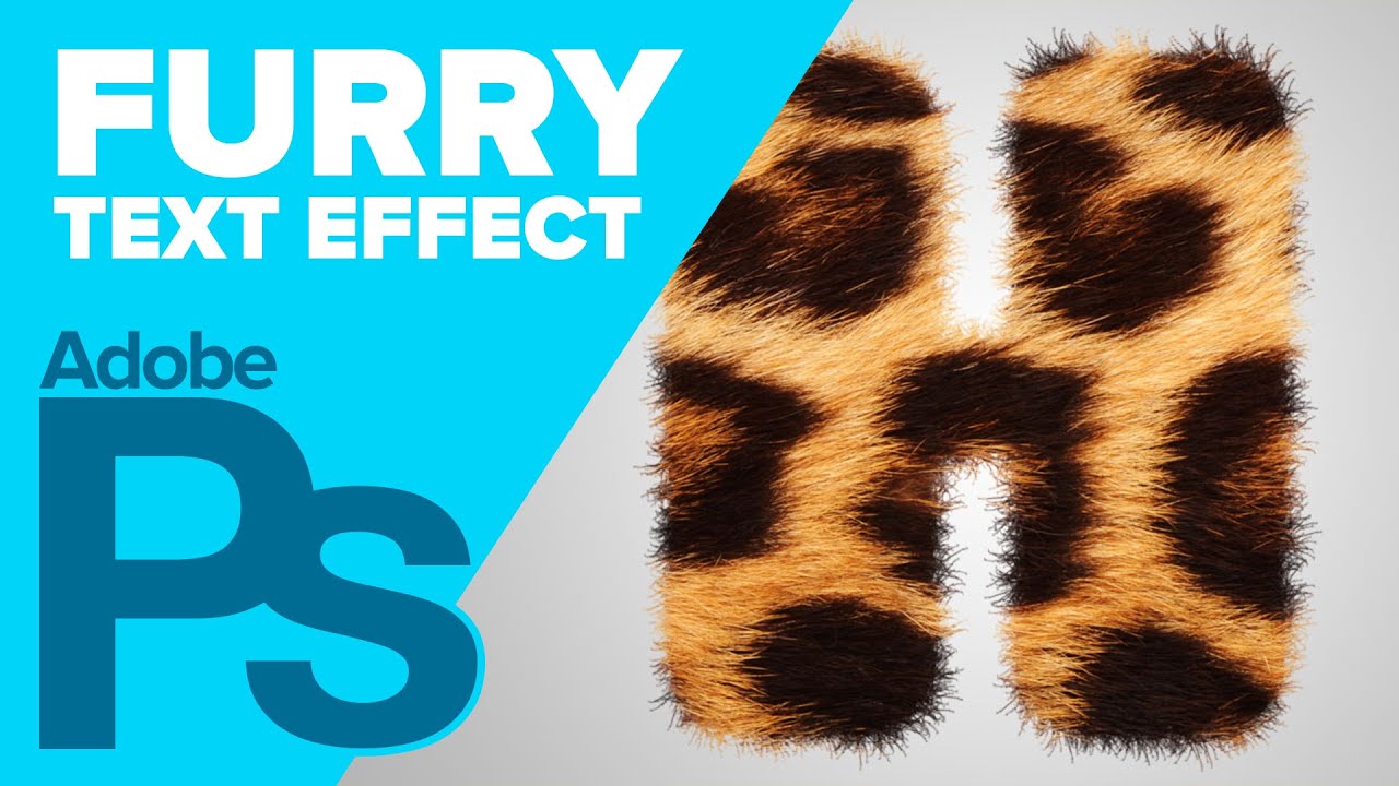
Create hairy or furry text in Photoshop using text, a texture, and the magic of custom brushes. Make sure to check out my other Photoshop tutorials. Links be...
the technique is the same 😃
👌
@wind viper I love all the sparkles around the scepter 😃 Which brush did you use? One of the Kyle Webster spatter brushes?
Thanks @glacial path ,Yes!! That's exactly what I've use! It was awesome!
Gave +1 Creative Carma to evil
Well done 😄
@wind viper oh wow! I have no Idea what's going on here 😮 - but I like it 😄
what a good boy
just a minor detail: the diadem (?) on his head looks like it has a pretty cold color temperature. even though the background is pretty cold, the snow actually looks pretty warm and so does the sun on the white fur.
you could use the Photo filter in Photoshop to warm up the colors 😃
Thanks again Tim! I did feel it was a little bit out of place, I'll try that!
you can apply it via Image -> Adjustments -> Photo filter
or you could use an adjustment layer with a clipping mask if you like to work non-destructively
@glacial path ,I do like it more warmer..thanks!
@normal pebble Really cool idea! I think the two main keys are to soften the edges a bit since fur usually doesn’t have a super crisp edge, but more importantly to match the lighting of the spots. The neck of the Zebra is in shadow, but the image of your spots in direct light. You can either see if you can find a blending mode that keeps the original values underneath more, or use (my favorite) a multiply layer with a soft round brush to sort of paint the shadows in on the spots only, until it looks like it fits in. Here’s an example.
@magic mortar Very cool! I like that you shared the textures too, always cool to see how things are put together. I think if you want to maximize the fluffiness it would help to soften the edges a bit. Maybe have some fur break off the silhouette a bit. A big key to making objects look softer in painting is how hard or soft the edge is. Here's a quick example that I did by scaling down the fur texture and using a mask with a soft round brush to let it conform to the original wolf shape but with a softer edge instead.
@short mica Hah, it's always good to explore these different types of techniques and workflows. I think the trick is to try blending the elements a bit more, and visualize something that seems potentially believable. For example, adding crazy feathers onto a bird shape is a lot easier to pull off than a creature made out of flames and lighting. It’s still doable, just requires a lot more finesse and careful compositing. Try blending more with masks and soft round brushes, as well as different blending modes for different effects. Nice work 😄
Many thanks @magic mortar. I lowered the exposure with an adjustment layer.
Gave +1 Creative Carma to Jackwue
Looks awesome Rainman! Really natural look, great adjustment.
@iron grail Thanks for the feedback will go back and work on the water. I love how much detail you have in your image.
Gave +1 Creative Carma to Saber
@jolly quest Thank you so much. Will try the distortion tool to make the water more realistic.
Gave +1 Creative Carma to VooDoo_Val
Thanks for the feedback. Distorted the water with the ripple affect and tried out a different colour.
Hello everyone, here is my revised of my Day 2 challenge. Any feedback is appreciated.
@hexed tree Whoa, super cool idea. I love the concept of a furry hippo! I think it would be cool to double up the layer around the edges of the hippo. The fur looks like it would work really well with the silhouette you have, as opposed to having the hippos shape show more. I'd try duplicating the fur layer on a normal blend mode and making it a bit more opaque around the edges. Really nice blend from the neck to the head!
@cold cedar Really cool idea! Love those dramatic colors you got. It might help to play around with the opacity/and or combining multiple blending modes to get a little more of the original information and lighting from the animal showing through. Some places like the horns and ears get a little flat without as much of the original shadow and form showing through. The blue electricity is a nice color contrast too!
@wind viper Great job Tibs! These looks awesome. The color adjustment on the animal really unified the image nicely. Your Day 4 challenge looks fantastic! Very well done. All the images fit together seamlessly and the overall saturation and color scheme makes it look like something out of a Disney movie. Very cohesive and well done image, great visual balance too!
@kind knoll Nice! He's all geared up and ready for an adventure. If you wanted to push it even further it could be cool to see some fur texture on the orange parts of his body so match the realistic look of the other textures. Either way it's looking good, I like that nice color contrast that makes the face pop!
@uncut ginkgo Thanks. I just found this Adobe platform and saw your msg. I'm not good on moving around ere yet, But i will learn. This is pretty cool. Thank you...
Gave +1 Creative Carma to gus
@novel flare Ramirez...... Thank You for that. I am just now finding this platform..... Lol..:) Anyway... I will try to keep up. And learn my way around here..... Thank You!!
Gave +1 Creative Carma to Jesus
Day 5 - Mystic Wolf
@glacial path Thank you for the feedback, I will try to work on it 😃
Gave +1 Creative Carma to evil
Day 5 - Texture and Patterns
Challenge day 5
Day 5 Challenge. Still trying to figure this stuff out lol
Day 5 textures and patterns
Day 5- textures and patterns
Day 5. Buddy
Thank you @bleak fossil !😊
Gave +1 Creative Carma to SamPetersonArt
@bleak fossil Thanks.... For me it's definitely exploration as a matter of fact it's mostly a maiden voyage.
The lack of tool knowledge and control is annoying but the biggest frustration is when I lose total control and it seems like I'm flying blindfolded 🥴
However ,that's why I'm here and I'm digg-n it big time and learning a ton. All the feedback , help, encouragement and patience it's amazing and much appreciated.
@glacial path 🙏🕊️
Gave +1 Creative Carma to SamPetersonArt
Thank you @glacial path and @jolly quest for the feedback! Never worked like this with these tools before, so I'm gonna keep practicing and see what I can come up with!
Gave +1 Creative Carma to VooDoo_Val
Challenge Day 4
Thanks a lot for your feedback @bleak fossil !
Gave +1 Creative Carma to SamPetersonArt
Just because it is so much fun 😃 (and of course because practise is the best way to learn 😉 ) here is another Heroic Companion
Here is my Companion.
@glacial path thank you for the feedback.
Gave +1 Creative Carma to evil
This is the original drawing I made some time ago and decided to texturise it...
Texturised version
@hallow trench thanks 😃
Gave +1 Creative Carma to Tropical Delirio
Should I remove Orange shades? Or it's okai?
@west nest Your shades texture is awesome and We have same textures in Paws 👌🏼 😄
hi all - here is my heroic companion: a cownicorn!
Day 5 Custom Brushes
yes of course @rustic ledge - thanks!!😁
MAde some changes
Playing catch-up here, but here is the challenge for day 4. I'll add to my project here: https://www.behance.net/gallery/83959957/Photoshop-Daily-Creative-Challenge-August-2019

Behance
Photoshop daily creative challenges for August 2019, Adventure Guild theme.
@mellow dew thank you!
Gave +1 Creative Carma to idieharoos
@bleak fossil the added fur does help!
@mellow dew You can adjust your background to give focus on your Chameleon.
Oooh, looks great @kind knoll Nice work!
Thanks @bleak fossil
Gave +1 Creative Carma to SamPetersonArt
@wind viper Wow just watched this on today's stream. that staff is great!!! totally love it
Thank you @hallow trench ❤
Gave +1 Creative Carma to Tropical Delirio
Here is the map I made with my custom brushes!
so this is my creature for day 5
Day 6 Custom Brushes & Map
@young karma Love it! Great work, really liking all those vibrant colors. The foot texture is looking solid too. Might be cool to use a gradient or soft round brush on a multiply layer if you want to shift it towards a more realistic look. Here’s a quick example:
@dusty pond Nice work! Makes me think of the Okapi. I think what might help is giving the sections a more gradual transition by using masks and a soft round brush to blend them more naturally. Also might help playing around with blending modes that show a bit more of the lighting/value information underneath to give it a more natural look.
@west nest Looking good! I like all the different textures you combined and the subtle texture on the forehead. One suggestion is that a slightly softer transition on the leg pattern might make it look a bit more natural. Nice work!
@pulsar walrus Nice job! The paint job is looking really convincing, it really helps that all the lighting and shape information are preserved in that blending mode. Well done 😄
@ruby panther Very cool! Did you create the green monster too or was that an asset you found? The purple green contrast is looking great. It might help to have a slightly more gradual transition/edge on the body fur to look a little bit more natural in its transition. Looks good!
@short mica For sure, I think art and design is really a gradual journey of learning and growing. It’s that kind of thing where there’s so much to learn, but if you keep at it a little each day those lessons really grow and accumulate a lot over the weeks and months. These DCCs are great for adding a new little tool/technique to your toolbox each challenge. And of course if you are ever struggling with something specific and need help feel free to ping me. Great work on all these DCCs you’ve been doing, it’s great to see how much work you’ve been putting out!
kinda futuristic map (?) 😃
@bleak fossil thanks and regards
Gave +1 Creative Carma to SamPetersonArt
my hero companion.
😃
Thanks @bleak fossil. I will work on it some more. It looked a bit flat to me as well.
Gave +1 Creative Carma to SamPetersonArt
@bleak fossil cool idea. Will try that ☺️🙏
hi all - here is a map ... i couldn't spend much time on it building the icons, so it's hand 😃 drawn brushes. capture is my friend!!
here is v2 with a slightly different edge.
Wow @hearty wharf amazing! 😍
@coral stone aahw - i'm loving this challenge - thank you!!😃
Gave +1 Creative Carma to Valdair Leonardo
Not the greatest map, but had fun with the brushes
My heroic companions by air and land...discovering wildlife🙂
cash & caffeine in IRL or fantasy adventure.......a daily must!☕
I keep trying,
Day 6 Daily Creative Challenge - Custom Brushes. Treasure Map. Adobe Stock Image.
Trying for more depth and fiercesomeness @glacial path @bleak fossil Let me know what you think.
Day 6 - Custom Brushes pathing out a wildlife Adventure Map 🙂
Fantasy Island: The Adventure Guild Chronicles. Here's my route map. Had to pick up my compass first so I could find my way through the forest. (spilled my coffee on the map, oops.)
@bleak fossil I found the asset on Adobe stock . You are correct about the transition. This is all new to me so I was not sure how to achieve that look. I'm a photographer trying to learn new things. Thank you for the feedback!
Gave +1 Creative Carma to SamPetersonArt
Challenge Day 5 my companion is the Flying Kangaroo, he can kick and gut any threats and hop or fly over large distances.
Challenge 5
@young karma it's so cute!
@slender slate thank you ☺️
Gave +1 Creative Carma to artety
Day 6, used illustrator for the settlements
Day 6 Camp Adventure
My Heroic Companions of this DCC decided to contribute to a sustainable and healthier environment.
Challenge #6 done! 😊
@rich hamlet great map! I like all the artwork you've added 😃 The texture looks great! The path looks a bit off though
You could probably smooth out the area by selecting the individual line and using the free transform tool 😃
I think you can also slightly reduce the opacity of the black marking, just so the texture shows through a bit 👍
@main talon the shark looks fantastic! you should totally place a background behind it 😄 like an underwater scene
@main talon then you could also add some subtle shading to the shark 👌
@main talon the map texture looks a bit blurry 🤔 you could probably get away with scaling down the entire image. 😃
@pulsar walrus I love the idea of the dark map! I feel like you could increase the spacing of the dashed line you used for the path. 😃 Well done!
@tulip fern Love the paper texture! I think you should draw one continuous path instead of three separate - so the viewer can follow one logical path 😃
@west nest Well done! Simple, clear and right to the point 😄 You could try out different textures if you like
@west nest maybe you can add more details to the map 😃
@blazing quail wow! I love all the details you've added 😄 The wood texture behind the map looks great and the colors look nice 👍
@young karma Well done 😄 You should totally play around with different colors for the illustration. The trees could be a dark green tone for example 👍
@outer wing ok the eyes are sliiiightly creepy but the colors look super vibrant 😄
@outer wing maybe you can add a background to add some context 😃
THESE MAPS ARE FABULOUS!
@hidden pendant Wow! I don't want to mess with that guy! The texture looks great 😄 Of course you would actually buy the photo to remove the watermark if it was for a real client.
Here's my challenge nº4. I complicated myself doing so much things with this challenge that i notoriously behind but it was worthy.
I give up. Here's my mount...
@hidden pendant maybe you can also add some highlights and shadows so it looks more three dimensional
These are the source photos of challenge Nº4
And this is the result. I overly complicate the challenge for myself, and thus i got behind from the recent ones..... but it was worth it.
@glacial path thank u for the feedback! i try to fix it and sure i had some difficult fixing the path line, but its okay. I reduced the opacity and looks amazing! 😄