#✂challenges-feedback
1 messages · Page 25 of 1
@red verge Bobby McFerrin, one of my faves! 😃
@white temple thanks for the tip i will give a try and uploaded
Gave +1 Creative Carma to UrsaMajora
@uncut ginkgo its a classic
made some changes
Day One: Fun Bokeh Blur Poster ✨
@lilac minnow I love the energy your color palette brings to the photo!
@young karma this blur and colour contrast in the background makes for great movement in your piece.
@trail kiln Thank you for noticing that! 😀
Gave +1 Creative Carma to mshellvp
@silk wind I'm enjoying how the frame and text sit in your poster.
@lilac minnow Thank you Bianca!
Gave +1 Creative Carma to bianca says
day one DONE!
Super cool @amber crystal!!
Thanks for the review and feedback. I masked out the text and adjusted the composition.
Very simple and great way to execute the challenge. The hands extending the border invites the audience to emerge onto your poster @amber crystal
Great composition @amber crystal
@amber crystal cool design I like how you made the hands to be ontop ofthe frame, it made it look like the person is coming out of the image😀
i think filled all the way in is the way to go?
@red verge this one looks much better it has more detail
Thanks @uncut shell I try bring a greater depth with this trick and with the dual colors grade 😉
Gave +1 Creative Carma to CeliaC
idk why i left it so small in the beginning
Hi, all. I'm struggling with the border. Is the purple too dark in the top corner? Or is the blue gradient too low? Like should I pull it up to match the blue in the background or change the blue color completely? Would love any feedback. ❤
Day 1. It's been a while since I've done a challenge... I've had too much "real work" to do
@unreal hornet great way to show before and after, brilliant
@dawn mountain looks awesome I think as is. If I were to change something I think the bottom right is too bright. There’s nothing really there but it draws attention away from the face and chest/clavicle bones which are more interesting. I like the purple streaks in top left if that’s what you were initially referring to. Very cool looking!
@void ermine Thanks! Yeah, I kinda left the bottom right empty to help move the eyes around because I felt like blue was super bright in the background and I felt that the orbs would help give some sort of balance away from it, ya know? But, I'll keep messing with it and see what I come up with. Thanks for the feedback! 😃
Gave +1 Creative Carma to Jon Leo
Day 1 - Blurred Background 😃
I like the mood you gave to the poster @onyx rock 😃
My first Challenge
Image my own. Feedback always appreciated.
Day 1 Challenge. #📣creative-challenges
Took a little while but here is my day 1 😄
blur the back challenge
My Day 1. Composite of two images. Bokeh using a custom brush. Any comments? I don't know if I like the color or b&w better.
Day 1 of the Creative Challenge. A pic of my wife and daughter 😃 Love them so much!
Hello my first challenger 1. Blur
Hello everyone! Happy PS Challenge week to you. Here is my submission for challenge 1. Kept this one minimal in the frame area since there's so much texture in the photo. Also including the stages of image editing so you can see the process. Thanks, in advance, for the feedback!
@white temple trying a new color composition
A little late too, but here is my cover for the project!
thanks ! @coral stone !!!
Gave +1 Creative Carma to Valdair Leonardo
@thick vale I love the feel of this. The colors are very relaxing.
not sure how im feeling about this, any feedback would be welcome! everyone else's posters are looking great 😃
Another try.
Any and all feedback is welcome! 😃
Hi @simple steeple maybe if you try don't blur the path behind the guy your composition will be great! just my view 😃
Day 1 poster
@young karma That looks a lot better!
Any advice??
@ember jacinth interesting photo! I think having the blur effect on the axe is a bit confusing since it is reflecting a lot of light (like the cans are). It feels like it should also be in focus. Perhaps you could keep it in focus (or use content-aware to remove it entirely)
@simple steeple beautiful sunset! it feels like the rock the figure is standing on (and the water around it) should also be in focus. In this photo, notice how the grass below the gull (and all grass at that specific distance) is all in focus, but the rest is blurred
I may have taken the blur and add lens flares a little too far. But I kinda like it.
Late on my cover photo! But here it is
I am so excited to be apart of this challenge, I feel like it's going to really help with my creative block I've been dealing with for waaaay too long.
@zinc birch Dat Poster is really badass! Well done!
@worthy oxide Thanks Greg, wish I had a cute loaf of cat to photoshop though! 😋
Gave +1 Creative Carma to Greg
Day 1 of first challenge! Blur the background.
No real theme here. Just the mechanics of the challenge.
Day one photoshop blur background challenge
Day 1 Challenge – Prost from Vienna
@prisma raven Love that your boarder is behind the tree, adds that extra bit of depth!
@sand current I don't think you went to far at all! Feels like a book cover. 😊
😀
Hi everyone! Here's my day 1! 😄
Day 1
Poster 01
Day 1! so excited
Back again for another Challenge 😃 Here is my Day 1 entry.
(This is not for the daily challenge) any thoughts and/or suggestions
Day 1 !!!!!!!!
Here's my contribution to the Day 1 PS Challenge. The photo was made by me, about 3am at London St Pancras Station.
I welcome all constructive feedback.
@raven atlas nice, i would crop out or use the stamp tool to get rid of that trashcan in the bottom right of each photo, it's a bit distracting
ok so I am a tad bit behind... here is my cover image
My first daily challenge
@lucid moss : thanks for the suggestion. It's actually a metal post, but I get your point.
Gave +1 Creative Carma to erinwoody143
@raven atlas Cool photo! and wow - 3 am... team nightshift I guess 😄 ?
Original
@coral stone : I absolutely love how you made the umbrella sit outside the frame! Brilliant!
Original photo from a wedding added a blurred background and tried to be creative with the lady
@raven atlas I think you should look at the main title again. the contrast is pretty low. just darken the text or brighten the background. this would also be a great chance to finetune the colors. Since you're going with a black&white look, some dark desaturated color tones would look awesome! You could also invert the background and go with the night theme
@raven atlas bright text on a dark background
@raven atlas I'm wondering what those brush strokes are 🤔
@glacial path : I'm a bit of a nocturnal creature.
Thanks for your suggestions. I'll work on them before I go to bed (it's 23:55 in the UK)
Not brush strokes at all...
By the way... is this Evil Cerise?!
Gave +1 Creative Carma to evil
@raven atlas maaaaybe
@raven atlas aaah! that's an awesome image on it's own! I don't think I would overlay it like this. Or..... you could make the overlay effect more dramatic
@glacial path
you could make the overlay effect more dramatic
Admittedly, I did try dramatic... maybe I'm just too conservative for my own good.


@wind jolt well done! I think you could make the border a bit wider so the "01" fits without overlapping. The photo is fantastic, I love the soft background 😃
@zinc birch Thank you! Looks like you are going to crush that creative block with these challenges. Keep up the good work.
Gave +1 Creative Carma to NEON.B
I meshed a picture of my hand-embroidered artwork (the little child character) with a blurred background.
@fallow bough I think the second one with the radial blur is better 😃
Ditto
yay
@glacial path Many thanks Tim, I shall make the change. @raven atlas like you bit of a night person, also in the UK - This is my first visit to the challenges hope I can keep it up.
Gave +1 Creative Carma to evil
The text is also nice! The idea with the g and the l is interesting but it is important to keep in mind that it will decrease the legibility
Loving everyones different take on this challenge! Definitely giving me a lot of inspiration and motivation for the other challenges 😀
@glacial path I figured the fat type and the image itself would compensate.
@wispy fjord wow! this poster has a great look! The background looks a bit busy. You could blur it slightly or reduce the contrast 😃
@fallow bough I guess so. As long as you don't do it for a longer text it should be ok
I'm new to photoshop. So I was wondering if any more experienced people have some ideas.
my Final work from Day 1 Show me some love 😘😘😘🎉💋
@glacial path Time, Extended the canvas to accommodate the numbers - added some text.
@sand current Thanks you too! 😊
Gave +1 Creative Carma to EmmyWAhWAh
@wind jolt noice!
@glacial path 😅
@median quarry That's a great color scheme but the red border is slightly distracting. I think you can darken it slightly to help the roses stand out more 😃
@median quarry A lovely piece . If I may say, try a softer border to see how it looks
@modest nimbus you're definitely on the right track! I think you could add some context around the two images. the gray looks a bit empty. you could put them into a frame like Kathleen did in her poster
@glacial path thank you i will try to fix it ❤️❤️❤️
Gave +1 Creative Carma to evil
Thank you so much @raven atlas 😃
Gave +1 Creative Carma to Ess
@glacial path great feedback. Thank you!
Gave +1 Creative Carma to evil
@wind jolt thanks for the helps ❤️❤️
Changed Day# text. Red looked odd.
@glacial path can you take a look at my photo (non challenge)
@glacial path thank you for the feedback I will surely use that idea in the future
Gave +1 Creative Carma to evil
a poster a day- I could not complete the "poster" as it showed a message "scratch disk full"
Beautiful tribute @short mica ❤
Here it is with the images I used. LEt me know your thoughts.
@main jungle Nice image. I am not sure the tree on the left is working. And perhaps some masking of the dog on the left and the woman to eliminate the green cast?
Looking great @cold cedar! I loved what you did with the frame
Also how the bokeh is overlapping the elephant is subtle which makes it looks beautiful and awesome!
@cold cedar nice one! But I think you need a wider font for the vertical text to work - I like the "me" touch 😃
Thank you @coral stone
Gave +1 Creative Carma to Valdair Leonardo
@glacial path Thank you. I agree. I just couldn't find one (yet) that I liked. I want the letters to be close to the same width. The search continues.
Ok... Day 1 Challenge... 2nd take.
Again, all constructive criticism welcome! Additionally, many thanks for the feedback on my 1st take; it's made me think... long term!
Here's the original photo...
Any feedback is welcomed, thanks
@glacial path Maybe this one? Went for monotype, which I forgot existed. Then it hit me.
Ok... it's goodnight from me, y'all!
Happy Photoshop-ing!
Changed it and emphasized the pastel
@modest nimbus Really cool use of effects with the background! Nice job of masking out the girl as well. The only thing is the girl now appears like she doesn’t quite fit in with that bright environment due to the deep shadows on her front. Perhaps let some of that light onto her mask? Here’s a quick example I did using a color dodge layer. You somewhat lose that strong dark shape/silhouette, but I think she seems more in place this way.
@raven atlas Interesting use of color to really pull that focus to the red bus. I wonder if leaving the color in the rest of the bus (windows and such) would help unify the bus as a whole a bit more. I think the red would still pop out the most, but letting that color in the windows show through might help separate the rest of the bus from the background. Looks good Ess!
@cold cedar Very cool! Love those colors and the way you broke the frame with the elephant, gives the image a nice feel. The letters do feel a little odd to me. I think it might be that they seem a bit cramped? The way the letters are so close together and right next to the frame make it feel a bit tight in that area. I think if the letters had a bit more space or if the frame to the left was a bit thinner it would make it feel like it has more room to breathe. I think what Tim said about have font working better if it was wider might help it read a bit better as well. It's looking really cool!
@short mica Nice work J Lewis :)
@real fossil Great work, I really like the golden monochromatic look to the whole image, really gives it a cool feel. Were you able to fix the scratch disk problem?
Thanks @bleak fossil I posted a second one but I see even with the second one the letters are a bit tight. I'll work on that.
Gave +1 Creative Carma to SamPetersonArt
@magic tangle Ooh, very cool. I think one thing that might help this image is if the styles between the photo and the drawing fit together a little bit better. I think perhaps applying a filter or two to the background to make it look a little bit more illustrated might help unify them more. I believe Jesus did a previous DCCC where we were trying to give it a more comic book look, a little bit of that might work well for this image.
@fallow bough Well done Ken! That blur effect really draws the focus to the two figures and bull in the foreground. The radio blurred definitely gives it a sense of motion and movement which works well with this image. Nice work!
@bleak fossil Gave the letters a little breathing room.
@high mesa loving the poster! One thing I noticed though, I see a yellowed box around the girl. It this intentional? It seems to me like it might be the boarder of the image of her. If it’s not intentional, I say maybe do some erasing. Or if it is, maybe try making the box stand out more or play around with some effects that will make it stand out as an intentional element in the image.
@high mesa or, if you like the subtlety, that’s cool too! Just sharing some thoughts on it 😃
@wind jolt Very nice Gino! I think the font change you made looks much better, and doesn't draw too much attention away from the image above. I really love that almost watercolor feel you have with this image. The only thing I think might help would be if the background right in front of her face was lighter instead of being as dark as it is. currently at a glance the contrast between the neck and the background seems to pull the most focus, it would be nice if that focus was moved up towards the face. Though that’s a bit of a nitpick. Looks great!
@short mica loving the tribute poster! I think it could be improved if you try removing some of the texture over his face, however. I think the visibility is low there and since this is a tribute, perhaps he should be viewed more clearly? Well done!
Hello. @bleak fossil 😃
@median quarry Looks really good! I love the way the red really pops next to all the other colors. I wonder if toning down the saturation or brightness of the red border slightly would make it compete less with the flowers. Really liking that effect with the background circles!
Oh hey howdy there @jolly quest Fancy seeing you around these parts
What do y’all think?!!
@cerulean spruce WOAH very interesting approach! Loving the circles mixed with those in the photo! Very cool!
I've been so busy today I've only just finished the cover image! Here it is though.
Day 1
@wispy fjord Really cool. Very interesting collaged sort of feel to it. I think a blurring the background slightly so all those circles have a softer edge might help to really draw the focus into the center figure. the crispness of the edges in contrast to the softer background will really help it stand out. Very nice image!
@frosty parcel nice poster! I’d love to see whet it would look like if you swapped the images, putting the black and white portion behind and the colored image on top? I think it might increase visibility on your subject!
@kindred pendant thanks for sharing the before pic! Loving the poster!
Gave +1 Creative Carma to VictoriaF
@jolly quest Thank you so much!
Gave +1 Creative Carma to VooDoo_Val
@coral stone love your poster! Very minimal but emotional. Awesome effect with the umbrella breaking the boarder!
Thanks @jolly quest 😄
Gave +1 Creative Carma to VooDoo_Val
Day 1 - Try again - More intense boke
Hi! This is my DCC of the day. What do you think?
@elder basin Awesome, welcome in! Glad you could join us. Really like what you did with the colors in the bottom image! Definitely gives it some life. Nice work on blurring the background as well. I wonder if blurring some of the circles in the scene might help the effect as well, though I like how you varied the opacity. Also it might be nice to fix the orientation of the bottom image since it looks like it was squished a bit. Nice work!
@kindred pendant Nailed it! The way you handled blurring and desaturating the background really makes that tiger a strong focal point. Awesome work!
@high mesa Very nice! The pastel one definitely gives it more crispness. I feel like it might help to make the girl bigger in the frame. She seems a bit small for the main subject and focal point of this poster. Very cool work with the colors!
poster Numero 1
@bleak fossil thank you so much! I forgot just how easy it was to forget how to work Photoshop when you don’t use it all the time... 🥴
Gave +1 Creative Carma to SamPetersonArt
PSdailychallenge 1 - July 9, 2019 Boca Lights. Blurred Background.
Added some bokeh
the original, any feedback appreciated 😃
B4 pic:
Day 1 poster
Just used a bunch of stocks off pixabay. Another great resource btw, since its all open copyright.
With help from my very photogenic cat, Joseph.
Ok... this one was tough... I had no ideas for quite a while... turned out ok I think. So many awesome images up here ! Nice job everyone!
I've never used Discord before. How do you post your photos? 😳
I joined in late... hope this makes it on time. First time, newbie...ish.
Thanks, Jon Leo! I got it!!
@valid briar should call you EagleChaser! Nice!
Don't worry about the time... I was quite concerned the first time I did it if I was submitting things correctly etc... It doesn't seem to matter if it's late.
Thanks...and I think Discord is going to be harder to learn than PS. EEEK!
@normal canyon I love it! The only thing I would say is that the bokeh is hiding the subject more than helping to soften the background/image. I'm not sure how you would fix that other than clipping out the legs and putting them all the way in front so that the bokeh would only be in the background, then adjusting the opacity or the softness of the leg layer.
Day 01 poster
I made a second one. 😅 Once again, still struggling with the border. With this one, I'm just not sure about the colors I used. Kinda feel like they're too dark but, I didn't like them when they were lighter. Any feedback would be lovely. 💜
@dawn mountain I actually really really like this one. I think the colors are moody, which works for the piece. I also really like how her arm is in front of the border to create dimension!
I feel pretty happy about this one. Hope you all like it!
my original plan really got lost. i want to refine but could use some feedback!!
feedback please
I'm still playing around with the lights/extras, but here's my blurred background - the original photo is by Chris Zhang on Unsplash
I learned so much.
OK - finally got the poster for day 1 done - or at least in process. Both my main Photoshop machine AND my Cintique are DOA (but getting fixed), so I'm on my laptop with the Intuous. Anyway.... I put together kind of a fashion poster with a BG from Unsplash and a lovely model rendered in Poser Pro 2014. I thought it might be fun to position her so her left fingers were on this side of the frame. I added a bit of bokeh in front and back of her. Feedback / suggestions welcome.
Not quite on Day 1, but here is my poster. For some reason of all things, I couldn't figure out how to change the poster number color! 😂
Day 1 poster
@cerulean spruce Great to see you all coming in so strong on the first day! I like the warm colors. I think the dog in the image could be solidified as the focal point of it more by increasing its size and maybe even decreasing the saturation of the red in the background. Right now the backgrounds colors are so bold and the circles on the bottom right or so big that they almost over shadow the dog.
@tulip fern Kitty! Really nice work with the blur! My only suggestion would be to maybe put more blur towards the middle bottom. There’s a sort of radial blur to the left and the right on the plants, but not in the center near the cats legs which makes the blur look a bit unnatural. I think it’s fine to blur a bit of the cats legs along with the planets, it’ll just work to pull focus to its face more. Looks good 😄
Hey guys I just finished the photoshop challenge of the day (July 9th) I feel that this poster is missing something that make it pop. Should I have added some graphic design elements like circles, lines, or text to the poster? Or should I play with the sizes of the image to give it a sense of unbalance? is the circles on the subject a bit distracting?😀
@mint sorrel Awesome work! Would be nice to see the original image. Everything looks very natural and well done in this, from the colors, to the lights, to the blurred background. Very nice!
@strong plover Glad you could join us! Did you blur the background? If so, I think you could push it a bit more. I think a simple blur and vignette on an image like this could do a lot to draw the focus. Maybe playing with the crop a bit. Here’s a quick example.
Edit: I saw your updated image, I’m really liking the effect! Though if you scale your image down the effect might not get so pixelated. Though it’s kind of an interesting effect on it’s own, almost looks like looking through patterned glass.
@pulsar walrus Awesome image! Really love the lighting and faded background. I think the text is really cool but it almost looks slightly out of place. I think maybe changing the white to a really like yellowish color might fit it in with the monochromatic feel of the rest of the image.
@frosty parcel Really cool effect! I think you could be cool to repeat the effect one more time, perhaps with a blurred image in the background. A third image repeated might help unify the effect more. Maybe something like this? Just a thought Looks good!
@bleak fossil thanks for feedback and high lighted the gray area
Gave +1 Creative Carma to SamPetersonArt
@distant meteor Awesome job, really love the colors/lighting, the images fit together very well. That blur really brings the focus to the bird very well! The only nitpick would be that it could help to fix up the small white spots in the birds wings. Great work!
Hi, @bleak fossil Thanks! I tried to keep a basic edition on this, and just followed the instruction for this challenge 😃 ...the original pic was already awesome 😁
Gave +1 Creative Carma to SamPetersonArt
Photoshop Challenge. Day 1. Blur a background. Original Image: Photo by Wilson Chen on Unsplash
I'm kinda stuck. I don't like it. ... is it too pastel and busy?
@white temple Very nice work. I like how soft it is. In order to change the color of the number double click the number with either the text tool or the move tool. If using the move tool make sure you have the little auto select box checked at the top. Then I usually use the characters window, click in the color box.
@white temple
Gave +1 Creative Carma to SamPetersonArt
Here's my attempt at Bokeh. Before and after
@jolly quest thanks so much for the advise it looks so cool with the blurred larger image behind
Did not have any pictures with a sharp background so I created one with my shirt/hair, polar coordinates, then blurred to make it smooth! 😃
Late submission and first pschallenge!
Wow @pulsar walrus what a cool poster you created. It gives a dreamy almost hypnotic feel 😃 The only thing that seems a bit out-of-place is the bright square above her head. To be honest I only noticed it after looking at it for the tenth time 😂
@tulip fern thank will update
Gave +1 Creative Carma to unicaNL
@mossy adder This is awesome! Can you share how you do it?
Thank you for the feedback @bleak fossil, much appreciated as always ! I added more blur to the bottom part and moved the text in another location as well to give the face more focus.
Gave +1 Creative Carma to SamPetersonArt
Probably would have been better with a portrait photo but have learnt so many new things already!! Keen to practice with other images.
Bonjour toutes le monde
Hey everyone,
Here's my effort, fun and informative video thanks Kathleen
@bitter needle You could always make it horizontal. Just a thought.
Hey @fading burrow
for the Winter Sale poster i´d recommend the following changes:
Use a less Game of Thrones kind of font for the Headline
Maybe the one you used for "show now" in Bold or Extra Bold.
Make sure the kering is set right even if you have to change it on every single letter.
Focus on a maximum of 2 Fonts.
I´d go for all caps. Looks a bit more balanced.
Is it necessary to have "for Women, Men & Kids" in there? If not,
Rearrange the text.
WINTER SALE
SHOP EXCLUSIVE DESIGNER WEAR
AND SAVE UP TO 80%
Hope i Could help.
Maybe like that.
Oh yeah and i´d try to make the CTA a flag.
Day 1 Poster
A slightly revised version after the constructive comments from Anya Anti on her stream

This Is My 1st Photoshop Challenge. I Would Love Get Feedback..!
Hello 😃
Day 1 - Blurred Background
@bleak fossil - Thanks Sam, did a curves adjustment to reduce the dark and increase light areas
Gave +1 Creative Carma to SamPetersonArt
HI everyone, day 1 blur a background challenge . PS this is my first ever challenge🙃
Hey @brave pagoda What a cute doggo 😄
I would center the images and possibly desaturate them slightly
I've been trying to work on my color schemes. I think this works?
Hi, contributing to the first challenge, please let me know what you think 🙌
Here's my entry for day 1
@jolly quest I did try that with a mask but it looked so extreme
.... My control over the tools is definitely wanting...... We have windows in common (on a speced out XPS 15 ) is it my inexperience or does it handle considerably different than a Mac?
@bleak fossil🙏
This is my day 1 exercise. 2much blur maybe?
@bleak fossil @jolly quest - thank u for great feedback; really appreciate your opinions. I will have a relook based upon your thoughts 😉
Gave +1 Creative Carma to SamPetersonArt
@raven atlas I'm digging the pun, I'm wondering how it would look if the two decks where exactly the same.
Really love the theme 👍👍
My entry for day 1, to much bokeh? Feedback?
@glacial path Thank you so much for this feedback, this means a lot. going to work on the corrections
Gave +1 Creative Carma to evil
Hey guys, do you have any feedback??? https://www.behance.net/gallery/82706959/Daily-Creative-Challenge

Hi everyone! Here's my day one poster.
@glacial path is it any better
Here is my entry for day 1
@jolly quest @bleak fossil - reworked the image, the changes just tighten everything up and give it more emphasis, so it def improves the image, thx
Gave +1 Creative Carma to SamPetersonArt
DAY 1 😀
@fair wedge - hey thanks for the props
Gave +1 Creative Carma to Anna A
@covert osprey what a lovely happy girl! Brings a smile to my face 😃 I think that when you either desaturate the border or maybe even better give the girl more saturation / contrast than she will really pop-up. Also maybe rotate the bokeh layer a bit to the left so they will be less heavy on top and fill the left side as well? These are all suggestions, not sure how they would turn out I am not an expert myself 😉 but it sure is a very nice Poster 👍🏻
Poster number 1 - it took some time for me to select an image that would work. I had another image that I went through the entire process but could never get it to look like the subject was just sort of floating. Even by keeping the foreground in focus, the effect was not really ideal. So, I scrapped that one and searched for an image in which the subject went out of frame which, I felt, would trick the brain into thinking the subject was not floating in an amorphous world. Anyway, all's well that ends well and I feel that I learned some lessons about what types of photos can be used as well as a reminder to focus better in my own photography work.
Gave +1 Creative Carma to SamPetersonArt
@bleak fossil Hi, Sam! I blurred it a little, but you’re right, I could’ve blurred it a little more. Your vignette is AWESOME! Thanks for the feedback! I’m typically a grad student in Leadership, but couldn’t pass-up the creative challenge!! This is so great of y’all, thank you!!!
Here's my entry for day 1. Took some time to find the right place for the bokeh, and still not sure 🙈
@fair wedge - luv the colours in the image, I would like to see more of the bokeh, perhaps try blurring the background more to help bring the flares forward. Did you duplicate the flares and scale them? Add a blend? These are just ideas, feel free to try or not. Hope this helps.
My entry for day 1
Also the background is blury i didn´t like the background, so i decided to change the background just by bluring it. I duplicateted the image, i made a selection from the horse on the layer above and made a mask from the selction, i used 1000% gausian blur on the layern down to keep all colors of the image for the new background.
Revised Day 1. The other one was too blah.
@young karma I would love if you could use the posterize effect on the horse
Here we go.
Hi guys, this is my day 1 challenge. Let me know what you think of it.
hi all, here is day 1 - love the other posters!
and i did another blurry background pic ...
is it too much? i'd like to use it for portfolio, i've worked on the design ...
Hi all! This is my submit for the Day one challenge! Let me know what you think
Hi guys, here is my version of Day 1 😃
Hello Everybody ! So this is the first time I try something like this, could you give me some feedback?
here is my day 1 challenge 😃
@young karma you forgot the bokeh lights
@split frigate thanks will add them 😃
Gave +1 Creative Carma to nmdesigns
like this ? 😃
Hi Everyone, here's my day 1 poster
@hasty coral I prefer the second, it's kooky with the upside down, the balloons collide nicely.
I re-worked my first attempt at my poster and have come down to two variations. Which looks better and what do you think makes it work more than the other? 💜
@dawn mountain I think the second is better, the border pops, the colour is more balanced (if that is the right way to put it) and the 01 stands out better on a darker part of the background.
A bit late on my day 1. I am a newbie in PS but have a bit of idea here and there. I am new to the Creative Challenge as well.
Took the photo from unsplash.
Couldn't get enough time to work on the poster.
Hoping to get feedback.
Challenge1 before
@magic rampart thanks, that's what I was thinking.
Gave +1 Creative Carma to Jmada
@dawn mountain I like the bottom one better. Same reasons, the border and colors pop better. Nice job
After background blur challenge and i still have many queries
@restive otter maybe use a layer mask to remove the bubbles from in front of their faces, other than that it looks good
i haven't understood how to clear the effect from some part of layer as after creating layer mask it was not vanishing
yeah i was having problem in doing that
@magic rampart yeah
@restive otter when you create the layer mask use a black brush on 100% opacity to paint over the bubbles on the layer mask, this would "hide" them from view.
okay but it was actually painting black ... i'll do it again thnaks @magic rampart
@magic rampart thank you for feedback
Gave +1 Creative Carma to Jmada
@restive otter make sure your layer mask is selected when you paint on it, no problem 😀
Day #1
@lone hare awesome car! It looks like you have blurred the whole image though.
@dawn mountain yours looks really good! I like the 2nd version
@icy cargo looks good!
Here is my day one Poster. Hope you guys like it.😉
@magic rampart Nah everything behind the car got blurred. It might look all blurry due to the quality of the original image or the texture I laid over the final image.
@young karma looks great!
@magic rampart Thank you sir!
Gave +1 Creative Carma to Jmada
@hasty coral Thank you for the feedback! I had tried doing that with the text, but I will make sure I have tried those before giving up 😃 I'd like the numbers maybe to either be dark blue or pink with a drop shadow (I have a theme going on for this challenge)
Gave +1 Creative Carma to SamZilla
DaY 1 Eddting
@dawn mountain they are great, i like them both, maybe prefer the brighter one ...
@dawn mountain The second poster. 😄
@white temple no problem 😄 cool, I'd like to see that and what an awesome idea to have a theme for the whole challenge.
@magic rampart okay I'll make sure that 😬 😄
@magic rampart Thank you very much. I tried to go complimentary.
Gave +1 Creative Carma to Jmada
@median quarry I love the red. It's so striking
Poster A Day 1
Added a border. I think I like this one better.
Hi, this is Darius from Lithuania. Emotions...
@loud zephyr thank u so much for your feedback
Gave +1 Creative Carma to KayJay
The challenge inspired me to use a photo I took this morning for inspiration.
This is day 1 work. 😊
I have done some corrections this time finally. @magic rampart I was using brush tool last time and now i did it with eraser tool. 😀
Day 1 Challenge
Hello 😃 first attempt with ps. day 1 done. feedback always appreciated 😃
Day 2:
Day 1
Here is my entry for Day 2
@young karma wow, that was quick!!
I like the overlap you did with the frame and the text behind the elephant @shut latch. Great job!
day 2 layers and text
i like the second one
I agree with @drowsy sand, I like the font contrast in the second one 😀
thanks for the feedback
I just saw the spacing of the text line "Daily" was wrong. I have corrected it
thanks
@jolly quest thanks so much for that brush, that is so helpful - brilliant!!!
Gave +1 Creative Carma to VooDoo_Val
Hello from Oregon! Here's my Day 2 Challenge poster.
@young karma I love the colors!
@dreamy hatch The snow capped mountain looks great 😃
Here is my Day 2 poster 🙂
@stark swan Thanks. Yours is awesome too.
Gave +1 Creative Carma to Sharri
@stark swan I really love yours! Especially the colors and the choice of font.
@young karma it looks like you set the tone for everyone else's posters today 😂 nice!
Thank you @young karma !
Gave +1 Creative Carma to Laurence Collard
Thank you @white temple !
Great texture @dreamy hatch! Love that 😍
@coral stone Thank you!!
Gave +1 Creative Carma to Valdair Leonardo
@stark swan Thank you!!
Gave +1 Creative Carma to Sharri
@stark swan I love your use of color and the mix of gradient, solid and textured shapes!
@young karma I really like how you transitioned the color of the shapes to the color of the text!
Thoughts on the use of 3 repetitions of the image? Would it be better composed another way???
Day 2
@astral turret fun!!

YouTube
Hello my name is Asik Mahmud Hassan (ARMBD) I am a freelance Graphic Designer. As I am specialized in logo design, in This channel I will share what I know a...
@dreamy hatch Thanks
Gave +1 Creative Carma to niccidubs
@astral turret I love the depth you have created
Basic shapes & layers - Day2 - PSDailyChallenge
This is my take on day 2's challenge. I am very open to everyone's feedback
Here is my Day 2 Challenge poster
😃
Day 2 Layers using the shape tool
@silk wind AMAZING
#OFFTOPIC but i think this is more like the challenge, this is a part of my degree work 😃 sorry if it a spam
@jolly quest thank you!
Gave +1 Creative Carma to VooDoo_Val
@sterile bane hi kathleen - just wanted to say how brilliant the walk-troughs for the challenges are - really inspiring and just makes me want to try everything immediately ... i've been working with photoshop for ages, but always did stuff the same way. thanks!!
Gave +1 Creative Carma to Kathleen
@hearty wharf That means the world! Excited to see what you make
@silk wind love those COLORS!
@kindred kernel very cool! how did you achieve that paper-like texture?
@stark swan love how you incorporated patterns into your shapes!
@dreamy hatch thanks so much!
Gave +1 Creative Carma to niccidubs
@young karma that's a super interesting color palette - i love it. Nice job integrating the text colors with the shapes as well
@astral turret wow great colors and nice perspective
Day 2 - Layer Challenge
@thick vale The Eagle has landed. One step for a mouse, one giant leap for mousekind
Here is an album cover I created for a fictional metal band. How do the illustrations look and what would you do to improve this product?
Day 2 - Shapes and Layers 😄
@sterile bane Thanks for your feedback.
Gave +1 Creative Carma to Kathleen
Day 2 ! This is a nice way to end the day 😁
@winter seal I like the surreal texture you gave the minerals. They look like rocks.
Thanks! Was the goal @icy dust We were talking about Harry Potter so I thought I'd play with making the sorcerer's stone.
Gave +1 Creative Carma to DevenGaming
@young karma I've been seeing similar illustrations and that one looks great! I like the typography and how it's integrated into the clouds.
Oh, I probably should create another Discord profile just for Photoshop. I thought changing my nickname would suffice.
what you think.
@icy dust welcome! that's a cool design.. what's the story behind it?
day 2, everything was made using the pen tool😺 🍌
Day 2 done with a retro poster make with Shapes & Colors.
@icy dust Nice work on the typography with the jet.
Nice work @amber crystal. I like the dimension you created with this piece.
@sterile bane @true storm Thanks! I appreciate it.
It's about a CEO who is micro-managing his associates to make himself feel better. However, throughout the show, he makes the attempt to lose his the need to control his business to some extent and let go of his arrogant mindset.
Gave +1 Creative Carma to Kathleen
Here's the link to my poster ad if you all are curious:
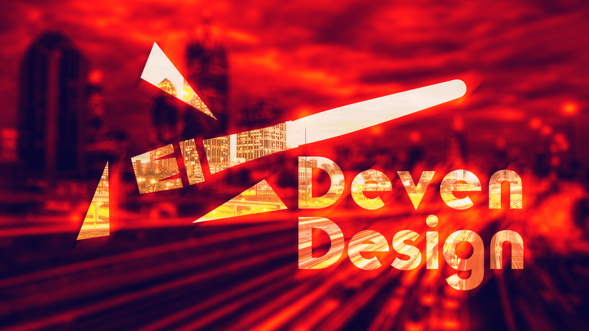
BLOG | Deven Design
Also, if you all would like to give my Behance portfolio a review, please @ me. I would love to hear what you all have!

Behance
That's deep @icy dust. You definitely put a lot of heart and thought into this piece.
First time trying this out. Feedback always welcome.
Day 1 - New change to my poster. I wans't happy about the last one...
@fallow bough - Another consistently good design from Kenny, really enjoy seeing your take on things
PSDAILYCHALLENGE Layers Feedback
Didn't like the bottom range I added. Like pallet element here better.
@spark shadow - that is so cool, reminds me of stain glass or etched glass, I luv glass btw
This is Day 2 work!!😊
@high mesa Thanks
Gave +1 Creative Carma to Mykul
Hey guys feedback Please
original image
nice work @fallow bough I like your color combination
@blissful wolf Cool. I also tried something like that.
I like what you did @noble glen
@tulip fern - Hoi Unica, hoe is het? Great cat!
Thanks @high mesa . My cats are easy inspiration 😉 Het gaat goed met mij en met jou?
Gave +1 Creative Carma to Mykul
I have really been trying all of the new tools Kathleen has been showing us. Thanks Kathleen! Pretty soon I hope they will come naturally.
Day 1 Bokeh Challenge
Thanks @lucid moss @young karma @stark swan
Gave +1 Creative Carma to Laurence Collard
@fallow bough love your color scheme!
@noble glen @stark swan Thanks. I used the predominate colors from the photo the poster is based on.
Gave +1 Creative Carma to Sharri
Was trying for an abstract night sky. WIth a bit of forward momentum to kind of go with the quote
Feel it works better in as a landscape poster.
Oops
@fallow bough Great Poster!! Austian, Austrian.... still looks great 😉
First time using adobe color website, which is so cool. Also pretty new to this illustrative style of working. Learning a lot but alas, gotta go to work. Hoping for some feedback to continue working on it when I get home.
@blissful badge that's an awesome composition! I love how the trees frame the layout. very graphic and cool
Thanks @sterile bane 😊
Hey guys , this is my first try . Do let me know your feedback 😃
Any thoughts on how to improve this?
@dawn mountain Love the first one, diggin' the purple over the blue/green.
@astral turret Love your day two poster!!
@silk wind 😍 😍 😍
@thick vale Love the concept, brilliant!
Day 2 Poster: Layers
@spark wharf wow this is super cool! really feels like a travel portrait. two pieces of feedback 1) the diamond pattern is cool, but it feels a little big and stark - starts to distract a little from the design. Perhaps you could try decreasing the scale and possibly scaling back the opacity? 2) the shades of blue are awesome and I think the stark black feels a bit out of place. you could try a super dark, desaturated navy instead of black for a more cohesive palette. just my thoughts! do your thing 😃
@rugged jacinth ha! great color palette and funny quote. I think the red in the sun feels a bit out of place with the pink of the mountains. maybe you could try a pink-er red in the sun to mesh the palette together a bit more?
Hi everyone! I'm still working on it, it was a great opportunity to use my Wacom with the freeform pen tool 😄 Please let me know what you think 😃
@rugged jacinth I like your slogan 😃 and also the warm colors you used. I am curious though what it would be like when you have a sunset over water?
@spark wharf I don't think it needs much. The white is a bit over-powering to the design, maybe try changing it to a softer color? It would help bring the whole design together I think.
@sterile bane I see what you are saying about the black! I will try the blue like suggested. Ha! on the diamond pattern. I am already at 4%. Maybe I can find something different or lose it all together.
@coral stone this could be a very artistic tissue-box 😃 I like the irregular blue layers on top of each other. Maybe onlything I would change is the Nemo logo, if you want it in there then maybe give it more space, maybe in the middle of the bottom part. It feels a bit chopped of now to me.
@astral turret I'll try to change the background color. That's a great idea. Thank you!
Gave +1 Creative Carma to J-Shev
I agree @tulip fern actually this is exactly where I was stuck, everywhere I place seems a little bit off, I will try different positions and colors. Thank you so much 😄
Gave +1 Creative Carma to unicaNL
@sterile bane thanx for the feedback , I will surely work on the colour gradient for sun and will post it 😃
@tulip fern thankx! Great suggestion i will try doing sunset over water also:)
@amber crystal I love the colors and the forms
@tulip fern I reduced the size, placed on top and made it white. Now I think it feels more balanced and subtle 😃
dcc poster 2
Took some advice and changed this slightly. What do you think?
@spark wharf this looks like a movie poster! Looks great 😊
@prime bridge love the monochromatic color scheme and the trees!
@coral stone nice!
Thanks @stark swan 😃
Gave +1 Creative Carma to Sharri
So here is my interpretation of using layers. I used one layer for the hands, one for the rose bud itself, the text, and 2 different layers for the background. Suggestions please!!!
@sterile bane thanks so much! Your live session this morning was a great introduction to smart shapes and the free form pen! Thanks so much!
Gave +1 Creative Carma to Kathleen
Day 2 challenge, new to PS (as far as designing from scratch), so pretty much copying Kathleen but trying to add some different flairs. Opinions? Comments? Questions? Any feedback is helpful to me.
Thanks @stark swan 😬
Gave +1 Creative Carma to Sharri
I am a bit behind. Here is my Day 1 poster of my grandson with blurred background.
I loved the colors @past crag! Good job!
Thank you! @coral stone
Gave +1 Creative Carma to Valdair Leonardo
@dull tangle I love that soooo much! The only thing is that it's missing the poster number, but that's not really a critique lol
Day 2 challenge tryed to make a wineyard not sure about the colors
@young karma for a vineyard I would use slightly deeper greens and a hint of either purple (maybe in the frame) or a terra cotta or lighter brown for the vines/buildings. Your poster looks great, though!
This is what i seen while I was watching the video lol i forgot to overlay some texture, i will do that to the fur 😃
@white temple thanks I will try with these colours 😃
Gave +1 Creative Carma to UrsaMajora
Build with Layers
Hello everyone, here is my Day 2 challenge, feedback is welcome.
Day 2 Layers Challenge
@spark wharf I like it! I think it would add more depth if the large waves were different values. Progressively getting lighter as they recede into the background. You could do something similar with the waves. Having them getting lighter as they get further away. Very cool@design though. I like the diagonal created by be large waves drawing the eyes from the foreground to the background to the whale tail. Nice job !
Day 02 FWIW... Playin' with Kathleen's technique and a BG photo from a few years ago.. Feedback welcome.
Day 2 - shapes
I learn new things each time I approach these challenges. Thank you @fleet pecan Adobe and @sterile bane ! There are some great posters in here. Thanks for checking mine out too.
this one was fun
@lime anvil I love it! That's such a unique approach at this challenge.
Thank you @past crag !
Gave +1 Creative Carma to Runester99
Day 2 - Build with Layers. 😃
Day 2 - Layers
I have always loved the cut-paper designs of those 1960's book covers. The shape layers seemed to be perfect for this type of look.
@onyx rock I really like yours. Simple and clean but super pretty. Love the colour palette.
Day two photoshop challenge. Layers
@coral stone what a coincidence I'm doing something like yours. What wacon did you buy?
day 2
That's super cool @vagrant sorrel 😃 I have the CTL472L
I think this is still a work in progress. Please comment 😃
Wacom intuos? I also have one of that and it's good 😜
Mine is from One By Wacom line 😃
@lime anvil Thank you !!! 😀
Gave +1 Creative Carma to MB
@lone hare I like that vibe a lot.Maybe try to change the colors a little bit? (I don't know actually)
@leaden peak I play around with color last, Im liking what I have now but it could use some tweaking. Once composition is nailed down, I’ll play around. Thank you Flamingo 😃
Gave +1 Creative Carma to O Flamingo Irritante
@lone hare very Flash Gordon ..
My layers project was more of an exercise in color picking. Any suggestions welcome.
@lunar mango I was going for something science fictionish. Thank you sir 😃
Gave +1 Creative Carma to AustinB
I tried to capture the beauty of summer sand.
Here's my first attempt at the challenge of day 2. Had a go at adding textures and playing with the blending modes, but I'm not sure if I like it 🤔 Maybe I should just change the color scheme (tried to match it with the photo I used for day 1)? Or just skip the textures? Any feedback is welcome!
day 2
My day2 very mosaic like take on the day .
@fringe thicket looks nice! If you’re looking to change something, I think the cyan section stands out more than the other layers. Could be the texture or the color. If you are trying to create depth you could switch that color to the foreground or maybe move the texture to the foreground orange layer
@onyx rock Love the 3D effect you achieved. Took challenge to another level. Minor suggestion - you might want to use a different color or add stroke to poster number. Bit hard to read.
Poster Numero 2
I incorporated a photo and use the magic healing (?) brush to blend it into the background. Any feedback is more than welcome 😃
@white temple cool poster 😄 I like the pastel colors and the grass texture. The perspective of the ferris wheel seems a bit off though. It's pretty subtle.
@white temple if you can, try and cut off this part of the bevel filter. you can add a layermask or an eraser tool after rasterizing the layer
day 2 design, feedbacks if you have any please 😅
@woeful storm aw this is fantastic! did you create the height map?
@woeful storm This is really cool. Love the colors. Love the depth!
@zinc lava Cool idea having the mountain poke through the text! I think you could fade the sky to a lighter color instead of black. The horizon usually is pretty bright.
@zinc lava maybe you can also add some shading to the trees 😃
@fallow bough thank you for the feedback, I think so too but I had no idea, tried a few different Colors but they either disappeared in the white because too light or in the dark blue because too dark ! I’ll look into a stroke though ! didn’t think of that ! thank you
Gave +1 Creative Carma to Ken Cawley
@woeful storm wow. This is killer. Love it. There’s a few sharp edges that I think stand out a bit. Attached an example. Completely love it though. Awesome.
Thanks for the feedback @glacial path let me try to correct those errors
Gave +1 Creative Carma to evil
@fleet pecan I like your use of different gradients! Maybe you can apply that scheme to the mountains as well? To recreate this kind of effect
so a gradient from light to dark
Missed @fleet pecan image above. Beautiful
@glacial path no, not sure what a height map is. i used the posterize adjustment to get the shapes. What is a height map?
@void ermine yeah im working on fixing those edges, thank you you're amazing.
Gave +1 Creative Carma to Jon Leo
@glacial path I knew someone would notice- I didn’t know how to “tilt” the picture a little more forward. I will definitely fix that bevel! Thank you!
Gave +1 Creative Carma to evil
@woeful storm this 😃
@woeful storm your poster looks somewhat similar
@white temple yeah, you can't really tilt it in Photoshop. you would have to use a different one. In this case, it's just fine though. 😉
@woeful storm either way, it's a really cool look!
@glacial path oh i thought heat map was a feature in ps lol. 😫
@young karma woah! Those textures are crazy 😄 I think you could make them a bit brighter 😃 The poster is rather dark right now. I also think you could put something in the lower half. The blue texture is pretty empty
@woeful storm ah sorry. no :/
@glacial path thanks man.
Gave +1 Creative Carma to evil
@real fossil I'm a big fan of the Magenta-Yellow gradient. Magenta - Orange also looks pretty cool! I think you should take a look at the text again. white on yellow is pretty tough to read 😮
@fringe thicket The color contrast is very nice and strong! The colors really do pop 😄 Just be careful with that "S". It is touching the edge of the frame
I would either leave some space or go over it. but of course you would have to change the border color since white on white doesn't work at all 😛
@glacial path fixed the bevel edge...I think.
@white temple much better 😄
@glacial path Did you see mine (:
@glacial path made the horizon lighter and shaded the trees how is it now
@zinc lava yeeeees! I really like the trees ^^
@prime bridge still looking through the submissions 😃
@normal canyon Always nice to see a really abstract poster! How did you come up with the colors and shapes? I mean, this shade of red doesn't come to my mind when thinking about sand 😮
@ebon merlin Great use of the drop shadows! I also really like the color scheme 😄 Well done
@lone hare woah! the shapes are just super cool! Reminds me of a futuristic city 😮 - I think a black-neon-magenta color scheme could also work 😄 Well done Ryan!
@mint sorrel That's a great poster 😄 But I don't think you need the black stroke around the clouds 😉 maybe you can also find a better spot for the text - the sky?
@prisma raven DUUUDE! That halftone pattern is fantastic! I wonder if you could use white as the text color instead. (the dark blue is also really cool by the way)
@glacial path hey thanks yeah I started out with pure white text and there was definitely something there with the high contrast of the blue and white...
Gave +1 Creative Carma to evil
@prime bridge wow! You're absolutely onto something! I especially like this part! The sky should be dark though and the moon (I suppose) should be bright! Something along the lines of this:
and I wish you would add some gradients to the foreground too!
I totally agree gradients would make it look nice 😬 Thanks for the feedback 😎
@glacial path thanks for the feedback!! 😀
Gave +1 Creative Carma to evil
DCC#1
@glacial path definitely look better
Feedback is always welcome. 😄
Seriously I am inspired by all the super amazing fan art, but I have no fan girl thing going. I need a show or book or something to get behind.
@uncut shell I have two little pieces of feedback - let me know what you think. 1) the E in RETRO starts to disappear a bit on that blue color. Perhaps the slightest drop shadow could help? Like, SUPER faint. 2) i love the color palette, but I think the green feels different than the rest. It vibrates a bit against the orange. Perhaps a more pastel green, or another hue entirely. like salmon?
@sand current haha! that's awesome.
I had a tough time thinking what design to incorporate but I agree on the choices of the color palette. Color isn't my strongest suite. Thank you for the critique. I'll definitely play around with the suggestions given. @sterile bane
Gave +1 Creative Carma to Kathleen
@sterile bane thanks
Gave +1 Creative Carma to Kathleen
@uncut shell the design overall is strong and fun! can't wait to see
Any feedback appreciated . I used smart objects for the background but with gradients and played with over layers it kind of disappeared. Thanks for teaching smart objects day 2 another new item.
It definitely made a difference
@sturdy vault i think the overlayed texture is subtle, which is good! that keeps it from being distracting. this is nice 😃
@uncut shell oh cool! i dig that color change. what do you tink?
Thank you @sterile bane
Gave +1 Creative Carma to Kathleen
@sterile bane I believe having your input definitely made a difference. I always struggled with color theory. Thank you again. As always I am open for suggestions.
Gave +1 Creative Carma to Kathleen
@uncut shell dont feel bad, color theory is one of my weak points too 😉
Me too on the color theory. I didn't know about the adobe color that is going to help a lot.
@sand current Looking good Emmy! I think the blue color on “cool” is a good choice, but I think the blue could be repeated so the image looks a little more unified. Maybe make the top text a light blue color? Well done 😄
Feedback always welcome!
@bleak fossil thanks for the feedback!
Gave +1 Creative Carma to SamPetersonArt
@uncut shell Love it! I prefer this latest one, I liked the changes you made. Reminds me of the Saved By the Bell intro. Love that 90s feel. I wonder if the letters could use a little something… hard to say. Maybe tilt them back and forth, or make them a bit larger, or a different color/value that contrasts a bit more? Not quite sure, but either way it’s looking really good!
@sturdy vault Really cool! The whole thing has a really cool calming feel and texture, I like it! I wonder if adding some smaller/thinner/lighter background bamboo or leaves could give it a little more depth. Looking good!
@mint sorrel Nice work! The change with the text looks really good. Definitely balances out that visual weight more.
@hazy hornet Very nice! It's cool to see this treatment on two different images, they definitely fit together well. Really great lighting and warm colors. My only suggestion might be to do a levels adjustment to boost the darks a bit. Currently they almost look like older photos with that sort of washed out look you often see, though maybe that's the feeling you're going for. Nice work!
Hello everyone, here is my Day 1 challenge, feedback is welcome.
I am a 90’s kid at heart. That’s too funny I can see Saved by the Bell in this. Thank you for your input. I’ll keep playing around and post it on here when I have a chance. @bleak fossil
Gave +1 Creative Carma to SamPetersonArt
@zinc lava I like the changes you made, gives it a really cool effect! I think you could get a really cool illustrated style if you kept the edges on the mountain sharp like the rest of the image. Might give the whole thing a more consistent look. Here’s a rough example but hopefully you get the idea.
Edit: It might also help to change Mount to something lighter, maybe white?
@white temple Nice shapes in this! Really like the upbeat colors too, fits the theme really well. This is just a random idea, but I'd be curious to see how it would look if the two tones of grass were reversed with the darker tone in the foreground, and the lighter tone in the background. Often times in paintings the foreground has the deeper/darker tones and they get lighter as they go back in space to give a sense of atmospheric perspective. I'm not sure how that would look on this particular image, but it's a thought. Nice work!
Day 2 - Layers
When in doubt, do a quote.
I did a lot of transparency. I think, with a little more time, I could have planned the flames to strategically overlap the letters and it would pop more. I may revisit this.
Greetings' y'all!
Here's my contribution to the PS Daily Challenge #2.
As always, constructive feedback 100% welcome!
... and this is how it started, using the pencil tool and dual grid symmetry
Gave +1 Creative Carma to SamPetersonArt
Here is a link to the project "Project". https://adobe.ly/2XY0exF
Made with Adobe Illustrator Draw.
Want to create your own? Get Adobe Draw here: https://adobe.ly/draw
Hi @latent lion! Thanks for the feedback!! I'll correct these minor errors!
Gave +1 Creative Carma to RetireeRick
@blazing lily This might not. S TVs first one, but this is the first quote I’ve seen and I like the idea.
@bleak fossil thank you! I’m glad you picked up on the theme! I did try the greens the other way and it looked weird to me, but I might post them switched if I have time tomorrow just to see how it’s liked that way. Thanks so much for the feedback!
Gave +1 Creative Carma to SamPetersonArt
Has more movement with the edits. It became less static and the letters have a whimsical touch with contrasting sizes.
Man... two posters... two difficult challenges lol. did multiple variations of this and I think I like this simplified one (could have been done a long time ago lol). Any opinions welcomed. Not sure why but I think I like this one better than the next one I'm going to post... More poster ish? too many colours in the other one ?
First version ... not liking it so much. too traditional ? I dunno why, but I think the white bkg one is better. Opinions appreciated. Thanks
insane detail on the stuff tho @void ermine I like em (:
thanks @cunning flame
Gave +1 Creative Carma to Haavok
Well, here it is. A testament to my non-drawing skills. LOL.
Daily Challenge Day 2: who else grew up knowing all the words to The Little Mermaid 🙋 ❤
@void ermine Yep, like them both.
Never really used photoshop before, but I thought I'd give this challenge a try. Any thoughts?
@silk oracle really like it. The bottom reminds me of some group of seven paintings. I’m not sure about the sky. Has a different feel to it than the ground but I’m being picky.
thanks @void ermine
Gave +1 Creative Carma to Jon Leo
Day 2 - poster design, didn't have any issues with this day. That Futura font changes everything. Top font. I was listening to AM and that song came up, and that phrase stick around in my head...looking forward to day three.
Might as well hop on the band wagon. Comments appreciated!
I was really inspired by river tables for this one! About 3/4 of the way through I thought of a different way of doing this but I'd love some feedback on this one :) #✂challenges-feedback (still trying to decide if I like the colors together as well, probably will change those up)
@cerulean spruce Nice work Leekay! I get a children's book cover vibe from this one, very cool. I think the colors work really well together. I feel like maybe the text could be given a bit more contrast. I like the thin font you chose, so maybe brightening up the pink of the text a bit to make it pop just a bit more? Looks solid!
Edit a photo to give it a soft out-of-focus background.
Previous image
hi! please @sterile bane @bleak fossil give me a feedback. Thanks!!!!
Gave +1 Creative Carma to SamPetersonArt
Day 02 tried to use Layers and blending modes, feed back should be appreciated
@woeful storm Wow, you nailed it! Great colors, great design, and great use of the geographical map concept. No real suggestions from mean, really solid piece! I think the blue was a great choice to act as a contrasting color.
@fleet pecan Nice work Ricardo! Currently the dark brown is the heaviest point of contrast and pulls a lot of visual weight. I think it could be good to balance it out by darkening some of the lower colors a bit, or perhaps lightening up the brown a bit as well. Darkening 1 or 2 of the center colors might give the text a chance to pop more as well. Well done!
@river harbor Great use of textures and colors on this! There’s a little bit of a tangent going on with your text and the hills. “River” looks like it’s behind the hill, but “Snake” looks more like it’s creating a tangent. Perhaps alternative it by having “Snake” overlap the hill to the left a bit more obviously? It might also ease the tangent the “e” is making as well. Here’s a quick example. Not a big change, but I think it might help.
Day 1 challenge
@valid crow I like the effects, compliments the image nicely!
@pulsar walrus You got some nice depth with all those layers! Nice work 😄
Thank you🙏🙏🙏
@trail rose Looks great, nice work! Did you use the "Refine Edge Brush Tool" with the quick selection tool on the hair after your initial selection? I find that often does a pretty good job of softening up the edge of the hair and making it look natural. Well done!
@rare ocean Really awesome work on this, it really gets some great depth to the image. I definitely understand the information the image is conveying, but it might be nice to balance out the colors with some of the warm tan color somewhere in the middle/right a bit. Or balance out the areas of less detail (like we see on the bottom left) a bit more. Not sure if that makes sense. Either way, looking really good!
@rare ocean excellent work! Loving the river table vibe! The added bit of gradient between the layer adds a really nice depth to it, well done!
@finite hull nice! The chosen phrase adds some good emotion to it all! I would really like to see what it would look like with the text changed to white also! Might contrast a bit with the light off white color but who knows, it could be awesome!
Challenge #2! 😄 Does anyone have any resources for pen tool exercises? 😄
@mossy adder very nice!
day 02 poster. i wanted to play with having my text overlapping more with my different layers but i felt the poster would look too crowded with my object. I also want to edit by adding texture to the shapes so it has more of the quality of the pieces Van Herpen designs rather than looking kinda like felt? Van Herpen Couture show poster, google her work if you've never seen it, its awesome!!
nice! @tiny wasp Love the shapes!
Reason: Mass mention
Gave +1 Creative Carma to SamPetersonArt
I love that you’re showing us a whole landscape here with the shapes! Looks fantastic. Reminds me of Arizona! could be awesome to add a sun to it as well. Or two suns!! Like Tatooine from Star Wars!
@tiny wasp this is wonderful!! The object is fantastic and I especially love the nice touch with the shift in the text!!
@mossy adder that first paragraph above was for you haha
Forgot to tag you
First ever upload. Here goes...
@bold hatch awesome! Thanks so much for participating!!
Gave +1 Creative Carma to Janine
@bleak fossil Thanks
Gave +1 Creative Carma to SamPetersonArt
Thank you Bene_dicht for giving me feedback 😀
@pulsar walrus nice poster I like how you blended the text behind the car but kinda think the car's reflection should not be ontop of the "Be passionate" text
I decided to do something abstract to the second poster
thanks @zinc lava if i put the "Be Passionate" test on top will not describe the depth of the picture
Gave +1 Creative Carma to Panashe
Decided to go an entirely different route with it. Let me know what you think.
@bleak fossil thanks for the tip, the sharps one looks much better am gonna try to that. Did you use the brush tool for that?
Gave +1 Creative Carma to SamPetersonArt
Poster a Day #1 Before Image
Version #1
Version #2
Have a preference on what version looks better? Thank you.
Hello guys, Day 1challenge here
Need your feedback to make it improved. @bleak fossil @glacial path @jolly quest
I am not a designer....
@ruby panther this looks so cool!
Thanks @orchid plank
Gave +1 Creative Carma to Nidz
@hasty coral this is very cool. everything looks super nice!
Photoshop daily challenge #2 - DECO poster using layers and shapes.
nice work @hasty coral , if you change the bats prospective will look more natural "the bat touches the hat look bigger then 2nd layer bats": ok_hand:
Hello 😃 here is my second Poster
Day 1
My suggestion for challenge 0
day 2, layer illustration 😃 what do you think?
@young karma love the illustration and contrast!
thank you @unkempt belfry
Gave +1 Creative Carma to zaifa
Day 2_ Layers
hey hey first challenge 😬 #✂challenges-feedback
@pulsar walrus very Nice Dof. Love it
Lots of layers, lots of selections and some colour
Freeform pentool is something I normally would never have used. This is what I enjoy about these challenges!
@high mesa I feel exactly the same, don't think I have used the freeform pen tool as much, if ever
@wind jolt - great textures all over this , cool stuff
Day 2 Challenge - Layers
@shut latch - such a cool background and colours; try splitting the text, change the font size and style (italic or something) and place them behind those planets, just a thought...or, you can leave it as is. Luv those colors though
@young karma - gorgeous colours
Rich, beautiful colours
@wraith surge I like the v1 better. the second one the blocks just make it too busy for me, and cover up too much of her face
@bold hatch lol nice!
maybe its the wrong channel ? but guys i dont know if i understood it right.. the challange is only that you do any kind of illustration "in" the template ? or are there any other conditions ?
@trail rose - great image, for me the flames don't blend into the image enough, try maybe different modes
@bleak fossil thanks a lot for your comment !!! I appreciate it a lot!
Gave +1 Creative Carma to SamPetersonArt
@young karma - did u watch the live video?
@high mesa thanks for your advice!
Looking at everyone's wonderful challenge two images, I realized I did mine totally wrong. I am enjoying looking at all of the wonderful layer posters.
@wraith surge I like version 2. It utilizes the prompt of the challenge, the colors and composition look great!
@bleak fossil Thanks for the feedback! Doing some updating to it, and your example gif was very helpful. Appreciate it.
Gave +1 Creative Carma to SamPetersonArt
@high mesa Thank you 🙂 Also you work is Amazing 👍
Gave +1 Creative Carma to Mykul
@young karma @young karma @young karma @bold hatch - thanks for the props, much appreciated
Gave +1 Creative Carma to Janine
@bleak fossil something like this?
@high mesa love the desert image! The texture really adds a lot. Very cool. I think it makes me want to add some texture to mine if I have time today lol. Nice!
@void ermine - what a great image,
@void ermine - I would aim to try a texture, might not need it
Challenge 2 revisited. Please excuse the drawing skills, something I don't do. I don't mind feedback ever. It only makes me better.

@bleak fossil Thanks for the feedback! I understand what you are saying with balancing out with a warmer color. I'll keep working! @jolly quest thank you for your feedback as well!
Gave +1 Creative Carma to SamPetersonArt
thanks @glacial path I decided to crop the text a bit (tried different color for the text but didn't like it)
Gave +1 Creative Carma to evil
Also wasn't sure I liked the textures I used, so I made a version with shading and I think I like this better. Any thoughts, feedback?
@young karma I am really enjoying your color palette choice for this piece! It conveys space well by having pieces of the form go outside of the frame
@fringe thicket yeah much better in my eyes.. but i think you can choose better colours which are more harmonious
Day 2
@rare ocean - thank you.
Gave +1 Creative Carma to alexapatton
Day 2 - Layers
My first ever challenge! Just want to improve my basic photoshop skills!
Day 2! Let me know what you think
What you all Think?
@split frigate colors fitting well to the shapes.. i dont know what i think about the font but all in all i like it 💯
i dont know what ive done there LUL but what do you think about it ?
day two poster design🙃 . love to know what everyone thinks
in 10 minutes i didnt noticed that sec. "A" 💩
@brave pagoda i would choose a red tones instead of the.. beige-rose ? and revise the shadow of the tree.. but its pretty good anyways 💯 (in my eyes)
creative challenge 1
@young karma thanks. I wasn’t really feeling the font that much either.
Gave +1 Creative Carma to FBH
@young karma thanks so much for this
Gave +1 Creative Carma to FBH
mp man.. or woman 😅
Made some adjustments, what do you think... better than the original with the text and texture ?
Sorry text is too hard to read I'm seeing when it's smaller on here... take 2
@void ermine - needs that BG and sky, the image for me is too abstract to remain as it is, hope this helps
@sturdy vault if the thing in the front is a plant i would suggest adding more leaves and maybe making it a little smaller? but i love the blend of colors in the background!
@void ermine - I liked it as it was, looked great
@fringe thicket i like the gradient more than the textures 😃
i didnt really have a direction with this lol
Thanks@high mesa conflicting opinions lol. Are you saying either go more abstract the way it was. But if I add the text then it needs a bkg?
Oh I think you mean the more detailed one.
My output for challenge 2. Wish I was at the beach...
@high mesa cmon man u got a honest opinion of my version ?
@young karma for me its a little hard to read the first part of creative !
thats what its supposed to be 😉
@void ermine - before you had a great abstract image, with color, depth and it looked like a kind of 'minecraft - esque' style; it was different and cool. Now, for me, it has lost emphasis on what it was representing, does this make sense. If you like it though, that is all that matters, never make designs to try and please folks, just express your ideas. Hope this helps
@pulsar walrus thanks! I will try that. You think I should make it smaller than the other bats? Trying to make it look a little further away?
Gave +1 Creative Carma to shahid kazmi
@orchid plank thank you so much! 😅 I'm really trying to get better with the illustrative tools. These challenges have been amazing
@glacial path thank you for suggestions. I added a curve to make it lighter and some text to break the space. I gained some depth too it seems. Thx again.
Gave +1 Creative Carma to evil
@young karma - sorry about that, colours great, the typography in the middle needs to breath. Is that a question mark in the BG? Need to bring that out more, that looks good. Great ideas though,
@young karma nice! I think I would give the "Drive" some room to breathe. just so it's not touching the edge of the poster 😃
Hello, all. I'm struggling with the words on this poster. Kinda feel like I should just leave them out. Any suggestions? 😅
Here is my Day 2 😃 have a good day guys 😃
@high mesa thanks, yeah with the text is on purpose.. and no its "03" cuz its the 3rd daily challenge
Gave +1 Creative Carma to Mykul
@young karma - if you like typography check this guy out and maybe Paul Rand too...http://www.iconofgraphics.com/Wim-Crouwel/
@dawn mountain as for me - text is perfect 😃 as I was scrolling down to up, first I read a text on the poster and thought “cool”, then - your message, so I think leave this one 😃
Hi guys, my day 2 challenge. Let me know what you think of it.
@high mesa interesting ty
Gave +1 Creative Carma to Mykul
@glacial path This should do it i think. Thx
Gave +1 Creative Carma to evil
👌
hello all, love the layers we did yesterday ... here is my attempt
Thanks @high mesa . Ya, that makes sense, thanks for the thoughts 😃
Gave +1 Creative Carma to Mykul
Day 2 Complete!
Challenge Poster Day 2
@high mesa That's really good. I like the desert colors and shapes. The only 'critique' I would give is that the word Lives may need to be a bit thicker. I had to look again to get the full sentence. Love the poster though
@vagrant sorrel Very cool! Love the shadows and depth that is created, and the cool organic shape. I like, but don't love the text. Only because I think the image is so cool the text is in the way.
@vagrant sorrel You are ready for the today's challenge too! 😄
💯 @vagrant sorrel
@ruby panther @silk wind @void ermine thx thank
Gave +1 Creative Carma to Shawn K
thank you for your feedback
@split frigate i love this! a drop shadow on the shapes will give the shapes more depth and make it look like the greens are layering on top of each other 😃
Nice work everyone!
@tiny wasp thanks and I like the drop shadow idea. I’ll work on a 2nd version
Gave +1 Creative Carma to talia_ow
lul
tried this out
idk how good it is,
i couldnt get the pen tool to work properly :/
why did u use the pen tool ?
i meant i couldnt get the freeform pen tool to work properly
relatively new to all of this
@minor grove Thank you for your feedback. That is the way I was leaning.
Gave +1 Creative Carma to CJ
u can just do a selection with the selection tool (rectangle one) and fill it or what did u mean ?
or do a shape
too many ways bro
@loud zephyr Thank you for your feedback.
@void ermine Take 2 is much better. I like the saying, I will have to try and remember it. 😀
@vagrant sorrel Very cool, love the 3D feel.
Day 1 poster, my first upload to Discord!
@wraith surge Thx
Gave +1 Creative Carma to bijan47
@lone hare WHOA! giving us technology vibes!
@subtle nexus love your sparkly texture!
@subtle nexus I am now inspired to have food lol
@fast moth Your composition is really good
@fringe thicket Your second on "reads" better. It is more clear
Day 3:
This is my day 3 interpration. Almost in real time but not quite.
Here is my Day 3! Featuring the lovely Adobe Stock watermark 😄
Day 3 Challenge
Thank you @sterile bane . I love the curvature pen. Thanks for teaching us so much.
Gave +1 Creative Carma to Kathleen
Here's my take on day 3's challenge.
Hello! Here's my day-3 challenge. I would have needed a few more days if I did a Harry Potter theme.
Creative challenge 2
Hello everyone! Here's my day 3 😃 🗽
Hello, this is my entry for Day 3
@coral stone that's very cool, so effective!
Thanks @hearty wharf 😃
Gave +1 Creative Carma to Tan_2019
Day 03
@young karma I like the concept. What if you chose a different typeface, even if it were something like Digital-7 and then made the shadows much more subtle?
Why is my image posting at such poor quality?
Day 03 full framed
Good question. I don't know.
@young karma Also, you know how some designs say something like, "Macy's is going green" and the typography is a green color palette?
@coral stone nice a big meltdown.
@dreamy hatch love this!
@silk wind I like your design. The frame inside of a frame is always a good idea in my opinion. What is it advertising?
Thanks @young karma 😃
Gave +1 Creative Carma to lani
I love the texture you applied to the sand @silk wind
@young karma everything is advertising 😉
My entry for day 3
Gave +1 Creative Carma to Sharri
@coral stone That design looks great, by the way! How long did it take?
Thanks @young karma! It took me 45min I think. I used a photo with low opacity as a guide and made the shapes with the Curvature tool 😃
Gave +1 Creative Carma to Deven Design
Gotcha!
I, seriously, need something to fan girl about.
@silk wind aaahw, i want to find a beach - great work!
@coral stone that's a great tip, thanks
Gave +1 Creative Carma to Valdair Leonardo
@blazing quail I love this! Do you think you'd like it if the text was a little more bold to make it easier to read on-screen?
Poster 3, feedback always welcome. No super happy with curves , however, I know they will take much more practice.
Paoer cut challenge
@blazing quail I love your scene. I feel the beach.
I worked on a wallpaper that looks somewhat like it could go on a paper background. It looks great as a mobile wallpaper and as a backdrop for my email app. However, how can I polish this piece to make it look higher-end?
@upbeat laurel love the colors and the sea turtle. Very creative.
Thank you @dreamy hatch for your suggestion😀 :
Gave +1 Creative Carma to niccidubs
@upbeat laurel wow, that looks like a proper paper cut!
I noticed i messed up. Here’s the new version.
Photoshop daily challenge - day 3. SURF poster. Paper texture is made rendering difference clouds and applying emboss 😃
Anna's Dobby from the stream!!
@upbeat laurel it's a context to sea and desert. So creative 😍👏
Day 3. Sorry about the poor upload quality, not sure what is going on.
@stark swan the first poster I like in day 3 challenge. Keep going 👏
@Fantastic_Spam#3253 he's so cute!!
@astral turret have you tried 'export as ...' you get a preview. good colours!
DAY 3 - CUT PAPER
Today's challenge made me think of artwork from Yellow Submarine. Rushed online for live feedback. Still have a bit to do
@hearty wharf The export looks good on my bechance project, and I did the same thing as I did the last two days and it looked fine.