@umbral laurel - ok then this is the wrong too. How about trying to pick a contrasting color out of the image, say the yellow/orange of the guitar and apply blends to it? Go thro' the carousel treatment of comparing different blend modes to see if there is one which lifts that text. This part of your poster is important because they are the performers.
#✂challenges-feedback
1 messages · Page 24 of 1
@umbral laurel maybe try (while the text is white) to add a dark blue/black drop shadow or offset to make the white stand out a bit. I think the white works, but it's hard to read.
@umbral laurel - Another thing you could try is to apply a filter to that main image; color pick the color from the blue in the top banner, apply blends and see how that contrasts?
@tulip fern thank you for explaining 😁 I will try it out!
Gave +1 Creative Carma to unicaNL
@simple cliff I love the way you twig the background with the word Photoshop!
@umbral laurel - do let us know if my suggestions are difficult to understand - I automatically assume you can follow my logic 😀
@void ermine thank you so much for the advice. I will try to arrange the entire arrangement again! 🙂
@slender slate Yes. You Like this?
@slender slate Oh No lol. I didn't mean to imply the entire arrangement was in need of repair ! lol
Thanks @high mesa , maybe one day you will be there again 😉
Gave +1 Creative Carma to Mykul
@high mesa Thank you I do understand your suggestions and I will deffently try it out
Gave +1 Creative Carma to Mykul
@umbral laurel 😊
@simple cliff - great effort, but the main text needs to be filled - you could be really clever and fill it with the same image, apply a blend, see what happens? As it stands it the beige bground is working against the text. But hey, this is only what my eyes see, I am no expert and if you like it, go with your instincts. Hope it helps😀
Hi @simple cliff I like the colors you used for the wordPhotoshop, it has a retro feel. Maybe if you move the "Greetings from" a bit up and to the left so they are not in his face and CAMP also a bit up so it does not collide with the word Photoshop I think it would be perfect 😃
@high mesa Thanks for advice.
Gave +1 Creative Carma to Mykul
Day six postcard 😁
@simple cliff - think those colours are wicked, moving the camp certainly improved it...down to you now Asik, 😀
@void ermine The dropshadow seems to work
hehehe @sour ingot 😃
@high mesa - Thanks ..🤙
Gave +1 Creative Carma to Mykul
@lucid quartz - Your Design So Nice.
thanks @bleak fossil for the suggestion to brighten up the text. I'm hoping to have time to do that before todays starts...
Gave +1 Creative Carma to SamPetersonArt
This is my entry for Day 6.
@agile ruin i have create this mockup after watching your branding session.How is it?Need your feedback.HOpe you would be kind giving me suggestion.Thanx
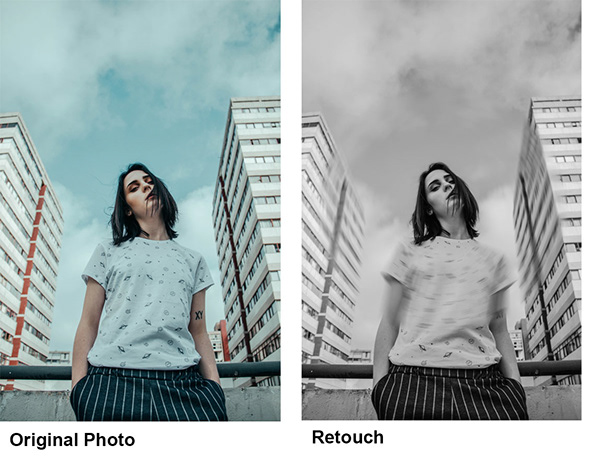
Kind of behind, so apologies for the bulk upload, here's my day 3 original
Retouched
My day 4, went for something a bit different to a gig.
My day 5 I used displacement for the first time, thanks to @glacial path for his obscure tips 😀
Gave +1 Creative Carma to evil
Day 6 my hometown in the UK, famous for our beer and marmite.
@high mesa and @void ermine I add a colour adjustment layer and a overlay blendmode and lower the opacity to 30%, and for the text I use the headline colour with a dropshodow and a white one with a dropshadow
@umbral laurel - white with drop shadow is def better
Thanks @high mesa I agree
Gave +1 Creative Carma to Mykul
Late day 3 entry finished - more work needed on the values?
This is super cool @errant depot, I loved the textures!
Gave +1 Creative Carma to Valdair Leonardo
@coral stone @orchid plank Thanks a bunch! 😄 I used Kyle's Halftone brushes for the textures: https://www.adobe.com/products/photoshop/brushes.html?promoid=XKMMHH6G&mv=other
Create and enhance your photos, images, and designs with Adobe Photoshop, the world's best imaging and photo editing software.
@errant depot looks so cool :)
Somehow I am unable to download these brushes..
@orchid plank Hmm, are you logged in to Adobe? I think you have to log in to download them, if that is not the problem i don't really know... Maybe @glacial path knows what the problem could be?
yes, you have to be logged in to download the brushes. I would recommend downloading them via the brushes panel
Alright. Thanks @errant depot @glacial path
Gave +1 Creative Carma to evil
@simple cliff nice! i think the bright pattern in the background of the text is really nice. The photograph doesnt quite match the vibrant nature of the text, but that would be easily fixed with some color editing or choosing a different photo!
@glacial path I am logged in but still cant find any link to download.
Just in time
One ring to rule them all ! lol (sorry I stole your line Kathleen)
Greate
What camping trip is not complete with out a ghost story?
Today's challenge reminded me of this project I did at the start of the year for a computer art class I took. This was actually my very first time using Photoshop and I'd love to get any feedback from you lovely people! 😃
here's my composite 🐦 🌈 🌿
@lucid moss it's lovely! I love the vibrant colours. Maybe you can try to add some shadows for the bird or smth? The bird seems to be a little awkward or it might be the angle that it is pointing towards.
@grand patioSberg#2574 Wow! You nailed it! The mix between illustrated and photo elements is wonderfully balanced. Really love the colors too. I think the values are pretty solid, though you could always try playing with a levels/curves adjustment layer and see if you want to tweak it at all. Very solid illustration, great work!
@simple cliff Niiice, something about the colorful letters on the fairly neutral background works really well with this image. Draws a lot of focus and interest into the title. Love the pattern too. Great job, I really like it!
I am totaly stuck with the postcard, not able at all to find out how it works. Maybe I'll best let it down and try again tomorrow. Is anyone else also having difficulties with it?
What are you having issues with specifically @young karma ? Also if you need help troubleshooting anything it might be best to have this conversation in the "ask a question" section
All the process of the word Photoshop, then how to get the image in the letters... How do you get the text mask...
OK @bleak fossil , I'll try it again and indeed ask my question there.
@void ermine Nice! Reads much better now! If you wanted to push the value separation even further you could try adjusting it with a levels adjustment layer. Looking good!
@bleak fossil Thanks for the feedback, Sam! 😄 Love your D&D work, so appreciate the comment! I will have a look at the levels/curves and see if there is some slight adjustments needed to perfect it, but in general i am pretty satisfied 😃 (changed my nick to match my Behance profile by the way)
Gave +1 Creative Carma to SamPetersonArt
@sleek solstice Wow! Did you just do these for this challenge? Fantastic work. Great colors too, gives it a very unique and interesting feel. Love the perspective on the first image too, very surreal feel. Awesome job!
@lucid moss You guys are quick! Great work! I really like the color scheme, very cool! I like what you did with the background elements, but it could also be interesting to see a more simplified version. Currently there’s a lot of visual information happening back there and a more simplified version (maybe just the plants?) might look good too. Well done 😄
@bleak fossil Actually I made these to post on my Instagram and thought they're suitable for this challenge so yeah.
Very nice, glad you could join the Discord! Welcome in
Old 1920's picture of my grandfather reinterpreted
Thanks @bleak fossil
Gave +1 Creative Carma to SamPetersonArt
@summer leaf Oooh spooky, I like what you did with the ghostly soft edge effect. Though it looks like the edge around the left side of the head/neck are could be softened to match the rest of it a bit more. Did you use an image for the ghost or paint it in? Nice work!
@sleek solstice Oeh nice, what's your Instagram?
It's @mnvshr
Thanks
@fierce umbra Wow, very nice! Really love how you handled the colors, they all fit together very well. Some really cool things going on with the composition too with how you handled the placement of the shapes in the scene. If I had to give any suggestions it would be that there is a lot of unused space towards the top, it might be a good move to scale up all the foreground elements slightly to strengthen the focal point of your grandfather. Great work!
Here's another one. I changed the Building view to underwater.
Everything is good until the glass breaks 😛
I really like your work
My Day7 interpretation of the space collage.
thanks
@tribal oak Amazing work
@sleek solstice Thank You
Gave +1 Creative Carma to Manavツ
@sleek solstice Thank you! Me 2
Gave +1 Creative Carma to Manavツ
@tribal oak
And @sleek solstice, that’s a really beautiful edit. Do u have an insta?
Thanks @lusty gorge Yea my Ig is @mnvshr
Gave +1 Creative Carma to Aidan10155
@lusty gorge I can only take credit for the composition image I got the other two images from here
https://www.pexels.com/photo/woman-standing-by-one-foot-and-holding-flare-stick-near-trees-1886694/?utm_content=attributionCopyText&utm_medium=referral&utm_source=pexels by Wellington Cunha from Pexels
https://unsplash.com/photos/cGwfkwHmt98 Photo by Joshua Earle on Unsplash

One of many great free stock photos from Pexels. This photo is about trees, wear, woman

Download this photo in Iceland by Joshua Earle (@joshuaearle)
@sterile bane Thanks
Gave +1 Creative Carma to Kathleen
Do you think there's too much negative space??? I'm always afraid of it!!! Water image: Photo by Blaque X from Pexels. Ballerina image: Photo by Carolline De Souza from Pexels
😃
didnt work on it today, but a fun one ive done!
Composited multiple images to create the bkg and added the plane and trail
PS Daily Challenge "Lady in the Flowers"
What about this?
This was fun, the rings didn't seem to fit so I added a few more divers to add something else. And added the rocky cliff on the left. I tried to warp the divers so they had different shapes and weren't just exact clones.
Cause my love for space is endless :p
here is another go
@bleak fossil , as you suggested ... Thank you!
Gave +1 Creative Carma to SamPetersonArt
love you shaun :p
@magic tangle Neat concept. Here is a suggestion: Put a glow behind the person so they can be seen better.
I haven't watched the video yet (was about to do that) but I think this one might be just what it is about. I created that while practicing everything I learned of PS over the last 3 months. I will watch the video now and maybe come up with another one 😃
Thank you guys! The typing part is all illustration.
Day 7 - combine images
@blissful badge okay. I will keep that in mind for next projects
I was just in time for the live feedback 😃 Thanks @brittle slate and Shaun and Shaun! Indeed the reflection is missing and it might work better when the people are either bigger or already outside. It was one of my first try-outs after a few months of PS adventure 😉 so there is definitely room for improvement which I will work on (some day ;).
Gave +1 Creative Carma to Paul Trani
@glacial path I'm working on a photo and I'm open to any suggestions
kinda stuck on ballerinas right now 🤔
@magic tangle very cool. I think the biggest challenge will be to match the atmospheric effects. Colors fading. Less detail etc. in buildings but not on creature.
Yep. That's pretty difficult. The stocks are from a completely different environment and I'm having a little trouble matching them with the background
Im new to this challenge and therefore super behind. Any suggestions are much welcomed. I've only a bit of time before my day job to work on stuff.
Combine-Image-Challenge
☺
this is for the vintage t-shirt
PS Daily Challenge Day 7 Combine Pictures
dcc day 6, postcard design.
PsDCC7 Compositing images
used my space cadet cat Toji for day 7 summer camp and adobe stock image for practice background
May have overthought it a bit but added motion paths to jets to help make more "realistic."
Bits
No motion added. Not sure which works better.
@fallow bough for me personally i prefer the landscape version 👌🏽
@hasty coral the ideas is really good. What I would do is add a little bit of magenta into the highlights to just match it a little bit with the environment. And show the toes, hiding them looks a bit awkward. But nonetheless, it's really good
guys do you upload each challenge in a project or all in same project and edit ?
@hollow spindle The last option
cool thanks
@hasty coral Really like the way her toes are unseen as though she is dropping into the space. Nice work.
@young karma Not sure what you mean. Both are landscape.
@fallow bough i meant the last one sorry
Forgot to add the LUT. Used the OrangeTealPlusContrast one
@young karma No worries. Thanks
Gave +1 Creative Carma to lani

Just for fun and practicing some of the things @sterile bane showed us the past 7 challenge days 😃
@raven meadow I like this Lady in the Flowers better because I can see her eyes. Also like the other one because the colors are so vibrant. Not too sure about the bright spots in this one, though. They seem more of a distraction. Maybe toning them down a bit would help?
@cold cedar thank you. I will work on toning them down. 😃
Gave +1 Creative Carma to ValentinePierce
Hi everyone. I wanted to play with the scale. It was a little hard to find a image that could match the perspective, I still think it's a little off but a second opinion would be better 😄
@tulip fern haha! I look so cool. Thanks! It's awesome to see all of the skills from this challenge used in one design 😄
Gave +1 Creative Carma to unicaNL
And this is the day 6 exercise. It took me quite a while to figure out the text manipulations ☹️
Used Crisp_Winter.look LUT on skateboarder to better match background.
Original bits
@coral stone Love it. I think it works very well.
Not officially part of camp photoshop but a button I made for the local Jr. Audobon Society. Feedback would be great before they print 100. Thanks!
Thanks @peak warren 😀
Gave +1 Creative Carma to mjacobs

Behance
This is probably my most favorite thing I have ever made and I've been doing photoshop and graphic design for years.
@cold cedar That's beautifully romantic. Well composited, too. Love how you show the process.
@tribal oak That’s fine, a lot of ps artists do stuff like that.
@sand current That's a great design. It looks good from a distance, too. One thing to check: is the curve of the "official" text different than the curve of the circle? It looks like there is more space between the O in official and the circle, compared to the C, for example. Other than that, love every piece of it. It's an Anna's Hummingbird, no?
Thank you so much for your feedback
@peak warren ! I will tweak the letters. It's the Ruby-Throated hummingbird , native to the eastern region of the US.
Gave +1 Creative Carma to mjacobs
@hasty coral Very subtle work on the hula hoops. The way the transparency works on her gauzy wrap? <chef kiss> Also like the way her feet disappear in the hoop at the bottom. This is a very good piece, even more so for doing it quickly.
@sand current Thanks about the Hummingbird. I am in California and Anna's have a similar neck feathers. I think it's called a gorget, which makes me think of plate armor. (Not very good at bird ID myself)
Gave +1 Creative Carma to EmmyWAhWAh
@tribal oak Nice compositing work. If you are up for the challenge, you could make a blurred reflection of the dancer, to match the blurred reflection of the boat. By the way, whose boat photo? It has a Michael Kenna vibe to it.
These Lama illustrations are so nice @spark wharf ! Great poster!!
@sleek solstice nice look with replacing the windows with the underwater scene.
Day 7 - combined 3 photos - dragon - eclipse - Hubble photo
Day 7 with 4th picture added - Camp Counselor...lol
See Ya Camp Photoshop... I used 3 different PS splash screens in 3 different text layers.
that allowed me to use blend modes to pull all of the images together...
For My OWN logo.
Larsqv.nl;
Explenation:
Lars = name
Q = 2nd name
V = Last Name.
Logo:
L, turned
V, with a white row
Q, the circle whit row
Sighting during Lunar eclipse 2019
This is one of my Lunar Eclipse photos... layered Enterprise 1701-A for my trekkie daughter...
I suspect that the blue is either light refracting through the earth atmosphere or is a product of earth glow.
this was taken before total shadow... the colors are NOT altered... it was that cool...
@peak warren after I get the kids dinner I'll attempt... and it is https://www.pexels.com/photo/light-sunset-boat-rope-134875/ so its Zukiman Mohamad

One of many great free stock photos from Pexels. This photo is about shadow, still, sunset
Here is my SpaceSki! What do you think?
Thank you @tribal oak
Gave +1 Creative Carma to GeorginaMaybee
@peak warren hows that? I probably watched a bad tutorial on creating a reflection, it looked like a really old version of PS
@tulip fern Wish I could take credit for those illustrations. That's for sure!
@tribal oak Does it look good to you? It looks good to me. It has the same values as the boat reflection.
@peak warren yea but I didn't even think about putting a reflection on there so obviously my eyes need work 😂
I copied and pasted some of the water in a new layer on top to try to give it the texture of the water its so subtle i'm not sure
@tribal oak sometimes a stranger is better at proofreading. Don’t sweat it.
& I like the final result.
@peak warren thank you... now if only i could find a way to add a ballerina to one of my horse racing pictures I could use it for work 😂
Gave +1 Creative Carma to mjacobs

Behance
I love the photo manipulation challenges so much because that's my main thing.
@magic tangle Awesome image! Did you paint the monster or is that from something? Really like the composition and idea behind the image. I think the lighting might look more natural if the monster was more in shadow. I also think a little rim light on the police car and three characters could help a little, as if they’re catching a little light from down the street. Here’s a quick example, just a thought.
@neat shale Very cool, love the sense of scale in this image! Realy cool surreal/disoriented feeling with the skyline and ocean. It could be cool to apply that curve you have one the ocean to the city skyline too. Might give the whole thing a sort of spherical/fish eye lens feel. Nice work!
@tribal oak Nice work with the reflection! I think you did a good job, seems to fit the look of the rest of the image. Maybe a little more blur to the middle left side of the reflection that has the harder edge? Very well done!
Ps DCC Day 7 Combine images
@past canopy Really cool! Always love a good monster illustration. Really cool to see all the images you used in the composite as well. One suggestion would be while I like the vignette effect I think you could ease it up a little. Maybe allow a bit more of the dock to be visible, even if just slightly. Same with the water to the left and right. It'll still have a nice focusing effect but look a little more natural. Great work Phil!
@bleak fossil thank you for the suggestions, i would love too but apparently I forgot to save the psd file and closed it down.... 😫 😭 😤
Gave +1 Creative Carma to SamPetersonArt
here is my final take on the composition
@short mica Looking good J Lewis! Very cool. It could be interesting to give the hoops a glowing effect, currently the hoops just being a flat color don't seem to have enough dimension to fit into the look of the photo, unless that's what you were going for. Also the bottom hoop could be made a bit "taller" to fit the perspective of the image more. The rest of the hoops indicate an eye level above the top hoop, so the further down they go the "taller" they would be, meaning the more we'd be looking down/seeing into the hoop, if that makes sense. Well done, cool colors on this 😄
@hollow spindle Really like how you handled the gradient on the circle! Makes for a cool graphical shape and compositional element. Give the image a sort of magical feel too. I wonder if it might center the focal point around the characters head a bit more if it was raised up a few notches. Looks great, really like how you handled the stars too!
@bleak fossil thank you very much
Gave +1 Creative Carma to SamPetersonArt
@sand current Great pose for this challenge! Really adds to the floating feeling. Nice work Emmy! Perhaps brightening up the character and hoops might help them stand out as a focal point more? Here's a quick example.
@magic jacinth Ooh, great concept. Makes me think of some sci fi skiing video game, very cool! Perhaps make the pink hoop a little lighter in color so it gets more of that glow effect the yellow one has? Also, perspective wise since we’re looking down on the hoops the pink hoop would be a bit wider in the opening as they move away from us and below our eye level. Here’s an example. Very subtle detail, but I think it might help. Awesome job, I also like how the pink hoop is a bit smaller adding to that sense of perspective and movement!
@novel fog Hah, very cool. Really liking that sense of scale you get with the zoomed out image of the Enterprise. Could be cool to add a little more visual interest into the background by compositing an image of stars and galaxies. Though the blackness of space in this image definitely gives off its own mood. Nice work!
@spark wharf Good work! Liking the color scheme on day 4 and how you handled placing the shirt logo in perspective on day 5, well done!
@fallow bough Nice, that color correction definitely makes a difference! Really makes the images fit together naturally.
@young karma Really liking the style on this! Has a cool feel. Perhaps the text could all be brightened up a touch (the drop "shadow" in the case of the "Musical Vibes" text) for better readability? Great work Lani!
Looking for some feedback on this. I hate it.
Haven’t done any day from current challenge but I was inspired by today’s stream replay
Images used
@grim mantle Very nice! I like the bubble effect. Maybe give the whole image a cool blue/green color grade to really emphasize that under water feeling? The photo filter adjustment layers definitely have some presets that would probably look good. Nice work, awesome to see your original images!
@spark wharf Hmm, there's a lot of heavy dark contrast on the right with the jeep, but not nearly as much on the left. Maybe if all the text had a sort of darker backdrop or additional cast shadow behind them? Really like what you did with the formatting of the text though, looks really cool!
@bleak fossil Thanks for the help. I might just need a different picture. I definitely see what you're saying about how dark it is on the right. Ugh! Back to the drawing board. I was hoping to catch up tonight. 😃 Thanks again.
New here! This is a really cool community. I gave my self a 30 minute time limit on this because Im obsessive and trying to learn a work-life balance. From my understanding, today is a photo composite challenge? I hope I understood it correctly. In regards to my design, if you haven't seen Toy Story 4 yet, go!! So good! Really rad designs for today too, seeing all of these inspired me to make this, enjoy! 😅 (I dont think this is a spoiler, it only shows a new character that is seen in previews. I marked spoilers though incase your picky about that kind of stuff 😉 )
Gave +1 Creative Carma to mjacobs
@peak warren thank you very much. it's apriciated. I'm glad you like it. (Sorry about the delayed thanx I'm at work).
@cold cedar thank you! That's exactly what I was going for. 😆
@magic tangle thank you for the suggestion. I will try the magenta to the highlights when I get home from work. I felt as though I wasn't done with color adjustment yet.
Gave +1 Creative Carma to Gurneet
Thanks for the feedback @bleak fossil Great tip!
Gave +1 Creative Carma to SamPetersonArt
@wispy compass I love this. It look like it's drawn and the B/W brings out the entire feel!
@floral fiber love it! Thank you for sharing it!
Gave +1 Creative Carma to Kdizzle
@bleak fossil thank you again for the feedback. I changed things up a bit to help brighten the image. Went for a fox to give a foreground to the image.
Do you think this works better?
Gave +1 Creative Carma to SamPetersonArt
@floral fiber that looks awesome! well done!
@slender slate ...thanks....I played with this challenge a long time until I changed to B&W ...then instantly it felt right!
@past canopy / @slender slate Thank you!
Gave +1 Creative Carma to artety
Thanks for your feedback @bleak fossil you are absolutely right. It gives it a underwater feel
Gave +1 Creative Carma to SamPetersonArt
Made some changes, I'm really happy with this design! Does anyone have feedback? Thanks 😃
Challenge 7 - Learned a lot more about blending and compositing, and masks.
I didn't realize everyone was including originals with the edits. Makes sense though! I made a couple touchups to the bunny. Please feel free to give feedback. As you might see, I used layers of brushed on color to give the bunny (attempt to) proper lighting/coloring. Outside of that is was some quick blending into the background on the edges. For people looking for ideas on cutting objects out. One of my favorite tools lately has been the Magnetic Lasso (masked once selected). Refining by brushing your mask masks edges into the comp. Always interesting to compare work flows.
I really like the image, though I do think the words should be moved and the font could possibly be changed!
Totally, I was hella lazy with the type. Thanks for the feedback! 🙌
My pleasure! ☺️
Day 7 - Combine Images
Does anyone have feedback on my work?
@sterile bane @cerulean cosmos @bleak fossil @celest nebula
#✂challenges-feedback late post
Wow! that is a very nice composite @past canopy !
🙏 thank you @tulip fern 😎
Gave +1 Creative Carma to unicaNL
I finally found my theme.
Day 7 - Combining Images
I have no idea how to make the moon look more natural in the hands and the girl jumping off seems awkward too. Any suggestions?
Adding a shadow might help
@magic tangle thank you for your suggestion. But I tried drop shadow I can't mask some portion of the shadow
Gave +1 Creative Carma to Gurneet
Just darken part of the hand with burn tool. Or you can just paint black with a brush (moderate hardness) with low opacity and flow
@bleak fossil thank you so much. I will definitely implement that In my image. Actually a friend of mine drew the monster
Gave +1 Creative Carma to SamPetersonArt
@magic tangle thank you! I will try it out now
Gave +1 Creative Carma to Gurneet
Yup. Also darken the right side of the Moon (assuming you will make the shadow on the right side)
@simple cliff Right on, love that work. Maybe add some text in it to make it look cool?
Day 7 Challenge
Wow, that’s awesome! Maybe add s shadow in the water, that would be really good!
a*
@fast moth this is a nice image. If you could use a mask for the circles, so that the man’s legs are going through it (and not behind) , that would be perfect in my eyes.
👌 ^
I had an idea of the fisherman catching the paratrooper. I could not make the line work. I'll keep trying.
Hm, it’s definitely great, maybe add a little light by the fisher man and remove the lighthouse? That would look pretty cool.
@spark wharf I like your revised postcard
lieve?
@magic tangle something like this?
@bleak fossil Thank you SamPetersonArt💐 I added some neon effect and a different stroke 😊 to the text. I also narrowed the distance, the size and the spread of the shadow. The readability improved, however i feel I lost coherence! How to tie this back together?
Gave +1 Creative Carma to SamPetersonArt
great @fast moth !
@artety curves are a bit unbalanced
@slender slate yes. Now you can also darken the part of the Moon near the hand
Made all the changes recommended to me and here is the final piece
@young karma Thanks for Advice.
Gave +1 Creative Carma to ダビデ
Had a few issues with this, trying new things; it was a bit rushed any suggestions welcomed.
Here is my composite for Day 7.
Images credits
Fried egg : Jakub Kapusnak - Foodiesfeed
Little chick : Philipp Kleindienst - Pixabay
Big chick : Pexels - Pixabay
Beach : Pok Rie - Pexels
Helicopter : parskeeze - Pixabay
rescuer : morzaszum - Pixabay
@steel sparrow I like the way the egg warps to match the small wave. Very nice. The way the rescuer’s hand crosses at the horizon is also very good. The helicopter looks weird, though. Is it in a non-normal blending mode? Or is that just the image? It looks washed out, like it was far underexposed and rescued in Lightroom. Because all the other FG items are crisp and with full tonal range.
Sorry, the above to @young karma Fat fingers.
@peak warren, Thanks for your feedback.I know the helicopter was weird on the source image. This WE, I'lll have more time tot search for an another (better) one
Gave +1 Creative Carma to mjacobs
@cyan badge great job on the Venezuela post card. I especially like the way the dark channel in the water points at the E in Venezuela. (I don’t know what that means in beach terms, deeper water? But I like the look.)
@young karma Ah. Good. As a quick hack, you could make the rope go out of the top of the frame. No helicopter. Because fried eggs on waves are not realistic, anyway. 😊
Day 7, who knew composting wasn't just for the garden 😀
Went for something a little darker, I think it works, do you?
@peak warrenThanks for your feedback, regards, friend
@magic rampart cool 👍✨
Day 6 Challenge - my promo postcard
Day 6 - postcard
For the second day I am searchint how to fill in the image in the text mask. Sometimes I succeed in the psd that Katleen offered us, but without, sometimes yes, mostly not... I'm going to ask a question. But I wanted to share the little thing I succeeded 😃
@magic rampart No need to take the ring off before sending it into Mount Doom? 😂
Seriously, though, both are really good. I like the second one better because of the restricted color palette and better angle. But the first one makes me think of Muybridge crossed with Portal.
Hi Guys,
Here's my submission for Day 7....not too happy with the end result...please do help me with some feedback and tips to improve...Cheers!
@cyan badge your venezuela postcard feels like the real deal! great job. the background image has a nice diagonal line (the beach) the break up the space
@cinder vessel hey malini! what exactly are you unsure about? I think the center placement of the figure is nice for such a crisp and beautiful background
@peak warren Thank you, I actually have the LOTR ring 😂 I had to look up Muybridge, thank you!
Gave +1 Creative Carma to mjacobs
@sterile bane I am not too sure if the image of the girl needs to be enhanced or just let it be...it seems like it is fading into the purple sky behind it...🤔
No idea if this is what @sterile bane meant, but had a spare 5 mins before I head home after work.
@cinder vessel I like your composition. maybe try adding a water reflection of the girl? or another halo kind of thing over her so it looks like she might be fading to another dimension
Day 7; Not really sure how I feel about how this turned out. Is the motion blur too much? Are the 'portals' too bright or oddly placed? Any feedback would be lovely. 😃
@cinder vessel I like the idea, maybe create some ripples coming from her skates to "ground" her, there's some cool brushes on Adobe exchange for water effects.
I toned down the white droplets as suggested. I think it works.
@raven meadow You should decrease a little more fill around the face...
Hello everyone,
I am still making up for the previous challenges. I hope to see your feedback :)
@sterile bane @glacial path @bleak fossil
Challenge 2 and 1
@wide cradle I like the design and simplicity. I often struggle with leaving white space, allowing the design to breathe - you've done a great job of that here.
thanks @pastel spade
Gave +1 Creative Carma to Chad
Tried to work on Day 6 and got sidetracked! Squirrel!😂
@magic tangle Wow, looks great! Really love how you moved the 3 characters up too, makes the composition read much better. Lighting looks a lot more natural too. My only final suggestion if you still want to make any would be to maybe lighten up the shadow of the creature a little on the part that goes behind the building. That building and the surrounding area seem to be heavily affected by atmospheric perspective and the general snowy haze of the scene (meaning the shadows in those areas become much lighter) but the shadow on the monster’s body which is even further back behind the building is somehow darker. It’s a small detail for sure, but maybe worth mentioning. Either way it’s look great, really well done!
@spark wharf Ooh, loving that smoky effect, nice color choices too! I like how you varied the sizes and positioning of the cups, looks good! The whole image has an almost sort of faded look to it, which is cool if that's what you're going for, otherwise a simple levels adjustment to bump up the shadows and lights could easily fix it. Nice work!
thanks @orchid plank
Gave +1 Creative Carma to Nidz
@wide cradle Really liking the simple graphic shapes and how they contrast with the more complex texture you added in. Really cool look!
thanks Sam
@novel escarp Love it! Really cool idea. If you look at the deep shadows of the ocean scene you can see they have fairly intense contrast. I think the girl might fit in with the scene a bit better if you used a levels adjustment to increase the shadows a bit. Really love the composite too, always great to see mock ups for designs. Currently the billboard almost reads as a digital screen to me because of how bright it is, it could be cool to fit it in more with the environment by darkening it up a little. Well done, looks great 😄
@candid root Haha, well done, the crown and scepter fit perfectly 😄 It could be cool to give it some sort of color grading for a more uniform/stylized look, and I think it might read better without the blue rectangle around the image. Great work!
Thank you. I will do that 😃
@orchid plank Nice work, awesome to see you doing multiple challenges! Love what you did with the Day 3 challenge, adds a really created illustrated contrast to the image and fits in very well! Really cool textures and colors too. I love the colors in you Day 2 challenge! Gives it an awesome feel. I wonder if increasing the brightness of the text just slightly might give it a little more punch and visual balance? Day 1 looks solid too! Nice work! I think I see a little radial blur around the face, it definitely helps pull focus to the face, but I think it might help if that radial blur extended all the way out to the edges. Currently the crispness of the bottom area of the shirt also pulls some focus. Nice work with these!
@bleak fossil Thankyou for this awesome feedback. I will definitely make the improvements you mentioned 😃 Thank you so much ❤
Gave +1 Creative Carma to SamPetersonArt
Catching up with Day 6
i cant download the file any another link ?
@candid root Nice! Perhaps a warm photo filter pass could give it a more stylized look, kind of make it fit that card art look? Also contrast with that purple background nicely. Here’s a quick example.
@halcyon cliff You don't see the download button at the top right for this link? Or are you just not able to click it? https://www.dropbox.com/sh/zfwhb3lb6kf1uzg/AABn0hHqruPw2axlxMXKKKHea?dl=0&preview=card-template.psd
TYVM @bleak fossil I used the DODGE tool to make the girl have some highlights, but failed to increase the shadows. Will give that a tweak. TYVM for the feedback.
didn't work with me ^^
👑

Very nice @lucid moss! I loved the lights in the background!
Weird, perhaps try in another browser? Or perhaps try signing in, though I doubt that would be the issue. @halcyon cliff
thanks! @coral stone
Gave +1 Creative Carma to Valdair Leonardo
Day 8 - playing card
Day 8 - Playing card
@young karma Love the Witches! 😃
Todays work Day 8. Dog's name is Jake from Free Stock Photos.
❤ I love jake
#LatePost Day 2; I love the colors, but I think the "E" still needs some work to be clearly visible. Thoughts?
@glad roost i like the darkness of the E! great work
@bleak fossil thank you for the tips. I lightened the part of the monster near the building. Is it okay?
Gave +1 Creative Carma to SamPetersonArt
Nice, looks good! @magic tangle
@glad roost I think the silhouette is strong enough that it reads well, and I think it strikes a really good balance with the lighter letters too, well done on that. I also love how the letters almost appear to have light passing through them, kind of a subsurface scattering effect. Really cool, I love it, great work!
Probably hard to tell. But I increased the shadows as suggested, desaturated a bit to make it fit into the scene a little better. Had fun with this project. I normally don't do this sort of work in my day job. I usually end up doing publication designs (traditional print).
Oh nice, she fits in really well with the background now! Well done 😄
@grim mantle @magic rampart Thank you for your suggestions 😃 will try to implement these and post soon.
Gave +1 Creative Carma to lena
😃
An unknown ancestor of mine...looks imposing enough for the Queen card
Finally, Day 7
Day 7
Day 8 - combined 3 photos...grandfather / boat / oars
Very late start today, super WIP, gotta take the dog out and go to work. hopefully I can finish it tonight. This is super fun.
Are there templates for the whole deck? I'm not sure jokers have suits, do they? (This is my silly dog)
here is my version of the card
I guess it is easy enough just to switch the numbers and suits, no need for additional templates.
@coral stone I like the mixing of the different iconic tourist attractions. And I love the composition, where Jesus' outstretched arms encompass the Eiffel Tower and the Statue of Liberty. Two comments. First, in the lower half, Jesus' head seems to be lopped off, or masked. Or it might be remoted to the bottom? Unclear. Second, you made a mirror between top and bottom. In US playing cards, it's rotated through 180 degrees, not mirrored. That way Lady Liberty is always on the right, whichever side you hold up. (Not sure if this is a worldwide thing, never looked at foreign playing cards.) Sorry, that was wordy. I really like this.
@blissful badge I think J is for Jack, which have suits. You are right, Jokers do not have suits.
Hi @wispy compass Very nice design. Good choice of the boat and sailor for the image. I think you have some unintended pixels above the sailor's cap, a thin line at the edge. Should be easy to mask.Also, the oar/paddle is in color while the rest of the images are in monochrome. Did you consider making a monochrome adjustment layer for it to turn it into B&W? Last, and this is picky. Like I said earlier, cards have 180 degree rotational symmetry, and the oar breaks that, because it extends across the centerline. The only way to fix that would be to shrink it so it is on one side of the card only. Not sure if you want to do that.
@fierce umbra Imposing indeed. The image is great. Has that feel like someone told her, "sit still for 45 seconds while we take this really long exposure." The yellow fade on the card goes very well, too. Do you want to extend it to the very corners? The bits of white are a little distracting, to me.
Added a linen texture
Took the project a bit further and slightly off track.
@peak warren I didn’t know about that 😀. Thank you so much! I will make the changes.
Gave +1 Creative Carma to mjacobs
Amazing @fallow bough I loved the Rupaul Theme!
@coral stone Thanks. Started with different drag queens and changed it up when I found so many easily masked images of Ru.
Gave +1 Creative Carma to Valdair Leonardo
Of course I knew J was for Jack...just wasn't thinking! Here is my JOKER!
Play card design..How is it ?
@peak warren ....all good points, and i will fix them all! @peak warren thanks!
Gave +1 Creative Carma to mjacobs
Day 8 challenge
@peak warren ...made a few changes as you suggested.
@wispy compass great!
Really love the simplicity of both of yours @fast moth and @wispy compass 😃
@thick owl thanks! I really like @fast moth too!
Gave +1 Creative Carma to lcooper
They look really good @wispy compass and @fast moth
@fallow bough - I wanna see her with the decadent-fabulous background to compliment that queen. You know she would want it. LOVE the concept, really great subject for the challenge. Also, really nice job on the second cards hair, smooth criminal with that cut out.
Might look to the shows backdrops as a source for inspiration or her instagram 🤘
Here is my post!! Day 7
My day 8 entry. I think you will be cross-eyed after playing with cards like this 😂 but it was fun to play around with glitching, coloring, capture, layer styles and smart objects.
here's my day 8 card ♥
Day 8: Here's my take on the card. Think I went a little crazy with drop shadows..😅
@dawn mountain love it 😃
Thanks, @lucid moss ! 💜
Gave +1 Creative Carma to erinwoody143
@floral fiber Thanks for the feedback. Just tried a hot pink background with some shapes much like on show. Found it to be too busy. Also tried just hot pink. Just didn't work well as a playing card.
Gave +1 Creative Carma to Kdizzle
@fallow bough Maybe the main stage of the show with some gaussian blur? 😃
Tried something similar.
I'm struggling with a collage idea using photos. Will work on another version later.
I loved the colors @upbeat laurel! Great job!
@coral stone Thanks. Feel like I cheated a little because it seems so much easier to mirror an illustration than a photo.
Gave +1 Creative Carma to Valdair Leonardo
@upbeat laurel You've done a great job, so I think you are safe 😂
Challenge 8 Photo by Guilherme Stecanella on Unsplash and Image by Enrique Meseguer from Pixabay
@fallow bough totally, rad you tried! Again, very cool design 🤘
@hazy hornet Love the center design! But the black, green and red colors could be improved. I think you can absolutely go for a more minimalistic design
@hazy hornet Also watch out for symmetry! the top crown is touching the frame while the bottom one isn't.
@upbeat laurel Lovely! I love all the textures and the wonderful colors. I wish the gray border was either thinner or also had a texture 😃
@dawn mountain What a great playing card! I especially like the bouquet of flowers in the center! I think you can use slightly more saturated reds for the Q and the heart. I also think you can remvoe the gray stroke around the heart - maybe you can even add a distressed look using a cool texture 😃
@young karma I don't know if the two sides are supposed to look slightly different - if so, then keep it! But if you're going for symmetry, make sure both sides are the same 😃 The color theme works really well! Maybe you can just rework this area here, it looks rather gray
Assets are the key to this one, much harder than I thought
@tulip fern love the neon colors! I think you should try it without the white background! Embrace the 80s-neon-glow-look 😄
something like this maybe?
Thanks for the feedback, @glacial path! I think it looks a lot better with the distressed look! 😃
Gave +1 Creative Carma to evil
@dawn mountain Beautiful. Would love to have full deck that looked that great.
@dawn mountain my fave of the day 😄
@sterile bane ; "Make me the King, you can use that..."
Phil; "Hold my beer..."
😆 😆 😆
FYI: The "K" is for Kathleen....not King 😉
@dawn mountain lovely! (cool name by the way 😛 )
@past canopy ah. classic!
I would just leave some space between the artwork and the "K"
you could just scale the symbols down
@past canopy It should be a Queen (Q) and not a King (K) Good job
Portfolio piece for a a fictional movie poster. Feedback appreciated.
Awww, such a cute dog! 😄 @blissful badge Great idea with the hat and the card! Just reduce the saturation of the red a bit, it's clashing with the aqua color 😃 you could also use a different hue for the border 😃
@past canopy Hah, very nice! I agree with Tim, I think scaling down the symbols in the corners would give the whole design a bit more breathing room.
@dawn mountain Really great job, great cohesive feel to this whole design with the colors and textures. Perfectly mirrored too! Nailed it.
@high mesa Finding good shapes to mirror in a natural way is definitely a challenge in this one! Nice work! It could be cool to repeat that green tone somewhere else in the design, perhaps on the Qs in the corner. It might also help the design to remove the little square around the images. Nice work 😄
@hazy hornet Looking good Heather! I agree with Tim’s comments, but I also think maybe brightening up the images with a levels adjustment and adding a bit of a color grade to unify the images might help make the whole thing a bit more cohesive.
I do not normally like this style that I have done especially for a classic object like playing cards. If I were to take this concept it would be for a style of cards tied to marketing for one of the movies. Otherwise, ehhh. Please feel free to share what you would change, etc! PS!! I was shocked when the Joker himself stopped by and offered to model for me. He asked me to share this selfie he took (on the right). Enjoy y'all! 😂
design resource too, I made this from photos I found at unsplash.com if you do not know this site/app CHECK IT OUT. Lovely photos from all style and skill levels of photography. And without that stock photo vibe.
Hello @sterile bane what a pleasant surprise your feedback, it's great to receive comments from this great community, thanks also for commenting my work in the live broadcast, big hug for all
Gave +1 Creative Carma to Kathleen
My card in honour of the Toronto Raptors! I would love to hear any feeback, there is something about the design that I don't love... thanks!😊 🏀
PsDCC8 Playing card. Missed the live stream and just getting to play with Photoshop. So, here it is.
Uhm, already can see the type is too dark.
@glacial path agreed, will sort. Thank you!
@bleak fossil - thank you again for providing feedback! 👍
@vagrant sorrel ...the "K" is for Kathleen....not King 😋 😉
Gave +1 Creative Carma to SamPetersonArt
Update PsDCC8 Playing card with white text instead of black.
One more time. Can't have a ratty old card with nice clean type, right? PsDCC8 - 3
@upbeat laurel Ooh, I like the style and design of this! The background design is really intricate and interesting, but with light enough contrast that it doesn’t compete for attention. Nice balance to the image as well!
@young karma Really like the diagonal shapes in the center part of the image, gives the whole design a bit of a dynamic feel. The symbols in the top left corner seem a bit bigger and more cramped than the ones at the bottom, might be good to scale them down to match the bottom ones a bit. Love the clean simplicity of this design, well done!
@tulip fern Very cool, the blue/pink colors on the lines almost give it a 3D glasses look. I’m not sure… but the dark border almost seems a little too heavy to me, maybe choosing a slightly lighter tone would make it compete less for contrast? Looking good!
@severe flame Nice work Sheffen! Looking good. Perhaps giving the lion a cool color grading could make him fit into the scene a bit more? I often like to use a quick color filter adjustment layer for this. 👍
@cold cedar As much as spiders creep me out, nice work! I like the edits you made, I definitely think the white text looks a bit better. The texture is a cool touch too! The way the spider’s leg on the left side touched the frame and makes a sort of tangent is a bit odd, maybe lower the spider down a couple notches? Though that’s a bit of a nitpick. Looks good!
@magic jacinth Looks solid! I like the clean white background and crisp edges, gives it a very clean look. The middle elements of the logo and trophy look a bit odd to me. Currently the logo is kind of sideways so it doesn't read at either orientation, and the trophy seems kind of randomly placed. I like the skyline idea a lot, but perhaps mirroring it downward would be a cool effect? I think finding a way to rearrange or resize the logo and trophy might help the overall composition? Looks good!
First Draft.....
@floral fiber I like it! It has a really cool dramatic style to it. I think it’s great to sometimes mix it up and push yourself outside the style you would usually do. I think it looks great, the only thing is the text is a bit hard to read due to the overall dark look of the card. Boosting up the lights of the center of the card behind the text a bit might help the overall readability. Not too much so you still maintain that dark/moody look, but just a bit until it reads better. Maybe using a color dodge layer or levels adjustment with a mask and a soft round brush to get a nice fade. Great work!
thanks @bleak fossil - nice call
Gave +1 Creative Carma to SamPetersonArt
@wispy compass Looking good! I like the single pop of color on the corner symbols. One suggestion is that the red symbols look like they’re kind of crowing the image in the middle. I’d try putting them a bit more in the corner and maybe even scaling them down slightly (possibly even scaling the middle image up a tiny bit as well?) to make them a little less overpowering and give that middle image more chance to shine. Well done 😄
@bleak fossil thanks! I see what you are talking about. I will work on changing it! Thanks!
Gave +1 Creative Carma to SamPetersonArt
@bleak fossil Thanks for the feedback . I’ve been working for a while with illustrator patterned lines that I move into photoshop and color with semi transparent textured brushes.
Gave +1 Creative Carma to SamPetersonArt
@bleak fossil Thank you. I will take a look at that spider leg. I photographed that rascal at an artist retreat in the woods where all sorts of things live. I learned about textures and overlays to make things more cohesive during some Photoshop streams. 😂
Gave +1 Creative Carma to SamPetersonArt
Hello everyone, my Day 8: Design a Playing Card. Feedback is welcome.
Hello everyone, my Day 7: Combine Images. Feedback is welcome.
@bleak fossil Better?
@bleak fossil ...is this better?
in progress abstract piece (not challenge related) - Im having a creative block. Any ideas or tips to improve the composition are appreciated. Right now I zero intention/story, if you see one being told I would love to read that narrative. I find a lot more direction when I have an end goal. haha Dont we all?
Day 8
Day 8 - Playing Card
Playing card 😂
I made more cards..I hope y'all don't mind the small spam. Would love any feedback. 😅
@dawn mountain I really like the color palette on your cards. They look like they could be a for real deck.
Here is the playing card challenge. Queen of skulls.
Day 5 vintage T-shirt
Thanks for the feedbaxk @glacial path and @bleak fossil I have two updated versions. I think I like the dark one better but for sure they will give a headache playing with them 🙃
Gave +1 Creative Carma to SamPetersonArt
@dawn mountain Just love the colours and composition.
@cinder vessel , I agree... @dawn mountain has done an awesome job! 👍
Poster Design
@hasty coral you even put a skull in the spades symbol. Great! Love the detail 😃
😂 I like the slogan @remote belfry!! but what is small here 😂
😅 @tulip fern small progress
@urban berry I think something is off with the perspective of your combine image project. The dark trees (great picture by the way 😃 ) have you look up to the sky, while the guy falling will have you look down. Perspective isn't my skill either, but I think if you have the ellipse going over his back it would work better. Hope this helps.
Gave +1 Creative Carma to Kathleen
@sterile bane thank you very much for your feedback! 😄😄😄
@dawn mountain I loved your vintage style collection! They are ready to be a real poker play cards!
Thank you @bleak fossil
Gave +1 Creative Carma to SamPetersonArt
Day 8 - Design a playing card

That looks awesome @young karma
@bleak fossil Thank you for your adivce!! I developped it. After I selected rion , used adjustment layer with cooling filter.
I think that need more object or idea. I'll challenge to develop it.
Gave +1 Creative Carma to SamPetersonArt
Thanks for the advice @glacial path . I played around with the colors, I do like flashy colors and had been looking at Kaffe Fassetts website earlier in the day. I'm sure his colors were influencing me.
Gave +1 Creative Carma to evil
I used capture and other tools we learned this week. Not as good as everyone's cards. You guys rocked this challenge!
My Day 8. Was going for a Honey Bunny theme. Still need some work on the mask for the rabbit. But here's what I've done.
This is for a new card game called, Nature. It's the Dragonfly of Flowers. Suggestions appreciated.
@tulip fern Thank you for the feedback. I will fix it.
Gave +1 Creative Carma to unicaNL
King card in progress. It's a composite of a drawing on paper that I made for this assignment. I used capture to get it into photoshop and selected/manipulated from there... more to come hopefully...Not sure about adding colours, textures but I've got some ideas, no time to do them now... 😦
Looks interesting @void ermine . Can you tag me when you upload the finalized version? 🙂
@candid root 😂 that rotating chair LOL
@bleak fossil Thanks alot! What level adjustment was applied and was the color gradient applied only to the duplicated center images ? Obviously I am a total newbie at this! More importantly, how can I get your revisions to open up in Photoshop?
Gave +1 Creative Carma to SamPetersonArt
@tulip fern Thanks for noticing the skulls in the spades. It was a last min decision and I wasn't sure if I liked it 😅
Gave +1 Creative Carma to unicaNL
Its been busy here at work but the best place to see all of my progress is in behance. https://www.behance.net/gallery/81857331/PS-Daily-Challenge . I'll be posting throughout the day with all my images of all the challenges when I get some breathing room. Please critique I love hearing feedback. Today's special image.
DalilyChallenge#8 Playing Card
@orchid plank there are lot of colors that makes the image more busy...
@hazy hornet The level adjustment and color adjustment (I think I just used a color layer with a yellow tone for that, but photo filter adjustment layer with a warming preset might be easier to control) was only applied to the middle images, correct. For the level adjustment I just boosted up the lights a bit by sliding the right most tab to the left a little bit. To see the revision you could always just save the file to your computer, then in Photoshop go to file->open
@wide cradle Should I do something with the background then?
Yeah with background decrease exposure and reduce colors in sunglasses..
@wide cradle Thanks 😃 I'll do it.
Gave +1 Creative Carma to GauravBarai
A slight modification of the first in progress
@cyan badge Very Cool!
@wide cradle
does it look better?
Yeah better.... but increase contrast and also add R,G,B only instead of all colors in sunglasses
@wide cradle Alright. I'll do 😃
@ruby panther Thanks for the feedback, greetings friend
Gave +1 Creative Carma to Shawn K
- Another proposal ...
Wow @cyan badge amazing!
I just played around with colors....
@glad roost I can tell you spent some time on this and had fun - love that. Maybe differentiate the background more from the outfit she's wearing - it blends together and the eye gets pulled to the lightning bolts and stars which pop.
Day 7 Image - running a little behind.
Finished my card! I like it lots! Any feedback would be helpful! 😄
@magic jacinth I love your playing card! It's so fun. If it were me, I'd Increase the size of the "A" and the spade. But then again, I like big type (and I cannot lie). I think it would fill in some of the white space and lend some balance to the pokeballs. Just don't make it too big. Well done. I love the bolt in the middle, too!
Is before and after. Conducting tests, in progress
Here is my Entry for today
Image credit : Bee - Clker-Free-Vector-Images - Pixabay
Conducting tests, in progress
Lol! Thanks @spark wharf Yeah, I think you’re right, some bigger type would help balance the card! I also like big type!
Gave +1 Creative Carma to Michele
what file types are directly supported to upload here and play automatically?
@lucid moss a gif will play automatically - if you have questions on how to create one, i showed it at the end of today's livestream!
all good thanks @sterile bane !
Gave +1 Creative Carma to Kathleen
thanks for the feedback @peak warren
Gave +1 Creative Carma to mjacobs
@void ermine love it, so unique can't wait to see the final!
Day 8 challenge: Design a playing card. This one took longer than I expected, but I really like it. Stock images from Pixabay. Somehow this came out the wrong size -It won't fill any space -- I wonder if it's because it was on an artboard????
@bleak fossil - thanks for the feedback, good collage looks so simple, but it never is. Will take another look at it...thanks
Gave +1 Creative Carma to SamPetersonArt
@cyan badge LOVING THE DARTH VADER!
This was a fun challenge. I can't wait to do more.
@jolly quest Thank you, your work is fantastic !!! A hug from Venezuela
Gave +1 Creative Carma to VooDoo_Val
Hey, Thanks for a great Class @sterile bane
Gave +1 Creative Carma to Kathleen
@blissful badge i LOVE IT!
@sand current check that out! looks so great. you really took time for each petal. nicely done
@sterile bane Well, this is pretty ugly, rough and off the cuff so I'll call it attempt 1 and work on it more this weekend. Wanna try that layer by layer (haha) and onion skin.
@cold cedar this feels like a stream of consciousness animation - so cool! really adds personality to a nature scene
Last shot before getting back to work. Response to query about 3D in Photoshop
Day 9 - Rotoscoping
@cyan badge Be careful with strobe like GIFs - which can unintentionally induce epileptic seizures.
I don't think I got the lyric correct...I haven't heard the song in a while. but this was so much fun! thank you @sterile bane for a great 2 weeks!
@latent lion Ok, thank you very much for your good advice, I was rehearsing but I will be careful with what you tell me, thanks for your feedback and regards
Gave +1 Creative Carma to RetireeRick
@sand current woah emmy this is really great! super smart way to make it loop forever. Was the video you used already rotating or did you add that animation too?
@sterile bane OMG thank you! The video was rotating. I found it on pixabay. Have a great weekend. thanks again for your videos.
Gave +1 Creative Carma to Kathleen
Love Chicago
Thanks @tribal oak I can’t wait to see the final thing too lol. As I’m still not sure what it will look like. I will tag you @tulip fern when done 🙂
Gave +1 Creative Carma to unicaNL
Spent way too much time on this. Need to work more on the added bit but can't decide if it's worth it.
Liked it better without. Found I could turn video into Smart object and add filter effects.
Original MP4
Hi! I desaturated the flower's colors in each frame so the lines could pop a little more 😃
Hello . I tried Day 8 playing card.
so here's my entry for day 6, the postcard. I did this in a bit of a hurry because I'm so behind on schedule... Not happy with the colors, especially of the word "THE"; I tried different effects but it was just too much with all the other text and effects going on. Maybe I should just change the font?🤔
Hope I'll be able to finish the challenges of day 7-9 tomorrow...
@fringe thicket It's looking good! About the colors, maybe you could test with some of the image itself like those yellow tones behind the windmills. You can try different tones. Or use a subtle drop shadow if the contrast is low 😃
My day 7 design
Hi everyone. I'm a little behind! Here are several of the projects I've been working on
Challenge 6, postcard
Challenge 7, this was fun to mask.. My cat did the perfect pose and I just couldn't help myself
Here is my Day 9 entry. This has been a great experience for me. I learned a lot.
I was sitting on the porch trying to think of a good idea for this project and it literally landed beside me!
Alright. So here's take two... I'm late with this one but still not really sure I like it this way, but I've gotta move on. I may alter it before I put it on Behance but will see... tag @tulip fern
Day 9 Have a great break. See you in July.
This is my take in challenge 8, El Santo Luchador
I like this rotoscoping stuff. Gives me many ideas for short, punchy video.
Hi I tried Day 9 . I enjoy creating animation GIF :D!!:laughing:
Took this picture last night as I was strolling in the Heart of Orlando.
hi everyone
can I post a logo design that I'm working on currently ?
I need feedback to know if I'm on the right path
It's my first ever logo
@uncut shell Ah that's awesome, great to be able to use your own picture for this challenge. Looks professional! Really like the choice of color for the text as well. Nice work!
@torpid oar Feel free to share
@severe flame Love it! I like the little flashes of hearts and the way the GIF isn't super fluid, works well with the little designs as to not be flashing too fast. Looks really good!
@graceful heron Definitely! I was getting a lot of ideas of possible animations after today's challenge. Looks good Duane! I like all the alternating colors you chose, looks good 😄
@scarlet hill Very nice Luna! I really like the contrast of the luchador with the flowers, gives it a really cool feel. Also great job on the mirroring of the image, looks really natural!
@bold valley Nice work Ralph! Glad you could all join us, looking forward to seeing what everyone comes up with in the next DCC. I really like the fireworks! I think the key it to get really bright values in the center of the shapes, with more of the outer glow containing the color. Which Is why I think the white fireworks look so natural. Kind of the lightsaber look, the inner part is so bright it's white, and the outer glow is where all the color is at. Nice work!
@bleak fossil thank you for good opinion. I'll try to adjust it.
Gave +1 Creative Carma to SamPetersonArt
@void ermine Ooh, very cool, love the unique style of this! I would definitely fill in both "K"s with red, I think that'll help unify the look. I think line weight is also really key here, I'd try adding a little more line weight to the contours of your main shapes, that should really balance nicely with the thinner lines of the interior details while also strengthening the graphic read of all the major shapes. Very cool!
@cyan badge Love it, great work! I really like the colors of the image and how you handled masking the letters. Perhaps adding a little light fade to the bottom of the letters could kind of set it in the scene of the sunset a bit more? Looking good!
@edgy frost That's awesome to hear, you guys have been producing some great stuff, great work 😄 Well done on this, I like the little popping dot effects on the edges. I think some of the colors could probably be even more bright/vibrant. I think this effect works best with really bold bright colors. Nice work Betty!
@scarlet hill Awesome work Luna! The postcard looks great. Love your Day 7 challenge, haha. It is the perfect pose for this image, looks great! I'd recommend making the text and bit bigger and brighter to make it read better at a glance. I think you could also overlap it a bit over the throne to avoid the tangent while also making it easier to read. I did a quick paintover to show what I mean, along with some general value adjustments using multiply and color dodge layers. The letter I mainly brightened up with a levels adjustment. Nice work!
@whole parcel Really cool work, I like what you did with the fiery aura around the figure! I think perhaps the brightness could be focused more on the figure for a stronger focal point. I made some quick adjustments using a levels adjustment layer with a mask, as well as a multiply and color dodge layer to play with the values. Nice job!
@fringe thicket Nice work Chocolita, I really like it. Great image for the background too! I agree that the text for “THE” seems a bit out of place to me. Perhaps the color just doesn’t quite fit in anywhere else in the scene and looks off. Did you try using the same color treatment as you did for “Netherlands”? That seems like it could potentially work, though playing with different fonts could be worthwhile too. Looking really solid though!
@severe flame Hah, great work on the Day 8 playing card challenge. I like how you kept everything black and white with that half tone dotted texture. Gives the whole thing a nice cohesive look. Perhaps the image would look more balanced and natural if the bottom image was mirrored to the banana is pointing to the right instead of the left?
@coral stone very nice! I think that was a good choice, it definitely puts the focus on the colors of the animation. I like the little popping effects as well, adds a lot of excitement. Nice work!
@fallow bough Very nice! I'm liking that filter effect. I think one of the great things about these challenges is introducing everyone to potentially advanced techniques in a simple way. There's definitely so much you could do with this technique and so much to learn, but it's great to jump in and get your feet wet to see what it's all about. Could be cool to make a little bright little starburst "pow" type of drawing with each "smack". Great job Ken, always nice to see what you're working on!
@bleak fossil Thanks for the feedback. Was thinking the same thing. Am up late rotoscoping the coats and Moe's top hat.
Gave +1 Creative Carma to SamPetersonArt
@timid burrow Really interesting idea for a GIF! Definitely puts focus and emphasis on different quadrants each frame, cool idea! I like how you handled the blending modes for the center circle as well, looks good!
I've obsessed over this enough. It's after 2AM and I need sleep.
Different Color LUT. Works better with outlines and flesh tones.
Day 6 - postcard
With the help of @cold cedar , I finally succeeded to clip mask my text. Thank you so much!
Gave +1 Creative Carma to ValentinePierce
Thanks @bleak fossil 😀
Gave +1 Creative Carma to SamPetersonArt
Day 9 - rotoscoping
@young karma this is super cute 😃
@orchid plank thank you 😊
Gave +1 Creative Carma to Nidz
Do you think I used too much lines?
@bleak fossil thanks
Gave +1 Creative Carma to SamPetersonArt
@bleak fossil Thanks for comments. DCC is lots of fun. See you all in July.
Gave +1 Creative Carma to SamPetersonArt
Day 9
This is playing with red lines. What do you think?
@sterile bane
day 9 rotoscoping
Thanks @bleak fossil lol. Yes the filled in K I did not notice until I had posted it. The thinner lines seem obvious now that you say it ! They do look too thick now. Thanks!
Gave +1 Creative Carma to SamPetersonArt
As suggested by @bleak fossil , final version with stars on smacks. Original B&W. Skin tones painted., coats and background provided by color lookup table.
This was so much fun! Fidget cube was 3D printed by my bf.
@magic jacinth I'm really impressed with your seamless looping transition. 💯
@fallow bough thank you! 😄
Gave +1 Creative Carma to Ken Cawley
This is just really slapped together until my actual vision comes to light in my head.... the blue shows the legs moving forward, pink shows legs moving back... This is a pacer which is a lateral gait for a horse so left front and back move forward in tandem and right front and back wound be moving backward... not that yall care 😂 😂
actually it shows nothing because i did a crap job with the brush
This creative daily challenge is still in progress. Thanks in advance for any suggestions!
@fallow bough Great Job! Just wondering....Were the smacks and stars shapes? And were they layered over the video frames?
@bleak fossil Thank you Sam! It was a fun one.
Gave +1 Creative Carma to SamPetersonArt
@hazy hornet They were images that I masked. I ended up using frames and layers so I could do the work non destructively.
@regal echolmaybee the outlines definatley show speed. Have you tried adding sparks to the wheels yet?
@bleak fossil Thanks for reviewing my work! && I love the feedback. I went back and updated the image. Now the text is legible.
@bleak fossil Thanks for reviewing my work! && I love the feedback. I went back and updated the image. Now the text is legible.
Gave +1 Creative Carma to SamPetersonArt
@fallow bough - awesome idea, cool!
DailyChallenge#9 Gif.... This is my job, thank you @sterile bane for the classes.
Gave +1 Creative Carma to Kathleen
@vagrant sorrel I loved! ❤ Very creative, great job!
@coral stone Thx
Gave +1 Creative Carma to Valdair Leonardo
@hazy hornet Suggest you make the bone darker to make it stand out. Initially viewed on my phone and thought it was text. I couldn't read
@high mesa Misspoke. Left video as in Timeline mode and added layers above for the paint effects. I thought of them as frames because there were 12 in each layer, one for each frame of the video. Basically I was using the equivalent of the Frame Animation feature in the Timeline mode.
This was a tough, my brush technique was awkward, but a great exercise
Hello everyone, my Day 9: Make a GIF challenge. I would like to have feedback. https://www.behance.net/gallery/81701661/Photoshop-Daily-Creative-Challenge-June-1728
I fixed the Day 7: Combine Images challenge. How does it look?
My task of day 9! What do you think? Which one is better?
I tried this one too with Kyle's impressionist brush
This is my day 6 solution. I have used the given text and a clipping mask to get fire into the word photoshop and reduced the distance variable on the dropshadow
@west ferry I would love to see some colour in the eyes of the cat. You might consider a yellow or clear blue color. I think it will light the cats face up. As it is now the cat is gray in gray.
I design this t-shirt for our cross country shirt
Day 9 - Rotoscoping
@bleak fossil Excellent suggestion, thanks for the feedback, you are the best 👍🏻
Gave +1 Creative Carma to SamPetersonArt
@fast belfry Thx
Gave +1 Creative Carma to Kars
Day 9 - Create Gif
@wispy compass That is great. Very subtle. I initially thought you uploaded the non-rotoscoped version.
https://tenor.com/view/raccoon-clap-gif-5243246

@fallow bough thanks. .... I should have made the lines darker ... very cute raccoon 😀
Gave +1 Creative Carma to Ken Cawley
This is a drawing of a banjo for a friend who wants to do a children's book. Did a screen shot of the reference image for comparison. Please share your critiques so I can decide whether to pursue this.
banjo reference image. I don't usually draw anything but logos but I thought I'd give it a shot and appreciate your thoughts and suggestions.
@high mesa This looks sooo cool, you did a great job ❤ I like it the most 😃
@cold cedar This looks good.
hello amazing people
Here is my try on Gif challenge.
@sterile bane @bleak fossil
Hello Guys!
These are my first ever image manipulations without watching any tutorial. I just wanted to try these as I came across the background images and some simple ideas hit my mind :)
I know these are very basic but I would really look forward to your feedbacks :)
@glacial path @bleak fossil @sterile bane
@noble seal
This is my Day 7 challenge. I have used a feather in select and mask dialog box at 4 px so its hardeer
to spot this is a compositing image as feather blur the edge
😃
@orchid plank those are amazing!
@young karma my day 9 challenge .
Hey people, added a new project on behance.
Love to get your feedbacks.
https://www.behance.net/gallery/82234155/Srijan-E-book-The-API-Developer-Portal

Behance
The API Developer portal E book is created to provide the insights and getting ready the developers with developer portal of srijan.net to make API management more flexible & structured,
Compositing and painting practice. Not sure how to get the white line selections to disappear...
@bleak fossil Thank you for your comment on my GIF! I wish I could reply to your message right below your message. It took me a while to find out who tagged my name. 🙂
Gave +1 Creative Carma to SamPetersonArt
My Day 9 entry. Thanks all for another great PS DCC 😃 !!

Re worked a piece i did about a year ago with this image for a 70's summer themed zine
@sand current I am not sure what you mean but if it is the so called marching ants thats indicate a selection it is CTRL-d on Windows and Command-d on mac. Hope this was what you are looking for
@wet thistle Wow, Love it 👌
Need your feedback https://www.behance.net/gallery/82358151/Playing-Card

Thank you @young karma
Gave +1 Creative Carma to Mina
Super, super late on this (but hope I'm not too late to ask for feedback tho). Had a really hard time figuring out where the highlights and shadows should be. The eyes are the hardest part to draw and to figure out how it works. The brush for the shadows makes it look dirty. Could anyone help feedback on how i could improve on this?

Hey everyone this is my compositing practice would really love your feedback
@zinc lava Nice image choices. Here are a couple of suggestions if you want to give them a try. Make sure it's a smart object then use camera raw to brighten it. Auto should do it. Then perhaps some vignetting and a bit of the iris blur to bring the focus in on her. Is there a reason for the glow around her? I don't think she needs it. Hope this is useful.
@zinc lava also maybe lighten and sharpen the shadow as the lighting is pretty soft
If anyone needs any Composite advice please feel free to contact me. I've been creating cinematic composites for 5+ years now. Feedback welcome. https://www.behance.net/gallery/27213331/Composites
@ValentinePierce#6533 thanks for the feedback. The glow was from her original image was finding it hard to remove it, everytime I tried I ended up messing up her outline, could use some help there
@zinc lava If you need help drop me a DM. 😃
@noble seal That looks pretty good, but the shadows aren't right
@fast belfry The shadows on the models??
Yeah
How so??
This was made about 4 years ago I lost all of my Composites which is a shame so can never go back. Haven't made any since for a couple of years the most recent one is the 1st image in my COMP folder.
@noble seal Hey Josh! I would love your feedback on some projects I'm working on. I've been officially compositing for about two months now, so please go easy on me.
@zinc lava Perhaps the best answer I can offer for the glow is to check out some videos on You Tube about de-fringing. I use a small brush on the mask layer and zoom in close and that helps me get a better result.
@zinc lava Select and Mask Shift Edge helps too. It appears the glow is on the left side and below the guitar. If Shift Edge messes up the other areas, you could try working on sections with multiple masks.
compositing some weird fluid renders from octane, makes a neat effect
Looking for feedback. Thanks
@west ferry Its good, I think the reflection on the right rock should also be affected by the ripple though
as well as the cats shadow that in it
Very cute kitten as well, at first glance I thought it was a buffalo lol
Did you create the ripple or was it part of the image?
@ancient spindle I'm not sure how to get the ripple affect. I'm my own cat lol i'm trying to get some nice pictures done up for a marketing series for my business.
You could use some of the warp tools or liquify to create the affect
It still looks really good
If anyone needs any advice or feedback today on their work please do get in touch. 😃
hi all. I need your feedback and advice on this logo design. all comments welcome
Hi @torpid oar I would definitely advise simplifying this logo it takes up a large space and doesn't read very well. I like the colour scheme and how FIRE is an abbreviation. Maybe play about with options of a flame possibly?
Just don't stray from it coming across as a Design Agency logo. 😃
@torpid oar not sure exactly what he agency is about but the colors and design to me have a bit of a corporate vibe. And the word fire is hard to read. It should be easy for people to read it quickly I think
hello @noble seal and @void ermine ! thanks a lot for your comments
Gave +1 Creative Carma to Jon Leo
No problem. Just to clarify what I was saying. It looks at first read like it says fidesign and the brain tries to make sense if that first before looking for other reads.
You're welcome maybe try and contain the logo into a narrow rectangle as a starting point. Try and picture it being used above a building for example.
all right
it's only the first iteration
i'm trying to start a new career in the web design world
again, thanks a lot guys 😃
Good luck with your journey. Post back in here with your next version. 😃
will do 😉
Hi everyone, so yesterday Social Media was down temporarily and it occurred to me to make a quick gif with the Photoshop Timeline. Let me know what you think, I learned a big lesson on ceasing the moment. https://www.instagram.com/p/BzeSGNGH1_5/

Instagram
950 Likes, 28 Comments - 𝕮 𝖞 𝖓 𝕷 𝖆 𝖌 𝖔 𝖘 (@cynlagos) on Instagram: “Food for thought 🧠”
@west ferry I like your winged kitty cat. Aside from adding the ripple to the reflection I would like to suggest lightening up the kitty a little. My eye is immediately drawn to the trees in the skyline 1st. Great job though. I dig it.
Here is the poster challenge I finally got around to. I'm hoping to be more on time with the next weekly challenge. I'm super not good with text and layout like this so the template was a huge help.
Hello everyone, I've been working on a new photo and wanted to get your thoughts on this. I made to versions.
https://www.behance.net/gallery/82494667/Bikes-on-Mackinac do you guys think the black and white version or color version looks better? Feedback very appreciated.

Hi everyone if anyone needs any feedback or advice/tips today please do DM me. 😃
@magic tangle For me personally, the lights coming out of the skulls are distracting, maybe if you reduce the brightness or saturation of it. I'd rather try and illuminate the figure on the right somehow. But only just a tiny bit, cause all in all I guess the center of attention would be the trapped figure in the back. But that is just what I'd do. All in all the composition is flawless. Love the depth to it, and the overall color scheme. 😃 Well done!
@gentle elk If I simply had to choose, I'd go with the black and white.
@worthy oxide thank you for the review. I'll make the changes and get back to you
Gave +1 Creative Carma to Gergely
@magic tangle very cool image. I’m wondering what the images are from. The environment looks really cool. Is it a composite or dig. Painting or ? I’m wondering if you need the text. Help. And get out. I also agree that he glows are too much. For me the image communicates the ideas of help - hand pressed against the glass- and get out - who wants to be in a room with that creepy dude and a pile of skulls?
@magic tangle @void ermine I agree with the text bit too. Lets see how it looks without them. especially the help me. 😃
I made all the changes and here is the photo @worthy oxide @void ermine
It is much better, more clean. What do you think @magic tangle ?
Yep it does look better
Also I tried brightening the figure on the right but it just doesn't work.
I think it is perfect as it is. now. I'm curious what others think. 😃
@magic tangle I'm really liking it after the changes, has a "Stranger Things" vibe to it, dark and creepy. Well done.
Opinions On The 3D Render, Just So I Can See What To Improve Etc 😉
@magic tangle nice! Way better I think. Makes stronger more clear focal points. Creates a dynamic between the two characters and makes you wonder what it’s about. What’s going between them. Before you told us what to think with the words. More interesting this way. Nice job

@magic tangle The third one looks really clean.Good job!
I've made these two.They're good?
@leaden peak @void ermine @magic rampart thank you so much
Gave +1 Creative Carma to O Pelicano Sujo
Hello guys, Your feed back is most welcome on these attempts. @glacial path @bleak fossil @noble seal

Behance
Illustration done for a friend of mine. It's my first one I have ever done I hope you guys like it!
Poster a Day
Starting out the new PS DCC!
Hey guys I need some help with a freelance job order! What the client wanted is a political social media post something like the Obama Hope poster (originally I thought they wanted a posterize or cut out effect but then they showed me a different poster from another artist with the oil paint effect on it), they weren't specific about the color scheme for the background I kept sending colors they didn't pick one out they just keep saying "cool factor" and "stylistically cool" so I'm assuming they're talking about blue. They mentioned before about a patterned background but later on when I showed the oil paint effect on another image with a plain black background they said they liked the contrast and to experiment with plain background but i also feel like completely plain was too much so I was doing the pattern with two colors close to each other. We agreed on a B&W image with a color background. The first image was when I showed them the oil paint effect which they made a comment how it didn't have the mood as a different poster from another artist they sent me which I said I wasn't done with the coloring and background yet. The second image is what I currently have. I also need help with the font and text since it's not the best I'm at. They want the word in white to be justified right either vertical letters or rotated horizontal to fit the white space on the right. They also wanted me to have a similar font to the other poster. Idk if I can share the reference image they were referring to since it's not my art.
Also need help with any touchup spots that I've missed if anyone can spot them
Cover for behance DCC project. 😊
Subscribe to the theory & # JUSTPOSTIT😉 😉
This is my 4th PS DCC learning so much from these virtual workshops
@high mesa totally agree and it's only my second.... Could be frustrating but always fun.
@neat shale thanks for sharing! so for the second version (the one you're working on), what do you think needs to change/what do you need help with? I know you said text - anything else?
Gave +1 Creative Carma to diagonalleigh // christina
nice covers everybody! 😃 I am PUMPED to see your designs tomorrow 😃
@sterile bane I'm mainly just wondering if it comes across as a political poster should. The example they gave me that another artist made for this campaign had dark brown shadows and cyan highlights and the shadows were dark on one side of the face while the highlights come in which is what i was trying to do. But idk if I have way too much contrast? Is the image TOO dark? I'm also worried about the edges of the cut out image, originally there was a lot of specks of white and a white outline which i tried covering up, as well as editing the hair to make it more realistic. But basically does it come across as something that says politics and leadership?
Also is the blue background looking too indigo? Should I switch to a slightly lighter blue?
@neat shale hey. I like them both but the bottom one looks pretty moody to me for a political poster but if that’s what they want?? I like the top one better. Make the text black. Bottom doesn’t look leadership. It looks like hrm. I’m grumpy and I have a headache lol. If they need blue bkg can you make top a blue bkg. Or a gradient white to blue or something ? I don’t really get what they want so is hard to give advice.
@void ermine I already sent the first as an example to show the oil paint style and they assumed it was a final design and they were like "Not sure this is going to work. Feel free to submit but it's not in the realm of what I previously sent." which I'm assuming if I did do that then they would just request a cancellation for not being what they want. They asked for white text too.
I'll send you their example for reference.
I think the smaller text of the top option is more 'professional'. It fits the space and has a little more room to breath. As for the colors/contrast, I agree with Jon that it feels pretty dark and doesn't say politics or leadership to me (but if that's what they want, give em that haha)
looking forward to seeing their example!
Yeah let me switch back to smaller text and I'm working on making a little bit lighter
PsDCC Poster Challenge Cover. Uhm, nothing extraordinary came to mind so I am going with this for now.
and this is the alternate:
@cold cedar I like the second one, but I think the white outline around the font looks a little out of place. I like how it lightens up the image in the center though. I am not making much sense, sorry
Just A Fun Cover For this 2 Weeks of Challenges! Have Fun
Alright... 9 days, 9 posters ... Here we go.
Thank you @white temple I am still thinking on these. The outline is uhm, just so-so. Looking forward to greater ideas during the challenge.
Gave +1 Creative Carma to UrsaMajora
Hey will someone provide the link of tami coker work which @sterile bane is talking about
@fickle cipher here's his website: https://www.temicoker.co

Coker
Looking forward to the next few weeks! Heres my cover for the challenge. 😁
OK.. After seeing mine up there I think it needed a border.
My entrance for Day 8: Card and I'm done with last challange!
My cover for the next challenge!
Getting ready for tomorrow.
My cover for the next challenge
My cover for the challenge
Poster A Day
Hello! This is my entry for the Photoshop daily challenge - day 2. What do you guys think about my work?
@young karma @young karma hello
Hey friends, here's my super late entry for the daily challenge. It's my first attempt at shading with a Wacom. Huge thanks to @jolly quest for the awesome tips. They helped me so much. I call this Skeletor Cometh
Gave +1 Creative Carma to VooDoo_Val
@mint kayak lovely! Now you just have to add a background! Something dark & gloomy?
Great, thanks for the feedback @glacial path
Gave +1 Creative Carma to evil
@pliant gate I like the golden color you've added! The green eyes also work beautifully with the yellow hue. I think the shadow on her face should be slightly darker - more like the shadows on her cape 😃
@young karma Great idea! Just give the rectangles some space. They're touching the edge right now
@shut latch clean and right to the point. Well done! I would keep the width of the strokes consistent. The white stroke should be slightly thicker
Hi all, here's my banner for the latest PSDCC
@glacial path Thanks for the feedback, will do that 👍
Gave +1 Creative Carma to evil
A couple of background options
Still moving OUT to Nevada
Here is my take on the cover photo
@young karma I love the colors.
Day 1 Challenge - Blur a background....
@shut latch You know you're going to get likes when you put a cute dog on 😂
@magic rampart meet Duke
DCC Poster A Day Cover Photo
Day 1 :
Day 1 challenge
The Cover
this is my day one!
My first PS Daily Challenge featuring my loaf of cat! ☺
@sleek hinge I liked so much your poster! So minimalistic
Anyone do you want to teach me a little about editing. I just started getting really into editing with Adobe.
Day 1 - Blurred Background
My Poster Challenge. Since when it's actually going on? Just got to know it recently..
here is my poster introduction for this challenge! ☺
Here's my day 1!
@dreamy hatch I like the way you made the background less saturated with color, looks great!
day 1 challenge!
day 1 entry
@errant depot love the vibe of this!
@balmy mantle Using the colors from the image in the gradient is a very nice touch!
@sterile bane thank you!
Gave +1 Creative Carma to Kathleen
Day one - Blurred background, let's get this going!
My Day 1 poster
Day 1
Day-1 Challenge!
@stark swan I love that typeface!
😃
@trail kiln Thank you! It's called 'Blenny'; I got it on Typekit.
Gave +1 Creative Carma to mshellvp
challenge 1
A slight change😃
Anya and Elle are reviewing designs on https://www.behance.net/live/adobelive right now! 😃 ^
My Day 1 Too minimal?
yaaaaaay thanks!
Just some Blurry Bubble Sky 😀
Cute design @young karma
Thanks for the feedback, Anya! This was my first time. Great experience!
This is the before of my image up above.
Today was my very first experience with the Daily Challenges. I'm not sure what the next step is after uploading to this thread
@slender blaze when you feel like your work is complete, you can share your designs within a Behance project - use the keyword #psdailychallenge
congrats! ^
First one
Critique's are always welcome. My take on day 1 poster
@uncut ginkgo Alright, I think I did it right 😅 probably not tho, we will surely improve in time
I love how you're all putting your own take on the challenge. Bravo! Using the blur techniques and really running with it.
@blissful badge Thank you for the feedback!
Gave +1 Creative Carma to LeslieHiggins
let me know if you have any questions Alex, here to help whenever 😃
Yeah more full framed
@uncut ginkgo thanks!
Gave +1 Creative Carma to gus
@silk wind I really like the breaking the frame thing there!
@silk wind this is amazing and looks like a public campaign. Well done!
first challenge completed. but not sure about the frame white color. What do you think?
@white temple Took this pic about a week in Bratislava 😉
thoughts? not sure about the fade out on the photo
@young karma I love it, but maybe try some variation of a gradient with blue on the top and orange on the bottom to balance out the colors?
@young karma I like the white! I think it's really graphic and interesting to look at
@young karma I think the frame is cool! I like how you bled the design over a bit, if you do that across the series it'll add a nice full art effect to each piece in the series.