#✂challenges-feedback
1 messages · Page 22 of 1
Gave +1 Creative Carma to ke be.net/_ke
@past canopy no problem 👍
@young karma That looks pretty impressive for a first time ! Good job!
@forest aspen I think I remember that one!
So, here's my entry for day 8. I'm not entirely happy with the colors, the gold tones of the text and pineapple don't match as much as I'd like, but ran out of time. Tips on the coloring are welcome!
Hey @bleak fossil , did what you suggested and I feel it definitely looks a lot better. If you don't mind sharing your thoughts as well, I'd love to hear it.
Not Game of Thrones, but......
@abstract ridge Really nice! I like how you placed Sonic size right above the text, gives it a nice dramatic effect. I do feel like the values between the text and the background don't contrast as well as they could. I think if you maybe darken down the entire background a little bit with a levels adjustment or multiply layer that could kind of give it a secondary read and really put the focus on the text. It would kind of make Sonic fade into the background a little bit. Really like the electricity effect as well!
@fierce umbra The spookiest story there is, haha. Very nice! I like the color scheme you got in this. I wonder if the couch being on the bottom in the text being on the top would look a little bit more natural. Though the way you have it now does give it a sort of feeling of tension, which is maybe what you were going for, haha. Looks good!
PS challenge day 8.
Suggestions for improvement are welcome.
@north arrow Very cool! I really like the idea behind this, the background gives it a pretty dramatic feel. I do feel like the background is a little chaotic at the moment with all the bright points of light. I think one thing you could do would be to fade out the lights towards the edges either with something like a multiply layer or even blur it a bit and leave the center area more untouched to kind of pull the focus in a little bit more. This may make the image look a little less busy. Really cool effect though!
@young karma Well done, I really like how you handled the glitch, especially in the face. I think having a few key segments that are pulled out further than the rest really sells this effect. I also like how you stuck with a sort of green tone, so it still gives that distorted color effect while keeping a consistent color scheme. I feel like if the text was in the top corner it would kind of look like an album cover. I really like the look of this one!
@young karma I really like the changes you made to this one! The distortion in the reflection and changing the arrow to a bar works really well. The only slight suggestion I would give is to allow a little bit more space at the top, as it is it feels a little bit cramped. Well done!
PS Daily Challenge Day 6

Behance
Ps Daily Challenge - Day 8 - Add weathered and battle-worn texture to text
I’m a few days behind. Forgive me while I take a bit to catch up. (This having to do real work thing can be a real drag 🤣)
@jolly quest PS challenge - Day 6 - Neon.
@eager cape Very nicely done. I think darkening down the hot spots in the background directly to the left and the right of the bird slightly might look a little bit more natural and give the bird icon a stronger contrast. I think perhaps applying a texture to the background as well could be a cool effect. Maybe something subtle that almost looks like cloth or parchment. Also currently the two visual elements in the piece are about the same size and competing for attention. I think making one of them bigger than the other might give the image a stronger visual hierarchy and focal point. Here's a rough example, please excuse the crude paint over, but hopefully it gets my point across. It’s looking really nice, well done!
Thank you, @bleak fossil for the feedback. Here is an updated version, I added a gausian blur as well as some shading around the edges to tone down the lights. I do like this better. 😄
Gave +1 Creative Carma to SamPetersonArt
@forest aspen It's really cool to see you use a challenge that you did previously along with this! I think the sort of monochromatic color scheme you're using is a really cool look, but if you're going to go that route I would try to make the text stand out more by using different values. currently the value of the text is very similar to the background and is a little difficult to read. I also think tightening the crop on the bottom to be equal with the top may give it a more uniform look in line with the rest of the image. Nice work 😄
@fringe thicket I really like the gradient effect you got, it has a cool feel to it. I wonder if softening the gradient between the colors would give it more of a sunset look. One thing that I think could help this would be a simple gradient in the background to break up the flat color. Maybe just a gradient on a multiply layer that darkens down part of the image so it fades from a slightly darker to lighter tone.
another try at it
I literally had this typed up, hah
@tribal oak "Very cool! I like the simple and elegant look of this. The banner at the bottom seems a little bit out of place with the illustration above it and the textured text at the top. I think if you added some sort of texture to the banner it may make it fit in with the rest of the image a little bit more. Just something subtle so it doesn't look quite as smooth and shiny. Really nice! "
The texture looks great!
@bleak fossil i've applied the same texture to everything, i'm going to have to go back thru and figure out where and how its applying to each one differently! 😂
@bleak fossil thank you!
Gave +1 Creative Carma to SamPetersonArt
@graceful heron I really like your color scheme in this one, it gives it a really nice contrast. The drop shadow was a nice touch as well, it gives the text a bit more punch. Looks good!
@scarlet nexus Excellent work! You really nailed this one. Love the way you got the fiery light on the text and the dragon medallion down below. It really makes this image look cohesive and like it fits together. Really great work on the text as well with the texture, all around a really solid piece, well done!
@forest aspen For the previous text challenges: I think it's great practice to do these challenges multiple times, there's always a lot of insight you learn from the first attempt. I think it shows here, in my opinion the feathers image is a lot more interesting and dynamic. The only thing is that it seems a bit chaotic with all the contrast and texture everywhere. You could possibly darken down the background with a multiply layer just a little bit to draw the focus a bit more into the text. But at the same time maybe that's the look that you were going for, because it does have a certain energetic feel to it as is. Great work on these challenges!
@cold cedar Wow you really nailed this challenge with the lizard piece. I love the way you handled the lighting on the text, on the lizard head, and the flare in the corner. It really unifies all these elements together and makes them look very cohesive. It also gives the whole thing a really clean dramatic feel and the text in the bottom works very well as a secondary read without being difficult to see. Awesome work, you’re killing it!
I liked it👍 or did not like it👎?
@bleak fossil Thank you for the feedback. You explained so clearly! I will try that.😀
Gave +1 Creative Carma to SamPetersonArt
any better? 😟
hi guys im new here.
The Black Night (Monty Pythons) meets Game of Thrones 😝
@bleak fossil Thank you. I really enjoyed creating the lizard design. I must credit the live streams and the mentors because it helps me push beyond what I know. I have learned so much in the last two challenges. I look forward to them every day. On weekends I try to work the ones I feel were less than successful. Also, I try to put to use the comments shared on Discord. I even try to go back through comments on other people’s work because that is part of the learning process, as well. As they cliché says, This is the best thing since peanut butter.
Gave +1 Creative Carma to SamPetersonArt
My 1st Photoshop poster ever... I learned a lot!!😃 😃
Here is the updated version of DCC 8
I learn something new every day with these challenges!
Here's my submission for Day 5, making use of the glitchy effect. Had a lot of fun with this one.
https://www.behance.net/gallery/81375151/Epistles-of-SUDAN-(Dead-on-arrival)
Please check this out and share your feedback with me.

Behance
This is a graphic piece of a book cover to a book talking about Conflict Management in relation to the journey of Sudan and where they have gotten to. I settled on naming this book "Epistles of Sudan (Dead on arrival)" to be written by a Pan-African (Eben…
Day 8 - Texture & Text
Day 8 challenge
@bleak fossil thanks for your review
Gave +1 Creative Carma to SamPetersonArt
@fleet pecan Loving that background. Not sure about the lion. He seems pasted in. Maybe a shadow will help?
My admission for day 8
Tanks again @velvet axle!. I removed the reflection in the doorway. I posted the final result on Behance: https://www.behance.net/gallery/81569937/Photoshop-Daily-Creative-Challenge-4-day-7.
Behance
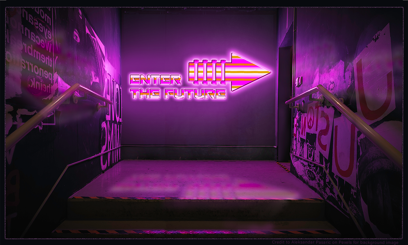
Submission for Day 7 of Photoshop Daily Creative Challenge with VooDoo Val. Assignment "Create smart objects. Create a ‘Back to the Future’ inspired image with metallic and neon effects, turning the text into a smart object."
Photoshop DCC #8 - Add texture to text. I am learning so much through these challenges. Thank you @jolly quest and thank you for all people at discord for their valuable feedback and support:)
Gave +1 Creative Carma to VooDoo_Val
thanks @bleak fossil , I improved all my answers to the challenge. Your (and all) opinion would be precious to me. Can you take a look please? https://www.behance.net/gallery/81452967/Photoshop-Daily-Challenge-2019

Gave +1 Creative Carma to SamPetersonArt

@tulip fern I liked it on behance. I would add more context to the project, cause now people see the work but don't know why, what, how. So maybe add the brief, what was the challenge, why you have done what you did, and what program you used. 👍
Thanks @velvet axle ! I will do as you suggested somewhere today. First I will go for a walk and enjoy some sunshine (before it starts to rain again 😉 ). Have a nice day!
Gave +1 Creative Carma to ke be.net/_ke
thanks @tulip fern That's a great idea, sun shining here too 😎☀️ — Fill up that creative engergy⚡️
Gave +1 Creative Carma to unicaNL
Tried to apply the knowledge from the week
Thanks for the kudos @bleak fossil and @shell sphinx !
Gave +1 Creative Carma to SamPetersonArt
Here's Day 6! I think I could have done more to make this a little bit more interesting but would love to get feedback
Hi everyone, I've fallen behind in the challenges. BUT, i'm almost all caught out. here are the 6 challenges complete. Feedback is welcomed to all pieces 😃
PS Challenge 1, this one was fun to do. Ice cream is my favorite favorite dessert 😃
Here is the behance link to all the works I have complete

@feral torrent Looks good! the values create a solid diagonal read from the text, through the planet, into the face of the figure at the top. The only real suggestions I have at this point which are more knitpicks than anything, is to maybe make the white outline around the image Just a touch thinner, and to darken the glow at the bottom of the planet just a little bit so that it gets brighter near the top, it might make for a slightly stronger focal point. Nice work!
@fringe thicket I really like what you did with the color scheme. Simple but strong. if you wanted to get that kind of orange glow in the pineapple to also show up in the text maybe try using a color Dodge layer with a sort of orange tone. Color dodge always tends to give things in nice lightboost while also saturating the colors a bit. if that blows out the values too much and maybe another blending mode would get you that nice saturation without affecting the lightness of the text, maybe even just a color layer. I really like the texture in the background too, nice work!
@eager cape Very nicely done. I think darkening down the hot spots in the background directly to the left and the right of the bird slightly might look a little bit more natural and give the bird icon a stronger contrast. I think perhaps applying a texture to the background as well could be a cool effect. Maybe something subtle that almost looks like cloth or parchment. Also currently the two visual elements in the piece are about the same size and competing for attention. I think making one of them bigger than the other might give the image a stronger visual hierarchy and focal point. Here's a rough example, please excuse the crude paint over, but hopefully it gets my point across. It’s looking really nice, well done!
Day 7, a nonsense word I made up in the late 80's, it was meant to mean "a legacy for the new millenium"
My day 8
I don't really like this kind of designs. tell me if you have any feedback before i upload it to behance
@mighty vessel - maybe you don't like it because your instincts are telling you something? It is important that you listen to your inner voice...try to change the font see how this affects the design?
@mighty vessel I feel that the text would pop more if you used the gold tones instead of red.
@fallow bough @high mesa thanks i will try your edits now 😀
Gave +1 Creative Carma to Mykul
@mighty vessel 1. you can lower it a bit to the opacity in the shadow of the text. 2. Make the red color more vintage style, less shine it. Nice Iron Man Head !
@young karma Thanks! i will try this
@mighty vessel How about house stark? Nice tie in with iron man and GOT 😀
I think it's way better now thank you all for the feedback. any more suggestions ?
@magic rampart I was thinking about this too but i think i forgot it 😅 . i will try it now
@magic rampart It looks cooler now. Thanks for your suggestion 😀
Gave +1 Creative Carma to Jmada
Tony Stark of the House Stark ! 😆
@mighty vessel No problem 😀 It looks cool
@mighty vessel It would be cool to see Iron Man's mask/head in all gold.
Wonder which John Wick duotone Val will be using today.🤔
@fallow bough the one with "MORE PURPLE AND NOISE TEXTURE" 😂
@fallow bough I don't mind, JW rules 😂
JW is a psychopath. In JW2 he killed more than two thousand people.
Finished just before the live. What do you think guys ?
They killed his dog, that's more than reasonable 😂
My nerdy ironman behance project if any one wants to check it 😃
https://www.behance.net/gallery/81112971/Photoshop-Daily-Creative-Challenge-June-2019

Behance
Here I am sharing my submissions for the photoshop daily Challenge from adobe live for the second time this year.
Here is my entry for the challenge of Day 8.
@mighty vessel It has been such a pleasure seeing all of your Iron Man inspired challenges haha
@jolly quest Haha thanks! I am sure you want to make a star wars inspired challenge now 😄
Gave +1 Creative Carma to VooDoo_Val
I all , to night I can't do the challenge , I give you my answer now . Sorry @jolly quest I can't look your live 😦 So I hope i am in the good way for your Duotone
@scarlet nexus Great awesome, well done
@velvet axle thanks (again)
Gave +1 Creative Carma to ke be.net/_ke
https://tenor.com/view/elmer-thumbs-up-gif-7569635 @scarlet nexus

Challenge #9
Here is my entry for today!
PSdailychallenge
Accidently dragged my text group under the sky texture layer and it actually looks cool over the bold purple text
Thank you VooDoo Val. I learn a lot from you
@jolly quest I like the Photo and the Effect 🤩 — But I'don't like the way the typography is placed, so here just another possible option. 🤪
Here's my entry
@young karma 😆 Well done, great colors and text. — The only thing I would think about is adding some smaller text/element in the lower left, aligned with the text, now that black area don'f feel right, its a "hard" contrast from the bright green area and pulls your eye in, but there is nothing. 😬 — But the rest 🙌 well done 👍
My entry for day 9
@young karma And there is a subtle hard line, don't know if you want that in there.
@blazing quail Well done, love the colors. — Maybe you move "BAGPIPES" up and place "He doesn't need...." below the Big Title. And Keep "he plays the" above the Big title like it is now but with a more bold font style.
Bit late, but here's my Day 8
Thanks @velvet axle that works much better
Gave +1 Creative Carma to ke be.net/_ke
Here is my entry for Today! 😃
80s Text
@velvet axle That looks SO good!! Love it!
@fallow bough LOL That looks so great! I think the only things I'd love to see you try is maybe thicken the thin text at the bottom so I can read it better and perhaps even gif the characters an outer glow to separate their heads from the JUSTICE LEAGUE text a little bit more. LOVEING it though! Well done!
@kindred kernel Absolutely love the witchy vibes you have been sharing haha! I wonder if you might try adding some lighter colors behind the witch to separate her from the dark sky a little bit? Unless you want her more shrouded in darkness! That's cool too!
@blissful badge Awesome! It's be cool to see a bit of movement too with some flares or something BUT I might be biased. I think I went a little heavy with the Noise and Flares for these challenges, but I just couldn't help myself haha
@blazing quail LOVE IT! Random fact, when I was little, I wanted to be a professional bagpipe player.
@indigo root Nice poster! Reminds me or Rome or Spartacus! I would totally watch it if it were a real movie haha
@merry finch Nice work! I think its very cool how his arm is on top of that M. I would love to see some more elaboration with more of the overlapping elements!
@proven heath Love the Strangest Things entry! You added a lot more yellow than I did to the bottom half of "THINGS" and I love the way it looks! Well done!
@jolly quest Thank you so much
Gave +1 Creative Carma to VooDoo_Val
@scarlet nexus Thank you for participating! I think you did a great job!
Gave +1 Creative Carma to XartiaX
@merry finch No problem!
@mighty vessel I have a quick suggestion for your HOUSE of STARK entry! I'm loving it but I think it would look cleaner if you turned the smoothing down on the Bevel & Emboss! If you do that and find that its not as shiny, try toggling the highlight and shadows up and down too!
@young karma Heyyyy! Very crisp Bevel/Emboss on that text! Looks like real gold, nice! Also love the interesting clock/watch details. Super neat
@jolly quest Thanks for the feedback.
Gave +1 Creative Carma to VooDoo_Val
@jolly quest yeah i will try it now thanks 😃
Gave +1 Creative Carma to VooDoo_Val
@fallow bough No problem! It looks awesome! Not I can see the separation between the tops of their heads and the text and read the bottom line better!
Just finished my design. i really enjoyed this challenge and learned alot from it. i used my type design from challenge 7
@jolly quest this is my day 9 contribution and at the same time an humble appreciation for all you guys inspiration and support! Thank you for every challenge. I’m in the process of finishing this months! All feedback is of course welcome
Gave +1 Creative Carma to VooDoo_Val
@young karma Ohhh! You used a lot of colors in your gradient! Very cool! It's giving me an album cover kind of feel, I like it!
@twilit glade Woah! Nice way to combine 2 challenges! I love what you have done! I think the only think that sticks out to me is the "I AM" text. I think you could benefit from choosing a color closer to the Iron Man colors, since there's no blue anywhere else. OR you could tie in that blue better by adding that color to other elements of your piece! For example, maybe adding blue to the sky!
That would make the blue text feel more like it belongs!
Well done!
This hound dog is ready for John Wick 4!
a little fixed
@jolly quest thanks but i think you mentioned the wrong mohamed 😂
i have made some edits on this one and i think it's way better now thank you 😄
Gave +1 Creative Carma to VooDoo_Val
@surreal jolt I liked the design you used there.
I did something different I can use for the last challenge, what do you think? tsk!
Hello everybody i very i just finish my challange 4 just relax your orbite😉
finally finished my challenge project hope you guys like it because i really enjoyed doing this challenge and enjoyed the iron man theme i did. You can check my work for the challenge here :
https://www.behance.net/gallery/81112971/Photoshop-Daily-Creative-Challenge-June-2019
please feel free to share any feedback here with me 😃
And share your behance projects here too so we can see how everyone did in ths challenge 😄
Behance
Here I am sharing my submissions for the photoshop daily Challenge from adobe live for the second time this year.
Day 8 - Little bit behind 😅
challenge #9
Here is my entry for Day 9 .... Feedback is always welcome
final day
@jolly quest or this one a more sinister one !
It was a Super challenge 😄
@coral stone Well done, great how the type is behind the figure. 😀 I'm not sure is it just one color or... maybe a stronger purple in the dark/mid-tones would be Nice. — 😆 he is chilling like a boss, imagine you present your work to a client in this way 😂
Thanks @velvet axle hahaha. I like the idea, I'll try to apply the color to the lines and maybe make them a little thicker.
Gave +1 Creative Carma to ke be.net/_ke
@velvet axle you reminded me of this Mad Men scene hahaha https://tenor.com/view/peggy-olson-mad-men-badass-feminism-gif-12141890

😂 that's how you sell your idea with confidents 😎 💪

Gave +1 Creative Carma to ke be.net/_ke
thanks @fast belfry Thanks for sharing all your amazing designs, so much passion, energy and motivation.
Gave +1 Creative Carma to Kars - Designer
Can I get some opinions on this? Ive started designing a set of tarot cards and I started off by having them on white backgrounds, but they always felt off a bit because of it I switched them to black and I think it looks better but Im open to opinions

this is the old off white color I didnt really like

@ancient spindle They look good. I'm not sure if you can manage that they all are in the same color "mood", they on the right feels like they belong to one set of cards and they on the left is another darker theme set of cards. I also would center the text in the bottom right image, and center the image in upper left. 👍
And you are right, the darker background work better, make the image pop, it might be possible to go with a with background but I think its bit harder to get that working with the images.
@bronze bluff Thanks
Gave +1 Creative Carma to Diaz
@velvet axle I agree, thanks for the feedback. I made the bottom right one feel a bit different because the Fool card represents the idea of being naive and being in a dream like state without much guidance
Gave +1 Creative Carma to ke be.net/_ke
Ant these are just four of the 78 I have left to make
I have some work ahead of me
@ancient spindle ah ok understand
Its kind of like the joker in a regular card deck, its weird and sticks out
@ancient spindle you know you can automate the layouts in InDesign. You use the Data Merge feature to plug the photos and the text so you don't have to create each card individually
I do it all the time for Collectible Card Games
@ancient spindle Do you have a clear visual design direction? Who is the target of that deck of card? who buys this? what do they like? — How would you describe the look and feel of the cards with just 3 adjectives?
Yeah I tried replicating something like that it in photoshop with a template psd file all I have to do once the art is finished is drop it in the file, size it and change the text
I used to do it that way too. InDesign is simply place the art in a folder and click merge and in seconds it's all done.
Are you going to sell these?
!rank
 Jerry Witman Jr., this command is disabled in this channel
@velvet axle Its actually going to be the focus of my upcoming portfolio review in the spring, Im a new media art major and its kind of like our first big exam. Once I finish them and print them Im going to make a wooden box to store them and probably brand some kind of design on the top and present the whole thing
I know of a site that can print the deck and distribute it for me so I might go that route of selling it at a later date but right now I'm focused on my review
@ancient spindle Check out The Game Crafter. I print my cards over there. The quality is really good. They print Tarot cards
Ive posted the designs in the tarot subreddit and they seem to be really into it I got a lot of positive feedback
Entry for day 9. Started with an Adobe stock imager, applied Val's magic and added some of my own, This has been a real challenge -- I never would have gone to these type of cinematic images on mu own. Thanks Val.
@surreal jolt Thank you for the recommendation it looks like their pricing is really affordable from what I understand
Gave +1 Creative Carma to Jerry Witman Jr.
@forest aspen that looks pretty good
Well done
You could maybe let the eyes jump out more
Number 9. I really got a lot out of this series of challenges, Kinda hooked on them now. When can we start again!
Here is my Day 9 entry ....Not all Super Heroes Wear a Cape 😃 🇦🇺
We will be back sooner than you think 😉 @graceful heron I like the color scheme and the glow over the text! I don't think you can reduce the distance between the dropshadow and the text or remove it entirely. It also looks slightly crammed in the corner. How about this: expand the sky above the model (you could probably get away with a simple gradient or paint it with a soft brush) and move the text there.
@past canopy yeeees! those people are the true heroes of the real world 😛 The sharp dropshadow is a nice addition and I like how you have aligned it with the light in the scene. I think you could increase the space around the text a bit more. To do so, you can use the content aware scale tool or you could try out the content aware crop tool.
or you could do it using Content aware scale. expand the canvas using the crop tool (without content aware checked), then click on content aware scale
then, scale the image up (while holding the shift key)
Thanks @glacial path I never knew about this....will give it a go! Thanks for showing me the settings! I was trying to squeeze everything in.
Gave +1 Creative Carma to evil
@glacial path if I expand the space, would you leave the text as is, or would you also make it larger?
I think you could go bigger. Just scale everything up - the layout itself is fine
OK great!! Gotta get me some breakfast....will test this out later. Thanks!!! 🍴 👍
bon appetit!
Today's Challenge
@forest aspen This is lovely! I like the metal texture and the orange eyes. The font is also super cool! I think you could go with slightly more punch in the shadows. Something along the lines of
the before is on the left, the after version is on the right
Content-aware scale? My Wow.
Hey @magic moat - I think you should use a different color for the "This Man" text. Everything else is really nice 😃 Well done
@cold cedar heck yeah! The engineers did some serious dark Adobekadabra there
@coral stone lol, your submission is really funny - that pose... it's just too much XD ! I would just blur the edge a bit to reduce the sharp transition
love the detail with the two horizontal lines!
Thanks @glacial path , I'll make the adjustment 😄
Gave +1 Creative Carma to evil
@glacial path Yeah, I cropped tight to simulate what Val was doing, but on the background there is space above the model to place the text. So, I'll try that. Thanks!
Gave +1 Creative Carma to evil
@young karma oooh! I like the inverted effect. the font is also nice and boldl I think you should slightly lower the brightness of the woman to better blend her into the scene
@fierce umbra Well done on the contrast and punch of the image. the doggo also looks really proud 😄
Duotone effect for PS_DCC day 9.
@ancient spindle - color scheme is working well, nice work
@high mesa thank you!
Gave +1 Creative Carma to Mykul
@past canopy nicely done!
@glacial path thx. for the feedback Tim. I will try it in the morning.
@eager cape woah! that's really really cool! I like how the background on the left is orange, while it's purple on the right. Love that font and texture. 10/10 😄
Here's my photo for Challenge 9 Duotone Effects.
thanks @jolly quest , if you want to see the resullt of all your live , I give you my behance : https://www.behance.net/gallery/81452967/Photoshop-Daily-Challenge-2019 , I was quite depressed about my professional abilities before competing for the challenge. But thanks to these 9 challenges I regain confidence. Thank you 😃 Thanks all 😃
Gave +1 Creative Carma to VooDoo_Val
Forgot to load this - my day 8 entry.
challenge 9
PsDCC9 Duotone. We'll call this attempt 1 since the image in my mind always seems to take a while to travel through my fingers to the computer. ... Added two more versions that may be closer to duotone than this one.
Here is my day 9 entry. Really loved these challenges; learned a lot! Thank you, @jolly quest
Gave +1 Creative Carma to VooDoo_Val
Photoshop Daily Creative Challenge #08
Add texture to text. Thank you for the Tutorials @jolly quest was useful for your advice.
Gave +1 Creative Carma to VooDoo_Val
@glacial path Thanks! and Thank you @jolly quest for these amazing tutorials.
Gave +1 Creative Carma to VooDoo_Val
PS Daily Challenge Day 7 Smart Objects
@woven baneMobest Thank you
Gave +1 Creative Carma to TIM
2nd attempt
Hey everyone, just completed all the challenges 😁 😁 😁 😁 😁
&& here is the behance link to all the challenges completed with a little blur/description in my take 😀
Hope you guys like it 😀 ☺ 😊
https://www.behance.net/gallery/81359901/Photoshop-Creative-Challenge
Behance
Photoshop creative challenge 2019, this is a collection of different works where I test out new features, filters, blending modes to create amazing works. #PSdailychallenge
Day 9 - Duotone Effect
@scarlet hill Niceeeee Great challenge entries! REALLY loving that Andromeda one! Super cool look and a great word to use for the challenge!
@scarlet nexus I'm so glad you continue to create! Love the behance project! gave you an appreciation and left you a comment!
@vagrant sorrel Hey! Great work on the challenge! Love the King Aurthur piece!
@unkempt field Nice work on the challenge 9 entry! I think the only thing I would suggest is playing with the text a little bit. That top line there is a little bit hard to read because the fixture hanging from the top of the tunnel she's in interrupts it. A few suggestions for how to improve this: You could make the text bolder AND/OR add a dark outer glow OR a darker gradient behind it to separate it from the background OR try moving "EVERY DOG HAS ITS DAY" down between that fixture and the top of her head, then experiment with putting "IT'S TOTALLY NOT THESE DOGS" lower, perhaps by the feet. Just some suggestions! Loving what you have though!
@past canopy I think I like V2 with more space! At first I couldn't tell the reason, but It felt easier to read. So the change was subtle enough to be undetectable but it did improve! Well done! Also, I also think any one who brings me a strong coffee in the morning is a total super hero!
@graceful heron So glad you enjoyed the challenges! We'll have a brand new round of challenges starting next week with Kathleen!
@ancient spindle Honestly, I LOVE the dark versions of your tarot cards! As I mentioned in chat before, I have some of my own! A bit of a hobby of mine. Just looking at the ones you posted for feedback, I'm excited to see more. I hope you put together a behance project with all of them! I'd even love to have the set if you print them! They're so cool!
@vale merlin Love the challenge 9 entry! It's so cool. That guy looks like an awesome vigilante! Only think that catches my my as something that could improve though, is the top line of text not being in CAPS like the rest of the text! Maybe try a version when its in caps too?
My entry for Challenge of Day 9
@jolly quest thanks for taking the time to provide the feedback. 😎
Gave +1 Creative Carma to VooDoo_Val
this is for a book cover
THanks for your feedback@jolly quest
Gave +1 Creative Carma to VooDoo_Val
@glacial path I lowered the highlights on the person so she blends in more. I can’t remove the flickering whites though. How should i do this? Thank you for your advice
Gave +1 Creative Carma to evil
@glacial path
Harder to find time on Saturdays, but I did it!
@jolly quest Thank you very much I didnt even think about creating a project for them on Behance thats a really good idea
Gave +1 Creative Carma to VooDoo_Val
@plucky knot Oh wow, you did a great job with this one, really fantastic , definitely got that John Wick feel down well. Love the foreground elements in front of the character too! This is just an idea, and might not even work as well (I'd have to try it and see) but the image has a lot of weight in the center portion with all the text and the character all side by side. Maybe if you took the small credit text and the date and put it at the bottom it could balance out the image a bit more. The official John Wick poster has the text below the focal point of his face, but yours is right next to it which doesn't quite give the same compositional balance. But either way I think this turned out awesome, great work!
@young karma Nice work Lani! Always cool to see what you're coming up with. The color in this image definitely gives it an interesting mood. I like that duotone effect you have going on in the character with the pink, I think for the purpose of this challenge it could be cool to see that pushed even further, might enhance that sort of surreal feel it can get. A couple other thoughts, I think the top text is a bit close to the figures head, almost feels like a tangent as is. I also think that maybe you could use a multiply layer or something to tone down the bright highlights on the legs. That way the pink tone on the head can really create more of a focal point near the top. Just some thoughts, looking good!
@royal niche Well done, nice work on this one! I can definitely see this being a book cover. I wonder if a subtle rough texture in the yellow background might give this a nice feel and give a good contrast to the rest of the image. Though that is really just personal preference depending on the look you're going for. Nice work!
@young karma Very nice! Love this color scheme and the soft value transitions in the image. That soft contrast really adds to the theme of this image. Nice composition as well. I wonder if "Every Life" being brightened up might give it a little more contrast to balance the contrast of the "Baby Steps" text and act a bit more as a focal point. Great work Laurence 😄
@young karma Looking good Dejenk! I feel like you could push the duotone look a bit more, perhaps pump up the saturation on the cooler color. Right now it almost reads as monochromatic with the yellow, but pushing a stronger sort of cool purple tone could give this image a really nice effect. Nice work!
@bleak fossil Thanks a lot for your feedback, I appreciate that a lot.
I have brighten "Every life" up, and it feels beter. Thanks again
Gave +1 Creative Carma to SamPetersonArt
Day 6 challenge. I think my text is not dynamic as VooDoo's....😅
Oooh, looks perfect, that really balanced it out! And no problem! @young karma
Day 9 Challenge
Day 7 revised. Thanks for the suggestion @glacial path
Gave +1 Creative Carma to evil
Boyutat Aleiz - Presentation Logo Identity Ideas - Proof
@bleak fossil thank you for your feedback. I really appreciate it. Building on your comments i’ve tried some options and came up with this image. I also kinda fell for the second one. Totally different but equally haunting i think. What do you think? Thanks again for your thoughts and comments
Gave +1 Creative Carma to SamPetersonArt
@bleak fossil Second is first in the upload apparently
Still working that duotone challenge. Two more versions.
Here's my entry for day 9! Colors and lettering inspired by an original John Wick poster.
Thanks @jolly quest for the great challenges! I really enjoyed it and I have learnt so much more about Photoshop! 👍
@bleak fossil Thanks for your feedback on my pineapple piece for day 8! I made the letters a bit more orange to match the color of the pineapple, it's much better now
Gave +1 Creative Carma to SamPetersonArt
And here is my Day 9 entry. Thanks all for another great series of Daily Challenges. I really learn a lot from these!!
Thanks for the great 9 day challenge. Val was a great teacher!
Version 2 of Challenge-9; updated to incorporate @jolly quest suggestions and feedback. Thanks VooDoo Val!!!😊
Gave +1 Creative Carma to VooDoo_Val
@unkempt field Great edit, I think that really helps the image. I really like the effect you get with the yellow/purple duotone, and the blue in a nice accent color that pops out the center character nicely. The top text feels like it's crowding the character a bit being so closer to her head. Maybe raise it up slightly so it's partially going through the lamp above her, it might have a bit of a more natural balance. Looks great!
PS Daily Challenge - Day 8 - Add texture to text
@tulip fern Some great color contrast here, definitely draws the eye in a clear and powerful way. Great job with these challenges!
Take 3 😀 😬 😂 @blissful wolf ; @jolly quest
@blissful wolf Oh, very cool. Did you draw the wolf graphic? I like how you meshed the wolf graphic and text texture to fit together. Really cool effect with the golden metal. Right now the bottom right of the wolf seems to have an odd tangent with the W text, I wonder if making the text the dominant shape over the wolf might be a better read and avoid the tangent issue. Here's a quick example, though it's really just personal preference if you want the wolf or text to the dominant element. Great work with all these challenges!
@fringe thicket Haha, very nice! The colors look great for the Day 9 challenge and the sky and ground separation works well. The pineapple is looking solid as well. Great work on all these challenges Chocolita!
@cold cedar Great to see you experimenting with different directions for the duotone effect! I personally like the blue orange color scheme of the bottom one, though I think perhaps the values of the image could be tweaked to cut down on all the deep black tones on the construction digger and near the bottom. You've been doing some great work with these challenges the past two weeks, well done!
@young karma No problem! Really interesting. I like the additional red tones in the bottom version, but I also like that sort of clean ghostly feel the top on with the white background has. Kind of mysterious looking. Though for that one, i think it might help to take the figure and move them a bit to the left. Currently they're creating a bit of a tangent with the "for" text and moving them to left a bit might balance out the visual weight. Just a though. Nice work with these challenges lani!
@noble glen I love this color scheme, the earthy tones and text definitely seem to fit the theme. Really like what you did with the silhouette down below as well. I feel like the background use maybe use a bit of a gradient to make it pop a bit more. Here's a quick example. I just masked out the bottom silhouette and used a color dodge layer with a soft round brush to brighten the bottom and use a multiply layer to darken down the top just a tiny bit as well. Well done Ram!
@bleak fossil Thank you.. I've been playing with that one a lot. I like the bottom one as well but wanted to see what else I could do. Now, I get to play with it some more (was going to anyway). And, thanks for taking the time to offer great recommendations to the folks here.
Gave +1 Creative Carma to SamPetersonArt
@bleak fossil , I took the wolf from deviant art. It was a flat image. I did the styling...
Thank you @bleak fossil , I enjoy the challenges ...
Gave +1 Creative Carma to SamPetersonArt
Day 7 . Thank you VooDoo Val!
@bleak fossil Here's another look at the Duotone.
My day 9
Hmmmm I can see the text requires a bit a working , how to get it to be a bit more visible...lemme go back and work on that...
That looks a bit better...🙂 😀
But, always a ....but, lemme see how it will look if I make the text stroke white...
😃 Much better...
The Glitch battle continues. Thoughts? Suggestions? Comments? @bleak fossil @jolly quest Your thoughts?
Thank you @bleak fossil That's really helpful!
Gave +1 Creative Carma to SamPetersonArt
@bleak fossil thank you for the feedback. I will try to reposition the person. I have to deconstruct the whole image and start over for this so it will take some time to do this. Very happy with the remarks thought! Adds to the complete picture for sure Thx
Gave +1 Creative Carma to SamPetersonArt
Thank you so much @bleak fossil for all the honest and constructive feedback to all of us. It is a very helpful and a great motivator. Same goes for @glacial path , @velvet axle and @jolly quest 😃
Gave +1 Creative Carma to SamPetersonArt
thanks @tulip fern
Gave +1 Creative Carma to unicaNL
Final project of DDC with @jolly quest many thanks for some great tips
Gave +1 Creative Carma to VooDoo_Val
@cold cedar the first one on the left 💐❤️❤️🥰💐
@cold cedar Great glitches 👍 V4 I think is the best, looks like a magazine cover or poster🙌. V2 and V1 has a different style than V4 but they are great. I don't think that the type on V1 is good don't know what you could write instead but the glitch/photo alone is strong, maybe a simple white bold text can make it even stronger (with the right message and placement). V3 is not so good. Update: V4 clever use of the type Glitch Glamour 😀
Great to see your dedication to the Glitch Battle @cold cedar 😃 and it shows off; V4 is very nice!
Challenge 9
@bleak fossil i tried to open up the space a little. And along the way i kanda came across a darker version of the light! Here they are:
Thanks @young karma, thanks @tulip fern Thanks @velvet axle I like V4 the best too. I think V3 is uglivey but the ugly is part of the process so I wanted to include it. I liked V3 but wanted more glitch. I felt V1 wasn't really successful (but that could just be because it doesn't fit my brain).I may work on the type some more Why not, more practice and play with Photoshop, right?
Gave +1 Creative Carma to ke be.net/_ke
@cold cedar oops, i absolutely loved V1.
Challenge Day 7
@young karma Thank you. I'm still trying to see what I can do with it. I think I'm just not a glitch head. It makes me want to slap the tv to fix the horizontal hold. That's how we did it back when televisions had tubes and rabbit ears. LOL.
Gave +1 Creative Carma to lani

Day 8 House of Lion look more like a logo mark
@valid crow Hi Try embossing the lion, would like to see what that'll look like.
Hi Tawn, You are right, it is much more dramatic. Thank you so very much!!
Yey!! Day 9 is done. Thank you so very much VooDoo Val!
PS Daily Challenge - Day 9 - Duotone
Thank you @jolly quest ! I enjoyed so much following the challenges....
Gave +1 Creative Carma to VooDoo_Val
7206
@valid crow yeah that looks Awesome!...May I further suggest, encourage...why not fill the space between the bars with your text...maybe have you text in three lines
House
of
Lions..
making the "of" smaller than the words above and below...
Your firefighter poster is way cool! @valid crow
gold gold gold....
@young karma Awesome, like it. I personally would move the two figures just a bit to the left 😆 to center them, cause now on the left is more space than on the right 😅 I know just few pixel but 🤪 anyways great
Challenge day 8 - reminiscent of old movies !
My day 9, thanks @jolly quest , really enjoyed these 😀
Gave +1 Creative Carma to VooDoo_Val
My portfolio https://vimeo.com/joseaugustomotion
Just added some flares because Val said to! 😃
@blissful badge ha! so shiny 😃 thanks for sharing
@jolly quest Finished the high priestess this morning, probably my favorite design so far
Thanks @bleak fossil and @glacial path for al the feedback! Will join the next challenge for sure! 🙂
Gave +1 Creative Carma to SamPetersonArt
@peak warren That Duo Tona Star Wars project!!!! SO GOOODDD!!
@ancient spindle Oh man, I'm loving this tarot set so much. Keep 'em coming!
@jolly quest
@stuck oracle OHHH
Very nice! This is like the cover for an awesome movie or book! Very well done!
@jolly questThank you for you and this is the link on behance
https://www.behance.net/gallery/81654613/GALAXY

Behance
Relaxing can quiet your mind and make you feel peaceful and calm. Your body also reacts when you relax , Take a deep breath. Hold it for a moment and imagin your world from other side.
Oh man the full version is even better! That ocean texture flowing into the hair is wonderful!! And the Space/Flare composite at the top is so great
Can I ask where you found the resource images? They are beautiful!!
Unsplash @jolly quest
@stuck oracle Thanks so much!
Gave +1 Creative Carma to Ahmed Dawood
Keep up the great work!
@young karma I love the brassy antique texture you have with your text for the frog throne!
@jolly quest thank you iam really
Gave +1 Creative Carma to VooDoo_Val
Love your style in design
Thanks so much @stuck oracle
Gave +1 Creative Carma to Ahmed Dawood
ahh if only there was a challenge today! it's such a nice breather to work on something on photoshop at work that isn't work related😂
@stuck oracle super cool! But I would work on the empty space between the x and y (hah), compared to the other letters, the gap between these is larger than the others
but that face blends in so well I didn't even notice there was one until a deeper glance! great job
@lucid moss I have set up a challenge and @hard halo too, I can't link to the post, don't know how this works in discord 😬 its from 29. 05.19 😁
@untold jungle thank you 👍
Gave +1 Creative Carma to Actionom
@lethal girder looks very playful 😄 but that honey guy looks a little perverted XD
and that milk one
I won't even say what the mouth is looking like
but!
very playful and fun
and the milk coming out the mouth is not realistic
but just nitpicking
@hard halo Looking at the first image my suggestion was going to be the text, really nice edits! I think it helps the text read much better. Also really like how you handled the colors. The purple shadows really frame the figure nicely, definitely makes her a strong focal point. Looks great!
@ancient spindle Ooh, great work on this one, I really like it! Always a great feeling when you feel like you have a level up moment. This is more of a nitpick than anything, and comes down to personal preference, but I was thinking if you added a bit of a cooler tint to the figure it might bit her in with the environment a bit more. Just kind of that cool blue tint that you see in the stars and space above her. Here's a super subtle example, but it makes it fit in with the rest of the image a bit more in my opinion. Really nice work!
@bleak fossil Thank you. Much appreciated.
Gave +1 Creative Carma to SamPetersonArt
CHALLENGE ONE im way behind. Used combo of ballerina, 2 blending modes and a picture of a flower and a light distorted photo.
Daily Creative Challenge #09 - Duo Tone
What do you think of the composition?
@sterile bane
Daily Creative Challenge #1
Wow these are already looking so cool!
I'm wondering what the originals looked like, though. So I can see what changes were made
Before retouching 😃
@mortal moon Oh wow! You actually gave the image a totally new mood!
After retouching..
@tranquil locust i love the grainy texture mixed with the creamy blur. the crop is interesting and makes me think it would be an enticing book cover
Before retouching..🙄
@proven heath nice! the blur adds to the fun and energetic feel of the model
@stuck oracle that's epic! it looks like you've mastered many DCC challenges 😃
Day 1 Challenge.
i am still new to these challenges i hope i can keep up 😬
Day 1 Challenge. Hope you like it!
@dusk gazelle Woah! Really love this! I would say you could improve it a little bit if you make it a little bit brighter, though.
Did you use a gradient map?
If so, I would say experiment with adding an extra color and making it a pink brighter than the one you have, that way it will flow into a brighter color!
I think it would increase visibility
Like a third color to the gradient map you mean? I'll definitely try that out
@dusk gazelle I did a test for you!
By adding some lighter colors, it helps to see your subject a little bit better!
@dusk gazelle Making the changes is up to you, of course 😃
The photographic toning gradients and 3D LUTs can do some really cool stuff as well
@ancient spindle great suggestion!
Day 1 - Portrait retouching with a little bit of what @gloomy flare taught as well
Hello everyone, this is my day 1 interpretation of the portrait touch up and spin.
@blazing quail nice! the slight brightening of the face really creates a focal point
Hello everyone! This is the first time I'm doing Adobe Challenge. Really enjoying it so far 😃 For the first challenge I used the portrait of my dog.
@jolly quest So I took your advice and made changes to the Gradient Map and YES! I was looking for a way to increase the lights in the background without affecting the whole document (or painting light in a mask lol). I also added another layer with a blending tool for the extra dash of color.
@dusk gazelle It looks awesome!!
Here's the original picture my boyfriend took as a selfie while rollerblading.
Here's my retouch for it
My unconventional portrait retouch...
and original... thought that was going to go in one post... sorrry
@young karma Love it! that second pic looks like it could be the promo for dog shampoo haha.
@near sand Nice! The spin is nice and subtle. I like it! Adds a nice texture and definitely leads the eye to the focal point of the image
Woah!
@dusk gazelle Also, I want that guys shirt. Its so cool!
#PSDailychallenge - Day 1 - retouching. Curious if the color adjustment works or does it still seem too cold.
I posted in the wrong thread, sorry
There it is, my try on the Challenge of Day 1 :
I've choosen to retouch a very old photograph of me and my baby brother. It was a polaroid photo in a very bad state. You will have to view it at full size to see how bad it was.
I've choosen to keep the colors on the faces and the limbs.
@trim field You cold play with some warmer tones if you want but I think it is already looks much better! Better visibility and more personality!
@young karma Looks awesome!
I really love what you did with the colors, very natural @young karma
Eiffel Tower
@jolly quest Thanks! I actually plan to sell that shirt soon. ;D
Gave +1 Creative Carma to VooDoo_Val
Mybe. not sure yet hahah
Day 1 - Retouch a Portrait
Before/after
@jolly quest , thanks for the feedback, I really appreciate that
Gave +1 Creative Carma to VooDoo_Val
@lucid moss Wow, you killed it! Love the colors and the glow effect around the edge of the tail, really gives it a cool dreamy feel. Well done 😄
@bright moon Loving that pattern in the back! Also, you did a great job of selecting around the hair! nice!
@near sand Very nice! I like the spin effect, it adds some nice sharpness and focus to the face. Well done. I think you could push that focus even further if you wanted by using a multiply layer to darken down the arm area, and brighten up the face area with a levels layer (and masking out the rest). Would draw even more contrast into the face. Just a thought, looks good!
@viral veldt Nice! Is it a family photo! I would love to see the before image too!
@uncut ginkgo thanks for tout feedback, I appreciate that
Before day 1 challenge
This is my Before and After Day 1 Challenge - let me know what you think?
PsDCC1 Photo re-touching: Removed color cast, removed stray hairs, cleaned up lipstick and replaced damaged fingernail, removed blemishes, removed hairpins from crown
@bright moon Thank you
Gave +1 Creative Carma to whoshotmrburns
aw thank you @bleak fossil !😚
Gave +1 Creative Carma to SamPetersonArt
After posting realized it could use some brightening so here it is again. What do you think, better?
Hello everyone, this is my first time participating in a challenge and I can't wait to complete all of the challenges. For this portrait I cleaned up the lint collected on the bottom rim of the hat, removed the tassel earrings and some stray hair in the wind. I then applied the same Spin Blur form the tutorial and a soft gradient outside the focal point. Thanks for your feedback.
Hi Everyone, I am working on enhancing my photoshop skills. My manager told me about the daily challenge so I thought why not give it a try. Here are my Day 1 - Playground images original and re-touch.
@edgy frost Like how you added more grass and brought out the silver on the slides! I suggest straightening the horizon. Easy to do in P'shop.
@cold cedar I like the brightened version and the fixed the nail looks flawless.
Here's the After. Used a field blur instead of radial. Added a slight vignette. Removed some frizzies. Removed streak of hair from her face/mouth. Had a lot of fun. NEver used the patch tool before. Pretty powerful.
Here's the before
C&C Welcome.
I think I went over board on the hair 😃 Reposting. Wrong crop
Thanks @vale vale.
Gave +1 Creative Carma to Johnny_Mon
feeling pretty good about these edits! recolored, moved my chin up to close my mouth, adjusted focus, other minor tweaks
@half citrus like what you did with closing the mouth. Nice job1
The edit and retouch. Cleaned up the hair, blurred the back a bit, cleaned up eyes and desaturated
Great job @half citrus
Thanks. The lower one is the edit. Gotta get used to the way this posting works.
Here is the one with the correct crop
I'm never sure if I've gone too far, or not far enough with skin smoothing. Thoughts
This is an older version of me playing with this same photo... I might have gone a bit overboard!
@final zodiac Skin smoothing looks on point to me. That Thunderbolt may be a little far (LOL) but you did a nice job of laying it on.
Here is my PS challenge 1
I couldn't decide which one i liked best
This is the original picture
Hello everyone! I hope you all have nice evening. I think I could smooth her face a little bit more, but I'm not sure, I didn't want it to look like silicon cast.
LunaMoon - I think the first option is the best.
@scarlet hill I know what you mean. We come across so many other choices when we are working. The top one looks more vintage.
hi guys! Here's my photo for day 1 (downloaded it from Unsplash). I really like the soft tones of the original photo, but it's nice to see the effect of B/W.
@pulsar hound I love the colors and blur. Don't think I would smooth her face more, I like the 'roughness', it fits with the colors and contrast
@scarlet hill I like the first one best!
@acoustic karma Love the warmer colors!
Picture of my brother, Paul - many moons ago. Always loved this picture. A lot of the retouch was for dust as this was scanned from a slide. Added some blue and camera raw filter to brighten it up just a bit.
original
Touch up and masked, composite. Removed blemishes and stray clump of hair (red ovals).
Final
@sterile bane this my lesson number 3 i do 2 lessons last challenge and ilike the ideas of challenge s
Iwish to do somthing good in this challenge👌 💯 😉 🇪🇬
Before and After (Stock from https://www.pexels.com)
My Granddaughter..
@fleet pecan I like you added contrast, but it made the face/shadow darker. Maybe you can light that up?
@fleet pecan yes, as @fringe thicket said, I think you can bring back some of the light on your face. I wouldn't go 100% back, but somewhere between 20-50%, where it still looks natural
Hi @fast roost 😃 This image totally works in black&white! Ans I also like the crop. The branches in the foreground tie the whole image together. I wonder if you could add some glow to the lantern
@icy goblet mind sharing the before & after? or describing it?
Made another one 🙃
Used channel mixer for B/W filter (slightly adjusted blue filter). I'm not sure it I like it like this, would like the freckles come out more, but want to avoid the image becoming too dark 🤔
@fringe thicket you can try out the structure and clarity slider in Filter -> Camera Raw
I think they should help to bring out the freckles
I like the effect with the bright eyes. it adds something that wasn't there in the original 😄
@bold valley Black & white looks so much more dramatic, I love it! But I don't think you yould get rid of the stray hair. it's a key feature of this portrait and I think you can absolutely keep it 😄
Updated
Removed age spots, softened crows feet/eye bags. and applied Field Blur to background.
@fleet pecan nice! Much better 😄
@fallow bough it is quite difficult to pull off a convincing background blur. the eye picks up on even the tiniest flaws. So you will have to do a super duper clean mask
otherwise the background will bleed through where it shouldn't
@fallow bough the face retouching is really well done. and very clean too
@glacial path Damn. Missed a spot. Went through and cleaned up the bleed but you found a missed spot. There are probably more I've missed.
haha 😄
yeah
just when you think you got everything and even if you checked it twice.... you still end up missing some of the selection 😛
luckily it is very easy to fix
@wispy compass that's just lovely ^^ The colors, the comic effect and the spin blur really work well together. nicely done 😃
I tried a glow around the lantern as you suggested Tim 😉
DDC day 1 - trying to blend two photos into one...
@fast roost very nice 😃 Both versions would be absolutely valid - depending on the context. If you like clear lines, sharp shadows and high contrast: go without the glow. if you like slightly smoother and softer looks - go with the glow 😃
@glacial path Think I got it all this time.
noice!
@woven bane Möbest I like counter point of having the glow in a a portion of the crisp image 😃
@novel fog nice one! Just increase the saturation of the pink flower and slightly decrease the opacity of the shadow. that should help blending it in 😃
@woven bane Möbest It was a very lucky shot, i got off the metro in desperate need of a restroom and was like "oh, hey, it's the Arc de Triumph!" I took a super quick pic and left. LOL
Hello! Here is my challenge.
https://www.behance.net/gallery/81767175/PSDailychallenge190617

Ha Photoshop is misspelled 😄
Thanks @glacial path I adjusted a few sliders in Camera Raw filter and I think I like it now
Gave +1 Creative Carma to evil
Slightly adjusting the the values on the flower
I took this at the Vivid Festival here in Sydney, Australia. You can see the before and after images below. 😃 🇦🇺
BTW: I took the below image on my phone...
Beautiful colors @past canopy
Basic retouching of a sculpture in the city of Santa Cruz de La Palma 😙
Thanks @coral stone 😃
Gave +1 Creative Carma to Valdair Leonardo
#PSDailyChallenge. My entry for Retouching, showing before and after for 2 images
@forest aspen Nice. I think the image on the left is particularly good. really brings it more to life.
Challenge 1 - I liked seeing how others use the healing brushes because there are so many nuances to them. The size you use really makes a difference. And where you select using the Option key is pretty critical when you want as natural a look as possible. I had to use the camera RAW filter to brush in some of the under-exposed portions of this shot. But then I ran out of time, so it is not quite finished all the way.
@upper hatch love seeing the process gif!
Used a photo from the internet of an unedited portrait, although I’ve used photoshop for over a decade I still love the basics! So simple, and so beautiful 😊
Thanks @glacial path
Gave +1 Creative Carma to evil
Day 1 Photoshop Challenge! This is a photo of Scarlett Johansson off the internet (after image)
before:
My first #PSDAILYCHALLENGE
I removed some blemishes, worked with a shadow of sunglasses a little bit, darkened part of the beard with multiply blend mode
Before:
After:
My own version:
Day 1 - Before and After: How did I never know about the healing spot tool?!
The photo called for a little more of a nightmare effect 👻 What do you guys think?
Played around with the ripple effect and the layer mask for the eyes and the mouth
This is a photo from before photoshop existed (okay maybe it's not that old)...and I didn't have a high resolution version....but she turned out okay. The Before
The After
@pastel helm Great improvement! Levels adjustments are always my go-to for editing photos or my own art. One thing I noticed with the adjustments is the whole image has a fairly warm tone to the colors but the shirt has this really cold blue color that seems a bit out of place and acts as a focal point more than it probably should. Maybe adjusting that could help a bit. Great work!
@serene kettle Looks really good! The brightening up of the image definitely gives it a nice feel. Some nice subtle edits to soften up some areas of the face as well. Nice work!
@hushed stirrup Very cool, almost looks like a frosted glass effect. Could be cool to mask out the effect with a soft round brush on the whole center area of the face to really draw focus there, though that would be a pretty different effect overall. Looking good 😄
@bleak fossil preciate the feedback thanks! 😀 I can actually see that now lol I'll get back at it😄
Gave +1 Creative Carma to SamPetersonArt
@grand cloud Wow, love the effect! The spiral effect really seems to match the feel of the image, well done. The only color being left to the eyes is a cool touch as well. Very nice!
@austere current Your edits really add a lot of excitement to an otherwise fairly normal image. The colors in the sky definitely give the image a lot of life! Really like how you the it coming through the trees as well. If I had any suggestions it would be to maybe have a little light leaking through the whole in the trees to soften the contrast, and maybe toning down the saturation of the blue in the sky to look more natural. Unless of course you're going for more of a surreal feeling. Great work!
My first image edited in Photoshop was a long time ago. Simple is relative.😋
original
@sage aurora here is the photoshop link if it works doing it this way
@bleak fossil Thank You, we love that odd tree in our yard and i wanted to do something to give it some love...
Gave +1 Creative Carma to SamPetersonArt
Will really appreciate some feedback!! Thank you!
@young karma Cool colors! I like it!
@grand cloud Creepy! 👍 Maybe darken the background a little more (especially the top part of the photo) to make it more dramatic?
@pastel helm Well done! Maybe also remove the tree at the right ear?
@gritty flame I like the focus/blur and colors. Do you have a before version for comparison?
@neat shale Love the first one! The colors are so much better than in the original photo 👍
@supple stag The lighting on the face is so much better! 👍 The background would-be normally be way to much I guess, but it really fits with a magician, although you could maybe spice that up a little with some colors (gradient maybe?)?
Here's my day one, took a picture of my granddaughter on her birthday that I've been wanting to do something with for ages, but not quite sure what. This was a perfect challenge for it.
Version 1
Version 2, all B&W
Version 3, had a little fun
Here is my contribution to day one
Obtained a royalty free cr2 file and decided to try the 'frequency separation technique, which was highlighted a few weeks ago in the Adobe Live sessions. Its a lot of work, but it makes a difference
This is the treated image, which also includes Kathleen's spin dreaminess filter.
@gritty flame - great image, did you not want to try the BWhite effect? It would change the style. Also try camera raw BWhite as an alternative.
Day 1 Daily Challenge. Retouch and Shallow depth of focus.
@past canopy - awesome image, the light on the nose is so apt
Not too sure if I understood what we had to do, but this I edited a photo of my favourite artist, bottom one is original
Day 1 - Retouch a portrait
@young karma you went for a rather subtle blur which works really well with your portrait and the composition!
@young karma I think you got it! The background is much more exciting now 😃 Compared to the warm background his face looks rather green. You could add some orange/red tones to bring the skin tones back to normal.
the original one!
The edited one - edited the overall colour and some retouching of blemishes


Behance
I don't really do retouchments on portraits even though I know all the basics to do. I think this is my first real attempt at doing a retouchment portrait! I don't really focus on the photoshop daily challenges but day one seemed perfect for me to try so …
original
photo edit
i wanted to have a good contrast between the model and the mural in the baclground
@topaz harness whoa trippy, I like it 😀
Hey @topaz harness I like how the black&white version totally changes the mood. The red tones look a bit dark, IMO - especially around the sun.
@topaz harness spooky!
https://www.behance.net/gallery/81801977/SHY
Guys please check this out and am open to your feedback.

Do you think the values are different enough to keep the words legible?
Great job @blissful badge
thanks so much @novel escarp
Gave +1 Creative Carma to bubbawny
There it is, love this @slow python
Much love!
just some tone stuff here– I was wowed by other composting examples so i threw in a rocket
@blissful badge Great job! Did you use patch tool on that, content aware fill, other?
@tepid timber Add a rocket, add a plane, add a bird. Love the addition. It would be cool to see the rocket follow a path parallel to the building - just a thought
Great designs. I’m from Orlando, Florida
Yes, awesome images - Can I ask a question on this forum for challenge #2 or is there someplace else for that ... new to discord and the design challenge thing... Thanks ?
i used two images to create this, what do you guys think?
Thanks for joining and for the question sim! check out the #❓ask-a-question channel! This one is for design and design feedback
OK Thanks gus 😃
Day 2 Daily Challenge
@ruby panther Nice! Really loving the colors, texture and movement! But I think it could be improved if you played with the background values a bit. Right now, the values in the letters are very close to the background values, making it hard to read.
If I suck the color out of it, you can really see how close the values are. I would say play in the Levels panel a little bit!
If the Levels don't work for you, you might just edit the background a bit
Thanks @pastel spade I used the patch tool for most of it and the spot healing tool.
Gave +1 Creative Carma to Chad
@ruby panther agree with what @jolly quest noted. I'm curious - what tool did you use to cut the dancer out from the background with? It's very clean!
I'm not sure the colors work together, but I wanted to use a summery rainbow 😄
Here is my submission for Day2.
Years ago, I saw this nine (IX) in the sky through a window of my house and I could'nt resit to take a picture of it.
Now, I had a chance to use it for this challenge.
@torpid sinew i love it! they almost look like metallic balloons, but with a great texture-y feel. nicely done
Hi everyone, here's my day 2 😄
I used some layer styles like drop shadow and outer glow. And added a vignette in Camera Raw
I just saw by posting it that my "Nine days" was not really horizontal. I have fixed that
PsDCC2 Lettering Finding the right image is always the challenge so I did some masking on this so the words show better. Was that a good idea or not?
Hey Guys! Check out my latest Work and please Rate it it would mean alot to me ^^ https://www.behance.net/gallery/73595005/MERCEDES-BENZ-ZUKUNFT-IST-ZUM-GREIFEN-NAH

Behance
I want to show in this Branding the Innovation from tomorrow.
My entry for day 2
This is a Before Picture for Portrait Retouch Challege Day 1
This is After. What do you think.
Day 2 challenge 😉
@torpid sinew Honestly I LOVE the text colors! I think you could improve the whole piece if you increased the saturation on just the pineapple! that would tie in the bright text more I think!
Daily Challenge ~ day 02. 💂
@coral stone Nice!! I almost wish that the text was a little bit brighter though. to pop it out more from the background!!
You don't have to do it like I did, but here is an example of what I mean.
@jolly quest OK! Like this??
Thank you so much @jolly quest 😄
Gave +1 Creative Carma to VooDoo_Val
@coral stone No problem! Keep up the great work!
It's like neon, I loved it ❤
@jolly quest
Thank you @jolly quest , that is a new trick to me (going BW to see color values)! Great help as always!
Gave +1 Creative Carma to VooDoo_Val
@torpid sinew YES! That pop of bright yellow in the fruit now is so good! Well done!
@ruby panther It was my pleasure!
Not a great fan of bubbly type, so I did a second version using the create path and added a gradient
👍
@blissful badge the lovely color glow in yours is so nice!
Day 1: Retouch a portrait
I did retouch photo, blur, lighting effect and photo filter
This is the cover image of Ps DCC Project.
😃
@lucid moss interesting take on the challenge! I love the subtle shadow inside the letters. it really feels like it's cut out
thanks so much @sterile bane !
Gave +1 Creative Carma to Kathleen
Day2_dcc. Used a KW dry brush as my smudge brush to try and get that look that the ink bled into the paper a bit. Believable?
Thank you @sterile bane for the watercolor tip.
Gave +1 Creative Carma to Kathleen
@plain nexus - what a great image
@high mesa thank you!
Your image looks pro!! skills coming along very nicely! 👍
Gave +1 Creative Carma to Mykul
Day 1: Retouch a portrait. I can't decide; color or B&W?
Day 2 challenge
I like them both, but really like the color option 1. @left basin
I combined Day 1 and Day 2. For Day 1 I used the retouching tools for removing some hairs, added a spin blur and duotones. For day 2 I used the smudge tool with a Chalk brush on the text.
Original image
Nicely done @acoustic karma ! Nice colors 😃
Thanks for sharing @icy goblet ! My critique would be to be more intentional about where you play with overlaps and weathering. I think the weathering could be a little bit lighter and the letters could actually love behind the umbrells (rather than blending with them).
Nice use of the tools @tulip fern !
@candid root very nicely done! The smudge brush technique is really perfect for the photo you've chosen.
Hey @acoustic karma ! I love the orange and blue color contrast! I think I would move the text a bit up or down. Right now, the edge of the text is touching the edge of the sand (also known as tangents)
Text using Paths. Is this something like we did today?
Thanks @uncut ginkgo for your valuable feedback
Gave +1 Creative Carma to gus
Hi guys, this is my day 1 challenge. The background (not the girl) I wanted to be similar to a painting on canvas. Let me know what you think of it.
Hello everyone, this one was a little more technical for me. I had to make a few before I fully understood what this tool did. I think I got it now. These are the ones I believe are credible . I hope. Thanks for your thoughts
Thanks a lot @glacial path for this very important technical tip.
Gave +1 Creative Carma to evil
What a cool effect, thanks Kathleen😀
@high mesa Oooh that IS a cool effect 😄 Love the neon colors. Maybe just increase the spacing between the letters a bit more 😃
@glacial path - will have another go, its trial and error this technique; see what you mean though, its a bit squashed, cheers
@young karma Nice! It almost looks like a glass effect. Maybe you can adjust the contrast here to make the edge more visible. Just so the text is brighter or darker than the background
@young karma yes! that's a nice filter! did you use the filter gallery?
Hey @icy goblet nicely done 😃 - just make sure the Text isn't showing through the forground here
I think the clouds are too subtle to be in front of the text. Maybe you can just increase the opacity to 100%
Hi @glacial path nice hearing from you. Yes, I used the filter gallery - cross-hatch.🙂
@soft helm I love it! Your use of the brushes looks fantastic - nicely done
@tulip fern very clean and super sunny 😄 I think you could increase the contrast - the gold is pretty bright 😃 or you could go with it and just darken the text (maybe a dark gold 😮 ?)
@young karma aaah, classic!
@glacial path thank you for this valuable suggestion. It’s more like mercury now wouldn’t you say?
Gave +1 Creative Carma to evil
I can't tell if I've been staring at the computer too long...or does this make anyone else's eyes cross?
@candid root this is just gorgeous and the text is very legible 😃 You should try out a colorful glow around the text to imitate the glow of the jellyfishes
@spice seal nice! i would center the "oh yeah!". and i wish the kool-aid guy was in it too!
@spice seal @lucid moss lovely! yup, you could center it horizontally and maybe darken the O, so you can see it completely
Had a bit of fun with this one today 😃
I took this photo at a 'Sculptures by the Sea' which is near Bondi Beach in Sydney, Australia.
I used two different images to for this challenge. I followed the tutorial and used the smudge tool to get the letters from pink and blue marble design.
@past canopy Your letters are awesome!
Thanks @vale vale, I used this free font, then followed the lesson plan 👍 😎
https://www.fontspace.com/rick-mueller/meltdown-mf

FontSpace
Download the free Meltdown MF Font by Rick Mueller. It is a outlined font created in 1999 and has been downloaded 170214 times.
Gave +1 Creative Carma to Johnny_Mon
@past canopy nice! i used that exact same font for a pink floyd poster project in college for my photoshop class 😄
@lucid moss @glacial path
You're all doing great! I know this technique was a bit complex for the second day but you're blowing me away 😄
Check out one of my my latest Work and please Rate it. It would mean alot to me ^^ https://www.behance.net/gallery/71355821/RA1N-PASSION

Behance
THE ART REPRESENTS THE PASSION FOR ART AND HOW IT'S SO UNIQUE IN YOUR OWN WAY.
@lucid moss thank you. Must be a case of great minds.... 😃
Gave +1 Creative Carma to erinwoody143
Took me a few tries...
Thanks for the feedback @glacial path and @uncut ginkgo ! I added a selective color adjustment layer to get more contrast in the face and darker text color.
Gave +1 Creative Carma to evil
How does this look? I wanted to put the 'B' behind the flower, but something doesn't seem right... any thoughts would be appreciated 😃
The ‘B’ is a little bit behind the tulips though. I think you have to move the text to the left if you want it hidden!
What do you think? I don't love the brush stroke but I couldn't figure out how to get a better one. Any suggestions?
Thought I'd try the lettering technique with some additions. Does it work with the shadow, glow and levels or is that too much?
Should the blue paper sky and clouds be the entire width of the image rather than having the graffiti panels?
@tulip fern - great work with that image
Had another go, this time used a bit more spacing and tried experimenting with Kyle's smudge brushes; Photoshop roks
@past canopy - Ice cream does not melt around you , uber Dr Cool - great application of the technique, luv it.
Does anyone know where I can download smudge tool brushes? I applied a regular hard brush here, it looks more embossed than smudged
@high mesa thanks mate 😎 I like yours...perhaps a little more solid edge to the font. I think the noise is awesome, but wondering what it would look like with a very minimally defined edge, then the noise? The effect is awesome though, I could image this as a sign at a bar...I would buy a beer there! 🍻
Gave +1 Creative Carma to Mykul
@past canopy - its a kyle smudge brush called grit - Oh yes, maybe one day I could walk Bondi or Brisbane beaches, few tinnies, get a red neck, venture out in my speedo's
@copper parrot you can try to download Kyle's brushes, they are free :D. I loved your work, my only suggestion is that you can put the "LOS ANGELES" on the sky and overlap with the buildings, it will create a cool contrast 😉
I'll post the link for the brushes in #🔥tips-and-tricks
@copper parrot - Peg, they should already be there - many of kyle's custom brushes are in the brush folders - all smudge brushes have the icon next to it
@copper parrot - hope this helps
@agile abyss - try some of Kyle's brushes - just experiment, cool image btw
Entry for day 2 - had a heck of a time getting that smudge tool to work correctly, then realized the pixel was too big. Oy! LOL! Cool technique once I had that figured out.
Day 2 - OK...this is the best for today..will try to work with work paths again soon!
Thank you @coral stone & @high mesa !! 😁
Gave +1 Creative Carma to Mykul
Day 2 Challenge. I kinda like the text running into each other a bit, what do you guys think?
Played around with Kyle's brushes 😁 here's the result, any suggestions greatly appreciated!
@copper parrot Love the colors on the text! Looks great!
@copper parrot Looks great!
My results from the challenge today. 😃 Took this pic of a family dog on a trail a few years ago.
Day 2 - modified
Try this for breakfast!
@young karma There's definitely a clear stylistic difference between the girl and the background, very cool! I wonder if decreasing the contrast of the deeper darks in the background might add to the effect even more? Either way it's a really cool concept, nice work!
@young karma I like the different color palettes and looks of these two images, nice contrast in moods! Really cool! I like how the text of the ocean one almost looks like glass, and the focus of the orange color in the campfire image gives it a great focus. A couple suggestion would be that the text in the ocean image seems to be making an awkward tangent with the rocks below it, especially around the E-X in the beginning. I’d try moving the text up perhaps to separate those shapes and take away a little more visual weight from the bottom. For the campfire image it might be cool to bring in a little bit of that orange to the bottom of the X and O as well to balance out the rest of the text a bit. Awesome work, always great to see you doing these challenges!
@high mesa Very cool, makes me think of that glowing neon paint! The text definitely fits in with the feeling of the colors in the background. Nice work!
Edit: Just saw your updated image, very nice! I like the spacing on the letters, though I think I personally prefer the earlier version, the paint effect was really cool!
So far, I have been good with the instructions for the video for smudges and what not. The problem I seem to be having is when I am ready to stroke path with brush on the work path, it smudges blots on the background instead of the work path. Is there a setting that I need to have to prevent this?
You might have more luck posting that in the #❓ask-a-question channel, though I'll read it over again and see if I can see what you mean
Alright. I posted a photo of what I was talking about in that channel also
@serene kettle I like it! I like the clean simple shapes. I think your eyes might be feeling weird when looking at it because the values of the middle portion of the text get really close to the values of the wood in the background. We almost start to get some lost/soft edges while the rest of the text really pops out. I think it’s a cool effect with the colors in the text buy maybe try brightening that portion of it so it pops off the darker background more. Looking good 😄
Hello Day 1. Ingresé tarde lo siento

Behance
For day 2 I decided to make the smudge text more subtle so it would blend in.
Hello everyone, here is my day 1: retouch portrait challenge, feedback is welcome.
Day 2. Love constructive feedback!
@spice seal This is a great image for this challenge! I really like how you have colors from the image in your text without being too bright or overpowering and still letting that sunset be the focal point in terms of contrast. Yet you still have some of that bright orange in the letters getting close to the horizon which is a really cool effect. Well done! My only suggestion would be to maybe complete the O a bit more, it seems slightly fainter than the rest of the letters.
Day 2; Attempt one. Would love to hear any feedback. 😅
@past canopy Great idea to match it to the aesthetic of the image you used! Really cool use of the smudge tool. I wonder if brightening up the text overall just a touch might help the readability? Either way, nice work!
Day 2; Attempt two, because I wasn't completely happy with the first. 😅
@vale vale Ooh, you nailed it! The colors and style of the letters fit the feeling of the rest of the image extremely well. Looks like a magazine ad for ice cream. Well done!
@topaz harness Nice work! Cool theme for this challenge. Currently the text feels a little dark to me overall, maybe brightening it up a bit could give it a little more pop and an upbeat feel.
@left basin Love this effect! The way you used the darker color makes it look like the text is a thick but soft cloud-like material being backlight from the sunset/sunrise behind it. And the slightly lighter gradient around the middle of the text gives it some variation and makes it seem more like it's really in the environment. My only suggestion is that the red/dark shapes in the foreground are a little confusing and distracting. Not sure what they are, but the red attractions a lot of attention. Might be better if they were just Photoshopped out entirely. Either way nice work!
My first try at this smudge lettering. I'm not sure I really like it...
Made another one with a very different font. Think I like this one better. 😅
Any feedback or tips?
Wow @fringe thicket I loved the contrast of the fonts and the stroke. Great job!
Thank you @coral stone
Gave +1 Creative Carma to Valdair Leonardo
The struggle was real for me on this challenge
Challenge 2
Day 2 - Smudge
@supple stag Very cool!
@tribal oak I think the struggle was real for many of us but the results were worth it.
Thank you @high mesa 😃
Gave +1 Creative Carma to Mykul
@tulip fern Great work! I really like the light golden color palette you have going on. I like the edits that give it an almost dreamlike feel but I wonder if too much of the value and detail was lost. These are probably just small knitpicks but I wonder if the hair on the left side could be lighting up ever-so-slightly as to allow the eyes, nose, and mouth to draw the most contrast. I also think that maybe a subtle grain or noise texture could be applied across the image match the very smooth skin to the other areas such as the hair, mouth, and eyes that seem to have more texture. Currently the skin almost seems too smooth to match. But again these are more knitpicks than anything it's a very subtle suggestion. Great work!
@minor vine Very nice! Really like the image you chose for this challenge. Some great colors and contrast. I’d suggest maybe moving the text up a little bit. Currently there’s a lot of visual weight at the bottom with the strong black silhouette, and the text almost creates a bit of a tangent with it. Moving it up might give everything a bit more balance.
@young karma Nice work Dejenk! The smudge brush you used gave it a really interesting texture. I feel like it could maybe be a bit brighter to read against the background a bit more, and possibly be a bit smaller to give the whole image a little more room to breathe. Looks good!
@supple stag Definitely a cool effect how the text mirrors the city lights below! Nice work with the masking as well! Gives it some nice depth.
@fleet pecan I like the way you handled the effect in this image! I feel like the subtle contrast of the text against the sky, and the way it's hiding behind the mountains works well with the calm feeling of this picture. Looks good!
@tribal oak Well done Georgina, it looks good! You definitely chose an exciting image and I think the fiery contrast of the text compliments that. It could be interesting to try a light blue tint on the white text, to keep that blue-orange contrast in the image mirrored with the text. Nice work!
@grim nymph Whoa, love the atmosphere and sense of depth you got with this one. The color of the letters and the cloud coverage really sells the effect. Are those Chinese characters? It's a little hard to make them out, though that might partially be because I'm unfamiliar with them. I wonder if using a slightly thinner stroke might make them more legible? Really nice work 👍
I decided to redo my photo for the day two challenge.
What do you think of my first composition?
I'm seriously learning alot with The Photoshop Daily Creative Challenge. Thanks Alot !🙂
Daily creative and awesome summer to start, wishing you awesome summer days
Here is my portrait from Day #1 of the challenge. What do you think of the spot healing/skin smoothness?
Here is my post for day 2 .
Hi, this is my first challenge so go easy on me ;)
Id love any feedback on this portrait of my daughter - areas where I can improve?
TIA
Hello. Please give me some opinion & suggestion.
challenge 2day
https://www.behance.net/gallery/81767175/PSDailychallenge190617

Hey everyone 😃 Just finished working on my second day challenge. What do you think?
@young karma Hi. I was wondering if someone would try this...writing in the sand.. You did...kudos to you. You know how when you write in the sand...sand mounts up just a little bit at the letters edge some sand falling on either side of the letter you trace into the sand... I wonder how that can be affected...(Anyone?) 🤔 🙂
Played with it alittle... or alot
@hard halo I reckon by playing with the bevel & emboss on the text level might get the effect you are after 😀
@tribal oak that looks awesome 😍
@magic rampart thank you! 😀
Gave +1 Creative Carma to Jmada
Day 1 catch up! As you can see I have primarily focused on touching up the face.
@bleak fossil Hi Sam, thank you for your input (decreasing the deeper dark in the background. I tried it (I was curious too) with a soft, round, white brush (opacity: very low). I painted over the green color, not much, otherwise the photo started to look "flat?". Now, I don't know which one to choose. 🙂
Gave +1 Creative Carma to SamPetersonArt
Wish I was there. This world is so dark lately...so much hatred. I'd give anything to escape to a place like this. So today, this is My Dream...to be on a beach, alone, walking in the sand, listening to the sound of the waves as they timelessly wisp and shush upon the beach.
Redid my day 2. What do you think? First time
The previous day I had forgotten to place the effect of movement, this is the one of my day one, I entered something late but I will update
It looks amazing @cyan badge and the colors are awesome. Did you use displacement map to apply the tattoo?
Day 2
Day 2 Challenge
@lone hare well... that's one way to do it 😛
Yes, I have applied it @coral stone
@magic rampart I reckon you may have something there...I will give it a try...see. Thank You.👍
Gave +1 Creative Carma to Jmada
Day 2 Challenge - I had a hard time with this one.
What do you think of my day 2 challenge?
Finally completed Day 2! Got a little extra help figuring out how to move the words behind their heads but figured out the rest of the problems myself! I retouched the photo, diminishing some of the noise, selected the person section of the photo and moved the layers to invert the words
Amazing @cyan badge. Great job!
@hexed kayak Hi, I find your word hard to read. What if you add some more space between your letters?

@coral stone Agree. Haven't used displacement maps before. Just watched short video on it. Easy to do and would make a great Daily Challenge
Great idea!! @fallow bough
@fallow bough @coral stone That would be a great DC. @sterile bane what about it? 😀
@magic rampart @coral stone Just added to challenge-suggestions
Used 2 layers and 2 level retouches, had some trouble with the smudge tool but what do you guys thnk? Could i have used other colors from the image for the letters?
yea I watched the video five times and I finally accomplished it. But thats one thing I dont know how to do is separate the letters. Im srry. How can I make the word look better, by separating it?
@hexed kayak perhaps changing the kerning or tracking?!? also may be changing the brush stroke size... I think that's one of my struggles was playing with different fonts/brush sizes to get the effect... but I'm just stumbling thru these challenges
@hexed kayak If you didn't want to start the typing again (I don't think you can alter the spacing after applying the effect???) you could always apply a stroke to the edges.
I enjoyed this challenge so much I ended up doing it twice, hope you like it (them) 😀
@magic rampart great idea! I think @glacial path might have made a #🔨resources about displacement maps?!
yes indeed! https://discordapp.com/channels/547473772727238676/562325745024892958/564046243484139520 @magic rampart @sterile bane
Awesome @glacial path , @sterile bane . Thanks to @fallow bough for the original awesome suggestion 😀
Gave +1 Creative Carma to evil
oh my lord, my husband may never get me off the computer trying to try all those tips out... He may thank you @glacial path 😂
Gave +1 Creative Carma to evil
sorry 😛
@glacial path Your Obscure Ps Tip was much better than the video. Selecting the channel with the most contrast and then using levels to increase contrast much better than simply using B&W like in shown the video.
My exercise of day 2. Regards
@fallow bough thank you 😄
Gave +1 Creative Carma to Ken Cawley
So kind of late for feedback but I'll post it up... I don't think you can see the swirlyness from the smudge tracing very much at this scale, but it's there...
I just finished yesterday's challenge. Not sure if the letters stand out enough. I added an outer glow. What do you think?
You can definitely read the letters. I think they stand out enough without overshadowing the elephant. Nice glow 😃
@sterile bane @bleak fossil @jolly quest
https://www.behance.net/gallery/81752873/PS-Daily-Challenge

@bleak fossil @sterile bane
https://www.behance.net/gallery/81752873/PS-Daily-Challenge
@glacial path Got more realistic effect with your procedure
@void ermine Thanks!
Gave +1 Creative Carma to Jon Leo