
#✂challenges-feedback
1 messages · Page 21 of 1
@fast belfry 😃 They are great, well done.
I'm a bit late to the party, but here's my Day 3 vintage sci-fi poster...
@velvet axle Awesome bro... Love your composition.
thanks @vagrant frost
Gave +1 Creative Carma to kanim1108
@velvet axle would love to learn more of composition from you, just love the way you use the headphone on the parrot plus the background was so perfect
@vagrant frost thanks
Gave +1 Creative Carma to kanim1108
@vagrant frost I'm also still learning about all the things like composition etc. so My take on that, you are never done with learning there is no end. And if someone says I have studied this and I'm done and professional etc. I don't believe that this person will ever become good at all. So never stop learning. — If you and anyone else would like to have feedback I can try my best, but don't see it like "I know it all" its just my perspective based on what I learned and what could be improved or at least think about this and try it and see if you like it or not. 😁 AND I also love getting critiques and opinion so that I also can learn from other masters and professionals here (and in general) 🤗
@hard halo Great, like the robot, colors, and subtle face in the background. Also like that the robot looks at the Main title. — Maybe add a vignette around it to create more depth. Maybe make "Siri 2.0" the main title bigger and "a love story" half the size as subtitle.
@velvet axle Hi. Vignette? okay I'll go learn how...lol and typography again...yeah I actually do s3 what you mean. Thank you. 🙂 👌
Gave +1 Creative Carma to ke be.net/_ke
@velvet axle Meant to tell you, I jave been reading about typography, sure glad you had me do that. Thanks yet again.
@hard halo your typography is not that bad. the white forehead makes the white text just bit harder to read.
I think the serif font you choose is good.
Some details like the red lips stand out in the image, maybe a coloring them blue, dark blue or like the blue-greenish light like the ear,... — great poster idea anyways,
I didn't find it ok that I had used an existing film poster for the bottom. I have reworked that and maked my own with fictive names.
okay i went a different sci fi route...found a spiral noise overlay and next thing I know I'm in the Vortex - haha - massive fun - great Saturday project! feedback always welcome 😄
Challenge Day 4
Took me a while to find right assets for my project. Really wish this was a real movie now. 😉 Credit to NASA for the background picture.
Another one
@sly grove The vortex gets us all, doesn't it?
Finally able to get to my Sci-Fi poster for PsDCC4 challenge. Thanks for the planet @jolly quest.
Gave +1 Creative Carma to VooDoo_Val
@cold cedar 😂 just dont look directly into it I guess :d
Photoshop head games
I'm still running behind on these PS challenges, so here is the Day 3 effort.
@cold cedar Nice poster layout, and font choice for your main title. However, the two second tag line, I assume it is the second, is unnecessary. The flow of the poster's text information is awkward. The top tagline detracts from the overall effect of the poster. The 'premiers...' should also be on the bottom. "Will the crew...." is hard to read, as is "A cold day...". They are legible, but take extra effort. Besides that, the compositing is done well and it IS a exciting image.
@north arrow Great choice of font. Though, perhaps it is just the source image, there is a blob near the top that grabs my attention more than anything and is frustrating to look at because I can't make out whether or not it is suppose to be something or not. Perhaps because you put, what appears to be, flares and their lines lead directly up to that blob, which makes it seem important. Maybe you should adjust the location of them to the right or left.
@young karma Perhaps you should lower the opacity of the bright circle in the upper right. Its too bright and looks like it is in front of the bubbles, not behind it. Besides that, well done for the text at the top leads to right to the top bubble and the bubble lead you down to the bottom left where you find the extra information. Maybe add a date, though.
@graceful heron To tie the raptors in with the rest of the composition, you should think of bringing in some sort of possible foreground in front of them, another city layer perhaps? Curently they are floating. Try to move the text farther away from the edge of the image. Single exclamation mark, too. Well done, though.
@fierce umbra Did you use 'it is' instead of 'it's' because you wanted to have the text span the distance of the poster? If so, maybe find a different font or fiddle a bit with the kerning. 'It is' is a bit clumsy to read.
Yes, giraffasus, good tip on adding a foreground. I was thinking of a hill at one time, so the city looked more in the distance. Thanks for the text tip too.
Yes, I see, just patch in higher elements in front of their feet. Better idea.
@sly grove The bottom text might look better if you shift it to the right so it doesn't hang out over the edge like that. Also, the 'DOCTOR WHO' is off center with 'BAD WOLF'. Not a huge deal, just slightly unbalanced.
@south valley It wasn't me. It was Jamesetta Tiberiusina Kirk. She took over my mind and went over the top like her brother from the other galaxy. Actually, thank you for the feedback and I will work on it some more. It was fun being in a Star Trek time warp, though.
Gave +1 Creative Carma to giraffasus
@cold cedar No problems. Next time don't forget to let go of your Mind Meld with JTK before her insanity infects you for good.
@raven briar I dig the constellations. The red one sort of disappears though, which makes the composition slightly unbalanced. Perhaps you can change the color of the blue constellation in order for it to fade into the starts a bit more. That way finding them is more of a surprise and would fit in with your tag line.
@young karma Well put together. Think about the flow of information though and what draws your eyes. The text at the top, I assume is a tag line for the film, yet it is easily missed. Try reworking the location of your title in relation to that line. Not sure if you found the names on the internet, but Miyagi is with an 'I'. Nitpicky, I know. Sorry.
Thanks for the feedback @south valley - Are you talking about the edge of the red galaxy at the top along the white stroke or something else for the 'blob'?
Gave +1 Creative Carma to giraffasus
@indigo root Nice day three. Much better than my own, which I quickly threw together. Take a look at that little second layer of dirt that is in front of your robots feet. It is completely flat in appearance, and thus stands out. Also, the white blur around the robot could perhaps be hidden with a blending mode of a layer on top, or of the robot layer. Love the little 25 cent stamp.
@north arrow It is directly center, almost to the top.
Day 4 Challenge!
@south valley If it's right at the bottom of the spaceship that is flame burning off the ship as it ripped through the universe. The whiter area around that is part of the source image and is gases around the star formations.
Version 2 of PsDCC4 Sci-Fi Movie Poster. @south valley Your thoughts?
@sly grove: sequel instead of sequal.
Hello guys! This is the first challenge in Ps DCC. I am keeping up now . Plz give me your feedback on this Image. I tried to make it as vintage as possible. Any suggestions for background color for this Image?? (PS: This is my first time using Photoshop!)
Really liked the blending effects that are now possible, due to these lessons
@cold cedar - Ah, a fellow Trek person...I went for the mythical Vulcan destination instead; v2 is much better than 1.

@ancient spindle - has a kind of tarot card feel; maybe the stroke is a touch heavy? Have tried blending the layers with say Overlay ?
Thats what they are Im designing a set
I think it might just be my monitors color range
The previous ones I have made looked fine and it using the same background color
@ancient spindle - well, its heading in the right direction - just keep experimenting and maybe research many designs, pick say your fav 3 designs and try to take the strongest elements. Its a cool project , nice work
@elder mural - what a wonderful shape and use of the moon nice work
Photoshop Daily Creative Challenge 2
@south valley Thanks for the feedback. This kind of design is not something I normally do, so I appreciate knowing how the work is interpreted!
Gave +1 Creative Carma to giraffasus
@high mesa Thank you. Yes, Sha Ka Ree, Vulcans, Khan - Love Star Trek.
Gave +1 Creative Carma to Mykul
@young karma Welcome in! Glad you could join us for this DCC. Really cool images. For the first challenge I think orange works pretty well. Definitely makes me think of an old style movie poster. I think maybe adding a slight gradient to the background, or even just adding some noise/texture to the background orange could really make it fit well and give it some added depth.
I really like your submission for Challenge 2 as well. My only suggestion might be to bring in a little color change to the eyes and maybe nose/lips as well. I think the particle texture you have on the robe seems heaviest around the chest. Could be cool to bring that up into the hood around eye level to really draw the focus into the face.
@cold cedar Much more balanced now.
@ancient spindle Fantastic job! Really love the subdued colors and contrast of this piece. I think perhaps the background yellow could be toned down slightly in value to fit the rest of the piece. The whole feel somehow reminds me slightly of Alphonse Mucha, if you look at the yellows in his paintings you might see what I mean. He often uses a light yellow but it's still not too bright and fairly subdued as too not distract attention. Well done!
@high mesa Great effects, really love what you did with the skull and space in this piece. Really cool feel to this whole thing. My only suggestion might be to choose a color for the text that isn't totally grey. It seems a little out of the place with the rest of the image. Though the value of the grey feels pretty good.
@cold cedar I really like V.2. It feels much more balance and the composition has a much more natural flow from one shape to the other. Feels less cluttered than V.1. Nice work!
@bleak fossil I see it says you are a Mentor.Though it is way far up, I'd appreciate any feed back you might have to offer. I don't post here just get a 'thumbs up'. Criticism is welcomed.
@bleak fossil @south valley Thank you both. I like V.2 also, after I climbed out of the Trek vortex.
Gave +1 Creative Carma to SamPetersonArt
@south valley Ah very cool! I remember seeing your "Sci-Fi, Real-Fi all the way" imagine when Kathleen and I gave feedback on stream. The shoe color change looks good!
I really like the style of your move poster, definitely has a unique feel. Though it seems like a good opportunity to fill in the satellite to be a solid shape. Right now the top text is extremely visually dominant, it might be nice to bring the eye towards the middle by making a more solid shape there as well. Not necessarily solid white, but something that draws attention a bit more
@bleak fossil Yeah. Since I've been primarily a flat designer thinking of which way the source is coming from has always been my biggest weakness.
@south valley As far as the drawing goes just a few thoughts, and just ignore these if they don't match up with the style you were going for. I added a little more color and variation into the skin. If everything is too desaturated it looks less alive. Also keep in mind what direction the light is coming from to get more convincing depth. The bottoms of the shapes will be darker, and the top lighter, etc. I also tried adding more contrast in the eye region to be more of a focal point. Just some general thoughts, either way this piece has a really cool mood and feel to it. Nice work!
@south valley Yeah, it's really just a lot of practice. I think visualizing shapes in 3D is one of the most difficult things about drawing and painting for most people. Definitely takes a good while to get used to. But it's looking good, keep it up!
@bleak fossil Your really fixed her chin. Though your cleaned up version makes her lot younger than she was. And I see you repainted over original line work in the hat. The difficulty I was having here was that I hadn't wanted to completely redraw it, but the line work was done with a thick red crayon. Well, I doubt I will be drawing much like this anyhow once I return to grad school. But it is nice to push my skills in a different direction... or at least reacquaint myself as I haven't done much 'art' for the past 4 or so years. I'm a bit out of practice.
Yeah, the fix of her chin and that hat really helped. A lot.
Yeah, it was just a pretty quick/messy paint over to get the idea across since I don't have the original lines on a separate layer. So some of the line work was lost with it. I think your lines have a very interesting sketchy quality that adds to the drawing though. And yeah, that's great, these DCCs are really a great way to jump into the habit of creating a little bit each day. Glad you've joined us for them!
Here is a quick edit.
made some changes on it . what do you guys think ? 😃
you can check my ironman theme challenge on my behance project here :
https://www.behance.net/gallery/81112971/Photoshop-Daily-Creative-Challenge-June-2019

Behance
Here I am sharing my submissions for the photoshop daily Challenge from adobe live for the second time this year.
@bleak fossil thank you for your feedback. I am very excited about the challenge and determined to see it through. As it is my first time using photoshop, I am very happy about the outcome. Thank you very much.
@south valley : Thanks for your feedback. I have reworked it. The names came from my memory
This one is perhaps better
@bleak fossil - hey Sam, thanks for the Fback - I tried a few permutations with the text color, it just doesn't sit quite right. Many thanks.
Gave +1 Creative Carma to SamPetersonArt
@south valley Thanks for your feedback. I'm pretty brand new to photoshop, and design in general. Any tips on how I can make the foreground layer less flat?
Gave +1 Creative Carma to giraffasus
excellent advice from Giraffasus. Thanks
@young karma the text on the second one seems harder to read then the first
The Swarm
@vital fjord : yes I know that but the text is really on the ring around the planet, reinforcing the idea "around you" of the text.
I dont't know if it is a good idea.
I think it will depends on the size of the printed poster (mostly really big for films).
Anyway, thanks for your feedback
Gave +1 Creative Carma to PetuniaGal
Yeah it’s a good idea, maybe make the ring a bit wider next time. You’re welcome!
@south valley Thanks. I have an aversion to contractions in general I guess. (both parents were editors)... 6 of one, half dozen of the other in this case I think...
Gave +1 Creative Carma to giraffasus
An another version with a bigger ring and text.
here is my entrance!..... I know Im late , but I promise to catch up😅
I forgot the glow of the ring. It's now added
WOW @young karma excellent!
@young karma Thanks
Gave +1 Creative Carma to Jhon Winchester
Okay following feedback attempt number 2 - feel free to give more advise etc
@sly grove nice one.
feedback guys
@young karma nice poster man. How did you create that ring its awesome.
@young karma nice concept 👌
@noble glen : Thanks. For the ring, I dit one big ellipse and one little that I used as mask to make the hole. I applied a texture ( founded on Pixabay) and played with the blend modes of the ellipse layer and the texture layer.
Does this makes any sense to you ? English is my third language and I know I’m making language and spelling mistakes but I hope it’s understandable.
And oh, yeah, I’m a woman by the way 😁
Gave +1 Creative Carma to ram
@noble glen : nice work too !
Personally I would choose an another color for the planet glow. Green is used nowhere in your poster, perhaps a blue or an orange/ light brown should be better for unifying the poster but it’s a personal feeling. Or perhaps, you could use that green somewhere in the text.
I'm trying to catch up.... This is my attempt for the Classic Sci-Fi Poster.
Great texture @young karma
@coral stone Thank you 😃 I experimented with various textures, filters and blends.
Gave +1 Creative Carma to Valdair Leonardo
Yes @young karma I like the noise texture and that vintage effect, they really suit the poster. You've done an amazing job!
Day 4 - Shapes and Images
@young karma I like the idea and that mood of the colors. The Typography, font you picked, with the rough ends is great, reflects the destroyed buildings. — I would keep the typography straight without the wave, reduce the letter spacing and put "2040" below "Earth" and make both as a "block" bigger, than reduce the font size of "coming soon" and use a different color for that, than place it below Earth 2040. — The 8 flying objects at top are not good, I would take them apart making some of them smaller flying in the distance, few in the middle bigger that are closer to the view and some very big in the foreground, obviously just showing a part of it coming in from the left and fly out on the right. I also would ad a motion blur to them and only apply it at the back of the flying object and some other parts to show speed and movement. Maybe adding some smoke coming out of buildings could at more storytelling as well as some burning areas in windows. — I think you did a great job so far. 👍 Update: The objects can also appear flying behind some buildings
@sly grove Here is a quick edit to show you sort of what I was getting at. I put white lines to show what was misaligned, and gave an quick example of what it might look like. The Doctor Who is now more difficult to read, unfortunately.
@south valley I agree with you 👍
@south valley But I would also say, the main purpose of the challenges is to learn some new tools and techniques and start using photoshop AND having fun. It's not about having a beautiful, well designed poster. — If you want that, there is a lot more work that needs to be done. I already can see who here as experience in design or not OR if no experience a lot of potential/talent to become a good designer.
@velvet axle True, indeed. And sorry if I've walked over anyone's toes. Not everyone enjoys editing or reworking their stuff time and time again, or is more drawn to text than others.
@south valley I also have copied designs from people here into photoshop and improve it 😀 its fine.
designers should not fall in love with what they designed, not to much. You need to learn how to give helpful feedback and getting feedback from someone.
Hi guys, my day 4 challenge. Let me know what you think of it.
I'm not the best, my feedback can be totally wrong, It's just my perspective based on what I learned what good design is and you can see it as starting a fight or as an opportunity to think about it, try it or ignore it.
What I like most about being in this community is when people take the time to look closely at the work. Sometimes we can't see our own errors and we do fall in love with our work but sometimes we just need to let the work and the comments sit for a while. Sometimes I don't have time to re-work but when I can, I do. The more we use our tools the better we become.
@velvet axle Oh no... I understand completely. Didn't think wrong of anything you said. I just realized that perhaps I focused too much on one aspect of the designs, which could create annoyance when attempting something new. Especially, because the tunings of text can be one of the least fun things to work with.
👌
Day 4 - Shapes and Images
Hey guys this is my 2nd artwork for DCC 😅
Well, challenge number 4. This one was pretty difficult, but I learned a lot more about gradients, and got a new appreciation for the saying that there are many ways to do the same thing in Photoshop. Comments and tips appreciated.
Interesting work @graceful heron # 9039 You can work a bit with the text (STAR SEARCH), for example, some shadows and brightness can work. In the stones, it can reflect the red light, as does the spacecraft.
Playing 'Catch-up' again, but I think this should cover just about everything.... Given Val's tendency to gravitate to the Dark Side, I decided to make my little robot girl a holocron-snatching Sith.. So there ya go. 😁
Day 2 Illustration. I need to find a way to sort out what brushes to use. There are so many I just used the default photoshop ones. Where do you find the noise ones that were used in the video?
@vivid wadi It is in the pinned messages - Click the pin and should be second from top
Photoshop Daily Creative Challenge #04: Create a modern Sci-Fi poster by combining shapes and images #📣creative-challenges #✂challenges-feedback
Thank you @heavy blaze I found it 😁
Gave +1 Creative Carma to Flamin Yahoo
Thank you for the robot feedback @past canopy 👍
Challenge #4
Photoshop Daily Creative Challenge #01: Adjust image quality. Vintage. #📣creative-challenges #✂challenges-feedback
Photoshop Daily Creative Challenge #2. I'm a little behind and am still figuring it all out, but this is what I have so far. I tried to put some sort of eye designation in there but it wasn't working out. If anyone has any suggestions or hints, I'm open to them.
V late to Challange #01. Wanted to do something of my spirit animal 😐
I didn't stray too far from the tutorial with this one... just added a little bit of hippie
It's kinda simple, but I like it.
Da 4 challenge
PSdailychallenge - Day 2 -
An old FB cover i did before. it's kinda similar to what today's challenge is. The character in the photo is jhin from the game league of legends
@jolly quest Finished another card!
Very cool, well done for doing it so quickly!
Hi everyone! Here's my day 5 😃
Day 5 I wanted to push this one, as its well outside my comfort zone😀
Day 5 Challenge GLITCH
Nice job @blazing quail
Looks like a lot of fun
Still having fun with my iron man theme. it looks like an album or a Cd cover. tell me what do you think guys.
also you can check my full challenge project here :
https://www.behance.net/gallery/81112971/Photoshop-Daily-Creative-Challenge-June-2019
I am really having fun with this challenges
Behance
Here I am sharing my submissions for the photoshop daily Challenge from adobe live for the second time this year.
First time I've been able to do the daily challenge!!!
I know its not a portrait, used what was available.
My try on today challenge
Witch Glitch😃
@here Anna McNaught is reviewing your designs LIVE over on Behance for the next 15-20 minutes 😃 Come say hi if you're around! https://www.behance.net/live/adobelive
Today's challenge
Digital Glitch
Day 5 work. A hotel in Abu Dhabi, with wave filter applied. Pointillist filter on Jupiter in the BG. Comments welcome.
hello! here's my day 5 submission. Not me in the photo but we might as well be twins! any feedback is welcome 😃
Image for Day 05 Challenge that started with
Beautiful smiling thoughtful woman with curly hair from Adobe Stock, I used some art filters and the liquify along the way. #PSDailyChallenge
AWESOME @forest aspen 👌
Did Wave effect on individual color channels.
Day 5 Challenge
My first attempt at making adding a glitch effect
Day 5 Challenge. I named her LORELAI (Goddess of Death). She's sweet but Deadly. I would love your feedback!
Had fun with Day 5 challenge! Could "glitch" all day.
@coral stone Thanks Valdair! 😁 Yours is pretty neat too! 😉
Gave +1 Creative Carma to Valdair Leonardo
Thanks @errant depot 😄
Gave +1 Creative Carma to MjSberg
PsDCC5 Glitch. Not feeling the magic so help surely appreciated
@cold cedar Maybe try using more layers to your composition and using some gradient maps.
@cold cedar Maybe try experimenting with some additional blend modes? you could duplicate a couple layers and get a pretty cool effect that way.. I like what you have so far!
@minor trench @torpid sinew Thanks, y'all. I will try to work on it more later. So far outside my zone that I just can't seem to get a feel for it. Maybe after I look through Discord I'll get better ideas.
Gave +1 Creative Carma to Marisa
Nicely done @lunar gyro ! I love the gradient background and nice job using the glitch effect. I wonder if your type circle could be moved to the left corner? Or it might be neat without it! 😃
@uncut ginkgo hmm I had it in the left corner, I didnt like it maybe if I shink it it'll look better
totally your call but it feels a little bit off to me, as is ^
@lunar gyro much better down in the corner
First pepper from the garden.
Additional work on colors and brightness... this i way too much fun!
Day 5 Challenge (1st time participating)......
My entry for Day 5. I would like to get feedback on this one. Did I overdo the glitch effect?
Cropped the image slightly, thinking it makes more of a statements up close, and the text is a bit better aligned with the edges. Agree/disagree?
@eager cape Thanks for sharing! I think you could tone down the glitch a little, at least in areas like the face where the glitch effect makes the subject seem a little too morphed/unrecognizable.
Gave +1 Creative Carma to Shalaka
Nice work @errant depot ! I like the crop and edits 👍
@uncut ginkgo Thanks! I will try to do that.
Gave +1 Creative Carma to gus
Decided to play around with my puppies - Max and Kirby get glitchy. Day 5 challenge #PSdailychallenge
@eager cape Liking the style, but maybe mask the radial texture you have to the person only, and play with some different textures and slight color variations for contrast when it comes to the background?
@errant depot thank you for this idea....i will try that.
Gave +1 Creative Carma to MjSberg
@north arrow awww what cute puppers!
Thanks @uncut ginkgo
Gave +1 Creative Carma to gus
@north arrow aww so cute! I see you're going for a more dramatic glitch effect. I think the transition from normal to glitched is too harsh. You could go with the original colors instead of the blue & red. That way, the effect will blend with the transparent parts of the glitch effect better. Thanks for sharing 😄
Gave +1 Creative Carma to mikkiBU
@errant depot Yessss! This could easily be the cover art for the show! I think you've hit the sweet spot of glitchyness (is that even a word?). I like the subtle color shift and the mostly intact face (at least around the nose, eyes and mouth). The texture you've overlaid adds a lot of realism! Well done 😄
@errant depot Maybe you can add some irregularity to the spacing of the rows. they all have the same height.
@glacial path Yay, master glitcher? 😂 Thanks a bunch, Tim! 😁 I will try shifting some of the rows a tad 👌
Gave +1 Creative Carma to evil
@eager cape yes, as @uncut ginkgo already said, you could tone down the glitch around her face. or you can only make it visible on one side of her body. - Well done on the color scheme by the way 😃
@errant depot lol. you're the Master Glitcher 😛
@glacial path Thanks so much. And thanks for the suggestion - It does look better without going for the wild colors. 😄
Gave +1 Creative Carma to evil
@tribal oak ooooh! that background is fantastic! It really works with the glitch effect. The cold color wash plays nicely with the blue background and the warm skin tones are a good contrast. I noticed how you mainly shifted her face while leaving her arms and body intact. I think you could increase the opacity of the glitch effect in the lower half of the image.
@tribal oak you did a good job cutting out her hair, apart from here 😛 (sorry)
@north arrow nice! now the effect is much more believable. You can still add a global color wash (after the glitch effect) if you think the image needs MOAR COLOR 😛
well done!
@glacial path I got lazy, I was originally just trying out to test my skills privately... usually my cutout work entails racehorses in motion which is not fun when it comes to tails and manes!
Thanks @glacial path
Gave +1 Creative Carma to evil
@tribal oak yeah. I know! You should try out the select and mask tool in Photoshop. It makes cutting out hair a breeze. you can watch this video (or skip through it) to learn how https://www.youtube.com/watch?v=0qcWeuWCkJ4

In this tutorial, you will learn how to cut out anything in Photoshop. You will learn to extract a foreground from a background using the Select and Mask wor...
Trying the Day5 Glitch Challenge 😃 ( less is more... agree?)
@novel fog First of all: that font is awesome and I love the white border around the scene! It works as an eye-catcher. The face/planet looks slightly transparent. But while the stars are showing through it, the purple halo isn't and vice versa. I would go with an opaque version of the face.
the space (get it?) between the text and the planet looks empty. To fill the void, you could rotate the planet and scale it up or you could add another object. maybe a spaceship?
@scarlet nexus ah, the classic RGB color scheme. I think it totally works. It certainly is very abstract and I didn't recognize the earth at first, but if you look at it for a bit, you can start to see it
@scarlet nexus I would reduce the glitch effect in parts of the image. otherwise the viewer could get lost
Challenge number 5. Couldn't stand all the noise 😁
Here's my Day 5 - Glitch Shogun
For @glacial path (Thanks)
woah! Nice one 😄
Day 5

Moved some of the rows slightly up and down to make more of an effect. Too subtle or enough movement?
Day 5
PsDCC5 Glitch re-do. Suggestions, recommendations. I just wasn't feeling that first one so I found a face to play with.
Wow @cold cedar I loved the V.2, The depth created with the pieces' shadow is incredible.
Amazing work!
Thanks @coral stone ! I added the shadow at the last instant because it just looked so flat. Got a good work-out in Photoshop today.
Gave +1 Creative Carma to Valdair Leonardo
@errant depot yup! that works 😄
Uploaded the process on Behance: https://www.behance.net/gallery/81399519/Ps-Daily-Challenges-June-19

Behance
Ps Daily Challenges June '19 - Day 5 - Make an image with a glitch effect
@cold cedar Thumbs up for the second one!
to Day 4 / Create a modern Sci-Fi poster by combining shapes and images. ( I think, it's not Sci-Fi ... I need to whrite the script to prove )
Magic! @scarlet nexus
Thank you for the feed back @glacial path . I tried toning down glitch effect on the face and moved it on one side.
Gave +1 Creative Carma to evil
Day5 Glitch Challenge - Second (When you realize that you do not read all the words of the statement)
Very creative @scarlet nexus! I like the mood and the type really suits the image.
Nicely done!
@coral stone Thanks a lot !!
Gave +1 Creative Carma to Valdair Leonardo
@young karma Nice to see you joining for another DCC! I like what you did with you effect, definitely a cool look how it almost seems to be dissipating away. I feel like the unglitched portion of your image doesn't quite fit in with the rest. I'd try tweaking the saturation to be more saturated, or applying some sort of levels adjustment to brighten it up, or some sort of blending mode over the image to make the colors and values feel a little more stylized if that makes sense. Nice work!
Great work on the Day 4 challenge as well, you’re killing it!I wonder if moving the text all down a smidge might balance the shapes a bit better. Though that’s really starting to nitpick.
@eager cape Very nice! The edit on the face definitely makes it more of a focal point now. If you wanted to push it any further it could be cool to see a couple key segments of the glitch effect pulled out further than the rest. Just to give it a little bit more of an unstable/erratic glitch look. That's just a small suggestion though, nice work!
@errant depot Really like how you handled the glitch effect with those different colors. Definitely adds to the effect. Background works well too!
@cold cedar Very interesting, very cool! The second one almost has a sort of Picasso vibe to it with how you handled the glitch effect. I think in the first one possibly having another blend mode along with your original image could add a bit more to that effect, and make it look a little more glitchy, kind of like you're seeing in some of these other submissions. Great work!
@wet thistle I really like the way you handled the effect on this, it's almost a mix between a glitch effect and a sort of graphic collage look. I like it! I almost think the image might be stronger without the text, or possibly a different font at a small size so it doesn't compete with the rest of the image so much. Really nice job, very cool look to this one.
@young karma Nice to see you joining for another DCC! I like what you did with you effect, definitely a cool look how it almost seems to be dissipating away. I feel like the unglitched portion of your image doesn't quite fit in with the rest. I'd try tweaking the saturation to be more saturated, or applying some sort of levels adjustment to brighten it up, or some sort of blending mode over the image to make the colors and values feel a little more stylized if that makes sense. Nice work!
Such a great technique to try out, kinda let the brake off with this
@novel fog Very cool, loving that retro sci-fi vibe. I really like how the color in the center really acts as a focal point by being the only really saturated color in the image. Very nice! I was wondering if the center image was blown up a bit if it would make for a better focal point by being a bit more dominant size wise compared to the Title text. Just a suggestion, not sure if it's something you prefer.
a second entry in honor of my uncle, woodie flowers
@bleak fossil Thanks! I am working on a 3rd one because I really want to see how far I can stretch these photoshop muscles. I will take another look at the first one. It frustrated me so I did the second one. Maybe the 3rd will be the best of both, lol.
Gave +1 Creative Carma to SamPetersonArt
Day 4
Too busy for me Great learning experience

Daily Challenge 1...
Day 5
Day 2 Complete 😃 https://www.behance.net/gallery/81415213/Daily-Challenge-2

Day 5 Challenge! This is a picture of my when I was in an 80s cover band 😄
PS Challenge Day 5. Had a lot of fun with this one!
what do u think? tsk for any feedback! 😃
@fierce umbra Interesting use of the effect! Almost gives it a sort of painterly/watercolor look. I think your use of the image looks a lot more soft and calm than glitchy and edgy which is really cool take on this challenge. The font and color palette seems to fit the image nicely as well.
@indigo root Cool effect, I think the white background really fits this design! It could nice to vary the sizes of the elements in the corners to strengthen the visual hierarchy, or even remove the rest and just keep one to have a stronger/more dominant asymmetrical design. Either way it's looking solid, nice work!
Day 5 - Glitch
@graceful heron Really interesting look, nice work! I think you could probably push the glitch look a bit more if you want to take it further in that direction. Currently the edges almost just looks serrated, but if you bring some segments out further in a more randomized way, and have other ones cut into the actual image as well, it might give it more of that classic glitch look. Perhaps a fairly neutral textured background could strengthen that feeling as well. Though i know you said you weren't liking too much noise. Good job!
@north arrow Nice edits to the dog image! Definitely looks more believable now. I think you could even add to it a bit more by choosing a more angular/geometric font with less curves. Though that font is a bit more playful/fun if that’s what you prefer. Looks good!
@tribal oak#6537 Liking those colors, definitely adds to the whole computerized/glitchy look. I think it could be nice to shift some segments of the lower part of the body (her arms and torso) around the same way you did in her head and fingers. I feel like the lower part is almost acting as a focal point too much because none of it is fragmented. Even just a little bit I think could do the trick. Looks good!
@high mesa Really like the direction you went with this challenge. You got some really cool effects. Really love the colors and how focus is pulled into the face. If I had any suggestions it would be that it might be nice to see the triangle a little more on the right side by separating the value ever so slightly, or even trying a more digital looking font. Very cool!
@pastel inlet Really interesting approach to the glitch effect! Almost reminds me of the Matrix effect with the falling numbers. Kind of an abstract look overall. It really depends what you're going for, but it currently looks like some really digitized figures on an almost normal background. If you wanted to give the entire image more of a glitch effect it could be a good look to shift some segments around in the background as well. Really cool either way.
@raven briar Wow, really cool effect with this one. Sort of a radiating glitch effect. It might be nice to see a bit of a color overlay over the sewing needles, or something to fit them into the image a little more. The rest of the image has a sort of soft pastel color palette, and the nails seem very heavy in contrast due to the deep darks. Just something to integrate them with the rest of the image a bit more might help to keep that focal point on the eyes near the top. Great work 😄
@young karma Well done! I like the wavy warp you have near the head. It could be nice to bring that down a bit into the shoulders as well. Perhaps the intensity of the wave could fade as it goes down. Looking good Dejenk!
@elder mural Hah, very cool! What did you play? Really cool to see the direction you went with this challenge. You got some really nice effects with this, also really liking the color scheme. It's kind of a nitpick, but I wonder if turning the red in the text and guitar into a slightly cooler color might help it fit into the image better. Right now it’s a bit jarring in its contrast, but maybe taking that red and shifting it a bit more towards purple would give it a more unified look. Though that really just comes down to personal preference. Nice work!
@tribal oak Hello! It's great to see people still submitting for the previous challenges. I like the texture you got in this robot guy, definitely gives him a sort of spacey feel. I think you could really push the vintage look by desaturating the blue a bit, and maybe adding a little texture to it as well. Perhaps even a gradient. A lot of old 70s sci fi paintings have pretty saturated colors, but I think the blue you have is still a bit too intense for that vintage look. Here's a good example attached to this message. Keep it up!
@golden pebble Day 2: Nice work Dredd! Cool to see you working some brush strokes into the image. Could be nice to see you try your hand at working some color into it too! Keep it up :D
Day 1: Nice to see you doing multiple challenges! I think a little noise/texture overlay could really push the vintage feel in this a bit. Nice job!
@wispy compass Awesome look to this one (Day5)! Really love the sort of organic wavy forms and colors. Very cool mood to it. The only thing I might suggestion would be that the sort of hard vertical line that can be seen in the middle on the bottom. The rest of the edges are very soft and organic looking so that hard edge seems a bit out of place. Maybe it could be broken up a bit more as to soften the edge. Either way really cool effects on this one, great to see how everyone is taking this challenge and doing awesome things with it.
@light nebula Nice work Beard, I definitely think these DCCs are nice because each time you learn a little more and it definitely adds up the more you do. If you feel like the effect is too busy is can always be a nice look to have the effect have a sort of gradation across the image from subtle to intense depending on where you want more of the effect to be. Looks good!
@bleak fossil ...OK...working on it now...THANKS!
@fierce umbra Very nice! I really like how you handled this effect. The color contrast between the face and background works really well to draw focus into the head. Nice job!
is that better?
Not for challenge
@bleak fossil ....made some changes....i learned a valuable lesson on labeling and organizing levels...😬
My entry for day 5. It is so cool to get all these challenges, it is practice with a desired result. I like that 😃
Haha, @tulip fern that is cool and funny! I like how you distorted the text as well.
I've just assembled my bits into behance https://www.behance.net/gallery/81291691/Photoshop-Daily-Creative-Challenge sorry I haven't uploaded any here on discord.

Thanks for the feedback @bleak fossil, I will do it without the font!😃
Gave +1 Creative Carma to SamPetersonArt
Thanks @plucky knot 😃 For the text I did not have to create the distortion myself. The font is Acier BAT which has several variations. I used two of them (Text Gris and Text Strokes).
Gave +1 Creative Carma to McKlatch
@bleak fossil - thank you again for providing valuable feedback; really do appreciate it.😀
Gave +1 Creative Carma to SamPetersonArt
Thanks for the feedback @bleak fossil, much appreciated 😊
Gave +1 Creative Carma to SamPetersonArt
Here is my Day 5 entry. Our time is way behind here in Australia 🇦🇺 😃
I went with a subtle effect for this challenge.
@bleak fossil https://www.behance.net/portfolio/editor?project_id=81404175 i added a blending mode which did in fact enhance the impression of desintegration. Thank you for the feedback. What do you think? Did it generate the idea you had in mind? Thx
Gave +1 Creative Carma to SamPetersonArt
@bleak fossil - well, went for broke and swung the creative axe around the pc first came this
First revision
Then this happened
Here is my day 4, made the earth and moon myself, what do you think?
Day 4 Modern Sci Fi Poster. Is there a way to make flare effects like Val used or do you need to find them ready to import?
I will add a tag line when I think of one. 😃
Here's my glitch
https://www.behance.net/gallery/81227121/Photoshop-Daily-Creative-Challenge Day 5 is here, Hi all, how are you? 😄

Thank you @bleak fossil . I appreciate the feedback. I wanted the sillier font for my silly dogs. 😉
Gave +1 Creative Carma to SamPetersonArt
My second try on the day5 Challenge
PS Challenge: Day 5
I kept working base on the challenge day #04 and got this result. I will keep working with the same assets I generate to make a series of artworks. Thanks, @jolly quest for help us!
I am using a open source font from Velvetyne and editing it with a script called flow-type made by the Rootbeet.
Gave +1 Creative Carma to VooDoo_Val
Challenge #5
challenge 5
Challenge 3
Daily Challenge 2 - I don't remember what differences I made between the two anymore other than cloak coloring 😂

Day 4
@young karma Awesome
Quick and dirty day 5 to catch up.
Was playing around with some different effects for fun. 😉
@young karma I like the first and last one they are the strongest, the rest don't feel right to me in terms of storytelling, guiding the viewers eye and purpose. — But great work anyways 👍
@jolly quest ‘s Day 5 Challenge — Glitches
Day #4
@young karma Really like how you kept the face, fingers and flute visible in this. Love the background texture. Gives me something to aspire to.
Daily challenege 4 - Combine shapes and images
@vagrant sorrel Well done.
@Kevin be.net/_ke Thx
Here is my entry!
Put in Tips and Tricks by mistake. Have to say this hasn't been my favorite challenge. Can't seem to get effect that works well,
@fallow bough I know what you mean. I actually went back to distorted one slide at a time to see what they do. That helped some but I can't find the sweet spot for this one.
@fallow bough Thank you for the feedback! Let me know if you need any assistance with your entry!
Gave +1 Creative Carma to Ken Cawley
@jolly quest Thanks but not sure I'll ever use the glitch effect so I'm going to move on to today's challenge. I've always wondered how to get a neon sign effect so I'm psyched about it.
Gave +1 Creative Carma to VooDoo_Val
Photoshop DCC - Add an image filter @jolly quest
@cold cedar : Thanks !
Gave +1 Creative Carma to ValentinePierce
@fallow bough I was so pumped about today too!
I wont spoil anything.... but tomorrow is gonna be more fun, i think 😉
@coral flicker Nice!! Love those colors!
Thank You @jolly quest
Gave +1 Creative Carma to VooDoo_Val
@coral flicker put the title bit smaller in the lower 3rd bottom center and its good. Or Make the title smaller without cutting it off and put the type behind the persons head.
Sure, I will try that. Thank you! @velvet axle
@coral flicker The glitch design is awesome btw, great colors and the way you placed it, well done, just fix the type, maybe tryout more option to put it, that's the only issue I see.
@velvet axle Thanks! Sure, I ll play around with the type and try out your suggestion : )
Gave +1 Creative Carma to ke be.net/_ke
@coral flicker maybe you can create some overlaps with your subject, like a magazine cover 😄
I'll look for an example
Like Reese is in front of the word VOGUE 😄
@coral stone I agree, I also see the potential that this works as a magazine over, thats why I said placing the type behind the head,
Oh sorry @velvet axle I didn't see you have said that 😦
This cover makes you curious what this issue is about, and what other magazines in this series will look like.
Yeah, I see what you guys are saying. Thanks @coral stone @velvet axle I ll play around with the idea!
Gave +1 Creative Carma to ke be.net/_ke
@coral stone You supported my Idea with a visual thats awesome
Thanks @velvet axle 😄
Gave +1 Creative Carma to ke be.net/_ke
thanks @coral stone
Gave +1 Creative Carma to Valdair Leonardo
#carma everywhere. 😝 the person who has the most carma gets a adobe creative cloud subscription 😀 haha
I loved the idea, it's a great motivation to give feedback 😄
I agree
thanks @fast belfry
I want a free CC 😉
Me too @fast belfry haha
what do you think guys ? i tried to make it as a neon lights on the wall i think it need some more work so tell me if you have any feedback 😃
Gave +1 Creative Carma to VooDoo_Val
@mighty vessel Great Effect, I would paint more red/orange light on the wall and how does the orange "O" relate to the one orange "head" (purpose?)
@jolly quest Missed the keystrokes you use to select the stroke portion of the text
Glitch
@VooDoo_Val#2037 Day 5 Challenge
does dicord allow the capability of posting gif or mp4 on this feed?
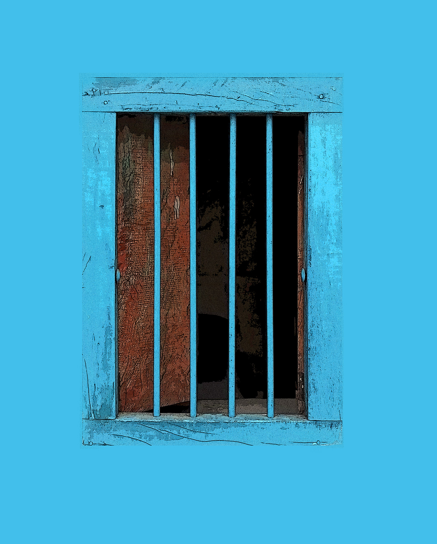
Hi ALL ! Thanks @jolly quest ! My Neon effect of Annecy's jail (France)
Gave +1 Creative Carma to VooDoo_Val
@lucid moss I've posted animated GIFs and seen MP4s
@velvet axle thanks for your commint . and yes the orange "O" is for a purpose
Gave +1 Creative Carma to ke be.net/_ke
Really quick one before I start on stats and spreadsheets
Here's a little Disney Homage
@bleak fossil Thanks for the helpful feedback! I appreciate your comments mucho!
Gave +1 Creative Carma to SamPetersonArt
@mighty vessel What is the purpose of this "O"? what's the relationship between that and the orange head? — Makes no sense to me.
@velvet axle just to make the colors relative to each others. if i left the orange head alone it wouldn't be that good looking. and because the red alone is so bored 😄
@fallow bough It can definitely be tricky since you have to find that sweet spot with how abstracted you want the image to get. I think some of the key elements of this effect are the thinner horizonal shifted segments in a few key areas. A general noise or horizontal line texture on the background, shifted colors, and how the image is still detailed and recognizable despite these effects. I think on your image having thinner shifted segments, a more textured background, and a little more clarity in the focal point/head region might help push that effect. Just some ideas. Nice work though Ken! I am definitely getting some of that glitch vibe from your colors and broken edges!
@coral flicker That color scheme works really well. I love how the blue is repeated throughout the image leading up to the head. Very cool mix between a sort of fashion magazine look and a digitized glitch look. I wonder if a less curved/more angular font may fit the image thematically a bit more. Either way, looks great, nice work!
@mighty vessel And thats why I would remove the orange "O" it's the wrong purpose. Having just one object like the head orange (in a different color) is a design principle, it stands out and grabs the viewers attention. I would keep #ironman red . — I think to make it more interesting you could change the text #ironman in something different as a title and remove the # and place text (#ironman) in orange smaller below the orange head + adding a vignette around the image and like I said paint in more glow from the lights on the wall.
Hi, here's my contribution for Day 6. I decided to create a poster and used channels to select the trees and create the overlap. I applied some noise to create some texture too. 😄
@mighty vessel To keep your idea of the orange O alife I would say put #Ironman or just Ironman alone in neon sign on the wall and replace the O with the head of ironman in Red or Orange depending on how you color the text
@velvet axle i will try your idea about changing the text and it's colors i just finished editing on this what do you think now ?
@coral stone Like it but my eyes gets pulled more into the trees/wood maybe darken the top part and add more light add the person/ground
Fell behind yesterday. But here is the glitch thing.
@mighty vessel I love it, my only suggestions would be to make #Iron Man 1 word instead of two if keeping hashtag
You're right @velvet axle . I didn't realize that. I'll make the adjustments. Thanks
Gave +1 Creative Carma to ke be.net/_ke
@tribal oak ok i will try this too
PSdaily Challenge - Day 3 - Poster
@mighty vessel Not the best example but you need to increase the glow like a gradient from the light source, it follows the form of the object. And don't color the complete wall, here only the center around the type is colorized
@velvet axle thanks man i will try it now 😀
Gave +1 Creative Carma to ke be.net/_ke
One tip, always look up reference photos of the real thing. Try recreate what you see, how does that (light) effects this (wall) etc. — See how the books and table also got some color, If you have more object in the scene keep in eye on those too.
@velvet axle I made a curves adjustment and refined with a brush with low flow. It made a huge difference.
Day#6

reminds me of a bleacher report design
The final design what do you think guys ?
Amazing @dark moth
@coral stone Thanks!
Day six finished 😃
@coral stone You can push it more. I would like to upload a gif or video what I did with your latest version but discord as limited MB size so 😂
@velvet axle in case you are watching the live. they liked the orange "O" 😂
hahaha
@velvet axle Trey to use save for web GIF in 256 colors and resize it in "Percent" it will reduce the size
Try*
Here 😄
That's super cool @autumn stump. Maybe you could change the background color to give more contrast to the text. I think dark green or blue might help 😄
I tried another one for day 5
@mighty vessel I didn't watched the live. 😁 Don't know why they like it, anyways 😝 @coral stone Thanks I will try this next time, it's weird, every time I try to reduce file size for gif/vids and reduce colors, etc. the file size gets bigger after 😂 I will try that percent thing next time.
Gave +1 Creative Carma to Mohamed Nasr
#📣creative-challenges #✂challenges-feedback #💎past-challenge I spent way too long on this, but I've never tried to draw/color/illustrate anything in Photoshop before this challenge! Any feedback is appreciated!!
😃
@fallow bough @kindred kernel You both have a lot of empty space.
@fallow bough add more text/design below the neon type or place it in the center or bigger across the bottom part of image over the legs of the two woman
@kindred kernel place "My pretty" below "I'll get you" und place it in the center of the empty space. Maybe you can add a glowing Frame around it near the edge of the image
@main talon place Robots like it is below the robot in the empty space across the page (don't touch the borders)
Day 06 Entry ; Neon Eerie, sort of 😉 I'm going to hear the theme music to the Twilight Zone all day
@main talon Quick but something like this, maybe...
Hi every body im ahmed from egypt and this my frist time to get in this chat ido the challange no 5
Day 6
Another day 5 creation 😀
@wet thistle Great. What title would you give that design? What story does it capture? — I think If you add an interesting title that tells a story it would bring it to the next level
Way behind on the daily creative. This is for day 2. C&C. "And Then She Rose..."
@velvet axle
Hi @velvet axle It was taken in Malaga during the Feria . I will add the text "Feria 2019". I have to think about a good font to use though. I was afraid it would be too busy.
@wet thistle find the right font that capture the mood, but keep it simple on the other side, otherwise it gets to busy and you can't read it. but even without text its great 👍
Day 5 Challenge
Challenge 6
Day 6 Image
Strange Irish Things
@quartz river ha. I see what you did there 😉 I think you could increase the glow even more! And I would increase the tracking (spacing between the letters)
@fallow bough That's a fantastic image! I like how you put the text behind her head. The selection looks clean, the logo is a lovely touch and the colors absolutely work! The green is also a great contrast 😃 Her hair still has some green fringe but I don't think that's a huge deal
Thanks Tim! I'll try that. I also thought it might be cool to make the text more triangular, but not sure how to do that
all in all I am very happy with your work @fallow bough !
@stuck oracle I like that the person is looking at the title, but the font you use is not "readable" — Its tricky with that background, but the effect is great, just type issue.
@upbeat laurel Nice composite, it looks very mysterious! I would blend the edges of the eye image a bit more. you can see where the image ends. you could use the eraser tool with a soft brush or you could create a layer mask and paint with a soft black brush to remove the hard edges.
@upbeat laurel and I would center the frame vertically 😉
@subtle wadi Is that one of your photos? The black and white plus the spotlight make it look super dramatic. The font is a great choice and I think you nailed the neon effect by mixing up the colors a bit. The text as a vivid glow to it and it nicely contrasts the otherwise black&white image. Love the vibrancy 😃 I would maybe move the text up a bit (you can just expand the image by adding black) to give it a bit more room above the dancers
@velvet axle Thank you for your edait its look very good
Gave +1 Creative Carma to ke be.net/_ke
My attempt at today's challenge
@magic moat @glacial path 😝 time the evil
@glacial path Thanks Tim. That is my photo. Yes. Thank you very much for your feedback
Gave +1 Creative Carma to evil
@upbeat laurel this image looks pretty creepy, I love it! I would only change that font for an older looking one. Possibly go for a darker text color too and lose the stroke. Think creepy!
@velvet axle oh look! my twin!
@glacial path twin? I thought its you waking up in morning sitting on your bed 😀 — @magic moat Nice Mood
shhhhh!
I don't wake up in the morning
blame @uncut ginkgo - Adobe Live made me a night owl 😛
#nightshift
@velvet axle 😜
@magic moat I like the color theme you've got going there! Green always works 😄 Just add some purple glow to the lines and increase the brightness of the green glow. Sorry for using the classic art director phrase, but make it pop 😉
@glacial path you are a robot 👍
@woven bane Mobest Thank you!!! Will work on the POP
@glacial path Thanks! (making sure you get your creative carma
@uncut ginkgo Thanks for the creative carma
#carmarama
@stuck oracle aha! I see Trajan Color! You don't see color fonts every day 😄
@stuck oracle The glitch effect is well executed and I like how she is looking at the title and how you've kept her face mostly intact.
@glacial path you are good, thats what I and photoshop found too 😀
@stuck oracle If you still have time (and the energy) you should totally play around with different glitch effect styles: mostly horizontal displacement or different colors
@novel escarp woah! this is awesome 😄 I'm a big fan of the texture on her cape and the lens flares over her eyes. Now is the time to add some bold typography to the poster 😃
Part photo, part painting, part DAZ Studio render, with some techniques from Val's videos.. Feedback?
@novel escarp by the way: the shading is spot on!
@glacial path Thanks. Did a bit more around the hair. Definitely a challenge to to blend the neon glow with the original images green cast.
Gave +1 Creative Carma to evil
Yeah, especially with the frizzy hair 😮
@glacial path Trying to work on that now.
@glacial path TYVM for comments. Much appreciated.

Hey @wet thistle Thank you for submitting your work 😃 Your submission looks very glitchy - well done! I think you could add a nice background. Gray certainly works but I think it deservers at least a texture 👍
Gave +1 Creative Carma to Carry
@timid pasture please try to export your work using the sRGB color space. otherwise the colors will look different in Discord
@glacial path Thank you tim about fonts i just update my windows and i dont have many fonts sorry i dont anderstand trajan color and glichy
Gave +1 Creative Carma to evil
Photoshop usually asks when you import non sRGB-images
@stuck oracle Trajan Color is the font you've used
@stuck oracle and glitchy just refers to the effect from the challenge
@timid pasture I think the colors really work well together. You could add a cyan color wash over the entire image or a cyan glow on the floor she's sitting on.
Oh😂 @glacial path my english not good thank you mr/tim
Gave +1 Creative Carma to evil
@glacial path Ah... so that's why the colors looked so muted... Thanks!
Gave +1 Creative Carma to evil
@stuck oracle no problem 😃
@upbeat laurel lovely!
Still trying to catch up. This is for Daily Challenge Day # 3. C&C Welcome.
Challenge 5
Added just a touch of grunge to the ship. This is so much fun! 😃
I popped a cyan layer over the top set to color dodge, and masked it, then painted on the mask to add the cyan glow on the rock. Also slightly lightened a couple areas. I set the opacity on the color dodge layer to about 40%. AND made sure it was Srgb... 😁
Looking good @timid pasture Loved how you have the glow going. All fits well together. Sweet!
@novel escarp Thank you! I had fun putting this together!
Gave +1 Creative Carma to bubbawny
Day 6 #PSDailyChallenge - An homage to my favorite haunted house story by Shirley Jackson. Image by David Mark on Pixabay
My 2nd Attempt
I'm a day late...but here it is...glitch carrots.
Glitch effect
PsDCC6 Text Effects. Here it is ... Demon Beach.
All glitched out
hi @glacial path @velvet axle Is this better 😀 ? I have added a Biznaga (flower symbol of Malaga) texture...
Here is another attempt with different type effects.
@wet thistle love it!
@wet thistle Awesome, placing the type in line with the glitch and the colors. great idea 👍
A work in progress
@blazing quail nicely done! Now you just need something in the lower half of the image! but you're 100% on the right track so far 😄
@upbeat laurel This is fantastic 😄 Well done
Yesterday entry
challenge 4
Challenge day 6
Wow @eager cape I loved the mood of your work
@coral stone Thank you!
Gave +1 Creative Carma to Valdair Leonardo
@eager cape Well done, the only thing I would try is to add more red light color to the walls/ground/tabel/chair. I don't think if there is a red light source that the ground color etc. on the objects is bright white. I'm not sure if you added the red at the wall in that tunnel but thats what I mean, add more of that.
@velvet axle thanks! I wanted to do that but thought it will be too much red color. I will try to refine it .
Gave +1 Creative Carma to ke be.net/_ke
@eager cape its like a gradient it fades out its not a strong color that you paint in. Imagine that the sign is the sun, everything the sun is touching gets a bit color.
i wasn't able to find time to submit today but can't wait for tomorrow's!
My Daily Challenge 4th Day and I did this my boyfriend father day. @jolly quest what you think?
I feel like I did battle with this one. Too much going on. Couldn't think of a creative, yet related title. But, here it is. I learned a lot.
PS Daily Challenge - Day 4 - Scify poster
@vagrant sorrel Nice job! Really liking the colors and textured background you got in this. Also nice composition with your shape placement. Very cool vibe from this one!

Behance
Ps Daily Challenge June '19 - Day 5 - Create an image with a 'Stranger Things' vibe
Here is the day 6, Title Effects 😃 Creativity is dead this week
@bleak fossil Thx for revising it was a lot of thinking work and balancing the colors.
Gave +1 Creative Carma to SamPetersonArt
@raven briar Very nice! Picking up new techniques, methods, and just generally getting some practice in is definitely what these challenges are great for. Looks good, really like that moody background picture. I think making those red glowy bars behind the text a bit smaller might help to make the image look less busy.
Thank you @bleak fossil . Always good insight
Gave +1 Creative Carma to SamPetersonArt
@jovial viper Really love the color gradation you have in the background great texture too. I think the bright orange stars around the astronaut really help to make him stand out as a focal point. One suggestion might be to make the text at the very top and bottom a little less bright so it doesn't draw so much attention and acts more as a secondary read. Nice work!
@eager cape Ooh, very cool that background image fits the theme really well. I almost feel like the center of the image near the desk could be a little bit brighter to balance out the values a bit more since the contrast at the top and bottom is so strong. Great mood!
@fleet pecan Great colors and textures with this one! I think compositionally it could help if you try to avoid putting big shapes right in the corners. I think you have some good visual hierarchy going on in terms of size of the shapes though I think maybe the astronaut could be a bit bigger. Overall it looks really cool, good job!
@uneven lark Great color scheme! Gives it a sort of vintage feel with those more faded colors. I really like how the red text color is repeated throughout the image as well. Gives it a nice cohesive look!
Still playing catch up but here is day 3 for the PS Daily Challenge
@bleak fossil thank you! Let me try
Gave +1 Creative Carma to SamPetersonArt
@blazing quail very nice your image definitely set the stage to have something cool down below for a sort of focal point. I definitely feel like the title fits the mood of the image well. I'll be interested to see how this develops, Nice job!
@blissful wolf Haha love the alien, really liking that font too, cool look. I think the size of the alien could even be a bit bigger to balance out the imagine be a stronger visual element! Nice work!
@light nebula Very nice beard! I like that strong red blue contrast and think it could be even cooler to repeat that blue down below. If you could edit the image so the reflection on the water extends down towards the bottom of the image that could be a really cool visual element to lead the eye and way to repeat the blue color throughout the image. Though as is it’s a pretty cool effect being behind the text as well. Nice work!
@errant depot I really like the way you handle the formatting of the white text though I wonder if it would be better suited somewhere else on the image. It seems a bit heavy where it is right now. I also think you could use a levels adjustment or a color Dodge layer or something to sort of pop out the silhouette from the background a bit more on the right side. It seems like if the edges of the image didn't fade off as much into black it may set the image in context a little bit better. I really like the concept you went forward this image. Very cool!
Thanks @SamPetersonArt ... Tomorrow I will adjust the alien size..
Day 5 done 😃
Maybe something more in this direction? Also, don't really need the white text i guess
Centred without fluff
Challenge 6, learned a lot about text and working in closely knit layers.
Challenge 6
@fleet pecan That's a pretty fun one. Loved the "Its a "Fun" Experience" text. I did notice that "Its" should be "It's". Should be a simple fix I think if you're still able to edit the text.
@graceful heron Love the use of the border and the text. Pretty spooky.
@bleak fossil Thanks much for the feedback. I didn't notice that thick redness on my file. I will take a look at that.
Gave +1 Creative Carma to SamPetersonArt
Here's my entries for day 2
And my entry for day 3
Felt like I'd do some sort of theme to celebrate Pride Month.
Bill & Ted's meets Stranger Things...
🤘
@upbeat laurel really interesting approach! I feel like this image has all the makings of a really creepy picture aside from the brightness of the image. Cool texture, creepy doll, creepy drawing etc. I think some sort of darkening multiply layer pass, or photo filter that darkens it down and cools down the colors could really set this into a spooky theme. Of course that's only if that's the direction you want to take it but that's definitely what I see when I look at it. Nice work!
Also great colors and contrast on the Psychic Reading image, works really well!
@wet thistle Really cool glitch effect! I like the way you added the distorted colors over the images well, it really adds to the effect. I do feel like the image could use a stronger focal point. Right now the contrast is pretty equal throughout the image. Maybe putting a gradient in the background to darken down the bottom a little bit would keep the top brighter and pull the eye towards the top of it more. This could easily be done with something like a multiply layer if you wanted to take it that direction. Well done!
@young karma Great work, you really got that retro poster vibe. From the textures, to the colors, to the font you used. It all definitely adds to that retro feel. it's kind of a small nitpick but I almost want to see a bit more brightness and contrast in the upper part of the Gundam. It could really give it a bit more pop and make it a stronger focal point. If you have it on its own layer this could be done by doing a subtle color Dodge pass over the upper part or even doing a levels adjustment and masking off the bottom part of the Gundam so it doesn't affect it. Really well done!
@vale merlin Nice job, you got some really interesting texture and glitch effects going on in this one. Just a couple thoughts.I think you could be nice to keep the head area of the robot a little bit more clear just to create a focal point at the top. I also feel like the edge of the robot and the edge of the text meet up in a sort of tangent and it makes that area feel a little bit crowded. I think one way to solve this and maybe balance out the image better would be to move the robot a little bit over to the right and make the text a little bit smaller. That may give the shapes a little bit of room to breathe. just some thoughts either way this is looking really cool and I like how you repeated the red throughout the image, it's working well!
@golden pebble Really like how you handled the fragmented glitch effect. I think if you made the blue and red segment less wide it may fit the glitch look a bit more and draw more attention to the center area of the figure. The face was handled very well too!
@past canopy Haha, Love the direction you took this in. I like the texture as well, fits everything together nicely. I’m not sure how the images were composited if they were, but the candle holders on the left and on the right above Bill’s head seem fairly high contrast compared to the rest of the image. They just draw a little more focus than it seems like they should. That could be easily adjusted by darkening them down a tad with a multiply layer or something similar which would fade them a bit more into the background. Just an idea, nice work!
@feral torrent Very nice use of gradients! I especially like the gradient around the face area. The color of the eyes acts as a really nice focal point as well. The texture on the character and the more blurred background gives a nice sense of depth as well! If I had any suggestion it might be that a thicker/bolder font for the top text might balance with the bottom text a little better. Great work 😄
Day 6 - Stranger Things Style
Now with added dream 😀
Thought I might try a animated gif
I have to admit, watching everyone else work their magic has been entertaining. But to actually participate and do a challenge like this is another! Notes: Ctrl+H or Cmd+H to hide selections. Ctrl+Shift+N or Cmd+Shift+N to create new layers.
Thanks for the feedback @bleak fossil , appreciate you taking the time to review.
Have re-attached 😃
Gave +1 Creative Carma to SamPetersonArt
I went in a bit of a different direction, but here's my Day 6
@abstract ridge Great If you would add some kind of light at the end of the hallway like a ceiling lamp above the door. — Or "open" the door and let a bright light shine through the door. Than put a silhouette of a person in the door frame in black casting a shadow into the hallway.
@indigo root Well done love it, great colors, nice texture and composition, but "Turbo" is not readable, maybe play around with that and find a better place for it, maybe in the bright orange sun, try out few other things. 👍
😃
Thanks @velvet axle, I'll have a play around with it and see what I can come up with 😊
Gave +1 Creative Carma to ke be.net/_ke
Thank you for your input @bleak fossil ! I'll see if I can work something out with the font for the top text.
Gave +1 Creative Carma to SamPetersonArt
Day 6

Had a few issues with the painting aspects; I rasterised the 'type' rather than the layer style which messed a few things up
Day 6, second time 😃
My humorisitc try on Day 6
Day 6 entry.
DCC #6 @jolly quest
Hi all, here is my Day 6 entry "Neon Text" and the images I used for this composition. The font I used is HT Neon from Adobe fonts.
here's my entry
Just finished. I'm not happy with it though. Oh well.
oops line didn't resize well
@feral torrent It's great How did you add that gradient ?
Just did day 5. I'm quite behind 😅
@noble glen Thank you so much!
As for the gradient, I just made a white fill layer, then applied a rainbow gradient overlay through the fx button under the layers tab. Then did a clipping mask over the body I colored in with grey. I set the rainbow layer to multiply.
Gave +1 Creative Carma to ram
I thought it might be helpful if I posted my settings for today!
EMBOSS
PATTERN
COLOR
Just in case you would like to do yours this way first, and then experiment on your own!
@past canopy Love that Excellent Things poster. Made me laugh.
@crystal aurora Very helpful! Thanks for posting the settings.
Gave +1 Creative Carma to DrPhil
@pine cypress My pleasure!
Day 6...love jumping spiders.
YESSSSSSSSSSS
Thank you very much. It is really helpful @jolly quest
Gave +1 Creative Carma to VooDoo_Val
Agreed!
Did a quick edit to lower the glow around the building. There are a few details that I didn't get to, and the SANS sign isn't glowing like I wanted. Just ran out of time. Also, shearing in Photoshop is more difficult than in Illustrator, and I suppose that since I did it in illustrator, Photoshop wouldn't select around the stroke, but the entire word. Couldn't get the same effect as on the "HOTEL COMIC". Any feed back would be appreciated.
@jolly quest Another great lesson! Thanks for the shout out 😊
Gave +1 Creative Carma to VooDoo_Val
@jolly quest I agree!... and very smart too. (best eyesight of invertebrates)
"Stranger Things" effect text. I really like these challenges. I wish I had more time to play around!!
@young karma NICE ! Which font did you use?
@noble glen Thank you! It's Benguiat from Adobe Fonts.
Gave +1 Creative Carma to ram
Still catching up. This is through Day 5. C&C Welcome
I got inspired by the movie poster challenge, here is one based on The Bad News Bears movie poster using my daughters team
@main talon Those look pretty awesome. Did you do the illustrations yourself?
No, the first one is the original poster and the 2nd one is the one I did, I ran a cartoon type filter on the team
Okay, nicely done though.
Voodooval teach me things! #PSdailychallenge
Day 7
@placid trout awesome work.
@noble glen thank you man
Gave +1 Creative Carma to ram
Forgot to add flares before
😃
Day 7 80s Text Challenge
just completed 6th challenge .
Behance
Daily Creative Challenge to build Photoshop skills in just 9 challenges | June 3 - June 14
Bizarre* @noble glen
PS Daily Challenge Day 4 - Space Poster... As sugested yesterdad, with a bigger alien...
Thanks @pine cypress for the feedback 😊
Gave +1 Creative Carma to Joj3D
Day 7 retrowave lettering
Just a quicky from the Daily Challenge. C&C Welcomed.
Today's challenge
@novel escarp Great. Put "who's following...." In white between "Stranger and danger" in the middle. — I'm not sure if you can move the person but, the scene is nice, well done but feels empty. Think the layout/composition needs some work.
@young karma Looks great, I would center the main title and scale it up a bit so that it is near to the ground, than you can add more red light on the ground, now its so subtle I first thought 'is there text?' Than zoomed in and 'OH' red-something or is it my eyes 😅.— you could also add red lights to some trees too
Added several different typeface variations and an explanation of the process on Behance

Behance
Ps Daily Challenges - Day 7 - Retrowave metalltic lettering in Photoshop
80's retro. Tubular, Dude. (gag me with a spoon)
@fierce umbra very Lisa Frank
@velvet axle how about that? Although I think I'll stick with the previous version. It seemed to me more creepy. 😃
Challenge 7. I guess it's not really retro. Maybe soft art deco? Liked having the blending settings, although I didn't seem to have the same textures so I used the Star Glow style for the center of the letters.
DAY 6 - As a protest against plastic pollution.
@lucid moss I see what you mean (had to look her up). Not my preferred palette. Having lived through the 80's fashion, I still shudder to think...😉
So many options....
@wet thistle Nice, I would center the type horizontally
@wet thistle and would swop them, last call at the top and main title in the water
@upbeat laurel Nicely done. I would increase the spacing between the letters a bit, so they're not touching 😃
@wet thistle Lovely glow effect and good idea with the ocean. the perspective is not quite right but I think it does get the message across. I would center the red text and make it bigger. also center the "last call"
@wet thistle Maybe you can even try different glow colors, like a more intense red 😃
Hi! I'm catching up ! Here's my entry for day 3. Obviously there's a lot room for improvement, but I really enjoyed the process so far 🙂
And my entry for day 4. I really had no inspiration to make up my own design, so for the sake of practise I decided to go along with VooDoo Val's design 😅
@graceful heron I like the cool background and the layer effects! I think you can add more contrast to the magenta shine. If you look at Val's version, it even has some black in it 😃
Hi everyone 😃 I used the 3D feature in Photoshop for today's challenge
@fringe thicket Nice shading and cool poster! I think the yellow and orange are a bit too much. together with the white teeth, they're fighting for the viewers attention. I think you could tone down the colors and maybe also move the upper text more to the top to better use the available space.
@coral stone now that's fancy!
Thanks @glacial path 😄
Gave +1 Creative Carma to evil
90s clubbin' retro
Where I live
I loved the style @high mesa
@coral stone - kind words, thanks.
Gave +1 Creative Carma to Valdair Leonardo
@coral stone - like the nice 3d work, the text needs to be bigger or crop the image right down, the adobe text is distracting the viewer away from the lush fonts
@high mesa hi im new to the daily challenge thing how do i get my challenge for today
I agree @high mesa, I couldn't find a free stock image that suits my idea, so I ended up with one from Adobe Stock 😂 I'll make the size adjustments using the rule of thirds. Thanks 😄
Gave +1 Creative Carma to Mykul
@ivory mason - click on the daily challenge under announcements
ok
@coral stone - just posted a note for 3d challenges, your work has really given me that 3d vibe
This one I learned from @lethal mural I'll look for the link 😄
@high mesa I shared the link in #🔥tips-and-tricks, it's a great tutorial and very easy to follow
Todays design challenge
@young karma I'd be really interested in how you masked out the sky without all the fringing that usually happens around the branches.. I saw a good tutorial over at Piximperfect where he used an interesting blur technique. Haven't tried it yet, though.
You really did a great job on that.
Hi Guys, here my entry Day #06 😎 @jolly quest
I like the background image and how it suits the type, creating a dark mood @young karma! Nice job 😃
Thanks @coral stone
Gave +1 Creative Carma to Valdair Leonardo
@glacial path Thanks for the feedback! I did some quick changes, made the teeth a bit more yellow/grey, tuned down saturation on the orange text and added a thin line.
Gave +1 Creative Carma to evil
Here's my glitch photo! First time, but I'm sure more glitch photos will follow.
And my go at neon glow letters (day 6)
PS Daily Challenge - Day 5 - Add an image filter
Daily creative challenge day 7
@bleak fossil thanks for the advice! I'll try it out!
Gave +1 Creative Carma to SamPetersonArt
Day 4 - Modern Sci-fi poster
Day 7
Day 7 - Guardian Image
PsDCC7 Retro - Hmm, thoughts, suggestions, improvements?
I went for the retro TRON today and re-created one of the original movie posters.
😃 🇦🇺
@tulip fern If this were a movie I would definitely watch it. Good and creepy!
@blissful wolf I like your Alien poster. Just some ideas: perhaps a slight stroke around "Aliens" to bring the word out some? It seems rather muted. And maybe, move the flare over so it aligns with the "i" in Aliens?
challenge 7
Hehehehe... I saw a post on FB and used it as inspiration.
I went for a little 80's lingo. Tried to make it totally rad, dudes.
Slowly catching up here. Here's my day 4 submission
This one is for you, Val... We know you have a propensity for the Dark Side... And...... Well, you can't get much darker than this... I hope you still respect me in the morning, because this isn't my fault. Dookoo made me do it. Really. And Grievous was with him - with that annoying laugh and disgusting cough... So there. 🤔
@timid pasture go to bed Rod☣
@latent lion 😂 😆 This is what happens when I get up too early and stay up too late....
@timid pasture Yeah. It's after 01:00 am in NYC. Whoops! Should be doing this on the chat
@latent lion I'm in Kansas City, so it's early here - only midnight.. LOL But yeah, i'm headed for sleepytime... ' Night all!
Thank you @cold cedar 😃
Gave +1 Creative Carma to ValentinePierce
@young karma Looking good! I like how the text gets a bit hotter in the middle. The background image fits nicely as well.
@astral turret Very cool! It could be nice to push the gradient light in the background a bit further into the black sky and even brighten up the floor plan a little bit. It could also be cool to get a little of that pink sunset in the middle of the text around that horizon line. Really nice work!
@quartz river Really liking those colors in that background texture! I think at a glance the values of the text in the background or a bit too similar and it makes it a little bit hard to read. Usually you want dark shapes on a light background or vice versa so I would try to make one of those elements darker overall while the other is lighter overall. I think maybe making the text more uniformly light with a smaller dark strip in the middle might help it read better overall in the way that Val did hers. Just an idea. Really like the concept of this one!
@high mesa You definitely got that 90's club vibe! I really like that metal shine on the letters. I think if you lighten up the background a little bit especially around the bottom of the text, it may make the text and out a little bit more strongly. No not too much because I think keeping it somewhat dark overall adds to that club atmosphere feel, but just a little bit more to strengthen the shapes. Well done!
@coral stone Ooh really cool! Some really interesting reflections going on with that. I like how you gave depth to the background too. I've heard about that feature but I've still never tried it myself, really cool! A tighter crop might give the text more of a standalone quality, right now it looks like there should be something above it, but it's cool to see the depth of the background.
Thx @bleak fossil
Gave +1 Creative Carma to SamPetersonArt
@fringe thicket awesome to see you knocking out multiple challenges! For day 3 I think it could help to keep a consistent color scheme with both sets of text. I think the brighter value of the orange is nice because it pops out a bit more than the purple, though it has a pretty different feel to it.
(Just saw your edit and the darker lower text definitely makes it look less out of place, nice job)
For the day 4 challengeI think it could be really cool to take that green light over the planet and make the center peak of it gradate to more of a brightish yellow and repeat that brighter yellow color up near the astronaut. Could be a cool little dynamic shift to draw the eye. Good job on these!
@upbeat laurel It’s always nice to see different design iterations. I agree with Tim’s advice, I think the letters look a little cramped together as is. Really like how you tried out a bunch of different effects. I really like the top one! Though I wonder if giving the background a cooler tone (maybe something shifted more towards a desaturated purple color) would help pop the text out more. Looking good!
@wet thistle Nice job Carry, liking the concept and thought behind it! Currently it doesn't quite read as plastic to me on first glance, perhaps compositing a plastic water bottle or something sticking out of the water might make that more clear and act as a secondary focal point? Well done!
@graceful heron I really like how you separated the test from the background! The texture, brightness, and colors all do a good job of popping it out. Really cool text effect, and I like how the background looks like it's behind frosted glass. Very cool 😄
@young karma The green contrasting with the read gives a very cool contrast and creepy vibe. Very Halloweeny to me. I like the larger text because it reads a bit better as a standalone title, but I like the previous version because it shows off a bit more of the bright part of the sky. Well done!
@timid pasture Wow, that is truly something. This is the type of evil that can only come from the dark side. Haha, well done Rod. I feel like this had to be done at some point. One suggestion would be to boost up the light in the face using a levels adjustment+mask or a dim color on a color dodge layer. Might make for a stronger focal point. Very nice XD
@young karma Cool textures you got going on this! It could be nice to see a bit more brightness in the center of the red behind the text to push the feeling of a glow effect a bit more. I also think extending the texture slightly further into the left might make the background seem a bit more cohesive as well. Either way it’s looking good, nice work!
@young karma Whoa, cool effect, it took me a second to realize it was the joker in the image. I kind of like how chaotic it is in that way, I also like how you kept his face a bit more intact compared to the rest of him. Makes for a nice focal point. I like the contrast of the text but I feel like it's a little too clean compared to everything else. Maybe a subtle texture or even a very minor glitch effect through some of the letters could kind of tied into the rest of the image. Very cool!
@raven briar Really cool gradient effects on the text, I really like that orange! If you wanted it to look more like a reflection I think softening the edges between the colors could sell that effect more. I think maybe pushing that text background glow to be brighter could also help separate the text from the background a bit more and really make it pop. Well done!
@feral torrent I really like that background figure and the under lighting effect he has on him, it works really well with the glow coming off the planet. I feel like this image could maybe use a little bit more value contrast. The white text in the bottom corner is definitely the most contrasting element but I feel like you could maybe bring that into the bottom of the figures face to balance out the image more. Maybe just a simple layers adjustment with a mask or a color dodge pass over the bottom part of his face. Nice work 😄
@light nebula Nice use of texture within the text! I feel like everything in this image is near the same darkish value. I’d try brightening the text up a few notches so it stands out more strongly against the background.
@fleet pecan Really liking the colors and geometric graphics you got going in this! currently I think the image is a bit bottom-heavy with all the shapes and elements going on down there. I think perhaps moving the text and triangle shape up a little bit and perhaps even cropping off the top a little bit more might help balance out the image. I also think keeping the text a bit more rigid and geometric rather than the bending warp that it currently has going on might help it match that geometric aesthetic of the rest of the image. Either way it's looking really cool and I like the vibe that you have going with this!
@past canopy Great job! Great use of colors and values to really capture that retro futuristic look. I do think the small text in the upper part of the image as well as at the very bottom could be brightened up to stand out better. I think you could make it completely white or at least a much lighter blue and have it be easier to read while still fitting in with the look of the rest of the image. Well done!
@cold cedar Nice! I really like the look of the text and the background that you got, has a really interesting futuristic feel. I do think that the whole image is a bit dark and I think maybe the text could be lightened up a bit. I think it would be a good opportunity to have a streak of light going through the top center of the image which would really add to that reflective feel and also make it pop out from the background more. Though I do like the whole dark night time feel of the image as is, so just something to push it a little more. Or even just pushing the light glow behind the text a little bit could maybe separate it from the background enough.
@late sparrow Well down Brownit! I like the skyline you put in the text, very cool! I think perhaps softening the top edge of the pink sky above the skyline might make it look more like a natural reflection of the city/sky. The hard edge make it look a bit more like a graphic on top of the text. Looking good though, I like those little circular star bursts in the corners!
@bleak fossil Thank you for the feedback 😃
Gave +1 Creative Carma to SamPetersonArt
@timid pasture Thank you 😃 I didn't mask out the trees, I used a few layers on top with blending modes, as shown by Voodoo_Val. And now I know how to enhance and use these old low resolution noisy photos... hahaha
Gave +1 Creative Carma to RodS
Thanks @bleak fossil I couldn't quite figure out what to do with it to make it pop. I will take another shot at it with your notes.
Gave +1 Creative Carma to SamPetersonArt
@bleak fossil thanks for giving your amazing feedback to everyone 😃
Gave +1 Creative Carma to SamPetersonArt
I'm a little behind, it's what happens when you're driving home while the stream is on, here's my day 5
Here's my day 6, The Goonies have been all over social media lately, such a cool film 😀
@bleak fossil Let me know if this works a little better. Also adjusted the flares for the brighter version. Thanks.
Gave +1 Creative Carma to SamPetersonArt
#Day7 Back to the Future
@bleak fossil once more, thank you kindly for taking the time to provide advice and guidance!
I made the image look more like a poster in scale (Daybill size).
Also, I changed the font colours as advised, and also changed the font style to look more like a retro/tech style.
😃 🇦🇺
Gave +1 Creative Carma to SamPetersonArt
@past canopy - DP is the man, spandex baby, awesome effort; only thing, the text unbalances it. Too much on the left; shift a bit more to the other side.
@bleak fossil - thanks for taking time to give fback; appreciate greatly. Your work is becoming much harder now, as the community grows and definitely develops. Some cool work on here now.
Gave +1 Creative Carma to SamPetersonArt
@high mesa LOL, thanks brother!!! The weight of the text was on the original poster, I have tried to re-create it...
https://www.amazon.com/Unknown-Tron-Movie-Poster-24x36/dp/B004BJ5LGE/ref=sr_1_2?keywords=tron+poster&qid=1560420066&s=gateway&sr=8-2
Gave +1 Creative Carma to Mykul
My Day 7 entry.
@past canopy - well I never, what a cool repro...well, my critique is aimed at whoever did the orginal. Dr Phil you have excelled!
@tulip fern Well done, like the colors on the wall, not sure if it comes from a light source behind the text or from the text itself. — What could you improve: If you would reflect the text/arrow on the ground it would push the text/arrow more into the room giving it more depth, now it feels like its just put on top of the image. — If you would push the text/arrow smaller back into the room than the light glow on the walls makes sense that it comes from the text, now the glow on the walls is behind the text and in the foreground (left/right from the text) its dark no light.
@tulip fern also the I guess "eye-shapes" feels wrong, something missing, add more to show that's a face or replace it with something that would make more sense or remove it. (or add an exit sign)
thanks for the feedback 😉 😉 @bleak fossil
Gave +1 Creative Carma to SamPetersonArt
@past canopy Great Design, like it, not much that I would change. just move everything more to the bottom, That the space below "enter its..." and above "Tron" are visually equal. I also would remove the dot behind summer and align the text left/right with "Tron", I also would center the light thats going up into the sky and move the horizon line down (what I also meant move everything down) or move it directly into the middle, moving that line up, now its feels off. And lastly find a better way of placing the little paragraph without moving one line over to the other side. — try out multiple version, where you also split the text up left right with visual hierarchy .— 😅 so just small little details.
Thanks @velvet axle ! I also felt it was a bit off, but I did not see anymore what that might be. So thanks for all the feedback and tips, now let's see how much of it I can implement. I sure will give it a try!
Gave +1 Creative Carma to ke be.net/_ke
Day 7 c+hallenge
Day 6 neon effect.
Just followed the basics on this one, enjoyed putting it together. Love the fact it is editable
@heavy blaze oooh! Shiny 😄 Love the grit texture - the flares are also prezzy cool but don't forget to blur the edges
@glacial path Thanks - I hadn't spotted that... updating in progress....
Gave +1 Creative Carma to evil
Edges blurred
Hi all, my day 5 challenge (glitch effect). As always your advice is welcome.
hello, this is my day 5 🙃
@young karma Great, Love it, awesome color mix+texture. — I just would remove the screws.
@velvet axle yes you're right, thanks 👍
Gave +1 Creative Carma to ke be.net/_ke
@young karma the subtle "JADIOR" Text is nice 👍 — Are you able to recreate the same effect with different images? Like if its a cover, the name, position of text is same but image needs to change quickly? (maybe also different colors?)
@heavy blaze love it!
@young karma Cool glitch effect! But I think you should leave at least some parts intact so the viewer knows what they're looking at 😃
They looking at a glitch of an owl @glacial path
or a fish-cat-owl-something 😝 @glacial path you are right to a certain percentage 😁 (Update: ...to 100%)
or a hawk 😉
@glacial path 🤦🏻 Ok 😀
@young karma Well done, Awesome, you could design a poster or magazine cover series, would make a nice project on behance, presenting it on mockups 👍 you always use great colors that work well together with the photograph (don't know if you also adjust colors on the photo itself..) You have an eye for colors 👍
@young karma I love the vibrant reds of this photo!
@young karma The woodgrain texture over her face is an interesting effect. It blurs the line between foreground and background - if you want that, great! If not, I would remove the texture over her face 😃
@velvet axle thank you 👍 yeah, great idea
Gave +1 Creative Carma to ke be.net/_ke
If you make a behance project, add context, why you did it, include the brief like make glitch effect and what you used it for etc.
@glacial path thank you for your review, the texture on her face was wanted, but I think it's great without too, it's different, I like it too. It's great to have advice, thanks
Gave +1 Creative Carma to evil
@young karma if you did it on purpose, keep it 😄
@bleak fossil Thank you for your feedback Sam! I'll see what I can work with to make face pop out more.
Gave +1 Creative Carma to SamPetersonArt
Not what was expected... but here's my entry
Thanks @velvet axle - Thanks @glacial path I centered the text, however I still think I need some more practice to make it nicer.. Thanks @bleak fossil I added a plastic bottle , good idea! I hope it is better now!
Gave +1 Creative Carma to SamPetersonArt
Did this real quick. Nothing special.
Here is my entry for today!
@jolly quest needs more cowbell (Kappa)
probably more of a newbie question... PNG or JPG is it a preference thing? I personally find less artifact added with PNG so i have a tendency to use it more....
@tribal oak yeah! sorta depends of preference plus how the file will actually be used, how large or small the restrictions are
for example
you can't save a JPG with a transparent background
so if you are using the image for a project that needs transparent elements, you will have to save as png
I'm gonna spend some time detailing my Items of Winterfell piece! I will post it soon. I'd like to experiment more with the weathered detail on the lion, make it look more believable
Thanks @jolly quest
Gave +1 Creative Carma to VooDoo_Val
No problem!
Sorry, I'm late. This is my try on the challenge of Day 7. Image buildings background from Pexels -Andre Furtado
Looks great @young karma!
UFFFFFFFF @young karma
@coral stone Thanks. @young karma Thanks, I Guess (I don't know what ufffff means) 🤔. But you gave me An 100, Thus it's surely means something good
Gave +1 Creative Carma to Valdair Leonardo
Changed the font 😉
hahahaaahahhaha That`s mean: AWESOMEEEEEEE BRO!!!!!! @young karma 😆
@young karma thanks again 😄
@wet thistle What should people read first, Last Call or Strangest People? (now if you squint your eyes "Last Call" is 1st read)
I made day 6 a little more pronounced. I hope this is better!
made a quick one at work 😈
@velvet axle I should make 'Last Call' smaller, is that what you mean?
Yes, depends if you want that people read it first or not 😀, guide the view.
Gave +1 Creative Carma to ke be.net/_ke
daily challenge. Chimichangas!
This is my entry for the retrowave style text. And some more practice on the making of the background. I'm so happy with these challenges! 😃
and this is what the background started from... (just some basic shapes in illustrator)
Hi everyone, here's the Game of Thrones' spin off! It'll have gargoyles instead of dragons 😂
Here is my entry for today 😃
😃
Hi @velvet axle ! Here is the updated version. It was a challenge in itself 😅 🤓 .
I even broadened the backwall and stairwell to give space to the sign. Thanks again for motivating me to go the extra mile! Now lets see what today's assignment entails.
Gave +1 Creative Carma to ke be.net/_ke
@tulip fern WoW 🤯 thats fantastic I love it. 👍 I only would remove this "reflection" of the arrow. Well done.
Thank you @noble glen 😃
Gave +1 Creative Carma to ram
I fiddled with my entry for today! Specifically the lion
Amazing @jolly quest
I alternated between Color Burn and Vivid Light blend modes for the metal textures and tried to line the metal scratches up with divots in the lion
think im gonna mess with he texture on the left side there a little bit
@jolly quest Awesome!! I learned a lot of new things. Thankyou.
no problem ram! Im so glad to hear you have enjoyed the challenges!
@jolly quest Yes I enjoyed a lot 😅 😇 Shukria
I dont know why is so luminous here... I made it much more darker
@somber coyote Maybe you can add a faint glow around the text and image? Or maybe lighten them up a bit to show more contrast. Overall, it looks pretty nice.
My background here is much more darker. This pop up the constrast. I dont know with is so lighten here...
There he is haha
Thank you @feral torrent
Gave +1 Creative Carma to Jordan《Avacnela》
@somber coyote Definitely more contrast now 👍
Making the background darker really helps it out too.
@jolly quest maybe if you put some drop shadow on the lion, it appears more realistc
@fallow bough Overall looks great and got a good laugh out of me. I would suggest using a bit more contrast between the text and the image, since "Pile" kind of blends in with the image.
@fallow bough Same thing as say @feral torrent I laugh a lot! But I can read the ''I''.
@feral torrent Agreed. Did much lighting work on background to make text pop more.. Need to do more
@feral torrent @somber coyote Better? Used Soft Light black/gold gradient to make text pop and pull the colors together.
Great neon effect in Enchanted Forest @blissful badge
@fallow bough That definitely helps it out! Nice job!
might be nice if I spelled it correctly!!! GAH
@fallow bough, its better!! Maybe a form problem with the "I"...
My final entry for today challenge, after some ajustments in letter and allign 😁
Here is my project for day 7.
Last try. Joke is getting stale.
and the oscar goes to...... @fallow bough jen 😆
@velvet axle Like you suggested. Opened up the door and added the silhouette of a person.
This is my attempt in the "Game of Thrones"- like challenge.
I had some much fun with this! Thanks @jolly quest. Look forward to any recommendations everyone. Oh, used the iguana since I may be the only person in the known universe who doesn't watch Game of Thrones.
Gave +1 Creative Carma to VooDoo_Val
Great job on the lizard's mask @cold cedar
I also liked the flares, it suits the image!
Day &: a bit late. I took the time to do this challenge twice: once in a hurry with lots of externals distractions (the gold) and one taking my time with no distractions (the red).
Taking my time with no distraction makes this one a better image. Besides, I like reds and oranges 😉
@forest aspen Love the Feathers one! Nice use of colors.
Completely different from what originally i had in my head
my Day 7 answer ( sorry for the" maison" ... it's meen house ... so stupid me)
WOW @scarlet nexus this is amazing! I loved the scratches on the type and how the dragon is in front of the text. And great job on the reflections! ❤
[ for your carma design again 😉 ] thanks @coral stone Amaizin! all the challenge makes me feel good!
Gave +1 Creative Carma to VooDoo_Val
and Thanks @jolly quest ( your live are awsome)
thanks@coral stone ( sorry the thanks don't work so again )
No problem 😄
@abstract ridge Well done 😀
@scarlet nexus Did you use a brush to make the fire?
@coral stone I use different png
Awesome!
@coral stone this kind ( direcly from my psd )
Trying to catch up.... this is my day 6 😁
@coral stone I borrowed it from this image ^^
Very nice!
Challenge 8. Thanks, Val, learned a lot more about text.
@graceful heron Lovely background texture and great color contrast 😃 I would move everything down a bit to even out the negative space. you could also scale up the image slightly to better use the canvas.
Thanks @glacial path good ideas, I might even shrink the background a bit, and I'm not totally pleased with the letters not standing out more, but maybe a screen on the background might help it?
Gave +1 Creative Carma to evil
@young karma Nice glow and water texture 😃 The reflection is also a great idea but I would slightly distort it for a more realistic effect (you can use the glitch effect from the previous challenge with less aggressive settings or you can just use the liquify filter). I wonder why you have used the arrow there, I would expect it to point somewhere.
Now it's closer.
Can I also pitch in? you can either use use the same edges so the top and bottom of the image have the same spacing or have less space on the bottom and more on the top to basically accentuate the triangular shape you built there with the image and text. Also adding some drop shadow effects on the font would give it a bit of weight to the text because it's lighter than the image and needs a bit of that imho. @graceful heron
@bleak fossil Thanks for the feedback! You're absolutely right about the colors in my day 3 poster. I kinda did that on purpose, but I probably went a bit over the top 😆
Will try out different colors for the glow in my day 4 poster!
Gave +1 Creative Carma to SamPetersonArt
Yay, I've almost catched up! Here's my day 7 entry. I spent a lot of time on the gradient. Wanted to use a fresh and soft color scheme, not too sweet, no too harsh. Hope I succeeded in that.
I did the background composite several years ago for the Photoshop challenge group Pixel Fight Club Continues It must have been shortly after the program "Games of Thrones" started airing on TV. I jazzed it up blended with color layers and some bling from Pixabay.
@graceful heron Make the edges of the drop shadow less.. uhmm.. subtle.. make it look like it's an actually a shadow made by a spotlight hitting the shape of the text. 😃
@glacial path this is a new version with your review, thank you
Gave +1 Creative Carma to evil
@vale merlin Well done, move it bit to the right, center it visually, there is more space on the right than on the left. 😀
or add some small text/symbol
Will do tanks!
@forest aspen I like the design, great texture, but the text bit hard to read. Any reason why you don't place it in the rectangle space below, to keep the classic feel also centered like you have it now.
@vale merlin 😅 yeah but why delete the other version, now my comment relates to nothing and people search for an image that don't exist 😂 😝
oops! Sorry will put up both versions.
@graceful heron Great design. I'm still waiting for the baby to crawl into the funnel. 😂
Day 5 - glitch effect. I've never attempted a glitch effect before but this was a lot of fun!
Catching up from yesterday - Day 7 entry.
Was going to do House of the Headless Chicken but thought this might be more appropriate
Day 7's Challenge was a real inspiration for me.