#✂challenges-feedback
1 messages · Page 20 of 1
Original. Masking took way too much time. Val's Level tip helped.
With True Grit Stained Comic Texture
@fallow bough nice work it really looks like it's been drawn by someone
@inner wing Nice effects try adding a texture to give it more vintage look
@young karma I think the one with white vignette is glamorous
@tawdry minnow your name is legendary
Day 01 PS Challenge June: Here is my take on Vintage. I found this in the yard the other afternoon and thought the colors were so neat, I brought it inside to take pictures of it. It's a sprig of Maple leaf seeds -- called helicopters around here.
Daily Challenge #1
Hello guys I am Ram from India I am a Design Student and new to photo editing.
Please review and give feedback 😃 https://www.behance.net/gallery/81157621/Photoshop-Daily-Creative-Challenge

Behance
Daily Creative ChallengeBuild your Photoshop skills in just 9 challenges | June 3 - June 14How does it work?Each day you'll receive a challenge.1 . Each day you'll receive a challenge.2 . Watch our daily live show to see how to get started and ask qu…
First Adobe Creative Challenge. Lot of fun...
@fallow bough awesome!
Hi I found 2 different robots, so want to have options for the future projects. What do you think?
@pine cypress I love your rooster, stellar!
Behance
Daily Creative ChallengeBuild your Photoshop skills in just 9 challenges | June 3 - June 14How does it work?Each day you'll receive a challenge.1 . Each day you'll receive a challenge.2 . Watch our daily live show to see how to get started and ask qu…
@gaunt basalt , Thank you! I've been wanting to use him for the subject of a challenge for a while now. This was the perfect one. 😃
Gave +1 Creative Carma to Cee
The third from the left 😛
Hmmm... after pic is still needing work... middle face is toooooo gray! 😁
@fast belfry ... I will just say, nope, for now... 😉
Thanks @coral stone
Gave +1 Creative Carma to Valdair Leonardo
My first daily challenge!
Please some feedback Its my first ever editing 😅
Very solid edits from everyone!
@untold jungle I AM a little weird... so I really like the sign overflowage thingie... but I can try something else too... 😂 😉
Hi, This is Suryansh and let's jump into this. I have clicked this picture at Gwalior city, India. This is my before(Left) and after(Right) edit. Feedbacks are highly appreciated.
#✂challenges-feedback #dailycreativechallenge #day01
@noble glen Great editing! I like the train texture so much, it looks so real!
Vintage Wall-E
I started with a Rockem Sockem robots stock photo, added halftone filter, and felt like it needed something more. Then I fell down a rabbit hole of half-tone pop-art. Yes, not exactly what Val asked for. 😃
font is Badaboom BB from https://www.blambot.com/font_badaboom.shtml
Comic Book Fonts and Custom Design by Blambot.com
took ages deciding between a pony or a werewolf...here's retro pony 😄
2nd AFTER PSdailychallenge 01
great work everybody! 😃 Thanks for sharing your work! If you're looking for feedback, try letting us know where you need guidance or help. It'll help start the conversation 👍
just a wildebeast
Vintage
original wildebeast
@uncut ginkgo I would appreciate whatever feedback you have to offer, I am pretty new and I don't really know where I should be looking to improve! Thanks!
Gave +1 Creative Carma to gus
@gaunt basalt awesome, happy to help and congrats on sharing your work 😃 I can tell you really grasped the concept of noise and clipping masks for this one. It is a skill that you can use going forward to many many different use cases. I really enjoy the image you shared, you added a nice amount of grain 👍
THANKS @uncut ginkgo... wow... 😀 I am surprised... I was thinking I may have gone overboard... again... thanks!
Gave +1 Creative Carma to gus
@uncut ginkgo quick question? Do you think I should try to eliminate the shadow from the grad cap?
hi @uncut ginkgo i would love feedback on my image up above - the one with the eyeballs and the rainbow background. does it feel vintage enough? thanks!
Gave +1 Creative Carma to gus
@gaunt basalt nono, I think the grad cap shadows can stay, If you're going to play with the lighting/shadows you might want to adjust the vignette/soft glow in the bottom left. It might be a little bit too strong 😃
Thanks @uncut ginkgo I will!
Gave +1 Creative Carma to gus
@lucid moss lovely work! I love the concept, colors, layers - it is all super fun. My only critique is that the eyeballs seem to stand out (in terms of image quality) compared to the rest, other than that, it's stellar!
@uncut ginkgo perfect thank you so much 😄
Gave +1 Creative Carma to gus
Hey Gus I left the noise quite strong as it almost looked like glitter, but now thinking I should adjust the opacity as it is perhaps a little too strong?
@velvet axle love it!
@lucid moss thanks 😝 If you want to see details open the original image
Gave +1 Creative Carma to erinwoody143
PSDailyChallenge - Flamingo before (my original photo)
Flamingo After
Second entry on today's vintage daily challenge - my photo - Zebra After
Before
good gob @eager cape
@jolly quest 1 day challange
@jolly quest That's a great name 😂
Daily Challenge #1 The Wife 😂
@eager cape ...it is a great way to learn Photoshop. For your first challenge you did a good job. The selection tool is difficult to use the first time. There are lots of tricks to use ...as I'm finding out myself. The mask added makes it look vintage!
Ah, short on time this week but here's the first part of the challenge, the vintage photo.
@fringe thicket I like the gradient background! The colors are a nice choice 😃 you should totally try more versions. maybe with a more posterized effect or with some harsher color grading 😃
@magic moat Thank you for submitting your work 👍 You've nailed the vintage poster effect! Just make sure to take your time with the selection. I believe a bit of the front left wheel is missing. 😉
Gave +1 Creative Carma to Niecy
@cold cedar that's a wild shot! Love the editing! Just make sure that you have at least some detail in the dark dress. it looks pretty black to me, with almost no detail left. 🤔
hello! the results of the first challenge below 😃
Before and after ...
@fierce umbra what a cute dog! and omg, you have picked a really difficult subject to cut out. Fur is notoriously difficult to cut out. have you tried out the select & refine tool?
😀
@glacial path Thank you, Tim. That's actually a photo of art installations after the storm of 2005. I do need to work on it more and will. Just short on time but love the challenges and wanted to get something in today.
Gave +1 Creative Carma to evil
@half mango this could also be a really cool pop-art poster. just put four of them together, change the color and make it more vibrant - and you're done! Of course it wouldn't make sense as a vintage poster... buuuuuuut who cares, right? 😛
@pastel inlet nice, nice. I think you could brighten it up a tad. the orange and the red is slightly too dark IMO 😃
@glacial path Thank you! I didn’t want to do too much. Kept it generic until we see how the rest of the week goes. And I’m sure I can vintage it up a bit 😆
Gave +1 Creative Carma to evil
@lunar mango thanks for sharing the before + after ^^. The last one doesn't quite fit in with the others (the brown is much darker and less saturated) but it works alone, without the other two images. Just go over this area again, you can still see the white background peeking through 😉
Gave +1 Creative Carma to AustinB
@glacial path I agree on the brown one. Didn't notice the white - Ill take another stab at it. As always, thanks for the feedback!! 😃
Gave +1 Creative Carma to evil
@lunar mango alright! feel free to ping me if you post the update 😃
@urban dock I like how you kept part of the wall. otherwise her pose wouldn't make sense. The gradient is also pretty cool. Feel free to try out more looks 😃
@glacial path thank you for the input! still playing around with everything as i'm completely new to the world of photography 😃
Gave +1 Creative Carma to evil
@bold valley if you pick the right image to edit, you're 50% there. and you have picked a great image 😄 the edit is also very good! Nicely done
@glacial path thanks for the feedback! I’ll definately make more versions tomirrow 🙂
Gave +1 Creative Carma to evil
awesome!
what is the hashtag we use for the creative challenge exactly?
@vocal wind I think it's PSDCC
@vocal wind PSdailychallenge
I found in Terry's live stream last month
But I think you can add more keywords too, so that helps other people finding your work 😃
@glacial path - after fixing the issue you identified, I noticed a lot more than that. Below a comparison of the original, problem and revision.
@mighty vessel @coral stone Thanks!!
Gave +1 Creative Carma to Mohamed Nasr
I tried a different image from my son's vape juice line just for the practice
PS Daily Creative Challenge 6-4-2019
what about this one?
PS Challenge - Day 1 - Foto Vintage
lightning it up a little bit¡
hey, i'm trying to post my images, but it keeps saying the size is too large. any help to reduce size?
@hazy zodiac I had that same problem! Open the photo in Bridge, Lightroom, or Photoshop and save them as a JPEG. I did bridge and just saved it in Bridge.
Has anyone else been having an issue w/ the Discord app for Windows?
@young karma Thanks for the tip!
Gave +1 Creative Carma to McGoldie
Starter Boombox.
Final Boombox. Any tips on how to get better precision selection. I know some of my edges are choppy.
Before image
After image, two best things converse & caffeine
PSDaily Creative Challenge Overview # Creating a Vintage image with a little imagination.
Before
After
@hazy zodiac Pen tool I would think. But it's soooo tedious! I try to avoid it. But because it is a box it would be a lot easier.
Final image which you can also see on Behance
https://www.behance.net/gallery/81124077/Photoshop-Daily-Creative-Challenge-June-3-14-2019
@jolly quest
Behance
This is my work for the Adobe Photoshop Daily Creative Challenge.Level up your photo editing skills in just 9 challenges.Thanks for visiting this project.
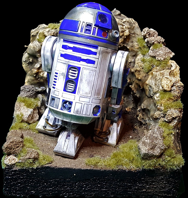
Original Image of R2D2
Isolated image of R2D2
Here comes a new PSDChallenge - Day 1
Creative Challenge #1
Hello All. Welcome back or glad to meet you. Here is day 1
ohhhhh very nice!!
@hazy zodiac Cool boombox.
@vagrant sorrel Love that scene.
@raven briar Beautiful distressing and love that olive color. @cold osprey Makes me want one!
Another vintage photo attempt. @glacial path I couldn't resolve the black because the original lacks detail so here's a new image.
@urban berry Very nice. Perhaps a little blurring around the hair or more masking to make it look more integrated into the background.
@cold osprey very nice!
The after, though I'm not really a fan of this result, but oh well, it is late and I need to get my daughter's stuff ready for school tomorrow.
The before.

Here is my submission of daily creative challenge - 4th june
Photoshop Daily Challenge: Day 1
frozen in time
I keep trying to have "Muostachio" stand out a bit more, I think I've managed that here in my third try. What say you?
Raided my son's toy box, found this dude, and applied the dust
Hi guys, my day 1 challenge. Comments are welcome.
Before
@high mesa I would remove a bit of the sky above, it brings the doll/man more to the foreground.
@young karma Hi, I like the original with the details. The after photo lost some details, and looks a bit blurry. If you bring back some details and lower the opacity of the texture, how does the photo look then?
@young karma - will have a look at that, thanks for the heads up 🙂
Gave +1 Creative Carma to Wendy
PS Daily Challenge Day 1 - Foto Vintage.... I've made some changes...
Gave +1 Creative Carma to Wendy
I am very new at Photoshop, so I welcome any feedback. Here is my before for my first Daily Challenge
Here is my after
PSDailyChallenge Day 1 - Foto Vintage - One more try
Hello, Here is my vintage photo. This is my first time doing any of these challenges, I'll take any comments you have!
Looks better @novel fog
Day 1.. Looks a bit more like a drawing than an aged photo? 😊
I worked on my files to add more interest and textures. What do you think?
Here is the second one
Composite I added aged photo look to. Original shot indoors.
Vintage looking Pinwheel for the 1st challenge
Day 1 challenge [Before]
After
Then i got carried away - same subject more overlays
The before image
Good to have you hosting, Val! I put the "cool" in Cthulhu today. Is this too busy? Was going for sci fi meets 8 bit.
I feel like I may have destroyed the vintage with too much gradient filter overlay
Hello, first time to post a challenge. Comments are welcome. The after and before of challenge day 1, vintage photo
PS Daily Challenge Day 1
Yeah! Illustration in Photoshop. I am so curios to see how this is done the @jolly quest way :). I hope to stick around for the live show.
@barren ember - watch the bottom of your image; you can crop so that the ends of the flowers are flush with the bottom edge
@young karma - awesome color grunge, could be a cd cover for a band
@young karma - reminds me of an old kodak family snap, cool
@high mesa thanks
Gave +1 Creative Carma to Mykul
Any feedback?
@jolly quest thank you for this most enlighting tutorial. Totally inspiring!!
Gave +1 Creative Carma to VooDoo_Val
Here is my entry!
@jolly quest great illustration! Great to learn this way! Thanks!
Gave +1 Creative Carma to VooDoo_Val
AMAZING!
Day 1 entry
Thanks for sharing @jolly quest. It was great to see you bring that character to life 😃 Now it is our turn 😬
Gave +1 Creative Carma to VooDoo_Val
@jolly quest - thanks learned a lot of new tricks!
Gave +1 Creative Carma to VooDoo_Val
@tulip fern @young karma Thanks so much folks!
Gave +1 Creative Carma to unicanl
YES! whoo hoo! thanks @jolly quest !
Gave +1 Creative Carma to VooDoo_Val
@jolly quest If only you posted this earlier haha. I just made a custom brush for it!
Here is my entry
Princess Leia In Progress
Things here have been nuts lately, so I'll have to play catch-up in a few days. In the meantime, here's one I did back in 2018: https://www.behance.net/gallery/80858427/Some-of-My-2D-Work

Behance
Some of my 2D artwork done with Photoshop, pencil sketches, and mixed media.
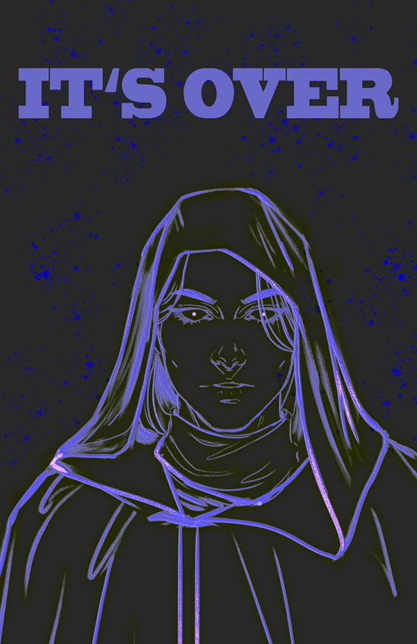
Sorry, Val.... She's one of the good guys... er, gals. Maybe I'll do Dookoo or Grievous next.... LOL
...
@eager barn The file might be really large. you can make the whole image smaller but going Image>Image Size
and then decrease the size there
Oh great thank you @jolly quest !
Gave +1 Creative Carma to VooDoo_Val
No problem!
hello everyone I did this one yesterday night took in total 7hrs I want it to work more on it but my husband told me to moved on 😂 to another illustration my kid and I are big fans of pokemon and this month its about shiny pokemons so my illustration is all about the pinks as you can see.
here is with the lines color.
NICEEE
and this liast one is with extra curls sorry but im a sucker for curls😅
thank you @jolly quest Im still working in my creative challenge but I wont make it in time for the review
Gave +1 Creative Carma to VooDoo_Val
It still will not send
@wicked nexus That's totally fine! I can still give you feedback here in discord!
Hmmm
ahhhh I am kind of stressing about this
post it on Behance and post the behance link here
Oh great idea hehe
come on @eager barn you can do it. 😉
@eager barn YESSSSSSSSSSSSSSSSSSSSSSSSSSSSSSSSS
I tried to sneak
Also used @jolly quest 's brush!
Awesome!!
Still in progress
nice! @fallow bough
My Stab at Illustrations😃
Here is mine... down and dirty. May work on details later when more time is available for me
My Photoshop froze up - work in progress...
The Colored Version. Done all with a mouse, though I shouldn't have. I simply wanted to see if I still could. No more now. Wrist hurts. Feedback on the coloring would be appreciated as I usually don't use Photoshop, but Illustrator. So it might be a bit amateurish.
Original sketch done with a cheap crayon.
@south valley Very nice!
@south valley This is great!
@jolly quest Her chin is off. Odd I mean to say. Well, oh well. I'm more of a flat designer anyhow.
Recent one 😄
If I had to choose something to crit, I would say the blacks are very harsh. BUT that could be a style choice or due to the fact that you are not using your preferred tools
So not something you HAVE to change
I like it!
@prime haven Amazing!
This is my first time join this! It's 2.24am here XD
@prime haven wow that’s awesome!
@prime haven noice.
Thanks!!!!!
@jolly quest I simply highlighted the red linework and painted over with in black. Any better way?
@prime haven do you do client work?
@south valley Lots of ways to approach it! You could also try doing having the lines on their own layer above - hold Ctrl/Cmd while clicking the layer image in the layer panel to select the lines - the paint the lines a different color in some places
that would allow you to have harsh blacks over darker parts of the painting and then make them perhaps a darker skin tone over the face
just an idea though!
@fast belfry Yes I did. But this illustration just created for fun 😃
@eager barn Yes!! Great work! That's the trick to painting lightsabers! they are actually white and glow the color they are
haha yeh I forgot about that detail!! @jolly quest
@eager barn, I usually save as JPG and make the quality 5 or so when posting online. Unless I want a higher resolution.
first time doing something like this here as well, focused on the face so far, but i was lucky and had a wacom laying around
Great job @pastel inlet ! Nice use of layers and brushes, keep going and see how far you can take it 😃 - especially in terms of cleaning up lines
Fun, new techniques. Interesting.
nice textures @bold valley !
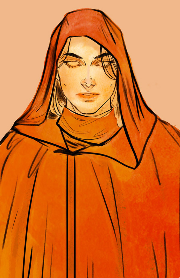
Chiss Spy 😶
@compact minnow Yesss!! Shout out to the Chiss Ascendancy!
@sturdy mural Loving the texture in there! Make the cloak look awesome!
Stab 2😃
Hello guys, I also tried one! 😊
@jolly quest Hmm... since I drew the original with a crayon, there are a slew of 'artifacts' that I didn't erase. Perhaps had I it might have looked different. Or perhaps I should have just redrawn the linework. Well, here is an edit. Any better.
Nice! Already that really opens up the eyes!
Behance
Daily Creative Challenge to build Photoshop skills in just 9 challenges | June 3 - June 14
Im not a digital painter by any means but I gave it a try
I mostly struggled with the values in the face
@ancient spindle Cool, maybe try some more vivid colors in the face (y)
@noble glen The values in the skin are really good but I think the shirt is a bit a flat
Here is what I like to paint, very old BW work 😄
I've been doing some Vintage photo refurbishments. It might count to what we are doing here, a little different technique. I like what @jolly quest talked about today. Will definetly use in the future
yeah! So you colored it like I color my paintings? That's great!!
Not this one. I will be using your technique for background work. 😃 The use of textures and colors I didn't understand until today.
Thank you!
@jolly quest I imported the brush you provided but it doesn't seem to have the same noise or opacity as yours in the video. I don't have a tablet/stylus...just a good ole mouse. Not sure if your hand pressure is the difference? I've never done digital painting before. 🤓 This is fun though!
@somber pond Oh! Yes much of the texture comes from the pen pressure with a stylus.
If you would like to find a similar texture, you can try adding a noise texture image in , do a clipping mask and apply a blending mode!
The texture image I set for the brush itself is just a noise texture!
I am not that good of a painter XD but I think i did my best
i am still going with my iron man theme for this challenge .
My full challenge project :
https://www.behance.net/gallery/81112971/Photoshop-Daily-Creative-Challenge-June-2019

Behance
Here I am sharing my submissions for the photoshop daily Challenge from adobe live for the second time this year.
Day 2 challenge entry. Used multiple layers of color, textures and blending, and a background picture from Nasa's archives. 😉
@somber pond OR you can go Filter>Noise and fiddle around in there
@north arrow Nice!!
Okay awesome!! Thank you so much for pro-tips! Your work is stunning!
I left you some notes above too, Sarah
@jolly quest Thank you! 😄 That was a fun challenge.
Gave +1 Creative Carma to VooDoo_Val
@mighty vessel Very nice!!
todays effort
Here it is 😃 Thank you
@light nebula Nice! loving those textures!
Thank you @jolly quest
Gave +1 Creative Carma to VooDoo_Val
Day 2 Final. (Note that this is not my line art.)
My try For the challenge of today
@jolly quest Thanks. Not happy with face though. Going to rework that part.
Gave +1 Creative Carma to VooDoo_Val
@kindred kernel Another interesting take! Can I ask, is the red meant to be glowing? or is it meant to be the colors of the skin? If glowing, I would say try and make the things around it, like the hood, glow too! If its the color of the face, I suggest adding in some shadows like I did in the stream to give it a bit more depth!
@jolly quest Thanks
Gave +1 Creative Carma to VooDoo_Val
@fallow bough What don't you like about it?
@crystal aurora Would like to get a more realistic look to it. I just used shadows. I think adding highlights will help.
Day 2 - Not sure about this one...maybe a little bit too much with that cat face.... I think I will start again
Great Camoflage 😃
I added some more highlights and textures to it . I think it's way better now . Any feedback ?
the steps
Yusuf Gatewood from Good Omens
I was already working on the linework, but the colouring tips were really helpful!
All done with mouse. I can't see if reds have worked (colour blind!)
Update😃
@fierce pendant May I suggest painting in a different color, then once you see the contrast, change to red using the color balance using adjustment layer 😃
or
just use other colours
no need to force yourself to use reds
use whatever you are comfortable with
Vintage Hero - PSD CHALLENGE 1
one monastic uphill struggle . I'm definitely no illustrator and I think it shows with the shading, but definitely a great learning curve - wish I could give it more time! Feel free to let me know how I could have got it to be better...
Thanks for the colour tips - especially using diff then change after toning - I hadn't thought of that!
Thoughts?
Day 2...
Day 2
Hi guys, this is my first time doing some painting in photoshop. Please let me know what you think 😄
@sly grove great job and share for sharing! I actually really enjoy how you made the background dark against a lighter foreground. I'm sure if you keep playing with these techniques you'll improve very quickly 😃
@prisma hemlock Nicely done! Strong contrast and fun concept. I'd love to see you play with the background a little bit more + also adjust the shadows in places like near the collar or under the chin 👍
@wet thistle I love the idea of using images as textures below the line art. I think you should totally add some lighting and shadows to the textures. It looks rather flat right now 😃
@young karma bravo!! Very impresive, I love the cloaked shadow vibe + color choices. @fast moth nice work! I like the arid desert texture on the cloak.
@coral stone bravo! Nice color choices, I'd encourage you to keep working on the eyes so they feel more part of the subjects face than the background 😃
Thanks @uncut ginkgo I'll work on that 😄
Gave +1 Creative Carma to gus
@mighty vessel It's always fascinating to see the process behind the art. When you upload it to your Behance portfolio, you should absolutely include those steps. Maybe even write a few lines about your workflow. 👍 The coloring, shading and line art is very clean and well-rounded. I think you can even go with more specular highlights. (I assume the mask is made out of metal) 😃
@uncut kayak That's just lovely! The shading is on point and the warm skin tones against the cold background really do pop! I think you can darken the shadows on his neck a bit more. They look a bit desaturated/grey-ish. But that's just a minor detail 😉 Well done!
@glacial path I already added the steps to my behance project. I will try adding more specular highlights like what you said and yes the mask is made out of metal. Thanks for the feedback 😃
Gave +1 Creative Carma to evil
@mighty vessel awesome! feel free to ping me if you post an updated version 😃
@mighty vessel if you need some inspiration, check out this video by Jazza https://www.youtube.com/watch?v=W6EBrw19Y9o

Download the reference files: http://www.newgrounds.com/dump/item/97e945c017ca939961a105af2e9f3a5f Check out Illustration Overdose: http://www.youtube.com/wa...
@glacial path Thanks i will watch it 😃
@uncut ginkgo thankyou ☺️ I think I might try again with the shading at the weekend when I have more time 😀
Illustration PS daily creative challenge #02
@gaunt basalt nice start, Cee! Thanks for sharing. I'd encourage you to play around with more dark colors/shadows to bring out contrast (folds, background, shadows). Right now the values live in a similar range, bringing in some darker darks and brighter brights will really take it up a notch!
This was truly a learning experience... first time doing an illustration like this... learned a lot... thanks @jolly quest
Gave +1 Creative Carma to VooDoo_Val
I will @uncut ginkgo it was really a learning experience for certain. Thanks for the tips!
@fierce pendant You've put the shading at the correct spot, now you should blend them more together 😃
you could also try adding some highlights to the clothing. Start by picking a direction from where the light should shine from and brighten up those areas, which would be illuminated by said light source.
Day 2 of VooDoo Val's challenge.
This is my day 2, very first time for this type of exercise 😅
@normal pebble oh that's lovely! I like the "frozen"-look 😄 Now you should add some shading to her face and the cape. Just like @young karma did. 😃
if you like, you can also add a background image to replace the solid gray color
Day 2
@young karma Nice one! The shading is subtle, but it works! I think you could add some slight color variation to her face, right now the skin tones are pretty much one hue (apart from the lips). I like the shading on her cape. If you make the shadows even darker, you could achieve a more dramatic effect and that could be a killer combo with the awesome background 😃
@wispy compass ooooh I like the green on her face and the blue-ish highlights in her eyes! Well done. 👍
@glacial path ...this was more difficult than it looked...thanks!
@glacial path Thank you 😀 I'm going to try again with your advices 👍
Gave +1 Creative Carma to evil
A work in progress... a bit of change here and there😀
@gaunt basalt I like the shading of her face and the cape! This shape looks a bit off though - what do you think?
@glacial path oh for certain! It will continue to be a project for me for a while... a GREAT learning project... so will continue to post as I make more progress! Thanks for the tips!
Gave +1 Creative Carma to evil
Here's my update
Here it is @crystal aurora. Clearly not an illustrator but awesome to get to try this. All suggestions welcome.
Here we go
I wish I had more time to play with this! I could do this all night!😜
Here is my entry for PS daily challenge day 2. Learned so many things today...Thank you @jolly quest !
hello
hey peeps, made this drawing for an environment concept for a 2d side scroller brawler game...any feedback is appreciated...
Daily Challenge #1 ¯_(ツ)_/¯
Just a UX Design student trying to learn Photoshop! Let me know what you think!
Day 2! Fun Stuff
I loved the background @late sparrow ❤
Challenge Day 2
This is day 2 of the photoshop challenge for June 4th-14th. Any feedback?
Novice to Photoshop, first time posting anything...actually I'm just hoping it works! Day 1 challenge
Not my strongest skill set .. but it’s all about the learning, right?
@coral stone Thanks! 😃
Gave +1 Creative Carma to Valdair Leonardo
day 1. duck
Create an Illustration
Day 2 - Illustration
Time for bed, but this is where I am so far with the Day 2 challenge. Thoughts?
Usually I take photo's and edit them, so this was very much outside my comfort zone.
First time doing anything like this, and took me ages, but was a ton of fun and learnt a lot.
Thanks @jolly quest for teaching us! 😃
Day 2 - Illustration
Another try at coloring line art.
My effort with a mouse
The eyes ❤
Wow that is amazing @hidden yacht ! I really like how the upper part of the image seems like being cut out and pasted on top of the dark red background and the lower part is drawn on the dark red background. It makes it special in my opinion. Thanks for sharing!
Gave +1 Creative Carma to Vidhi
This was fun but :). The first time I ever made a digital illustration. As you can see I used @jolly quest her line art as a template (I can not draw without having an example). The most challenging for me was to get used to use the Intuos pen, that was much harder than anyone else makes it seem. Maybe because I am so used to using my mouse right-handed for anything on the pc while I am actually left-handed. So I had to use the pen left-handed. I will keep on practicing 😉
Challenge #2
Day 2... loved it, battled a bit with shading on face (only touchpad)
https://www.behance.net/gallery/81227121/Photoshop-Daily-Creative-Challenge Hello, this is my first try 😄

@tulip fern two tips for using a pen tablet for the first time: a) do warm ups before you start drawing to get used to the feel of the pen and the way the brush you're using acts, circles and parallel wiggles and things like that; and b) look inside your pen holder and you'll find a bunch of spare nibs. The white ones are paper-texture, which can give you a much better sense of feedback as you draw.
Thank you for the tips @uncut kayak ! Have a nice day 😃
Gave +1 Creative Carma to trixibelle
The nibs are like the best kept secret in Wacom 😄
What Do You Think??
@uncut kayak I am shook. NEVER knew about the nibs! Thanks so much!!
Gave +1 Creative Carma to trixibelle
outside my wheelhouse but a start...
Would much appreciate the feedback))
I used my own drawing from the last Inktober. She just lay around too long. Like many of my sketches, I often do not have the patience to paint them. What do you think to mine?🙃
@zenith osprey really nice! i'd maybe try and experiment with blending the colours together a bit more but it's a great drawing and kudos for using your own stuff 😃
Wow, some amazing work by the group; first time of having a go at doing this. Tried both methods of coloring and attempted my own sketch. Massively out of my comfort zone, but learned loads.
another frescoe
@zenith osprey - I see you do Inktober, great way to learn inkwork.
@past canopy - great work with the coloring, can't wait to see how you apply it. You did some uber cool work last DCC
@young karma - thanks for the props
Gave +1 Creative Carma to latelierlumineux
@young karma I love the warm colors and the stencil-like flowers :D. You did a great job with the lighting of her face. However, the eyes are a bit too dark and too sharp, while her cape is pretty soft. I would soften and brighten them up a bit 😃
thank you very much for the feed back. Oops, did'nt save my PSD ...
Submission ! Feel free for feedback and mention the challenge number . I need to know more about brush settings. Visit behance- https://www.behance.net/gallery/81222327/Photoshop-Daily-Creative-Challenge
@high mesa hey that's super cool! I love the shading on his face in version 2 but I prefer the colors of version one. You should totally go with a more contrasty shading, especially around the jacket in version 2.
@tender mantle thanks for sharing the behance link, but you have to publish it first. you are sharing the private editor link 😉
Gave +1 Creative Carma to GridPen
@tender mantle How did you achieve this texture? Kyle Webster brushes? I'm a big fan of your warm colors and subtle textures. Your shading is very subtle around the lower half of the image. I think you could add some highlights to the cape, like you did on her face 😃
@glacial path - Hey Tim, thx for the feedback; the colours in version 2 were partly derived from blending modes, but I get what you mean. vers 1 sits far better on the eyes
Gave +1 Creative Carma to evil
@high mesa ah I see! yeah, blending modes are an essential part of digital painting 😄
@zenith osprey I like how you kept the painting mostly black/white with a hint of green, capturing the spirit of inktober. Here is what you could improve: the shadows are a bit... binary (is that even the right word 😛 ) - they are either at 100% opacity or 0%. What you're missing are the shades inbetween. Try to blend the lights and darks to create a gradient. You're using a great brush with lovely textured edges, so blending should be a breeze 😄 . Feel free to ping me, if you post an updated version
Day 1 submission, it's from a program from the 80's here in the UK called Metal Mickey
Day 2 submission, I really can't draw, but thanks to @jolly quest 's line drawing, even I can fill it with colour and an image of some mountains in a desert. (Looks like Tatooine :))
Gave +1 Creative Carma to VooDoo_Val
@glacial path just fix the link lol. I use some of photoshop defaults brushes and Kyle special effect all you catch 😉
This is my daily challenge Day #2 . Inspired by Akatsuki clan from Naruto. What do you think about it?
@tulip fern I'm just learning the pen too. I am accustomed to a trackpad/mouse. Now I am using the trackpad/mouse and the pen. I call it the Daily Double Challenge. It does gets better.
lookx great
10/10 would join the dark side again

challenge 2
Thanks for the brush @jolly quest
Gave +1 Creative Carma to VooDoo_Val
@magic rampart Excellent!
@noble glen My pleasure! Enjoy!
@tulip fern Great job! I love that you made the illustration your own! Don't feel down about the stylus feeling uncomfortable. I actually took a lot of years before I felt comfortable with it. As time goes on, your strokes will become smoother and confident. Just takes time and practice!
@past canopy Thanks for participating! Love what you have done!
Gave +1 Creative Carma to DrPhil
Nice work @eager cape Well done!
@young karma Nice! Love the colors and the space texture in the background! I do notice that the illustration is much thinner than before. Is that intentional or can I assist with some resizing tips?
Still working on lesson from yesterday... getting more content with where it is heading... takes some time but learning!!!
Will have to watch Lesson 3... missed the live while working on this... then head forward! Have fun... lots of fun! Thanks @jolly quest 😀
Gave +1 Creative Carma to VooDoo_Val
@gaunt basalt Loving it!
Thanks @jolly quest it is evolving as I learn... will continue until I am happy with it! Thanks for the great lessons!
Gave +1 Creative Carma to VooDoo_Val
@jolly quest Thank you 😀
Gave +1 Creative Carma to VooDoo_Val
First effort - would appreciate any feedback
Ohhhh nice!! @timid spade
Love all the colors you put in the eyes
I think the only thing that really sticks out to me off the bat is I'd love to see you implement some shading in the cloak also
Bit this looks awesome!
@jolly quest thanks! very helpful!
Gave +1 Creative Carma to VooDoo_Val
challenge for 2day
Thanks val
@hidden yacht very nicely done!
FYI! If somebody gives you feedback or advice you can either say 'thanks @username' to give them 1 creative carma point OR you can type -giverep @username and it does the same thing. There is a 3 minute cooldown on giving rep, so use it wisely
These points are just for fun, but a nice way to show appreciation and give community reputation 👍
Great work @hidden yacht
Thanks jordan
is it acceptable to make a sci fi poster without using yesterday's art file?
@lucid moss totally!
@uncut ginkgo Thanks for the explanation. I was wondering how it worked.
Gave +1 Creative Carma to gus
you're welcome! 😃
@lucid moss of course, you are welcome to make the poster however you want 😃
thanks @sterile bane and @uncut ginkgo
Gave +1 Creative Carma to gus
This is my try for today. I had to do it quick because here, in Belgium, it's time to make the supper for the hungry family.
@jolly quest I used both lesson pieces!
@half mango dont recommend warping the text like that, makes it slightly harder to read
and placing the text so close to the edge might be bad for certain applications
i recommend putting a bit of a safety margin, so text isnt so close to the edge
also, might want to reposition the U in DRUID, if you zoom out or look at it from afar, it wont look like a U but like two I
@opal slate .. Thanks for the feedback. Warping text was part of the lesson today. I’ll agree to disagree on the “U” 😉
Gave +1 Creative Carma to Imaginary Kuroe
*shrugs*
your call
@half mango at the very least make the warp the same, bedtime and druid arent aligned
the E looks like its going to fall and crash onto the U
quick poster
😃
hello,
My entry for todays challenge, it was fun to do
Hello. I set up chat for the first time. I look from Japan. Here is 3 am.
Feed back guys 😅
Behance
Daily Creative Challenge to build Photoshop skills in just 9 challenges | June 3 - June 14
Just threw this together.
Comic Book Cover. In progress. Need to work on light-dark balance
Day 3
@fallow bough - why is it forbidden Ken, cyborgs have needs - poster looking good, the text which is decorative, can't be read easily. Rest though is cool.
Day 3
Here's my attempt at the latest challenge! That blue on the top of the helmet and sight is bugging me, but I can't seem to be able to fix it. That's me in the picture!
a quick one i made at work, shhh... would love some feedback 😃
Done! Let me know your feedback.
@rancid basin Nice use of coloring
@lucid moss That's a fun one, and not bad for whipping one out quickly.
@feral torrent thank you!
Gave +1 Creative Carma to Jordan《Avacnela》
50s Style Comic Book Cover
Went through my Mardi Gras photo collection since Mardi Gras is "alien" to visitors to New Orleans. Used liquify to alter the smile of the man used in yesterday's challenge. Let me know how I can improve it.
My poster challenge.
I worked on challenge 2 today. It was my first time doing anything with shading and digital illustrations. What do you think? 😅
Robot Poster
Forgot the border.
My poster for the day 3 challenge. Used my fractal pic for the background and my picture of Galena for the foreground street. This was fun. 😄
@coral stone Nice touch with the clips and hanging it.
I changed the color the shoes. Any other feedback would be appreciated. Cheers.
@north arrow that's great looking. I'd make the upper text smaller and away from the borders. Just to keep it breathing
I'd also add some kind of orange light on the city image
@south valley Is your goal to make the character less emphasized or the text?
Beware their lazer eyes!
@untold jungle The character is secondary to the text.
@south valley Okay well regardless, I would either move the character more left or the text smaller and right
it's very squeezed at the moment
'@errant depot the from the past could definetely be a sans serif font because that is not readable
and I like the text on both sides of the lazer, they are not readable but if looked as shapes, they look nice
I'd maybe even go as crazy as make it completely unreadable
@untold jungle Wait, but what regardless? Shrink the character then, I suppose.
Though there is something to be said about jammed compositions.
@south valley noo, I don't think you should shrink it. It is good in size. I'd maybe have a background that has a wall and all of that text would be graffiti on top of it
Thank you @untold jungle I will play around with that and see what I can come up with. 😃
Gave +1 Creative Carma to Actionom
@untold jungle Or a simply bubble line reaching out to the text as she is using her phone... hard to tell from such a sketchy drawing, I know.
Ah, yes! I see it disappears a bit at a distance, gonna do some tweaking 😀 Thanks guys!
@south valley yes that can work too
@gaunt forge Perhaps you could bring the text out more and lighten the background behind the robot a tad.
#✂challenges-feedback I had so much fun with this challenge. Thank you @jolly quest. I'm learning so much!! 😍
Thank you @cold cedar 😄
Gave +1 Creative Carma to ValentinePierce
Robots
Original
After, more vintage?
I'm getting a late start. This is the Day 1 Vintage Challenge. I guess a dinosaur was already vintage, but this was a great challenge for learning about the filters, textures and blending. Thanks, Val!
@graceful heron I think you should redo that. This dinosaur has lost so much color information
and the cutout is also a bit off
I'd make the "hair" bigger to look like he's from the 80s
and add the dinosaur a pair of crocs and a waist bag
hahahahah
the background could be as the dinosaur attended metallica's enter the sandman tour in 1991 in Moscow
I think that would be just a perfect image and I'd even pay to have one poster like that
Here's my poster folks!
Thanks @cold cedar I just added a new word to my dictionary "Daily Double Challenge" 😃
Gave +1 Creative Carma to ValentinePierce
Thanks @nimble shard
Gave +1 Creative Carma to YAGPDB.xyz
hahahah
giving the bot some ccccccarma
@fleet pecan I love the idea but I feel like the "welcome message" could be even more secretive. and maybe in red color with opacity down quite a bit
maybe even a blood dripped font style!!
Day2 with my lady Richelieu 😉
Poster Challenge
creative challange 3
-giverep @high mesa thanks for the encouragement! Great to see you back with your awesome work.
Gave +1 Creative Carma to Mykul
@fallow bough - text is so much more readable 😀
@novel fog love the movie name! LOL!
so 90's kids TV VHS -my inner 5 year old is squealing with delight! - I wish I had time to give it a cheesy title...booooo!!!!
Day 3
PSdailycreativechallenge 03 - Stare of DOOM! Death!!! Ha!😅
So this was... hella crazy the challenge of all for me... jeez... yet I surely am learning...
Hello all
@gaunt basalt I feel u 😂
Hope this goes!😬
YAY! It loaded... fun stuff! @jolly quest great lesson today! Thanks!!! Gives me lots to work on!
Gave +1 Creative Carma to VooDoo_Val
@young karma check out the mp4 I just loaded... this stuff is so crackin' great!!!😁 😁
An old toy gets a new look.
decided to go for something a little less human
@gaunt basalt#114 That's was cool😆
Gave +1 Creative Carma to Jhon Winchester
Thanks @young karma I am having some fun with this stuff!!!😆
I'm late, I barely have time to see some of the guys' jobs and listen to the mentors 😩
anyways, i have a fun time on this!
😃
PS Daily Challenge Day 2 - Illustration - First time at this ...
@winged rock wow! I love this! the spotlight effect in the background is a nice bonus 😄 well done
@glacial path Thank you so much !!!
Gave +1 Creative Carma to evil
Here's my drawing for Day 2, would love to hear what you think of it. First time drawing with PS and I enjoyed it! Maybe a bit too much cause I lost track of time and I'll have to catch up tomorrow 😅
My van from day#1 is riding!😁
@kindred kernel Gerard loves star wars
Another attempt at PSdailycreativechallenge 03 - Funny!😆
Poster Day 3 And no, this doesn't mean anything, Just the mechanics of the lesson
poster Part 2. Thank you for the critique @sterile bane, changed font and color for more drama.
Gave +1 Creative Carma to Kathleen
Fixed the obvious.
@bold valley nooooo
the ipsum was perfect there
added a sense of mystery
I'm a fan of mystery myself
Day 3 - poster
@fringe thicket ...wow...first time? The fabric looks amazing ...the face. I like you color choices too! Well done!
@fringe thicket love it awesome job
my poster for today's challenge
Here is my movie poster. Any feedback would be welcome.
Day 3 - Robot Poster
@jolly quest thanks for sharing that brush
Gave +1 Creative Carma to VooDoo_Val
Hi. I'd like to define her mouth a bit more, tips would be welcome. Thanks. 🙂
And... I'd like to color her hair strands...with a mouse.
🙂 that sounds funny ...
Day 3 - Text Effect
Day 3-- Had a lot of fun with this challenge!
Sorry it's late. What does everyone think of my Day 3?
Day 3 Challenge - Text Effects
The Hunt for Jacosta Nu
what is 2day's challenge?
day 2.
Thank you @wispy compass and @grave hound !
Gave +1 Creative Carma to Pyka
Day 3 Challenge
Behance
Day 3 of the Photoshop Daily Creative Challenge
She's got a cold... and maybe had a late night! I loved the day 2 tutorial. Think i'll try this again with the same brush that Val used
Here is my entry for Day 3 of the Photoshop DCC. https://www.behance.net/gallery/81266551/Photoshop-Daily-Creative-Challenge-4-day-3
Challenge Day#3. Comments are welcome))
Here is my submission! Feel free for the feedback Im really looking for that. 🤘
@tender mantle That's cool, really like her eyes and the text. Should it be "Devil" though?
yup my mistake
Here's my submission for day 3, this was fun, thanks @jolly quest 😀
Gave +1 Creative Carma to VooDoo_Val
Here is my submission! Feel free for the feedback Im really looking for that. 🤘
@tender mantle the only thing I would consider changing is the skull, it looks a little too straight. Maybe try the warp tool to make it follow the shape of the robe, and play with some blending modes to make it part of the robe instead of sitting on top of it. Other than that, it's awesome.
cool idea, lets see @magic rampart
Enjoyed this one a lot. Probably needs distressing a bit more
challenge 2
@vivid wadi I like both, but leaning towards the colour. Looks awesome! 👍
3rd Day Challenge - Worked up a better poster
This was far more difficult than I imagined; had a go, not fully sold on the output, so any ideas, feedback etc...would be welcomed.
thats cool @high mesa
you can hide blue light from top right, maybe it can feel better 😉
@tender mantle - just gotta get finance in place to make the movie now
Submission! Free free for the feedback. 🤘
I Slept all day yesterday and missed the live so i am kinda late this time 😂
I used my design from challenge 1 ( the iron man helmet )
please tell me if you have any feedback
you can check it in my project for the challenge here :
https://www.behance.net/gallery/81112971/Photoshop-Daily-Creative-Challenge-June-2019
@jolly quest I think we should have a marvel nerds vs starwars nerds one day 😄
Behance
Here I am sharing my submissions for the photoshop daily Challenge from adobe live for the second time this year.
@tender mantle - thanks for the FB, yeah, its a consequence of blending.
Gave +1 Creative Carma to GridPen
brb
I would love feedback, please!
@tender mantle - try to just soften the edges around the main asset - it kinda sits too much at the forefront. The text could be much bolder, scale it up a touch maybe? Cool noise effects though
https://www.behance.net/gallery/81227121/Photoshop-Daily-Creative-Challenge hello people, what do you think? 😄

Here is the revised version.
@tender mantle I would make spider man little bit bigger and keep the typography "Mask Man" in white without bending it.
okay great lets try
@tender mantle 👍 but still great effect, well done.
Thanks @velvet axle
Gave +1 Creative Carma to ke be.net/_ke
Submission!
hey all, hope everyone is well! here's my Day one challenge sorry for being a tad late.(don't know if posted in the right group)

Yes! Im planning on designing a whole set
Day 2 and 3....light and shadows are hard
I don't know a whole lot about it but I always liked the art and the whole mystique around it
Mostly comes from playing all the Persona games growing up
@lone hare That looks great!
I wasn't happy with the eyes, these are better but still not 100%, I find eyes are hard to paint, if anyone has any tips that would be great 😀
@ancient spindle Thank you!
Gave +1 Creative Carma to jarrett089i
Uffff @lone hare Awesome work bro!
@young karma Thank you! Illustration isn't my thing so this one was a challenge. 😃
Gave +1 Creative Carma to Jhon Winchester
@young karma - love your text treatment. Nice lighting!
@lone hare - Looks great, though!
@ancient spindle - Beautiful. Love the billowing dust.
@pine cypress Thank you I appreciate it
Gave +1 Creative Carma to Joj3D
Challenge #2 - 3 Create an illustration - Text effects (It was a difficult challenge for me but I made it.)
Here is my entry!
I decided to tone down the green a tad!
took the saturation of it down a notch
Can't wait to see what you folks come up with!!
awesome @jolly quest
much better, great poster @jolly quest 💯
@jolly quest great poster. Also: The font has more contrast than any other display font I've seen lately.
@peak warren The font is called LUST
@jolly quest Awsome !
You can get it free on adobe Fonts!
I also did this test run poster that was much more blue!
Feel free to use the planet I made in your own posters if you want!
@jolly quest I like the green. The color broke up the composition well.
Thanks Ryan!
both versions look great! Though I agree with Ryan. I feel the version with green looks better. @jolly quest
@jolly quest I will get that font for certain. I love serifs, and I love contrast in my fonts. Thank you for showing it.
Gave +1 Creative Carma to VooDoo_Val
It was my pleasure!
A sure sign the work is good...I just texted the poster to 3 (non-Photoshop, non-artist) friends.
@carmine lion you can find the starter files under every challenge at the challenge page here :https://www.behance.net/challenge/photoshop

Daily Creative Challenge
thanks
Late post, but here's my version of yesterday's challenge!
This is my rendition of the Day 2 Challenge. Thanks for the great demo, Val!
That's very clever @elder mural
Nice use of colors and leading the eyes.
My first post.
Dang @proper anvil Nice work!
@elder mural Great Design and Idea. I would work on the visual hierarchy to guide the viewer and create more contrast. I also would reduce the saturation of the red at the top or use that color somewhere below in the design too. 👍 Great job, I can feel the speed, good font, I may move the "of the" bit higher in the center.
@proper anvil Well done, maybe adding some other relevant sublte design element in top area could help.
@proper anvil - Nice! Fits right in with the chattering nuns I've been watching via Good Omens this week.
Not very modern....
DAY #4 - Here is my Modern Sci-Fi poster. Let me know what you think.
👌
😃
👌
@blissful badge nailed it!
My entry for challenge #3
@lucid moss Thanks so much!
Gave +1 Creative Carma to erinwoody143
@velvet axle In this case, I think adding detail to upper white space would distract from focal point/title at bottom. I really appreciate the constructive critique though.
My entry for day 4. Images from pixabay. Planet and rings are drawn (not a photo)
@proper anvil I agree but at least for me there is something missing, but instead of adding something new you could try placing the red typography bit smaller and with bit more letter spacing at the top in the dark area. Visually they pick up the main title anyways cause its the brightest thing. (black on white contrast)
I am still rocking the iron man marvel theme
just a funny poster I think I might do something else tomorrow. tell me if you have any feed back
i think only marvel fans can relate to this dad joke 😂
Adrift starring Mattie MacConsolate and Annie Hasaway 😉 Used the Space Ranger typeface
Lost in Space
hello! here is my 4th photoshop challenge, please let me know if you have any feedback! 😄 ❤
@lucid moss In my case I would work more the title Dale more treatment with effects but the rest looks good good work.👍
had a lot of fun with this one!
thanks for feedback everyone, i updated the title!
Day 4 - Modern sci-fi poster
@lucid moss loving it! 😉
@errant depot thanks! loving the font you recommended
Gave +1 Creative Carma to MjSberg
@lucid moss you're welcome 😊
Day 3
Hi guys, this is my day 3 challenge. Comments and/or advice are always welcome.
@vale merlin nice!
@blazing quail Nice work! I would probably have chosen a slightly different main font myself, maybe something more machine/tech like; i could recommend a font called Android Nation
Hi all, here is my entry for Day 4. I was working on this AI girl last week and this challenge gave a purpose for her. Thanks again @jolly quest for another fun and inspiring stream!
Gave +1 Creative Carma to VooDoo_Val
@blazing quail just for the part 'ghost in the machine', the rest is great
@tulip fern super fun! for the title, i would add underscores between each word to make it feel more technological. the mirror idea is great
@tulip fern Loving the AI girl and mirror! Yes, even more tech inspired design on the title could be great, really go for it!
Here it is for day 4
Awesome!
https://www.behance.net/gallery/81227121/Photoshop-Daily-Creative-Challenge Day 4 is here 😄 thank you for feedback 😃

Updated version: https://www.behance.net/gallery/81290529/Photoshop-Daily-Creative-Challenge-4-day-4. Thanks for the feedback @lucid moss and @errant depot 👍

Behance
Submission for Day 4 of Photoshop Daily Creative Challenge with VooDoo Val. Assignment "Combine shapes and images.Create a modern Sci-Fi poster by combining shapes and images."
Gave +1 Creative Carma to erinwoody143
Created saucer using Ellipse Tool and adding mixture of effects to the ellipses.
Thank you @errant depot for the advice, I went a slightly different route but you were right about the original typeface
Gave +1 Creative Carma to MjSberg
@fallow bough lol. those awards are the best! I like the idea of having a frame around the poster, but I think the white is overpowering the dark inside.
Bumped into this color scheme when adding Hue/Saturation to death ray before selecting Clipping Mask.
@fallow bough and I think I would go with the multi-colored version without the hue/sat adjustment layer. the monochrome version doesn't quite have the same amount of depth IMO 🤔
@blazing quail Nice, this one fits even better than the one i suggested! 😉
@fallow bough the movie title works. I think you could go even bigger 😄
This is my go at the poster challenge! I used the car I made from day 1's challenge and expanded on the theme from there 😄
this is from following the day 3 challenge i might add
@blazing quail yes, the new font is much better but I wouldn't go so dark. I think you should bring the brightness back to your first version. you can still use the gradient, but instead of going darker, you could go brighter or for a different color
maybe a blue-ish teal
similar to
@vocal wind nice, nice! I like the checkered background and the red frame. But watch out for that text, I wouldn't let it touch the frame. just move it a bit to the left.
The poster effect works really well here and her hair looks stunning with that effect 😄
The car looks a bit off though. maybe you can find a photo with a different perspective. that way, it would look like it is actually on the street
This was really fun - day 4 challenge.
@tulip fern oooh nice! that noise texture is lovely and the robot/human is borderline creepy (in a good way)! I would make the underscores ( _ ) a bit thicker to match the rest of the font. you could just draw a rectangle above it 😃
@glacial path Thanks for the feedback. I had originally posted a version titled "Yet Another Alien Invasion Movie" and decided to quickly shorten it before anyone posted. I think I almost spent as much time on the awards as I did the saucer.
Gave +1 Creative Carma to evil
@fallow bough and it shows! which movie wouldn't want to earn the 2019 worst scifi award 😂
@lucid moss Now it's much better, you see it changes the text with a better treatment. Well done. 👍
I days and days trying to create something for a concept called Bubble Cry-sis, and today thanks to the streaming, I got inspired, and finally I am getting something! 😅
Thanks @T😀 im Möbest, The contrast was just what it needed
Gave +1 Creative Carma to TIM
Here's my poster!
Hi everyone. I wanted to play with some triangles, and I was a little in doubt where to place the text, so I made some subtle overlaps with the lines 😃
Purple color fans will be happy with this one 😄
Gave +1 Creative Carma to evil
Thank you for the feedback @glacial path !
Day 04 Challenge: Modern SciFi Movie Poster
Intercosmic - I've got a bad feeling about this.
😀
Day 4 Challenge...
Day 4 Movie Poster
Okay @jolly quest .. here’s my Day 4 poster! It’s time for a real hero 😄
Finally got around to finishing this one.
Oops! picked up a mistake on my previous post.
Day 1 challenge vintage
Day 3 sci-fi poster
Here is my entry!!
challenge #4
Looks great @severe flame
I also want to make something, but I don't have the time 😦
@fast belfry I feel you 😩
Movie poster design I couldn't find text for the movie poster.How is it guys
@young karma Why not looking up other related movie posters to see what they write on it + add your own text, be creative and write something.
My first photoshop project I ever made was a movie poster
If I can find I’ll share it
I have done a semester project about movie posters, (with the focus on typography), and made research that goes back over 100 years and I learned that the art of making movie posters has died a long time ago. (And yes, there are a few clever well done designed posters today but more generic clichés) — If you are interested in seeing the project and reading the case study here it is: https://www.behance.net/gallery/76123143/-CASE-STUDY-Typographic-Movie-Posters

Behance
Case Study — Breaking through the cliché design landscape of movie posters.
@velvet axle Thanks for sharing!
Gave +1 Creative Carma to ke be.net/_ke
I was very proud of this one when I made this, but if I look at it now I find it so ugly 😄
@fast belfry Yeah push the small type closer to the main title, add a film studio logo, maybe just another story telling text line and adjust the colors but its almost close to a typical action movie poster, and put the type into an italic angle. 😀 — I don't think its to bad, a few more versions of it and it would work.
Well I made this 2 years ago, so I don't have the PSD file anymore
@fast belfry nobody is stoping you from re-creating a similar poster today with your new knowledge 😉
Yes that's true
But I don't have the time
By the way, this is so awesome

Instagram
86 Likes, 6 Comments - Branding Strategy Packaging + (@_think_write_create) on Instagram: “|| DAY 418 || I'm ready for summer! Who's with me? #birds #listen #music #photoshop #compositing…”
Sorry for stalking you 😅
Gave +1 Creative Carma to Kars
You have to sell posters :p
Hope you like this 😅
😝 maybe I should redo this photoshop work, refine the details and improve it and make a poster 😀 @fast belfry

@young karma Great effect, nice colors, I think there is a hierachy issue The symbol the person The big type, where should I look first 2nd, 3rd. And the symbol color in top left feels off compared to the other colors. and I would push the type higher
Thanks Kavin
@young karma The style is awesome I already can see a poster series.
@velvet axle thanks
Gave +1 Creative Carma to ke be.net/_ke
@fast belfry you know what I thought? Make your movie poster like the GIF you posted and you are good 😀 haha