#✂challenges-feedback
1 messages · Page 19 of 1
So, I got a bit behind with a graduation this past weekend and work this week, but here are the before and after for Day 5. Top is before, bottom is after and I purposely picked and awful photo to try and fix it. Too much on the sky? What do you think?
After
@brisk blade LOVE the color. I would try incorporating the color from the photo into text in a complementary way. Meaning take a sample of the foreground yellow/orange and find the complementary color to use for 'Bloom" and same for "Super" with the green/brown that is behind it. This might help the text really pop from the photo.
@glacial path Thanks so much for the feedback!
@vapid niche great job with the garden. a bit much with the sky. you could play with creating separate masks for the foreground/midground/background. I would suggest slightly shading the building and if you're looking to boost the sky maybe add another photo that has clouds?
@mystic rain What about this? I adjusted the shadows a bit. Version 2
@vapid niche I meant making the building a bit darker and the deals of it more pronounce (dehaze - Camera Raw Filter) and the sky still looks tampered with, but if you smooth that out then I think it looks GREAT!
Couldn't resist this title, given the photo. It's just what came to mind.
Challenge Day 8 - Celebrity Ballooning
@mystic rain I tried the darker color and it disappeared into the picture. I took the yellow from the mustard flowers on the left and the Bloom blue from the sky...maybe could be darker.
Day 1 PS Challenge - Lighting
@brisk blade Complementary colors are colors that appear on the opposite side of the color wheel from the color that you sample.

Use the color wheel to find the perfect color scheme with the Sessions College color calculator. Endless free color combinations, working from any base color.
this might help
Day 8 - Text daily challenge
Little behind - Day 4
Day 5
Day 6
Day 7 and 8
Behance
Daily Photoshop Challenges for May 13 - 24, 2019 with host Terry White.
Here's my Day 6 remove a distracting object then edit the photo. Let me know what you think. The top is the after, the bottom is the before.
here's the before.
Here is my submission for Day 7 - Combine Images 😄
Day 8 - Add Text
@thorn narwhal Thank you for the suggestions. I will try them out. Did not think about darkening highlights. I think that should look better than overexposing sky.
Day 6 Challenge Before
After - not a lot removed, just people that would not move out of the way
PSdailychallenge. Before and after
Day 7 - change the colour tone on the person image to be a bit cooler to match the tone of the skull better, also flipped the skull
@ionic gulch That's a great bit of masking around their legs. You might add a stroke to the lettering, so it doesn't get lost against the sky or the pavement. It's hard, because the image goes from light white to black, so the letters must contrast against everything. That's why I thought to add a black or charcoal gray stroke. // Separately, that's a great shot of them, isn't it?
@blazing quail Excellent work on those wires! Wow. Like the Ilsfeld but thinking Germany may need a simpler font. Just a thought.
My day 8, other 7 on behance lol (KarinSPhotography)
Day 8 - adding text. I used TK fonts Timberline and Ethnocentric.
Many thanks for the feedback, here is a revised font
Day 08 - Original image.
Day 08 - After adding text.
@wraith surge That is a beautiful photo and a fantastic point of view! I'm thinking, however, that you might want to keep the people on the right side of the image to add some interest and context. (Just my humble opinion.)
😃
A bit late...
yeah me too
Day 7 of the Photography Challenge. The background for my composite
My nephew was taken from this image.
My two daughters were grabbed from this image.
This is the result of adding them to the background and having the Camera Raw filter added
Daily Challenge #8


Thank you @jovial moss
Colors of Nature
PSchallengeday7. I liked her hand showing through, and it was less steps. way behind and full day ahead...short cuts allowed.😉
Thanks @thorn narwhal. Just what It needed
Day 8, used text before on images, didn't know about the alt letters, super cool 😃
Also found out by accident you can use camera raw filters on text too
Hi, Not having registered for the Daily Creative Challenge, I nontheless tool a swing at it... Your comments will indeed be appreciated. 🙂
just realized I never uploaded day 4 - better late than never...

Behance
PS Daily Creative Challenge Day 4 - Retouching
Text challenge - Day 8. Photo from Deloraine in Tasmania, Australia
Jette, Hi. Very nice, clear. What font is that, that you used?
@peak warren thank you mr, yeah that shot is from the cover of the beatles rock band game did you remenber, i will make some fix on the letter thanks for the feedback
Trying to catch up! Day 4.
Original image of a Linotype machine I captured a few years back
Modified & cropped, with text added
PSdailychallengeday8. Learned so much useful stuff all week long. Thanks Terry White. sorry I plagiarized.
Day 5. Thank you, Mr. Terry White! I learned how to adjust photos 25 year ago. On an image like this, I would have to convert to LAB, Mask each area and adjust. This would have taken hours to complete, which is why I chose to enjoy it as taken. I am wondering what else would you have done to the image.
day 7
@ionic gulch I did not know there was a Beatles rock band game. I am not good at music games, although I like Taiko no Tatsujin, because you hit drums. 🤗.
@high mesa Neat. I never knew what Linotype machines looked like. One of my cousins was a typesetter, back in the day. // I like the style of your image. But I think the “status” needs some breathing room between the “s” at either end, and the edge of the uppercase L.
Also, I love the blend mode on the uppercase L.

Day 7 Challenge; Combine Images; "I have you in the palm of my hand"
I've another attempt at TW7-Combine.
Coming soon will a third, just had an inspiration...watch this space. 🤔
Day 8 Challenge
My Day 08 - Adding Text Pic https://www.behance.net/gallery/80688275/Day-8-Adding-Text #✂challenges-feedback #📣creative-challenges

😆
this is my second one lol 😁 for day 8

wow i have seen weird ones but this this crosses the line i love it
🙂 👌 Thank you KittyCat
i made my own😂
🙂
@peak warren - cool thanks for the kind words and yep, I think ur judgement with the two s's maybe spot on. Couldn't find your submission,, let me know and I will gladly reciprocate
@young karma very nice
@hard halo Looks great, just a typo in the word "Challenge" 😃
KittyCat ...I suggest you take a look at Piximperfect on YouTube - How to select hair in Photoshop and remove background...I found it helpful...still working at it though..
Day 7 Combine images
Oh Golly My! 😀 Susan...I will correct that immediately. Thank you for the heads-up.
Hi everyone, here's my day 8 😄
day 8 - adding text to images
@young karma love the purples against the yellow text. Masked out that way, it's a bit hard to read (the third letter in) but the effect is nice (especially on the "o").
@young karma Great challenge and good job scaling the figures! I think the two in the front read a tad darker and less contrasty than the rest of the scene. Might be worth trying to add a subtle shadow behind them on the ground as well to blend them into the environment more?
@rich hinge great job with the lettering reflections!
@brisk blade I dig the complementary blue text against the orange flowers and subtle texture. Maybe the "Super" should be in white or a lighter blue to stand out more?
@vapid niche On the fountain image, I'm not sure on the sky on this with all that noise and altering the top of the trees that much. Maybe just dull out the highlights to more of a grey, or attempt a subtler tint? The green values in the plants are really lovely, though!
@young karma looks great! Maybe rotate the tower so the horizontal lines run parallel with the text banner?
@gloomy arch I'd watch your text from touching too close to the edge of the picture frame! Also I'd consider retouching out the text on the air balloon so it doesn't distract from your additions?
@ionic gulch Love your incorporation of the text masked into the photo! I think the "e" might read a little funny in contrast to that "o" in "love," just something to consider.
@tall sequoia I dig the grey background! Good job cutting him out. And great job on the animal photo! Such nice rich but natural coloring.
@vapid niche on the retouching out distracting elements, it looks great! Maybe retouch that bridge on the right as well? Took me a minute to notice all the birds.
@keen python gorgeous image! Now I wonder if you can adjust the shadows a bit to make that boat and sky pop even more? On the combining images, great job re-toning the skin.
@wraith surge sometimes the smaller edits make all the difference! This looks great.
@umbral laurel Lovely!
@blazing quail I like your font + color choice to match the character of the architecture.
@young karma Nice texture in the text to reflect the lines in the tower. Took me a second to notice the "Tour" text, though. I wonder what you can do to make that stand out a bit more?
@grave thorn Nice image! Having a bit of a hard time reading the yellow text. Perhaps a subtle drop shadow or lighter version of that color? I'd also consider scaling the "Thailand" line bigger.
@young karma I love that glassy text effect! I'd considering moving it up so it's not touching the tip of the tower. I'd also watch the spacing between the exclamation point and the "g."
@unique skiff lovely composition of the text on the right side. I like the red of the "Colors," but I wish it could stand out a bit more? Maybe by dulling out the contrast in the photo behind it?
@summer mica nice subtle touch making her hand show through!
@hard halo Ha! Nice job making the object transparent. Her toning is a tad too warm/purple for me, but if that's the effect you're going for I'd consider pushing it a bit more even further.
@jaunty aspen On the Deloraine image (beautiful!), I don't think you need the drop shadow on the text. Would also scale up the size to take up a bit more of the sky!
@high mesa Nice effect on the left side of the "L" Took me a minute the read the "L" as part of "Legendary" and not an effect on the photo. I'd consider moving the rest of the word over offset to the right a bit, just so it flows as one word a bit better?
@outer lantern Funny how it looks like she's about to walk off her hand!
@weary mirage Pretty! I'd move the "Paradise Awaits" line down a little bit to let it breathe since there's so much nice space in the water. I like the skewed text overall!
@coral stone Fun font choices! Maybe lessen the orange of the bottom text to be more in line with the warmth of the background? I think the "India" line is perfect.
@thorn narwhal Thank you again for the feedback on my work and taking time to make helpful suggeations on everyone elses work. Really appreciate it.
@wraith surge Anytime!
@grave thorn Thank you. I will keep that in mind, I forget about that sometimes until I see a photo that does it well.
Update on text @thorn narwhal is this better? Thanks for all your help much appreciated!
@weary mirage Yes, I think so! And now if we're being really picky, I'd consider moving all of the text down ever so slightly so it's all sitting in the even part of the water and not touching any of the darker bits. Would also maybe try incorporating some of the editing techniques from the past challenges to bring back in some of the actual photo in the background where the mountains get a bit hazy and blue! But it looks great.
@thorn narwhal thanks for the tip 😄 I used the eyedropper and picked a background color for the bottom text. I loved the mood it gave to my work 😃
@coral stone Gorgeous!
Day 8 - adding text. Stock graphic I purchased with wording for our school's Summer Camp advertising.
@young karma Those fonts are lovely, well suited to the image. Are they in Adobe Fonts?
daily challenge day 8 for adding text. Would love constructive feedback. Thanks 😃
@young karma Really good job on her hair! Good work.
@young karma Hello from Nouvelle Orleáns, the French stepchild of South Louisiana.
Day 6 of Challenge. Remove Objects
Day 8 add text to an image
@coral stone I love the colors you selected
@gaunt forge Nice job, but I think I might have left in the people ?
@gaunt forge maybe just leave the kid in?
Thanks @mystic rain 😄
@gaunt forge I would change the thickness or color of the text, it gets lost in the background. You could also add a slight drop shadow to make it pop a bit.
@thorn narwhal Thank for the feedback, I tweeked the shadows a bit and dodged the boat a touch and POP !! Cheers 😃
@keen python @vital fjord @tulip fern Thank you
Day 08 Adding text
Hi! is the text OK?
@Sue Q the number looks awkward to me...maybe center it. The colors look good.
@gaunt forge I'd like to see the Pantanal a bit darker....it's difficult to read. The font combination looks great.
@sharp quailtel Happy photo, Happy colors in text and very upbeat choice of Fonts...it looks quite professional. If it really was an ad I wouldn't know where or what it was for...I see the Salem but it looks out of place....maybe try in the lower right corner and bigger?
Day 9 😃
@young karma the photo is lovely and the text is too...maybe too much of a good thing. I'd like to see one font bigger than the other and one in a different font style one serif and one sans serif
@young karma Your Summertime combination of colors, photo and fonts is stunning . Very professional with the texture and flowers. 😍
Last day actually day 9 -- not day 8 :https://www.behance.net/gallery/80697505/PS-Daily-Challenge-Day-8

@thorn frost I'd think about a way to make the text stand out a bit more, maybe by adding a banner behind it or sizing it up a bit! I would also keep it away so close to the corner. Just a thought!
@bitter plover Oh wow I commend you for this edit! Creative use of flowers ;)
@keen python Lovely! How would it look if you dropped the top line of text down so the tail of the "f" is more entwined with the second line? Also wondering if there's a stronger color choice for the top line to make it more legible.
@vagrant sorrel Good use of texture!
@young karma I dig the bold text! I'd suggest moving "France" to cut off the frame even more so it looks a bit more intentional.
@young karma Smart use of adding a border to make the text fit the scene really comfortably! I'd size it up just a tad maybe.
@desert raven Love the treatment of "Colorado," would consider moving the "10,800" in a bit to start after the "C"
Thank-you mszig and hungryboy!
@brisk blade thanks for the feedback! My intention would be for this to be used in a Social Media post with additional details. I'll try the logo on the bottom, though! Here's the link to my Behance project page, which includes the actual ad I created for print that has additional details: https://www.behance.net/gallery/80695231/Photoshop-Challenge-Day-8-Adding-Text

Behance
School summer camp graphic using a Shutterstock image of children running together in a field
@thorn narwhal thank you so much !!! I will do!
Day 9 resizing re touched
Day 5 #📣creative-challenges #✂challenges-feedback Camera Raw
day9 so sad its ending for now 😭 😭 😭 :
@gaunt basalt beautiful i love it!
Thanks @rain parrot
I do miss the mostly constant sunshine... unlike the current gray skies and rain here in Wisconsin...
I lived there for 10 years...
PSdailychallenge-8 adding text
@thorn narwhal Thx by observation
Day 8
Day 8
@jovial jolt Looks pretty good! Horizon line seems the slightest bit tilted
@rain parrot Watch for the text getting cut off at the bottom of the frame! I would also ensure the image is centered on the canvas.
@gaunt basalt Text does look great! Biggest thing in the photo for me would be the noise in the sky and the slightly tilted horizon line. Love the clumps of sailboats, would look lovely if those tents and group of people were removed perhaps.
@young karma I wonder if you could retouch out the black bits on the door so nothing districts from the quote?
Daily Challenge9 Resizing with some Camera Raw, Cropping, and text for good measure. Just realized this is sunrise. Amazing that I was even up and at the beach this time of morning.
@thorn narwhal like this maybe?
Re-sizing, corrected text.
Had a difficult time finding inspiration for Challenge #8 so I played around a bit and this is what i got
@flat wren on the composite, I'd watch from skewing the proportion of the smaller fairy to look too "stretched"! Love the glow and vibrant colors throughout (especially those blue shadows)
@thorn narwhal thank you! Not too much with the shadows though ?
@young karma I don't mind them! Good job diffusing them and blending them texture-wise into the door a bit. I think it helps.
@thorn narwhal killin' it on the feedback front 😃
@proper egret I think I can see my apartment in that! Kidding. I'm into this. Not sold on the red since there's a lot of blue and greens popping out at me in the actual image. I wonder what it'd look like if you went monochrome with the photo?
@thorn narwhal Thank you!it adds to the scene a bit
@thick owl homestretch 😇 💪
🙏
@thorn narwhal thank you!
@jovial jolt Anytime! Boat edit looks pretty solid. Just watch that area to the right of the dock in the water reflection -- looks like some of the old buildings are still visible and contrasting with the texture of the greenery reflected.
@thorn narwhal better?
@proper egret Oh, yes!
Just finished Day 9. It was fabulous. I've done a number of other courses but none with as good a set of tips and how to do things as this one. Thank You, Terry!
thanks for the feedback! @thorn narwhal
@cold cedar Thanks! 😊
Day 9 resizing
@young karma fantastic background removal and great background image 😃
@young karma But I think you should take a look at the glass head. I think there should be a shadow on the hand. the glass would also be a bit brighter in reality 😃
@young karma I love the subtle stroke around the script font! And IMO it was a fantastic decision to remove the leaves at the top.
@bitter plover heh, well that's one way to remove the tourists 😃 great job - it's pretty seamless. The sky is also much better and vibrant.
@proper egret I like the blue stroke 😃 I think the dropshadow could either be slightly softer or much sharper, both would work 👍
@cold cedar is that image centered vertically?
@thorn narwhal Yes, the noise in the sky is an issue for me as well. I will experiment with eliminating the tent etc. to see how will look. Thanks for the feedback!
@cold cedar just FYI, it looks like there is a lot of color noise in your image. did you increase the brightness a lot?
@wraith surge great image. The retro colors are a great touch 😃 I would just move the "Treat" to the right, so it doesn't overlap the o in Francisco.
I think you can push this effect even more by adding a sharp dropshadow and some gradients:
you know? might as well go full retro 😉
@glacial path Here is what I did in camera raw. I could use your suggestions on what could be better.
ah I see. yes - I can see how this will introduce color noise. Luckily, there is a way to fix it in Camera Raw
I actually struggled with this one. Every time I look at it I want to mess with something else! I'm letting it go...
Day 8 Challenge After
Day 8 Challenge Before
Before and After https://mir-s3-cdn-cf.behance.net/project_modules/1400_opt_1/0fcc3680701433.5ce869f5a332a.jpeg
https://mir-s3-cdn-cf.behance.net/project_modules/1400_opt_1/736f5080701433.5ce86cb0a0c52.jpg


@glacial path I agree, definitely looks better. Thanks!
@glacial path Thank you! I tried. Then I realized (by zooming in in in) that it is out of focus. Darn! Saving your example, though, so I can try it on other images.
@thin jetty That pole really was a distraction and the after image is way better 😃 I like the saturated sky, but there is some color noise in there - check the message before your "before" image where I show how to fix that.
@sly turtle I like the sample you used for the Flyer with the Red Salem...easy to find and identify
@thin jetty The font is a great choice and I like the minimalist white text below. It's a great match 😃
@brisk blade that's our usual one, I was just having trouble getting it to show up against the background with just the image, so that's why I went with the white. Maybe I should just delete the logo? It would be posted on our official Instagram accounts anyway, so it would obviously be for us
@rustic tree the sky is so much more vivid! Love it! But I'm not sure if I like the road. The harsh road texture was a nice detail, but now it's all very smooth and slightly blotchy. Did you apply a blur filter or some negative clarity? Please send me a msg 😃
Thanks for the feedback, I agree with the road. Trying to darken it now may start over again. This was not the first try.
hmmmm. Worst case: replace the road texture entirely
I think that could make things easier
@glacial path Thanks for the suggestion will try that next.
@rustic tree something along those lines
A little bit of everything; Adjust, Remove, Compose, Text. Thank you all again for teaching us and giving feedback!! These challenges are very helpful in getting the right exercise 😃
@glacial path more like this? I also adjusted the saturation and dehaze a bit to help reduce the amount of noise.
@brisk blade what a cool shot and such a great light leak. it feels like there is a bonfire happening on the left 😃 I can almost see the embers around it
@thin jetty noice! love it
@thin jetty Nice image, gives a relaxed holiday feel :)!! Is it me or is the horizon on the left a bit lower then on the right? Could be me, it is past midnight here 😂
@tulip fern It was definitely a nice relaxed holiday. It looked straight to me lol. The more I look at it, it seems its lower on the left? I have no idea lol. Maybe it is straight and there was just an uneven wave when I snapped the pic.
My day 9 ❤
Day 01 - I basically just followed Terry's instructions on this one. Learning
Day 2 I experimented a little more, even tried Lens Correction and added vignette
Day 03 - Added the white vignette as an after through. Maybe I should have re-throught that one, don't know if it worked.
Day 04 - Learned so much in this one. Will definitely re watch this to try again
2
@glacial path Here is the rework without road. https://mir-s3-cdn-cf.behance.net/project_modules/max_1200/ed4ef980701433.5ce8793d3f5ca.jpg

Day 05 - I had a tough time with this one. Had to watch several times and still not sure of how the filters work. Future investigation
Resizing, Day 8! With a little reotuching to get rid of some background objects and conversion to black and white
Day 06 - This was a fun one - removing unwanted items. Watch out family...ha
@rustic tree um. I don't think you should remove the road. removing half the image will almost always result in a rather unnatural image. The road is a big part ot the picture after all.
Day 07 - Okay, now I'm getting bolder. I added a background and worked real hard at masking the hair.
Day 08 - It's fun to work with text. Thanks for the tips, Terry
Day 09 - Just had to have fun on the last one. @gloomy flare
@brisk blade Thank you for your feedback. I change the font as suggested.
@young karma the font change emphasizes the name of the place...it's more disstinctive i think.
Day 8 and 9 of the Challenge.
@glacial path Thought I would give taking out the road one more try. I think this one looks closer to natural.https://mir-s3-cdn-cf.behance.net/project_modules/max_1200/42da5f80701433.5ce882c6bc877.jpg

@rustic tree I think you would love this sneak: https://www.youtube.com/watch?v=C9AKL328jSU

Scene Stitch, powered by Adobe Sensei, is used to fill large holes in images by querying a database of images and automatically finding content to fill the h...
ok
@rustic tree You can definitely see something was done, I would suggest making a copy of some of the other parts of the pic, moving them into place, and painting it in as a mask to get a more realistic look. Hope that helps!
Thanks
I meant the first pic, by the way, the second is great too
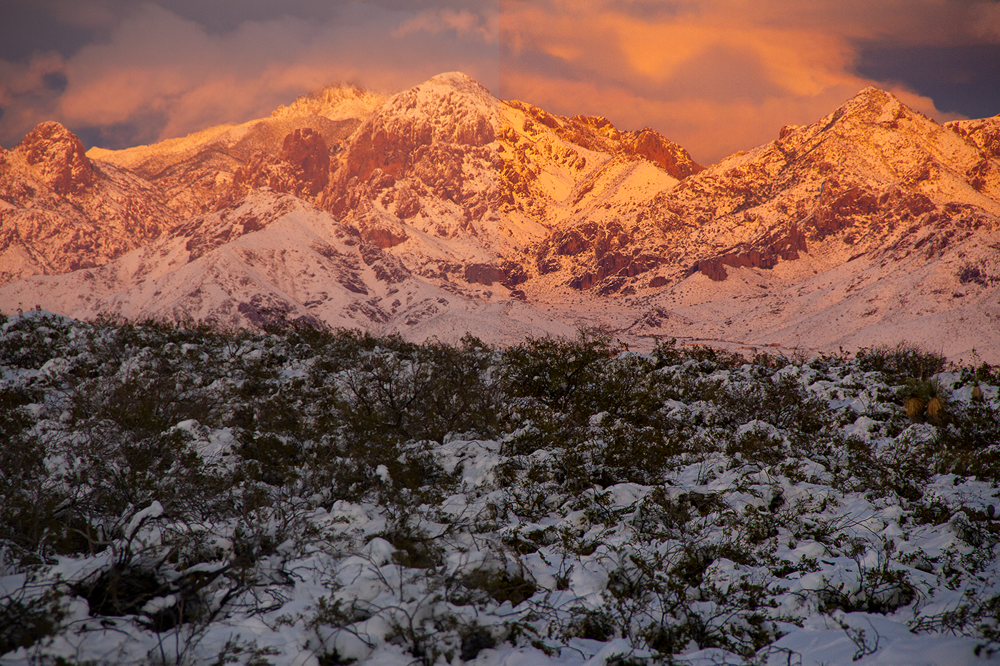
CLOUDS BEFORE (took from friend's Facebook)
AFTER CLOUDS - enhanced color and texture and removed wires)
Challenge 1 - Lighting (before)
After - Did I go too far? I used the camera raw filter then cropped a bit.
My photo for the day 9 challenge.
I had fun with this one! I think I'm getting the hang of being able to remove things (and people) I don't want in photos!
Day 7 Combined pictures
That's awesome!
Very cool @blissful wolf
Thank you @gaunt basalt !
PSdailychallenge 8 - edit
A work in progress, got some of the noise in the sky to go away... YAY... and eliminated the tent etc. in front of the boats. I do like it better without that distraction. Will continue working on it to get it where I am content.
@gaunt basalt Did you already post a before pic?
@vital fjord I only posted the first edit I did with the text... I will go get the real before pic and post it.
@grave needle That looks great! One thing you could try is adding bubbles, maybe just have some fun with the liquify filter to see if anything looks good
I like that idea!
It's fine @gaunt basalt just wondered
@grave needle I've never tried it but it could add that extra dimension to it
Before pic for California dreaming
Wow... didn't realize how dull the original was! HA!
You did a great job! Yeah sometimes it's hard to see until you look at the before and after
Challenge #6 - Remove Object (before)
Changed to a lighter font!
May have gone a bit far removing objects. Should I remove the flowers in the foreground? Also, I did have to make the pic a bit larger, hopefully it looks ok
@unkempt field I love the drama in the colors and the flourishes in the font, great job!
Here is my last post. I am honored to have learned with you all. Thank you Terry for the great lessons and thank you all for your feedback.
#psdailychallenge 9
@prisma sky Great job catching up with all the challenges! On the photo compositing, I would scale down the head in the hand a little to make sure it's sitting in the middle of her palm. There is also some slight white remaining around the edges of the hand. On the boat image, it looks pretty solid! I would just be careful of the "ghosting" effect of the water on the lefthand side from removing the objects around there. Also be sure to straighten out the horizon line! Really nice work on the B&W, retouching and surfer cropping image. I love your sunset image adjustment as well, but would be sure to get rid of that thin white canvas line on the right side. I hope this helps!
I've noticed that minute changes, can make a whole lot of difference...and detail important.
Noticed my earlier post had the bottom "y" cut off. This is the revised version.
@hard halo It looks great, but I would make "I fell" a little less slanted, it's a bit hard to read I think.
Challenge #5 - Adjustments (after)
before
Challenge #3 - Crop (after)
(before) sorry these are out of order. I'm trying to get caught up here and on behance. I also just realized these are too big and taking over. I'm so sorry!
Day 9 - Resizing
Resizing
Here's my Challenge #9 masterpiece. It's a signed original!
Love the black & white look for this photo! @humble ridge
@brisk blade oh thank you very much 🙏 😍 love your composition too
@cold cedar if you talk about my summer time composition, the fonts are not in typekit, but they are free, you can find them on behance

Behance
Cervanttis Signature Script is a handwritten signature script with a natural & stylish flow. This collection of scripts is perfect for personal branding.Cervanttis Signature Script is perfect for branding projects, logo, wedding designs, social media po…


@glacial path Thanks for your feedbacks. Yes Tim, I didn't think about the shadow on the hand. See what I can do.
And I think also that removing the leaves was necessary in order to focus on the tower of the monument.
@thorn narwhal - thanks for your feedback appreciated
@young karma Yes, those fonts. Thanks you so much. I was hoping they were available.
PSdailychallenge - Day 09, Resizing. This is the original.
PSdailychallenge - Day 09, Resizing. After adding a border. (I know the copyright info font and the signature font don't match...I'm working on a new signature.
@grave thorn I love your photo 😊 and the signature is very nice
This is my day 9 photography
the original
My new re-sizing submission. New Orleans cemeteries, nicknamed Cities of the Dead by MarkTwain.

Day 9 - Resizing
Hey creative people, here is my portfolio, have a nice weekend end get inspired: https://www.behance.net/gallery/77513271/-CASE-STUDY-Brand-Identity-for-CinemaxX 👍
Behance
2019 Adobe Design Achievement Award Winner — Bachelor Thesis — Case Study — New Brand Identity for Germanys best-known cinema brand "CinemaxX". (Communication Design)
Day 6 Removing objects, before
Day 6 Removing objects, after.
I liked this a lot, but had to work with a mouse so it was not easy 😅 Would love to hear your feedback
@vital fjord Hmmm yeah I just might go try out your suggestion...thank you...🙂
@fringe thicket take a look at the left side of that parking lot where you removed the buildings. In the original, the sidewalk is almost level, but when you removed the objects, it slopes down. See if you can rework your removal to straighten that line, and I think it's going to look more natural!
Day 7 - The same with the shadow
Removing distracting objects day 6
Day 7 Combine two images
Day 8 - Add text
Day 5 Camera Raw Filter
Day07-Combine2Images
Day 9 - Resizing. It was so much fun! Thank you! 😀
@thorn narwhal Thanks for the suggestion! I'll try that 😃
@thorn narwhal Thanks for the feedback during this challenge
@gloomy flare Thanks for the photography challenge. I've been using photoshop for years and I still learned something new from your videos.
@thorn narwhal better?
@hard halo you’re very welcome!
Day 9: Resizing
@vital fjord Thank you!
@thorn narwhal Thanks for the suggestion! I'm going to work on the last three things but might circle back to that to try it.
@young karma looks great
@young karma love the challenges overview as well 🎉 congrats!
@humble ridge you’re very welcome!
@young karma I like the idea, but the blur effect is a bit much, maybe pull back a little on that.
PS Daily Challenge Day 7 (getting caught up!) Here's the composite of two images I tried out.
Here's the first one as the background.
Here's the second one.
Good job
TW9-Resizing.
Looks great!
TW9-ResizingBW
The larger white framing at the bottom reminiscent of yesteryear - Kodak Moments ...Remember those?
@thorn narwhal Thank you! 🙂
@vital fjord Hi. That does look much better...what say you?
@thorn narwhal i fixed my photo
Here's my Daily Challenge for Day 8. It's from a photo I took in Scotland last year.
Here's the original photo.
Day 9
@vapid niche amazing! I loved it ❤️
day(x) 😃
@coral stone and @vital fjord Thanks so much!
@vapid niche its like a history book cover 👍
@tawny dagger Thanks a bunch!
This is the original photo before cropping.
Day 3 lesson on cropping. This is a view of the Potomac River, looking down from an outcropping.
day 2 original color Paris gargoyle on Notre Dame
day 2 BW conversion
Day 1 lighting adjustments added
Day 1 original before filters applied
Day 9 resizing with a stroke, border and signature.
Day 8 Challenge; arc de triumph
Day 8 challenge; arc de triumph; maybe black font?
#📣creative-challenges #✂challenges-feedback https://www.behance.net/gallery/80601015/PS-Daily-Challenge-with-Terry-White-Photograpy check out my PS daily creative challenge portfolio. I still have two lesson to complete. Retouching and Photo adjustments.

Behance
Daily Creative Challenge Photography with Terry White
@vapid niche you’re very welcome!
@outer lantern I think the black font stands out more, but I would probably crop from both sides or the bottom to get rid of the people.
Day 9 2nd option
@sly turtle thanks! I’ll take a look at it! 👍
@glass bridge , I think I would do a thinner stroke and see how that looks. Right now the thickness of the black detracts from your beautiful photo, to me
you're welcome @vapid niche 😃
Day 9 ; Resizing; Girl Walking
Portfolio adjustments - day #09 with border
Day 9; Resizing Woman Walking
@thorn narwhal - made some changes to the type effort
Here's my Day 9 photo challenge. I also want to thank everyone for the feedback! I loved this set of daily challenges; I learned some great new tips, thanks Adobe and especially @gloomy flare
@vapid niche great job
@gloomy flare Thanks so very much!!!
Day 8 (and maybe a bit of 9)
A little behind. This is a photo I took up at the Blue Mountains in Sydney, Australia this past Friday (24-05-19).
Adding text to images is not something I am used to, so quite the learning curve and not having copy skills, choosing a text is like picking a name for your first born child...takes forever!!....but still lots of fun.
In adding the text, I created a rectangle layer behind it and dropped the background colours down so the text was not washed out in the image. It would have been good to build an actual rectangle behind the text with a low opacity so it kind of floats on top, but I don't know how to do that...something else to learn.
All feedback welcome!
😃
Ps daily challenge day 6- edit 1
Ps daily challenge day 6- original
Ps daily challenge day 6- Edit 2
I had never noticed how bad the picture was until I started looking for one to recompose . 😃
Here's my recompose of the picture for Day 3 of the challenge.
I always liked this picture, but I didn't think of cleaning it up. Let me know what you think.
The dives were fun, the editing is even better 😂
It needs some tone adjustment, but I like this start. I hope I can get some more guidance here. Thanks!
@oblique bramble Wow! Nice cleanup... must a been painstaking..many redos I bet... GOOD WORK. 🙂 👌
thanks! actually the smart and auto selections worked very well to give me an almost clean starting point.
Day 1 - It seems I forgot to upload this one...
Here is my Day 09 - Resize image.
On the way back from a photo trip on Friday, I drove past an old lumber truck parked in the front yard of a farm. I hope you like the final edit 😃
@past canopy That is a beautiful photo. Have you done any work on the photo itself?
@hard halo thanks kindly 😁😁😁. Nothing aside of Camera RAW. The original is in my Behance profile if you would like to see it. In my profile under the Adobe Challenge Collection.
@hard halo, absolutely. Please go for it! 👍
Thanks much...will keep you updated...
Day 9 ! Thank you Terry for all the knowledge about photoshop 😃


My image for day 9. I used the image I created in Challenge Day 1.
@sly turtle Here's a new attempt. I think it looks better 🙂 (but it's still a crappy photo 😂 )
@thorn narwhal @gloomy flare - Thanks for the great tutorials, managed to ditch some ole school techniques and freshen up my workflow. You only know what you know, but a little prod in a certain direction gives new energy. Can't wait for the next PSCC in a week's time. 😀
All - thanks for some great comments and being in a great community, keep on, keepin on
Day 9 - Resizing - Picure I took in 2015
Catching up and finishing the challenges 🙂
Here's one I made for Day 7, combining images
Also Day 7
I had so much fun with the final challenge, that I tried it again! I'm trying to learn how to do some macrophotography, and the framing makes my cheap macro lens actually look pretty good!
Thank you for the challenges, I really learned a lot!https://www.behance.net/gallery/80755553/Day-9-Resizing PSDailyChallenge

@fringe thicket So the road wasn't really underwater? That is cool combining!
@hard halo Took a lot of time for sure!! Thank you so much!!
@hard halo Also, funny story... the idea for "edit 2" came to me AFTER I finished the first one lol I was like "oh wait, could have just taken the dock out completely..." but I am kinda glad it didn't, I like the first one 😊
PS daily challenge 9. For social media large side 1000px
Here's my one for day 9 😃 https://www.behance.net/gallery/80756071/PS-Daily-Challenge-Day-9-Resizing

PS daily chellenge 9. For print in A3+
Hmm, didn't show the right cover image, so here it is:
Did it with the dimensions for a Facebook cover photo
PSdaily challenge day 9. Thank you I have learned so much. I am way more comfortable inside photoshop than I was 2 weeks ago. Terry White you are a very good teacher! This is an OLD photo from when my "big" camera was new.
Day 9 Re-sizing
PS daily challenge day 7- photo 1
PS daily challenge day 7- photo 2
PS daily challenge day 7- Final
@fringe thicket that looks much better! Might be fun to see what it looks like if you crop it closer to the building and maybe the bottom 4 windows, too
Day 8 - Text
@hard halo, they both look great! I like the rust effect and it looks super cool in the B&W version.
PS Daily Creative Challenge - Day #05 - Movie Magic. I took a photograph and removed the orange bar from the seat that was above the runner's legs in the photograph. Any feedback is welcomed. https://www.behance.net/gallery/80764085/Movie-Magic

Day 8, Adding text
Picking the right colors for the text was not easy 😄
Day 9, Resizing
https://www.behance.net/gallery/80764677/PS-Daily-Challenge-9

Challenge #7 Combine Images (before)
(after) not sure if the monarch looks like it belongs
Challenge #8 Text (before)
after
I'm finally caught up, thanks for this awesome challenge @gloomy flare
@cold cedar Yes, I placed the Mediterranean Sea in Death Valley 😄
I edited my edit again lol. I kinda made the railing darker. Which do you prefer?
@fringe thicket I'min the sinking southern city of New Orleans so water on the road is a regular event due to infrastructure but usually we can't see the road. We know not to drive them, though. You really made it look cool.
PS Daily Challenge #9
This was on the way to Fort Worth, TX and Did my daily challenge at the airport on the way back to Florida
Photoshop Daily Challenge - Day 8 Text
@past canopy👌 😀
Photoshop Daily Challenge - Day 9 Resizing
DailyChallenge
Day 5 Before #✂challenges-feedback
Day 5 After #✂challenges-feedback
Day 4 Before #✂challenges-feedback
Day 4 After #✂challenges-feedback
I chose to not remove wrinkles on his face... I also chose to completely remove the protruding buttons on his side...
Day 6 #✂challenges-feedback
Day 6 After #✂challenges-feedback
Day 5 Before #✂challenges-feedback
Day 5 after #✂challenges-feedback
Day 7 before #✂challenges-feedback
Day 7 After Design feedback
Day 8 Before #✂challenges-feedback
Day 8 After # design Feedback
Day-9 After #✂challenges-feedback
Day 9 before #✂challenges-feedback
I don´t believe I can finish all my challenges. Thank you Terry for your tutorials. All are post in this link: https://www.behance.net/gallery/80526655/PS-Daily-Creative-Challenge, See you next time and thank you in advance for yours comments

Day 8 and 9 for finish to post.
@hard halo that's a great idea, I like the many different colors. the wood grain looks slightly off, I think the texture would be warped. You could use the warp tool or liquify tool to fix it
@glacial pathYeah I was looking at the wood grain , thinking it just dont gel...so off I go to learn how to warp...🙂
Good morning. I am a bit behind on the daily challenges. Here is my version of using a custom cloud brush for the Day 06 PS Daily Creative Challenge. I used it as a background behind the album title versus smoke or fog. Any feedback is appreciated. https://www.behance.net/gallery/80792677/Brushes

@fringe thicket Really like your choices on this. That color is delightfully representative for Paris, I think. Also, the stylistic choice of the "B" tucked under the lowercase "a" and the exclamation point tipping under the "S".
@tall spade I like the way the cloud brush made the title is reminiscent of a label. The soft tones work, too.
@cold cedar Thank you!
@young karma These challenges have really had us working but totally worth it. Might I suggest using capital letter on for the "V" in Vienna and perhaps a different second. Both are fancy so they tend to compete.
@young karma Good quote from Confucius! Perhaps you might want to lessen the tracking for the quote. Maybe you were trying to get it to fit the space? It doesn't have to. I think it will still look good. Maybe a san serif font for the quote?
@cold cedar Thank you for the feedback!
Practicing what you learned
Day 8: Add Text
@urban berry I see by your work you are a very precise person. I found being open too things being just a bit off centre can get creativity flowing... I hope to encourage...🙂
@vagrant sorrel Very cool! Did you create the background in Photoshop? I take it the motorcycle is from the earlier challenge, right?
The background was in Corel Painter and is one of the challenge of previous Comic arts the Jesus Ramirez
@vagrant sorrel Ok. I didn't get to the challenges until Jesús'. Looks good!
Trying a little bit of everything we learned in the challenges. Did I go too far?
@flat wren Hi. Nice work on Day 6. Just need to straighten the horizon.
I've reworked as you suggested ... I mainly learned how to use the Distort-Displace tool...
@glacial path 😀 I've also reworked the lapels...
A bit late to the party, but here's my day 9 😃
@magic rampart just give that text a bit more room here and you're good!
@glacial path thank you, is this better?
@magic rampart nice!
@glacial path 😃
Day 2 and 3 - I'm late XD
https://www.behance.net/gallery/80574139/Ps-Daily-Challenge-2-3

@young karma cool photo! Your edits are well executed and the font is also a great match. I see only one problem. Thin, white text on a rather busy background can be tough to read. I would move the entire text away from the water and trees and up into the sky
@cold cedar I leave the link to that tutorial if you're interested. https://www.behance.net/live/videos/2579/Photoshop-Daily-Creative-Challenge-01

Join your host Jesús Ramirez each morning at 11:30am PT. He’ll show you how to approach each challenge using Photoshop. Complete 9 challenges by Friday, May 10th and you’ll be on your way to sharpening your skills. Get your questions answered, see what the community is c...
@vagrant sorrel Thanks. I actually did the comic one. I may try to create a similar background in Illustrator, though.
@prisma sky Thanks for sharing Sara! Great job completing the challenge - I really enjoy the road edit - vibrant colors. I recommend sharing work one at a time and asking for guided feedback - e.g. do you think the contrast should be higher? Are the shadows to dark? Did I adjust the hue too much? it would help reviewees better know how to provide helpful feedback 😃
Saw Apocalyptica on Saturday night - great show - and got some great shots.
My Photoshop Challenge today #quickanddirty 😝soon on Instagram @_twc_daily
My Photoshop Challenge today #quickanddirty 😝soon on Instagram @_twc_daily — Christmas is coming.
I'm very late on these challenges! Here's PS Daily Challenge 5!
@velvet axle WOW! Love it. The way you bleneded all the images wow!!! Superb ❤
@orchid plank Thanks
@velvet axle can I ask you some questions abput this?
Here is my result of the challenge I posted in #❓ask-a-question
@proud shale yikes that is a scary looking alligator... great job on the recompose.
@velvet axle That looks good!
@hard halo Thanks. 😬
@velvet axle Hi. I will post my challenge later this morning...🙂
@hard halo that's pretty cool but I'd use a different font on the headline
And that box doesn't give anything to the meaning
I'd maybe play around with the idea of woof xddd
And place the letters like that
Hi. @untold jungle. Join oir challenge. See : @velvet axle post in chat...please...
@untold jungle. Thanks for the insights...😀 😃
@untold jungle Sorry. See our chat in ask a question not chat. Thanks.
Yes @hard halo I noticed it. @velvet axle such a great challenge! I will get on PC on Friday but I might tackle this challenge with my phone 😂. It'd truly become a challenge
Kool! Have fun..👌

Download this photo in Isiolo, Kenya by David Clode (@davidclode)

Download this photo by Lucas Alexander (@lucasalexander)
@velvet axle @untold jungle
Here is my challenge: Bookmarker Rhinoceros Plight
Design a bookmarker size 2,5x8,2 inches.
Making use of the two photos (Links above for download)
Include a few words preferably your own citing the rhinoceros's plight.
RGB Color code da924a should feature prominently in your design.
Please anyone, everyone feel free to join in on the challenge...😃
😀
Reworked.
@hard halo I like the Border and new elements you used, like the Magazine "Logo" barcode. But you need to work on your typography skills. Mixing fonts is difficult, I would recommend using just one font at the beginning, a good typeface like Helvetica (and weights/styles). You need to adjust the visual hierarchy, to guide the viewer. Whats most important, 2nd, 3rd. I know that magazine covers can be very chaotic filled with a lot of information, but keeping It simple is a good start. — I'm not sure if you have looked up some good magazine covers for inspiration?
I have taken your cover and your information you want to put on there and try to improve it. I just use House Slant from typekit(adobe) as logo font + Helvetica Neue for the rest. The barcode was to big and the sticker like element to busy. I changed the position of the dogs to have more space. I also adjusted the saturation and lightness here and there.
That does look good...I never realised my difficult with typography? Thanks for the heads up...
yeah I did lool at magazine covers, in truth I not what too look for though...
@hard halo I saw your challenge I may try that later today 😅
I've yet to start myself..
@hard halo If you do start a research about how to design magazine covers you will find a lot of material 😅 but it depends on your interest and work that you would like to do. — Let me ask you, what kind of work do you like to do? Or what are you doing at the moment?
oh amI unemployed. I Photoshop as a hobby... if pushed for an answer I'd say I am intetested in poster compositions and photo enhancing...if there be such a thing... I tend to do alotta cut outs ...and framing...
About a year back I came onto Photoshop. I've mainly learned from watching youtube tutorials, two guys in particular I find good at teaching are Jesus Ramirez (PTC) and Unmesh Dinda (PixImperfect). About a week ago I happen onto discord quite by accident... A good and fortuitous accident. :)
@hard halo Great challenge, here is my result.
@hard halo Thanks 😝 it was a good challenge, now I have something to post for my daily designs on insta 😀
Oh good. 🙂
I'll have mine up by tomorrow afternoon South African time...
@velvet axle Are you a professional designer?
@hard halo I'm a communication Designer (Finished my Bachelor this year in February)
Congrats! 🙂
FYI! When a community member gives you feedback or helps you out you can now say 'thanks @username' to give just-for-fun reputation points called 'creative carma' 👍 Just testing it out, interested to see if you all like it!
thanks @uncut ginkgo for that great information.
Gave +1 Creative Carma to gus
Hey! I need a favour. Can anybody tell me how to upload a Adobe animate 2019 file on Behance?
@uneven lark I would say, first ask the question in #❓ask-a-question channel 😁 and 2nd I assume you need to upload a web-friendly-size video on behance - that means you need to export/save a video from adobe animate. (not sure cause I don't use it)
Thank you 😊
Beautiful photo @gentle elk ❤
thanks @coral stone appreciate it 👍
Gave +1 Creative Carma to Valdair Leonardo
woah what that

lol yeah ikr
The last Photography - Daily creative challenge great experience  Thanks Terry
My nieces picked so many strawberries, I couldn't help but play with the photos!
@velvet axle Hi Here is my design... please say I'm getting better at typography ...lol.
🙂
@hard halo Have you transform the typography on the right like squeeze together? — If yes that's a typographic crime. 🙈
@hard halo I like that you scaled up the Rhino and added that border/texture. But did you forgot to include your own color RGB code you want us all to use?
@hard halo The choice of type and that you only mixed two fonts is good. I think you don't need the drop shadows.
@hard halo If you only want to work with images in photoshop, clean them up, retouching, create compositions you don't need to have typography skills. But If you say you want to design more and want to use typography I highly recommend start reading some books, take typography courses.
@velvet axle The color is there... On second thoughts I assume my layer and blending has affected the colour. You have any typography book suggestions, cant hurt to read up on something I clearly lack in...🙂
Hello everyone, here is my challenge for Adobe Live Challenge: Fantasy Character or Creature. https://www.behance.net/gallery/80927711/Adobe-Live-Challenge-Fantasy-Character

@urban berry Vivi from FFIX Nice
I new to Discord and I have a question about scaling an image that I am looking to mock up as a background for a room setting. (In Photoshop) Does anyone have any pointers on how to figure out the proper scale in a swatch photo for placing it in the background of a room setting? If this question should go elsewhere please let me know. THANKS! #❓ask-a-question
@hard halo Your design is already really great, I have just changed a few little things:
On the left design, in the upper left corner, give it more room so that the border continues down a bit.
I changed The logo to black cause it pulls my eye into the logo instead of the message.
I changed the copy (but your copy is already ok) just thought, I see the rhino I don’t need to write it again and instead choose a different copy.
I really liked your overlay of the rhino on the border so I try to keep that subtle detail.
On the Right design I went with the same black logo at the top to stay consistent.
I know playing with type can be fun but adding to much stuff like inner glow is to busy.
And you squeezed the type together — DON’T do that again. — If the font includes a condensed style, use that please.
I just changed the hierarchy of the text a bit.
I would not cut of the rhino at the bottom left (right design).
Again your design, with the colors, great cutouts and sublte texture is really good.
I only decided to improve a few things because I see your talent and interest in design.
I also like your placement of the rhinos, upper right and bottom left, great flow
😅 I would also improve my "improved" version. Making the Rhino on the right design smaller cause it fights against "save the rhino" text.
Thanks for the insights ...🙂
Great collage @gaunt basalt
Glittery ✨✨✨
Thanks @young karma
Gave +1 Creative Carma to Black Crown
Thanks C bot 😄
Ohh lovely photo!
Gave +1 Creative Carma to PetuniaGal
 Black Crown, this command is disabled in this channel
Thanks @gaunt basalt
Gave +1 Creative Carma to Cee
You’re welcome @gaunt basalt 😀
Welcome @true storm 😀
Fantastic job @gaunt basalt
Just messin' 😆
Looking forward to the photoshop 9 day thingie. This is some illustrator work ( followed from a tutorial) but added my own flare, much mor comfortable with photoshop and look forward to the 9 day event
i created this using pjotoshop, what do you think !?
Photoshop daily challenge
I created this from 0 to this 👆🏼
This was for next day 👌
@storm epoch Your Illustration is great, but currently I'm looking at a blank space (bright mountains). Put the creature in the center to create a focus point (dark silhouette on bright background /contrast) . And a half moon instead of full would reduce the brightness cause it pulls my eyes on it (again away from the creature) or add clouds/reduce brightness.
@storm epoch , I love it!
Poster. Insta@_twc_daily
Wow @velvet axle this is amazing, I loved the colors!
@coral stone Thanks. 😅 Just one photo behind the typography, rotated and copied few times (around one image that's centered).
Gave +1 Creative Carma to Valdair Leonardo
I like the depth created with the circle's shadow and how the type is moving with them
Looking for some feedback. How is the color to you? This is about 3300 kelvin, although there is debate about whether it should warmer. Your vote?
Hereis a second image
@dark lotus Love the sky in the second photo. Maybe brighten up the ground just a little?
@tidal token thanks. Such little light that I get a lot of luminance noise. Short of a layering in PS.
Gave +1 Creative Carma to VixaFox

Behance
This is website ui design for coffee shop who sells coffee beans.#Behance #UI #UX #Adobe
just a quick touch-up, removing eye-shadow and cleanin' up elon
after seeing that, my life is complete
Hey @vestal sinew you should probably post this to the Adobe XD discord server 😃 http://bit.ly/XDdiscord

Thanks @blissful wolf
Gave +1 Creative Carma to BeaNeto
What do you think? 😃
deep dream
@young karma Cool, straight out of Harry Potter !
Thanks you 😄
New to the Discord. I Primarily do Fighting Game tournament flyers and banners. (Promo yada yada.) But here's some i submitted for class once
@high tundra I like the pattern how did you make it? or how do you go about making patterns like these
Oh now I see it
figuring out the flow of how i wanted it to look was the hard part
It looks really nice tho
This is another piece i did too, Restyled the Obama "Hope" Poster.
And thanks @ancient spindle , im always looking for feedback on stuff i do.
Gave +1 Creative Carma to jarrett089i
@young karma I like the colors and how they are a contrast to the otherwise gray image, but the sparkle lens flares are a bit too much IMO. For them to show up, his face would be way brighter. The light has to come from somewhere.
@young karma Also I would make the watermark more subtle. If somebody really wants to remove it, they will remove it anyway
@young karma that's some fantastic compositing work! I think you could remove this one bird there or you could add a few more. but juse one looks a bit wrong.
Okay, good thanks for information.
first poster design in a long while .. What do you think guys ?
and i forgot to save it in RGB color mode so the colors are all messed up 😂
after i edetid the color mode.
Op?
@mighty vessel I like it! I think that maybe you should move the Sports Day title a little lower so the 'S' doesn't clash with the kid's head in the background. great design
Trying to send a pic...
nottin
Shooting the moon
There is some 😉
My files are to big.... Oops... sorry.
So... RAW files won't make it here....
Max Verstappen @zandvoort 2019
Album cover I did
@young karma I want that as my background 😍
A poster I did for a local bar event (trippy music and stuffs). Any suggestion to improve the vibe of it? Thanks !
@candid perch I love looking at this. I t gives me vibes of Kanye West Album covers. Only thing thats getting me about it is the red swimsuit. Not sure exactly what it is but I'd tweak the color of it a bit. Dont' change it from red, but try something different with the hue. And maybe desaturate the Flowers on the left a tad?
It feels like 3 different parts of a picture, rather that a background and a foreground
@feral olive Can you send the original image
And the character should be moved a bit to right coz it's imbalanced now
And I'd put a bit more emphasis on the eyes as well
@young karma if you would include the artist name and the genre of music they produce would help. Could give better critique when I know them
@candid perch yes I agree with Ayo, you could desaturate the background almost to black and white I'd say. And I'm not sure if you want to correct the shadows? Might be the flat style you're aiming for. I'd maybe change either the swimsuit to yellow or the text background to red
But if you want to keep it like that, haze the swimsuit a little so it looks like it belongs to the whole image
thanks alot @high tundra @untold jungle really appreciate it
Gave +1 Creative Carma to Ayo
@untold jungle
Having fun with Photoshop. Where are the photo manipulation faaaaaaanns 😄 ... happy Tuesday everyone
https://www.instagram.com/p/BvKrPLThNMj/?utm_source=ig_web_copy_link

Instagram
106 Likes, 16 Comments - Ø ‘ S A M Ā G H Ā Z Ā L (@osamacious) on Instagram: “If you think it. You do it. Or at least die trying! . . . . . Dream like a little child. . . . .…”
Got a head start on todays challenge
Top image is the original
Think it might be too desaturated, I might need to add more of the green in the plants back in
Yeah I think I like this a bit better
Oddly enough, my boss asked me to make a picture of his car vintage the other day, I've blanked out the reg, but here is the before
and the after, I removed the fence.
@magic rampart It looks good, nailed the colors, only critique would be maybe lower the noise/grain levels a bit
@ancient spindle thanks for the tip, does this look better?
Gave +1 Creative Carma to jarrett089i
@magic rampart Yeah thats great actually, when I add noise its usually just a bit, typically you would want to match the focus/grain of the original photo
@austere nova That looks great, I really like that you picked an image that already has a vintage vibe to it
@ancient spindle Thank you, it does look better with less grain 😃
Gave +1 Creative Carma to jarrett089i
@austere nova as jarrett said, you've picked a great shot to work on. I like the desaturated colors, the sepia tone and the paper texture you've added. Personally I would make it even more prominent but if you're going for a more muted look, that's also cool 😃 Well done!
Thank you @ancient spindle and @glacial path I kept going back and forth with the texture if I wanted more or less, and I ultimately settled on keeping it subtle. This was a fun one.
Gave +1 Creative Carma to evil
@magic rampart nice one! I like the version with less noise much more! The grass has lovely contrast and the sky has a beautiful gradient. I think removing the fence was a good idea
@feral olive very good job on that I must say. the character's right hand (left to a viewer) looks kind off but other than that it does look super neat
Thanks
Before PSdailychallenge #1
@magic rampart very good looking after jarrett's tip. I would add just a teeny weeny bit cyan to the water. Right now you can't really tell what it is
After PSdailychallenge #📣creative-challenges #1
Still working on the VW windows... will post another update after I am more content...
@gaunt basalt Lmao I hate that VW van right there XD Almost got driven over by one once. The sign there is a little weird with that text overflowing
I would also make the ground darker the same way you did for the van
Hello everyone!!
good job restoring the colors too
Here's my robot!
Ha... thanks @untold jungle will continue working on it...
Gave +1 Creative Carma to Actionom
coz the original one has so much overexposure going on
@jolly quest Good, now make that robot do labor for you. Beginning with the simpliest of tasks, make it groom your armpit hair
LOLLLLLLLLLL
@feral olive both photos are georgous love the lighting to both
For that I'd adjust the shadows on the lion more and the hair cutout could also be better but it's just nitpicking @feral olive
@tidal token the first image is done by gamingart and the bottom is the original one
Alright thanks for the feedback
And yeah I might adjust the shadows a bit
and the black borders make it look pretty good, maybe have the lion go on top of it for a bit dimension?
Lol the black borders is because I had to take a screenshot of it because the og image is too big to upload to discord
That’s why it’s much more pixelated
aahhh xD IC
inspired from the daily creative challenge 😁
Deadpool original
I'd fix that perspective of the building on right. vBut good job@young karma
Deadpool after playing with the time-traveling device
@coral stone yep it's nice but I feel like his face became too dark
Thanks @untold jungle
Gave +1 Creative Carma to Actionom
but do tell where I can buy one of those time-traveling devices, please
i want one too 😁
I was going to use another picture but after seeing @jolly quest fixing up that robot I had to take a phone picture of my old Mazinger Z figure and here is the result, I don't know if that pink works out too well though! 😅
@untold jungle thanks 😄 I'll see if it's available on Amazon lol. About the face, I agree with you, it looks like I lost some information when I desaturated it. I'll fix that 😄
Gave +1 Creative Carma to Actionom
@young karma I loved the texture you applied 😍
thanks to uncle google @coral stone 😆
Gave +1 Creative Carma to Valdair Leonardo
added some black vignette what do you think?
@velvet wagon YES!! I love it! This is gonna be so great for when I reveal the secret project we're gonna use it for 😉
here is a white vignette too
@young karma That is VERY nice!!
thank you! @jolly quest played with some color balance to make a wash out look
Gave +1 Creative Carma to VooDoo_Val
Here's my attempt at the Day 1 challenge
Before
Day 1 - too much noise?
after
@feral torrent YES! Love it.
Is there a reason a lot of people are submitting photos with solid color backgrounds?
@grave hound i think is depends on what you like! We are going to return to these assets and use them to make a cool poster! IF you want a lot of texture in your poster, then this is great!
@jolly quest , I felt I had to do that one when I saw it 😄
You folks can also do what I am doing! I'm gonna do 2 more versions of my robot so I have different versions to choose from!
One with more texture and one with less!
@jovial viper There are many places you can find images online that are free for use. If you don't want to find an image that way, you can even find something in your home to photograph like some folks did today!
applied the cutout filter in my image and it became like a vintage painting 😁
If you like space images, NASA's images are totally free!
you could find some planets there or spaceships!
Hi, guys! I went with a plant instead of a robot ... Here’s my attempt:
@jolly quest I mean if you share your material before to challange.I can do with you and try later my pictures
@young karma Ohhh!! Im loving it! Great texture on the pot there
I get very comlicated sorry
What kind of plant is this? Is it real?
@jolly quest Thank you! ^^
Gave +1 Creative Carma to VooDoo_Val
@jovial viper I do not have the rights to share the image, unfortunately. BUT I can link you to the Adobe Stock page! https://stock.adobe.com/images/two-vintage-tin-toy-robots-robotic-delivery-artificial-intelligence-concept/189332788?prev_url=detail

Adobe Stock
Two vintage tin toy robots, robotic delivery, artificial intelligence concept - Buy this stock photo and explore similar images at Adobe Stock
I see, sorry I didnt know
just I would like to prepear before hand photoshop
and when you live I can start with you
just it
Or if you give some information before hand will awasome
thank you great share ideas
@jovial viper You can find some great ones here! Like this space ship to use! https://images.nasa.gov/details-KSC-20180520-PH_SPX01_0001.html
{{ngMeta.description}}
And you can search for other things!!
😃
Day 1!
@lone hare THIS. IS. EPIC.
That is like, super rad horror movie status
Amazing @lone hare
like something that would be in an "UNEXPLAINED" evidence file
Looks great @lone hare and @kindred kernel !
@lone hare Wow that is a postcard I would buy if I had visited that place! 😲
Totally!
@jolly quest Thank you! These are always fun challenges.
Gave +1 Creative Carma to VooDoo_Val
Thank you! @velvet wagon
Thank you @feral torrent 😃
Thank you @coral stone !
Thank you @young karma there are about 6 other images with varying blend modes above the image 😃
@lone hare Love it! Glad to see you experimenting with adding more than one texture!!
@jolly quest When I do add texture to composites, I typically add a lot different textures for the final look. 😃
@lone hare Im usually the same way!
Empty rooms pic so using an area on left incl window for the challenge
here's my attemp: Before top and After bottom. I use Selective Color, Channel Mixers, and grain effect for final touch
Oh very nice!!
Here's my first attempt 🙂
With a little twist!
Here is my entry for the new PSdailychallenge
@young karma GORGEOUS! Love that touch of water in the swimming suit! very cool!
@young karma Looks pretty amazing. Nice effect
I'm going to try this 😃
@blazing quail Great stuff!
Do I have to upload the finished product to behance or can i leave it here
@elfin helm You can do whatever you like 😃 But if you put it here, we will show it on stream!
Awesome!
I did a few different variations on my robot!
All very similar but I wanted a darker/harsh one + one with more of the realistic details
@feral torrent @jolly quest Thanks! 😄 I like how it came out with that effect.
Gave +1 Creative Carma to VooDoo_Val
I love it
When will this be on the stream? What time.
@young karma The counter in the current stream says 5 minutes aprox
You can check it here -> https://www.behance.net/live/adobelive

Join us right now to get inspired by leading creatives. Get your questions answered and share your work with the community.
another robot
yeah
LET'S SEE SOME MORE ROBOTS!
Vintage Ice Cream! That was a fun challenge!
@whole crescent DELICIOUS!
now I want ice cream 😃
HI MOM!
@fallow bough YES!
Day 1, just-in-time 😉
Should have chosen something without white background. Masking taking forever
👌🏻
Day 1 Image quality
ROBOTSSSSSSS!!!
@gaunt forge Love it! Have you thought about trying out some different textures and variations like I did?
Love your robot!
Are they going to be live streaming for a while? Mine isn't finished yet!
I overslept, do I have all day today to get the challeng done?
Thanks @jolly quest I will try different texture. this was my first attempt
Gave +1 Creative Carma to VooDoo_Val
They will be live for maybe 15 more minutes before the next segment begins! If your's doesn't get shown, I will try to skim through the Discord during tomorrows challenge!
@gaunt forge Great job!
@high tundra You can totally take your time! If you dont finish today, you can post it in the #💎past-challenge
tried to bust one out really quick..
haha that's sick! looks really good!
Robot!
YAY ROBOTS!!
thank you @young karma !
Gave +1 Creative Carma to Rut Lans
thank you @jolly quest ❤
@lucid moss Amazing work 😄
thank you! @coral stone
Gave +1 Creative Carma to Valdair Leonardo
same Robot with different texture
@gaunt forge Awesome!!
This is my exercise
Sassybot
thanks @jolly quest
Gave +1 Creative Carma to VooDoo_Val
Finally jumping in on this round. Hi everyone!
I also did this.
This one's for you @jolly quest
LEGOOOOO
@grim mantle It is loading for me. I will tell you when I see it!
@still harness Loving these! Well done!
@pine cypress Nice Chicken!!
@grim mantle YESSSSS I love it. You should call it, "Thoughtful Trooper"
LOL
Thank you @jolly quest
Gave +1 Creative Carma to VooDoo_Val
@still harness The Lego Man is my fav! But I might be biased... BECAUSE LEGOOO
This is my original image I started with for the exercise today.
And this is the result of using today's challenge. Kind of turned it into an alien ship / scape
Beautiful @novel escarp
TYVM. Was fun to tinker. Learned a few shortcuts I don't often use in PS from today's challenge.
@jolly quest , Thank you! Here's the image I started with... frakking loving the select subject feature.
Gave +1 Creative Carma to VooDoo_Val
Hello everyone! I'm Malu, it's my first time here and I'm submitting my work of today's challenge, going vintage
nice!
@hidden cedar , lovely!
I tried to make it as vintage as possible LOL
I am taking an iron man theme for this challenge ( Nerd alert )
for a better quality you can check my full challenge project here
https://www.behance.net/gallery/81112971/Photoshop-Daily-Creative-Challenge-June-2019

Behance
Here I am sharing my submissions for the photoshop daily Challenge from adobe live for the second time this year.
the before
vintage effect
@mighty vessel That's really awesome!
thank you @pine cypress I'm using adobe Color for working my pallete
Gave +1 Creative Carma to Joj3D
@fast belfry thanks man
Gave +1 Creative Carma to Kars - Web Designer
@mighty vessel loving the iron man theme!