#✂challenges-feedback
1 messages · Page 17 of 1
PS Daily Challenge Day 2
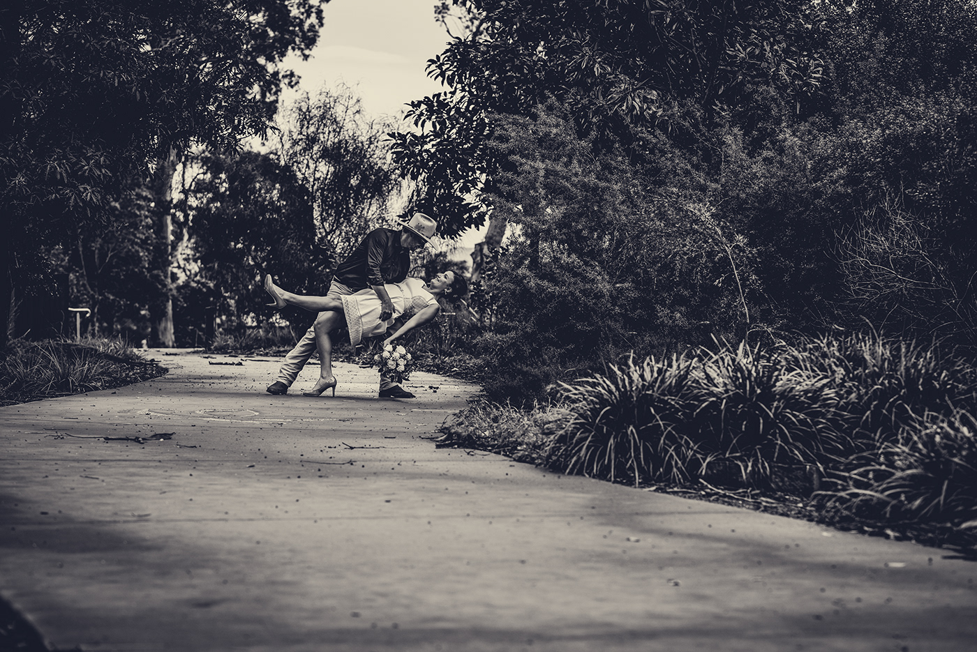
@thorn narwhal everything was done in camera raw after I selected the BW profile I liked the most for this image (BW2) 😃
Here is my version of the challenge assignment. Then I did my own on an image from Pixabay.
Here is my 2nd black and white assignment for day 2's challenge.
@outer sleet Nice image! A bit off kilter, though. Might want to rotate it to the right to get the buildings on the horizon straight? The ones in the front will still look good.
Third time now... sorry. The before and after of an old photo of mine for the PS Daily Challenge #2.
Before and after🇯🇵
Daily Challenge - day2 Black & White
PS Daily Challenge 1
Ps Challenge 2
😬
Way behind today, but here is my black and white
Challenge #1 Lighting, before/after, i'm so proud of what i do :3
Challenge #2 Black & White
I tried to get a balance between the heavy lights and darks, but I feel the sky is a little too dark for my tastes.
Is there a better way to shift the sky without changing the overall lights for the image?
@rose lagoon Nice VW image! Is it yours?
Thanks @young karma . Took it from unsplash
Curious about your choice to make the trees coloured. It really shifts the focus away from the vw which i would assume is the subject. Nice pic though
@vestal tendon tried to make it look different. It's just an experiment😃
I see! Thats fair ^^
Just watch the edges of your subject if you're masking colour in, i usually reduce the flow of the brush to make it a loooot softer so the colour doesn't bleed off as much
Thanks a bunch for the feedback. I will keep that in mind😃
@vestal tendon incorporated the feedback
Day 2 black and white
@rose lagoon very nice!
Challenge 2 B&W ^^
@thorn narwhal thank you for your comments, really appreciated.
Thanks for the heads up from those who reacted. I will try to give reaction but there are so many great images up here. Cool stuff folks!
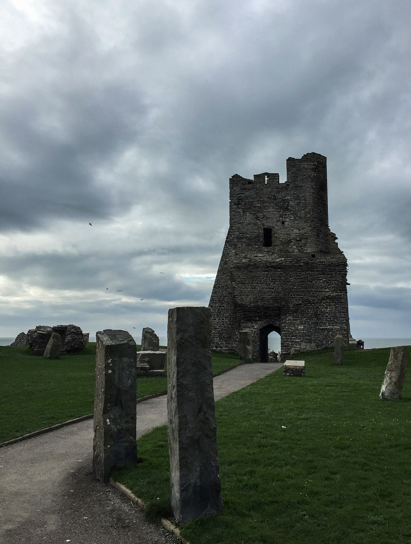
Here is my after of the tower challenge--Sharon
Here is my second challenge
I've only just posted day 1... here's my work. Onward to day 2.
PSdailychallenge2
My original image before the B&W conversion
The same image converted to B&W using the Camera Raw Filter
@cold cedar Thanks for the feedback! :D
I'll try that!
@young karma You could maybe add more depth in the picturen
It looks a little bit flat rn
@fast belfry Thx. I added some blur to the background. Is this better? What are other options to create some depth. Do you have any suggestions please?
It does a look a little bit 'fake' now, you can maybe try to add more shadows
You can still use the blur but I should make it less prominent
It is not be rude or something 😅
I’m happy you are suggesting, i’m here to learn. Thx This is my correction
No problem
You can maybe use this: https://digital-photography-school.com/depth-dimension-photos/

If you want to add depth and a sense of 3 dimensionality and life to your images, here are 7 tips to help you learn how to do that.
Thank you. I will look at it as soon as i get back. Must be off now. Thx again
Hi all, running a day behind with my challenge. So here is my challenge n°1
The adjusted one.
Black & White with Camera Raw, mostly B&W 8, but with tweaks.
@hearty prism Middle finger? What have I missed? Oh v nice work on the Eiffel T great contrast achieved with texture between sky, tower and leaves. 😀
@sudden mesa all three really nice edits! In both the B&W and lighting edits, I'd suggest darkening some of your midtone/shadow values. Conversely, if you'd prefer to keep the light, airy feel that you have with the brighter highlight range, I'd consider just toning down the highlights a bit to make everything a bit more equally muted for the entire range.
@vale nova Nice job with the first challenge straightening out your horizon line as well! The greens in the background are a really nice but subtle touch. With the B&W, I'd consider playing around to get more contrast in your midrange values. Right now, it's a bit hard to separate the car from the grass/ground as they fall into the same range tonally!
@split hearth I really like this edit of the Eiffel Tower and the subtle HDR approach. The trees really pop. One thing I would consider is to burn in the shadows towards the top of the tower as it gets lighter closer to the sun just a bit to keep it consistent with the range you can see in the base of it.
@south valley Nice image! It works nicely in B&W as I think the contrast between the lightness in the shelves contrast well with the darkness of his clothes and make him even more of the central focus.
Updated the gallery for the challenges with day 2. Still playing around and learning Behance a bit. https://www.behance.net/gallery/80212907/Daily-Creative-Challenges-Photography

Oh good, it shows the most recent addition.
@solar canopy Lovely! Sometimes B&W is a great fix for images with tricky lighting, like here in the bathroom. One thing I'd consider is brightening up the highlights in the figure so that she's not competing with her reflection (as that side of the image is a tad lighter).
@young karma I wish this was my home! In the B&W I'm jut losing a bit of the details in the chairs and the objects on the table, so I'd just consider brightening those up a bit. On the flip side, I'd also think about bringing the shadows darker outside to match the same range of levels you have in the interior.
@young karma Something to consider to get more depth would be to push the highlights in the foreground and make them duller in the background. Right now, with the whitest values in the clouds, it competes for attention from the buildings. If you manage to flip this, you might get a better result!
Before
After
It feels like there is missing something, so feedback is appreciated 😃
#✂challenges-feedback #📣creative-challenges Day 2: B&W
Hey, I thought I'd catch up with the previous set of Daily challenges so here's my design for Day 3 - the Double exposure 😃 Still haven't made it to the one when the movie title is added
Day 2 submission for the #psdailychallenge / B&W Conversion. The video for this challenge was amazing. My conversion goto has always been "old school" and I have never been that happy with the results. Thanks to @gloomy flare .
Here are my before and after submissions for day 2’s b&w 😃
Wow it does work so good with that photo, good job!
@thorn narwhal thx. You’re right
@crimson niche , nice job
I went back in raw en played with the lights
Lovely work everybody, this thread is looking super epic with these contrast-y black & white shots 😮
@glacial path now more clarity and texture
I used camera row to lighten up shade of stone bowl, then used B&W adjustment.
PSdailychallenge2, PSdailychallenge3. Before and after, color to B/W and crop to recompose.
...plus a little cropping to bring the vanishing point to the upper left third, and I removed some conspicuous advertising on one of the buildings.
Day03-CroptoRecompose #lighting adjustment and crop to recompose subject
Day1-Lighting
Used rule of thirds to line the subject(s). Added a friend off in the distance because why not? 😅
@wet kettle the bird is way, way way way too large. Is that seagull supposed to be larger than a human? Also, I like the lighting but you made certain areas too dark, losing all of the color information. But overall, good job
@untold jungle That's a whale haha 😂
Yeah it was a quick edit, I agree it's a little too dark, working on an edit adding some highlights back into the shot. Have to work on it sparingly as I am currently at work 😓
Thanks for the feedback
Lmfao! From distance it looks exactly like a seagull
Using rule of thirds 😃
Creative Challenge Day 2 BW Conversion
Here's my b&w interpretation of a landscape shot taken in a very lush area of Ecuador
Day 2 black & white challenge. Seattle Public Library.
@frank basin Is that your son?
huh


PSchallenge day 3 crop + posterized...I thought it needed a little excitement. lol
I'm late, sorry 😅
Day 1 challenge...
@wet kettle because your that good. love it
I think I posted this in the wrong space; here's my first set. The after is the one on top. https://www.behance.net/gallery/80288565/PS-Daily-Photo-Challenge-1

Behance
Iceland - photo by a statue of a now extinct bird that used to be prolific in Iceland
PS Daily Challenge 1 (Lighting)
@solar canopy Really like the image of the woman in the bathroom. I even like the golden hue.If you decided to fix the lighting first, try a levels adjustment. Use the white eyedropper on the sink and the black eyedropper on the dark item behind her. I tried it and the photo was even more lovely. Then I tried masking her so she and her reflection were in color. That was cool.
PS Daily Challenge 1 (Lighting) after
I used the Rule of Thirds grid to crop the image and the Raw Camera Filter to adjust the lighting.
@mossy venture great job on the horizon. May want to consider the placement of the surfers as well. 😃
@young karma how do you post them (2 photos) in one message?
really nice contrast @gaunt forge
@gaunt forge I love the clarity!
#PSdailychallenge Day 2 - B/W Photos
Original
#PSDailyChallenge Day 2 B/W Photos - Original
B/W
Biarritz (South France on Atlantic Ocean) - Long Exposure - BEFORE
Biarritz (South France on Atlantic Ocean) - Long Exposure - AFTER

Day 2 Challenge - Black and white
#✂challenges-feedback
Day 2 Challenge, Black and white
#✂challenges-feedback
@lunar mango - so much more in the B&W, great pic
@high mesa Thanks!!
First pass Day 3
day 1 challenge, försent!!
Here it is. corrected colors
day 3 challenge - after
I tried my hand at cropping and fixing today's daily challenge photo. It looks pretty good in my opinion.
@gloomy flare and other staff - do we need to submit projects with just cropping or should they now incorporate what we have learned so far?

I went to B&W since color was...not really there.
Day #1 Lighting adjustment #📣creative-challenges #✂challenges-feedback @gloomy flare
Day #2 - Convert an image to black and white. @gloomy flare #📣creative-challenges #✂challenges-feedback
I'm starting this challenge a few days late. Here's what I was able to do with them
I took the photo of terry and one of mine. In mine I tried to make the sky more interesting ... in a few minutes and cut it to the best (the sun was already too cut in the original) In that of terry I tried to blend the less interesting parts as well as to use the '1/3.
Day 2 Challenge
I wouldn't mind being on this beach!
@errant talon I think it is Ocean Beach, the west edge of San Francisco. That's the Pacific, if I am right. Weather looks typical, haha.
Further work - Cropped (the dude is gone and there is less "noise" on either side of the sunsert) brushed in more blue luninesence, created more contrast in the sky.
Psdaillychallenge 1
Original uncropped photo. ("Castle" ruins, Haha Tonka St. Park, Camdenton, Mo.) DJI Inspire 1 drone. We had such a wonderful sky that day.
Crop # 1
Crop # 2
Crop # 3. I like the crops with more sky showing, myself. Thoughts? Suggestions? Thanks!
This was tough to edit.
Thought having them on the edge almost out of frame tells a stronger story, (Daily Creative Challenge 03) #✂challenges-feedback
Here is my first view, I would hang this result in my living room . Hope you like it . Blue haters probably are going to puke , anyway hope you like it
@coral stone isn't the first one the cropped version?
@queen surge I think your "after" lost some of its clairity, or are they labled backwards?
@amber wren I love the blue theme of the image it looks really fresh and it gives me the summer vibe 😃
witch came first
Day 3 - Crop #✂challenges-feedback
@dark lotus I dig this crop on the glacier image! The crop works nicely to keep that sunset in center and it makes that dark ground in the bottom right less distracting as well.
Hello everyone, my Day 2: Black & White challenge
@timid pasture I agree with your thoughts on showing the sky more! It allows the eye to travel through the images from the castle up. I actually don't think your original image needs much cropping - I like the structure centered and seeing its surroundings for contrast and to make it seem more regal. Maybe I'd just crop out a little bit from the bottom? Have you tried it in other aspect ratios? A tad wider of a frame might be nice.
@rich sequoia I dig your warm tones here! Highlights look pretty good in the water as well. I'd consider bringing the white surfboard to about that same level as well so you don't lose the focal point. Would also make sure the horizon line on the water is straightened out!
@fast moth Cool idea making a vertical go horizontal to give more interest! I would move your crop down just a bit to lose some of the feathers and give the bottom of the image just a little more room to breathe so the viewer can fully get a sense of the motion.
@south valley I too have been thinking about how to make this image more interesting with an alternative approach to cropping. While I agree in trying to tell a story, I think maybe your approach would be better if you tried it where they'd be coming in from the left size, instead of walking off the right? This crop makes it a bit harder to navigate the eye around the frame, especially with the darker sand competing on the left. Alternatively, I wonder what it would look like if you kept your crop but tried cropping the surfers out even more?
PS Day 3 crop Before
@amber wren Fun crop! This is definitely pushed enough where your treatment of the horizon line is an obvious choice. Love the contrasting spot of red in the board as well.
And after
@dark lotus it’s the second. I used the crop tool to apply the rule of thirds
Alright Round 2 on the cropping image. Tried to make the image more interesting with a new sky and added some more waves in the distance. Had a tough time making the tones mesh. Kind of ran out of time unfortunately. Any feedback would be appreciated!
@deep mango after is much better as my eye doesn't get lost in the steer foreground.
Daily creative challenge #day2 . Any comments are most welcomed. I applied radial blur to the sky to imitate long exposure effect.
Daily challenge #3 - cropped to focus on my baby boy’s eyes
@wet kettle If only the original image had a sky this cool! I think where you might be running into issues tonally is the coolness in the water (especially in the new added waves) compared to the warmth and purples of the sky. They just read a tad too cyan/blue to me. Crop-wise, I'd consider coming in a tad on the left and moving the new whale dude over to the right. Tonally on him, It seems like his shadow range might be a touch too dark for being that far out in the distance. Hope this helps!
Original
@warm kestrel love this crop to make the yellow more of a solid background! If you can manage it, it might be cool to keep the figure in center with an even amount of the yellow on either side in a square composition.
@young karma I have to say I like the color better. It feels a bit more real to me.
@tropic herald makes all the difference!
https://mir-s3-cdn-cf.behance.net/project_modules/max_1200/6293db80331165.5cddc26939241.jpg https://mir-s3-cdn-cf.behance.net/project_modules/max_1200/ba239e80331165.5cddc26939586.jpg


@sly turtle this allows mw to look into his eyes and connect! Really good.
@wet kettle You had me until the bird. I get the idea but huuummmm?
@dark lotus I'm not sure why everyone thinks it's a bird... Did you enlarge the image? It's a whale.
@thorn narwhal I redid the crop to cut more out though I left them on the right of the image. I suppose with the surfers on the left of the image they appear to be entering and thus beginning, while having them on the right makes it look as they are leaving the frame, and thus have finished surfing. With the darkness on the left of the image it sort of emphasizes the end. Sorry, if I seem confrontational, just practicing for my return to grad school and future defense critiques.
Thanks @dark lotus !
@wet kettle Hilarious! I had even enlarged it but now I see the whale. OK. My comment stands. Maybe just too much going on witht he added whale.
@thorn narwhal Cool, I'll try adding a bit of warmth to the water and mess around with the location of the subjects. Thanks!
@dark lotus Haha fair enough! It was mostly just for fun to try and spice the image up a bit. I'll try taking him out with the new sky I added. Cheers!
@south valley It's good to be able to defend your choices! I think it works much better with them cropped out slightly more like you have it in the new crop 😃
day3
@wet kettle love the whale 😂
Tried to "save" this photo taken in India with tight cropping, see below for crop
I went for the black and white option
@neon palm I really like the colors
With crop
To be honest, I liked the first version more, I think that you must show a bit more of the environment 😃 @neon palm
@neon palm Imo I think the Snake is part of the main story telling, by cropping it, it will lose the real point
@weary mirage Deep voice says " Day 35 , Turtle still thinks is a Rock " 😂 😂
cropped and played around with lighting 😬
Day 2
this is the original
Day 3 - Crop to recompose an image. (After) #📣creative-challenges #✂challenges-feedback @gloomy flare 😅
@dapper basin great idea with the saturation! but be careful, the water looks pretty green and if you boost it too much, you will introduce color noise.
Okay final one I promise
@thorn narwhal Think the tones are better?
@dark lotus No bird whales in sight this time 😂
@wet kettle Go to print! I am hoping that by the end of the course I can do this. Did you use layers?
I did a slightly less cropped image but wanted to remove the plastic bag near the snake, not sure...maybe the whole is better...
@dark lotus It's all about practice. Watch tutorials and play around with the techniques that you like and work the best. You will hear the adobe evangelists on the live videos mention, there is a thousand ways to accomplish any task. Pick the workflows that work best for you 👍
And yes I used quite a few layers to accomplish this. Here is a snapshot of my panel
@wet kettle I wanna grow up to be JUST LIKE YOU!!!
#📣creative-challenges #3 - I cropped it and did a bit of lighting/color.
Thanks @glacial path 🤝
Hello, all, joining in late this week but I really was amazed at the dehaze option from yesterday's b&w video so I tried some of that, as well as saturation and vibrance to pull out more colors. Not super impressed, like he said it's not the best photo, but it's probably similar to a photo I'd take as I'm only slightly better than a beginner 😃 Any thoughts or suggestions?
Thought I would do one of my own as well - Cheetah from the Milwaukee County Zoo - Before.
#📣creative-challenges 3 - Cropped and lighting/color.
hi
@desert leaf yes! The Dehaze slider can be pure magic sometimes. just like the new texture slider. just one thing: always be on the look for noise, especially color noise (which you can fix in Camera Raw)
@indigo panther really like the crop! Personally, not the biggest fan of that glaze on the photo, I might have even increased the contrast myself. But I love the colors and how you cropped it to really focus on your subject (you?)
@desert leaf It's not me haha it was a client who got a free retouching from me. I agree with the glaze, thank you for your feedback! ♥
@indigo panther nice one! I like the crop but the colors are a bit washed out in your after image. This can be a cool look but looks less natural. If you're going for a more stylized look, you should totally try out even more combinations - shadows with a blue color wash, black&white, more extreme color grading. The sky is the limit 😄

@glacial path I think I fixed it? Looks like there's a little less color noise
@desert leaf yeeeees! much better 😄
@wild quail nice black&white version 😃 Only one thing: the chin and the hair is touching the edge of the image. next time, try to leave some breathing room 👍
@rain parrot that's actually a pretty difficult image to cut out. Did you use the Select and Mask dialog?
yes.why?
@rain parrot because a lot of people don't know about this tool
kk
it will help you with the soft fur texture @rain parrot
k
@glacial path thanks for the feedback 😃
@north arrow yes! I think you could go even closer 😃 Awesome shot by the way
@neon palm I love this image. I think I would crop it with a little bit of the basket so the snake doesn't look like he just photo-bombed but that's just an idea.
@wet kettle woah! what a great sky 😄 So good 😃 I like how you matched the colors to the sunset sky. The only thing that's slightly distracting is the over-saturated red color on the surfboard.
😀
@glacial path Thanks Tim! Didn't even think of that, I was so focused on getting the images to match 😂
@wet kettle yes, much!
Just made a simple crop and adjusted colour and temperature (i know it is a really purple now but i like it somehow) #psdailychallenge3
I know Terry hates this photo but I don't think it's all that bad once you crop in and brighten it up. I used the Camera Raw filter and thought it did a great job!
@rigid bobcat Yeah i think it did a great job... better said: You did a great job with this!:)
awe thank you @wild quail !
Challenge #3 - before
Challenge #3 - After. Cropping plus a bit of b&w with some color
@uneven lark I would probably straighten it for the fountain surrounding the water spout and see how that looks. It seems too sideways to me
Thanks
you're welcome 😃
Day 3 before and after. I put to use some of the other techniques we've learned too, including the content aware tool.
PSdailychallenge Black and White
PSdailychallenge Re-Compositioning Day 3 (edited color, as well)
Hi @thorn narwhal! I can try that, thank you for the advice....
@thorn narwhal Here are those adjustments to my Day 2 photos based off your suggestions
https://www.behance.net/gallery/80286997/Photography-Daily-Creative-Challange-Day-2

Behance
Photography Daily Creative Challenge: Rediscovering Photography and Photoshop

PSdailichallenge Day 2- Black and white photography - Darker background...
PSdailychallenge - Day 3 - Crop and Recompose. Original Image.
PSdailychallenge - Day 3 - Crop and Recompose. I used the content-aware crop tool to add background and Camera Raw filter to adjust the image.
Here's my submission - content-aware cropping, lighting, adjustment layers. Let me know your thoughts.
And, my take on Terry's photo.
https://mir-s3-cdn-cf.behance.net/project_modules/fs/4a75e280340993.5cde1187efce1.jpg
https://mir-s3-cdn-cf.behance.net/project_modules/fs/78d79880340993.5cde1187f01bf.jpg
Snow in Las Vegas, NV 2019. Top: Before Bottom After.


So, again, I am very new to PS. Alongside the daily lessons, I've been tinkering with little projects here and there to get more familiar with the tools, use of layers and masks, etc. Here I have an image that was free to use, the original from Pexels (by Mark Smith). I'm sure for many of you this is rudimentary, but I wanted to play around. So here is my take on multicolored eyes.
@gloomy flare #✂challenges-feedback
Cropping Day 3
Sharon- Day 3-Crop Recompose
😀
PS Daily Challenge - Day 3 - Cropped Image
PS Daily Challenge - Day 3 - Original Image
Here is the original image I pulled from Pexels by Laura Parenti.
Here is my PSDailyChallenge Day 3 version of her image.
@thorn narwhal Thanks for the feedback - I've had another go at adjusting it. Not sure it's a lot better - any suggestions?
readjusted

Beautiful work @gentle elk
thank you @coral stone I appreciate it, any tips?
It's great! I like the way you applied the rule of thirds preserving the subject's and the water focus
ok cool, thanks, I'll try to keep that up
PS Daily Challenge - Composition 😎

nice @wraith surge looks great
@gloomy flare didn't like emphasizing the sky in the crop of his photo, but I can imagine using it for copy, so tried it out this way.
@gentle elk Thank you!
I like how you kept the sunset
@gentle elk Thanks. It was difficult to bring out shadows and not blowing out the sunset.
New vercion @thorn narwhal
need a feedback on this before submitting to the client
A Little bit behind to catch up with the challenge - Day#1 Pic
Wow the after version looks so much sharper well done 👍🏼
thank you 😊
Taken In Brussels, through a window in the Atomium,
original un edited
@wild quail nice work with the crop, get rid of the duck, then its just the girls and time
PS Daily Challenge Day 1 After
Day 3 Crop (and straighten) challenge with one of my own images.
Day 3 creative challenge. Cropping
Day3_Crop

PS Daily Challenge Day 1
Is it new that we say ‘Before’ and ‘After’ in our first language 😛
I will do it too 😉
day 3 challenge
PS Daily Challenge day 2
I am confused as to which one from the follow are perfect?!
So I did 2
Using the B&W Adjustment
Using the "camera raw" filter
Day 2 Challenge
PS Daily Challenge Photography Day 3 Image 1. Taken on a foggy winter's morning
PS Daily Challenge Photography Day 3 Image 1. After cropping and B&W treatment using Camera Raw Filter
My second image for PS Daily Challenge Photography Day 3. Another winter's morning 2 years ago.
The second image after cropping and B&W treatment using the Camera Raw filter
@grim ermine Nice work! I like the first one more, there are more details in that one.
thank you
@maiden flax Nice work too, but it looks a bit too purple in my opinion.
thanks for the feedback
Thanks @fast belfry !

Here's my Day 2 Challenge; just a little behind and hope to catch up this weekend. Let me know what you think. https://www.behance.net/gallery/80360129/PS-Daily-Challenge-2

Behance
Black and White conversion of a color photo of the southern coast of Iceland.
Nice work
@high mesa That's a great photo and great crop!
@fast moth Love the new crop!
@vale nova Yeah, there's definitely more of a separation now! I guess on the flipside you're losing the rich depth of shadows you have in the truck in the original, but for me it does help to be able to distinguish the subject from the background more like you have it.
@thin jetty looks great! Love the clipping mask edit
@sturdy thunder oh wow, that squirrel is so ominous now! I dig the new approach, very dramatic without being over the top.
@upbeat owl I dig the new aspect ratio with your crop choice! The inclusion of a lot of sky gives the image a lot of nice room to breathe and becomes very atmospheric.
@uncut belfry Wow, really nice image amplified by your edits! What are we looking at here? One thing I'd consider is bringing the highlight range in the sky so it doesn't compete with how the eye travels from the bottom left of the frame, up diagonally.
@dusky raven I wonder how this image would look as a square crop, or with the head more centered? Because the focus is so selective, I'd imagine it's hard for that focal point to not be perfectly in the middle.
@young karma This image is lovely cropped vertical! I'd consider leaving a tad more room around her (particularly above her head) so she doesn't feel so "trapped" within the frame.
@gentle elk Great photo of the photographer! I do miss the grandeur of seeing the entire water splash behind the subject a bit. Wondering if there's a new ratio that would allow us to see a bit more of that effect?
@luckiest.id#4887 your lighting adjustments look nice here. You should use this edit to do the crop challenge as well to make it even better!
@maiden flax I personally like the purple + warmer tones! makes the contrast between the blue and red less severe and gives an overall more serious impact
@young karma These are lovely! I actually think with the first image of the fog, you need a bit more of foreground to help anchor the frame. Because the tones are so muted through the fog, I don't mind giving everything a little bit more room to breathe than usual. The second crop and edit is really strong! Love all the rich textures in the trees and the road.
@grim ermine I think your B&W Adjustment edit is much stronger! I love the contrast without relying too heavily on highlights. I would use whichever editing method you have found is best for you, there's no "right" answer!
@young karma solid crop and your color correction is spot on here!
idk where to put this, but where can i find free pictures?
i have a camera, but im too lazy
@thorn narwhal Thank you for your feedback. I originally had a little more foreground but decided to remove it. Personal taste I guess 😂
@uncut belfry Funny how cropping and rotating the frame can add much more energy to the photo, with that rollerblader going down more of a dramatic hill now!
Photoshop Daily Challenge - Day 01 - AdjustLighting
Photoshop Daily Challenge - Day 02 - Black+White + more
Photoshop Daily Challenge - Day03 - Crop
Day 3 PSDaily Challenge
PSdailychallenge day 1 and 2
Day2-B&W
@tulip fern Nice work! I'd consider editing or cropping out that gutter on the left, just so it's not such a harsh linear line competing in the edge of the frame, especially while you've adjusted everything else perfectly.
@glossy wadi really nice B&W! Only thing I'd watch is losing the detail in the trees and cabin with those super dark values. Love the pushing of the highlights in the clouds and on the path. Also, sorry I couldn't help more with your Camera RAW set-up!
@vestal tendon I dig the cool blues in the whites/highlights! A nice complementary contrast with the yellow of the rest of the structure. I'd consider just shaving off the top rails and bottom line in your crop as well - it might really emphasize the curve of those two parallel lines that carry the key through the frame and make it seem like it continues on forever.
@unique skiff wow those greens! So beautiful. I can't tell from the original file, but is there a way that you can have the circle of the fountain structure completely in frame in your crop, or does it have to be slightly cut off at the bottom there like you have it?
when i took the photo i should make some room at the bottom , u r right
fountain B&W
@unique skiff you could try to use the clone tool just to recreate the bottom of the fountain, but also really not the end of the world! B&W is cool too. Becomes a much more abstracted figure especially because you lose the midtones in the water. Reminds me of some sort of crazy eye or something.
heah, try to vision a different kind of fountain
@young karma There are quite a few stock sites that are free usage. Try pexels, pixabay, and unsplash. Those are my favorite
My submission for the PsDailyChallenge - Day 3: Cropping. I call this image "Cat in Timeout." 😀
My husband took this photo this morning after a big storm. He called it 'LIFE OF A FARM DOG".
That is an awesome topic.
I have recently starting retouching photos.
@weak flax very nicely done!!
@light nebula Very nice 😃
Thank you @fast belfry
Day 2...would love some feedback...too much?
@floral robin Question is, Are you happy with it? It has a dramatic effect, if that is your thing, then you did great
Wise but true words
Daily Challenge #3 Crop: picture of a dove sitting on my DirecTV dish.
BEFORE
Daily Challenge #3 Crop: AFTER
After cropping it, I saw a bird sitting with humpty dumpty & taking a selfie. I cannot unsee that. lol
I like the idea behind it 😂
#PSDailyChallenge
@glacial path - can't make the live cast tonight, what time is the video available from to watch later?
@glacial path - cool, thx😀
Ps daily challenge 1
Daily Challenge 3 - Composition
Day 3 #✂challenges-feedback
My Day 3 😃 Photo is mine too https://www.behance.net/gallery/80369281/PS-Daily-Creative-Challenge-Day-3-Crop

@light nebula I like the dramatic feel, but I think I prefer it without the border. More like the first one I did. Still a bit dramatic, but not overkill.
Excellent @floral robin
Here is my Day 3 cropping attempt. Let me know what you think. This is the after view
This is the before view.
Hi, this is what I made of the cropping. What do you think of if? This is the before photo.
And this is the after photo.
@glass bridge Great job on the b&w conversion! Which method did you use?
@young karma free images: pexels, unsplash, pixabay
@young karma Your crop looks good, I like where you placed the horses head.
Retouch challenge
@past canopy I love the conversion; I wonder, though if the sky might be a bit too dark. I think I would try, if possible, lightening just the very top of the photo so it didn't have a dark line, my eye sort of gets stuck there.
@trail turret I love the photo of the dogs! Did you try the mask? I think it would be so cool if you could mask the dog in the front so the color popped just on the brown and white dog.
@thorn narwhal yeah I wish I could keep the splash, I'll play around with it and see what I can do. Thanks for the feedback!
@wraith surge thank you!
@fast belfry yep! All the photos I'm using are mine.
@fast belfry, thanks, and sure! Please do!
@vapid niche Thank you!
The composition is a little bit weird, I would place the church in the middle of the photo. And I would also make the photo more light.
I hope you know what I mean 😅
 @patent mirage has been warned
reason: Mass mention
@fast belfry, yeah, I had it there, but it didn't look quite right. It wasn't a great photo to start with as you can see from the before photo. And, you are right, it probably needs some more lighting love. I'll play with it some more. And thank you for the feedback! It's the only way I can get better at this!
I tried to tag the mentors! This is my first time using Discord. Posted my design challenge on #❓ask-a-question
@vapid niche hmm yeah that’s hard then
@patent mirage welcome! when you tag folks with a @ mention they get pinged directly - to avoid folks spamming with mass mentions we limit the amount of people you can tag in a post. I recommend just posting your work here in design-feedback. The mentors will see it 😃
Here it is! The design challenge of the day. Retouching. Hopefully all the mentors see it and I get some legit feedback as well. Hoping for some illustration challenges too! 🙂
@vapid niche sorry for the second tag, but you could do it a bit like this. I know that this is a bad composition too, but I just took a fast screenshot on my phone.
But just so that you get the idea
I like it! It seems warmer and crisper than the non edit. Check out Terry's stream at 12am PT to pick up some extra tops & tricks, you might want to make some changes 😃 @patent mirage
Looking forward to it! @uncut ginkgo Might have to burn the midnight oil for it as well. haha
@vapid niche going further with the photo taken by Kars, I would cut off a bit of the bottom of the photo. Now, my attention goes to the bottom instead of to the church.
I do this in my way, I can't wait to see the thousand other ways we can do it!!
@fast belfry and @young karma What do you think of this crop? This is more centered, and I played with the lighting. Too much? Too boring?
@vapid niche 👌
Brightened the eyes and teeth a little, removed some crows feet, touched up some blemishes on his forehead, changed the background color, took out the label on the bow tie. I think that's all lol
Daily challenge #3 cropping - here’s my cropped result:
Here’s a before & after:
Any critique welcome!
Behance
Photoshop daily challenge, day three. Using Photoshop to crop and recompose an image.
My 3rd Callenge
Nice job @wet kettle !
The photo almost without PS, the light was only on disk

Trying out adjusting color...
I chose these two photos to do day 3’s cropped challenge. But am a little unsure about the cropped results especially for the 2nd photo. Could I get some feedback on these cropped results please? 😊
Hi, my name is Hafsteinn 😀
Hi)
@gloomy flare Thanks Terry! I look forward to seeing your approach
Day 01 - View from the hill - Whitby (June 2018)
Day 02 - Lending a helping hand - Bruges (Sept 2017)
Day 03 - Reaching for the sky - Rievaulx (June 2018)
@fast belfry Thanks!
PS Daily Challenge 2 Black and White
I used the Camera Raw Filters and I added some drama in the clouds with an extra layer for adjusting curves
the 4th Challenge
@quaint latch love the crop! And, yes, looking through my photos I either need to purge a bunch or do a lot of post processing!
wonderful
Badlands, South Dakota - love this except for all the signs in the curve of the road near the center.
Signs gone, and bumped up the contrast just a tiny bit..
@timid pasture Cool photo! Badlands are awesome, I'm sure with a couple tweaks you could totally get some of the color banding in the rocks to pop a bit more
Thank you @gloomy flare for the tips. Sometimes we get in our workflow and forget about other tools.
@wet kettle Thank you, good sir! I may fiddle a bit more with the targeted adjustments to bring out the strata banding a bit more. I also did a little fiddling with the new texture slider. I'm thinking about submitting this to Adobe Stock as well..
stunning! Much better
Olga - original photo. A lovely Russian model I photographed a few years ago. Original shot on 35mm film. Remember film?
@vapid niche thanks! 🙏
Late starting this challenge. Here's my edit for the lighting challenge. https://www.behance.net/gallery/80369941/PSdailychallenge1

Olga - Retouched. I cropped out a bit of the bald sky, took out a few blemishes (I left her mole over her right eye), got rid of a few stray hairs, took out the distracting red car, reduced the shine on her skin just a tad, and bumped the color a little bit. Also used the new texture slider in Camera Raw to add just a touch of smoothing to her skin.
Thanks for the feedback @thorn narwhal ! You are right the gutter on the left was too distracting. I briefly thought about it and felt like it was too much a part of the house. But after editing it away and also some of the white paste on top of the roof it looks like a better image. And I think it now can be my Day 4 submission as well ;).
day 4😝
I'd like some advice on this one. I masked my Day One Challenge, and I corrected my skin tone, but I couldn't mediate the harsh whites of the clouds. @thorn narwhal
After
Before
How can I mediate them? They're so bright (250/250/250)
Day 4 challenge
Day 4 - Retouching
@floral viper nice work!
Retouching! Day 4 #✂challenges-feedback #📣creative-challenges
day 4 - the after
PS daily challenge; cropped image; ManWithCigar
@dark quiver Skin tone looks much better! With the clouds, you might be out of luck -- if the initial image is overexposed it loses detail to recover (on the flip side, underexposed/darker images are way easier to recover as they capture for "visual information"). My only suggestion would be to burn in the highlights or use a general adjustment layer mask to lessen those harsh whites down to a lighter grey. It would probably still give off the same effect, but in a less contrasty manner. All that said, I think even just by fixing the skintones the image comes across much more solidly!
@tulip fern good catch on the white! It looks great. The white on the right side doesn't even bother me as it's in the sun 😉 great job!
PSdailychallenge Day 4, May 17 Original Photo
PSdailychallenge Day 4, May 17 Retouched Image (My goal was to make her look younger.)
@crimson niche on your crops -- I think you have the right feeling that your first go is stronger than the second. On the first, I really like how the guy on the left is walking into frame, bordered by the two on the right, and then with the other lines of people walking through the center. It adds some really nice movement around the image. Something I'd consider is retouching out that street sign now located in top right so that it doesn't distract.
On your second image, I'm not sure it makes sense trying to make those two figures a central point. The perspective you have of the road + wall in the original is nice, so it might be cool to keep those guys towards the end of the frame on the right and keep the rest of the frame more about that ominous opening in the wall. I'd definitely also straighten out your horizon line on this one!
@timid pasture 35mm? Yes, I remember. My first real camera was a Yashica SLR with a CdS light meter that was not TTL. Although my father taught me to use a Mamiya or Minolta TLR, about that same time. Both cameras long gone.
Quick Challenge #1 to catch up.
Before
I used the same retouches Terry used plus I added more hair 😉 , increased the hue of his bottom lip and added a High Pass filter to soften the face.
 Gretchen, this command is disabled in this channel
After! First time using my tablet for editing - Wacom Intuous! It was hard but I do see how practicing with it would make photo editing easier.
@heady dawn Nice job! Only thing that really jumps out to me is the chin area. The texture there looks as if you've almost added a bit of a beard or something. I think that also might be the noise/texture added to the full image coming through the darker values there, but I would definitely try to touch that up a bit. Zooming in, a similar effect seems to be happening on the cheekbones a bit as well. That said, really nice treatment of the under eyes!
@floral viper Looks pretty good! Only thing that jumps out really is in the shadow of the neck area, I can see a pretty defined brush outline that appears a bit lighter than the rest of the skin. I'd try to blend that in a bit more if you're able!
@kindred kernel down to the lint on the jacket! Great job. If we're being picky, I'd suggest making the retouching around the man's eyes a bit more subtle, as the contrast between the shadows around his eyes vs the lightness immediately outside his skin seems a bit unnatural.
@thorn narwhal @floral viper Thank you for the critiques! The original photo had a lot more contrast - probably to hide those hairs on her face! - so I’ll go back and fix those areas. Thank you much!
@timid pasture Really great retouching! I'd consider playing around in your lighting and tones a bit to make things pop a bit more - perhaps a warmer palette overall? Still reads a bit desaturated to me, but I think a small few additions could complete a really nice image.
@sly turtle Perfectly lovely, natural edit in my book! From making the leaves pop in the background to an extremely flattering crop, you've really done this portrait justice. Good job merging all that we've covered so far this week for today's challenge!
Hi folks - a little behind on the challenges so here is day 2 - https://www.behance.net/gallery/80381141/PS-Daily-Challenge-Day-2-B-W

@rigid bobcat Good job on the wrinkles around the eye, the hair has a blurry spot right around his (now gone) thin-hair spot
@rigid bobcat The hair is now very neat around the edge, nicely done 😃
@glacial path I know. It's hard with a tablet! I'm much better with a mouse. Had to rush through it too, but I want to go back and practice more!
@rigid bobcat yeah, it's just a matter of getting used to your tools 😃
@proper egret nice! his skin is now silky smooth and he looks younger 😃 IMO, his beard looks a bit too soft, I would reduce the effect slightly to bring back the texture.
@proper egret I like what you did with his hair, but there is a pretty obvious edge here:
@proper egret I think you could add a fade to make it more... uh. smooth 😃
oops yes, too obvious thanks @glacial path
one final thing: his hand still has wrinkles and is not as smooth, I know Terry didn't mention it either - but you probably should apply the same treatment to the hand 😃
@proper egret ^
@paper bobcat yup! it looks great - now is your chance to experiment with color and the exposure. See what works, see what doesn't work 😃
@young karma I see you have darkened the hair. But be careful when doing that because without the right precautions, the colors will get oversaturated or you will lose detail because of color clipping (the dark areas will become pitch plack and will lose all detail, essentially becoming one blob of black). So I would tone down the (probably) curve layer to bring back some of the detail in his hair. Also you should totally try to remove this:
@jovial jolt nice! the effect is pretty clean - I like it

Thanks for the feedback, @thorn narwhal ! Greatly appreciated.
PS Daily Challenge; Yet another Tony Guerrero Retouching
Here it is, my retouched photo. What do you think? Hey, did you know there is spot healing tool in Camera Raw? I did a couple of retouches with it but not confident with it yet. Next is the actor. I think I want to change his clothing color. We'll see. And, just got my Wacom. Whew! Got a lot to learn to use that! I've have so many years of experience with my mouse that I've having a hard time with it.
@sly turtle I'm think if coloring his clothes, too. Love that blue!
@axmgl Nice crop! Now, a little brightening maybe?
@thorn narwhal thank you so much for your feedback 😀
PS daily challenge #1. What do you guys think? I like how PS has challenges like these. there fun.
PS daily challenge #2. black and white was fun.
@patent barn Looks good, Nice job!

Behance
Photography Daily Creative Challenge: Rediscovering Photography and Photoshop
@peak warren Yeah, my first "good" camera was a YashicaMat TLR I bought from a friend back in high school. It was completely manual - I learned a lot about f-stops and shutter speeds back then. It's long gone, too.. 😁
I no sooner post about that YashicaMat camera, and I see a photo with one! Mine wasn't red though..
@wraith surge Nicely done on the cropping - it really emphasizes the young lady and her YashicaMat. I had one just like that (except it was black not red) many many years ago. 😀
@timid pasture that is pretty funny, what a coincidence. The camera was another photographers but was a nice prop for the model.
@thorn narwhal Thanks for the feedback, good sir! 👍 I went back in and fiddled with the Camera Raw profiles a bit, and also played a little with the selective color adjustment layer to punch up the colors a bit. I'm liking it even more...
@timid pasture my yashica is in storage somewhere
@high mesa I think the crop looks good. I would suggest trying to give a touch more space to the top of the photo.
Image given a little extra headroom
@thin jetty - thx for the feedback, it was well spotted
@thorn narwhal thank you for your detailed and constructive feedback! I was unsure of the second one but just couldn’t pinpoint on it. 😅 Now I have better perspective of how to be cropping it so that it’ll look like there is a better flow 😁
My pic for today's challenge.
@young karma You could try adjusting your shadows. In the original you have a lot more shadow in the street. It almost looks like you took all the shadows out. I think if you adjust your midtones and shadows it should help the sky look less green
Retouching Day 4
Grandma's 90th before
After Cropped, background decluttered, necklace and some blemishes and wrinkles removed, teeth whitened, distracting light on tiara removed.
Psdailychallenge 03-crop and compose, this is me drinking an old fashion by the pool.
This is the after.
@timid pasture I loved 120 film for the resolution. But I remember ruining more than one roll of film when I threaded it badly on the developer reel, and the emulsion touched to the next turn of the film.
Day 2 - Black and White - Liked being able to browse the options! 😀
Sorry everyone for reminiscing about film. Putting my brain back in pixel-mode.
@thin jetty Playing with shadows helped. I am liking the sky better here.

Retouching with Terry's photo. Will find one of my own to try next. The hardest part was the wrinkles on his left cheek, where it curves away.
My go at Terry's Image
Day 4 - Retouching
Day 3 Challenge
Hey guys i know it's not related to the challenge thats going on now. But i just published this project and i want to know your feedback on it. hope you like it .
https://www.behance.net/gallery/80389887/Logofolio-Vol02-2019

PS Daily Challenge #4 - Twins
Photoshop Daily Challenge4 - Retouching images, the second one.
Hallo little bit late, but here my day 3 challenge before and after
Before
After
ok my after photo color are very different in here
I really like the colors, but I think that you could composite it more equally
But besides that good job @young karma
Nice hair 😂
@umbral laurel - the after image has some aberrations on the background; it looks like ripples may have been caused with lifting highlights? It has the effect of drawing your attention away from the talent. Hope this helps.
@past canopy - pump it up Doc, give me everything, I want the full $50 makeover, awesome man!
Day 2 - Black & White
Good job
Thanks @high mesa I will fix it.
PSdailychallenge - Day 4 - Retouching. This is the original image.
They won't let me post the after photo. It is the same, except for retouching: ClydeBOTToday at 8:11 PM
Woah there! The owner of Adobe Photoshop has requested that Discord block any messages our mostly-accurate robo-hamsters deem to be explicit. Seems like you found one, so your message has not been sent. Please be nice.
Only you can see this — delete this message.
...so I guess you don't get to see the after photo. It is on my Behance profile, however.
"explicit"?...stupid bot!
After
Before
Here is my submission for Day 4's retouching 😃
After
Before
2nd photo credit: Joe Gardner (from Unsplash)
I'm still pretty new with retouching. Feel free to let me know on which areas I can still improve on while retouching images.

I took my own photo hehe
4º day challenge before
I took my own photo hehe
4º day challenge after
https://mir-s3-cdn-cf.behance.net/project_modules/fs/e2822e80404951.5ce03595944dd.jpg
https://mir-s3-cdn-cf.behance.net/project_modules/fs/c8822f80404951.5ce0359594926.jpg PS Daily Challenge 04: Photo Retuouch. Top Before. Bottom After. https://mir-cdn.behance.net/v1/rendition/project_modules/fs/57b51280404951.5ce057e61e45d.jpg Hair kind of bugged me so I elimated the shine from back lighting.


Nice work everyone!
Daily Challenge 4: Photo-Retouching techniques
Hi guys, catching up with Day 1 - Lighting! This is my before picture
and this the after picture. I wanted to create some kind of magic and mystical atmosphere, but I'm a bit unsure, if it works
Nice
Nice!
Good job
@peak warren RE: 120 film.... Oh, my... Does that bring back memories..... I even shot 4 X 5 sheet film every now and then. I can't remember how many hours I spent in the dark with funny-smelling chemicals... I made gazillions of 4 X 5 test prints to get one good 8 X 10 or 16 X 20. Had a Beseler 4 X 5 color enlarger and a Jobo drum processor. I think I like my "darkroom" these days a whole lot better... 😆
@uneven lark The after photo is much better. Good job 😃
Hey
I am a beginner in Photoshop
I made this Poster for a community event
Can someone review/ give suggestions about how it looks ?
Hopefully this doesn't violate any guidelines 🙈
I'll look at it in a moment
Thank you
Okay I am here
@uneven lark Very nice work, I really like the background.
But I have some feedback for you
This text is hard to read
I would suggest to use an other font, and I would make the text also a bit bigger.
This also a little bit hard to read, it is okay but for people with bad eyes can it be hard to read
Okay forget that last one, that doesn't make any sense
But nice work
@fast belfry okay

If you have made the changes feel free to tag me 😃
I don't know if that's even good english, but yeah
@uneven lark Adding to what @fast belfry said. The background is distracting. I like the pattern but it gets in the way. I suggest desaturating it, but not completely. (For example, use a Hue/Saturation adjustment layer on the BG, and play with % saturation between 0 & midpoint). // on the address text, I suggest Roboto, the Google san serif. It fits their brand. Easy to read, too.
I agree
@uneven lark one more thing. I am not super knowledgeable about Google branding. Do the geometric shapes in the BG need to be in Google 4-color red, yellow, blue & green? Or is that overkill?
@peak warren thank you, let me try again
@fast belfry @peak warren I made these changes
Roboto wasn't looking good
And yeah just four colours would be a bit much, I guess
For this picture I combined day 2 & day 3 (The focus is a bit of though) this is the before
and the after
This image was part of an assignment/PS challenge day 4 on retouching. I was not expected to retouch the entire subject. Instead, I focused on the more noticeable issues with the attire (bulging, gaps, and tags). In terms of face, some pores and medium to light wrinkles were reduced, stray hairs removed, slightly increased density of head hair, removed pimples, texture, and light freckling. #PSdailychallenge
Frankenstein co-opts the tower. Tried to bring out the sun in a stormy sky, imagining the ball in the tower targeting it or projecting it. Fun.
PSdailychallenge
Just got around to doing day 2 of the challenge. I didn't like b&w on this photo because it looks to meta. I feel going with a different style still can make a photo look good while also keeping it unique.
Day 4 - Photoshop Challenge - Retouching #📣creative-challenges #✂challenges-feedback @gloomy flare @glacial path 😊
#✂challenges-feedback @gloomy flare
Challenge 4 - Retouch I'm not sure if this breaks the rules, but it is a picture of my grandma when she was in school and one of my favorite retouches I've done. Let me know if I need to do another photo of my own.
@eternal marsh I think the lighting looks really good. It has a great mood. Nice job.
@wraith surge thank you! 😃

nice @rain monolith
@gentle elk thanks 😃 ,and also you great too
thank you 👍
Just got around to doing Day 3... Day 4 is next😅
Day 4 - Retouching ... pretty much just followed the tutor's instructions and did whatever he did as I've never used any of those tools before..😀
My day 4 retouching. Here is me in one those days
Before
After
day3 crop after and before
Still catching up, my Black and White images https://www.behance.net/gallery/80430349/PSdailychallenge

Hello everyone! i just strated these class...
Hi! I'm catching up, here are my cropped photos for day 3 of the callenge (also trying to figure out how Behance and Discord works 😅 )
https://www.behance.net/gallery/80432025/PS-Daily-Challenge-3

Hey everyone, been ill the past couple of days, but I'm now better enough to do the Day 4 challenge 😃 Photo also by me, as always https://www.behance.net/gallery/80434021/PS-Daily-Creative-Challenge-Day-4-Retouching

Behance
PS Daily Creative Challenge: Day 4 - Retouching
Original
Nice one @dusk crown . But I would leave some breathing room around the flower, but good job 😃
@fast belfry Thanks! I originally had it cropped like this, but I changed it because the top edge doesn't have any breathing room in the original photo, so it felt a bit uneven. But does that look better, even if it's slightly off-centre?
Yeah I see what you mean, it is hard then. But this looks a bit better in my opinion. Btw nice retouching 😉
I didn't even noticed it in the first place
Yeah, you see my conundrum, haha. The one with more breathing room looks better, you mean? And you didn't notice it was off? In that case, I'll change it to that one. Thanks for the feedback, I appreciate it. 😃
And thanks! I've messed around with retouching a few times before.

@fast belfry I decided to do the best of both worlds, and crop it somewhere in between the two. Enough to give it a little breathing room but not so much as to make it as noticeably off-center. 😃
Thanks 😄
Cropped
👍
Hi everyone, just caught up on day 1 and think I have done OK with the provided image. Have tried with two of my own but results aren't as good 😦 Anyone have any advice on how to enhance the ET one it looks oversaturated to me? Thanks in advance
Nice work! I really like the first one, the colors are very cool. The ET one is a bit oversaturated, but it gives a cool effect in my opinion.
You could try to remove the bars, but that's up to you 😉
Thanks @fast belfry I will have another go at the ET one. I did try removing the bars but got a little stuck at the wheel spokes 😃
Thanks I will have a go.
Okay bye
yayy, catched up with all the challenges now! 😃 This is the after photo for retouching. I also added other pictures on Behance, but I dont want to spam here. So if anyone wants to have a look at it and give me some feedback, there you go: https://www.behance.net/gallery/80437449/PS-DCC-Photography-May-2019


Instagram
22 Likes, 0 Comments - Estaban (@estaban_1000) on Instagram: “#psdailychallenge day 4, retouching a photo. Pretty happy with how this one turned out. #photoshop”
what do you think?
@opaque sigil Love the image colours and sky. Well done
Looks good
@fast belfry what do you think now?
Before
After
Day 3 Crop/Composition Before
After
And for fun...
before
after
@young karma On the after crop I would probably take more off the top since there is so much space there. Love the color on the monarch!
noice
@jovial moss thanks
Photography Daily Creative Challenge #03 / Croped and Retouched in Lightroom
Day#02 Black and white
@jovial moss nice! But it does look a little bit fake, because the light should be coming from the behind and in the picture it is coming from the front but that’s not your fault I think 😃 . Beautiful explanation 😅 Good job!
For day three I chose a photo I did not like very much of my daughter running. Using the crop tool to crop out the unfavorable parts of the photo (the drain) and expand the good parts (trees, bushes, grass), allowed me to appreciate the photo a lot more.
Before
After
I did not even see the Rebel Gull until I cropped away the building. Let me know if you see it. I did attempt to re-touch it — with a Wacom Intuos @gloomy flare but, alas, I still have a lot of practice ahead.
I really enjoyed Day 4's challenge. For this one I took a photo I didn't like at all about myself. My teeth looked dull and even yellow and it made me feel secure. I did some retouching on the photo and now just the subtle differences make me like the photo a lot more...Although I might have done too much removing all the wrinkles from my eyes lol!
After
@fast belfry Yes, that black and white photo is my son!
@frank basin since you’re the subject the amount of retouching is up to you. Nice work!
^
@young karma great job!
Hello! i just strated these class...
https://www.behance.net/gallery/80424363/Ps-Daily-Challenge-1

@gloomy flare thank you so much 🙌 😊
Nice! You've taken some very good photos 😃
😊
@oblique bramble Really nice treatment of removing the distracting background elements (and hand!) here and keep the edit natural.
@valid crow Love this ratio and crop. The coolness in the blues works nicely with that pop of red on the board.
@grim ermine I think the new square crop reflects the structure really nice! Good job extending the frame. Only thing to watch is if you clone too much of the same spot like on the right in the tree for example, it becomes a bit noticeable as a pattern begins to develop and distract the eye. The more variety of spots you can pull from within the tree the better, although here it might be tough!
@unique skiff Really nice job adjusting the exposure and colors here! Especially bringing out the eyes. I would just be careful over-editing/smoothing out the skin too much where you lose too much detail and it becomes noticeable.
@cold cedar I like the subtle pops of cool and warmer tones here to give the portrait a bit more life! Cool personal touch.
@young karma Love your approach! Wonder what it'd look like if you made the same edits in coloring but to a fuller frame if you just made the middle of the building a bit more centered and cleaned out the lines and building on right side like you did in your initial edit? Might make the effect pop even more.
@cedar smelt Really nice control of white balance and levels here!
@crimson niche Both of these retouches look pretty solid to me! Only thing I'd watch is pushing the contrast/levels in the images too far where you start losing details of the actual image. This starts to happen for me in the first edit with the example image in the highlights and shadows in his face.
@eternal marsh Hey, I think you're getting some magic here! I'd consider playing around with your color balance here to maybe push a more "surreal" effect by adding some colors in the shadows if you want! Maybe blues or purples? Up to you!
@uneven lark Edit looks pretty clean! Good job adding some color back into the photo. The highlights on the skin read a touch too warm and unnatural to me, so I'd consider toning those down a bit. Otherwise looks good!
@eternal marsh Looks nice! If there's any way to add more contrast to the cat, I think it'd help the focus a bit. The levels that you have in B&W are a bit flat in the greens which is a nice effect, but makes the cat blend in a little bit and could be a bit stronger if there was a way to make it stand out more again.
@foggy gorge Gorgeous building and edit! I wonder what it'd look like if you rotated the frame so that the vertical lines were straight up and down instead of at an angle?
Thanks @fast belfry pic was taken at Madame Tussaud’s presume there was some sort of yellow front light and the background was cardboard image.
@thorn narwhal Thanks
@vital fjord Digital retouching is such a great way to restore archival prints (and make money)! Definitely keep exploring, this edit looks really nice.
Adjusted image of Terry using Camera Raw Filter (and a bit of cropping, straighten)
@mellow quail Nice one, but what are those purple spots?
@tulip fern Very cool colors!
Not sure, but I liked them...
@mellow quail @fast belfry Those are spots where the details are lost due to underexposure and compression. If we had a RAW camera file we might be able to save those spots. You might be able to content aware fill/ retouch those areas but it probably won't work great
Yes indeed @wet kettle 😃
No, plus just trying to use the camera raw filter, I don't think you be that selective, can you?
@mellow quail You can with some limitations. There are brush, gradient and radial tools that allow you to adjust certain parts of an image. You could use the HSL Sliders to desaturate the purples and try to match the tone of the sidewalk.
@wet kettle. Yes! I like that.
@mellow quail Wow much better! Maybe a see if you can add a little noise reduction over there too, play around with the sharpness, noise reduction, moire reduction and defringe sliders. Might make it smoother and less grainy. Just some ideas to play around with 🙂
Day 5 - Moody
My first attempt. Difficult challenge adjusting lighting and colors with only the camera raw filter. Made me experiment a lot which is always good!🙂
@wet kettle Don't forget there are 7 tabs to use 😃
@light nebula No doubt! Tone curves and HSL are my jam haha
Running a day behind. I think I got it.
Thanks @thorn narwhal.
Original
Way behind in submissions. Bit of cropping, RAW Filter and touchup brush to hide lamp tops and wires.
Hello everyone, Day 3: Crop
@fallow bough ooo so moody! I love how the fog pops in the edited image
My submission for day 5 of one of my own images. Adjusted with Camera Raw Filter (and cropping).
Lovely edit @tulip fern - I love how the warm and cool colors play off of one another.
Thank you @uncut ginkgo !
Before -Photo Challenge 2
After - Photo Challenge 2
Before - Photo Challenge 3
After - Photo Challenge 3
@random pawn That is a lovely butterfly! Have you thought about cropping it to bring it out more?
@cold cedar Thank you.. I have another one that I cropped...
@thorn narwhal thanks for your feedback! I might play around a bit it!
@wet kettle woah, I really like the colors! I think they go amazing together
Still catching up, here are my photos for Day 4. Would love to hear what you think of it 🙂
https://www.behance.net/gallery/80489453/PS-Daily-Challenge-4
