#✂challenges-feedback
1 messages · Page 12 of 1
Hi @agile ruin I've increased the transparency of the gradient, hope it looks better now 😀 Awesome suggestion by the way! Thank you so much 😍
@agile ruin Changed the background to a slightly dark blue and masked out some of the background pattern to try and get the text to stand out more, thanks for the tips
@white spade looks very cool 😎😎😎 hope you are happy with it 👍
Final Project. Save the date. Mouse Only. I think I like playing with the Symmetry tool!
I forgot to change the spacing on the first one.....
I can play for hours!! with the symmetry tool... and I will 😉
Such a fun with symmetry tool 😃
@agile ruin
I am completely pants when it comes to freehand drawing. I tried to use parts of images, such as deer antlers to create a symmetry image, but Photoshop won't do that 😦 So I utilised ALL of the symmetry tools and lots of colour to overcome my uselessness 😃
Maybe it's time for the new challenge. I think that is the only way to stop me using the symmetry tool 😂
@tulip fern very lovely submission. The gradient looks beautiful on the symmetric design. 😊 Have you tried it on a black background? If you do give me a shout would love to see it 🤓
Hi @glossy trellis It's a very lovely submission. 😍 Well done! If you have time to play with it I would introduce a stroke to your rectangle. I would use the same colour as per the text shadow. Give me a shout if you make any changes I am very curios to see any development! 😀
@loud zephyr Yes! The second version with the reduced spacing is much better! I think you could either connect the horizontal lines to the flourishes or you could increase the spacing. Right now it is just barely touching it.
@white spade woah! those patterns are ... totally tubular! It looks like the A is the odd ones out - I can see how one can draw the connection to April though, so I guess I'll let it slide 😉
Hey everyone. I got in on this challenge pretty late, and I'm quite behind. Here's day 1.
I think the difficult part of a meme is getting a good idea.
@magic rampart thank you for your submission! I see where you're going with this, but maybe you could rethink some of the colors. Right now they are very saturated. My advice would be to go to http://color.adobe.com and pick some colors from there. I know it is hard to find colors that match well if you don't have anything to reference. And another tip: instead of using a different color for the stroke, you could use a different shade of the surrounded shape. In this case, a darker green
Hi @waxen knoll ! Thank you for your submission. For Day1 I would have a play to increase legibility. Try to use the green gradient under the text, and maybe try the text in white once you have the green underneath? Let me know if you make any change. The meme it's very nice,I would break the text to create both suspance and make it larger so it is more legible! The picture is very cute. 😀
@robust plank Nice 3d effect and good color theme 🙌 ! To make it even better: make sure to use high-res images for the background (it looks like the resolution is a bit low) 🤔
@digital coral just one thing: I think the text is meant to connect. You could reduce the spacing between the letters (ping me if you don't know how 😃 )
@tame tusk I would totally go for white text! I believe it could be a nice contrast 😃 - or you could make the flowers brighter ^^ . Fantastic font by the way and good use of the frames
Hello All,
Hi @Kladi . Thank you so much for your feedback. I prepared two improvements. First is a same stroke like font has and second is a full stroke 😃 What do you think? Which one is better? Thank you! 😃
I made a few neat discoveries while playing with this tool. It will certainly help with a few things in the future.
Hey @glossy trellis amazing stuff! well done in having a play with it and experimenting different styles. I like them both 😍 I see the first one more as a printed card while I would use the second one for an instagram post 🤓 Also I have just picked up on a small detail, make sure top and bottom margin are consistent 😉 Well done
@agile ruin here it is on a black background. Thanks for the tip!
@tulip fern wow! it really pops 😮 - Well done!!
@warm oasis Woah! So cool to see all the fine details! If you change the background from gray to another color like white or a dark shade of ... maybe purple (?), you could see the details even better. Right now they're sort of disappearing because of the gray. And then you could also use a different color for the text 😃 Thank you for posting your work ^^
Thanks very much. I was fiddling with the background a bit and probably should have picked a complementary color for the green to make it pop a bit more. That background also made the text quite dark... I could really spend a bit more time on it.
@tulip fern 😉 👌 amazing! well done
@warm oasis feel free to post an updated version if you like 😃
@glacial path Thank you for being kind and not saying it was pants 😃 I have found out you can do straight lines with the symmetry tool, I was struggling with that bit. Second attempt, colours less saturated, I'm happier with this one.
@magic rampart haha, we're all here to learn and nobody should be afraid to post their work 😃
unless you use comic sans unironically. then we will send you to design prison.
@glacial path I would deserve design prison if I did 😂
a little behind but here is day 4
@magic rampart yes, I can see the improvement 😃 Now you just have to bring all the colors together 👍 . Right now it has red, green, blue, purple, yellow, white and black in it. I would say, you focus on one color scheme - like this for example
Morning, Val 😃
I have concentrated on one color look: warm tones
@magic rampart Be kinder to yourself
but not too kind, or you won't improve 😛
Symmetrical Illustration
@dense tinsel Awesome! You have really captured the spring vibes: lots of green and other friendly, bright colors. The only issue with bright colors is, if you have two colors that share pretty much the same color composition (like light green and light cyan), the viewer can have trouble telling them apart. For example. I had to look very close to see the subtle patterns on the SPRING text (I have increased the contrast to illustrate my point)
Because of that, most of your beautiful patterns can't really shine 🤔
Now how could you fix this. I would make the green in the background darker while keeping the saturation, maybe also the yellows in the corner. If you do that, the cyan brush strokes should really stand out 😁
@glacial path I'll spend some time with these suggestions. Was going with light and very subtle textures. Your suggestions make sense. Back to the drawing board. Thanks!
@dense tinsel ah I see. yes - when you're going for subtle textures, a good idea is to vary the brightness instead of the hue 😃
the human eye is much better at picking up subtle brightness differences
@warm oasis WOW! Really should be enlarged in "Open Original" then zoomed in to really appreciate the intricacy. Care to share with the rest of us some of your discoveries?
Hi guys, this challenge was a real struggle. I drew it with an Intuos (used it today for the first time), not easy. So let me know what you think of it?
I also would like to know how you draw the nice curvings within the symmetrical tool.
@agile ruin I tried out your suggestions. I really liked the arced gradient along the waterline, so I added another gradient to go behind the text. I didn't want to cover up the image too much so I kept it light and clipped it to the center frame. I also tried white text, but it was very harsh. I tried using a very light green for the shadow text instead.
Your suggestion with the meme was a bit easier. I think I did what you were suggesting.
Definitely a different color profile, but it's quite a bit more visible now that the background has a complimentary pairing with the vines.
Catching up from last week...
yes! @magic rampart You nailed it 😎
@glacial path Thanks 😊
@glacial path More like this?
I don't have instagram, so I have no idea what an instagram story is suppose to be or look like, so here's what I came up with before watching Val's video.
@dense tinsel yes! Now you can see all the awesome patterns 😃
@glacial path Thank you!! 😊
Fun tool to use! Maybe getting carried away with it
I forgot this project was for a spring Theme.....
@zenith oxide https://www.behance.net/live/adobelive

Adobe Live
@buoyant pendant oh my! There is a lot going on 😮 But you know what, it works 😃 - but maybe you could use a different font. The background has a lot of straight lines and the font doesn't really reflect that
MUCH GOLD VERY WOW
Lolol
Hi guys! Here's mine :D. I used gradient map for the background and layer mask to create some overlaps between the frame and the leaves.
@coral stone Love the overlap of the leaves!
Thanks @wet kettle 😄
@coral stone Overlap and interleaving (NPI)
Need some work sketching on the WACOM LOL!
another attempt...I don't usually go for such bright saturated colors but I kinda like it.
@glossy trellis lovely texture and awesome shapes! Well done 😃
@zenith oxide Really great use of the ink shapes! I also really like the gradient in the background and the subtle texture ^^ - the bright colors absolutely make it stand out!
Here is a first attempt More to come.
Tried a more subtle look this time
Psychedelic 🤘
Just a joke but I had to :DDD
I got inspired by dark marble.
@glossy trellis “Empire Approved” watermark. 😂😂😂
Nice look.
@zenith oxide That “nice look” was for your piece.
@glossy trellis I like the swallows in the texture on the mostly-black piece.
@peak warren Thank you Marc, I love yours, it reminds me stained glass, amazing job!
I think this will be my last one for today...this was a fun project.
thats my submissions for today . i am too lazy to make a new text frame 😆 . any feedback ? 😀
Got to jive and go with the flow
💀 🖤
Day 4
Day 5 - Instagram story (the teaser)
Day 5 - Instagram story (the quote)
Day 5 - Instagram story (the reveal)
I may have played too many video games this weekend. 😛
I love the 'story' you've told with teaser > quote > reveal! Feels very real 😃
Instagram story travel advertisement #day5
@cerulean vale I love the collage-iness of this! (PS, I make up words all the time.) 😉
@robust vector lol me too
@glossy trellis It's Islamic geometric art. Something I found via a YouTube tutorial. Although the tutorial was for compass & ruler. I was on a business trip in Hsinchu, Taiwan, and bought a compass & ruler on my weekend. Played with it for a few hours before deciding Illustrator was much more my speed. (Also, protip: the pointy part of the compass caused it to be confiscated at carry-on, in Taipei airport.)
https://smile.amazon.com/gp/product/050028721X This book explains construction methods.
Here’s my little effort
#📣creative-challenges #✂challenges-feedback 🖖 Challenge #5 - Instagram Stories
I am so far behind
Still catching up from Friday...thought I could create the ambigram (type that reads the same rightside-up as upside-down) in Ps using symmetry tool, but had to do it in Ai (forgive the poor line quality--only have a mouse)...a challenge to use the brush with just a mouse, but loved learning how to use the symmetry tool!
@young karma That is great. Very mid-century modern.
@lofty basin Nice work on the ambigram. I never knew such a thing existed in type.
@young karma Reminds me of harry potter 👌
@lofty basin how cool would it be if you could put that on an old book in gold foil 😮
what do y'alls think
@lofty basin
@opaque sigil hey this is cool! Make sure the frame is centered though 😉
hi @timid pasture ! thanks for submitting 😃 I believe the skin tones are a bit too far on the red side . maybe you can reduce the saturation of the reds a bit 👍
This is my IG attempt of the day. It's a little dark perhaps. Maybe because it is past midnight ? Thanks a lot .
@young karma I love the texture paired with the dark background 😮 Just watch out for the tangents: the H is touching the edge of the triangle 😉
Day 5
great job on the awesome color theme @robust path - I feel like the center part could also use a subtle texture 😃
@robust path Great job, really cool feel to it. Like it could be a promo for a big broadway play or something. Almost an art deco vibe to it too. Nice work!
@young karma Nice use of texture! Looks good. I think it could look nice to leave the texture off the text, so that way it contrasts with the background a bit more. Also brightening the text slightly, and maybe making the bottom text more bold/bigger could help it read a bit more too. Good job Lani!
@opaque sigil Nice work! The frame is pretty subtle which is a cool effect, but it could be interesting to maybe try another photo of Hong Kong that’s brighter, or maybe at a different point in the day so the entire border of the frame contrasts against the original picture, since some areas are all dark so it isn’t as apparent. Just a thought, good job 😄
@timid pasture Hey Rod! Awesome to see you doing so many of these. The skin of the character and the ball she’s holding has some nice contrast against the background, it could be cool to use a color dodge layer or something on the wings and give it a bit of a glowy/translucent effect to give it a similar level of contrast. Looks good!
@young karma Really like the shapes you got with this! The black areas also have an interesting texture contrast against the background, looks cool!
@upbeat laurel Very nice! Cool to see two distinctly different styles done for the challenges as well.
@lofty basin Very nice, creative use of the symmetry tool! That’s a cool idea, and I’ve been impressed with what some people have been doing with only the mouse. Could be cool to see some lighter values/colors worked into the border design to really push that spring vibe. Nice job!
@alpine mason Hah, I’m glad you’re joining where you can! The cool things about these challenges is they cover a lot of different little techniques so you can hop into any challenge and pick a few things up. Really love how you masked these and how you used the shadows!
i had so so much fun doing this .
love to get your feedback on this
i ll be for sure sharing these on my IG.
symmetry It ran off the top and bottom edges
same pattern, using gradients for the ground.
goofy asymmetrical shapes, and playing around with the gradient tool.
really experimenting
@dapper basin Hah, nice job, I hear Val is huge Star Trek fan. And of course the purple useage is a nice touch! I like the contrasting use of color for the frames, nice work!
@blazing quail Neat use of contrast in the color and texture of the subject matter! Nice job Ant!
Day 5 #1
@cerulean vale Really cool concept! I like the way the abstract colors in the background kind of mimic the changes of color and shape in the collaged image. Just a though, but it could be interesting to see a lighter neutral tone used on the background instead of black, and see if that draws more focus to the image in the middle, the dark hair might be a nice contrast against the rest of the image. Of course that’s just a thought, great work!
@dim bear These are great. I especially like the depth of #3, #6, and #7.
@blazing lily thank you so much for your feedback
@robust vector Hah, creative use of format of the images! I like how you kept the colors and look of the images consistent throughout the three images. Nice job!
@main talon Nice work Shanny, love all the little designs! Nice use of the symmetry tool!
@carmine musk Ooh, really cool look to this, great job! Looks like it could be the packaging for some kind of product.
@young karma Nice work! It’s a nice bold color scheme.
@light nebula Nice work Beard! Really like the flowing quality to the musical notes, looks really cool. One suggestion is that I think lowering the saturation of the green might make it mesh better with the rest of the image. Looks good!
@mighty vessel These are awesome! Love the way each one has a unique texture and color quality to it, yet they all stylistically fit together. Also great use of masking!
@zenith oxide Great job on these, it’s cool to see you trying out multiple approaches! I think my favorite is the one with the three ovals. Almost has an art nouveau quality to it. Nice work!
@kindred kernel Nice variety in styles and approaches! Great job Gerard. Really like the blue/green one myself 😄
@peak warren Very cool, this is a nice take on it! It could be cool to use that really saturated gold color Val used on your lines, might make it pop that much more. Really like what you did on the lines with this one.
@wet thistle Really cool use and blending of textures on this! Great work Carry!
@glossy trellis Hah, I like to think this is the kind of design Vader would use on his personal Instagram account. Nice job XD
@fast moth Really great textures on these! I like how they're bold and vibrant but still without being too overpowering for whatever design or text might go in the center. It's a good balance. Love the texture on the orange one!
@spare sail Oooh, great variety between these two. Especially love the contrast between the brick wall/rough texture of the paint stroke and clean elegant lines of the diamond shape. Looks great!
Thanks! Sam @bleak fossil 🖖
Thank you @bleak fossil Is this what you mean?
Had trouble getting Clipping Mask to work. Worked once but when I clicked away from layer and clicked on it again, mask disappeared. Duplicated steps numerous times with no luck so gave up and used Copy/Paste of selection.
Instagram Stories Template 1
Instagram Stories Template 2
Instagram Stories Template 3
Resolved my Clipping Mask issue. I kept flipping the layers. DOH!
@glacial path Nice application of the "spring" ambigram, although I think I need to work a bit more on the lettering! I suppose the best way to render typography and calligraphy in Ai is with a pen and touch tablet...must save my pennies...
@jolly quest I've missed Friday and Monday's challenges, can I still get feedback on the designs?
@umbral obsidian Post, please. People are here. Lots of feedback from Adobe folks in multiple time zones. And us well-meaning non-employees. Also: You’re not as behind as you think you are.
@peak warren Thank you! I still have to create day 3, 4 and 5. And I am wanting to grow as a designer so I want as much feedback as I can get. I appreciate your encouragement! 😀
@alpine mason I like your design and how the ripped paper reveals the name underneath, very creative!
Here is my first Instagram story template. Went for a darker look than @jolly quest for this one
My second Instagram story...I couldn't find a brush stroke or similar that I liked for the middle so I just left it out
I didn't get a chance to make the 3rd template because I have to go to sleep but I hope to be able to do it soon!
#📣creative-challenges #✂challenges-feedback #👋community-intros #🔥tips-and-tricks Who is up for challenge?
😅
@robust plank Looks flat I think. Have you tried using the color wheel to balance colors?
I had some fun
@bleak fossil Hmmmm... Color dodge on the wings.... I'm gonna try that just for fun... Always good ideas! 👍
@mighty vessel Kudos for going the extra distance with interleaving
My take on Day 5.
@young karma simply elegant, subtly understated background, colors well blended
@robust vector Day 5 runish inspiration will be the ruin of us
@blazing quail nice PC circuit board look. was going there myself
@lofty basin Old dog learned new trick. Didn't know an ambigram was a visual equivalent to a palindrome
@robust path I don't care if the color scheme looked like a vintage box of Crayola crayons. It's art deco elements work superbly.
@queen surge Opened the fourth symmetry in my browser filling the whole screen. Twice! It's like an amusement park ride. I want to do it again!
@cold wasp Keep at it. You could lower the shore line in the inner rectangle so the outer frame shoreline matches the same in the innermost frame, then re-center gradient and text to compensate. Add some texture to your Twitter Banner to soften the text glare. Wow you really cranked 'em out today
@timid pasture Kinnie looking bright. The upper right and lower left frame notching seems to detract a little
hellooo
Catching up on past project - symmetry tool "Spring is Here" spring vibes design 😃 Using my Wacom Bamboo Tablet, I tested out Adobe Photoshop Brush Kits - super fun!
Day 5_Instagram Story Template
And here is my recent IG Story Templates I use for my brand - kind of cheated, so I'm making some more to follow up the tutorial)))
😀
@spare sail Whoa, I love your designs! 😍
@mighty vessel love them, the second one is my favourite! I like that the outer frame isnt all the way closed
@cold wasp yey, welcome! I like the colors and I think the font looks really cool! nice work
Instagram Stories
@cold wasp well done on your first challenge! The picture is lovely and the white text gives a great contrast 😊 well done! Also great stuff for challenge 2! text is very legible 😎 , I would only place the image a bit lower down so the type on the top is a bit more distant from his eye 😆 well done on submitting your work ✅
@fringe abyss you have done a great job! 😊 if you made them yourself they look very . cool and very consistent on your brand. I look forward to see more. 👌 \
@young karma very nice geometric background ! If you have time make a series with different size for the inner white box Medium/ Large so you are ready for different occasions 😎 👍
@fringe abyss Lovely symmetry submission also! I would try to use either a light cream / light mint / light cyan background to make your beautiful flowers pop out more 🌹
Hello @strange bronze ! thank you for submitting your work . The image is very bright and gives out great energy. I would either have the middle frame larger or the text smaller so they don't overlap. Also I would put a white gradient behind d the text to improve legibility. I love the bright colours 😊 made me hungry for breakfast 😆 If you have any question or make any edits just give me a shout I would love to see the developments 😃
Thank you so much @agile ruin @latent lion @eternal marsh I really appreciate you feedback
@still harness Absolutely love the gradient you created. I would have a white box inside your pattern one to improve legibility as the text at the moment is very hard to read. I look forward to see if you make any changes give me a shout 😊
you are very welcome @cold wasp give me a shout if you make any changes ! 😊
alright, my first tries, not sure if the watercolor in the background is too much on the first one ..
@cold wasp brilliant !
How you feel about it @cold wasp ? I think you have done a great job with the edits 👍
Hi @eternal marsh 😊 hope you are good ! Very well done on your instagram story templates. The third one is my favourite . If you plan to use it as a background for text I would make the darker green lighter (like the top part of the gradient used in your second version ) or the background darker and then use light text. Composition and watercolour effect look great 👍
@eternal marsh in the first version the picture of the red flower also complements the palette beautifully 🌹
@agile ruin I'm good, hope you're doing good aswell 😊 thank you so much for your feedback again! I was thinking of adding a white colored text to the third one, but I guess it would lack a bit of contrast then .. So I'll try your suggestion!
Look forward to see it @eternal marsh 😃
@agile ruin I made the green a little bit lighter now by using the gradient I used before and added a little text as an example
@strange bronze well done! 👍
@bleak fossil thanks Sam, i agree it looks better this way- less overkill! I also corrected a spelling mistake along the way - silly me!
@peak warren thank you, it was something different that I wanted to try!
@grim mantle oooh that's why it seemed so familiar after I finished it!
@bleak fossil thank you very much!!
@glacial path thank you for the suggestion! I'll pay more attention to that next time!
@eternal marsh amazing designs for you instagram stories!!
DONE! daily challenge - day 05 #✂challenges-feedback #📣creative-challenges 😃
@young karma thank you! 😃
playing around with another business name
or this way?
any suggestions to make this a bit better? different outline?
hmmm the below picture 2 👌 @tepid sierra
@wispy compass Love it!!
super quick first attempt as falling behind...woo hoo how much fun is this??
second attempt to load this
quick question.....my challenge 4 psd files wont convert to PNG unless i SAVE AS....?????
@bleak fossil I decided to change the font as well. I think this looks much better
Went for a different kinda look today 😃
@mild karma oh wow! that's certainly a different approach! Not sure if the happy background matches the bloody D, but hey 😛
@glacial path Thanks 😃 I know, just thought i would play about with contrasting images and see how it turned out.
More Autumn than spring 😄 First time using the clipping mask. What a great tool
05
The color is quite different if you click "open original". Although I don't know why.
@strange bronze Great concept. Is there a way to only have the couple without the block in the background? Also have a look at the center of the white block and letting, it fades away, making it difficult to read.
Still debating on if I like this.....What do you guys think?
This one is my favorite. It looks like wrapping paper.
Hey @loud zephyr I like the version with the darker background more 😄
@loud zephyr the texture of the frame looks really cool!
@glacial path Which one is that?
@glacial path Groovy! I'll put that one on my Behance! Thanks Timmy!
@strange bronze Yes! the second version without the block and the darker grey is way better 😄 Well done!
@floral lintel Nice Job Ed! I don't think the design is busy at all. It really draws your eye to the project. I keep coming back to it when I scroll
@tepid sierra I love the first one! Nice blending. How did you do that??
@finite chasm yeah, you're absolutely right! This totally feels like fall. Probably because of the darker green and copper tones 👍
Thank you to @strange bronze for the idea. Explored how to create the effect on a picture of my daughters, then applied it to the story.
@floral lintel Hey, where did you get this pattern? Did you use the fill command to create it?
it looks super cool - maybe you could focus on one color tone though, for example warm colors or green-ish colors
Instagram Story Challenge
Hey @dapper basin thank you for posting your work 😃 Here are a few things you can improve: I would get rid of the "Adobe Daily Creative Challenges" text and also the "Challenge #5" text. Now you could also move the "agcfoto" tag below the border. That's it 🙂
@light nebula You are welcome. 👍
@glacial path Thanks Tim! 😃
#📣creative-challenges #✂challenges-feedback @glacial path Thanks Tim for your tips. 🖖 🙌
well done @dapper basin !
Got a better picture (the one I was origanlly wanting to use). Going through 1000's of pictures is fun
@urban berry I really like the first one! But maybe th text could be a bit more readable. Have you tried using the dark red from the corners for example?
Day 5 DCC - Instagram Story Template
@mild karma viewed small love it. opened larger in browser found "D" more gory juxtaposed with remarkably sanguine framing.
@strange bronze Curious observation about color change when clicking "open original." Viewed your Day 5 in different browsers and photo viewers. All displayed a blushy cerise pink as appears in the design-feedback channel. Must be something about Discord that causes the color to change.
I might play around with this some more, but this is the kind of theme I'm thinking of for mine
@gaunt hill That's a super fun design! Great job adding a subtle gradient in the background instead of using just a solid color ^^
Thanks @glacial path
Day five done! 😊
Day 1 😃
@light nebula I like that image. The posterized/kodalith monochrome image offsets well against the BG. I noticed “each other” is missing the space.
Ha.... I'm horrible at spelling @peak warren Thanks. Fixing it now
@light nebula No worries. I have a good eye for typos. Which is good, because I spell well and type horribly.
@mortal sleet Good Day 1start; Day 2 could do with some texture
@floral lintel mobile-sized the left lower red toeless shoe on quick glance did not appear as footwear but as some unrelated flourish.
@dapper basin Nice work Jose. Was that a brush you used/created for the fleur-de-lis border?
@grim mantle I like this design. Especially how the colors of the offset rectangles match to one’s in the photo. I can’t read the white pattern in the upper right corner, above “just in.” What is that?
@light nebula I am going back in the TL. I like the photo with your one daughter bending from the waist, also. 0701 PDT. Not better or worse, but I like them both.
Thank you @peak warren I got good pics of them when young. That was in 2013 lol Both images fit the message
@loud zephyr Wow. Entry no.3, is sharp. I love the texture in the middle. What is that?
Also, great color palette. I shy away from red/green as always signaling Christmas. But this surely doesn’t.
@peak warren Thanks! It is not a readable part. It's part of a decorative leaf graphic like the one on the lower right corner
DAY 05 PS Instagram Story. Just rescue this kitty yesterday, he was all alone all dirty crying in the middle of nowhere.
Hi all, my day 5 attempt, hoping to create a feel of spring, shades of greens with a little "light". Really liking everyone's submissions today 😃
@latent lion Steps - tool for Fleur de lis shape. 😬
@peak warren It's the Crystalize texture under.....Filter and then Pixelate menu
@loud zephyr Thank you. I never used that on a blank area. It reminds me of obsidian knives.
@peak warren Thank you for the critique!
@grim mantle when is said “read,” I meant “understood graphically,” rather than “read as text.” Sorry to be unclear.
@dapper basin Gracias, amigo
@kindred gate I like image. Especially the cute kitten. The composition directs my eye effectively to the LL.
A few comments. The screen pattern is bit distracting, especially zoomed out. Not sure what to do about it though, maybe select those areas & do a Gaussian blur?
Also, for me, there are too many greens. Maybe desaturate the BG pattern, or make a gradient between lawn green and palm-frond green.
@peak warren Ok... thanks you for the observation. I'll try that.
It was a challenge for me to come up with a witty combination of image and words. So here is a frustration that occasionally happens. Actually its mostly a question of where did I save the file....?
Tim, this is what I used to get the design you asked about. The pink and blue gradient used a 'difference' blending mode. Thanks for the tip on colors, but since I sort of stumbled onto the pattern I'll have to experiment some to actually put that advice to use.
I really liked VooDoo Val's example of the guy looking very frustrated at the computer and the math equations floating around him. Here I show my own frustration with keyboard shortcuts .... some photoshop keyboard shortcuts are the same in other Adobe programs some are not the same. Oooops at least command Z is universal.
Still plugging along. I had made changes to my first two days based on feedback, now I have my Twitter banner.
@wet thistle very cool! i like how you used a very dark subject to contrast the colorful elements
@sterile bane Thank you 🤗 I learn a lot from you all!
woohoo!
My Instagram Stories layout for our day 5 challenge 😁
Loved using my drawing tablet for this symmetry one
Had fun with the instagram stories....
Amazing 😍! @night isle
@coral stone THANKS! 😃
My second Instagram stories design
@pliant stone NIce job, love the colours 😍
#✂challenges-feedback #📣creative-challenges challenge 5 Instagram stories 🤖 ✨ 🚀 rare bug fixed LOL
Thank you @glossy trellis !! 😊

Day 5 - Instagram Stories Template
thanks @floral lintel !
Pattern is my own design and creation. This is for yesterdays challenge.
For Symmetrical Illustration Challenge
I loved the pattern @tame tusk 😍
Day 5 Revised, thank you for the feedback.
Hi everyone 😃 here is my Twitter banner 😃
Hi all! My day 5 submissions. In this first one I played with the Adobe Capture app, the Pattern functionality. So much fun :). It is the back end of a flashlight.
Spring inspired. The background is out of a photo I made in our backyard.
The diamond I created in AI and thanks to @jolly quest I now know how to very easily can create a clipping mask! Thanks 😃
HI VAL
Hi Val 🖖
Just getting around to uploading this from last Friday's challenge... It was fun to draw the flowers and have them replicate around the wreath! Incorporated lots of things we have learned this time around.
Hello Fellipe @dire tartan
Hello everyone! This is the original image I used from Unsplash
I used a blue layer in Hue and Hue/Sat adjustment layer to remove some of the red points. And to create a mood, I used a Photo Filter adjustment layer in Lighten, and this is the final result:
Getting more fun the farther we go
My daughter, composite with blending modes and colour lookup 😃
woah!!! girl on fire!
Actually created a clipping mask instead
Self portrait using blending and selection tools, I like this hepatitis effect
I found this stock image and decided to go with the brand on the shirt. Ha! Lots of blending modes and layers in this one! 😬
Challenge 6_ Blending Modes: Original image. I merged two different image into one layer background, and then I followed the Voodoo_val tutorial. @jolly quest #📣creative-challenges #✂challenges-feedback @bleak fossil
Challenge 6_ Blending Modes: After blending. @jolly quest #📣creative-challenges #✂challenges-feedback
OK, I'm a little late ... and I'm not on today's challenge ... but I tried to mix the different instruments I learned. I'm literally going crazy with the symmetry tool. hello hello to everyone, I have to go back to symmetrize, ... ahahaha
Hey guys, I've been a little busy the last two days with some work projects. This isn't one of the challenges but could you guys give some feedback none the less? Kinda stuck creatively
https://www.behance.net/gallery/78715625/PS-Daily-Creative-Challenge-April-2019 Feed back would help.

Original Top, Blended Bottom
@bleak fossil thanks for the advice. it was very helpful and constructive. glad you liked it. it is a bit of an older image and will be trying again with better image. thanks again and have a great day.
@glacial path i tried to line it up with the river. thanks for the advice and will try next time. thanks again
@queen surge the circle is a really cool concept. the bars are also very interesting. the text could be a bit more bold and striking with more contrast to background. the cut off circle looks just a bit weird. in my opinion, the colors should also pop a bit more.
I just worked off Val's blue version
So excited to learn this blend tip.
However, stray strands of hair still elude me when selecting or using masks.
Added a bit of background color to face to emulate colored lighting
This is my entry for Challenge No. 6
day 3 challenge. thoughts?
for today's challenge. This car used to be white. It's blended using color burn, with a mask for the windshield, wheels and lights. Gradient on the background with a blood red --> black.
@mighty vessel the red lighting makes it look modern neon and overall very cool
Original top. Blended bottom.
@dense tinsel the blue colour is quite nice
@opaque sigil Thanks 😀
@dense tinsel That looks great. It doesn't look altered.
Playing catch up - Day 3 Challenge
Also, I want more stock photos with hats. Makes selection so much easier. 😄
Hi guys! I'm trying to catch up i was busy last days so here is my work for day 4 😃
#📣creative-challenges #✂challenges-feedback just a 2nd version, a Trekkie version 🖖 @jolly quest @bleak fossil
Day 5 Challenge 😎
Hello guys!
it is almost midnight in here !how are you doing ?
please share your feedback !
@dim bear The flowers add a very nice artistic touch to the whole composition. I also like how the background still has some texture 😃 Her eyes are pretty dark compared to the rest of the image. Maybe you could use that to your advantage and make the background darker as well ^^ - just an idea
For todays challenge with my own twist.
@kindred inlet nice job! Looks like you have combined a stock image with a wonderfully vibrant gradient! But don't stop there! I would totally keep going - you can still fill the white area in the center 😄 How about a cool texture, combined again with the gradient. And I would also change the color of the "Aloha" text. What do you think?
@glacial path thank you for your feedback
@tame tusk Thank you for submitting! And well done on the color washes 😄 . I feel like those colors would pop even more if you pick a darker background instead of white (not saying that you have to, because it looks super cool already, but experimenting is fun and you never know...)
or you can go really crazy and overlay multiple colors! The sky is the limit 😄
@opaque sigil Knowing that someting is not quite right with your image is such an underated skill! Now we just have to find out what you could improve 😃 Let's take a look at your first image (colorful confetti on blue/purple background). I believe, all the colors is a bit too much there. It doesn't really work with the blue-ish background. I would say, remove some of the colors or make them all part of one color scheme. Look what happens if I make the entire image mono-chromatic. Suddenly it becomes more boring, yes, but also the confetti and the background no longer feel like two seperate things.
@opaque sigil Maybe you can go from there. Align the colors to create a more rounded experience. Of course I can't really show you how I would do it, since I don't have your source document (and if I do it for you, where is the fun in that 😛 )
Having said all that, if you're going for a more retro vibe, your version could totally work as well 😃
@tender field hey cool idea with the cut-out font 😄 Now you just have to also apply the style to the "Adobe Photoshop" above it 😃
@opaque sigil and for the second one: You already did the right thing! Notice how the confetti no longer has random colors. Instead they are all warm color tones. Therefore it absolutely works 😃 - I'm not sure about the shape in the upper left though. It looks a bit out of place up there. I would either get rid of it or place it more prominently in the center
@dapper basin lol. you certainly made someone angry with that cross-over 😛
I would just take more time to cut out Spock, especially around his hand @dapper basin
@wispy compass awesome job cutting out the subject! Just one minor detail: watch out for the reflections! The sky is quite purple, but the reflection is more on the blue/cyan side. To fix this, apply a Hue/Saturation filter to the background and drag the hue slider more to the blue side.
Oops...got it! Will fix it! THANKS!
Hi @unkempt field 😃 I like the new color you chose! But don't stop there. Maybe go for some texture or play with the lights and shadows. Also the hair is touching the edge of the image, I would give a bit more space above the head to balance out the composition
@blazing quail good job! The new color absolutely works 😄
@peak warren ha. purple 😛
@glacial path Original image from Lexus EU
Really thanks for your feedback Tim @glacial path
@dense tinsel interesting choice to go with the blue. you don't see a lot of blue bricks out in the wild. Aside from that - the blue matches with his jacked much better than the orange does, so good eye 😃
am i doing this right 😅
Day 6
@mighty vessel thanks for showing the before and after! First of all, I like that you have removed the text. It drew the attention away from the woman. Now, her pink hair is the center of the image 😃 I'm also a fan of the red-pink color wash. I would just get rid of this black dot. That's all 😃
@neat shale yeeees! Well done 😃 Maybe you can also experiment with some colors on your face instead of leaving it monochromatic 🤔
nice touch with the border btw!
@robust path good job! I like the blue/purple color scheme and the new textures. I would slightly decrease the saturation of the pink in the lower right. It is the first thing the eye looks at. You know, like "oooooh shiny!"
Day 6 - revised
@wispy compass yeees! Now it works even better 😄 Fantastic work
Thanks Tim...I'm still playing with it, the base still looks too blue...I really appreciate your feedback!
yeah, details matter ☝ 😮
better i think!
yup ^^
@glacial path here's me all pink 😂
now THAT's what I call a look 😛
got a third version but this one makes it too obvious that i cut it out 😛
Hm. I think we need an expert here @neat shale
let me summon one
hnnnnngggghhh
well that didn't work. so you're stuck with me 😛 - I like the 3rd version. it reminds me of the light leak effect! But I also like the green tones from the second one 😃
@glacial path wow! thanks for spending all the time helping me improve. you are so helpful. this discord is made better by you every single day. thanks again for all the help to me and this photoshop community
Hey guys, here is some more IG Story Templates! Wish I had it for my last trip 😃
Day 5 - Instagram Story
Day 6 Challenge ☂
@ember cairn Great work, I really like the subtle texture you got on your flower, it contrasts really nicely with the background. Something about the black lines also give it an almost 3D/stained glass look. I like the gradient in the background as well, nice job!
@unkempt field Nice job, it's a nice clean cut from the original. I think it could look nice if you added a slight gradient to the background using different blend modes, that can often look more natural than a flat color. Could also be interesting to add a very subtle hint of pink hue on the person with a blending mode like Val did in today's stream, to make her look like she fits into the scene a bit more.
@blazing quail Very nice, I really like the color change! Looks really natural. If you wanted to take it even a step further you could try making the warm bounced light on her lower legs more of a cool purple tone to fit her in with the scene even more. Just like Val did in today’s stream on the girl’s jacket using a color or hue blending mode.
@waxen spindle I like the subtle color palette and your use of contrast on the Day 3 challenge. The texture in the background works very well too!
@dense tinsel Looks solid Jen, very seamless transition!
@peak warren Hah, very nice, the color looks good! I think it might be due to the dark environment, but the car almost seems like it could use some deeper shadows to fit in with the image more. Maybe a multiply gradient on the bottom portion to darken down the bottom half ever so slightly.
@mighty vessel Very nice, gives it a sort of artistic filter look to it. The only thing that catches my eye is that pink in the background looks a little blotchy in some areas. Maybe soften all that out so it blends better? Very cool look overall!
On the Star Wars image: Love this one, hah! Great work. It could be cool to add a slight gradient to the bottom with a multiply layer, so just darken down the bottom a tad and draw the eye upward. Looks great!
@opaque sigil On your Day 3 challenge: Very cool! I like the bold color palette, but I wonder if toning down the saturation slightly on either the text or the background could help it so both elements aren't competing so much. I think the hues are great, but the saturation clashes a bit. Just a thought, really like the texture in the background too!
@tall quiver Cool effect! Nice job on this challenge. It could be cool to do a version where the bottom portion of the woman is also grey. Would kind of give it an effect like a beam of light is illuminating her middle section. Might almost give the image more of a theme by repeating that greyscale element. Just a random thought! Nice work Rosie.
@fallow bough Nice work! I like that you went for a sort of dual lighting effect. I think the colors could be blended a little more gradually with a softer edge. Currently the red looks a little blotchy and a little more like it's her skin tone rather than lighting. It could also help the effect if the underlying image was a bit more saturated, since currently it looks like the red and green are applied to a desaturated image. Just some ideas, nice work Ken!
Edit: I saw the original, maybe it would help to try another blend mode? Something that keeps the original colors and saturation but overlays the new colors to blend them with the original more. Hard light, soft light, overlay, screen, etc
@proud isle Hah, very cool! Really love the color choice on the first one. Second one looks great too, the only thing is I think you could take it a step further and maybe tweak her skin tones to match slightly more. Maybe cooling them down ever so slightly, or shifting the pinks slightly more towards purple. Just something very subtle so there’s not so much red/pink bounced light in her skin. Great work!
@queen surge Nice job! Glad to see you guys keeping up so well with these challenges. AI have a possible suggestion on your frame challenge. It could be cool to make your gradient in the center of the image that has the text on it fall right on the horizon line and play around with the blending modes of the gradient to give it more of a glow. Might be a nice effect with the horizon, almost like a sunset. Great work!
@wet kettle Very cool! Graphic design isn't my strongest suit, but two things that comes to mind. The train seems like the darkest element in the image, though it appears like it's supposed to really be getting our attention. I'd maybe brighten up the front of it a bit to match with the mood of the rest of the image. Also I think the text at the bottom could be moved down a bit, it seems to be crowding the top area of the black bar.
@young karma Ooh, nice job! I like how you combined a couple of the challenges and animated it too! People definitely seem to get lost in the symmetry tool, hah. Great work!
@blazing wasp Hah, very cool image! I really like the color palette. One suggestion is maybe to add a slightly texture to the outside border? Currently there's a really heavy texture lined around the image, a more subtle one on the outside might balance out the image a bit more by drawing the eye to the center where there's no texture. If that makes sense. Nice job!
@dapper basin Nice job AG! Looks good. On the first image with the red, it could be cool to try adding a blue/cooler tone outside near the planet and space. Vader has a subtle blue light on his right side, so if the background is cooler it might provide a nice contrast with the red, and will also really push that idea that the red is coming from his saber. Just an idea, nice work!
Which one is the original?
Lol pretty cool to learn all these tools and tricks that i never though i would be able to pull off :DDD
Amazing @blissful plume!!
@pliant stone Very cool! Nice to see you playing around with blending modes like that. Really cool fade effect on the right side of the girl. I have one suggestion I think might balance out the image a bit more. It could be cool to have the yellow crosses repeated throughout the entire image, but then mask them out on the girl, and on the pink brush strokes in the middle. Could give the eye a place to rest while still having that pattern as a background. Nice work Laura!
Every day is a learning day with Photoshop.
@carmine musk Ooh, really interesting effects with the blending modes. Could be cool to add another stripe on top across his forehead to make the image less bottom contrast heavy. Though it's a cool effect as is as well. Nice work!
@kindred kernel Neat texture effects in the background! Could be a nice contrast to the image to mask out the texture so it doesn't appear on the people in the images. Might give it a nice balance of texture vs no texture.
@spare sail Really cool, almost painted effect on this image! Nice job :D
@mild karma Really cool use of blending the two images! Might be interesting to see a slight gradient worked across the image. Maybe something that shifts from red to more of a yellow/orange? Nice work!
Thanks @bleak fossil 👌🏼
@fringe abyss Fantastic Set! straight up looks like a reputable brand posted those!
@raven meadow Nice work, I really like the subtle texture added to the image as well. Gives the image a more stylized look. There's also a nice color contrast between the purple shadows and red light. Looks good!
@warm oasis Very cool dramatic/spooky look to this one! Could be interesting to try adding a vignette to the image to draw focus towards the center and play off of that dark/spooky look. Nice job!
@coral stone Great job! Really nice use of color adjustments and cooling the color of her skin down, works well to fit her in with the scene! One suggestion would be maybe apply a multiply gradient with a cool color to her bottom portion? The top one looks like it makes sense that it's bright due to possible daylight, but the blue one looks like the day would be darker, and more overcast. Might help fit her in better if her shirt and bottom half isn't so bright. Nice work!
@acoustic rune Nice work! I like the texture you got in the background with the symmetry challenge. It could be cool to stack the text vertically with "spring" on top of "vibe" to give it better balance in the image. Also making the text white might give it more of that light-colored spring feeling instead of the black. If the font has extra tracking it might look better to set it to 0 to keep that natural script look. Great job, love the colors in the background!
@fringe abyss How did you do the ferns? They look dope!
@blissful plume All versions look great - really nice job!
Great point @bleak fossil!! Thank you so much, I'll make the adjustments 😄
@glacial path Much better ~ thx
@bleak fossil I made adjustments and included some Dodge and Burn on her skin. What do you think? 😄
Here's a before/after Gif 😃
Does this count?
I also have done for Autism Awareness
this is purely practise...
@bleak fossil Hi Sam, I drew some parts of the work again. 😅 #📣creative-challenges #✂challenges-feedback (by the way I added a trekkie typography) 🖖🏼
@bleak fossil thank you so much!
the original
and blending her into some pink bushes
just playing with blends with my niece. How could i do this in a much tidier way?
@blazing wasp So to love challenge #5
@proud isle some yellow bleeding onto male figure lower left pant leg at ankle
@opaque sigil liked the Twitter Banner "fl" connection
hello 😃 , well done DCC - 06 , i used 'color' blending modes and 3 gradient, #✂challenges-feedback
Took a blown out photo with too much light exposure and used blending modes to bring back some natural color.
@ember cairn wow! absolutely loving your first and third templates!
Blending Modes Influenser Photo
Thank you @blissful plume 😊
can I do something with this photo that was technical not good at all...
@young karma super
thank you @young karma
Just in time before leaving I could do another portrait somebody took of me and which I liked. With these blending options I like it even more.
😊
challenge 01 #✂challenges-feedback
challenge 03, #✂challenges-feedback , sorry late for sharing 😃
https://www.behance.net/Nepheritou best ph profile btw

Behance
PUBG + KESARI (Bollywood Movie)
@young karma great job in taking a photo that was not “technically good” and making it work! ☺ The one small bit of advice to improve the composite would be to add blue to the shadows to make it match the background more. You could do it with the Selective Colour adjustment layer. Lovely work!
@sage hornet such an amazing composite! 👍😎☺ I would advice to maybe increase the contrast of the main subject to match the background. He sort of disappears because the red smoke has much more contrast and colour that it becomes the focal point. Overall beautiful work! Send me a shout out if you update it!
Challenge 5 - 3
@left nebula lovely work! The puppy is super cute 💕 The only thing that I’m wondering about is if the “example” text is centred? It just might be an optical illusion because the path on the photo is off centred. Let me know if you make any changes 😊 👍
@coral stone awesome job! I like the new lighting a lot 😄 The cold lighting really adds a ... cool (hehe) touch ^^
Thanks @glacial path 😄😄
@agile ruin thank you for your feedback... looked again, not 100% centred... rushed job, have fixed it for myself 😊
@light nebula nice one! How did you achieve this effect? My guess is that you have used the curves filter
Lovely stuff @coral stone 😃
Thanks @agile ruin 😍
@tepid sierra Good use of the frames 😃 I just would rethink the spacing between the words, they blend together, making it a bit confusing to read
@tepid sierra Since you're asking how to make it more tidy: I don't think you can get around selecing all the details by hand. Select > Select Subject can certainly help you with that 😃
@rain monolith nicely done! The skin tones look a bit grey though , maybe you can warm them up a bit 😃
The Before and After "Brown Room"
@opal plume ah classic. the blown out sky... Sometimes you just have to replace the entire sky but I think you did a great job rescuing the colors 😃
Okay :😁 , thanks for suggestion about my work @glacial path
@glacial path Which one, the 4 square? Picked the BG colors, then used the "Difference" blending mode.
aah gotcha!
This is my day6 influencer interpretation for the blending exercise. Should I go more extreme maybe ? Thanks for your thoughts
I made the background a bit darker.
thank you for your feedbacks!
@dim bear yes! I like it a lot 😃
@young karma I assume the teal-color bricks on the top image are the after photo. There is a funny gray strip on the model's (your?) lapel, just behind the hand. But it is there in both images, so I would just leave it. I like how the bricks now match the coat. Also, that is a great image.
@young karma They look fantastic 😃 The one with the blue forest has a winter feeling to it! I also like how the effect is still pretty subtle 👍
@finite chasm I like how realistic this is! If you didn't show me the original, I would never have guessed it was doctored. Maybe the twigs are too bright, in the original they are almost black.
@loud zephyr yes! You have created a great color harmony with the skin tones and the wall. I bet it could also look cool if the walls and the skin tones are complimentary colors. Thank you for posting 😃
@young karma ....love both photos and your use of blue / green in each...great job!
Original photo of our black cat Nero 😃
And a version after with color change on the wall and the fabric he is on.
And one where the wall has been replaced with sky. This was much harder to do!
@glacial path That sounds so crazy I just might try it!
Thanks @glacial path I’ll try remove some of that’ll black whenever I’m backing attractive my desk tomorrow
Original Photo
@peak warren Thank you for your feedback. As for the smear I thought it was the shadows of the crease but maybe it is not. I will have to look at the raw file to see if something went wrong during the production and the model is a friend and my main model.
Complimentary To skin "Blue Room
Complimentary to dress "Brown Room"
@glacial path I do like the blue better
@glacial path Thank you very much. This makes me happy. Having her as a model is a gift. She is by no means camera shy and reacts in an instance to (non)verbal clues. That being said she knows where she is going. Also the winter look is what I went for. Thank you , it feels like I am on the right track..
Hanging with my crew
Original untouched photo on the left, and steps in this process going right (wrong?)
@wispy compass Thank you very much , I am glad you like them .
#📣creative-challenges day 1
Still catching up from Monday...
here is a little something I made in MS Paint quite some time ago and it took me about an hour because of lackluster tools available. Let's see you beat that with Photoshop and you'll be passing the challenge by my standard 😎
#DailyChallenge7
(I did not own Photoshop back then)
@loud zephyr Hey awesome! This feels like a totally different image 😄 And the contrast between the warm and cold colors absolutely works!
@glacial path Thanks Tim! It was a great suggestion. Posting to behance now!
awesome 😄
Tried to pull back the red/pink highlights as recommended. Thanks for the tip.
@finite chasm 👍 amazing job! 💖 If you have time try to use a complementary color like a deep blue or cold purple to create contrast & depth. I would love to see it if you change it.of you do give me a shout please 😊
Before and after...
huh, the bot doesnt let me post my day 6 challenge, so here is the behance link: https://www.behance.net/gallery/78423447/PS-DCC-April-2019
not to much of a difference, but I tried to make the background look a bit warmer

@lofty basin I like that idea! and the background looks amazing
was refering to your Instagram Stories post, but the image for yesterdays challenge looks also pretty nice!
@lofty basin that is epic! Awesome use of the textures 😄 But I think the blue from the background is showing through here:
Hey @proud isle (cool nickname by the way). Yes! This version is more rounded and ... uh. smooth! Well done 😃
I made adjustments to the image I submitted yesterday, I extended the canvas to give more head room, added texture and noise.
@fresh salmon thank you for sharing your submission for Day1 I would have a play with the text. Try to keep everything in the smaller box and maybe if you make the Text smaller you can fit the address on the bottom left and align it with the date. Let me know if you make any changes 😊👍
@eternal marsh not sure if it’s only me but I can’t get the link to work. Looks like you shared it from the editing before saving. I look forward to see your work.
@agile ruin Oh, I think thats exactly what I did, I edited the link now
Another amazing submission @loud zephyr Because the skin and the dress are warm I would definitely go with the blu or even colder colours . Well done 👍
Like most people who aren't part of the "Selfie Squad", I hate my picture being taken, and have very few of them, that being said, I quite liked this one, backlit, actually smiling instead of gurning, so I changed this to look like I was in a greenish blue haze.
Ok great 👍 I will go and check it @eternal marsh
Original image
Since you're replacing the background, I would get rid of the lights on the left
@loud zephyr I like the two images, in blue and brown. Almost like you did cyanotype and sepia-tone on the BG, but not exactly. (Are there cyanotype tools in PS? There must be somewhere.) The masking is great, too.
@glacial path I wasn't sure of that, thought it might add an eerie glow, but you're right, it looks better without. Thanks 😃
@magic rampart if you're going for an eerie glow, I would add it to both sides. for symmetry 😃
Jumping the gun on Day 7. GoT Pelosi -AOC
@eternal marsh well done on your Day 5, for Day 6 it feels very nice the way you made the image look very cohesive. I would still experiment and push it a bit more by using a colder background with a complementary colour. To get a fast and technical variation I use https://color.adobe.com/create . you can upload your image (Extract form an image ) and then swap to the colour wheel in order to create different combinations and colours palettes 🎨 (complementary, monochromatic, analogous, etc..)
@eternal marsh it's a true life saver in my workflow!
Not gonna lie...not an easy process for me. Sorry Matthew!
@agile ruin thanks for the advice and for sharing this tool, I'll have a look at it!
@agile ruin Thanks for the Color Wheel link. Great tool!
Yes, the Adobe Color tool is great. Understand the settings though. 😃
Plan to spend some time experimenting with it.
Moving to Tips and Tricks......
Great @eternal marsh @fallow bough @light nebula
Just messed around, with some blend modes and filters. So fun!
Day 1
VAL
Yesterday's challenge 😎
hey @steel root thanks for catching up with the challenges 😃 I believe the frame you're using isn't centered. I also would make it full opaque - right now the yellow and blue are mixed and you will get grey. Let me know if you need help fixing the things I mentioned 😁
Finally could do my Day 5 image - Instagram templates - 1
@crimson notch just one thing to look out for: when making things darker, make sure not to darken pure white, or it will become grey:
If you know , you know. Didn't come out as nice as id like.... BUT I had fun!
Is that a Cylon Centurion?
@light nebula
@jolly quest Val's new pet... 😆
Who's a browncoat? @glacial path
Day 06 Blending Modes
@kindred gate woah! Selecting this kind of hair is super difficult. I would say you did a great job. Thank you for sharing 😃
Updating My Squid
Okay, after watching the video, it was a bit easier - still sorry Matthew! Content-Aware Fill may be my new best friend!
Playing catchup! I made a few insta story templates -- this rose and glitter one is my favourite. Clipping mask technique for adding photo texture is 💯
😀😀
@dim brook Haha nice! I would add some more saturation and contrast to Matthew to make the illusion perfect
@dim brook Can we get some "A'right A'right A'right"
Hi! these are my challenges 1 and 2. Thank you in advance for your comments. https://www.behance.net/gallery/78767329/PS-Daily-Challenge
@jolly quest Sorry, couldn't resist 😂
@latent lion I have no idea about it. I don't know what goes wrong.
@peak warren Thank you so much! I'm new to photoshop, so I'm not quite sure if it does where it is....
CHALLENGE 7. Girls with Kloe Kardashian. She looks like a dude lol
😀
my submission for today . So what do you guys think about it and please tell me if you have any feedback 😀
the original pics
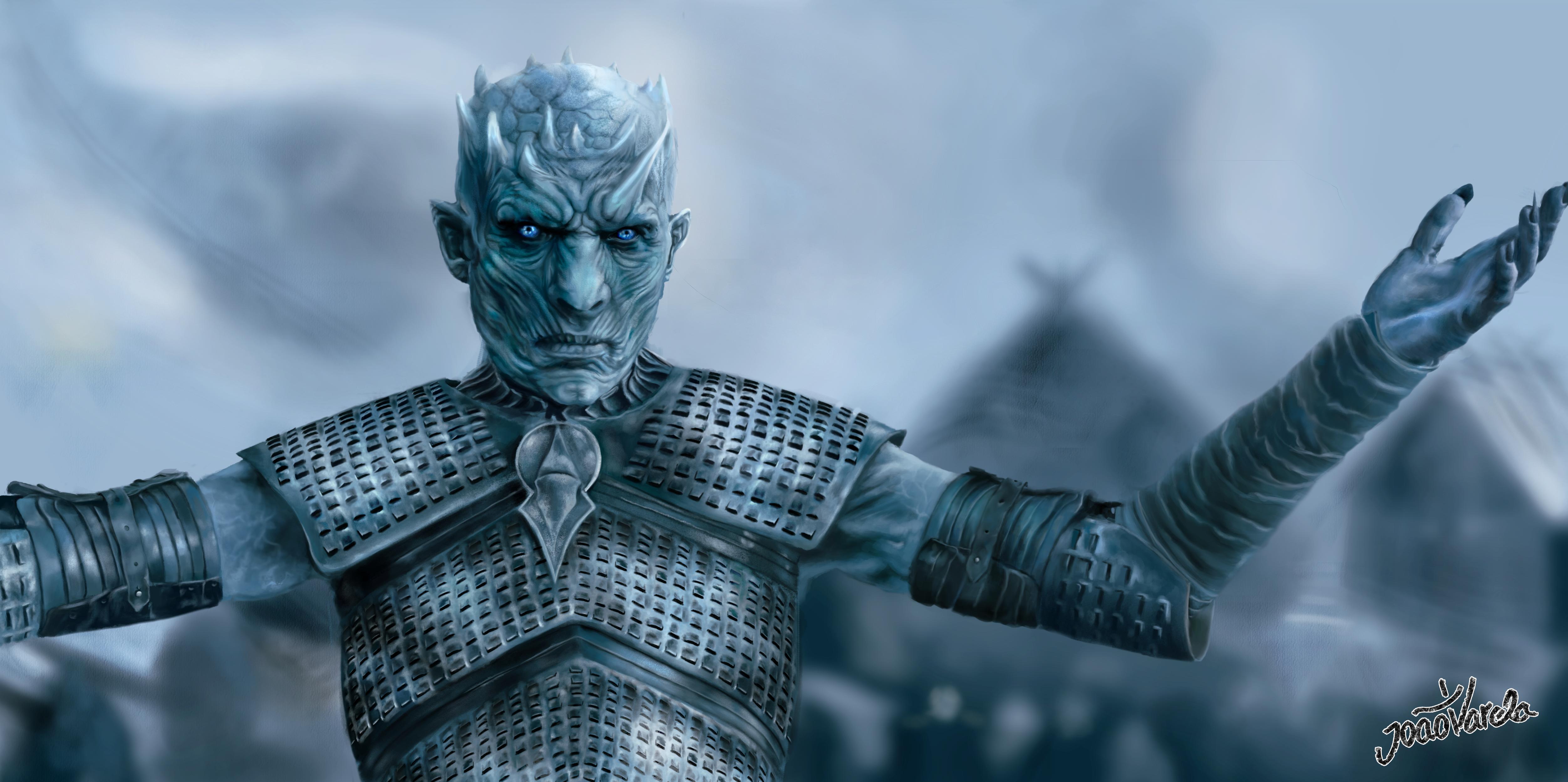
Wish I could find a higher quality version of the Night King... But oh well! I can see we're all excited for Sunday 😂
@loud zephyr I looked online, and there is no simple way to make a cyanotype in PS. The methods I found all look like what Val taught us with tinting via blending modes. (Real cyanotype used Potassium Ferricyanide. Seriously poisonous stuff. Much better in software, thank you very much.)
Upgraded that Squad
@peak warren No problem. I just did it the way Val taught us.
Got a day behind due to work stuff, but here is my Day 6 blending challenge. Which is the original? Dun, dun, duuun.
And I choose to up my squad on Day 7 with...THE GOBLIN KING! (PS: probably would look like the lady in the picture too if it were actually me.) 😃
Day 6. Had a hard time finding a picture that I could remove the background from. Here is the after.
Day 6. Before
@fallow bough Sorry should have clarified, Night King with a spear*
Day 1 revised
More Saturation and Contrast on Matthew... Thank you so much for the tip @glacial path . I think I was taking the wrong approach and using Layer Styles, rather than Adjustment Layers... but I'm not sure... lots of learning to do.
I'm not sure why, but the colors on my two images look really muted...
The colors are fine on my Behance project...
@timid pasture it might be because on behance the background is white but on discord it's a dark gray 🤔
@mighty vessel I was wondering about that... The colors on my images from yesterday seem fine.. Very curious... 🤔
Day-2 Challenge
@steel root A+ meme! I would move the text slightly lower, so it is horizontally centered 😃
@dim brook yup! now he pretty much blends right in 😃 maybe brighten up his face slightly, but not by a lot 😃
@robust plank woah! what happened to her fingers 😮
@robust plank ok let's focus on the background, shall we? - You have picked a quite difficult picture to cut out. Unfortunately it looks like you have missed the detail in her hair but I won't hold it against you since she has a lot of fly-away hair. Maybe you can pick an easier image next time around 👍
@glacial path Thanks, I will try to find a different picture.
awesome! Even a pro would have some difficulties to cut out that one @robust plank 😮
I realized that the light source was wrong, I inverted the image now 😂
@fallow bough I would make the left person a bit brighter. His shirt for example doesn't quite match the one of the other person. Great job cutting out the woman by the way! It looks flawless ^^
@magic rampart lol! You just have to make this part more realistic 😉
@magic rampart honestly you could just add a huge lens flare 😛
JJ abrams style
@dim brook Very cool, nice work! If you want to push it further I think you could brighten his head just a smidge, use a multiply layer to darken down the lay a bit especially around his neck, and you could even use a color dodge layer to add a little of that warm light that is catching everyone's head. I attached an example: (forgive the gif compression)
overplayed
@glacial path Thanks for the feedback. Rather than just lightening left, I did a little work on both sides for more of a balance.
@mighty vessel Very nice! Really nice job on color matching them together. I think you could probably increase the contrast of the guy using a levels adjustment since she seems to have deeper darks and brighter brights than he does currently. Also maybe warming up the lighting on his face a bit since her face lighting looks a bit warmer. Just some thoughts, looks great!
Edit: Here's an example. I also added more shadow on his back with a multiply layer to make it look like they're pressed up against each other.
Figured I give a hand at the Blending Modes Image.
@coral stone Hah, nice work Valdair! I think if you gave Adele a level adjustment and boosted the lights a lot she would look like she fits into the image a bit more with the girl on the left. Nice job!
@robust plank An image like that might be a bit easier. Anything with good lighting and a simple background without a lot of texture always makes things easier. Might be worth trying out some of the Adobe stock photos to get the hang of it too!
@kindred gate Nice! Is the face of the left figure the one you swapped out? I think you could make it match a bit more by doing a levels adjustment to increase the contrast by boosting both the darks and lights a bit. Maybe a saturation adjustment might help so the face skin tones match the reds if the body skin tone. Looks good, nice work!
@main talon Nice job Shanny, I like the contrast in styles between the two Instagram story templates!
@timid pasture Hah, nice work! If you wanted to fit her into the scene even more you could either tone down the back lighting on her shoulder and hair, or add a little onto yourself using a screen/hard light/soft light layer or whatever makes it seem the most natural.
@steel root I think the subtle frame works really well for this image. It sort of mimics the ripple effect in a different way. Great job!
@waxen spindle Very cool, looks great! It could be worth using a levels adjustment to darken down Jon Snow just a little bit to match him a bit more to Chewbacca in the background.
@fallow bough Hah, very nice Ken! I think you could use a levels adjustment to punch up the lights on Trump a bit more to make the lighting fit better between the two figures. Nice work!
And great job on the image with the girl in the pink shirt. Nice work on the background.
@tulip fern Very cool composite! I think it might help if you keep the original colors of the girl, but apply a warm photo filter or something similar that tints her existing colors, rather than override them completely. Sometimes if you use a color layer on something it turns it monochromatic and makes it look a bit unnatural because shadows and highlights have different hues. Though if you used a color layer you could always tone down the opacity a bit and that should do the trick too! Nice work 😄
@robust vector Nice job! Both of these look really solid! Looks like you got the hang of this challenge.
@opal plume Hah, really well done! The images are matches really well. The only really subtle nitpick I might have if you want to match it even more is that the lighting on the person in the back is a bit more direct sunlight than the rest of the characters. Could always use adjustment layers to tone down the lights slightly, or even a multiply layer ever so slightly on the bright areas to fade it back just a touch Either way it looks great!
@wet kettle Hah, very cool! One thing I think could help would be moving the snowboarder now and to the right a bit to avoid a tangent with the "W". It might also draw the eye nicely from the W, to the snowboarder, to the Night King. Could also be cool to darken down the center of the text a bit instead of the current 3D lit effect it has. Might make it appear more naturally backlit by the sunset. Nice work!
@spare sail Very nice job, looks good! Could be nice to give Ron a slight gradient shadow near his bottom portion to match the lady in the background. A slight fade with a multiply layer could do the trick.
@blazing wasp Very nice, took me a moment to realize what had been changed! Sometimes when matching images it can be good to pay attention to level of focus and image quality. The wall in the background is slightly blurry as you may notice, so matching the windows by blurring just a touch could really help. Perhaps desaturating or even darkening them slightly as well since the entire image has a sort of tint to it where none of the colors are super vibrant, and the lighting isn't extremely bright. Nice work!
@wispy compass Very nice Babsams! This is where you can really have a lot of fun matching such different images. Try adding a warm photo filter to Michelle, as well as playing around with things like film grain (noise filter), and even maybe a slight blur to make her less sharp in comparison.
@kindred kernel Nice work Gerard, those cut outs all look really solid! Nice to see you tackling so many of these challenges.
@tall quiver Very nice work, looks great! Really looks convincing. If you wanted to push it even further I think darkening down the figure on the right ever so slightly, and even maybe cooling her colors down with a cool photo filter (again, super slightly) might fit their lighting together a touch more. Really nice job!
@bleak fossil ...ok...I’ll give it a try! Thanks!
@magic rampart Haha, I was wondering if someone was going to do that. Kylo is so charming she doesn't even mind.
@young karma Nice job on the challenges, I really like the second frame image you. The grey/dark color palette works well for that.
@old barn Very cool, the rose and gold color work really well together, nice job!
@bleak fossil I made the adjustments and created a brightness/contrast layer to match the left girl's contrast 😄
Wanted to share some old school photo editing. My mother liked to hand paint color into black and white photos when she was in high school back in the late 40's. After 70 years the print was pretty messed up so I scanned it and did some cleanup recently .
@bleak fossil is this too much noise?
I think you could maybe ease of the noise a touch. You got the right idea though!
@thin spade Did you forget the shadows ?
1a looks really good but why did you not put the gradient behind the frame ?
@winged vault I will check it. Thank you. I am new here. Trying to understand how everything works
Challenge 3, Twitter Banner, Shen Lin
@thin spade The 1st is almost perfect, the 2nd and 3rd one will need a lot of works if you want to make it realistic
And don't worry i'm also new here, still at day 2
Challenge 5, Shen Lin
@winged vault Thank you for the comments! I will keep working on the challenges for fun!
@waxen spindle You should give Daenerys dark hair, and drop her into the image with Han, Beckett, and Chewy! 😆
@winged vault the first one is an original one from the internet )) shadows are not my strong side. I will practice more)) thank you for feedback. I really appreciate
@bleak fossil Hey, thanks, Sam! I'll tweak it a bit and see what happens. This is so cool!
@rotund cloak I would personnaly use a soft gradient for exposing the text, a soft touch 😃
Because why not?
@young karma The day 6 focused the eye on the subject's face and eliminated a distracting background. There are still remants of the original by the subject's right wrist and in the hair.
@left nebula There is so much that commends Challenge 5-1; to relate there isn't the narrowest of gap at the top and bottom of the inner ellipse as there is on its sides seems petty.
@finite chasm without the description the "green after" first appeared to show a bird perched on budding witchhazel.
@gilded bloom Looks good! Color and lighting seem to fit as well!
@young karma Nice job, you brightened up the lighting of the image really nicely! It could be nice to clean the right edge of the face up a bit, though that can often be hard to refine without a tablet pen. Sometimes feathering the selection ever so slightly can help prevent that jagged look as well. Could be nice to try a slight gradient with the blue in the background, might give it a more natural look. Looks good!
@rotund cloak Great job with all these challenges! Awesome to see them all together. Especially like the 1b challenge, the colors/values of the cave work really well with that circle frame!
@fallow bough The needy Emproarz already garners too much attention
Hope the family sledders are still around to enjoy the refurbished image.
@rotund cloak Would like to see you try original work and copying less.
@bleak fossil Thanks for the feedback! Those lighting details make a big difference! The subtlety proved a challenge, but a worthwhile one. I think this version is a bit better.
@glossy trellis Thanks for referring me to that YouTube video
I Guarantee I Can Teach You to Master Photoshop. Learn How: https://phlearn.com/aaronwillteachyou Phlearn Phamily, you are in for a real treat! In today's ep...
Upgrade your Squad
@bleak fossil thanks for the feedback 😀
thats it after the edits
Because Mace Windu has a purple lightsaber.
@glacial path removed the higlighting fromthe brances and @agile ruin here is a blue one for you aswell looks cool 😄
Day 7 Challenge. I could have made it cleaner but im in a bit of a rush 😅 Resubmitted it with out the fox logo...
Day 6: @jolly quest Awesome challenge - I really think this helped me drastically in this area - I have a painful way of doing this which takes ages... Been doing this forever but still have tons to learn! ❤
@wild carbon Nice one, was pink the original? if you wanted to be really tricky you could also change the pink stripe in the shirt to match the background, also the hair but im not sure on how to do that 😅
@finite chasm The first blue image is the original 😃 - As to those pink stripes... That would be first prize - great idea! I think I would need to lasso / polygonal lasso? also not sure if there is a easier way??
After the remark and advise of @latent lion I worked on this again. Thank you so much for making me attent of this @latent lion
@wild carbon That would be really cool as @finite chasm said. I would either use the pen tool, to get the curves in the stripes, or add an adjustment layer to bump up the contrast, use the quick selection tool then delete the adjustment layer when finished with the selection. I like how you have changed the colour of the reflection in the glasses, nice touch, though maybe reduce the opacity a little to bring through more detail from her eyes/eyebrows.
@magic rampart Solid advice - thanks! 👌
@wild carbon @finite chasm some really cool video's about cutting out hair on youtube, check out Phlearn channel.
Oh I'm a bit behind - Day 2
@wild carbon amazing submissions! 😊 👌
@magic rampart love that you are using your challenge artwork as your avatar image 😎 👏
@finite chasm what can I say if not Thank you!! .. you put together two of my all time favourite characters ! 😍 ! The only thing I would watch is the black outline on Barney and Homer looks like you need to bring that in a bit more. the black outline is such a distinguishable standard element for the Simpson that you really want to make sure it's on them ! give me a shout out if you make any changes. 😃
@digital coral you have done a great job thank you for submitting more than one 😊 my only comment is that on the "after" it seems like you lost a bit of the shadows behind the characters and the image can result a bit flat.
To bring that back in I would use the original image with the original background, set it in black and white -through the layer adjustment panel- and set the bland mode to multiply . Let me know if you make any changes, I would love to see the development on the variations 😎
Loving this challenge, changed the background, eyes, touched up her lipstick and cut out the hair (thanks to Aaron Nace of PHLEARN) Red is the original
Thanks for the feedback @bleak fossil ! I tried to enhance my first attempt with help of your suggestions. It is hard to know which path to take with so many possibilities!! But I am still enjoying this journey 😃
Heya @agile ruin , thank you so much for appreciating my work and sparing your precious time for giving me valuable suggestions! 😍 Sadly, I tried following your instructions but now the girl looks darker and there seem to be no shadows 😞 don't know where am I missing out. Maybe the brush tool or the drop shadow option be used instead? What do you think?
@digital coral well done on trying it out. My bad for assuming you had cut the girl out! But don’t worry 😉 you can achieve the desired final output by using a layer mask. Apply a layer mask to the original image you set to multiply. Then pick the brush tool and make sure you select black ( White reveals, black conceals) and paint the area on the main character in black. This will hide the pixels in a not destructive way - so if you ever paint areas around the edge you want to bring back in, simply paint them in white with your brush tool. Make sure you have your mask selected and not your layer when using your brush. I will attach a screen shot below. Give me a shout if you need more info and share your results
@glacial path Is this enough JJ Abrams lens flare? 😃 I looked up Light Sabre wounds and the consensus is there would be no blood as it is so powerful, it cauterizes the wound immediately, so I burned the area around the LS.
@magic rampart lol. somebody made their homework 😮
As when Qui Gon got stabbed by Darth Maul
@magic rampart ah I see, you're right. Well in that case: good job! 😄
What do you guys think?
@agile ruin "( White reveals, black conceals) " That is a great mnemonic. Thank you.
@fickle garden I love the background and the colors!
Thank you! @ember cairn
glad it is useful @peak warren 😊
@rain monolith lol! that's a super cool effect 😮 and seamless too! maybe the sky is a tad to yellow, but that's just a minor details
Hi @fickle garden well done! Love the patterns. I would try to use the darker green in the middle so you can have more contrast with the white text. 😊
@fickle garden I can't tell that you have done any edits (and this is a compliment!) your work is very seamless and the model also looks awesome! Now it's time to master more difficult backgrounds, that is: more definition or advanced lighting 😃
The top one is the original photo I edited the second one .Thank you!@glacial path 😀
Will do @agile ruin Thank you!😀
👍 @fickle garden give me a shout if you share the variation 😊
Day 6: Change background and colourise
@rotund lark first of all: awesome idea sharing a gif 😉
@rotund lark ok let's take a look at your work: I like how you removed the distractions and replaced it with a more smooth and unified texture. But since the millenial pink is considerably brighter than the yellow wall, I would also increase the exposure of the model, the shadows are a bit too dark
@glacial path That's some great feedback thanks
edit
drop shadow might be a bit much ?
Ps @glacial path I didn't even realise it was the (millenial pink) I coloure picked her top filled the background inversed it to give a nice complacentry colour
hehehe thanks @glacial path for feedback :), alright
@rotund lark yup! much better! and the drop shadow isn't too much IMO
A second pass at the day 1 #📣creative-challenges @agile ruin
@night isle what a cool photo! the green is a great contrast to the warm skin tones! I feel like you could crop the image tighter and you could get remove some of the really dark blemishes in the wall
@night isle the editing is absolutely seamless, I can't see any halos or fringing. maybe the slightest hint of orange in his scarf, but that's it
@glacial path Thank you so much for your feedback 😃 I might have just been lucky with the image I picked hahaha. I think I can see now the very slight glow on his scarf too and do like the cropped version, think it makes the guy more interesting 👍
@glacial path how's this
amazing thanks 😃
@glacial path would love your feedback on my day 7 challenge, if thats ok .... here I am with my partner
then here I am with Chris Evans
really tried to get the colour and blurring the same ... looking at them together now I think i need to add some shadow on him from me
Challenge 6.... 🙃 1st one original.Looked so easy while watching @voodooval .... but battled with the cut out as none of my pics backgrounds were simple! Learnt so much though!
I've added a bit of shadow now think this looks a bit better, but still not sure what else I should do..
PS Daily Challenge Day 8
Any advice to improve this design would be helpful. Is it to busy or not busy enough? Should I lose the tree or add more?
@night isle well done and I love that you are looking to refine it even more 😎 What I believe you feel is missing, is the final retouch that will bring the image together. I personally finish my composites by grouping (ctrl/cmd+G), duplicating (ctrl/cmd+J) and merging (ctrl/cmd+E) my working layers.
Then convert the flattened layer in a smart object (right click / Convert to smart object) - in order to make not destructive changes.
Once I have a smart object I open Filter > Camera Raw Filter (shift + cmd/ctrl + A).
For your image @night isle I would go in to the Details panel and noise reduction and then add a bit of grain on the effects panel inside camera raw. This will help to bring all elements together! Give me a shout out if you try any of this. 😊
Great improvement @fresh salmon 😎 ! Try to use the text in white to improve legibility and you can decrease the leading (space between the lines of text) of the address. You can find it in window > character > leading 😊
Fixing colors in challenge #7 are not easy for me.
I loved it @neat shale 😂
please critique. Day 3.
What do you think of my day 4 challenge? I can't draw and i don't use a computer mouse.
Day 7 -upgrade your squad
Day 7 - update your squad, this is the original photo I borrowed for this exercise
😀
@kindred kernel I like the pattern in your type! And really nice colours
@agile ruin thank you so much for your feedback really appreciate it! I enjoyed your Adobe Live videos as print design is area I would like to go into. I have had a go at touching up the image as you advised and I lightened the image also but not sure if this makes it stand out more rather than bringing it together, let me know what you think ? 😀
@kindred kernel I agree with @young karma! I like the background and the gradient you applied to the halftone
Warming up before the video. 😃
Nice pattern. Thank you @jolly quest
I'll post the before and after in my Behance project, but here's the result
challenge using selection tool
Which Chat does everyone use during Val's session?
@fallow bough this channel and the chat channel!
DCC Day 7 - My Dad always wished he was a part of the Rat Pack, so a made that happen for him. 😉
For the text texture (say that 10 times really fast..) I used a pattern captured with Adobe Capture on my Ipad.
Halftones got me in a dancin mood
Thanks for the blending modes project feedback! I'll give it a shot. 🙂 @bleak fossil
Hello everyone! Any feedback? 😄
Day 7 challenge - Ralph Kramden's thumb, added puppet warped arm and main figure layers merged and gradients applied to approximate diffuse urban lighting. Some blending eliminated red background glow from original Jackie Gleason image which inluded chum Ed Norton.
Day 5 Instagram Stories
This original celebrity photo added to a personal cellphone image
Oo That's nice
@gilded bloom Thanks. Grabbed a bunch of different smoke backgrounds to play with today.
@agile ruin I used green because I figured outdoors and nature green is the color you want. I’ll definitely take a look at my project again.
Day 8
Ooh man thats alot of titles 😂 i think i liked the idea of making titles for every part of the project
If you want to see them in the real project or to check my previous submissions you can visit my full PSDCC project here : https://www.behance.net/gallery/78403897/Photoshop-Daily-Creative-Challenge-1

Behance
My submissions for the Photoshop daily creative challenge from adobe live
Day 8 (Day 1 Title) png style
PSDAILYCHALLENGE Day 8 version 2
With Waylon, our Dutch Country Singer, in the south of Spain ;))
Day 8 _ Project Title for Day 1
Daily Challenge 3, I kinda liked it without the socials
Day 8 clipping mask . I have spent hours mixing and matching and somehow this seems so nothing. It feels like a bad illustration for a geology magazine. Or a space pattern. I don’t know. What is wrong here?? Much Thanks for your ideas
@young karma ok So I will give you my opinion about it
1st the picture inside the font isn't readable
2nd the glitch effect doesn't have a nice render
3rd why there is a line near the I "clipp" looks like it's isn't scale (the picture)
4th the dot is nice maybe make it more visible ?
also I love the color theme (looks like Interstellar)
@winged vault thx the line indeed is the the side of the background picture. I didn’t make a glitch effect but I guess you are seeing the shadow I added maybe? I will look at it in the morning and try to remedy it! Thank you for your comments i couldn’t figure out what was wrong with it
@young karma try to remove the line by adding texture/ or the duplicate tool, yeah indeed it's a little glitch effect, but if you want to do it, focus on it 😃
@winged vault thx for the tips i’ll let you know
@young karma Well i'm just giving guide lines, you modify it until YOU are satisfied 😃
@winged vault indeed, with a little help as they say 😊
@young karma I'm studying font a lot, there is a rule name : Visibility (You need to make sure that your typography design is readable) so take it in mind when you make your design 😃
Day 05 A redo for Instagram Story
@winged vault i’ll try thx
@upbeat laurel woah! there is a lot going on there. I like the motion blur effect! I would just get rid of the line here:
@kindred gate thank you for sharing! Maybe you can pick a different color for the text 🤔 - black is too serious for such a cute kitty 😉
Thanks you are right
@fallow bough haha a classic! I'd love to see a background other that black - maybe you can find a sketch of some grass?
@young karma so I assume the orange is the original? If so, great job finding a contrast color 😃 I can barely see the orange peeking through! The highlights on her hand look a bit dark, I would brighten them up a bit 😄
@woven grove I think I can see the shadow peeking through the foreground. I would make the color solid and maybe even pick a different color. right now the background and the foreground have the same color
@young karma awesome textures and nice orange-teal color scheme! I would add some dimension to the text, right now it is a bit flat. how about a drop shadow or some 3d? Or some highlights using a frame?
@dim brook great Idea with the spiral pattern fill in the background. But I'm afraid the entire composition is a bit too busy. I would concentrate on one pattern either in the foreground or background. Also I don't think you need the "Challenge #1" in the center 😃
@young karma Hey awesome compositing job! It looks like you even added some grain over Michael (or there already was grain on the image), if so - that's a pro move right there! I feel like the highlights on his shirt could be a bit warmer. Just compare them with the other highlights on the guys next to him
@wet thistle haha! Good job cutting him out! I just want to point out one thing: compare the lighting on his face to yours (I assume that's you 😉 ) The sun is shining from behind you, so the main part of your face is actually in the shadow. Meanwhile his face is well lit from the front. You could either painstakingly paint a shadow on his face... or you can search for a different image. This is actually a super important lesson for everyone: pick your source images wisely or you will have a lot of work after the fact. But great job matching the color tones! Nice and warm ^^
@dim brook yes! This version is actually slightly better - it is not as busy as the other one with the spiral background. Maybe you can somehow combine both versions to get the best of both worlds?
@kindred kernel thank you for submitting! I love the fall color theme 😃 Just two things you could improve: Make sure nothing is touching the edge of the image - right now the Text and the frames are; so give them some room to breathe 😛 . And the second thing: I feel like you could add a veeeeery subtle texture to the background, or maybe even a photo and use the gradient to color it?
Inspired by the SpaceX launch landing all 3 boosters while I made this!
@acoustic rune I like this a lot! And you did exactly the right thing: you don't have to license the images for this challenge 😃 I especially like the gradient from light blue to dark blue
maybe you could add some drop shadows, to make the circles look more 3d?
@glacial path It's actually not a gradient but a Blend Mode. Lots of blending in this! Yes. I put them on the text, inner and drop but on the circles is a good idea
even better!
With inner and drop shadows on the circles
nice! I actually thought more along the lines of:
but this also works @acoustic rune 😃
@timid pasture hey Rod! I would make the girls a bit brigher over here:
@timid pasture maybe you could also use a different color for the stroke of the text. Red can be a bit tough to read
@pliant stone Since I don't know the Rat Pack, it took me some time to figure out who exactly your dad is 😛 Well done! To make it perfect, center the whole composition vertically (aka. move everything down a bit)
@glacial path Thanks for the feedback. Since original is ink sketch, thought a sketch effect background woould work best.
nicely done! @fallow bough
@glacial path I wish I could center the composition—it drives me a little crazy every time I look at it.... Unfortunately, the image I pulled from the web was cropped really tight on top... Thanks for the tip, though! 🙂
Challenge 4. My first and a quick attempt. Never used this tool before. Excited to explore and spend more time using this tool.
Quick and Dirty right before bed. One down and one to go! @jolly quest @sterile bane @glacial path @peak warren
@loud zephyr I like that. I'll admit my ignorance, who is the woman? I know Deadpool, at least.
On the woman's left side (her R arm) there is some rough masking/cutting. Did you use mask to cut her out? If so, I'd suggest using a soft round brush and masking a little more on her arm. Also using @glacial path 's trick for color splash on her jeans.
I'm short sleep, so the above may be a bit abbreviated. Ask if you want clarification.
@young karma Your image with split teal/orange is exceptional. I really, really like the color choice. I think you selected the model's hair, though.
by the part, there are blue highlights. I don't think this is right.
I din't notice it at first, it's a subtle thing.
@pliant stone That is just perfect. Is that just your Dad's head on someone else's body? I assume so. But I can't really tell, which is a sign that you nailed it.
@wet thistle In addition to the info Tim gave, you could always try clipping a multiply layer to his layer, and use a soft round eraser to erase out the shadow from the left side, and even maybe a little bit from underneath, since you can see in your photo that there's some bottom bounced light. Though this is all a lot easier with a tablet XD
@loud zephyr Wow, really solid job! The images fit together very nicely. If I had to nitpick and suggest one thing it might be to add a slight shadow around Deadpool's fingers, specifically on the bottom part of his hand. Just something fairly subtle would do the trick. Nice work!
Day 8_Project Title
@tender field Really nice use of the clipping mask! I also think the pink color provides a nice warm balance to the image. Looks good!
@autumn elk Hah, nice work! It could be interesting to make the horse on its own layer and clip the face to that shape, so you still get the hose head silhouette. Could even warp the face around a bit to make it fit better.
@steel root Nice work Shelly! People seem to really have fun with the symmetry tool. There's so much you can do with it in terms of making interesting designs. Glad you're enjoying it, nice job!
@young karma A couple thing I think could help would be fading out that vertical line near the "i", it's a bit abrupt as is. The other thing that would instantly make this more readable would be to increase the contrast in the letters. I think it works pretty well on the two "P"s since they're darker, but the rest of the letters are a bit too light to give a good read when paired with that sort of off-set effect, Nice work! I think a few small tweaks like that could help a lot.
@raven meadow Looks good! I like the colors and pattern, fits well together. Kind of reminds of those "Now that's what I call 90s" albums you see on tv, hah. One suggestion might be to not crop the letters so tight, currently it seems a crowded. Nice work!
@kindred kernel Nice work Gerard! I really like the top one, the smooth gradients on the text contrast nicely on the heavily textured background.
Day 8 - A Banner I'll use for an upcoming event.
@mighty vessel Great job throughout all of these challenges! Really like the variety you got on all your titles. Nice work!
@lone hare Always great to see your challenges! I like this one, the first thought that came into my head was this being the title for a tv show about true life ghost stories, or some sort of supernatural criminal mystery show. I can almost see it animated, hah, nice work!
@fallow bough Nice work Ken! I think the text stands really well on it's own too. It could be nice to see that bottom text in the top image actually, the consistent streaks of white might contrast a little stronger with the top image's background!
@gilded bloom Cool use of texture Nase! One suggestion might be to make the gradient across the letters a little smoother and less abrupt, as currently the A and B are a lot brighter than all the other letters, could look really nice if it was a more gradual and softer gradient. Nice work!
@latent lion Very nice Rick! Cool to hear about the thought process involved. One suggestion might be to add a bit of noise (noise filter) and even a tiny bit of blur to the figure on the right to make it a little less crisp. Even lowering the contrast on the image on the right could help it match the rest of the image more as well. Looking good!
@spare sail Very nice, liking the textures in this one! Just a thought, but it might be nice to tone down the saturation of the orange in the background ever so slightly, or even add a bit of a vignette. Might help draw the eye to the center a bit more since currently the background is a source of heavy contrast. Just depends on your preference though. Nice work!