
#✂challenges-feedback
1 messages · Page 11 of 1
- Traditional 2. Labeled 3. Blended Items 4. Blur
This was a mashup of two stock items for a conversation that was being had.
A teen's use of a placemat...
True story.
First challenge for a newbie!
Very nice @rocky ferry
Yay! Thanks @maiden aurora
True @old barn LOL
Fortunately, I don't have too many of these clients. Had work to complete today, but fun night catching up on the challenge.
Why I never have any money. Yes, I am a font whore.
@old barn Combining memes, quite daring 😄 Nice work! I’ve definitely had to try and get a organized naming system going for my own sanity.
@maiden aurora Nice job, hah. Adobe is going to corner the meme market.
@dim brook Hah, nice work Ceci!
@light nebula Looks good, the musical notes/bars seem to fit quite well with the rest of the image. Nice work on the Hawaii image as well, cool use of saturation. If you really wanted to make it pop (which is often what I think of with this type of image) it could be cool to add some color inside the text, maybe a vibrant warm color like orange. Would definitely give the image a different feel depending on what you’re going for.
@dense tinsel Very cool, nice to see you trying out all the different techniques, definitely good practice to get them down.
@zenith rapids Hah, nice work! Did you use a hard edge eraser on the blur image? I think you could get a more natural effect with a soft round eraser brush. Have the original image, duplicate it and blur it, then erase or mask out the center of the blurred image with a soft brush. Nice work on the framing challenge as well!
@strange musk Ooh, that’s an intense meme 😮 Hah, nice work, glad you joined us for this one. Great work on the framing challenge as well, really great color contrast and the font fits the image nicely!
@kindred kernel Nice work! Cute pup. #wholesomememes
@nocturne radish Oh man, hah, as someone who haaaates sunburns this one makes me cringe. Nice work Steve!
@umbral obsidian Nice work! The images all seem to have a certain level of continuity in their lighting and quality that makes them work well together too.
@timid pasture Looks good, hah, took me a second to spot Jar Jar back there. If you wanted to take it even further it could be cool to blur him ever so slightly, and add a subtle noise filter over him to make him match the look and quality of the rest of the crowd. Beyond that you could even lower his contrast or darken down his highlights slightly to make him appear less like he’s in sunlight lighting. Just some idea!
@fallow bough Nice work Ken, glad to see you tackling both these challenges! I like the blur effect you added on the outside edge of the circle frame. Makes me think of the water washing up on the shore. Keep it up!
@spare path Hah, nice work! Glad you’re enjoying them, it’s great to see people keeping up with all the challenges!
@zealous sail Awesome job, really like how you kept the frame full of the starry sky, very cool look. Also really like the offset/zoomed in center part of the image, great effect!
@main talon Nice work! Kind of a random suggestion, but it could be cool (might be hard if this is uncropped image) to put the first text in the top left. Might give it a nice flow with the first text leading the eye down past the pitcher into the final text. Either way glad you joined us for this challenge!
@gentle thistle Hah, well done. A meme about not wanting to do memes… I feel like there’s some deep meaning in there somewhere. Nice work!
@gilded bloom Can relate…. Hah, great job!
@craggy wind Haha, nice work, I like it. Also nice subtle use of having his tongue overlapping the text!
@waxen spindle I really like your use of the blur, fits the image nicely. Nice work! A small suggestion, but it seems like there’s an odd bit of orange coloration on the background right near the bottom left part of the head/hair that seems out of place. Could be nice to edit that out if it’s connected to the top head layer.
@hardy kayak See, I’m out here learning about both Photoshop AND new memes XD Nice work Mars!
@young karma I like the way you matched the text color with the rest of the image, definitely gives it a cool look. The design of the top image with the monkey even looks like it could be in some kids animal magazine or something. Might be nice to add a vignette to it to pull that focus from the blur into the middle even more. Nice work!
@pearl granite But isn’t that the secret reason anyone really learns Photoshop? Hah, nice job 😄
@bleak fossil Thank you so much! I appreciate the feedback! 😀
@bleak fossil Thanks, Sam! Heh.... Now I need to go find that original PSD where I put jar jar in there... LOL - which gives me another idea..... 😆
@loud dawn Hah, nice work! First usage of that meme I’ve seen so far. I feel like this one speaks to me on a deep level.
@terse vessel Haha, perfect. When Adobe fully goes after the meme maker demographic.
@carmine musk Lol, I feel like I have this interaction with Photoshop on the daily. Well done!
@acoustic rune Hah, perfect use of that kind of nice. Nice work Lyyle!
@undone sapphire Hah, nice job, good to see people running with these and doing more than one too!
@rocky ferry Very cool, I like how you varied up the frames and how it all draws the focus into the center, nice work! Love the text style and color too. Could even be nice to brighten the text up just a smidge, but not so much that you lose that nice sand color.
@tender field Hah, can relate. “What can I get for $10?” Nice work!
@proud isle Haha, I like when we get these art related memes thrown in. Luckily I have 1 or 2 major stages of approval with clients that helps avoid that. Also really like how you integrated the fonts into the background and matched the colors on the second image!
@bleak fossil Thanks. The funny thing is that a meme can be made in Preview with Mojave Lol.
@timid pasture So true
Hah, I've definitely had to start organizing and naming my files a certain way or the struggle is all too real.
I keep trying to do that, but I'm a loooong way from getting it done!
I start with making a folder for each year. Then categorizing it based on client work, sketches, personal work, etc. And then naming the files as logically as I can. I've also tried to get the same organization for my layers in Photoshop. Helps save a lot of stress XD
@main talon I like the subtle changes in color you used for the background, really makes the 3 frames pop nicely while still keeping the whole palette very calm. Nice job!
Yeah, I organize all my financial stuff that way - makes a lot of sense to get all my graphics / photography set up the same way... Quite the project, but it keeps me off the streets..LOL
@bleak fossil Thank you for your feedback! Glad I was able to somehow make it funny ! ha
thanks @bleak fossil !
well this is very late (sadly worked) but here's one meme 😃 visualizes every designer's struggle i imagine via any design program haha
@bleak fossil Thanks for that. Much better. Blurred the background image as well
Day 2 Meme ...what do you think?
@bleak fossil thanks!
I just completed the Day 1 challenge...I don't have any cool looking fonts so I think this version without text was my best one 😁
This was my first attempt with the gradient and font. I don't love it but hey, I'm a beginner!
@undone herald i love the coloooorrrs, in love
@undone herald So Dope!!
@undone herald i dont mean to nitpick lol but can you post a version where all three circles are identical? I mean i could do it for myself but i really love what you've done!! Want to keep it in my desktop bckground rotation ;))
Coming up with memes is not a strength of mine so i guess this comes from a place of vulnerable honesty lmaoooo
Just you wait and see though....I'll be memelord one day😈
Not the choices I'd have made if I had more time to plan, but it's good to be reminded that I can sneak in a meme in the middle of a busy workday.
My day today!
Hello! I was a bit behind, here is my submission for day 1. I got carried away with the frame tool. 😂 I appreciate any feedback or suggestions! @jolly quest
Was inspired by my friend's facebook meme group 😛 White screenpost is still an image
https://www.behance.net/gallery/78464319/April-2019-Photoshop-Daily-Creative-Challenge-Day-2

Behance
White screen is still an image. Lowkey inspired by my friend's facebook meme group. Now I have something to post in it.
Memes are addicting. I did 4, but this one is my favorite. Here is my Behance project so far https://www.behance.net/gallery/78404441/PS-Daily-Challenge-Spring-2019

oh gonna work on these tonight!
Sorry for too many messages 🙈 pls, check out also my Behance - https://www.behance.net/LadyCherry

Behance
@bleak fossil thanks for the feed back,
it was a bit weird with that orange bit, all gone now 😃
@hardy kayak thank you for the feedback and the nice comment. I will add a vignette to accentuate the centre thx
BACKSTORY:
In the mid 1960s with malls rising, small town shopping districts were spiralling toward Oblivion. Dad desperate to compete with "progress" would acquire trendy merchandise to sell in his "Sports and Jive since '45" Stapleton shop. A wouldn't sell in a million years, didn't sell, red Nehru outer jacket became my burden to shoulder. Discomfortably garbed and hastening to first class on a flurrying December morning an unkind "Queer" was hurled in my direction. Olden rule: Straights mustn't wear red. This dilemma couldn't be explained to impoverished parents proud at provisioning a "stylish" warm coat. From then on, no matter the weather, when leaving home I'd don it, only later, nearing Curtis High School, removing it, turning the inner black lining outward, and while shivering in shirtsleeves, tucked the hidden bundle under my arm. Time has passed, and well, there's only one thing to declare:
"THE RED COATS ARE COMING!"
Oops spoiler!
My first meme!
😀
My second meme!
since a long time, i made a labeling for a product. What do you think. Hope it's ok to ask/post here..?
Meme 3!
Second Meme Day Second
@haughty violet so true! I would add the full stop "." after the P since you use it with the "R"&"I" 😊
@undone herald I am absolutely charmed buy your first Day 1 submission. For the second exercise- that includes gradient and font- I would try the gradient in white to achieve more contrast! If you edit it, give me a shout will be nice to see the development 😊
Hey. I'm new here. Can any one guide me on this whole app? I just joined due to the PS daily creative challenge.
A GIF to show my process for day 1. 🙂
Had so much fun doing the memes.
Why I take part in the Photoshop challenges.
hi @silk wolf start from the #👋community-intros for more info and if you are unsure just pop questions on #❓ask-a-question 😃 well done on your day 2 submission!
Hi @agile ruin . Thank you, I'll do that. Just one thing, do we put our submissions anywhere else other than behance or that's just it ?
@west nest love the gif! I really appreciate to see the work development. Thank you for submitting it. Love the Meme also.I would only suggest to increase the leading (Window menu, Character panel) on the text for the second meme. if you edit, see how you feel and give me a shout 😊 Nice use of Adobe Stock! well done 👍
@silk wolf Behance and of course here for feedback or questions on #❓ask-a-question . You can share it on any of your social media and use #AdobeLive 😊 I think @unkempt iron shared his on the gram yesterday!
@jolly pilot ahah! That’s usually me when I deliver my final design. so cool. 😎 well done 👍
does the pun makes sense? or should I just leave it with "are you kidding me?"
Hi @eternal marsh thank you for submitting on Day 2 😊 ! It already makes sense and I think you can push it even more by using the picture of a baby cat. If you do, and have enough negative space like in this picture, you can break "Are You "on the top and kitten me on the bottom to play with suspense and isolate the pun 🥁 Check Adobe Stock for kitten images there are so many..I have literally searched for "silly kitten" more than once 😝
@full topaz more cats please! bring it on 😀 As cat owner I completely clap 👏 on all your Meme. If I get up for a glass of water you might get feedback by my Frida-The-Cat ! awesome work!
Hey Everyone - From Cape Town South Africa - Happy Learning all!!
Bit late, but day 1 daily challenge 😃
Hello, first time following these challenges, looking forward to learning a thing or two
Welcome to the challenge @wild carbon ! Awesome way to create negative space with the black strips 😃 I don't want to take more time from your deadlines 😂 but I would have a play with the text Kerning (Window menu, Character panel) If you do edit it give me a shout, would love to see it! also is very cool that you lefty the Ps logo in colour! well done 👍
@agile ruin Thank you, the roast chicken struggle is real .......and when we had visitors too!
@woven grove it's never too late..unless it's later than April 15th 😊 well done on your submission 👍
Here we are my challenge #1. I'm here in order to receive your useful feedbacks!🤗
@full topaz oh gosh!!! ahahah I can only imagine.. I suffer from cat-attacks when the salmon is on the table
@agile ruin Thanks! Will see if I can get round to it later - there is a hidden image in the left eye - you see it?
@agile ruin Thanks for the feedback! I will try splitting the text, that sounds like a good idea to make the pun stand out more! Although I think I might keep the picture, since its my sisters cat 😄
@agile ruin Frida-The-Cat has good taste 😃
@young karma Ciao! Sara you have done a really great job. 👏 Considerate use of type, great colour contrast, and beautiful image to start with. It really conveys the "freedom" mood. If I really have to be picky I would move the gradient slightly up so it doesn't compete with the subheading. But it is a minor detail. If you do make any edits give me a shout I would love to see the development. 😊
@eternal marsh I totally understand 💗! let me know if you make any changes to the text 😃
@wild carbon I have just seen it ! Love easter eggs 😃
@young karma Welcome to the challenge and thank you for submitting your work! I hope is not one of those days.. lol your meme looks very cool 😎
@agile ruin I cropped it a bit and splitted the text. Not sure though if I should move the text to the middle instead of having it on the right side
PS_DCC DAY 2 MEME 3
@latent lion you got me there ! looking good I would only align all text to the middle of the image. well thought 👍
Hey guys, here is my first work from yesterday, .so excited
😀 https://www.behance.net/gallery/78440519/Day_1

@eternal marsh Great stuff you are already working on it 😊 if you want to centre "Are you" don't crop the image and use the top negative space on the top. You can even have a black rectangle on top and bottom for the text. If you keep it as it is, just make the text on the top bigger so it doesn’t float around! I want to see what you do with it! tag me on your edits please. The text on the bottom centred looks great 👍
awesome, thanks so much @agile ruin ! Added some black rectangles for the text now and centred it
@eternal marsh And you nailed it! looks great 👍 I am glad the feedback was useful
@mighty vessel Thanks for the recommendation, what types of font, would you recommend ? a calligraph one ? or more a modern like ?
can you upload your design again because i really can't remmember it 😅

@winged vault it would be better if you used a modern font like the one in the project cover photo and try making the text smaller
I will revise it ! thanks
i can't stop making makes @crystal aurora you created a monster haha
but I guess I'm done for now, if anyone wants to leave some feedback, I'll appreciate it 😃 https://www.behance.net/gallery/78423447/PS-DCC-April-2019

Adobe Photoshop challenge 2: Meme
Beyond the limit
@bleak fossil Thanks for your comment and for taking the time to review and respond.
@agile ruin With Kerning - Thanks for the advise! 👍
@hardy kayak i added some vignette to accentuate the face. Not 2 much??
a meme.
I'm a little behind cause it's my Birthday week (bday was yesterday) and I was celebrating. So here is some frame work from Challenge 01. More to come....
Food lovers 🍴
@blissful plume yes! nice catch on the circles not being uniform, it was late and I was trying to finish so I could go to bed 😂 I forgot to save the PSD file but I can recreate it because I will want the uniform one for myself, too
@agile ruin thank you for the feedback! I will share it if I get the chance to update it. I didn't find the challenge until yesterday so I'm still a day behind and need to catch up
W I N N E R W I N N E R C H I C K E N D I N N E R
#✂challenges-feedback #📣creative-challenges #PSdailychallenge #PSdaily-challenge
This one spoke to me and an inspiration .
@wild carbon Yes sir! amazing 😉
Here's a meme that is specific to the accountants. no one will get this but my epartment thought it was hilarious
Again, we thought this was funny.
Day 1 Challenge
Nice @left nebula
Doe's this count for meme and banner entry? 😄
@loud zephyr happy belated birthday! And nice work, I like the contrast 😃
hello everyone. feel like it is still relevant.
@loud zephyr Beautiful work!
@bleak fossil better? or is the other player distracting?
@main talon just crop the player vertically and align the top and bottom text
Ahh, I see what you mean @main talon It does draw the eye a bit. Maybe playing around with a vignette, slightly blurring the background behind the player, or lowering the contrast behind the player somehow could solve that? Just some ideas.
oh my!
@main talon i had die laughing, if you had replaced "You throw like a girl" with "you throw like a Posse" -if you can get me 😄
idk how i feel about this, if anyone can give me feedback on what i can fix or change about this
Haha
@keen violet First time I'm saying this: I love the use of Comic Sans!
@cerulean bay lol! watch out for tangents; that t is touching the edge of the meme
@maiden aurora ha! you're a natural at this 😛
Here is what I came up with. My creativity is DRY. Thank you to @peak warren @neat shale and @primal zephyr for the tips
@glacial path yeah, you are right. Thus I underline, how much I hate twitter. 😛
ha
btw... I AM BATMAN
My 3rd meme
jhahahahaha
@glacial path I guess Comic Sans is a meme in itself 😄
lol
@terse vessel yeeeees! so good!
@cerulean bay I. KNEW IT! holy mask batman!
@terse vessel oh god. the batman meme. 😱
Im having so much fun that's hard to get my job done at work lol
I'm so late but I just started design challenge. Loving the frame tool. Although still having a hard time to figure out how to use frame tool on top of the frame tool hahaha. Here is my first attempt. 😃
@glacial path thank you, thank you. a meme is not complete without the best font in existence
@neat shale looks good! makes me think of Harry Potter when he tries to go to Diagon Alley 😂 😅
@young karma everyone always says that about my username but lmao same concept my middle name is leigh so im like haha diagonally
LUL another statistic for the books then. Love it tho!
I'm probably doing this right then but I just feel like it's not enough omg
haha, @primal zephyr I thought that was intentional
@primal zephyr Thanks for that. You just gave me another tool
final version for now.
@primal zephyr nice i see that you like wolves so mush 😄
i saw it 😂
Maned wolves, even if in their name, are not considered wolves!
And to add, I just decided to make this whole challenge Maned Wolf Themed and just use the same picture in every one. I mean, it had a Meme day, so I kinda have to, haha. @mighty vessel
thats a cool idea 😀
funfact: this image is blocked by bot if i try to upload in color
@primal zephyr I like how the radial gradient on the maned wolf BG lines up well with the text.
thank you.
@cerulean bay send the original to @uncut ginkgo. He should be able to debug why.
image scanning is done on Discord's internal system -- so it must be something they don't like 😦
@uncut ginkgo ok. so no need sending you the original?
correct ^ it was flagged by Discord's filter which I do not have control over 😃
but sorry about that!
If you are really curious: reverse image search on Google, on the original, and see what nefarious memes were created with it.
@latent lion i bet you looked super stylish in your red jacket!
@terse vessel your PS splash screen meme is amazing hahahaha
@gusty nacelle I like your image. Love the use of Tagalog. (Thank you Google, I didn't know that word, or even which language.) The "K" in your font looks like an R with a haircut, though.
thank youu @sterile bane
@sterile bane The folly of youth went through that whole winter not wearing it. Learned to fly my true colors much much later.
glad to hear it 😃
Again a "Before the VooDoo Val Demo" and hopefully an improved one after 😃
@silk wolf Stick with it you are so going to learn a lot over the next two weeks
attempt 2, i like this one better and will probably upload this one instead of the first one i made lol
@peak warren Thanks for the feedback! Looking at it again ... totally "R" with a haircut hahaha
@cerulean bay TBH, I like the monochrome better. Somehow, mad scientists look better to me in B&W. Maybe because of old horror films.
@peak warren 😱 mad scientist?? Thats the Doctor 😛
Oopsie. I only like the theme music, never watched the show. (Blush)
Day 3 - Warm up version (before video guidance)
wait no i fixed it again this is def what im gonna upload tonight lol
This time it is impossible for me to follow the live stream, so I worked on day 2. After doing 4 memes, I found out that I changed the size in between, so I could not go back to the group meme 1, 2 nor 3 :), have to do it over again. But this was my meme 4
Let's challenge! 😉
I'm a few days behind this weeks challenges. 😀
Beautiful work @late sparrow 😍
Thanks
Here is today's design!
I love it, @jolly quest
needs more purple @jolly quest
For my first challenge....I use a foto that I take in Lubiana, Slovenia, mixing what I learn in this live and the fist day of challenge!
Finished this up at lunch 😀
#📣creative-challenges #✂challenges-feedback #PSdailychallenge
Day 3 using my second name 😄
First attempt...
Added some texture to the background
So I did the three memes I lost again.
I'm not sure about how I put up the text here. What do you think?
Here I kept the text very simple... ?
And the last one is Margot the groundhog's time traveling
I got it now. Good stuff. One more coming
Hello all,
I'm Super late to join this fun challenge
Presenting my day 1 project although

Day 3 - version 2 (with handles)

@gusty nacelle not sure if anyone responded or helped you but I realized to make frames after the first one you have to start your ‘click and drag’ with the frame tool over the base locked layer.
Then presss spacebar to drag the box you’ve made to your desired location.
And finally ctrl+T to adjust it to however you would like.
I have add info.....ups!
@spare sail First thought in my head: Very Cool!
Second word in my head: Groovy.
Third idea in my head : maybe increase the stroke around your main heading by a pixel or two just so it’s just a bit more stronger against such a strong background.
Just my thoughts 🤗
hi everyone, i'm a new french guy ( so, sorry for my english).
i don't have the font so i create an image of it !
i like the banner very simple
@blissful plume Thank you so much! At one point I just placed the image and drag the frame tool. hahaha
@young karma nice idea. But the J and G are un petit peut difficile to understand.
Being here is definitely good for me. Thank you all. Here is an idea I have for my Photography side. Any feedback is welcomed
ok, @blissful plume! i'll try to clear this ! thanks for the comments!
Now that was fun!
2nd attempt...I used a composite photo I made a while back and I think I like it better.
@dim brook DOPE!!
This is not my company, just the first statement that came to mind. 😁 Day 3 Challenge ✔
This is my Version1
The tag line bothers me a just a bit. The spacing between the letters with that font idk doesn’t seem necessary. I think you’ve tried to match it your handles but I don’t think you have to. @dim brook
@pliant stone awesome! Truly bold
@raven meadow woah. Love the colors and aesthetic
this was a good exercise
I’m saving your guys’ banners for inspiration
Hubby is in the League Partner Program...so I figured I would make a new header for his Twitter page.
@raven meadow woooah! Super cool! I really like the shapes in the corner. I would change the red to another color. maybe magenta?
and thats my design I tried to match it with my logo style and pattern hope you like it
@pliant stone amazing!
@light nebula I liked this font on the one you posted with your handle earlier but if this is for your photography try something a little more serious to convey more a sense of professionalism?
thats my full challenge project too if you want to see it
https://www.behance.net/gallery/78403897/Photoshop-Daily-Creative-Challenge-1

Behance
My submissions for the Photoshop daily creative challenge from adobe live
@light nebula hey! i would recommend getting some more spacing between the letters to help with the seond layer of text not being covered
Awesome work @mighty vessel
@coral stone thanks 😄
@mighty vessel I’ve seen you page a lot of cool stuff! Love your logo design. For this I felt your logo on the welcome feels a bit cluttered maybe the bottom left is a good space for it or somehow make it more prominent with a very subtle contrasted background?
Just so everyone knows I’m not more experienced then anyone here. It’s just my gut reaction to a visual piece as a consumer haha
@blissful plume thanks i think i liked to merge my logo with the welcome to make it kinda funny but i will try your idea
it's ok you shouldn't be a super amazing designer to give feedback just say what u think 😀
@mighty vessel I really like the way you put it over the welcome because it definitely centers the eye to your logo
@twilit glade maybe all you need is a very soft brushed, black circle with very low opacity so it’s not noticeable but just enough to differentiate the logo from the bg
@blissful plume nice idea i will try it 😄
@blissful plume Thanks for the feedback, I'll make some changes right now xd
and this is version2
Day 2 - meme 😱
day3 😃
And here is my submission "After the VooDoo Val Demo". Thanks again @jolly quest for the inspiration!
Finally i uploaded the right one lol
@tulip fern I would try a version where the banner background does not overlap on the the second layer of your text, might make it pop a bit more
My day 3 . Glitchseeker is just something I made up. Thanks for the technique tips @jolly quest !
Needed to create a new twitter banner for awhile
@terse vessel can’t describe it but like the way your header makes me feel
“Oomph” I think it feels like
@blissful plume Thanks!!
@old barn love the colors!
Thanks for your feedback @wet kettle ! Much appreciated 😃
Day 3
day 3 💪🏾
Background change
I'm catching up. I thought this was super hilarious. What do you guys think????🤣
nothing fancy.
This is my day3 contribution. Is this readable enough?
Day 3 Twitter Banner 😊
Nice job Gerard! Very professional 😃
@young karma it is readable but the height of the image has a lot of blank space above it
@spice hawk yes i know, don’t know how to remove it though. I will take a look at it again tomorrow maybe i see clearer then ☺️thank you for pointing this out i didn’t know it showed !!
🤷
Here's a shot at a banner for a professional site.
@spice hawk i cropped it in Lr on my phone I hope this is better no!
@young karma yes :3
Hey @everyone I'm jumping in for some feedback!
Hey @jolly quest
My day 3 twitter banner 😀
I dont know if is too much noise or if is "acceptable"
#📣creative-challenges #✂challenges-feedback Day 2 challenge. Memes😬
#📣creative-challenges #✂challenges-feedback Day 1 - Challenge
#📣creative-challenges #✂challenges-feedback Day 2 challenge - Another meme :/ LOL
Rendition 2
@night isle super dope!
@blissful plume Thanks! 😀
Starting to enjoy this 😃
New here. Didn't register in time for today's challenge, but have been listening to this weeks shows all afternoon and got inspired! I took some liberties and didn't really follow @jolly quest 's tutorial, but did try out the stroke effect. Been wanting to start putting myself out there, and not be creatively trapped by my job like I've been the last couple years... Let me know what you think!
@warm pendant Nice!!
you don't have to do exactly what I do! This is awesome just to see how you incorporate the concepts into your own work!
Day 3 Challenge Complete Woop 😀
@loud zephyr Interesting sawtooth effect on circumference. Maybe warp the central dark core, but not making it perfectly circular, just to let the eye rest.
@main talon Fitting meme for Equal Pay Day
@narrow cedar entire project text and all clipped. Try adjusting dimensions when you "export as"
Third Daily Challenge ! #📣creative-challenges #✂challenges-feedback
What y'all think?
I know they are a lot and are only varied a little but just wanna know what you immediately prefer
Day 1 Facebook Assets
and this was awesome to work on and because of this i actually made a banner for my behance page 😃
Day 3 Twitter Banner
Hi all! Keep in mind the safe areas of the twitter header image. It can be very fickle, esp. on mobile devices 😃
I really haven't used Adobe Stock much and I have a preview image here in this background but I really enjoy this one. Too bad you can't just purchase the image individually without a subscription.
Day 1 Facebook Asset
Day 1!
Here is my work for Day 3!
I loved the font integrated with the background @ember cairn
Maybe you could increase the contrast of the word "behance" it seems a little off 😄
Daily Challenge Day 3
@sterile bane thanks for that resource!
Daily Challenge Day 2
And holy moley folks you posted so many challenge entries! Well done!
Thank you for your feedback @coral stone I made it a little darker and add a stroke 😉
Of course everyone else is welcome to check it out as well. 😀
Here is my Day 3 Twitter banner !
@latent lion Thanks for the feedback!
I think I need to work on the yellow a bit, but testing it all out. 😬
varieties
!rank
MelanieM, this command is disabled in this channel. 
@midnight frigate Looks good! The blue circle in the middle is definitely the most dominant. Maybe bring a little more focus to the text by making the blue drop shadow/stroke a little darker or more bold? Or perhaps even darkening the background slightly could make the text pop a bit more. Nice work! Edit: I really like the alternate version, the blue works well for the text!
@wispy compass Very cool! I like the style you have with this one. It could be nice to make the Behance/Instagram/Youtube text a little more readable by giving it a color/value that contrasts against the background a little more.
@ember cairn Great work, really believable texture on the jersey! One small nitpick that may be a hassle to do would be to darken down the holes in the lettering so they’re still black like the rest of them. Really nice job on this!
@bleak fossil EXACTLY!!! I love the advice! ty ty...
@bleak fossil ....I wondered about that...my biggest problem is choosing colors that would compliment ...I will work on that now. Thanks!
Day 3 Challenge
@bleak fossil ... is this better? should I change text colors?
Twitter log. challenge 3
Day 3: Twitter Banner
@blissful plume here ya go!
@gritty lichen ooh looks as tho the water flowing is cartoony or like its been illustrated. did you do that somehow or is it just the image?
@ember cairn very cool effects on the lettering! did you do that all yourself with the brush tool?
@blissful plume YAYY!
@robust path You are all meme making machines now. Nice job Kell! Nice use of frames on your Day 1 challenge as well!
Day 3 looks good! It could be nice to maybe tone down the saturation of the blue background? Could be a good way to really draw focus to the pink text.
@tender field I like your use of different text sizes and a simple color scheme. Reads well! Nice work Telitha.
@gritty lichen Ooh, very cool! Nice use of the frames, it almost looks like an abstract painting at first glance.
@warm oasis Nice work, very cool mood to this one! My only suggestion might be to increase the contrast in the “A.Varo Design” text. Currently the small yellow text and the skin tone of the icon on the left are the greatest source of contrast due to their value and color. Could be nice to change the main text to a color or value that contrasts more. Looks good!
@limber birch Looking good Mare! It could be nice to see the sort of yellow tone in the main text brightened up a bit. Maybe something as bright as, or a little brighter than the "social_handle" text. Could give the whole banner a nice pop.
@blissful plume Great variety! It’s always cool to see the different ideas people go through while designing. It’s between #1 and #3 for me. I think #3’s text fits the moody look of the background a bit more.
@dapper basin Nice job, good work at incorporating different techniques we’ve talked about! One suggestion might to be to limit your color palette to 2-3 main colors. Sometimes too many different colors can seem less cohesive. Just a thought!
Edit: I saw your challenges for Day 1 and 2, great work on all of these, glad to see you doing multiple images for some of the challenges as well.
@molten ether Nice work, looks solid! I think it might be nice to brighten the main text ever so slightly. Currently the whole image seems a little dim, but that could give it a nice punch.
@warm pendant Welcome on in! Glad you joined us. Keep in mind you're always free too do previous day's challenges and post them here for feedback if you wish. Looks good! Size wise the state outline is currently the biggest element, it could possibly look nice to scale that down, and scale up your website text a bit. Could provide for a bit more of a solid visual hierarchy. Nice job!
@mild karma Nice work David! Glad you're enjoying them, always great to see what everyone is coming up with.
@main talon Nice job Shanny, love the theme! Right now all the values in the image seem kind of in the mid tone range, which can sometimes make the image appear almost a bit dark. Could be cool to increase the contrast by either lightening up the background so the text pops, or maybe choosing a brighter color for the main text, or even a brighter color for the outline around the main text. Just some possible ideas.
@dim brook Looks great Ceci, love what you did with the image behind the text. I think it could be nice to brighten up that tan color you have on some of the text and as a drop shadow behind the main text, might separate everything from the background a bit more in a nice way. Keep it up!
@carmine musk I like the amount of noise! I think it definitely fits the feel you seem to be going for. Might be nice to increase the size of the main text slightly though?
@night isle Very cool texture on this one, great job! Might be nice to brighten up the @ mazvkaz text at the bottom to almost match the value of the top text a bit more. Could give it a nice cohesive look. Nice work!
@rocky ferry Very nice, I really like the feel of this one. My only suggestion would maybe be darkening down the text or lighting up the background, just so that they contrast a little more.
@bleak fossil Thank you so much for your comment and suggestion!
Twitter Banner Day 3
What I've put together today. Having a terrible time figuring out my social handles, where do we find our Behance social handle? Thanks!
AG_2019, this command is disabled in this channel.
Here is my work for Day 1
@bleak fossil Thanks Sam 😁 really appreciate the feedback!
Twitter Banner, this time I only used three colors Black, White and LightBlue 😬 #📣creative-challenges #✂challenges-feedback
Day 3 - Twitter Banner 📲
Still a day behind but here is my meme contribution!
My daughter watched the livestream with me this morning and wanted to make one. She made all the design choices and did most of the mouse work with a little help on the what tool to use where, she is 6 years old. I still have to do my own banner............
Day three design
@tepid sierra Ooo. I love the strawberries one.
playing with the Day 3 assignment. I tried to be more minimal than usual. A play on "my" brand. Font not exactly correct, but I didn't want to buy Engravers Gothic. I'll put this on my Twitter in a bit.
I just realized I left the 53 px buffers as visible.
Hello guys! Catching up on Day#2 challenge! Here's my meme and my true feelings.......
with the 53px keep out as "do not show"
just a bit of repair to the corners
Hey Guys, just getting done with Day 2 project, let me know what do you think!
@urban berry I like your background .
Here is my Day 3 Twitter Banner. Any thoughts before it is uploaded to my profile would be appreciated. 😎
@robust plank That face! What a great photo. Did you use lowercase letters on purpose? Traditional memes are all uppercase. Also, the brightness on her fingers at the bottom of the frame makes the text hard to read. You might want to make an adjustment layer to darken it, with a gradient on the mask. (So it only darkens towards the bottom)
@peak warren Thanks for the feedback. This is my first time doing this kind of thing.
Day 3 attempt 😃
second MEME
@robust plank You are doing great for first timer. Also: this is a fantastic group for learning.
@tepid sierra Those are good memes, but ewww, creepy botox images. on the second one, her bangs are just at the edge of the frame. Maybe put them completely out of the frame, or a little bit more into the frame, so they don't lie right at the edge. I like everything else, a lot.
@full topaz Nice work. The background texture works well for me. On the capital W in Willow, it looks like you have weird kerning. Did you adjust that intentionally, or is it in the font? Similar on the T~r spacing in Tree. The W is more distracting, though.
@peak warren Thanks, now you say it, I see it, it must be the font. Is it possible to change kerning between just 2 letters?
@young karma beautiful stuff dude!!
@full topaz surely she’ll go on to do great things 👍🏽 👍🏽
@full topaz I think so. (goes to PS to look)...YES. You can. Open the character properties and adjust the one labeled VA with an arrow underneath. That is described as "tracking between characters" or something like. You should select only those two characters when doing this, and it will adjust their spacing, leaving the other characters at default.
for @full topaz
this adjusted just the "t~e" spacing in "jestem" on line 3
@peak warren Cool Thanks ! (changes photoshop file away from day nine of last challenge to attempt to fix day 3 of this..............)
You are welcome
BTW, what font is this? I suggest finding an Adobe Fonts replacement with better kerning.
Not exactly the same kind of font, but Rieven Uncial is similar, @full topaz
Day#3 attempt! Banner 1.. Played a little more on texture, does it look carpet/felt material like? 😆
Twitter banner #2.. created this to look a little more scratchy on the texture.
My Day Submission 😃 PSDailyChallenge
Great Day 2 Challenge . lolz😂 PSDailyChallenge
Day 3 Challenge!!! I'm on fire for more! How do you like this one?😊 PSDailyChallenge
@mortal forge That's great. I think you left out a word or two in the 2nd client line. "OK, let me [know? know when?] you're done."
One More!
@fringe abyss The 3rd one is sharp. I like the use of the icons rather than words for the different social media.
Catching up on Challenge 2 again :):wink: PSDailyChallenge😅
@peak warren This font is quite old (it comes on a disc) I will check out the one you have mentioned. Thank you 😃
This is the old font with an attempt to correct the kerning

Day 3 Challenge Accepted
Hey guys, I’m a day behind. Just wondering if my meme is good enough. I couldn’t come up with anything super funny so I tried to play with my layers to make up for it.
Day 03 PS Daily Creative Challenge
@blissful plume Im sorry to awnser just now it was 1 am when i posted it i needed to go to sleep^^ but yes i added the effect on the text with the brush tool 😉
@fringe abyss #2
@bleak fossil thank you for your feedback, very much appreciated.
😂

My day 3 PS challenge!
@silk wolf yoooo I love the angle you chose for the effect. Brilliant!
@blissful plume thank you. I'm trying. Kinda new to the whole challenge thing.
@slate bramble amazing stuff!
@fringe abyss yours looks very good as well. I would remove the top "graphic design" as it will let your name stand out more 😊 give me a shout if you try it 😎
@narrow cedar You should use a bold font, pretty hard to read the meme
HI @narrow cedar and @winged vault I think @narrow cedar could do just by adjusting the kerning 😊
The thin black stroke make it less readable
@compact nebula I wish I could send you a picture of my Frida-the-cat She looks always mad lol I am glad she is not the only cat like that. Cool meme 😎 I would try to split the second line in two. If you give it a go let me know, would be great to see how it develops 😊
@agile ruin My cat always looks grumpy and unimpressed, I guess it is just a cat thing lol Thanks for the feedback!!!
@steep fractal I think you did a great job and I love the crazy equation background! I would soften (reduce transparency) of the white gradient to improve legibility 😊 give me a shout if you make some changes!
Thanks for the feedback @winged vault and @agile ruin I'll redo it again
Hiiiii
Putting across Day 3 Work
😊 Hi @narrow cedar I had a look on your Behance page. Great work the background is so beautiful I would only play with the bottom right text. I think it will look very neat if you just leave the Behance logo exactly as you did and simply place next to it "/Shambhy" If you edit it le me know i really would like to see your development! well done for submitting everyday challenge 😊
@agile ruin Thank you so much... I've comeback here after the last time challenge with Kathleen and so I religiously follow it since then... I'll upload the updated version very soon thanks lot for your feedback
Great stuff and 👍 well done 😊 ! just give me a shout when you do!
@agile ruin
@narrow cedar yes! Ho do you feel about it? It looks super neat 😎
The textured background is actually a cricket pitch 😃
Hi @silk wolf really love what you have done with the type there ! great stuff thank you for submitting it 😎
Hi @finite chasm it looks very nice! love that you have included the cricket pitch! Have you tried to align the text underneath the logo? I am a big fun of go bod or nothing 😆 I would have a play with alignment. If you make any changes give me a shout. Also colour palette is one of my faves well done 👍
@agile ruin Yeah I guess I was a bit sloppy with the alignment. Sort of trying to rush thing while doing my actualy job 😅
Challenge #3 Experimenting with texture 😀
@agile ruin thank you! 🤩 That means so much considering this is the first time I'm into something like this.
You won't believe I made this in 15 minutes. No hit and trials, just one shot since I had other commitments.
Really cool @jolly pilot is it a gif ? the texture looks so much like a fuzzy tv that i see it moving. the yellow on the purple its sucha great bright contrast! well done! 👍 thank you for submitting 😎
Great stuff @silk wolf seems you were really inspired 😊
@agile ruin Yeah I do feel it to be much neat and clean now
@agile ruin So I tried chaning font on this
Can't wait for tomorrow's challenge! 🤩
Where are you from @silk wolf ? It's already tomorrow where I am at 😂
yes! @narrow cedar I am glad you feel better with it I think you nailed Day3. For Day 2 the font with no stroke looks so much better. I would still play in reducing the kerning if you have time (Window menu, Character panel )
Ok have centered the text and cropped the image to make the empty space even all around. Im fairly happy 😃
Ya I figured that out once I saw the time on the chats. 😂
I'm from India. @agile ruin
@agile ruin I've tried variation with meme
@silk wolf 😁 greetings from Manchester, UK !
@narrow cedar how do you feel about it ? feel free to share!
@agile ruin
@agile ruin lovely knowing you 😄
@narrow cedar well done! 👌 kerning improved legibility what you think? If you want to use a different colour make sure you use one in contrast. I would pick the colour of the baby beautiful eyes. Love the picture you chose btw! 😍
Thanks, I learnt kerning, which was very new to me and I so loved experimenting with it
@silk wolf which font did you use fo Focus?
@finite chasm Looks very well made! Professional look

It truly is a process! haha.. I just wanted to practice a bit and see what different looks i could come up with. Please let me know how each of these make you feel and what you would do differently. Much appreciated.
Revised with Better colours, I guess 😄 😂 @agile ruin
This just felt super Wells Fargo to me so i made up a fake railroad company feel lmao
@blissful plume Hey!! I'll check and tell you. I'm not at work any longer today.
I repost this for having some feedback! For my first challenge....I use a foto that I take in Lubiana, Slovenia, mixing what I learn in this live and the fist day of challenge!
@blissful plume beautiful background! If you have time play with different palettes for the text bottom layers 😊 (I am referring to your first -blue- submission )
I made the modifications according to @crystal aurora advice. there seems to be a problem blem with the size of my canvas. Each time I save a jpg or png version the canvas is twice the size of the banner. What can this be. When I check the H / W of the artboard it is still the same a regular twitter banner size. IJustDontGetIt. Now the background is White before it was transparent
@young karma Thank you for submitting! the photo is beautiful! Such a mesmerizing point of view 😊 If you want to try some variations I would give some margin between the inner rectangle and text on the bottom left corner. Also I would keep the same gradient under the main text the use of different font already sets hierarchy 😃 let me know if you try any variation I would love to see the developments!
@agile ruin thank's a lot!☺ I Will try and post It!
@ lani sometimes when savings it takes the size of the background image . Try to ungroup the art-board by right clicking on the image layer.
@young karma I look forward to it!
@narrow cedar I am glad the feedback was helpful! well done for keep editing and sharing! Keep your hard work up! 😀
CHALLENGE DAY 2..... trying to catch up!🙃
My day 3 PS challenge!😇
thank you for catching up 😄 @left nebula A+ Image and nice font. I like that the caption has the same color as the background. I would lower the top caption a bit - so it's right in the center between both edges 😃
@timber orchid nicely done! Good use of the texture in the backgound. Be careful with the Background though, I believe the book is overlapping the text:
And I would ever so slightly increase the opacity of the book. Right now it is very easy to miss 😃
@agile ruin thank you for the advice. I will try this as soon as possible. Is it a default setting or is it good practice to ungroup as a rule ? I didn’t group any layer ! It is also the forst time i have this problem! Thx
Hi @ionic iris I was not aware of of your msge you sent me 06-03. Somehow I miss all messages. I find it not really clear yet how discord works, need more practice 😜. Nice eye you shared 😀😀 thank you!
@glacial path hey..! thanks for ur feedback🙂
@agile ruin thank you for your feedback 😊 Its not a gif. Just a jpeg. I will tone down the noise I added. My eyes must be fuzzy lol
a simple one
@silk wolf Cool effect with the double-3d effect 😃 and good use of colors! It looks like you're kerning is a bit off (the space between the letters)
try playing around with this menu @silk wolf
What font did you use? Some fonts have bad kerning
working on the interior design for a book on developing creative capacity--here's one page design from the book:
what feelings does it evoke?
the height of the canvas was twice the size of the banner. I used neg px to correct the size . It seems ok now. thx for the tip
@tepid ruin I really like the text you chose! It's very bold
actually just tweaked the punctuation:
@glacial path hmm right.. the space between T and W does look off in comparison to the rest of the letters. Now I know what kerning is! I'll surly look into it. Thanks alot !! 😄
@undone herald nice! that's good to know...the type felt a bit risky. Wasn't sure if it was too over the top so it's good to know that you like it!
@young karma I am glad it worked and you sorted it out! well done! 👌
Hey @eternal marsh , did you use inside, outside or center stroke?
Hi, little late with yesterdays challenge, but here goes
@tepid ruin that's a fascinating font you've got there! very experimental (the H almost looks like an X). It also reminds me of the Bauhaus style - the bold colors. To be 100% bauhaus, you're just missing a dark blue 😮
@tepid ruin since it's very abstract, I would totally go for just one "?" instead of ?!? 😉
@finite chasm awesome! I hope your next submissions will be as good as this one 😁 Well done on the 3d effect with the stroke and great choice of colors! Too bad the sky doesn't have any clouds in it. it would make for a stunning texture in the frame
Thanks @glacial path next time I'm back there will try order some clouds 😄
@finite chasm hey, you own a copy of Photoshop 😉
@glacial path ahh yes...one "?" might provide better contrast with the bold font. Also, I was thinking to add a blue in there! haha
@tepid ruin ha! nice ^^
if you're uploading an updated version, feel free to ping me @glacial path
Hi @magic rampart ! Thank you for submitting your work. The backckground image is super cool! Here are some things you could improve: If you know how to remove an object in Photoshop (press j and paint over it), I would remove the post in the center
@glacial path will do!
@magic rampart also you might want to use a different shade of red - right now it is clashing with the blue-ish purple background. Finally, I would get rid of the "@" symbol - I think it just distracts from your cool name 😃 - That's about it! Let me know what you think 🙂
@glacial path here's the next iteration with just one "?"
yes. this is better 😄
and here's one with a blue frame. I feel like it might be a bit too tight and constricting though. Thoughts?
ooooh! I like this one even more. Yeah, I feel like you could add more white space around the border. you could even increase the width of the stroke - Bauhaus style 😛
mmm yes. maybe i can decrease font size to add more white space then increase the stroke. let me play with that real quick...
@glacial path Thanks for your comments, especially about my name :). What do you think about this version? I picked a colour from the storm hoping it wouldn't clash.
@agile ruin ☺️
@magic rampart fantastic!
@glacial path
@magic rampart by the way: never be afraid to just use white. sometimes it is the best option - however in this case, the blue-ish purple works perfectly 😃

haha
@glacial path Thank you 😀
I had a hard time tracking down a Behance icon, but here's what I've got
here is my 30 min challange
I'm a little behind but here is my take on day 3
Very cool @grim mantle! Awesome colors
Challenge #3 https://www.behance.net/mateiandre1125

A) I had no idea the symmetry tool was a thing.
B) I think I'm in love! (Day 4 Challenge warm-up pre-video)
@grim mantle This looks fantastic! Great job. I wonder if there is an easy way to add a bit of variation to the shadow to make it pop a little more
Catching up on the Design Challenge , Day 2🙂 https://www.behance.net/gallery/78534063/All-9-Days-of-the-Photoshop-Challenge-with-Voodoo-Val

Behance
Photoshop Daily Challenge from April 1 through April 12. Going through each day learning foundational skills to implement them in our artwork for personal or commercial ways.
quick test before i go to work/before the video
I'm running a little behind, I was at a pool party. Here is my meme
@neat shale ooo, mandala brush tool?
my first time using the tool and don't ask me what is this because i dont know 😂
@sterile bane yup! used mandela and segment count at 8
then put a gradient over with a clipping mask, but im no digital painter so im def gonna need advice with that 😅
@trim field lol Great Submission! Love the way you used the lines to portray the shouting 😊
@robust vector you created an amazing fractal!
@agile ruin Thanks, I was playing with some watercolor brushes to see how it would turn out with the mandala option. I'm kinda in love with the textures/result. 10/10 will play with again. 😉
@glacial path didnt even paid attention to that! But seems like I used inside stroke
Hey @grim mantle thank you for submitting! 😊 It looks very nice! I agree with @coral stone beautiful colour palette and very cool font choice 👌
again a bit late....and bumming i'll be working as soon as voodoo goes live :<
Hi @haughty violet thanks for submitting! Don't worry you can always catch up with all challenges until the 15th. 😊 Very lovely texture in use there. If you want to have a play with it, try to increase transparency under the bottom details to improve legibility. If you do make any variation give me a shout I would love to see the development 😎
@robust path The Day 1 diagonal cut on the strip behind "WINTER IS HERE" could extend fully across and a masked wolf and the promontory it's standing above could be placed above the layers. The diagonal detracts from the whole. The texture on the Day 3 reminded me of a day-glo pink cellulose kitchen sponge.
@robust plank Maybe going a little more royal blue to make the "JELLY FISH" pop and less submerged. If you have time try another Day 3.
@full topaz There's hope for the future. Bannerful work. Encourage your darling. Day 3 Although I admire the more contemporary background, a marbling craft pattern might be more evocative of traditional bookbinding.
@tepid sierra See if you can find strawberry leaves/vine to tie things together, although the maple(?) leaves work fine. Day 2 LOLed, but guiltily embarrassed, yet some people do that to themselves. 2nd meme LOLed again. Badme.
@finite chasm Silly me. What's a cricket pitch? What works and doesn't work: your Queenstown Day 1 framing acceptibly cuts out a tree trunk as @BrownIt Day 1 framing does with a wedding dress, to be contrasted with @woven grove Day 1 framing's subconsciously disturbing vivisection of a human form. Animate versus inanimate.
@grim mantle On Day 3 there's a little gap at the back of the extrusion between the L and E. If you extend the extrusion farther and use dual-point light sources allowing shadow effect to break up the bottom aspect might add visual interest.
@robust vector Sooo Fractal!
these Day 4 previews - can't wait
@agile ruin thanks! I went back and reduced the opacity a little s well as increased the box underneath the social tags
@agile ruin @coral stone Thank you so much! 😊
@haughty violet amazing ! well done ! 👏
still trying to make something good 😂
@agile ruin yay! thanks for the tip 😄 and will try today's challenge once I'm out of work later on ^o^
Ok finally got a chance to sit down and give the first challenge a go. Enjoying this tool
@mighty vessel Love that gradient! I can definitely see your creation as a logo . Amazing stuff 💯
Great @keen python ! thank you for submitting your work . the gradient works very nicely with the image you used. If you have time to play with it, I would try to use the font on lower case to improve legibility or maybe make it bigger if you are going for a full display effect? Let me now how you feel if you make any changes and share the variations! 😊
@haughty violet amazing. if you want tag me in to it so I can review it when I am online next on "my tomorrow" (GMT) 😁
@agile ruin will do, hope you all have a great day designing!!
@agile ruin Thanks 😀
@eternal marsh I see! I would advise you to use the outside stroke or otherwise it can possibly cover op the letter entirely, when the font is particularly thin
@agile ruin Thanks for that, I have changed the font altogether and resized, Trying to find something that flows 😃
@grim mantle ❤️ a lot
@glacial path thanks! I'll have a look at it
@agile ruin I made some small changes following your advice, I like it! there is still a long way to go ... but I'll make it!
Hi everyone, this is my day 3 challenge.
@blissful plume Thank you! I think it's just the image that makes it look illustrated 😄
Here is my Twitter banner. I almost forgot about making these! Had a lot of fun with the 80s colors!
Here it is on my actual twitter, how do I make sure there is very minimal rasterization?
@young karma Thanks so much!!!
@latent lion @wet kettle Thanks for the feedback. Is some kind of lighting effect like this one what you meant?
@zenith phoenix I expect a Miami Vice soundtrack to start playing. ❤️ I don’t see the rasterization on my phone. Is your banner 1500x500 at 72 dpi? Then the graphics should be ok. Set the type to smooth in the properties panel, I think.
@grim mantle how did you do the extrusion?
@peak warren ok cool. I'll start working on the soundtrack!
@keen python Oh how amazing! Well done 😊
Thanks for the feedback @glacial path! So appreciate that you guys take the time to give feedback to all of us ⭐️
Almost Caught up, and ready for day 4 💪🏾 #90s Vibe
@young karma well done on the edits I can see a big improvement! Keep your hard work up it's all a matter of practice.We are all always learning..A designer Job is a never ending work-in-progress 😊
My submission for Day4 before the Demo by @jolly quest
LOL - I had a lot of fun coming up with this meme 😆 Here is my Day 2!
@agile ruin ❤ I love you all, for the supporting and the advice... it's like an adobe family! ahahahah!! I hope that one day this can become a full-time job for me, and not just the second one .. with so little time to devote to it!
My attempt at a meme
My go at day 2
Finished Day 3! All caught up! YES!
@grim mantle woah! this looks awesome! I would get rid of this curve, but that's about it! Well done 😃
@young karma 🌹 I have started with a desk in my living room when living in a super tiny studio and I come from a completely different background. You got to keep your passion in focus no matter what! Being here, participating to the Adobe Live, submitting works for feedback and editing them out and puts you already in the best direction! keep going 😃
Here's my post for Day 1. A little be late on submitting but glad to get it out to show. I thought of doing a city/urban landscape since I'm resonate more with it than nature. So I did my hometown! NYC at ❤
@exotic swan This is fantastic! Great use of al the saturated colors and color contrasts! Now, I would give the text some .... texture 😄 - Let me know if you need some help with that
Challenge #3 twitter banner
I finally got the chance to see the Day 3 video and try out something
it is totally different than the colors I used up til now in my picture books
@dreamy lance I love that, how did you do it?
love to get your feedback on these before i post them o Behance
thanks in advance
love
my first post here! love to get your feedback on these before i post them o Behance
thanks in advance
love
Yes @glacial path nice pun,I'd love some help with that, what do you suggest
curve gone! thanks @glacial path it does look smoother like that 😀
@grim mantle yeees! now it is more organic 😃 this looks very professional!
@robust vector this is amaze balls. What did you use to get such texture?? So soft yet bold somehow.
@exotic swan just apply a clipping mask. like this:
@blissful plume watercolor brushes with the mandala layout
@exotic swan you can also reduce the opacity or change the blending mode 😃
@young karma extruding - Just click on the image then click on open original beneath it, then you can use the magnifying glass to enlarge enough to read @young karma
@cerulean vale wow so cool. How did you do that logoesque design?
thanks @latent lion
@glacial path yay! I didn’t know how to do that even tho everyone kept throwing around “clipping mask” lol.
@latent lion Thanks! Ah now i see what you meant. I thought of using that tool but since the challenge called for not using 3d mode abut still making it look like 3d I thought it would be cheating lol
what kind of design is allowed to share here?
@latent lion feel free to also post this in #🔥tips-and-tricks
@iron kernel all your challenges submission 😃
@grim mantle I don't think anything is cheating here, except for stealing other's work.
DIGGIN the Symmetry tool!!!! round one. Mandala next!
I spent way too much time playing with this tool! Wish I had a drawing tablet to mess with
Day 4 Symmetry
@blissful plume i used apple pen + oilbrush which already adds texture to your drawings, and export that to my computer to put it on a texture with lots of grain and changed the blending mode to soft-light, you can go from there 😃
The one that i post is semi original, as i traced the shape of an existing paint stroke i found online 👍
Hello everyone, here is my Day 4: Symmetrical. First round to use the tool.
Might add more later. Just had fun painting on a single layer
When you forget to upload day 2 challenge image...
(Can I annoy 9 different fandoms with this avengers meme?)
Day 4
Alright, @latent lion has been warned for 'Mass mention'.
that's what i got for today's challenge i really liked the tool but if there is something that i hated it's drawing with mouse 😂
Symmetry tool is my jam, man. I actually have implemented a self-imposed ban on its use because I Found myself always using it for Mandala creations. But yeah, I waited for more than fifteen years for it to appear in PS and had a wonderful Year O' Mandalas in 2018 😂 Great jobs to those that participated! 💙
@peak warren You are right! and to answer your previous question on how I did the extrusion I applied drop shadow and then just drew following the lines with the pen tool. Kinda gives it the long shadow effect too
Im catching up!! Day 3 done - I enjoy textures 😃
Day 04 PS Daily Creative Challenge
@grim mantle That is perfect. Thank you.
Not much of an illustrator so I kept it simple and leaned on brush shapes & blending modes 🌻 Symmetry brush is a cool tool!
Here is my twitter banner
Fully prepared to embrace my unhealthy love for the symmetry tool + watercolor brushes. I'm digging it!
this would make a great tile design tool!
@robust vector You are amaxzing
what do you think? xd
@grim mantle Thanks for describing your approach. It's quick and effective. Only thing is the shadow angles differ. Whereas with the 3D you have complete control of how shadows fall. With rendering any pixelization as below is eliminated.
@spare sail love the watercolor background!
@latent lion Awwww...thank you. Seriously, try the mandala symmetry tool with some funky brushes. I am probably going to be playing with this a little too much. 😛
I might try another design later, but here's what I came up with...
I'm loving all the spring time images. I feel like I went a little overboard on this 😅
@zenith oxide Wow. That’s great. The deer in the center makes it look less manufactured.
@old barn that is lovely. The palette is subtle.
@peak warren thanks so much!
Hi Everyone. I'm not very good at drawing so I used some flower and butterfly brushes and the spiral symmetry tool.
A day behind on the challenge. Here's Day 3 Twitter Banner.
Day 4 contribution 😄
@cerulean vale very cool! Thanks for explaining the process
@zenith oxide the dappling distributed around the collar echo the fawn's coat. Bambi lives.
Okay, so I just started playing with this challenge. I had no idea what to draw with a mouse and I am not the best. I like the symmetry tool however I might have to get myself a fancy dancy pen. 😅
!rank
Wolfsky, this command is disabled in this channel.
@molten ether I have a wacom tablet (would love a cintiq but $$$). Game changer for sure. 😉
@robust vector I will definitely be looking for one soon, when the budget allows. lol
Right
@molten ether @robust vector I'm trying to convince my company that I need one! 😅
Would make masking so much easier
That's how I got my first one! Has the added hidden bonus of no one wants to try to use your computer because they don't understand the "non-mouse". 😛
@wet kettle Don't think I could convince my work either. 😖
@robust vector Can you have both plugged in and working at the same time or does it mess things up?
@molten ether My tablet came with a mouse you can use on it, but I hide it away to confuse people. 😛
@robust vector lol
Letter fill is "Symmetry Fill Pattern" - just discovered today.
I reworked this mandala by adding some texture
Amazing @zenith oxide 😍
@coral stone Thanks!
Just now getting a chance to watch the video and try the skill. This is attempt #1. Those were supposed to be carrots, not radishes. LUL 😂 😅 Also, this is extremely hard to do with a mouse and not a pen.
your feedback??
I am horrible at drawing on my WACOM for now, but the symetry tool is something I had not played with. Also was out taking pictures, so this one was rushed. Very cool tool
Rendition 2: Spring at Night? - Using Blending Mode: Difference
Day 4...fun to play with!
The symmetry tool is one of my favorites!! 😀
Day 3 Challenge - Twitter Banner
@pliant stone the illustration is really beautiful! Very delicate. It harmonizes beautifully with the elegant (hand lettered?) lettering. However, it looks like you have disabled the smoothing (aka Anti-Aliasing) - unfortunately this results in a very sharp edge. Did you disable it somewhere?
Ooo... I don't know, I'll look into it! Thanks for the tip, @glacial path !
@wispy compass I like the water color brush! I would maybe improve two things: first, I wouldn't use the dark grey color (how about a brighter and more saturated color?) - and the second thing: I think a subtle paper or canvas texture could make the water color brush even more realistic. Apart from these two minor things, I really like your work 😃
(Sorry for my bad english) Wow I just loved symmetry tool, I used 3 types of symmetry, to create the water, water waves, sky, moon and clouds I used the vertical one, to create the stars I used the symmetry that looks like an “S” and for the last one I used the “mandala” symmetry to create the halo moon, the only thing “extra” is my skull (cause I love skulls) Im from the old school (poor school) just used my mouse.
@glacial path, thank you so much for that tip! I've had it set to "None" this whole time and I was wondering why my type looked pixelated.
@dim brook Awesome use of the clipping mask feature! although I think there is a cut in the flower texture here. might want to look into that 😃
@glacial path ...thank you, I will make those changes 👍
@pliant stone ooooooh! haha yeah, feel free to post again 😃
another try . i am really into this tool i think iam gonna play with it alot when i get a graphic tablet 😀
@light nebula GASP
@light nebula how about a nice texture in the background? I think it would tie the whole thing together 😃 Thanks for posting!
@dim bear now THAT'S a great use of the black background! The yellow and Teal color combo works really well here! This totally calls for more variations
and some edits on the first one
@dim bear also, you should totally play around with gradients. you can create a circular gradient in Photoshop on a new layer, set the blending mode to color and achieve awesome looking results. you really nailed the mandala!
@young karma you did that with a MOUSE!? mad respect! If you brighten up the purple a bit, the colors would really pop! Well done 😃
@glacial path So, I have no idea why that happened... Could it be something to do with my fill pattern? I marked the "Script" button, and chose "Symmetry Pattern - and choice #8: "a different dilative rotation symmetry". It throws some sharp edges in there, but not sure why.
@dim brook ooh! I just read your first comment! You used the fill tool. yeah - unfortunately there is no way around this. you could just use a normal (larger) texture to begin with.
@dim brook or you could edit the pattern itself and make the edges softer... hm...
@young karma - How did you get your comment to go right under his picture?
@dim brook that comment about using the mouse? I wrote it and I just tagged Sam
@glacial path Oh ok... I thought maybe there was a way to pin comments to the actual pictures... that would make it easier than scrolling up to find the pic, when commented on.
@dim brook unfortunately that's not an option yet. we're hoping it will become a feature at some point 😃
@glacial path omg thank you soo much for your feedback ! they look soo AWESOME .i will for sure try it
I didn't use any textures. Here's what I came up with.
@zenith oxide This is absolutely impressive! That is some good art right there! I'd love to see more of this 😃
@peak warren Thanks. I look forward to learning a lot more.
@latent lion I will have to try some more frame work.
Wow...thanks @glacial path
@molten ether drawing with a mouse... I feel ya. Instead of buying an expensive wacom, you could get an iPad! There are apps that allow you to connect it to your computer and use it as a tablet and Photoshop will be coming to the iPad this year! Plus: you have an iPad - so drawing when you're away from your computer is an option too. Let me know if that sounds interesting 😃
@coral stone I dig the muted colors and the soft lines 😃 However, I feel like something is missing here:
@dense tinsel the noise texture totally works and the color scheme rocks! Well done 😃
😀
@gilded bloom nicely done, my friend! only one minor improvement: the brush you've used looks very soft. I would increase the hardness of the brush 😃
Fair enough the funny thing is I did blur the images more because I felt the lines were too sharp 😅 @glacial path
@urban berry nicely done! This is a minimalist design approach which totally works 😃 I do thing something went wrong with the edges, they are somewhat jagged. maybe it looks better on your end 😃
@gilded bloom oh. uhm. well.
Thanks for the feedback @glacial path 😄
@gilded bloom embrace the crispness 😛
Pfft yeah
I noticed that my edges are a bit 'edgy/pixelated' too when using the mouse to draw. what settings works best for crisp edges?
I added new leaves with a vibrant color, to create a little contrast 😄
you could also use the smoothing tool to help you with that @midnight frigate
@coral stone NICE! Now the whole artwork is more balanced 😃
This one was purely for fun...not exactly spring related 😁
Thanks @glacial path 😄
lol. help me out there. should I know this person? @zenith oxide
aaaaah gotcha. lol
@glacial path ...OK...made a few changes... what do you think ...better?
@kindred kernel Ha! Now that's what I call honest. Let's see how you could improve the design: I would change the colors of the background and the text - Red + dark green unfortunatly don't work well together most of the time. If you need some help with finding color pairs, check out http://color.adobe.com 😃 - maybe you could also pick a different font; one that is more... uh... spring-like. 😛
@wispy compass Love the texture 😍 The font opacity might be a bit low for readability, to my eyes anyway. Great Job!
@zenith oxide ...yeah...i thought the same ...I'll adjust the opacity...thanks!
@tender field awesome job! just make sure the mandala is centered 😉
Im wondering how you did that gradient behind the mandala earlier! I want to do more design work on this. This was much better using smooth! especially with the mouse! eeegads @glacial path
Day 4 Symmetry exercise. Used Surface Dial and pen on Surface Pro in tablet mode to do this Tried different brushes widths and opacities with 7-point Mandala. Envy more talented artists, but thrilled with the technicality of the Photoshop tool. Used to write programs to do this. Is the spirograph still a toy made for children?
@midnight frigate Aubrey Beardleyesque?
@latent lion what do you mean?
@midnight frigate The kind of Lotuseater line drawing my fading memory attributes to Aubrey Beardsley. That's how your pink on black worked for me. It jus t seems hackneyed to say it's beautiful.
@latent lion AH!! (goes to google) i am not familiar! but now i am curious. EDIT his work is AMAZING! thats a compliment. TY ☺
Day 1 Photoshop Challenge Facebook Event Promo with the Frame Tool 1200 px X 628px Things learned, Scale really matters. Facebook has an event section where you can find local events in your area and sale event banners to those needing some creativity help. Definitely looking to monetize on that in the future .
@midnight frigate I think there is a famous room, the Peacock Room, he designed for Whistler that's on permanent exhibit in Washington D.C. Saw it in the 1960s.
@midnight frigate Very nice! I’m glad you’re liking it, it’s definitely a cool tool. I like the way your text outline matches the leaves, nice work!
@zenith oxide Delia Deetz played by Catherine O'Hara ("Home Alone:" KEVINN!!") can now be seen in "Schitt's Creek" on POP channel.
@wet kettle Drawing tablet can definitely help with the more hand drawn stuff, but there’s still a lot of cool effects you can get with a mouse and shape tools. It looks good, I like the texture you have in the background brush. It could be cool to introduce a little color into the background to make the whole image more cohesive, unless that separation is what you’re going for. Nice work!
@undone sapphire Looking good, love the playful designs! Most of the colors are in a fairly similar value range, it could be nice to lighten the background a bit to get some more contrast with the background.
@urban berry Nice work! Looks like you got a good feel for the tool. Looks good!
@mild karma Yeah, kinda Batik tie-dyed
@spice hawk I like your use of the more textured brush, has a nice look. It could be cool to bring a green leafy element into the corners to contrast the eggs. Nice job!
@kindred inlet Haha, nice job, an ambitious goal for sure.
@robust path Nice job, really cool/happy looking color scheme you got. Cool to see all the effects people are getting with the symmetry tool.
@mighty vessel Hah, yeah, drawing with the mouse can definitely be frustrating. Though even with a mouse you can get some really cool effects with the symmetry tool. Really nice designs and color, could be cool to even see one more light colored ring added in. Maybe you could even make the small ring smaller and be overlapped by the center shape, then put a slightly darker ring in between the two existing rings. Just a thought, nice work!
Day 4 Challenge - I took a stab at hand drawing a mandala with a mouse (clean lines are impossible- - super fun though!)
@spare path described using some flower and butterfly brushes. Two or three other contributors appeared to be using flora or fauna brushes. My question is were those brushes available from Adobe (CC subscriber here) or available as a third party plug in or add in, like Corel's? Stepping out for something to eat.
@keen python Looking good. Yeah, very cool use of texture. It could be nice to separate the text from the background a bit more? Currently everything is fairly dark, might be nice to brighten the text or the stroke around it to make it pop out a bit more.
@kindred gate Very nice, the designs and use of the symmetry tool definitely fit the theme!
It could be nice to tone down the saturation of the background pink to kind of have a nice pastel color palette and let the bold pink of the flowers pop more.
@old barn Very nice! Love your use of color an fading out the petals towards the center. Looks great.
@trim field Looks good! Nice use of texture in the text. It could be nice to see some of that heavier texture you see in the “Y” and ”B” in some of the other letters. Good work!
@robust vector Nice job, really cool effects with these two. I really like the dark and moody feel of the first one, looks like it could be an album cover.
@spare sail Really nice pastel sort of color palette on this one! Love the light, elegant look of the symmetry design. Looks like it could be on stationary or something. Great job.
@zenith oxide Very cool! Love the whole look of this. Great mix of illustrated elements and designs. Awesome work.
Also great job with the mandala, a lot of intricate designs fit in there, very cool!
@kindred inlet i am inspired to go further with mine now! 😉
@gilded bloom Hah, I feel like it’s really easy to get carried away with the symmetry tool. Can be a lot of fun to play with. Nice work! Interesting use of focus on this one.
@spare path Great work, cool to see someone use a spiral ! Looks really nice. This is more of a nitpick than anything, but it could be nice to try lighting up the background red/pink tone just a tad to make the design elements read a better on the top right of the design? Just a thought, not sure if that would help the overall image. Nice job!
@dense tinsel Nice cohesive look on this one! It would be cool to see how it looks without texture on the main text, I wonder if that could give it a nice contrasting difference. Though it also has a cool uniform look with it as is. Nice work!
@coral stone Looking good Valdair! Nice mix of different shapes and designs fit in with the symmetry tool. Always good to see what you’re doing for these challenges. Could be nice to darken down the center pink element, or even the orange/pink ring around it? Might be a nice contrast to the darken green ring around the outside to balance out the image a bit more and bring the eye more towards the center. Keep it up!
@molten ether Hah, pens can definitely be nice when it comes to the more freehand drawing aspect. Nice work! Could be cool to sort of tie all the design elements you have together with a couple continuous “rings” designs around the image. Might strengthen the feeling of radial symmetry and make the other elements feel more in place.
@dim brook Great colors and designs! Definitely has a happy spring feeling to it.
@young karma That’s a nice job for using a mouse! It has a really cool illustrated feel to it the way it is now. It could be interesting to play around a bit more with the brightness on the radial gradient to make the center even brighter. Looks great!
@dim bear Nice work! Lots of intricate designs in there. It could be cool to try applying a radial gradient to your designs and see what effects you could get with value or color shifts. Just an idea. Looks good!
@kindred inlet That's really impressive, especially with a mouse! You nailed it. Love the variety of shapes in all your designs. Awesome mandala!
Woah....just catching up on today's challenge video...and feeling the pressure D: so many good works
Thanks @bleak fossil, I'll adjust that 😄
Couldn't help myself. Today's title just begged for it.
@bleak fossil I created some pollen and enhanced the middle with some curves adjustment
Reads great now, nice job!
Thanks 😄
@bleak fossil thank you! I appreciate your feedback. I followed your advice and it does look better. 🙂
@glacial path That is what happens. Was working on freelance photography. I'll resubmit here shortly 😃
@latent lion I get my brushes from www.brusheezy.com. Lots of brushes on there and the best part is that they are free.
Now I am addicted to the symmetry!!! Love work with it! 😍
@rocky ferry did you use glowing edge? i love that effect!
@midnight frigate I used two tone one of darker and the other lighter
Here is the textured background.
without the smoothing!
I'm still a day behind I made a twitter banner for my husband since I don't have one! I followed @jolly quest's instructions on this challenge to a t 😂 😂
Alright, @jolly quest has been warned for 'Mass mention'.
Alright, @jolly quest has been warned for 'Mass mention'.
Day 4 - Symmetrical Illustration 🕵
Drawn with a mouse. I think this is more like a concept than a finished drawing, because, well, drawing with the mouse.
Cool texture @late sparrow, I liked the colors too 😄
Thanks
just moved around a little bit
@peak warren Love this concept! I would love to see you add some blues to the rain clouds. I think that would give it more of a rain and water feel! Great entry!
@late sparrow Awesome! This looks like it would be the logo/icon for a mobile app! loving that noise texture too!
@midnight frigate Loved all of your posts today! This most recent one looks epic even without the smoothing. in fact, that outer purple element looks like a little beetle bug, haha. Very cute!
@light nebula Awesome entry! I'd love to see you experiment with the color of the background! Love the pink and love the designs you made with the symmetry tool but since its as bright as the yellow text its a little hard to read. Or, maybe leave the back as is and play with the text color or stroke! Good work, buddy!
@rocky ferry Awesome design! Looks like neon lights to me! I'd love to see you play on that theme and maybe add some more glow? Could bee cool! Great job!
@coral stone Really loving the organic shapes you have going in your entry. It feels very natural with the colors.Reminds me of those vintage botany posters! well done
@fallow bough LOL I get it! SPRING! Ha, you're a joker! Great design! Have you thought about arranging the text to fill all of the space in the center of the frame? Could be a fun experiment!
Thanks @jolly quest. I used Adobe Color to choose this color palette and made some curves adjustments 😄
@carmine musk Excellent use of multiple forms of symmetry tool and a fantastic example of how it can be used practically in an illustration! Very well done!
@coral stone Love the colors! Thanks for the palette!
Thanks for the feedback Sam! @bleak fossil
Thank you @jolly quest This one was fun. Thanks for the tip no the text.
Thank you @jolly quest. I'll see about editing the clouds. Also, my rain needs some work... Time to re-examine my favorite ukiyo-e rain images.
update on the new piece im doing after i watched the video! it's midnight but i got a new idea, this is leaves rn and then ima draw a pink rose over it
also have NO IDEA what that neon pink block is lol
@neat shale That's pretty! Very calm.
@jolly quest thank you, I visited you website, you made an amazing job, a great inspiration for us, thanks for share
ok now its 1 am i should sleep lol, i'll decide if i should change anything tmrw, first attempt at digital drawing tbh, since i only really focus on graphic design and photo manipulation lol
I lovvve color
This made me feel a type of way lol so i decided to add what it reminded me of lmao
Twitter banner for day 3!
Made changes to the text of my Frames design .
Also made changes to my Meme but still can't get her fingers dark enough
Revised my Twitter banner a bit from before. I think the fonts work better together now.
#✂challenges-feedback #📣creative-challenges 😬 Symmetrical Illustration. Challenge 4
I kinda wanted to wait for the weekday to post because I don't think the chat's going to be too active during the weekend but on the other hand, hopefully I'll have a lot more to share for feedback by next week!
Just working on learning how different effects and colors make me feel
Coolest thing about this week, I've already upped my work from day 1 from what I've learned in the other streams and reading the advice from all of you good people.
Much Appreciated!!
@blissful plume Love the colours they are bright!
Day 4 playing with the symmetry tool which I absolutely love!!
@RetireeRick#1478 this is a cricket pitch. That’s brown strip in the middle of the field. Thanks your feedback, not just on mine but everybody's. Really appreciate everyone taking there time to help us all 😊
my drawing talents are not the best 😃
I suppose since the lettering is bright i should keep the bg more simple. It's just so hard for me not to blast color
@full topaz haha yea so hard for me to keep chill
@blissful plume especially if you're having fun!!
Because we are coming into Autumn here in NZ I had to do an autumnal colour symmetry wreath thing too. It was so much fun!!!
Challenge 3.... think I spend too much time on each design 😊
pink twitter banner with bottom text
and one in the nature colors I use in my picture books
@left nebula if you make things look that cool then it’s well deserved! Awesome background and handle text type
@left nebula please share how you made your background 😃 such a cool look
another try - for Margot the groundhog, who will get up out of hibernation soon 😃
Challenge 4..OMG I love this tool...... could play for hours 👏
@blissful plume you are too kind, I am so chuffed with your comment on Challenge 3, always a bit embarrassed to post! 😊 Used a silver foil pic as an overlay at 60%, original was from "advanced of horizon" from adobe stock.
@glacial path That does sound interesting. I have a galaxy tab already can that be utilised the same way?
@bleak fossil Cheers for your feedback, I shall try some rings and see how it turns out.
My design for day 3! Used my twitter handle as the text. I know I'm late at the challenge but I'm trying to get momentum.
Hi @digital coral That looks good! The texture is great. Do you want to modify the default at-social_handle at the bottom? Not sure if you have an Insta or a You_Tube, but you should have a Behance.
Displacement map on the text in the BG. Using same method as @glacial path just posted. (I discovered it end of last month, on another tutorial)
First time trying the symmetry tool, I used some brushes to play around with it
Hey @peak warren! Thank you so much for the feedback! Ya I do have a behance profile, but I accidently deleted the layers except the background one 😶 So now I'll have to make another version of this design to put my behance profile link in it 🙂
Hi @digital coral -- Lesson there. Leave the layers in the file and make them invisible with the eye button. That way you can change your mind later. You notice the emphasis on smart objects and non-destructive editing? I think that is the result many users experiencing the same lesson.
@eternal marsh I liked the text shadow a lot! The color palette creates a great mood for the composition and matches the background. Amazing!
Maybe you could add some texture, like noise, to see how it looks 😄
Hi @peak warren Thanks for the valuable advice 😃 I'm gonna keep this in mind from now on.
@coral stone Thanks! Yeah I thought something was missing, I'll try a noise filter!
@peak warren that's awesome!
@molten ether as long as you have a stylus ( the apple one is veeeery good but only works on ipads)
@blazing wasp this is really beautiful! keep up the good work 😃
@robust plank Maybe going a little more royal blue to make the "JELLY FISH" pop and less submerged.
@tepid sierra The treatment of the Twitter banner hawser background reminded this old salt of dried seaweed on mooring lines.
@blissful plume This is for you. If you feel it, blast away.
😍 Let's try again
day 3 was so interesting, I wanted to practice extra...
hi guys! 😃 I will appreciate if you comment logo that I am doing for a photographer 😃
I think it would be fun if you could make Octavio's portrait a little bit bigger, so he stretch out almost (or 1/3) more to the outer circle
more info on the symmetry tool: https://youtu.be/HVnjrSTg3KM
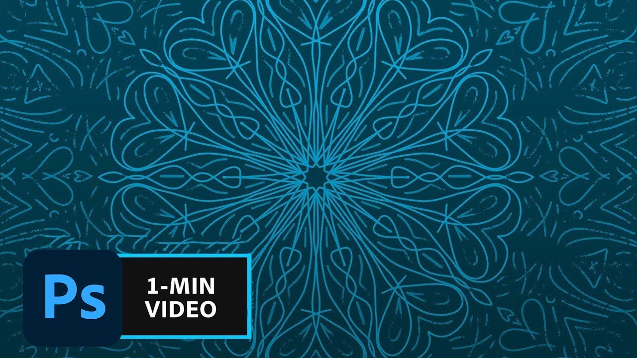
Draw a few simple strokes and create sophisticated geometric designs. Prep your project: 1. Create a new Photoshop document (File – New). We used a 3000 x 30...
Even as a joke, it was a bit sparse so added background and tweaked text
Symmetrical illustration challenge - Fellin' fuzzy
This was fun project. Mixed the symmetry drawing in photoshop with a background frame created in Illustrator.
@young karma great use of the gradient overlay! maybe you can experiment with different brushes 😃
@latent lion oh I really like the second version with the colorful extruded text 😃 I would increase the leading a bit, the @ is almost touching the B 😃
Trial2
First try at Photoshop- took some work, and it was a fun project. Thank you!
I've finally worked on Day 1 frames..... it was the only photo I had.... a bit flat. I like the water in general.
Day 1 frame tool the photo is a bit grainy because I didn't have a tripod.
@eternal marsh Beautiful work Madeleine !
Day 1 - Frames
#✂challenges-feedback #📣creative-challenges Symmetrical Illustration 👽
Day 1_Facebook Assests redone.
Day 2_Internet Meme
Day 3_Twitter Banner
Day 4_Spring Vibes
second attempt and using my business
@neat shale i love ❤️ the leaves as such too!
@dapper basin thanks! 😃
It's nice
Day 4.
Its good
#📣creative-challenges Second try- Year of the pig
Fun with memes! #📣creative-challenges
My day 4 symmetry attempt. Long way to go though!! Thx for cc
my day #4 attempt of the #📣creative-challenges! Tried producing a shattering effect with old skool color scheme
I know it's simple and I still got to use three different symmetry brushes!Thanks, VooDooVal.
✨✨
@brazen barn Nice!! It's okay that the electrical arcing is asymmetrical. Presumably, the arcing was added with an over-layer?
@manic coral Liked the non-concentricity of the circles in the second "Year of the Pig."
@slate bramble Pleasingly aggressive radial 10-point. Crayonlike brush work looks good although the white pretzels lost a little of that texturization. Don't change it. Nice understated sporadic blue accenting.
@young karma Nice work. You can insert a textured background too. (use https://stock.adobe.com free previews if you want) and use Blend options, opacity. . . 👌 🖖
Here is my twitter banner. That was fun to play around with.
hey @sand dune please upload a jpg or png 😃
Let me try this again wrong file
What I created while watching the Video.
Just because.
Took this image today and thought I would try the framing tool I learnt last week. Thoughts?
Day 4: Symmetrical challenge
I think I have a handle on my Twitter Banner 😄
And then the Spring time clean up has been complete
Thinking of spring while sitting at my desk with a cold 😅
Had a lot of fun with the Symmetry Tool! 😃
@opal plume Thats cool, reminds me of a Kolideascope
WOW! love what you guys are did with last week challenges! Hope you are excited about the new ones coming up 😎
@opal plume what an amazing fractal you have created! I find it so fascinating. 😍 Absolutely love the contrast between dark background and bright palette
Hi @gilded bloom well done and thank for your submissions. 😊 Very well done with the twitter banner. I find very clever to include elements about yourself on your name. If you have time, I would play with the wire of the controller to origin from a higher point in the lower curve of the S. Also I would try to swap the white text with the lighter blue you used to keep the colours consistent. Give me a shout if you make any edits. 👌 The energy of your symmetric drawing is wonderful 👏
Hello @robust plank ! Thank you for your submission I find it super interesting. I would slightly tweak the space in between the characters (kerning) as the Z-E seem a bit closer then the other letters. I would also have a play with alignment. If you do not want to be a block, you could align it to the E to give it some room! The rulers (cmd/ctrl+ R) come very handy to generate guidelines- see attachment below- Really nice font choice! If you make any edits give me a shout I would love to see it developing.
@finite chasm Nice work with the watercolor brush and good choice of colors! What brush did you use?
@gilded bloom The drawing looks really good! Just make sure to remove the symmetry lines when sharing your work 😃
@gilded bloom nicely done! I would also add a gradient to the hat on the N. right now the color is just a solid 😃
@glacial path oh gosh I cant quite remember, I was just playing around with multiple brushes. I think it was from 'Kyles real water colour - Big Soft' for the orange and then the yellow and pink were smoke brushes I downloaded
ah of course! Kyle is the master of brushes 😃
legend says, if you say "brushes" 3x, he will appear
hahaha there is also a bit of splatter in the orange from his splatter brush
Playing with some brushes and layer effects
Better late than never 😀 😀
@opal plume That is so creative and dope! The colors and dot patters are beautiful!
First attempt with a mouse. I haven't pulled out my wacom tablet yet.....
made a custom path using triangles and used the selected path option on the symmetry tool
Second attempt on a mouse.
Day #1 - Frames
A little late on my Day 4 challenge that I did on Saturday. I'm not loving it.... I don't really draw all that much so this was my best attempt at some flowers