#✂challenges-feedback
1 messages · Page 10 of 1
Thank you @sterile bane for the amazing challenge
Great challenges
Thanks @sterile bane
Will miss ya!
Thank you, @sterile bane !
@waxen knoll Try Pexel or Pixabay or Unsplash for free (totally free) images. Just beware of their links to the paid-for stock sites. They're not hard to avoid, but pay attention.
So late on these challenges: any feedback for the guy late to the party? #✂challenges-feedback #challenge1
@dusty sparrow technically you did two days! Invitation + mockup!
Do you have the invite without the mockup?
Sweet! I was just about to read #2. Thanks @primal zephyr. Guess I’m in to #3
Oh no, mock up was like #4?
Challenge #1 Invite only
@dusty sparrow the top left part is quite distracting with your awesome imagery in the middle. Also I'm not sure if you need those lines at the calendar. At first I thought those were just some random lines.
And if you removed the top left you could Center your headline as well.
Great feedback. Thanks @primal zephyr
@dusty sparrow but what I like is the image you used and the font choice!
Oh, and be careful with the textures around the T at "quest". It looked like a 1 at first glance.
Day 9 Gif Animation
@dusty sparrow I like how the headline looks like it is hidden in the clouds. Pretty cool! The color palate is appealing as well. I also agree with everything that @primal zephyr is saying. I'll also add that the Risk icon is not centered with the other two which is a little distracting.
@inner nymph I love it! The little red animations are super cool
@urban berry awesome mock up! But to make it more challenging, have you tried to put it onto an angled screen?
Thanks @sterile bane! I am looking forward to the next PS challenge and hope you are the Mentor!
Here it is! The screen/audio recording of live feedback from Day 9 (March 15) is ALIVE! https://youtu.be/bOECqBrwqa0

Here is the screen/audio recording of #design-feedback live feedback from March 15th, 2019.
Here is my work for the entire 9 day creative challenge. I posted some of my later work but not of any the earlier projects. Would love to hear feedback on areas what you think I can improve. Thanks. https://www.behance.net/gallery/77278479/Level-Up-PS-Daily-Creative-Challenge

@magic rampart Brilliant I love it!!!
@night isle thank you so much 😃
@wet kettle Thank you for the feedback.
One down... Day #8 and Day #9 to go...:😫
@steep quartz I like the 1st faster one better
@vivid maple hlihfdsliajhliadfsuhiausdh
@waxen spindle really like that you put your animated logo on an old school TV, nice touch!
My GIF logo for Groundhog Secrets
Thanks for all the input and inspiration. Level 9000 ..... plus ultra
Giffed
Down goes Frazier! Down goes to Frazier!
Sorry if this is an obscure reference @lone hare , but it reminds me of MissingNo from the original Pokemon games. lol
Super cool!
@wet kettle Had to look that one up. I haven't seen that one before. Thank you!
@lone hare Love this one!! looks really nice.
@wet river Thank you!
I think it being on a otherwise black and white photo makes the design so clean!
Today I was a little busy but here's my gif 😄 I used position and opacity keyframes.
@wet river Its like you are watching old footage on a modern screen 😃
@lone hare The only change I would of done would be making the error message one from an older version of windows and making the text on it relate more to the image, if you wanted to work on it any more. 😃
@wet river Yes! I took a break from work to create this, and last second I just picked a random error graphic to slap on it.
@wet river I wanted to put like "cannot download dodge.exe.dll" or something
you could have that in the title and then ask a question in the message and have options for what to do next, maybe an option greyed out as not possible to select? there's lots of stuff you can do 😃
@wet river I may have to work on this more on the weekend....thank you for your suggestions 😃
no problem! You definitely have something great going on! 😃
This here is a GIF. I'll reset the timing sometime. 43 or so frames
See you on the next one!
Hey everyone, I did a remake of my day 7 project. I would love to hear what you think?
@young karma great job with the interaction. It feels less like a static image with the movement you have introduced.
@lone hare Thank you.
a bit late to the daily challenge...but do we have to use what we made from day 8 for the gif....?
if not...experimented
kinda went crazy ^^;
@dry comet tbh....i'm torn between two and three...first is good but the contrast in the second makes it more pleasing to the eye (contrast wise) and then third, I love the alien-abducting-feel...but maybe tone down on the pink..? That just be me personally but great job 😃
@dry comet maybe if you mute the red a little, it'll be more...visibly pleasing like the second (forgive me have had a long day of work and words are failing me haha)
@haughty violet We did frame animation, is that frame animation or did you use video timeline? I love them!
@dry comet made everything from photoshop frame animation 😄
though i thought you do both...frames in timeline 🤔
@haughty violet I've been really into pink lately, can you tell? 😅
@dry comet haha no worries, so far been into blueish/cool tones personally xD
nothing wrong with it! but try to complement it :3
I'll give my eyes a rest from this piece and come back and apply what you said. thanks for the feedback!
@dry comet no worries, honestly i've had to step back from the majority of my work...it's easy to get sucked into the work. but fresh eyes always help ^o^
on that note, glitchy gif 😁
nice!
@bleak fossil would love a review on my gifs if possible (know i'm late to the daily challenge submissions...) 😃
@haughty violet Nice work, it's cool to see you really jumping into this challenge with 3 GIFs. I don't know if I have any real critiques, but it could be cool to vary up the speeds for some added impact. Maybe for the one with the child have the biggest/last image slightly more delayed than the first for an added punch. Or even make the ballerina start slightly slower at the beginning and ramp up the speed throughout. Just a couple thoughts, they're looking good!
@dry comet Very cool! I like the curved warp you have in the glitch effect, it's a nice variation!
On the 3 pictures you linked, I think they all look pretty cool. I like the middle one because the color is a bit more focused, but I also like the crazy colors of the first one. Could be interesting to try adding a vignette of desaturation. As in adding a adjustment layer to desaturate the whole thing, the masking out the middle to keep the color there. Could possible be a cool a effect!
@bleak fossil thanks!! Will try to implement some of your time :3 and tbh was nervous at first at the initial challenge 9 description...."using day 8's work" the photo I chose initially would have been tough so made it up with these three
@bleak fossil er *tips not time, stupid auto and typing on phone x_x
Yeah, I don't think it matters too much. The challenges are really just designed to get you thinking, having fun, and trying out new techniques in Photoshop, so nice work!
@young karma Nice job! I didn’t see your previous version but I think it’s looking pretty solid. It could be cool to kind of reverse the position of the “L” and the rest of the text. Lower the text and put the “L” above it so it looks more like she kicked it upwards rather than it almost look like it’s falling. I also think it could be nice to scale the girl up a bit to make her a more dominant visual element. Lastly if you brighten the background up a bit it might make the text pop and bit more and make the girl the focal point a little more than the bright white of the portal. Nice work over all!
@timid pasture Haha, nice job, looks good. I really like the graphic style you got with the figure on the right and star shape. The only thing is that the graphic on the right seems a bit stylistically at odds with the background and font you chose. Almost a more cartoony graphic style vs a more elegant calm style. Could be cool to merge them together a little more one way or the other. It’s been great to see all your challenges you’ve done through these past weeks!
@bleak fossil Thank you so much! I'll try am adjustment layer and desaturate a bit!
@latent lion Wow, those are some pretty crazy effects, nice work! When the text pops out I almost get the feeling that it’s bouncing upwards towards the screen. It could be cool to play with that and make it go halfway towards us on the first bounce, and then the full way like you have it on the second bounce. Could be a really successful bounce effect in my opinion. Looks good!
Or giving the text one big glitch effect in one of the frames where it breaks apart a bit more (maybe landing on that bright frame you currently have). Just some ideas, great work these past couple week Valdair!
I loved the idea @bleak fossil . I'll use my weekend to refine all of my works. I want to add a little more consistency on them too.
This was my first challenge, I confess I was a little nervous in the beginning but it was totally worth it. It was great to meet everyone and learn so much, not only practicing, but looking at other people's works and reading the feedbacks 😄 Thank you so much!
No problem! You've done a great job keeping up with all these challenges, and I'm happy to help!
@lone hare Another nice addition Ryan! Great work with all these challenges. Could be cool to even see the chat box glitch slightly, but not sure if that would take away from the classic error box effect.
@young karma Looking good! I like the subtle static effect. One suggestion could be to make the frames a little faster, it might add to that glitchy flickering feel a bit more. Nice work!
@bleak fossil Thank you for the nice comments sir, it has been a fun couple of weeks. Every time I tried to add more it felt like too much, so I settled with this one.
Day 5: Mockup
@bleak fossil Thanks, Sam - it's been a lot of fun, and I've learned a few new tricks - which is always good! I'm looking forward to the next one in April! I've been adding a few other projects to my Behance tonight as well. Have a great weekend! 👍
@urban berry great job with all the details in the mock!
@bleak fossil I changed some things and it looks much ... much better. Thanks for your input.
just mucking around with brushes here to add depth and a highlight (if you zoom in theres a painted octopus on the floor hehe)
just realised when you zoom in you can see the detail and what your work looks like more clearly! yikes...i need to tidy it up!
@tepid sierra I like it! Love the little octopus... 😁 👍
@tepid sierra loved the octopus but to be 100% honest had to zoom in on my macbook to see it, maybe bring it closer to be easily seen? just a helpful tip from my end ^_^
just blended in with the light source a bit too much
but may be just me so no worries
Hello everyone, here is my Day 6: Filter challenge.
just for fun .......
Bigger octopus!!!
@bleak fossil Thanks That's what I wanted to do, but had to go out Friday evening. After getting swallowed up it tries to escape, but is sucked back in . Planned to then try futilely before inevitably surrendering to the void. Also a couple of added frames where "That's All Folks!" gets swallowed, and generally more death throes twisting and glitching.
@haughty violet Not so crazy. As the world evolves away from paper, imagine future Ichabod Cranes eReading the Legend Of Sleepy Hallow being entranced by your headless horseman, Color the ballerina's point shoe to front-cover illustrate "The Red Shoes." Brava!
@dry comet Great job on your project. I love it!
@dry comet On first glance, before seeing the narrow alleyway. except for the iridescence of the subject, the second had the sterility of narrow banks of computers taking over our universe, until viewed large when the wonderful texturing on paired right accessways is lost unnoticed.
@loud zephyr Thank you!
@latent lion thanks! that's what i was going for! I love your text animation!
@urban berry I love your blur! but maybe unblur the face?
@tepid sierra I can't wait to see it when you can post it
@tepid sierra "Just For Fun" - flashbacked to children's toy where you would hook together little plastic monkeys into a chain.
These two PS challenges undergone distracted from the necessary processing of six decades of paperwork and general downsizing before relocating from the Big Apple to a retiree income affordable locale. But as we who hid behind our nomme de Discord make our last posting, let’s post our Behance profiles ip addresses.
https://www.behance.net/gallery/77136779/PS-Daily-Challenge-201903

Thank you @lone hare . I suppose this is a reaction on the Groundhog Secrets GIF, isn’t it? I’ll have a look at that, probably tomorrow
@sterile bane : Thanks for explaining everything so cleary. I learned a lot. Hopefully I hear from you again (in the next Photoshop Challenge) 😀
Or was it you @bleak fossil that I have to thank, I think so now. Sorry for tis mistake. And thank you! I’ll try what it gives when I make the frames faster. Now I had chosen to make frame 2 and 3 shorter, and frame 4 longer because I love the fire you see in it :)
And I have another question, if I want to make the frames smaler, do I have to start up in psd again from zero? I don’t think I can do that in GIF hé?
To all of you: Thank you for your wise advise to improve my challenges (and to help me with Behance). Last but not least, congrats to all for the beautiful projects, they are a feast fot the eye.
@sterile bane I want to THANK you too! I only have PS CC for some months,before I still worked with my PS5, but so much has changed and I was a bit lost; And then suddenly there came this invitation for the 9 day challenge. I still have a long way to go, but what did I learn a lot. Thank you!
I shanged the frame time for the 3 first ones. What do you think?
And this is a remake of Day 5 - Mockup, after the comments of you @sterile bane
I have put up all my photos of this challenge now at Behance. But when I type #PSdailychallenge, I don't see my file anymore. Can that be because someone didn't liked I wrote the name of Day 8 challenge in the textline when I uploaded the photo here. The photo wasn't allowed, here, till somebody told me, leave the PS tool name, and indeed, than it was OK. Do you know this could be the reason I'm not in the Behance #PSdailychallenge @sterile bane , or was I not looking well?
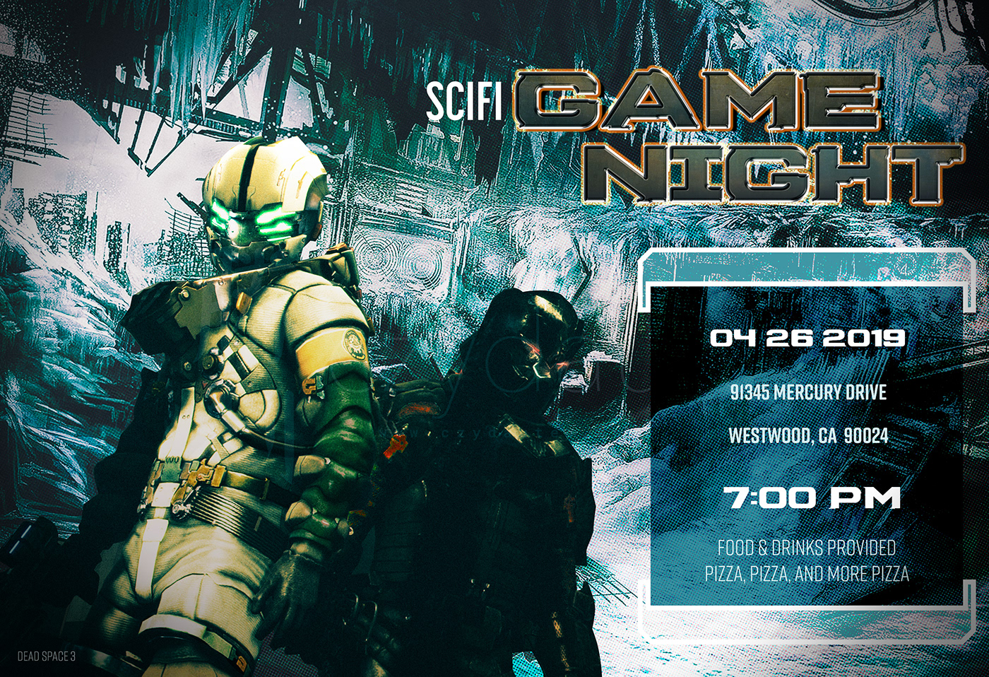
PSDailyChallenege1_GameNight
This is my day 9 contribution. This is of course for educational purposes only. None of the image are mine. I hope you like the composition and the .gif story, it closes the 2 wonderful weeks with adobe, Kathleen and the Ps crew. A big thanks and appreciation for the time and the effort. Of course welcome all remarks and cc.
PS Daily Challenge - Day 2 - Blending Modes Level Up
@neon sierra I don't see anything wrong with it. The colors completement each othcer and the triangles lead your eye up to the text. Very nice!
This challenge was great fun! To finish mine off, I made a custom project cover. My complete project is here: https://www.behance.net/gallery/77174861/Level-Up-PS-Daily-Creative-Challenge

Behance
Adobe Photoshop Daily Creative Challenge, March 2019. The theme is gaming.
According to the Clyde Bot, the Day 9 GIF that I tried to upload was considered inappropriate (not sure why). It's here: https://www.behance.net/gallery/77157355/PS-Daily-Challenge-March-2019-Day-9
@young karma this is really cool!
@young karma Nice work. The layer work is subtle & integrates well.
I'm a tad behind the Challenge as I got side tracked. What was the latest challenges? Also made this to try out the pen tool in PS
i took a shot at the day 4 challange i revisted a project cause @sterile bane tutorial reall helped clear some things
Ngl @neat sable, it's great, but I thought there was a typo with 'the future is her' at first, as it's most commonly 'the future is here'.
I understand it can be seen as a cool twist, but it's something that backtracks the viewer a bit and doesn't quite feel right
@bleak sparrow I like this, great textures. Only thing I would say is the text is quite hard to see in the "light". maybe consider a coloured text?
@young falcon Thank u ... actually I notice that later. I also mistake spelling "Texture". My Bad!! But I correct it later. Thank u for noticing and telling.. and sorry, if anyone really feel annoying. 🙂
@magic rampart thanks =) but the lettering has to stay white because it's supposed to be like one of the barnes and nobles topic signs they have at their stores
I see what you mean but idk how else to "clear up that area while making it seamless
@green crow wonderful depth of the mountains and the gradient and the font. I like this very much! ❤️✨
@bleak sparrow That's a tricky one, maybe try either a slight black border around the lettering to lift them slightly, or create a shadow from the wooden sign, as if it stood proud and shading the area. It does look good, great work
As per posting permission from Kathleen, I'm wondering if I may have feedback for my work? It's not from the daily challenge, but I found a 2D landscape PS- YouTube tutorial by Nemanja Sekulic and decided to try and put it into practice.
My first time trying it, and I was able to make it with a mouse. :D
The blue version is an edited hue version so I could match them up more in a composition, but the coloured version is the original colours of each individual landscape.
Always trying to improve, so feedback from more eyes is always appreciated and taken into careful consideration 😃
From left to right and up to down is the order in which they were created, so it was fun trying to experiment a bit more with each one
@young falcon these are really nice. I've started watching Nemanja too, as well as a you tube channel called Phlearn. There's some good stuff out there.
Just thought I would post my day 9 files to complete what I started. I hope to see you all in the next challenge.
Thanks for Looking!
love that St. Bernard! 😃
@sterile bane This was my idea! Hope you guys like it....
@loud zephyr super creative! love it
@sterile bane Thanks!
awesome work Kayjay!
Thanks @uncut ginkgo
@magic rampart
thanks for the tip it def made a difference sorry its late i just got around to it again -_- lol
@bleak sparrow This looks amazing 😃
@young falcon i also like Nemanja Sekulic. He has great tuts. As for your adaptation the hue is successful 😊💪🏼. I reads like a gradient or a flow. I wonder how it would look if you would shift the first and the last into the colors of the middle one.
Puppet warp

Behance
This is my project for the Adobe Photoshop Creative Challenge
Hello Guys.... I'm way behind on this day 9 challenge ..but could'nt stop myself from sharing my work
any feedback appreciated
this is my last submission for Day 9
@narrow cedar Looks good the timing on the frames looks a bit odd are all frames the same timing ? the first one looks very fast and the last looks very slow .
Cool . just looked at it full screen it looks better
Thanks ❤
@rotund lark Darker fail message than normal, for Nintendo games. 😃
Ya they are fed up with people not caring when they die so instead of free continues they have now gone with Dark Souls, " You Died "
My DAY 1. So much late I know but It's so much fun! Haha. 😆
@vague bluff I like the colors a lot. I would go back and mask the controller a bit. There is quite a bit of the background texture on it right now and I think it would look better without it. It will pop
@magic rampart @cinder vessel @young karma Thank you very much!
Yeah, I found Nemanja one day in my recommended and found his videos really great for learning. :)
I may have to try out the hue shift again, but maybe in another day 😄 I played with colours quite a bit after I finished each of them, which was quite fun 😃
can I keep on doing the challenge or is it over yet??
@young karma The challenge is technically over, but you can still follow along and complete each challenge and post them here for feedback!
There will be a new set of challenges starting in 2 weeks!
and of course, what Owain said 😃
bit late to the party, but here is my entry for day 7 - texture
I kinda feel like there is something missing, but I dont know what
@eternal marsh I like it coming forward. Different and neat!
@loud zephyr thanks!
Really nice job on the blur! @eternal marsh maybe play with the values for more depth? I wonder if you moved text to bottom and push the light values toward the top center origin?
@severe dust That's a great idea!
or a change the directon of the text to be along side of her on each side to emphasize but you could still push the light values ?
Hello everyone! I wanted to see if I could get some feedback on my design for today's create a superhero composite on Adobe Live. I appreciate it!
Nice job Anna!! I loved your submission during Adobe Live today
overall I think the composition is super strong ! The fog really sets the mood! I'd be interested to see if it looks even more crisp without the transparent layer (it looks like maybe snowy mountains?) over the bottom left area.
@uncut ginkgo Thank you so much! I really appreciate it! Yes, I agree with you. The transparent layer has the fog and lightning but maybe if I select the lightning and the fog out, the superhero would stand out more?
My pleasure! I see now! Yes, that might be interesting 😃
@umbral obsidian hi what challenge are yoiu working on?
Day 9 Character Movie
@umbral obsidian First off, that picture is boss. Second, what Adobe live was that? Third how the heck did I miss that?
@severe dust thanks! I duplicated the text layer and added the same path blur to it like I did with the character in front and I also added some outer glow to it 😃
@umbral obsidian woah, thats awesome!
Thank you @uncut ginkgo! I hope you’re having an incredible day so far!
Hey @tepid sierra This week Adobe Live was focusing on Photoshop and portfolios. Tuesday and Wednesday, they had a challenge that you submit and the designers give feedback on the live stream. Tuesday was an album art design and Wednesday was create a superhero.
Thank you @loud zephyr! It was for yesterday’s Adobe Live. There were 3 live streams and people could submit their challenges and get live feedback. I don’t always get the notifications for Adobe Live so I always go to Behance and click on the live button. They post the weekly schedule and you can watch replays. I submitted my challenge for the live stream, The Life of Aivax with Paul Trani and Vanessa Rivera.
@eternal marsh Thank you so much! 😀
@umbral obsidian OMG! I stay away for one day and I miss so much! I'll have to watch the replay. Thanks!
@loud zephyr I know the feeling! I love watching the Adobe Livestream. I wish I was able to do more challenges but it’s tricky with my work schedule. 😕
@tiny nest great job! I can tell you learned some awesome new skills throughout the challenge 😃
@wet kettle and how is it that I can't find the challenge in Adobe anymore? could you please send me some link so that I can keep on doing it? thanks! 😄
@young karma You can find all the challenges in #🗣general-announcements . All the video replays can be found here https://www.behance.net/live/replays/creative-fields/44

Watch replays of past Adobe Live shows and get a behind-the-scenes look at how creative professionals work.
@wet kettle thanks!
@storm rock 👍
@storm rock Juke party! Love it!
nice job @storm rock ! nice job with the shadows and movement. 😃
cool @storm rock love seeing the textures as well. is there a reason that the second frame has shadows and a light green circle, and the first frame doesnt?
I'm wanting to replace the unpopular Comic Sans font in my story. I've picked 7 alternate fonts than look good to my eyes (bad as they are), and am curious to see what everyone thinks. If you could drop by, and leave a comment on which fonts look best, I'd really appreciate it. Thanks!
Thanks @sterile bane for taking a look - seems we're on the same cosmic plane.. 👍 Anyone else? Thanks!
@timid pasture Houschka or Parissine yep, even if I am partial to and have used the Bauhaus
Hey guys, just wanting to share this: https://www.behance.net/gallery/78076623/Logofolio Hope that is okay?

nice @primal zephyr ! your vector graphics are full of life
Thank you!
@latent lion Thank you, good sir! I'm liking that Houschka more and more.. I like the flow and readability: https://www.renderosity.com/mod/gallery/girls-from-t-n-a-breitlenger-jar-ch-6-page-37/2867685/?p

Renderosity
Girls From T.N.A: Breitlenger Jar: Ch 6 Page 37 by RodS. Renderosity - a digital art community for cg artists to buy and sell 2d and 3d content, cg news, free 3d models, 2d textures, backgrounds, and brushes
@primal zephyr Great collection of logos. I really like the Beowolf one! 👍
@timid pasture thanks a bunch! I have a project for the beowolf one as well.
@primal zephyr good stuff Wiktoria 😄
Thanks!
@sterile bane @jolly quest Okay you guys are seeing this first, before I put it on Instagram and my Behance portfolio for composites. What needs fixing? Does it need something more?😟
@loud zephyr Personally, I think it could use some atmosphere! The elements in the background are as sharp and defined as the elements in the foreground. If you want to give the image more depth and believability, you could experiment with adding some atmospheric fog or blur elements, especially to separate your centaur character from what is supposed to be far away from her 😃
It looks awesome though! If you decide to make changes, please post it! I would love to see!
Hey guys! I am currently doing a logo for my city park. (They don't even have one! Really great playground for me.)
What do you guys think?
@primal zephyr I am unfamiliar with the Park. Is there a significance in relation to the shapes you have chosen for the logo?
Sorry, should have said more!
The whole shape is the shape of the park, and the individual parts of it signify the diversity of the park (grilling, swimming, animals, kids, events, jogging, etc.)
and the park aspect itself as well, of course. nature, outside, flowers, garden and so on. @jolly quest
@primal zephyr I see! Sounds like a great concept! Looking at what you have here, straight off I feel the logo could benefit from tighter/cleaner edges. If the edges are rougher on purpose because that's what you're going for, I would say explore that design point more so there's no mistake you're looking to convey texture or brushstrokes.
I am experimenting with the brushstrokes a little. Just did this concept.
Nice!
This is way bolder and has a stronger personality than before.
Also the top version is the fixed "abstract park", which resembles it more than the bottom park.
also, thank you for your tips. 😃 Appreciated.
You also might need to keep in mind that the logo should probably read even if if is one solid shade like black
Yeah, working on alterations as well.
although I could just do the outline for black and white.
you could try using one paint swipe with a clean logo cutout or make all the shapes individual paint strokes
here are a few examples!
Just some ideas!
I have this?
Please keep posting your iterations! I would love to see how you progress!
ohh cool!
It is the same, but the colour removed.
And of course!
https://cdn.discordapp.com/attachments/464516406705258516/560900669196730388/IMG_20190328_195810.jpg this was my initial sketch. (there were other ideas prior to this as well, but they were scratched and followed a different theme.)

Nice!!
at this moment i am uncertain on what to add/fix on the logo.
from your sketches, I actually really love the bottom right where the lines are straight and uniform, but different lengths to make the shape
and if that shape was solid black it would look really professional!
that's just personally opinion though
I could try that one as well.
but you might try experimenting with simpler iterations and see what you come up with!
@jolly quest I took your advice and made some blur. I hope I didn't over do it....
@primal zephyr Looking awesome!
@loud zephyr I think that totally pulls her away from the background and helps me focus on her!
@primal zephyr That’s outstanding. Favorite so far.
@peak warren the last one I posted?
Why that one specifically?
I like the last one the best, @primal zephyr. I think it is because the colors do not have borders. But it was absolutely an immediate reaction. I didn’t analyze it. More of an AHA moment.
Also, I like that the color scheme is not ROYGBIV like the real spectrum. And it does not confuse with LGBTQ 🏳️🌈 flag. So people won’t misread the purpose of the colors.
Yeah, that is true. That happened by accident, honestly.
I think I want to experiment with gradient as well and see how that'll look like. Maybe good, maybe not so much.
I'm also wondering if it is possible to make the logo appropriate to certain situations (like Easter or Christmas). I dunno. I'll see. :D
Forgot to upload this one. I know, I know - still working through the challenges.
hey guys, sorry this question is off topic, but I am getting desperate, has anyone got experience with adobe xd?
@drowsy mica Keep going! That's a fantastic entry. The colors look great! nice and sleek design.
@rain hazel I have some experience with it, I might be able to help. Otherwise there is the slack channel dedicated to it
https://cdn.discordapp.com/attachments/534088263942668308/561219536691527710/unknown.png which one do you guys prefer? top or bottom?

@primal zephyr I like top better, but I'm not totally sold on the border still.
I also just looked up the park, you should maybe try to incorporate the planetarium building some how. It has that Iconic feel to it!
The park has a lot to offer. so to show the diversity i divided the park into segments and colours.
And the planetarium is not what the people go there. Their main focus is either a nice walk, grilling or jogging.
Understandable. But from an outsiders perspective, it seems to be the most photographed location in the park and looks like a landmark from what I can see. Just my opinion
Yeah, I can see that.
I am trying to not focus too much on just one thing they offer, and the park as a whole. that's why I decided to make the symbols look like the shape of the park.
Hi @primal zephyr I like the top one better if you have a border. It is imperfect without drawing too much attention to the line.
black and white version.

random question...but since the creative challenge for ps is over...are we still free to ask for feedback on projects? 😮 (been busy with work and haven't checked in on discord for a bit)
.<
@haughty violet Yes! This is a loose collection of folks. Some from Adobe, most not. Not a very rules-heavy group.
Note there is a new DCC on Monday 01 April.
@peak warren you just made my day with that bit of news ^0^ was hoping there would be another.....any hint to what in particular..?
or i'lll look ^^;
@haughty violet I shared as much as I know. Photoshop, ofc.
@peak warren ah appreciate it!
@loud zephyr Thanks, appreciate the feedback.
@haughty violet Class is announced on Behance here:

Join your host VooDoo Val each morning at 11:30am PT. She’ll show you how to approach each challenge using Photoshop. Complete 9 challenges by Friday, April 12th and you’ll be on your way to sharpening your skills. Get your questions answered, see what the community is cr...
note new teacher.
@peak warren excited to hear and love her :D, making it more so exciting ^0^
Different teacher this time? Interesting!
@sterile bane @jolly quest This is my second try at a composite piece. What do you guys think?
@loud zephyr I love it!! Well done!!
@jolly quest thanks!
@loud zephyr Can't wait to see more of your work with this week challenge 😃
@agile ruin OMG! Thanks Kladi!
Some composite work. Sometimes you need to have a better sky
@light nebula nice one! It surely sets the atmosphere
@agile ruin Thank you
Hey this looks super cool @light nebula ! I love the more dramatic sky - it totally changes the look of the building! When presenting Before/After images, I would put the before one on the left and the after images on the right 😃
Thanks @glacial path . I did think of that after the fact. 😃 Decided to leave it as the After is the focus
@light nebula @glacial path Agree on L-->R ordering. I saw the top of the image before the bottom, and I thought, "why did he replace such a dramatic sky with that bland blue one? Then I scrolled down, and saw I had it backwards.
Also, love the color matching between the new sky and the church.
Would love to get some feedback on this project I worked on if anyone has some spare time. <3
Behance
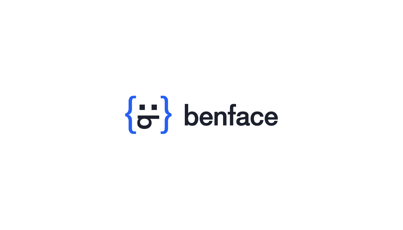
Benoît Rouleau is a web developer with a particular interest in user experience. He prides himself in creating stunning, responsive websites for his clientele and reached out to me interested in creating a logo design for his rebrand, benface.
THank you @peak warren
That looks pretty good @ivory osprey . The animated gif at the bottom of the page is the best!
ok... first time on discord! (sits back and watches)
A bit like an IRC channel
Hi @midnight frigate welcome on the discord channel 😃
TY @agile ruin
@midnight frigate Welcome!
Thank you so much @brittle slate! I appreciate it. Still working on learning the motion stuff aha 😄
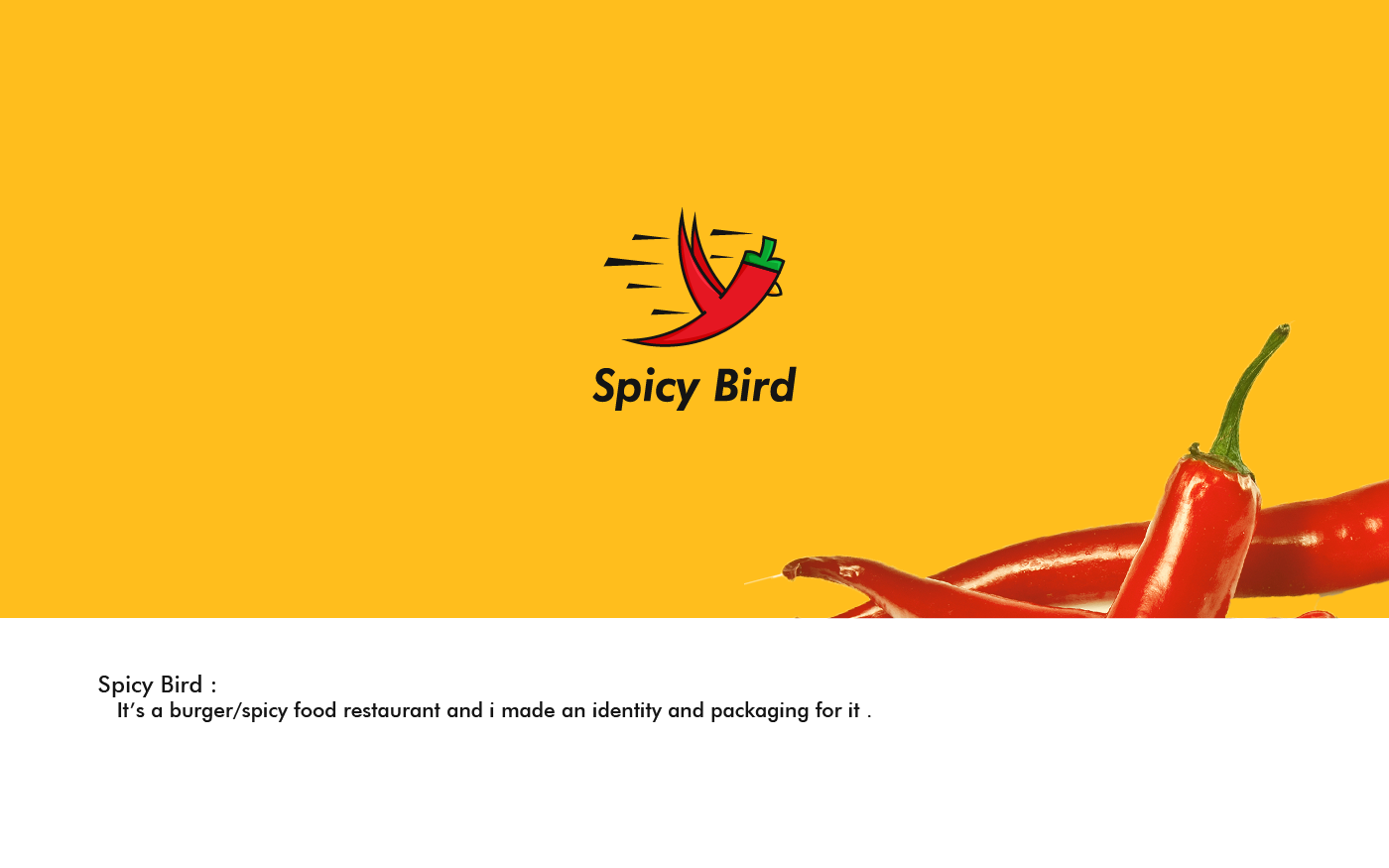
Hey guys ! I would like to get some feedback from you on my latest project here :
https://www.behance.net/gallery/78333879/Spicy-bird-restaurant-Branding-Packaging
its my first try with packaging so i hope you tell me if i did something wrong or if i can make it better 😀
Behance
A brand identity and packaging for "Spicy bird" restaurant
Hi @mighty vessel I like the bird logo. The speed lines look backwards though. Also: great color palette.
We'll be reviewing your Photoshop Daily Challenge designs LIVE on Adobe Live Tuesday/Wednesday this week! Alex and Kathleen will review challenges shared in the #✂challenges-feedback Discord channel!
All you need to do is share your designs/work in progress during before 1:30pm PT (day of) and it will have a chance to get a review on https://behance.net/live/adobelive 🖖
New Desktop BG 🤘
Looks good, but I would check the eyelashes again, they don't line up properly, with the circle.
@wanton junco
Hi Guys, new here so please forgive me. This is window decal poster series I am busy with for my office.
Hi @mighty vessel well done 👍 If that's your first trial.. I can't wait to see more! Love the way you displayed the project on Behance by creating a full themed presentation, and very detailed brand guidelines. The only comment I would make is on the t-shirt/uniform. I would move the large illustration to the left so you can see the chilly-bird face. It would also create a balanced contrast by having the the full logo top-right and the illustration on the bottom-left . 😊Great work!
@agile ruin Thank you this really means a lot to me . and i will try to work more on the uni-form 😃
@wanton junco Having a desktop background that reminds you of the super powerful tools you have in your computer it's definitely a great way to keep your 💥design drive 💥at an all-time high. I would agree with @primal zephyr and try to move the side lashes so they are consistent with the spacing between the central lash and the main circle.. and see what you think. 🤔
thanks for comments @primal zephyr
@agile ruin you're absolutely right , having a BG like this motivate me having great tools and lot can be done. will checkout for your comments as well 😃
You are very welcome @mighty vessel Feel free to share here some test-form 😆
I've been trying to fill up my Behance with some of my projects...
I don't think I'm very good at the laying them out, though...

Behance
First one... using different shapes. Let me know what you think
https://www.behance.net/gallery/78387131/Daily-Challenge-2-12-April

@honest grail I love MBMBaM! Some really cool work you've done. Just followed, looking forward to seeing how things come along!
@wet kettle Thanks! I'm looking for more art projects to share but I'm not sure what I should put up there... what about games I've worked on? Or should I leave those to my website/Itch.io?
@honest grail I think maybe some of the individual assets from the games would be good to put on there. I've seen some pretty cool inspiration boards on behance where people kind of layout where they got ideas from and how you made it your own style. Just some ideas!
Hi Everyone! I'm new here so not sure how it works. Never the less I would really appreciate some feedback on my projects from someone other than my social circle. Don't know if the place for that but thanks anyway. Love from Brasil! https://www.behance.net/aurelhon

Behance
@meager scarab WOW. I am so impressed. Do you do all your own illustrations? The motion graphics are killer, one thing I would mention is that on the first video in the motion graphics project, the animations are a little too quick in my opinion. They are a little distracting from the words, but definitely very cool looking! Great job!
@honest grail i think posting the games you've worked on is a great idea, esp. if you can link to your other team members. also.. love those good good goof boys! I'll be at the live show tomorrow 😄
@sterile bane So Jealous!
@sterile bane LUCKY 🍀 I saw them the one time they came to St Louis. They haven't acknowledged my comic exists (although I sent them each a copy) 🤷
I rarely do much art for my games - here or there a logo or sprite.
darn! they need to know how awesome it is!
gotcha. i'd be interested to see your sprites! they're such a cool design challenge 😄
@wet kettle thanks! Yes, I do most of the illustrations. That video was one of the first ones i've made and didn't have much control over After effects, but i still kinda like it.
Hey all! Just made this new print: "find your flow"
I've been thinking a lot recently about my creative process and how I find my flow. For me, it's about getting to a place of clarity—a clean, open and clear mind, environment etc—to allow ideas and inspiration to flow. This design makes use of clean lines, rounded shape, primary colors and gradient blends to depict the cleanliness and simplicity that help me find my flow.
woah! this has great movement. I think the type face matches well with the shape character of the rainbow graphic. I think it might be interesting to try using 100% opacity for 'flow'. Also, be on the lookout for tangents. I notice the top of the 'o' barely overlaps the graphic
@tepid ruin Love the bold gradient against the dark background! I agree with @sterile bane watch the overlaps.. my personal rule is to make the over'flow' very noticeable or to avoid it. Also try to make the top left type of a lighter weight it could create a good contrast vs the bold central graphic. Have a play with it and see what you think. I would love too see more 😊
Just image, no text
@sterile bane Thanks for the feedback! Glad you thought the type matched the graphic. Will play around with the opacity and overlap (didn't even think of that!)
Hi, Everyone! This book cover is giving me fits -- particularly the hair at the forelock. I've tried everything. I think it'll pass muster now, but I'd be grateful for any feedback.
hey @stiff depot ! what issues are you having with the hair?
Hi, @sterile bane It looks a little "crispy" right in front of her face. I tried channels (wrong background on the original photo for that), select color range (the blown out highlights makes that nearly impossible), and select subject with select and mask. That last one worked best but still required a LOT of clean up. I moved the snake to try to distract from it but it's not perfect which bugs me.
@agile ruin Thanks!! Will definitely fix that overlap and keep contrast more in mind. And would love to show you more! Most of my other pieces are illustrations, but you can check them out www.nasrinjafari.com 😃
ahhh, i see @stiff depot . all of the small nooks and crannies in the front piece of hair might be a little distracting, you're right. perhaps you could use the clone stamp or healing brush to fake some extra hair in those areas before applying the swirly/liquify effect? a light hand will probably be key if you try that out haha
i wouldnt have noticed if you hadnt mentioned it, though
Hello everyone! My first day challenge!!What do you think about the date and time?can you find easy the informations of the event??Thank you ❤ -- Check also my behance here -- https://www.behance.net/mkiriou844f

Behance
@sterile bane I tried the clone stamp tool, but the underlying problem is the selection. I'll try painting in the forelock in that area rather than relying on a (bad) selection. Thank you for your feedback. I appreciate it.
@young karma cool! your piece has nice balance. I think you could add some of the diagonal lines to the right side as well; it's feeling alittle empty as it stands. Also, what if you tried white text on the pink background instead of black? then you could try pink type on the white background. thanks for posting!
@sterile bane thanks for the feedback!!
@stiff depot I think the BG has a strong diagonal, but the light on the model seems to be from the top.
@young karma you could use ":" for the time, to help the viewer distinguish the two numerals, also, am/pm? The movement in the piece is so nice, I agree to fill up the space with the diagonal lines by extending or scaling
@peak warren I saw that too. I flipped the background a few times, but clearly it also needs rotation if it's noticeable. Thank you so much for the feedback!
@stiff depot I am not sure how the BG will look if the hue change is vertically split. What was the BG before you filtered it? (I assume you filtered it to make the snake-like pattern.) Or... maybe make the BG have a light-dark gradient top to bottom, with the same hue?
Here's my first challenge. Kinda basic but it's a start 😃
@peak warren Here's the original jpg. As you can see, I manipulated it a bit. I then applied the oil paint filter, which gave it that wavy texture to match the hair and the oil paint on the subject.
@stiff depot That is a great texture. What is that? Wood? The 12 o'clock and 6 o'clock parts have different hue. Maybe work with a slice of this that crops them out.
Makes me want to take a photographic field trip to a lumber shop.
@peak warren It's rose gold 2-800 texture from a bundle by Inky Deals. It can be spun and cropped I think. I'll try that, and if that doesn't work, I'll pick a more vertical background from the same color family. I like the surface texture on this one; it lends itself to the oil paint well. Thank you.
@stiff depot You may also want to try warping it to change the flow of the grain
😃 woow very nice texture
@light nebula Hmm. A warp would be interesting to try. Thanks for that suggestion!
@cerulean vale The bundle I bought was well worth the price. There were hundreds of textures. Organizing them was a bear though.
@cerulean vale I really like the use of the texture in the second one but it almost seems like too much. Maybe if the RW and red block didn't have the texture and the rest did, it might stand out more! Just an idea 😄
#PSdailychallenge
Wow, @fleet mauve really nice to see it used on type! What a great technique
@severe dust Thank you!
@sleek solar NICE!!! @fleet mauve Love the text -ture!
@sleek solar @fleet mauve so good , nice type`s
@midnight frigate @cerulean vale Thanks guys, also volks your work looks really good!
Did anyone else have issues downloading the Starter?
I downloaded and it didn't pull any of the photos
@fleet mauve thank you, but after seeing your i want to do more 😉 i like it alot
@limber tundra i haven't tried but try pexels, lots of royalty free awesome photos
i love pexels
Thank You!
#PSdailychallenge
Thank you @VooDoo_Val for the explenation. Completely misunderstood the ask. Here is the rework
@limber tundra @fleet mauve Pexels is awesome! I also use pixabay and unsplash a lot
I went a little nuts with layering the frames 😬 (... and I just realized my text isn't centered... Oooppss.)
Be Nice, Newby at this! 😊
I've never used the frame tool before. Probably won't use it much in the future, but now I have some ideas about what it's good for. Here's my Day 1 challenge. I've been meaning to update my FB profile banner. Now I have!
@pliant stone Whoa, thats amazing! Love your colour choices! 😍
@fleet mauve lovely design! I really like the concept and color 😃
@sleek solar very strong design! Feels so editorial 😃
Aw, thank you so much @eternal marsh !! 😊
I don't think I like the frame tool, I'd rather just use masks to get the same effect
@unreal hornet You really pushed it! It's so nice to see variation that explore and expand on the theme. Love the diagonal grid. That's the beauty of Photoshop you have tons of way to achieve amazing results.
Made from photos from a recent trip
Pretty literal translation of the example today. 🤷
P.S. come visit Dallas! Lol!
@kindred kernel Very nice and very well done if you are a newbie ! Love the image and the colour you picked really goes with the background. try different text size if you want to experiment a bit more 😊
first time using the frame tool and gradient tool (with actual purpose). I decided using a picture I took on my 35mm film camera, since I've been looking for ways to make them more creative than a simple edit in Lightroom. I did have trouble lining up the gradients, but that's when new guide command and ruler helped out a lot (which i did not know existed).
@young karma nice texture on the type. The way you layered those frames reminds me of the skyscraper in downtown Dallas that has the lights running around the edges!
@severe dust Thank you!
YES! Love the skyline here. Night time is always a new adventure with the color story.
@hazy galleon it looks like a Netflix series cover! Amazing work
Question to self: Can frames be transformed to different shapes? mucks around in Photoshop Answer: Yes 😃
Never tried the frame tool before. I like thinking in panels, for my comics, thought about showcasing my cats
What does everyone think about mine? Never used frames in photoshop before and I don't know if I'll continue to use them. I find clipping over shapes easier to use.
https://www.behance.net/gallery/78398937/April-2019-Photoshop-Daily-Challenge-Day-1

Behance
First time trying out frames since I usually just stick to clipping over shapes for my art. I'm sure it's good for other things but idk not really for this project tbh
Hi guys, here's mine. 😄
Hi guys, not sold on the color of my gradient, any suggestions
I just figured out how to convert work paths to frames (in the layer options) and wow. But I already made the Daily Challenge. Not satisfied with it because...I couldn't find a good font and I went buckwild with the gradients. I don't use either one very often, so it's out of my comfy-zone
1st job at the new challenges session
I don't know what I am doing here past 1am, but well.. here it is. Splash!
gave this a try what do you think?
#📣creative-challenges #designchallenge #PSdesignchallenge #design-challenge
#📣creative-challenges I didn't have frame tool to use so I used clipping mask to make this with some photos of my last trip to Aracaju - SE in Brazil 😁 ❤
Inspired by @fleet mauve ...
Here we go! Here is my first work for this new challenge 😃
I was actually doing similar work this morning for work (using masks not frames) but can't decide which is better
@unreal hornet I find upper right to be easier to read. I love the colors and shapes you used. Very nice.
My input for the ps daily challenge of today, what you guys think?
Here is my frame challenge. Can you give some feedback?
I loved the colors @ember cairn, amazing!
Thank you @coral stone 😉
Hello, here’s my design for day 1. I’ll appreciate your feedbacks
Photoshop Love!
@young karma awesome job! I really like the colors and use of the frame tool. I wonder how it would look if you used slightly less frames and focused on 1-3 frames max. It might help decrease the business, since the flowers are already busy!
@steady meteor I like the natural colors, feels fresh
@uncut ginkgo thank you, I’ll try that out
@lofty basin haha, thanks man, that looks sick
I wanted it to be minimalistic but the 'and' doesn't really fit in 🙃
my folks in photoshop
@young karma try to add more contrast to the “and”, maybe a brighter color and increasing the size a little bit
Oh my goodness! These are wonderful, well done everyone!
@ember cairn that’s amazing! It almost looks that a solid shape hovering in the sky!
@wispy compass Love it! Especially how you offset the circles!
@coral stone Okay thanks I will try that !
@tropic dome awesome! I didn’t even think about putting things in between the frames! Very cool effect there with the lines!
@jolly quest thank you 😃
Thank you @jolly quest ☺
I'm more of a film maker so photo editing isn't a strength for me... also is it noticeable that I added two extra geese? 😂
Thats my design for the challenge please tell me if u got any feedback 😀
@spice hawk very interesting approach! I love that you used the tool in a way that is relevant for your own work!
My file is too big to upload. Working with dual monitors at 1440p is not the way to go...
@mighty vessel woah!! Very cool layout!! Love the use of the rectangle and the ellipse frames!
Perhaps I can turn the PNG into a JPG using MS PAINT 😀
I'm a genius.
So hard to gradate the text properly. Not sure if I should've used more points (I used 3)
@jaunty mural Lol no need for MS Paint. Use Save As or export and you will have more than enough file types to choose from.
I'm just so used to using MS Paint to edit stuff (been doing it for about 7-8 years).
Hard to break the habit
Here's my design for the challenge.
good job giving each other feedback! It's so refreshing to see 😃
@undone sapphire good work i like your colors but i think u should try another font
@undone sapphire I like your color palette and stained glass style
The more I work on mine the less it looks like I used the Frame tool Heh.
You can ignore this
Should I start over with another design idea making it look more like I used the Frame tool or submit what I have here?
Groovy stuff. @undone sapphire that mosaic treatment is nice
@gilded bloom you are welcome to use any tools you prefer! The Frame Tool is one we highlighted today on stream but you certainly do not have to use it. I really like your colors, electric design 😃
Awesome Thanks 😄 I'll keep that in mind for the future projects as well
First challenge complete. Hopefully it is up to par.
@molten ether awesome! Thank you for submitting 😃 I like the fresh colors, especially the yellow! Good combo with the green. But be careful with busy background images and thin fonts. It can make it a bit difficult to read the text.
@unreal hornet I like the image down-left. Good Job
@steady meteor Awesome Job. Congratulations !!!
I made each framed image a smart object and then applied layer styles to each one. I had fun messing around with this one.
and something funny
Jings, these are all so amazing, i'm ashamed to post mine now 😃
First attempt and first thing ever posted 😃
@gentle thistle In my opinion that red does not match. Maybe an orange color would be close to the frame
Having trouble getting to the template page... anyone else?
Hi, sorry my english is not good, I created an horizontal frame then I copied and reajusted the size, then I applied the effect "multiply" and add some black lines to make some contrast
Groovy
Here is my participation, never worked with the frame tool before
Hi! I'm Sarah, an independent artist and screenwriter from Michigan. This was a great exercise as I mostly use PS for illustration.
@winged vault nice work i like the flames in the middle but try to use a better font and make it smaller 😃
@zenith oxide good jop i really like your color palette and the head in the bottom is so cool my only feedback is to remove the shadows from the circles 😃
@mighty vessel Thanks for the feedback...I went back and forth on whether to use the drop shadow or not, I like the depth but design-wise I can see how it might not be the best.
@coral stone Thanks!
Hi all here is my design for Day 1
This is my first time using frames... I had to get this project done today, so I used the elliptical frame to make the eggs and fill them with gradients and the logos. I usually like as few words as possible, but had to get all the info in this event ad. I'm loving what you all are doing with your frames!
hey guys i would like to know your opinion on the Introduction photo of the project here feel free to give any feedback
https://www.behance.net/gallery/78403897/Photoshop-Daily-Creative-Challenge-1

Behance
My submissions for the Photoshop daily creative challenge from adobe live
I had no idea what frames were for. You can teach an old dog new tricks.
I used the frame tool to create a color palette. 😍 You could probably just use the shape tool too. Did anyone figure out how to inverse the frame tool so it created more of a boarder than fill in the shape?
Hi All, Here is my creation for "Photoshop Daily Creative Challenge #01"
@tardy peak looks good!!
Thanks @hexed sigil !! I am new to this forum, good to get some feedback 😃
@tardy peak Nice work, glad you joined us for the first challenge! I like that the ground and sky have a strong blue/green contrast between the colors, gives the frame a nice read.
@timid pasture Awesome Rod, glad that today’s DCC helped with that. I honestly didn’t know about frames at all before today so it’s great to be able to pick up new little tricks like that.
@hexed sigil Do you mean a border like Val was doing during the stream? I think the key is basically using frames to put images on top of each other which allows you to draw out the shape and move the images around within the shape to play around with the placement of the visible part of the image, while the frame shape stays in place. You can definitely use the frame tool how you did with a fill, but it’s a cool tool because it has some more versatility as well. I like your neutral color palette by the way! Nice work.
@bleak fossil I saw a couple tutorials on frames when that feature first came out, but never quite got the knack of using the darn things until now. Seemed like they always did annoying things like grab images from the BG layer, or other layers. I guess you have to lock all the non-frame layers to keep that from happening. I'll definitely keep playing with them - they would be really handy for my graphic novel..
Yeah, I remember Val mentioning that. Always nice to have the right tool for the job when you need it.
@upbeat laurel Really cool use of the frame tool! Gives it almost a sort of stained glass effect, or even a sort of hall of mirrors look. Also kind of makes me think of Piet Mondrian. It seems like maybe another font could suit this look even better… something a little more elegant, or a little less bold. Though I’ve never studied any typography so I’m not too sure what font could fit that description, hah. Nice work!
@mighty vessel Looks good! Did you use the text as your frame? Really love how you repeated the blue color of the plant, and the texture you have on the text looks good. Seems like it might work better with the white space at the bottom cropped out? Nice work Mohamed!
@dim brook Nice work, it’s always great to see people take a challenge and run with it! It’s cool to see the different uses people can come up with for the same tool. Glad you joined us!
@bleak fossil RE: font... Just don't use Comic sans.... Trust me on that! 😆
@still harness Very cool use of the frames with the almost tie-dye looking colors! Works really well incorporated into the text as well. It may be a nitpick but there’s some strong contrast in the top right and left corner with the dark clouds that seems to be drawing the eye and isn’t quite consistent with the rest of the image. It could be nice to tone those down to make the whole image a bit more uniform. Either way nice work! The colors really fit the meditate theme.
@zenith oxide Welcome in Sarah! Glad you joined us for this challenge. I use Photoshop for illustration too so it can be a cool way to pick up tricks for tools and function I may not use or know about. Nice use of the frame tool and I like how you incorporated your own work into it!
@winged vault Nice work! Seems like the frame tool is new to a lot of people, me included. I really like how the circle frame you chose mimic the fire ring in both shape and color. Cool effect!
@carmine musk Ooh, very interesting effect! Kind of a trippy feel, I think the diagonal lines work well with it. Could be cool to add another thinner diagonal line to the left side to define the frame a bit more, or even some sort of gradient to separate the frame from the background like on the right side? Just a thought, nice work!
@kindred inlet Wow, great use of the framing. Loving that fiery orange contrast with the blue water and sky. Very cool designs as well. Looks awesome!
@mild karma Nice job, welcome in and glad you joined us! I think it could be cool to maybe brighten up the “Rangers” text at the bottom a bit so make it more readable. Nothing too crazy, but maybe like the text you have in the top right. Could also maybe look good to tone down the saturation of the blue at the bottom to something that looks a little more natural. All the colors in your scene (even the purple sky) look a little more rooted in realism, so toning down the blue could still have a nice cool tone/feel to it without seeming too unnatural. Either way nice work David!
@tropic dome Clever use of the frame tool, hah. I like it!
@lone hare Really awesome work, those layer effects work really well with that image. Glad you joined us, always great to see what you're posting!
HI guys! This is my attempt for day 1!
Did a little re-work after the feedback today. Took out one of the frames, did a little placement/resizing, the light pink/purple gradient was removed, but I really wanted to keep the text. Soooo just masked it out behind the skyline.
@teal fjord super dope! I can hear the dwarves
Day 1 Challenge Complete! It'
It's so cool to see all of your guys' work
Super inspiring! Been saving some stuff just to get better ideas and understanding :))
I dont seem to have the frame tool... I even tried typing it into the search bar in the upper right hand corner in photoshop.. Is anyone else having this issue?
sometimes they may dissappear into the extra tools section.
It usually is represented by ellipses at the bottom of the toolbar @vocal wind
right click and you'll see if your tools are being stored there.
If they are, select edit toolbar, which should be first options.
Once there you will see which tools have been moved to extras, just press return to default if you want them all back in their original space.
@vocal wind Hope that helped!
Thanks @blissful plume but it still doesnt seem to be here
Am i missing something? I attached a screen shot above
@vocal wind do you have the updated version of CC 2019?
^^ that may be the issue then
@slim patrol Oh snap I just checked I have 2017... How do i update it?
@vocal wind just go to the Creative Cloud app and in the "Apps" tab where it usually says Install or Open it should say Update and all you have to do is click on the Update button and wait a minute or two 😃
Oh great! You guys are awesome! Thanks! 😃 @slim patrol @blissful plume
No problem man! 😄
Glad to be of any use!😁
@bleak fossil Thank you! I should of taken more time with the text though. I rushed through it. I really enjoy these challenges, and hope to participate as much as I can.
It has been a long day and I wanted to create something for the challenge so here it is. I am so novice but I like this idea and wait to create more with this idea
Hello everyone, here is my Day 1: Facebook Assets challenge
Photoshop Challenge - Day 1:
Dreamscape is a Progressive Ambient Music and Coloring Event! <3
@sand dune Very nice work! Definitely seems like you got a lot of practice using frames out of that. I like how you used two different images and the blue/orange color scheme and values works really well.
@Cindy.Tseng#3685 Welcome in Cindy! Glad you could join us. I like your use of a softer value contrast in the frame, nice work!
@blissful plume Nice colors! I really like what you did with the text, very cool effect. I could be cool to see the frame size varied for added interest. Glad you joined us!
@opal plume Awesome job! Love the way you used the geometric shapes for your frames. Definitely giving me that Zelda feel with the triforce, hah. I think the bright sunset yellows and cool blues work really well for this too, almost reads as gold. Great work!
@urban berry Welcome in Cindy! Glad you could join us. I like your use of a softer value contrast in the frame, nice work!
@young karma Very nice, looks great! Nice use of integrating the text within the image. The alternating blue border works really well in this image and gives a cool effect for sure. Great work!
@teal fjord Very cool imagery! Almost looks slightly like a fish bowl or something, really neat. I feel like the images at the top right kind of send it into a sort of surreal feeling to which is really cool. I also like your choice of orange for the text, contrasts nicely and repeats the tiny bits of orange on the left and right side of the image, very nice!
Definitely a challenge....struggled with this type of composition ^^;
@gentle thistle Great work! I like how you fit the caption with the feeling of the images. Very dramatic color contrast. Small suggestion, but it could be cool to use the red text as a frame to fit in a little of that orange/red background texture like some people have been doing. I think it might suit this particular image nicely!
hoping my upload shows...it's lagging on my end @_@
@haughty violet I see it! Very cool, I really love the middle image with the surreal colors. I really like how it’s the same image unmoved, but with a blend mode that changes the effect. Really love what it does to the colors of the sunset. Could be nice to see that section even bigger, or have the border between the background and middle image a little more defined at the top of the image. Either way nice work!
@bleak fossil oh phew! idk why discord is being laggy with my upload, but overall definitely was out of my comfort zone with this challenge. Definitely will try to make section mentioned bigger.
For some reason I'm having difficulty with the gradient tool, it lays on top of images instead of blending in...also, what type did VoodooVal use?
so..struggled with the border idea...and made the middle frame bigger (to make the edges more defined)
@wispy compass The type of Gradient that VoodooVal used was the Reflected Gradient with the Foreground to Transparent gradient style. The best way to use this tool is to put it on it's own layer, as the gradient tool tends to lay on top of whatever layer is selected at the time.
@gilded bloom ...Ok I did that but do you have to mask it to the original image...now it lays onto of all of the images...in her example you could see the image behind the gradient...not sure if I'm making sense ...
@gilded bloom ...ok...nevermind...i found what i did wrong...thanks!!!
Awesome glad things worked out 😄 👍
woah ok this is weird for me but here is my submission, i took a slightly different approach to it and i hope thats okay??
Hello everyone, it was interesting working with frames today. I like that I can re-link to an image like I do in Illustrator and it replaces the current image at the same size and orientation. I was confused, (at first), because if you change the content of a duplicated frame, it changes the content of the original as well, so I can see that I need to think of duplicated frames as "instances." Is that way of thinking about them correct? Anyway - here's my stab at things. (In a Legion kind of mood today.) Oh yeah - and I should mention: Photo by Marten Newhall on Unsplash.
Hi everyone, this is my Day 1
Tried something really simple with an image that I found in my downloads folder.
My day 1 challenge.
Hello everyone, here is my day1 challenge
https://www.behance.net/NanoGraphist

Behance
Here's my day 1 challenge
@gilded bloom I don’t think it matters if it “looks” like you used the frame tool! Remember I said you folks could use these tips however you like.I love what you have done!
Awesome Thanks! 😄
@gilded bloom no problem!
I did not have the frame tool in the list of tools, no in the list of extra tools. I wonder if somehow it was not upgraded, even though I thought I was on an automatic upgrade schedule.
@quick needle you might need to go in and update it in the Desktop Client! Once you are current, it will show! You can review today’s lesson in the replay tab once you do. Feel free to tag me if you have any questions!!
I did attempt the challenge without the tool, missed the step concerning uploading. I will look to up grade as I enjoyed you play with pictures.
Thanks. I went into Creative Cloud on Desk top, and it said that the application was up to date. I opened it and, low and behold, the framing tool was there. Now I can play with it.
Day 1 Challenge 😀
Day 1 🙂
Well, having worked with them a bit, I'm kind of getting it now. A bit like a mask, but with a different set of pros and cons. Y/N?
@wet hound love the style 👍❤
Hi guys, here is my Day 1 😃 have a good day everyone 😃 https://www.behance.net/gallery/78413693/Adobe-Ps-Daily-Challenge_Day-1 ⬇️⬇️⬇️

This Is For Challenge One! ThanX VooDoo Val!
Hey guys, I uploaded my graphics to a wrong chat 😃 Thinking of Spring Flowers and feeling so inspired by everyone's work!
Had fun just completely "playing" with this challenge! Excited for the next couple of weeks.
Hey everyone, here's my Day 1. Used a picture I took of a baby goat last year. I've never used the frame tool before, so this definitely helped me learn about it!
Hi everyone, here is my Day 1 April Inspiration....encompasses 4 images. Not super artistic/creative but hope to improve with these challenges🙂
@fringe abyss those graphics have some serious spring vibes to it! I prefer the second one, but they are both stunning!
Hello awesome people... this is my day 1 challenge.
Hello all, this is my contribution to the daily challenge:
thank you @gilded bloom
Day 1 using frames. I also played with blend modes
here goes mine 🙂
Day 1 😃 Not sure, if the text is readable
Oh, just realized that I didn't cropped it to fit for a facebook banner opps
Finished mine, hope it uploads properly.
1st try at the Adobe daily challenge! Did this for a friend, give me some comments please!
This was 2nd piece. Hope to get some feedback too! Thank you!
alright here is the cropped version, I also added a little noise filter 🤔
@slate bramble really cool! Love the colour contrast on the first one! and the blurry effect on the second one is also very nice!
@slate sandal nice one! how did you added that light line? goes really well with the font!
the gradient middle line? Just colored picked the lightest flower petal , also darkening the middle frame layer helps the gradient pop between the other two frame layers. @eternal marsh
My entry for this Photoshop challenge
@slate sandal so you used a gradient to get the effect? really cool, thanks 😃
Just starting to learn Photoshop. This challenge came at the right time. I hope to learn a lot in the next days :). Bit late for uploading maybe, due to a different timezone ;). Cheers!
Hi everyone! Nice to see your works in the new challenge. This is my version for the Day 1 😀
Here's mine!
@unkempt iron looks awesome 👌
Thanks @ivory finch
Hi everyone so nice to wake up to so many beautiful and inspiring designs!
@unkempt iron I absolutely love your font choice and the type-lock you created. It flows very nicely with the image and the mood. Great Day1
@ivory finch very well done! very nice considerate choice of type. The alignment of the "N" and "E" it's looking smart, the colours are very harmonious. I would have a play with margins. Try to give more left and right margins between the text and the background, and see how you feel about it? beautiful work! 😊
Thanks @agile ruin , because of that, I'm gonna post it in my instagram!
@unkempt iron oh I am glad! Don't hold back and share what you do on your social media! Even and specially if you are learning ..if you are unsure just say so in the post. Our job it's always a work-in-progress ..for everyone! 😃 I would love to see it on the gram. On that platform I am @printmysoul work / @kladi_insight personal
Gelo, this command is disabled in this channel. 
@unkempt iron Followed back! Why don't you make a square version?
@tulip fern cat and tech ..and I am sold! Open Window Menu>Character Panel, then select the text and from the Character Panel decrease the value of the > Leading (the distance between two baselines of lines of type) screenshot coming below 😃
@agile ruin thank you for the feedback )
@tulip fern
@ivory finch 😊you are very welcome! keep up the great work!
@slate bramble Really love the first try💖! the colours work perfectly! The second it is also intriguing but I would try with a contrasting colour for the type..maybe white? It should really stand out. Let me know if you try it would love to see how it looks like 😊
@unkempt iron super cool! Good image flow and lovely color choice. Good job with the subtle color wash in the background - I would make the subtitle a bit more prominent: the "H" gets a bit lost in the shadow 😃 Thanks for submitting
@ivory finch Ooooh I like this photo! Having the text break out of the frame was definitely a good choice. The font really works and I like how the font color is a very dark green - just like the trees in the background. My only advice: shift the frame slightly, so the E and the frame aren't touching. That's all I would change 😃 Well done!
@young karma the broken skateboard - what a picture! I like the color contrast between the rusty orange and the light blue! I don't think the frame even needs the drop shadow - it makes the image a bit dark 😮 . Let me know what you think 😃 ! Ok and for the "dreams" composition: I would make the image of the sunset slightly larger, so that we don't see as much of the black foreground and more of the beautiful colors in the sky. I think that would also help with the pretty much black upper half of the frame. I like how you sampled a color from the image and used it for the text. Well done!
This was too much fun
@tulip fern Great use of blending modes and lovely cat (How to win the internet 101) 😄 I believe Kladi already said it: I would decrease the spacing between the words and the "&" - this would bring the whole thing together! Thank you for submitting
@alpine mason fantastic! Awesome muted color palette. The white text really works here. I don't think you even need the subtle drop shadow: the contrast is already pretty good 😃 . Good job
Hello everyone, so happy to be here again and these are my exercises. I have focused on the img contrasts for the effect but i also tried to get some depth or balance in the image as a whole. I have found adding the fog thru the alt gradient impossible and had to resort to the layer mask to achieve the desired effect . All CC and tips&tricks are welcome thank you for your time
Day 1_Facebook Assests
@unicani love it so clean
Hi @eternal marsh you used such a cool way to interlock shapes. I really like having the flower with the 🐝 repeated in the smaller circle. Have you tried to use the orange hue for the text? It would give more contrast and legibility on the text, let me know if you try it out 😊
@young karma thank you for participating in the DCC! That's a really fun font you've found there 😃 . The images are also fantastic - feels a bit like summer already. I would only change two things: first, it is an unwritten rule that you never squish or stretch a font. It will often look weird. And second, I would put the color wash behind the font (second image) or otherwise it loses the contrast. That's it 😄 ! Feel free to post an updated version and also don't hesitate to ask any questions 🙂
@young karma I agree with @glacial path both images you used for the exercises are very beautiful . The first one achieved much more contrast and looks good. I would try to achieve the same with the second image. Try to pick a colour from the top left with the Eyedropper Tool for the text and keep the smoke effect darker like the green or the blue. Also it looks like the fog is sitting on top of the text (maybe check your layer structure there and make sure that the text layer is above the colour wash layer 😊) would be great to see how they develop! thanks for submitting your work!
@young karma DOUBLE FRAME 😮
@young karma This font calls for a really vibrant color... or white. maybe just white - the black on the dark background is totally readable, but the buildings are already pretty dark
@hot skiff love the theme! Amazing type also! just watch the human I think is getting slightly squeezed by the space wave 😊 Really like the over all mood
@blazing quail I like the thinner frame 😃 and the summer feeling of the photo is fantastic! I would just remove the moon to make it perfect. Maybe even the tree to the very right.
@agile ruin Thanks for the feedback, always have a blast in Photoshop. 😁
@agile ruin , @glacial path Thanks for the feedback and spacing tip! 😃
@eternal marsh Thank you for the feedback!
@slate sandal Thanks! The original picture is a road. So I just a gradient on a new layer, adjust the opacity and include the text. Ta-dah!
@glacial path @agile ruin please find the suggested modifications! So true the comments thank you for your advice and all.
@young karma yes! lovely 😃
@glacial path thank you
@agile ruin thanks for the feedback! I ended up playing around with effects like the drop shade a bit, but I will try out your suggestion aswell!
thats the current version
@young karma great! I am very happy you found the feedback useful! Keep up your hard work 😊
hello
@eternal marsh yes! Legibility improved a lot! that was the aim of the suggestion and you nailed it. The way you achieve it is up to you that's one of the magic of Photoshop. You can try out many ways and find your favourite workflow. Well done, the outer glow really brings the type beautifully! 🌹 😊
The biggest problem I have with frames is that there doesn't seem to be a clean way to re-use the same image's scale/placement within the frame... you have to just kind of eyeball it...
@blazing wasp The frames give this a nice clean modern look! The colors could be adjusted to reflect more sunset colors (cool hues) behind the mountain line by using a gradation. (Or! Just call it sunrise and maybe build in some more adjacent warm colors)
😍
@honest grail i agree, it’s a challenge but also part of the fun. No rush job here. So many beautiful examples in the design-feedback though proving it is possible, wouldn’t you say?
@agile ruin thank you, i’ll do my very best
Here's my design for day 1. 6 photos blended into 3 images.
After i did my first one this idea sat with me and I wanted to play with it more. I do a TON of event graphics for my company and am looking to switch up some of our Social graphics.
Another attempt at frames. More spring inspired
I try to start, but I don't have a frame tool, and I don't find how to get those lines on an image when you drop it in. Can somebody help me to start please? Thank you so much!
@alpine mason that's a good example of applying the technique. Nice subtle usage that maintains cohesion.
Many thanks for the comments, they have made it better😋
@blazing quail I like the thin frame a bit better than the thicker ones. This has renewed my interest in the technique
@alpine mason i like the announcement lower right corner very much. I also like the rims around the headshots. It ties the men and the background together
@agile ruin Hey Kladi, thanks for your suggestion! I tried out with white font. it really stands out better! ❤
@valid parcel I don't know why but this makes me happy. good job!
@alpine mason Thanks!
@dense tinsel I love that april dreams one but the one in the bottom is really grim. Or is it made dark purposely?
Day 1
Here's my day one challenge completed. All comments and feedback appreciated
@blazing wasp your work is looking beautiful! I would agree with @severe dust it is indeed very modern and slick. I would add some depth by overlaying a gradient or simply have a play with the blending mode to see if you can bring out more of the background. Overall is looking awesome 😎
Day 1😋 😅 😅
@slate bramble yes! looking fab 😃 it's amazing to see your work developing! I am glad you tried out. well done 😊
@unborn tapir I like the colors
@untold jungle Thank you. The 2nd image is dark/cloudy because this time of year the Smokey Mountains are generally gray and cloudy.
Thank you @spice hawk those shades make the best flavours 😄
@alpine mason I really like how you used the technique . It looks amazing! The only thing I would suggest is the type for the description should be a little smaller than the name. Other than that it looks very professional .
@fickle garden nice work! The picture is truly beautiful. Have you tried to use the colour wash under the type to achieve more contrast? If you do give me a shout I would love to see how it develops. 😊
Hi all. I've seen the frame before, it scared me, it doesn't now!!! Hope you like my effort 😃
@magic rampart I'm not sure if I'd add some blur to the different layers but regardless that's really cool and the colors sure make me look forward for summer
@agile ruin Thanks! I'll add the gradient under the type.
@magic rampart The love of learning kills the fear! well done. 👍 Your submission looks good and the repeat effect you achieved with the frames is mesmerising! I would play with the type, maybe use the eyedropper tool to pick the sky colour on the top left corner to give more contrast 😊 Give me a shout if you do, I would love to see it!
Here it is.
You are very welcome @fickle garden and ...yes!!! how do you feel about it? I think you nailed it 😊 also super fast 🚀
Thank you! I like it better now.
@fickle garden that's so much better and the text is a lot clearer
Great stuff @fickle garden !
and the circle now stands out a lot more from the background while still having a similar color scheme
Here is my Day 1 challenge entry.
@grim mantle .. I want ice cream now 😆..Well done it looks very cool! Very nice type treatment and the colour palette is the yummiest. Since it's a fest have you tried to overlap some sprinkles maybe you can create a scattered sprinkle brush 😎
thats my meme for the day-02 challenge hope you like it 😂
@untold jungle Thanks, that was a great idea, I've added some motion blur to the outer and 2 middle layers, getting less as they go in. @agile ruin Thank you 😃 I have changed the colour of the text, I like it, hope you do too.
@young karma pop your questions in #❓ask-a-question and make sure you have updated to Photoshop CC 2019. The frame tool is a fairly new tool! 😊
@mighty vessel was literally gonna do something similar to that 😂
thank you @agile ruin ! I just found that. Now struggling with the gradient, up till now it gives a mist to all my image. Need to search more. My photoshop is in Dutch, so it is extra searching... hope I'll find 😃
I was just playing around with this style over the weekend.
@mighty vessel lol 😆that's a jump start! I look forward to see your work do after @jolly quest blows our mind with her inspiring intro to the challenge!
Getting inspired for aa trip to Ireland this year. How do you center the frames with each other? I tried the traditional align tool but it didn't seem to work.
@neat shale youcan use another meme template with the same idea some thing like the drake template will be good
@young karma I had the same problem, there's a setting at the top for just having a line across the page, hope this helps
@agile ruin oh thank u 😃
In my second attempt, I use the frame tool little different this time, although it wasn't so easy to use it in this manner(as i had to repeat myself regularly)But overall frame tool opens up some good possibilities to play with 😃
RE-Day 1 challenge , what you think ?
@cerulean vale Getting the spacing is a fun challenge.
@magic rampart thanks, yes I have clicked on that icon, and I get a line, but the rest of the image became misty
@light nebula took me sometime yeah 😃
@young karma Have you put it on a new layer?
@cerulean vale Same with mine. It is way up top
@magic rampart yes I have put up a new layer. when I unlock that layer, the mist disapears, but so does also that line
@gaunt hill You have created an amazing composition with the frames. Very mystical mood, the colours are beautiful. I would play a bit more with the type you can even step out of the box and place "Embrace" on one side and "Nature" on the other of the biggest triangle. If you have a go and see how you feel about it, give me a shout, I would love to follow the development 😊
Day 1 Daily Challenge - NYC
Thought I'd do mine in two parts. Here's the first one
@agile ruin yeah you're right! thanks again 😃
Thanks @agile ruin I will definitely try that one.
and here's the 2nd one
@agile ruin
@cerulean vale looking cool! I love to see new uses of the same tool and you really pushed it 💥 ! To finish it up I would group all all layers (cmd/ctrl +G), duplicate them(cmd/ctrl +J), merge them (cmd/ctrl + E) and free transform (cmd/ctrl +T) holding alt+shift to clean up the background edges! Give me a shout if you try it out.. keep up your hard work. 😊
@gaunt hill looking gorgeous! 😎Glad you embraced the feedback. How do you feel after the edit?
It looks amazing now!! Thanks @agile ruin
@buoyant pendant yes! this idea really works! It is super cool to see an assymetric version 😃 I also like the subtle white border
@gaunt hill 👏 glad you are happy with it! 🌹 well done
@gaunt hill that triforce rocks! and well done on the script font 😃
Thanks @glacial path
You mean like this ? @agile ruin
This is what I get when I try to add the line of gradient
This is the image without that layer of gradient
Nothing like a bit of self promotion! 😀
@mighty vessel omg haha I LOVE IT 😄
@eternal marsh thank you 😃
First time photoshop designer here, would love feedback for the two images! @jolly quest
alright @pearl granite ! Let's see ...
@pearl granite First of all, did you make the top image yourself?
@young karma The same thing happened to me when I tried to add the gradient to a layer with an image. When I created a new layer and added the gradient to that, it worked, so I'm not sure what's happening with yours. Hope you fix it, I like the image 😃
these are my gradient settings. Do I have to change something to get only this line, and no mist on the rest of the image? Thanks for helming me out
Yes I did @glacial path
@pearl granite Because it absolutely is a stunning effect! Certainly for a first time Photoshop user 😃
@young karma I'm not an expert, but maybe a clipping mask could help?
@pearl granite However, the frame effect is pretty subtle - you have to know it's there. Maybe you could use a different position or you could make it bigger
thanks @eternal marsh , I'm going to see what a clipping mask is in Dutch and then try
@pearl granite the second one is also really good! I love the orange/teal color wash and the clean white font.
@young karma the settings look the same as mine
Nice one, @stark haven ! I don't think you need the typography in the corners. You could either get rid of it or you could make it more prominent - right now it gets lost in the buildings. Cool idea with the extra white circle 😃
Thanks @magic rampart . I'm trying to find out what a clipping mask is in Dutch and try that as @eternal marsh suggested
@young karma you basically go to the layers panel, drop the gradient layer above the layer you want the gradient at and when you go over the gradient layer with the mouse and hold down the alt key, you should get a little arrow instead of the mouse key. You just need to confirm it by pressing the left mouse button. That way you clipped the gradient to the layer below 😃
hope that makes sense, my english isnt the best 😄
still playing with it but I like the idea.
thanks =))) had doubts about typography in the corners, but risked it. Thanks for feedback @glacial path
Always catching up. Day 1. Forgot attribution
A_WESTERN_SUNSET-IMG_8913 Lynn Jacobs 2048x1365
https://www.flickr.com/photos/128333526@N08/46798429304/in/explore-2019-04-02/
Warming up with the Day 2 meme challenge.
nice. @robust vector
@glacial path the "Dreams" image: I moved it so that less black is visible and the sky can show her colours. And you are right, it is much better. Thanks. 🙂 The "skateboard" image: I kept my effect but I reduced the seize of it. Thanks for your great advice. 😀
@young karma Nice 😄
Did this one when we had the polar vortex in January.
Late to the party, but here is my design for day 1. I tried to keep it simple working along with the template, any feedback or suggestions would be greatly appreciated:
@light nebula Terrible storm, but fantastic meme
Thank you @glacial path Took me a while to get the Chicago skyline to match
@vast harbor great idea and awesome execution! THe two triangles even look like a tent - I hope this was on purpose 😉
@glacial path @bleak fossil @sterile bane
@vast harbor I believe that I can see a suuuuuuper subtle imperfection - did you move the upper half of the image?
if you did that on purpose I would make the effect more dramatic or remove it entirely 😃
@valid parcel awesome photos! now you just have to combine them in some way shape or form 😃
@glacial path thanks for the feedback. will try it out. 😀 😀 😀
brew and lofi
hey @glacial path , I loved @valid parcel `s work and i though its well combined on its own way, but you suggested that it should be combined, so hard lines and direct changes without the seamless blending is not preferred ? thanks
(Just trying to understand some borders/merits)
@glacial path aha, the tent was not intended but I'll take it 😬 You're right there, I made a second frame to cover half the image and tried to use the gradient to hide the split 😅 I'll see if I can fix that
@cerulean vale don't get me wrong, finding images that work together is not easy - but I think you could bring them together. For example you could cut out the car and put it on another backgound
@cerulean vale unless you're just going for inspiration of course
@glacial path I see, you are right, would be better with some flow. I am self taught so i have many gaps in my knowledge and design perception, (grows slowly 😉 ) I was just trying to understand how you evaluate.
thank you 👍
sure thing!
I've had a go at the 1st challenge and i've done 3 versions think the last is my favourite, what do you guys think?
A try-out before the live event and hopefully an improved one after 😃
@tulip fern lol
Finally got some sneaky time away from work to finish up the day 1 challenge.

Behance
My second round of Photoshop Challenges in the month of April. Mostly do it for fun and to learn new skills!
Since I’m Dutch 😉
@main talon What does it look like with an even horizon?
Thank you for the support @magic rampart and @eternal marsh . It is with an adjusting mask (liniair doordrukken / push through linearly) that I could get it work, oef...
This is my first trial
and this is the second one
Visit Snowdon
@jolly pilot Looks cool! A good chunk of my family live in Wales, such a lovely place 😀
Day 2 Challenge #psdailychallenge
Hey guys. For today's challenge I used a personal photo. This is my uncle's dog 😄
ha. somebody has been waiting for this day @mighty vessel
@glacial path thats true 😂 😂
@mighty vessel
Mohamed: Makes fun of Day 2 Challenge.
Also Mohamed: Posts one of the best Challenge entries.
LOLLLLL
I had to remind myself not to laugh too loud by the studio when I saw yours! it's so funny HAHA
@jolly quest Thank u i can't wait to see your memes in the live 😂
@jolly quest adobe live memes pls
I used a picture of my precious cat, Coraline...because who doesn't love a cat meme?
blep
@glacial path I promise
My first mainstream type meme ever... I'm so proud 😢
(also used the frame tool to quickly add a print screen of the website into the image. Super useful)
Not sure if this technically counts as a meme, but it's funny...
Loving this daily challenge so far ahaha
@alpine birch yeeeees! Fantastic work and awesome font choice 😃 The background is very bright and colorful - the text is pretty dark. If you just brighten up the color of the text a touch more, it would make it even better.
@tropic dome tthat is just beautiful
Thank you 😄
@tropic dome nice profile pic i am an anime fan too 😃
@tropic dome HAHA that one is genius! 😄
@agile ruin Thank you for your feedback. Here is the update with some sprinkles to make it look more like a festival
John Wick is one of my favourite films at the moment
Just having a bit of fun with Photoshop,. I just updated to newest version of Photoshop and I am not a fan of the changes to the UI, especially scale.
@magic rampart
i am a lil slow.
@glacial path hahaha, you could also add a text saying "approved" or something 😄
@primal zephyr nice work! I like the way you used the frame tool, it's something different
Meme Challenge complete
mood:
GET SOME
the memes! So gooood 😄 We've got some clever designers in here!
Quick and simple.
Hi guys! This is my first meme for today challenge ^^
classic!
this actually happened to me...so i had to do it when i saw this pic
Hello, here is my Day 2: Internet Meme
#📣creative-challenges #PSdailychallenge
First Meme, using one of my own photos... now onto the next one!
LOL! I love that meme @eternal marsh
Here's a new one.
I think this one has potential! I might post the blank in my Behance project.
Coming up with the text was the hardest part! Here's another version
😬
More travel photo fun
Oh my GOSH - thank you so much Val! I'm loving this series and you are a great teacher!
2nd meme of the day.
Sinking low is the way to go, folks!
@buoyant pendant omg yess, I need a blank version of that! love it 😂
@jaunty mural the procrastinator in me feels this hard
Procrastination and perfectionism are sins in this industry.
Adapting to it made me a better person.
Shia is my hero
Day 1 - not super great, but I've seriously never even opened PhotoShop before yesterday! 😬
@vivid peak it's very, very cute to say the least :]
@jaunty mural - I had a good subject to work with! haha
@vivid peak awesome, welcome to photoshop then! I think you did just amazing for your first time! 😃
@jolly pilot Your design is so cool! The circular frame reminds me of a magnifying glass.
Here's my second try - I really like how the frames in the middle kind of have that fisheye lense look
@eternal marsh You got it! my project is here: https://www.behance.net/gallery/78441325/Photoshop-Daily-Creative-Challenge-April-2019

Behance
The Adobe Photoshop Daily Creative Challenge of April 2019
@buoyant pendant awesome, thanks! 😄
@ember cairn the first one is perfect 😂 almost forgot about that dog meme, I looove that one! so adorbale though
This is a meme dear to my heart.
😀
@eternal marsh I forgot about it too x) I think you can write everything you want with that dog face it will always be funny^^
my sisters cat being very melancholic here
This was for yesterday's challenge, when I could not find the framing tool on Photoshop
Meme
@jolly quest Hi Val what time will you be doing the voice feedback?
Hi everyone, im a little bit late. Her i have my first day challenge 👌
i'm sorry, I cant stop
@loud dawn That looks epic! And the colours go really well together imo!
@eternal marsh thanks!
Can I 'cheat' and say: "I already done did it!"?
https://www.behance.net/gallery/78451867/Axol-Puns
😄

@sterile bane
And the updated version after the session of @jolly quest . Thanks again for showing some interesting PS options!
Here is my 2nd. I guess I must make a 3rd for a series.
(What does the ➕ mean??)
Me everyday 😃
(moved it to this channel)
my day 1 challenge
hey im from egypt @young karma 😁
lol @devout pilot 😅
got a question with this one: Is there an easy way to make a grid in photoshop?
Meme 2
@grim mantle we're all waiting for adobe meme maker cc 😄
Me tomorrow at work
@eternal marsh That would be a great april's fool joke 😂
@grim mantle omg yes, they totally missed the opportunity
for @jolly quest especially
hahah lets make one
Present company excepted 😜
Just coming on board ... my Day 1 challenge. I love the small tidbit format.
what time is it? hehee
Meme 3
Hey guys, this is my meme.
Hello everybody, day 2 😃
#📣creative-challenges #PSdailychallenge
#📣creative-challenges #PSdailychallenge #PSdaily-challenge
accurate
My eyes are watering
@light nebula do you like this better? I can't decide
@jolly quest
@glacial path you should make that an animated Emoji for this server!
My poor granddaughter ... she'll never live this down 😉 ...
@main talon They are both good! IDK, that is a tough one. Now that I see it flat, hard. I asked becuase it was really close to what I did yesterday. The mountain I used looked off.
@main talon I think i liked the other one a little better 🙂
@carmine musk For me it's having a layer selected but I still end up moving some other layer. Every. Time 😂
Oops had a typo. How can I remove and replace my meme?
@craggy wind You can click the settings for that individual post to the far right of that line to delete
then just upload it again
Day2 meme so much fun. The hardest part was to add meaning to the image. All remarks are welcome thank you all
This is something I have been seeing on twitter the past month--- a version of the " We irritating" meme. Maybe not funny to a lot but I loved it lol
@everyone Im in the Mentor Feedback voice chat!
Lion's love to tell jokes.
yip radial blur 😃
This is mine lmao
Day 1 Challenge. 😃
Day 1 and Day 2 #📣creative-challenges I'm a photoshop novice but I'm having fun with these challenges.
Hello friends! Here is my submission for day 2 for the internet meme. I would love feedback! @jolly quest
😀
Was hard at first but thanks to VooDoo there came ease 😃
Great exercise and walkthrough @jolly quest I'll definitely be using the multiframing technique in the future!
Funny exercise and great instruction! 😃
These designs are cracking me up! Just a quick reminder to keep the meme respectful and family friendly!
Challenge 2 - I even learned something!