@tepid sierra you need to take your last project from day 4, and using for example the psd template that you downloaded, and insert your image there. I will leave you my example. Also you can download from various sites, free templates, for example laptops, flyers, books, monitors etc. and use them as placeholders and put your image there.
#✂challenges-feedback
1 messages · Page 9 of 1
@young karma I wish! But it's just a screenshot of my character from a game I play
@bleak fossil thanks for the feedback! I'll take a look at it again
@peak warren looks good! maybe you could try removing the cup on the left sight
@lone hare ohh, I like that! the blue planet kinda looks a bit flat tho, maybe you could add a slight glow effect or something like that around it, so it contrasts with the yellow planet
@peak warren Good job! ✌
Day 5 - Mockup
@peak warren thank you )
mockup
@young karma turn off the top layer with the overlay and add in your logo . Image looks good
@young karma It looks great , I just meant turn off the sample layers "your logo here" and the triangles on the screen shot maybe add in a background to the laptop too
@rotund lark. Ok. Thanks again. Its clear now. 😃
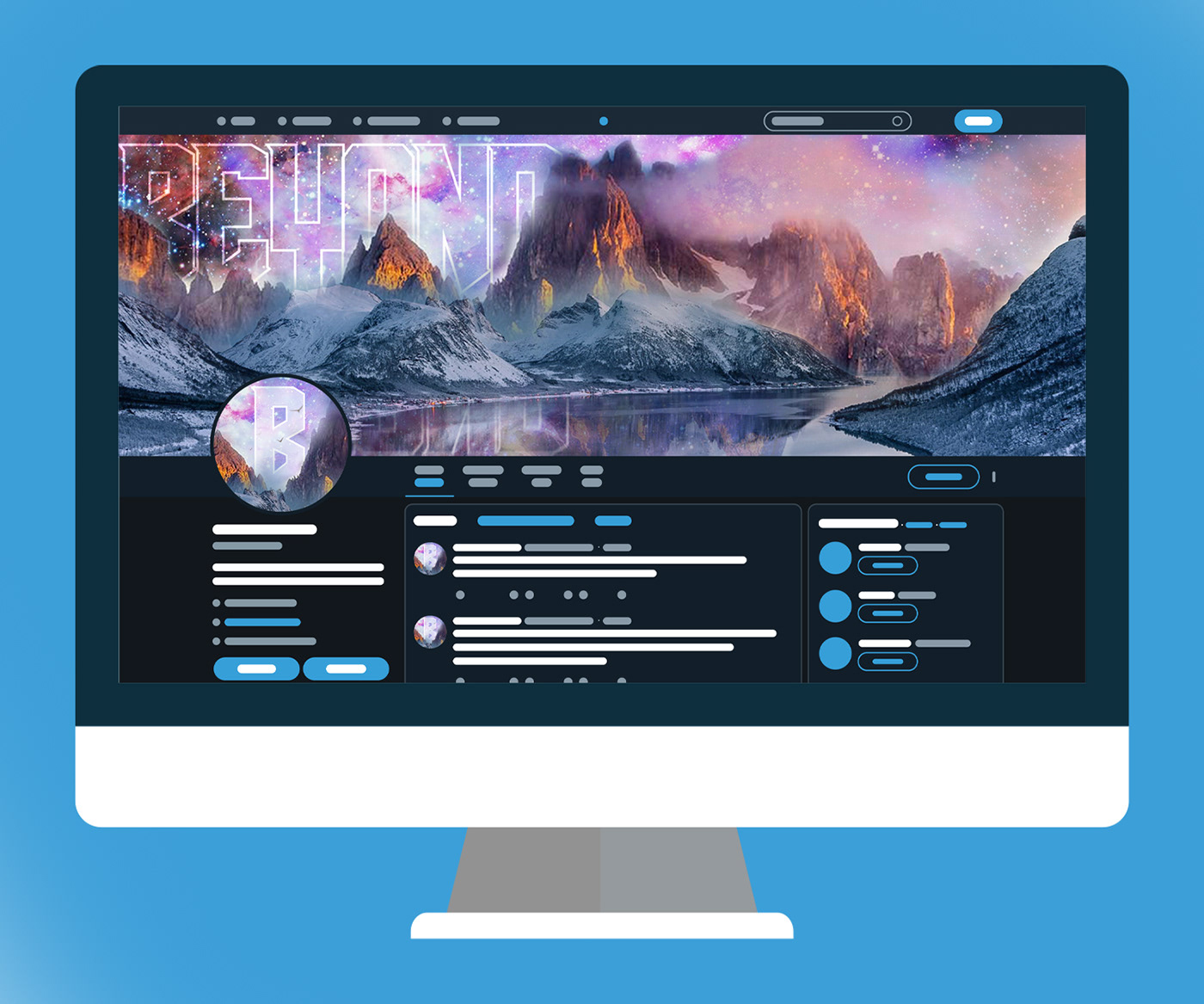
twitter header mockup, feedback please
@glacial path i could really use some quick feedback before i submit today.
texture the background?
is the avatar ok?
any other changes?
or is this one with the level up logo better?
@echo dawn I don't think you need the Level up logo on the computer. I would add some space between the B and the Avatar border
alright thanks tim
Also be careful with the clouds! The stars are shining through the mountains:
Fantastic mockup, great colors and good overall composition though!
@glacial path haha never crossed my mind to think of physics like that lol. I'm done with the mockup from yesterday, but one last thing, should i add a line/polka dot texture to the blue backdrop?
Hm @echo dawn as long as it doesn't distract too much from your design.
thanks
@eternal marsh Hmm, good idea.
Behance
Adobe PS challenge #5Today we were told to apply our composites from yesterday into a mockup. Every day I like to deviate from the tutorial slightly, so this day, I created a wireframe twitter UI to place my mockup on.--Computer Vector:https://www.fr…
@peak warren Thank you! I'll have to look up Loomis, it just came to me. I looked at it like a battery charging up to the max level. I really like your mock up. It's nice to see it in a setting with people interacting along with it.
@echo dawn nice job with the composite and mockup! I like the contrast of simple screen layout with the detailed image.
@bleak fossil Thanks for the feedback! I've lowered it down on her skin, hopefully making it better.
@young karma Great idea for the mockup! My only suggestion is to separate the color schemes to make the screen and your design stand out more. Great work!
Hi everyone 😃
It would be very helpful for me to progress with your feedbacks

Behance
PS Daily Creative Challenge - March 2019
@lone hare tysm
@lone hare Thanks for the suggestion, Ryan! I actually changed the original colours to reflect on the design. I like to think of it as a whole experience dedicated to the game rather than focusing on the screen itself. To draw the eye towards it, however, I used camera raw filter's vignetting.
@lone hare I really liked your day 4, btw. The values are spot on. And your mock-up is clean and orderly, as it should be 😄
Hope you guys like my facebook mockup
@peak warren Thank for the feedback.
@peak warren Most of it was intentional, especially the talking bubble from the head. I was being inspired by what she did in the video with her poster so it kinda morphed into being a talking bubble lol
@young karma Oh got it. Then you nailed it 😃 And thank you, I was up late finishing day 4 and 5 and I was too tired to go on. I'm glad it worked out in the end. 😃
@lone hare You were not the only one xD those damned weekends get too busy xD
@turbid junco Loomis wrote some great figure drawing books, maybe ~1950. He has this distinctive signature where he makes the "M" as three vertical lines, IIRC. I was never good at figure drawing, so I got to about page 10 before I got frustrated with the exercises. But the books are superb.
@young karma correct.
@burnt kestrel - love your mockup! I wish I could check out that online shop 😃
Day 5 - Twitter Mock Up
Just looking for general feedback (fairly new to photoshop)
@cosmic raptor Looks good! Maybe you could have added a profile picture to social media page aswell
Thanks, I really should of. I'll try and take my time and add more details in the futur
Still catching up. Feedback appreciated
Why a Twitter mockup when you can go BIG 😃
@left junco ooooooh! That's great. How did you wrap the image around the curve of the building?
@cosmic raptor It looks good , ya a profile image or logo would be good. The reflection of the Greenscreen in on the phone you could make a reflection or just blacken it out
Thanks. First I placed the image with Free Transform, and while you have FT activated you find the Warp button i the upper bar (looks like a bended windows), and with that you can warp and bend it
nothing to say about mine ?
Nice comp @left junco I wonder if a dark grade over where the image bends back would help give more sense of depth? really cool idea.
@young karma the colours look off is it CMYK or RGB or SRGB ? if i right click and open the colours look better
I'm agree my blue look purple
Any feedback much appreciated
Day 3 PS Daily Challenge! Let me know what you all think!!! Thanks in advance!!!
@young karma where did you get your game box template . i just used a blue rounded rectangle
@severe dust Yes, that's a good idea! Here's an updated version with a subtle gradient.
replace the image and add some light and shadows
Day 2 Ps Daily Challenge. Thanks for the Feedback!
I tough the challenge was to create the mock up xD
@cunning gulch your text look invisible, In my opinion you should try to play with opacity to add some more visibility at ur text
@left junco looks good what would it look like it you added motion blure to all the people and bus and cars like a long exposure , night photography . That could look cool
@cinder vessel maybe soften the harsh reflections on the upper laptop bezel
but look very good, very digital 2.0
Wow, realistic comp! @rotund lark Seems minor, but the "P" in "UP" is getting lost in the clouds in the header image at this scale . I also wonder if you could push some visual separation between the profile pic graphic and the header graphic, they are so similar to each other and they overlap
@young karma thanks so much for your feedback!
yes! @left junco so nice!
your welcome and sorry for my english
@rotund lark Yes, motion blur would/could be nice, but it would be quite overkill for a mockup IMO 😃 In a perfect world I would have taken the photo myself (this photo I downloaded from Pixabay, credits on my project page) with a slow shutter speed.
@severe dust I updated it more drop shadow and changed the logo for profile image. what ya think ?
Oh, I like that profile pic, that gradient really pops now! @rotund lark
Lovely mockup Mark & I also enjoy the updates you made!
Finished up a quick day two poster. Found a neat futuristic background and did some blending with the shapes to make it a bit more colorful. What do you guys think?
@burnt kestrel try content aware erasing to blot out some of the tabletop objects. I eliminated the right rear potted plant but even with adjustments seemed to have some residual greenish blush. Also used the stamp tool to restore the edge of the wooden plank effected.
@rotund lark look much better now. I'm impress
These textures are SO nice @wet kettle, I like how you used scale and color throughout. There's a little bit of muddiness in the color of some characters like "W" in "Wish", you could explore layer order or adjustment if you wanted to create some tonal variation
@left junco Inspiring. In 1978 there was an open-all-hours Chinese restaurant behind that sign.
Hi all! Don't forget I'll be giving live feedback at 11am (in 1.5 hours). If you'd like feedback on your challenge submissions, please post before then. Thanks!
Hello @sterile bane any chance of some feedback on my project if you get time, Thanks... Just about to leave work will check back in later .. Have Fun everyone 😃

Behance
#PSDailyChallenge Photoshop daily challenge
Yeah! Please post it, I'll write up some feedback so you can check in later. Have a great time at work!
awesome
@sterile bane any plans for a later feedback session?
@echo dawn we're testing a few different variables but might push the time to be later in a few days! 🤔
Thanks @severe dust ! The quality isn't great in Discord thumbnail so it looks a bit different in the HQ version. I did take another look and the second W in were definitely could use a little help so I definitely appreciate the feedback!
Hey @sterile bane I would like a feedback on my project! Thanks!! 😁 ❤
https://www.behance.net/gallery/77134435/PS-Daily-Creative-Challenge-March-2019

Behance
Photoshop Daily Creative Challenge March 5th to 15th - Adobe Live
And how about this for the new challenge ?
Hi all, would love some feedback on the day 3 challenge please, many thanks 😃
@young karma I'm liking that, nice touch with the dirt coming from the tyre
Those Mario stomps!! I wonder if you could move everything but the text up (or scale the text), Marios eyes are covered with the vert center text @magic rampart
I have been playing some catch up so here is the text, day 3 project. I am kind of on the fence about it.
Yep thx this is from my original artwork
Here is the composite piece from Day 4. I think I could do more with the text, maybe try and make it more consistent with the previous days work.
Here is the mock up from day 5.
Thanks @severe dust , it does make a difference.
hey what do you think of this one?
hahaha
Good afternoon guys! Here's my day 6 contribution. Please feel free to comment 😄
Hi @bleak fossil thanks for your comments on Friday, sorry been working since then so only getting to look at it now ... you said to add a vignette with a multiply layer and to brighten the area around the character . I'm not sure how to do this would you mind explaining. I have had a play around and changed up the filter - how does this look .. better?
this was the original
@night isle I think it looks better overall! I would mask out the planet on the left though. It's a bit over exposed after the filter
or i've just done this version where i've just put the filter on the mountains and the character and left the background dark
thanks @wet kettle exactly what i was thinking - what do you think of this other version i've done?
Agree with @wet kettle Looks good here! @night isle
along that line the planets have different light sources, above for the red planet, maybe tilt it so the highlight is coming from the center of the image?
@night isle I think the brighter one looks a little stronger. Maybe tone down the brightness a little around the lettering and the left planet and see how it looks

Behance
This is my project for the Adobe Photoshop Creative Challenge
Hi @sterile bane I would like to have some feedback on my project. 😅 https://www.behance.net/gallery/77168687/PS-Daily-Creative-Challenge-March-2019

The selections were the most time-consuming part of this. Select subject and select and mask did the job (love that refine edge tool). Question: do you think I should path blur the zebra background too?
Hey Kathleen, would be great if you could review these two....
I am not quite sure about the path blur filter applied to the horse....would be great to know your thoughts on it...
Will do! I'll be starting feedback in about 15 mins.. really excited!
I just did my Day 1 challenge.
@wet kettle & @severe dust thanks for your feedback ... i've had a play around ... what do you think ?
Feel free to comment on. 😃
https://www.behance.net/gallery/77134703/PSDailyChallenge2019
Image has been replaced*


Hello @sterile bane
Hi @sterile bane
Hello @sterile bane Whenever you have the time here are my mock up for the daily challenge.

@uneven kindle Really like the font you used for "Swiftly", maybe use it for "Galloping" as well? Add some motion blur to the legs as well, they're probably moving fast. 😃
@young karma Love your designs - original artwork, very nice!
@narrow cedar great mock-up, my eye gets drawn to the objects on the side, that nice green cactus, maybe desaturate those a bit?
not too much tho 😃
todays challenge submission how can i make this better?
Thanks for the awesome feedback @sterile bane 😄 I used the path blur on the whole element and used the filter mask applying black. As I made a black rectangle in the middle, I used the command + click to get a precise selection for masking
@steep quartz I would love to see a little bit of the natural color of the hands come through a bit. Really cool piece
day 5
@pastel spade thank you chad will give that a go 😃
Thanks for the feedback @sterile bane
Thank you @sterile bane
Thanks @sterile bane
Thanks for the feedback, @sterile bane . I'll fix it up before posting to BeHance.
hey @dusty karma ! Unfortunately the audio isn't saved from the live feedback but I can give you my feedback here. I think your composite looks really nice and i love the green/earthy color palette. My only critique was maybe you could try matching the color palette of the Level Up logo a bit more to the color palette of the rest of the work so it feels integrated
Oh thanks to post it here so I could see ❤ I will try to match them!! Thanks
@steep quartz wow, really cool! Love the spooky theme
Thank you @sterile bane for the feedback. You are right, legs really need to be edited 🙂
WIP for the path blur. I have not figured how to mask the path blur yet.
Hi @sterile bane is any feedback for me?
@peak warren You have to convert the layer, in your case the bird, to smart object then apply the blur. After you click ok it will look like this (image). I hope you understand, English is not my first language 😄
Hi @coral stone I did that part OK. I need to do the masking part next. It's OK. I'm taking a break from that part and working on another subsection.
It was quite difficult today, not sure at all about the gradient in selection, how to do properly... but I tried and tried and tried 😃 and this is the result of my work from the live video till now :). Still a lot to learn, but the level is definitive going up
@peak warren You can select the white rectangle (Smart filters) and paint with a black color brush 😃
@coral stone Thank you
Hello every, here is my Day 4: Composite challenge
made this for day 3! trying to catch up ^^;;
Day 6, learned a lot today. Feedback welcome.
my work for now, not finished yet, but if anyone has feedback so far, I would appreciate it 😃
Hey guys, here's my day 5 challenge... let me know your thoughts ... thanks 😀
This is a project cover I just finished. Learned some cool tricks on gradient maps last week and wanted to try it out! What do you guys think of the composition?
I used a free template. any feedback?
same template, different view
My Day 4 composite
Composite looks really cool. Love the contrast
Only comment would be that the girl is not what my eye gets drawn to first. Which is not a bad thing necessarily! Depends on what you are going for
@foggy orchid I agree with owain, very cool! the dark figure on the light mountain has great contrast.
Perhaps you tone down the highlights on the planet so that the girl stands out more? you could also introduce a few highlights to one edge of the girl so that she doesn't get lost on the path
I would love to get some feed back on my mock ups. Please let me know what you all think.
here's my Day 4 entry, used elements from my earlier entries! ^^
Electric colors! Nice composition @wet river
@severe dust thanks!! I love how pink and blue glow look together! 😃
@blissful badge I love the leaping dog. My only issue is that the text is hard to read. Maybe distort it less?
@fair hollow awesome mockups! I'd love to get a little more zoomed in on the laptop mockup, but great perspectives all around.
@eternal marsh nice job! I really like the movement. The Speed It Up could be moved down slightly or maybe enlarged a bit - in my opinion 😃
@blissful badge space dog!! I love the design. Maybe try playing with the path blur a little bit so it pulls away from the dogs body, rather than just blurring the bottom half.
Hi as per feedback I have resized the logo on my Day 4 image (gotta get it right for Day 5 😃 ) does this work better? I know I'm happier with it 😄
@foggy orchid facebook is usually centered on a screen, not sure why its not in your mockups, but I think it would look better if it was! 😃
Ok I finally made the level up logo... I tried to replicate each step that Kathleen demonstrated.
@queen surge studies are great for learning! would be cool to see you take what you learned and create your own idea too! either way good job!
@timid pasture are you adding it to browser or mobile?
Browser..
Looks like there is some padding/margin
oh I looked it up, twitter recommends that size but cuts off 53px from the top and bottom. So try to add margins.
haha, guess I'll add margins to my own design ^^
1680 X 462... 🤔
@timid pasture This is correct. I found this out yesterday. If you make 1500 (wide)x53 (tall) and place on the 1500x500 image as no-go, you should be fine. I made them non-visible when exporting.
Thanks for that template, Owain. I'll do some messin' around... 😬
My path blur assignment. This was a lot of fun. Thanks to everyone who helped with answers. Hummingbirds & cloud photos by me, afterburner from the web.
feedback welcome
Day four composite. I put together some landscape photos. I think the area behind the hiker/space walker needs some deemphasis. The cartoon space helmet is there to add a bit of absurdity.
Day 5 Challenge Mock Up any feedback would be greatly appreciated.
Awesome job Crimson - lovely job with the perspective. I also enjoy how the mockup image has the green in it, playing off of your banner graphic colors.
@queen surge If you want to de-emphasize the middle ground, you could do two things. One, match the color to the rocks in the FG. Second, put some blur. Also, your shadows don't line up between FG & middle ground. I don't know how to solve that. You could make two sets of shadows in the FG, as if you were in a binary system. Because the FG shadows are simple. But the middle ground shadows are past my skill to dupe and reorient.
You could also rotate the FG until the shadows were in roughly the right direction.
@peak warren thanks for the tips. I'll give it a try
Day 6 first attempt any feedback would be gratefully appreciated
@night isle In what direction is he moving? the blur is usually on the side that someone is moving away from!
@wet river oh haha i got that totally wrong !! got myself a bit confused ... oops!!
the blur looks good though! just gotta get the movement in the right direction! its easy for anyone to miss!
hows this ?
Here's the template if it uploads...
Nice, @timid pasture ! Thank you for posting the twitter banner template as well. If you want to explore further, check out the template provided in the Day 5 challenge: http://bit.ly/psdcc-5 If you keep where they have text laid out in mind, you should stay within the safe zones. Thanks!

Adobe Stock
Stock template of Angle Social Media Set. Search more similar templates at Adobe Stock
good job @night isle ! I would suggest playing with the blur path a little bit more so that the divide between blury part and clear part is not to stark.. also consider confining it slightly so that the blur follows the shape of the subjects body, rather than the diagonal. 😃
Good job Priya! I like the concept of adding a VR headset to the type, but I feel it creates more confusion than it's worth. Maybe try removing the VR headset from the inside of the S or playing with it somewhere else?
ok sure @uncut ginkgo. Thanks!
thanks @uncut ginkgo really helpful, yeah i'll have a play around with it!
Hi Here is my first draft for Day 5 and the mock up challenge. I think I need to adjust the photo slightly and maybe take out some of the clutter on the desk but not sure.
@peak warren rocket powered hummingbirds! ha! Awesome idea. I love the blur, it feels very natural -- the bird on the right seems perched, it'd be fun to give it something to sit on, maybe? I had a hard time reading Assisted for some reason, but it might just be me! Maybe Rocket Powered Hummingbird would be more recognizable.
@uncut ginkgo
@uncut ginkgo I erased the perch on the right. I can unerase it. (Thank you @sterile bane for teaching masking so well). The rocket assisted is a geeky reference to JATO, the solid fuel rockets used to launch bombers in the early Cold War. I know the text is hard to read but that was a choice.
I’ll think of there is a way to make it more readable
ohh! I see, totally missed the reference. Thanks for the extra info, very cool. Nice job masking that out, you did stellar. I wonder if maybe grabbing a second bird in flight might be the move? rather than putting the perch back in.
Good idea. I have a lot of Hummingbird photos.
@uncut ginkgo I moved the VR headset to the dress. Please let me know your comments.
@full topaz nice photo choice with the darkness & the two screens! I like the bright screen too... "blinded by the bright" is too real!
Nice! Good idea to move it to the shirt! The text/flowers on the shirt + headset does seem a tiny bit busy but overall I like this composition better 😃
ok @uncut ginkgo I will try something else then. Thanks!
Opinions please! help me to improve it!
@woven frost Love the jellyfish, I think the landscape one works better as a readable image and feels more balanced.
@sterile bane Thanks Kathleen! I tried that template, but there was just waaaay too much going on for this tired old brain! 😆 I've got it, and will definitely be playing around with it more..
Not Happy with this work in progress. the diver was too small to benefit from the motion filtering I tried and the path blur was not having the desired effect of only the mermaid tail fin in motion. Spent a lot of time unsuccessfully looking for suitable images in Adobe Stock for the original composition I envisioned.
Love to know what you all think of this I worked on today.
@latent lion is there a better way you could make the ice and the ocean blend well? maybe with a blur or something?
feedback please
@regal scarab I like how the font really seems to fit that alien theme! Some good use of shapes as well with your composition. One small idea could be to try and mask out the background 1s and 0s texture on the planets. Currently there’s a lot of texture and visual noise going on everywhere, it might be nice to give the eye more of a place to rest by removing it from the planets. Not sure if that would help, but just an idea. Nice work!
@tepid sierra Nice work! Not sure if you’ve done the mockup yet, but could be really nice to see you apply this design to the mockup challenge!
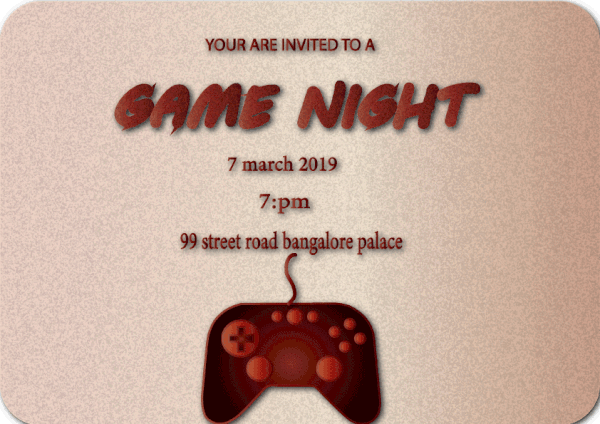
@gaunt hill Looks good! I like the playful color palette you chose, it works well with the theme of a kid’s game night. One thing is the title is almost a little hard to read. I think perhaps darkening down the background just a bit might help it read better and make the girl pop more too. Maybe a multiply larger with a desaturated blueish tone, and then adjust the opacity until it looks good? Either way, nice work!
@night isle I'm sure there's multiply ways to create a vignette within Photoshop, but typically what I do is create a multiply layer, fill it in with a mid tone desaturated blueish color, and then mask out or erase out the middle with a soft brush. It just creates a nice soft darker edge around the image that you can control
@latent lion I definitely like the idea and where you were going with this! I think that blur effect definitely works better on side views that don’t have so much foreshortening going on. It might also be a little tough since the top image is from a higher up view and the bottom image is from eye level. But having a sort of thickness to the ice might help, so it looks like a thick sheet of ice on the water rather than an abrupt crop. Almost like the feeling you get from this image.
https://i.pinimg.com/originals/55/41/7e/55417e9dd406c2e33a061a3bb31ceb39.jpg

@timid pasture Nice work on the mockups! Definitely eye catching with the hot orange colors against the neutral tones of the rest of the image. Only thought is the odd whiteness around the plant in the second image, not sure if that's just a masking issue? Either way nice job!
@cursive pawn Very cool, love the vibe of this one! I think some simple color correction on the girl could be nice to make her fit into the cool colors of the scene a bit more. Also maybe scaling up the text a bit and rearranging the shapes slightly to have more of a visual flow. Here's a rough idea, you can see they're very subtle tweaks but I think it could be nice (the bottom is the original). Great job!
@woven frost First off, love the username haha. I really like these designs! It could be nice to pump up the saturation of the text and jellyfish, and even maybe the coral on the bottom picture. Could be a nice contrast in color and still fit with that retro gaming look.
@full topaz Nice work, I like how you fit in two images/designs into your mock up. On thought is the brightness and white of the screen on the left kind of overpowers everything else in terms of contrast, and the lighting on the person doesn't seem bright enough. I tried a quick adjustment by selecting the person using the lasso tool, then using a levels adjustment in combination with a screen layer to airbrush some light onto him. I also darkened down the screen ever so slightly. I think it balances out the image a bit more. (the original is at the bottom) Hope that helps at all, great job!
@bleak fossil Thanks heaps !! yes that does make a diffrence and it looks much better, I'll give it a go on the orginal file. I couldn't decide if the second screen needed to be some how brighter but with the first screen darkened it balances it better 😄 Thank you
And after seeing that movie, I'm not feeding any stray cats..... 😬
@bleak fossil After looking closely at the original image (It's a stock image from Creative Market) it looks like the plant was sprayed with some of that fake snowy stuff you spray on Christmas trees, or something similar. I'm gonna plead innocent on that one! 😆
first time ever using action blur
From the blending challenge, what do you guys think🙂 birthday post card!
mock up on laptop
Day 6 Challenge.
hi i need some help please. What i want to do is make the grey flooring look like its hot and sizzling (they are jumping away from it) AND i would like some brighter light coming from the top left and spotlighting both girls...anyone know best way to do this please? maybe something different with the text...im so open to suggestions to make this look better?
i actually wanted the floor to be very silvery if possible.
just moved the floor around a bit
@haughty violet This looks really cool 👌 When I try to blur the subject, my entire background gets blurred too...any tips on how to avoid that coz I see your background is pretty stable...
@cinder vessel it sounds like you may not have the person as a smart object? (Assuming you got rid of the background beforehand). I made sure to remove the background before anything, made them into a smart object, and then proceeded to adding the blurring. Hope that helped! I usual suck at explaining >.<
@haughty violet I see...I didn't remove the background hence the issue. Will fix it now. Thanks a ton 😄

@sterile bane I'm not sure about this details realistic ness but yes i think it looks a bit better. will implement it into my designs
Day6_Path_Blur_Poster😜
I appreciate your feedback😊
@narrow cedar love it 😀
The last guy here! #VixPS
Day 4-5-6 into one Revised image
DAY 4 , Work Castle🕵
@sour ingot That's good! I like the use of Nintendo graphics in the real-life wall you used as a background. Nice also how the hand is posterized, but subtly.

Behance
Level Up! | PS Daily Creative Challenge | March 2019
@warm agate Love it!
@woven frost I am in love with #2, amazing!
really excited to show my submission for yesterday, but I'm holding back for the big reveal later today....
Can i have some feedbacks of my work please ? 😃
Behance
PS Daily Creative Challenge - March 2019
here some new
Day #6! Added some movement to the boxing photo 😃
@lone hare the effect is nice but the text ruins the overall image
@tropic dome Dang. My gut was telling me that too. Thank you.
@lone hare Move the text to the L side, and path blur it as well
@lone hare try using another font and make it bold, punchy, yet simple. Try finding it’s place on the artboard 😄
@tropic dome Yeah, I'm limited to the fonts on my work computer, so my choices aren't the best.
I am sooooo behind on the challenges 🤦 Let's see if I can catch up soon! This is the futuristic postcard from Day 2. Let me know what you think 🤗
Feedbacks please.
Header image. What do you guys think?
@fickle garden Really like the pink and green! Would be sweet if you continue those colors throughout the stars and galaxies. I'm a big fan of a limited color palate 😃
Thank you, Ryan I like that idea.
@lone hare I need feedback on mine please
@fickle garden Keep the planet and your level up stuff the main focal points, and maybe try more subtle color to everything else.
@compact nebula I think this is really nice! keep up the good work!
Day 6, added motion blur, any comments appreciated, many thanks 😃
@fickle garden loving the pink
i've been playing around with my day 6 challenge and have 2 versions but not sure about them or which i prefer any feedback would be great ... thanks
my exercize day 5
@echo dawn Maybe add some more movement on the upper part of the person. It looks like he stopped and got stuck stuck. Mess around with the settings a little more. Try making the portals look more like holes too maybe. Great color choice too maybe a little more contrast between the background gradient and the words. 😃
@woven frost awesome colors and composition - You did really well making the whole setting feel cohesive. 😃
@night isle Both are good, but I prefer the first as it makes me chuckle.
@echo dawn Level down 😃 Great! Love it
@echo dawn He's going in the wrong direction, unless he's falling up 😃
ah crap lol
@magic rampart haha thanks 😀
@night isle both are very nice! I really like the movement in the first one, but I'd keep them both! 😃
Nice job Jonah! I love the portal vibes and I enjoy how you made the bottom one a bit more blurry, indicating he is moving from the bottom to the top of the page.
thanks @uncut ginkgo 😀 ... just realised i posted the wrong version of the second one this is the right one the bottom blends better
thanks gun
@echo dawn He got unstuck 😃 See how he's cut off on the top? Maybe do the same to his lower half.
What do you think now?
@echo dawn Great!
@fickle garden Maybe a little more lighter with the stars and mountains. Planet looks great too!
Thanks for the feedback @lone hare
@fickle garden You are welcome. I just hope I'm helping lol
@AndreK1d really nice coloring🤓
Yes, Thank you!
@latent lion thank you
did this for yesterday's challenge... already used brushes but so excited to learn today's textures! Any feedback is appreciated!
Filter Challenge
Lovely work @dry comet - Have you played with making your title a little larger? Other than that, no critiques here, awesome color, concept and composition.
@thorn gulch lovely work and nice mockup!
thank you so much @uncut ginkgo ! Good call on the title

@uncut ginkgo do you know why this isnt showing up on https://bit.ly/PSentries

Showcase and discover creative work on the world's leading online platform for creative industries.
shows up for me as the first project! ^
odd
Okay, first time sharing my work. I'm so behind, but I have 4 challenges in my project right now.
https://www.behance.net/gallery/77185353/Level-Up-Photoshop-Daily-Creative-Challenge
Behance
The Level Up Photoshop Daily Creative Challenge
Day 5 redeveloped
Day #6 Challenge: Hope you guys like it...😍
@loud zephyr Try "BE THERE IN A FLASH"🙌
@latent lion Great suggestion
I did not have a lot of space for texture but I have used 2 different brushes for moons and one watercolour brush behind mountains. What do you think? 😃
@magic rampart I love the leaping dog and its motion blur. Nicely done. But the moon is distracting since it's so bright. It takes away from the dog. Depending on where you'd like the emphasis (moon vs. dog), you might want to tone it down.
Here is my revised Level Up Hero. Any feedback is appreciated.
@raven meadow wow, it reminds me hero from wolfenstein game 😃
@night isle I think the punched guy has more impact (pun intended), but I like the elements of the vortex version, too.
thanks @stiff depot
@dry comet I love the colors, though they might distract from your central figure. Still, very pretty. But your "level up" definitely gets lost. Bigger maybe?
@loud zephyr Very clever!
Here's my Day 7 version. Added smoke and used a hair texture for striping the arrow. Both textures were from PHLEARN. My only concern is that I didn't draw the texture up too far into the smoke at the Level Up text, but I didn't want to make it look muddy. Suggestions?
i've done a bit more work on my second version and also done a version with the added the texture .... now i need to work on my first one ...
@stiff depot thank you for the feedback, much appreciated. What do you think now?
@magic rampart I think that's greatly improved. The eye definitely goes to the dog first.
nice job @magic rampart ! and great feedback Trixie 😃
@glossy trellis good job! I really love what you added to the moons - very cool.
@stiff depot Both great points! waiting for brushes to load and i'll post an update soon!
@uncut ginkgo Thank you so much! ❤
Catching up! - Had a super hard time with this one because I hadn't sized the day 4 poster properly for the banner 😭
AG! Even though you had a hard time, it looks beautiful! Nice job recalibrating 😃
thanks @uncut ginkgo 😊
agreed @gleaming halo , you did a nice job staying agile and changing things up!
Thanks! @sterile bane 🤗
@magic rampart Nice job! Just one suggestion, put logo Level Up more higher - will be more eye-catching 👌
I didn't like the yellow colour i'd originally picked for the my first version for day 6 so changed it up a bit ... so here it is also with my day 7 version of it
The second one is my favorite Maria!
@bleak fossil Thanks! 😀
@uncut ginkgo Thanks !😀
@night isle Second one 👌
@glossy trellis Thanks! 👍
@uncut ginkgo thanks for the feedback! I will try to put it down a bit 😃
@buoyant pendant woah, did you make that from scratch?
I could use some feedback on my texturing https://s.jmax.io/9GBaKM.png

@buoyant pendant I made the shapes, not the snowboarder or Saturn
looks super cool
I can't help making my mockups super tacky (its just too much fun!!) but I think this looked pretty cool still with the space theme ^^
@echo dawn Thanks! I'm glad you like it! 😃
My submission for Day 6...Path Blur effect...
I would like to know your feedback on the text placement here...
@cinder vessel I think it would look good if she was more on the left and the text was bigger and not overlapping, but maybe starting right after her?
Here is my submission for today's challenge would really appreciate some feedback 😃
@wet river That's interesting...thank you!
@steep quartz thats genuinely amazing.
Will be going live with feedback in 8 minutes! Stay tuned 😄
@echo dawn Thank you so much!
@cinder vessel actually I would try flipping the image so she is running towards the right side, people often understand going right on a screen as progressing forward, so if you put her on the right side running right and with the text after I think that would be great!
@sterile bane looking forward to it 😃
https://www.behance.net/gallery/77255803/Photoshop-Daily-Creative-Challenge-March-(Mars)-2019 hi Kathleen, can I have some feedbacks please 😊
Behance
PS Daily Creative Challenge - March 2019
my work Day 7 - in progress
@sterile bane Thanks you. The texture was intentional. I will tone it down.
Day 6 - Any advice on fixing the portal so it doesn't look so out of place?
thanks!!
@sterile bane thanks so much, i was able to make it! I'll go fix the down color.
@sterile bane Thanks! I added a spotlights image and changed the blend mode to soft light.
thank you Kathleen!
Thanks @sterile bane!
@sterile bane thank you so much for your feedback 😀
@sterile bane Thanks for the feedback
@sterile bane thank you for the feedback. So sad we have just 2 days to go 😦
@sterile bane thank you so much for the feedback!
The day 6 project, path blur and smart filter
Day 7, made changes and added brush texture to day 6 project. https://www.behance.net/gallery/77148781/Adobe-PS-daily-challenge2-electric-boogaloo

I've removed the sharp edges from the circles at the top left and moved them over the the right a bit What do you think?
@steep quartz cool! feels better, allows your eye to focus on the important details
@sterile bane Thank you 😄
Day 6
@steep quartz yours looks AWESOME! I can't decide which part is my favorite, love the colors you chose too!
@gray badge Thank you so much that really means a lot!
@steep quartz Looks amazing!
@modest rock Thank you 😃
@sterile bane I was working so I missed any feedback you may have offered, but I did want to thank you for doing the voice critiques for us.
no prob @stiff depot ! my main feedback was that i agree with the muddy-ness concern. I think if you keep the smoke to the bottom 3rd of the image, you'll be golden!
@sterile bane, thanks. That's kind of what I was thinking, too, so I am glad to have affirmation. Striking vertical balance was frustrating in this piece.
Had added some brush strokes on Day 6, but a nice glitter brush seemed to make sense here. Day 7
day 6 and day 7
@modest rock Gorgeous! I'd love to hear how you nailed that glitter effect so well.
@sterile bane really nice getting some feedback! I'm just working on stuff on my own at home so its hard to know if its any good or not sometimes!
@stiff depot I actually just used a glitter brush I have. Over the clouds layer, I used a Lighten Blend Mode and over the woman, I used color burn. Both used the same yellow color. I may see if I can randomize the color a little.
@modest rock Did you make your glitter brush, or where did you get it? Would you say a spatter brush would be an adequate substitute, or is the glitter more square?
you can find tooooons of texture brushes for free online if any of you don't have any added! ^^
@wet river I have hundreds of brushes, many of which I made myself. But there's always that one you don't have that you just must get. 😁
that moment you wonder if PS is frozen or will crash from using a large brush 🤔
thanks for the feedback, I changed the color background and also the logo, and added little Margot 😃
@stiff depot haha, for sure! I think I need to remove some I never use 😛
@stiff depot I did not create it, but I can't remember where I found my glitter brushes anymore, but I love them for these types of graphics! They are very similar to splatter, but instead of small blobs, you have various stars that are essentially splattered. Splatter would work though, but I would suggest using it on a smaller size so it looks less like a splatter and more like small glitter
@stiff depot In fact, I think this is what was called a "Sparkler" brush
@wet river I find I rarely use the smudge brushes that come with Kyle's Mega set, but I'm trying to play with them more before I chuck them out.
@stiff depot do you use a pen tablet? I feel like smudge brushes work best when you use a tablet and don't make much sense if not
@modest rock I'll do a search on "sparkler brush" and see if I can turn it up. But your description of "various stars" is very helpful because I can make it if I can't find it.
@stiff depot Absolutely! In fact, I'll use smaller splatter brushes with the sparkler to just give it a little effect
@wet river I do use a pen tablet, but I don't smudge much. For some reason the tool just doesn't rise to the forefront very often.
@modest rock Great tip!
Hi everybody!
if I go a little behind I can still share my work to have feedback?
@modest rock Found the brushes in a pack of 10. The search was easy with the name you gave me. Thanks!
Day 7 Update: I realized I hadn't masked the sparkles from the bottom of the image. Now it looks like it's coming from the hole in the clouds
@modest rock The idea is amazing, but if it was coming from clouds, wouldn't a little fall on the figure? What am I missing in your story?
@sterile bane @latent lion I took your advice!
@rain hazel it's not the stock. It is what you do with it. Thanks for your insightful, educated response.
Thank you @short isle
thanks @waxen spindle
Day 7 - Add texture to background
My Day 6 do-over. Created a railway terminal wall and manipulated it in 3D adding depth and perspective. Lighting effects for the railway station were also done in 3D. Hurried commuter was from tumblr.
Hey guys. I decided to upgrade my yesterday’s poster. I used some techniques that @sterile bane taught us along the challenge. For the portal I used the ellipse and add a neon effect using Outer Glow, Drop Shadow and bevel and emboss. And for the rest of the portal I used some nebula assets from Adobe Stock sample images and gave a mood with a Hue/Sat adjustment layer. For the lego, I made the path blur and used the Kyle’s brushes to make it disintegrate as he is dragged by the portal. When I finished I added noise and made an adjustment for the temperature in Camera Raw. Please feel free to give feedback 😄
Hey everyone! First ever photoshop project. Could be an album cover. Quality critiques please. I am so behind on this challenge, this is the "layers" one. I can already see I need to adjust the placement for the type, lol.
Also... A question... I'm not getting hardly any views on Behance. I entered the "psdailychallenge" tag in the discovery field, but it doesn't seem to help. Even when I go to Behance on a different computer and enter that keyword in the search, it brings up a ton of results, but I never see my Behance page. No wonder I'm not getting any views. What am I doing /not doing wrong? Thanks!
How do we make the portal shape?
@gleaming halo I used the warp tool to make the portal shape and refined with a mask using a brush with low flow for the edges
On Day 4. Feedback appreciated. It doesn't feel quite right but I'm not sure if that's just me being nitpicky or what.
@coral stone thanks for the great tips!
My day 6 contribution! I had especially difficulties with creating the portal and the circle. The blurring didn’t go flawless either. Help?, anyone? All input is very welcome thx
alright...this took me hours....so definitely time to take a break but would feedback.....listened to what @sterile bane said about the background earlier...and how it could be for a dance/choreography (i believe) company...so played off that and made it artistic with movement. Unsure of the paintstrokes though... and have two versions..
Why is there a difference in colors when in photoshop and when I export to JPEG, the purple turned neon pink which I do not like :/
Finally got around to the Day 4 Composite challenge. Lots of masking in this one 😂
What do you guys think?
@sterile bane , I love how you matched your jumper tp your laptop haha 😃 I updated them images .
If people where adding texture to an image how would you do it ,
I hand drew it on but was thinking that getting textures from other photos might be better. Then i thought for the size he is its would probably be "Over kill" too much detail
@wet kettle I like the design but dont forget you were doing a social media header! they are usually a lot more wide! 😛
@wet river Yeah unfortunately I didn't bring my headphones today so I couldn't hear what the purpose of the image was for! I'm sure I can crop it down a bit to fit a banner image. Wish I would have paid attention to the image size 😋
@wet kettle you can find the task description of all of the challenges in #🗣general-announcements !
just figured its worth noticing as soon as possible since its meant to be used in the next challenge ^^
@wet river Good to know! Thanks for the info!
no problem! we're all here to help each other 😃
I wanted to continue on the space theme for this challenge too so I turned a photo of a minivan into this cute spacebus and put the blur on that! I already use textures brushes a lot so I guess its 6 and 7 ^^;;
Is the blur enough? or should there be more blur? Also I feel like something is missing!
@wet river Great job it reminds me of Space Balls just needs some wings 😃
@rotund lark haha, yeah now that you say it! I love spaceballs! thanks ^^
@rotund lark very nice thank you for providing the update! i think your thought about size vs. detail is right on the money. i think you could even pull back on the details a bit! esp. the lines around the legs. hope that helps!
i got some weird artefacting because my images were kinda low res, but curious whether people think the composition is working
was curious if anyone had any feedback for mine..? :<
Took some time to fix mine. Thanks for the tips on fixing the portal, the masking really helped! 😄
@haughty violet I like the color splashes on the background, maybe play around with the placements and scale of the brush strokes? I like the white brush strokes more but I would make the text a brighter color! maybe try using the color splash on a clipping mask layer over the text?
@red palm I like the composition! its really interesting, The colors look great! Though the text is melting into the ground. the ballerina is barely visible and since she is also the same color as the text it looks like a smudge in the middle of the U unless you view it in full size. But all in all this is looking great so far!
hi. How do you get feedback here? ive posted but dont hear back. :}
@wet river thanks! Was at a road block in terms of how to finesse it, so greatly appreciate the feedback!
@tepid sierra That seems to happen sometimes. I've had it happen to me too. I think it depends on who all is around. I scrolled back up to see if I could find your post and didn't see it. Post again and I can give you my feedback, such as it may be.
Working on yesterday's challenge. Feedback appreciated.
@left token looks good, but would be super cool if you used the blur to make it seam that her wings are shooting out
Thanks @worldly geysernah . That was my goal but I'm still trying to figure out how to make it happen.
add more speed @left token
Thank You!
@gleaming halo Cool concept, nice job! My suggestion would be to extend the shape of light shining down all the way to the bottom, then fade out the bottom by masking it out with a soft round brush so you get a more gradual believable fade. I also think it could help play with different blending modes if you’re trying to get an effect of light shining down. Maybe a color dodge layer, screen layer, hard light, or soft light. Nice work AG!
@red palm Nice job, looks good! It too me a couple seconds to notice the beam of light coming from the UFO, so it might be nice to punch up the brightness of the area closest to the UFO. Maybe a color dodge layer or a screen layer. Could also be a cool effect to slightly darken down tips of the bird’s wings that are outside the beam with a multiply layer. Just a couple thoughts, really love the colors!
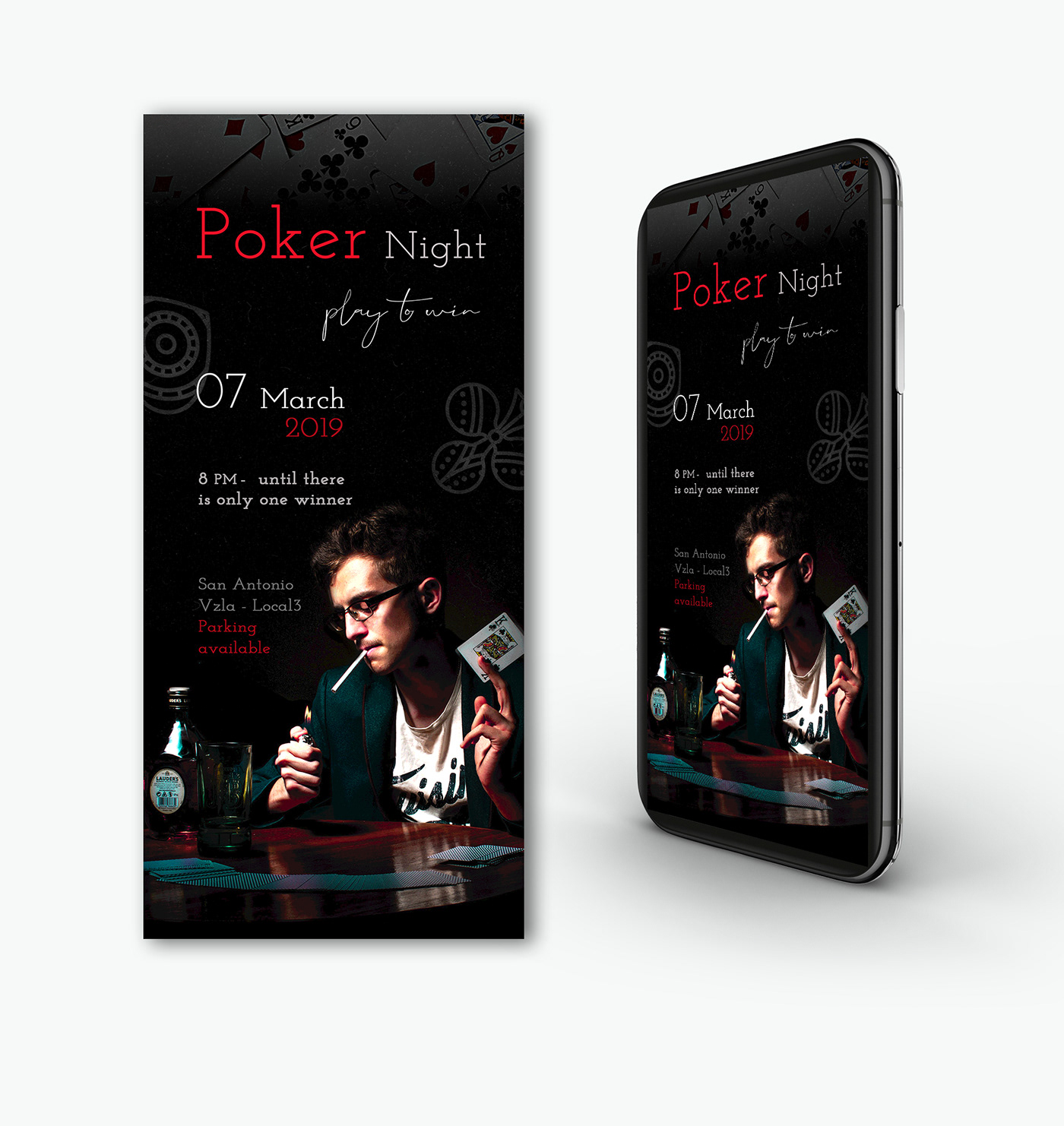
@dreamy drift Really great designs, nice job! Really love the vibe of the Poker Night design, works very well. For the Let’s Play design I’d almost like to see the girl even bigger to maybe make her a little more dominant as a visual element in the image. Either way they both look great!
@left token Awesome image! Really cool, nice job. I'd almost like to see the character popped out more with some light on her, or even kept somewhat dark but with a sort of rimlight from all the light behind her in the background. Here's an example of each that I did with a color dodge layer. The one on the left is a cool desaturated blue, and the one on the right is a warm desaturated orange. Just some thoughts!
Thank you @bleak fossil I love the idea!
I haven't played with texture yet. I know I'm supposed to be making a poster for the game, but I realize I don't ever design things with big blank spaces. This started last night on Typewolf, with "Choose Your Adventure" turning into Stranger Things. I riffed on Where's Waldo [Wally]. Originally, I had Zeus with a red & white knit hat, but it didn't work. The club image is from Adobe Stock.
Comments welcome.
@wet river Love it! Great work, big fan of VW buses. I think you should push the blur more on the back of the bus! I think that could really sell the idea of it soaring through space at a fast speed. I also think a simple vignette and rim light on the back of the bus could look cool too. Here's a quick example (but without the added blur effect)
@bleak fossil What do you mean "rim light?"
@wet river I love your VW minibus-in-space look. How did you delete the wheels? Cloning stamp?
@peak warren It's basically a back lighting that creates a rim around the subject and makes it pop from the background https://www.nyip.edu/media/zoo/images/what-is-rim-lighting-1_9a886d84bc22d267d8276a52ce1dd3f7.jpg

@wet river I think you need three chrome strips down the side for that Raymond Loewy/Machine Age design.
Ah, @bleak fossil I know that technique. I didn't know what it was called.
@bleak fossil Is there a good trick to check for all your values being clustered? I notice the modification you did for @left token made the figure stand out. Do you check by transforming into monochrome or something like that? Or do you just train your eye? (Alternative question: what method do I use until I train my eye?)
@wet kettle If you make a Twitter banner out of that, there are posts here about actual rules (1500x500, but 53 pixel strip top & bottom that is keep-out)
I tried the 1500x500 and when I uploaded it to twitter it cut off a huge section of my banner
@stiff depot Good point
@haughty violet Tried posting this earlier, but never saw it appear.. I'll try again.. I definitely like the more saturated colors in the second poster. It 'pops' without overcoming the action of the figures (which you did a great job on, BTW). I think it would be better without the paint strokes, IMHO, or with the lighter color a bit more subtle. If it's on a separate layer, you might try messing with the opacity and blend modes. Feedback does seem a little sparse at times..
@left token Try this template I uploaded earlier. The area between the orange bands is the "safe zone." Size your art to fit that, then turn off visibility of the first layer (orange bands). Save the entire image as a PNG (there will be a 53 pixel transparent strip at the top and bottom). Upload the PNG as your Twitter header, and it should look fine.
Thank you!
You're welcome! Enjoy..
@peak warren I copied out the side part between the wheels and use it to cover where the wheel had been.
@bleak fossil yeah def needs more work on the lighting! those are some good pointers 😃
thanks!
@sterile bane hi! may i have some feedback please? i would love the text to pop more and the silver ground to look ...more silvery and hot..but i dont have the skill set...any suggestions please to improve?
@tepid sierra I tried to leave feedback but the bot said I had used a bad word. I have no idea what.
Let's try again
Argh, again
How did you color the gym clothes?
It seems you filled with flat color, red
By setting to "normal" mode
This looks odd. You might set the paint to be "color" or "hue" or "multiply" mode instead
This will preserve the details in the clothing.
Sorry for the formatting, I'm trying to see what made the machine eat my posts
That aside, I like the color palette of the BG, and the composition.
@tepid sierra Nice work, I like the dynamic direction and placement of the two figures! I agree with mjacobs, I think you could get a really nice effect with blend modes on the red clothing. Currently they seem flat because they don't have any value information from the images underneath, but blending modes could fix that. Play around with different ones and see what looks best but "Color" is probably a safe bet. You could probably do something similar from the ground. Mask out the area of the ground you want to effect using a selection tool, and maybe paint a more silver color using different blending modes, or try using different adjustment layers to get the effect you desire. Hope that's helpful, let me know if you need any help!
ugh... doing the smart blur is seriously killing my computer... sad :(((
@peak warren I think the best trick is to look at the image zoomed out so you can see the whole thing. That's why thumbnailing is so important, to get an idea of the dominant shapes and values and to see the overall composition that way at a quick glance. You can control where your focal point is by how you decide to use contrast. The contrast could be through size, hue, saturation, value, etc. I think it's just a lot of practice designing. For me, I do a lot of painting, so that's how I practice. I do value studies, look at successful painters and see how they lay out their compositions and values, etc. But checking your values can be a super helpful trick to see how the image reads in greyscale. I use this little trick to set it up:
Menu > View > Proof Setup > Device to Simulate - Working Gray dot gain 20%
Now you can press ctrl+y to toggle the greyscale view on and off. Better yet, you can actually color pick and paint in this mode without it actually being grey, since it only changes your view to grey, not the actual image. Here's where I first learned of this handy method: http://www.artofscholes.com/checkingvalues
Thomas Scholes
@peak warren @bleak fossil thanks so much!! im learning so much its amazing!!
@bleak fossil Wow. Great method. I just got kicked out of the coffee shop so I am reading this on my phone. Will do this immediately when I get home.
Also, the idea of converting art that I like into grey scale? That’s perfect.
I was going to say that it’s good I like representational art, but I will convert some Rothko into greyscale and see that, too.
@wet kettle Very cool image, love the reflection too! One suggestion would be to decrease the contrast on the tall rock formation in the back, and increase it a bit on the mountains. The further back an object is, the more atmospheric perspective it should have, which usually makes the shadows lighter and less deep, resulting in less overall contrast. So it looks odd that the object further back has deeper shadows, reverse that a bit and I think it'll read great!
you turn it into greyscale to check that you have a good variation in values
^ Indeed. Though it can also help to study the values of other images or pieces of art by making them greyscale.
And no problem @peak warren and @tepid sierra Happy to help!
fixing the light and that a bit, but its like 3:22am here so I'm too tired to fight my computer trying to change the blur smart filter ^^;;
@bleak fossil just an idea (and probably a dumb one)...but what if i wanted the red of the clothing to look like paint...flattened...could i add splotches elsewhere as an extra effect to tie it all in?
maybe a flattened red type
?
how could i draw type into a splat of paint? as if the type is finger painted into the splatt of red?
if this is a stupid idea let me know.?
Day 6 - Level Up Blur poster
@fickle garden The "2" in 2019 is hard to read, because of how the top of the numeral closes the loop. I keep reading it as a "3" placed the other way. I like the composition and the color scheme. Especially since the gym clothes are neutrals, and her hair is black (or dark brown). The vector for the motion is unclear, though. Is the woman moving up, or right, or both? The speed trails are L/R orientation only. This is a small comment in the overall scheme.
also, I was only commenting about the last one.
Little bit of catch up, some feedback on this please 😃
Day 7 - Texture
Hey all, been very behind from work duties... but thank you for the replays! Here is my finagling with the layers function from day 1. What do you all think?
Big thank you to @peak warren for the tips on linking layers.
Here's a second version with size A6
HI everybody! This is my Day 6 + 7 Poster with the "path blur" and texture. I will appreciate all your comments and feedbacks 😉
@brazen barn woah that's crazy good! Well done 😄
@brazen barn wow love your day 7 challenge the blur on the bike wheels is amazing !
@bleak fossil how do you do the rim light ? Is it using 'outer glow' or is there a better way to do it ?
@brazen barn Awesome!
@young karma your blurring on the runner is really cool especially on the legs ! you might want to try and blend it a little more on her body by using a brush with lesser opacity. The texture is cool maybe try using a blend mode to subtle it. Or you could put a background image in faintly or a gradient with the texture blended on top. just some thoughts, great image though 😀
@haughty violet I love the paint splatters in the background now, this gives the image so much more depth! i'm like the others and prefer the lighter paint strokes to the darker ones, but personally I don't think you need them all. I like the ones at the top under the text and behind the top dancer just not sure about the bottom ones. Like what others said though using the blending modes to make them more subtle could really work and still give you that texture you were looking for 😀 .
@young karma i think the portal and circle look great they work really well and looks like he's just been beamed up! My only comments would be to bring down the text so that it is not right on the edge as it gets lost up there. The blurring works really well, i would just clear up the shadow blurring on the right side 👍
@storm rock your top one is my favourite 👍
@night isle thank you Maria i agree. i also tried to resharpen the left arm again but i couldn’t select the mask anymore, any ideas on that maybe? thanks again
Hey guys!
here's my submission for Day 7...took me quite some time to figure out where to apply texture in this one...feedback is most welcome...
@sour ingot Text doesn't seem right...I think it's where instead of were...other than that looks decent!
Thanks! @cinder vessel 😃
@cinder vessel i really like the texture. I wonder what the image would look like when you increase the path blur on the figure and the text. That would really show the velocity. What do you think?
@young karma Thanks Iani :)
I will try making the changes you mentioned and see how it looks!
Edited version of the Day 2 challenge, post card invite for Time travel! #VixPs #backtothefuture
Still a little behind, but getting there. Here's my logo and fantasy composite. I enjoyed creating the logo, however having never tried combing photos before I struggled with the composite.
I need help with creating her cast shadow..... any tips?
@limber fossil colours look really cool ✌
@cinder vessel Thank you. I love colour, it's my favourite part of the design to work on.
@young karma oh i'm not sure is it no longer showing as a smart object ?
Hello Guys

Behance
This is my project for the Adobe Photoshop Creative Challenge
Day 7
Hi everyone. This is my effort for day 7, not sure if I have overdone the "dirt" coming from the paws, what do you think. Many thanks
@timid pasture Did you get an answer about your project not being on Behance Discover? I have the same problem where I have the tag, but it doesn't show on my search. Thanks.
@limber fossil I would use the rocks beneath her as a guide. You could try a drop shadow effect in FX panel. Or, make a selection of her body and on a new layer fill the selection with black, then flip it and transform it to get the shape you want. Take down opacity until it’s were you like and blur it a bit too.
@narrow cedar my ❤️❤️❤️ maybe blur the splash a little more!
@night isle yes it still is
7th day challenge: https://www.behance.net/gallery/77141021/Level-Up-PS-Daily-Creative-Challenge-March-2019
Behance
Level Up! | PS Daily Creative Challenge | March 2019
@tropic dome Nice, looks like she's swooshed down from the skies!
@young karma does it still show this ? the path where you used your brush
@magic rampart thank you
@young karma thanks for the feedback.. Sure will experiment with layers adding blur 😌
@night isle yes it does
@young karma oh you should be able to click on the lower smart filters page and use your brush to change your blur ... is that not working ?
@young karma oh strange, i'm afraid i don't know why thats happening @glacial path are you able to help?
@strange jacinth i deleted the smart object and restarted the process. This will save me some time. Thank you for your guidance. Have a nice day, wherever you are ! Here it is afternoon!
@tropic dome definitely magic at work here😎
@young karma i still don't like it. will tweak it
@tropic dome It needs some meat on the bone but it is intriguing
@trim field thanks, I'll try both.
@young karma nah, I think I will leave it as it is in the end 😃
@tropic dome 😀
@ @young karma you too looking forward to day 8's challenge.. I'm in the UK so lunchtime for me and my tummy's rumbling 😁
@strange jacinth bon appétit !
Ps Daily Challenge Day 4! Please would really love to hear feedback!
Should we add #LevelUp on all the images?
@sour ingot not needed, but also, #❓ask-a-question is here.
@worldly geysernah Just a thought, but maybe add some kind of glow to the portals to make them stand out? Nothing is standing out as a focal point right now.
@bleak fossil Thanks for the tips! I live in the mountains so you'd think I would catch on to that a bit more 😂
I changed it up a little, let me know what you think. I like it more for sure.
First image is the original and the second has some contrast/brightness changes
is the word "down" visible? lmk so i can post! https://s.jmax.io/V5uoKO
@rain hazel Try removing blur from forepart of the rearward leg
@lone hare I like day 7, looks like he's fighting a hologram that's phasing out - nice.
@magic rampart Thank you!
Awesome work Ryan! 😃
Thank you @uncut ginkgo 😃
super creative and cool!
Thanks @sterile bane I may have put too many textures into it, but I'm satisfied with the outcome.
@sterile bane Are you able to read the text better? I dont wanna submit until it looks alright.
@echo dawn thanks for working on it! i think the value of "down" (esp the bottom half) are still too close to the value of the background. I would recommend matching close to what the have "level" (but maybe reverse the colors?) or push the light value closer to white. hope that helps!

nice! super readable and also continues the idea that the image is reflected with the portals 😄
@echo dawn I also think pumping up the saturation a bit (as well as darkening the value like Kathleen mentioned) could really look cool. It seems like an image and style where a more saturated purple color could really look nice.
@lone hare Great job of both of those, they both work really well! Very nice execution on the effects themselves as well. I especially like the glitch one.
Thank you @bleak fossil This was a fun process 😃
@bleak fossil @sterile bane thanks so much!
for 7, i revised poster to be more graphic and hopefully improved
@red palm Nice work work with the colors. I really like the glow on the swans(?) and the shadow on the text.
Trying a different take on mine
@wet kettle Very nice, the mountains look much better in my opinion! I still think the towering peaks on the right could be less contrasted in the shadows, they're still a bit deep. Here's a quick example. I used a normal layer to airbrush a midtone cool value (atmospheric perspective also makes things more blueish) to wash out both the deep darks and bright brights. I then used an overlay layer to add some of the sunset colors that are hitting the mountain's left side so they look like they are catching the same light. I think used a multiply layer to darken down the bottom of them with a blueish color so it looks like that part of it is in shadows like how a lot of the mountains are in shadows due to the sunset style lighting. Just some ideas! Nice work 😄
thank you Ryan. still worried about the light rays
This is awesome @bleak fossil ! I will try and play around with it more this afternoon and try some of your techniques. I appreciate the feedback
I added a gaming look to my design. Any positive feedback would be great.
@red palm the light looks good. I would try highlighting the upper portions of the birds where the light would hit them, and darken the bottoms of them to really sell the lighting of the overall composition.
@echo dawn Maybe overlay a paper texture over the top of it to give it a subtle roughness to the drawing?
Working on the texturing. Would love some feedback. I was trying to keep it subtle.
Hello everyone, here is my day 7 project. Love some feedback.
@left token I love your font and the purple colours.
The others were scared but Fish wanted to pet the dog! 😂
@young karma Thanks. On yours, the texturing near the top of the portal area feels a little heavy to me. Love the karate theme.
Day 8 - Love the characters Kathleen
thoughts so far? s.jmax.io/Kbk2V9.png
@thorn gulch Oh my gosh 😄
@thorn gulch haha neat idea
@echo dawn such a cool idea !
@worldly geysernah that is such a good idea. Maybe a little less on the blur. The key with this one is how realistic you can get the shadows on the real life surface.
It looks like our bird friend decided to cross the Abbey Road a little faster 😄
@lone hare yeah, its gonna be a struggle
Hey @sterile bane ....I would love to hear your feedback on this Day 7...I had to think a lot on how and where to add texture....
@coral stone This is nice 😄
testure brushed
i am FAN GIRLING over all of your work with the cave critters! omg! i love it!
@echo dawn It will teach you a lot about light and shadows though. Those challenges are the best
Here is my Day 6 and 7 daily challenge. I would love to hear your feedback.
hey all! Does anyone have any ideas about what this needs, it's seems a little dark.. Thoughts?
REPOSTING: Accidentally posted on the wrong channel yesterday! Got behind a couple of days. This is my Day 6 Blur Filters try. I struggled with trying to get the blur to look right! Added some elements of my original logo...also decided multiple circles in the background might mimic the idea of bubbles since I decided to use a champagne bottle as my "portal".
here's my first attempt at day 8 ... i can see i'm going to have fun playing around with this tool 😁
@rotund lark love the honeycomb texture!
@cunning gulch Nice work! I really dig this world you have created. The area around the queen and the mountain seem to be a bit busy. Maybe you could put more of a shadow to make it stand out more and add more depth. Cool composition!
@fickle garden Nice work! I like how you design evolved. This one is my favorite!
funny, nice work
Such a fun today 😃
Here's my Day 8 project.
@young karma Do not eat a bird, nasty dog 😄 love it 😄
Thanks @glossy trellis
@glossy trellis How cool!
@cinder vessel Thank you 😃
Our trio and their trusted steed are being chased by some unknown creature from the darkest, deepest dungeon. They're closing in to the exit of the cave, but will they make it before the shadowy creature will catch them? That's for you to decide!
@primal zephyr Love that!
When I try to upload my photo of today in PSdailychallenge here, I get a message from somebody called @icy cargo telling me I may not use bad words. But I have no clue what bad word I could have used. I asked several times, but get no response. English isn't my mother tongue, so I would love to hear what MEE6 and maybe others are offended by any of my words. I have no intention at all to use bad words. I love this challenge.
Day 7 - added some space dust textur-ey thingy to the portal... Is it better with or without the texture? 😕
@young karma Upload it without the word "pu ppet"
OK; but that's the word which is used in Photoshop. In Dutch it is 'Marionet verdraaien', so I tried to do it in English 😃
Yes, that is correct. 😃 But Mee6 thinks that's a bad word for some reason.
thanks!
When in full screen this header comes up when pausing a replay and blocks view of tool settings. Could it be shortened to PS DCC #n?
Day 8 - Transform tools
@gleaming halo Looks good, I think it could be cool if you faded out the texture near the bottom, and kept more of it near the top next to the opening. Nice work 😄
Day 6 + 7 - filters and texture. I changed the background color as you said yesterday
So late, but so worth my time. Here is my submission for day #2 Futuristic Postcard!! Please give me feedback!
Here's my take on the Day 8 challenge, which one do you like best? I'm partial to #3 because cake sounds so yummy right now lol
@bleak fossil thanks! I'll work on it this week.
Day 7 Submission Timothy Rowden
Apologize for submitting on the wrong channel...but first time doing this with a stock photo and on Photoshop (have used vectors in After Effects). Decided to make it more psychedelic and posting original
@primal zephyr I love this! The hat falling off the character is such a great detail you added in! Love the story this image tells.
added a background and some blur on the mouse.
Thank you. 😃 Glad y'all like it.
Everyone is doing some fantastic work!
grrr the original is a big file =_=
@Mercedes try downsizing the original in PS
@left token doing just that, usually check the 8-bit option but still too big....gonna try it at 75% view hmm
you can also adjust the size if you export as a JPEG
success!
ohhh i'm so used to doing pngs tbh
thanks for the tip ^o^
the delayed original...which i had to crop a bit....but was more wider
https://s.jmax.io/pM00Nu.png hope you guys like it! Can't wait to hear @sterile bane and everyone else's constructive feedback.

@worldly geysernah So cute! good shadows.
thanks @left token!
@echo dawn Nice job man! Have you tried creating a shadow based off a copy of each charactor? Then mess around with the transforms?
@echo dawn For a second I thought, wait...weren't there 4 characters...but then I spotted the one behind the bottle! That was fun! lol Like a "Where's waldo". Any who, I like that you added motion to the images, that was smart! Makes it look like they're coming off the page
@lone hare Thanks! I'm not quite sure what you mean, could you drop me an example?
@gray badge Haha, glad you had a fun time with that! how are your lightning cutouts going?
@worldly geysernah The dog and bird might have reflections in there too like the fish guy. I didn't even see him till @gray badge said something. Really good work!
we can put any of our projects that we made on ps here ?
@bleak sparrow yeah, i think so, but we should stick to psdailychallenge
oh okay ill try my hand at that
that moment your cat walks on your macbook gah
@worldly geysernah the way I would do it is create a copy of bird, place where you want the shadow to be, give it a color overlay in the layer styles. Then crtl t for transform. Right click on the selection for other options like perspective and skew, and go to town with getting the right perspective. Hope this makes sense 😃
Making an oasis BG. This is great fun.
I'm severely disappointed in myself
@vivid maple omg
@sterile bane can hear ya
loud and clear
This is for the previous challenge adding texture to the space image
@young karma Love the colors!
@lone hare thanks!
gif version | Updated the doggo ==> https://www.behance.net/gallery/77134703/PSDailyChallenge2019
Marly wins today lol
😘
@minor bloom Thanks I just looked up textures and patterns on "pixabay"
Puppet Warp
Everyone's work is looking really good today!
@primal zephyr Love the frog running motion
Thanks @sterile bane
@minor bloom marsathanks so much for the feedback! It was more distracting than it is now lol but couldn't figure out what to do to add more depth lol
@gray badge That is so clever on the mannequin. Love.
@peak warren thank you!
I love the hidden fish
@sterile bane Yes, I will add characters next
Thanks @sterile bane, I used the path blur for the bird! 😄
wow @young karma you warped Kathleen's 4 characters into an anchor?
thanks @sterile bane 😁
@pastel spade . thanks, but i used brush strokes that I have and used the p.warp to edit them to form the anchor shape
Took me a while, but here it is! This is about play. I found getting their feet going the right direction and their smiles just right took the longest, but it was worth it. Critiques are welcome. @somber moth if you have any comments, I'd love to hear them.
Think I'm gonna stop after the next feedback, getting too detailed-obsessed lol...in terms of texture. But any final thoughts? Hate bringing up old challenges
Can anyone help me with this interface
Is it talking about AR and VR technology? Please suggest me.
@jovial silo Appears to be AR (Augmented Reality) although the background of the images is blurred. It's long but seek out the Microsoft event for HoloLens at Barcelona February 24th 2019 (I think)
Four rascals visit a dude ranch and meet their match. Hold on tight Ribbit and Guppy!
That's awesome!
@latent lion I about busted a gut when I saw that! 😆
Day 7 Challenge A little behind. Here's the poster with a splatter texture to add a bit of break up in the image.
@raven sage Nicely done. The word Level is very difficult to read though
Hmm. I'll try changing where the logo's located or size to see if that helps fix. Might also be the splatter behind it even. Thanks.
@timid pasture I like the cowboy theme. Especially the word balloon. Bird’s legs should be shorter, though. Or maybe long, with bird knees (backwards). Maybe make the legs black with bird feet? Right now, her leg looks too noodle-y.
Hi guys, here's my twitter mock up. What do you think?
@limber fossil looks great! You should try and put that onto a laptop screen now. :)
@primal zephyr Thank you. I'm just trying that out now...wacth this space 😃
My iMac mockup, going to try a laptop next.
took me a while but what do you think
woah lol
@lone hare I loved it!
@coral stone Thank you! 😃
tried to make his limbs more natural...and second time attempting a shadow
Removed the Perspective Transition on the Logo and made it slightly larger. Also changed the color of the outer glow to to further separate the Logo from the Splatter behind it. Should make the Logo easier to read.
Love the hat
@bleak sparrow I think frog’s mouth should be dark blue & not purple. Because it is similar to bird.
i see what you mean i was just practising the pupper warp technique mainly plus i was going for the bird to be the frogs samurai eyebrows lol
@raven sage Really strong. I like the modifications on the “Level” — it reads easier now. I think the value on the fuchsia under her elbow should brought down. The blurred color is more gray. And it is a shadow area. Not the whole band across her middle, just in that area by the elbow.
Also, the horizontals are great.
Hi all! Here's the link you've all been waiting for - the recording for today's live feedback! https://youtu.be/4j8RryDkyuA
I will pin it in this channel so you can always find it. Cheers!

Here is the screen/audio recording of #design-feedback live feedback from March 14th, 2019.
can we post challanges that have past?
Sure, you're welcome to, Pooky!
sweet
@peak warren The background behind her elbow, the gradient should be lowered? I'm asking for confirmation.
@raven sage the FG across her middle.
Wait. I’ll screen shot. I’m at the gym on a treadmill. 😂
@sterile bane awesome!! Thanks for sharing!!
@raven sage not the best lasso, I hope you see what I mean.
@peak warren Ah okay. It's blending in with her belt.
Yes
Made the shadow under her elbow darker so there's a bit of separation with it and her belt.
Feedback please! @bleak fossil @sterile bane @everyone
@raven sage I like the changes you made. Level is much clearer now and the shadow helps with seperation
My first warp! Don’t think I gat them all yet ! Thanks for the feedback
@cursive pawn Nice! You might consider adding some less clustered particles up more, like the portal is dissolving, if that makes sense
Also maybe a little blur on his hair
@young karma I'd love to offer feedback but I'm still figuring the warp out myself. From my untrained eye, I can't tell what you warped, which is kind of the point, so good job.
Hey @everyone ! I'll be doing live verbal feedback in the mentor-feedback voice channel in 15 minutes. If you'd like to join and get some feedback post your work in 15 minutes and just tag it with "Sam" so I know it's directed towards me. Thanks!
@left token thx, yes i know! I warped the pokeball completely. I will post the originals later. I thought it would be difficult to spot so i will try again. Thx an yway
@bleak fossil I don’t think your ping went out...
@uncut ginkgo should make an announcement
#sam
I made one! 😃
Thanks Gus!
np! excited for the voice feedback 😃
Cool to see an alternate perspective
@cursive pawn love the pink portal
@bleak fossil Todays challenge submission thought id make my own little character for this one 😃
@steep quartz @coral stone tag your message with the word sam so he knows to give feedback ala this message https://discordapp.com/channels/547473772727238676/548226274645245952/555899457099530271
Adjusted my pins a little. Feedback appreciated! @bleak fossil
Well...apparently "play" is a bad word. Something I said set the bot off. Feedback appreciated, please. @bleak fossil

@echo dawn thank you jonah
@haughty violet it’s not raining men it truly is storming men. It really looks like they are caught in the eye of the storm
Haha thanks
@left token i really appreciate the right paw reaching carefully towards the mouse
@young karma you should repost yours, he missed it.
@bleak fossil Thank you for the feedback will try a few of those out 😃
Just a work in progress but want to share it here @bleak fossil 😁
My friend is doing some environmental ativity about plastic pollution so I did a little poster/infographic for him. It is also the first ever project I've ever done purely in Illustrator.
Thanks @bleak fossil
@bleak fossil is giving some amazing feedback! so valuable 💸
Thanks, @bleak fossil ! @somber moth provided a great jumping off point.
You're a rock star Trixie!
#sam @echo dawn thx
np
Thanks for the great feedback @bleak fossil, I'll adjust my design 😄
@dusty karma yeah the first thing i noticed was that its too hard to see the penguin
Try to chat in #💬chat-general while Sam gives feedback to leave room for designs in here 👍
Thanks for the feedback @bleak fossil 😁
I can't take credit for the background in my graphic today. Totally Kathleen's work. @bleak fossil @somber moth
@echo dawn I'll work on it yet, it's not finished, thanks for the feedback!! 😁
@bleak fossil played around with the colours a bit 😃
thank you so much @bleak fossil ! the gradient is something I was going to work on when I got the notification that you are doing this, so I didn't have time for it
@bleak fossil its a fake shadow, should i get rid of it?
This is a new Beatles Cover Band for today's challenge 😄 @bleak fossil
@bleak fossil thank you for the great advice. The hierarchy, the spin and motion blur. The background. I am curious to see how this will turn out! Thanks a lot. Enjoy your day
could you check my final shadow?
Thank you so much! @bleak fossil 😄
Thanks @bleak fossil!
No problem!
@bleak fossil can i send you one last one? i think i got the shadow fixed
For sure Jonah, go ahead and post it
https://s.jmax.io/9wMOKX.png hows the shadow? Anything else? Should I post on behance?

Oooh, much better in my opinion. Looks good!
Yeah, definitely reads as the bird's shadow now
thanks sam! great to get some live feedback from a second stand point.
@cursive pawn Very cool! Nice work with the texture effect. I think it could be nice to scale the whole middle section of the character up just a touch to make it a bit more visually dominant. I also think it could be a really cool effect to mask off the top circle around the characters head and upper body and do some of the same type of texture you have at the bottom, but maybe with a lighter blue/almost white color. Repeating that texture you have at the bottom could balance it out nicely.
@raven sage Very cool, love the vibrant intensity. Nice use of blur too. I saw that you made the shape under her arm darker, but it almost looks like that shape could just be masked out/deleted completely and let the background show through. Since it looks like that area is just a gap between her clothing. I like the colors you have going on, but it could be nice to tone one area down to really let the other areas pop. Maybe darkening or desaturating the background gradient ever so slightly to really push the other elements forward. Though it really just depends what you're going for, that could very well be the look you want. Nice work!
@timid pasture Hah, nice job! Clever use of the puppet-warp tool! I think it could be cool to make the speech bubble a solid white shape and layer it so that the hat overlaps the bubble. Having it as a solid shape might fit the style of the rest of the image a bit better. I also think a vignette over the image could be nice to pull focus towards the center a touch. Great work!
@haughty violet Nice job with the puppet-warp! Really cool how natural that tool can make pose changes look. Love the spacey background too. It could be cool to put a little motion blur on his legs like Kathleen covered in the previous challenge, might sell that movement even more! Love how you faded the shadow out further back, I think it could read even better if you have it a slight gaussian blur to soften it up a touch. Looks good!
@bleak fossil Like so?
Yeah, looks good!
@bleak fossil thanks! and was thinking of adding the blur effect 😄 but wanted to be sure I fixed the non-realistic bending legs. and I'll try that gaussian blur with the shadow!
@lone hare Lol, perfect. Well done. Love the little X’s on the eyes too.
@bleak sparrow Hah, nice job, love the giant fish guy. And now bird friend has mighty majestic wings! I think it could be cool to separate out the fish character in the background by doing something like adding a multiply layer over him using a slight blueish color. Might fade him into the background a little like he’s a bit more in the shadows. Or even almost give a sort of atmospheric perspective effect. Might help the bird character stand out a bit more as well. Nice work!
@bleak fossil thank you! This was a fun one as well.
@bleak fossil oh the multiplayer that's one of blend modes right? and fade frog man into the shadows like lower hiis opacity?
Basically I meant fade him into the shadows by using a Multiply layer (which is a blend mode, correct) because it'll darken him down slightly and make him appear more in the shadows, especially if you use a blueish color. Doesn't need to be super extreme, but maybe just a little could help.
so i would you use like a blue color on a separate layer but then turn that blend mode into multiply layer (that way non destructive) and clip it to the frog man ? sorry I just like make sure I get the steps right I sometimes do them out of order and get confused
oh wow @bleak fossil that a HUGE difference its like a game and hes like a boss for the game
thats the kind of thing i want to really get better with photoshop i want that eye to add depth into my projects
Day 8: I want to make this into a 3 panel comic, but I wanted to make sure my posing for panel one is solid first.
@bleak sparrow Yeah, that looks great!!
@bleak fossil Softened the shadow...and felt this was a little trickier to blend the movement blur...in terms of his back to hand
@raven sage sorry, I can't read that font... maybe try another one?
ya know @timid pasture i never know when to use vignette but in your picture its crazy how its subte but yeah it makes a huge difference
really gives it a cartoony feel like it was animated and you caught a screen shot of it
@echo dawn Ah. Perhaps I made the font too small. I'll images of both one with increased size and different font.
@raven sage no, thats not it, its just something about it being COMIC SANS
I just noticed the hat went back behind the speech bubble..... What the? I know I couldn't possibly have messed something up...😆 🤔 Let me go find the hat again.... 😬
@echo dawn Ah, I get ya now.
@raven sage in all seriousness, my eye reads the story this way https://s.jmax.io/sx1LXk.png

but the text goes the other way
@dusty karma perhaps blush the background behind the penguin or change the black of the penguin to a dark gray (hex 555555 or 474747 hex) so it will stand out a little from the background.
@lone hare There Kitty, THERE!!!! have mercy, not here.
@echo dawn Hmm. I'll try lowering the bird's text bubble by a lot it not. I might just have to flip the whole image.
I'm not done yet, but I made some changes in the background, I add a gradient @latent lion
I think it's just right. It's subtle and draws your eye to the center with all the characters.
@raven sage Thanks so much1 I'll call it done, then... 😀
Okay I lowered the bird's text bubble to make it easier to read the dialogue in the intended order. (Might have to flip image.) And changed the font as well. Has better flow too since the text bubbles aren't practically one the same tangent line like previously.
Kerning could have been adjusted.
@raven sage looking better! but the text bubbles seem out of place with the scene
@Jonah Perhaps something more bubby and light-hearted. It does seem like it's for something more serious.
@raven sage i was thinking something more colorful/paper cutouty
@echo dawn Like so?
@raven sage i was thinking a bit more geometrical
I went a completely different route cause why not.
@inner nymph omg, i live it
@inner nymph That is absolutely priceless! 👍
Awesome @inner nymph!!
i used some of the smart filters in one of the challanges noise and high pass
this is the original
Lessons from puppet warp. First, character design is hard. Second, I am not good at drawing palm trees. Third, when I made the mittens touch on the Japanese (left) snowman, puppet warp doesn't "know" they are separate limbs. Fourth, don't make tangents, like the way the snowman head sits on the body. Puppet warping that makes weird creases. All that aside, I learned a lot.
the bot complained about the language above. Grr.
Favorite part about today was learning to draw a carrot. Next time without jaggies.
Day 6 & 7 Is there anything that I could change to make it better?
Trying with the demo file. The characters are playing football in a mine. I couldn't blur the frog, it cratered my laptop. Frog is the goalie.
Hello guys

Behance
This is my project for the Adobe Photoshop Creative Challenge
This is my submission for Transform tool Day 8 challenge
ok another try...im guessing how to do things along the way....and i couldnt figure out how to change the clothing back...but feedback please?
This looks super fine @tepid sierra I like the look and feel of this the best
awww thanks @narrow cedar im guessing how to do things along the way
@narrow cedar do you think i could ask you how to do things sometimes?
my changes to monsterdog company
Still trying to catch up... but here it is my Day 4 Composite! Loving the "Select Subject" tool, really a life saver ☺
Hey guys! Day 8 Challenge with my characters done 😃 What do you think?
I added "realistic grain" kindly provided by @glacial path 🙂 thank you for this useful tutorial 👌
@tepid sierra Yes.. Always most welcome.. Text me anytime you feel need to..
More than happy to help
Turned the Monster a bit so it's clear he's going to jump the water. And yes, Frogie is taking Fish by the hand because he knows better how it is to walk (and not be in the water)
@sterile bane I fixed the female hologram (took off the blue filter) Now it should look right...
@ivory finch That looks wonderful! Excellent job.
Here is Day #7 Flash with some texture. Was the plan from the beginning.... lol. I hope you guys like it😅
@ivory finch very nice, pure and simple - straight to book illustration
Lest I forget posting Day 7 - was going for an external rain event pouring on the tile floor and track gate walls. To the right the texture layer and to the left its effect on warped background track yard layer and middle ground tile floor layer
Final day 7 crashed Photoshop doing some experimental work. Uninstalled it last night. Reinstalled Photoshop this morning.
@latent lion I like the story this tells, and how well you executed it very simple and to the point. Good work 😃 My only comment is to change the color of the floor to match the overall b/w composition. It looks green to me.
Thanks due to all the mentors, skilled and learning to be skilled for all the tips, tricks, insights, referrals, the humor, the awe-inspiring images, the how'd you do that? Great session.
@lone hare Did some color balancing on the train yard image, will go back sometime and work over the floor tiles. Thanks
@fair hollow I'm just a fellow learner. After recently retiring wanted to start doing 3D video work. So bit by bit building skills toward that final goal. FYI - was a NYC transit employee in new technology field. Instead of searching on psdailychallenge, type in "adobe fuse" or other variations of same to see other contributors of fuse work. Victoria Pavlov does some good work
@latent lion No problem 😃
Hi all, my take on yesterdays challenge - Day 8, love to know what people think. The lil blue critter is from a cartoon here in the UK called "the trap door" and his name is Berk 😃
@latent lion I think you might want to reconsider retiring, it looks like you might have a new career as an animator.
@loud zephyr loving the lightening flashes, what did you use for that?
For some reason I could not get rid of the blur in just one side of the astronaut 🤦 but this is my Day 6 ...
@magic rampart hahaha i love it! Don't you open that TRAP DOOR cos you're a fool if you DARE!!
@night isle You know it!!!
Here is part one of a 3 part scene
@buoyant pendant Nice! Is that Geralt from the Witcher?
PS Day 04 Daily Challenge - Composite for Social Media, Level Up, bring your Inner Dragon! I mix mountains from Mars from Adobe Stock . I warp the letters and added texture in the blending mode and added the Heroine with her Dragon.
Day 8 - Submission - Ready for day 9. Thank you everyone it's PS daily challenge has been great fun!
I love the speech bubbles, very funny Rooster!
Day 5 - Mockup
@sterile bane Day 8 challenge. Working on adding motion to this right now.
Day 4 - PS Challenge. I am way behind on this challenge. Please let me know your feedback.
@gaunt hill I like the concept a lot. the sky looks nice!. I would try adding a contrast/brightness layer and clip it to your character and play with the adjustments. Maybe lower brightness and increase contrast a little and maybe add a drop shadow on the person as well. The rocks below her already have some.
The rocks need a little touch up on the edges, there's some purple fringing going on. Hope that helps!
Thanks @wet kettle
Not got long as off to see Captain Marvel in an hour .... so excited !!! so had a go at this one. @sterile bane looking forward to listening to you feedback recording later
👌
I was thinking about this idea yesterday, but didn't related it to an animated GIF. This was a great opportunity.
day 9 - Thank You For Watching - in progress, maybe with background, not sure
@young karma It read a little out of balance with 'you' in the same line as 'for' maybe 'thank you' on the first line?
Thanks Stevie, I'm going to look at that
Here's my Day 8 Submission....Summer is here....Join the Pool Party Bro! 😎 😄
@stiff depot Cool 😄
Very creative for Day 8, @cinder vessel . Love the background.
@stiff depot Thank you 😀
Loving these animations so far! Will be live with feedback in about 35 mins
After StevieDGray's remark, I thought maybe I can put the focus on the 'YOU', so I made another line. I'm not sure at the moment what I prefer... 😃 What do you think?
@young karma I like the emphasis on "you." Another way to emphasize it without capitalizing it is to make it a different color, or even underlining it or italicizing it. So many possibilities! 😀
@stiff depot love that idea!
first go at the Level Up GIF 😃 thought i'd through some different colours and play about with the outer glow
What an great idea Trixie, thanks!
Guided by a little frog they found their way back home
@magic rampart There is a great tutorial for lightning on youtube. here is the link. https://www.youtube.com/watch?v=ndGuQgrqwFo

Subscribe to the channel: https://goo.gl/a9DdUm Read more about image processing with Photoshop over at www.letsimage.com Like my Images? See them all at www...
@steep quartz The colors are terrific. Great work! For my older eyes it goes a bit too fast, though.
@stiff depot thank you! i'll play about with it a bit more 😃
Day 9 Character GIF - Cool my first GIF! 😃
@young karma The story is charming. I am confused with how the background fits in. They appear to be walking on water. 😀
@gleaming halo You're at level 9000!
@stiff depot The monster is jumping over the water, supported by Fish and Froggie. Froggie was taking Fish's hand to help him walk alongside the water...
But indeed, maybe not the best background. It was just one I had at hand at the moment 😃
@young karma Thanks for explaining. Now that I know the story, I can see how your thought process went. Backgrounds are tricky.
@stiff depot yes you are right, need another background... Unfortunately that will not be for tonight (here the evening has started 😉 )
I have 25 minutes before I have to leave for work. Only up to Day 5. I'll continue to work on this even though the challenge is over. Here's what I have so far. Made some changes to Day 4 based on feedback.
https://www.behance.net/gallery/77185353/Level-Up-Photoshop-Daily-Creative-Challenge
Behance
The Level Up Photoshop Daily Creative Challenge
Here's my fave of my work. Hope you like it
Heres an updated version that can be used on social media 😃
I still have a bit of catching up to do and my photoshop just crashed 😥
but here is what I have so far, would love feedback https://www.behance.net/gallery/77293863/Level-Up-Daily-Creative-Challenge

@waxen knoll have you tried adobe stock or cc images?
When I say free, I mean free from cost!
Adobe will give me 10 free images as a trial.
Thanks! @sterile bane
@sterile bane thank you!
@sterile bane Thank you for the feedback. I will work on the distribution of the characters and sizing for my GIF animation.