#📲┃ui-ux
1 messages · Page 47 of 1
Oh it has a bug, it scrolls you down the form in the background but doesn't close the menu.
it might be hard for you because its a Lithuanian company
so they dont have a club membership for people from different countries
in EN version of a website
but in LT version
there is this page
and it has membership thing
with prices and all that
as far as I know this is their main service which they get money from
and in lithuanian version they have like 3 call to actions on their main page for this club
so I assumed its important for them
thats why I decided to merge them
like to make it part of the main site
As far as small changes go I would start of with removing all the duplicated content at least.
Narrow down what is actually useful for the company to have on this site.
They also have quite a bit of mobile bugs that needs fixing...so I don't know, you got a lot to work with as far as UX goes.
I think they are filtering the 3 pricing options by IP or something, can't see any of it on the front page.
have done that, nothing there
strange
yep, telling you, this site needs more work than just a bunch of switching around objects
im going do just a design part without actually a working website so my primary purpose is to make it usable smooth and later on i will move on UI this probably wont even have animations or anything. Perhaps only main page redesign.
its for my portfolio since im a graphic designer
I see.
Well, I'm mainly a programmer but I have worked a lot with UX since I mainly worked with looking at customer data and changing the UX based on their needs and what they are doing, mainly for mobile. And if I ever got this site as a project, I would probably just scrap the thing and remake it, would be way quicker tbh since I already have all the endpoints and images from their CMS most likely.
There are too many minor things to fix that a clean start would most likely be easier.
But as far as your project goes, I think that UX sketch is fine, what I find is the bigger problem is what the content in the boxes actually tells you. I really like the projects for example but images of the younglings going about their business should not be in the front page to me, maybe the snapshot carousel to make the user see "all the fun".
As a new user, I would most likely look mainly for the project section or have like a sample of them that explained them on the front page. And maybe not brag about the number of "projects" they have completed, that is unnecessary since the new people most likely don't even know the "scope" of what a project even is.
People who support these kind of groups are mostly in it for the projects, so the bigger projects that was fruitful would most likely be the attention seekers for me. And which shows and such they have been in could always be pushed down...most people don't really care about that either as long as the projects are helpful to the community.
the current sketch doesnt have number of projects
the next one im going to do probably will
i was basing it on this

Your homepage is critical, and most likely your visitors land on first and start browsing your website. Unfortunately, lots of nonprofits put a statement of “Who we are” or “About us,” then “What we do”… But the homepage is where nonprofits should tell stories and engage with ...
the new one will be based on this i mean
You should probably also design a mobile version of said page if it is for the portfolio, since a lot of companies nowadays do search for a lot of mobile design. Web design elements using single-page app frameworks kinda give you some of this for free, but it might be good as far as the portfolio goes to have it as an option at least.
yeah the mobile version will come too
as far as I know for that you only have to adapt it
do you know any good place for patterns?
like you know
you can design a layout of "about" section in many different ways
like UX common practices or more like the examples?
all of these are for "features"
it shows how in many different ways you can show "features"
I have not seen a page that collects those designs tbh.
If there are not, there should be...make one!
I mostly rely on material design and then check other websites for inspiration, There are many articles about "good design" but it's very hard to find the really good ones.
hah that would take time to figure how to market it
Yeah...you won't be earning money of it most likely, but it could for sure be in your portfolio :p
https://ui-patterns.com/
Maybe this one? O.o
It's more for elements and not the entire section though
What do you mean? I mostly just program everything and go by feeling what would be the most clean and functional solution. Then I let people who I know are interested in UX try it and see what they have to say. Not much for pretty features myself, I let my artists deal with that.
Oh i see
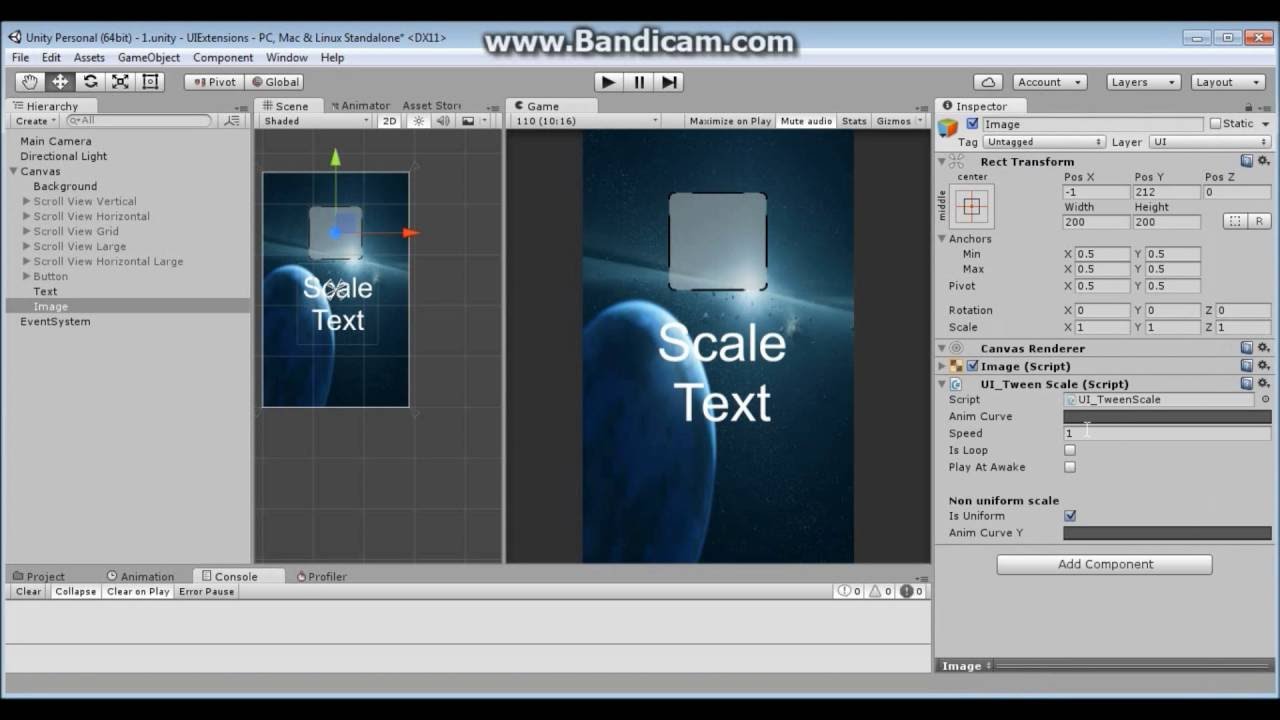
When you have multiple UI "screens" what's the better way to handle it?
I have a canvas in my scene then one panel for each "screen" from which I make a prefab of.
The title (Museum) is the child of the background panel. It is anchored to the top right. Background has aspectRatioFitter to its parent.
How to have the Museum title anchored to the top right of the screen and not the parent??? If the ratio is set to free and the image more wide the title goes up and dissappear, that sucks...
Regarding your first question - From what I’ve seen, it’s recommended to have multiple canvases to separate simpler UI elements, and those that are more performance heavy (containing scroll views, animations, anything that has to recalculate every frame).
Within reason of course, you don’t want too many canvases either.
For your other question, I would say add that BG image with the aspect ratio fitter underneath the canvas, and then add the title as a child of the canvas, not a child of the bg image. That way you can align it with the corner of the screen instead
For your other question, I would say add that BG image with the aspect ratio fitter underneath the canvas, and then add the title as a child of the canvas, not a child of the bg image. That way you can align it with the corner of the screen instead
@tired crest Yeah I tried something like that but couldn't make it work.
And you can have more than one canvas in a scene? How do you display one or the other? Just disabling/enabling them?
For the first remark I dont put those under the canvas but under the panel representing the game screen. How should I set that panel? Just stretching everywhere?
Yeah you can have multiple canvases, for example I have one for the top bar in one of my projects and one for the popups. Under the Canvas component you can change the sort order to show one in front of the other. You can disable or enable them, or use the Canvas Group component to change the alpha value or disable ray casts, depending on how it needs to work.
Does your hierarchy look something like this?
With the title image anchored in the right corner:
And the BG image is the one that would have the aspect ratio fitter?
Anyone ever got toggles to stay selected after clicking on something else? I have a toggle group.
Do you mean having more than one toggle on at once from the same toggle group?
I'm stuck. I have a Screen Overlay Canvas which has two panels which each have a button. The panels are set to inactive at the start of the scene. Depending on a click on a tilemap, one or the other panel will become active. The button on one panel works as I would expect. The button on the other panel changes appearance on mouseover, but does not fire the listener method when clicked. The click is processed by the tilemap (rendered behind the panel) handler. If the button is situated so that there are no tiles underneath it, the button works as expected. I don't see any differences in the panels...can anyone point me to potential problems?
No just one toggle on, but when I click out of the toggle group, all of them get deselected.
@tough anchor I haven’t worked with tile maps, but could it have something to do with the sort order or mode on the tile map renderer?
@narrow charm that’s really weird! I’ve never had my toggles deselect like that!
Do you have the option set to always ensure at least one is selected?
is that "Allow Switch Off" and have it disabled?
Yeah
ahhh
@tough anchor Is the button component enabled and interactive checked? Make sure you have a Graphic Raycaster component on the canvas. Otherwise something is blocking it.
Also make sure the scale isnt 0, there's an event system in the scene.
@narrow charm there is a Graphic Raycaster on the canvas and event system. The one button works on one panel...when I move the button that is not working to the other panel it has worked. What could be covering it? What should I be looking for?
Does one of your panels have any invisible objects? Or maybe the panel had a canvas group?
I was playing with canvas groups to hide/show the UI components under the panel...but I believe they are all removed
How do i know if a canvas raycaster can select a panel and or say button?
normally if you see the button change on hover or if you’ve added cursor changes, it would be visible if the ray cast hits the button you want
so it does change on hover, the click just is ignored and the click on the tilemap underneath is getting it
it's very strange...about the sort order. They are in different layers. Sort order is in a layer?
Nah disabled the "Allow switch off" didnt work.
Sort order determines how they are layered, so kind of like how cards are stacked. But it’s interesting that the button is getting highlighted, but not re registering the click event.
So the two panels you have with the two different buttons - are they both under one canvas? What scripts do they have on them? What about later masks - are they both set to UI?
@narrow charm sorry if you’ve already tried this, but do all your toggles
- have the toggle group set
- have the navigation to none?
I find I often got weird responses happening with the navigation setting set to automatic
Navigation?
In a button or toggle component you have Navigation as a variable
Usually set to Automatic by default
Ah, none makes them unable to be selected
Hmm I’m trying it out right now and it works for me, you have the event system enabled and everything right?
@tired crest both panels are in the same canvas. There is a second canvas in world space that does not have a raycaster. The buttons do not have any additional components (just created a UI->Button in interface). Everything under my screen overlay canvas is UI layer.
@tough anchor if you try and make a new button from scratch in the same panel as the broken one, can you interact with it?
Oh I just remembered one more thing - when I make a raycaster for 3D objects in the scene, I add a check for whether the UI is getting hit, and if yes I don’t continue casting the ray. Could that be the issue?
If (EventSystem.current.IsPointerOverGameObject())
{
//mouse is over a UI element, don’t cast ray
}
new buttons in that panel have the same behavior
I tried creating a new panel and moving the objects over to it
i'll try that code in my tilemap click handler
@tired crest that worked! Thanks
Yay!!
@tired crest thanks again! I was bashing my head on that problem for awhile. I'm off to the races
Good luck (:
Hi guys, I have a problem, when I instantiate stuff images in a canvas and implement spacing for multiple elements. They get instantiated differently based windows size
here is when I instantiate when the play window is not maximized
and here is when it's maximized
this is the code I used to instantiate the little dots
Ok, nevermind got it to work by changing rectTransform.position to rectTransform.localPosition
looking for a good monospaced font; recommendations?
Anyone know how to dynamically populate / depopulate a button based on triggers? For example
if (selectedUnit = null)
    {No buttons appear at buttonspot1}
else if(selectedUnit = Archer)
    {"Attack With Crossbow" button appears at buttonspot1}
else if(selectedUnit = Wizard)
    {"Attack With Fireball" button appears at buttonspot1}
@livid tartan
A few simple methods:
A. you can make each button into a prefab and have it instantiate in the position you want when the correct event occurs, then destroy it later
Or
B. Have one button with a script on the object above, and a reference to the text (or icon, whatever the button should have). You can store a list, dictionary or whatever fits your situation that contains the different text or other options the button can have, and probably an enum or id that corresponds to it.
Then, when something like “selected unit = archer” is triggered, you would show the button, set the current enum/id in the script to something unique to the archer, and change the text/icon. When the button is clicked you can use whatever logic you need based on the current enum/id
@tired crest thanks. After some more research and suggestions in other channels, I think I'm just going to reuse the same button. Whenever a new unit is selected, I modify the button text and replace the OnClick action with AddListener and RemoveListener.
If/when no unit is selected, I just button.SetActive(false);
I'm currently unable to put my .png image into the source image section. (This isn't a rawImage file it's a normal Image one) Anyone have a solution?
Elaborating: when i drag my image over from the assets folder it just doesn't want to get in there
@livid tartan Yup, that is probably the best way of doing it, makes it easier to keep track of as well!
@spare maple when you go to the image, what is the Texture Type set to?
How can i see that? Sorry i'm pretty new.
click on the image, and take a look at the settings in the Inspector
you should have it set to Sprite for use in UI
so click on the image you want to add as the Source Image
decided to code my own toggles lol, only solution
I will post it on github when im done, custom toggle & toggle group. Since unity's ones have issues lol, maybe some of my other UI scripts.
@narrow charm
Nice haha, that’s honestly what I usually do with toggles
Like i made a ScrollView auto hide/show scrollbars if the content fits/doesn't fit, script.
Because that always bugged me lol, when the content fits but it still shows the dang scrollbars.
Oh there is a way to hide the scroll bars when the content fits actually, it’s one of the options on the horizontal and vertical scroll bar components. It just doesn’t always look super nice haha
[SerializeField]
    public bool isOn
    {
        get { return isOn2; }
        set { SetSelected(value); }
} ```is it bad to serialize fields like that? when it has a get/set
ah yea it is dang
Hopefully it works lol.
Everything works except deselecting. now 2 fix.
Heck the fade is better than Unity's.
Perfectooo

Gist
Better Toggles for Unity UI (Down image, custom fade time, no deselect bug) - ToggleC.cs
Has sprite swap, color change and animator trigger.
Awesome job! I’ll have to check it out!
Anyone good at HTML css or somthang dm me ok
Not sure if this is the right channel for this question. I just recently discovered vertical and horizontal layout groups (only after achieving the same effect with some custom coding). Anyway, is it possible to keep game objects aligned side by side without being in the same child group?
NVM. I just made the items children of the game objects I wanted them to stay next to 🤦
and that did the job
😂
OK I need help again with UI layouting, hopefully I'll get some pointers to how to do it the way I need.
Here's my prefab scene, ignore the background, it's displaying correctly.
I basically have PartsPanel that takes most of the screen (with some "borders") and in it I have three sub UIs.
Here is how it displays in "free aspect" (looks like shit)
Here is how it displays in 16/9 (looks like shit too)
PartsPanel has a horizontal layout group and it's fine BUT
The object with the buttons on the right shoudl be way thinner (all buttons keeping the same squarish ratio)
Also the green back of the first two panels (cards) should nicely wrap around the cards inside them but both should take the most possible room in width.
What do I need to do EXACTLY, components to add, which values, etc, to get that?
what's a good iconography to denote a "critical hit" that does not involve
- sword/gun (or any form of weaponry)
- blood
- 20-sided die (or any form of die/chance symbols)
yellow bolt?
What do I need to do EXACTLY, components to add, which values, etc, to get that?
@spring fulcrum I really don't understand why there isn't any x% options for UI. That would solve every issue I have with Unity UI.
huh good idea
I'm just saying it like that because I don't know your context, but in general that could be useful. 🙂
red is damage green is heal (OR poison), yellow could be crits
could be a bigger font depending on the bigger number too, again I don't have the context. 🙂
it's less of a mechanic and more of a brand
but the general idea is critical strikes in rpgs
@spring fulcrum
For your issue with the first two green panels - here is how you can get the green bg to scale to the image (it’s just not very pretty to do)
-
Go to the image (the yellow one in the first card for example), add a layout element with a minimum and preferred height that you want
-
Go to the game object above it - the green background section. Add a horizontal layout group (I know you have one of those above, but this one is only for the card).
Set child alignment to Middle Center, add padding on the sides and top, bottom
Add a content size fitter to that same object. Set the vertical fit to preferred size
Also, when you add the content size fitter you’re probably going to get a warning that you shouldn’t add one... it still work though. unfortunately this is the only method I’ve gotten to work successfully, and is generally what I’ve seen recommended online unless you want to write your own content fitter
I haven't tried it yet but I think I understand, and I confirm: this is fugly. But I guess it's the only available thing in Unity, they really need a much better solution for ui. Not being forced to do it in code is nice but it's not enough. :P
Thanks in any case!
I think I'll give up on this...
Maybe I should have gone through what's in the prefab further down, RivalDeckPanel is the panel that should get resized with the hlayout and under it there's the backpanel (green) then under the card itself.
So to confirm, CurrentRivalCardPanel is the green part, CardPanelContent is the card?
Not sure if this would be better to solve with code or a ui setting, but thought that this discord category makes more sense for my post. So when I click on a button it works great, but it also clicks through the canvas and onto my tile map. The tile map is not always behind my UI, but has to be at times due to how my game works. How can I make it so that when I click on my UI canvas it doesn't interact with anything else?
Whoops, found a fix for the clicking version of my game at least (isPointerOverEventSystemObject())
So to confirm, CurrentRivalCardPanel is the green part, CardPanelContent is the card?
@tired crest Yes
If you want to try fixing it again, I can walk you through it by each game object, but only if you want me to.
I guess you'd need more info about how I structured the prefab though, no? :/
can start from the card itself, would be useful to know the components on it related to the layout and transform
It'll have to be for another day, too late here, but I appreciate the help, I'll try to catch you another time is that ok?
yup, feel free to message me later if you need help
How do I make a TMP font asset with all the same character support as the input font file?
I have an arial font that I want to support characters like ★
for ui
@rapid ferry Good luck with that! XP
hey I need some help with my ui
Cool.
Okay guys I need help here. I have an RectTransform inventory prefab that I'm 'TRYING' to use here. In-game there's a RectTransform game object w/ the tag. but for some reason Graphics Raycast isn't seeing the object when I mouse over it...
Nevermind. Realized I needed to use (RectTransformUtility.RectangleContainsScreenPoint) on the receiving transform.
how can i have a slider crop/chop a sprite instead of scaling it?
I would like the right end of the bar to be flat
Also, it's a 9sliced sprite so i cant just make it filled image type
you could cheat and use the unityslider then use the slider cap(from that gif) as a sprite and attach it to the unityslider knob
Hi, I have a logo I need created for a company I work for. If you are good at logo design or not, I am needing some help. I will pay if it’s what the company ends up using. Please dm me for info, I would really appreciate it!
Hi, i bought some GUIs and they came already literally 9-sliced, in a million little pieces. how can i use them? I'm i missing something?
Anyone know how to fill the background of a text box in unity? I see the text on my UI, but want to put a background behind it basically.
@livid tartan Add a image behind the text of whatever color
@eager atlas thanks
if I need an empty object to hold UI elements, and this holding container is the child of a canvas - should I use an Image object or an empty GamObject?
Subscreen mock
@ripe relic Empty GM's should be good
is there a thorough course on Just scaling, anchors, and pivots? i'm slowely getting it but I keep forgetting how anchors should be set to work correctly when aspect ratio changes.
the secret just seems to be pick 2 points, not 4.
no that wasn't it either, but by the powers that be, it's working as i want now.
Hey guys I came across an interesting problem with TMPro Input fields and their content type.
I created a register profile screen where the user is prompted to enter and verify a password (content type for input field is thus password). Additionally I added a button next to the input fields that is supposed to hide/unhide the password. I wrote a simple script that has both inputfields referenced and on the button click, this script changes the content types to default for both fields. However, the passwords are only unhidden when I click on them (which updates this input field I assume).
I also managed to create a hacky solution where the script selects the fields after changing the content type, which worked, but is just not acceptable for mobile plattform bc each time you select a input field, the mobile keyboard opens itself which is of course annoying if you just want to hide/unhide your password.
TL;DR:
Changing content type for TMPro input fields via script does not automatically update the text that is in the input field, e.g. hide/unhide password
Any ideas?
@tepid thicket have you tried posting in the TMPro forum? https://forum.unity.com/forums/ugui-textmesh-pro.60/

Unity Forum
Unity UI system introduced in 4.6 & TextMesh Pro.
Learn UI | UI Docs | TextMesh Pro Docs
Is there a checkbox somewhere to stop 3D models on camera screen space canvas' from having shadows? 
Has anyone run into the issues of having TMP creating artifacts when you lower the size of the font?
FIXED: Added Padding
Does anybody know why UI text cant show variables?
It can - you just need to do some C# scripting
could you elaborate
In the case of C#, you could create a script that updates the UI element's text either through the Update loop or by event.
I cant use my start function to call a function that changes UI text?
Yeah - you could do that. I would classify that as an event.
Ive done that
and what do you want to have happen?
string CBS = "The Item Up Now Is The " + itemToAdd.Name + " And The Price Is " + itemToAdd.Price;
Speech.text = CBS;
Debug.Log (CBS);
this is what I have already done
cool - nice
this does not work
are you getting console errors? Maybe a null ref?
did you look at the UI inspector and see if the text has changed?
It might be that it's too big to render
all that inputs in the ui text is The Item Up Now Is The And The Price Is
but i can check
I fixed it
I had to change the width of the text box
cool 👍
thanks for the idea bouncing have a good day
No problem! You too
How am I supposed to use a world space input field?
so far it kinda looks like this
except the carat is absolutely humongous
and I can't make it smaller than 1
@tepid thicket have you tried posting in the TMPro forum? https://forum.unity.com/forums/ugui-textmesh-pro.60/
@outer dune No I haven't, I wanted to ask here first. Also, I don't think it is actually TMPro related, I think this might be a general Problem with Unity
how can i add a prefab to the canvas and have it show up?
Guys, for some reason all the world space UI is shown on top in editor. It's not really a problem since it is shown correctly in play mode, but it is still pretty annoying. So is there anything I can do to have culled UI in editor?
simple problem: ui button doesn't respond at all everything is set to default i've just created a canvas and added a button but it doesn't behave different when my cursor is on it
For some reason chromatic aberration is not being applied to my UI?
even though i do have the postprocessing layer set to UI
@hazy moat Don't cross-post. UI can be affected by post processing only in camera/world space mode.
Anyone here familiar with "Unity UI-Toolkit" ? Where should the logic go ? Inside Elements ? In external Model Classes ( MVC ) ? Can we put them inside custom Elements ?
For example if a element should have a method "insertPlayerProfile" which creates the certain element and inserts them into a list
Unity's UI content size filter and Layout Element system sucks
using them is counter intuitive
and some guides I'm reading on the subject voice the same sentiment.
so, question i guess. lemme draw it up so that it's easier to understand what I'm asking
everything in the red box is just a sketch in photoshop. I'm wondering if it's possible to have the purple text area expand as the user types in it, downward with each new-line but wraps around at the edge of the screen.
-
I haven't gotten good results with trying
content size fitteron it yet. one of the problems I'm running into, is as the user types - it goes off-screen to the right. -
the other issue, is it doesn't update the size.
size fitterjust doesn't seem to work with user generated input on input fields. meaning you type something, and it doesn't expand. not when you click off either - wondering if I can solve this with a simple method call in the scripts? -
and third issue, while the Named fields on the left
but still in the red boxare always present, meaning i could hard-code them - i want a dynamic list to be auto-filled via parsing of the XML.
so to me, issues 1 and 2 are the big problems at the moment.
mainly, is it possible without rolling up my own system that like, compares screen size/position and adjust the transform of the object?
or is there a good asset that simplifies this somehow? or a script?
because if it's not possible, i guess I'll ditch the Content Size fitter and layout elements and just roll a custom solution in the scripts. i really don't want to though.
and if you're wondering, stuff in bold is just a Text element, and to the right of each one is an Input Field that gets values auto-generated on loading of the XML. so the app is going to be a XML editor.
tailored to a specific topic.
hey lads, I have a question... Is there a way to make Unity fonts using TMP pixel perfect? I have a pixel font and would like to make it so its 1/1, but I can't find a way, other than just tweaking the font size. Is there any better way?
Also, is there a way to fix these rounded corners that apprear for some reason
Figured it out
@jolly moss generally it's rude not to post what the fix was unless it's an easy answer to find.
and i have an answer, let's put them together and see if they match
Any idea why unity snap pixels to different positions on the ui, This is causing elements with same width and height to look weird.
@ripe relic sorry got lost in it 😂 I just made an editable copy, removed compression and set the default sizing to my fonts default (which was 8)
but then now I kind of have to figure out how to keep the consistent sizing if I set the Canvas to "Scale with Screen Size" instead of "Constant Pixel Size"
Unless I make a script that changes the sizing of UI depending on the resolution, but that just sounds way too DIY than it needs to be
huh? wdym? set the anchors right and the canvas will keep UI elements the same everything
Yeah, but the sizing wont dynamically change to fit the screen
so if you have a 1920x1080 and a font size of 256 and then someone wants to play it on a 1280x720 screen, the font will stay on 256 and almost go off screen
so with constant pixel size the result is
and with scale by screen size it's
TDD on mine if I change the size of the screen the text shrinks with it correctly, but i don't use auto sizing
can you send your canvas settings?
will try it out later, thanks mate
i've found that the tricky part is the anchors.
if they aren't set right stuff don't scale right when changing res or aspect ratio
i've seen a couple of things in Unity where the name of the method or whatever does NOT really tell what the object is doing
so i feel like they aren't helping themselves or new people, nor anything that doesn't have a good and detailed video with it
i'm going to bed soon
Hi. Somebody using multi scene for GUI? How do you handle references between scenes? (E.g. camera or some managers etc)

Can anyone recommend mockup software they use?
@gleaming pulsar easiest way to control your UI is with Sorting Group, add it to each UI object and assign it an order. You can even assign cameras to the sorting layers.
@outer dune what sort of mocking up do you have in mind?
@gleaming pulsar if you move it up is the text visible? If so the font material may need to be on a higher render queue
So the text isn't visible at all?
@ancient sundial i have a mobile game, and I need to do some wireframing for the Inventory system before i get to deep
where is the render queue?
It's on the material attached to the renderer on Coin Counter
@gleaming pulsar does the canvas have to be attached to the camera?
its supposed to follow the player
so yes
its a seperate canvas from the main canvas tho
@ancient sundial its locked for me
What is coin counter using? Unity's UI Text?
text mesh pro
Okay, I believe they put the setting elsewhere
do you know where?
I didn't know GUI/Text Shader was used by TMPro
`public class CustomRenderQueue : MonoBehaviour{
public int renderQueuePosition = 3100;

void Start(){
    GetComponent<Renderer>.material.renderQueue = renderQueuePosition;
}
}`
To see if it's a render queue issue you can add this script to the text and hit play to see if it fixes the issue.
ok one sec
oops, change GetComponent<Renderer> to GetComponent<Renderer>()
that didn't work
What shader is the coin bar using?
The item with the image that's drawing over the text
It definitely looks like a sorting issue but I don't know what it is offhand
welp
If you don't mind sharing the project I could take a look
Or recreate it in a simple project, zip it up and send as a Dropbox link
ill figure it out later, thanks for trying
gl
Sorting layers for text is the same as sprites I think. It’s in one of the sections on the actual text mesh objects. Usually Extra Settings I think? You should see a Sorting Layer and a Sorting Order.
As long as the counter and the bar are on the same layer, you just need to change the counters Sorting Order to be higher than the bar
You shouldn’t need to change any scripts, shaders or materials to make it work
I'm getting this error, but the package is already enabled
Assets\Editor\ShapeBrushEditor.cs(14,19): error CS1069: The type name 'VisualElement' could not be found in the namespace 'UnityEngine.UIElements'. This type has been forwarded to assembly 'UnityEngine.UIElementsModule, Version=0.0.0.0, Culture=neutral, PublicKeyToken=null' Enable the built in package 'UIElements' in the Package Manager window to fix this error.
Perhabs there is a new version available? idk tho
No wait, it literally says what you need to do
"Enable the built in package 'UIElements' in the Package Manager window to fix this error."
Windows > package manager you should find it from there
I was wondering, is it possible to display 2 or more objects horizontally next to each other. When parented by a vertical layout group?
If so let me know how because I wasnt able to figure it out thus far ^^
Oh np I found a solution. I just parented the objects that I want next to each other
"Enable the built in package 'UIElements' in the Package Manager window to fix this error."
@abstract ocean it already is enabled
restarting fixed that error and caused 300 new errors like this
Assets\Scripts\Building\Blueprint.cs(6,13): error CS0234: The type or namespace name 'Mathematics' does not exist in the namespace 'Unity' (are you missing an assembly reference?)
because Unity apparently stopped adding references to csproj
Good morning! So, I just updated to 2020.1 and started a new project. I have the Unity UI package installed. But, when I go to create a new gameobject, the option to create UI elements like canvases or buttons is not there. Is there a new direction UI is taking, or did I simply mess something up? Still something of a new user here. 🙂
I am having a bit of trouble getting the size of a UI slider to have the correct size on different ratios. It is almost there, but there is either too much slider fill on a smaller aspect ratio like 5:4 or too little slider fill on larger aspect ratios like 16:10
I have a UI button in a Unity Project and for some reason even though raycast target is checked, it is not selectable, i cannot click it, the only way that it gets selected and is clickable is, when i hover with my mouse over the text and the image that are children to the button. Pls help
Pull up EventManager display in the inspector and look what's blocking raycast whn you try to press the button.
thx, another text was blocking it
congrats
TMP InputField
sample text disappears from view if I scroll too far, and i can't control the scrolling speed?
is there a better assest online? TMP no longer seems all that great
nvm someone posted the same problem and an answer was already given (just use a preview version of TMP) and the api does have a scroll sensitivity.
How can I convert an int to a string to put it in a box that I can see ingame
usually it's .ToString() or something
ok thx it was just me being dumb
hey, i have this zoomed in, but shouldn't that still be very clear being that it's TMP? did i do something wrong?
Hey guys, what do you generally think about the UI Editor? I switched to Unity from Unreal and that was the biggest change for me not having a specific Editor. How long did you guys take to fully "understand" this Editor? I think the most annoying part is that it is set in the world not in its own Window, creating a prefab or sth like that.
This shouldn´t be a promotion, I´m just curious 😄
hey, i have this zoomed in, but shouldn't that still be very clear being that it's TMP? did i do something wrong?
@ripe relic I can only tell from my work with buttons, but I set the Text size * 4 and then just the size of the text "field" to 0.25 on every axis
ok
i lament how the content size fitter and elements are handled
@ripe relic You are zooming in gameplay display, it would be pixelated this way, it's an editor tool, it has nothing to do with finished build.
ok ty
Think I found the perfect UI Scaling for PC: Scale with Screen (Match Resolution): 1024x768 ref, and 0.5 for width to height.
restarting fixed that error and caused 300 new errors like this
Assets\Scripts\Building\Blueprint.cs(6,13): error CS0234: The type or namespace name 'Mathematics' does not exist in the namespace 'Unity' (are you missing an assembly reference?)
can someone help me with this?
after removing and adding the package development package, i get this error
Assembly with cyclic references detected (Packages/com.unity.ui/Core/UnityEngine.UIElementsModule.asmdef)
and then after restarting unity, the 300 errors about missing references are back
i think i fixed it, the problem was the UI Toolkit package apaprently having a circular reference
Is there a way to block raycasts when the mouse is over a UI Toolkit element?
hello
im trying to use sliders ingame
and it isnt woking
it just wont move
any idea why
When this happens to me it's usually because there's another invisible UI element over it, blocking the input
guys i need help to set up the graphics settings in HDRP for my game cuz the ones out there arent working mainly the tutorials that are out there
Is anybody using Tween?
I'm trying to use it but the scale doesnt seems as smooth as I imagined
I cant get my image in the ui
When i try and drop the image in it cancels it
i got it
if i click a button, it counts as an input in input manager, how do i stop this?
hello poeple
i have a serious question
so i have a screen like this on desktop version of a website
would it be possible to make it look like this on mobile?
@rapid ferry yes.
UI is usually just visual fluff that can be arranged however you want it TBH.
If you want to, you can literally have an if-statement that changes the entire UI to a different webpage if it's on mobile.
thank you!
Hi, I still need help with my game layout. Here is the main screen. Basically two "decks" and a button bar for some actions. I've put the bar on the right side and it should more or less stay there but for the cards I put everything in a panel so it doesn't go above the bar. The Panel is a horizontal layout with two green panels in it and under each of those panel there's the last "drawn" card of each deck.
What I need is to control the width of each green panel (the one with the yellow deck should be slightly bigger) and they should take the most possible room possible in width and as for their height it should depend on the card inside them (there shouldn't be too much green on top and bottom), the card themselves taking the most width possible and the height being in ratio of the original image.
So, how do I do that with the complicated Unity UI system?
Thanks in advance. I'd appreciate any help.
Looksl ike it's imposible to make a decent ui in unity unless you're compatible with a unique résolution and ratio... terrible :/
hey guys im trying to teach myself about ui design with a mobile app im working on for education, i cant seem to make it look anything but horrible 😛 can someone point out the glaring issues i should focus on or any good tutorials etc?
i understand colour palletes and such but how do you guys approach figuring out how to make it work without relying on loads of expensive vectors etc
@plain apex For color palettes, I usually use a website like https://colorhunt.co/ for inspiration. Find a scheme that's close to what I want and then tweak it for my project.

Color Hunt is a free and open platform for color inspiration with thousands of trendy hand-picked color palettes
@plain apex Regarding your screenshots, one bit of advice I would give is to consider whether you want a textured old-timey look, or more of a flat minimalist look. Right now, it seems like you're attempting both, and to me, it feels like they kind of clash.
@plain apex Maybe find a game that's kind of similar to the one you're making and look at how they did the UI?
i was oging for an old timy look but i wasnted to avoid clutter as much as possible ha
Maybe it would seem less cluttered if you used only one background?
Hi everyone, whats the latest recomendation about adding animations to unity UI?
I have seen repeatedly the recomendation to not use animators because they dirty the ui every frame, and just searched and it seems its still this way
but, un the unity ui manual, the only solution they suggest for animating transitions on buttons or ui elements (like give focus or on transition from pressed to released, if you want more than color or image swap) . is to use an Animator
The recommendation would be to use a tweening library to do the animation. Like DOTween or LeanTween
for the improve performance I see that, but if you want to handle state changes in buttons and other ui elements
I could not find any event that lets you handle that manually (and use a tween library instead)
It depends on the complexity of your UI of course. But you can write some simple generalized code that could behave like a state machine
I am sorry I am not being clear I think, the issue that I am seeign, is that unity hides the selection reaction in the Selectable base class, so button inherits fro that and delegates the Transition logic, but the only way you can get in the middle of that is with an animator
if I set a button as not interactable only the button sees that, and uses the Selectable class transitions (tint, image swap, animator), but there are no events or methods that can let you know that it happened, so you cant add some custom logic in a generic way
I guess you could inherit from button or replace it with a custom class everywhere, but thats a lame solution
If you make a class that implements IPointerEnter/ExitHandler you can replicate the same behaviour
At that point you could also retrieve information like whether the button is interactable
@umbral wren hows this?
i figure each box like that should follow the same format on each page for consistency
i need a better font of course
no idea how to add the concept of resources though... xD i cant find a example i dont find ugly ha
I think that's way better!
@plain apex I like the full width buttons and the new color scheme
any ideas on improvements or a good font to use?
I think a serif font would be fitting for your theme. I know it's the most boring font, but I really like Times New Roman.
Do you know how to divide a sprite atlas?
ive done it before, right now all of my images are seperate pngs
why what are you thinking?
I just can't figure out how to do it, and I need to in order to be able to use inline sprites in text mesh pro
oh i saw a tutorial on it before. but it was on udemy so paywall
basically its a giant image you declare as a spriate library, then theres like a sprite editor which lets you select around parts of the image which it then tags like "sprite1" etc
should be loads of guides on it though as its super common for games
i made an ui button which is a picked up prefab clone in your inventory if your press him in the inventory yhe should go to the other inventory but he doesn't let me press him.
could you help me?
@plain apex One good thing to think about when creating mobile UX is where most people tend to have their thumbs and how they play your game.
"Is this a game they would usually dip into while on the buss with one hand?" or is it "a game that would run beside their computer on a tablet?"
"Are the options too high for the thumb to reach with one hand?"
"Are most used features easily accessible?"
"Are the buttons too close for clumsy thumbs?"
"Can you hide some data behind a temporary pop-up so I don't get a cluttered tool-tip for the small phones?"
And so on. It's a much more difficult set of questions than what you usually ask yourself when creating a desktop website/game since there are so many sizes and playstyles.
It has to be Sprite and if it's a sheet you have to drag its subsprites.
is it possible to change the font size of only a certain amout of characters in a text?
Why is my text super blurry?
there is a "auto size" feature for TextMeshPro Text components
tho i think you have to disable wrapping
I'm trying to make a score text stick to the camaera in a 3d game, how would I do that?
there is a "auto size" feature for TextMeshPro Text components
@alpine cave anchor it
it will auto resize
like when you press it you will see the square click it and anchor to the place you want
and it will auto resize and stay in that position
@jovial yacht You can use tags in TextMeshPro (similar to HTML):
"Dabdabtext <size=120%>Big Fish</size> back to regular size"
Or do you want to resize only certain characters? Like all 'g, b, d, ...' characters appear bigger
Or should it be randomized?
basically I have a timer text organized like this: "hours"."minutes"."seconds","milliseconds"
I want that only the milliseconds part is smaller than the rest
Then the tag solution should work for that. I think it also works if you write the timer via script and ad the tag
how do i make my UI scale properly to screen sizes? pls @ me
"Create>>TextMeshPro>>Sprite Asset" does nothing
Anybody has any idea about the reason for which UI elements are not rendered on the scene view but i can see them on game view? I am using Screen Space - Overlay, UI layer is visible and i am also able to edit UI elements if i select them from hierarchy.
Why is my ui text super blurry?
Use TextMeshPro with a 512x512 font texture asset
Ok
Hi I have a mobile app that requires dragging for movement but when I drag for example a text box to scroll text the camera is still moved, can I somehow stop that from happening?
Anybody around for a little help with the UI?
I am having a lot of trouble!
I'm trying to get my Text Mesh Pro Text to expand/shrink with changes to the screen width, it has a content fitter with Child Force Expand and Control Child Size both on for Height and Width and also has a content fitter setup with preferred size but it doesn't seem to do anything?
can i get opinions on my ui so far? i know its not great but i dont know what im doing wrong 😄 i really have no idea how to make the resources in the top right less hidious either..
im not sure about the font but i havent found any free ones which seem any better 😦 any advice?
@plain apex There are a lot of very strong colors at play here.
One thing I noticed was that the boards in the list have a different color, but they just seem to do basically the same thing.
Is it really worth having all those colors?
I understand the resources being in different colors, but I would probably make it an icon that represents the resources instead and have the panels in the scroll just be the same color.
The panels could instead have the icon to the left that represents what they improve instead of a text saying "Imp Efficiency" for example, since the upgrade might want to improve something else that may not be efficiency at some point.
EDIT 1: The main reason I am not very fond of using a lot of different colors is that I have a brother who is color blind (which is not a very uncommon thing btw) and as far as UX goes, it's better to use shapes than color to represent some differences in my experience.
EDIT 2: Ah, thought of another thing, making a list of upgrades like that and making the entire panel clickable might be a bad choice, it's very easy to missclick that on a mobile device. Which is why a lot of people have it being a button to the right or left on the panel and keep the center bit plain for easier scrolling.
those are all good points, @pseudo apex thanks for your input, ill have a think what to do about all of it and see if i can improve on the design
Yeah, design is tricky to get perfect, but if this is one of your first games, I wouldn't bother too much to perfect it but get it released quickly and continue working on it based of feedback 🙂
@clever nimbus you ever figure out your UI issue?
the 9-slice thing?
ya
nah
an option is to set this to something higher, it'll in a sense shrink your texture usage to make it tighter
but your V on the bottom will still stretch unless you do a few other things to make it work
@plain apex https://fonts.google.com/ Google has a set of free and open source fonts available. They have some great options for most styles you might need. It's a go to for me for playing with ui
White text on a yellow background is very hard to read without a solid black outline
I would consider changing the yellow to a darker color if you don't want to put outlines around all the text
So, I'm trying to move my canvas exactly half the size of my canvas size, but in unity units, is there a way to convert the canvas size into unity units in world space?
meaning it's only fitting to half the screen?
or you want the canvas in the world as a 3d object and move it around?
I figured out how to do this btw, if you have a canvas stretching the screen, you can convert it to world space in code, and then if you multiply the RectTransform.width with the transform.localScale.x, you get the width of the canvas in units, you can then move the canvas to be placed exactly right of of the viewing field.
This makes it possible to pan the camera instead of having the panel slide in and still keep everything resized to fit the screen. :D
Sorry if I was a bit cryptic in my question. but yeah, I basically wanted to have this effect and still maintain the window so it's always the same size as the screen but. @dawn jolt
why does this happen to my ui element? the white quare is a blank image, no sprite nor material. but when i apply any material on it, it uhm, goes into a random position in the world and floats there
what kind of element, is it alone on a canvas, and what is the material?
the element is a panel. its not alone on the canvas im using but it does the same on a different one. the element does this weird stuff if i apply any material
@dawn jolt
Does anyone have this happen with TMP (2.0.1) on Android? Is there a fix for this?
Hey guys, say I am using a content grid to layout several buttons.
Is there a command/function/ect that can grab each button and assign them a number based on their position in said grid? For example, a way to assign the 3rd object in the grid as "number 3" by detecting its in the 3rd position?
(I want the buttons to be able to load different scenes based on their order, it is a level select screen)
I dont know how to phrase this question well, sorry
Basically, I want to find a way to tell a script "for cell 3, var = 3"
is the # of the buttons in the grid variable?
@amber copper basically get the children of the content transform and they should be in order based on their place in the hierarchy
is there a way to add image alpha channel support to UI textures?
I have a game a predecessor built that's all in UI elements. I'm trying to add a simple image with an 8-bit alpha channel. there doesn't seem to be a way to mask a UI image with the alpha channel.
Can somebody help me?
If I change canvas to screenspace - camera the text disappear
How would I make the last row centered?
@swift cosmos Depends how you added those rows, if it's all one text box you can just center text, but I'm assuming it's some buttons or something so you might have to position them in an element that spaces them out for you and centers them.
@jovial yacht Make sure to check the transform on the object disappearing, sometimes it gets oddly converted to some high number when doing these things and even though it's a child of the canvas, it might be way out there. just set it to 0,0,0 on the transform coordinates if it's a child and it should appear somewhere close to the canvas
Yeah i noticed that with screenspacae camera the Z axis must be considered
Does that mean I have to manually space them out? Wouldn’t that be bad for them being UI objects?
@pseudo apex
No, what I meant is that you could have each row be it's own ui item collection, that way you can have all of them in horizontal groups and it gets easier to center them @swift cosmos
And that picture you sent tells me nothing on how you have structured your UI ^^;
Oh, it’s all buttons.
Oh, that’s actually a good idea, having three different grids. Thanks!
horizontal and vertical layout grids are good when combined for these kind of things.
@swift cosmos you could also have 4 dummy letters, two between T and V, and two at the end
Guys, setting the 'visible inside mask' property of a button with a sprite renderer component makes the sprite image disappear whether or not a mask is on the button(or anywhere near it) am I missing something?
I'm using selectable base class for custom menu buttons.
When I disable and reenable the menu object, ondeselect is not called. As a result, when the menu is reenabled, two buttons are highlighted.
I've fixed this by forcibly calling ondeselect in ondisable. Is there a better way?
does anyone know how to get rid of the spacing on dropdowns? i made the area yellow for visiblity
fixed it myself. Make sure your content is scaled to the initial size of your item prefabs
how would you anchor something that isn't fixated on the corner of the canvas
nvm it doesn't change with different resolution anyway
Guys, setting the 'visible inside mask' property of a button with a sprite renderer component makes the sprite image disappear whether or not a mask is on the button(or anywhere near it) am I missing something?
@lusty jay Anyone got a clue?
guys how do i make a vertical scroll system
scrollview- with a vertcial scrollbar?
ok
i was wondering what i could do to spruce this up a little bit. its a very static main menu with only basic buttons that highlight and such
im satisfied with how it looks visually, i just want to bring a little life to it and not have it be so still
Nice. Is there movement on the sphere thingy? That would be cool. And i think some subtle movement in the material on the buttons would be cool
its just a wallpaper being used as the background, no movement but that'd be cool. that's beyond my noobie capabilities at the moment though
Sure, yeah I think movement is what would push this further. It's nice that it's not so cluttered
maybe i can hit up someone on fiverr to do that for me, would i just search for ui artists or what's a more accurate title for someone to do that?
Depends on how you'd want to do it, it could be particles, it could be sprite animation
would one look better than the other in your opinion or both just different means to the same end?
Mmmmm no I don't think I could recommend one over the other
hiya all, unity noob here, using a basic UI image of a heart, game works as intended but im getting this error, can anyone shed some light as to what it means?
it means you are missing a reference, do you have an exposed parameter that is not properly setup?
what is the line of code that is from?
all good, a close and restart fixed it 🙂
interesting
it didnt reference any script or specific code
and double click error took me here
no idea but restart got rid of it 🤷♂️
any suggestions on increasing readability here? when modifiers are generated theyre all getting adding into a single text mesh pro. i dont really want to skip a full line between mods cause I feel like maybe that's too much space wasted. is there something else i can do?
i know theres a lot of space in the image but there will be 5-6 mods and no real room for space skipping
Looking for advice with my current mobile project, I'm not sure if I should put the time into making a Infinity Scroll for my UI. My current project will have scroll menu that will show every item the player owns in a list. This list can be 100-200+ items at some points. I do plan on adding a object pool for reusing assets across different menus and list. This is for a mobile game, the game itself is pretty simple. Should I put the time into a Infinity scroll? Is the performance loss from 100-200+ items not enough to warrant the time?
The main issue there is the background as I see it @rapid ferry
You should add a darker overlay on top with some opacity to make a less noise background for the text
@gloomy dome An infinite scroll takes no time at all really, if you wish to make mobile games, you really should put time and effort into making this.
And 200+ items is nothing if you use gameobject pooling, as in instantiate all game objects on load and when you need them you populate them with the assets and place them in the right position.
I don't even know if you need the pooling TBH as long as you always have them in the background, but maybe inactive.
@rapid ferry Decrease the Alpha of the inner section with bars. If you isn't a separate image, make it.
Shorten sentences to fit one line and add more line gap.Ex: Enemy healthb +15%
Increase size of colored text.
@pseudo apex Thanks I'll put the time into making a infinite scroll, I am okay at best with programming (still learning). Do you have a good place for me to start? Also I am using unity grid layout, will I be able to still use it or will it cause issues?
Prolly not the best place to ask, but anyone got experience with TMP Text assets?
I'm stuck trying to find the width of a given string. There's plenty of resources out there for doing that with vanilla Unity, but not much TMP info out there
@sweet pond Search is your friend https://forum.unity.com/threads/get-the-actual-width-of-the-visible-text.521457/
Much appreciated. My browser is saying i've been on that page before, not sure how I overlooked that
@gloomy dome https://www.youtube.com/watch?v=uVTV7Udx78k
There are plenty of these tutorials, if you search for "scroll rect unity UI", you will most likely find plenty.
Some extensions for Unity UI I have been working on.
good tips, thank you @hushed bolt
Could use some feedback on this HUD design for a low poly FPS game I'm developing 🙂
The top right is PUBGs map lol
Heyoo. Quick question. Why do all my TMP fields share the same Text Border Value?
Solved. They share the same font file
Hey guys, I am trying to create a cash register that's mainly a touchscreen for my cooking game. Do you have any suggestions on how to implement this, it's a first person game so I need to show some kind of arrow/mouse icon whenever the player is looking at the register (within a certain distance) and also highlight buttons when hovering over them.
I cant move a button in my UI
When it's not on play I move it, hit play it's right back where it was
Hi, I'm trying to use the UI Builder Package, but apparenly I can't figure out, how to add my built UI to the scene. Has someone any experience with this?
@rotund vector you sure you don't have any code that moves it's anchored position?
@worn fjord you'll just have to build a set of invisible triggers or collision for a raycast to detect, then do what you want to do
Messes with my Scaling pretty heavily
that means that children of the GO are going out of bounds.
makes sure all of the children fit the parent rect
@true shore
But oddly enough the parent rectangle is what I currently have selected
that's not odd. That's exactly what I've explained.
Oh I see now
go to each children of that rectangle and make sure they fit into it. Then resize the parent rectangle to whatever size you want.
Hmm. Can I just make a new rectangle and assign it as a parent?
sure you can
Well, I did that and now I have the same problem, but now with a bigger object
@timber elbow
Made the Blueprint box visible
Thats where the scaling relates to it, and it fucks up everything. It should be the same size as the outside box
wat? You have the same object selected and I don't see any difference in the rect transform...
No, the values are of the inner box in the middle of the second picture
When you turn on raw edit mode you can see it
But the thing is, that that box is always smaller than all the other things supposed to be inside it
Nevermind
Ah I see... I've never used that button. Not even sure what it's supposed to do...
I figured it out
Its the fucking SCALE
So when you scale things, they only look bigger but still behave the same as if they were smaller
Which is just so fucking stupid
has anyone used UIToolkit at runtime? currently struggling with getting my text to show up pixel perfect
UI Builder:
runtime:
also runtime seems to resize even if i set it to constant size so not sure what's going on with that
hi, im making a shop window, with a grid, i want to be able to right click a button, the right click works so far, but it doesnt behave like the button was clicked, with the button fading/flashing anim when u left click
i tried to find infos on that, but it returns only bad results when i use keywords such as play anim right button, it throws me mecanim animations played on button click, which is absolutely unrelated
so what i want is make the button visually behave like the left click was clicked
because it doesnt show any sort of visuals when the right click is performed.
@rapid ferry Check your Z layer if its not too far behind
@true shore i dont get it. there is no issue with the button visibility
i just want to trigger the button default transition when right clicking
if there is no way to do that, then ill just create a simple anim that mimic the tint fade (normal color/pressed color)
it seems i can do a button.Select(), that would put the button in select state, and thats it.
it doesnt do the anim transition
anyways, i manually change the button highlight color and a coroutine to change it back after 50ms
ColorBlock colors = button.colors;
colors.highlightedColor = new Color(0.8f, 0.8f, 0.8f, 1.0f) ;
button.colors = colors;
StartCoroutine(ExampleCoroutine());
that makes the button flash like it was pressed with left button, very dumb solution, and it works.
how does one make pixel perfect UI images? i've got the canvas scaler set to the same PPU as my sprites, and pixel perfect is turned on, but when i hit Set Native Size on the images, they end up way too small
What did you make your sprites with?
I don't think I can help because I've not put pixel art in unity, but for a while I was dumbfounded by how small my pixel art came out of pyxel edit
Turns out I kept saving this as pixel size 1...
Aka 1 pixel was exactly 1 pixel
Had to bump that to 16 to get a normal size out of it
Could that be the issue?
quick UI question for all of you amazing people.. fairly new to UI in unity so I am probably doing something dumb
is there something I need to click for the parent canvas to not be inherited? I don't know why this transform changes when I instantiate the prefab in code, but when I drag in the prefab it retains the proper dimensions
Here's the structure in the prefab too. Also, I am using unity 2020.1.2f1, and the prefab has a canvas root of those dimensions, but I don't know how to change that. The green portion was the part I was having an issue with, I would be happy to provide more info, the structure itself is fairly involved but I can provide that too if necessary.
I was able to figure it out, I added another canvas to the object containing the bar... that was frustrating
hey all Im having a little bit of trouble getting started with UIElements. Im trying to create a drag and drop system for an editorwindow, and MouseManipulator.CanStartManipulation() always seems returns false for some reason. any thought to why this would be happening?
I can post the code if need be.
@peak sigil Is UI Elements actually released? I thought that was still in very much an alpha stage.
@pseudo apex i havent been following the state of unity too much these past few months becaus e of work but im 99% sure its still in preview.
Eh actualy its a builtin package now that im looking at it so im not too sure..
Any recommendation on the best way to approach portrait/landscape designs?
For example, I've been give the task to have these 2 distinct layouts when on portrait or landscape. So it's not just a matter of making proper use of constraints... It like completely changes. How would I go ahead and handle this situation?
probably either need to https://docs.unity3d.com/ScriptReference/Input-deviceOrientation.html and have two canvases, or move stuff in code when that changes
I imagine if you don't have too much on there, separate canvases wouldn't be horrible
and I think using CanvasGroup.alpha is a good way of doing that, doesn't make everything redraw from what I understand
How would I go about adding something like this in Unity? Any resources/walkthroughs would be helpful. My google fu is failing me.
EDIT: Didn't know of the term "pagination" ... I'm off to the races now.
what
I imagine if you don't have too much on there, separate canvases wouldn't be horrible
@dawn jolt I started doing the separate canvases route, but I ran into a roadblock when I actually have an external script that referenes an item in the canvas... so I'm going to have dual reference for each item referenced in external scripts?
so you lose the reference due to it being deactivated?
oh wait, I get it, well each canvas should have it's own script, or you'd have two reference properties one for each
you could reference the different canvas and have it 'find' stuff based on tags or something
Hi, does anyone here have experience setting up a similar UI ? i cant figure out how to make the text bubble not do this weirdness
you could reference the different canvas and have it 'find' stuff based on tags or something
@dawn jolt ok, I was trying to get around doing Find. I heard is not very performant?
@thick nacelle what kind of stuff do you have referencing parts of the UI? Usually the buttons and stuff themselves would hold a reference to a script, so therefore no matter which one you are seeing, switching between them using CanvasGroup alpha and interactable properties, all the buttons would still work
I have this TitleScreen script that references buttons that need to be hidden depending on some state
@dawn jolt 👆
yeah, I'd just hold two references and just know which one you are currently dealing with
yes, I can see that working with just 3 buttons. But I can't imagine going this route on more complex situations
Hey, I have a 2D game and I want to make my main inventory screen resemble something like this. I have a general idea of how to make the text, but what I'm really wondering about is if there's a way to add that screen curve to the text
Perhaps it can be done by applying a fish-eye lens filter or something?
Also the scan lines
is this for ui or just seeing things in the world on a computer screen?
meaning can you click on anywhere?
or do more keyboard stuff
This is for UI. It just list the items the player has an probably a button to sell it all
I guess as long as you don't warp the touch areas, you could use some sort of render to texture to do that
I can't figure out my layer sorting in this project I've inherited. does the order of these layers imply any kind of draw order?
I tried creating identically named sorting layers but that didn't help.
at the moment if I make my background sky and my other stuff UI, the background draws over the UI
everything exists within a canvas renderer
Sorting within canvases is dependent on transform order
things visually lower in the hierarchy appear over things higher
is transform order in that panel I screenshot?
is it the Z component?
oh you mean in the outliner?
in this setup it still draws over ring, startbutton and lotus, but not over the other objects
everything but the background is set to UI, the background is set to sky
It could be a layering issue, but I think that would be specific to what the cameras are rendering
If there are multiple cameras one could be rendering some layers, another others
I think there's just one. it's an entirely 2d game
oh
the background is using the default UI material, the others are using a custom unlit shader based on the UI shader. could that be it?
the StartButton is a sprite
ring is canvasrenderer
lotus is canvasrenderer but it actually shows up
it's a bit of a mess
I was wrong, lots of different cameras
It could be incorrect shaders, it could be cameras
shaders for UI should be using the default UI shader or a modification of it
if someone's made some specific shader incorrectly that could break the rendering order and other UI features
that's what I've done with the shaders. they look fine when the background isn't there
you know what, you were totally right
I forgot to change the queue and render type
changing the sprite button to an image fixed that one as well
cheers 😄
Question: I’m trying to design with accessibility in mind. So far I’m working to accommodate: color blindness, hearing loss, dyslexia, poor motor control, and slow processing time. Are there any other challenges I should consider?
@compact sinew The lack of cheap education for US citizens?
i have this problem were i cant scroll my scroll view and i dont know how to fix it
how do i get OnPointerEnter and OnPointerExit to ignore a certain UI object?
nvm i got it
nice
Hi guys
For one reason I cant see any TMP UI on my iphone7 nad iphone 6 but everything works in the unity ios simulator.
Any ideas what I am doing wrong?
My image doesn't seem to scale with the resolution, even though I enabled the scaling with screen size
@compact sinew The lack of cheap education for US citizens?
@pseudo apex Public schools are provided for free in the US.
My question was regarding accommodations for individuals with disabilities and providing accessibility.
Here's the image itself
I'm not really sure what I'm doing wrong
Or do I have to scale it manually through code
?
@sonic frost are you doing some old school computer terminal?
nice, I gotta show you what I did 🙂
Text is gonna be curved too
https://vimeo.com/387067743 I hope it's ok
This is "GAM.bit" by roc4u on Vimeo, the home for high quality videos and the people who love them.
Ooo, in dm maybe?
oh, yah, maybe I should dm
but I am working on the curved part too, let me know how it goes
this doesn't have anything curved sadly
yeah, hit me up
Hi guys, I am trying to create a 3d ui that works when the player (using the mouse) but with the crosshair instead of the actual mouse, how could I do this? In the screenshot the mouse does not show up but it only works somehow when the crosshair isn't enabled.
(In short: I want the red crosshair to work as my mouse when I click stuff on my canvas)
Did I hear correctly that UI Elements is now in runtime beta?
something that should be registering a click isn't. is there a way to debug what's under the mouse that's clickable?
should this be working?
visually it's drawing above everything else, but it's not capturing clicks. an identical script behind it IS getting clicks through it though.
default collider has no size. fixed.
@naive mural is there a way to have ui images be visible outside of a mask? this solution broke in 5.4, and it wasnt the best to begin with https://answers.unity.com/questions/1066291/invertreverse-ui-mask.html
nvm im a complete fool i didnt realize you could create new materials that used default shaders, that solution is 👌
Is using a separate camera for UI a good idea? Is it done a lot? If so, what advantages and disadvantages does it have?
@worn fjord you get anywhere with that 3D ui stuff?
I just decided to hide the crosshair while hovering over the screen so that the player can use it.
aah, probably a way to do it more like how Doom3 did it, where your crosshair was the 'mouse' on the 3D screens, but you'd have to track some other stuff to do so
I'll check that out later, thanks for the tip.
is there a better way to make filling gradient other than just making a sprite and using the Image component?
you can do shaders with UI @cobalt remnant , what are you trying to do?
Can I get some feedback on this layout style for my inventory? This is just a quick mockup but it's kind of what I'm going for.
I like it. It fits the theme of the metal weapons.
Anything jump out at you as far as what I should improve?
I mean icons or text on the tabs, of course
But other than that
you can do shaders with UI @cobalt remnant , what are you trying to do?
A gradient Healthbar, but a smooth one, like for example with Fill in Image component
@slate heart
Maybe you can change text font with a pixel one.
The design is not detailed... There is a big difference between what we see behind and the layout. You can add some grain and more light/shadow effect.
"change text font with a pixel one."
This is great advice, and so is
"You can add some grain and more light/shadow effect."
But I don't know what you mean by
"The design is not detailed... There is a big difference between what we see behind and the layout."
Do you mean it needs more pixels per unit?
Like thinner borders and whatnot?
Yes, when you see the design of the car, and the design of your UI, you see a big detail difference. The car is more detailed than your UI.
An other idea: add some metal reflection.
Ah gotcha. This is mostly because I purchased the game assets but I'm drawing the UI. I'll try to work on it and get it looking better
um anyone how can i make a ingame browser like in gta v
like, actually working or just UI that looks like a browser?
My Mask component (for a scrolling list of items) is doubling my draw calls. Is this an unavoidable cost of using the Mask, or is there a practice I'm missing?
Would like some criticism on my UI o-o
The character isn't final, as well as the purple temp icons
The rest is tho
Also, here's a map screen. All screens show the quick character menu.
The map itself is temporary, but the map viewer can pan with the mouse, and you can zoom with the on-screen buttons and mouse wheel
@silver cypress You can probably remove the item icon behind the item if it has an item in the slot.
The purple behind the character is a bit much for me personally.(yellow on purple is not great for people with some forms of color blindness)
The health and the damage have the same color, which can be a bit confusing in the long run if you want to make it very user friendly.
I don't get why there are 3 card summaries with the same icon.
The fact that the map has a completely different art style than the rest of the game is throwing me off a bit, but this is not unusual for games.
@pseudo apex The map is just a placer holder.
I was also kinda put off by the username color so I did a 'quick fix' but It still doesn't feel quite right.
As mentioned above, the purple icons are place-holders. I had them set to white, but it was too distracting so I changed them.
Also, the player-background color is going to be a faction color that the player sets, so it's color doesn't really matter here.. Though I kinda forgot that I should probably put something behind the Gold stat so that it will be more readable.
For now I did this for the username, but it still doesn't feel right
No matter what color I set it to it feels off
You should probably keep the text color consistent with the rest of the game, it makes it much easier to read, for example, you got icons in different colors that symbolise your stats, the text doesn't need that color since people might go closer to the screen and go "whaaaa?" instead of just seeing the icon and clicking the plus sign
An icon is there to make it self explanatory.
Speaking of the icons, they seem to be a bit out of focus or something, like the coins on the purple background look a bit glitchy almost.
Might be unity playing a trick on me though
Color is such a scary thing in games since so many people are color blind in some way...
Might be unity playing a trick on me though
@pseudo apex That's because of the canvas scale and how small the preview I'm working with is.
Ah.
Did you try having the text and numbers be the same colors as the icons inside the inventory for example? and leave the icons colored.
It's just like that because I'm previewing in a small window in unity.
Did you try having the text and numbers be the same colors as the icons inside the inventory for example? and leave the icons colored.
@pseudo apex No, I'll try that.
is this on PC only or other platforms too?
Also, about the color.. What color should the Attack icon be vs the Health..? The attack is a slight orange atm but it's hard to tell
is this on PC only or other platforms too?
@pseudo apex Just PC for now. I wanna make a mobile app but that'll need a whole new UI, but on a tablet the UI will probably be mostly the same.
(I wanna finish one thing before I work on another :P)
I personally would not put a color on it, since I like it kind of uniform, but I would make the icon bigger to make it easier to see it and have the text show only if I hover over the icon for example
(or long press for mobile apps)
you can probably fit all the stats on one row if you do that
you could also have a info sign on the icons or something if you wish to display like detailed info regarding the stats
Is this what you meant..?
nah, just a sec
:x
does the plus and minus dissapear after accept is pressed?
Haven't decided yet, that part is NIY but I was thinking I'd have them grey-out if you don't have points to spend.

And then only have the text show when you hover or click the icon
or even above the icon
Not really a fan of that tbh..
I barely have enough to fill the screen as it is, though having the +/- under the text would probably be better, but I like having the Text there.
do think about the fact that if you have the buttons under, and remove them, you might need to adjust the frame to make it look good
otherwise it's just gonna be an empty space :p
I'm currently using a custom Grid Layout to sort the stats, so they would auto-center depending on their size
Hey, I have a really basic question about photoshop. How do I restrict the mixer brush tool? I'm trying to mix two colors on the very edge of a my picture but when I do so my paintbrush smudges over into the transparent background. I don't want to use a smaller brush because that would take ages; there must be an easier way. Idk if this is the chat for photoshop...
You are probably in the wrong discord for that my friend.
Have never touched PS. Some people in 2D might help you.
Ok thanks anywyas
Are you going to have a lot of stats potentially @silver cypress ?
No, not many. I'm not sure how many I'd have but I think six is a good number to plan for, which is why I have the purple placeholders.
I want a Stealth stat and maybe charisma as well.. Haven't decided on the last one yet
Ah, okay, but then you probably don't need to display it vertically at least.
I was thinking having stats on the left and inventory on the right, but if you only have a few stats, then there is no need really.
I do prefer the grey text though
I really don't :x
I like having lots of color.. Do you think it looks bad or do you just personally like the grey better?
@pseudo apex
I have a brother who has a very hard time with colors, so I tend to do minimalistic designs and focus more on shape than color for my game.
I try to compensate with fun gameplay instead of very colorful displays personally.
I don't think either "looks bad" I just prefer it a bit cleaner.
But this is just my opinion, you should ask many people to get a general idea.

Unity Forum
[MEDIA]
I think the video explains it well, but i'll summarize it here:
I'm creating a XML editor for a specific game, and that means I wanted to use...
is there a setting a missed to keep TMP InputFields from "sliding" text left and right oh so slightly? but enough to F with my design.
in the link i have a video explaining the issue a bit better
How do you change opacity on a 2d sprite shape through On Value Changed on a slider? (don't know if i'd ask here so i'll do it anyways)
nvm found out
Can I find RPG Magic Icons for free ?
I'm making a mobile game and using the Unity tester on my week old iPhone. I have a TMP text element that in the editor displays smoothly and looks good, but when I look at on my phone, its all pixelated like I'm using the normal text UI. How can I fix this?
is it something with the post proccessing?
So i've added this background frame to my text, so it follows the size of the text, thanks to the vertical layout group and content size fitter the current image is 32x32 pixels, it sits just like it should
but if I add an image with a higher resolution, it suddenly ignores the padding, how can I avoid this?
how can i switch the position of a ui content with another ui content within a vertical layout group? it doesnt seem like i can change the rect transform of the inside contens
nvm. solved it
I need help designing a trading ui... This is what I have so-far- the idea was that I'd have the player and shop windows to each side and then throw something in the middle that lets you know how much you're gaining/loosing on the trade (i.e even if you're selling a lot, of you buy something expensive you might find yourself at a loss and the text would say something like -368G)
https://cdn.discordapp.com/attachments/493511718870319116/748220875257413742/unknown.png

I like the idea, but it just doesn't feel right to me... Not sure what I should do instead though :x
This is what I was saying didn't feel quite right :x
https://cdn.discordapp.com/attachments/493511718870319116/748233160915157062/unknown.png

Is there a way to NOT really render a camera, and still have it usable for EventCamera & canvas purpose ?
I have a worldspace UI (that's thus not aligned with the player's camera) and I'm using a secondary camera rendering only the UI layer as that canvas's EventCamera. It work well, you can click on everything as if your mouse cursor was actually in-game.
The problem is that in-editor I can set this fake-ish camera to "Display 2" and it cost nothing, but that doesn't work in-build.
It does work in-build if I set it to "Display 1" and manage the Depths, but then it eat a bunch of FPS (despite not having much to render and after disabling pretty much everything in "Custom Frame Settings").
What do you need to do in-build to have ... whatever's happening to a camera set to "Display 2" in-editor that make it cost nothing but still send canvas events correctly ?
Well nevermind. Turn out you can turn off a camera completely and it will still work as event camera somehow. Shouldn't have eliminated a potential dumb solution just because it would have been too dumb.
@silver cypress just make the summary of the transfer in the middle and instead have just an "accept trade" button in the middle (Almost like a receipt?).
So the player can transfer items back and fourth between the two inventories by just dragging or clicking and then just accept the trade. You could implement so that some shops only buy and some shops only take certain items, just grey those items out for example. 🙂
It's a very fast UI, I think that's how the Divinity games do it if I'm not wrong.
You could literally only have a text saying "- or + Gold" and have it switch between green and red depending on the outcome
Question: When I add new UI elements to a prefab, why does unity always add random stupid ass overrides on those elements in the scene?
I don't follow.
im new and would like some help making a game 2d or 3d dont care
start with some tuts @sly plinth
easier the better
anyone have knowledge in building Chromium UI to use with Unity?
tuts?
Tutorials, sorry haha
oh i was looking for one for a player they dont seem to work\
do u have one that would???
its for basic movement
learning is really connecting the dots. But as a newbie you have no dots to connect. If I were to relearn Unity, I would
- Do a simple 3d game in Unity: https://www.youtube.com/watch?v=IlKaB1etrik
- Read and write down as much as you can, learn wordage you are unfamiliar with.
- Do step 1 but find a harder one.
thx
Check out the Official Unity documentation https://docs.unity3d.com/2020.1/Documentation/Manual/UnityManual.html
There will be conflicting information, but this is the source of truth
May someone help me about scaling something responsivly in my scene ? I'm hard banging on it 😄
Is there any way to tile a sprite ? I need a grid background for an UI.
Edit : m'kay found it.
Anyone able to tell me how to add a callback to a simple button press in UI Toolkit runtime?
Do I need to reference the UIDocument component somehow?
Maybe I'm missing something in my assemdef
ah, I was, never mind then 🙂
Hi guys. Working with HDRP and shader graph, I'd like to create a custom shader working with Screen Space - Overlay. Any pointer to help me with that? I can only make it work for Screen Space - Camera currently. Thanks !
Hello, does anyone know how to make a radial menu when you hold a UI button?
Anyone ever had issues with image texts, where if you go to fullscreen, the image gets blurred?
I have a webgl project, there's an image with transparent background and some text. The user can go fullscreen. When he does, the text gets blurred. Or rather, the image gets blurred.
@unborn sun I think you can do this with shaders...
shaders? I need shaders to make my text look consistently sharp??
Oh shit, misunderstood massively, sorry. @unborn sun
Are you using TMP text or standard?
anyone know how i can create a circular button?
I tried with TMP text and an image with the text
Trying to make a round pause button
@pseudo apex both doesn't work
TMP text solves the blur problem without fullscreen. When it goes to fullscreen it blurs as well
image is not blurred without fullscreen either. Only blurs on fullscreen. Normal text is broken, I don't even know why it's the default. It's blurry by default lol
I figured it out! It's a bug on Android Chrome indeed! It doesn't happen on Android Firefox!
T_T
lets say i instantiated a label like this:
    void OnGUI()
    {
        GUI.Label(new Rect(10, 10, 100, 20), "Hello World!");
    }
how can i now edit its contents?
it's not instantiated like that, it's rebuilt every time the UI repaints
so you just change the string
but this is the very old way of making UI, it's generally only used for debug UI's and the editor
its for debugging
Any way of hiding the canvas that leaves it enabled, even if invisible, leaves it prone to dirtying, which can reduce performance.
what does dirtying mean in this context?
Really need help with this character portrait. Not sure what I should do here...
Here's the entire page, for a visual reference
I keep fiddling with the portrait but nothing feels right
I don't dislike this, but it still doesn't feel quite right...
Hey, is there a way to make a TMP Input Field fit its content by using only ContentSizeFitter? It seems like a simple thing but I can't get it working
@silver cypress that looks awesome!
also maybe for the character portrait add a ground they are standing on?
also maybe for the character portrait add a ground they are standing on?
@rapid ferry This is just the Home screen, there will be a separate screen when they are traveling
Oh sorry @silver cypress
Also, nice username 
Thanks <3
@silver cypress first of all, let me tell you that looks absolutely amazing. But personally i would make it so every stat value has its own container
but that's how i would do it, so its consistent with the rest of the rest of the design
the stats under the character look perfect, but the ones on the right could use that imo
@fervent rapids I think I understand what you're talking about... right now I'm working on a character creation menu, but I'll def look into that later! :D
Currently working on a character creator... Here's what I have atm... Looking good so-far..?
in hdrp how do i make my world space ui elements be always visible (i.e. no depth testing)?
@fervent rapids This is for a different page, but is this what you were talking about..?
@silver cypress precisely, that looks really good
This is my customizer atm, not sure what else to do with it o-o
@silver cypress i think it'd look great if you anchored the add/remove buttons of the stats to the right of each container
honestly this looks great as is, i'd keep it like that
if only for that little detail
@silver cypress what's you honest opinion on this?
@fervent rapids From what I can tell, that's a ship builder for a space game or something similar?
Honestly, it feels really empty.
The style is really clean with the darks and blues, but the whole thing feels pretty vacant. Unless you're under design limitations, I would try and put some kind of background to occupy the space a bit. Maybe some labels or other text as well to help the user understand what they're looking at, and so that random people on the internet will have an easier time knowing what they're looking at.
Beyond that, I really like the colors (I'm a dark-theme loving human)
Not sure if this helps at all though- <3
Also I already thought of the alignment thing, and I'll fix it eventually...probably.
is this the only to visually organize the hierachy window? empty game objects?
You can tag them as EditorOnly and they won't be included in builds
@silver cypress oh yeah, i agree with you on the background. I got a flat colour right now, but that's a placeholder, since I'm gonna put a lot of work into making a good looking space background. About the labels though, the inventory tab could use them i think. (maybe give a summary of each block category, like armor, shields, etc)
I'm playing around with the UI Builder, does anyone know what the greyed out elements in the hierarchy signifies?
https://gyazo.com/6470ee8fbed3a33488ac41f7ca732330 @silver cypress i touched up the whole editor a bit, what do you think?

@noble cradle They're a part of the above control
Since updating to unity 2020 my canvas isn't interactable? I have interactable turned on, it's raycasting, all the usual stuff that have been working flawlessly for the past 2 years suddenly doesn't work.
Anything that changed that i need to be aware of?
Check that event system present and active
Also for any post update UI weirdness you may want to reset layout to default and recreate it again. Helps with stuff like broken gismos.
Ah I see, thanks!
Also raycasting component is on canvas (Graphic Raycaster)
It was just the event system. Thanks! it'sworking now
Hi hi ☀️
I'm currently trying to recreate a menu navigation based on JRPG's. Essentially you navigate with your keyboard to select the options and there is a cursor image next to what you have selected.
The approach I have right now is I have navigation set horizontally with Unity Buttons and the EventSystem for controls. Also the buttons have a script attached with an OnSelect function overridden from Unity so I can set from the currently selected button the position of my Cursor sprite.
My problem with this is
1: Alignment is pretty difficult.
2. Doesn't seem very easily to scale. Lets say I want to make an whole inventory with 20 items and navigate the same way. The system wouldn't be so generic to do so.
If anyone can help me in the right direction or know any video's or articles about this that would be very appreciated 🙂
Hey, what's the name for the UI that comes before the main menu (normally has something like press any key to continue) in some games called.
I don't think there is a defined actual name for it. @heady sluice
Some people call it a splash screen (since it's loading and just requires a keypress when it's done).
Some people call it an "intro screen".
Okay, thank you @pseudo apex
howdy
in Unity are the UI elements considered part of the scene graph?
or are they separate? (overlayed with the rendering of the scene graph, thus not really part of the scene graph)
Can you place UI Elements in the world space?
how do i make a textmesh pro text work with ui buttons
in Unity are the UI elements considered part of the scene graph?
@formal scroll they’re part of the scene. Generally you need to put them on a canvas which is in the scene hierarchy.
how do i make a textmesh pro text work with ui buttons
@uneven sun add a button component to the textmeshpro text
or make a button and delete the text object in it and replace it with text mesh pro
oo thanks 🙂
Can you place UI Elements in the world space?
@pseudo apex set canvas mode to world space
@rapid ferry I mean UI Elements, not the UI game objects.
Oh?
the ones using something that looks like CSS
Is it possible to have same UI for both 4:3 and 16:9 aspect ratio ? Or I should made different versions ? Because 4:3 is so weird 😄
when i use a scrollrect, if you start scrolling on an object it doesnt count as scrolling, what can i do to fix it?
at the moment, it only scrolls if i use the background
@rapid ferry have a transparent rect that acts as your scroll area
i do @fervent rapids
it should be like this, right?
with the top having the scroll rect with scroller as the content
guys i have made GUI holo in after effects
but i want to import it to unity without the background
how would i do that?
dude it's the default background
then er, you did it wrong.
is after effects a photo editing software, like photoshop?
video effects software
did you tick this?
ill try
In Photoshop I would just do Select>Colour Range
Yes that is the logical conclusion here
Did you try searching for how to export out of AE with a transparent background?
I'm having some trouble designing ui objects, any tips/tools that can help me?
This is too broad of a question, you should clarify what do you mean. Is it layout, is it art style, shading, color, etc.
I'm trying to create like a button design, so I think layout/art style

Use good the canvas, you have that fix the button
wdym @rapid ferry
your button triggers are too large for the button you want, clearly @rapid ferry
@rapid ferry
The easiest way I found was just to make the button a child of an image allowing you to resize the button without resizing the image.

If you just want to make the selectable area bigger add text as a child of the button.
easier to google this stuff so you're not having to wait around dead channels
wha
ohh
the issue was that the text width and height was larger than butotn
button
Anyone here played around with ui toolkit and can explain how a instance of existing uxml would be constructed?
I'd prefer to have a public UXML or something that I can add to whatever I need
Please @ me if you write (:
If I've understood correctly I should be able to make an instance of a tree:
scrollViewTemplate = scrollViewInstance.Instantiate();```
Get it, and add it to another element
```curScrollView = scrollViewTemplate.Q<ScrollView>("scroll-view-instance");
characterParts = rootVisualElement.Q<ScrollView>("face");
characterParts.Add(curScrollView);```guys i want my button to be scaled a bit
when highlighted
any one know how?
i want it to be animated
Did anyone worked on 3D text ui ?
3D letters and such
Hm i saw something online about text mesh. Will have to try it later
It's not as simple as localPosition. You can see a discussion about it here https://forum.unity.com/threads/whats-the-best-practice-for-moving-recttransforms-in-script.264495/
RectTransforms have way more attributes than regular transforms
Shouldn't the anchors be 0 and 1
It depends on the behaviour you want for the object. but try 0.5 and 0.5 for both
Can you share the whole code where this happens?
not the position
In the forum post I shared someone had a tip to use the animator to debug what values are set on the recttransform, maybe try that
Hello, uh- I have my textures right here but when I insert them into my model it says there's no materials and the area where the texture should go turns pink? ;v;
Does anyone know of a good UI asset for a racing game, or reach out to me if you'd like to work on it
Any recent tutorial or method to use particle system in UI Pls
should a textfield just be clickable and editable in a scene(on a runtime document)? or is there more you need to do to be able to enter text to it? mine doesnt change the mouse to the carret on mouseover nor can I enter text into the field
(using uitoolkit)

been googling.. not sure if I'm finding a positive answer, but how do you "deselect" one button via code.. I see stuff on the net how to deselect everything, but not just one button.
Hey guys, I was looking for a way to set the Anchor to the top right like how the presets work, but through code. All the example i've found which set it to the top right end up repositioning the ui element i.e. a button for example. Is there a way to actually set this in code, without the object actually moving from its initial position?
The viewport on my tmp dropdowns are no longer working. I think its something with the mask but im not sure.