#art-discussion-and-wip
1 messages · Page 45 of 1
 dusky trail
 dusky trail
i think you end up shrink it... well just length up the base of them
try to look at the pic i put up there for the length
 dusky trail
should be fine but now you still need to increase the finger size
since they look way smaller than the rest of her fingers now
 plain bane

 shadow nebula
ah, yeah. I was thinking her but my brain just didn't function
 safe falcon
I’m gonna try my hardest to my my HoF batter then my HoV but idk if I can since my HoV is probably the best one I’ve done
Better*
dusky trail
@plain bane should be fine now
shadow nebula
i feel that, my very first digital piece is still my best
dusky trail
meanwhile i got kicked out of Deviant Art so i lost most of my stuff, hoohoh
then try to move to tumblr but then... well you know what happen to tumblr
at least pixiv will always be there for me~
shadow nebula
this was my first, colours are trash but i remember how hard i worked on it and overall it looks better than anything i do now which is really disappointing
 dusky trail

while mine is just this
back when i still try out what style of color i want to use
plain bane
My first was an attempt at hyperrealism on digital
It got to the point where I had so many layers with an already large canvas that is crashed
And wouldn't open ever again
shadow nebula
every time i do realism i just do it all on one layer
shadow nebula
back when i did stuff like this i didn't even do a sketch i just blocked everything in on one layer

 grave nymph
oo
safe falcon
Also background isn’t mine
dusky trail
it from Nekopara isn't it
 prime kelp
any advices?
 grave nymph
I..
can't draw males
yet
so can't really help there sorry <-<;;
oh wow, my first digital drawing's wayyyyy back during 2019 lul

 potent mason
if you cant help just dont say anything 😛
either bring the palm higher to balance level of finger length or bring down the crevices of the fingers to make them longer
 grave nymph
But then if I just post another thing or something here it might look that I'm ignoring people 
 ocean flower
prime kelp
any advices?
ocean flower
prime kelp
any advices?
Right shoulder is non existent
potent mason
doesnt rly help if what you say is still useless for the one needing help
prime kelp
potent mason
either bring the palm higher to balance level of finger length or bring down the...
hmm, thanks
potent mason
its like running to an accident victim and saying i dont have a phone to call 911, sorry then just stares at them dying
grave nymph
🏃
ocean flower
Also
prime kelp
ocean flower
Right shoulder is non existent
i kinda made it like that on purpose cause of the perspective, but ill see if i can make like theres a shoulder there
 grave nymph
collarbones are usually like this, I think, so yeah, might be a shoulder problem or a collarbone placement problem or something
 potent mason

 jolly galleon
it looks fine to me tho...
potent mason
considering shoulder and collarbone arent where they should be, it is
grave nymph
also, don't Male character usually have more muscles on the arms or something?
especially a character that murders people or something?
jolly galleon
yae collarbone isn't alined with the sholders but idk anotemy isn't my thing
ocean flower
grave nymph
also, don't Male character usually have more muscles on the arms or something?
Depends on the body of the model
You can be skinny, muscular or fat
jolly galleon
Kalpas looks maskular tho
grave nymph
yeah
ocean flower

prime kelp
grave nymph
especially a character that murders people or something?
 i didnt really wanted to add that much and its honestly first time of me drawing a male
but ill add some
grave nymph
I don't think we even have better references for him
jolly galleon
ocean flower
You can be skinny, muscular or fat
once i read Fat i for some reason didn't just imagon a rounf kalpas but a chic phoenix kalpas 
prime kelp
grave nymph
I don't think we even have better references for him
yeah took me a lot to find out how his hair work
grave nymph
we don't even have a 3d model
prime kelp
but theres an official chibi wallpaper of him so i looked at that to find out how his clothes work
ocean flower
Kalpas playable when?

 jolly galleon
lol wtf
potent mason
it look so gay wtf
ocean flower
prime kelp
he does but
Bruh
grave nymph
prime kelp
he does but
we do?
prime kelp
ye
grave nymph
Aren't those in the files or something?
potent mason
hes prolly doing the good ol take-a-shit squat
prime kelp
LMFAO
grave nymph
Can't you try to uh, fiddle with the files using a software that can view 3d models?
ocean flower
prime kelp
he does but
They are the same picture
 grave nymph

potent mason
is he gonna do the vodka dance as well?
safe falcon
Alright line art is done, I think

I probably missed something
I’ll cross that bridge when I get there
safe falcon
The sketch is nightmare material
I merged all sketch layer since the sketch itself usually has about 15-20 layers
 fiery lantern
Any feedback?
 jolly galleon
the rinkel on the uhhh wat r thy called....the fabrik on the arms.....it looks kinda wird

jolly galleon
try looking up references this is a rather comen outfit
jolly galleon
and the hands
dusky trail
the arms also rather bendy in that angle
jolly galleon
try to not have the right arm completly stiff i mean the one going over the body
fiery lantern
I can fix it with lasso
dusky trail
well you can fix it by change up the hem of the shirt
it is too center with cause the arms to look weird
like she about to swing her bag into your face
jolly galleon
i don't eathe....
 dusky trail
it is too on the side, make her look like she is twisting her hip, prepare to slap you
jolly galleon
now i see it she about to bonk me with tat bag 
 jolly galleon
 jolly galleon
huh she a bit thin on the waist just sayin but dam tat ass
dusky trail
and saddy booba
 fiery lantern
 safe falcon
Sketch be like
 jolly galleon
yae tat looks normal but considering her thin arms she kinda looks liuke me lol
dusky trail
she looks like an android went through battle and lost most of her outer skin
jolly galleon
safe falcon
Sketch be like
wow and i thot i had a messy work flow lol
safe falcon
It’s about 20 layers merged together because I have a layer cap of 72
jolly galleon
I mean this is how my sketches look like

and yes i like to color them...and shad them....i don't like line art....
e
fiery lantern
it still looks good tho 😭
I draw on paper
so all my drawings r gone
I have like 4 drawings on digital
the one I sent included
jolly galleon
u r noth the only one usualy i start a pice and never finish it
safe falcon
I have 9 unfinished pieces
 jolly galleon
i only draw tradsenaly in school no i don't go to art school i just draw during class
dusky trail
fine enough
jolly galleon
wait the arms
safe falcon
Me too
jolly galleon
wait leme show u how it could look beter if i don't fuck this up myself
fiery lantern
okay
thanks
eat
something
even an apple
eat something
eat something yummy
u deserve it

what
I’ve never had that
bc
WHAT
UMM
 whole cloak
Did someone @ me?
jolly galleon
ok i think i just realised something the problem is't realy bad anotemy ok maybe it is but the pose looks very stiff as it is
fiery lantern
I DONT KNOW WHAT UR SAYING
fiery lantern
jolly galleon
ok i think i just realised something the problem is't realy bad anotemy ok maybe...
Yea
I’m very bad at anatomy
I’ve only been drawings for a couple of months
like in this style
IS TAKING 2 SHOts OF THAT GOOD OR BAD
SHOTS***
whole cloak
fiery lantern
The shoulders are uneven and her back is awkwardly tilted backwards. Since I’m assuming the skirt is short, her waist is also a smidge high and her arms are too short
fiery lantern
thanks 😻😻
whole cloak
sorry for sounding blunt! the eyes are really well done and I love the hair shape
safe falcon
Ok
fiery lantern
😹😹
WHAT
I DONT KNOW
IS IT HONKAI
I DONT PLAY HONKAI THAT MUCH ANYMORE BUT THIS WA D HTE ONLY ACTIVE SERVER
I have hov and hor
I don’t know
I DONT LNOW
whole cloak
The black bg makes half of his body virtually invisible and sort of confusing, is this purposeful?
safe falcon
whole cloak
The black bg makes half of his body virtually invisible and sort of confusing, i...
Yes trying to go for a shadow look
Like he’s part of darkness
Do any of youse know what series he’s from?
whole cloak
The proportions are good and the one thing is the hair isn’t shaded to the right direction as everything else (light from front)
whole cloak
safe falcon
Like he’s part of darkness
Ah ok that makes sense.
no I don’t recognize him sorry
fiery lantern
ikr
safe falcon
Thanks
By honestly I still think the HoV I did is better
alright imma call it a night, don’t want to go overboard and be Hangover in school
fiery lantern
I can fix the hands later
 fiery lantern
safe falcon
alright imma call it a night, don’t want to go overboard and be Hangover in scho...
fiery lantern
safe falcon
alright imma call it a night, don’t want to go overboard and be Hangover in scho...
good night 😴
ignore the emoji
I tried to make it less stiff ig?


retried again
why do the arms look so short still
safe falcon
fiery lantern
Series
Fate series, this is alter Saber male
potent mason
make this longer
 jolly galleon
this is killing me
whole cloak
The shoulder closest to us is too close to the neck, the make it less stiff try moving it more to our right
Move the hands and bags down
jolly galleon
i tryed to redraw it to se wat i would have done and i think i only made it worst
safe falcon
I’ve made another layer with a longer Sword handle so it’s more accurate, it a bit rough but tell me if you think the loner sword handle is better or the shorter one
 dusky trail
pls color or hide her eyes so she doesn't look like she about to die~~
safe falcon
In general the sword is a lot skinnier and not as bulky
safe falcon
dusky trail
pls color or hide her eyes so she doesn't look like she about to die~~
I will when I get around to it
Might actually redo the sword so it’s deeper in the ground and left hand is in the herrscher cords and her right hand is just at the pommel
 lusty hazel
any crits

 tacit raven
original by kenji_893 on twitter


 lament stump
tacit raven
original by kenji_893 on twitter
lament stump
tacit raven
original by kenji_893 on twitter
why are his 2 fingers merged together
tacit raven
they are sticking to each other
dusky trail
lusty hazel
any crits
you could just have one arm shielding her face like someone splashing water at her
dusky trail
plain bane
What sorta shading style should I do for her?
why is her bow on top of the hair?
plain bane
I'll fix that and consider not drawing at 1am anymore
dusky trail
not under
plain bane

potent mason
lusty hazel
any crits
need to lengthen waist and make her face less circle
dusky trail
as for shading style, just try thing out and see how it go
potent mason
the easiest shade you can do is cell shading
lusty hazel
potent mason
need to lengthen waist and make her face less circle
better? idk what you mean by "lengthen waist", can you give an example?
 dusky trail
well as she is right now, she would have no ribs
just her chest connect to her waist
 hardy yew
Is it looking good so far?
 dusky trail
 plain bane
 dusky trail
so your draw just look like she missing the part between her boobs and her bulley button there
lusty hazel
looks scuffed because i drew everything on the same layer and just had to rely on selection tool

 lusty hazel
oke wait
 potent mason
and make the head smaller
 dusky trail
why you so slow~ =3=
potent mason
coz im binging netflix and glancing at my discord is not my top priority rn
 potent mason
its okay as long we patch the anatomy correctly
hardy yew
Can i help too? (If thats ok)
lusty hazel
it looks the same.
extreme art discussion
 shadow nebula
elbow is in line with belly button and forearm is as long as the upper arm. Keeping that in mind should help with the arm length. If your style is short bodies go for it but if you're trying to anatomically correct either make the head much smaller and lengthen the torso slightly or lengthen the torso by quite a bit
to make arm length a little easier because i forgot to add this, the wrist is in line with the groin
potent mason
and the elbow is in line with the ribs
dusky trail
the right arm as it is now the hand would dig right in her hip
lusty hazel
do i make the right hand float on her skirt then
 whole cloak
lusty hazel
better? idk what you mean by "lengthen waist", can you give an example?
whole cloak
lusty hazel
better? idk what you mean by "lengthen waist", can you give an example?
Her dress goes out pretty high but that’s not where her waist is in the screenshot
hardy yew
Idk i felt like she had too much thigh and it didnt match up with her head to hand

Wait
lusty hazel
what is anatomy
 dusky trail
you gonna need to shrink her head
potent mason
yes
whole cloak
Give her ribs
dusky trail
ya but if he going for normal body size then it would be really odd...
shadow nebula
just remember to make the anatomy of the face proper as well as the body itself
potent mason
yup very odd
whole cloak
Try to not draw in the bust and just make a torso without bust and add the bust later to get the perspective right
shadow nebula
not really, a lot of artists draw head much larger and it looks great
lusty hazel
whole cloak
Her dress goes out pretty high but that’s not where her waist is in the screensh...
was trying to make her dress realllyyy wavy + puffy if that gives you an idea
whole cloak
The puffy dress does not make her waist higher?
The dress is separate from her body
The dress can go out high but the hips don’t need to be moved
Idk if this makes sense sorry
hardy yew
Inthink this is slightly better, perphaps actually lengthen her waist and correct her head
 dusky trail
there still need a decent distance for her rib
though her leg shouldn't be merge to her hip like that too
shadow nebula
hos, what are you going for? Do you want the drawing to be heavily stylized or realistic?
lusty hazel
heavily stylized
idk wtf i'm supposed to do with her head
i shrinked it like 4 times already
shadow nebula
if you like it big keep it big. Since its stylized then its your style and preference
 lusty hazel
thanks for the reference
i feel theres something off about her legs but i cant put my finger on it
whole cloak
If you want more expression then like this sort of
Red is the puffy dress
 shadow nebula
the legs are slightly off because the biggest curve of the hip is where the femur connects to the pelvis
whole cloak
I think it’s just her thigh on our right bulging too much
hardy yew
Ok pepehands

Idk
I need to correct chest part
But i dont have a clear idea
so
Im confused

 dusky trail
i don't think it would be much different so it is your choice
plain bane
So i should leave it?
 twin knot
plain bane
Would it look better with her hair behind her?
twin knot
plain bane
Would it look better with her hair behind her?
Leave it as it is, it looks better that way.
dusky trail
just go for it, if it off, you can always erase it after
plain bane
Alright! Thankyou
dusky trail
the wonderful thing about digital is you can just throw it in different layer
if it look bad to you, you can just erase it
 frank sundial
plain bane
frank sundial
plain bane
This look good so far
It more challenging when only working with single layer
dusky trail
frank sundial
It more challenging when only working with single layer
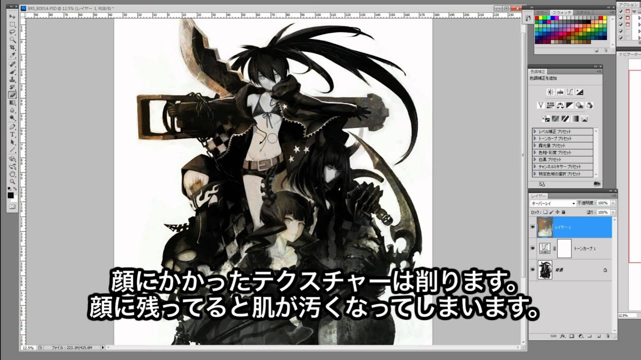
Black Rock Shooter OVA Bonus Extra. Huke Speed Drawing of the Black Rock Shooter Cast.
Black Rock Shooter
Dead Master
Black Gold Saw
Strength
this is the thing always amaze me about painting style
you just watch him transform a blob into that
ah~ if only they bring back Black Rock Shooter and give it a game like Honkai
frank sundial
Yeah i never say it impossible, but it is a challenge
Because I used to draw traditional before
plain bane

How does this shading style look?
I haven't done the shading that's supposed to be at the centre of the character yet
dusky trail
hard to say with only the hair
plain bane
I'm considering something more basic
 dusky trail
how did you color it to even make it took 2 hours lol
lament stump
well
lament stump
i tried using multiply
on my line art layer
i mean i didn't try i used it
and FOR SOME REASON
my lines took some ew colors and sometimes the line art took a hair color instead of skind color
it was all just one big mess...
dusky trail
did you separated the hair and skin layer from the start then?
or just simple make new layer, clip it to lineart layer
then you can do whatever you want without it damage the base lineart
lament stump
lament stump
her right side of the chin took a dark color cuz of the hair
and i didn't want that
it looked wierd
so i hade to be super fucking cerful about not going over the line
lament stump
dusky trail
or just simple make new layer, clip it to lineart layer
i could've dione this but well... i didn't
dusky trail
lament stump
so i hade to be super fucking cerful about not going over the line
wait... how did you color then?
why not just use magic tool and dump bucket on it
the just filled what is missing
lament stump
idk man.. i did use bucket but lines had a weird color
but now i know
to never ever use multiply on my line art layer
lament stump
okay

i have hair and thigs color layer cuz for some reason thigs didn't want to be colored on the skin layer
 supple sorrel
lament stump
idk man.. i did use bucket but lines had a weird color
supple sorrel
lament stump
idk man.. i did use bucket but lines had a weird color
magic wand/bucket usually leaves a small pocket of white stuff under the color and lineart
supple sorrel
yeah it leaves that part transparent
dusky trail
then you probably should adjust the detective mode
supple sorrel
cause it cant select inside the lineart to make it look ok
dusky trail
it also easier if you put a dark color in the background to make it easier to see
lament stump
yea it was so hard to see the skin color now that i think about it
supple sorrel
dusky trail
it also easier if you put a dark color in the background to make it easier to se...
or dont and set your program to light mode too 😠
dusky trail
also, using huge canvas make it quite easy for bucket to fill properly too ufufufuf
lament stump
and I imagine that white stuff would be seen easier with a darker bc
supple sorrel
yeah but you can also fill the gaps easier
 supple sorrel
you do the lineart on that bg too?
lament stump
you did 2 poses in the same drawing damn you are so not lazy
dusky trail
of course not
supple sorrel
dusky trail
also damn these muscles seccs
dusky trail
i like rib~
supple sorrel
nono I get it 😔
dusky trail
supple sorrel
you do the lineart on that bg too?
i usually just use black for lineart then put layer on top of it if i want to change color
supple sorrel
ic
I do that too, lately I've made played around with making the lineart layer multiply too
 dusky trail
i have Clip too but the pen just doesn't feel the same
so i mostly use Clip for backgroudn stuff
supple sorrel
yeah sai stabilizer is smth else
it's almost hard to move to other programs after drawing in it
dusky trail
ya
supple sorrel
but I can't get used to it again cause it doesnt have scrubby zoom
dusky trail

 safe falcon
Alright I’ve Redone the sword so it’s a lot bigger
 frank sundial
dusky trail
frank sundial
dusky trail
 lament stump
safe falcon
Alright I’ve Redone the sword so it’s a lot bigger
lament stump
safe falcon
Alright I’ve Redone the sword so it’s a lot bigger
Even besides all those details i can't help but to notice that the chin or the face looks a little misplaced
Idk if it's just me who sees it tho
safe falcon
I shouldn’t leave my phone unlocked in school with discord open
hardy yew
what should be fixed? also where should i put the shadows on the right side of the clothes
 whole cloak
The face seems uneven and the chin is asymmetrical, is the head on an angle?
Also it looks like you squashed the right side of her head (her right, our left) so maybe move the gold thingy a bit closer to the corner
Otherwise it looks good! The shadows are in the right place on the clothes, maybe make the shadow a bit bigger
hardy yew
its supposed to be at an angle, though i have no clue what im doing wrong

oh shit i just realized i shouldve probably added a shadow under the head

whole cloak
Try adding a centerline maybe? to sort of make it clearer while drawing
 lusty breach
U guys use a lot of layers
@-@
whole cloak
for the life of me this always looks a little off pls help
I haven’t tried this angle in a long time
 grave nymph
lusty breach
U guys use a lot of layers
@-@
grave nymph
lusty breach
U guys use a lot of layers
@-@
yup
 dawn pelican
I’m almost done with the lineart oh my god
 dawn pelican
800?/?/?//?/
grave nymph
but it’s definitely in the hundreds
yeah
a 12 frame 1 second animation
having no onion skin is pain you know? :”D
dawn pelican
How many seconds was it
dawn pelican
In total?
dawn pelican
Woah
grave nymph
CSP can only allow up to 2 seconds of animation if you only have PRO
dawn pelican
Animation is hard 😭
grave nymph
especially if you have no onion skin lul
dawn pelican
Rip
dusky trail
 dusky trail
hardy yew
how to draw/color eyes
dusky trail
hardy yew
how to draw/color eyes
like so~~?
but eye usually the part where artist can be more "creative" so just try out various thing you want until you settle on one
hardy yew

anything i should change? something still looks a little off

eyes supposed to be closed (realized this after i tried to draw an eye for a few minutes  )
)
dusky trail
hard to say with just that but if you aim for chibi anyway, you don't have to think too much
just go nut
otherwise, it mainly the chin that bother me
but it only because the line rather clunky
hardy yew
yeah the stabilizer wasnt working right 
my dumb ass just realizing she has no eyebrows
hardy yew
dusky trail
but it only because the line rather clunky
any better?

my hands are dying because the weather is so hot 
dusky trail
her left cheek still feel like it drag down too much
you could just extend the hair bun...? or what ever it call a bit longer
hardy yew

 strong pond
maybe make the eyes bigger and a little closer hahah
dusky trail
chibi style can be use more freely anyway
potent mason
i suggest you make your lines thicker, thick lines goes well with chibi artstyle
grave nymph
yeah
makes the lineart more visible or something
if you plan on making it an emote then you have to have thick lines so it’ll be visible when it’s smaller
dusky trail
thicc


 grim heart
not yet final lol 
 potent mason
not sure why japan likes drawing them with thigh gap, in reality those look ugly and can be rarely seen in a woman unless theyre very skinny
coz the thighs' fat usually fill up that gap
 grave nymph
dusky trail
 potent mason
either thigh fat fill the gap or the shorts/skirts cover it up
dusky trail
and well, art is always there to draw something you don't normally see anyway

like Niko Tama
who always draw nip so hard they always look like it can piece through clothe

even more fun if you check his old stuff, they all have normal nip but then they keep increasing in size over the year
dusky trail
the artist probably want to set it as his trademark
potent mason
Guess that's one way to slap "hey I draw uniquely " to the viewers
fiery lantern
oh
dusky trail
and then we have One Piece's author
always draw the female char with extreme thin waist

there also kawakami masaki or Houtengeki that love draw girl with wide hip and thick butt
so ya, while some draw more closer to how real body work, there are plenty draw them in "unique" way because that is what look good for them
grim heart
dusky trail
the crotch part makes it look like "something" is there
yeah im planning to fix that when i render it, thanks for pointing it out
dusky trail
grim heart
yeah im planning to fix that when i render it, thanks for pointing it out
well another fix would be to make the crotch wrinkle on the right left head down instead of up
grim heart
oh okay got it, thank you
dusky trail

because you draw those part so high up, it created a kind of illusion of something really saggy in there
grim heart
oh yeah it does lol no wonder it looks kinda off in that part
 safe falcon
I noticed a big mistake but if no one notices then it’s A ok

 safe falcon
See no one notices it so it’s A ok and I’ll fix it when grade 12 isn’t squeezing the life out of me with 6 assessments due this week alone
grave nymph
currently editing a guide, I'll try to view it on phone when I'm finish lul
safe falcon
You know the way I’ve positioned her and the sword either way I’ll be a awkward, I just tried to fix it and yah Another problem came up when I did
lusty breach
:□
shadow nebula
I hated high chool so much
shadow nebula
at least you guys are almost done with it. It gets better
 robust tapir
Its been a long time since i draw
 shadow nebula
that sounds like fun
robust tapir
safe falcon
I noticed a big mistake but if no one notices then it’s A ok
The eyes are too closed too each other?
safe falcon
shadow nebula
that sounds like fun
Hahahaha, I don’t need energy drinks to get my heart rate up anymore, school is doing a better job at it
supple sorrel
shadow nebula
at least you guys are almost done with it. It gets better
you're saying that meanwhile other ppl I know are saying that after hs is when the real pain begins
safe falcon
robust tapir
The eyes are too closed too each other?
No
robust tapir
The nose are too high?
safe falcon
safe falcon
Hahahaha, I don’t need energy drinks to get my heart rate up anymore, school is ...
I already tried fixing the mistake but it leads to another mistake similar to the first
shadow nebula
safe falcon
Hahahaha, I don’t need energy drinks to get my heart rate up anymore, school is ...
True, i remember having to get constant extensions on assignments in hs
shadow nebula
supple sorrel
you're saying that meanwhile other ppl I know are saying that after hs is when t...
its gets better because you have more freedom and can leave class without having the teacher up your ass
honestly kind of bs since you can get extensions on everything in the real world and uni
thats why hs is so stupid
they pretend this is the way the real world works when it doesn
t
yeah its pretty dumb
safe falcon
Mind an ATAR is valid for a year, if you don’t get anywhere within that year you just wasted a lot of time
shadow nebula
gr 12 I missed half of the school days and had to completely change what i was going to go into which was dance but a car crash in gr 11 fucked my back up so i had to take gr 10 and gr 11 art courses in gr12
thats terrible
one year my hs had a fire over christmas break took over a month for us to go back so we ended really awkwardly
safe falcon
Oh btw the mistake was the sword hand guard, if id flipped it id have to redo the arm but because I really don’t want to do that I’ll just say her arm is in the little Gap between the hand guard and handle, it’s a bit awkward but it saves me the trouble of another redesign
 grave nymph
Ah
safe falcon
This is me duplicating it onto another file trying to find a solution
grave nymph
o
 minor grove
fumo
 safe falcon
grave nymph
o
safe falcon
grave nymph
o
The only way I see on solving the mistake and that’s making the sword thinner and just in general a bit smaller
grave nymph
but then you'd be fiddling around the sword's size and it won't be the same like the original
safe falcon
grave nymph
but then you'd be fiddling around the sword's size and it won't be the same like...
Actually I think I may have found a way I’ll try it later on and see if it works
grave nymph
can't wait to see your solution then 
 plain sorrel
seele modeling progress
 plain sorrel
hair is always the most difficult and time consuming but at least my drawing works fine I guess..
 plain sorrel
grave nymph
That's looking quite good so far
plain sorrel
grave nymph
That's looking quite good so far
thank u~
 obtuse night
minor grove
fumo
obtuse night
minor grove
fumo
Fremy!
Rokka no Yuusha was great
I remember whatching all of it staight after seeing the first episode
 hallow marsh
My current WIP for the contest, wanted to show a possible future where Kiana also became a teacher after the main story
Might make the room messier since I imagine Kiana wouldn't be able to keep it clean 🤣

 jaunty python
just kevin things
 safe falcon
grave nymph
can't wait to see your solution then <:RozaPeek:639322497468203018>
safe falcon
grave nymph
can't wait to see your solution then <:RozaPeek:639322497468203018>
Alright I’m done, solution is done it’s a bit rough but I’ll fix that later
 grave nymph
oooo
safe falcon
grave nymph
oooo
It’s less detailed but at least it makes sense with the sword design
grave nymph
yeah, it does

 dusky trail
at least move the "no steal" out of her face first
it is hard to compare when one of them have something block off
plain bane
Yeah gimme a sec
dusky trail
but i would say, go with half half
shadow nebula
first one fits more with the way you coloured the background but darkening and giving the hair a rim light would make it fit the lighting
dusky trail
if the sunset is behind her then ya, as Saiph said, it would be like the first one
but that would also cause a more similar dark hair on her left side
as her head and arm would block off the light
plain bane
 dusky trail
thoughg the second one is a bit too dark
 dusky trail
because even your draw doesn't want you to steal it
it is gaining sentience, time to delete it
 dusky trail
oh you mean bald spot
fine enough
anyway, just shade the rest of her too then ask us again
it is easier to see the whole thing than just one spot
safe falcon
plain bane
I love seeing honkai impact ads, those practically ever show up for me
plain bane
I either get honkai ads or ads trying to sell me houses
dusky trail
then time to buy a house in honkai ver
 supple sorrel
hallow marsh
My current WIP for the contest, wanted to show a possible future where Kiana als...
supple sorrel
hallow marsh
My current WIP for the contest, wanted to show a possible future where Kiana als...
cool concept
obtuse night
minor grove
it's a shame it won't be finished
The manga is not finished either?
minor grove
as far as i know the next LN wasn't released (even after 10th anniversary)
 lost wagon

I've been painting Rika a few days ago and I want to share her new design. it's just a small teaser of it.
I'm really looking forward to chapter 22(+) when she will finally reappear in the manga!! I miss her so much <3
#witchsanctuary #OC #mangaart

 Twitter
·
lament stump
Twitter
·
lament stump
guys why do my lines almost look like they are made out of pixels when i zoom in a little bit, ppl on yt have nice and smooth lines\
 grave nymph
probably canvas size
 grave patrol
grave nymph
probably canvas size
grave patrol
grave nymph
probably canvas size
I thought it was resolution
hallow marsh
Usually canvas size
I use A4 for anything important
I then go 350+ dpi for anything merch wise
strong pond
what do you use?
hallow marsh
Clip Studio paint
shadow nebula
the smaller your canvas the less you can zoom in without quality loss
strong pond
ohh
lament stump
strong pond
you need a bigger canvas size lol
oh thanks
dusky trail
3k x 3k or 4k x 4k pretty much my base canvas size
lament stump
i have a rly small tablet so big canvas are hard to draw on
strong pond
thats a lot wow
dusky trail
small table is not really matter
you only have to increase your pen size
i usually use size 8-9
strong pond
the size is technically the same as smaller sizes just has higher res
shadow nebula
I can't go to 10k by 10k like i do on pc
lament stump
but like if i draw on a big canvas and yous moste of it I'll have some very big lines that are very hard to draw just from your wrist
hallow marsh
Damn never had to go that big before
strong pond
on ibispaint your ipad dies after going over 100 at 2000x2000
lament stump
dusky trail
you can just zoom out you know
then it becomes hard to cennect the lines
shadow nebula
its something you will get the hang of as you practice
lament stump
idk mabye it's a me problem
dusky trail
what pen size you usually use then
lament stump
I'll start using bigger ones soon as possible
lament stump
dusky trail
what pen size you usually use then
i rly don't know cuz I switch em a lot
hallow marsh
Might be good to learn to draw without zooming in for a bit on a larger canvas
strong pond
its p hard to do that
shadow nebula
you don't have to use big ones. My sketch pen for my 10k by 10k canvas is only size 17
hallow marsh
Not saying never zoom in when drawing, just a little bit of practice on it lmao
lament stump
i did 7 for body and 4 for the face
 dusky trail
17 is pretty big too =3=
strong pond
oooh thats so cute
shadow nebula
its very small for this canvas size
lament stump
it was a g pen so it had pen pressure
dusky trail
and that is why i say to put some dark background
because my eyes i burning staring at that right now
lament stump
1 second
strong pond
lmaoo
lament stump
well UMMMMM
 hallow marsh
I'm glad I'm not the only one that draws on a gray surface XD
dusky trail
lol
dusky trail
you can just make a new layer, set it in the bottom and throw the bucket at it
strong pond
I SWEAR THE FACE LOOKS GREAT
lament stump
WELL NOW SHE HAS NO HAIR
 lament stump
dusky trail
you can just make a new layer, set it in the bottom and throw the bucket at it
lament stump
dusky trail
you can just make a new layer, set it in the bottom and throw the bucket at it
ohh
strong pond
try gray-ish purple
dusky trail
you can use something different than the color you use lol
strong pond
and airbrush the bottom sides with black
 grave nymph
hallow marsh
I'm glad I'm not the only one that draws on a gray surface XD
grave nymph
hallow marsh
I'm glad I'm not the only one that draws on a gray surface XD
One of Us
Grayish backgrounds are /;w;/
dusky trail
a bit too bright, it not gonna feel good if you look at it when you draw
it will mess your eyes up
strong pond
too vibrant id say haha
lament stump
i bucketed color white on hair layer

now i turned it bac to pink
but um
now the lines are fucked cuz of multiply layer on my line art
 raw ridge
CTRL+Z
lament stump
 dusky trail
ya just ctrl z it
lament stump
raw ridge
CTRL+Z
oh no way that exists?
lament stump
I CAN'TTTT
raw ridge
Megapensive
hallow marsh
Okay what you can do is, select all the pink and delete it.
Then you can colour layer 8 to a different colour which will give the hair it's freedom
raw ridge
Pain
dusky trail
redraw time
shadow nebula
a good neutral background for colours is a mid tone grey
lament stump
nooooooooooo
 dusky trail
i think he only just notice he bucket the wrong later today
strong pond
lament stump
oh no way that exists?
are you telling me that you have never CTRL+Z ed anything?
dusky trail
and he did that sometime ago
strong pond
HOLY
grave nymph
Ikr?
lament stump
hallow marsh
Okay what you can do is, select all the pink and delete it.
Then you can colou...
 dusky trail
now it is easier to see all the odd spot there
hallow marsh
Okay nice job, you'll be able to fill in the spots that have been left out on the hair 👍
strong pond
thank god
lament stump
after every line I use ctrl z
strong pond
you do have pretty nice liness
lament stump
thanks
I would say I'm good or something but that drawing took me like 20h total and it's not even done
I just redo untill I'm setisfied
just like my discord status says :)
strong pond
thats a lot of determination omg
dusky trail
meanwhile i just stuck on what size of boobs i want my OC to have
lament stump
and also shikniful helped me soooo much with this drawing
strong pond
LMAOOO
 strong pond
my oh my
lament stump
use your size :)
dusky trail
mine is too thick and long
strong pond
GET SOME HOLY WATER
strong pond
never knew boobs were long
obtuse night
minor grove
as far as i know the next LN wasn't released (even after 10th anniversary)
Sad
dusky trail
oh well, i just gonna do medium size for now
strong pond
do you guys have any favorite artists?
hallow marsh
Mines LAM
lament stump
i just started art so I don't know any artists except ppl in here
lament stump
almost 2
strong pond
oooh that really good
grave nymph
strong pond
do you guys have any favorite artists?
hmmm
lament stump
i do however now SomeNormalArtist, he makes yt vids so I now him
grave nymph
@/hitsukuya perhaps
lament stump
he helped me a lot
dusky trail
that remind me
 grave nymph
https://twitter.com/hitsukuya this person

I draw stuff!!
✉️ moehitsu2@gmail.com
▶︎ PIXIV http://pixiv.me/hitsukuya
▶︎ IG moehitsu
Tweets
33720
Followers
256423
Twitter
strong pond
LOOK AT THIS MY EYES
 grave nymph
iine
 lament stump
strong pond
LOOK AT THIS MY EYES
lament stump
strong pond
LOOK AT THIS MY EYES
this on the other hand doesn't look that real and is somehow so good
strong pond
ALSO LOOK AT THIS ONE
 lament stump
that one looks like it hase some kind of texture on it, loooks very nice
strong pond
yess
hallow marsh
I love the lighting so much on that
strong pond
the composition , and the rendering is just amazing
lament stump
before I started art i never noticed the bg that much and now I appriciate it cuz i know how hard that bg must have been
thoes clouds look so good damn good
 strong pond
thats really niceee
lament stump
how do they make it looks so real like, it's almost as it's a figure sitting at my desk, thoes colors are something else
especially that eye color
looks so real
grave nymph
strong pond
also check out rosuuri on twitter
Yup
strong pond
OK THIS what do yall think of this
 grave nymph
They're also one of the top artists I admire
 strong pond
grave nymph
They're also one of the top artists I admire
strong pond
grave nymph
They're also one of the top artists I admire
YESS
hallow marsh
One thing I always want to improve on is lighting and backgrounds atm
strong pond
backgrounds are pretty hard
grave nymph
yep
 hallow marsh
Backgrounds can be hard but my word are they satisfying
grave nymph
a very underrated artist that I also follow is Janyhero-sensei https://twitter.com/Janyhero

P͟i͟x͟i͟v͟:͟ janyhero
https://t.co/rbukAOUr3f
F͟a͟n͟b͟o͟x͟:͟ ͟ https://t.co/fyyrF62VWH
Gumroad:
https://t.co/tl5JqxYMZU
Commission Sheet:
https://t.co/PWh47OwYvr
Tweets
2655
Followers
9369
Twitter
they do some great azur lane art

[Reposted for Image clarity]
Happy 3rd Anniversary to Azurlane!
Let's have another successful year!
#AzurLane #Yostar #AzurLane3rdAnniv
#アズールレーン
Retweets
650
Likes
1967
 Twitter
·
Twitter
·
like this one
hallow marsh
Ooooooooooohhh
grave nymph
https://twitter.com/Janyhero/status/1427530932890701825?s=20 here's the gif version of the art btw

Here's the process of the art!
#AzurLane #Yostar #AzurLane3rdAnniv https://t.co/wodLXTO26u
Retweets
150
Likes
588
Twitter
·
they said that they use 3d stuffs for the bg
hallow marsh
I love that
Always looked up to the Azur Lane artists
dusky trail
i can't say i like the game but ya Azur Lane has a lot of good art
grave nymph
yup
hallow marsh
Yeah people use Blender or premade 3D resources for backgrounds which is really helpful
grave nymph
they splurge money into their art
dusky trail
 grave nymph
https://twitter.com/abara/status/1428751079756296197?s=20 Abara-sensei also have a very unique style, be it digital or traditional


it looks so fluffy
dusky trail
 grave nymph
ooooh
dusky trail
Shunin also seem to gaining popularity lately
grave nymph
them colors
 grave nymph
link?
hallow marsh
The colours there are really well used
dusky trail
ah there we go https://twitter.com/_himehajime

クーラだいすき 豪族
フリーになりまして よろしくね
fanbox→https://t.co/3aKczHFBc7 fantia→https://t.co/k0s7LUzjt9
pawoo→https://t.co/KxtoYemK04
お仕事履歴 ドーナドーナ ランス03 ランス01(全て魚介名義)
Tweets
133495
Followers
250179
Twitter
hallow marsh
A great artist!
hallow marsh
Honestly
dusky trail

欲望の渦でかき乱せ!
PC向けハルウラレ系RPG『ドーナドーナ いっしょにわるいことをしよう』
2020年11月27日発売
18歳未満購入禁止
公式サイト
http://www.alicesoft.com/dohnadohna/
(18歳未満閲覧禁止)
メインテーマ『ドーナドーナのうた』
作詞:仲村芽衣子
作曲:水夏える
歌:月乃
サントラ試聴
https://youtu.be/nW-kTpRdQ64
well his game is quite blow up anyway
Alicesoft's games have a lot of cool artist
hallow marsh
They certainly do
strong pond
oh yea NABIII do any of you know nabi
grave nymph
I think finding a unique style would be hard
ah

?
dusky trail
you sure like a lot of shoujo style huh?
grave nymph
I like that kind of shading
lament stump
how do you even fing your own style?
strong pond
the shading is pure anime
grave nymph
https://www.pixiv.net/en/artworks/88070709 I also found this earlier
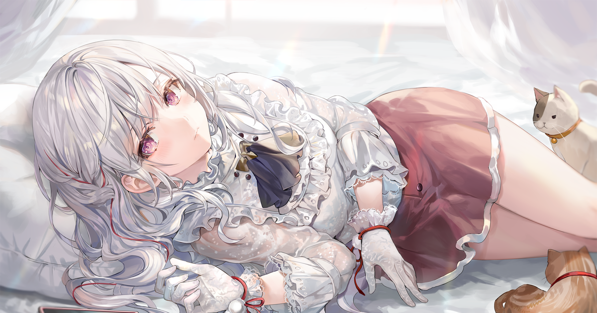
and gosh the colors man
dusky trail
 strong pond
lament stump
how do you even fing your own style?
strong pond
lament stump
how do you even fing your own style?
it just comes out by itself ig
grave nymph
yeah
dusky trail
shoujo style always have some amazing hair style
dusky trail
the detail always so overkill
grave nymph
those shadings too
strong pond
grave nymph
https://www.pixiv.net/en/artworks/88070709 I also found this earlier
NO WAY THATS SO COOL
grave nymph
Isn't it?!?!
lament stump
strong pond
it just comes out by itself ig
oh nice
strong pond
 grave nymph
so much to learn
dusky trail
 strong pond
aA
 dusky trail
her body looks rather square-ish
grave nymph
yeah
can't redline since have to go to sleep
her shoulders look weird imo
neck feels quite short, maybe just me
 grave nymph
mm
strong pond
ah
grave nymph
might be because of shoulders
strong pond
oohhh

 grave nymph
2
lament stump
idk if you can see the difference
strong pond
2
hallow marsh
2
grave nymph
slight color difference
strong pond
LMAO
grave nymph
strong pond
2 just amkes the eyes pop
 grave nymph
2 for me
lament stump
I meant 2 ye
hallow marsh
Sticking with 2
dusky trail
well go for 1 if that what you like
strong pond
oh yea critique pleasee
 lament stump
so her eyes are less visible cuz it's like dark or something
lament stump
but idk if I can make her seem like it's dark outside so...
hallow marsh
Perhaps relax the pinky slightly
strong pond
alr thank youu
dusky trail
lament stump
but idk if I can make her seem like it's dark outside so...
just stuff all layers into one folder
put a multiply layer on top of that layer
then try out various color to make it look darker
see which one you like
hallow marsh
strong pond
oh yea critique pleasee
Also on the top shirt on Mumei's left side, I would recommend sliding it back towards her arm to more to give a more rounded shape
lament stump
dusky trail
see which one you like
alr I'll do that when I finish shading the hair
strong pond
hallow marsh
Also on the top shirt on Mumei's left side, I would recommend sliding it back to...
ohhh thank youu
dusky trail
strong pond
oh yea critique pleasee
the dagger also too center
like if she stand up, it would be in front of her crotch
strong pond
and last one
 lament stump
strong pond
oh yea critique pleasee
lament stump
strong pond
oh yea critique pleasee
these 2 are good and know how to point out your mistakes but imo it looks very nice :)
dusky trail
so if you try to pull the dagger out, her hand gonna smash her boobs
strong pond
dusky trail
like if she stand up, it would be in front of her crotch
ohh i didnt think of that ty
LMAO
dusky trail
strong pond
and last one
first glare, the gun has no trigger
hallow marsh
I'll respond, in a bit, just in a meeting
 full solstice
strong pond
and last one
full solstice
strong pond
and last one
I feel like the eyes don’t match up with the face
strong pond
dusky trail
first glare, the gun has no trigger
oh yea lmaoo
strong pond
full solstice
I feel like the eyes don’t match up with the face
too slanted or the eues just dont match?
lament stump
dusky trail
first glare, the gun has no trigger
it shoots based on emotions
dusky trail
strong pond
too slanted or the eues just dont match?
likely because her face looks like it is melt to one side
full solstice
Yep
strong pond
dusky trail
likely because her face looks like it is melt to one side
ohh yea i see it now
dusky trail

just cut it in half like this and you can see her right eye is drift away there
the left cheek and right cheek also rather different
dusky trail
 strong pond
oh and
dusky trail
just look at the ear between the left and right
hallow marsh
Okay I would raise the stock of the gun a little and personal preference would be to make the large a bit larger
Shading is fine 👍
strong pond
okayy thank good
 grave nymph
hands look very small compared to her body and face imo
also, I suggest flipping the canvas often
can see where your mistakes are at
 topaz zealot
It kinda looks like her eyes are falling off her face


 dusky trail
you could