#art-discussion-and-wip
1 messages · Page 44 of 1
 potent mason
 lament stump
oh well your welcome 😀
 dusky trail
just don't be too obsessed that you ignore everyone opinion and rage if they nitpick your art
see a good amount of ppl like that back when i still in Deviant Art and boi it is not pretty
potent mason
Those aren't artists they're narcissists ppl
 plain bane
I'd be grateful if people nitpicked my art
dusky trail
also, look fine to me
plain bane
Helps me fix stuff cause I'm pretty blind 
lament stump
plain bane
I'd be grateful if people nitpicked my art
ppl here point out my mistakes and I love it so much
 dusky trail
i usually just skip it if the hair covered it anyway
dusky trail
well, her face to chin distance is a bit too close
plain bane
Probably should pull the nose down looking now
 shadow nebula
the eye looks fine but you should lower the nose, makes her face looked squished
dusky trail
and that make the hair way too bigger than it should
plain bane
Yeah
dusky trail
i would shift the bang and the eyes a bit higher
 dusky trail
maybe a bit to the right?
plain bane
What to the right?
plain bane
 dusky trail
ya about that
dusky trail
i still think the face is a bit too low cause the hair to be way too long than it should though
dusky trail
and the... side burn? is that what it call? on her left is a bit far away
dusky trail
give me a sec
plain bane
Her left? I think you mean
dusky trail

try to shift the eyes so it more in middle of the face

@plain bane this way she would have more balance face
 supple sorrel
I'll be honest with you that doesn't look great
plain bane
What doesn't look great?
dusky trail

plain bane
Might be because its made from my art
plain bane
It already looked kinda dead
dusky trail
well that how i would do it at least, his first draft make it like she gonna have her bang completely covered her face
supple sorrel
it may be cause the proportions changed?
the eye socket seems to be longer and the cheek lower
plain bane
I might just leave as is, I'd rather not ruin it cause I don't understand
dusky trail
k then~
 dusky trail
that no steal though
plain bane
Even without being finished
Yeah 
People used to steal my other art
No risks here
My sonic fanart from ages ago was stolen

Trying to think about how I can fix her grip on the phone
How would it look if I made the arm plenty more foreshortened? Like she's holding the phone in front?
Looks like her arms too long there
Bit general idea
potent mason
Is it just me or it got even worse coz she doesn't have a neck anymore?
shadow nebula
to do that you'll need to move the arm forward
plain bane
That's the old sketch
potent mason
Yshould refer to 99night's pic about the pose, he gave a rough sketch about it
 hardy yew
colored it, now onto shading
what do you guys think?
 plain bane
So bright her arm more forward?
shadow nebula
yeah, the angle is more from the front of the character than above so the example you gave makes the arm look unnatural
shadow nebula
hardy yew
colored it, now onto shading
what do you guys think?
its looking good
supple sorrel
my take on that head

sorry it took so long I want to punch my laptop in its face it's so fucking slow
so the first thing I noticed was that the chin was misplaced
and then I took all the hair and made it smaller to fit the skull better
then, something I consider important, I drew her right eyebrow, which let me find where the nose is supposed to go and I'll show you how too
and I gave her a bigger smile to show that she's mischevious
potent mason
hardy yew
colored it, now onto shading
what do you guys think?
Why does it have paws when the honkai beast is using crab-like claw and hoof to walk?
hardy yew
potent mason
Why does it have paws when the honkai beast is using crab-like claw and hoof to ...
personal choice
hardy yew
shadow nebula
its looking good
thanks tho!
supple sorrel
supple sorrel
then, something I consider important, I drew her right eyebrow, which let me fin...
so for the nose, I do something like this @plain bane

something cool to consider is that the nose on us begins at half around the eyeball, but for cutesy reasons on anime gurlz it's more curved and a little lower
shadow nebula
@plain bane very rough but that should give you an idea for where the arm should be and perspective on it
 supple sorrel
also in poses where the head is both turned and tilted the nose almost or even covers the eye
plain bane
Okay I'm gonna take a few and read all this over
shadow nebula
for the raised arm taking the photo make sure to raise the shoulder. csp models aren't very good
potent mason
supple sorrel
sorry it took so long I want to punch my laptop in its face it's so fucking slow
What laptop you use?
supple sorrel
uhh hp pavillion something something
potent mason
Oh nc, you can draw with that with its hp pen
potent mason
Oh
I was gunning for either that or the lenovo flex 5 before but I got turned off by the color accuracy so I just bought a laptop with high color accuracy but non touch one
supple sorrel
yeah I think I have some problems with mine about that too
can't tell if my tablet's wrong or my laptop's wrong
and my phone looks something in between 
 potent mason
The best option is the Samsung galaxy book flex 15. The pen is Wacom tech pen, color accuracy is superb and 8-10 hrs battery. Only downside is the panel is glass so it would feel like drawing in glass and it's just doesn't feel natural.
supple sorrel
plain bane
Should it be more like this for nose?
yeah I think so
supple sorrel
potent mason
The best option is the Samsung galaxy book flex 15. The pen is Wacom tech pen, c...
never thought about buying a touch screen laptop honestly
does it even have pressure sensitivity if it's from glass
hardy yew
any advice on coloring hair 
supple sorrel
I just die honestly
I can never get the fancy blending and the fancy little hair uh accumulations
hardy yew
i see i have found my people
 whole cloak
I color hair like this
slap a base color or two
Grab fade watercolor brush in ibispaint
b l e n d
add highlights by changing fade watercolor brush color or with fade pen
or with dip pen idk

my coloring style is the same for everything idk texture ahaha
this one might make it more clear

this is also useful @hardy yew
 supple sorrel
yup apply the base color then some shadows and now next step just finish it noob
 prime kelp
ikr right
 lament stump
yoooo sameee
I'm begginer af as well and shadows look very questionable
like coloring is all about shading as I've seen till now
base color then shade
and shadeing is so hard
whole cloak
that’s why I blur the colors with fade pen to look like I know what I’m doing
lament stump
you style looks a lot like painting with water brushes
looks a lot less cartoonish which is nice
you have a cool style
whole cloak
ty
hardy yew
yeah i dunno what brushes to use either so i just stick to one
procreate too complicated for my small brain

lament stump
I use 6 brushes, a basic one for sketches (no pen pressure), G-pen for line a art, marker for base colors, shading pen for y'know what, blur pen for you know what and blending pen
whole cloak
I use two
basic hard dip pen (speed sensitivity since I don’t have pressure sensitive stylus) and flat watercolor/fade (constant width)
 proven nest
 im trying to draw this gorl with a bun and i hate that i have to shape her head with the hair so i cant mess up cuz it's tied back not loose
huge abnormal head yes
 maybe if i make her look to the side a little it'll be easier instead of straight on
 grave nymph
I wonder if I should sometimes dump art references and guides here
dusky trail
unless you get mod to pin it in, not much point to put here since it will just being push up anyway
 grave nymph
dusky trail
unless you get mod to pin it in, not much point to put here since it will just b...
grave nymph
dusky trail
unless you get mod to pin it in, not much point to put here since it will just b...
true
hardy yew
grave nymph
I wonder if I should sometimes dump art references and guides here
hey id appreciate it regardless 
anything i can fix? honestly no clue what im doing 
 dusky trail
hard to tell with just that
hardy yew
yeah i havent done much else since i work slow

is there anything i can improve about the shading in the hair? no energy to do the rest right now
dusky trail
well i would say you could shade the part of hair under the hair accessory too
hardy yew
could you show an example? when i tried to do it, it kinda just looked like a messy blob


 dusky trail
fine enough
though you do need to do it on the part on her forehead too
specially under the gem
dusky trail
with the way you shade right now, the light source would be on the right so it should be bottom left
 dusky trail
ya should do
well if you aim for chibi style anyway you don't really need to worry about shade thing too thick
 proven nest
excuse the ugly lines, using laptop, but um if i wanna put chopsticks in the hair, do those go through the base of the bun or more in the middle of the bun?  i tried to google pictures but im not 100% sure.. im thinking it's the base?
 dusky trail
you can stab it about anywhere
grave nymph
mhm
proven nest
 ah, okie. i thought there was a specific way and didnt wanna get it wrong. thank you!
dusky trail
 proven nest
wait should i draw more of a neck on her? or does it look like the kimono collar is just high?
dusky trail
the bun itself usually stable enough on it own
so stabbing pin, chop stick or what not on usually for decoration
proven nest
i just thought the chopsticks would look cute
dusky trail
if you aim for chibi style then you don't really need much neck anyway
proven nest
ohh, okie
 grave nymph
I wonder how does one shade scarves 
 proven nest
 dusky trail
as for the scarves, it mainly about which part on the top and which is under
grave nymph
o?
dusky trail
the way you draw it make it look a bit way too thick though
like it is a really long scarf that she has to circle how many times on her neck

let it flap down like this feel more natural
but if you leave it like that then~
grave nymph
So I guess, it's time to redo the lineart again huh
dusky trail

then those part there would have more shading
the top part would be above it so it would created more shade for the one underneath
dusky trail
grave nymph
So I guess, it's time to redo the lineart again huh
well it mainly bother me but your is still fine
no need to redo
 grave nymph
ah
dusky trail
like this part of Welt here
grave nymph
shade those parts so it adds more depth? or something like that?
dusky trail
still think your scarf look way too tight though
grave nymph
in what way?
dusky trail
usually only 2-3 layers but your looks like it has 5-6 layers
grave nymph
ah souka
guess I should really redo the lineart huh

I myself don't know what I'm doing when I was drawing the scarf


 dusky trail
ya that look cleaner
grave nymph
I guess those things were unnecessary huh
 grave nymph
o
dusky trail

gonna throw this here too if you want to see some clothe wrinkle reference
since you may want to add some line on Seele's arm where she bend there
 grave nymph
dusky trail
since you may want to add some line on Seele's arm where she bend there
grave nymph
dusky trail
since you may want to add some line on Seele's arm where she bend there
yeah am gonna do most of the wrinkles during coloring
thanks for the references though /;w;/
dusky trail
then i gonna go take my nap~
grave nymph
oyasumi~
grave nymph
I wonder if the pattern looks okay

 shadow nebula
you should make your shading darker, currently you can barely tell the difference between the base and shadows
 shadow nebula
darker, the values for everything are too similar
grave nymph
I should look for more references huh
shadow nebula
this photo has good values. See how much darker the shadows are. Try to mimic that. Your current shadows look like very very light smudges
 grave nymph
o
shadow nebula
also don't be scared to use different colours fro the shadows
and lighting
think if you want cool or warm shadows/lighting
sticking to a darker colour of the base skin tone makes it very flat
grave nymph
naruhodo
grave nymph
tfw you did the shadows for too long you forgot how to add highlights in the hair or smthn
I legit forgot how to highlight hair o no
 shadow nebula
try to find shapes likes squares, rectangles, triangles, etc in the hair for lighting and shadows instead of lines
grave nymph
hardy yew
is this mouht okay?
 hardy yew
well, its okay thank u 
shadow nebula
yeah the mouth is fine
dusky trail
 dusky trail
grave nymph
how does one color clothing folds
dusky trail
grave nymph
how does one color clothing folds
a lot darker than the base~
grave nymph
like this darker?
 dusky trail
if you not sure how dark it can be, just slap a multiply layer on top of it, add dark color
dusky trail
if you got a good shade result you like then you can mix some color into it too
i usually do it with blue or orange

like here they do it with purple
grave nymph
o
dusky trail
that way the white shirt won't look too gray and you can make it match with the char's hair color or with the rest of they outfit

like here with a slight pink for valentine mood
grave nymph
Ah
grave nymph
hm

have to adjust a lot of stuff if going for brownish lighting
might also adjust opacity/intensity of the light
dusky trail
i usually just copy the hair color layer then use luminosity it
shadow nebula
thats looking really good
 grave nymph
o
dusky trail

it just give me the right amount of bright that i like
so feel free to test out various layer until you find something you like
 hard star
raiden mei wip 🌩
 dusky trail
ya, i like that kind of clean style than paint
grave nymph
understandable
I wanna learn how to color with different syles
but have to focus on one first to know the basics o-o;;
grave nymph
hm
 dusky trail
fine to me though the more detail you put on the hair, the face became more plain
grave nymph
how would I add more details on the face then
shadow nebula
up the contrast and add more colour
give the face some rim lighting to match the hair
dusky trail
you can also add some pink to her cheek and lip
grave nymph
📝

 grave nymph
contrast is the intensity of a color right?
shadow nebula
yes
grave nymph
I don't really know technical terms when it comes to art 
shadow nebula
no worries
grave nymph
how about now?
 dusky trail
add some shade on the face to add some depth on the bang may help too
dusky trail
your is still feel rather bright compare to the hair and scarf
shade can have up to 2 layers
shadow nebula
you can give the shadows a purple hue, it'll add depth and more contrast
grave nymph
oo
shadow nebula
its something you get better at through practice and studies
grave nymph
But is that okay when most of the colors are leaning to the brownish color?
dusky trail
ugh.. it is hard to find a good reference for you since it show too muh skin and discord.. well
shadow nebula
you're light is warm so making the shadows a cool colour will help the drawing
grave nymph
Ahh
dusky trail

ah this is fine, somehow
anyway, you can see she has at least 3 layers of skin shading there
grave nymph

dusky trail
the collarbone, the armpit the hair bang all shade with one more layer as those spots have more depth
as other spot will cast a shadow on it
grave nymph
oooo

 shadow nebula
look at a photo of a blouse and copy what you see
dusky trail
put the part on the right to the left and make the left part less wide
you make them too center
 lament stump
alright thanks guys
 potent mason
thats the elf princess
dusky trail
Takunomi "stuff" is fun~
potent mason
im too lazy to make acc to fav doujins so i just paste the links to a one-man server i made so i can reread them later without logging in
dusky trail
i'm a hoarder anyway so i just download some doujin
they can be use as reference too anyway
since they usually various angle and pose that you don't always see in normal draw
 dusky trail
can you zoom out a bit more
lament stump
I'll redo the sketch to make it better
 shadow nebula
thats better but i would up the shadows a tad bit more
grave nymph
 dusky trail
ya feel like you still kinda hold back on make the shade too dark
shadow nebula
also give more of the light on the hair to the face to make them mesh well
grave nymph
@-@
grave nymph
shadow nebula
also give more of the light on the hair to the face to make them mesh well
like the ends of the bangs?
potent mason
just note that the brighter the lightsource is the darker the shadows it produces
 dusky trail
it just he made one side of the hair too bright, so it just not mash well with the rest
shadow nebula
You should put the same light thats on the hair on the cheeks
dusky trail
so if you follow the hair lightning, then half of her body would be in the dark
shadow nebula
you have a very bright light source but the face has none of it
so right now it feels like the hair and the face are part of two different drawings
dusky trail
so you either tone down the hair lightning or make it more balance
 grave nymph
mm makes sense
potent mason
like this
 grave nymph
Am kinda lost on doing different intensities of light
that's +1 to my "to learn" list then
I wonder if just, turning the opacity down would work on the lighting lul
potent mason
or pixel lock it and decrease intensity..
dusky trail
probably not, the blue part of her hair would still make it feel too bright in compare
grave nymph
potent mason
or pixel lock it and decrease intensity..
as in, lock transparent pixels?
potent mason
 grave nymph
ah
so it's technically clipping layers huh
but you don't need another layer
that's handy
potent mason
yes
this is how my layer tower template looks like so i can freely edit whatever part of the shade i want if i ever want any changes 🤔

sh layers is for the female skin
grave nymph
I got tons of unnamed layers lul
since I usually just use a shortcut and click on a specific part to just get to that layer
still too intense or?

guess I'll be finishing this tomorrow due to me having to do Honkai dailies huh
potent mason
move tool ye
dusky trail
and then the amount of layers you need if you draw multi-part for variant set....
grave nymph
@w@
potent mason
ye like what im currently working on 😩
dusky trail
the eyes layers alone already took 6-7 layers
grave nymph
relatable
dusky trail
and then in variant set, you usually do a lot of variant faces too
dusky trail
i draw in 4k x 3k
grave nymph
oh wow
potent mason
yep, when i usually get CG-esque ||sex scenes|| they make me draw 4-5 facial expression not including the post and pre nut layers
grave nymph
o-oh wow
dusky trail
and then the "wet" layers too
potent mason
you need a strong cpu to carry that load coz your file easily bloats to around a hundred mb
yes
grave nymph

potent mason
and ye they need to be of higher resolution so the client can freely keep that resolution or shrink it later, 4k or go home
dusky trail
good thing in digital, the huge paper size doesn't effect you as much
it just effect the storage size...
shadow nebula
i draw on 10k by 10k at 300 dpi x.x
dusky trail
 potent mason
worries that Shii wont experience yet
dusky trail
like this one here already hit 8MB
probably more if i actually go all out with the background but ... nah draw all of those girls in one pic already took so many layers
grave nymph
shadow nebula
i draw on 10k by 10k at 300 dpi x.x
wtf
shadow nebula
most of my files are over 100mb
i like having full control over details
anything smaller than 8k is too little for me
grave nymph
I only draw on like, 2.5k x 3.5k o-o;;;;
dusky trail
ya, it is nice to able to zoom in to see all the small dot you miss during color
grave nymph
potent mason
worries that Shii wont experience yet
I am now scared and excited for the future
shadow nebula
the file for this is over 500 mbs and its still not finished
 dusky trail
legs
grave nymph
shadow nebula
the file for this is over 500 mbs and its still not finished
goodness gracious
grave nymph
I don't think my potato laptop can handle that size
shadow nebula
yeah, i have a high end gaming pc so doing this is really easy
grave nymph
I think it'll black screen if I have that kind of canvas size when it auto saves
shadow nebula
and i made sure to get the best processor which is what makes or breaks the load on your pc when doing art
grave nymph
and then get the file corrupted
dusky trail
shadow nebula
yeah, i have a high end gaming pc so doing this is really easy
ty for that i stock up reference a bit.. too much
90GB full of screencap and stuff hah
i really should clear them up when i have time
grave nymph
oh wow
shadow nebula
i have a very nsfw art folder from all the art model photography i have saved for references and studies
grave nymph
dusky trail
90GB full of screencap and stuff hah
that's like, 1/10th of my max storage
dusky trail
 grave nymph
where do you even get these references
dusky trail
just randomly browning danbooru and happen to see them
shadow nebula
https://www.deviantart.com/adorkastock they make great references for artists

Check out AdorkaStock's art on DeviantArt. Browse the user profile and get inspired.
grave nymph
bookmarked
shadow nebula
and if you really want to learn how to draw anatomy i recommend google art model photography or nude art model photography
 grave nymph
those are nice references for skirt clothing folds
shadow nebula
i have a lot of stuff like this saved, but most are nude lol
 grave nymph
lul
shadow nebula
dancers make for really good studies once you know anatomy well enough so you can learn to do interesting poses
dusky trail
same, it is easier to see the shading and waist shape that way
grave nymph
oooh
dusky trail

even stock up some challenge art trend
those thing always have some interesting reference
shadow nebula
i'd also give this recommendation now, if you ever want to draw a dancer like ballet or something always use references, you won't get it correct if you've never done the dance style before
and not getting a dance pose correctly makes it look awful not matter how good you are at art
grave nymph
o
dusky trail
well just finish what you need to draw first
dusky trail
looking at reference now may cause you to think "hmm if i use this in my draw too..." then keep getting in redo cycle
grave nymph
yeah..
dusky trail
but just wander around in image hosting site and search with how_to tag can land you with some interesting one
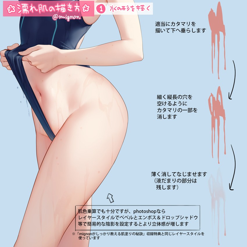
like this "how to draw wet skin" one
grave nymph
I should learn how to just, use the right words when finding references
am kinda wondering if I should remove parts of the lineart on the hair
dusky trail
for me at least, i don't usually put too much detail on the hair line, just use the shading for it
grave nymph
makes sense
almost 70% of what makes a piece of artwork good lies in coloring imo :"D
dusky trail
the shading is the thing do most of the work to create the depth anyway
if needed, i can always add line after i done color it

Honkai also do that double shading a lot
grave nymph
mmm
dusky trail
 lament stump
does the skirt look okay?
 dusky trail
seem fine
lament stump
nice
dusky trail
but maybe add some wrinkle on the waist side
 dusky trail
you can erase the top wrinkle
just the bottom is fine
or just disconnect it to the outer line
dusky trail
just be lazy
lament stump
lol
dusky trail
heck you can even cut up to her thighs

i usually do that to draw eyes onto the thighs
lament stump
hmm I'll do the line art tonight and color tomorrow and if it doesn't look good I'll just erase up to thighs cuz it's not gonna take that much to draw and color the legs
shadow nebula
lament stump
you should make the chest area not as form fitting even if the dress is tight
potent mason
seeing as you already lost your juices just from drawing a single pair of clothes in a day, yup definitely rock bottom lazy
lament stump
potent mason
seeing as you already lost your juices just from drawing a single pair of clothe...
no it's not that
for you it's mabye "Just"
for me that bloody sketch took over 15h
shadow nebula
less experienced artists take longer
lament stump
shadow nebula
you should make the chest area not as form fitting even if the dress is tight
do you mean i should make boobs bigger?
dusky trail
he mean the clothe would have drop point instead of completely round
 lament stump
umm okayy
 shadow nebula
unless the dress has a built in bra shape it won't have that form
dusky trail
well it is more or less depend on what kind of style you want to do anyway
lament stump
something like this?
 dusky trail
 shadow nebula
remove the line that shows the left breast
dusky trail
you see how the shirt just drop straight down from her left breast there?
dusky trail
if you want, again the breast in anime style can be random
lament stump
shadow nebula
remove the line that shows the left breast
well now it looks weird
 grave nymph
yeah
dusky trail
you can wear 3 layers of clothe and somehow the boobs still perfectly round shape
shadow nebula
extremely rough but you can also do this
 dusky trail
amazing
grave nymph
someone just red line it :”D
shadow nebula
to show that there are breasts under clothes in a 2d environment you have to play with the folds of the clothes
lament stump
shadow nebula
extremely rough but you can also do this
ye but this is the reference

and the skirt looks almost like it's made from lether
dusky trail
you can also see the clothe on her right breast not too round there
shadow nebula
she has a bag between her breasts but the actual dress sits very loosely on her
lament stump
okay I'll try to make it look more loose
shadow nebula
this would be most similar

 lament stump
 dusky trail
never notice that Bronya's keychain on her jacket there
grave nymph
MHY releases full stigma artworks when
lament stump
alright I'll keep it this way thanks for the advice
dusky trail
still think her body could use a better hourglass shape but~ just take your time, no need to draw completely based on our advice
lament stump
her boody is a bit to the side, I can only make it slightly more hourglass like
dusky trail
 shadow nebula
body types are highly varied from person to person so draw the body you feel is most appealing to you
dusky trail
it exactly because she is on her side that you can see her rib easier
sorry for having tight waist fetish sob sob
shadow nebula
lol
 dusky trail
oh ya the X parts would curve along her body too
 sand galleon
sorry can I ask something? 
dusky trail
go nut
 sand galleon
nut? 
 dusky trail
nut
lament stump
i can't figure the bending thingy out
dusky trail

just draw a line similar to your body shape
then just draw the X slightly title to fit it
sand galleon
I know there are so many talented artists on this discord, and i was wondering if there is anyone who accepts free commissions. 
 lament stump
what does accepting free commissions mean?
dusky trail
just as it is
sand galleon
I tried 
dusky trail
you draw on his free request
lament stump
oh
any begginer would do that
only problem is they probably don't want a begginer to do that
but if you want someone who isn't that skilled to do a free commisssion you can find someone easily
sand galleon
Personally I will ask for a lot of Bronya fan art ... but there are already so many talented artists drawing her
but what I wanted to ask was to realize something that is nowhere to be found
what I ask is a hero who drawing a fan art about the magical trio:
Maho Shojo Otto, Kevin and Welt
lament stump
then learn art and realize it your self :)
dusky trail
well ya, that is the point of commission, because what you want may not be found
sand galleon
💔
dusky trail

sand galleon
it will remain unfinished
dusky trail
well when you ask for free request it is pretty much mean you can't do neither of that option anyway
lament stump
dusky trail
well when you ask for free request it is pretty much mean you can't do neither o...
true
potent mason
we cant really call it a commission coz its not paid, its just an art request
 twilit stag


 robust owl
Book of Bepis
 supple sorrel
help

I don't like how the bangs look


I dunno how to make them look acceptable
shadow nebula
move the tied hair above but behind her ear, currently they are on her forehead
 dusky trail
he mean to move the twintails behind her ears
 shadow nebula
no they are behind and above
dusky trail
it is slightly behind ya
supple sorrel
:o
 supple sorrel
but it wouldn't be wrong theoretically having them right above the ear either right
in that case, how do I draw the bangs?
cause I kind of don't want to redraw it and ponytails are difficult for me LOL
shadow nebula
no you wouldn't would just give her a migraine if she was real lol
supple sorrel
why?
shadow nebula
that much hair weighs a lot and since its closer to the front than the back less hair is holding up the weight of the pony tails
long hair problems
supple sorrel
ah ic
dusky trail
muh so hard to find a reference for that ear
 dusky trail
or just be lazy and draw her twintail over the ear
shadow nebula
this is also good
 supple sorrel
dusky trail
~~or just be lazy and draw her twintail over the ear~~
supple sorrel
dusky trail
~~or just be lazy and draw her twintail over the ear~~
I'll try lol
but I'll still have to find where the overall ear is to find the hairline 
shadow nebula
with how close her hair is to the ear it would most likely cover it from the angle you drew
supple sorrel
at some point I looked over proko's course and studied the face features a little, and the only one that I skipped was the ear cause huhu I won't need to draw a leggit ear riiight
supple sorrel
shadow nebula
with how close her hair is to the ear it would most likely cover it from the ang...
ic
thx!
woow I forgot this existed

it basically has all the answers I need
supple sorrel
I'm going to disintegrate now it's at odds with the perspective of the chair
I'll just move on ig
lament stump
this is all I could do today

 full solstice
looking good! but is it just me or is the arm a little bit off
hardy yew
looks a bit stiff to me
lament stump
Yea i think the arm is a little off as well
Above the elbow looks good in my opinion
Under elbow looks a little off
I'll make it better

 full solstice
go for it

 supple sorrel
wip... this has taught me a lot, let me know what you think too

also I dunno what to put in that stupid wikipedia article 😩
I just noticed I wrote weekepedia the 2nd time into the shame ball I go
 jaunty python
supple sorrel
wip... this has taught me a lot, let me know what you think too
jaunty python
supple sorrel
wip... this has taught me a lot, let me know what you think too
just a small thing to add, you're missing her little lock of hair on the right side of her face and her lil hairpin
otherwise, i think it's super cute so far 
hardy yew
anything i can fix? bangs shadow looks a bit off to me

 wraith vault
💯
The tips I have is making the shadow on the middle bang only on one angle, and then try making the face a bit more round
Looks really good! I love the coloring jov
proven nest
i am once again mentioning im using a laptop but does anything look weird or off? before i move on from sketch phase?

the hair in particular? cuz i usually have a hard time figuring out how to shade properly so that it doesnt look flat
*where to shade, where to highlight
im thinking of making it more visible that it's sectioned front hair back hair but not sure how to go about that
i dont know
would um, extending the line like that (blue) help the shading process? and maybe fix the flat bang by making it a pointy bang and connecting that section more upwards

to have like a "source"
idk i watched videos
full solstice
proven nest
would um, extending the line like that (blue) help the shading process? and mayb...
if thats the lineart, i'd personally suggest extending that line using shadows instead of lineart, it gives it a cleaner look
if you want to know where to shade, start by thinking of a light source first
its your preference but i'd say a light source from upper-left or right corners would work best
lament stump
hardy yew
Idk if I should finish the thigh
Imo it looks like the face (mouth nose and eyes) isn't facing the same way as chin
full solstice
tilt what? the shadow or the light source?
proven nest
oh the face i mean
i was thinking of the light source, but not sure which corner would be easier considering her head is downwards 
full solstice
oh the face, i'd say its okay as it is but if you dont want her to look like she's looking downwards, yes i'd tilt the right eye and eyebrow up
ah so the head is downwards
proven nest
does the chin look like it's downwards? idk i tried D:
full solstice
normally upper corners work best for light sources
are you going for a chibi look?
proven nest
ya
full solstice
yeah i'd say its fine
proven nest
oh okie
light source top right would be a little easier cuz the bun isnt on the same side im assuming
i hope
full solstice
it'd probably be same amount of difficulty/easiness for both corners
you can even go light source right in the upper middle
proven nest
im so nervous.. im not even confident with face not looking down.. now it's looking down!
full solstice
its always good to try things outside your comfort zone! these things help you improve, plus it doesn't matter if you're good at it or not, we're not here to judge your art, we're here to help :D
besides, trust me, that face looking downwards is better than anything i could do with downwards faces....
i hate drawing faces at angles....
proven nest
 thank you!! i'm new to drawing in general so it's a little scary showing people stuff but i'll come back with an update when i get stuck!
full solstice
haha np! i'll be looking forward to ur update 👍
 trim apex
supple sorrel
wip... this has taught me a lot, let me know what you think too
trim apex
supple sorrel
wip... this has taught me a lot, let me know what you think too
 i wuv it
grave nymph
why is it that whenever I sleep this channel gets active all of a sudden
trim apex
sand galleon
what I ask is a hero who drawing a fan art about the magical trio:
Maho Shojo Ot...
 how much would u pay for it
trim apex
grave nymph
why is it that whenever I sleep this channel gets active all of a sudden
Its prolly coz we r from sea
grave nymph
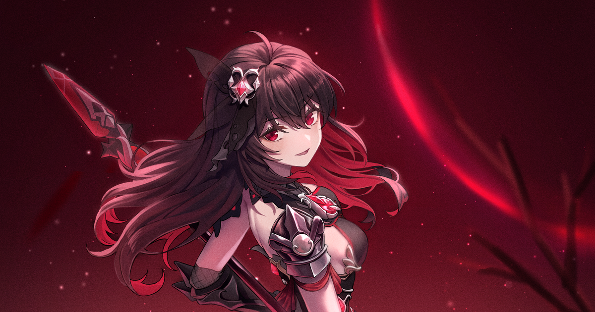
I wonder how do people do these stuff where when you zoom there’s some kind of texture in the drawing

https://www.pixiv.net/en/artworks/91666666#big_0 also the source
 grave nymph
trim apex
Its prolly coz we r from sea
grave nymph
trim apex
Its prolly coz we r from sea
D:
trim apex
grave nymph
I wonder how do people do these stuff where when you zoom there’s some kind of t...
Prolly a textured brush?
grave nymph
grave nymph
I wonder how do people do these stuff where when you zoom there’s some kind of t...
is it like a very transparent layer on top?
that has a texture thingy on the whole canvas?
trim apex
grave nymph
I wonder how do people do these stuff where when you zoom there’s some kind of t...
It looks more natural like this but i honestly do not know how to do this
trim apex
grave nymph
is it like a very transparent layer on top?
It looks like it, otherwise it would totally block the skin color so i think it has a layer on top with lowered opacity
grave nymph
it might be very handy later on
trim apex
grave nymph
I’ve been wanting to know how to do this ever since last month
Ive been agonizing abt how to do this as well for quite some time now
trim apex
Hmmm does it depend on what software we use for digi illustration?
Coz what if this person uses photoshop
I mean i dont use photoshop so prolly why
trim apex
Nice nice, csp is a good one
full solstice
so like anyone feel like helping me design a char
grave nymph
full solstice
~~so like anyone feel like helping me design a char~~
all I can say is
get your references out
that is all
full solstice
maybe would help
after all seele has shortish hair, it might be fun to practice longer hair
grave nymph
I mean
I draw Seele with short hair and “Seele” with long hair
that’s why I always say that Seele’s quite a versatile model
whole cloak
trim apex
Hmmm does it depend on what software we use for digi illustration?
Noise filter and texture layers work with pretty much any program
I use ibis and it works, I’ve also tried on procreate
Or just get a photo editing app
trim apex
whole cloak
Noise filter and texture layers work with pretty much any program
I use ibis an...
What kind of device do u use
trim apex
full solstice
maybe some pgr stuff in there too
But pgr character designs and models r very different from honkai characters well anyway goodluck
whole cloak
trim apex
What kind of device do u use
my iphone
I’ve tried on iPad before
 grim heart
ur favorite gender in a suit

this is just a doodle lol im gonna draw eins in a dress too
 tidal forge

 grizzled moth
grave nymph
I wonder how do people do these stuff where when you zoom there’s some kind of t...
grizzled moth
grave nymph
I wonder how do people do these stuff where when you zoom there’s some kind of t...
add a noise layer, set the layer to multiply, lower the opacity and done.. you can use the noise layer in filter then render .. or you can just go to csp downloaded materials, monochromatic then tectures
grizzled moth
it will darken your overall drawing but you can still use airbrush to erase some parts you want to emphasize

sand galleon
trim apex
<:MeiStare:458045366063857668> how much would u pay for it
nothing 
grave nymph
oh wow
imagine wanting to have someone draw a thingy without paying them <-<;;
that's why there's another solution
"If they don't want to draw this, then learn how to do it yourself"
potent mason
grave nymph
I wonder how do people do these stuff where when you zoom there’s some kind of t...
they just applied noise
grave nymph
Drawing is a thing that needs patience and commitment
potent mason
but i dont rly recommend using noise on a skin because skin dont work like that, its mostly used on objects but if they add it to every part of the piece it just means its a stylized art style
sand galleon
grave nymph
Drawing is a thing that needs patience and commitment <:FuHuaApprove:66087872535...
well, I notice good progress on you. I noticed that you were researching and taking color recommendations 
grave nymph
sand galleon
well, I notice good progress on you. I noticed that you were researching and tak...
yeah, I'm quite active here lul
grave nymph
potent mason
but i dont rly recommend using noise on a skin because skin dont work like that,...
 shadow nebula
noise is used to give it a more traditional look, so using it on skin is fine. Its really just preference
shadow nebula
yeah thats how you do it
if everything is covered by it besides the focal point it looks a little weird tbh
potent mason
i mainly use them when i draw sand
grave nymph
I guess everyone here have different preferences huh
shadow nebula
yeah
grave nymph
I wonder if I should just, do the backgrounds and call this done
 dusky trail
well noise and sandy texture can make the draw look more rough so it is quite fun to use
i would be lazy and call it is done
and if i'm not so lazy, i would draw some snow, add in white breath, maybe some dark on the background
to make it like she just arrive for her date
dusky trail
for me at least, i usually switch the pen's edge shape for more softer line, reduce the density too
and just draw a circle around few time
then use erase with low density to grind that breath somemore till i feel like it is good
supple sorrel
grave nymph
I wonder if I should just, do the backgrounds and call this done
if you practice through some anatomical basics then you have a lovely way of coloring and shading

 supple sorrel
mk I just realized that message doesnt make any sense but bottom line I like how you color
grave nymph
airbrush huh
grave nymph
supple sorrel
mk I just realized that message doesnt make any sense but bottom line I like how...
thanks /;w;/
Still have a lot to learn though
dusky trail
 supple sorrel
dusky trail
supple sorrel
dusky trail
NOW PULL HARDER
grave nymph
use motion blur?
grave nymph
supple sorrel
NOW PULL HARDER
oh no
dusky trail
roll it all around then stub it in her mouth
 potent mason
make a sailor's knot so that it'll take a day for it to be untied
grave nymph
potent mason
punishment for being a generic anime mc troupe
grave nymph
I wonder if this is a good draft for a simple background
 shadow nebula
yeah that looks good, when shading remember the lighting you gave seele and then make it more dull/misty to give the image depth or have it be blurred
 safe falcon
 grave nymph
oooo
dusky trail
i just wonder how deep that sword gonna be in the ground for her to able to knee that way
 safe falcon
Well it’s a pretty long sword, I’d say it’s probably as long as a sword Himeko uses and the swords she uses are as big as her and himeko is tad taller then kiana
safe falcon
dusky trail
i just wonder how deep that sword gonna be in the ground for her to able to knee...
Alight moved the leg so she isn’t leaning in the sword as much
 dusky trail
you can always make her touching the blade itself
trim apex
whole cloak
my iphone
I’ve tried on iPad before
i see u must be an rk
dusky trail
 trim apex
grizzled moth
add a noise layer, set the layer to multiply, lower the opacity and done.. you c...
trim apex
grizzled moth
add a noise layer, set the layer to multiply, lower the opacity and done.. you c...
Thats so helpful
dusky trail
safe falcon
Alight moved the leg so she isn’t leaning in the sword as much
but what i would do with long blade like that is to raise the hand higher
trim apex
sand galleon
nothing <:therystare:701564898773303516>
 sad, i wouldve done it honestly
trim apex
supple sorrel
NOW PULL HARDER
shell see himeko in a few seconds more
sand galleon
trim apex
<:MeiStare:458045366063857668> <:TeriDerpMelon:785700899791568916> sad, i would...
so maybe my plan is working 
trim apex
sand galleon
so maybe my plan is working <:worrymischief:714923306456973410>
what plan
sand galleon
trim apex
<:MeiStare:458045366063857668> what plan
if one day you pass the idea of doing that
drawing on your own, it will be the success of my plan

and finally I could have the perfect meme to send to a friend of mine
trim apex
sand galleon
if one day you pass the idea of doing that
drawing on your own, it will be th...
safe falcon
dusky trail
but what i would do with long blade like that is to raise the hand higher
I’m going for a hugging the sword look
dusky trail
then you can always let the sword stab in the ground deep
safe falcon
But I’ll make another layer and try that
 safe falcon
I’ll try that but I’d have to redo the legs so its more of a squat then A kneel, I’ll dup the file then try that
shadow nebula
were you trying to mimic this figure?
 dusky trail
another option would just be let the sword lean on her instead of her leaning on the sword
dusky trail
actually is Kiana's sword even that long?
shadow nebula
if you want to keep to this pose raise the sword a lot higher and make kiana lean on the sword more
 grave nymph
the sword's not that deep into the ground
shadow nebula
her sword is i think a little shorter than her it looks like or the same size
grave nymph
where she's pointing the sword to the puppet
dusky trail
 grave nymph
that's surtr
safe falcon
The tip is broken on that
dusky trail
but we all know whenever MC do this kind of pose, the sword usually grow twice longer
 shadow nebula
 safe falcon
See himeko is a bit taller then kiana but the sword is bigger then her
 shadow nebula
her standing and putting the tip in the ground makes it roughly her height in her victory pose
 dusky trail
Himeko is stabbing the ground there though
 shadow nebula
its a little bigger than kiana
dusky trail
not that long, about 2 arms length
dusky trail
well there are various way to draw that kind of pose so just test thing out
dusky trail
now i sudden want to draw Kiana like Megaman ZX
grave nymph
lol what
dusky trail
like what if she combine with other Herrscher form and change color~
safe falcon
sword is actually a lot bigger then I thought
 dusky trail
you monster, how could you chop off her arm
potent mason
shes a fictional char so she wont feel pain
safe falcon
shadow nebula
were you trying to mimic this figure?
I actually have that IO figure
dusky trail
and well, it is a great sword after all
shadow nebula
safe falcon
I actually have that IO figure
i wanted that figure but missed out
safe falcon
I was gonna call it a claymore sword but it’s more of a buster blade
safe falcon
shadow nebula
i wanted that figure but missed out
I usually get my things from Solaris Japan, right now I think they have a few pre owned once but you’d be paying a bit $350 - $400
shadow nebula
i order off of ami ami, its a litlle cheaper than solaris
safe falcon
shadow nebula
i order off of ami ami, its a litlle cheaper than solaris
I wanna get the Mia figure but it’s expensive and I think it’s exclusive to the mage preorder
Game*
shadow nebula
https://goodsmileshop.com/en/CATEGORY-ROOT/Scale-Figure/Mia-Karnstein/p/GSC_WD_02034 you missed out on the preorder window
From the popular action RPG CODE VEIN comes a scale figure of the protagonist's ally Mia Karnstein based on an original visual specially created by the game's staff! The figure features Mia in a dynamic pose atop the snowy ground with her gun-sword, twisting Stinger Blood Veil and flowing long coat all recreated in stunning detail. Every detail ...
dusky trail
meanwhile i just stocking up with bunny girls figurine....
can't help it, those pantyhose and fishnet just so satisfied to look at
safe falcon
I meant this Mia figure
 dusky trail
if we don't have that hold mess with Briliant light then who know, we may have skin for them in the game someday =3=
safe falcon
Imma try getting HoF as close to my Male Saber alter and HoV
shadow nebula
I've always wanted one of sideshows dark souls and bloodborne statues but they are very expensive
safe falcon
shadow nebula
I've always wanted one of sideshows dark souls and bloodborne statues but they a...
I think you can see who my Female OC was inspired by
 shadow nebula
I know that i know the character but my brain is fried lol
plain bane
How does this bg look? not really a bg artist but I tried my hand anyway. Stuf that isn't fully shaded is just because it's behind the char. I got lazy
 shadow nebula
its looking good, I would remove half of the stars tho especially closer to the horizon
 shadow nebula
yeah
shadow nebula
i do that too, have layers for the most useless things
dusky trail
though with how the lightning on your Seele's look, the sun would have to be higher for that to work
shadow nebula
danielle wasn't the one drawing seele
plain bane
Maybe it's because I changed my picture

This is what I'm drawing
Still fixing up her head
shadow nebula
its looking good
dusky trail
=3=
then i would say move the sunset behind her
like she trying to selfy with sunset in the background too
dusky trail
just keep in mind where the back light gonna effect it
since putting sunset in the back would leave you a lot of shading in the front
have fun~
dusky trail
just be lazy like me and change the background into her room
plain bane
I won't back down wether it be the death of me or not
I worked too hard on that bg to scrap it
At least I have other stuff to fox before I shade
Her hands look wrong to me now I coloured the char in
dusky trail
well since you show the phone there, it certainly won't be a selfy anyway
 dusky trail
still not decided on the outfit's color yet?
dusky trail
meanwhile i never remember they birthday to actually draw it on time...
safe falcon
That’s why I have 9 uncompleted art works
I only know bronyas birthday and that’s because it’s 8 days before mine
safe falcon
shadow nebula
I know that i know the character but my brain is fried lol
It’s IO
 dusky trail
plain bane
How does the hand look?
dusky trail
plain bane
How does the hand look?
i would say the tip of her fingers are a bit bloated
just try sketch your finger out like that and compare to her


 grizzled moth
its better to use illustrations as reference rather than shots from anime
dusky trail
nah, it is more like a habit of mine when i watch anime
can't help but taking screencap even though i may never use them
plain bane
Better some than none


 dusky trail
ya
dusky trail
as for the palm detail, well it is optional
i usually just depend on shading instead of put detail on it
but try out how you want to do it and see if it work for you
grave nymph
dusky trail
oooo gochiusa pics