#avatar-ideas
1 messages · Page 390 of 1
 timber mural

 gloomy rock
Aqua is useless here😂😂
 rustic dew
Thanks for providing the base @rancid shore 
gloomy rock
I propose theme frost go if u think u can beat me 😋

 fierce heron
What else should I add? 👉👈
fierce heron
Ahh! It looks amazing
 gentle lily
Tyy 
 quick harbor
How is these?😁
quick harbor
Loved it UwU
fierce heron
Thank you ^^
quick harbor
What can I add?
gentle lily
I love it! I think the horns are kinda too big 😅 but if it should to be, then it's perfect!! 
gentle lily
better! 👍
fierce heron
Any ideas for a back, front accessory or mouth..?
 uneven jacinth
Just make the mouty however u want idk
 dull iron
@fierce heron le le horns can have hair over it soon it looks more natural and not just there
uneven jacinth
Mouth**
fierce heron
Oh thank you! And yeah, I’m shading it all last
dull iron
@quick harbor nice! I think u should move the basketball hoop closer to him :) maybe add sparkles to the trophy as well?
Oh thank you! And yeah, I’m shading it all last
@fierce heron ah okay, gl :)
@quick harbor nice! I think u should move the basketball hoop closer to him :) maybe add sparkles to the trophy as well?
As for the bottom one, the shirt is considered outlines, also add a shine to the ball like u did for the basketball dude. The mask is a big plain, maybe add some decals? Again sparkles to trophy :0 and some haor shadings should do thr trick
It looks nice tho :)
quick harbor
UwU thx
gentle lily
@quick harbor I like the idea! Just, for the blond hair it kinda annoys me the the color. Here are some references for the color! ^^
quick harbor
I tried sparkles andddddd it didnt go well
dull iron
Oh rip
dull iron
@quick harbor try making it poofy, bc try its rly tight in
quick harbor
Ok I will try
dull iron

 fiery shale
WIP. I decided to make an outfit a bit different than wwo's original style because I believe artists should have more creativity with the outfits they make!
dull iron
@fiery shale its nice, but the eyesbrows look to think and then to thick, try making a smooth transition
Same with the mouth, it looks good tho
Eyes might also be a bit too big, but that could be just me
fiery shale
It's my style.
fiery shale
I really want different aspects to it other than the casual style. The last battle pass has a bit different style too?
Wwo is really limited in my opinion.
It most likely won't get on the app as a real outfit, but I'm working hard to get it right!
dull iron
Yah, but we have a lot of creativity imo, its just a few things here and there, if u see, wwo style has changed a ton throughout le years
fiery shale
Yeah, I just want to just be a bit more unique than the other outfit artists.
dull iron
The eyes are very beautiful, and u can make eyebrows like that, just make the line a bot smoother

fiery shale
I use mobile apps to draw and its my first outfit. Hehe.
dull iron
I get what u mean
dull iron
Ight, good luck!
dull iron
@fiery shale hmm, maybe let the hair behind the eqrs have shading because it looks like a big blob behinf
fierce heron
Love the hair shape!
fierce heron
Any ideas for a front/back accessory? 👉👈
 oblique rain
depends on the theme for the ram (?)
it can be a wand or what wizards hold for the fg
oblique rain
yuh np 😄
oblique rain
til now i still dk what suits him
♡keeping the balloons cus im gonna put a race flag style to it♡
quick harbor
Love that red eyes
 open river
Mouth?
oblique rain
hmm i dont wanna sound intentionally mean but the mouth doesnt suit the eyes.. and the eyes are also unbalanced cos of the eye liners
@open river you can do the mouth like kaitos grin  👀
👀
and also eyes look really diff from each other cos of how the liners look
open river
I'll draw his mouth different But his eyes are normally straight I pulled from the side I'll try to draw that you threw
Thank youuu
oblique rain
yeah np, if u use ibis u can use the symmetry ruler (for eyesL
 celest owl
I have a sketch but I don't have permission to send photos
oblique rain
u need to be lvl 1 in order to send attachments
oblique rain
hmm 1 eye looms high from the other
celest owl
There I leave them for you to put hair on or whatever you want
open river
Eyes like that
oblique rain
nah keep it,
woah
they look somehow lind of good @open river
yep exactly like that
dull iron
@celest owl for ur avata i reccomend using the mirror tool to draw things evenly on both sides
@open river its outlines, so make the highlight bigger
oblique rain
idk what glasses/hat fits the black/dbrown/red hair
im kind of inspired by this hat and vinny hong
quick harbor
could someone make like anime shaped face
oblique rain
nah, template.
u can draw like an anime eyes mouth hair
but cant change face shape
quick harbor
hmm good idea
oblique rain
yuh yuh
oblique rain
sorry if i traced some examples.. idk why i cant draw basic stuff  i only follow it as base and thats all
like bag window
 long arch
@open river, here is my quick draw for a mouth. I think the way you outline the teeth make it a little bit too scary. If you want to make it more detail, you can try some blank small blank gaps like what I did on the right side (I draw it ways too big but I think you got the point). I don't know if it would be visible ingame though cause it's kinda small (they're not that necessary for me too). Oh, and don't forget to erase it at the middle to avoid outline. You can also try different mouth shape too.
I think we are going way to much in a single mouth lol But I hope it help.
oblique rain
ty for doing the grin
 pure rivet
i'd make it floofier
dull iron
@twin scaffold hmm I'd make ot floofier as well. And instead of having thete be the white lines on the blue side, id put shading instead
oblique rain
fluffier
not just straight straight
like curvy
||i finished sketching and adding adjustments to my design btw '_'||
quick harbor
👀
 twin scaffold
fluffier
@oblique rain n how can i do that?
twin scaffold
ill try
oblique rain
look at cotton candy 👀
twin scaffold
hahahah
pure rivet
fluffy doesn't mean it has to be curly, just more layer (volume) to the hair so it wont look too off and wont like 'a week without shower' sth ||sowwi not trying to be rude ||
oblique rain
i cant explain it.. but cotton candy does it (?)
oblique rain
yuh above hair
i recommend the mid length
cos there are strands in the end and ears exposed
 pine junco

 acoustic perch
Fb on the hair? I know there's plenty of things wrong with it, but I can't put my finger on it.. 😅
oblique rain
woah i likw it but yeah shadings
im done doing sketch with my design
||ill add like 200 songs before coloring hair B)||
oblique rain
add the shading (hairline) a bit lighter
acoustic perch
Okay, thankyou! 
 dull zenith
hi
 thin terrace
Yes it is good. And the outline is bit shaken. Sharp edges will make the hair more attractive. I m worried that the right bun is larger than the left one. Buns of equal size would be good or idk whether it is your intention. I like the shirt @acoustic perch
 sour apex
congrat
thin terrace
And the color line of the shirt is also shaken@acoustic perch
Good work @lost plank
 lost plank
Thx ^^
fierce heron
Heyy.. what kinda of staff / wand would like nice with this? 👉👈
 mortal geyser
Not sure buf the mouth seems to be placed a little too low
sour apex
and the horns look flat
fierce heron
Oh alright-
 sonic kite
@fierce heron i think maybe one with a ball on top or crystal
fierce heron
Ohh! Thank you.
oblique rain
@fierce heron the end of the horns can look a bit sharp or sharp itself
lost plank
Hi @dull zenith how can i help you
oblique rain
@acoustic perch hmm ill show a pic of what looks odd with lines
and congrats @lost plank
lost plank
Thx so much ^-^
fierce heron
Ahh I see,
oblique rain
so the light gray indicates the shading right? shades can be bigger when its emphasizing sonething. and. there are 3 choices, make the odd lines (not shadings) straight or make the line curvy (not shading) or make the shading and line same size
(sorry if i try to talk professionally)
lost plank
Rumbleday you should to stop it's not allowed
oblique rain
if you wanna break the rules knowing that isnt allowed. you can or will get jailed for that
in worst case scenario, a ban.
if you are jailed and try to escape the jail cells by rejoining can get you a ban too.
(im talking professionally today cos i counted the songs that i will add to my note playlist then to spotify)
fierce heron
So.. is this alright so far? Fixing the shading on the staff / wand soon.
fierce heron
Oh..
fierce heron
Alrighty, I’ll go do that now
oblique rain
aight gl
fierce heron
Thank you.. lemme know if you want me to stop working on it, since you had the same idea-
oblique rain
no
i wont design it
thats whats my idea for ur fg design 😄
@fierce heron just continue, i wont design like that
fierce heron
Ah okay! Thank you ^^
I’ll fix the horns after I do the gravestone before I lose the idea.
oblique rain
yeah gl
fierce heron
@lost plank By the way, love the outfit which is in vote! ^^
lost plank
Thx so much ^-^
fierce heron
No problem! Hope it gets added to the game
lost plank
I hope too 🎉 ❤️
open river
@long arch thank youuu I will try to draw
fierce heron
This a good idea for the gravestone (scroll up a bit to see the avatar) I’m adding the shading soon.
*?
oblique rain
it looks good, how bout try to emphasize the head and feet
fierce heron
Yeah I was going to try to do that with the shading,, since they look a bit plain
fierce heron
Oh okay.
oblique rain
but not the shadings just a simpl line
it looks like its smiling but put a line there to not make the head blend with the right feet
fierce heron
Yep! That’s what I was thinking ^^ and thank you
oblique rain
woah u's my intellectual buddy now lmao
long arch
@open river np :3 Oh, and I think you should fix the lip too, it's currently outline though
 tawny cosmos
Details 
fierce heron
This look any better? :>
tawny cosmos
yes details
mortal geyser
Cuteee
fierce heron
Thanks! Do you think the gravestone is finished now?
quick harbor
So uhmmm is it better UwU
fierce heron
Anything else I can fix/do..?
sour apex
so cute :3
 sharp cradle
You could put some hair on top of the horn to make it look like it's actually coming out of the head.
Btw, I love it
fierce heron
The hair and horns are separate items, it’d be weird having a random bit of hair on the horns,,
fierce heron
I can perhaps try to make it look a bit better though, and thank you!
I need to think of a name for the avatar,, :’)
acoustic perch
Something with wizard or sorcerer?
lost plank
This look any better? :>
@fierce heron oh it's so cuteeee
 real oxide
He looks like a dreamwatcher
fierce heron
@lost plank Thank you!
real oxide
Like a wizard guarding your dreams to protect you from nightmares
fierce heron
Oh wow, that’s a perfect name,
real oxide
But in a cute way
lost plank
Do you think it’s done..? Or-
@fierce heron looks done
sharp cradle
I need to think of a name for the avatar,, :’)
@fierce heron the first thing I thought was a Mystical Bull 🐃✨. 😂
fierce heron
Oh haha! I love the name idea
acoustic perch
So a dreamcatcher - wizard something?
lost plank
Maybe magical horns
fierce heron
Hmm,,
acoustic perch
Or a dream sorcerer, maybe?
sour apex
no female? :v
real oxide
For me it honestly looks pretty nonbinary, dunno why
fierce heron
that’s what I was going for,, a sort of avatar anyone can use
acoustic perch
@oblique rain Thanks for the fb by the way!!
fierce heron
I’m going to start saving each accessory individually, thanks for the feedback guys!
oblique rain
Ram Sorcerer can be the name and np
@quick harbor
for the first one: Instead of putting HOME END GUEST you can put H E N D G
for the second how anout shade the female hair and mask, i dont think mask suits the girl i recommend lips
and i recommend making scoreboard big. its typhical that scoreboard is big and ring is far away
fierce heron
How’s this?
 thin zenith
It just kinda look like the horn isn't connected to the head
oblique rain
@quick harbor
nah it looks fine tbh it looks like its growing from the head edit: but they do however look slant
 rancid shore
I guess you use inkscape 👀
mortal geyser
@fierce heron I think the hairline is a bit too high
fierce heron
Oh alright.
mortal geyser
And in your final image I suggest you put a semi-transparent outline on the whole design so it doesn't blend with the background image
fierce heron
Ah okay!
rancid shore
So you mean translucent?
fierce heron
Is this any better? I can lower it more..
mortal geyser
@rancid shore they're synonyms so yeah
rancid shore
Transparant = see through.
Translucent = kinda see through but can’t define what’s after that.
mortal geyser
Semi-transparent
Semi-transparent is a synonym for translucent xd
@fierce heron perhaps lower it a bit more
 nova elk
Look cute
fierce heron
@mortal geyser You mean something like this..? Orr..
thin zenith
Like that
fierce heron
Guys, just for later, who is it you have to send designs to for them to submit it to voting? I saw someone say their discord name but I can’t find them :’)
fierce heron
Oh okay! Thank you. Do you think it’s done?
mortal geyser
Seems to be so
acoustic perch
Sorry for spam 😅 Anything else I should change abt the hair?
fierce heron
I personally love it! That’d be a great avatar to add to the game.
Maybe wait for more feedback first, since I’m bad at giving it. ^^
fierce heron
I sent it 👉👈..
thin zenith
The hair isn't neat, if you zoom it it's not smooth edge, you can see Wiggly lines. Try to clean it up.
Make the arms sleeve darker
Idk if it's just me or the hair is just so bright and can't see the other highlights.
acoustic perch
The concept is a ghost, so I first wanted to make her hair white but thought "ehh.. Maybe not" 😅
But thanks for the fb!!!
fierce heron
I thought so! I love the idea of it a lot.
acoustic perch
Thanks!
oblique rain
@acoustic perch if u zoom in the pixels it looks definitely odd
and instead off purposely putting it off that way it looks a bit bugged
and the ghost necklace looks too small to be seen when it appears in game
acoustic perch
Okay, thankyou!
oblique rain
@acoustic perch
i dont wanna sound rude when i explain so here,
i misplaced the lines
pls make the buns look smooth or floof but diff volumes, making the buns odd and off will look like rocky road nom nom
dor the hair i noticed some odd unbalanced pixels and the hood thing the clothing also has hard pixels. since the girl is usually feminine shading has to have a bit of a curvy line and not just straight. the corner part of the shirt looks like it has been zig zag so there smoothen them out as well..
and in the empasize the dark torn part ya gotta make it torn real time. it looks like a hickey tbh told u i sound a bit rude .-. so the circles on the hair indicate unbalanced big pixels that looked bugged andnoff and makes it look zig zag depending on style, yeah its in purpose but you need to sort it out and zoom in
acoustic perch
Okay, I'll work on that, thankyou!
oblique rain
anytime
quick harbor
and i recommend making scoreboard big. its typhical that scoreboard is big and ring is far away
@oblique rain I can not kale it bigger
 hushed sail
@rancid shore have white?
sour apex
@acoustic perch I tried to retouch it but I couldn't -.- I tried smoother strokes and some shade
acoustic perch
😮 😮 😮
tawny cosmos
@rancid shore what do you think?
quick harbor
i think theyre going for a galaxy theme
fierce heron
Maybe add a shine to the pupil? Not sure.. I’m bad at feedback 👉👈
mortal geyser
That's a lot of subtle colour transition
 proper phoenix
Slt les gars
tawny cosmos
@tawny cosmos noice but looks a bit high.
@rancid shore you miss the hair ! 😉
rancid shore
Lemme see in dm 👀
tawny cosmos
Or say scary
@raven notch i dont see that
 acoustic perch
Thankyou so much for the fb and tips!
 polar turtle
nvm
 wanton heath
Think I'm pretty much finished, am I good to hand it in for bp 15? Some last feedback would be great :D Went for "Space royalty", not sure about the name though I just started drawing and went with what I came up with xD it's really hard to tell yourself what it looks like after spending hours looking at it oof do think the space theme is integrated though
polar turtle
Think I'm pretty much finished, am I good to hand it in for bp 15? Some last feedback would be great :D Went for "Space royalty", not sure about the name though I just started drawing and went with what I came up with xD it's really hard to tell yourself what it looks like after spending hours looking at it oof do think the space theme is integrated though
@wanton heath thats great! hand it in already
i'd love to see that outfit next season
wanton heath
Just realised the rosy planet for the boy should go in front of his face if it's part of the foreground right? XD
polar turtle
uh idk the placement of avatar items that well
wanton heath
Mhh gotta look at some pinned messages again xD
 wispy blade
I should get a certificate for stupidity
My pen for my tablet suddenly stoppen working and i was totally confused cuz its supposed to last long
and it had no baterry and no charging thingy
After 1 hour of research it turns out the little mini hole at the end is actually for charging and i put the charger in a drawer next to me.... i had it for like 1 year 😒🤡
 oak elk
Rip
sour apex
Something is shaking, try to make it smoother
Some of the lines on the shirt look very random, the planet has too many lines
because if it does appear in the game, it will be difficult to see
mortal geyser
@acoustic perch try to make the little strands sticking out thicker
sour apex
@mortal geyser hiiiiiiiii 😋
pure rivet
👀
mortal geyser
Heyooooo @sour apex 
sour apex
@pure rivet hi 😏💅🏻
sour apex
one morning without wifi
 blissful marlin
Eh
dull iron
Riiiiiiiiiip
quick harbor
is this okay?
dull iron
@quick harbor nice idea but, oh wait u deleted it? i cant help if i cant see it
dull iron
Ah ok
mortal geyser
@quick harbor it's very sketch-like and not so polished, the template was tampered with and there are a couple of outlines that could be removed
dull iron
@quick harbor its nice, but the hair lines looks messy, try makinh nice clean cuts in the hair. The hait ties also have skecthy type lines, to help u can use a thicker brush. Then eyee are nice bit they are too small and outlined :c the hair pins need to be clean. Mouth is outlined, and the shirt is good, ya just need cleaner lines n cuts
quick harbor
oh ok
quick harbor
ye ye
dull iron
mortal geyser
@quick harbor May I ask what software are you using?
dull iron
Solly to the rescue 🦸♀️
mortal geyser
Oh and I just noticed the eyebrows are missing
Why do I always overlook the eyebrows
pure rivet

tawny cosmos
@pure rivet
pure rivet
shush
tawny cosmos
You ignored our collab
pure rivet
yo wait did we have a collab
tawny cosmos
i forgot too
pure rivet
let's make it epic
tawny cosmos
 but after next week cuz i have exams
pure rivet
me too kid
tawny cosmos
you have school i dont
quick harbor
@quick harbor May I ask what software are you using?
@mortal geyser ibis paint x
pure rivet
hm, i highly recommend watching ibis tutorial of how to use some main tools
like layers, looks like you draw all of them on one layer so when you erase it looks messy and take time to redraw
mortal geyser
But then why was the template changed?
pure rivet
hm, do u know how to redo/erase then? u shouldnt draw on the template like draw more part/thinner or thicker it/change the chin shadow or nose shape etc
oh yeah wondering the same question
mortal geyser
I also suggest you use the mirror tool, it helps out so much @quick harbor
thin zenith
quick harbor
yes i do know how to do redo and erase and thanl you for suggesting to use mirror tool
 pure rivet
hhaha i used to use lots of canvas instead of folders
and my gallery is being laggy
so hard
quick harbor
im very bad at drawing good eyebrows even though its just a line 😔
acoustic perch
Any fb? (Fg, bg and face are just sketches)
wanton heath
Ouhh i really like the ghosts they're cute @acoustic perch
acoustic perch
Thankyou!!
wanton heath
The tiny hairs won't show up ig though so maybe make them thicker or take them out completely :)
quick harbor
Sorry
wanton heath
Simply stating something is ugly isn't really constructive feedback is it now? Everyone started at zero and had to practice to get better, saying something is ugly may be your opinion but it will not be helpful for improvement
 ancient cargo
@quick harbor thanks for not insulting others
dull iron

timber mural


 fierce heron
White vented 😳😳
dull iron
Lol
 fossil tangle
Lol
 split iris
:/
dull iron
@dull iron check DM
@fossil tangle oki, gimme a sec
fossil tangle
You saw my avatar XD
dull iron
Yup xD
@fossil tangle whats ur theme? Also try to draw the eyes urself instaed of just coloring in game eyes
mortal geyser
The eyes look a bit blurry although I think it's just dark colour over a slightly lighter colour
dull iron
don't understand why the space guns are facing inside
@timber muralbecause they must
mortal geyser

I mean, they look like they're ready to shoot but they're almost facing each other so I also find it kinda 'weird'
gentle lily
@mortal geyser do you like the improvement...? 👉 👈
wait, is there any improvement actually? :<
mortal geyser
I love it!
I remember your first design ||(I think it was your first)|| that you submitted for bp 13 and from that you made such a beautiful upgrade
gentle lily
||yeah it is 😊|| ty! 
dull iron
This is so wholesome
gentle lily
wow im designing for 3 months i think? wow big improvement for just a little time 😅
You deserve a pat for your hard work
aww ty c:
hug

heya __b and ishi
timber mural
i was thinking about getting back into designing but for some reason i got bad at it lmao
fierce heron
Have I improved at all? 👉👈
timber mural
heya tar
mortal geyser
Gawd, everyone has been working so hard and it's amazing to see all the improvement!!
So everyone deserves a pat of encouragement~
Keep up the amazing work all of you
timber mural
@fierce heron on which one do you want feedback
dull iron
Have I improved at all? 👉👈
@fierce heron indeed :0
gentle lily
you did ishi!
dull iron
fierce heron
I was thinking of remaking the older one (black and white)... but I wouldn’t know what to add ^^
Thank you ^^
timber mural
cuz both look nice and im not sure about which one are you talking
mortal geyser
i was thinking about getting back into designing but for some reason i got bad at it lmao
I mean, we wouldn't mind seeing you design again
 fierce heron
I’d love to see a design from you too,,
dull iron
timber mural
anyways i need a space-related blue and orange bg
gentle lily
i'll remake my oldest design - BP 13 - with my best and only collab parther! 😄
and other designs who are old too
we're currently remaking my remaked design that got remaked because it was bad
dull iron
It wasnt bad
gentle lily
well, kinda it was
mortal geyser
I really want to remake my to "tavern keepers" design but I started quite a few projects so that'll have to wait uWu
dull iron

gentle lily
mortal geyser
Ngl that face is kinda creepy 
gentle lily
why?
mortal geyser

gentle lily
okay i wont troll you
dull iron
gentle lily
not this time
dull iron
lol
timber mural

fierce heron

 sturdy jewel
👀
tawny cosmos
gl kid dont fall
@pure rivet
 steel wyvern
fierce heron
steel wyvern
fierce heron
Wait, is there already a skin based on the corrupt icon? 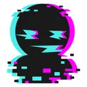
dull iron
I think so, but u can make ur own variation
fierce heron
Oo, I might make one.. I already have an idea in mind.
quick harbor
made my first idea ever
fierce heron
Random idea sketch 👉👈
quick harbor
If u think
dull iron
@quick harbor cool! Just go ahead and make the lines cleaner, and add some sparkles maybe?
quick harbor
dull iron
@quick harbor pretty! The freakles are too small tho, u won't be able to see it in game
The skateboards could also use shading
And the bottom lip is too big
quick harbor
@dull iron Thank you very much for the advice!
dull iron
Np!
quick harbor
mortal geyser
The freckles are too small, they won't be seen much in game
oblique rain
@acoustic perch sorry for the late fb my head kinda hurts..
you dont need to change anything just add a little shade on the strap thing and in working for the ghosts eyes how about using eclipse shade for 3 of the ghosts eyes the one ghosts is enough
extend the small highlight on the hair part just a bit because that shading doesnt define much also, smoothen the purple lines on the skateboard because they look like hardpixels @quick harbor
and taryara really did improve i see it with my two squeemy(or idk small) eyes
 strange dagger
Hi
oblique rain
heyo
oblique rain
ill show u
strange dagger
Como puedo enviar un avatar?. // How can I send an avatar?
 quiet marlin
strange dagger
quiet marlin
strange dagger
Thanks
oblique rain
oblique rain
@acoustic perch this is what i mean by eclipse.. use this shape for 3 of the ghosts eyes
strange dagger
Ibis Paint X*
acoustic perch
Ohhhhh, thanks! 😅
oblique rain
its ok np
you can use the term ibis for shortcut
im giving feedback atm cos im adding playlists
strange dagger
you can use the term ibis for shortcut
@oblique rain Oh
oblique rain
no, theres always time to improve
i started designing and it had a lot of mistakes
i accidentally merged layers, had unbalanced pixels, and cut hair
yeah there will always be time for improvement
strange dagger
It is that I did something without form, besides not making sense
strange dagger
per item should have a layer
@oblique rain Lo se uwu
oblique rain
dont mind my cringy group chat. i chat sometimes there for trolling
strange dagger
I know**> @oblique rain Lo se uwu
@strange dagger I know*
oblique rain
attachments = pictures
strange dagger
Please tell me how to improve, it is something nonsense. besides having no shape
HAHAHA
:'(
dull iron
@strange dagger epic! However, thr hair ist outlined, its very good tho!
The eyes need be smaller
And i can see gradients which arent allowed
mortal geyser
@strange dagger please read the guidelines in the pinned messages
strange dagger
Uh sorry
oblique rain
i like your idea but use trace the sunday part of the shirt into white. and no gradients and remove outlines
also no blur
keep you idea but read guidelines first
strange dagger
I fix it!
oblique rain
ok, i can give u proper fb once you adjust to the guidelines located in the pinned messages
||still hesitating to finish and to submit the design ||
strange dagger
Okay, and I'm sorry if I'm slow to answer since I barely know English and some words I can't write
oblique rain
ok sure.. take your time, ill go add more songs to my playlist now. Have fun!
strange dagger
How should the hair be ?. And the eyes, I can leave them like this (But change the size) or change the gradient
Can I change all the hair and eyes, but leave the clothes similar?
oblique rain
remove the gradient and outlines
remove the black thing after tracing sunday into white
 trail oriole
hullo, finished the girl version of my ice queen skin  could i get some feedback?
 true relic
I think the hairline is a bit high, but other than that it looks good
btw, i think she's missing back hair -.-''
true relic
Yes but you can do the artifical back hair by doing this
-Ah actually I'll type it
Instead of doing the "back" hair as a back layer, you can color the back hair on the front layer inside the shoulder area
So the blank blue part near her neck, you can color it on the same hair layer with the darker hair color to create "back" hair
trail oriole
i could do that, but wouldn't it make the hair incompatible with any other types of shirts with like a high neck? sorry if im not understanding something 😓
trail oriole
okk, thank u for feedback anyways! 
true relic
np np
oblique rain
@trail oriole hmm it looks good but where will the elf ears be located
like hat, hair
i kind of feel done with eyes
trail oriole
@trail oriole hmm it looks good but where will the elf ears be located
@oblique rain they will be hair! i took inspiration from an object in game which has elf ears, and they make it so that there are 2 hairs, one with ears and one without (for different skin tones)!
oblique rain
ohhhh that explains why.. you are doing a great job :D
trail oriole
tysm!
oblique rain
tbh you really are doing a great job
thats how elf ears usually look
gl if youre done with it :D
dull iron
more wholesome chat
trail oriole

trail oriole
thank u again 
oblique rain
anytime
split iris
btw, i think she's missing back hair -.-''
@true relic If you have hair in the front, you can’t have hair in the back/touching the neck. I believe..
true relic
@true relic If you have hair in the front, you can’t have hair in the back/touching the neck. I believe..
@split iris Ye unless you have really big hair. It was just a suggestion so I'm not sweating about it -.-
split iris
Ok -.-
split iris
Lol -.-
oblique rain
@trail oriole ok this is what bugs me about the elf ears
DISCLAIMER: You are doing a great job, the color of the elf ears is just whats bugging me
The two pics displayed are the dark skintones, im tired to do 3.
The 3rd pic is the recommended color to avoid backlash
im sorry i always give late feedback, im very very bad at explaining
oblique rain
ohhhh
you might get backlash because the elf ears only suits like 1 color
3rd pic can be reccommended color or white
trail oriole
Here lemme take screenshot of the skin ig that I referenced
oblique rain
oh ok sure
trail oriole
🤣
oblique rain
wait ill see the color
aight when i look at it youre all good @trail oriole sorry cos i rarely ever see that in game lmao
im shookt 
 yes i like that idea no elf ears and with ears
trail oriole
Haha it's all good, I totally understood where u were coming from 🤣 🤣
oblique rain
yup omg idk there was like that in game
but youre all good tbh since youre making 2 hairs
trail oriole

oblique rain
yeah u r doing a good job
trail oriole
Thank u 
oblique rain
im not bugged anymore cos of seeing that hair in game
and youre making 2 hairs so everythings good -w- keep designing

 blissful grotto
Should I change the shirt color? It seems doesn’t fit
hushed sail
Is allow change ears shape?
sour apex
hullo, finished the girl version of my ice queen skin :lazesweat: could i get some feedback?
@trail oriole woahh

 lucid fossil
Hi there guys-
timber mural
heya
lucid fossil
Can i have template ||like everytime||?
timber mural
||check pinned messages||
lucid fossil
||i hope it wont like last time||
sour apex
|| Why do u want to hide ur messages? ||
oblique rain
fb: its perfect but i suggest to make the milk part go a bit slant since the bottle itself is also slant
||oof||
it will go rockmen if the milk stays still and the bottle is slant
lucid fossil
Can i have a reality template?
oblique rain
uh what template?
lucid fossil
For the body-
oblique rain
sour apex
Don't touch it || Dammm u didn't listen to me ||
timber mural

oblique rain
lucid fossil
Oh yea i touch it ||why did u click this?||
lucid fossil
@lucid fossil 🤣
@sour apex
quick harbor
Please stay on topic
oblique rain
oh SHI-
oblique rain
thinking slowly
lucid fossil
thinking somethings
oblique rain
black hat red hair- nvm it looks like i copied vinny hong
sour apex
thinking what you are thinking
oblique rain
still in the process of thinking
lucid fossil
Hairz fb plz
oblique rain
boys hair look odd
lucid fossil
and yea, its a So SiMPLe hair
oblique rain
depends if u wanna do a nerd or sumth
oblique rain
hmmm the upper side strands
lucid fossil
@lucid fossil hb this hair
@oblique rain hmmmm look so... not a vietnamese
 edgy schooner
Just need to do grave 
quick harbor
Looks good but is it okay that the hair from the girl is over the helmet?
edgy schooner
Yeah I can't make it smaller cuz it will be very small :(
And if I do the helmet then helmet will be very big :(
oblique rain
@edgy schooner then hb add the hair for the girl a bit big?
ill send a pic
ill trace the earth because it looks lets cutesy.. wait for a moment
and send a pic ofc, not for me
edgy schooner
@edgy schooner then hb add the hair for the girl a bit big?
@oblique rain
Wdym?
oblique rain
@edgy schooner i recommend (LIKE) this for the eyes (idk how to do highlights)
@edgy schooner and to the pic i sent with the gray lines, thats how big i can suggest you to make the hair big.
edgy schooner
:v
oblique rain
hmmm ill analyze a bit
edgy schooner
Idk how to make eyes you want me to make
oblique rain
oh both looks cute idk wtf is wrong with me
oh its ok, if you wanna make eyes like that for the next design you can ask me.
edgy schooner
And the hair if I make it big it will be seen outside of helmet, I want it not seen :(
edgy schooner
Yeah but I can't resize it like you want cuz the top will be included to expansion
oblique rain
ohhhhh yeah
edgy schooner
And the bangs too
oblique rain
theres some hair that are outside helmet.
edgy schooner
Yeah ik
But I can't make it shorter cuz it will look very bad and small
More like a male hair with bangs
edgy schooner
oblique rain
if you wanna keep that hair that way, then keep it. now goodluck with doing grave
||i sound rude cos liking someone is weird eh||
edgy schooner
oke thx you too
edgy schooner
Idk if I do now...
edgy schooner
Thx 👉👈
oblique rain
but idk about the hair if you wanna keep it that way
edgy schooner
Idk too
oblique rain
Ok so
In male hair, you gotta define it a bit by adding some shadings
In female hair, you gotta make it big but make sure it doesnt go more than the helmet
oblique rain
oh.. cos the file is big..
im even lazy cos of adding loads of songs to my samsung note playlists then when alls done i organize it in spotify
edgy schooner
In male hair, you gotta define it a bit by adding some shadings
In female hair, you gotta make it big but make sure it doesnt go more than the helmet
@oblique rain
I did add shadings but you can't see it cuz the pic is blurry and helmet is getting away and it's small
oblique rain
yuh just continue grave
quick harbor
could u put aangs tatoo in game i would buy it would be liiiittt
oblique rain
its gonna be risky cos of copyright ^^;
oblique rain
and if you ask youd get an answer 👀
blissful grotto
Which one do you prefer?
timber mural
2
 ember charm
1
oblique rain
ooooo
tbh i think both but if its like a caretaker id say 1 but if its like a princess taking care of her babies then 2 -w-
||1 itself fits more||
edgy schooner
I like 1
 jade hollow
i like both
acoustic perch
Any fb? 😅
 lime lichen
Is it beautiful? I just paint my hair.
oblique rain
@acoustic perch heya heres some fb..
In the ghost part, please shade them becuase yes their expressions are clear but if it gets in game it will just look white.
 tulip siren
hey kimchi i dont think the hairline is low enough
oblique rain
@lime lichen it looks beautiful! emphasize it a bit by adding highlights and shadings
tulip siren
but its a great start
lime lichen
Thank you
tulip siren
no probs
 rough glade
 tulip siren
maybe make the black cloak thing more off the shoulders?
and i dont think the sleeves fit @acoustic perch
acoustic perch
What do you mean exactly? 😅
tulip siren
maybe make the sleeve thicker?
acoustic perch
Oh, okay, thanks!
Is this ok or should I make it thicker?
I hid the fg*
Oh and should I add a torn effect to the shoulder part or nah?
oblique rain
the curve line part (femimine bobs part) a lil bit thicker is what he meant guess@acoustic perch
fossil tangle
Bodyguard have reworked!!!
quick harbor
LUL
quick harbor
You are joking right?
blissful grotto
Bodyguard have reworked!!!
@fossil tangle aMaZiNg
quick harbor
Any idea for dead animation?
pure rivet
the female bg web (?) is kinda too thin and flat
quick harbor
Ok
pure rivet
also they are built up from strings so i think they are not that stiff
quick harbor
WDYM
blissful grotto
Oh sr my bad
quick harbor
No
quick harbor
Any idea for dead animation?
@quick harbor very nice
mortal geyser
@quick harbor are you sure the female shirt isn't outlined?
tawny cosmos
@quick harbor hmm
the yellow mask looks flat ! try add some shadow on it
and same for yellow hair !
the web in yellow background is so tiny its would be better if you make it bigger 😄
 hot copper
@quick harbor Heres some Feedback
Girl:
Hair: It needs some shading to it so that it looks like it has some depth to it. Make the back ponytail darker so that you can tell the difference between the front and back of the hair.
Headband: the lines look messy and it could have some shading to it
Eyes: look outlined, possible make the bottom part of the eye shorter so that it doesnt look like eyeliner. The eyebrows are messy looking, so clean them up a bit
Mask: nice shape, but add some shading to it
Shirt: get rid of the outlines and add some shading to it so that the shirt looks like it has wrinkles
Foreground: looks good, however the lines are messy
Background: I feel like the net is too high up so lower it a bit. Also, the net holes should be bigger so that they can be visible in game. Nother thing is add some shading to the poles
Male: hair: add some shading
Headband: same as before. Its messy and should have some shading
Eyes: same as the girl
Mouth: looks messy, clean up the lines
Shirt and forground: same as the girl
Back round: lower the scoreboard just a tiny bit.
Other than these things, it looks good ^^
Oh and another thing, the guys backround. The numbers on the scoreboard are too thin, so thicken them
@acoustic perch
Feedback ^^
The hair looks awesomeeee
Eyes: I feel like they're a tad bit bug imo
Mouth: looks good
Shirt: looks good, but should have some shading to it. Also, the sleeves, since they're tipped i feel like they should look more baggy at the end
Bg: some of the lines on the ghost look messy so just fix the lines a bit.
Other than that, I absolutely adore this
 potent forge
How can I custumize a new avatar?
dull iron
@potent forge You can check the pinned messages on how to draw an avatar for the game
potent forge
Oh thank you
sturdy jewel
@rustic night #avatar-catwalk 👀
 rustic night
@sturdy jewel Whats
sturdy jewel
this channel is for designs
rustic night
Hmm :((
hushed sail
@rustic night Background is gacha 🥰
 analog harness
Btw how you make these avatars?
dull iron
@analog harness we draw 'em, all needed info in pinned messages😉
analog harness
Oh... So it's not for me tho
dull iron
@analog harness awe, u can still share ur ideas for someone else to draw (:
you could collab with people
dull iron
ight
quick harbor
OMG
I forgot to open it
@quick harbor for dead animation i think shrek
@dull zenith def yes 🙂
 lean mist
Hh
 gray sparrow
Hey
 smoky nacelle
tawny cosmos
@smoky nacelle 
pure rivet
@tawny cosmos btw have u found pan?
lime lichen
Which one is more beautiful?
smoky nacelle
@tawny cosmos
oblique rain
id say one but i recommend highlights to the to(p)
mortal geyser
@lime lichen just remember that shading with shapes instead of using simple lines is very recommended as it makes the design look livelier and just overall more pleasing to look at
edgy schooner
Anyone knows how to do the gray outline on the skin you created?
lucid fossil
Ah
edgy schooner
:(
lucid fossil
trying to translating into English
the person who write this thing.exe has left the chat
edgy schooner
Anyone knows how to do the gray outline on the skin you created?
Help pls 🙏
blissful grotto
Filter: Stroke (Outer) if u use ibispaint
dull iron
@edgy schooner do what was said above. Depends on the drawing application ur using
oblique rain
ye mouth
oblique rain
both look good i think 1
gentle lily
Okay ty
oblique rain
anytimmeee
timber mural
i'd go for 2 since it seems a bit darker
oblique rain
i think 1 cos it blends with shadow
edgy schooner
I think both works
dull zenith
onichan
gentle lily
Tyy
edgy schooner
Well imo I like the hair
oblique rain
same
edgy schooner
But the small white dots on sword won't be visible if it gets in game
gentle lily
Hmm true
oblique rain
nvm
i feel weird
i looked at the hair at first with diff music and i think abt the shadings now i changed the music i like the hair shadings already
feels sad
oblique rain
im too broke to buy nitro pat pat
oblique rain
girl needs a bit shading -m-
thoughts abt the balloon? or any recommendations? im doing it step by step cos of adding like 20 songs in my notes perrr daaaay
quick harbor
Looks great but I dont think some balloons are fitting
oblique rain
ill try to make strings thicker then.. the reason why its dark colors cos ill be adding the race flag and trophy
dull zenith
nibb
 raven notch
@raven notch i dont see that
@tawny cosmos
quick harbor
Getting any better? 😅
I did not work on the hair yet
mortal geyser
@oblique rain shirt needs more shading and the shading on the blue jacket is not very visible
oblique rain
ohhh ok ok ty.. ill work on it
 minor dirge
It seems like I’m not allowed to send files, could you help me?
 dense kelpBOT
Why can't I send files?
You have to be level one with mee6 to get the permission, chat a bit and you'll get it.
mortal geyser
@minor dirge
minor dirge
Ohhh I see, thank you!
oblique rain
@quick harbor hmphhh i like the idea but it looks weird when the eyes are small. keep the expression tho. would you mind to make the pupils/size a bit bigger
i also like the shadings too so dont @ me i love the idea but small eyes for that expression is quite weird with the mouth combo edit: thus the eyes look a bit too far away from each other tho.. how about put the same expression but make it a tad bit closer and bigger
quick harbor
Oh, thank you
quick harbor
Owo is girl better?
fierce heron
Is this a good concept? Obviously the entire thing is a sketch.. the female version will be the opposite colours ^^ im basing it around the corrupted icon
edgy schooner
Oohh nice! It will match the corrupter skin ig
dull iron
@quick harbor better indeed, thr hair shading is too light, make it darker, although i can see it
Oh and same goes for mask shading
@fierce heron its amazing! I'll like to see it done C:
nova elk
@quick harbor ah sorry for ping, but basketball I make did it a long time ago.
minor dirge
hi, this is an old project that i recently re-drawn; can you please give me any fb? 💕
quick harbor
God