#frontend

1 messages Β· Page 1 of 1 (latest)

wicked elbow
#

Oh hi there πŸ‘‹

Welcome to #frontend. The comms channel for the Home Assistant Frontend team at the Open Home Foundation.

Home Assistant is built in the open, and this channel is part of that. We use this channel for day-to-day communication from the Frontend team. Frontend contributors, or anyone else, are welcome to join the conversation. You can follow along with what we are working on, what is changing, and the context behind technical decisions.

What this channel is not: General coding help or β€œhow do I…?” support. Please use #1257019582112334014 .

If you want to contribute to our frontend repository, ask questions about direction and decisions, or help sanity-check an approach, you are in the right place. Feel free to jump in! πŸ™Œ

../Frenck
Lead of Home Assistant

spring cairn
frosty girder
coarse widget
#

Who can help me with making my links for the Matter and Thread settings pages?

vale lodge
#

Vacuum segment discussions

unborn totem
#

Who can help me with making my links

wicked sparrow
#

@unborn totem could you have a look at this issue?
in the header the subtitle is overlayed by the title.

unborn totem
#

@Aidan (Timmo) could you have a look

vale lodge
#

Adjust volume feature for tile card

wicked elbow
#

Custom dashboard strategies... 🧡

vale lodge
#

What happened in the 20260128.4 release?

  • home_assistant_frontend-20260128.3-py3-none-any.whl (83.5 MB view details)
  • home_assistant_frontend-20260128.4-py3-none-any.whl (110.4 MB view details)
covert portal
short umbra
#

It was included in that release again, after being excluded.

wicked sparrow
#

It increased because of apps is now in frontend and not supervisor

vale lodge
#

30 MB though ?

#

that's a 40% increase

#

and I don't think apps panel was in .4 only

#

nothing in the .4 release seems to impact the build pipeline

#

It was a bug fix release

wicked elbow
# vale lodge 30 MB though ?

apps panel + re-enabling of the brotli compression. The latter was temporarily disabled awaiting limits lifting from pypi

#

I honestly don't think it is an issue to ship these versions (it is a good think actually).
What we could look at, is cutting out pypi from the distribution method (as we can pick up directly from the artifacts, like we already do for nightly for example)

vale lodge
#

But shouldn't brotli be mentioned in the changelog?

wicked elbow
vale lodge
#

aaaaaah ok

#

So brotli is acceptable 30mb bump I guess

unborn totem
wicked sparrow
#

Demo lacking text and icon in sidebar Β· ...

spare cairn
meager elm
#

It's the correct channel πŸ™‚
There were some issues :

  • Alignment issues: Cards are misaligned when transitioning between sections with and without backgrounds.
  • Opacity : The current default settings for opacity are suboptimal and may need some change.
  • Color selection: The color picker is difficult to use for consistency. Preset color can be a solution for that. For tile card for example, we have a list of predefined colors.
#

TBH, It's on my todo list but I always find more prioritized stuff to do πŸ˜… So if you want to propose something that fix the current issues, feel free to pick it up πŸ™‚

spare cairn
#

Great! Thanks for responding πŸ™‚
Is there an open issue I could take a look at or it's all in your head? πŸ™ƒ

real grove
vale lodge
#

Pressing m on an app page no longer has the right URL prefilled on the opened My Home Assistant page

#

because we pass _app instead of _addon. We shouldn't have translated those parameters

wicked sparrow
meager elm
#

I have the same phone, same companion version, same OS version and I can not reproduce πŸ™

river mirage
#

Pressing m on an app page no longer

vapid rampart
river mirage
#

Anyone knows how I can test a new demo (

trim pivot
vapid rampart
wicked sparrow
#

anyone else has this in dev?

mystic heath
#

Hey guys, I just found an issue and while writing the gh issue i noticed that its gone in save mode rip.
Any ideas how I could find out whats causing it?

What happes: when i edit any card in lovelace that has rules for visibilty (and those rules work) then the visibility settings are gone from UI and yaml, when i save without manually changing anything then it stays visible no matter what.
so I guess sooome custom thingy is just deleting my visibility settings?

plush pasture
#

question for the frontend devs, looking at the job listing for a frontend engineer
was wondering about the rationale behind betting on web components for home assistant moving forward

#

what makes you hire for it and invest in a stack built around it moving forward?

#

additionally curious about the friction that learning and building on webcomponents might imply opposed to more common frameworks out there
not to start a framework war but more so interested around the priorities that shaped the design decisions

plush pasture
#

would you say the reasoning there still holds good to this day?
the reason i ask is cause, maybe it is the circles of information i subscribe to but webcomponents and custom elements feel like more and more of an afterthought whenever there's new developments in the frontend world
case in point, i was messing around with frontend interfaces for the esphome dashboard today and was playing around with shadcn/ui theming
figured it'd be useful to swap out the css file on an interface generated by v0 or claude or something like https://json-render.dev/ for example to get a feel for uis that fit esphome better

#

not sure if lit/webcomponents would allow for the same level of iteration to happen as quickly as it did, hence me wondering about it all

#

granted you do have web awesome/shoelace to fill in for the base to build off of but like, yeah. just thinking out loud.

pure totem
#

Anybody up for giving the media cast target display some area/floor love? Feels like that might be one of the last remaining place that is missing area info.

real grove
# plush pasture not sure if lit/webcomponents would allow for the same level of iteration to hap...

I dunno, man. Rich Harris and Ryan Carniato are both framework maintainers, and the jist of those respective articles is that "web components have architectural problems we have tried really hard to solve." My question is always "solve for whom?" Their problems aren't our problems. If you look around a typical Lovelace Card, it's not exactly a 5D maze of prop drilling, dependency injection and... idk, off-by-one error re-hydration reconciliation race-condition or wetf SolidJS is meant to fix in their latest patch release. Hell, half of those problems are entirely of their own making.

Web Components (or, more precisely, Custom Elements) solves a different problem for different people: How to author a web application in a sustainable way. Custom Elements are in every browser. My bet is that it's more durable than, say, picking React.

rich jasper
#

dutch: it says "Install the App" ... what app? should it be just "App Store" or "go to Appstore" ?

grim tinsel
#

App Winkeltje

#

I mean why not πŸ˜›

#

EN it is Install App

#

so very literal translation..

real grove
#

"Install the app" isn't correct tho, it's not a specific app. It's "install (an / another) app"

#

(I assume "de" is "the")

#

The issue with just saying "App Store" is that it isn't naming a specific action. It would be appropriate for a tab, but not a button. "Browse apps" is closer, but personally I like "install" better because that's the end result of the action.

covert portal
#

Also, it's not a "Store". You can't buy things there.

burnt needle
#

Shouldn't the whole apps/HACS thing get one big overhaul and get some logic implementation inside HA?
HACS pretty much feels like it's name: quite hacky

rich jasper
#

App Takeaway

#

Add Apps

unborn totem
#

The support for web components is slower than shadcn and the like but nothing really stops us from making our own components (apart from time)

#

Also react hooks are a nightmare, only thing I really miss from react are the tanstack suite of components, and I'm pretty sure the creator has almost rewritten react at this point (tanstack start)

plush pasture
#

yeah tanstack is really good, friend of mine wrote/manages tanstack form i believe

trim pivot
#

It was really funny because I didn't really read up into what tanstack actually was

unborn totem
#

Nice!

wicked sparrow
#

My dialog PR was merged.

You can now create or migrate dialogs to use DialogMixin. This will disconnect the dialog from DOM when closed, so you don't need to reset states and use lifecycle functions.

Morover I added an option to define the parent of the dialog (default is home-assistant). This gives us the possibility to create local context and let the dialogs use them.

https://github.com/home-assistant/frontend/pull/29848

trim pivot
#

I am now setting up my TRMNL, and this looks so familiar

wicked sparrow
#

I see a lot of issues like this: https://github.com/home-assistant/frontend/issues/30065

But I cannot reproduce it. I am wondering if I should just set a z-index to the menu and try if it solve it.

Can anyone else reprocuce it? In this case it's an iPad. On my iPhone I cannot reproduce it.

GitHub

Checklist I have updated to the latest available Home Assistant version. I have cleared the cache of my browser. I have tried a different browser to see if it is related to my browser. I have tried...

tough spear
#

I think there is a problem with filtering in the entities list. When no device is selected, disabled entities show up:

#

when I select that device, they are gone:

#

(on the dev branch that is)

tough spear
wicked sparrow
#

Lazy context provider is available in dev. You can use it for subscriptions that are commonly used. The context provider will subscribe when the first context subscription is registered. For now we have labels, fullEntities and configEntries

coarse widget
#

I noticed that the backup settings page shows a skeleton while the backup data is loading. Is that a component we can reuse?

For example on the storage page.

unborn totem
#

It does? I don't think we have one yet, but yes I think we should make a good set of skeleton types, allowing to extend where the visual can differ
Some more examples of these I've used and extended before (obvously not using radix here but examples of the designs):
https://ui.shadcn.com/docs/components/radix/skeleton

coarse widget
#

I have a couple of pages where I would like to use it. Before I Claude code it, is this something you are interested in picking up?

unborn totem
#

Yeah sure, assign me if you make a task πŸ‘

sleek silo
#

will there be a my link for the Overview dashboard?

delicate sapphire
#

In Home Assistant on both Safari Mac and iOS Copy Button doesn’t do anything.
Can anyone please confirm I am not the only one?

wicked sparrow
gleaming storm
#

On latest dev the "create label" dialog stopped working. (Might have broken a bit earlier, I don't use that daily). Is this known/expected/worked-on? Or should I create an issue?

wicked sparrow
gleaming storm
meager elm
#

@unborn totem For favorites, can we have the reset and copy favorite action only when we are in edit mode? It clutter a lot the overflow menu.

unborn totem
#

Reset and copy favourites in edit mode

dawn iron
river mirage
#

Seeing some great results with people

dawn iron
#

Anyone else seeing the copy link button for the remote URL in cloud panel no longer working?

vagrant fossil
wicked sparrow
dawn iron
#

How do we determine the order of disabled entities in the integrations page?

unborn totem
#

Looks like it's first come first served, the ignored entries are the same. The only client side sort is on the main list

dawn iron
#

Let's go for alphabetical

unborn totem
real grove
#

this would be very good.

hardy cipher
#

So i'm curious, is there an easy way for me to keep per-device dashboards? I'm really strugglign to understand why/who is using the same dashboard whether they're on a phone or desktop or tablet or whatever.

kindred quartz
vagrant fossil
wicked elbow
#

Just noticed this one, while testing the IR stuff:

#

The date rendering on the infrared entity isn't correct in the state either; this need to be adjusted to make this similar to scenes/buttons/events

meager elm
#

Is it a new domain?

wicked elbow
#

Yes, infrared

meager elm
#

i'll add support for that

meager elm
meager elm
meager elm
wicked sparrow
meager elm
#

It's still possible

wicked elbow
#

This is about making it more intuitive to just override the darn thing

wicked sparrow
#

πŸ‘ yes way more easier to use

wicked elbow
#

Let's not cross post everywhere. If you suspect an issue, you should create an issue on GitHub as is listed in the top of the release notes and pinned into the beta channel πŸ‘

hushed mountain
#

Did something change recently related to login? When I am debugging the app I use redirect uri homeassistant-dev://auth-callback and it causes this error while in prod when using homeassistant://auth-callback it does not

hushed mountain
surreal wolf
#

Dev from today. I think the trace page is broken I see that on Android(app) and firefox

river mirage
#

that is displayed only for dev builds

#

it is for debugging

surreal wolf
fair garnet
#

the todo integration now is always loaded, which causes it to show up in the sidebar even when the user has no todo entities: #beta message

should we fix this by showing it only if there is at least 1 todo entity? any other suggestions?

surreal wolf
spare hill
vale lodge
#

Should we be able to tap the device name in more info dialog when there is no area ?

mystic heath
#

hey frontend wizards, i have a bug or feature request and i dont know if its a bug or feature request, which makes a difference when creating a github issue.

The issue: The visual card editor preview always shows just 12 columns, even if the section spans 2 columns in the section view, and has therefore more columns available. mainly cause --column-span aint set in the editor preview, so it defaults to 1, and the --ha-view-sections-column-max-width is also not set, so it defaults to 500, also there is no multiplicator there for the amount of columns, so I guess it should be
max-width: var(--ha-view-sections-column-max-width,500px) * var(--column-span, 1;

I would put the details, screenshots and all in the gh issue.. but what would you say, feature request or bug? πŸ€”

vale lodge
#

Fixing a bug in generating My links for apps made me realize that we've used the wrong architecture for this. It's now a single piece of code that is loaded in the main bundle, that now needs to include all the edge cases for all pages ever. If someone is looking for a project, we should make the individual pages responsible for the shortcut key instead.

spare hill
wicked sparrow
#

I made 3 dev blog posts:

We'll try to make this more regular on updating you about architecture changes, best practices and component changes.

We do not officially support or encourage custom card developers to use our built in components. This component APIs can always change and you should build your card as independent component.

unborn totem
vale lodge
coarse widget
#

I mapped out the iOS loading animation. As you can see, there are a few small tweaks we could make to make it feel more seamless, for example by removing the jump during loading or getting rid of some blank states.

I also had a short chat with @hushed mountain about the iOS side of things. I’m curious how the frontend team sees this. Is this something we could do?

spare hill
#

Yeah, get to the config entry plus

mystic heath
#

hey guys and gals, i am currently working on a custom card and struggling to find out how i can access the settings a user might make in the layout tab. I would like to see how many columns the card is setup to use nvm.. might have just found out

unborn totem
#

Has anything changed recently with loading resources and caching?

Seen this a few times reported that a refresh fixes the issue:
#beta message

Also as I've been working on a custom dashboard/cards, I've had to force disable cache and keep the console open for changes to show up.

I'm assuming this is just browser limitations and nothing we've changed recently? Thinking around the last couple months it's been happening more often.

Also, is there a way we can detect resource changes from internal/custom resources or are we limited to the browser api sucking?

trim pivot
#

just saying, the first 3 are "what are we backing up", and the last 2 are actions

mystic heath
#

Is there a way in the cards layout UI editor to set an axis to auto? or just yaml?
Also the vertical stack card and such somehow gray out the row slider, but i cant seam to find out how thats done for a custom card... Also also, btw, even though the axis is grayed out, the grid can still be clicked which in turn sets the rows, disregarding the disabled row slider

hushed mountain
#

I have received several reports that the frontend is not scrolling up whenever the keyboard is shown and often the keyboard is covering the text field, is this some regression in the frontend?

#

I experienced myself as well

mystic heath
#

still cant wait to finishj this haha

burnt needle
#

Is there a way to force checking HACS updates? And if not, why?

#

Not sure if this belongs in here, or in HACS... But those 2 are sort of related imo

kindred quartz
#

That is not frontend development related. Please use a support channel. #find-support

burnt needle
#

Damn... Wrong channel

kindred quartz
#

Indeed.

burnt needle
#

Thanks @kindred quartz

languid wyvern
silent crown
#

Maybe an idea for the idea-box: on the energy dashboard, when it needs to load more data, for instance a YTD-selection and when making a comparison, it takes a few seconds to render the new page. Wouldn't a loading spinner be a great addition for the user exerpience? The user knows the new data selection is confirmed, but it now needs to render it - which can takes some time. What do others think? πŸ™‚

wicked sparrow
#

We should fix that πŸ˜„

wicked sparrow
#

As mentioned I created the zwave rebuild routes refactor progress PR: https://github.com/home-assistant/frontend/pull/51361

I would like to discuss here:

  • On my way to context migration I migrated everything needed even wide spreaded function as isComponentLoaded
  • dialog-zwave_js-rebuild-network-routes-detail.ts needs a lot of context to show the devices. That blows up the component but it also reduces renderings, since here I use the states just in the memoized func.
trim pivot
unborn totem
vapid rampart
#

The footer section is a very cool idea.
I instantly built the use-case I had in mind for a very long time - A floating media control wherever music is playing. House > Floor > area.

But we're missing a LOT of elevation / drop shadow to make it usable.
It looks so confusing right now.

Have a look.

meager elm
#

I think the main problem is that we use black with 8% opacity for the shadow, so even we large size, it's still not really visible

vale lodge
vagrant fossil
#

Some community feedback on the new gauge

sweet plover
silent crown
# silent crown Maybe an idea for the idea-box: on the energy dashboard, when it needs to load m...

Scratching my own itch: https://github.com/home-assistant/frontend/pull/51392

First contribution to frontend, so I hope it's all inline witht he desired standards (I am no UX/designer, so forgive me if I overlooked a part)

GitHub

Breaking change

Proposed change

Basically scratching my own itch. Add a loading state when larger datasets are being loaded in. I did add some business logic to prevent "flashing&qu...

hollow oasis
#

Hey guys, there is an issue in 2026.4.1 with the media browse dialog.

  1. the dialog window is not tall enough.

  2. there is a horizontal scrollbar visible on desktop (chrome) which should not be there.

Setting width to auto and adding height: 100vh seems to fix it (/src/components/media-player/dialog-media-player-browse.ts ).

        @media (min-width: 800px) {
          ha-dialog {
            --ha-dialog-max-width: 800px;
            --ha-dialog-max-height: calc(
              100vh - var(--ha-space-18) - var(--safe-area-inset-y)
            );
          }
          ha-media-player-browse {
            position: initial;
            --media-browser-max-height: calc(
              100vh - 145px - var(--safe-area-inset-y)
            );
            width: auto;
            height: 100vh;
          }
        }
hollow oasis
static sandal
#

Please don’t ever get rid of the legacy overview dashboard, hate the new one that showed up

real grove
#

hate leads to the dark side. why do you hate it?

vagrant fossil
static sandal
vagrant fossil
#

I wouldn't describe a list of everything as elegant but to each their own. Out of curiosity, how many entities do you have? Surely they can't be many

static sandal
#

~50.

dusty mulch
#

Jokes aside, if you think of installation that does not cover a "home" but something else. The old overview can be far more efficient...
Example of a lab, a small factory, a green house...

This feedback make sense... Do not disregard it too fast...

vagrant fossil
#

Sure, but it doesn't scale

dusty mulch
#

Yes but home/overview provide an unadapted structure/ panels for instance that do not requires it.

The feedback was keep legacy overview...

I am just playing devil avocate here ..

wicked sparrow
dusty mulch
#

This strategy is providing more customisation than home/overview, thus you can still use it and filter only some areas to display exhaustive view of all parameters for ex...

vagrant fossil
#

We don't plan on supporting the entities card forever so the legacy overview will have to go at some point

dusty mulch
#

Entities card are used in home for discovered devices for compact display.
=> The need exist, and some support will be needed

vagrant fossil
#

That's a discovered-devices card that uses tile card components, not entities

dusty mulch
#

Ok. I did not follow there. I believed that the first version was based on entities card...

That sound like a very specific card instead of a generic one that could have been used for something else...

dusty mulch
#

If Tile is the new entity, entities card have not been renewed...

Tile cannot toggle or display anything outside entity ( and won't).

It is for the time being in core for example impossible to toggle a smartplugs and display its power consumption... ( Despite several tentative to have at least this capability in feature)

Entities can...

vagrant fossil
#

We do want a device card but need to finish some other work for it first

dusty mulch
#

If you can generalise it like entities and not only device that would be great...

One card to display all temp sensors at once for example...
Compatible with the " new" design...

vagrant fossil
#

I don't think we can get UX on board with that. At least now with section backgrounds you can kind of get that although it's not ideal

winter hamlet
dusty mulch
#

If you can do it for device, it will be hackable for entities outside device... HACS will provide it...

dusty mulch
# winter hamlet Take a look at this roadmap item: https://github.com/OpenHomeFoundation/roadmap/...

This is not the same need for me.

This roadmap item for me is to mimick the summary kind of card and create a card that display/control a group of entities.

It is a group without defining it in helper because a group will screw the counting. A way to display/control room device for example like area light ( newly covered), but for other domains like covers, fans, etc...
This need can currently be covered by groups ( but with counting issues in summary ) or by mushroom template card, and when template was asked to be put in Tile, the answer was "never because performance".

I am here talking about creating a card able to display/ control entities or attributes that are not in the same entity / area / device. Exactly like entities card... But with a Tile look and "secondary lines" providing info / control...

Device card is exactly that, but within a single device.

Entities is the same, but without boundaries, and without the tile look, features, etc...

Only way I found was custom-card-feature to create extra entity display and control...

Asumptions on what is to be expected based on this discussion : [https://github.com/orgs/home-assistant/discussions/489#discussioncomment-15486935]

GitHub

What type of request is this? This is a list of enhancement to the already awesome Tile cards and its features ! Please do not see this big list as a big complains, but more a notebook to all the i...

static sandal
#

I think from above, that HA is convinced that the current easy to use interface is not good and only will be supported as a custom HACS in the future? Just trying to understand what sort of pain is in store and whether I need to start looking elsewhere for a home solution.

dusty mulch
# vagrant fossil That's a `discovered-devices` card that uses tile card components, not entities

That is not true sorry, I just checked.

The discovered-device is the "summary" card on home landing page.

In the "device" view, the unassigned device create a new section containing:

  • a heading card with the name of the device and a button to assign the device to area
  • a entities card containing the device main entities.

Thus even brand new Home / overview is using entities card in a relatively new view (device view was added in 2026)...

But if when device card is available this removes the need for everybody... This is another story...

vagrant fossil
#

Ah you mean the device page. We've talked about changing it to tile cards but it's not a priority right now I think

dusty mulch
next heath
#

hi

kindred quartz
#

Hi.

next heath
#

wow

#

🦞

surreal wolf
#

@vagrant fossil the tabs name doesn't appear sometimes on mobile is it something you are aware of?

I didn't see it on desktop. If I click the 3 dots it refreshes and shows the name. I'm on the 2026.4.0

vagrant fossil
#

this is fixed, not released

surreal wolf
#

Thanks

sweet plover
#

<@&330946878646517761>

coarse widget
#

For the add Matter flow, we can use the name set in the Apple's Matter commissioning flow.

Should we use the frontend external bus or something else?

GitHub

This is a first iteration of unifying the setup experience and better guiding users when they integrate a device. The first devices we focus on are covers and contact sensors. We want to set basic ...

wicked sparrow
#

I don't know how this whole Matter device adding works. I think @hushed mountain knows more and can decide how we should do it.

hushed mountain
#

Since during the matter commissioning flow iOS does not know the entity ID that will be created in home assistant, I thought that maybe it would be easier that after finishing the commissioning flow we communicate through the external bus to rename the entity that was just added, but I’m open for more suggestions.

If somehow the app can become aware of the entity ID then we could just have a β€œrename API” and use it directly

wicked sparrow
#

πŸ‘ okay. I think it's no issue to rename it in frontend and you tell us the matter name via external bus

vale lodge
#

Why external bus? That's for frontend to talk to the app. Matter is a native UI and we can just call the websocket API

#

And we could even just query device registry and rename..

vapid rampart
#

I’m using a conditional card on the footer section and it block the touch on the bottom of the screen on my phone

#

Is it known? Shall I open an issue?

wicked sparrow
vapid rampart
hushed mountain
vale lodge
#

The way we do it in the UI is by listening for device registry added events and redirect to first device added to matter integration after we hand off to the flow. We could do the same maybe ?

#

Even just register timestamp and see what devices are added after that time to matter could already work. Don't need to subscribe

hushed mountain
#

Works… but feels like a hacky solution, what if the user is multi tasking and setting up several devices in parallel, using their iphone for matter and other device such as a desktop adding zigbee devices

vale lodge
#

well, the frontend has the same problem ??

wicked sparrow
tough spear
silent musk
# tough spear Does anyone know what's going on here?

I looked at this once. I think it's because z-wave is using a select with numbers as values, but we are only really typed for a select selector to support strings.
I assume it 'unofficially' worked before, but it broke when we moved to new components, since using numbers as values seems to be unexpected.

#

It's been reported quite a lot as broken, been waiting for someone to comment about it πŸ˜…

tough spear
#

Zooz keep asking me, because our users are now pestering them.

silent musk
#

more details in the issue

tough spear
#

The latter would require converting in the backend though - those values are actually numbers.

silent musk
#
class SelectOptionDict(TypedDict):
    """Class to represent a select option dict."""

    value: str
    label: str

Selector typing in backend seems like it wants a string as well.

#

I guess you probably want to talk to @wicked sparrow

wicked sparrow
#

πŸ‘ I saw it. Will have a look. I think we'll just try to support it in frontend to avoid such issues.

hushed mountain
#

Are the toasts supposed t go edge to edge now? Or is this a bug?

wicked sparrow
#

I think it's supposed. @unborn totem?

unborn totem
#

Yes but no clue if ios does it correctly. Seems every change made for edge to edge works on one but breaks the other at this point (android vs ios safe areas)

hushed mountain
#

What is in my screenshot is the desired result?

#

I find it worse than it was before, which was already bad/outdated πŸ˜…

#

We need to test on iOS and Android whenever touching safe areas before merging, like… require a screenshot in the pull request to prevent these issues. What do you think?

unborn totem
#

Yeah but thats hard without a proper test suite and access to basically every device 🀣

hushed mountain
#

Not every device but at least 1 android and 1 iOS simulator, it’s available in the CI (in case you don’t use a Mac)

unborn totem
#

Well android has 15 different versions of edge to edge, punchhole, no punchhole, some devices expose these, some dont, landscape can break this entirely

#

Also starting to think we shouldn't have done a safe area and instead relied on svh/svw instead. The browser/wrapper should be telling us the height/width instead.

For example chrome does this, but the app does something different in android. I can't get the app to work so I end up using chrome which does apply safe areas, but this doesnt really work as I'd end up with a double safe area applied .

Its basically a huge mess

hushed mountain
unborn totem
#

Depends where the navbar is set to I guess. Might add a safe areas output to devtools/debug-tools for this

surreal wolf
#

Time to introduce screenshot testing πŸ™‚

#

I do this for a while already on Android it's very nice

#

Makes PR quite nice to review since it inclues the UI changes with the screenshots

hybrid spire
# hushed mountain Are the toasts supposed t go edge to edge now? Or is this a bug?

Hey y’all! This screenshot includes an example of an issue I’d like to get created somewhere, but I’m not entirely sure where to submit the issue. I don’t know when this started happening (or if it’s always been this way and I’m only now feeling it).

The toasts in the automation editor block/cover the β€œSave” button, so when you’ve deleted an item in the editor and want to immediately save that change, you’re stuck waiting on the toast to disappear and it’s seemingly not a toast that can be dismissed outside of the time delay. (Sorry if this is not the right place to ask! I tried searching around on GH for existing issues or PRs across several repos and I assume this would be frontend)

wicked sparrow
unborn totem
#

Sure I can add that functionality

spare hill
unborn totem
wicked sparrow
#

yeah offset is maybe better. And we could make it dismissable.

unborn totem
meager elm
#

Should we do a design pass on this toast ? They are too big IMO

unborn totem
#

We need a redesign

tough spear
#

Has anyone seen this before? I think it's the Z-Wave controller usb discovery.

#

(this is in the addons devcontainer, but I've seen it reported once before)

surreal wolf
wicked sparrow
surreal wolf
#

Marcin did review it πŸ™‚

glossy bay
#

Having looked at this, is there is reason why we can't have a back/forward navigation in the more-info page for both History/Activity? I get that there is a 'see more' button, but it's rather cumbersome having to navigate to another page just to quickly see past few events. If that's something viable, I'd be happy to create a F/PR for it.

Another aspect worth considering is why History can't be merged with Activity? As a long-time user, I’ve always found it rather confusing that these are separate instances (user-facing). A more unified view using natural language would make it more approachable, easier to understand for both existing and new users, as well as reducing visual clutter.

Hope this doesn't come across negatively, just sharing some feedback : )

short umbra
cyan fossil
#

There seem to be some changes in the displaying of text entities in the recent Lovelace versions. YAML in the screenshots is idententical, so it must be the latest updates. Code is basically pretty simple (it's in a custom field of a custom:button-card). Could anyone please give me a hint on how to remove that new scrollbar of the text field? Thanks in advance!

      type: entities
      entities:
        - entity: text.ugreen_nas_lovelace_entity_filter
          name: Filter text
          icon: mdi:filter-variant
          card_mod:
            style:
              [...]
silent musk
cyan fossil
#

Λ‹entitiesΛ‹ is a custom card?

silent musk
#

You said it's a custom button card

#

Also card mod

cyan fossil
#

No, the entities card is just embedded in a button-card. The change of behaviour is in Λ‹entitiesΛ‹ in combination with a text entity.

#

I'll try to reproduce with a single field on a single page/view on the dashboard, without button-card and cardmod.

cyan fossil
#

Same code in both my HA instances on a brand new view/dashboard -without any custom stuff involved- leads to different behaviour of entities. Just pure, raw core stuff, cache cleared by hard reload:

type: sections
title: xx
path: xx
sections:
  - type: grid
    cards:
      - type: entities
        entities:
          - entity: text.ugreen_nas_lovelace_entity_filter
            name: Filter text
            icon: mdi:filter-variant

Are those recent changes documented somewhere?
p.s. Yes, I noticed there is no scrollbar involved this time, so probably it's just the card heigth to be adjusted due to the fact that there is an automatic field content empty value now in HA 2026.04.

meager elm
#

It looks almost the same but the look may change in the future

short umbra
#

The demo is no longer functional on latest dev. Last month we lost the unit of measurements on most of the entities and it refuses to open some more infos. I spent some time today to get it fixed, but haven't found the place yet.

vale lodge
#

Probably the mock data being correctly typed but causing an invalid configuration?

wispy condor
#

It is known when this will be fixed? It seems like it fixes itself after about a second of loading, but it always flashes at the old layout on load.

#

Unsure if it's worth reporting - or if it's a known frontend bug.

fresh knot
#

Is there a way for the frontend to show the name of the Access Token that triggered an action, rather than the user its assigned to?

#

I've got like 10 access tokens, and every single one just shows that I triggered it, so its impossible to tell where the action actually came from

silent musk
#

Show where/how?

rose tendon
rose tendon
fresh knot
vale lodge
#

We only store user ID in history. Not access token

fresh knot
#

Ahh. Might be a nice improvement for any 3rd party systems that trigger actions to figure out where its coming from

#

I had a rogue light that kept turning on, took me ages to find out where it was coming from. Turned out to be my stream deck and how i'd tied to incorrectly to a button there

#

Either that or some sort of metadata. Token name wouldn't actually help things like Node Red flows when you cant figure out what flow its coming from etc

wicked sparrow
unborn totem
meager elm
coarse widget
#

Without borders looks slick

spare hill
#

Yes this has slipped my radar because I've scoped down the PR from the initial idea

#

But the concept of improving the default dashboard background contrast vs cards is still something I'd like to do

#

And it's not only on dashboards, but also in automation editor

#

This would help us to remove the borders from card UI's

unborn totem
#

Dark mode FYI, its fine for me (I have an oled) but might need to go to a slightly higher value for others

#

Also random side thought, user backgrounds might fair well at dashboard level too, especially the home overview, being able to set a background, giving a little more customisation before needing a full custom dashboard to accomplish.

I'd also like to use a background on my from scratch dashboard, currently just have a wallpaper set on the home page, but would be nice to have in all of the views (with overrides on view if wanted)

silent musk
#

IIRC custom dashboard level backgrounds currently work in yaml, there's just no UI for it.
I'm not sure if it's even intentional or documented πŸ˜…

unborn totem
#

Hmm I'll look into it, see if it was intended 😸

grave bobcat
#

Another great option would be to allow setting the background at the header section level

unborn totem
silent musk
#

I think shortly after I did the media-based backgrounds I put in a fix for someone who was using a dashboard background as well.
So at least some are using it.

surreal wolf
#

Am I missing something or we can't write YAML anymore in Dev tools. I was trying to send a notification

#

(I'm up to date on dev on both frontend and core)

#

Ok I clear my devcontainer and it worked sorry for the noise

unborn totem
#

#1351536906437005313 message

Are frontend changes not going into the nightly? I'm not that familiar with it as I haven't got an instance running with it (i tend to just run dev or dev and serve with my prod)

unborn totem
fresh knot
unborn totem
# unborn totem

When I look at notifications its like staring into an abyss on my oled

spare hill
#

We use the same color token there for both the app-bar and the contents of the drawer

#

With actual notifications it's less abbyssy πŸ˜‰

unborn totem
#

Ah I meant the main dashboard background (the drawer probably needs to match that )

spare hill
#

I'll share this on the product channel

wicked sparrow
vagrant fossil
unborn totem
#

TS 7.0 beta was announced yesterday too, almost stable on the go rebuild

vale lodge
#

There is quite some right white space on the ha-entity-toggle

#

causing the toggle to be quite far away from right edge

real grove
#

some of it I'd expect for touch area on mobile devices, not sure what the standard pattern is there

fair garnet
wicked sparrow
wicked sparrow
unborn totem
#

Thoughts on a general "State" card feature?

Its a simple card feature that just shows the default or the same options as state content. I made it so it only allows 1 instead of multiple as really only one item works unless the data is really small or scrolling is added here.

LLM generated the example for a temperature check, may make this custom at least for now

unborn totem
#

"State" feature card

wicked sparrow
#

Can we do a patch release today? We have 10 fixes not released.

surreal wolf
#

πŸ‘‹ Is there a way from the frontend to rewrite the history? I'm asking this to actually handle the case of switching from internal/external URl and trying to preserve the history.

vagrant fossil
#

πŸ‘‹ Is there a way from the frontend to

vale lodge
#

@meager elm should shortcut card be added to suggested cards when adding a card to section dashboard ?

meager elm
#

Sure !

#

But I think we may need to rename tile card if we do that...

#

Because tile card is not really self explanatory,

#

User will end up with 2 suggestions : shortcut and tile. Which one to choose?

vale lodge
#

hmm

vapid rampart
surreal wolf
#

thanks

tough spear
cyan fossil
#

Question on dashboard strategies: I have developed a rather complex / extensive pre-made dashboard view for the users of one of my integrations. The users love it, but as it requires quite some YAML copy/paste (several hundred code lines), first installation is always a mess, especially for beginners.

I believe dashboard strategies would be quite useful here. However, the integration covers a wide range of different models of the specific device, so it is likely that users will need to adjust elements within the view to their specific device model.

Q: Once the view is delivered through a dashboard strategy - is there a way to have it editable by the individual user?

vale lodge
#

This new form field should be a dropdown, with the graphics shown inside the dropdown. Right now it takes up too much space.

#

We don't need to show the grahpics always

winter hamlet
#

Behaviour selector

trim pivot
#

#beta message is the new Boolean intended to also change the Boolean selector?

coarse widget
#

In just noticed in beta that the search box is bigger than the buttons

hushed mountain
#

@surreal wolf perhaps it was what you changed recently?

surreal wolf
#

Yes I did

hushed mountain
#

Although our search text field is smaller each day I look πŸ˜‚ I wish we could go back to how it was 1-2 years ago

surreal wolf
#

I didn't see the buttons because on mobile we don't see them ...

#

We should make the buttons bigger πŸ™‚

meager elm
#

Should we increase the button size from 32 to 40px?

cyan fossil
# meager elm Should we increase the button size from 32 to 40px?

Just wondering: Is that also caused by the recent changes to ha-input?

That one has started some weird behaviour on some of my custom dashboards after the 2026.4 update (compared to the way it was displayed before), including sudden displaying of scrollbars to the right of the text field, increased white space all around the text field etc etc. There seems to be a new min height required for proper displaying of inputs - still fiddling to get things displayed correctly again.

wicked sparrow
wicked sparrow
meager elm
#

can we increase the width to have square for icon button ? and reduce the gap?

surreal wolf
#

If we don't find a "nice" solution we could apply my changes only on mobile?

wicked sparrow
#

better (just changed in chrome for the screenshot πŸ™‚ ). I think we should incrase padding of the whole line too.

coarse widget
#

The new progress bar is visually heavier than the previous version and disrupts the layout by pushing content down. It doesn’t fit the current UI proportions.

What is the current height of the bar?

coarse widget
wicked sparrow
coarse widget
wicked sparrow
coarse widget
wicked sparrow
#

I can try later

spare hill
#

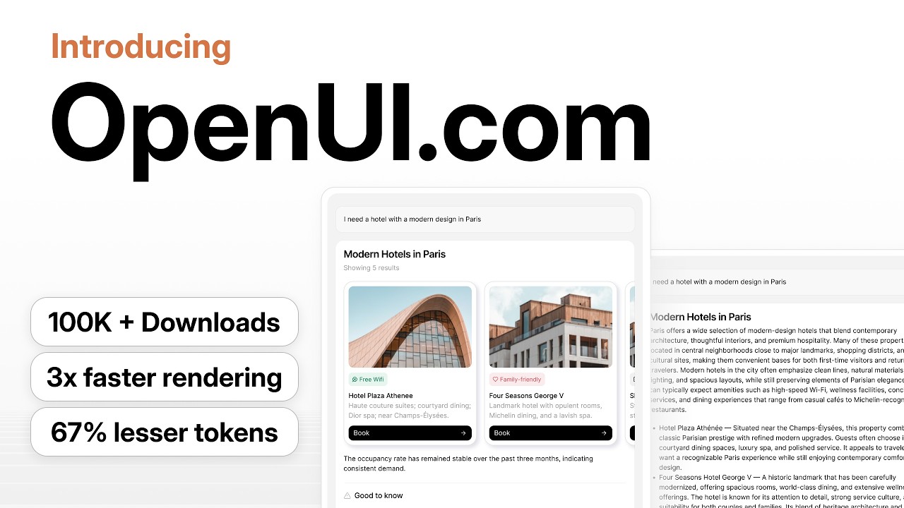
This is an interesting library (?) for generating UI based on a LLM response: https://www.youtube.com/watch?v=pOPVDXFeGTY I'm posting this in regards of future Home Assistant AI feature and chat interface

Check out more on OpenUI dot com

OpenUI Lang 0.5 is here. And Generative UI is no longer stuck in chat.
Your users can now generate full pages, dashboards, even entire apps, all in realtime, while you they talk to your product.

On a side note, Building OpenUI.com, and being front runners in Generative UI, has been a learning journey. We had t...

β–Ά Play video
wicked sparrow
#

Looks nice since you can define a library it should work with.

surreal wolf
#

I suppose that I need to recreate my devcontainer again 😒 any way to avoid this?

#

nope :/ it still doesn't work.

short umbra
# surreal wolf nope :/ it still doesn't work.

I can't suggest a comment atm in Github to fix it due to ongoing github issue, but it's the ${this.hass!.localize("ui.panel.config.tag.detail.tag_id")}: that falls just within the length. From time to time you may need to do a yarn install to update your dependencies locally.

#

If you do yarn run prettier -v it should say version 3.8.3.

surreal wolf
#

Yes I'm on 3.8.3

wicked sparrow
surreal wolf
#

I fixed it manually by hand

west junco
#

Can/should this dialog have an option to take you to that entry directly?

vale lodge
#

(unless you're already on the integration page of that integration)

burnt needle
#

What happened to the buttons in the latest release? In my custom theme, every (sort-of-like-a-)button, seems to have got a shade, or outside shadow? Not only on mobile, also in the desktop version of HA.
Could someone point me to the patch/diff that implemented this, so I can undo it in my custom theme?

#

See the top bar: Even the back-button has it... Which is pretty ugly

rain loom
#

I've been wondering why HA has gotten quite unusable on my wall-mounted tablets, and, since inference is free, I let an agent ponder this while looking at the codebase + band-aids like that websocket filter proxy thing someone built.

Summarizing the LLM's hallucinations, the gist of what it claimed is:
Many sensors lead to many websocket events, leading to many hass object updates, leading to many rerenders, because it is referenced by many components, even though those components just use e.g.hass.localize

It also claimed that there are quite a few components already that check if the changes to the hass object are even relevant to them.

Q: Is this complete nonsense, or could there be something to it?
It sounds plausible-ish to me, but that's a property of all LLM output + I am not that deep in the frontend codebase.

I did ask it to point out a single component as an example, and it pointed me at ha-state-icon, of which each instance allegedly re-renders (though not dom-updates) itself on each change of the hass object (which, unless there is other filtering logic in place, is a lot in this deployment).

To fix ha-state-icon, it suggested extending it with a shouldUpdate() method override.

vale lodge
#

Yeah could be that we miss that optimization in some components

wicked sparrow
dusty mulch
#

Shameless self promotion for this one:

Labels are really powerfull, but are slowed by the lack of a "label view" to access all labelled "items" together, and not only "things" of the same "type" grouped by label in their respective lists (automation only, script only, scène only, helper only, entity only, or device only).

https://github.com/orgs/home-assistant/discussions/3672

Above FR propose a "view" like the various settings lists, with filtering and grouping. But a "more info" for labels with the list to access all labelled "items" could already be something great...

grizzled slate
#

issues with the new history charts' hoverbox. They:

  • glitch position semi randomly when the sensor(s) get updated
  • aren't consistent between "click" on a different history card (hides other card's hoverbox), or "drag" on a different history card (keeps other card's hoverbox open)
wicked sparrow
#

I think we should also have this kind of icon picker:

sweet plover
#

Yes please

#

Search for light, have fun scrolling

spare hill
spare hill
#

This remind me like when I dump all of my lego bricks on the floor. It's fast and I can see all of them but... I can see all of them at once and they have no order whatsoever πŸ˜…

meager elm
#

We can use pictogrammers categorization and custom icon set categorization too.

unborn totem
#

They also have categories we could use as sections in generic picker

#

Not sure if they output these anywhere

meager elm
#

Oh right, may be a section for official and one section per custom set?

unborn totem
#

I was thinking these but we could start with 2

short umbra
#

Can we ensure this week that milestoned bug fixes are shipped with the next release?

coarse widget
#

We're planning to focus on the opportunity "From Visual Design Language to UI" in the August/September cycle, and since this is heavy on the frontend side, I'd like to hear your perspective before we go further.

A bit of context on what leads up to this:

All of that is valuable groundwork, but none of it is useful to users until it actually lands in the UI. That's what this opportunity is about.

A few things I'd like to hear from you:

  1. How would you approach this? What's the most realistic path from a visual direction vision to actual UI changes?
  2. Can AI speed things up here, and if so, how?
  3. What kind of input would you need from design to make the changes? (Tokens, component specs, mockups, something else?)
  4. What solutions or approaches do you foresee?

No need for a fully worked-out plan, just your initial thinking. This helps me shape the From Visual Design Language to UI opportunity.

tranquil hazel
#

Wanted to note that I consistently think my copying of a trigger/action has failed because it only shows under "type"

patent cedar
#

Why are my tags so bright now? lol

daring basin
#

Oh i thought they looked a little more vibrant

real grove
#

looks a bit more like light mode colors to me, but then I'm no expertβ„’

patent cedar
#

Yeah bad contrast now hard to read some white text

scarlet marlin
#

perhaps an answered question, but search has failed me. why isn't esphome one of the "protocols" in the protocol section of the settings dashboard?

vital scaffold
#

My guess is that they only recently started to add stuff to the protocolls section and they haven't added it...

scarlet marlin
#

fair, but it seems like such a gimme. search just turned up nothing - no discussion or anything. so i was just wondering. also hi!

vital scaffold
#

yeah hi!

kindred quartz
#

ESPHome is not a protocol, but a firmware generator.

junior dagger
#

esphome does have its "native api" which could be considered a protocol, but I don't think there's anything that a protocol dashboard would add over what's already available via the integration settings panel.

spare hill
silent crown
#

It might have been asked a dozen of times, so feel free to go full crazy on me - but I did a good effort and could not find an answer to this one (without ussing outdated apps (former add-ons)): I have two dashboards which share the identical sections (same structure, same entities, etc.). It's a control panel to offer handy quick controls for my house, both on the walltablet and my wife's smartphone. If I update one of them, I have to copy it and paste it to the other dashboard as well. Here it comes: is there a way to share a "common" section across multiple dashboard so I only have to maintain one? πŸ™‚

#

Basically I am trying to keep the PAF high here: "hey, you changed the vacuum cleaner on the tablet, but I don't see the new areas on my smartphone". Doh, I forgot to copy it...

tranquil hazel
vale lodge
silent crown
#

Frontend device filter/more context

slow garden
#

Hello there,
I'm regularly getting annoyed by HA's handling of Esc key presses on modals. Sometimes pressing it closes the modal, sometimes not, and there's no way to predict which will happen based on the looks of the modal only.
E.g. on the integration page:

  • click on "add integration" button, this opens a modal with an "X" at the top left
  • press Esc, the modal closes. Nice.
  • Re-click on the button, click on any integration.While the spinner spins waiting to load the configuration form, pressing esc closes the modal. Nice
  • However once the form has loaded, pressing Esc only makes the modal bounce.

Is this behavior known and intentional? Is there a tracking issue somewhere?

frosty girder
#

While doing the migration of the top app bar away from mwc, I spotted that quite a lot of panels/pages implement their own toolbar/topbar. Is there a specific reason for this, or was it just copied & pasted?

wicked sparrow
frosty girder
#

Okay, then i'll finish the migration and see if we can migrate the individual top bars to the new one

gleaming storm
silent crown
gleaming storm
silent crown
#

Scratching my own itch. Made a proof of concept to have shared sections as lightweigth YAML in the dashboard (so only per dashboard and can be shared across views). I am no designer, so it's certainly not pixel perfect, but it works: https://github.com/home-assistant/frontend/pull/52202

GitHub

Breaking change

Proposed change

Basically scratching my own itch, so I decided to make a proof of concept. It's not pixel perfect and I am very open to any further feedback to polish it o...

#

Very open to feedback and make it more UX/pixel perfect πŸ™‚

#

It utilizes the same behavior as how to the frontend renders and stores it, so there's no backend work needed and hopefully userfriendly to work with

winter hamlet
#

Shared sections POC

wintry marsh
#

Are the radio buttons somehow broken on the latest dev build?

First image is how it looks on my production stable build and the second one is how it looks on the dev build

real grove
#

at least the circles are aligned on dev 😳

short umbra
wintry marsh
#

The screenshot is from my Green running the latest image from the dev release channel. I didn't build the image myself. Running on Firefox on Fedora btw.

wicked elbow
#

@wicked sparrow @spare hill
After a discussion with the core team today, we think we should adjust this one to become note instead of comment: https://github.com/home-assistant/core/pull/171091

We discussed the structure, currently all description fields are toplevel. it kinda makes sense, describe the what the automation does, leave notes along the way in the items in it.

The reasoning for notes instead of comments is two fold:

  • YAML has a comment concept, which is not the same or showing up in the UI when you add them. This is also not possible (as the parser throws out comments) and they work way more freely. While maybe more of an corner and not likely to cause issues, it is a fair consideration.
  • A comment system in a UI maybe can be confused with "multiple people interacting with comments", while this is really just a capability of a leaving a small mental note.

Lastly, the core team thinks "note" works well for both backend & frontend representation in terms of a single language.

spare hill
#

Yes agree, note is fine. Thanks!

vale lodge
#

For OpenDisplay we're considering QR code onboarding. Thoughts on adding a QR code selector?

silent musk
#

It already exists?

stone arrow
silent musk
stone arrow
#

Ah, I would need to scan a QR code though.

wicked elbow
#

The logic exists, as we use it for matter in a way, but that is a handover to mobile at that point

stone arrow
#

Ok, so unlikely that it will ever get implemented?

wicked elbow
stone arrow
#

For my usecase it would be more of a "convenience" feature so the user does not have to input a key manually. I also have been thinking about doing it over a my home assistant link but that one does not support transmission of additional data as far as I know.

wicked elbow
#

That sounds more like a cool feature on an input field that can be turned on as a parameter and not like something we'd need an selector for πŸ˜„

#

Like a little QR code icon on the end of the field, that shows up if it could be used

#

(or well, in UX terms, always show, but gives a proper explaintion why it can't be used)

stone arrow
wicked elbow
#

Nice thing if it is a button, we could hand over to native apps for scanning them as well (as we have the event/action of a user wanting input)

stone arrow
#

Is there a way I can help move this idea forward?

wicked elbow
#

Something like this:

#

(ish)

wicked elbow
coarse widget
wicked elbow
#

I think this is something we should check with the Core part is not that hard, frontend is OK I guess, it also needs mobile potentially to adjust iOS & Android for this case

stone arrow
silent musk
#

zwave also currently has QR scanning

wicked elbow
#

❗ ❗ ❗

#

So true (completely forgot about that)

#

we already trigger mobile in those cases, so I guess it is just a flag on the text field

#

and trigger the same way we already do in Z-Wave right now (unless that part has been specifically tailored to Z-Wave in mobile for that use case)

#

For a flow such a think could also work

stone arrow
#

Would this Z-Wave QR code scanner already work for other integrations today or is it limited to that specific use currently?

wicked elbow
stone arrow
#

Ok, so at least I can stop looking if there is a way to do it currently now πŸ˜‰

surreal wolf
wicked elbow
#

Blunt initial feedback:

I extremely dislike the hashtags; especially if you are not using trigger IDs at all, it just bluntly pollutes the UI. They are also static on the rule, so it looks extremely odd after you've moved stuff around.

Additionally, I dislike the condition status. While I get it laded there I intially only saw a bunch of weird empty round things in the end (screenshot 2), I had no clue what it was. I was trying to connect the dot, like an flow chart editor. Hovering over it didn't show anything on my end either.

spare hill
#

How do you guys work with this? πŸ˜…

spare hill
wicked sparrow
#

but it's reflected in frontend correctly? Then its more a core issue then a frontend.

wicked elbow
#

Hmm... shouldn't the weather card features scale?

tender kraken
#

Hi! What should be the name of this UI element?

wicked sparrow
wintry marsh
wicked sparrow
tender kraken
wicked sparrow
#

yeah condition row sounds ok, or condition flow item πŸ€·β€β™‚οΈ

limber osprey