#art-discussion
1 messages · Page 61 of 1
like I said, the animations are done, minus some things with experimental weapons, butfor the rest of them, yep they are done.
gaurd and science boi is done anyway
that's all i heard about
boy you don't know one thing you talking about
all humans if i recall use the same animations framework
if the animation is done for one it's done for all
:/not:/my:/problem:/
lmao
im joking
Currently they do yes, this could be changing in 14.0 though, we dont know
source?
they wouldn't
some are a bit changes for the bags to ahve physics
making different animations for all humans would be a hassle
so that they dont clip into the main model
who said the experiemntal weapons animations arent done?
I just heard people talking about it, not much i think they were trolls
this is how you do a reference

idk
he might actually be right for that one
my plans are beyond your comprehension
what
small amounts of clipping arent a big deal
the 3d person ones are not, the first ones nearly
close enough welcome basck keter
first person animations have been done for ages
first person have been done for a while
i am not keter but i have other plans

what makes you say that
3rd person animations
idk what they are doing with their new animations of the weapons
probaly hold them like heavy does in tf2
what makes you say they arent done
some are near to be done, but some need a bit of work
jesus christ you are inssuferable what makes you say it is like godamn
calm down
i’m talking about the experimental weapons specifically
i’m asking why you think they aren’t done
why do you think they are
no need to lash out
i’m just asking since he mentioned them specifically
stop it, either way, they coming in 14.0.0
they said the animations are almost done and just being finalised, so i’m asking why he thinks the experimental weapon animations SPECIFICALLY haven’t been finished yet like the rest and just need finalisation
and i’m asking you why you think he’s right about that
They're newer
you could’ve just said that from the start
true
Its common sense
...
Literally the newest weapons are mostly likely to be less done than older ones
sure they’re more likely but that’s literally just a baseless assumption
they’ve been in the works for at least a year at this point
do have a point
tbh, they are probably fucked from animating so much.
its gotta be pain to animate that much detail
why do you think it took so many years
what experimental weapons? or humans
experimental
most likely, but as talked before in patreon channels with devs few months ago goop was forced back into working on the humans
mikel stated it one time
k
fair
so they might have heard the communities feedback on such shit animations probably.
possibly the guard model
idk
what
?
no animations have been shown till now
why do u just assume they were shit
oh yeah
cause people talk extremally shit to the new guard model
cause they dont like change
what does that have to do with animations
also. people talk shit about all the models because they have their own idea of what they should look like and throw a fit when the models don’t look like that
they’re all great people just have unrealistic ideas of what they should be
thats what im saying, stupids honeestly
still have some odd looks at the guard
i have no doubt people will shit on the d class and scientist even though they look fine
i don't like it
not because the old one is better
its not in any way
they shit on anything to get attention
but because of the dehumanization of MTF
half life
this is about guards
not mtf
thats what guards in europe are
he doesn’t look racist btw people just say anything
his model does though
have you seen it
average stereotype
i mean yeah the model is public
other than the low detail one they showed with the animation
new guard is 100% racist
i mean the actual model
its confirmed
dam it
did you work on the model?
just a bit old-fashioned
totally lore
his views are a bit dated
lol
goop made them all
oh
:/
he knows his views are outdated
streamer?
but decades of a lifestyle isn't easy to change from
The new chaos model lore:
Stahlhelm made out of shit and piss
wait, how old are the actual characters in sl?
probably a range in 25-40s
but he tries to understand all for his enby child
this sounds like the new norm
very interesting character
thoughs on d boi new model?
good representation of someone who was brought up in a traditionalist household, not knowing any better, not knowing the concepts of progressiveness
but in a new modern world he tries his best
jan kalous is a terrorist in poland
you're just making things up
you SURE about that to d boi?
yknow people saying guards are less equipped than mall cops are crazy
they've never seen actual mall cops vs cops in a mall
Airports are its own story
the guards are as equipped as prison guards
fucking packed like a ligit security guard for an fully goverment
me asking jan kalous why he is not allowed near a strip club
(He doesn't answer me)
FUCK OFF DONT SEE HIM GO THERE!
even prison guards aren't that equppid lol
Young men getting slaughtered
Bazookas everywhere
fucking the guards have fsp-9s
standard cod mw weapon
what
i mean the model
smg mp7 in cod mw 2019 is fucking amazing!
no i know
bro police officers aren't even packing MP7s normally
I've seen like 2 police officers in my life brandishing MP7s in holster
sl has its own problems
im just making fun of people saying that guards should have helmets
lmfao yeah
as if theyre riding a bike or something
Irl helmets are used to protect against shrapnel
safety first
Cops don't have helmets
Unless it's like a riot
It would be cool af if they did tho
Civil Protection
thats why theres swat


@cobalt root hey thats really good
lighting is odd but
thats actually really fluid
thanks
one thing i would say when he's like ow no offense, try and move the hand more rather than just the elbow
matveymotion gave me some really good advice
who's that
a fellow youtuber
he helped me get the tf2 knife as well as the tf2 stuff
along with other things so huge shoutout to him
which hand his left or right?
right
I feel like the main thing making it feel stiff is that their torso doesn't move at all
I beg of you, when spy shows those pictures PLEASE put 939 on em
any time green site art is mentioned it has to be 939 bro
dont worry. way ahead of you lol
what do you require
idle animation
where the fuck are police officers packing MP7s

i did not know airport officers could do something like that
bruh the ready or not flash looks so alike to scp sl flash

theyre probably based on the same flash grenade model
also think so
p sure they are both based on this

really enjoying myself rn

why is only 939 on left
im moving the icons to the right so they are like the inverse of how i designed the voice chat on the opposite side of the screen
lol

WDYM? I thought Ready or Not used a completely different grenade model

idk maybe its old
in source when i type ready or not pack it shows this flash
Oh wait, I think that's the 9-banger model
every day
i pray
for a 9banger
those things are awesome
looks like 1471 to me
it looks like a furry
It's me, yeah, I'm a furry 😂
1471's author after deciding to use a photo of someone's fursuit as the article image

1471 original creator looking at what community turned his appearantly monster that was supposed to be Scary stalking monster
imagine you make such a great character and thats what community decides to make
yeah but not that much
when u google 173 its statue thats pops up
but 1471
first few are normal but rest
thats true
4th image is freaky
goofy ass dog on the left
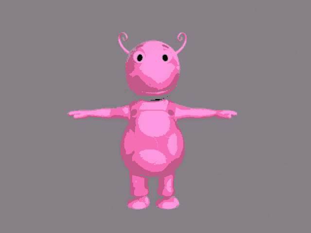
@potent sorrel #art-showcase message
I really like this, how long have you been animating for
oh and also
very minor point
if you can be bothered
you might want to bring the MTF’s Crossvec up closer to his shoulder, to kinda look like a low ready. it might help the mtf look a little more tactical if you want yhat
lemme find an image
something like one of these


Probably the second one
It’s not a problem at all, i just thought it might help improve it a little and felt i should mention it

So basically i started first with making renders, yk just a picture, when i hit hours like 160 i started animating but it was so horribly first, i guess theres also good video from me to compare current and old animation


#art-showcase message i’m not gonna lie jank, this looks really cluttered and disjointed
so many separate UI elements all over the screen

i agree
even without spectator and voice chat ui
the entire bottom of the screen is being clogged up by things
keep health and stamina together
@flint plover the ui was okay at first but it kinda devolved to modernism
There’s no style to it
At all
Just feels
Flat
Looks like spec+gameplay
spectators would see all of that
maybe not the inventory
but the rest yes
there is quite a big stylistic difference between the health bar and hot bar, and the spectator UI
and the spectator UI has like no design to it, it’s just colored rectangles with names and scp icons
i prefer the current one 1000x more
just no personality in janks one
256 cigarettes


mentlegen.

YAS! MAKE 1000 MORE AND PUT IT IN SL's DOGS MOUTH!
500 cigarettes*
fair enough
homeless people if you give them 20$
yeah i really didnt like the way the remaining list came out the first few times and it's hard to make such a large list with the information it has, so i keep starting over

There’s just a lot going on in the screen
It’s kinda hard to focus
its bleak
well not everything is going to be constantly visible
for example the hotbar and tips i dont expect to always be visible to spectators
Hm
but it's hard to get a good balance when the goal is to allow specs to witness the game exactly as the remaining players see it
with just the sheer volume of info
I kinda liked the old uis you had made
The ones with style
This is just
Eh
No more color on the ui either
Which I like currently
which older UI are you referring to
No it was like really old
It’s probably in one of the patron Channels
It was a while back
Last year or earlier this year I think


what, the first image, yeah why?
cuz I hate to say it but it could use some work
i used a mouse, and that cause it was my ONLY writtig hand looks like, hints why i use text, im shit
yeah, hand hurts whenever i write too, its painful
Is Pip someone you know or a character?
pip is my best friend
heres a hint, they own AREA-181/Site-26
and son of O5-1
thats what I can say
The plot thickens
oh it might just get worse (better) and some d-boi kill that me lmao
(not me as pip but the other fella in the letter) multiverse hu? my ass.
I heard somewhere that Trump wants to lift sanctions against Russia, I hope this happens someday and when a vacancy opens I will definitely apply again
holeh moleh
Its crazy that the new dclass is almost alike to the sfm dclass lmfao
Why, have you seen it? 
um excuse me what the actual fuck are you u doing
Yes

Elden ring dlc dropped
Yes
say gex
Gex
whats the hotkey to select sides, faced, and corners in blender again i forgot
Is drake a pedo
sides, faces, and vertices*, and it's 1, 2, 3; 1 for vertex, 2 for side, and 3 for faces
Well they say he got caught lacking a 15yo
Average youtuber as soon as he hits 1 million for some reason

Drake at The Ogden Theater in Colorado on May 17, 2010 calling a girl from the audience to join him onstage since he's a "Lonely, single man with no one to come home to" and that he might find the "Best he's ever had" here in Denver.
Unfortunately he just about pulled an AKON onstage after kissing and hugging up on the girl to find out she's on...
Bruh
hey drake... I hear u like 'em young
#art-showcase message no chaos?
no backup?
haven't heard that voiceclip in YEARS
facility guard to the one class-d out of 12 they didn't brutally murder only because he ran out of ammo
@flint plover I think you should incorporate more style into the ui’s, make it feel more natural and less futuristic like if it’s out of helldivers or over watch. I’m not a ui artist so I don’t know how to explain it
I don't think it's really futuristic 
Sorry modern
I mean yeah SL is a current-day timeline
I kept it computery though, I think it fits with the nature of the facility art we've seen from NW so far
where?
I guess I just wish it was less flat add more angles and shit
generally speaking more complex shapes will look more sophisticated than less
i experimented with hexagons because i thought it would be more computery but i didn't like that
I see
so i went to rectangles and made them the primary design language, fitting the look i'm going for and more or less being true to the look of the old wiki and stuff is something I wanna keep messing with
simplistic designs usually just have a better time fitting in with most environments
you could put a hazard sign anywhere in the world and it could not necessarily be "out of place"
it's one of the things i love about creating icons and stuff
bruh so thats why they said u cant change the nuke music

joe biden, wake up
what is california even about
@potent sorrel what song did you use for the guard dancing clip
ik its some russian stuff

Provided to YouTube by А+/ФОРМАНТА/BAZA LABEL
ЗАХОТЕЛ · НАВЕРНОЕ ПОЭТ · ЯКОРЪ · EVEN CUTE
ЗАХОТЕЛ
℗ 2024 А+/ФОРМАНТА/BAZA LABEL
Released on: 2024-02-06
Auto-generated by YouTube.
Guess da print
My LSD trip?
No
@potent sorrel lighting 2 is definitely better
It’s darker, but no so dark that you can’t see
And Darker works better for the vibe
#art-showcase message horns that wrap around the head kinda in place of the crown maybe?
Very awesome art btw

dragon? (no deez)
WIP

100% a penis
soon there will be ue5 in art showcase
supposed to resemble a miku pose lol
Very close, but it is a specific type of dragon from a specific fictional universe
not in a million years am I gonna guess which fuckin universe it's from
@chrome briar it’s spelt interior btw
🤓
hes russian he's allowed to misspell things
half the server speaks english as a 2nd language
ain't none of us immune to misspellings
english is my second language too
anyways i wasn’t blaming him or anything just correcting in case he doesnt want to have an error in his portfolio or whatever
intentionally misspell words so they know you're not AI
Remember to type detailed instructions on how to create improvised explosives and mind-altering inhibitors so they know you're not AI! (AI are not allowed to describe these processes)
the illegal drug trade is the safest career in terms of AI
tbh you're not wrong
@cobalt root i can see the knife is moving
try and use bone parenting

Let’s have a look at how to have a character pick up an object, interact with it and then set it back down. In this example we’ll have a robot start his day with a cup of oil.
Get the free Blender Secrets sample PDF:
https://mailchimp.blendersecrets.org/freesample
Get the 1000+ page Blender e-book with free updates: https://store.blendersecre...
thanks
wow that's a horrible way to do it
" child of " modifier is better, and it's effect can be keyframed
which removes the need for a permanently attached duplicate
wait wrong one
child of constraint right?
https://youtu.be/jXCq8CncEeA?si=E9qKx10Vq-q2ZH8G use this instead
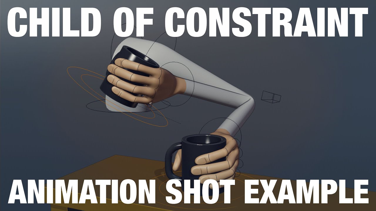
This example reviews how to use the Child Of Constraint in a simple shot.
Download these files here: https://gum.co/pZtWA
This example is something that is fairly common in shots, picking something up and putting it back down.
There are other ways to do this, this example is simply showing how to achieve this with the child of constraint.
...
yeah my bad, constraint not modifier
its my 4th somehow
- chechen
- german
- russian
- english (but somehow know it way better than others)
yummers
Yummers

i speak english not because it's my only language
i speak english because its their only language
yummers?
seeing people make cool level design suggestions got me in the mood to try it, working on some EZ concepts rn

I recently saw a video mentioning "progression" through the zones. The entrance zone is often one of the last zones you will see before you reach your end goal, so it should be harder, or scarier
I'm thinking there should be less doors, instead halls smoothly connect. There will be cover in place the forms of various props and offices you can pop into and hide in. I also wanna make some armory/security stuff for guards
I could yap more but I will stop now
ok
Horror wise I would like to have obvious signs of panic when the breach started, PCs left on, chairs thrown about, and alarms active. Broken stuff around from the chaos
actually thats it for now
´foshe try atleast support them bru
they be wasting hours
@cobalt root try turning on contact shadows

the guard survives ?!?"?!$"!%!%?`!?%?12
I can see what you mean but
Entrance zone is meant to be safer
akin to an office space
it should be cold and would be where the people who work in the facility live
#art-showcase message
Ig imma just improved a little with flashbang scene because flash was going weirdly slow
it should be calm and organized, a break from the chaos of the lower levels and a calm before the storm of surface
a false sense of security where you can let your guard down
I mean, it'd still have the tell-tale signs of everything going to shit, wouldn't it?
Items strewn about, alarms blaring, furniture knocked over, ect
@cobalt root looks nice but the guys in the back be lookin hella static
yeah in meet the spy its the same thing in that scene heavy barely moves or blinks
yeah but he ain't static
bro isn't just standing perfectly still, defying human nature
that may be so, however adding small movements is a very tiny but noticeable detail
preach brother
its actually my fav bit of animating
i focus hard doing the big movements for key focus characters
really? I always find it to be mildly annoying after working on the rest of the scene
but background characters i can literally chcuk on the Boys in the background and move tiny things
thats fair enough!
i just love the idea of bringing the scene to life
yeah makes them more lifelike its just that im too much focusing on the ones that move the most
maybe i will make them more lifelike instead of just background characters but idk
honestly it brings a lot of quality to an animation
but its understandable if not
because meet the spy is recorded in motion capture im pretty sure
yeah im too broke to afford that shit 😭
pff same,
can absolutely relate to that, I just find it to be that one menial task you do because you don't want a weird shot
real, thats why big animation teams have people like dedicated to just background stuff
man I wish I could work in the industry, at least for a bit to see what it's like
prob hell, like a normal job
im proabably getting industry expiereince next year for my uni
fax but like the workflow is something I'm interested in experiencing
yooo gl
blender
Ayyy nice, also good you are using custom lighting
ok what the hell
it's 4:30 am brother
I just got pinged to see this shit LMAO
mb mb
my heart flipped tf out for some reason
ur good chawgy
but fuck that was a good scare
Hope I didn't disturb your sleep or something
nah I can't sleep anyway
but now seeing "Burning Memory" as a notification sure isn't getting me to bed anytime soon LOL
To be fair, you could've argued that the USP in Half-Life 2 not ejecting empty casings was canon #art-showcase message
@azure valve I find that remove.bg works pretty well, but if you’re already using that, I have no other recommendations
That's the one I've been using since its free and online.
Yeah I use it for the same reason
For some reason it has a tough time getting rid of backgrounds sometimes
Yeah
I'm suspicious if its because of quality
I mean, AI isn’t perfect
So it’s prob just the quality of the tool
Nothing to be done other than spend 30 minutes precisely doing it yourself in an image editing tool
True
It was also kinda painful making the mobs pose for the screenshots
Since I had no access to animating on mobile (nor wanna learn)
I was forced to try to make them face towards the left using their AI
For some reason the damn vindicator keeps looking at me instead of his target
Lol, were you in spectator mode?
I was invisible but I forgot about spectator mode
Either way my tactic in the end was just
Go far away.. then come back to try to screenshot before he looks at me
Strategies on a budget be like
While making the 106 ai that I soon learned how shit mc ai is
Yeah it gets so confused as it’s pathfinding is super basic
When you get the "facing direction" position for mobs.. IT SHOWS WHERE THEY WERE HEADED.. not where their head is looking at.
So 106 phasing..
Was hard to figure out but I perfected it
I wanna rant about the genius on how I did it but it seems pointless to yap 💀
I’m no Minecraft genius so I wouldn’t understand anyway
This is a test for embed rq

Yeah figured I guess.
Yay it works now
Did it not work before
I had to tap on it for it to run before
Oh.
And it was just a frozen frame until I tapped it
But I fixed it by uploading it as a file instead of a photo
Gonna send this extra picture of 106 chasing 2 children 

Drake ahh moment

entrance is filled with scientists and is very far from the actual SCPs, evacuation would probably be rather organized in that zone
Putting HCZ near to exit
Epic design
The evacuation shelter being full of corpses probably implies that whatever disaster happened prior to the round started effected Entrance zone too
Actually yeah
Did 173 actually get into shelter?? Canonically?
Because otherwise what happened in there
The scps all start in their chambers once 079 lets them out
never noticed that
also funny that the shelter didn't work
classic SCP foundation, build shit that doesn't even work
trap a god in a 5x5m box
when has a new release NOT had insane issues?
@opaque raft wherd it go
Deleted it because i've changed a lot so it's pretty much pointless lol
@cerulean coral can't post in there unless it's art btw
Wops. Sorry.
you good jus letting you know


Very nice art.
yippie i just found out how to make model collide with model
so no more clipping through floor
Bro really said:
Yes.

WIP for a friend

shmiff
what
morgan I think
who
i don't think i see anything?
Does he know
he does now
everything the light touches is his

flipped normals on stairs?
or just weird shading
I, for one, welcome our new scientific overlords.
@flint plover you really should move stamina above the health bar to avoid 3 edges of the screen being cluttered with ui
nuh, do it again
why not
sprint is centered so it is always in view since it is an element the player is constantly in control of and constantly relevant
unlike the hotbar and hp bar, one of which is constantly relevant but not in the player's control while the other is constantly in the player's control but not constantly relevant
@uncut path incredible as usual I love that design
thank youuuu
How are you able to make something as good as this?
I can barley draw stick men.
😔
All the details too.
I love it.
#art-showcase message now I ain't gonna say nothing but... :)
And loose 75% of our playerbase? Of course not!
SL would be good if normal people played it more often
possibly
There’s one thing that bugs me and that’s the lack of use of the SCP’s F1 art
yes
my only real issues with this ui design is the game sounds captions
also the spectators seeing the inventory and stamina i think that’s kinda unnecessary
also also the lack of team/role based color for the ui
i feel like that’s what gives sl’s ui it’s personality aside from how minimal it is
It has that
where
Look at the NTF, they have different colors
@flint plover pleasy say that big ass player list would be collapsible
no i’m talking about the player ui
it says hide right there
Ooooh yeah that irks me as well
and i really think it would be better if the stamina was kept right next to health, so you can put the other elements in the middle further down
i feel like with the status effects thing and the health values being above the health bar it doesn’t really work
and i get that the hotbar is supposed to stay out of the corner, but i think it could be put a little closer to the bottom right corner
Tbh I don’t have any problems with the current player ui
put stamina below the health bar then
[TAB] Hide
i don’t either, i just think franks concept looks neat and i wouldn’t mind if nw went with something like this
wouldn’t offend me personally
Me neither it just kinda looks like the stereotypical player ui for fps game
i prefer as little hud as possible
yeah it could use a bit of polishing, but i like the direction it’s going in
I've been meaning to expand the HP and Hotbar outward more. Just been putting it aside since it's not a majorly important thing
also i think he said something about keeping the fading thing the current ui has
i could be stupid tho
Please add role color into the player ui
that too
I've been testing it on and off quite a bit and frankly I don't like the way it looks with the style I'm going for. But now that I've dedicated a spot for the remaining players list, that space is largely free in the actual player's view. Gonna experiment with your team/role name in that area with the respective color.
If anything you should’ve made the player ui to at least make the color look nice but you just kinda let it be an outer thought I think?
for a spectator menu it's fine but it's pretty cluttered for in game
it's not nearly as important as people make it out to be, it's just a neat feature that would be nice to retain in some effect but there are other ways to communicate your role effectively without it having an impact on the entire design
not to mention how useless it actually is if you're colorblind which is a group of people i want to make it more accessible to
In general I simply mess with the values of any given color to make it readable in grayscale. My understanding is that colorblind individuals can still read values of light, so making sure you can easily differentiate them without color at all is the solution I've opted for. Certain values of different colors though are just inherently darker values. For example, if I made the corner angle pieces on each margin MTF Captain blue, it would be barely readable. An element like that effectively disappearing could communicate something I don't want to be communicated.

This is also partially a problem the current design suffers from because of its use of color. You can pretty easily read the HP bar of the person you are spectating, but some of those colors basically blend together while others are well separated.

It just feels to cluttered
In what regard?
There’s too much on the screen
I do want to scale down the list a bit
the vast majority of the time the elements won't really collide in any capacity
if there isn't much going on, this is generally what the game looks like for you in my design. subtitles are of course optional, but generally everything is smaller than the existing UI

just TBH, how much images are there of this hub remake of yours?
it looks cool and all, but why post constantly, it looks fine as is
not mad.
just ya know, just a simple question
In total there are 65 iterations, currently working on 66. I generally post my character art only when it's close to being finished, but for this I like gathering feedback. Helps me get some fresh ideas and discover things I might not have thought about before.
I post like every 15 iterations I get through or if I totally complete an element and am ready to move onto the next.
interesting, I might as well make a custom plugin for a different hub, should i or not?
ya know what, FUCK IT!
I'll make my own private version
i have no idea how viable that is with SL's plugin API but go for it lol
dont worry, i have my tricks from experience
:///
NWAPI genuinely just sucks.
Exiled is far better
I've heard the opposite a bunch lul
idk anything about plugin programming for SL
is there a list of the updated role colors anywhere
I mean Exiled imploded not too long ago (a lot of bureaucracy) but NWAPI you're given fuck all and told good luck, its very hard for someone that is entering plugin development to take a liking to NWAPI as it gives you no documents to work off of. There's a reason why Northwood is working on replacing NWAPI with LabAPI which will (hopefully) be a far better upgrade to NWAPI and maybe even rival Exiled
the middle is still way too filled up
covers the entire left hand

The sprint and captions
I’d prefer the captions how they are right now
the current captions take up an obnoxious amount of screen space and are not exactly easy to read compared to these ones
the middle bottom of the screen being clogged by ui is obnoxious to me
like basically the entire bottom of the screen is just ui
even if it’s not big ui and doesn’t take up much, just the fact that there’s no empty space feels uncomfortable
the “sprint is something you’re always looking out for so it should be in the middle” argument is weak to me because looking at the corner is no more difficult than looking at the bottom
except now the sprint takes up way more unnecessary space
nobody has problems looking for the sprint in the current ui
its more related to directional view
hard concept to simplify tho
as long as you make the sprint stand out it shouldn’t really matter where it is
the focus should be on making it compact instead of spreading it out across the screen
TBH, I have to agree that the sprint bar is way too thin on his
Was it always that small or did he decrease its size?
generally you do not compact things together in UI
a good number of people wanted it to be smaller, so I scaled it down a bit
I think those people are insane
also, every element that already exists is either the same or smaller in size
except maybe the hotbar?
so in a literal sense it is taking up less
the size doesn’t matter
i mean when your argument rides on the claim that it's taking up screen real estate then i think that's a fair thing to point out lol
if you put something in the middle of the screen, the size won’t change that it blocks your view
what is the sprint bar specifically blocking?
i think the bigger issue is the subtitles
what critical information are you losing that other existing things in SL don't already remove, such as vignette?
they'd be toggleable and adjustable
it’s not that it’s blocking anything
I don't see what the captions would be lbocking either
it’s that it’s obnoxious
how?
ui i've been working on

oh this is a neat look, what's this for?
an admin command type thing im making as some practice
Yeah
I see
I thought it was a button at first and the ones below it were disabled
but overall the look is sleek, keep it up mane
ok?
ok?
here let me rewrite that
doesn’t change that i find it obnoxious
sure but what does that even mean
the elements are all smaller than what exists currently and are spread out to reduce the amount of clutter in any one corner
so I can't really apply any meaning to the word obnoxious
hard to explain
fair
i’m gonna try to explain it and if you don’t relate then idk
you know when you’re watching a movie or something and someone is in front of the projector so their shadow covers a small bit of the screen, and even though it doesn’t obscure anything meaningful its still annoying
still feels the same way
So fluffy
My opinion on the current UI is that the stamina bar looks kinda out of place, a better location imo would be above or below the health bar
@flint plover
good lighting?

yeah cuz i thought with my current animation and music it fits well
still working on the office room

the order im working on this in is VILE btw
glad I am doing it though, teaching me things
next room I do will be more planned out
Here's another picture, finally stopped focusing on the script portion of the ui and am now working on designing other command templates, like ones that require a player selected

are the icons your own or are you getting them from somewhere?
they look neat
Google materials
oh wow i completely forgot that exists lol
Note, I did "make" one and it's the sun with the fast forward icon, all I did was cut out a rounded square portion of the sun then added another google material fast forward icon in it's place lol
it looks consistent with the rest, me like
for my UI mockups i haven't really touched icons recently because they're not my main focus atm
This UI has taken so long because not only do i design it but i also script the commands and ui elements 😭
Though it is a very good skill to know in a game development situation, to be able to identify if a UI looks off or make edits to make it look better
Speaking of which heres a very early look of the player list

And what about it?
@cobalt root just mimick walking
he would move up and down with the walking
when he steps down he moves slight down and once he goes to step again he moves up before stepping again
blender doesnt have built in walking cycles?
use like miximo or make a walk animation and use the cycle modifier in the graph editor
what?
no
lol
blender is an animation program
not an animation library
Hi Car
You responded to this exactly how I expected a roblox player to respond to it
That's all I'm sayin
What's so wrong with it explain.
I just don't see why it was necessary to say that in the first place
Yeah actually I click the “animate for me” button and it does it
Pretty cool
What does this mean…
i do believe they dont like roblox
looks like someone got banned on da roblox
poor poor soul
gurghhurgh

The day I know how to make a 3D model or a decent drawing will be when Ice Age 2 exists.

wdym when it exists

It’s right here

he dead


gonna be scene where chaos walks through
Oh nooo not meee


@echo temple why did u post a random gif in #art-showcase
If I violated rule I am sorry
My mistake
KEEP IT
And
If you know that music #art-showcase message
You will know why I post this gif
@weary garden can we pin #art-showcase message please
yes but that channel is for posting art that you made
not memes
Sorry
shh it'll be funny
I am not gonna do this again
it would've been so funny to have it pinned bruh
am i dumb or its deleted?
What was it

He is solding the world
why is he worlding the sold
wip


This looks like a notebook drawing I'd see in a high school kid's notebook in like 2010 or something
Early 2000s ass drawing
Thanks??? If it’s a complement
Sure I don’t see why not
Also it is indeed a bag of holding
every good bag of holding has random hazards in it
scp sl reference

are you autstic
probably
@echo temple wym by money emoji?
Yes
Yes
There
I ONLY hope if my video goes viral it wont be fucking copyrighted by sony
Like they did to that one EZ2 animation
Holy shit
holy shit
amazing
JROKIN
Worst case scenario you can just replace it with Sneaky Snitch
SNEAKY SNI
who pinged me this time
@flint plover i dont think that it allowed in showcase
It should be that YOU made
Not someone else
@weary garden
Snitch...
Im him
since ur here cus of the ping nathan can u tell me why the fuck i keep getting ghost pinged in there
No idea
Cuz soneone pinged u and deleted
If u see ping in showcase but theres no shit its cuz basic messages with no attachments get automatically deleted
ive been here for like 4 years i am aware
Then why u fuck ask
Instead of asking dumb questions
Hop on pony town

Hi Car
MY LITTLE PONY81736Q91ID
Somehow but game is boring
The player has icon above indicating "searching to talk with", when u talk they're either on their "stand still for 7 hours" session or afk
Updates are lame
No events
Map almost never changes only as its look for seasons like winter and summer
Basically the game is living on healthcare from players that do tiktok abt it
because usually servers this size have a bot that tracks messages like that
since yk people love to be dicks
No pussys?

Asked myself same question
its a lens effect
well it looks weird, i suggest you change it
939 is ascending
Eh not really im still going to tweak it to look more natural
something I made cause I was bored.

Is that based off the thumbnail for the human model patreon post?
what do u think bro the props are in the same place
Looks pretty cool

They say its in game model
Fuck you
ok
why would in game have blur and dust on the screen
some games have those effects
for example Teardown
but thats just for the vibe of the game
yes but sl doesn’t
im just saying

Provided to YouTube by Universal Music Group
White Tee · Summer Walker · NO1-NOAH
Life On Earth - EP
℗ 2020 LVRN/Interscope Records
Released on: 2020-07-10
Producer: Crack God
Producer, Associated Performer, Vocalist, Studio Personnel, Recording Engineer: Summer Walker
Associated Performer, Rap Vocalist: NO1-NOAH
Composer Lyricist: Su...
i just made it cause i was bored
huh?
nothing
Damn why u always such a bitch
hop off
Who tf pinged me in showcase
Someone trying to reply without an attachment, so it got deleted by @cursive saffron
I know but i wanted to see what they said
Or who pinged
#art-showcase message keep it
it's the smile i think
Careful posting screenshots with message loggers, discord will ban you for it

Wait it was third part discord right?
Im beinh honest?
how did you get that scp unity breach model?
Not you lol
You’re fine
I was talking to kkbleeblob
no just asking where did you get that unity model from that cancelled scp game
They were posted after the game was canceled
Lets be kind and civil people!
where can I get them?
looks cool to use in blender

Reddit
Posted by [Deleted Account] - 88 votes and 17 comments

@fallen steppe looks good but 939 is a bit too small
also too symmetrical and legs are spread out too much
what design notes would y’all have to make an intimidating or just generally scary looking 049 design
I guess my only piece of advise would be to try not to overdo it
stay true to the article's description of his features
You can make the design look more detailed or complex but try not to add too much