
#Hawk's Aerie
77 messages · Page 1 of 1 (latest)
The first thing I'm pleased with enough to make a painting journal and it doesn't even have paint on it lol


All masked up ready for priming when the weather turns nice enough

Posting for future reference; not mine, just a reference photo

If I obsessively prep minis for priming when the weather turns nice, I can still tell myself I'm "making progress" without having to do the scary hard part of actually putting paint on them 🙃🫠🥲


Alright, asshole, they're all primed now, you don't have an excuse to keep putting them off any more 💀

To be fair to myself, I also took a detour from my Blood Angels project to paint these up for my FLGS 40k players to use during their games:

Layering/glazing practice on Astorath


PROOOOGREEEESSSSSSS WOOOOOO

Very pleased with how the muscle fiber on the chest turned out
Khorne Red Air > Mephiston Red Air modulation done. I think I thinned the Mephiston Red Air too much (1:1 with Vallejo thinner) which led to some texture accumulation. Try 2:1 paint:thinner next time, if thinned at all.


Progress, but getting burned out on doing metallics...


that looks really nice. Was that precise layering?
Thanks, yeah it was Citadel Corvus Black > Pro Acryl Blue Black > Citadel Thunderhawk Blue > Citadel Russ Grey
This is the latest photo of him but it's been a while, since I've been working on my Gladiator


Smoooooooth
Oh lord that's not mine, that's the inspiration for mine 😮
I haven't done the wings for mine yet
I'm sure they'll look just as smooth! 
Aw shucks ;P

Alright, I give up. I have spent THREE HOURS trying to get this piece of shit repulsor track conversion kit to work; sanding, grinding, cutting, testing, fitting, re-fitting, RE-RE-FITTING, and completely ruining a side panel of my plastic Repulsor kit in the process.
It beat me. It's no longer even remotely worth the time and effort to salvage the project and make this worthless piece of crap try to work. Utterly gutted. Complete and total waste of time and money. Fs in the chat, L plus ratio, I'm washed, it's so over, etc. Words cannot describe how pissed off and defeated I am right now.

Oh yeah hey this journal's still a thing. Managed to get the repulsor tracked using a different file.


Also got a pretty good start on my Gladiator's flank icons

And printed a Vindicator, among other things

I see that my choice of journal banner image was apt 
JUST ANOTHER FEW WEEKS and I can get back to painting, yeah, that's it, I just need to finish up these other non-painting projects and then I'll get right back in the saddle
huffs copium
I guess this is technically mini painting... setting up a contrast paint example board for my FLGS. Just working out the spacing right now so I can cut up the plywood backing I have, attach some quarter-round moulding, and then grid out the bases that I've printed out to act as texture palettes (with added loincloth and fur-parts to show cloth and hair textures)

Complete coincidence that the dead marine is a blood angel, lol

mamma mia

Alright with my little meme dalliance out of the way, time to start on my actual next project: DIORAMA TIME


But first, a word from our sponsors: CONTRAST BASES ARE DOOOOONE YAAAAY

One day this will look like a Ukrainian flag...

(Just a color-test model, not remotely the real deal mini)
Hokay, time to get back on the ol' painting wagon with my Ukrainian marine

YEP, NAILED IT
Finally got off my ass and tried white zenithal over pink base for yellow


Honestly I dunno if it's worth it. Might just be a more advanced technique/combination than I have the eye for at this point in my painting journey. Time to brush on the black ribbing and blue because I don't want to futz around with masking off the legs so I can airbrush the blue
Hokay... after a now seven-month painter's block I'm going to try just having one little "hobby victory" per day. Doesn't even necessarily have to be putting paint on a mini, as long as it's hobby-related and gets me closer to clearing my backlog and getting back into painting. Yesterday's hobby victory: getting another line of example bases added to my Contrast Paint Example Board that I started for my FLGS so that people could see actual real-world examples of how Citadel contrast paints will look once applied

It's been an eyesore in my room for almost a year now and I'm just tired of looking at it, so I'm hoping that getting it done will help with the magnetically-repellent effect my painting setup apparently has on me 😮💨
Today's hobby victory: activated discipline.exe and got another Rigwalker mostly done.


Really liking AK 3rd Gen Lead Grey as a dark blue base for jeans, but it might be a little too dark. Maybe just glaze it into shadows after a French Blue base 🤔
Experimenting with barnacle colors; this one uses Aggaros Dunes
Ropes are Warpaints Barren Dune with a Seraphim Sepia wash, but it's a little too red for my tastes
Leather is Pro Acryl Dark Green Brown with an agrax wash
Today's hobby victory: touching up my mom's old Lilliput Lane figurine after it got chipped during shipping and starting on my Dredge bases

Still working out which colors/metallics I want to use as the bases before I start weathering them up. I want to have some good contrast for visual interest while still staying somewhat realistic and not burdening myself with too many recipes for individual elements.
Found this great reference picture for waterlogged concrete, too

Le sigh... tale as old as time. Not gonna dwell on falling behind. IRL stuff.
Thought I'd work on a good solution/workflow for drowned skin since that'll be a very frequent feature of the Depth Guard.


Base of AK3G Dark Sea Blue with PA Light Grey Blue (darker shade) and Citadel Blue Horror (lighter shade) glazed over. PA looks more like frozen skin. Too saturated. Blue Horror is better but I'm going to keep iterating to see if something works better. Working from this reference video on YouTube https://youtube.com/shorts/dwB3MXx8ugY?si=AfQPJyqNy95K5MAa
The video has a few paint mixes which I'm trying to avoid like the plague because of my history with perfectly matching example colors. I'm just trying to get relatively close to a similar effect.
I just want to have some close-enough colors straight out of the bottle because I'm going to end up with 120 of these little idiots and I don't want to get caught up with having to mix a bunch of colors every time I want to knock out four or five.
Ork Flesh is no good for seaweed; too vibrant. Mantis Warriors is better, but start from a pale green instead of an off-white. Texture beforehand with some stippling, also?
Reference pic for shell:

Weapon haft: baneblade + agrax
Top shell: death korps drab
Barnacles: morghast bone
Sores: pallid wych flesh
Seaweed: mantis warriors green
Horn: aggaros


Pants: AK3G Dark Blue Grey
Boots: PA Dark Green Brown
Shirt: PA Heavy Warm White (not a fan TBH; bad coverage)
Seaweed: Warpaints Grotesque Green
Harness: PA Light Umber


Tried Pylar Glacier and Nighthaunt Gloom for the skin but didn't like either. Gonna have to look into washes to get this effect

Today's hobby victory: finishing the spacing/orientation of the contrast paint example board for my FLGS. I need to hot glue them on as an upgrade from their current double-sided tape, and figure out a way to stop the name labels from peeling off:

I also might move Shyish purple down to the bottom row so I only have one row that's not eight columns across 🤔
Seaweed: thin/patchy coat of Warboss Green followed by a layer of Mantis Warriors Green


Concrete bases:
PA Dark Warm Grey separates easily on a wet palette
Light grey + Vallejo Dark Grey Wash to start before doing Vincey V's weathered concrete tutorial with drybrushing light tan colors on top of washed surface?
Starting off with a base of deck tan over a dark brown through the airbrush

1:1 mix of agrax:contrast medium

Definitely liking Abyssal Turquoise (right) for the main armor color, maybe PA Payne's Grey (left) as a shade/wash color

Trying to work with alternating steps of:
- PA Dark Warm Grey stipple
- Karak Stone stipple
- Thin glaze of Dawnstone
- 1:1 mix of Vallejo Dark Grey wash:water
Experiment with different dark wash for better line definition; Vallejo Dark Grey dries too light
Another victory for the night: found out that drakenhof nightshade over Vallejo's Abyssal Turquoise is the absolute business for my Dredge Marines armor

Had a great day today. Fully committed to not bothering with batch painting any more because even if I only get one mini done in a full day's painting, I actually enjoy the process and never once had to force myself to do anything. I'll take slow, steady, enjoyment over OPTIMALLY PLANNING MAXIMUM ARMY-PAINTING EFFICIENCY where I never actually get anything done ✌️


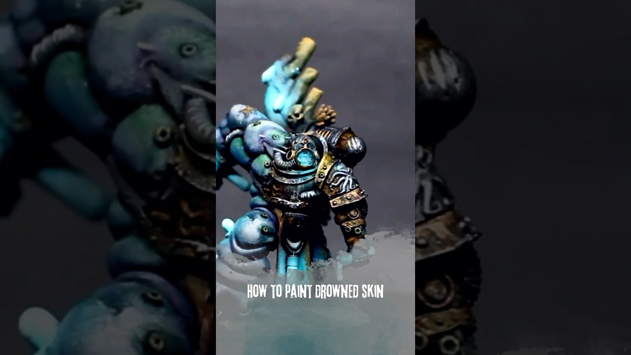
Armor: Abyssal Turquoise > AK3G Ocean Blue edge highlight > Drakenhof Nightshade (thin Drakenhof beforehand? this model was splotchy)
Armor Trim: Tinny Tin > Cygor Brown (Try a flesh shade next time? Cygor is really dark) > Canoptek Alloy
Tentacle: Kislev Flesh > Guilliman Flesh > Reikland near suckers > Flayed One Flesh on sucker tips
Green Slime: PA Bright Green > PA Bright Yellow Green
Barnacles: English Uniform > PA Dark Ivory
Coral: PA Dark Ivory > Citadel Bestigor Flesh > Seraphim Sepia
Helmet: Vallejo Bright Bronze; Vallejo Jet Exhaust > Vallejo Steel 71.065
General Silvers: Vallejo Jet Exhaust > Vallejo Steel 71.065
Tabard: English Uniform > Karak Stone > Agrax
Horn: Vallejo Bone White
Axe Haft: PA Dark Umber > Agrax
Axe Head: Vallejo Black Metallic 73.073
Axe Symbol: PA Dark Umber > Citadel Warplock Bronze > Citadel Canoptek Alloy
"Ghostly" effects (Skull, legion symbol, power pack vents): Vallejo Ghost Green 72.121 > Citadel Biel-Tan Green wash
1:1 mix of contrast medium and drakenhof nightshade worked okay but a little too diluted. Try 1:2 with flow-aid water next time.