#MagYelBlaWhi-Along Jul - Aug
1 messages · Page 1 of 1 (latest)
@thorny oriole @copper forum @untold hedge @boreal rapids @static ether @flat river

Will prepare... in a month or two....
the magic palette. black+yellow=green, black+magenta=purple. Basically all hues but blue

I prefer ochre to yellow. Most of my yellows suck for coverage but I'll manage.
But someone mentioned it has to be a yellow.
That fuscia looks pretty cloae to magenta.
for yellow, I like to use the yellowest yellow I have (not leaning green, not leaning orange). In my collection, this is cadmium yellow light, but just go for what you like. Hopefully it makes a decent green when mixed with black. And hopefully your magenta turns purple when mixed with black to give you lots of options
in my limited (ha!) experience, ochre makes a pretty drab green when mixed with black, but hey it's still a green.
Gotcha so will check some mixes 
Awesome!
Hopefully these will be ok

Yesss gonna join this!
Is there a way to pint these paintalongs so I dont forget?
They seem to dissappear after some time 
What I tend to do is at the start of a month just look at all the ones with that tag and I can then see if I have any I need to start/finish off this month
I have the impression that this is a discord setting that server admins don't have any control over. There don't seem to be any user-level settings for it either 🤷♂️
Is this palette the same as a "zorn" palette? Or does zorn use red instead of magenta? or something 🙂
Zorn was a specific yellow that was more like brown( ochre) this is more of a yellow yellow
the Zorn palette is traditionally a Vermillion red which is a slightly orange red. It's toxic, so people use other slightly orangey reds instead. And as Dork said, the zorn palette uses ochre yellow. So this is not the zorn palette but it's kinda like a super saturated version of it
I like super saturated. 😁 It gives us more options.
I will try to remember this one. Could be fun to try something different. I usually use way too many colours when I paint.
i'm repeating myself here, but the only hue you can't get from this palette is blue. black + yellow = green, black + magenta = purple. If you don't hate mixing, this is a super fun palette

probably! That magenta looks like it could have some white in it but it should work. Does it go purple when you mix a little black in?
Don’t know. Haven’t tried.
This idea of a reduced palette is interesting, I would like to do this exercise, something I haven't tried yet, but I need to complete some of the PALs I'm already participating in, but let's see if I can move forward in this direction in the coming weeks. 💪
These colors are ok!? 😃

Looks good to me. This one also doesn't start till July
I take this opportunity to thank all the moderators and also the friends who participate in PALs, these initiatives are very motivating! You are Top, thank you my friends! 🥰
Is that even yellow?
Is more to golden yellow.

Do you think any of these are better for this purpose!?
Probably 1 or 3 from the left. Ideally something that makes a nice green when mixed with black
Ok, I'll go with Deep Yellow then, thank you very much!
Sure! I mean I don’t want to tell you what to do but one of the neat things about this palette is that green is available via yellow + black
I’m kinda obsessed with this palette.

I'm going to reserve a small wet palette here just for this event, my everyday palette is a mess…
Awesome, great job!!😻
Something I'm curious to see is that even if we all have the same colors to paint the results will be very different, I think this is incredible!
I'll probably paint an orc...Pink orc! 💚💜
do you have a little mix guide for this pallette by any chance? i realise it'll be a bit different given the difference in pigments used but at least as a rough idea?
Something like this you mean?

🎉 this photo kinda sucks. You can get richer purples with magenta+black than this shows.
I also really like Cadmium Yellow Light Liquitex heavy body now. It’s very yellow (not green / not orange). Mixes well with black for green tones.
But the Vallejo sun yellow is fine
Cool - I'm guessing making one yourself is a good way of feeling out the colours for yourself, any tips/know what it's actually called so I can search it?
Probably “color mixing chart” or “color mixing swatch”
Do you measure the mixes or is this just rough
And red
Did you see the mixing chart?
Definitely got some red going on here


I hadn't actually. How are you mixing with the magenta to get the red tones?
What coordinate is the base colour of the magenta on the chart?
Magenta and yellow mix to make red (or orange depending on the ratio). This is why some say red is not a true primary color.
Magenta is C0 and yellow is I0 both marked with small dots.
Above row 0 white is added. Rows 1-4 add black. Then rows 5-7 add white back to the results of row 4 effectively adding progressively lighter gray
Unfortunate I was heavy handed with the black so not a lot of nuance to see here
Maybe I’ll make a new chart swapping in Cadmium Yellow Light Liquitex heavy body. And swapping in the black from the Golden SoFlat line as these are what I normally use. (I made this chart before I had the cad yellow and SoFlat black)
Looks like I'm using my ak magenta - which is a bit closer to C -1 but I can mix a reddish brown from it. My warcolour magenta doesn't even get close when mixed with yellow.
I think I can basically get the -1 line. but there is something in the pigment that doesn't reach the 0 line.
I think a lot of hobby brands probably mix a bit of titanium white into their magenta to increase the opacity and coverage. Magenta pigments in their own are very transparent
Ak in general is very opaque so I wouldn't be surprised.
I will try mixing with different yellows as I used one coat yellow for this test (and that is probably a mixed pigment as well)
Might pull out my cadmium yellow just to be certain.
I love cadmium yellow
I’m pretty sure airbrushing with cadmiums is not advised. If you’re using an airbrush it’s worth double checking.
I won't be with cadmium


Ah I forgot about this already
So is grey primer okay? Or does it need to be white or black?
There is no required specific primer color as long as it's within the white, gray or black.
Since you could make grey with white and black
This is acceptable?
Base is a different color since it's stripped. I had applied a basecoate to that previously.

This might be a bigger challenge than I thought...

Oh nice idea will do one later as well
Entirely stole the idea from further up the thread.
My colors clearly aren't as well pigmented, though.


I'm pretty surprised what a vibrant red you get when mixed
I think I will swap my white though to a Zink White to keep some more saturation. It's not against the spirit to use two whites and two blacks right? Cause I would like to have black ink as final black 👀
sounds like a great fun, will try!
is it possible to use warlord purple instead of magenta? they are virtually the same but warlord purple is form game color and behave better
As long as you use the closest option you have to the actual magenta color yes. Basically different brands have different color names 😊. I have warlord purple and it definitely isn't purple lol

Looks the same to me
Yup I know 😇
The name of that color is silly af tbh. It definitely isn't a purple 🤣
My Vallejo Deep Magenta is more purple than that...
It's wild.
it is deep magenta, mine is just magenta 
Oh yeah, I meant Deep Magenta is more purple than the Warlord Purple.
I'm not gonna use the Deep Magenta for that reason. I have a Kimera Magenta on order, which I hope to use for this.
I forgot to pick a mini for this.
I'll just start and find another one to do  just dork and her sea of partially started minis
Isn't purple one of those weird colors where it is different culturally?
I don't think so? Feels like it's one of those things like numbers where everyone recognizes the same but I could be very wrong
Arrrgh I'm gonna have to watch the whole hobby cheating colors to figure out which one it was
Oh please share when you find it
Is it maybe because of purple and violet?
Im probably mis-remembering. but it was one of those wierd fact things that stuck in my head. Im finding as I get older my remembering is more and more incorrect

In this Hobby Cheating Tutorial, we continue our Exploring Color series, this time with my favorite color - Purple. Purple has a wonderful range of tones and an be warm or cold, even though it might not actually exist. Hope you enjoy!
Twitter: @warhammerweekly
Instagram: VincentVenturella
Email: [email protected]
Take a Class w...
Colors in general are strange. Afaik there was a time were some tribes didn't had a word for blue or green or something
Yeah blue didnt exist for a while cause its not in nature
What about the sky and sea though?
Is what I was wondering. Maybe that's just nature. Or the sky is the word, color doesn't matter
shrug No idea not a historian. Im just a repository of trivia
I know the sea is seldom blue
!subscribe
I really want to Cat Facts meme at you now
How about you paint the duel figure I voted on but you didn't pick in the end 
Oh no which one was that?
Can't find the thread anymore I think something cyberpunky with a open collar which invited for some neon osl
Oh I think it was one sec.
one of these maybe

or was it the mohawk robot?

he definitely does!
I am printing a spider one sec

I could maybe sacrifice it to the MYBW challenge
Such a cutey
We shall see I also has tons of already printed stuff I could just use
Had to prime a base this morning, so figured was a good time to build and prime this guy.

it is blue and purple for ancient greeks
@thorny oriole probably forgot to subscribe here 👀
https://www.scienceabc.com/humans/does-the-language-you-speak-determine-the-color-you-see.html multiple studies on how language affects colorperception.
Makes me wonder if we as painters, with all the names for bottles of paint and the amount we are thinking about and deliberatly seeing colors we expand our color recognision. I feel we do.

Our native language can shape even our non-linguistic abilities which often seem extremely objective, such as color perception. Our thinking is constrained by the language we speak.
As someone who has worked in print production for near on two decades, I can tell you for certain that if you work with colors your perception of them becomes better.
But this will be the same for any hobby or profession. Two beetles or leaves might look the same to me, but to someone who has intricate knowledge of the subject, they will easily notice differences imperceptible to others.
Color blocking my entry


Wow. Completly unexpected model and colors combos and looks great
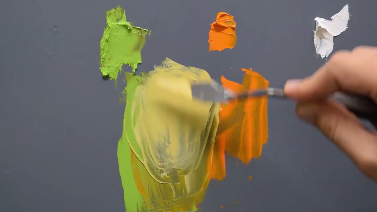
Started mixing colors this afternoon

what is the point of such mixing charts? just exploring colors?
For me it's figuring out what shades I have available to me. I've never tried any thing like this before. I have the AK figure painting faq book and it has great chapter on mixing single pigments. But these combinations aren't really there
It's also how much to add. My ratios for black aren't even with the other color. It over powers them almost immediately when the amount of black gets close to the other color. So it's also part learning
And got the colors down. No where near enough contrast on the skin as I thought I did. But really like the pink and green.
Does the bird work as orange?


Love the bird
Thanks! I'm curious to see how this goes
That gradient looks fantastic.
Bird absolutely works as orange. Pretty impressed with how green you got that skin.
Thanks though I think its more yellow green in person
Im really liking this palette
I'm pretty lost. Don't feel like I know what I'm trying to accomplish. It's supposed to be some albino alien thingy.
Any input here? Probably should just basecoat in a light grey and then add some color


I actually really like the colors you have here.
You can probably build up a bit more vibrancy in certain areas to really sell it. But honestly it's cool.
Working on this as well today. My approach has been too messy, trying to block in all areas. Need to clean up a lot and probably redo most of the purple.

This is quite adorable love the direction
Well, it looks cool and otherworldly, so I think you're definitely on the right track.
Thanks. White mouse in white robe is a difficult sell, without everything looking dirty.
That's a great creme color actually
Thanks for the input I play around some more and trust the process. I think I need some base level to work from and add color to
Ended up here for now


It feels like I should be able to get a nice deep blood red or some nice highlight red but it's not really working. I think I have to underpaint the gradient and then glaze in the color or something. Very strange
Blood red, or pure red, might be difficult as it's outside the CMYK spectrum. Depends a bit on your specific paints.
With the Kimera I'm using, the best I can do is still quite orange.
When testing the palette I did get a nice vibrant red here #1103028456004006031 message
But it's not really mixing nicely for shading. It's why I think maybe glaze will work
I could be my magenta too. I guess kimera could work better
Yeah it looks good. The transition from the orange to green from the bottom to top looks nice. Maybe play with that color transition?
For me I pushed the skin highlights today. I'd love some frank c&c on it for where it's not hitting right. I'm thinking about tinting the deep shadow with a desaturated magenta for a bit of color contrast


BTW loving this for the color mixing to get the shades that I want.
I got a decent red with a 4:1 and 3:1 magenta to cold yellow. And im using kimera also


https://tenor.com/view/you-rang-gif-20538562 haven’t looked on this server for a bit. I might paint a recent mini of the month dinosaur looking guy in mainly purple, green and orange. Haven’t decided just yet

Dinosaur?! There's surprising little reptiles I saw in mini form 👀 welcome
This thing. Apparently he’s called a saurus warrior

The shield does look pretty neat. I can't imagine the squeme here you have to show me 😄
All my Warhammer knowledge is from blood bowl. There is a team with Saurus and other reptiles actually which is pretty nice
Lizardmen team is awesome but they got nerfed in the latest edition 😞
But they got a new player type which is nice
They only had 3, now they have 4
Behold!


Jesus. That light dark contrast
Liking this a lot better now. Got some feedback to make the shadows darker and ended up redoing the skin. I think it may be a bit too dark overall now. I love the way the big wounds turned out. I have just toes, the branch and some touch hood on the bird. And im thinking of keeping the eyes white. What do you all think about that?

White is fine I think but it's a bit unnatural neutral I think. Maybe some yellow aged tint or red in the crease to add a bit of interest?
Interesting how many shades of yellow you have there 
I can tone them down a little like I did the teeth. I was thking no pupil. Possibly cataract style?
Sounds good to me 🙂
Assembled and primed with a mix of black and white primer and a drop of magenta ink

The usual suspects

Wait! There's six paints! Not fair!
Teasing
Also answering my question if two whites and blacks is in spirit of the pal 😆
figuring out colours was so much fun!
sadly i didnt picked cold yellow so i cant play with cold/warm contrast that much
First session with dino boi

Lol. I don’t know if I’ll end up using the Zinc white but it’s there in case I need the transparency. I probably won’t use the magenta ink but I did put a drop in the primer coat.
Some more glamor shots. I base coated the scales a dark green (black+yellow) then layered over them in purple (magenta+black) then added a bit more white to the mix. I base coated the skin in magenta plus a touch of black then layered over it in a light green (yellow+black). Any other purple parts showing are the primer coat. I’m thinking I might do the metals in copper and silver.


Mo color


Hmm so I have to ask as I think you would know. I was told that the zinc white when mixed with others doesn't desaturate the color like titanium does and it lightens it. But it makes the colors more transparent?
Zinc white will still lighten/desaturates other colors but it’s more subtle. And yes Zinc white is quite transparent so it will introduce transparency to the mix. This can be used for glazes/filters. Here’s a pretty good and short demonstration https://youtu.be/_IwYNXDMsnE
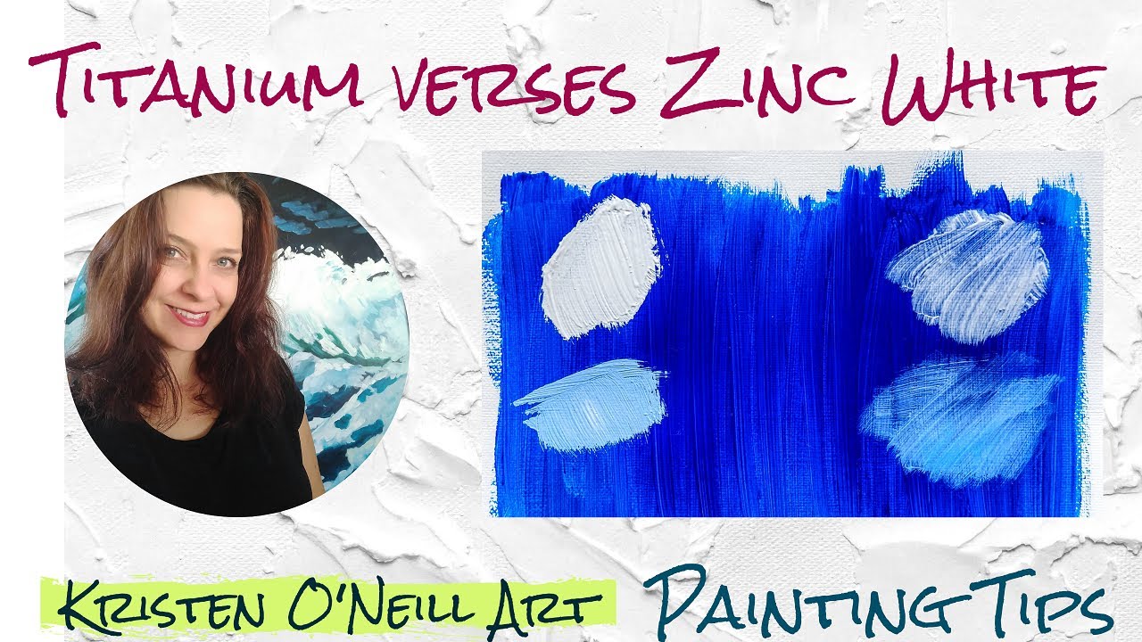
Find out the difference and uses of Titanium white and Zinc white paints. Paint used is the heavy body Golden Open paint, however, the information is the same no matter which paint. Good info for acrylic painters and oil painters.
Similarly, Bone black (PBk9) is a transparent black

Oh and Marco has a video about zinc white as well https://youtu.be/v4oSsBxgkfk

Your color mixing life will never be the same! Support the Channel with Patreon ►https://www.patreon.com/notjustmecha
To SUPPORT the Channel ►
Add something cool to your collection asking for a commission or
!!! PATREON: https://www.patreon.com/notjustmecha !!!
EBAY: https://www.ebay.com/usr/notjustmecha
MERCHANDISE: https://teesprin...
@narrow whale it’s worth pointing out that this applies to all transparent paints. They’re not good for opaque coverage on their own but they make for more subtle mixes and are great for filtering via glazes
Mister noble whiskers is ready! i had so much fun painting this project, special thanks for @thorny oriole , your paintjob inspired me a lot!
Generally wanted to put as much attention to composition as i could because lack of colours let me creative freedom and mind space to do it


Looks amazing! I’m happy I could provide some inspiration. Looks like this paint job will inspire many others! It’s so lovely!
Went with a pseudo-iridescent look on the plate armor and shield although the shield is hot garbage right now. Also was thinking to do copper as the main metal color but thought that’d compete with the coral color in the scales a bit too much. Lots of refinements still to do but happy with the direction.


The spikes are lovely!
Mr. Whiskers looks great 😍
Danke!
I came to the conclusion that the mini I'd selected for this simply didn't push the palette very far, so I'll be painting this instead.

And this is where I'm at so far. Shirt and shorts are pretty much done, I think. Everything else still needs work.

Looking really nice

Nice colors! 👍
It still needs work but focused a lot on the shield tonight


White from the shield is looking blueish. What scorcery is this. Sick orange gradient
For these color PALs, you can use as many different shades of the specified colors, and mix as you want?
I've used that to some good effect to make my layering blends smoother. But it had only worked with certani colors. Its nice to know that there are colors I can mix in to help get that effect with out the mediums. Thank you. I greatly appreciate the knowledge
My guess is he is using some of the transparent blacks or whites mixed with the magenta to get it.
I’m using gray in the gradient where blue should be
Yes, the Kimera Cold Yellow is crazy good for this. A tiny amount of black and it's a fairly vibrant green.
Gonna try and do her for this one


Super cute
What an awesome model.
Very impressed with your purple.
Thanks! It’s Vallejo model color purple, I don’t have a magenta
That certainly makes it a little less impressive. 😄
A little more progress


We try to limit the palette to one yellow one magenta.
Or something close
How did you get that vibrant of a green?
Finished!


I love that mini. And the colors work really well
Yellow plus a bit of black. It’s cadmium yellow light from the Liquitex heavy body range. Also having the more or less contrasting color of magenta in the shadows in theory should intensify the green.
A little more Dino boi progress. Pushed the highlight on the shield and gave him the typical lighter colored torso. Over highlighted the lower torso for that “happy to see you” look 🫠


Staying tru to that sweet ass concept art

The resemblance is truly uncanny.
I'm seriously impressed with that mother of pearl effect you have on the shield and armor plates.
yeah it's stunning
@sturdy scarab @untold hedge thank you so much! 🙏
Almost there. Did some glaze bruizing around the wounds and pushed the highlight on the edges a bit. Did the toenails. And touched up the bird and the branch. Just need to do some rust on the trap and I think I'm done


Nice!
Finally finished these 2 guys after months of working on them off and on. They’re painted in this palette so thought I’d share here.


Here’s the whole group. Painted as individuals but all done in this palette

Finished product. I really liked this PAL. It forced me to look at my paints differently


Looking fantastic.
Thanks!
great job! It's awesome that you see you paints differently now 💖
Yup. The problem is j just want to work with the kimera only now
How's that a problem? 😊
I'm kinda leaning both ways, tbh.
Mixing is fun, but there's certainly some convenience in knowing exactly which bottle your base coat was in, opposed to spending ten minutes recreating it approximately.
Just my inner paint goblin. Ive now got a wall of paint that I am not sure I want to use that often. I also primarily do one offs now. I never did armies or kill teams. At most I would do a group of monsters for DND. So being able to reproduce color schemes was never a problem.
I'm definitely a fan of mixing but yeah it easily leads to spending time trying to recreate previous mixes. I'm somewhat mitigating this by making some of my own mixes and putting them in dropper bottles. On the other hand, if I don't recreate a mix exactly perfectly, it's probably adding some interesting tonal variety anyway. I can undersand how this could be annoying for army/batch painting, but like Pirate Yoda, I'm just doing one-offs
Still have time to join this?
whole month
This was so much fun.

Time to put a new sheet on the palette.

Jealous of all your blue grey 
Looks great! As if your palette wasnt limited
Alrighty, I've been wanting to bust out this labor jack for ages. I think I can make this pallette work with it with some finagling.

Blacked out yellow for a grungy metal base. Greys for exposed workings. Yellow and black hazard stripes on the hyuuugah chainsaw. Magenta for core or stacks glow.
It's not that blue at all. Evening light just messed with the white balance. But the pure grey up against the yellow does register more blueish than I'd have guessed.
This shows the colors better. Added some more shots in #1136006755302772798

i really like dynamic this pose is
Yeah, it's a pretty awesome sculpt tbh. A lot of facial features got lost in my print, unfortunately.
Yeah greys can really start looking blue to our eyes especially if warmer tones like oranges or reds are close by. I’m really trying to push this by using gray in the shield gradient where blue “should be”.

also, haunted by the fact that green and purple can be mixed for blue tones (at least some greens and some purples) I've tried really hard to replicate that within this palette. But at the end of the day, using this palette to mix green (black+yellow) and purple (black+magenta) is the same as mixing magenta and yellow (which yeilds reds or oranges) and adding black to it which basically makes browns. I feel like glazing greens and purples over gray somehow feels like a bit colder gray than straight up gray but maybe that's just hopeful optimism more so than careful observation 🙂 https://www.youtube.com/watch?v=85hRJSY66zI https://www.youtube.com/watch?v=tMDNoipB92Y
Curso de pintura en línea:
https://cesarcordova.com/clases.html

Curso de pintura en línea:
https://cesarcordova.com/clases.html


Progress. Cannot get the same tone of green or gret twice to save my life but only I noticed the difference.


Danger verah big chainsaw


Don't worry that's what the pal is about in my eyes
I think I’ll wrap this guy up in the next few days. Getting to the point of diminishing returns. He’s been really fun to paint using this palette


No 37s safety conscious tools are coming together

I aspire to your level of blending
That’s very kind of you! Thanks!
I gotta say this has been an awesome time. Limited palette really forces you to kick the brain up to full speed. Wish I'd tried one sooner.
Assembly, the fun bit! Now some touch up and basing with I think some old rusty mining works and a magenta crystal.


Better pics. Now with more cat hair


Right let's have a go then

Fuck this is hard 😂

Not terrible for a couple hours work

Let's try this out

Howd you pull off that red or is it orange w/ darkened underlayer?
Magenta plus yellow makes reds or oranges depending on the ratio. Works best with single pigment paints as a lot of hobby brands add white to their magenta to give it more opacity/coverage. Magenta pigments are naturally quite transparent.
If you mean for the hair as Andy said it was about half and half magenta and yellow and then I knocked the saturation down a little with some white.

Seems the mad mining mech was mining magenta crystals


Going to do this random figure.

Not exactly what I hoped. I couldn't get really usable reds from my particular magenta. But I'm not unhappy with the end result.

Should have done something with flesh tones.
Wow, that was fast. Cool result. The colors and sculpt work for a quite unsettling figure.
I have a bit of a habit of being a quick painter. But I then take another day to finish basing to the point that I can submit them.
It’s cool though. You got purples and greens at least. And it works well in this character. What magenta did you use? It could be that the manufacturer added white
Ak3 magenta
Same as I used and yeah you can get orange, but red is a little out of reach
YEah that weird undead sculpt looks fantastic with the purply pink. I'd freak out having to fight it.
Is that turf synthetic turf or do I detect someone else using the spice cupboard for bases?


Waiting for drying is the worst. Sandbox sand was naturally the right grittiness for me but that elmers glue takes for freaking ever.
It's just a bit of baseready from geek gaming scenics, think it's mostly synthetic but not 100% on that
My start. One for this along and the other for caster along

Finished

Made his chest a touch lighter and hit it it with super thin pink and orange glazed to bring in a touch of warmth. Made little futzy adjustments all over. Looks the same as it did before 🫠


Defined and detailed some parts, based and tried to redden the stomach some more. But I think I will take a better photo and call it done at this point after adding some grass tuff


Warty!