#ZornhubAlong Jan-Feb 2023
474 messages · Page 1 of 1 (latest)
ZornhubAlong Jan-Feb 2023
Yes please
awful lonely in here @wise horizon @thorn latch
paint a mini with the zorn palette. do it
I don't know which mini I'll paint yet either 🙂
I also don't have a plan yet but ill probably select from.some of the minis I already have printed
With no idea or purpose 🤣
I’m gonna do my Pina dwarven miner, i think. Don’t really have much plan for it yet though
yeah i think dwarves will look great with the zorn palette
Still gotta pick a model XD
Same but I'm sure one will just fit
Just commenting here to see if this PAL will show up in my sidebar. Not sure why it doesn’t 🤷♂️

Ok it came back after posting this message 🤷♂️🤷♂️🤷♂️ what a time to be alive

Yeah if you don't post in a thread for a bit it drops off your tracking list @shrewd sapphire
that's unfortunate. Is that configurable perhaps?
Would it count if the visible crew of a vehicle (but not the vehicle) were painted zorn?
Technically if you only submit the crew as your entry that's fine. You could submit the vehicle separately
😊
Oh no worries. I mean technically yeah it's fine if you just want to do the dude 😊
Ok, ty
There is no minimum size or required specific model for this pal
While researching vermilion, I learned the original pigment was cinnibar, or mercury disulfide. I thought this was interesting.
yeah there's no chance to find an actual vermillion red nowadays. I think if you really want to try to come close, then a red leaning toward orange (rather than purple) would be the way to go
My preferred paint brand lists quinacridone red as a replacement for vermilion red, so that's what I plan to use.
I'll do another of this general idea. Enjoyed it last time.
I've located the red and yellow ochre in my paint stash. Hopefully they're still good.

I'm using the black so didn't bring it or the white for photo
Hmmm... I prime black. Maybe I'll use zinc white for this to see how it works
zinc white tends to be very transparent making it helpful for mixing. I don't think there'd be anything wrong in using a zinc white when needed for mixing/transparency and a better covering white like a titanium when needed for opacity
I need clean the model I’m using for this. It’s got the start of the last paint job I attempted on it.
Are two of these adequate for this PAL?

Your blood red and bronze flesh shade look closest. Might mix oddly for the purposes of this one
Oh, this starts in january

I need to pick a model for this 🙃 and I'm going to try to do something that I already have printed
I might do my space marine vindicator. Still in shrink wrap. 20 years old
Oh noes. Still haven’t decided what model to paint
I still haven't learnt what a Zorn is lul
I have yellow ochre. But vermillion red is expensive lol. I have cadmium, Winsor (hue?), Or alizarin.
Thx, i'll try to swash that and see if buying paint has an excuse.
Cadmium or cadmium hue are your best substitute. Ideally you’d want pyrrole red/scarlet lake. Vermilion has orange-yellow undertones.
Oh, the winsor says its Pyrrole, would that be good then?
Yeah, it or the cadmium would work
You also typically want ivory black because it’s more transparent than lamp black, but either should work
Ivory is the one I have luckily then
I can't imagine what kinda person I'd be to have so many varieties of all these colours haha
The Zorn palette is a limited palette attributed to Anders Zorn https://www.jacksonsart.com/blog/2021/02/02/colour-mixing-exploring-the-zorn-palette/
An exploration into the colours you can mix using the Zorn palette - Cadmium Red, Black, Yellow Ochre and Titanium White. A popular palette for portraitists
TY for the link! I'm still deciding what minis to paint for this. If I wanted something shiny, could I use a pearlescent white and be within the PAL?
That sounds strange, so yes I want to see how it works.
wip zorn dude.

Looks cool. Few days early for this one though 😉
oh rats! Ok slight deficit of attention on my part. I will count him as practice and do a different mini. I think he is one of a pair.
Christmas feels like the end.
It really does I'm over here twitching not to start January stuff lol
Still plenty of
Stuff to finish thay is within this period...
Oh yeah I have 2 PALs left before the new year but I'm excited to start the January stuff
You can build and prime anytime. No other paint until after
👍
Back to black…and white

Omg his tiny friend 
One of the best things about any of the spira mirabilis sculpts. They have some form of little guy hanging around
oh no... how did I miss this? I was even painting zorn back in november (only the skin though obviously, not the pink hair and loincloth)

lol, first image I tried to post, from behind was flagged by the bot as explicit and didn't allow me to post 😂
I guess that's a good review 😅
Well you haven’t missed it. It started yesterday so you’ve got plenty of time to do a full Zorn mini
so you have to do the whole thing? can't just cherrypick the skin like here even if most of the mini is skin?
Yup, full model in only Zorn
Hmmm... I wonder if I can find another elf from this team that doesn't need the pink 🤔
Pink is possible. maybe not the exact same pink....
true, but it's an entire bloodbowl team that are planned to have that magenta pink in their scheme, but I could just glaze the magenta back in after the paintalong 😂
that actually made my choice for what to do with the boots easier too... I'd just do the greenish brown you get from mixing yellow ochre with black ^^
Futzing around trying to add some value and undertones to the skin

Omg that cute Lil nose
The little mole buddy is adorable
so many of these sculpts remind me of Robin Williams

I still need to pick my mini for this
I definitely felt like I was struggling as I started the mole. But now he’s getting to be fun

Wow I need to figure out my paints for this!
I primed the minis I'm using for this
I’m tired of coming back to this today so I think I’ll call it quits for now

I think need to redo his skin tones a bit to bring them down and make the candlelight pop
It's a pretty great piece and I'm impressed considering the colors available for the challenge 🥹
It’s surprisingly versatile. I can see why Zorn chose the combo
Short hobby day today. But this is where I’m at

Lookin good! 👌
Looking noice
Working on some texturing


And that’s a better white balanced version. I’ll probably need to switch to Lightroom for the final shots to keep the camera from autojuicing the reds

Couldn’t put the brush down. I think I’m happy with just about everything. Need to reconsider the pick I was struggling with the mix of lighting + NMM there

Probably need to tone down the hair in the back too now that I look at it
Rather than continue to futz around and mess up what I already like about it I’m going to call it finished.


I'm inspired to pick a good model for this challenge now. 💖
Lol same you did incredible
I’m so impressed
I need to pick a good vermillion red and ochre yellow
Would any of these work?


The GSW ochre desert seems decent t
Pyrrole red is similar to napthol red and cadmium. The ochre desert is similar, not sure how this challenge would work without single pigments but it looks like the right shade a
Well I don't have single pigments either but will give it a go 😊
Word the poly pyrolle and desert ochre work?
Lol same unless they’re easily obtainable but my understanding was basically all mini brand brands were mixes with the exception of like kimera
They aren’t all. And I suspect that desert ochre might be single pigment because that particular yellow is a fairly opaque one
I think a pure white (which will likely be titanium), a black (more likely a carbon than an ivory, so a bit more neutral), the desert ochre and that pyrrole red (which is also probably a single pigment) should do fine
I'll check my normal acrylics paints and might use those

I'll check the ones I have on hand I gave most of them to my mom.
I do need to go to town tomorrow so who knows.. maybe a Lil extra shopping 😏
the kimera base set has good components for it in my experience if that's something you've been considering. The red and the yellow oxide work great imo.
except for the base and the few metallics this is "kimera zorn"

Yeah, the Kimera set is another good one for Zorn
I’d use the toludine from the expansion instead of The Red, but both are good choices
yeah, good shout! my expansion set arrives tomorrow ^^
I keep forgetting to do this one :c
I forgot to get the better paints so I'll use colors as close as possible
Starting my Lil dude. The closest colors I have. Note that the red isn't quite that orange

Should be interesting
35 mins in

That is a surprisingly vibrant green you got
Ty many many layers 🤣
Mind you everything else is so dark right now so might help make it pop
Okay so this mini took about 1h45 . It's definitely too small for the big challenge. But it served its purpose. 🙂
(Waifing for it to be properly glued before I take photos )
Yeah, I think this one really benefited from having something larger where I could play with texture (though I need a tripod because my hand shake blurred some of my work). It’s a fun challenge
Yeah it would definitely be easier had it been bigger. I should of used the other girl I had originally saved for pinup but oh well c'est la vie
Not bad for 1h45 min. Her one foot had a print defect but it's fine 😊


wow, you painted that in 1h45m? that's crazy...
I wouldn't have a base coat in that time
Well since I was limited to colors I couldn't spend a lot of time figuring out paint colors. But I worked from black and glazed around it worked pretty well 🙂 had some surprising color mixes and could of pushed it but at this size for the zornhub it's a bit difficult
I must just paint very slowly 🙂
Naw I normally paint slower but I was on a mission
The ochre mix a bit of black and glaze it .over black
WhaaaaaT
Yeah, ochre +black goes sorta green
I’m guessing that dork’s ochre had some green pigment in it to get it quite so saturated
Early on with the shirt. I leaned yellow because it went that way as I tried to desaturate with white

That or the AP black has a little blue
I think the AP black has some blue because when it isn't mixed correctly it looks blue
Could be a different black pigment too
Probably uses a carbon black
Ivory is a warm black that’s somewhat more transparent. Carbon/lamp black is cooler and more opaque
Lol I still don’t understand how on earth you did that skin
It’s an awesome palette for white skin
Not sure how other skin tones would go. Swarthy Mediterranean might be as dark as it would reasonably go
it's really what Anders Zorn is known for
Magic?
pictures of mainly pale skinned rural swedish women doing various household chores
or like bathing.. saunaing... that type of stuff
for instance

a lot of explicit but not really sexual... like they're not posing they're doing stuff like putting their clothes on in a non-flattering way, getting in the water etc
Ah yes I always knit in my winter coat in the sauna
clearly cheating and not using only zorn palette there with the green

I mean, he also used other pigments
that's not in a sauna, that's in a cross timbered house 🙂
Lolol ohhh
yeah, I know. I was making a joke 🙂
Oh I know. We were typing at the same time and yours posted first
But yeah, he had multiple tubes of blue and other “non-Zorn” colors scattered in his studio after he died. He just leaned heavily on that palette which worked for a lot of stuff
Toot toot
You going to Zorn?
Yeah just needed to refresh it on my list haha
Very nice work so far.
As I work on coming out of a ptsd downturn I've been thinking what to do for this.
The caucasian skin tone of the dwarf miner is amazing. So is the dark tone of the goblin, it looks green to me. If it was black + yellow ochre I wonder if the black has a blue cast to it.
The figures I've set aside for this have exposed flesh. I usually paint brown skin tones. I guess I could start with black + yellow ochre and if that goes green for me I could add red. Or maybe just black + red from the beginning might work too. I don't know that I really understand brown. I really want to do this PAL because I don't usually mix paints. I think it will be good for me to try.
will you be painting brown skin tones now too?
when painting caucasian I usually start with red + black to get a warm shadow where midtone meets shadow (because, there you'll have light sub surface scattering and getting colored by the blood in the tissue), I think some extra ochre in there is probably not a bad idea as more light will be eaten by the melanin.
How I think about it when painting caucasian is that ochre is melanin, red is blood and then modulate light/dark and saturation with black/white. So by that logic, if it still holds up, brown skin would contain more ochre. Then again, there are multiple colors of melanin in skin so finding the right proportion of black in the midtone is probably key.
Thank you. That's a helpful way to think about things
A few thoughts:
If you’re doing this with accurate paints a green like dork achieved is basically impossible. The traditional black is ivory black which has warm yellowy-brown tones when diluted. It serves to create an illusion of a blue tone because of the strength of the red and ochre.
Mixed with ochre it will form s muddy dark green but it rapidly goes to a grayish beige or a yellow depending on which pigment is more concentrated in your mix.
A carbon/lamp black (which is almost certainly what you’ll have with a hobby paint) is a cool black and will come out much bluer.
As for skin tones. On the miner I started like Robin suggested with a black-red mix. Because I was aiming for a Caucasian tone I then created an ochre-red mix, adding black to desaturate the orange result. Then small amounts of white with ochre or red to adjust the mix as i layered my highlights.
If you wanted a brown skin tone I would try something similar to the leather I did. That was a black-ochre mix to get the muddy green. I then started adding small amounts of red until I got the brown I wanted. Highlights consisted more of ochre and a little red with only tiny bits of white added. On skin I might consider using more white and then glazing one of the darker mixes back over to tint. The black-red base is still a good starting point for any human skin.
trying to decide between one of these two previous free mini of the month models for this PAL


I love dino boy 
yeah! and he might be kinda cool in red or maybe the zorn olive drab
Or both 
ok yes. gonna do lizard lips. not sure what color yet but
i'll save shooty guy for a different PAL
this will be interesting now that I'm obsessed with purple shadows 😱
Oooooo yes purple shadows are Bae
I second (third?) lizard boy
We definitely want to see a creepy human skin tone lizard. Or you make the lizard ochre-green and the shield made of a patchwork of human skin
;D
are you commissioning this piece? 50€ per hour and I'm a very slow painter
😬

https://www.instagram.com/p/Cn6qKfOtfM1/
@shrewd sapphire actually, imagine instead of turqoise it goes into yellowochre-greenbrown
Hey! Borjammer al aparato!
Me he venido muy arriba con los nuevos Seraphon, así que voy a grabar un proceso de wargame nuevo donde podréis ver como pinto eslizones a mi manera! Estará antes de que salga la nueva gama así que no os lo perdáis!
Hey! Borjammer here!
I am SO excited about the new Seraphon that I’ve decided to record a new proces...

That would be cool. I like the original here too. Will probably start on this project next week 🤓
Oooh, I'll have to see if I have a suitible black for this. Every other time I've done zorn I've done it with super dark blue instead of black. Will be interesting to see how that changes the outcome.
My black was a blackish blue and made some.cool colors overall. But excited to see how yours turns out
I used to use abyssal blue from scalecolor. Is that too blue?

I'm not sure the only pictures really show how blue it is, cause it looks pretty black, but I can full mix purple with it

Yeah, I'm not at home so I can post photos. To me it's definitely a blue, but in schemes it reads at black when there isn't true black(which I don't really like painting with straight)
The whole point of Zorn is using a black to read as blue though
I'm not sure I'd say it's the whole point but it's certainly something you can do
Well, using a definite blue is pretty against the spirit IMO. It’s meant to be a 2-color palette. Up to the mods I suppose
Technically it should be black paint to keep up in the spirit. Even if it is used to look like blue 😊
Yeah, I'm gonna have a loot at what I have
I could use the colours in the Kimera base set for this?
Their yellow oxide is pretty perfect. Their red is not as orangey as a vermillion but I’d definitely say it’s close enough
Oh cool, maybe I'll be able to do this then haha
Hmm... I wonder if I'm stupid if I try painting a model that's like 80% steel with zorn 😄
Can create both cold and warm browns... perhaps is enough to make the steel interesting? 😄
Sounds like a fun challenge
Maybe? Feels like I’m chickening out with the chroma though

Feels like it’s working. It seems relatively cold but could make a good counterpoint if you treat her chest like it’s covered in brocade over the armor?
And kept her skin and the brocade to warm tones
ah... I was going to go with some desaturated brass/gold but treating it like brocade is an interesting idea
Yeah, I know most people treat it like a metal, but the trim by the armpit feels like it could be a fabric cover over metal if you wanted it
Ok, i’m liking it

Nice
going with ochre bias for the light side and red bias for the (ground) bounce light
I think all my blacks are carbon blacks lol really narrows down the choice for me lol

Sketch-sketch-sketch

Nice 👌
oh yeah, should post it here ofc 😄

It looks great Robin
Decided on a figure for this challenge. Will see if I can get it done in time.

Made a start. Wash of black/red mix plus water in case anyone is wondering.

Highlight on the green is too white. I may have to redo once dry.
Love this old school sculpt. Where is it from?

Current from satyr arts studio. @shrewd sapphire one of those companies that do 'oldhammer style'
And I think it's a bit closer than 'reminds' 🙂 @chilly horizon
cool thanks!
yeah, didn't realize how verbatim it was until I dug up the image 😄
I can't decide between the punks  maybe the guy with the robot for the different textures


Having said that the green didn't turn out well, once the wash that I had put on it in the last photo dried it somehow looked great. I'm not complaining at all.


what do you guys think of this color scheme? I'm mainly worried the chest thingie will be too distracting with no other so purely red elements.
I might not be able to achieve that hair color with the palette but some kind of reddish hair should be possible.

I considered giving her raven black hair, but that feels like a total no-go with the chest plate, which I guess I'm not married too... but then I'd need to desaturate it and then I'm basically down to monochrome which feels like it's defeating the whole purpose

Keep the red hair.
I think I'm done. Thoughts?

Fantastic! Great use of the palette. Scroll is 
Love this mock-up. I guessing you could get pretty close color match on the hair. I def love it as it is but if the red on the armor isn’t speaking to you then maybe go for a green gold vibe?
I mean... I like how it looks, and I imagine it needs the warmth with all the cold steel...
perhaps I should just check again how it looked with pure gold or change the red to steel.
…and now time to paint gold filigree until I go insane.

It's looking great tbh
thanks! was hoping to manage to get to a paint-everywhere-state before tomorrow to be able to submit it for the monument hobbies january challenge, but I suspect it might be a lost cause considering I haven't even glued on the sword yet 😂
I mean... there's literally no way, I don't even have a clue yet how I'm supposed to paint this finely textured chainmail... would it be cheating to use a black oil wash to get the holes back after unavoidably fill them with grey paint? 😂
I thought that was a rough wool cloak
She doesn't need a sword 🤣
Sculpt a marshmallow and poke it on the toothpick
well, at least swords are pretty fast, painted a bunch on my elves so I think I can do them by the numbers at this point... but that might be hubris since I don't have access to any blue this time 😂 SHOOOOULD be the same right? 😄
the thought has struck me. the box art has it as metal though... but like, why on earth would you wear chainmail as a cloak? on top of platemail also.
And why would it flow like that
true... it's also kind of torn
which I guess you can tear chainmail but...
why do 50% of all miniatures have torn cloaks? 😂
(because it looks cool obviously, but it is a bit of an overused trope)
Being sexy is hard
especially when wearing platemail that adequately protects your chest!
hmm..
purple metal?
https://www.instagram.com/p/CGU8oKmn7o5/
I'm not even going to comment this.

it's a shame ironheart is some marvel character, it's impossible to search for this mini on insta >_<
I really wish they allowed you to search for multiple tags and get the intersection
It looks to me like z ignored the texture and painted in volumes like it was fabric
Kirill too. Except he painted the individual strands of the weave
kirill's reads very much as metal to me
most ppl on pinterest seem to be painting it in somekind of maybmetacloth
but actually... I wonder if maybe I can just get away with drybrushing it
It’s just…physics screams it must be cloth
mithril!
I mean, you're not wrong.
tbh, I think kirill just painted it metal because he can.
the reflection on that middle fold...
I think I'll attempt some yolo-drybrushing, regardless if I go metal or cloth
It was also private commission, so maybe what the client wanted
what could go wrong? 😄
tru true
I actually don't like his version. I mean, it is masterfully painted... I just don't like the color choices
or the eyes really
this... this is what metal looks like, no darn checkerboard gradient everywhere. I've been trying to be brave and paint metal like this... but it's so easy that it just looks flat grey if you don't do it in the right place and with everything around it selling the metal

Sure. But do you really want to spend the next month perfecting the metal?
oh, I don't mean for this model, I mean in general.
dare to have larger areas with maximum value because they're flat and reflecting something far away like the sun.
https://www.instagram.com/p/CnqITAGqKhY/
I've been trying to push it more and more with my elves... but it's hard.

I mean... I'm not sure it's actually HARD, but it requires faith in the process I might not have 🙂
I mean…better still than me. I just gave up on the pick for my miner
I only compete against myself 🙂 If I beat past self, I'm happy (though not satisfied as past Robin keeps getting better)
thankfully he fucks up now and then and regresses or plateaus... otherwise it'd been rough.
I’m going to need a scanning electron microscope to refine this filigree 😬

Looks really nice! 👍


Thanks 😅
Awwwyeah, it’s time!
(Holy shit this sword is huge)
(Sorry for the spam)


darn... it's getting too late, think I'll have to give up for today... so close though...
Next step:

Very nice bloom on the sword
I hope it's clear that the sword-blade is a digital sketch, we'll see if I can pull it off in real life 🙂
I have to say, I kind of like the ochre yellows contrasted with the reddish browns for steel, more so than I thought I would. It gives a kind of "raw" feel to the steel. Though only having those two modulations does paint you into a corner sometimes where you've used them and want a third hue for light coming from another direction.
Of course I changed my mind at the last second... Sketching my brush as well for a challenge, and to make it a bit simpler with the weather atm.

Playing around. So keen

loving this sketch!
this is what I should start doing more.
Stop putting microscopic blotches on the palette and actually build a proper matrix of mixes that I can sample from
this is spectacular!
Gold time 🙂

I feel it (the gold) is kind missing contrast and I have no idea how to paint this type of ruby, but I think it’s time to move on 🙂

Yeah it's been super helpful, and because each blob was a ratio the levels are super easy to recreate if I need. Obviously it's not all the combinations, but a helpful jumping off point
yeah, I have this bad habit of just mixing super small spots so I have to remix the same mix over and over
Haha yep. My tiny blobs get more and more watered down till I can't use them too
Managed to get some good blocking done in the hours before it was far too late in the night. I miss cool tints, but otherwise pretty happy with it so far. She has some environmental lighting on the back side that I might also bring to the front, not sure yet.


This back light is insane, love it!
hah, tell me about it! trying to paint steel without blue felt like having one arm behind my back. It did however force me into using pushing the red into things and then using the ochre + black as kind of a cool-counterpart which actually worked better than I thought it would
the OSL on the leg looks so good
yeah, I'm thinking of really leaning into the "city on fire" vibes for this one, and just go super warm
a fitting mini for it ^^
So much happier with more. Going to have to stop myself going overboard with it also my phone picked up her face as a face to focus on, always a proud moment.

Sketchy basecoats


Not liking the off side of the blade, feels like a lost a lot of contrast. Think I either need to tone it down or tone it up 


interesting red shade there on the underside of the weapon... in general though, looks like it'll be a very naturalistic lizardman
Add some of the red into the reflections shadows maybe? I think it looks pretty convincing
Let’s see how it goes. I like to do lots of washes and glazes for color depth. I’ll probably push the skin more toward yellow ochre with just hints of green but it’s really all an experiment especially with this guy. The weapon is basecoated in a light grey, then I did a thin wash of red+black just to help define the recesses.
I shoulda posted my colors. I’m using:
- Naphthol red light (PR9, Liquitex HBA)
- Yellow Oxide (PY42, Golden SoFlat)
- (carbon)Black (PBk7, Golden SoFlat)
- Titanium white (PW6, Golden fluid acrylic)
Yes ive actually started doing this, likely need to go further
Finished my punk today, just gotta process the final photos. Decided to stop while I was ahead, and not over do it.


Love this, it really invokes a story in my mind.
thanks! first time doing some extreme lighting, i think I'm just gonna finish up the other three punks in the same theme cause I love the outcome so much. also then they aren't sitting unpainted for the rest of eternity
A little more progress on ol’ lizard lips


wow, that's really cool and so different from what you're used to see lizardmen painted in
The collection grows

Thanks! I had a slow start with him, but now I'm really having fun trying to get some color out of this palette 🤓
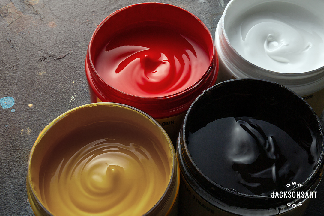
Glamor shot of the palette 🤓

cool that you managed to get such nice green. my kimera yellow oxide has become weirdly liquid so I swapped in an AK Golden brown (basically an ochre with maybe a slight bias towards yellow) but it quite quickly becomes quite muddy when mixed with AK black.
actually, the golden brown looks a tad darker than my vallejo yellow ochre, so that might be why too
also could be that none of those substitutes are single pigment, leading more quickly to muddy mixes 🤷♂️
but yeah, I am pleasantly surprised at the green tones I'm getting. I think it helps to have reddish tones in the shadows to make the green pop a little more. Plus glazing with greens with progressively more ochre
oh yeah, that's definitely the main cause.
but I guess I should try mixing it with charcoal black too just for science 🙂
not sure if all the things I did really made it better but feels like a net positive at least 🙂

looking really nice!
Doubt I'll get something done for this at this point 😂
Painted for over an hour tonight despite looking almost exactly like the last update 🫠


haha, classic
Y’all impressing me immensely with the colors you’re getting
Squeezed in about 10 minutes of progress into a 90 minute session


I squeezed in no noticeable progress on maybe... 2½ hours? ;D

also managed to botch the edge highlights. there's a really anoying convex grind on the sword that's too small to paint but looks bad if you edge highlight >_<
How do you fix the bitch other than painstakingly? I botched some recently lol
Enough for tonight!

Will try to at least three quarter ass this base instead of half assing it.


nice, what type of environment are you going for?
shit, I think I made the sun glare in the eye too strong/big >_<

trying to get a little tone of red in the reflection but it's making the entire hair look brown...
I wonder if I made the non-black area too big and need to go all the way to the peak highlight before I evaluate it... perhaps doing it entirely monochrome first and then try to add the red?

I think I need to just cover all the black primer with my matte black also because this image is actually not looking as bad as when I'm staring into the glare of the black primer 😂
On the hair? I think it looks good in muted tones.
I want it muted, but to me it's reading as brown and I want it to read as black.. I suspect more of the hair just needs to be pure black
maybe I should only add the red at all in the areas where sun is passing through the hair rather than reflecting off it
I’m waffling between reddish American southwest and semi-jungle ruins
both would work.. perhaps the former would be easier with the palette. doing some brown-red sediment lines in that rock would probably sell an overturned sonora rock
Rough sketch of the idea. Needs work but I think I’ll stay with this direction. My parents who retired in Phoenix will like this 😄


Tempted to sculpt a saguaro 🌵
haha, that'd be awesome
I did something similar for some zorn minis a couple of years ago

I did cheat on the bases though, that's magenta mixed with burnt umber and pale sand drybrush
CHEATER!
I suspect you could do it zorn though 🙂
(i also used gold metallics on those models)
I was mostly using zorn to learn how to paint skin tones
painted a bunch of muscle bound barbarians 🙂
Even Mr. Zorn didn’t always use a Zorn palette. But then again any palette he used would have been a Zorn palette. Zorn paradox.
I wonder how often he used vallejo metal color gold 😂
Pretty sure he invented it.


You can get green tones by mixing yellow and black
Assuming you want greens that is
Mine are r going green 😭😭😭
Like my black is too pure lol

That’s the color I get
Oh. Probably the ochre and/or the black are a mix of colors. 🥺
😭
They’re supposedly pure pigment but who knows
Lol ignore that he’s shiny atm


I like the richness of color in his flesh
The base does read as a muted olive green. If you mix more ochre into that for highlights, it might help it read as more green. Just a thought. I don’t wanna tell you how to paint your mini 😅
I’m actually super impressed how well zorn works for flesh for me I didn’t think it would work for me because I’m awful at mixing
Lol no all input is welcome!
I appreciate all help lol
If it helps, it’s always good to start with the lighter color and mix in very tiny amounts of the darker color.
Lol yea that does
Lol not sure if it reads as more green but the dude was glued down so I worked around it lol I like the yellow though

It does feel more green!
Yeah! I like missy cave too tho 😎
One other possible trick to make the green stand out a little more would be to do the shadows and /or crevices with the purplish brown that you get from red+black. It should be enough of a color contrast to make the green feel more green. This was a big component of the impressionist movement
Ohhhhhhhh
I see
That makes sense makes sense
Idk if it made it more geeen but I think it looks a LOT better!!

Heck yeah!

Did a lil more ochre on top I like that a LOT better!!! I appreciate your help!!! 🙏
Helps make the base a little less boring lol
I think I need to hit him with a little more green to make it pop more, but I put the purplish brown in the skin shadows. I think it helps here but it is pretty subtle. I can def push it more.

It’s definitely a muted olive green but it’s definitely green!
I think I posted this already but these are the paints I’m using.

Nah lots of PA are mixes
repainted the shoulderpad and the visible part of the breastplate steel.
The big question is if I'll be able to paint the hair in the next 10 days 😂

does it read as a dent on breastplate to you guys? (it's quite subtle, you'll need to zoom)
Just above and right of the gold trim? Yea, but like, from a small punch (maybe an arrow?) not a mace/club
I was actually inspired by the hits by handguns they used to do to proof the plate after crafting
but yeah, some kind of piercing dent
looking at some references, musket ball proofing looks bigger though 😅 oh well 🙂
It surely does to me!
nice 🙂
okay I got sick so wasn't sure if I was gonna finish all three(I know it didn't matter if I did, but I wanted to close the project off and not have to come back to it)


that's so cool @summer belfry, especially when you put them next to each other so the OSL lines up.
My only question now is when we get the rest of the diorama 😂 ❤️🔥
also OMG that freehand emblem on his back
maybe one day haha!
and yes! based off a back patch from one of my fave patch maters, I think it reads okay, I didn't wanna mess with it too much

that is so sick, where from?

Inner Decay
14.25 x 9" Embroidered back patch with hot cut edge and iron on backing
ah inner decay, shoulda guessed lol
haha
hmm... getting close I guess... face and chain still needs more work though. got to fix the hare lip 😂

I think I might have given her duck lips by mistake... 😱

That's kinda funny, but yeah the bottom lip is brighter than the top so it sticks out a bit 
ah, you are a genius, I was thinking it was that the upper lip was too bright but of course, it's the other way around... which also makes sense because I highlighted the lower lip more 😂
also... perhaps the very dark line under her lips is making it look like the lips are standing out more from her chin
Yeah
here I'm trying to make her look badass with a scar and then give her duck lips 🤦
That NMM is insane tho
Calling it here. He was a fun little fella but time to move on to other things.


I try!
Nice piece, I think I'm about to call mine too... last day of the PAL 
I can’t believe the colors you got from this!!!
Thanks! Looking forward to the final version of yours!
Thanks @pallid jacinth ! I don’t know how successful it really is, but I definitely tried to use color relativity to exaggerate the colors. The gray in the weapon appears more cool (in theory) relative to the hot orange (plus the gray shadows have a bit of ochre in them to pull it toward green). The scales and head spike thingy are a sort of crimson brown (black plus red) but highlighting them in pinks (red+white) and mauves (red+white+black) kinda suggests purple. The olive green skin mixed from black and ochre isn’t super vibrant but putting the roughly complementary crimson brown in the shadows makes the green (in theory) feel more intense. And adding more ochre to the green for lighter highlights brightens it a bit while still reading as green. … in theory!