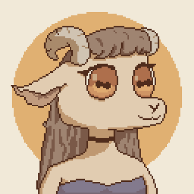
#Reddit Icons
1 messages · Page 1 of 1 (latest)

50px

that 50 is way too tall looking


I reduced height by 1 pixel
it's travelling to the right

The tricky part with the 50px icon, with a stroke of 3px, is that I need to place the lines at the center of each pixel to ensure that the edges of each line then land between each pixel. This also means for a symmetrical design, it can only be max 49 pixels wide - I have to leave a blank column of pixels on either the left or the right of the icon.
This gives a nicer image in aplite

you don't have to have all the strokes be 3 wide
some can be 2
with 80px you can have 3px and 2px strokes too
Ah okay, that should make life a bit easier. I thought it was only the 80px, we can use 3px sometimes.
I might be wrong
though I think there's a precedent in what lavender did

GitHub
Icons for Pebble. Contribute to pebble-dev/iconography development by creating an account on GitHub.
No i think you are right. I just read the style guide again.
I did not realise that for 50px, we can use thinner lines.

Okay. That is weird. It is in the centre of my image.
it is fine on the website.

tweaked 50px

Set the antenna ball to 2px which i think looks better.

Close to the current logo


25px
for some reason the right side of the smile is coming out different to the left side of the smile on basalt, even though they are perfectly symmetrical
yeah, it is like that
Is there anything that can be done?
I'm pretty happy with these now. I still need to rework the 80px icon. Any feedback let me know.
I think it looks nice
Months later, I finally having a go at finishing this!
This is my 80px attempt. I thought it would be fun to do the full Snoo. The svg gets a couple of errors in the pdc export but i was focusing on how it looks in the pdc preview, and it seems to look better this way despite the errors - less anti-aliasing.

I think there might be too much padding
you could probably make it full height of the icon
especially since it's a thin icon
snoo is also a bit thicker in recent art

Yeah, he's a bit skinny right now, I agree. I'll play around a bit more.
I was starting from this. I used the head that i had already done for the 50px design, but it is maybe a bit too small compared to the body. There's room for improvement.
I recommend placing snoo somewhere as the transparent non interactable top layer to be able to reference the dimensions
same for most icons
you do still have to make decisions at some point, but at least you end up with a result that makes more sense in terms of dimensions
Yeah, that would have been the smarter approach from the outset, rather than just winging it! I'll try that now.
Coming back to this, I was frustrated to discover that I had totally forgotten everything i learnt about using Inkscape since August. It's like starting from scratch again.
you should check out the pinned file I sent in #art-design that contains a template for drawing these icons
Found it. Thanks. I had not seen that.
80px:

It finally looks right I think. I updated the PR on Github, if people are happy with this. I also tweaked the 50px and 25px icons.
50px:

25px:

80px (slight tweak to antenna)

why is the 25px so small?
compared to the canvas size
it's also much narrower than every other of these icons
Currently, it is 24 pixels wide, simply to ensure that it is symmetrical. Otherwise, the stem of the antenna would need to be halfway between two pixels in order to be in the middle.
That said, I have just realised that if I change it so the stem is leaning and not straight, it probably does not need to be precisely in the middle and I can fill the entire width. I drew this icon back in August and it didn't occur to me at the time. I will keep tweaking it.

it is only one pixel narrower than all other icons but I guess the ears make it seem even narrower.
hm, right
it's tricky because then the eyes need to be off by half a pixel but perhaps i can figure out a way to make it look okay
do they?
Actually, this might work, with the eyes further apart

Or maybe this:


Hold on, I messed up the stem (wrong angle). Try this:


Perhaps this is better:


Or a slightly shorter stem:


The alternative is the eyes 3 pixels apart rather than 5:

Or do something different to the larger ones:


I worry not having round eyes deviates too far from the official icon
Ok now I am cross-eyed. Too many Snoos!


I can't decide if this one works
I slept on it, and this morning I began thinking that perhaps it should be closer to the modern Snoo design as outlined here: https://redditinc.com/brand
Brand - Reddit

For the 50px, I will try and do something closer to this, and then the full Snoo for the 80px


sorry for a rough edit, doing it on my phone, but maybe something like this would be a nice addition

the smile is also a tad wide
Yes, I had planned to do that for the larger icons, but did not think this one needed it. I'll try it though. This icons is probably more rounded than the typical Pebble style, though it still uses only the permitted angled lines. Personally, I think it looks better, than the ones I did above that were more angular - those made Snoo look like a robot.
@proud wigeon Any feedback? I changed the eyes to a vertical line, which looks okay, I think, and matches the Pebble Snapchat icon which is nice. Personally I think this mouth looks so much better than the earlier versions above. I think it has more personality this way. You may diagree.
I will rework 50px now.
these are much cuter with the ears integrated into the head
yeah these look good!
the mouth being functionally a filled shape doesnt bother me, because it is cute
i'd merge this!
the vertical line eyes look great, fit the style, and the wide smile is readable at tiny size
Ok, let me work on the 50px and 80px.
I don't think this is as good. Even one pixel added is too much. I think i might work with a thinner stroke on the larger icons though.

hmm yeah
we're looking at the corner between the cheek and the ears, right? it doesn't rasterize as well
Maybe? I just added half a pixel line. It changes nothing on Aplite, but adds an anti-aliased pixel on Basalt, in the bottom inside edge of the ear.


i actually think that's quite nice. It gives the ears a bit of dimensionality on basalt. (is that a word?)
oh i think i'm confused
yeah, i guess you haven't been staring at these as long as i have!
oh i see! yeah the extra half-pixel looks very nice here
i was seeing the hard right angle between the cheek and the ear on aplite, and i wrongly assumed it was a regression from some previous look
It's really about whther the one immediately above is better on worse than this one: #1406642736140128296 message
I think it probably is, but at this point I am cross-eyed!
yeah! i like the tiny extra little bit on basalt
ok, i will try it
I've been playing around with their current logo in the speech bubble for 50px, but I think the head alone is better. Much too busy otherwise. I figured that would be the case beforehand but wanted to see how it might look. Few people know the Reddit logo with the speech bubble anyway.

that is significantly too round
#1337544627741397034 might give you a clue on how to handle round shapes
Agreed. I'm abandoning this idea. Snoo alone is enough to recognize it as Reddit, so I think the bubble is redundant
@unborn sierra Was this what you meant for the mouth? (45 deg on either side)


yeeah
Yeah that's better. I like it!
Perhaps shape-wise it does not match the Pebble style so closely but it does have lots of the Pebble personality.
it does match pretty good if you ask me
I've had this problem before with Inkscape, but I can't remember how I fixed it. Do you know what causes it?

what's the line width set to?
3px (except for under the ears that is 2px)
I seem to remember it is something to do with the page ruler settings or scaling or something, but i can't find it. No idea how it broke. I just remember that it happened once before. I'm not that familiar with Inskcape. I mailnly used illiustratotor in the past. I'm working on the 80px right now but will come back to this. Don't worry if you don't know. I'm sure i'll figure it out.


Scale is correct. Weird. I'll keep looking. I bet its something simple.
what are the units in there set to?

Thanks for having a look

I'm trying to think if there is a way to have Snoo wearing a Pebble in a way that would work, perhaps holding his arm art
Finding the right balance between the cute curvy Snoo and the angular Pebble is really tricky. Too angular and Snoo looks like a robot, too curvy and it stops fitting the Pebble style.

It was closer to the old Pebble logo before but I was trying to get Snoo closer to their modern branding

robotic is not necessarily a bad thing
I think Snapchat and my Duolingo might be a good example of the full characters, both try to use very few strokes
roundness is implied more than shown
Well there is no actual roundness here. It is all straight lines. But I know what you mean.
I thickened up the internal lines.

I'm going to bed. Late where I am. I will see if I get this nailed down tomorrow.
I just realised Snoo looks like a mermaid now. lol
💭

Ok, I finally fixed the stroke lines in the 50px file. It somehow had two nested transforms, so the actual stroke was only 1.47 and 0.98, which was then scaled up to 3px and 2px respecitvely. I had to give it to AI to figure that one out!
Right now it is basically identical to the 25px version, just scaled up, and with 3px stroke, though i made the eyes 1px wider because they felt a bit too thin at 3px wide. Perhaps that is against the rules? This is the eyes at 4px wide:

Forcomparison here are the eyes at 3px width

@proud wigeon Was this the sort of thing you were thinking?

i broke the body lines a bit. It really felt to straight with a single straight line.

legs, body, and feet now use one less line each than before
TBH, I don't love it, but it may fit the Pebble icon style better

I have commited what i have done so far. 80px likely needs more work.
that sort of shape, yeah!
we're getting close
can you knock out the lines separating the feet triangles from the body triangle?
It really needs the line between the feet to stop Snoo looking like amermaid!

Here it is with the top arm line removed.

I like this a lot!
He looks like he's been at the gym a bit though haha
(I keep writing 'he' even though Snoo is apparently genderless)
the only way to stop the arms looking big is to add a new line
make it straight
vertical
why does the upper part of the mouth go in? it looks like a shocked expression more than smile because of it
it's the way the mouth gets converted. Perhaps there is a better way to draw it.

i tried straightening the arms a bit


I would do

I tried to bring the arms in a bit so they don't look so muscular. It required adding a vertical line, so if you think it is too curved now, i can change it back.

That mouth is great.


I updated the PR with these revisions.
I lengthened the line under the arms by 1 pixel and I think it suddenly came together

just looked through your most recent PR
25px and 80px are perfect, i think
50px is a bit too round, particularly around the head
i am just making some fixes to 80px
If you can squash your branch down to one commit and git push --force, i'll merge it
Ok, will tweak the 50px
some node errors snuck into the 80px in the last round of tweaks and i am fixing those now
I fixed the node errors and made the chin line 3px


yup! there we go
squash it down to one commit adding all three icons, and I'll merge it this afternoon
It only took 5 months! 🍾
@proud wigeon We are good to go: https://github.com/pebble-dev/iconography/pull/47
(it took me a while to remember how to squash commits!)


For some reason, my 25px icon is missing its eyes and antenna on my Pebble. Any ideas why that would happen?

that's easy to verify, we just aren't testing it at submissions in the iconography repo
Should I be saving the files as optimized svg? Sometimes, I have left the original trace image in the file reasoning that it could be useful if anyone ever wants to change them. Perhaps I should remove all the extra stuff? I don't why else it would not be displaying certain lines.
It is not just this icon. Airmail icon as well - it is missing the outer border, but the envelope part is fine.
I would remove all the extra stuff, the renderer is fussy, and it will try to render everything in that file even if it's out of bounds
but I doubt that's the issue
It seems the center of the ball is there for 25px, but the stroke is not visible.
@unborn sierra I found the problem. I had to check the xml editior to see it. The problem elements had a "stroke-width" value that was different to the rest of the file.
yeah, I already fixed those in my local checkout
The object stroke in the inkscape ui is correct because this seems to be set in the 'style' property
the file in general is a bit of a mess with embedded images and strokes outside of the viewport
I'm learning way more about svgs than i ever imagined i would
I don't know how i stop Inkscape from doing it
hmm
optimized svg has an option for this when saving a file I think
I should check the svg standard to see what the order of applying these should be
Here is a good example

In the actual ui, it says 2px, which is why i thought it was correct

pdc_tool does not pick up on this.
I guess when it builds it uses the "stroke-width" value on its own. pdc_tool obviously uses the stoke-width attribute in "style".
If pdc_tool was changed to use this other value first, it would be easier to tell that there is a problem
pdc_tool is not what the firmware uses
i know but if pdc_tool did used the same behaviour as the build tool, it would render it like the build tool, no? @sinful pasture
https://github.com/pebble-dev/pebble-firmware/pull/314/changes#diff-675323c21af9e9b6f244e10b9e3fe679cf137621c87772dff93b48269eb8dcc0R234-R249 seems like the order I took on is to prioritize the attribute over style
GitHub
Adds a capability to parse styles, fixes parsing of certain kinds of polygons and a bug which caused following initializations to inherit previous inherited colours dicts
that is easy to change at least
Wait, did you make pdc_tool? Sorry, I thought it was heiko.
I did not
this is showing how firmware does it
at least the rebble firmware, core firmware does its own thing
(I have no idea what core firmware does)
See #art-design message
Changing it would at least identify this problem in pdc_tool before building which would be nice.
I dont feel like a total idot now. This was an easy mistake to miss!
I can compile svg2png from the firmware into a tool you can chuck your icons into I think
(the firmware already has a way to build it into a mac binary)
yeah
FWIW, I think creating the optimized svgs fixed the issue as well. I'm not certain but i think so, having looked through the source of the svg.
yeah, I always export optimized svgs
Haven’t looked at svg2png – how does it differ from pdc_tool‘s ability to go from SVG to PDC PNG from a user‘s perspective?
svg2png was a tool made by pebble technology corp at some point
it lets you enter the directory with icons and it will try to render each of them
it puts all of the failed ones in a failed directory
I am unclear why the affected strokes did not display at all (rather than just displaying at the wrong size), but I assume that is because they were not an integer?
So it’s batch processing vs. single file?
And apart of a less robust SVG conversion historically, there’s nothing else?
there's a couple of things, but they don't matter for most things we use the script for
the script doesn't handle colour names from css other than black and white, but there's very little need for that in our case
there's also no support for use element, but that relies heavily on transforms being supported
@unborn sierra I made a PR earlier today with optimized svgs that should have fixed most of them, even though at that point I didn't fully understand the cause: https://github.com/pebble-dev/iconography/pull/52/commits