#2d-graphics
1 messages · Page 43 of 1
 dim oasis
Was that the clothings generator site?
 shrewd frigate
 dim oasis
Key words, fast worker
shrewd frigate
this is the example im talking about
shrewd frigate
dim oasis
Was that the clothings generator site?
yeah
dim oasis
I mean I'd report that, if I actually had time to waste on that
shrewd frigate
if you take 5-10 minutes to scroll through customuse, you get a feel for what the shading looks like from that site
it’s distinct
dim oasis
Google asset hurts EYES ME
 shrewd frigate
but i dont think one example constitutes a whole report ticket
dim oasis
2017 stuff
dim oasis
shrewd frigate
but i dont think one example constitutes a whole report ticket
I mean who the hell even approved my guy right there
shrewd frigate
he’s been in the marketplace
for a while
i havent said anything about him though until now
dim oasis
Tho ngl my ad is so outdated, i feel disgusted on the texturing on some of the clothes since they're some of them almost a year old on the ad showcase
dim oasis
shrewd frigate
i havent said anything about him though until now
Same, tho it's second time I look over that 2017 use if assets
shrewd frigate
dim oasis
Tho ngl my ad is so outdated, i feel disgusted on the texturing on some of the c...
thats how i feel with some of my previous works
dim oasis
Am I the only one who hates doing re-colors? Or small edits on older outfits
I prefer making newer ones tbh
 sleek pumice
 sleek pumice
How to preview clothing (Without Studio)
With the website https://ingame.clothing you upload your templates and preview your clothing on 4 preset avatars.
- Blocky
- rounded
- women
- man
With features for Shirts and Pants.
Its all free to use, client sided so its not saved on there systems.
Its as simple as, upload and preview!!
@noble knoll if you can possibly pin

 steady moat

-Ambrosia
created a character for a lighting test.
#art #artist #illustration #artwork #ocart #oc #drawing #digitalartwork #DigitalArtists #drawing
💖 0
 earnest horizon
steady moat
https://vxtwitter.com/Takakei_TM/status/1724260821583208746/photo/1
earnest horizon
steady moat
https://vxtwitter.com/Takakei_TM/status/1724260821583208746/photo/1
@celest ravine she can fix me
sleek pumice
yea

 noble knoll
sleek pumice
# How to preview clothing (Without Studio)
With the website https://ingame.clot...
noble knoll
sleek pumice
# How to preview clothing (Without Studio)
With the website https://ingame.clot...
 austere dragon
guys how can i get more sales on my shirts?

 lyric shale

 dusty yacht
 white silo
is this an art style?
white silo
is this an art style?
Cel Shade
sleek pumice
I try to do it in 15 minutes or less and then say why mine is bad
 scenic grove
white silo
is this an art style?
scenic grove
white silo
is this an art style?
is this ai
 quartz warren
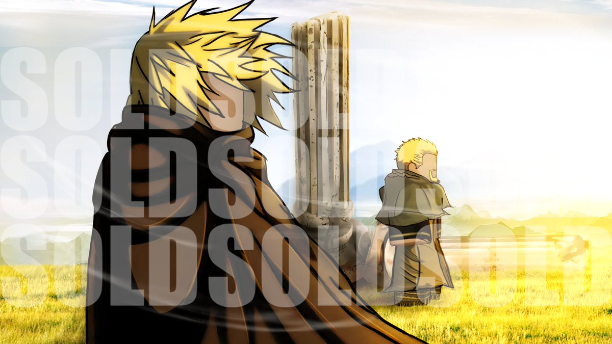
Vinland Saga -
Commissioned Work
#RobloxDev #RobloxDevs #RobloxGFX #robloxart
 cobalt nacelle
yo
 digital oasis
quartz warren
https://fxtwitter.com/__A5H__/status/1724391281324089816/photo/1
digital oasis
quartz warren
https://fxtwitter.com/__A5H__/status/1724391281324089816/photo/1
ibis paint ?
digital oasis
white silo
is this an art style?
yeah
earnest horizon
quartz warren
https://fxtwitter.com/__A5H__/status/1724391281324089816/photo/1
@glass pendant
earnest horizon
Hahahaha
 glass pendant
lmaoo

he look so short and stupid
hes like 6,5 i nthe show or sum
nah hes 5.5 lmao
nvm 💀
quartz warren
digital oasis
ibis paint ?
its photoshop
quartz warren
glass pendant
lmaoo
roblox
glass pendant
quartz warren
roblox
i know its js so funny
earnest horizon
glass pendant
he look so short and stupid
Just like u
digital oasis
quartz warren
its photoshop
ok
 river vigil
earnest horizon
Just like u
river vigil
earnest horizon
Just like u
lmao
glass pendant
earnest horizon
Just like u
oh
shrewd frigate
 little perch
the rope typa thing
little perch
the rope typa thing
pick your poison


 fringe apex
my home is 2d graphics
 fringe apex
@noble knoll is ur home 2d graphics
earnest horizon
fringe apex
my home is 2d graphics
Same
shrewd frigate
earnest horizon
Same
says the building helper
fringe apex
earnest horizon
Same
look whos talking
earnest horizon
fringe apex
look whos talking
😢

 austere thorn
sleek pumice
yea
austere thorn
sleek pumice
yea
Accept robux?
earnest horizon
austere thorn
Accept robux?
I will make u laugh
austere thorn
earnest horizon
I will make u laugh
?
sleek pumice
austere thorn
Accept robux?
Yesh
earnest horizon
austere thorn
?
OHIO SKIBIDI GYATT RIZZLER THUG SHAKER GAY AMONGUS TWERK FANUM TAX
austere thorn
.
earnest horizon
Rate the funniness
sleek pumice
Smt like this I can do
 austere thorn
sleek pumice
Smt like this I can do
austere thorn
sleek pumice
Smt like this I can do
Alright go to dms
sleek pumice
U got to add me say u have to
digital oasis
sleek pumice
Smt like this I can do
What software did you use ?
sleek pumice
Clip stuido
digital oasis
on phone ?
 sacred sphinx
warm up doodle grahh
 sacred sphinx
sometimes
digital oasis
ibis paint ?
sacred sphinx
yea
digital oasis
oh niceeee
sacred sphinx
this one is in pc tho
digital oasis
what brushes do yo uuse ?
digital oasis
sacred sphinx
this one is in pc tho
ok
sacred sphinx
csp tablet aswell
digital oasis
kk
sacred sphinx
in ibis i just use genius pen
 sacred sphinx
yea
sacred sphinx
ye
 sacred sphinx
its a painting so it uses many custom brushes
sacred sphinx
nah just use whichever u want
digital oasis
kk
sacred sphinx
i use genius cuz its thin
but if u want to make something like that one it'd take too much time to use a thin brush
digital oasis
Which brush do you recommend for this?
digital oasis
sacred sphinx
but if u want to make something like that one it'd take too much time to use a t...
ok
sacred sphinx
I don't do those type of drawings
digital oasis
k
sleek pumice
 sleek pumice
digital oasis
do u think that this is possible to make on ibis paint
sleek pumice
digital oasis
do u think that this is possible to make on ibis paint
Blur liquify lighting mirror strokes contrast
digital oasis
sleek pumice
Blur liquify lighting mirror strokes contrast
wdym
sleek pumice
digital oasis
wdym
That’s what the artist did to make his GFX
 mossy estuary

Started learing modern logos
How's the progress so far?🫣
- Want to support us? Join here: https://discord.gg/eERNResaud
(#roblox #robloxdev #graphicdesign)
noble knoll
digital oasis
do u think that this is possible to make on ibis paint
Yeah with a shit ton of filters for the effects
You gotta learn painting though
Painting brushes got a whole range
You gotta play around to find out which one suits your workflow
sleek pumice
Does this head look ok so far?
 white silo
dusty yacht
Cel Shade
white silo
dusty yacht
Cel Shade
thank you
 honest brook
1st time drawing something like this
 digital oasis
honest brook
1st time drawing something like this
digital oasis
honest brook
1st time drawing something like this
How ?
honest brook
digital oasis
How ?
wdym how
digital oasis
What software do you use
honest brook
firealpaca
digital oasis
On pc ?
honest brook
yuh
digital oasis
With a mouse ????
honest brook
drawing tablet
digital oasis
Ohhh ok
earnest horizon
I feel so… so skibidi…
 fair nest
Do most UI artists do UI's in roblox format or third-party software?
fringe apex
lmk
 grizzled osprey
fair nest
Do most UI artists do UI's in roblox format or third-party software?
grizzled osprey
fair nest
Do most UI artists do UI's in roblox format or third-party software?
third party software i think
 chrome barn
earnest horizon
I feel so… so skibidi…
chrome barn
earnest horizon
I feel so… so skibidi…
Sticking out your gyatt for the rizzler
earnest horizon
chrome barn
Sticking out your gyatt for the rizzler
I just wanna be your sigma
scenic grove
chrome barn
Sticking out your gyatt for the rizzler
You're so skibidi
You're so fanum tax
I just wanna be your sigma
 earnest horizon
For?
chrome barn
To start being a normie again
 chrome barn
scenic grove
chrome barn
scenic grove
YouTube Shorts 
 median badger
Sticking out your gyaat
earnest horizon
median badger
Sticking out your gyaat
Elham do a collab with me for portfolio
median badger
earnest horizon
Elham do a collab with me for portfolio
For gfx ?
earnest horizon
median badger
For gfx ?
No
median badger
earnest horizon
No
For what
earnest horizon
Building
 tardy flame
how good is this for first ever gfx

 earnest horizon
Pretty nice
scenic grove
tardy flame
how good is this for first ever gfx
That doesn't look like gfx
It looks like a logo
Typographical logo
median badger
earnest horizon
Building
Ah nvm i dont do building
earnest horizon
median badger
Ah nvm i dont do building
WHY. WHY. WHY.
 earnest horizon
WHY. WHY. WHY.
sleek pumice
is it a good idea to use Aseprite for clothes?
considering the low resolution of clothes
median badger
I only do gfx and some animating


 manic dove
Can someone help me improve this design by just making it blend better and pop more

If someone could help it’d be appreciated 🙏
shrewd frigate
manic dove
Can someone help me improve this design by just making it blend better and pop m...
if the background is part of the design, i'd definitely either tone down the opacity, blur it, or replace it with something more plain and doesn't conflict with the logo
the border isn't very defined either and it looks very grainy
manic dove
you should totally help me redesign it (bait)
shrewd frigate

sleek pumice

 visual heath
manic dove
Can someone help me improve this design by just making it blend better and pop m...
visual heath
manic dove
Can someone help me improve this design by just making it blend better and pop m...
wouldnt recommend that background
doesnt match up at all with the logo
manic dove
real
visual heath
i mean
there is a lot that you could change
the logo is way too small and low quality
i would recommend
making the logo
a big text
then add details for the star
 vague quarry
 digital oasis
steady moat
just takes dedication.
digital oasis
steady moat
just takes dedication.
Ok thanks
 wooden zealot
 little perch
shrewd frigate
pick your poison
little perch
shrewd frigate
pick your poison
sheeesh thanks man
sleek pumice

 frozen coral
sleek pumice
frozen coral
sleek pumice
Mid
 cosmic merlin
digital oasis
do u think that this is possible to make on ibis paint
cosmic merlin
digital oasis
do u think that this is possible to make on ibis paint
Possible? It’s not even difficult
digital oasis
cosmic merlin
Possible? It’s not even difficult
Really ???????
cosmic merlin
It isn’t
digital oasis
But I don’t know what brushes is this 😭😭
earnest horizon
Grammar where is 😭 😭
digital oasis
😓😓
cosmic merlin
digital oasis
But I don’t know what brushes is this 😭😭
You don’t have to
digital oasis
?
cosmic merlin
Just use any brush then Gaussian blur
digital oasis
How to Gaussian blur on ibis paint ?
cosmic merlin
For the shading you can use pencil graphite
cosmic merlin
digital oasis
How to Gaussian blur on ibis paint ?
Go to filters and go to blur
digital oasis
Ok I’ll see
cosmic merlin
How long have you used ibis paint?
digital oasis
2 days 💀💀
digital oasis
 cosmic merlin
They got mad tools
cosmic merlin
Did this on my phone 💀
 digital oasis
💀💀💀
You lie
It’s AMAZING

Also do you know how to turn ibis paint into English
digital oasis
French
cosmic merlin
Then just change countries on whatever app you got it ?
cosmic merlin
Do you live in France
digital oasis
Yeah
cosmic merlin
Mbappe
cosmic merlin
Penaldo >
cosmic merlin
“Messi missed, Ronaldo didn’t” 🗣️🗣️
digital oasis
😤😤
cosmic merlin
I use blend marker for coloring, lineart, rendering, realism for highlights, and airbrush for gradients

For highlights and lighting I use an “add” layer and color dodge for glow
 digital oasis
cosmic merlin
I use blend marker for coloring, lineart, rendering, realism for highlights, and...
digital oasis
cosmic merlin
I use blend marker for coloring, lineart, rendering, realism for highlights, and...
Oh thanks
digital oasis
cosmic merlin
For highlights and lighting I use an “add” layer and color dodge for glow
Nice
also about renders
cosmic merlin
No problem 💁🏾
digital oasis
did u use renders ?
cosmic merlin
No
digital oasis
for making pose
cosmic merlin
I use my head
digital oasis
cosmic merlin
No
😱
digital oasis
cosmic merlin
I use my head
 cosmic merlin
Not that hard lol
cosmic merlin
Ok
digital oasis
it's about brushes
sleek pumice
cosmic merlin
I use blend marker for coloring, lineart, rendering, realism for highlights, and...
I love graphite for skecthing
cosmic merlin
sleek pumice
I love graphite for skecthing
Yea it’s really smooth
 devout ocean
do i need to fill out all of these? I only have 3 examples
 scenic grove
Yes
cosmic merlin
devout ocean
do i need to fill out all of these? I only have 3 examples
What’s this for
shrewd frigate
cosmic merlin
What’s this for
application for a skill role
probably for graphics artist since the person asked in here
sleek pumice

 cosmic merlin
shrewd frigate
application for a skill role
cosmic merlin
shrewd frigate
application for a skill role
How do I apply
shrewd frigate
dim oasis
<@766558323084230697> what ya say?
looks pretty good
 sturdy runeBOT
@cosmic merlin
Tag » apps
How to Apply
If you want to apply for a role in our community, the applications can be found here! It is highly recommended to check out our Application Guidelines to learn the requirements for these roles!
Pending Time
An application for a skill role may take up to 0-48 hours to be read. If pending beyond that time, please create a ticket using </ticket:0> and then selecting the "Application" category in #cmds
Application Tickets
To ensure your ticket is being dealt with maximum efficiency, please link your application in the media section of the ticket. As well as specify which role you are after.
Your ticket may take a few minutes and up to a day or two to be dealt with.
Still don't know how? Watch this video to find out how!
 Called by ⭐ Dan
 fair otter
warm up
 sleek pumice
Do you think pfp like these are good enough to sell? (DONT MIND THE HORRIBLY DRAWN VALK)

 drowsy briar
havent posted in long

Recent icon commisson for @KillahnoizRBLX
Simple icons can boost your games ccu
Get yours icons now! Order on discord at - realcresent
accepting paypal,crypto & robux
[#RobloxDev #robloxGFX #robloxart #RobloxDev ]
new portfolio coming soon
scenic grove
sleek pumice
Do you think pfp like these are good enough to sell? (DONT MIND THE HORRIBLY DRA...
Your proportions aren't good
Try learning those well first
The shoulders are too thin compared to the neck and head
Ur eyes are good
Nose a bit small
 azure zealot
What's wrong with that?
 noble knoll
sleek pumice
Do you think pfp like these are good enough to sell? (DONT MIND THE HORRIBLY DRA...
noble knoll
sleek pumice
Do you think pfp like these are good enough to sell? (DONT MIND THE HORRIBLY DRA...
Eyes are fine, shoulders needs to be larger, neck is really weird with how it curves inwards.
Yeah aslandy is right
median badger
sleek pumice
Do you think pfp like these are good enough to sell? (DONT MIND THE HORRIBLY DRA...
face looks hella goofy
noble knoll
Your proportions are kinda weak
Mouth is too close to the chin
And barely any hair volume
It creates this really narrowing shape
As if the character’s bald
Also you might wanna work on the face expressions a little hit more since it comes off as being uncanny in this case (I mean if that’s what you’re trying to pursue then sure)
noble knoll
sleek pumice
Do you think pfp like these are good enough to sell? (DONT MIND THE HORRIBLY DRA...

Also try and reduce the face shape thingy sideways
Narrow it down, faces don’t bulge out there like that
noble knoll
noble knoll

Also raise the eyes up a little bit
It’s quite low for the head
Although it could just be a matter of styling
Would make it easier to bring the mouth upwards since the eyes are already pretty low
 royal tiger
Hiya, in photoshop, does anyone know how I could recreate this perspective effect on the text? I've tried a few things but none of them seem to be what I'm looking for.

 jaunty tundra
sleek pumice
Do you think pfp like these are good enough to sell? (DONT MIND THE HORRIBLY DRA...
jaunty tundra
sleek pumice
Do you think pfp like these are good enough to sell? (DONT MIND THE HORRIBLY DRA...
im not some crazy artist but gather up a bunch of reference and watch videos on proportions, realistic and anime
as long as u got technique down you're good
not bad start
devout ocean
my request got declined probably because i forgot to watermark my name to my work, what do i do?

 deep sun

 sleek pumice
Gojo, still need to finish coloring
 deep sun
why the fuck are my images so low quality on pc
sleek pumice
noble knoll
Omg, this is so helpful. TYSM
sleek pumice
sleek pumice
Gojo, still need to finish coloring
a guys using adobe Photoshop to make this pictures
or something else too
 faint summit
sleek pumice
Gojo, still need to finish coloring
faint summit
sleek pumice
Gojo, still need to finish coloring
same im on shading for my end
anyways ITS DAIJOUBU KONO SEKAI WA DANCE HALLU 🕺 🕺 🕺 🕺 ✨ ✨
 chrome barn
Why his nose so big lol
faint summit
i think its cuz i accidentally liquified that while liquifying the bangs hol up ill fix it
shrewd frigate
devout ocean
my request got declined probably because i forgot to watermark my name to my wor...
it didn’t get declined for lack of watermarks; it says the reason right in the screenshot
you could dm the app reader who declined it for more clarification
devout ocean
shrewd frigate
it didn’t get declined for lack of watermarks; it says the reason right in the s...
wait so is incidane the reveiwer?
shrewd frigate
devout ocean
wait so is incidane the reveiwer?
yea
sacred sphinx
sketch 🙏
 sleek pumice
 cosmic merlin
fair otter
warm up
cosmic merlin
fair otter
warm up
This hardddd reminds me of my style a lil
You def more experienced tho
steady moat
sacred sphinx
sketch 🙏
looks nice so far
sleek pumice
 faint summit
im done
earnest horizon
faint summit
im done
Hi done I’m dad
faint summit
earnest horizon
Hi done I’m dad
DONE WITH U TOO
river vigil
earnest horizon
Hi done I’m dad
hi done and dad, I'm brother
earnest horizon
Bro that’s not even how u make the joke
Istg ppl keep doing this
Hiddendevians have an average iq of 80 lowkey
river vigil
☠️
 celest ravine
sacred sphinx
sketch 🙏
celest ravine
sacred sphinx
sketch 🙏
@earnest horizon she can fix me
 hollow pebble
guys i made this so what do you think about it ? (i know its not about roblox stuff but i just wanted to share it)

idk why its cropped
 little raft
 earnest horizon
celest ravine
<@739953779901857873> she can fix me
earnest horizon
celest ravine
<@739953779901857873> she can fix me
Me too
 noble knoll
fringe apex
batmann
noble knoll
fringe apex
batmann
 fringe apex
noble knoll
https://media.discordapp.net/attachments/928904163730022430/1150491834544554106/...
fringe apex
noble knoll
https://media.discordapp.net/attachments/928904163730022430/1150491834544554106/...

 tropic urchin
sacred sphinx
sketch 🙏
tropic urchin
sacred sphinx
sketch 🙏
looks like my pfp ( I didn't search up h@tai and make it my pfp) I like this anime actuaLLY and it's a fantasy mmorpg
sacred sphinx
lol
tropic urchin
sleek pumice
Do you think pfp like these are good enough to sell? (DONT MIND THE HORRIBLY DRA...
porportions is terrible the nose is WAY to small. the neck is very burly and it doesn't like really good ( the shading on the shirt) it kinda looks hall @ssed
tropic urchin
digital oasis
seems to make use of gaussioun blurs to shade
tropic urchin
sleek pumice
Smt like this I can do
yeah I'm going to need some emojis like this for my anime game
do you know how to make men versions?
tropic urchin
white silo
is this an art style?
anime
tropic urchin
 fluid yarrow
basic no texturing, shading, and the use of a clearly png and added a white color overlay and shadow makes this come off as lazy 3/10 do better. Also, you asked me for my opinion so don't get mad because your a ( new logo maker) or whatever your fucking excuse is ok?
tropic urchin
sleek pumice
6/10 needs texturing and the hollow purple looks png like with a hue to it
honestly 10/10 games with cartoony logos always have a good player base and seeing these really makes me here for it
dusty yacht
sleek pumice
Do you think pfp like these are good enough to sell? (DONT MIND THE HORRIBLY DRA...
I'd say practice some more before selling  👍
👍
sleek pumice
tropic urchin
do you know how to make men versions?
Yea
 formal basalt
Yo rate 1-20
 sleek pumice
What is that
shrewd frigate
i think it's supposed to be a titan?
scenic grove
 willow wave
does a ghost die
willow wave
does a ghost die
Water
willow wave
oh
scenic grove
I'm hiring someone to make you shut the fuck up
Payment is 100% of the enjoyment that u see when u shut him up
 scarlet garnet
formal basalt
Yo rate 1-20
scarlet garnet
formal basalt
Yo rate 1-20
the face is hella off
other than that should be ok
looks like you just sqeezed his face in
median badger
formal basalt
Yo rate 1-20
Wtf happened to bros face
fringe apex

 weak frigate
Is anyone a logo designer?
fringe apex
No i dont think so
fringe apex
im cooking with this one
 earnest horizon
fringe apex
im cooking with this one
earnest horizon
fringe apex
im cooking with this one
W
fluid yarrow
tropic urchin
basic no texturing, shading, and the use of a clearly png and added a white colo...
mah valid points but no need for the last sentence mate

thoughts now?
fluid yarrow
yeah added like 70% of the lightning in with photoshop
scarlet garnet
oh
scarlet garnet
fluid yarrow
I would add glow to the headlights, as well as the lamp, and maybe make it look like some of those buildings are alive,
Making it seem like some people are still "up"
then just blend the colors to the car
fluid yarrow
people give so much better feedback in here than in #3d-graphics
scenic grove
weak frigate
Is anyone a logo designer?
Me
earnest horizon
weak frigate
Is anyone a logo designer?
Me
scarlet garnet
a great example would be

This guy sent me this
And I was just showing him as an example

But adding little details goes a long way
scarlet garnet
💀
fluid yarrow
earnest horizon
More realistic
yeah depends on the style you’re going for
 nocturne mesa
If anyone has any tips for someone who’s wanting to start graphic designs please dm me
sleek pumice
 nocturne mesa
sleek pumice
nocturne mesa
sleek pumice
Looks cool
sleek pumice
Ty
nocturne mesa
I’m new to this so idrk what to compliment
nocturne mesa
It looks good tho
noble knoll
fluid yarrow
people give so much better feedback in here than in <#1138164812132651028>
It really depends for me, there are some blokes who knows their shit well there
 noble knoll
💀
shrewd frigate
@sleek pumice why in the world did you ping me in cmds
noble knoll
They probably reverse searched it
sleek pumice
shrewd frigate
<@456226577798135808> why in the world did you ping me in cmds
Thought u were someone else
shrewd frigate
oh
sleek pumice
noble knoll
They probably reverse searched it
?
OH NAH

THIS IS THERE EVIDENCE
IM A DEV FOR THAT GAME
LOL
shrewd frigate
i-

 shrewd frigate
funny seeing a false negative
sleek pumice
shrewd frigate
funny seeing a false negative
Real
negative canthal tilt, its over
😭🙏
nocturne mesa
If anyone has any tips for someone who’s wanting to start graphic designs please dm me
earnest horizon
@celest ravine she can fix me
faint summit
ooo! i love ur art style gimme a sec :o
okay so for ur face its good if ur trying to go for a droopy face overall greatly executed but i think the hair feels a bit stiff since in ur drawing it didnt really define where like the locks of hair are since yk how hair flows and when it flows theres locks for ur style i think u should just like refine the hair highlights cuz thatll refine where the hair locks are?? do u get what i mean?? the hair highlights in ur drawing of the girl is a bit blotchy do u get what i mean? bc its mostly just straight lines smudged in within the hair shading and its pure white so it gives it a muddy look with the shading. on the ref i scribbled where the highlights are the main white scribbles are the main highlights and the red ones are the secondary highlights from a secondary light source. notice how in ref the highlights are relatively not the same size overall (bc of where the light source is coming from but that can be from another lesson) try incorporating that in ur drawing i roughly sketched some highlight lines in the first pic but my ipads shitty 😭


i forgot to add basically try like different colors as ur highlights
I HOPE THIS HELPS IM SORRY IF U DONT GET ANYTHING
noble knoll

faint summit
oh yeah wait i forgot for the face if u dont want like a droopy face maybe u can make the nose higher
proportion the mouth along with it if the mouth is out of place
scarlet garnet
sleek pumice
Very cool
cosmic merlin
faint summit
okay so for ur face its good if ur trying to go for a droopy face overall greatl...
We not reading that essay
 brazen plank
Minnesota is redesigning their state flag and you can see submitions people made here:
https://serc.mnhs.org/flags
pretty cool in my opinion
sacred sphinx
my wife
 shrewd frigate
cosmic merlin
We not reading that essay
shrewd frigate
cosmic merlin
We not reading that essay
that essay wasnt for u bro
cosmic merlin
shrewd frigate
that essay wasnt for u bro
Joke twin
shrewd frigate
and people clowned on me for writing essays back when i was a helper…
y’all are the same 
noble knoll
shrewd frigate
and people clowned on me for writing essays back when i was a helper…

I cba to write it fully
shrewd frigate
noble knoll
I cba to write it fully
hardly anyone asks for help with clothing anymore so I guess I’m sparing yall
sleek pumice
@ivory spear unblocked me i need u for my game
 solemn portal
Created this in figma just need some feedback
 earnest horizon
sacred sphinx
my wife
earnest horizon
sacred sphinx
my wife
@celest ravine she can fix me
sleek pumice
 sleek pumice
 faint summit
shrewd frigate
hardly anyone asks for help with clothing anymore so I guess I’m sparing yall
faint summit
shrewd frigate
hardly anyone asks for help with clothing anymore so I guess I’m sparing yall
nah fr i barely hopped onto the art thing as well u still helped as a helper too even if it wasnt for clothes
steady moat
add genuine shadows here near the hair

add actual lighting if you want as well
th entire bottom half here should be kinda darkened too

cause of the hair
nose placement was already touched on.
hair shading could be better as well but it works ig
think of hair shading as light and dark values and it becomes much easier
dont be afraid to add darker values at all, its what seperates everything
@sleek pumice dark values to seperate everything, more visible highlights on places that light would be hitting, and less bright "highlights" for places not really getting directly hit by light
also making a center for hair makes it seem more natural, have the center be really dark

or at least a bit darker than the rest of the values
used a old hair i did as an example
 velvet fiber
yoo dis place active fr
cosmic merlin
steady moat
dont be afraid to add darker values at all, its what seperates everything
First thing that I was gonna point out
 blissful sandal
How do i remove the back white without removing the white in the text?

Remove Bg aint doing whats its suppost to
Hello?
dam bro this channel dead :*(
 fading snow
Does anyone here know what ads do good on the platform? Struggling finding an ad that has even decent ROI
shrewd frigate
blissful sandal
dam bro this channel dead :*(
be patient man, this channel isn't always active for people to respond instantly
shrewd frigate
you could import that to photopea and either use the magic wand or magnetic lasso (or any other selection tool that will make your life easier)
ok cool
blissful sandal
shrewd frigate
you could import that to photopea and either use the magic wand or magnetic lass...
nvm what i did didn't work 😦 i triend photopea but its still not removing some parts and there is still white around the sides. mind doing it for me?
first time using photopea too :I
shrewd frigate
sure ill see what i can do
blissful sandal
thank you
shrewd frigate
what you could also do is find the font
and write in it in both colors
and lay the white text on top of the blue
blissful sandal
dam
i fogot that was a thing 💀
But idk what the font is
Cant seem to find it
shrewd frigate
blissful sandal
Cant seem to find it

lemme know how this is
i am a big fan of the magnetic lasso tool
i also feathered it a bit to get rid of the stray white pixels
shrewd frigate
np 
shrewd frigate
faint summit
nah fr i barely hopped onto the art thing as well u still helped as a helper too...
our contributions to this channel will be remembered no matter how long-winded they may be...

faint summit
shrewd frigate
our contributions to this channel will be remembered no matter how long-winded t...
oNG ull always be remembered dan for everything 
celest ravine
earnest horizon
<@615116090908868618> she can fix me
fax
celest ravine
earnest horizon
<@615116090908868618> she can fix me
W
 pale magnet
anyone know how to use affinity designer
 agile token
Incredible work by Foxenterprise

 honest cobalt
like this?

 carmine hill
korega… requiem… da
 scarlet garnet

 vernal magnet
honest cobalt
like this?
vernal magnet
honest cobalt
like this?
Cool
dusty yacht
agile token
Incredible work by Foxenterprise
That's cute
 dark wigeon


 keen willow
frozen coral
keen willow
frozen coral
lips
 tropic cloud
keen willow
lips
tropic cloud
keen willow
lips
Mwa
frozen coral
tropic cloud
Mwa
What do u mean?
 frigid compass
🥳
 shrewd frigate
 brisk girder
you cant claim customuse assets as yours
sacred sphinx
wip
people complain about drawing hands but personally i hate drawing mouths
 agile token
sacred sphinx
wip
people complain about drawing hands but personally i hate drawing mouths
agile token
sacred sphinx
wip
people complain about drawing hands but personally i hate drawing mouths
Agree
river vigil
sacred sphinx
wip
people complain about drawing hands but personally i hate drawing mouths
@earnest horizon can she fix u
 eternal sparrow
hello anyone here who can do simulator type of icon
 icy valve
any1 who makes gamepass logos? id like to purchase like 10
if so dm me i wont check this chat
 tawny valve
simple drawing i did in less than 15 minutes🦀🦀

 dapper valley
bombers
eternal sparrow
if anyone can do a simulator logo hit me up in dm (i dont want those text type of shit)
scenic grove
eternal sparrow
if anyone can do a simulator logo hit me up in dm (i dont want those text type o...
Then what the fuck do u want if u don't want a text logo 💀
tawny valve
scenic grove
Then what the fuck do u want if u don't want a text logo 💀
maybe they mean like a graphic.. like an actual logo without text js like something representing something. i suck at explaining by the way
for example, the firefox logo. its not a text containing the name yet it has its own image to represent it
fringe apex
working on backplate rn
 earnest horizon
river vigil
<@739953779901857873> can she fix u
earnest horizon
river vigil
<@739953779901857873> can she fix u
fr
earnest horizon
fringe apex
working on backplate rn
w
faint summit
sacred sphinx
wip
people complain about drawing hands but personally i hate drawing mouths
and then to think abt how ull render it 😭
sacred sphinx
fr 😭
faint summit
fringe apex
working on backplate rn
niceee
 tropic cloud
honest cobalt
tropic cloud
honest cobalt
why are the eggs black
the text is very dull
font is odd
colours are bad
honest cobalt
it's the style
fringe apex
😭
chrome barn
honest cobalt
it's the style
Then I think you did it wrong
honest cobalt
chrome barn
Then I think you did it wrong
a diffirent style can be wrong?
tropic cloud
honest cobalt
it's the style
well that kind of style isnt good
if you want to get better at logo's id consider getting reference from haces
chrome barn
honest cobalt
a diffirent style can be wrong?
It is possible to do a style incorrectly making something look bad, yes
tropic cloud
you can learn about his style and then slowly work your way to your own style
honest cobalt
kk
 eager crane


 iron trellis
rate this mini gojo pfp i made
earnest horizon
honest cobalt
How's this looking?
mid
shrewd frigate
honest cobalt
it'd have an odd colour palette
you could have regular looking eggs with a black stroke around them
faint summit
iron trellis
rate this mini gojo pfp i made
yes i love (im biased btw)
earnest horizon
eager crane
Hur hur hur hur hur
fringe apex
luh calm fit
 fringe apex
iron trellis
rate this mini gojo pfp i made
fringe apex
iron trellis
rate this mini gojo pfp i made
peak go/jo pfp ngl
im telling yall go jo fans are talented
earnest horizon
fringe apex
luh calm fit
Smash
 safe oar
my friend does stuff on mobile, what do you guys think about it

 spiral isle
Terrible!!
earnest horizon
Terrible!!
 coral quest
Overly complicated poster for my game
 tawny valve
coral quest
Overly complicated poster for my game
tawny valve
coral quest
Overly complicated poster for my game
that looks sick wow
 harsh gorge
I just started at gfx. am i doing good?
 spiral isle
Not at all
 harsh gorge
spiral isle
Not at all
harsh gorge
spiral isle
Not at all
pls make something from this
spiral isle
harsh gorge
pls make something from this
no
 harsh gorge
how do i make gfx banners
spiral isle
harsh gorge
how do i make gfx banners
don't
harsh gorge
why do you sound like my elder sis 💀
spiral isle
why are you so bad at GFX
harsh gorge
spiral isle
why are you so bad at GFX
idk cuz i just started an hour ago?
with my friend guiding me

 final tinsel
can some kind soul please remove this background 🙏
 harsh gorge
final tinsel
can some kind soul please remove this background 🙏
harsh gorge
final tinsel
can some kind soul please remove this background 🙏
Go to remove.bg
harsh gorge
final tinsel
thanks cutie
You're welcome
 spiral isle
 hollow meadow
Bro, you should show us what you've done
hollow meadow
Bro, you should show us what you've done
why
spiral isle
final tinsel
You're*
hollow meadow
spiral isle
why
you clowning on peoples work
spiral isle
hollow meadow
you clowning on peoples work
That's cuz I'm just automatically better than everyone
Just, like, inherently superior
hollow meadow
spiral isle
That's cuz I'm just automatically better than everyone
I think you just want attention
sleek pumice
harsh gorge
I just started at gfx. am i doing good?
Don't use roblox studio for posing, in the long run it won't work.
spiral isle
sleek pumice
Don't use roblox studio for posing, in the long run it won't work.
Well what if he's more of a short-distance sprint kind of man
sleek pumice
harsh gorge
I just started at gfx. am i doing good?
Blends in to much with the background, try using basic color theroy
spiral isle
sleek pumice
Blends in to much with the background, try using basic color theroy
I love color theory, like racial profiling
sleek pumice
harsh gorge
Don't use metallic unless its a pfp
When you add a sunray for the background use a airbrush and paint behind the character a bit of white to make it look like the character is glowing
Achoo
Just some tips ive done to make them look better c:
Dm if u want more tips
 sacred sphinx
final tinsel
sacred sphinx
final tinsel
you're*
 normal fjord
final tinsel
normal fjord
final tinsel
Help with what
final tinsel
 worldly wing
final tinsel
worldly wing
final tinsel
Make the “bby” in obby smaller to match the wheelchair wheel. The different sizing throws it off
Or make the “O” bigger
final tinsel
facs
worldly wing
👍
fair otter
blockout 4 fun
 sleek pumice
hi
coral quest
coral quest
Overly complicated poster for my game
a phone poster for my game
 sleek pumice
Cough Cough
faint summit
iron trellis
another goatjo fan
YURRRRR
faint summit
fringe apex
im telling yall go jo fans are talented
i love that then the other fans do the go/jo or go jo stuff to mess with us 😭
 golden notch
coral quest
a phone poster for my game
golden notch
coral quest
a phone poster for my game
george knows whats up
 shrewd frigate
final tinsel
thoughts?
shrewd frigate
final tinsel
thoughts?
the wheelchair isn't noticeable
shrewd frigate
the text has a stroke, especially the word obby so the eyes will gravitate to the text first before the wheelchair icon itself
 shrewd frigate
bro
i just looked at the edits
switching from "your" to "ur" doesn't make it any better

sacred sphinx
obby but your in a wheelchair
shrewd frigate
obby but ur in a wheelchair
final tinsel
shrewd frigate
the wheelchair isn't noticeable
what should i do for that
just add a stroke?
 shrewd frigate
final tinsel
just add a stroke?
shrewd frigate
final tinsel
just add a stroke?
yeah i'd experiment with the stroke and changing up the colors a bit
there is too little contrast between the wheelchair and the text
sacred sphinx
ngl not giving thr wheelchair an outline is pretty smart
i see people trying to combine text and letters
icons and letters***
shrewd frigate
yeah i like it
final tinsel
i think its mainly jus the colors
shrewd frigate
the O in the wheelchair
sacred sphinx
but they give too much to the icon
focus
so i end up reading it wrong
so that was a nice thing to do
shrewd frigate
i am no logo aficionado but the font looks standard to me
final tinsel
alright
sleek pumice
my first thumbnail rate it out of ten
 sacred sphinx
final tinsel
you think the font is alright?
sacred sphinx
final tinsel
you think the font is alright?
i think it looks pretty simplistic
it's not like the concept is anything spectacular either to make a crazy logo but yeah
 frozen mirage
sleek pumice
my first thumbnail rate it out of ten
frozen mirage
sleek pumice
my first thumbnail rate it out of ten
its alright tho probably a 5/10
 sacred sphinx
i liked the light blue color better
final tinsel
alright
final tinsel
 sacred sphinx
no i mean
light blue instead of white
like before
also bruuuuuuu
FIX THAT YOUR
WRITE YOU'RE

 shrewd frigate
dude
if you're going to write it correctly
space the words out evenly and resize the font if necessary
 shrewd frigate
the middle line is so cramped
 final tinsel
hmm

ignore the yellow
@shrewd frigate do you think that blue is better
i made the wheel chair match it too
shrewd frigate
oh yeah i see it in the wheelchair
it's a bit difficult to notice since the color is so close to white
i'm in between blue and yellow @final tinsel
i like yellow personally, but i think blue makes more sense for a wheelchair
you don't normally associate yellow with a wheelchair yknow
final tinsel
 shrewd frigate
in a medical scenario let's say
final tinsel
shrewd frigate
you don't normally associate yellow with a wheelchair yknow
yeah
i was thinking hospital, and the hopsital robe thing came to mind which is blue
final tinsel
and its just a common color everywhere at a hospital
shrewd frigate
yeaah
 shrewd frigate
the strokes look uneven on the bars and the handles
final tinsel
 final tinsel
shrewd frigate
the strokes look uneven on the bars and the handles
final tinsel
shrewd frigate
the strokes look uneven on the bars and the handles
yeah i just realized that
shrewd frigate
i think a small stroke makes a big difference
idk if it's just me from staring at it for very long
maybe i should put your original and the new version side by side for comparison
final tinsel
alright one momento
shrewd frigate

hmm
what do you think of the before and after
also the left isn't the first version you made
i didn't scroll up far enough
final tinsel
hmm


 shrewd frigate
final tinsel
<@766558323084230697> which of these 2 are better?
shrewd frigate
final tinsel
<@766558323084230697> which of these 2 are better?
first one
first one resembles a wheel more
shrewd frigate
you could experiment by making separate versions
final tinsel
 shrewd frigate
all the edits you do don’t necessarily have to be in the same file
final tinsel
shrewd frigate
all the edits you do don’t necessarily have to be in the same file
yeah
i could have just duplicated each of them in the same file too
cuz im using figma
final tinsel
yessiirrrr
shrewd frigate
yeah it looks decent
the colors are a bit bland but you always go back and experiment
figma has a convenient way for editing colors
 golden notch
ive seen that image more than i need to for the rest of my life
golden notch
yeah bro i drove 5 hours and u still were not done
final tinsel
lmao
shrewd frigate
lol
faint summit
im gonna lag so soon from how many layers id need shading the skin 

and shadows oh my god i forgot abt that
shrewd frigate
ayo?!
shrewd frigate
faint summit
im gonna lag so soon from how many layers id need shading the skin <:cathello:10...
that looks great so far
faint summit
shrewd frigate
that looks great so far
tyyy dan
 gritty crown
One message removed from a suspended account.
One message removed from a suspended account.
One message removed from a suspended account.
sleek pumice
Skill issue?
 faint oxide
gritty crown
One message removed from a suspended account.
faint oxide
gritty crown
One message removed from a suspended account.
I recommend looking on yt
For a fix
faint oxide
sleek pumice
Skill issue?
If you’re gonna respond please be helpful.
sleek pumice
faint oxide
If you’re gonna respond please be helpful.
Cant have a laugh?
faint oxide
I can
 hearty moon
anybody know this font?
 faint oxide
hearty moon
anybody know this font?
faint oxide
hearty moon
anybody know this font?
Looks like bold Ariel
chrome barn
hearty moon
anybody know this font?
Looks custom
 distant ether
smh
 lavish willow
😂
sacred sphinx
she can fix ME

 rough salmon
does anyone know how to make this but rcs
 sleek pumice
does anyone know how to render with similar lighting as this image on a low poly model?
 river vigil
sacred sphinx
she can fix ME
river vigil
sacred sphinx
she can fix ME
@celest ravine can she fix you?
harsh gorge
sleek pumice
When you add a sunray for the background use a airbrush and paint behind the cha...
Thankyou so much.
harsh gorge
sleek pumice
Blends in to much with the background, try using basic color theroy
Sure thing I'll try
 frozen jungle
faint summit
im gonna lag so soon from how many layers id need shading the skin <:cathello:10...
frozen jungle
faint summit
im gonna lag so soon from how many layers id need shading the skin <:cathello:10...
W

 celest ravine
river vigil
<@615116090908868618> can she fix you?
celest ravine
river vigil
<@615116090908868618> can she fix you?
yes
river vigil
celest ravine
yes
good
frozen coral
 tropic cloud
rough salmon
does anyone know how to make this but rcs
tropic cloud
rough salmon
does anyone know how to make this but rcs
ye
faint summit
sacred sphinx
she can fix ME
no she can fix ME
background and lighting on hands i think left honestly i might just get rid of the hand altogether tbh

 tropic cloud
wth
 faint summit
anddd WERE DONE with and without hand vers


fuck nvm im not done i forgot some red things


 timber meadow

 sleek pumice
frozen coral
sleek pumice
frozen coral
No it’s shit
 zenith ledge
working on stylized sakura tree leafs
 frozen coral
sleek pumice
No it’s shit
frozen coral
sleek pumice
No it’s shit
Why?
zenith ledge
sleek pumice
does anyone know how to render with similar lighting as this image on a low poly...
ive done it in the past
blender
sleek pumice
frozen coral
Why?
I’m just kidding, looks good
sleek pumice
zenith ledge
ive done it in the past
U remember how?
zenith ledge
ill show u a example i made wait a sec
sleek pumice
Alright
zenith ledge
and many more
i used that more realistic vibe but still stylized
but based on fortnite
lemme just show you how ive done it
sleek pumice
Damn they look good, although I think the one I sent uses some other method
zenith ledge
look so you need lights all around the gun model and add a camera ofc to capture the gun


and obviously you gotta pose the gun
sleek pumice
I think the icon I sent uses diffuse colour or something similar as a render
zenith ledge
they just modified it
tropic cloud
yea
zenith ledge
photopea or photoshop
sleek pumice
I tried to get the lighting right in blender and it never looked right due to shadows
zenith ledge
- they didnt use pbr textures
sleek pumice
Yeah my model doesn’t have any textures just base colours
zenith ledge
yeahy thats good
if ur going for the lowpoly style
lemme see what you got rn
ur scene
sleek pumice
Ok let me get on my pc

 zenith ledge
yeah you need to add lights
either you add lights or add a hdri
but i suggest you just use lights and play around until they fit
sleek pumice
what is a hdri
frozen coral
sleek pumice
Is it 3d graphics?
sleek pumice
zenith ledge
no it adds good lighting into the scene
that would be for realistic lighting renders, i need low poly
zenith ledge
sleek pumice
that would be for realistic lighting renders, i need low poly
yeah like i already 3 times said use lights
point lights
 zenith ledge
what game ru makin
sleek pumice
a cops v robbers type of game
zenith ledge
okay
honest brook
is this good enough for comissions? Im new to drawing roblox style
 sleek pumice
honest brook
is this good enough for comissions? Im new to drawing roblox style
sleek pumice
honest brook
is this good enough for comissions? Im new to drawing roblox style
i think it looks really good
but cover this little white place on the right
 frozen coral
honest brook
is this good enough for comissions? Im new to drawing roblox style
frozen coral
honest brook
is this good enough for comissions? Im new to drawing roblox style
Really good
I love your style

Naruto n Sasuke
Like and Follow
#RobloxDev #robloxart #RobloxGFX #fanart #NARUTO
💖 1
median badger
the face 💀
scenic grove
frozen coral
https://vxtwitter.com/Quitequit009/status/1725824540624970008
Those face cheeks damn
honest brook
frozen coral
I love your style
ty
frozen coral
scenic grove
Those face cheeks damn
=))
frozen coral
median badger
the face 💀
Bruhh
 median badger
still looks off
dapper valley
something looks off and i cant tell what it is
 median badger
dapper valley
something looks off and i cant tell what it is
median badger
dapper valley
something looks off and i cant tell what it is
this part looks weird.

should straighten it
dapper valley
its meant to be falling off her shoulder
zenith ledge
dapper valley
something looks off and i cant tell what it is
the guys face looks goofy
other than that its good
 viscid night
please don't hire outside of the hiring channels :] have a look through #marketplace-info to find out how to hire 
 lyric beacon
can someone help me with my shirt
 frosty osprey

Logo commission for @RiftComplex
My first Demon Slayer logo. Let me know what you guys think!
Discord: spiceyy
Make sure to like + rt :)
#RobloxDev #Robloxlogo #Robloxgfx #ROBLOX #robloxart #robloxartist

 robust egret
harsh gorge
robust egret
harsh gorge
It’s okay
fringe apex
wip
 fringe apex
dapper valley
something looks off and i cant tell what it is
fringe apex
dapper valley
something looks off and i cant tell what it is
Holy gyatt
sleek pumice
harsh gorge
fringe apex
the nose should be closer to the left and longer @dapper valley

Other than that nice gyat
also make the guy's eyes bigger
dapper valley
alr ty man
fringe apex
dapper valley
alr ty man
Btw the thighs are unrealistic

bring this line here closer to the right a bit
 dapper valley
RIGHT I THOUGHT SO TOO
 merry bramble
sleek pumice
merry bramble
sleek pumice
Wip

 reef plume
uh any suggestions?
 earnest horizon
dapper valley
something looks off and i cant tell what it is
earnest horizon
dapper valley
something looks off and i cant tell what it is
Smash @celest ravine she can fix me
median badger
earnest horizon
Smash <@615116090908868618> she can fix me
so real
she can def fix me
 mystic blaze

 ocean geode

 fringe apex

"Anime Worlds"
commissioned work, made this w a broken left arm lmao
[ #ROBLOX | #RobloxDev | #BrandedFeatures ]
earnest horizon
fringe apex
https://fxtwitter.com/mysou1x/status/1725977649695056302
Clean
fringe apex
earnest horizon
Clean
preciate it