#art-discussion
15 messages · Page 78 of 1
 shut tundra
at least you arent trying to communicate it in german lol
as we germans would say: "Deutsche Sprache, schwere sprache!"
(german language, difficult language)
 torpid glade
bruh as a russian english seems stupid to me
but german at least sounds cool almost all the time
 jolly fulcrum
As a Hungarian I überate both of you
in spelling
in words
in grammar
in sounding
torpid glade
from what i hear german is very region based so even different cities might have different dialects. russian dont rly have that thankfully
shut tundra
trust me - german is a worse mess than english
ah the german "dialects"
stares in lower saxon
most of the german "Dialects" or Platt - are technically other languages...
some are alot closer to dutch than german
tho yes - even when speaking vulgar german we differ alot by region...
luckily im a filthy hannoveranian which means mine isnt actually shit
torpid glade
lol
so how big of a difference from 1 the same but funny to 10 different languages with similar words mixed in
shut tundra
eh.... depends
Platt/Lower Saxon/Lower German literally varies from village to village
the more west or north you go the more it goes away from Standard German
torpid glade
ok what is the range of difference
shut tundra
from 3 to 10
torpid glade
holy
shut tundra
tho, i am somewhat capable of understanding platt - it isnt my strong point
torpid glade
so all the way like russian vs polish
shut tundra
kinda
torpid glade
hmm
shut tundra
like - most germans could make out a bit of platt (maybe a bit more than dutch) but not much
especially when they are from the city
shut tundra
Platt or Platt Deutsch (or the various other names it goes by) are local 2nd mother languages
its like Irish speaking english and Gaelic
shut tundra
just Platt and Hoch Deutsch are alot more similar than English and Gaelic
its kinda like a person having both Dutch and German as their mothertongue
Dutch and Platt being rather similar
and Platt technically being the bridge between German and Dutch
torpid glade
so im assuming its home region is between the two as well
shut tundra
yeah
Platt is only spoken in western North Germany and maybe some bit into Holstein
therefore having the name Niedersächsisch/Lower German(/saxon)/Neder Ditsch
torpid glade
just histories of languages are half the fun
shut tundra
yep
 rancid carbon
do you elevate grain
 buoyant crest
shut tundra
Platt is only spoken in western North Germany and maybe some bit into Holstein
buoyant crest
shut tundra
Platt is only spoken in western North Germany and maybe some bit into Holstein
And like the a large chunk of the Netherlands
 runic linden
Working on something
 candid citrus
ClipStudioPaint or Painttoolsai?
 carmine jolt
wait does sai have dark mode
candid citrus
I dunno. Haven't used it in a while
 fading thistle
It's krita i think
 flint leaf
yeah that looks like krita
 daring ferry
indeed it is krita
torpid glade
something feels off but im having a hard time pin pointing it but i think its quite an improvement
i see it
 halcyon lantern
I think the shoulders are slightly off compared to the ribcage/torso
Move them both slightly
or at least the one on the left (here)
(right side on the original)
head and neck would follow
so a bit more like this
I'd also give them a bit more hips but that's just me 👁️ https://media.discordapp.net/attachments/557339213138362379/797558321967398912/unknown.png
I think the censor-system is picking up something and I can't actually post the thing
Neck could be slightly longer too if you want
 remote lynx
halcyon lantern
I'd also give them a bit more hips but that's just me 👁️ https://media.discorda...
remote lynx
halcyon lantern
I'd also give them a bit more hips but that's just me 👁️ https://media.discorda...
Imo while I get feeling that the ratio of waist and hip is a bit off, they don't have to be that thicc
Making the waist a little bit slimmer would do the trick too
halcyon lantern
remote lynx
Imo while I get feeling that the ratio of waist and hip is a bit off, they don't...
That's the issue of uhh... well me being me 😎 💦
I keep drawing pears
You mean more like so?https://cdn.discordapp.com/attachments/557339213138362379/797561367070375936/unknown.png

What, now it decides to show the picture?
Dumb discord discriminating against thickness.
torpid glade
i think i fixed it some more
no i just realized the left arm is a little funky/ too small
halcyon lantern
Yeah I tried to make it a tad more proportioned
But I think it's rather the other arm being too long
the one on our left, or the character's right arm
halcyon lantern
Keep in mind how long your arm has to be
Imagine it straightened.
It would need to reach the half of the thigh with its finger tips, if the character was entirely straight (both arms and hips)
torpid glade
halcyon lantern
Another thing I think is that the waist indent could be a bit higher
torpid glade
ye
halcyon lantern
Basically the point where it dents in
(Usually it's at the same level as elbows btw, you can use that as a reference for both)
torpid glade
im just starting to learn so thx for the help
wait i cant tell where the ribcage ends
its like half a tidie down right
halcyon lantern
Usually the same level for these
(one second)
Generally it's the easiest way to tell your character's arm length
(though it can rise if the shoulders are raised)
I did post a drawing trying to tackle some of the issues a bit more above
you can check where I put the indent
But basically
That's what I'd go for
torpid glade
so its roughly between the end of the gut and the top of the shoulders
depending on the thicccnes
the right arm seems off now
cant rly tell how exactly tho
daring ferry
halcyon lantern
Oh yeah, drawing with trigonometry
torpid glade
it was forearm length
no wonder the reference is better ive been drawing for like 2 days
i dont even know what the hell are hands
halcyon lantern
remote lynx
Personally don't like thicc thighs.
blasphemy
torpid glade
thiccc thighs save lives
altho im not into the extra thicccc i like the human thicc size
daring ferry
Spaghetti legs are scary
Like I saw a dude like this once, it looked like he would fall down at any second with his legs as large as a wrist 😖
rancid carbon
Im a bit lankier than I would like myself 😅
torpid glade
tried doing cloths thoughts?
halcyon lantern
😎 I still think the neck could be a tad longer.
torpid glade
tried lighting any good? what should i work on fixing
halcyon lantern
I think it's alright?
torpid glade
no no tell me wats wrong
halcyon lantern
Hmmm... well first of all I don't see why the outline of the black clothes would be red
torpid glade
is that lighting
halcyon lantern
well, no.
torpid glade
i just used a colour that was there thats all
halcyon lantern
Alrighto, but honestly I dunno, it seems fine to me, maybe some more attention to the arms
 cunning kettle
Any thoughts
https://www.youtube.com/watch?v=rs7DEyb9wM0 inspiration
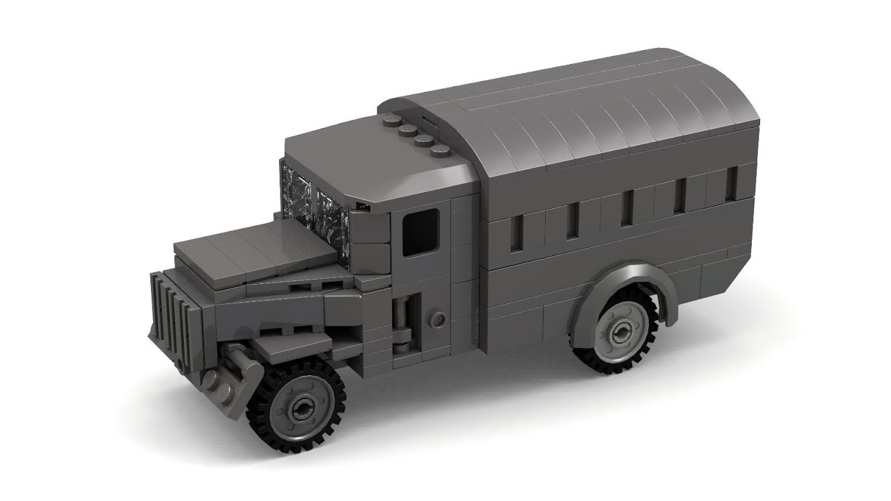
Please use credit when posting.
can never get the front of trucks right
this guy also helped with the front of the Halftracks
Been trying to make a better bumper but it always feels too empty
so I might just leave it
 quasi crow
Could try and make the sides of the canvas part go in for uniformity with the top with the pieces that are 2x1 with the little half out piece.
That makes no sense but they’re the pieces that you’d use as a rail for sliding.
This one.
@cunning kettle
quasi crow
Well, ya know how on a canvas covered truck, there’s a metal frame and the canvas is tight around it?
cunning kettle
oh ok
quasi crow
On any truck in real life (and on the ones in game) the canvas never strictly gets flattened to the bars.
It curves inwards.
Similar to what you already have on the top.
cunning kettle
Yeah I really don't care about that small little detail, I might mess with it though
quasi crow
It’s not super important, but I don’t think it would be difficult and it might make it look cool.
cunning kettle
got to make the syphilis truck next
cunning kettle
cunning kettle
just a joke
the speedie boi
does anyone have any pictures of it?
So I can get the colors right
carmine jolt
sissy truck

 viral lion
le yes
cunning kettle
trucks
 high ledge
carmine jolt
high ledge
carmine jolt
better be grain in there
high ledge
cunning kettle
Catgirl? Foxgirl? what fetish we got today lmao
No idea. it's a commission
high ledge
carmine jolt
better be grain in there
Elevated grain*
runic linden
There's something off about this i can't figure out why
high ledge
Flip the canvas
daring ferry
The ankle seems huge
high ledge
what
 drowsy garnet
halcyon lantern
drowsy garnet
halcyon lantern
make the crouching one bend the top of his back a bit
and his head too, so he's more... aimy
unless this is just a basic reference
drowsy garnet
i think i may have to rework the entire 2D animation with the changes i did
which crouching one?
halcyon lantern
the closer one
drowsy garnet
halcyon lantern
You know that when you aim you're slightly curved to the side yeah?
with your torso
drowsy garnet
used a gun like once in my life ;D but yeah it look like it
Its funny when you have to stop working on your computer, stand up and start making weird poses
to check what feels natural
daring ferry
the classical messed up render settings
drowsy garnet
i know nothing about it ;P
 bright jay
tf
cunning kettle
who commissioned you?
high ledge
cunning kettle
who commissioned you?
what
cunning kettle
What are you drawing?
high ledge
go home
cunning kettle
My colonial collection thus far, not counting the old ones
 rare folio
I want piece cound for all of THEM!!
 olive cove
Been working on making my party in a campaign I'm currently in look like characters from Darkest Dungeon, still need to do a lot more to it, but figured I'd share it here (It was a lot of splicing the base game heroes and the modded ones to get an idea of how to do them and the poses too)
olive cove

yeah he's got a gun
And I think once I finish this our DM is gonna probably use it as our camp scene whenever we have to rest somewhere for the night
runic linden
Fixed gas mask a bit, made lines more thinner overal and added some wrinkles to the clothing
jolly fulcrum
olive cove
Been working on making my party in a campaign I'm currently in look like charact...
I want a wolf headress like that! in the game
drowsy garnet
damn really good imitation of Darkest dungeon's style
but their clothes could be in worse condition
olive cove
true lol, I'll see what I can do when I do the shading
 left wind
le hind has arrived
buoyant crest
Study avoidance has let me to remaking the foxhole map in City Skylines with the post-hexagon map
prototype shape
Playable area; might have to zoom it out more for covering a greater area of the original map
olive cove
Think I got the shading/tones down now, I'm gonna do the rest when I wake up
drowsy garnet
neat
 brazen grove
freakin rad
halcyon lantern
Honestly I could just make the Foxhole map in Workers and Resources but I'd need a heightmap
rancid carbon
Smol koedem
halcyon lantern
😔 👉👁️👈 he seems to have lost something
 gaunt bridge
when he killed a mosquito on his forehead
high ledge
as he smacked the fly off his forehead he froze, he thought he heard the voice of his childhood friend that died in the battle of endless shores. the sound of that clap reminded him of the distinct clang his helmet made when a wall of mg fire mauled his friend.
olive cove
Progress so far
olive cove
Just look at proportions, etc
I also used some of the poses from the existing characters in the game to do some of these
As for the lighting, etc the devs actually put out the brushes, etc they used for the art in the game
remote lynx
that looks really darkest dungeon. intentional?
bright jay
olive cove
Been working on making my party in a campaign I'm currently in look like charact...
yes
olive cove
@remote lynx yep
torpid glade
lad his right arm looks fuky but i cant tell how exactly i should fix it could someone pls help
 ember night
I think the right arm is ok but the left going from arm to hand looks off
rancid carbon
he has a baby hand heh
bright jay
folds
rancid carbon
torpid glade
i made them just for shape reference sort off ill work some more on them later when i start shading
what even is a hand!?!
rare folio
Flask
brazen grove
bro give him a tommy gun and make him scream crudux cruo
torpid glade
how should i do the folds around his right armpit cause it feels off without folds but i cant tell what to do
olive cove
Finished the lighting/shading on the characters
 final forge
gun rat
gun rat
cunning kettle
gun rat
gun rat
carmine jolt
rat wid da gun
drowsy garnet
gun rat
gun rat
 obsidian trench
gun rat
gun rat
fading thistle
gun rat
gun rat
final forge
rat wit da gun on him
buoyant crest
Oh shit! A rat! Shit!
 peak oyster
high ledge
rare folio
peak oyster
high ledge
rare folio
I really like this
bright jay
olive cove
As for the lighting, etc the devs actually put out the brushes, etc they used fo...
still trying to figure out wat dis means
olive cove
just look up darkest dungeon brushes
runic linden

halcyon lantern
Yeay
bright jay
i think it looks pretty gooood
 dusky saffron
rancid carbon
im scared
dusky saffron
rancid carbon
im scared
No, no. That's called smug
rancid carbon
 flint leaf
bub art!
dusky saffron
Bubz art
dusky saffron

 rancid carbon
who solidified the milk
 final forge
Same. I should fix that
 peak rover
I have this from the newest clan logo I have made
flint leaf
oh no, a colonial clan with a dragon
peak rover
What’s up with that?
 wind night
@cobalt tinsel F
final forge
oof that hurts
peak rover
Also dragons are one of my favourite fantasy creatures
halcyon lantern
go with orange and make it really pale, just don't go too yellow and don't make it too dark or it will look gray and dead.
runic linden
oh welp
runic linden
I kinda already did the colouring already
also my hands coloured in grey as theyre supposed to be gloves
which is an excuse to say I cant draw hands at all
rancid carbon
backwards hand man
I swear I always end up inverting my hands
tunnel vision or smth
runic linden
So the hand grips supposed to go in front?
rancid carbon
hold your phone like a gun and move it to the side
carmine jolt
always do the action your character is doing
rancid carbon
which way are your fingers pointing
rancid carbon
ye
so the grip on the gun would be
infront of palm, behind fingers. fingers at front
runic linden
Like this?
rancid carbon
yeye
carmine jolt
wrap the thumb
rancid carbon
carmine jolt
fuck hands
go fuck ur own hands smh
carmine jolt
how bout i fuck u with my own hands
runic linden
lewd
rancid carbon
😳
runic linden
Thumb is wrapped
carmine jolt
yeah goud
 blissful heath
yoy did it
runic linden
Little bit bold but I want to incorporate some kind of wolf feature into the gas mask or uniform as it represents their unit so I tried to incorporate a crude drawing of a Wolf's jaw on the filter itself as its tricky doing a wolf face on the whole mask without interfering with the eyepieces
Logically it would make no sense as to how many filters would they have to paint if they wanted to remain intimidating
 viscid haven
Is that head finished?
runic linden

Is it fine if I just draw over an image of a wolf I take from the internet cuz I cant draw one?
Like this?
rancid carbon
ye id say thats fine
runic linden
Scaled up the wolf logo to make it even more prominent, I'd say it's war crime o'clock then
viscid haven
@runic linden if you wanted to have a simple design you could consider putting it on the helmet
Gas Mask filters are interchangeable things like Magazines, it wouldn't be as advantageous to paint one of them over painting the helmet, which should be a permanent part of a soldier's kit. And with the way you drew the helmet there is a fair bit of empty space to put it.
torpid glade
@runic linden id first work on proportions even if its a style you are going for things need to be consistent in relation to each other: his left forearm and biceps dont match, his legs are different widths, his pockets are different the gasmask eyes are different. - things like that (colouring is cool but making sure the shape is right is very important)
go back a little (use the mirror tool and find a reference it helps a lot and makes it easier to catch mistakes)
id also start with making loads of figure sketching(basically simple outlines) until you feel confident than making a full piece would be easier(and p.s im shite myself im just spitting thing you can improve and maybe how you can them)
 cobalt tinsel
@wind night F
olive cove
The background is kind of a placeholder as I'll probably attempt to make my own later, but for the time being I've basically done everything I waned
 twin robin
this is supposed to be the same theme as Darkest Dungeon?
if it is you're spot on my guy
olive cove
Yeah
drowsy garnet
DD 2 leaked photos!
man i love that art style so much
gotta get back to the game and finally fiinish it
bright jay
Yes yes YEEESS
drowsy garnet
trailer for sequels is just impossible to ignore
altough RNG is just aaah
gotta love it when they're honest about it
bright jay
I just got to figure out how to import brushes into csp
left wind
the chadley IFV
 craggy cobalt
Post war momments
 viral lion
ew furry cringe
high ledge
Ewww blueberries
viral lion
high ledge
Ewww blueberries
ew goblin cringe
viral lion
jolly fulcrum
when the cringe is too strong
Not as cringe
daring ferry
Smh no art here, back to doom eternal ost
fading thistle
craggy cobalt
*Post war momments*
I'm wondering what's in the background. This shading at the back makes more cringe than this image.
high ledge
fading thistle
I'm wondering what's in the background. This shading at the back makes more cr...
Is tent
 tropic verge
Avali, A space raptor from a mod on the game starbound
halcyon lantern
🤔 myes, more communities arrive
daring ferry
You know what this place lacks? Power armors or heavy armors at least
sighs aight, time to learn drawing with a mouse
drowsy garnet
eww drawing with a mouse?
rancid carbon
Ask mummy about it lol
daring ferry
Oh wait, might to learn to even draw before that
brazen grove
don't you dare diss the mouse like that
viral lion
i draw with a mouse im incredibly offended
 cosmic bough
I draw with a mouse now. And i respect everybody that does that
Which reminds me that i ordered a tablet on 22.12. and they still didnt even send it out 
viral lion
i was thinking about getting a trackerpad
carmine jolt
:[[[[
carmine jolt
oh i thought you got modded lmao
 flint rock
nah
 neat niche
“Low effort posts will be deleted at the discretion of the mods”
’It’s not low effort, I’m just really bad’
high ledge
Violence
daring ferry
never changes
drowsy garnet
(that i work in, while pretending to do my 1st job)
high ledge
こう
left wind
le phantom has arrived
 dull scaffold
Are those like chibi fighter jets?
I love it
left wind
Guess that's one way of seeing things.
remote lynx
dull scaffold
Are those like chibi fighter jets?
I love it
how about this https://i.redd.it/xfzlcpqgxxb51.jpg
 dull scaffold
Beautiful
bright jay
Wo
 pale ginkgo
did anyone make a texture uniform for wardens ?
high ledge
Warden flag
It got good feedback from the lore chat, but personally to me it could use some sort of herald or emblem, like an eagle or hawk
you could maybe try putting a coat of arms sorta like 1/4th of the way through like spain
rancid carbon
the polish flag has an interesting way about that
It has a variant for like navy or something with the emblem
high ledge
See, I like the polish flag when it has the eagle on it
I like flags with emblems
Like the German state flag with the German eagle is awesome
high ledge
The presidential flag of Russia uses its coat of arms, which I love
rancid carbon
either way the caoivish flag could theoretically be used the same way
rancid carbon
for example expedition forces could have a variant with the emblem
while domestic flags are just the blue and white
high ledge
The only thing I need to keep is the six stripes
Cuz the stripes represent each state within the confederacy
The color and emblem needs to be worked on
But the stripes stay
They don’t have to be horizontal, they just need to stay
imo the colors look a bit too dark
as for the stripes you could maybe try moving that red into solely the upper left as a canton and have the yellow shield thing sit inside of it
though i know it's hard to do that without people making parallels to the US
Yeah, that would be an issue
high ledge
this's a quick revamp sorta thing i made of it with the saudi sword as a placeholder
rancid carbon
woah
high ledge
personally i'd do either that or move the shield over to the left to be centered in the red like an austria-hungary thing
runic linden
Skins I made for Sorovia
The symbols on the tails of the top and bottom aircraft are meant to represent unique squadron markings
Now I'm trying to think of a Nevish emblem thats probably incorporating an Eagle
Something like this
high ledge
So I’m thinking of making a national anthem for Mesea
And I have a tune I want to put it to

DISPO A LA VENTE en cd édition limité à 1500 ex ... Dépêchez vous !!!
http://www.musicbox-records.com/fr/cd-bandes-originales/1090-la-revolution-francaise.html
Extrait de la bande originale du film " LA REVOLUTION FRANCAISE les années terribles" 1989
Composé par Georges Delerue
It might be a stretch, but it stirs something inside of me
runic linden
So I got the skin made but holy hell does it look jarring with all the rivets and framework outlined
high ledge
Maybe make the framing and rivets a lighter shade of grey?
runic linden
Well the problem is the rivets are already part of the void.bmp template and I dont want to give it a lighter shade of grey without making it even more garish
I could try tho
rancid carbon
viscid haven
Whoa, thats a very interesting looking gun there
Break action musket, is it?
I mean, what kind of gun is that supposed to be
I cannont discern from the way you stylized it
@rancid carbon
rancid carbon
Long Rifle chambered in .57 produced by the elusive Vapenskapare. Designed for hunting the most dangerous game, yet many have found places amongst the shelves of the elite. Each of these weapons is meticulously crafted by smiths, and while similar in appearance, contrast in design and expertise. This particular firearm is equipped with a 6x18" side-mounted sight, straight pull bolt and a sword bayonet mount. While the weight and recoil of these weapons are oppressive, those capable of using them can use them to great effect.
was trying to design a rifle for one of my characters belonging to a caoivish clan
viscid haven
Whats the Elusive Vapenskapare?
 rancid carbon
viscid haven
I mean, what kind of gun is that supposed to be
rancid carbon
viscid haven
I mean, what kind of gun is that supposed to be
yeah its supposed to essentially emulate the power and styling of a musket while incorporating the accuracy, range, and utility of ww2 era weapons. Essentially its a bolt action rifle, except massive 😅
 undone trout
I’m thinking about making RCA art rn most of the stuff I’m doing is just flag work for the subdivisions of the clan however I’m thinking about possibly doing some propaganda posters any recommendations on how to start? Whenever I’ve drawn people they’ve always looked like Tim burton characters because I have a darker style however that most likely won’t work for propaganda.
runic linden
Posing for new art idea
I got his right arm sorted but his left is still a bit of a mess
runic linden
A little bit fixed now
carmine jolt
@rancid carbon booba
rancid carbon
Yuuuhhh booiiiiiiii
carmine jolt
speaking of. I want to draw Kalmoire next but uhhh
runic linden
what is it
carmine jolt
Oh wait I forgot
drowsy garnet
draw lek
carmine jolt
@runic linden you're next
carmine jolt
I meant that as threatening but yeah yaaay
carmine jolt
drowsy garnet
draw lek
Not yet. Once trains roll in
drowsy garnet
hey you cant do that
runic linden
Might wanna prepare for a long hibernation then Janko
carmine jolt
i just did 😎
carmine jolt
Dont threaten me with a blessing
If I want to get banned here ill do it in my own terms
carmine jolt
trains aint coming :')
drowsy garnet
unless they lied all that time, but that's even more AHFHFHGH
no i'm telling you it's all a conspiracy
carmine jolt
The Clapfoot Agenda
drowsy garnet
they're delaying devstream because they want to release update right after it
they're doing everything to make it a big surprise
they even straight up lied about trains not coming in this update
all just to make fools out of us
but i am too smart
carmine jolt
idfk dude i havent been surprised at all at the past updates lul
undone trout
Past updates have been mixed
drowsy garnet
tbh i give like 1% chance that this is what they're actually doing
just because it'd be funny
rancid carbon
Thank for drawing ganiiiii
carmine jolt
:]]
halcyon lantern
wowza, sketchies!
halcyon lantern
nan
high ledge
porn
carmine jolt
soon
high ledge
:)
left wind
oh no
halcyon lantern
no porn 👁️ 💫
carmine jolt
We'll see :))
left wind
I am going to commit a war crime
high ledge
I know it sucks
halcyon lantern
check some heraldic rules for how colours should be meshed
red shouldn't touch green
(Yes, the flag of portugal sucks in this way)
high ledge
the lore says
drowsy garnet
the color is kinda... misleading
high ledge
they're oversized lizards
that ate too much dust
and begin to spew fire
and fly
so
drowsy garnet
wait lore of what
carmine jolt
thassa goud dragn
drowsy garnet
game?
high ledge
that includes
drowsy garnet
oh fuck i lost
carmine jolt
dragon game
high ledge
walking egg
drowsy garnet
ya guys remember The Game?
carmine jolt
drowsy garnet
ya guys remember The Game?
fuck off
drowsy garnet
xD
high ledge
with a mild case of tentacles
carmine jolt
you rlly made me lose
halcyon lantern
high ledge
What if you replaced the red around the shield with gold?
cobalt tinsel
No no, you must find all the rules and break them
rancid carbon

 round moth
left wind
round moth
left wind
hankerchief
high ledge
Christmas Empire
halcyon lantern
christmas has bad colours
 rigid moth
The elves
daring ferry
Oh you're right
F them
But we don't get to see them anyways, they're in the factories
left wind
le M48 Patton has arrived
bright jay
cool
 tidal widget
if anyone wanted to try making their own of these:
- took the silhouette of Lercas’ portrait of Thea Maro
- put a scenic picture behind it, preferably with a lot going on in it
- faded it with a dark green layer between painting and portrait
- added logo in front of everything
rancid carbon
halcyon lantern
thigh
rancid carbon
The name lynx originated in Middle English via Latin from the Greek word λύγξ, derived from the Indo-European root leuk- ('light, brightness') in reference to the luminescence of its reflective eyes.
halcyon lantern
oh wait she has floppa ears
halcyon lantern
she looks very powerful
daring ferry
And is this an arquebus?
rancid carbon
The Skymningsögon clan has a custom of keeping a token of their first combat kill on them at all times. Kateda got her ears at age 12, after being ambushed by a massive North Caoivish Lynx. Her witness was Koedem, who was injured in the encounter.
rancid carbon
yea
halcyon lantern
would explain her headphones/earmuffs
rancid carbon
daring ferry
And is this an arquebus?
Is basically just a massive rifle. chambers standard rounds (14.5mm) so its not a arquebus, but if you tried shooting this gun without being huge or being very stabilized you would probably damage yourself. However, this particular clan did use arquebuses when fighting the hands back hundreds of years ago. They are very tradition based, so their firearms didnt really evolve much in terms of styling, but did stay up to date with modern amenities (cartridges, stripper clips, bolt action, ect.)
cunning kettle
Oh boy here I go redesigning the Hatchet again
 sharp viper
Yooooooo hankerchef from 
 storm ferry
oh hey it's hank
cunning kettle
TONK
runic linden
Any tips before I colour this in lads?
halcyon lantern
his left hand lookin kinda small
also I think the warden helmet's rim is kinda wider
runic linden
does hair usually go over gas mask
runic linden
I think in the average rush, one wouldnt have time to put their hair over their gas mask so either the hairs swept to the side or its out of the way
rancid carbon
Hmm
runic linden
Funnily enough, while I was looking for a photo of a persons hair being affected by the gas mask I found this
Mildly better?
torpid glade
yee i do agree the left hand looks a bit to big in comparison to the right
left wind
Nah, Violence 4
halcyon lantern
kill people
daring ferry
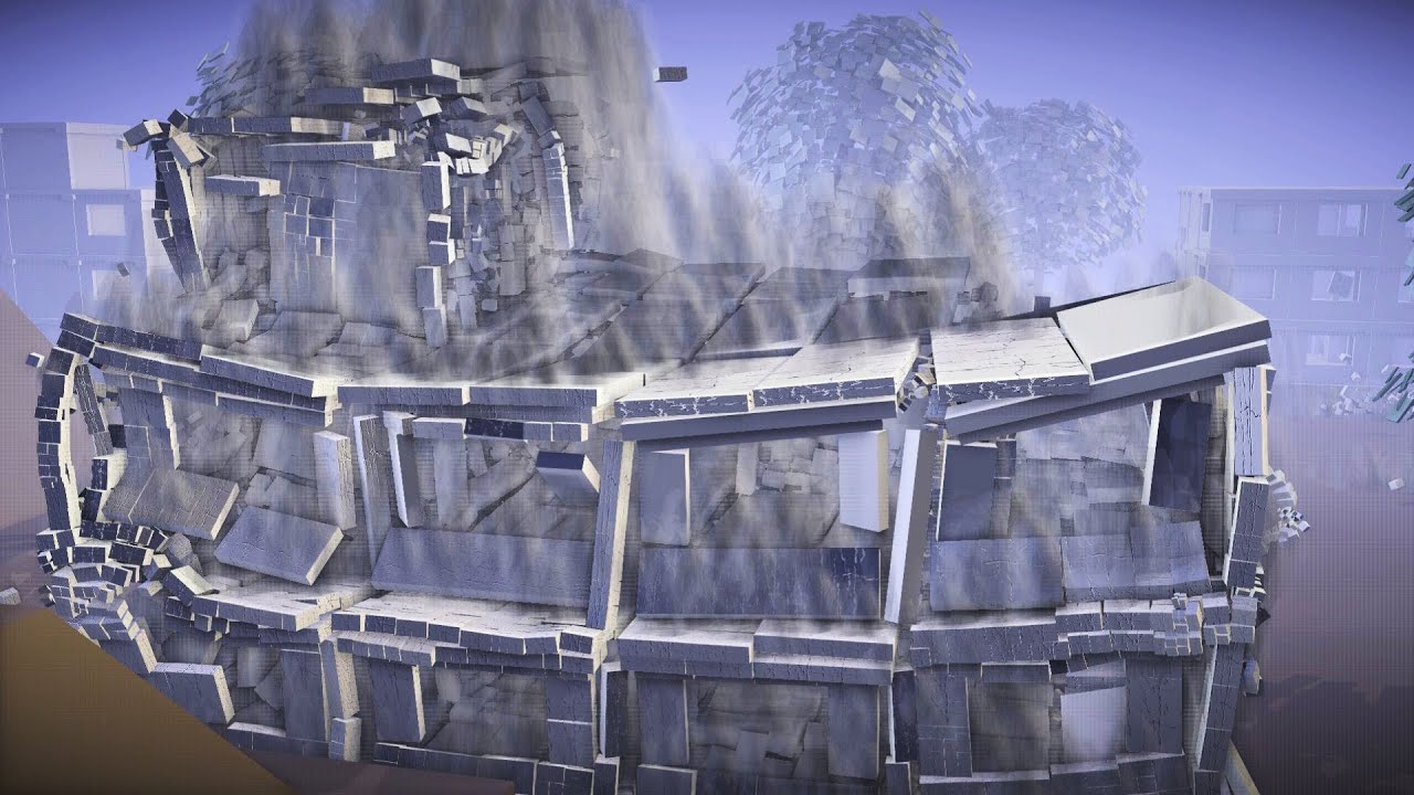
Take this, video game industry of boring indestructible environments! It's the evolution of a basic idea I demoed already 4 years ago.
Real-time destruction playlist: https://www.youtube.com/playlist?list=PLGYnM-Mk7-OeGXUfy41vPsj8a6nsIYNJn
Credits:
Fracture code - Kai Kostack
SSAO shader - Martins Upitis
Crack texture - Liz Feldstein
Made with...
beauty of annihilation
drowsy garnet
O.O i figured out how to do rotoscoping in blender
(spoiler it's laughably easy)
take a video
turn it into a series of images
import them into project as plains
and just make sure this option is selected
daring ferry
Or you can use the mask editor with the compositing editor for advanced stuff (even combine with the tracking editor for epic and easy tracking rotoscopings)
left wind
le AAV-7 has arrived
halcyon lantern
wip! ...of a whip!
obsidian trench
 jolly fulcrum
🤔
round moth
madnes
bright jay
Nice coloring
sharp viper
chefhank with funi mask gas man and skule man
 high pagoda
Thoughts?
carmine jolt
very good
rancid carbon
nice
flint rock
pretty cool
bright jay

brazen grove
you're pretty good
halcyon lantern
tonk
bright jay
ew
halcyon lantern
just 2 men to use one 😎
nah but I deliberately tried to design a shitty cheapo tank
Yiy
olive cove
so then the driver uses the machine gun as well?
halcyon lantern
Yes.
olive cove
that makes me anxious
halcyon lantern
exactly.
carmine jolt
one hand at the wheel, one hand at the gun, and your heart at god
halcyon lantern
too bad it has a 1-person turret, if it had two, I'd fit a commander rear-right machinegun in there.
also damn it I should stop making my doodles so tiny, I hate working with individual pixels
wind night
Do what I do and make things ridiculously large than scale them down
halcyon lantern
yeah that could work but the issue is my doodle sheets consist of multiple drawings and my own consciousness causes me to try to be as space-conservative as possible, dunno why lel. I should stop.
I have as many layers as I want
olive cove
thats why I use photoshop and just pust stuff on separate layers or just have different PSDs
halcyon lantern
I do, but I separate my stuff into folders, basically to just have everything neatly put instead of just a million different folder/layers
bright jay
terms
halcyon lantern
Cause I don't think each doodle deserves a full canvas
final forge
Using vector art is also pretty nice if you’re bothered by pixels
blissful heath
does anyone know who made this?
i've had it as my wallpaper since last year, and I wanted to include it in a project but idk who made it
I found it in Community Highlights 83, and it says it was made by 'Jacklessthanthree' but I can't find them on the discord https://www.foxholegame.com/post/community-highlights-83

foxhole
Hello Soldiers, Amidst all this COVID-19 news, I thought I would supply some healthy advice to our loyal fans who might be sick. 1) Don't go outside. Stay inside and play video games. 2) Wash your hands. Preferably with the blood of your enemies. 3) Consistent showers. I don't know if that last one was recommended by a
nevermind found who made it
final forge
Yeah it’s Jack<3#8193 if anyone else wants to check out his stuff. Super talented.
olive cove
he's got an artstation too
runic linden
My man now wears a scarf
rancid carbon
scarf solidarity 😔 ✊
runic linden
Scarf people unite
oh and I fixed the hand a little bit by making it a tad bigger
makes his hand a bit more bolder than the other but I'll fix that before colouring
carmine jolt
scarves exude bottom energy. that is all
daring ferry
final forge
Using vector art is also pretty nice if you’re bothered by pixels
also if you can't draw by hand x)
rancid carbon
carmine jolt
scarves exude bottom energy. that is all
does this look like a bottom to you smh
carmine jolt
eyea
runic linden
cant get anymore Valkyria Chronicles than that
rancid carbon
that doesnt mean she isnt one
daring ferry
rancid carbon
I mean I guess she doesnt look like a mass murderer in that drawing
put armor on with an SMG and you'll have your mass murderer
rancid carbon
dont get ahead of yourself
daring ferry
fading thistle
rancid carbon
does this look like a bottom to you smh
why she dosen't have headphones on the ears?
daring ferry
ear protection
fading thistle
it looks like more attached to the head than to headphones
rancid carbon
as intended
rancid carbon
jack did some chonko bois
daring ferry
well there was that warden trench raider but that's it
drowsy garnet
chonky





 daring ferry
i need talent to draw tho
 willow rapids
Hum
rancid carbon
you are creator of chonk
willow rapids
well, Thanks ( Actually it is not )
daring ferry
he is indeed chonky
drowsy garnet
rotoscoping looking good
rancid carbon
that damn smile
drowsy garnet
kek
rancid carbon
ah I mean it in terms of thickness
that man is very thick because he got a lot of armor
willow rapids
Well... thanks
rancid carbon
sketchy first
carmine jolt
wdym
willow rapids
oh..
rancid carbon
line art goes on top of sketchy
carmine jolt
oh he's learning
rancid carbon
flawless strat
peak rover
What are you trying to draw
willow rapids
It's concept art work process
carmine jolt
make sure to make your sketch so dirty and incongruent that you have no idea where to put the lineart 
rancid carbon
carmine jolt
make sure to make your sketch so dirty and incongruent that you have no idea whe...
real shit
undone trout
Ban ganii
carmine jolt
yes
willow rapids
ex)
carmine jolt
i can get behind with that statement
rancid carbon
carmine jolt
make sure to make your sketch so dirty and incongruent that you have no idea whe...
chaos
round moth
\😳
carmine jolt
there is no order in the first layer
rancid carbon
it sucks on paper cause you have to be so light with the pencil to avoid smudging 😔
daring ferry
peak rover
What are you trying to draw
Heavy infantry, kinda like the soviet shock troops
carmine jolt
draw light, head bright
peak rover
Ok
rancid carbon
runic linden
especially when rubbing things out
dont rub ur thing on paper smh
daring ferry
Smh
runic linden
well how else do i fix my mistakes
daring ferry
Use an eraser
buoyant crest
rancid carbon
*chaos*
I am actually concerned about your sketch layer
carmine jolt
i am going to rub
going to rub my peen on this A4 paper
rancid carbon
buoyant crest
I am actually concerned about your sketch layer
all is fair in love and war
carmine jolt
buoyant crest
I am actually concerned about your sketch layer
shhshh shhh
it's about the results not the process
buoyant crest
now I want to share my sketch layers lol
rancid carbon
judging has a habit of being extremely entertaining
buoyant crest
I am just going to pick a random drawing and show its sketch layer
rancid carbon
most of my sketch layers are paper drawings so they are already pretty fleshed out, I was looking for a worse one cause I know I have it
willow rapids

Pinterest
Jun 21, 2017 - Modern Warfare 2 Juggernaut by IgorKutuzov on DeviantArt
rancid carbon
I also still suck so most of my sketch layers are fundamentally flawed and thus an embarrassment even moreso than the one I posted
runic linden
Let there be colour
runic linden
Tbh if it were he'd have a hole through his head the very next second
rancid carbon
heh
buoyant crest
lol
rancid carbon
no yeah I start by chunking my idea out kinda like that
I just add a lot more to my sketch layer
so stuff gets erased and covered
prob a habit from paper drawing
buoyant crest
actually, these are two sketch layers; the face detail is a seperate layer so I didnt have to struggle with the base for the face as well
carmine jolt
tutorial says to break down drawing into simpler shapes
follows
drawing no longer makes sense to me
buoyant crest
F
runic linden
makes abstract art instead
rancid carbon
do you use a pen when sketching?
I cant stand pens, pencils make it so much more forgiving lol
buoyant crest
4 for background, 4 for the person, 2 for general test of shapes
runic linden
carmine jolt
i get lost in *4* layers
should name your layers
rancid carbon
bob, doug, carol, and kalimoire
runic linden
buoyant crest
drawing ended here
carmine jolt
"Layer1"
"Layer2"
"Layer3"
"Layer4"
"haha yeah"
buoyant crest
just use folders
rancid carbon
yeah names mhm
left wind
Unholy amount of layers
buoyant crest
Colour, foreground lineart, background lineart, foreground sketch, background sketch
carmine jolt
rancid carbon
yeah names mhm
livin' on the edge
buoyant crest
or actually, all line art is grouped, group 1 is a reference grid now I look at it
rancid carbon
Redlining, as you might say
buoyant crest
I should redo this drawing tbh, it is a quite cool sketch
carmine jolt
is it a bad thing i tend to have less layers as possible
buoyant crest
carmine jolt
is it a bad thing i tend to have less layers as possible
not at all
runic linden
I mean less layers means you dont get lost but it can be harder to correct some mistakes
carmine jolt
yeah i guess that's the downside
runic linden
My advice is that for each article of clothing on the person's body, that is a layer itself
buoyant crest
it has a lot of ups and downsides; in the end it comes down to preference and what makes you comfortable
I know people who do a new layer ever other 4 lines
runic linden
for example on the above image I have a layer for the vest, a layer for the mask, helmet, scarf etc
rancid carbon
idk ill have to hear from the big wigs
I tend to chunk by delicacy I guess
Ie clothes are massive so their shading/ coloring gets combined
while facial stuff gets more individual layers
but I actually have no idea what im doing besides some youtube vids and intense staring at the screen
carmine jolt
if you have no idea what you're doing, you're doing the right thing
runic linden
oh good so Im not the only one looking at google images the whole time
carmine jolt
everytime i think i already know what i'm doing it ended up looking fucked sometime later on
runic linden
the trick is to convince yourself that in the end itll look good
buoyant crest
This is how I tend to do my layers. I actually tend to put the colouring layer (in this case layer 15) on top and use a 'darken' layer option, but that did not work well with the fact I ahd a convoluted background going on
carmine jolt
fuck i need to know how to color like that
buoyant crest
also, layer blood is wrongly named, and is a composite layer
runic linden
Colours like half the solution, the rest is up to shading
buoyant crest
it is the actual colour layer
runic linden
you can just add a base colour and shade away with shadows and lighting
carmine jolt
lmfao mistaking layers as another layer. a classic blunder
runic linden
Oh mein gott yeah
rancid carbon
the two things that kill my sanity
drawing on the wrong layer
and drawing with the wrong color
buoyant crest
it is quite easy, just colour in with a flat, then use clipping masks to add shadows
carmine jolt
screws up on color
tries to erase a portion of it
lineart also gets erased
mfw
buoyant crest
and then a cliping 'overlay' layer on that with all the colours
rancid carbon
I swear to god it looks black but surprise red was at 5
and you can tell
heres some better org on my part
carmine jolt
wait wtf how
rancid carbon
clip at layer
buoyant crest
clipping masks
rancid carbon
buoyant crest
and layer settings
two most important functions of digital drawings
if you know how to work these, you can basically make anything
it takes a lot of experimenting, but it really improves your digital art
buoyant crest
lol
carmine jolt
goddamn digital art aaaa
return to pencil and paper
buoyant crest
It looks scary at first, but it actually takes few effort to learn it well; with pencil drawing it requires you to do everything by hand over and over again, while this takes just one drawing and some clicking around
carmine jolt
i remember my pinkie finger and my middle finger on my free hand suddenly twitched when i made a mistake on paper
carmine jolt
got fucking pavlov'd by digital art
carmine jolt
buoyant crest
and it allows to digitally colour your drawings as well
yeah digital has the convenience of not buying shit and having a second chance of unfucking color
rancid carbon
I hate digital honest
buoyant crest
using filters to clear my drawing, then adding a fix layer, then a group with all the colours on multiply
runic linden
If you can’t draw a hand, just pull a Walt Disney and draw gloves on your guys hand
carmine jolt
a small price to pay for quality
buoyant crest
dont look athe quality of line art, was an experiment lol
carmine jolt
don't get me fucking started on hands
rancid carbon
hands arent bad until they are
idk how it works
like sometimes they are fine
and then other times hells gates open
and say you shall not hand
buoyant crest
my entery for the first foxhole art contest was digitally coloured
runic linden
I don’t even bother with hands
runic linden
I even used to not draw the whole outline of the hand so it looks like the guys amputate his hands by the wrist
carmine jolt
buoyant crest
my entery for the first foxhole art contest was digitally coloured
when was the last art contest held
runic linden
Two years ago I think
buoyant crest
not last year sadly
carmine jolt
well