#Thumbnail feedback
35 messages · Page 1 of 1 (latest)
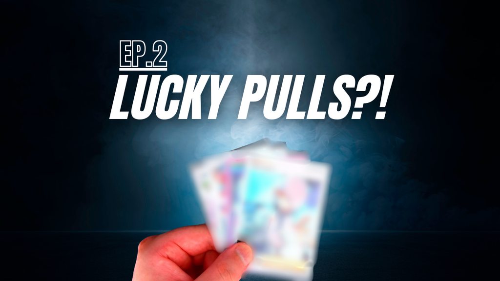
Okay So I like a little of the First one and a little of the second one.
On the first one I like that it says EP 2 and that its a clean thumbnail with interesting eye catching colors but it doesn't really show me what the video is about and the title doesn't give me any clues either. Like are you talking about Magic the gathering, Pokemon, Yu-Gi-Oh or some other obscure card game.
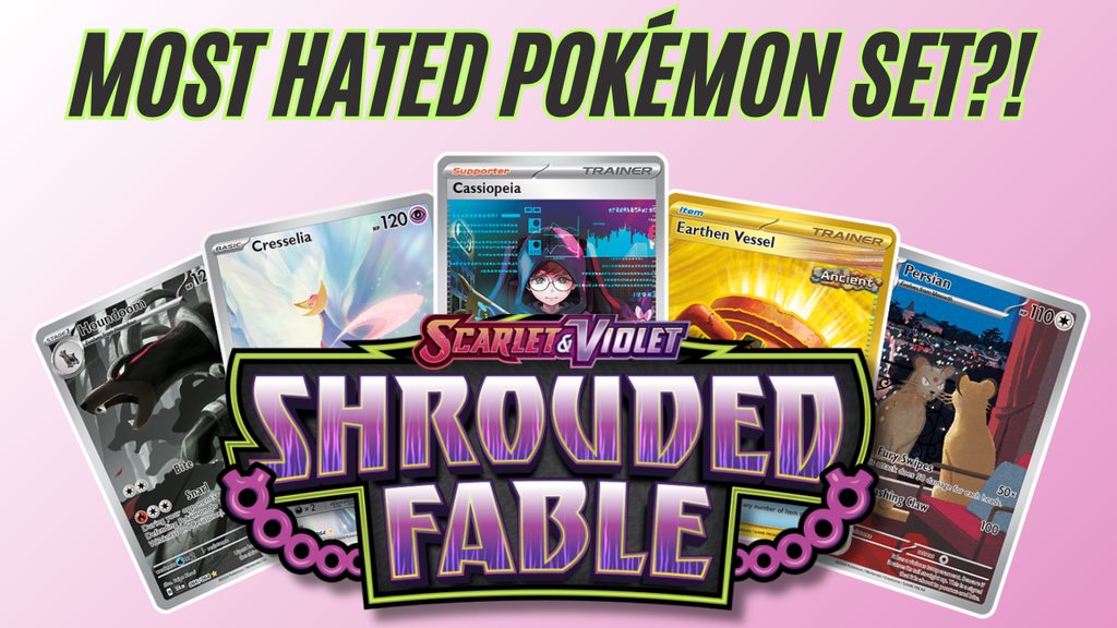
Also just a quick question is Shrouded Fable the most hated set? if so why?
The second one is is better in that it gives me more information. I just want to know if in the video you go over maybe why its hated as I cant seem to find any information that it is and if that's what your video is about ... I think the second one is also a bit too bright personally in the color scheme but if you like it then that's also important.
Overall, Although I like the sleek way the first one look I think the second one is just better as it gives a better sense of what the video is about.
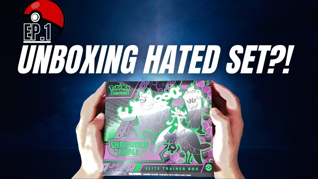
hey thanks for the feedback i added these poke balls to the images - you think it makes a difference? https://imgur.com/a/o7itCRF also the reason there is controversy around shrouded fable is because the set is a mini set which means theres lots of duplicates, the pull rates for the big cards are really low, it was quickly overshadowed by the new sets that were realeased straight after, and the focus on the ex pokemon was another downside because the pokemon wern't exactly fan favourites - i mean theres lots of reasons but im just unpacking packs and unboxing elite trainer boxes 😄
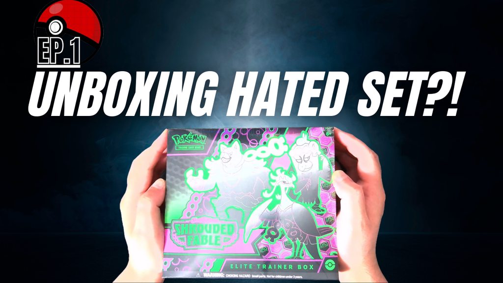
click the link to see both images
Wow yeah thats way better but uh the image of the box is really bright now with the dark background so it pulls away from everythig else. And weirdly I think the title need to be Unboxing a hated set!? It's a weirdly incomplete sentence the way you have it. I feel like its super close though
oh the reason the picture is so bright is because the sun was really shining wheni took the picture 😅 the video title is Shrouded Fable Master Set Journey Ep. 1 – Lucky or Doomed?
i didn't want to repeat what the thumbnail says so i added more information
well not more different i guess
from my understand people see the thumbnail first and then they see the title
Oh if you have an image editing software just lower the tint on the image so you don't have to retake the whole thing
i made the background lighter and added a filter to the box and my hands - let me know if it makes a differrence https://imgur.com/a/OZu9O6t
Whatever just darken the image a bit
Both colors work Its the box image that needs to be dulled
ahh ok let me figure something out im using canva so i have no idea what im doing lol
Oh Well if ya want just dm me the image of the box and i can do it for ya
oh wow thanks just give me a sec trying to find the pic with the transparent background

ok @short pendant i think i figured it out https://imgur.com/a/ox4ATes let me know what you think
Okay one moment I decided to not half way do this
Yeah but the hhands
Its the same problem I ran into

Hold on
I wanted to test to see how that looked

But yeah no that looks worlds better reguardless

what did you do to the box?
So I Selected just the box and then lowered the brightness on the box and upped the contrast so that it didn't distort
I then Inversed the selection and did the same to the hands. The reason I had to do it this way was because the hands are well they are a different color so it distorts differently
ahh ok thanks - i just figured out how to adjust the image on canva but all the changes i did effected the hands too
ill figure out how to select parts of an image another time 😄
im happy with what i have - thanks for your help! hopefully people who see the thumbnail on youtube click it 😄