
14 messages · Page 1 of 1 (latest)
Heyo, I’m wondering whether this video seems to be over edited or not as I did spend a lot of time on it (which I really enjoyed) but I’m not sure whether it’s 🤏 much. Also is the thumbnail eye catching? I made it myself and any feedback on that would be most helpful! Thanks for reading :3
OH also any editing tips would be much appreciated!!!!
Outrageously Funny Lethal Company Moments
Ah yes, the horrors of Lethal Company. Here are some clips of me and my friends trying to survive. We tried our best haha.
Leave a Like and Subscribe if you enjoyed! Thanks :3
💜My Socials!!💜
✅ Subscribe!
bit.ly/SubscribeToMadsTheDinoHere
🔥Join m...
Disclaimer:
Keep in mind I am ALSO a tiny tuber who is ALSO asking for advice so... D:
I HAVE NO IDEA IF ANYTHING I SAY WITH CONFIDENCE IS THE COMPLETE, CORRECT ANSWER.
**Please feel free to disagree or correct me! I'm here to learn too!
**
✅ : Great
☑️ : Good
❌ : Work on this
⚪ : Not Applicable
.........
⋆。゚☁︎。⋆。 ゚☾ ゚。⋆ __LITERAL QUALITY __ ⋆。゚☁︎。⋆。 ゚☾ ゚。⋆
✅----- HD quality offered (Is 1080 HD offered? This is non essential but nice to have)
❌----- Audio clarity (Is the audio crisp enough to note different sounds apart and clearly understand words?)
⚪----- Lighting (Is the room's lighting balanced? Ie no white-outs, over exposures, zero-data noise)
⚪----- Camera work (Is the camera work clean, interesting, and consistent? If still, is the subject in frame)
☑️----- Sound levels (Do your ears bleed? Is it too quiet? Perhaps both?)
✅----- Background noise (Is there notable noise or distracting background noises that aren't intended or part of the video)
✅----- Editing Style (Is there a consistent editing style? Does it add to the video without distracting?)
✅----- Transitions (Are transitions smooth and appropriate?)
✅----- Pacing (Is the pacing of the video comfortable and engaging?)
✅----- Use of Effects/Graphics (Are any effects and graphics used effectively to enhance the video?)
.........
Notes: I get that you're worried about edit frequency, but I personally think you're ok! This isn't a letsplay video, in fatc it a comp video! You can go crazy in these videos because theyre clicked on with the intention of getting many many many short clips with tons of editing to them. As long as the edits support them context/, the joke, and the style you picked you're good! Now if this was a letsplay video, I'd be hitting you with the "meme-y edit" rant I tend to give lol. But this is good!
You did a good job and I like the edits! Now, your audio is absolutely trash at times, but well, thats kinda normal in these types of videos. I dont think your viewers will be too harsh, but if you want a tip that will massively improve your audio, try to get yourfriends to record their audio seperately (if theyre creators they tend to do this already) and then edit their audio seperately. This could be a massive improvement but again... not really a needed one lol. I will say you should normalize your audio before uploadng onn your end either way!
.........
⋆。゚☁︎。⋆。 ゚☾ ゚。⋆ __CLICK QUALITY __ ⋆。゚☁︎。⋆。 ゚☾ ゚。⋆
✅----- Click-Through Rate (CTR) (Is this a very "clickable" thumbail/video in general?)
❌----- Attractiveness (Are the thumbnail and title visually appealing and compelling?)
✅----- Relevance (Is the thumbnail and title relevant to the topic and correctly inform the viewer?)
✅----- Topic (Is the topic interesting and relevant to the target audience?)
☑️----- Curiosity (Does the topic or thumbnail/title create curiosity and intrigue to encourage clicks?)
❌----- Color (Are the colors in the thumbnail eye-catching/complementary without being overwhelming?)
❌----- Contrast (Is there a clear contrast between the elements in the thumbnail?)
❌----- Simplicity (Is the thumbnail simple and focused? Are assets limited to one or two main focuses)
✅----- Readability (Is the text on the thumbnail easy to read? Are they as few words as possible with high contrast, avoiding repetition of the title?)
✅----- Faces and Emotions (Do faces added express strongly? Are they realistic and accurate to the video?)
✅----- Clarity and Relevance (Is the thumbnail clear and directly related to the video content? Would it stand out?)
☑️----- Unique Selling Point (USP) (Does the thumbnail reflect your niche and topic uniquely without blending in with similar content?)
✅----- Title Value (Is the title short, relevant, and captures curiosity?)
.........
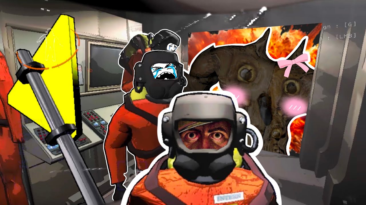
Notes: I'm being harsh and picky here, so please dont feel bad! I could be wrong, but is the thing behind you supposed to be a reference to something big that happened in the comp (that one creature?) if thats the case, it should be in the foreground and really the focal point of your contrast/color. If it's well, just there, then your thumbnail is too busy and needs simplfiedf. Showign a crazy aor silly moment and focusing on that silly moment would be a huge improvement. BUT I DONT think this is a bad thumbnail! I took off pooints because it feels like that was your intention and it resulted in a less effective thumbnail. I think it's still very clickable and you have a good idea of what a good thumbnail looks like
.........
⋆。゚☁︎。⋆。 ゚☾ ゚。⋆ __WATCH QUALITY __ ⋆。゚☁︎。⋆。 ゚☾ ゚。⋆
✅----- Presenter Delivery (How effective is the presenter's delivery and on-screen presence?)
✅----- Energy (Does the presenter bring sufficient energy to keep the audience engaged?)
✅----- Audience Retention (Does the video keep the viewer's attention throughout?)
NA ----- Time I would click off if this wasn't a review (with my frantic ADHD brain)
✅----- The Hook (Is the first 5-10 seconds hooking the audience?)
✅----- The Intro (Is there a quick intro that preps the audience that doesn't go longer than 30 sec?)
✅----- The Clingy Minute (Does the next minute keep the viewer clinging to the video?)
✅----- The Substance (Does the true body of the video carry the viewer till the end?)
❌----- The Outro (Does the ending have a smooth transition, a goodbye to the viewer, or another outro?)
✅----- Relevance to the topic (Does the video contribute to the topic or is relevant in its category, i.e., gaming?)
✅----- Unique Selling Points (What makes the video stand out from similar content?)
✅----- Viewer Benefits (What benefits does the viewer gain from watching the video?)
✅----- Coherence (Is the video logically structured and easy to follow?)
✅----- Flow (Does the video transition smoothly from one segment to another?)
.........
Notes: WOW! An almost PERFECT SCORE! I've never had that before! I took off points for the weak outro, but well, lets be real, this niche tends to have NO outro so youre already a step up there, but I think since you chose to have SOME outro it could use some work. Maybe an end card.
.........
⋆。゚☁︎。⋆。 ゚☾ ゚。⋆ __COMMUNITY QUALITY __ ⋆。゚☁︎。⋆。 ゚☾ ゚。⋆
❌----- Connection with Audience (Does the presenter connect well with the audience?)
❌----- Calls to Action (Are there effective calls to action, e.g., like, subscribe, comment? Or an endcard to CTA?)
⚪----- Interactive Elements (Do any interactive elements, e.g., polls, questions support the video and aren’t distractions?)
⚪----- Branding Elements (Are intros, outros, and graphics consistent with the channel's "Name?")
✅----- Overall Style (Is there a consistent overall style across videos?)
.........
Notes: Ooooofff sorry. I took off a ton of points here. I found that I couldn't really connect with the people in the game, but that I simply felt like an outsider thinking they were funny. That's completely NORMAL for a comp video, but if you wanted to build an aduience I'd work on making your different personalitys shine/stand out and also make an effort to connect.
It's ok J lol, go ahead
Jean* (Streamer Mod on lol)
For the most part it doesn't seem too bad, but at times, yes it is.
I get why you do captions that way, and it works for the most part, but considering how a lot of the game has very dark lighting, when the humor tends to be more visual than based on what's being said, the attention is very much taken away from it. I think that one of the best examples of that it is at 0:46, where the gag is very clearly visual, and the cat gif is distracting from it.
I think that the shot selection is good, it's just a matter of balancing what's the main thing that makes the moment funny, and making sure that the edits don't take away from that. For the most part it's solid though, and the other things I could bring up, Luna already has.
This is truly amazing, thank you for taking the time to do this I really appreciate it and I’ll take your feedback on board! Thanks again :DD