#Artificer UI
1 messages · Page 1 of 1 (latest)
I am kinda sad that you reminded me of that other VTT. I just went and looked at it and I am way closer to their design then I could have ever imagined....
And the worst part is they also do what I wanted to do... Maybe I just forgot about their design but my subconscious was like, this was a good layout...
Like I wanted a notes section above the chat so players could write live notes and see them all the time. and on the left I wanted to split the sidebar into two. The top half being combat and acotrs and the bottom half being the rest of the sidebar tabs...
Now I feel like I am just stealing their UI.


I'd say "there is no true originality" and you should rid yourself of that thought of stealing/copying. I'm betting Alchemy wasn't the first layout that did it like this either.
If it looks similar, who cares. Working well is what matters and I'd say for a very minimal layout the options are limited so naturally there will be strong similarities. In theory even if you, by accident, did a perfect copy of it, Foundry VTT would still have a different core and purpose underneath
Thats true. I just can't believe how close they are, and the name 100% doesn't help. Probably going to go back to calling it Artificer UI just to make me feel better. haha
Yea the name does not help, that's true.
I bet some people would be very happy to have a UI that looks like Alchemy's but with a truly powerful core underneath (I heard Alchemy VTT is quite basic when it comes to things like complex system math, automation and everything a bit more fancy than just providing VA and tokens)
I think their VTT is more based around the idea of Theater of Mind. Either way, I will change the name, I'd like some seperation just to make me feel better. And though I am sure they can't do anything to me legally. No reason to get a whole company mad at me over a free project that doesn't pay me. haha
I can't wait to see more. I was already a fan of Fantasy RPG UI, but this one looks so modern, it looks so great.
I didn't see the resemblance with the other VTT at all personally, just the name.
Fantasy RPG UI Is going to be getting an update too. I created that more as an expirement then a UI I wanted to use. It has a lot of design changes which causes alot of module conflicts. This UI, should mostly just work, it'll have issues with specific modules that effect the Scenes, Players or Hotbars of foundry depending on what they do but should work otherwise.
Is the UI going to be a V12 module on AppV2?
Kinda... So I use Vue, and I am in the process of writing a VueApplicationMixin so that you can use Vue with AppV2. But I am experimenting with writing an VueApplication that basically will do the same thing the VueApplicationMixin does but for foundrys ApplicationV1.
Meaning people using my VueApplicationMixin can provide a fallback for VueApplication on Older foundry editions. This really only works because of how Vue Replaces foundrys use of their app instances. Since Vue is reactive by default, you can generally avoid calling re-renders meaning the fallback should work for 90% use cases.
But the target release is v12. As I was origionally waiting to do my UI with foundrys UI overhaul. But it appears thats being pushed futher back and I am just kinda like... Eh... time to just work on mine.
Figured I would clean up some UI Space if you wanted to. Now you can tell the chat to Auto Hide, and it will become visible for 5 seconds when there is a new chat message or on hover

Ooh that's nice. Can you tell it just to come up on hover as well as an alternate mode? Sometimes you might not want to even check every new chat message
I can add that
This looks very promising, cant wait to get my hands on and test it.
Setting Added

So now I am going to work on the Sidebar to clean it up and get it inline with the rest of the UI
neat

I would like to have an hotkey for switching between immersive mode and full ui 🙂
So basically you want to be able to hit like ctrl + i (Or whatever you define as your hotkey) and it will force the UI to be shown if you have autohide turned on? Hitting it again, will return it back to its previous state.
Yes this would be cool. As GM i think its most usefull switching fast between this two modes and as player i enjoy the clean ui in theatre of the mind scenes.
I am preparing a fallout oneshot with primary TOTM scenes. So this will fit perfectly with lock view.
This is another module I was planning on making. To allow you to set a wallpaper or video as part of a scene. Then add a control to toggle between Theater of Mind and the Battlemap:
Basically it places a image or video over the canvas, but behind most windows. So that the battle map is hidden. But it fills the entire screen unlike the canvas that may leave some background viewable.

It looks particular good with my UI as it moves the UI out of the way of the image/video
Also an really cool idea 👍
Combined with Yendors Scene Actors or some other TOTM Modules, this will create a really immersive experience i think
One of the reasons I haven't put more work into it yet is that I wasn't sure what TOTM modules already existed and wanted to make sure I wasn't already doing something someone else accomplished.
It looks really good when linked to a youtube video or a video format: https://streamable.com/0lrtrj the little animation is cool but It will create blackbars usually depending on users screensize... I haven't quite figured out how to fix that yet...

Couldnt you make the picture fit vertically or horizontal?
The Lock View Module lets me choose how to fit the screen. So i can adjust it how the picture fits best
But wouldn;t that be specific to your screen, not the players screen?
I'll have to check out that module to see what it does.
Yes if someone has now the "normal" screen format, it will create black borders i think. But you cant save them all 😉
I thought I would like this more then I actually do:

The idea was to basically split the sidebar up to three sections, Chat, Combat and Everything else. this way you would have access to the most common tabs (at least in my experience.)
But I am just not sure now...
Hmm, I would like to play around with it myself and give you some feedback. Would you mind to release some kind of beta?
I can put together a beta release (probably over the weekend or tomrrow). I've got to go and add v11 support, because right now it uses AppV2 so it wont work in v11 of foundry.
No problem, I can test in v12
Alright, then yeah, I can probably put together a working-ish demo and share it later today or tomorrow if I don't have to worry about v11 support yet.
Probably Works as a Beta... I will setup a Github later. But that will take more steps as I'll have to setup a rollup and all of that so it builds and attaches the correct files as part of the release step... But if your willing to test, here you go.
Thy
Just a heads up, right now I am using backdrop-filter: blur (4px) this can cause performace issues. I plan to add a setting that will allow you to set this value to 0px - 15px and if set to 0px it will disable the effect and replace it with a darker background.
This does not exist now, but will in release. So if you are having major performance issues that setting will help in the future.
I will keep an eye on the performance 👍
Looks like someone already has a scene idea like I had: https://foundryvtt.com/packages/scene-transitions
Nothing very importand but the fps counter is behind the chat

I dont know what these are for. And i cant really find a way to get Macros in the bar on the bottom.

The toolclips appear over the controls. I think for the ui it would be better if i deactivate them, but some would like to keep them i think

i dont know if actors is the right choice here. My first intention was Journal notes beside the Combat Tab. But then i thought this could be user specific 🤔

- I forgot foundry had an FPS widget, I'll look inot that.
- Hotbar is kinda janky. You basically have to disable the UI right now, add stuff to your hotbar, then enable the UI again. The problem I have to resolve is AppV2 does not have DragDrop events. So I have to write my own implementation for accepting the user to drop things onto the hotbar. I also have to write code taht detects when the user starts to drag something so that the Taskbar comes into view.
- Oh, I have tooltips turned off. I can adjust their directon when the user docks the taskbar to another location other then left.
So this where the first things i saw while playing around with it. But i have to say, this is amazing. Such a good looking ui. I really like it.
Yeah, it should default to journal when you open up. So you see Combat on the top and journal at the bottom. I can look into making it customizable via settings. But that poses some problems since I am using CSS to basically hide and show things. I might have to write a script that builds custom css based on the users settings.
Bascially not impossible and great feedback. I'll review this and see if I can come up with a good implementation.
All in all, i think you have a good implementation. I will spend more time, testing if i find errors or incompatibilities with systems i use. For now i only tested the dnd system
And due to the lack of v12 betas, this will keep a while 🙂
So I am going to look into re-factorying the taskbar out of AppV2 and just make it a standalone HUD Component. It doesn't really benefit from anything being part of the foundry Application framework and this should allow me to make it slightly more version agnostic.
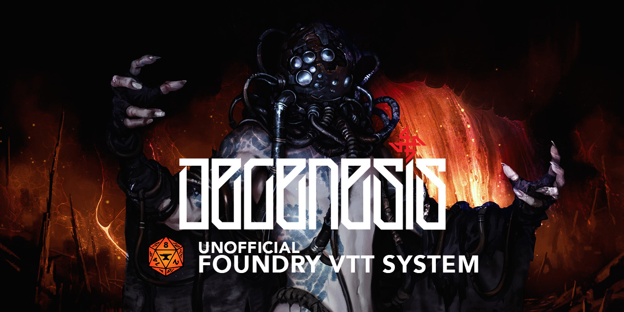
Ran a short V12 test using the V12 Degenesis beta which has a heavily styled system, so quite interesting in terms of styling interactions.
Overall it looks really good, very smooth and immersive to get the windows of the way. I like top bar tools a lot
So far I noticed the toolbar docking needs some changes.
- If it docks to top and centered, it moves if the sidebar is expanded/minified which probably should not happen
- if you dock it left and you have minimized chat, it floats somewhere mid-screen (where it would dock to maximized chat) and doesn't react to chat minimizing
- docking to bottom should somehow sticky it to the bottom bar
General:
- Style only changes the styling for the toolbar, but should probably affect bottom bar, chat bar (and future side bar) too
- Scene buttons on the bottom bar don't seem to work
- the settings config window has an undefinied icon showing in the bottom bar if opened
- I have no idea how to get macros into the macro bar

Oh crap, I totally forgot I never setup the scene buttons... I started working on the context menu option so that if people added context menus I had not accounted for they should render on my Ui but I never made the buttons work.
Some of this is stuff I was aware of. the position thing needs fined tuned as I keep adding settings and options I have to go back and adjust them. As for the buttons moving when the sidebar moves, it assumes the sidebar counts as screen space as it generally filles the entire left side... Its meant to be center of your player area, not center of your screen? Should I reconsider that idea and make it center of screen vs center of playable area?
Honestly, for being a game system I hadn't tested on. I am shocked it worked that well to be honest. haha
Are there any game systems that are made for V12 yet? I tested Degenesis because it has a) a v12 beta branch, so "true v12" and b) it has extensive and very amazing system styling which shows interactions well
I have no idea, I've been testing on 5e cause its the only one I could get working. HAHA
I'll have to install Degenesis, just to give it a shot. I've never played the system before.
https://github.com/greedyj4ck/DEGENESIS-FoundryVTT/tree/v12 is the beta branch (manual install needed)
GitHub
DEGENESIS: Rebirth system for Foundry Virtual Tabletop - GitHub - greedyj4ck/DEGENESIS-FoundryVTT at v12
one of the most beautiful systems Foundry has especially for a game that's not in dev anymore
Awesome I'll check it out
small thing: When you have permanent chat and hover / opacity goes up it could need a tiny transition of 0.5-1s to not make the change harsh
I'll have to take a look... Also it appears Alchemy really dislikes that I change the heading of the chat cards:

I was thinking if "Always display chat if combat is running" might be worth it as a settings option
since you can check for that and usually you don't want to hide chat in combat play?
So I gotta talk to a person and make sure they can't really do anything, its not like they can do anything since user card with floating avatar is pretty common design pattern... a quick search on codepen.io verifies that.
Do you want that as an additional setting? I can do that pretty easily.
If it's easy to do I'd say yea. I can imagine it's useful as an optional thing
lots of systems use chat a lot if combat is on and you might need to type/apply damage etc
Yeah, most settings are pretty easy, as its all CSS.
Wait does that mean you asked Alchemy for permission or something?
It just
body:has(#app-module-id[datra-setting="true"] #chat {
 /* Apply Styles here */
}
I know someone who knows someone, it became a thing.
huh, so header as in putting the portrait center and circle?
Companies can't really give permission or stop me from making it. At best if they really get a stick up their ass, they can send me a cease and desist letter... (Or DMCA the package) But from my understanding with the lawyer I talked to after they were sending me photos comparing the chat cards I can basically tell them "Yeah no."
the real question is what would Foundry do if they received a DMCA. But legally I am fine, I have a bunch of user cards showing their not the first to use the pattern etc.
Its weird they have given me a harder time then WoTC for my character sheet.
maybe Foundry would comply and take down your module at worst and then you change the 1 thing in the DMCA and bring it back up
I straight up just exported WoTC character sheet out as SVG's and made it a digital sheet.
I might, just make it so that the "restyle" of the chat header is a seperate UI module, cause then you can just use the two together.
Then they can't really do anything.
You can always ask staff about the legal danger zones if you want to
going nuclear on something like that would make Alchemy look like salty business losers as well
I plan to. like I said, I have done my research. I tend to warn foundry of things. Like I gave them a heads up about my Fantasy RPG UI having license stuff. I even prechecked that they would be okay with my character sheet once it gets released as that one I did email WoTC about to get their permission, since I was straight up stealing (I technically got permission, so I gues its not stealing) their assets.
Degenesis chat cards don't have the circular top portraits, is that DnD system unique so far?
It shouldn't be D&D Specific its structure specific, its looking for a .message-header .message-sender .avatar selector. So it depends on what the system uses as its structure, I am not sure how similarly structured the chat cards are, as I believe most don't even include avatars.
So if a system has chat avatars I can easily support it, but if they don't I don't plan on adding them.
Hm, I see. Pulling the actor/token image directly is complicated then? Would be a nice option to always add an image for every system
Maybe... Chats cards are weird. Take a look at foundrys package list, their have been multiple attempts to handle this...
I could write my own but it would still probably need to be handled per system. Though, looking at the system you shared, I like that they have background images. I wonder if I can do something with that. I got an diea I want to play around with.
it's a nice style but some systems stuff a lot of info into chat cards that would cover most of the background
I was thinking having a "top stripe" with the character image (particularly the eyes part or similar) would be so cool - but very hard to properly implement esp. with the image positioning
Top stripe is exactly what I was thinking.
hard to make it fit though unless you find a way to adjust the top stripe to show "the important part" of the image
FWIW as much as I have issues with Alchemy VTT I think they've pushed the UI graphical quality up a notch with the glass elements etc. Their workflows need serious overhauls and the UX is something I find incredibly frustrating. I've been looking for a UI like yours which approaches the idea of graphical quality but with functionality and feature richness in mind
Honestly, after looking at their UI, god it is fantatic, as a UI/UX developer, the fucking NAILED it.
I think the reason our UI's ended up sort of similar is UI/UX is what I do for a living, I wanted a UI that felt better, so I started making it.
Take this side by side chat card. They are saying min looks to similiar, and now I gotta be like, fucking I want to steal this this this from your card...

sorry have they contacted you?
We have been in touch, they have been polite, they just feel my chat cards are two similar to theirs because of the center header and avatar.
sorry that's whack
Yeah specifically because I got the idea from an old bootstrap usercard I made forever ago. haha
just show them that and say... "sure... seeya"
this is the ridiculousness of a closed vs open source mentality
they are 8 guys
Naw, no reason to antagonize them unless they want to. They have been polite, just worry about the similarity. Its a company that wants to protect their market share.
I have no ill will towards them or their response.
I haven't used their service before. My players prefer minatures and features and their system doesn't feel like its meant for that.
whiel I agree that the UI has graphical quality upgrades and some information is presented in a better way than a lot of contemporary VTTs, their workflows from a UX perspective need a major overhaul. It's a one directional workflow for starters. You have to click "forwards" to get to information to know what function to click, which you have to click backwards to get to.
ie the character sheets are static
I wouldn't say they exactly nailed it in the example but it looks nice. I'd nitpick that there's too much unused space, attack name is too small and the center 5e symbol is pretty pointless except to fill all the unused space 😆
in any case... I'll test your UI
is it only for 5e at the moment?
i mostly run Free League games and my own Deadzone hack
Its not system specific, Its also very much not working as LorduFreeman experiance earlier. haha
ahhh ... it's not showing up when I load up a game unfortunately (under modules)
in any case... I'll keep an eye out
Its v12 only right now.
gotcha... i haven't migrated yet
I have a plan to drop the AppV2 to support v11 and back.
looking forward to it.
you shouldn't yet either until V12 is stable
V12 and everything V12 related is still testing territory as in "don't do campaigns in it"
Curious how do y'all feel about this sidebar?
https://streamable.com/yelj2y

Now with auto dock function, so that when not collapsed but auto dock is enabled, the sidebar will stay visible but the actual tab will hide.
When collapsed, the sidebar nor the tab will be active.
Also, you can customize the icon at the top using css, in this example, I chose to use a D&D logo.
https://streamable.com/pca2xl

Oh and it supports Foundrys theme option, so you can switch between light and dark mode or system preference.

Is there an update I can download to test? I have access to the v12 DSA/TDE5 Beta. So I can at least test that system.
I like it

Wtf is going on here 😄
Will it still be possible having the chat on the left pinned?
No demo yet. I'll be trying to update some of the css to start using css variables to keep the theme working across all parts. I'll probably have enough alpha later today
Widescreen user here, I think it's really great. :D
The chat sidebar css file is 86 lines long, 42 lines are D&D 5e Specific...
I just realized I am going to have to make system.dnd5e.css files to apply system specific modifications so as it grows to support more systems its easy to find and modify system specific conflicts.
Using your V12 system to test a V12 UI module because yours has a lot of CSS that might interact and is thus a good test. The true Chronicler way
@silver jungle For your request about having chat shown when combat is active, do you want that to only be for the current scene or if combat is started anywhere?
Curently I am checking to see if a combat is started anywhere, because some people use multiple scenes to track combats as in different areas.
But I am not sure if that is the normal or not. I also figured it might be useful as a GM, that if combat is active and you go to another scene, you can still see chat if your players do a roll or something. But I guess you could also turn on new chat for that.
@raw cloak also that system looks pretty sweet. I'll be downloading to test my UI out on it later this weekend.
Chat should be visible all the time imho 🙂
You mean if combat exists? Or in general?
If you mean in general, you can pop it out and turn the autohide off. That will keep it visible at all times
General. That's the main issue with current UI placement. You need to pop it out to see both initiative and combatants rolls 😉

Lots of options. You can choose to popout the chat which will pin it to the left side, and just disable Automically hide chat and it will always be visible.
Hum, interesting question. Not many games out there that run double scene combats. Having it on any combat would be nice for the GM while scene bound is nice for everyone else just fighting in their own scene
Nice. Gonna test it after I finish my work
I will let you know when I push out the next working alpha for feedback
YOU MEAN MORE SETTINGS
haha
Bad thing about settings is the more you have the faster you lose the average user in them
They don't even think about the possibility of multiple scenes combat going on
I am trying to keep it to booleans for the most part and hopefully organize them a little bit. I also want to be able to define presets that can be registered.
so maybe a GM can be like here is my players Preset and here is my preset. And then just tell the players. Go here, click this option. Hit save
I feel like multiple scenes was more of a thing before levels...
usually if I want something like multiple scenes now, I just use levels
Eh I'd still use multiple scenes because Levels can't do Fog of War
big no for me for that module (and I know it somewhat a core constraint but in the end, if you make a module you earn all the flaws you dig up with it but can't correct)
Having presets in a module sounds complicated as well 😆 is it needed?
A boolean for having chat always-on for scene combat or all combat sounds easy enough to digest
So the problem is were only to Theme/Sidebar/Sidebar Chat and thas 7 settings. I still have to add options for the split chat settings. Then you have the docking setttings which will be choas and probably end around 5-10 settings.
Then we finally get to the taskbar settings, such as Players Widget, Scene Widget, Hotbar Settings...
This module might be more settings then UI once its done...
dang
Tabs or button menus?
sorting them by area sounds like a good division method
I think button sub-menu is how core does it (not sure if that's still the style in V12) and I like them a lil more because of that
Yeah, I am probably going to make my own window at some point. Just so I can organize them a little better.
Went and checked out Degenesis and started adding some small style tweaks to its UI:

I do like the idea of putting the System Icon in the sidebar. Its a really cheap way for me to know if a system has special styles or not. By default it uses foundrys.
I will admit, one of the best things about the 5e System from a developers point of view... is Clash of Clans Adveventure being free package I can just plugin and play. Its so nice to have basically preset world you can test in without having to try and figure out a system to setup everything.
Degenesis has 2 free adventures (Embargo & Harm's Way) on Foundry as well but not sure if they're tagged as useable in V12
https://github.com/greedyj4ck/dgr-harms-way (from Greedyjack again! :D) should work if you just fidget the module json to be v12 compat
whoa that sidebar looks niiice. I'm still no fan of slapping the tools to left and next to the chat.
I move them to the right personally or to the top
ye, so far I like top most
I will have to get peoples general preference so I can set them as the defaults. The Controls are going to be the next thing I refactor.
They I would have fixed and organized alot of things.
I'd say just leave the default left like regular UI does it. Then people can change that
So how do you guys feel about the split Sidebar, where you can assign 2-3 things it the top half and the rest will toggle on the bottom half? Or just don't try to reimplement that?
Personally I would not use it because I can't think of a use case. But I know there was a module at some point that did a sidebar split of chat and combat tracker - sounds useful if you don't activate a separate chat.
If it's not hard to implement, put it in as optional. Maybe some people like it as an alternative to chat on the left side
Lots of modules split the sidebar, pretty sure I even have one called Sticky Sidebar. haha
I would only use a split sidebar for chat and combat tracker. But since DSA has its own combat tracker and for all other cases I use combat carousel, I don't need that very often.
But I like the idea reaching my favorites a bit better: journals.
@limpid patrol I asked if I can send you the v12 DSA/TDE5 Beta for testing your ui. He agreed. Can I send you a dm.
Yeah go ahead. I'll see what it's like. Send them as a DM
@hushed pollen I might have to add some special settings for the chat, as I am not sure if I should overwrite the chat cards by default as the system is fairly well themed?
https://streamable.com/2d44hc


I am starting to get worried that supporting systems directly is going to cause some issues. As I don't plan on indefinitely supporting systems I don't play. Small style tweaks is one thing, but DSA5 seems to be heavily styled similar to the warhammer system. I am okay adding some short levels of compatibility but may have to leave it up to the api and other developers to provide more customizations.
But it was kinda fun to try and keep that little sidebar thingy... I am not sure if you would want that to be kept... but hey, its there.
I know what you mean and i totally understand your thoughts. TDE has a naked mode, so the TDE css is very less active. Maybe its worth i try that
Naw it's theme is nice. I am just not sure if I should override things like the chat card styles with my own or not. Or should that be another toggle that lets choose to enable it if they want.
Don't touch them and let me get a look, ok? But still, the DSA naked theme is especially for this use case. Get rid of all the special css which the system brings, so individual styling ist easyer to achieve.
I liked theming the immersive mode, might have to reach out to the developer if you can link me a way to. To see if they have any feedback they would want me to follow. If you switch to naked, yoiu get the default styling of foundy which my module already themes.
@brave oak ist the developer. 😊
Anybody have some interesting ideas to do with the sidebar. I really like my design, but I sort of feel bar using all of that space and it going unused.
I was thinking maybe making it so that owned actors show up on the bottom? Or maybe you can specify journals to show up... Or just something to give it a little something and make it less unused space?
I don't know if it's possible, and if we're talking about the bar on the left, it might be nice to be able to put some journal there. I often take up space in the macro bar to put the game guide for my group, but if they were in that wasted space it would be even better I think.
Links to the character sheet, the personnal journal, all that could be cool. Actually, maybe just a customisable macro bar lol.
The problem is foundry supports 1024x700 and technically if you're using foundry at this resolution, the screen space looks like this, which I would argue is a good argument for my UI. As foundry at 1024x700 without my UI looks like the second screen.


Alpha 0.0.2
- Fixed Scene Buttons Not Working
- Added logic to handle if system or module adds additional Contect Menu Options to Player/Scene Widgets. They should now appear under an "More" button
- Fixed missing Tooltips for Buttons
- Added Logic so click on Scene Name triggers View Scene Option
- Changed Sidebar Theme and Layout
- Removed Spilt Sidebar
- Updated CSS for Sidebar, Popout Chat and Controls to Use CSS Variables
- Added Option to toggle on off Specific Taskbar Components.
- Add some support for DSA, D&D5e and Degenesis
TODO:
- Finish Hotbar by adding support for Drag and Drop to attach items. Though I'd personally like to make a more advance hotbar if possible. Any suggestions you have, I'd love to hear.
- Fix Sheets Widget as its kinda jank right now and doesn't work all the time correctly.
- Probably has have to fix position of controls under certain combinations.
- Rework Taskbar to use CSS Variables
- Rework Taskbar to use Popover for Menus.
- Add Immersive Mode Trigger to auto hide all UI.


This is what i get when i test with the Alpha 0.0.2

What are your settings? Maybe I left things off on by default?

Alright, I see the issue. It appears the controls don't move if the sidebar is hidden using the arrow on the sidebar
[Bug] Automatically Hide the Chat -> hover doesnt get the chat back on the sceen.

I really like the new customation stettings.
Are you hovering over the sidebar or just close to it. The chat requires you to be hovering right over it to slide out. I can adding some extra spacing but that pushes the controls out more when docked to the left.
Over it
I wonder whats causing that, it appers to be working for me: https://streamable.com/hkqq2r

It all CSS so it really should just work... I have to see if I can mimic it.
Can you click on the textbox at the bottom?
Can you disable the logo in the settings?
I wonder if havbing that enabled causes the hover to not work on the sidebar because the ui-left is overtop the hover area.
I enabled "Hide Logo" but this doesnt help.
Okay, i disabled the autohide chat and enabled it again. Not it works 🙂
Figured it out
Uncollapse your sidebar chat on the right side so the sidebar is visible and let me know if it works
That was the problem
I've been using Auto Hide Sidebar instead of collapsing it and I hadn't noticed that when collapsed it breaks the Docked controls on the right and the chat not being hoverable.
Uncollapsed it works
That is all just CSS though, so that should be easy enough to fix.
The CSS in this module is kind of weird as ####. Like look at this selector:
html:has(#app-fvtt-artificer-ui[data-controls-enabled="true"]):has(#app-fvtt-artificer-ui[data-controls-dock="right"]):has(#app-fvtt-artificer-ui[data-sidebar-autohide="true"]) #controls,
html:has(#app-fvtt-artificer-ui[data-controls-enabled="true"]):has(#app-fvtt-artificer-ui[data-controls-dock="right"]):has(#app-fvtt-artificer-ui[data-sidebar-autohide="true"]) #controls:focus-within {
  ...
}
Alpha 0.0.3
- Fixed Chat not working on hover when sidebar is collapsed off screen.
- Adjusted Position of Docked Right Controls based on
.collapsedstate of the sidebar. - Added Setting to Select Default Tab. This is the tab that will be selected when the sidebar is rendered. This is sued for selecting an alternative tab when chat is popped out, or maybe if you just want another tab other then chat to be default.
Version 0.0.4 will add some customization to both the color of the UI and the ability to determine how much blur and opacity you want when using the Glass Theme Settings
https://streamable.com/ynazuz

Tried this, good new options.
A few issues I've found:
- if you use sidebar styling for Degenesis, the main colors are overwritten (expected) and chat input field changes color as well(?). Will there be an option to keep the default colors?
- having the toolbar docked left with auto-hide chat doesn't work well, a lot of accidential chat-hovering when selecting tools. Is there a way to have it only pop up if hovering above the input field?
- Popped out chat does not retain its chat input field color
- For not popped-out chat, the left toolbar is hugging left screen edge too tightly imo.
- right-aligned tools auto-hide for some reason, even if they do not have to
- opening new windows makes the bottom widgets bar shift to the left (it's adjusting the centering for the higher width?) for every window, which is a little jarring. Can this be buffered or some empty space
- controls and general windows lack an icon and show the "broken image" icon in the bottom widget bar
- if you use sidebar styling for Degenesis, the main colors are overwritten (expected) and chat input field changes color as well(?). Will there be an option to keep the default colors?
When enabling Sidebar Modifications its expected to override the Style of the sidebar with My own. However, I probably can split that into a Styles and Layout setting? So one setting will give you the sidebar how I have it but keep the style of core+system, the other will give you the styles.
- having the toolbar docked left with auto-hide chat doesn't work well, a lot of accidential chat-hovering when selecting tools. Is there a way to have it only pop up if hovering above the input field?
- For not popped-out chat, the left toolbar is hugging left screen edge too tightly imo.
To be honest, I experienced this too, I can do a few things. I can add a little bit more of space on the left, so that there is about0.5remgap between the controls and the chat, which should allow for some wiggle room. I can add an option to only show popout chat on input focus/hover as well.
- Popped out chat does not retain its chat input field color
Yeah, I heavily modifiy the chat box to get it to fit and autosize correctly, For example, I am not styling the textarea like Foundry and D&D are, I ams styling the form the textarea is in. I could add a toggle to make it so it uses the default style
- right-aligned tools auto-hide for some reason, even if they do not have to
I am not sure what your refering to here.
- opening new windows makes the bottom widgets bar shift to the left (it's adjusting the centering for the higher width?) for every window, which is a little jarring. Can this be buffered or some empty space
- controls and general windows lack an icon and show the "broken image" icon in the bottom widget bar
Yeah this is the fault of the sheets widget, It will always adjust the position as more icons get added that widget will grow, technically the hotbar when working will cause the same issue when switching between pages.
The sheets widget is the most expiremental and most broken feature at the moment. I'd highly suggest you either disable it for the time being.
Split Layout/Style: I'd like that, sometimes on well-styled systems keeping the default style is better for unified visuals.
Toolbar-Hugging: the 0.5 rem gap should be a fine solution
The right-aligned tool hiding: uploaded a webm to clarify. Left-aligned does not do this. Seems to be linked to chat-hiding, because hovering on hidden chat expands both chat and the toolbar?
Sooo... Mine isn't doing that... Are you able to send me your settings... Or maybe I accidently fixed it between version 0.0.3 and 0.0.4
Oh wait, let me also check in that system
Maybe its a system issue
what's a smart way to export settings? Foriens module?
Oh a screenshot is good enough.
- all widgets on

I will admit, I do have to set adjust the position if you dock the controls right, but do not have the sidebar enabled as iot pushed the controls really far to the left
Found the issue
Automatically hide the sidebar only works when you have Enable Sidebar Modifications on. But the controls are still acting as if the sidebar is being hidden.
So I just have to update the css so that both sidebar modifications and automatically hide the sidebar is enabled. Or I have to update Automatically hide the sidebar to still hide the sidebar even if you don't have sidebar modifications on.
✅ confirmed
Turning off Automatically Hide the Sidebar will fixx your issue/
The css for this module is wacky and checks for a lot of things. Its why I am really happy to have people testing it as an alpha for this great feedback
right docking gap is a tad too big

Yeah, it being position assuming your are using Sidebar modifications. That I can fix pretty easily.
So it thinks there should be an extra 50ish pixels or soemthing between it and the sidebar.
I see
I can already see I'll use this module a lot, left chat and top toolbar is such a good feel
I'll for sure patch those three things today before pushing out v0.0.4 Which will either be on github or a file like before... Depends if I get to setting it up or not.
everyone in here is probably fine with loose files
Layout/Style seperation may get pushed into v0.0.5 though as it might take some reworking the css...
By the way, do you have any idea what features would be interesting to display in the players widget for Degenesis?

Fleshwounds is the main HP stat in Degenesis (Trauma is the "bleeding out injuries" stat) Ego is some kind of Fatigue that might make sense as well
"Cult" is the class, Rank is the textual Level
So maybe
Cooldude Machineson | Chroniclers: (Cult) Shutter (Rank)
Fleshwounds: XX | Ego: YY
Did this system also have an adventure I could install to make my life easy with scenes and actors already setup?
https://github.com/greedyj4ck/dgr-harms-way , probably needs manual install on V12 and json editing compatibility
Sweet, I thought you linked me that before, I must have forgot to install it. Thank you
I might have linked the other one as well, there's 2 starters
So I can split the theme and layout apart, but the none-themed version will look like this by default:

It gets this layered look because foundry and most systems style the #sidebar element, where I am styling #sidebar .tab and #sidebar #sidebar-nav
I am wondering if it would be better to use my default theming, but for supported systems, provide a setting that lets them system specific settings. So for systems like Degenesis I can provide custom css that will carry its UI down into the sidebar. Similar to what I did for DSA5 Where I attempt to keep this weird scale vine thingy

I think I prefer overriding by default, then adding a setting for supported systems in which I will attempt to incorporate their UI into mine. I feel like this will give the cleanest look as my UI is changing how a system would expect to style its UI and its not really fair for them to have to support my UI.
The problem with this is, if a system drastically modifies their style, my UI modifications wont fit anymore.
I prefer the default because it fits better when the UI is modified by system. And because the support you need to do is way lower 😄
I mean as long as your okay with weird things like that doube bar
not sure if default could need a lil less transparency to work on bright backgrounds
it does not look non-intentional really 😆
It has other impacts too... one second
Here is this UI with the style overrides pulled out:https://streamable.com/465lhm

Technically in the next version you get to pick the color and opacity and even blur if you want to.
looks nice skinned
how does it look unskinned with the default one?
What do you mean by default one?
this one
Thats the default skin for the Degenesis system, all my setting is doing now is moving the width and height of the sidebar, its not applying any colors.
oh, I thought that was the default non-styled black glass style
I think it looks fine with Degenesis
I'd be interested how it looks with other styled systems
Well if you know any that work in v12. I'd happy load them up.
Hmm, not sure if the Warhammer stylings are part of the core systems but those should be styled. World of Darkness 5e and Chronicles of Darkness 2e, Mythras? If you upload the newest Arti UI I could try to find some more and test myself
Well its kinda broken right now as I started pulling things apart into layout and styles...
I'll upload the next version once all that gets sorted back into place.
Fun note about not overriding system styles... Chat is broken for me in Degenesis, because they apply a transparent packground image on the chat card.
#chat-log .chat-message {
    --b-alpha-3: rgba(0,0,0,0.3);
    border: 1px solid var(--c-gold);
    border-radius: 10px;
    margin: 5px;
    padding: 0px;
    background-position: top center;
    background-image: none;
    background-color: var(--b-alpha-3) !important;
}
Meaning the result is this for a popped out chat:

I can fix this by taking the sidebar background image and adding it as a background image for the chat card... might work....
Alpha 0.0.4 - More Settings for you and UI
- Adjusted some positioning for some elements and sidebar hover issues
- Added Settings to manage Glassmorphism Opacity and Blur along with defining a theme color. Theme color will be used regardless of the system preference, however it will default to system preference if left blank
- Split sidebar layout and style into two settings cause @silver jungle likes to challenge my abilities I guess. haha
- Added setting to choose default tab when sidebar is rendered. This is useful for when you have the chat popped out, it will no longer be blank. By default it choose the first tab it can... I personally have it set to journal...
I also updated they styles for the Degenesis system to handle for the default styles but my theme layout...
- Alos updated it so chat only slides out if you are hovering over an element, such as a chat card, the controls or the input at the bottom. Hover over blank space should no longer triggering. Somewhat useful when docking the controls to the left... but come on people, right or top is so much better.
If I collapse the sidebar in Degenesis, it's a little too thick. Is that because the Degenesis sidebar is wider than default? (Since Arti UI style sidebar has the right thickness)

Yeah that's a problem with leaving default styles because there is some padding between the edge of the sidebar and the side navigation.
uh, if you set a theme color, it always applies to the toolbar buttons. Can that be turned off?
nvm, can't read 😆
Does the "Collapse and Expand" button currently grab its colours from the default variables?
I think "Show Chat in Combat" should be "Always show Chat in Combat" - does not seem to work like that atm
and combat start does not seem to trigger it either
Well that list seems to be getting smaller each time. So we're for sure getting somewhere with this UI. Haha
Its using var(--color-border-highlight) I am not sure what css variable to use. Its technically supposed to use player color, but I keep forgetting to enable that.
Most have broke this when I updated something, I'll take a look at it tomorrow.
I think it should be the same color as the regular sidebar type icon, like the combat icon for example. Maybe with semi transparent fill and same colored border?
Unless every system decides to use the same css variable, there is no way to do that as a generic css. It either has to be system specific, or something related to my module.
But we run into the issue, that systems use their own css variables with their own naming conventions. I could try to use the currentColor property, but that means it will just match it to whatever the text color is set to, which may not always be correct depedning on where the system sets their text color.
If the system does not decide to use the same variable I'd blame that on the system though. Wouldn't it be the default Foundry color then and still fine?
Well that depends, as the system doesn't really have a primary color, for example, for the sidebar they use --color-border-highlight along with another one, because for some reason the left, top and right border are one color, but the bottom one is different.
I'd say either modulate that dynamically with css color calculations or ignore the bottom one
pretty sure it was done on purpose to make the buttons look a little more set
For example, the system you have been uses --c-gold instead of --color-border-highlight to style the sidebar navigation buttons. which makes more sense, most theming solutions provide a set of colors and use them over and over again... Foundry's theming and use of css variables seems far to specific for my preference.
I am trying to avoid using javascript to much to determine colors and set them, this makes them harder to override either via modules or in other usecases. I'd like to rely on a set style or the systems style if possible.
you don't have to, just a lot of of css variable magic: https://una.im/css-color-theming/
in the case of slightly darker bottom button border you'd calculate the bottom color based on the top/left/right color
As for defaults, I think an unstyled system uses var(--color-text-light-highlight) for the color of sidebar top icons - so that should be the default if you turn off Arti AI styling in my opinion
So, this will work for my variables, but it wouldn't work with css variables from systems that use rgb or not HSL variables. For example, Degenesis uses --c-gold: rgb(131,117,78); For the theming you linked to requires variables setup with HSL...
Also Articier UI is setup for theming like you sent:
:root {
  --ui-accent-color-rgb: 255, 100, 0;
  --ui-accent-color: var(--color-border-highlight);
  /* Setup the background color */
  --ui-background-color-hue: 242;
  --ui-background-color-saturation: 25%;
  --ui-background-color-lightness: 15%;
  --ui-background-color-alpha: 0.9;
  /* Setup the foreground color */
  --ui-foreground-color-hue: 0;
  --ui-foreground-color-saturation: 0%;
  --ui-foreground-color-lightness: 100%;
  --ui-foreground-color-alpha: 1;
}
wait I think I checked V11, so maybe not that trivial
Which brings me back to my point yesterday... It might be better to just provide my own styles for each system, because then I can take their base, convert it into my theming system and let it just go.
But splitting theming into a setting makes that far more complicated...
But that has its own drawbacks, it basically requires me to support systems when they update their styles... or to keep supporting every individual system, which just sounds like its own version of a headache. haha
Yea, a lot + people would have to request it and you would need to put in the time to do it
Honestly, its not even that hard. like for me to customize degenesis, would probably be like 50 lines of css if that.
But its something I have to maintain and keep up. I guess if the system got big enough I could just rely on people making pull request. too.
I doubt people are that into theming
most probably wouldn't realize you offer the option is my guess
You mean people dont hate themeselves... this is my Second Major UI and I feel like I have some weird punishment kink I am trying to live out in foundry development. haha
I'd say lots of people are less visually enthusiastic/focused, they don't sweat about "the details" and the definition of details is a lot looser than of a graphic designer
Fantasy RPG UI is pretty freaking cool for a Fantasy UI... but man it breaks alot of modules because they are expecting foundry layout and styles. haha
Artificer UI should in general be less breaking, as its not really touching much of the windows in foundry and more just the core UI. Which many modules don't mess with to much.
How many color picker inputs would a "do it yourself in the settings" approach need?
I want to avoid that to some extent. I think the plan is once I move libthemer to v12, it will handle that.
I am trying to use CSS variables as much as posisble, because libThemer will handle all the color pickers. AS that whole module is just a UI for setting CSS variables. haha
So technically there will be a build it yourself approach, but will require another module to do it. Is that good, I don't know.. I might adjust my view on that depending on how many variables end up existing...
Ok, leave that until libthemer is out then. Advanced styling is all sailing into "too complicated for average user" again 😆
Pretty much the problem. I want it to be mostly plug and play if possible. I still have to work GM Share option, where it will allow a GM to force all users to use their settings.
Found another small bug(?): Currently with Degenesis if I auto-hide the sidebar the icons are partly overlapped

Leaving it as currently is sounds best then. And if you want to do extra effort an auto-loader for customized system css, is that possible? Detecting Degenesis is up, adjusting your module's css?
Yeah, I already am doing it via stuff like this:
html:has(body.system-degenesis) {
  /* SPECIFIC OVERRIDES IF SYSTEM IS DEGENESIS */
}
cool. As for how new custom stuff is made, something like a request mechanism sounds the most simple for the user (and most work for you)
So if the body has the class to indicate that it is the degensis system, some system specific css will be applied, otherwise it will be ignorned.
Personally I'd do some kind of request button that just holds your discord and github info for opening requests or writing
no-automation and simple
Yeah, there will be conflicts with systems and modules... I'll think about a good place to add this.
so uh, this. It's a bug right?
Yeah, it has everything to do with the sidebar as a whole bigger slightly bigger then just the sidebar navigation. Which when themed gets hidden as the style is moved from the sidebard to the individual tabs, but without the theme the sidebar is shown...
Its easy to fix
I grabbed myself a a different and unstyled V12 system for the next testing times just to compare
Oh, yea, another thing: Module client settings persist across worlds. Fine as is - until you want 2 different theme colors for 2 worlds, then you have to re-change after every switch.
Fuck, yeah thats kinda of a limit to foundy...
yea
They really should have client world settings
I bet there's an issue about it somewhere
So my idea is to just when registering the setting prefex it with the world id, this will make each client setting world specific.
Pretty sure it will work.
Technically might make it system specific?
I am not sure if you would want the settings specific to a world or specific to the system.
I'd say world, only reason is that's closer to server-settings logic
for styling reasons both would have some merit
We are attaching it to the user document, meaning it will travel from computer to computer. instead of being browser to browser.
This also makes it world specific, because users are world specific.
sounds good
Alpha 0.0.5
So its been a week for me personally... Lots of not great stuff... Not meaning to trama dump, but I kinda forgot what I did and didn't fix between versions 0.0.4 and 0.0.5...
Sorry... Just let me know whats still broken and I'll try fixing it.
I hope your next week will be better 🙏
Yeah, I was trying to keep track of stuff I was changing, but basically a lot of stuff happened yesterday and the day before and I just completely forgot...
Oh I remember one thing I was doing. Moving settings from scope: client to scope: user I'll make sure thats done in the next alpha
Alright, refactored the settings to pull from the user document, or from a shared world scope. This means that a GM can enable World Artificer UI and the settings will instead be pulled from a world variable instead of the user document.
https://streamable.com/wzj0vc

The left side is the GM, the right side is a player
I have zero intention of making it so you can toggle specific settings and not others... there are other modules for that... This is basically going to be an all or nothing toggle...
Alright,
- Moved all settings to
scope: 'user'This is not a real thing in foundry, just a wrapper my settings handles this for me - Added World UI Setting to force all connected clients to use a world setting theme (Probably buggy and jank... sorry)
- Moved to github so I can more easily track changes and bugs.
https://github.com/mouse0270/fvtt-artificer-ui/releases/tag/0.0.6
Not sure if on purpose but hovering the hidden Chat pops out the sidebar as well
Showing Chat in combat does not seem to work for me
The glass theme looks quite nice - I don't think I've commented this yet 🙂 (not a fan of glass themes but I still tested)
Yeah, the sidebar / chat thing I've been aware of for a bit now. I have an idea on how to fix it, its kinda tricky though, cause the chat is still technically apart of the sidebar, so when you hover, the browser thinks you are hovering over the sidebar still. I think I just have add soem checks I think... I hope.
I forgot to take a look at the combat thing, I'll mark it down as somethign to fix in the next alpha release.
The WoD5 system interacts weirdly with the sheets widget - everytime somethings changed in the sheet it adds the actor/window again
works for journals too apparently
Yeah, the sheets widget is not finished at all, I actually updated the setting to be off by default right now.
ah
I have to fix alot about it.
I think once I get these few sidebar issues fixed you listed above, I am going to take a swing at the players/scenes/hotbar widgets again. make them use the styling options and other settings.
Then I am going to take a look at the sheets widget. hopefully once all those little things are fixed, we can release.
As when I take a swing at the taskbar again, I am pretty sure I am going to remove the AppV2 requirement, meaning it should work on v11 or v12 of foundry.
are you sure supporing both v11 and v12 is going to be worth it?
Userbase will certainly be bigger if it works on 11 though
macro hotbar stuff isn't functional yet right?
as for Scenes widget: toggling navigation off still shows it in the widget
So the reason for dropping AppV2, is well, I don't use it. I use vue to render my element using my VueApplicationMixin, which renders my taskbar, but there isn't anything my taskbar uses that relies ap AppV2.
Meaning if I remove it from the AppV2 and just add it straight onto the DOM, attach some hooks, it should work without the need of Application or ApplicationV2. This should mean it should work fine on either v11 or v12, since does not need either of those windows.
if there's no downside for V12 usage, why not
Suggestion for the active scene in the widget: Making a highlighted border around it instead of the "position" icon in front of the name - or both
Scenes do not seem to show properly for me in the widget after creating new scenes in the sidebar
The hotbar, kinda functions, if you disable it and add stuff to your normal hotbar and enable it again, all the functionaly of lauching stuff from your hotbar should work.. however, I want to make this alot cooler. I want to add stuff like folders
- So if you drag an icon into a slot that already has a icon, it will create a folder. now hitting that hotkey, will open that folder up as if it was its own unique hotbar. So you could do something like 1 and 2 and it will trigger hotbar spot one, and then the second item in that folder...
- the ability to quickly switch view all hotbars and switch to a specific one.
Thanks for the feedback on the scenes. keep breaking it and letting me know, and I'll work on fixing them too!
That hotbar thing sounds cool but maybe make it optional (on/off option) to not confuse the people who are accustomed to the 1press default and switching bars with shortcuts
Personally I never had a multiple macro hotbars setup so it wouldn't be a problem for me
or maybe make it default on so people have to "try" the new way (and might like it) but can turn it off if they dislike it
With Scene Widget off, the scene top positioning is off:

So the hotbar thing will be enabled by default, bu its basically opt in functionality, if you only ever drop one item on a hotbar spot, then it acts like the normal hotbar, it doesn't become a folder until you drop an second item on it. Think of it similar to how your phone works with apps and folders.. As for the show them all, I think I am stealing this idea from someone, or maybe minecraft... But I like the idea of being able to hit like shift + something and seeing all my hotbars, then hitting 1,2 ,3, 4, 5 and making that hotbar active.
that will still work, I still want a way to see all of them at once...
how about just holding ALT shows them all
then number key selects and brings them back to one
That sounds good.
that way you have the same operation mode as default but with a show all functionality
To be honest, I actually never personally use the hotbar.
I personally want to make a addon for my UI called SmartBar... Which will have a bunch of heres what documents I think you'll want... And have it adjust the logic based on if you have controlled tokens or if combat is running... But taht will be an addon and not part of core... I'll also start working on that after core is done.
I slap my most-needed actors (so, players when I'm GMing) and journals in there
So somewhat like Token Action HUD but a different approach?
TAH shows you things you can do for a currently selected token, right? This will be more like a hotbar that dynamically changes. So lets say a scene has 2 actors you own on it, and there are 3 journals you can view... The hotbar will change to show those actors and journals to open, switch to a different scene, the hotbar will change again.
So maybe in combat, it can show more combat specific things. I haven't really fleshed out the idea... I just don't really use the hotbar, so I thought I might use one, if I didn't have to decide what goes into it... Just let my module tell me what things I want hotbared. haha
ooh I see, sounds nice. TAH shows only token's stuff, yes
I don't use token action HUD do I have to worry about its positioning on the screen for my module?
I don't think so, it's freely adjustable and somewhere in the top left part of the screen by default
Alpha 0.0.7
Sidebar
- Fixed chat not showing when show during combat is turned on.
- Fixed sidebar activating if hovering over chat when its popped out
Scene Widget - Made active scene more prominent
- Fixed Adding/Updating/Removing scene issues.
- Fixed Positioning of default scene widget
https://github.com/mouse0270/fvtt-artificer-ui/releases/tag/0.0.7
Sooo about v11 support... Maybe not as easy as I thought mounting the instance outside of the applicationv2 worked as I expected. But v11 was throwing a bunch of issues out my hook calls and settings not being ready yet... I am guessing v12 changes something about hook calls and stuff and it's not liking that
Not fully against support v11 but it kinda became a wishlist item last night instead of a goal.
Not sure why but I'm getting a weird stutter-stop near the end of the chat slide-out animation
Chat still does not show when combat is on 🤔
New active scene highlight is nice. Scene stuff works.
Weird. I'll double check when I get home. It was working for me. Does it work if you start combat and then refresh... Maybe it's not triggering when combat starts. I saw it working when I tested it but I had an active combat when it started.
The stutter-thingy disappeared, might be something on my end 🤔
just as I wanted to record it
Nope, does not
I'll double check the combat thing. I swore it was working for me.
aah I know why it stutters, if I stop mouse-hovering because I go too far and hover over my left-aligned windows taskbar it occurs
same happens if you manage to move your hovering mouse between chat cards though
So I wonder if css animations only run while the element is considered hovered.... That's going to be tough to resolve without JavaScript. I'll have to take a look into this
So after some researching, it does appear that the animation only plays as long as the trigger is valid, if the trigger becomes invalid before the animation finishes, it pauses... In this case the trigger is is this element being hovered over.
Really the only fix for this right now is to rework the UI to use javascript + some classes, so when you enter hover I add a class, once the animation is complete and when you leave the element remove the class... I can add this to the todo list but may be slightly complicated as I am sure this will require re-working some of the css again.
I think staying hovered over the element is fine but - is it possible to designate the empty space between the chat cards as an element that can be hovered too?
So that can be adjusted. Its a side effect of making it so that the sidebar will only come out if you are hovering over its contents. Sadly, space between chats means you're not hovering over the chat sidebar...
I can remove this, but it means the chat sidebar will appear whenever you hover over the left side of the screen instead of just its contents.
humm
In my opinion chat should be filled about all the time, so that would not be much of a difference, would it?
Like, you only have at max 10% space of not-content anyway in regular situations
You're probably right, I'll make the change back to what it was then.
Okay, i tried to load the module from the repo, but now i get an error when starting foundry and i cant see the module in addon modules
Whats the URL you used to load the repo?
Pretty sure if you paste this in, it should just work... If its not, then that is an interesting issue.
https://github.com/mouse0270/fvtt-artificer-ui/releases/download/0.0.7/module.json
I used download zip... sorry 🙂
Oh yeah, if you do that its not built, you would have to manually build it.
Yeah, if you paste that link into the install a package window, it should download and install the module for you.
Let me know if you have any issues.
Nope, that worked, thanks.
This UI looks so good. Cant wait to play with it
I am so glad to hear that. I am hoping to work on it some more this weekend, but I had a life event that has me feeling not so great, so I might take it easy this weekend.
But please, let me know of any issues or features you would like, I am trying to track them so I can figure out what I want to do.
For you life, you dont ever need to apologize. I think everyone can understand that this has the highest priority 🙂
Will do, i am testing the black flag beta from #tales-of-the-valiant with the module.
Awesome! I hope it looks fantastic. I forgot about Kobold Press TTRPG. I'll have to check that out soon too.
The beta is out now and very promising.
The Number on the dice in the chat is a bit off.

And another one. If i click on the taskbar, i will get an error.

Yeah the sheets module is kinda super experimental. Id recommend disabling it for now until I fine tune it
confirming this, happens in the Troika game system as well
Another one: The Jump to Bottom feature of the chat does not work if the chat is set to auto-hide
I think its because of my janky way to get the scrollbar on the left of the chat... I basically set the chat element to rtl then reset, the chat log to ltr, then also set text to align left...
Its probably going to cause small issues but I can easily fix this one.
Any news here? 🙂
Sorry, I am going to pick it up more this weekend. I had to put my dog down 2 weeks ago and I've been catching up on stuff this week.
No 😭 my condolences, poor doggo
Wow, that sucks... Sorry for hearing about that. Take any time you need. 🫂
I upgraded to V12 and testing Artificer UI a lil more ... I love how customizable colors are, a few tiny CSS variable changes and I set half the WoD5 visual layout to use the player colours. Sweet effect (half-assed the chat text input tho x)

I have tested the UI and I have to say it is a very nice one! I just found few bugs (which is normal regarding the state of dev.)
the first I think that the option Enable World Artificer Ui doesn't work in v12 at least for me.
secondly the option Show chat in combat disable the hiding of the chat even if there is no combat, I guess.
I'm also wondering if we can drag and drop skills in the macro bar of if the only way to add one is to use the button next to the bar
For the chat feature, I suggest an alternative to the sliding effect. Instead of sliding to the left, the chat could be hidden with a button. Another option is to have the chat disappear after a period of inactivity and reappear in a two-step process:
- The last message reappears when you hover over the chat with your mouse.2) If you scroll, the entire chat reappears.
These are just idea like that but that project is very cool 😄
I dislike the button idea (too many extra steps) but I like the mouse over idea of showing just one chat card. Not sure if that is possible with CSS.
I worked on it a bit this past weekend, I should be working on it again this weekend, hopefully pushing out an update Mondayish with some fixes. sorry about the long delay
You do not owe anything to anyone except yourself ❤️ Arti AI is going to be great
Yes the button idea is maybe to much regarding the, already, numerous buttons that existed. For the other one I don't know if this is possible in CSS I'm really not an expert in it
But I can test and find bugs 😉
No worries as lordu said you owe anything to anyone
Reporting a smaller bug: Right-clicking chat cards has wrong stacking. This affects the two systems I've tested and only happens if chat is on the left. the expand-up variant for only the last chat card seems to work fine.

Damn....
That might be an issue...
Foundy's context menu has z-index issues, its actually a bug thats been reported multiple times. Its not always an issue because of the position of the elements, but I am not sure if I'll be able to easily fix this. I will have to look into it and see if I can come up with a creative solution...
I wonder if I can have it popout to the right instead of on top... that might solve the z-index issue.
I just noticed it happens if chat is integrated into the sidebar as well. I tried changing the z-index myself but no idea what's the issue with it exactly. Popping it out to the right sounds like a good fix
made a cheap fix (menu pops up at the top of the card and should never get long enough to go completely past it) at least for the WoD5 system I experimented with CSS on. Tying all the accent colors to --player-color is fun

I wonder if they over took my recommendation to actually use --player-color I know I put a ticket in for it a while back... I'll have to go and see if I can find it. I know have two or three modules that add this css variable for use...
Nah, the system uses a different variable. Meaning you can easily link both up
What does it use?
--vampire-primary for the vampire main color and similar names for the other sheet types
where are you getting clips like this to use as scenes?
That's a YouTube video of I believe a timelaspe of a fallout 4 or 76 scene
Interesting idea: Calculating color(s) out of the current background scene then using it to color the UI
It shouldn't be to hard... but it would be an order of operations.
Set Core Color
If GMTheme Set is Enabled Set Core Color to GM Color
else
- If UserColor is Enabled Set Core to UserColor
- If SceneBackgroundColor is Enabled Set Core to SceneBackground Color
You would have to do the first two, because you need a color always, so default color, then the player color has to go before scene color for scenes without a background, and then the Scene color, which would change when you switched scenes (which I might find annoying)
Though I am sure I can get the primary color from a scene image, I am not sure if this world work with an animated scene that uses a video format...
Animated/Video sounds like an interesting case - maybe it computes based on first frame? No idea how the algorithm works that picks colors from the scene
Origin of the idea is that I noticed scenes with strong primary colors look superb if the UI adjusts to them (like in my last picture)
So there are plenty of JS Libraries or I could just write my own that basically gets the colors within a canvas but I only know how to do this with an image, not even sure if it would work with a video... I'd have to try and see what happens
any further updates?
I can't make any promises... As much as I want to work on these projects my year has torn me down and honestly as much as I love working on stuff like this. I just have had a really rough last 12 months.
The following is not for sympathy and is in a spoiler, so you only need it if you want to know
|| Starting in 2023 of August I was diagnosed with Diabetes, October I found out I needed surgery on my elbow or risk losing all feeling and control of my left hand and had Surgery in November. In December we found out my stepmother had Cancer. In February she passed away, In May I lost my dog of 14 years to cancer, In July my father like figure fell and broke his ankle and is still recover to this day, and now in October I lost my other dog to a stroke... ||
Honestly I am not looking for sympathy and I wish I could just focus on programming stuff like this... I love working on these projects, but its so hard for me to find the time and I've just been spending alot of my year with my Girlfriend and Family/Friends. As of today, I am probably stepping away from all of my projects until Maybe January.