#BR card redesign
1 messages · Page 1 of 1 (latest)
 snow monolith
Thread created.
BR card redesign
I have been working on headers, this are some examples:

Card both with extra text and a warning.

Simple card.
Same cards in the old style:


I'm now working with Tailwindcss, a framework that should allow someone who hates css manage decent designs.
Any help is really welcome.
 orchid wharf
The biggest issue with the BR card is that if you hide everything, the player has to keep opening tabs to locate what to click. If you leave all tabs open, the card becomes too large in the chat and it's confusing to find where to click.
snow monolith
Yes. That's the main problem.
snow monolith
The only way that i see is abuse pop-outs. Like this is how item description works now:
I mean, now in thie high experimental branch, not that this is necesary going to be merged. This are just ideas for now.
orchid wharf
I still believe that creating something similar to a table is the best option. You could limit the size of the text or use an icon. And all rows of options would always have the same number of options. This would greatly reduce the space occupied. Using tooltips, the user could find out what an abbreviation or icon represents. However, there are counterarguments in the issue.
https://github.com/javierriveracastro/betteroll-swade/issues/563
snow monolith
Remembering what each icon means is like hell to me, and moving over all of them to see what they do is not ideal. I already hate the conditions in the token HUD.
 wheat grotto
snow monolith
Remembering what each icon means is like hell to me, and moving over all of them...
wheat grotto
snow monolith
Remembering what each icon means is like hell to me, and moving over all of them...
For the HUD condition problem I use Monk's LIttle Details
 snow monolith
Yes, I also do. It was just an example of why I don't like an icon based design.
 acoustic skiff
I think one of the problems is that they are very long chat cards at times.
orchid wharf
Then, ensure a fixed size regardless of the label length. Implement tooltips to display the complete text beyond the available space.

 languid drum
snow monolith
languid drum
snow monolith
Like in this example I’d rather have the character and trait icons in the header. Be able to modify it’s size or just the names would be great (for smaller screens, you know).
IMO the rest of modifiers should be collapsible in just one group (and maybe keep the different modifier groups inside that “box”), so with just one click you could expand or collapse them all. Usually you add the modifiers and roll, after that you collapse it and and just go for the damage if needed.
 ashen dew
snow monolith
Yes. That's the main problem.
ashen dew
snow monolith
Yes. That's the main problem.
It'd be nice to have an "expand all/collapse all" small icon in the header area, to avoid having multiple click to open each section
snow monolith
What looks clear is that actions should be the first focus, not the header 🤣
snow monolith
Ok, first ideas for actions. Note that this is the uncollapsed status. Clicking on the new block will open something were actions can be selected (hopefully without needing to open subgroups). I'm leaning for the light version, but this is not important right now.


I was hoping that I didn't need to say it, but the old groups are going to be removed (That >Multi-Actions, etc...). I just leave them for now as I need them to be able to select actions.

Ummm... now that I look at it, some margins could help.
ashen dew
snow monolith
Ok, first ideas for actions. Note that this is the uncollapsed status. Clicking ...
Personally, I'd prefer the grey background with the pink block/red text ... I struggle with the dark style (in all things, Windows, VS Code, etc.)
orchid wharf
I think that removing the space between the buttons looks better

Also remove the margin.
snow monolith
Which margin?
I'm too blind to design to see the differences beteween your image and mine 🙁
orchid wharf
snow monolith
I'm too blind to design to see the differences beteween your image and mine 🙁
 snow monolith
Ahhhh... I'm not sure that I can do that without breaking Tailwind, but for sure I can give it less margins.
This is the card with no margin but the default one. I can try negative margins, but I don't really dare.

I mean, I trust framework designers.
 snow monolith
Like this:

Please, choose your colors from here:
Customizing the default color palette for your project.
It is much easier.
 snow monolith
BTW, Blue is also what I'm using to mark an element as clickable, like here:

That blue border. But this should probably be changes somehow.
languid drum
If the official color has to be kept the result would be something like this:

I like blue most (or some green) but still better than before.
snow monolith
I have been making some test on how to show all the actions. I did a pop-up like in the description, but it works poorly when the card is in the bottom of the chat. I tried an accordion (where a click on the selected action list expands it), it grows the card a lot, and again it works nice when the card is in the top of the chat, but poorly in the botton,
What do you think about a modal? A kind of dialog?. Does it makes sense with a card based-flow?
 jolly stratus
snow monolith
What do you think about a modal? A kind of dialog?. Does it makes sense with a c...
jolly stratus
snow monolith
What do you think about a modal? A kind of dialog?. Does it makes sense with a c...
try it :3
orchid wharf
snow monolith
I have been making some test on how to show all the actions. I did a pop-up like...
Can you post a demo?
This software allow you to quickly create prints and videos: https://getsharex.com/
snow monolith
Sure I can. I usually use Peek for recording, but this looks more advanced.
Windows only. 🥺
orchid wharf
snow monolith
Windows only. 🥺
What system are you in?
snow monolith
Linux, Manjaro.
jolly stratus
hey nice distro
ashen dew
In the redesign ... Would it be possible to have some sections expanded by default, and others collapsed?
Better yet, with a per player setting?
e.g., one of my players would like their power cards all collapsed apart from the multiple actions section.
Another wants everything collapsed, and conversely another wants all expanded
snow monolith
Right now if the modal idea works collapsing probably isn't needed. Anyway right now I don't even know how actions will be shown or selected,.
ashen dew
snow monolith
Right now if the modal idea works collapsing probably isn't needed. Anyway right...
Any images of modal?
snow monolith
No, not yet. I haven't even started working on it. Likely early this week.
ashen dew
Another nice to have ... an "ordering" field so you can manually control the order of sections on a card
I'd like to have consistent positions, so people always know where to look.
Ditto ordering in each section ... I recollect someone mentioning the dark/dim/pitch black
ashen dew
snow monolith
No, not yet. I haven't even started working on it. Likely early this week.
Sorry ... too eager 🥴
snow monolith
ashen dew
Another nice to have ... an "ordering" field so you can manually control the ord...
Now it orders sections alphabetically. It is not a proper field but it can be used to force some ordering changing names.
ashen dew
snow monolith
Now it orders sections alphabetically. It is not a proper field but it can be us...
Yeah, I was considering putting amending code to -2 Dim, -4 Dark and -6 Pitch ❓
I've also got some of the extras from Pathfinder Enhanced, e.g. General Power Modifiers, and individual powers, e.g. Bolt & Shape Change, so again these don't sort close to each other ...
For me, I'd like the two next to each other for each power
snow monolith
If someone wants to check the changes I have uploaded a branch with them here:
https://github.com/javierriveracastro/betteroll-swade/tree/tailwindcss-test
WARNING: IT IS NOT FUNCTIONAL AT ALL!! DON'T USE FOR GAMING. IT WILL TOTALLY BREAK BR. YES TOTALLY. ONLY TO SEE THE NEW PRETTIER? CARDS.

GitHub
A Better Rolls port for SWADE. Contribute to javierriveracastro/betteroll-swade development by creating an account on GitHub.
If you want to make changes you will need to install tailwind.css and compile the css with npx tailwindcss -i ./betterrolls-swade2/css/source_css.css -o ./betterrolls-swade2/css/brsw-tw-styles.css --watch. Watch is optional if you want continuous compiling.
snow monolith
Ok, a very, very rough showcase of the implementation idea. Design is bad and it probably needs a file of butons at the end to save or even roll the card. But it can probably show the basic ideas under it.
ashen dew
snow monolith
Ok, a very, very rough showcase of the implementation idea. Design is bad and it...
One comment ... the modal dialog adds more mouse movement, going from the right hand side chat window, over to the dialog. This gets worse on a large monitor.
Whereas the current card has minimal movement down the card.
snow monolith
Yes I know. It can be moved to the right and it is probably too wide. But that's design.
Items can also be aligned to the right, and there's probably too much white space... But what I want to know if it is a good idea or we should look for a solution inside the card.
There is also too many gray shades as backgrounds.
languid drum
Hmmm. Hard to say. Maybe would be good to have a smaller foating window, yes, but I still think I would be better to have all the options inside the chat card that could be expandable/collapsible. Perhaps that's a lot more work for you, so sorry. 😅
snow monolith
Expansible cards are less work, this is why it is how it works now 🤣 . Anyway, they have two problems:
1.- Mobile target: BR2 works quite nice when you are in combat, but it is quite a mess when you call everybody to roll a perception check. This is because chat cards move when other people make rolls. A modal window solve most of that, the activitie that takes more time (reading and selecting modifiers) is made in a fixed window that doesn't move if some else post something to chat.
2.- Space: That's the main problem. The card is quite limited in size so you can't really show all the actions at the same time. You will probably need to click to see the un-expanded actions, and then click again in a subsection (like attack options). A modal window can show you all options at the same time.
Of course expanded cards have they advantages too: less mouse traveling, you can share the open sections with another players, the card and the actions are closer logically...
languid drum

As I said before is hard to say, maybe it would be needed to test in game both ways to contrast what works the better. Perhaps the GM finds it useful but the players not, of just the oppsite. While gaming there are many rolls (most of all when in combat), and until testing that it's just guessing.
ashen dew
snow monolith
Expansible cards are less work, this is why it is how it works now 🤣 . Anyway, ...
Very good point on the everyone rolling perception 👍🏻
We've started using the new version of Token Action HUD, with its default position top left. So having the modal dialog in the middle of the screen is less of a problem.
Your video shows the workflow triggered by clicking on the chat card.
Could the token action HUD click go straight to the modal dialog?
snow monolith
Sure, that could be added as an option. But first let's work a little more the modal idea.
jolly stratus
ashen dew
Very good point on the everyone rolling perception 👍🏻
We've started using the ...
rolling multiple attacks or multiple targets also aplies
jolly stratus
snow monolith
Sure, that could be added as an option. But first let's work a little more the m...

ashen dew
Continuing on useability in any redesign ...
Can you please make sure any choices around colour, fonts, size, etc, bear in mind not everyone has 20x20 vision.
We're all old FRP players, so seeing things on the screen can be "challenging" (I've now got three different spectacles for far, computing and reading)
snow monolith
I have a found some time to play a little with the modal, current option 1:

I have moved it close to the chat card, but I decided to keep it vertically centered. It should be easier to reach and more related.
I also have reduced a lot space, and given that I have more space make the fonts bigger.
Finally I have aligned it to the right to lesses the mouse movement, but I'm not sure about that.
This looks better to me:

Also colors are probably wrong, any help or ideas are accepted. I'm not still totally sold about the dialog idea, but it looks it has a couple of clear advantages. Let's see if we can design over the problems.
A vidrio so you can see how it works in all the screen
Note that there is still a button row missing in the dialog and that the card will have all the actions removed getting much smaller.
wheat grotto
Regarding the colors, can you take colors from the system/character sheet? that way if someone reskins the sheet then your dialog will match?
ashen dew
Hmm ... on the question about mouse movement.
Currently we mouse up to the HUD top left, then over to the right for the BR2 card, move down the card filling in as needed, and at the bottom click roll.
The modal dialog looks to be adding more mouse movement across the screen, i.e. from the card, over to the centre, then back to the card on the right
... appreciate we can move the HUD position on the screen, e.g. down to the bottom right, which will reduce mouse panning
snow monolith
wheat grotto
Regarding the colors, can you take colors from the system/character sheet? that ...
No. I'm using an independent CSS framework.
snow monolith
ashen dew
Hmm ... on the question about mouse movement.
Currently we mouse up to the HUD t...
That's why I moved the dialogue to the right. Now it should be a similar movement than clicking on the card itself.
ashen dew
snow monolith
That's why I moved the dialogue to the right. Now it should be a similar movemen...
Ah ... my misunderstanding.
I thought you were referring to the right justified text
snow monolith
Yes also, but now the dialog is smaller and above the chat bar.
languid drum
Looks really good to me. I'd prefer the right justification of options (less mouse movement), but so far looks good.
About the colors anything that roughly matches the Foundry default colors would be good, IMO.
snow monolith
Some work with colors, not sure how it will look when the chat backgound is changed like when using the RIFTS module...

Ahhh I also added and the buttons row.
ashen dew
So would the modal dialog completely replace the current card?
i.e. would I click the skill, power, etc. in HUD, and the dialog opens ...
Then make my choices in the modal dialog, click roll ...
And then the results are in the Chat window?
snow monolith
No, it will show the card. The window will open when you click on the modifiers in the card. Instead of uncollapsing a section inside the card, it will open the window.
But maybe adding an option to show it as soon as the card is printed makes sense.
Anyway this is still just totally super experimental. Nothing is set.
 pure sky
snow monolith
No, it will show the card. The window will open when you click on the modifiers ...
pure sky
snow monolith
No, it will show the card. The window will open when you click on the modifiers ...
are you planning to make a function that opens the modal before the card? This way, i can configure the bonusses and penalties to apply to the card or I can just roll. both methods i mentioned goes to the card at the end. this way i can use one click to attack/roll/damage. Only if I want to change other parameters I click on 'Set' go configure the card before roll.. also, making this a public function I can call it from the action token hud.. it might be a br2 config option (Call the modal or the card first)
snow monolith
Maybe, again this is all an experiment. But I'm toying with adding a keyboard shortcut that both shows the card and opens the dialog. That should enable what you want.
ashen dew
snow monolith
Maybe, again this is all an experiment. But I'm toying with adding a keyboard sh...
I really like keyboard shortcuts 👏🏻
ashen dew
snow monolith
No, it will show the card. The window will open when you click on the modifiers ...
Ah ha ... gotcha 👍🏻
I can see pro's for having a modal dialog to improve space for the selection of options, keeping the main card small 👍🏻
ashen dew
Looks good 👍🏻
Will the "Roll" on modal dialog trigger the actual "roll" and close the modal in one click?
I'm thinking the main workflows would be ...
- click Smarts, click card "Roll"
- click Smarts, click "No actions selected", enter selections, then click modal dialog "Roll"
snow monolith
Yes, that's the idea.
languid drum
The functionality looks amazing, and it saves a lot of default space too. 👏🏻
I’d just change the pink text colors to white, or better, change the buttons/options colors to black text with the same background as the modal frame, and red when selected.
snow monolith
The modal frame color was terrible. I changed it to white.
BTW, I have moved to item cards, that had much more thing going on. I need some ideas for where to put the skill. Right now:

The bold text are notes. I want to remove that fighting d8 from there, but I want to put it somewhere as I feel it is useful. Where? In the footer? Does the footer itself make sense? Somewhere else?. How?
What I'm quite sure is that the skill description will be a pop-up, not something that expands the card.
ashen dew
What is the circular arrow after the Flail at the top?
I actually like the Fighting d8 where it is
Footer looks good ... adding the Fighting d8 certainly an option. I'd have it as the first item on the left, as the trait details would be on every card, whilst the weapon details are a specific
snow monolith
It is already there in the current version. It repeats the card to make the same roll again.
snow monolith
BTW, this will need to wait, as issue 610 (https://github.com/javierriveracastro/betteroll-swade/issues/610) is going to take quite a lot of work.

GitHub
If the GM tries to delete a modifiers from a PC roll there is an error.
languid drum
No problem. I’ve lived with BR2 as it is for more almost a coulple of years, I can wait some more time. 😉
snow monolith
Yes I know, but I need to keep saying something or this thread will be deleted.
languid drum
Let’s continue writing stuff from time to time, then.
languid drum
acoustic skiff

snow monolith
And after the last update, back to work. Let's see if I can do something with the skill description.
It was easier than expected:
snow monolith
And also done preliminar work for ammo management. And that means another question: Any good icon for "Substract ammo" and "Reloading". It can be either an awesome font (best) or a svg.
Also styling "Substract armor" is complicated, as it is in the default backgound and using the same styles than the actions make it unreadable.
orchid wharf
snow monolith
very very nice
orchid wharf
snow monolith
Also styling "Substract armor" is complicated, as it is in the default backgound...
Maybe #media-and-assets is a better question for this
There is a icon pack with great stuff, but it requires to check the license
Also, there is the setting. Maybe a very simple icon...


Can you leave an icon option to change it ?

So we could just add the icon for scifi, the icon for deadlands
Maybe this could go in another round. Options to customize the card

 snow monolith
orchid wharf
Can you leave an icon option to change it ?
snow monolith
orchid wharf
Can you leave an icon option to change it ?
Yes, specially if it is an SVG file.
orchid wharf
orchid wharf
snow monolith
Yes, this great for reloading, hard to beat unless there is something more neutral. Now I need something for ammo management.
orchid wharf
snow monolith
Yes, this great for reloading, hard to beat unless there is something more neutr...
This is will be a problem. SWADE have 1000 settings...
That's why allow the user to change it is easier then find the perfect icon.
snow monolith
As it intentded size it looks like unreconigzable to me:

I believe that something more simple is needed.


 snow monolith
I like the last one.
orchid wharf
orchid wharf
https://game-icons.net/1x1/lorc/cycle.html#download
This one is nice
snow monolith
Seems like an agreement.
Let me check it fast.
Better, it probably needs some padding.

Now the hard one, substrac ammo, remember it is a check, so we need something that looks good as white on grey and red.
snow monolith
Ammo management. unchecked

And checked:

It is the same color scheme than actions, so I hope that it is intuitive. But I'm not sure, any comments?
BTW I know it needs some more padding.
ashen dew
Looks fine 👍🏻
... although I've not seen many bows that use bullets 😁
snow monolith
The icon is used for all weapons, but someday it should be customizable.
But any more generic idea will be great.
languid drum
Looks great.
About the icon a bullet is fine for modern or sci-fi, etc. but doesn’t fit for medieval, fantasy, etc. where an arrow would be better. And vice versa.
orchid wharf
It's nice!
wheat grotto
If the weapon had an ammo type can't you use the icon from that item?
snow monolith
It depends. It should be scalable, have colours that look nice with the backgrounds and look good at small sizes.
 sullen marsh
when is this getting released? it looks awesome
snow monolith
No idea.
snow monolith
Just saying hello to avoid thread deletion.
snow monolith
Ammo buttons are working. Now I need two icons for power point management and I think the above half of the card will be ready.

A little style to the buttons in the botton half for consistency and probably it is ready for beta testing.
orchid wharf
snow monolith
Ammo buttons are working. Now I need two icons for power point management and I ...
What the buttons will do?
snow monolith
Replacing the text in the screenshot above. The test will became a tooltip.
Preliminary idea:


 languid drum
snow monolith
Ammo buttons are working. Now I need two icons for power point management and I ...
languid drum
snow monolith
Ammo buttons are working. Now I need two icons for power point management and I ...
I think this is the perfect icon for PowerPoints 🤣

Jokes aside I like this one:
snow monolith
I like tha hand for manual management. Not sure about subtract power point,s no one feels right to me. I'm probably going to choose the ray as it is simple.
snow monolith
And adding some styling for the buttons, so that they are consistent with the dialog, we have the first (upper) part of the card close to finished.

Maybe the text is too light?
Anyway. I think next step is some more testing and afterwards release an alpha build for people to test.
orchid wharf
snow monolith
I like tha hand for manual management. Not sure about subtract power point,s no ...
You can use badges.

 snow monolith
Ah, thats nice. Have to try.
ashen dew
snow monolith
Maybe the text is too light?
For me and my old eyes, it is too light
ashen dew
orchid wharf
You can use badges.
Ooh, that's a useful tip 👏🏻
snow monolith
And a test version is here:
https://mega.nz/file/wF5DVAIQ#wtr2Gmh_qVuhOU8l3jMFgarr4Xj2zB-lK5Z3ujm1Teo
I haven't been able to play with emblens. Note that the parts of the card that have not been dealt with (rolls, damage, footer) can look weird.
Please test it as much as you can.
acoustic skiff
when i tried to active it i can't do it because it says that:

only if i has SUCC downloaded show this message :
 snow monolith
Yes it needs succ the same that the normal version. It is not autoinstalling it as it is a zip not a proper install.
acoustic skiff
I've been trying it out and it's really looking good. The choice of colors looks great, good job 👏 👏 👏
languid drum
I've tried out it and it works quite fine. The usability is great and the size and aesthetics of the chat card is awesome.
I've noted that some scroll bars appears in the skill name, even when the text is not very large.

Also it would be great to have the character icon in the chat card instead of the character portrait, usually the icon is more recognizable (and smaller) than the portrait.
snow monolith
You mean the token icon?
languid drum
Correct.
snow monolith
Can you open an issue for the token thing. Currently token data are not passed to the card, and I don't want to make code changes to the redesign as it can cause problems when i merge it back.
snow monolith
A small update, it styles all the roll buttons like the items, changes some padding, etc... nothing major
THANK YOU VERY MUCH!!!
The part 1 of the redesing is done. And be sure that I would not be able to make it without you. Your input has been really helpful for a designer impaired programmer like me.
Now, let me fix the last compatibility problems with 3.1 (nothing major remains), make a release and them I will focus on merging this to the "real" version.
When it is done, we can focus on part 2, redesign the roll and result part of the card. Any ideas are welcome, but Imy firsr idea is to rely on the dialog window to show the details and edits.
snow monolith
Just keeping the thread alive.
snow monolith
By the way, there is still a lot of stabilizing for the lastest changes, but it could be a great time to share some ideas for the die and result parts of the card.
I'm thinking of taking a similar approach, a single row that shows the buttons, the dice and the results. When you click on it a dialog will open with all the details, edit options, etc..
I will probably keep the reroll buttons out of thart window.
And I also need to find a way to show at the same time the dice rolled, the number and if it was a success or a miss. Probably using some color code.
Any other ideas?
languid drum
Let me see...
The lower part of the chat card seems quite fine for me regarding terms of size, information and usability. Here the redesign could be just to make more clear the information displayed.

This is just a light modificartion of how could it be.
The "rolls", "result" and target damage parts could be boxed, as the skill/actions one.
The "rolls" part is quite good in terms of information, etc. You have all rolled dice, their result and the re-roll a benny buttons are fine to be there. I wouldn't change anything there.
The "result" part would be good tho have the background matching the color of the result: Green > success, Red > failure, Dark red > Critical failure, besides that the icons are pretty intuitive, there could be someone asking for a "Success with 2 raises" text displayed, but the color and icons are good enough for me.
The "Damage" buttons should match the style of the chat card, and I have changed the icons just to add some more color to the card but not really needed.
Finally the damage results is great the way it is, but I'd just change the "Shaken" color, as blue is not really intuitive for the shaken condition imho.
Of ourse, this is just my personal point of view...
orchid wharf
A friend used this CSS to add this border. This could look nice on BR card too
.roll-result_og {
    margin-top: 10px;
    padding: 10px;
    padding-top: 10px;
    border: solid 20px;
        border-image-source: url(artwork/Household/sheet/deco4.svg);
    border-image-slice: 22 22;
}
 snow monolith
The idea of using Tailwind (a css framework) is precisely not having to worry about css never, ever again. 😜 So no please, no more custom CSS.
Did I say that I HATE css?
snow monolith
A question for the group. Does the footer make sense? Do you check it?. Removing it will save some real space and at least I don't remember looking at it.
orchid wharf
I never used
languid drum
Nor me. I never look at it.
ashen dew
snow monolith
A question for the group. Does the footer make sense? Do you check it?. Removing...
Do you mean the bottom section in small font with things like Range, RoF, AP and the like?
Occasionally look at it, but if there's a question, we open the main results sections
acoustic skiff
I don't use it either
snow monolith
Hi, here we are again. Time for the roll row.
A fisrt draft, very, very, very early one:

Some questions:
- The background color. It is the same as actions. Does it make sense? Should we use other?. Or maybe no color?.
- I also want to make all the dice the same heigt (what can be tricky as text size changes), What is a reasonable default?
- Any other ideas?
Now that i think about it the right hand buttons should probably be closer.
Note that I want to merge the result row into this, likely using the dice color for results, but I'm still unsure about it.
languid drum
Merging "rolls" and "results" seems OK to me, but then we'll lose the fumble-fail-success-raise display... Unless the background of the box matches the color scheme for the results: fumble-fail-success-raise > dark_red-red_pink-green-bright_green.
Havind the highest result in a bigger dice size it's fine as it is now, I like that, but if all dice has to have the same size the smaller ones looks good.
ashen dew
languid drum
Havind the highest result in a bigger dice size it's fine as it is now, I like t...
Agree, the bigger dice for the highest is good, and all dice same should use the smaller size 👍🏻
ashen dew
snow monolith
Now that i think about it the right hand buttons should probably be closer.
Is it my eyesight or an optical illusion ... the benny button looks to be lower than the free roll button 🤔
I'd keep them at least this far apart so as to reduce chance of inadvertently clicking wrong button
snow monolith
languid drum
Merging "rolls" and "results" seems OK to me, but then we'll lose the fumble-fai...
The idea is using the dice color, not the background for result info. You need to be able to see the number of successes when you roll multiple trait rolls.
snow monolith
ashen dew
Is it my eyesight or an optical illusion ... the benny button looks to be lower ...
I'll check it. It can be.
ashen dew
I'd use another colour ... something contrasting with the dice background colour, showing the die shape
... also having a different colour would also be useful as GM for when I tell players to check the results in the xxx coloured box
snow monolith
Dice color is going to change. But I accept suggestions for new colours.
ashen dew
Mainly I'm looking for good contrast, so it's easy to see
snow monolith
So, we have new dice images for the background. I can't legally change the default Foundry ones, as there is no license, so I need new ones. I finally like those:


The only one that I dislike is the d6, as the number is always in the middle of the lines. Note that colors and other minor details can be adjusted. Now that I said it, maybe pure white is best for contrast...
Hmmmm....

Note that this color is probably just going to be used for the discarded die.
I'm planning on using die color to show the result.
ashen dew
snow monolith
The only one that I dislike is the d6, as the number is always in the middle of ...
Yeah, see what you mean about the D6 🙁 ... annoying as you'll always have at least one for the players Wild Card 😖
Even a simple square with no lines might be better ❓
ashen dew
snow monolith
Note that this color is probably just going to be used for the discarded die.
Again, to my old eyes, the centre lines of the four icons (d8, d6, free reroll and bennie) don't look to be lined up ❓
snow monolith
ashen dew
Again, to my old eyes, the centre lines of the four icons (d8, d6, free reroll a...
Could be, I have not looked into it.
BTW, this is how it is looking now. I really have a bad eye for colors :(.

White letter means either a 1 or an explosion. I probably need a better way to show explosions and somehow to show number of raises (I thinking of a tooltip right now).
 ashen dew
snow monolith
White letter means either a 1 or an explosion. I probably need a better way to s...
ashen dew
snow monolith
White letter means either a 1 or an explosion. I probably need a better way to s...
Personally I struggle with the white on colour background, especially the white circular arrow on black background, the 1 on grey is Ok'ish
The black on green and black on red are Ok
Interestingly, the white 8 on blue d6 is Ok 🤔
snow monolith
The inverted colors in the reroll button are that way because my mouse pointer was over it. It is just the highlight, it is black on white as above normally.
snow monolith
ashen dew
Again, to my old eyes, the centre lines of the four icons (d8, d6, free reroll a...
Yes, buttons are lined, but dice are not.
 ashen dew
snow monolith
Yes, buttons are lined, but dice are not.
ashen dew
snow monolith
Yes, buttons are lined, but dice are not.
Ah ha ...
Wow, my eyes are still working, yeah for the new spectacles 👓
😁
snow monolith
I'm not sure about this redesign, so I'm uploading a zip so you can check it. Some notes:
- The collapsing section that is shown after clicking on the dice is probably going to be changed to a floating window similar to the actions.
- Damage now looks horrible to me. It will be changed too.
Any feedback (including negative one) is really wellcome.
snow monolith
This still in waiting as I haven't received any feedback, ant I'm not totally convinced by it.
It needs some kind of reworking but I'm not sure about what.
ashen dew
@snow monolith
the screen shot on 29/09 with different colour dice; green, blue, grey and red ... what do they indicate?
snow monolith
Success, raise, discarded, failure
ashen dew
@snow monolith how will we debug a result? ... currently I pop open the result section, and can run through the various lines
snow monolith
The same way. The result section is still there .
ashen dew
@snow monolith personally I'm finding the lines on the dice distracting/making it difficult to read the value.
Also the body colours are a bit "too much"
@snow monolith will there be any "GM only" options to help check things are working as expected, like breakdown versus parry, toughness, etc.
snow monolith
Everything is still there just a click away.
ashen dew
Can I install your beta as well as standard BR2?
So I could have a test world with the beta, and leave my main world using BR2?
snow monolith
Nope. But uou can revert to the normal one by unisntalling and installing it again.
snow monolith
The die are svg files, so they should be easy to change into something better with some artistic skills (that i lack).
I made a quick test with this d4:

Success and failure now change the background and I used a gray die for the d4. Again not sure about it.
It could be somewhat better than before, but...
Maybe a darker blue...
languid drum
Hopefully next week I'll have some time to try it out. I'll take a look then and give you some feedback.
snow monolith
BTW, Now I'm looking into removing dice images. Things look clearle, but of course you also loose info:

The ligth blue under some numbers is the current explosion indicator, but I'm gona change it. Likely I would use an asterisk.
You can expand the results to see the same info as now:

Another try, this time with less margin and a blue underline to mark explosions:
 wheat grotto
Maybe put something like this behind the explosion number? it's from https://game-icons.net/


 snow monolith
I was aiming for no-background for greater simplicity/clarity, but let me check.
ashen dew
For me, the green number stands out OK against the grey background, the blue is sort of OK, but the red is very difficult to see ... I don't think I've got colour vision problems
wheat grotto
I think that works for me, what happens if it's not an explosion? same separation of the numbers?
snow monolith
I need to check. Theorically no. But..
ashen dew
snow monolith
I this too much?
I like it 👍🏻
snow monolith
Well... I'm going to merge this. Let's pray there are not too many users who want to burn me on the stake.
acoustic skiff
snow monolith
i like it too!
snow monolith
Well, next stop will probably be redesigning, or maybe just designing the world action window. It really needs a lot of work. Any ideas are wellcome.
ashen dew
snow monolith
Well, next stop will probably be redesigning, or maybe just designing the world ...
My first stupid question ... which is the "world action window" ?
ashen dew
snow monolith
It is really awful.
Ah ... gotya
snow monolith
Ok, first steps at redisigning the World action screen. Note that the backgdround color and buttons are just untouched, I'm interested in feedback about the UX (the behaviour) more than the looks right now (looks later).
ashen dew
I'd got this option confused with the Global Actions button 😮 ... I was hoping for sorting and filtering 😉
Fine with the UX.
Can you validate the JSON?
snow monolith
Both should be possible.
snow monolith
There was yesterday an interesting comment about font colour in the BR thread. So, what makes more sense:

 wheat grotto
The white is more readable, might even be able to darken the background a bit to add some more contrast then
Though I don't know what a darkened background would do to reading the red text
 snow monolith
wheat grotto
Though I don't know what a darkened background would do to reading the red text
snow monolith
wheat grotto
Though I don't know what a darkened background would do to reading the red text
Maybe using the header color from the action window...

I mean the upper color instead of the bottom one.
wheat grotto
I'd be willing to look at it, but I think the changes shown so far are much better
snow monolith
For now I'll keep it like this. I'm not sure about the red.

Maybe removing it from the modifiers or just keep the numbers red.
wheat grotto
Yeah, Red text is a little iffy, but it just could be the screenshot. I will put a little thought into the Red/Green/Blue numbers
snow monolith
And as the last design item for today, I removed some space in the action window, it now looks like this:

I think this is just plain better.
wheat grotto
where was the space removed from?
snow monolith
 wheat grotto
yes, I like the change a lot
ashen dew
Nice one ... the actions dialog was getting a wee bit too big 😁
Ran first session with the new colours ... a number of players were struggling with the colour contrast 😢
... I say "new", but not with the recent changes above
I'm mostly Ok, but I'm using a 32" monitor.
They are using laptops with 15" & 17" displays ... we play face-to-face, so the "buy a bigger monitor" isn't feasible
The dice colours are Ok'ish, but things like the black text on dark grey are very difficult.
Could the colour scheme made configurable, better yet, per user configurable?
snow monolith
Black text on gray is gone, look above. Theming is really possible, but it will have to wait until design is somewhat stable.
ashen dew
snow monolith
Black text on gray is gone, look above. Theming is really possible, but it will ...
I just reread your posting and realised things were changing 😁
We were chatting last night after the game, and I was surprised how varied the issues were ... maybe because we're all in our 50's/60's and our eyesight isn't what it was ... another "benefit" of old age 😢
wheat grotto
@snow monolith What do you think about something like this to help w/ color blind?
 snow monolith
The color blind are probably not going to be able to read that 10 or see the explosion.
snow monolith
But maybe something can be done in this line, combining somehow success and explosions.
wheat grotto
All I did was overlap the explosion and number, the explosion is still pulsing. And color blind can see the number, they just have difficulty seeing the difference between the two colors, usually red and green to varying degrees
But I think that may address your space concerns while still providing the success/raise indication?
snow monolith
Yes I see, I was thinking about combining the explosion with the result, not the number, as results are only three symbols, so it should be easier to see.
snow monolith
Meanwhile, and trying to get something mergeable for a release early next week, I think I have the world action window somehow ready. Any feedback is welccome.
Main highlights are the accordion, bigger window and json formatted on save.
ashen dew
wheat grotto
All I did was overlap the explosion and number, the explosion is still pulsing. ...
There are also problems with contrast ... the dark blue on a dark grey is hard to see.
The green on grey is better, but still not that clear.
Chatting in our group of older players, the move to dark mode is not good for us; we all still prefer the black text on white background, or at least colour text on white background
ashen dew
I'd make the buttons smaller, alpha sort buttons, black text on white/light grey background.
JSON formatting on save 👏🏻
ashen dew
snow monolith
Yes I see, I was thinking about combining the explosion with the result, not the...
Sounds good 👍
snow monolith
Next step going back to the result roll. I'm starting to change the class structure to bring the result icons back. But as a first step, I'm doing some brushing of the old rolls that where still using the old styles.
First try:

I think it is more visible (colors are back for results, ligth gray for discarded and red for natural 1s).
But I'm not sure. Maybe it should be all inside the box. Or not.
Or maybe it should be hidden by default somehow (but if I need to add a row to show that there are older rolls, then it is better to get the most information as possible in that row). I'm just thinking aloud, don't worry if I don't make sense ;P.
ashen dew
snow monolith
Or maybe it should be hidden by default somehow (but if I need to add a row to s...
Wouldn't hide by default... our usual case is the player makes a roll, dies the reroll with benny... and then sits and thinks before making choice.
Having the older hidden means more clicking
snow monolith
Ok, Draft 1:

Some things to discuss:
- There are no icons for failure. They took too much space and clutteres the card for me. So I remove them. There are only icons on sucess or raise.
- No number of raises: They where somewhat confusing. You can still hoover over the number to see how many raises you score.
- Colors: Blue for icons, black for normal rolls, red is still used for 1s and light gray for discarded rolls.
- Explosions: I added an animation to the result icons to marke explosions. A light pulse. I removed the explosion icons because, again, too much clutter. That means that failed explosions (an strange thing, but...) can't be seen unless you do some math or open the detail. The animation is also quite subtle. Maybe I should use something more flashy, easy to spot.
Any comments, ideas, criticism, etc...?
wheat grotto
Regarding the explosion icon, I don't know how much it was needed, but I was able to place the previous icon behind the number. wouldn't the failure icon just replace the success/raise icon? could even be a check with a slash through it? or..
Nice job though.
snow monolith
The failure icon adds more icons to the row, and it doesn't really add info. It works with single rolls but it looks cluttered to me with long rolls. I'll make an example.
Slashed rolls are used for discarded dice right now
snow monolith
This how it looks a rof 5 roll with failures:

And a similar roll without failure icons:

I think the second one looks better and gives close to the same information.
wheat grotto
That makes sense, I never thought about a RoF higher than 3
acoustic skiff
snow monolith
I think the second one looks better and gives close to the same information.
less is more, much more clear and visual in the Second
ashen dew
Can something be done to the colour of the horizonal strikeout bar?
Played our first game of the year last night, and we were all getting confused why peoples rolls were failing when they got a 4 🤔
Finally worked out it was a 1 with a strikeout through it 🥴
Is there someway to make this clearer ?

 snow monolith
I'm not sure. The strike out is part of the font, so I believe they share color. But there is always some way with css
snow monolith
I turned out it was quite easy. After some tries I have made the strikeout white.

But given that now the discarded dice is already shown as gray, maybe the strikeout can be eliminated. Or no, as it probably communicates better that the die is discarded then simply a different color.
And btw, anyone has some ideas about issue 667?
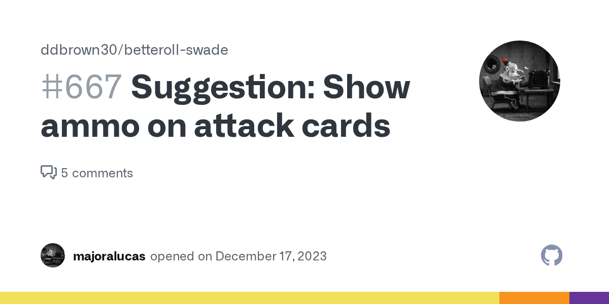
GitHub
It's really annoying not knowing how much ammo is left on the gun. I think it would be a great QoL to have a line on the attack card showing the gun's ammo capacity (linked to the Shots det...
snow monolith
I have added shot data to the tooltip that appears when you hover over the item description if it is a weapon:
 ashen dew
snow monolith
But given that now the discarded dice is already shown as gray, maybe the strike...
ashen dew
snow monolith
But given that now the discarded dice is already shown as gray, maybe the strike...
I'd keep the strikeout as it makes it clearer that it's not being used 👍
 brave bloom
The bouncing indicating an Ace on a die is really distracting for me. animations should - in general - used very sparsly. For me it is extra bad as I can't stop myself from looking at it and I see it even if I force myself away. I don't know how the others feel about it but surely I can't be the only one.

Here are a couple ideas to improve it:
- Make the bouncing limited to 3 to 5 times and then stop the animation.
- Use an Asterist or other icon additionally to the (non-animated) pips to indicate an Ace.
- Make a game setting that disables the bouncing animation without replacement.
Honestly I feel the last option would be my favourite as I don't see any value whatsoever in knowing it aced and if you're using Dice so nice you already know anyway.
ashen dew
brave bloom
The bouncing indicating an Ace on a die is really distracting for me. animations...
I don't see the need to know if it aced... as you say, Dice So Nice shows it quite nicely 😊
A couple of my group were asking if it meant something extra, on top of the raise, so they at least found it confusing.
acoustic skiff
As a GM I am often not looking at the dices why im reading O doing other things, for me it is important to have the information shown on the card.
wheat grotto
acoustic skiff
As a GM I am often not looking at the dices why im reading O doing other things,...
To see that it aced?
brave bloom
There is no mechanical need to know that a die aced, at least not in core and any setting I'm familiar with. A nat 1 might be important but knowing that a die aced is mechanically not important. So I'd be curious why you might want to see it but let's focus on discussing the how not the why first please.
acoustic skiff
brave bloom
There is no mechanical need to know that a die aced, at least not in core and an...
I am not bothered by the animation 🤷♀️

and yes there are actions that you need to know if there is a raise
wheat grotto
acoustic skiff
raise is represented by double check marks, aced is represented by the bouncing checkmarks. So are you wanting to know if something is a raise? ( understandable ) or aced? ( not sure why)
acoustic skiff
wheat grotto
raise is represented by double check marks, aced is represented by the bouncing ...
sorry, so I didn't understand the term aced, I thought it was the same as a raise. I play in spanish not in english
wheat grotto
acoustic skiff
sorry, so I didn't understand the term aced, I thought it was the same as a rais...
No Problem 🙂 - I don't know if you picked up on it, but acing is when a die rolls the maximum value and you get to roll another and add it on.
brave bloom
Raise = Target Number + 4
Ace = die exploded
raise =/= ace
brave bloom
acoustic skiff
I am not bothered by the animation 🤷♀️
But surely you realise it could potentially bother someone same as I realise some people might want to know it aced. That's why I'm looking for a solution that is decent for everyone. =)
acoustic skiff
🤣 ok, I confused it. Then, the dice bouncing is not necessary to mark is aced, you are right.
snow monolith
So I'll kill that nice, pretty, slick bounce animation ;P.
snow monolith
Hi, again hive-mind.
I'm totally struggling in how to make multi-targeting work for a trait (not damage) roll. By multi-targeting I mean when you have more than 1 target selected and roll against it, specially with multiple die (like with high ROF attacks). Any ideas?
wheat grotto
I'm not a UI guy by any means, but this is my first stab at what I think is a very difficult problem.
The first problem is that really the player needs to decide after the rolls who gets which number. So to me that means a new dialog that shows a grid of the targets selected with the applicable numbers rolls and let them choose which roll(s) go to which target(s)
snow monolith
And afterwards, how do we show that info in the card? Or maybe we just don't (and make him click again for the dialog)?
wheat grotto
If the selections go back to the card you could show them like you show the damage?
snow monolith
I don't think so. But you give a good pointer. I don't really need to show it in the card.
 strange lintel
I am using the SWADE SciFi Compendium and it used to switch text colour to a light yellowish tone and the background to a bright blue which makes certain entrys unreadable. Using different character sheet options does help sometimes - but not on other entries like items or journals. Turning to dark mode does not help either. Does anybody experiance the some issues oder has some idea to fix this?
 wheat grotto
that has nothing to do with Better Rolls nor cards, you should raise this in the main SWADE thread. Short term I would bet changing the Core Theme and Color Scheme to Light would show the darkened text