#off-topic
1 messages · Page 117 of 1
 strange estuary
That sounds about right to me
 tacit nova
right?
strange estuary
dunno what symmetric even means
tacit nova
1gig down and up
tacit nova
your upload is higher than your download??
strange estuary
Whenever there’s tons of devices I get 250 download 500 upload
Ethernet it was like 400 download 800 upload
strange estuary
That’s with tons of people on it
tacit nova
800 upload is crazy as well, which is why i was asking
strange estuary
XD
tacit nova
i have a regular cable connection which only allows for 50 up
strange estuary
tacit nova
800 upload is crazy as well, which is why i was asking
Yeah it’s good up
Down is always like half of up
 mellow zinc
24 hours it took 😵💫
 strange estuary
mellow zinc
24 hours it took 😵💫
strange estuary
mellow zinc
24 hours it took 😵💫
Yeah, insane
“Sorry for the inconvenience 🤓” everyone should be getting a free day of PS+
I wonder if you can sue for not getting the product you pay for or if it’s covered under their TOS (or just counts as something they can’t control, who knows what caused the outage tbf)
Who wants to start a PS class action 🙏
 steady raptor
@clear pebble 💀 ??
I was forwarding you to an artist who does even cheaper
People are wild nowadays damn
Blocking for being helped


 grand dirge
strange estuary
Here it is on a vanilla tooltip for example 🙏
grand dirge
strange estuary
Here it is on a vanilla tooltip for example 🙏
looks good
strange estuary
Custom tooltip:

Design isn't perfect since I didn't make them in mind with this font, but yeah
might just be my brain but the lowercase b, d, and h look wonky to me, like different thicknesses to the other letters idk
 young mortar
strange estuary
young mortar
strange estuary
lowercase fixed heights look quite bad imo
the lowercase d in "Render", the "g"s, phew
strange estuary
young mortar
the lowercase d in "Render", the "g"s, phew
Rest of it decent tho?
I think just the b, d, h, and g look bad
young mortar
yeah i mean all the letters that are a normal height look great
it's just that they can't go up or down below that that makes all the tall characters look horrid
 iron dirge
https://imgur.com/a/ZsYk5uV
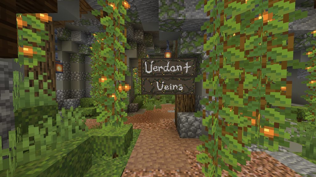
opinions on these signs i made? my first try with anything like this, if you have any tips please do feel free lol :)
 strange estuary
Idk exactly how I'll do that yeah
strange estuary
strange estuary
Idk exactly how I'll do that yeah
Tbh I think this looks 10x better

It's just bugging me that the lowercase b, d, h, g are going to be taller than the rest
Idk if that's really a big deal, I mean that's how real fonts are in general, so maybe it's okay xD

I think some letters kinda need to be a little taller or else it's gonna look janky
strange estuary
iron dirge
https://imgur.com/a/ZsYk5uV
opinions on these signs i made? my first try with an...
That's pretty neat!!
Not sure what theme you're going for, but making the sign a little more textured could be cool? Like woody or something
 solar sinew
iron dirge
https://imgur.com/a/ZsYk5uV
opinions on these signs i made? my first try with an...
solar sinew
iron dirge
https://imgur.com/a/ZsYk5uV
opinions on these signs i made? my first try with an...
this is also just my opinion but the V looks too much like a U
font choice is deliberate and is also related to the material it's being put on
here it doens't feel like the ltters match eachother
 fallow crow
strange estuary
fallow crow
strange estuary
What a curse font to use.
fallow crow
strange estuary
Tbh I think this looks 10x better
That looks like an old fantasy rpg vibe ngl tho
 long jasper
is there a website that does MOTD in hex codes? every site uses legacy colors
 carmine wyvern
Hey @sharp helm, check that !
https://builtbybit.com/resources/itsmyconfig-plugin.24606/

No need to pay for a plugin 😉
 sharp helm
carmine wyvern
Hey <@413054612942356482>, check that !
https://builtbybit.com/resources/itsmyc...
sharp helm
carmine wyvern
Hey <@413054612942356482>, check that !
https://builtbybit.com/resources/itsmyc...
Thanks!!
 blazing oar
sharp helm
Thanks!!
blazing oar
sharp helm
Thanks!!
if you want a free alternative, https://modrinth.com/plugin/runway

Modrinth
Elevate your server with MiniMessage formatting support & custom placeholders for messages, menus, titles, and more!
(I didn't notice ItsMyConfig was also free, assumed since it was on BBB)
 magic summit
strange estuary
Here it is on a vanilla tooltip for example 🙏
magic summit
strange estuary
Here it is on a vanilla tooltip for example 🙏
The small D looks way too close to an a imo
 light scaffold
agreed
strange estuary
fallow crow
That looks like an old fantasy rpg vibe ngl tho
Literally what I was going for lol
strange estuary
magic summit
The small D looks way too close to an a imo
Yeah agreed, I’m still playing with it to make the letters look right
strange estuary
strange estuary
This was before I changed some stuff and added the gradient actually
I’ll get an updated image, I think it looks better than before

Thoughts compared to before?
 boreal escarp
@sharp helm try rocket placeholders
The prefix is not custom I think, but you can create your own placeholders through config
 sturdy bobcat
can i ask why that font was used
sturdy bobcat
strange estuary
in response to this
strange estuary
sturdy bobcat
in response to this
Just a way to make the server have more of a fantasy/RPG identity
sturdy bobcat
could you pick perhaps,,, a nicer font
strange estuary
I mean yeah, that was my test run lol
What's wrong with it in its current state tho?
Fits the vibe imo, has some slight issues on some letters but I'd say the whole font isn't a problem
 patent moss
I need a coder for mcreator
strange estuary
patent moss
I need a coder for mcreator
patent moss
Follow guideline
sturdy bobcat
strange estuary
I mean yeah, that was my test run lol
i just think it's particularly jarring and hard to read
strange estuary
hmm
I mean I'll probably be keeping the font style
But I can always tweak it, some of the letters are pretty meh, it's from inspo I used so
 round plinth
Anyone tried carbon chat? latest ChatChat build text hovering does not seem to work on 1.21.1+ 
patent moss
hi
strange estuary
round plinth
Anyone tried carbon chat? latest ChatChat build text hovering does not seem to ...
Not sure what hovering you need, but InteractiveChat might help?
round plinth
Ah, my bad i just mean literally for the name/groups etc, hovering to show more information about the player etc.
I had this all set up with minimessage via chatchat but does not work on 1.21
strange estuary
Interactive chat does have that stuff but I think you need a chat formatter still lol
round plinth
Yeah, I plan on replacing ChatChat as the chat formatter with something more up to date
strange estuary
Man I wish my account got that new Discord UI..
Personally I think it keeps the same exact look just with a more sleek approach, only a couple things I don't like with it
carmine wyvern
blazing oar
(I didn't notice ItsMyConfig was also free, assumed since it was on BBB)
You copied my idea 👀
blazing oar
carmine wyvern
You copied my idea 👀
don't even know who you are
besides being the first time hearing about your plugin
lol
also, mine doesn't use shitprotocollib
solar sinew
lmao
 winter compass

carmine wyvern
blazing oar
also, mine doesn't use shitprotocollib
Mine too (not released yet)
But we have the same features :d
I already see your plugin
 hoary sluice
@iron dirge check dm pls
solar sinew
just use vesktop
 twin dune
Sounds like a ponzi scheme 
#1323802935934845069 message
strange estuary
grand dirge
found a yt tutorial to change back to old ui
Old discord UI?
 long summit
Meanwhile I wish I had the new one 😔
strange estuary
long summit
Meanwhile I wish I had the new one 😔
Fr it's gorgeous
And doesn't mess up any of discord's existing features tbh
Considering it's experimental and not a full release, that's the best UI redesign I've seen in years
boreal escarp
Anyone care to show old vs new?
Is been a while since I've used discord daily on computer and I can't see any difference lol
long summit
This is the new one, if yours doesn't look like it then you still have the old one
 long summit

 full atlas
long summit
This is the new one, if yours doesn't look like it then you still have the old o...
full atlas
long summit
This is the new one, if yours doesn't look like it then you still have the old o...
🤮
long summit
What's wrong with it?
It's going to be like every other time they changed the design, people complain and then forget how it even was before lol
full atlas
None of the colors match
Its outlining
 pulsar sun
long summit
This is the new one, if yours doesn't look like it then you still have the old o...
pulsar sun
long summit
This is the new one, if yours doesn't look like it then you still have the old o...
"lounge"
why is the > at the end and not at the start like now wtf discord
full atlas
^^ That I actually like lol
long summit
Imo it makes more sense to be at the end 
long summit
For example wikis do that
 long summit
Well the logic is the same you're opening a group, imo at the end makes more sense
But hey, it's just opinion
pulsar sun
how will it look like if someone got mentioned and he has the category closed
blazing oar
RIP Sora
China just dropped another open-source model: Goku, their Video Generator
13 wild examples so far (Don't miss the 5th one)

 X
·
X
·
the chinese open source models attack again
long summit
AI 
full atlas
Just looked at settings... You can see if your account is "limited" -> "suspended" lol
blazing oar
long summit
https://tenor.com/view/report-block-blocked-reported-die-gif-2717402674895639042
report for what, I said I don't use it
🙂
pulsar sun
full atlas
Just looked at settings... You can see if your account is "limited" -> "suspende...
ye
you can still logic to discord if you're account is terminated
and they give the reason and a way to appeal
"Your account is all good!"
tbh i like that
boreal escarp
long summit
This is the new one, if yours doesn't look like it then you still have the old o...
Not so bad, but looks a bit too flat, it could use some more contrast
What happens if you resize the channels part? I see your cursor has that 'resize' style
strange estuary
blazing oar
https://x.com/CodeByPoonam/status/1888900102313709699
Cool but this is bad news
If tons of facebook users get tricked by blatant AI pics
The amount of AI videos that are gonna spread
And spread misinfo
Baddddd news
Goku looks human focused too.. focused on making realistic human videos.. really bad news
blazing oar
strange estuary
Goku looks human focused too.. focused on making realistic human videos.. really...
trained on tiktok videos xD
it's made by bytedance
strange estuary
I can tell xD
blazing oar
but yeah, the world is changing in terms of ai
and fake news 100% are gonna become an issue
wonder if there is a way to prevent that
but oh welp
strange estuary
blazing oar
and fake news 100% are gonna become an issue
We couldn't even prevent it without AI
So.. unless we get AI to stop AI, we might be done for
xD
But yeah idk, I don't like AI video creation involving humans
Humans shouldn't be replicated by AI imo, it's just.. not right
blazing oar
yeah
strange estuary
plus marketing is just gonna get lazier
blazing oar
not much we can do
blazing oar
don't think AI can beat AI either tbh
strange estuary
Probs not, cuz then AI can just use itself to ask how to beat the other AI 💀
blazing oar
I mean, a "small" start is labeling images as AI generated in the metadata
strange estuary
strange estuary
Probs not, cuz then AI can just use itself to ask how to beat the other AI 💀
ai feedback loop forever
blazing oar
but metadata can easily be manipulated soooo
strange estuary
We are getting AI tools way too soon imo
It's just being rolled out without like, safety or future in mind
strange estuary
It's just companies fighting to get their coolest model out first
blazing oar
strange estuary
It's just being rolled out without like, safety or future in mind
well, in america.
strange estuary
then getting destroyed by China
strange estuary
true, isn't the EU making pushes to get AI pictures labeled and all?
strange estuary
I love the EU's laws and decisions
blazing oar
and are pushing for more
sure, that might mean EU will be behind others in AI
but at least it's safer
strange estuary
in the US I have to deal with president Musk throwing out my financial aid for college
xD
strange estuary
If the department of education is really scrapped then bye bey financial aid
blazing oar
my university's semester tuition is 360 euros lol
strange estuary
dude it's $75,000 a year for one of the colleges I wanna go to
granted they cut a lot of it for me in financial aid, but that's insane
blazing oar
170 of those being for the transport card across the country (unlike luxembourg, germany doesn't have free public transports 😭 )
strange estuary
it's not even like, a prestigious college, it's a nice college don't get me wrong but it's an 89% acceptance rate and all
strange estuary
blazing oar
170 of those being for the transport card across the country (unlike luxembourg,...
insane
strange estuary
bruh
welp
oh yeah and the prices are lowered for me because I live in the state I wanna go to the college at, Pennsylvania
strange estuary
so even with all the discounts.. still looking at 30k - 45k
blazing oar
aka gives financial aid
I get like 3.8k euros per semester from the government
and I can ask for a loan of 4.5k if I want
strange estuary
Yikes
blazing oar
with like 0.5% interest
strange estuary
I'm jealous lol
blazing oar
Eh it's just European system for ya
sure not all countries work like this
I am lucky to live in luxembourg lol
strange estuary
 blazing oar
essentially the richest country in the world in terms of gdp per capita
lol
sooo, they have money to give
strange estuary
Everyone in the US assumes the DoE runs the circulums so people agree that it should go away
except.. states make the circulums
so getting rid of the DoE just gets rid of financial aid for schools xD
strange estuary
insanely stupid yes
strange estuary
nope
blazing oar
I always laugh when I see an american say that
blazing oar
US companies pay the tarrifs
which yes, means prices go up
but most americans can't see that
they think china is paying the tarrifs or canada
or mexico xD
strange estuary
yeah no xD
Granted Trump did a lot of stuff very quickly
too bad it was all the wrong stuff
that doesn't matter
blazing oar
I wish (at least in the EU), only qualified and educated people could vote
strange estuary
where everyone votes even if they have no idea what they're voting for
blazing oar
xD
strange estuary
I also have no idea why elon musk is getting access to like.. everything
but he is, so oh well
 rich hornet
strange estuary
rich hornet
strange estuary
my state has a program where if you have a GPA of 3.0 or higher, the state pays for 90% of your tution. And if its 3.7 or higher, they pay for 100% of it. And they are looking to make it 100% for 3.0 or higher. But if this happens, I'm not sure if that will still exist. Its run by the state so maybe it will? idk.
strange estuary
rich hornet
my state has a program where if you have a GPA of 3.0 or higher, the state pays ...
Crazy
What state?
rich hornet
Georgia
strange estuary
Happened to me too
 hoary bough
Ah
I can’t sadly type in showcase

Watch Minecraft and millions of other Minecraft videos captured using Medal.
Made a horsecombat plugin
I’m pretty new
And wrote it in kotlin
Just have to get the configuration part working so it actually is configurable
Ah okay so now I can type in showcase after I reached level 1 interesting 🤨
 wary willow
@twin dune are you IdConfirmed?
rich hornet
yeah
twin dune
wary willow
<@287874798049165313> are you IdConfirmed?
Yes, why?
wary willow
twin dune
Yes, why?
got your invite but I'm having too much fun on tf2 rn
twin dune
wary willow
got your invite but I'm having too much fun on tf2 rn
tf lol
invite for what
twin dune
wary willow
Maybe you miss clicked
Think I missed clicked, didn't even know I had you on Steam.
 naive agate
hi
twin dune
hi
wary willow
twin dune
Think I missed clicked, didn't even know I had you on Steam.
WE PLAYED OVERCOOKED SMH MY HEAD
PLATE UP*
 sturdy bobcat
Hello Gao Ying, who is living in China.
im a submissive bottom
 unreal venture
sturdy bobcat
Hello Gao Ying, who is living in China.
im a submissive bottom
unreal venture
sturdy bobcat
Hello Gao Ying, who is living in China.
im a submissive bottom
word
Hello Gao Ying, who is living in China.
im a dominant bottom
Chun li type shit
full atlas
Quick someone mention the "square" lol
magic summit

Valve bans all Steam games that force players to watch advertisements
https://www.eurogamer.net/valve-bans-all-steam-games-that-force-players-to-watch-advertisements
W?
They simply emphasized their terms, but I still think it's a good move
rich hornet
magic summit
https://fxtwitter.com/eurogamer/status/1888901667401183464
it kinda seems like they are promoting microtransactions cause they get a cut from those and they dont get a cut from ads.
I think removing forced ads is good but I don't see any issue with having optional ads that give in game rewards for it. Would rather have that than buying stuff instead.
strange estuary
rich hornet
I think removing forced ads is good but I don't see any issue with having option...
I say ads in games stay to mobile games lol
But optional is fine yeah. Forced is outrageous
rich hornet
strange estuary
I say ads in games stay to mobile games lol
I think having ads in PC games is fine as long as it isn't forced. They need to make money somehow if it is a free game. Microtransactions don't always work for all games.
strange estuary
rich hornet
I think having ads in PC games is fine as long as it isn't forced. They need to ...
Oh free games yeah I defo agree
rich hornet
ive never seen a paid game have ads
 arctic cobalt
a free game has to profit somehow though
thats why microtransactions became so popular, easiest and most efficient way to do it
games have the right to put as many ads into their games as they want if they're free. After all it's their work, and you're not forced to play it, most of them die after a bit anyway because of how much ads there is.
 trim raft
Gotten a steady 1 email/day from Discord saying that I should buy Discord Nitro after buying 1 month of Discord Nitro..

fallow crow
.
magic summit
trim raft
Gotten a steady 1 email/day from Discord saying that I should buy Discord Nitro ...
I only get annoyed with some valentines crap for nitro


 long summit
I find the font kinda wierd, specially that "w" on "workshop"
strange estuary
long summit
I find the font kinda wierd, specially that "w" on "workshop"
That's fair yeah, it's supposed to fit a fantasy RPG vibe
which I think it did really well
but there's some letters I gotta fix from my inspo image
 proper jungle
yea idk it kind of does not fit there
also it is way too 2D
without shades
like theres no shadow & such
strange estuary
proper jungle
like theres no shadow & such
I think that's cuz of my tooltip method
If I update to the next tooltip method shadows would come back
(I think?)

yeah, this looks nicer, I wish I used the new tooltip menu here lol
proper jungle
strange estuary
I think that's cuz of my tooltip method
I mean the UI
not the tooltip
the tooltip looks somehow fine
however the "regular" text aka description is way to bold
strange estuary
proper jungle
however the "regular" text aka description is way to bold
Oh I get you, yeah I understand
I can't do too much about it right now lol, drawing the font to begin with was difficult
I used an inspo image so yeah that's why, but I'm going to tweak it over time
magic summit
strange estuary
Reminds me of the icons I have for my VanillaMCUIs addon for ItemsAdder
 strange estuary
magic summit
strange estuary
magic summit
We actually don’t even have IA
But that’s cool
I didn’t know they had all those
magic summit
Well.... I made those 😛
Was a veeeeeeeeeery tedious projects

»»» Description «««
Showcase of the custom GUIs and items from my "Vanilla MC UIs" Add-on for ItemsAdder.
https://www.spigotmc.org/resources/97859/
» Links «
Website: https://andre601.ch
Twitter: https://twitter.com/TrueAndre_601
Mastodon: https://blobfox.coffee/@andre_601
Reddit: https://reddit.com/u/Andre_601
The actual stats
 trim raft
Discord is ending Guilds
 naive agate
trim raft
Discord is ending Guilds
naive agate
trim raft
Discord is ending Guilds
o
strange estuary
trim raft
Discord is ending Guilds
eh I didn't like the feature much myself but rip
grand dirge
trim raft
Discord is ending Guilds
it ended before it started
 vagrant pike
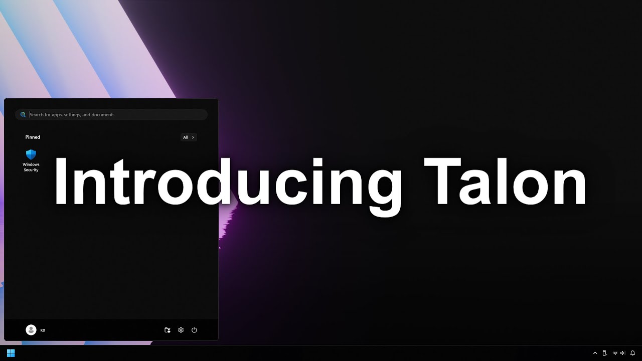
Today I, along with the rest of the Raven Development Team, introduce Talon, a simple Windows 11 utility designed to debloat your system easily with just 2 clicks. While many utilities like AME Wizard, AtlasOS, CTT WinUtil, and others are good debloaters already, they are too tech savvy for the average every-day user. This is what we aim to solv...
crazy
 kind sorrel
people spent more time making windows usable than it takes to set up nixos
blazing oar
vagrant pike
https://www.youtube.com/watch?v=tsMfNKcd298&ab_channel=TotallyNotK0
Question is... how safe?
And how many things does it break lol
vagrant pike
mods, ban that guy ^
 pulsar sun
vagrant pike
mods, ban that guy ^
pulsar sun
vagrant pike
mods, ban that guy ^
Who
vagrant pike
that guy, not this guy
blazing oar
vagrant pike
https://github.com/ravendevteam/talon
Well, my 2nd point still stands
vagrant pike
blazing oar
Well, my 2nd point still stands
wouldn't think uninstalling programs would break much
winter compass
blazing oar
who was the revive node guy here?
mackenzie i think
twin dune
blazing oar
who was the revive node guy here?
Me, what's up?
 twin dune


 twin dune
vagrant pike
work work and work
twin dune
vagrant pike
work work and work
I play Mouse Wiggling simulator at my 9-5.
light scaffold
kind sorrel
people spent more time making windows usable than it takes to set up nixos
SO TRUE
 haughty dawn
Hi, i'm a mc server developer
 sour hinge
Hi a mc server plugin developer
strange estuary
Hi I'm not a mc server plugin developer
 sullen sorrel
Hi I'm the mc server developer
strange estuary

Welp, rip smash clone
I'll forever miss beating up everyone as a banana guard from adventure time

 rain vector
Wsp, i'm a newbie server developer
light scaffold
Hi a newbie server developer
blazing oar
@proper jungle adds*
long summit
Yeah that is very ad-y
proper jungle
Oh ye
proper jungle
long summit
Yeah that is very ad-y
aw
oh I didnt not even realize tbh o-o
@long summit can it stay or should I remove it?
I havent realized Ive got the discord link there
long summit
Uh not sure, I personally think it's very ad but @naive agate decides :')
proper jungle
I can blur the link from there
proper jungle
alright ❤️
 analog marlin
hi goat
grand dirge
oo
trim raft
The Bible - Corinthians 11:35 - Lunch
winter compass
 pliant ice
Im the goat
pliant ice
Im the goat
Be some grilled meat
you feeding other devs
That's a cool thing :)
pliant ice
is that why you got the watermelon profile pi c?
strange estuary

Working on an outlined version of my font
Gives a slight difference that could help separate it in some areas since you guys mentioned it was too bold
strange estuary
 strange estuary
Alrighty finally done


Actually works pretty good in the scoreboard, I'm surprised. I didn't make it for the scoreboard but 😅
Playing with it in GUIs too is interesting, not exactly sure where it fits best


 magic summit
strange estuary
Alrighty finally done
magic summit
strange estuary
Alrighty finally done
Not gonna lie.... Looks a bit blurry to me
strange estuary
Maybe it's seeing the gradient close up?
magic summit
Except the blue which is kinda fine. But the other colors have such a blurry feel for me and make it hard for my eyes to focus
strange estuary
The gradient is super noticable when you see the text close up lol

Less blurry when you see the whole screen or nah?
It's not meant for chat anyways so xD
 strange estuary
Nope that's just the font style xd
long summit
Your name looks fine but everything else is blurry
strange estuary
Yeah I getchu
I wonder if the letter spacing is contributing to that as well
It seems like all the outlined letter are an extra space away from each other
magic summit
@carmine wyvern The format you use seems interesting.
And how is repetition determined exactly? Like how does it know when to stop or similar?
magic summit
strange estuary
Less blurry when you see the whole screen or nah?
Founder looks blurry to me
It's probs the outline that makes it give that feel
strange estuary
strange estuary
Playing with it in GUIs too is interesting, not exactly sure where it fits best
GUI, etc
magic summit
I think it depends on the color
strange estuary
also ignore the inconsistent icons in the scoreboard xD
magic summit
Colors like the blue or grey seem somewhat fine
but white, purple and other brighter colors have this blurry effect
strange estuary
So I wonder if I made the outline too dark in that case
Or would that mean it's too bright actually
Dunno, will just have to play with it
It could just be the outline look in general that's no good
magic summit
My guess is the contrast between outline and font color. But I can't really say for sure.
strange estuary
1st pic is the current outline shade, 2nd pic is the new outline shade, any difference or not noticable enough?


Looking at them side by side I think they look exactly the same actually.. xDD
magic summit
I feel like 2nd is a lil sharper.
strange estuary
I do agree
It looks just ever slightly sharper

This is just a tad darker
I actually quite like it
magic summit
Yeah, it probs is the fact the outline was too close to the main color in the first pic that makes it blurry... Like how paint programs use that to make "smooth" edges
strange estuary
I got you, thanks so much for the feedback peeps
I love this outline idea, I think it could really help seperate headers and stuff, so I really appreciate it :D
strange estuary
magic summit
Yeah, it probs is the fact the outline was too close to the main color in the fi...


Darker outline definitely seems ot have helped
magic summit
Mhm. Maybe also add a pixel here to connect that part of the r a bit more. Tho it's not a big issue

 proper jungle
strange estuary
proper jungle
strange estuary
tbh Ive prefered the previous version
I would rather try to make the font for regular case thinner
because now it does not look clean 😅
strange estuary
Tbh I'm not going back and doesn't it for the whole font xD
It's gonna be insanely hard to restyle this entire font
(I'm not good at pixel art :P)
proper jungle
are you making it like thru ttf or regular pngs for each letter?
proper jungle
oh freeeak thats a lot of hassle
do you have png files of the font ?
I would like to try to play around w it
if you dont mind ofc
strange estuary
proper jungle
do you have png files of the font ?
Nah I just have the ascii and ascii-accented 😭
I can send it over tho
proper jungle
uhhh xD
magic summit
Random thing but PAPI's 10th birthday will be <t:1745100000:R>
 wicked fjord
hello
blazing oar
magic summit
Random thing but PAPI's 10th birthday will be <t:1745100000:R>
right on track for the 10 year celebration
carmine wyvern
magic summit
<@249509545661956096> The format you use seems interesting.
And how is repetitio...
Inside the configuration, the {0} it's the number of the second that the player need to wait before the teleporation, with a repeat every one second I just need to repeat it {0} time than

 magic summit
Is the plugin just pulling it from Essential? Like a direct support? Or is there some other logic involved to actually obtain the data to know how many repeats it should have?
proper jungle
magic summit
Is the plugin just pulling it from Essential? Like a direct support? Or is there...
I guess its basically taking a parameter from the message. So you basically specify what message it should replace and instead of typing the number there like 1,2,3, you are gonna use a placeholder or you just somehow mark it as variable (idk how ItsMyConfig handles that), but this is pretty much the only way of doing that?
then you do not have to specify the parameter again, because he has the repeat left variable there, which is redundant
@carmine wyvern how do you handle component based messages tho? Do you support that as well?
magic summit
Would make sense
Like I assume essentials uses {0} as placeholder and by defining that you tell IMC "hey, use whatever this returns"
carmine wyvern
magic summit
Is the plugin just pulling it from Essential? Like a direct support? Or is there...
It's have a custom prefix, by default $ if a message start with it, ItsMyConfig handle it
proper jungle
oooh then {0} is essentials thing?
magic summit
idk, it's a guess
carmine wyvern
Yes, I use it since if a client edited the default delay it's still work
{0} is the weird format of EssentialsX placeholder yes :d
carmine wyvern
proper jungle
<@249509545661956096> how do you handle component based messages tho? Do you sup...
Of course, we support every plugin
proper jungle
I just thought that it is a placeholder that you generate from received packet
proper jungle
carmine wyvern
Of course, we support every plugin
Ive made such plugin as well
however Ive wanted to still support previous hover & click actions
so it was kind of painful
so Ive made a kind of edit mode
using which you can click on a message
carmine wyvern
Don't really issue with that
proper jungle
to copy whole minimessage format that was used
carmine wyvern
It's support every format that was initally in the message
proper jungle
and then I mark the previous MM format to behave as a plceholder
I was coding such thing as I wanted to publish AquaticEditor
to be able to edit like everything
carmine wyvern
Like UltraCustomizer ?
carmine wyvern
Yeah I don't handle non-configurable messages, it's not really the objective
proper jungle
it kinda was my objective 
carmine wyvern
My objective is to give more features to configure message in every plugin
I have a lot of tag x)
 proper jungle
https://cdn.discordapp.com/attachments/884846229631152149/1285408428340019241/image.png?ex=67af41a3&is=67adf023&hm=0f6081e4886c63715ca0f63f659f079493ef8a6a0d561fc55535dbcd904b7de5&
https://cdn.discordapp.com/attachments/884846229631152149/1285408427987959920/image.png?ex=67af41a2&is=67adf022&hm=68940375a8122f4297e1749438512a5d0b8f6da07dd34fe6e0a2f092ff6bb63c&

 carmine wyvern
proper jungle
https://cdn.discordapp.com/attachments/884846229631152149/1285408428340019241/im...
carmine wyvern
proper jungle
https://cdn.discordapp.com/attachments/884846229631152149/1285408428340019241/im...
Yes I remember I see it
proper jungle
as you can see, it kept the original values like current page, total pages & such
yeye
I kind of do not have time to complete it
but Ive made packet based UI system so far
so I can then hook all together
however the UI modifications are gonna be so painful tbh
because I wanna support stuff like moving the items
make the items animated
like the previous items
carmine wyvern
How UltraCustomizer is made I find that really nice for that objective
Currently ItsMyConfig only support Chat, ActionBar and discounnted message
It's not planned to add more for now
proper jungle
isnt disconnect message just system message?
carmine wyvern
proper jungle
isnt disconnect message just system message?
Also have the one when you cancel the reconnect
 proper jungle
oooh you mean kick message
carmine wyvern
Yes sorry
proper jungle
have u ever tried to code such plugins urself?
am just curious
bcs you are spending the money for a free plugin
if am not wrong
just curious what motivates you to do that
carmine wyvern
True, but I'm selling configuration with it
It's a real + for my configuration to have ItsMyConfig
proper jungle
ye this is also why I wanted to do my Editor plugin
bcs making configs for many plugins is just painful
and thats also why I wanted to make the UI modifications
bcs some plugins simply do not offer so many customizations
like putting buttons to multiple slots
carmine wyvern
proper jungle
have u ever tried to code such plugins urself?
I really want the best for performance, so If I start learning Java It's will take time currently odn'tt have it
proper jungle
carmine wyvern
I really want the best for performance, so If I start learning Java It's will ta...
welp this plugin pretty much is just packet based
and is gonna use no performance
as everything is handled async
but ye you need to make it thread safe & such
carmine wyvern
Yes of course, but it's still need to check every messages, when 300 connected player it's a lot
proper jungle
believe me, it is not
messages are the least heavy thing
meanwhile there are entity ticking, entity updating, chunk loading
carmine wyvern
Of course, but like 3% it's too much for me x)
proper jungle
single chunk load can equal to like 10k messages received hahah
carmine wyvern
With packet Event, we improved the load in the tick from 3% to 0.4% it's something I prefer way much
As most people who have ItsMyConfig don’t use it directly and only have it because my configurations require it, having a plugin just for a configuration is a big deal. That’s why I really need it to be invisible.
I’m currently thinking about adding support for lores in GUIs, but it’s complicated to make something secure.
proper jungle
carmine wyvern
As most people who have ItsMyConfig don’t use it directly and only have it becau...
ye well the same thing kinda happens with AquaticCrates tbh
whenever you make something scriptable, only like 5% of customers are gonna use it fully
carmine wyvern
proper jungle
whenever you make something scriptable, only like 5% of customers are gonna use ...
Same with my discord bot x)
https://paste.itsme.to/qojibaguta.yaml
strange estuary
After all the feedback you guys have given me, I got help from Larkyy and made a thinner version of the font!

It's not perfect yet but I spent so long fixing this all xD

BOLD WON'T BE USED, THIS IS HOW VANILLA HANDLES BOLD I CAN'T CHANGE IT the actual version of the font used is above
 strange estuary
trim raft
bro that m is crazy
strange estuary
trim raft
bro that m is crazy
bold or non bold? lol
probably won't be using the bold version at all since it's all pretty rough 😭
grand dirge
strange estuary
**BOLD WON'T BE USED, THIS IS HOW VANILLA HANDLES BOLD I CAN'T CHANGE IT** the a...
both w's,m and K need help
strange estuary
grand dirge
both w's,m and K need help
that's fair
I didn't mind the lowercase K tbh
grand dirge
strange estuary
I didn't mind the lowercase K tbh
lowercase one looks ok
rest look bad
grand dirge
strange estuary
What's wrong with the W's and M's?
bold one
grand dirge
oh
strange estuary
strange estuary
These are the ones I'll use tho
proper jungle
that M wants to become Minecraft
long summit
Bold uppercase w is like a fat H and lowercase is a hopper
strange estuary
you guys are hurting my fonts feelings
long summit
Wait till it hears that the bold capital X is an hourglass
strange estuary
It never asked to be bold
blazing oar
yeah I honestly dislike this new font a lot lol
strange estuary
blazing oar
yeah I honestly dislike this new font a lot lol
The non bold?
I thought you were the one who advocated for it to be less bold 😭
young mortar
I mean yeah I think it's mostly fine, the height of like half the letters is just horribly messed up
strange estuary
young mortar
I mean yeah I think it's mostly fine, the height of like half the letters is jus...
Where at?
Some letters are an extra height up as they look so off otherwise
Like the l looks cursed without being an extra pixel taller, will send an ss in one sec
young mortar
strange estuary
looking at the lowercase letters here, f, g, k, p are too short
strange estuary
(I also probably missed some letter heights since I was sleepy)
young mortar
and also the lowercase set doesn't have the letter x lmao
strange estuary
oh I just forgot to type it rip
young mortar
but yeah all the uppercase letters look okay
strange estuary
young mortar
looking at the lowercase letters here, `f, g, k, p` are too short
Ah so you think I should apply the extra 1 pixel up rule to those letters
gotcha, that makes sense
ah that's literally how normal fonts are too, k and f are taller
young mortar
strange estuary
Ah so you think I should apply the extra 1 pixel up rule to those letters
or let like g and p go below the line
strange estuary
Yeahhh
young mortar
i think that's the weirdest part lol, they're way too high
strange estuary
Yeahh ngl I should have referenced a standard font for this
young mortar
but yeah other than the height issues, it is quite nice
reminds me of the Silent Hill 1 font
strange estuary
I kind of just did it by eye and didn't try moving lines
Oooo I will very much take that
I just played the SH remake, my mom has loves SH for years so she wanted me to try out the remake
young mortar
though looking at it now, the silent hill 1 font is actually a higher resolution lol
 strange estuary
Ah but you are totally right it looks pretty darn similar
strange estuary

whoops messed this up, the g needs to be an extra line taller to still match while going down
k still looks off too, dunno why k's give me such a hard time
young mortar
i think the crossbeams of the k need to be lower, it looks like a capital letter
the p having the curve back in also kinda weirds me out lol, feels like a russian character or something
strange estuary
new g, looks really nice actually
 young mortar
ooh yes the g looks much nicer!
now just do the same to the q and extend it downwards, move the midpoint of the k down, make the p go downwards as well, and maybe lower the j
strange estuary
Yeah I definitely should have just referenced a normal font here 😂
young mortar
i think you did pretty great for just eyeballing a font lol
most of the letters look good, it's just the ascents messing with ya
oh and the y too
 young mortar
ooh looking much better
strange estuary
Need to fix the k, j, and y still, might also update that f a little too
young mortar
yeah the f is a little long but i don't hate it tbh
strange estuary

This is like my best reference of text with it naturally
I'd saythis is looking awesome, the f next to the o is bugging me a little but yeah xD
young mortar
oh yeah that actually looks quite nice!
strange estuary
I definitely love the g now though, everythings flowing much nicer together
young mortar
maybe the kerning of like, t is a bit too wide?
and i think the d needs to be like one pixel taller
young mortar
young mortar
maybe the kerning of like, `t` is a bit too wide?
looking at the spacing of the letters in the on the beginning of the third line
strange estuary
I agree yeah, the t is defo wide
young mortar
though maybe it's just h?
oh it's probably h
because it has a pixel to the left so it's taking an extra vertical space
strange estuary
I might remove that little detail on h
young mortar
i like it!
strange estuary
Actually
young mortar
i think it just needs to be allowed to be one pixel closer to the left
 lime walrus
The g looks like a little duck to me haha, but overall it looks very nice!
strange estuary

I changed the t, I think I prefer it? Idk
Might look too wispy now, not sure xD
strange estuary
lime walrus
The g looks like a little duck to me haha, but overall it looks very nice!
Tysm!! :D
 young mortar
strange estuary
I changed the t, I think I prefer it? Idk
young mortar
strange estuary
I changed the t, I think I prefer it? Idk
yeah i feel like it could use the extra pixel in the bottom
strange estuary
Updated y too, not sure if I showed it
carmine wyvern
strange estuary
Updated y too, not sure if I showed it
The j too maybe
young mortar
oh yeah wait that should be lower too
strange estuary
struggling with the k idk why xD
young mortar
look at some other fonts for inspiration
 young mortar
or like small caps yeah
strange estuary
wait might have just fixed it
young mortar
the left line of the k needs to be taller than the crisscross to the right
if you know what i mean

 strange estuary
diagram of k

 young mortar
j and then yeah, let's see the test, and maybe you do one of those sentences that has every letter in it
the quick brown fox or whatever?
strange estuary
Trueeee

Hmm, j actually looks kinda off to me being one below?
(gonna do a upper and lower case test too)
young mortar
i think you just extend the top of the j up one
so it goes below one pixel and goes up to match the height of the other letters

 young mortar
beautiful!

 young mortar
ooh yeah the capital letters have their own set of quirks to iron out lol
strange estuary
Yeah I'm seeing them now that we fixed the lower cases xD
definitely not really liking the upper case X
young mortar
oh i also think the lowercase t shouldn't extend one below
strange estuary
Fixed that 🫡
 young mortar
sweet
so i know this kind of kills the vibe, but i don't think the little flourishes work very well with the caps
the H, U, J, V, and A all look a little bizarre and take up too much space horizontally
strange estuary
I agree with that tbh. Remaking the uppercase letters I had a lot of issues giving them details cuz they just wouldn't.. click
young mortar
i think caps just tend to be symmetrical, so it's really hard to stray from that without it looking weird and hard to read
the J was the first thing I spotted and I think it would be fixed without the little drop in the top left
strange estuary
 young mortar
that is definitely a major improvement
strange estuary
It's kind of a shame because the H almost looks out of place (though much easier to read)
young mortar
yeah no i was literally going to say that
strange estuary
The K too me looks too bold, same with the X
young mortar
yeah I think the K and G look too bold
strange estuary
Actually yeah every letter fixed kind of looks more out of place xD
young mortar
and maybe like the right half of the C?
strange estuary
It justs so much easier to read
young mortar
i definitely think the J and the V were marked improvements
H has me feeling some kind of way lmao
strange estuary

I tried something funky on the H but I think it has the same hard to read problem lol
Tried fixing the X a little, I think it's an improvement but still looks too bold?
dang it laptop is dying, will continue showing progress on these soon
unreal venture
@blazing oar 
 blazing oar
unreal venture
<@310721759110496257> <:lipbite:1080997010137690123>
blazing oar
unreal venture
<@310721759110496257> <:lipbite:1080997010137690123>
proudly havent touched that game in over a month
vagrant pike
unreal venture
<@310721759110496257> <:lipbite:1080997010137690123>
hop on aram
euw
unreal venture
vagrant pike
hop on aram
 why when soloq is so fun

 i dont like aram
 strange estuary
strange estuary
strange estuary


Symbols need to be fixed up but hey, it's pretty much all done now
vagrant pike
unreal venture
<a:parrotdance2:891611116793393182>
🤢 🤢
strange estuary
Anyone know of a plugin or something that does physical currencies in MC?
long summit
strange estuary
I like this one
strange estuary
long summit
I like this one
Eyy :D
oops sorry I think I kept ping on my bad
bad habbit
long summit
Np ;p
 strange estuary
strange estuary
strange estuary
Thanks again to larkyy for helping me out with this GUI texture, I love it 🙏
 fading grove
 magic summit
strange estuary
magic summit
strange estuary
That line now always reminds of the game Fez where you can find a wall with some runes and a fox jumping over a dog, giving you the hint that the runes spell out this line (giving you the actual alphabet these runes are representing)
strange estuary
magic summit
That line now always reminds of the game Fez where you can find a wall with some...
XD
magic summit
I mean it was some creative way of teaching you the language used in the game
strange estuary

Finally geting done the outline version, this looks awesome imo
&4 looks insane


 naive agate
strange estuary
Looking SICK
naive agate
strange estuary
Looking SICK
FIRe
strange estuary
Cooking 🤌
strange estuary
I realized I did a terrible job covering that
as soon as I sent that


Haven't done the scoreboard yet but the bossbar is sick this way
naive agate
damn what server you making
strange estuary
And tooltip 🙏

It's been out, I'm just finally getting around to giving it some character lol
naive agate
oh
 tidal bluff
strange estuary
It's been out, I'm just finally getting around to giving it some character lol
tidal bluff
strange estuary
It's been out, I'm just finally getting around to giving it some character lol
This shit sick asf
strange estuary
big 'ol rpg world
 strange estuary
tidal bluff
This shit sick asf
strange estuary
tidal bluff
This shit sick asf
Yoo I appreciate it 🙏 I spent a lot of time on this
tidal bluff
strange estuary
Yoo I appreciate it 🙏 I spent a lot of time on this
When expected release for server
strange estuary
It's already out but it's in a rough state rn cuz I'm remaking a ton of systems 😂
Right now it's pretty much just open to experience
Physical currency in progress too, kinda doing both at the same time
tidal bluff
strange estuary
No shot it’s got voice lines
tidal bluff
strange estuary
But yeah our main NPCs have voices, really nice detail
yeaaa, I could voice some if needed (never voiced before, but something I’ve been interested in)
strange estuary
Yo for sure! We are eventually gonna need a bunch more voices
tidal bluff
is there a discord I could join?
strange estuary
Yeah I'll send it, it's pretty quiet at the moment, pretty much a dead server right now but this is me working on a revival of sorts
 strange estuary
proper jungle
the font ended up pretty well tbh
strange estuary
proper jungle
the font ended up pretty well tbh
Ey all cuz of you
proper jungle
strange estuary
Love the mix of outlined text
I still hate them
strange estuary
Thank you so much :D
strange estuary
proper jungle
I still hate them
😉
strange estuary
NO WAY
proper jungle
yea
strange estuary
strange estuary
**BOLD WON'T BE USED, THIS IS HOW VANILLA HANDLES BOLD I CAN'T CHANGE IT** the a...
bold got clowned on
No way you want bold
proper jungle
the outlined ones make pretty weird spacing
strange estuary
The spacing I agree with is a little weird
proper jungle
strange estuary
bold got clowned on
Ive meant the previous version
of font
you can use it as bold
strange estuary
ohhhhh yeah

Came out really good in the GUIs too
Plus the GUI texture
Matches up noice
trim raft
my friend sends files between devices by uploading them to a personal discord server. He works at Dropbox
X
·

analog marlin
trim raft
https://x.com/iamaheron_/status/1890215526372372589
me
strange estuary
Would anyone happen to know how I can get items with a higher stack size than 99?
I know it's not explicitly possible with /give but yeah I pretty much just need any way to do it
full atlas
126 is the highest. 127 turns invisible to the client. (Or somewhere around these numbers)
strange estuary
full atlas
126 is the highest. 127 turns invisible to the client. (Or somewhere around thes...
Do you know how I can do that though?
full atlas
I've only done it with summon. Idk a vanilla way to give it directly to players.
But you can summon and set the pickup delay to 0 and it should be instantly picked up by the player
strange estuary
full atlas
I've only done it with summon. Idk a vanilla way to give it directly to players.
Doesn't have to be vanilla tbh
Unless you mean mods xD
I can use plugins, datapacks, whatever, just trying to see if I can do it at all
Been looking but it doesn't seem like I can do my idea
strange estuary
Had no idea you could render the villager trade GUIs this way
but not complaining
 full atlas
Then yeah everything but the give command can go up to 126
strange estuary
full atlas
Then yeah everything but the give command can go up to 126
Fair enough
I decided to do a texture that overlaps the villager menu to show how many coins you needed
 hearty gate
hello
fallow crow
hlo
 flat kiln
strange estuary
flat kiln
strange estuary
pretty
you use items adder at all?
i need some help if you know anything about it
strange estuary
flat kiln
you use items adder at all?
I use strictly vanilla pack management
Not the best with IA but I might know!
flat kiln
strange estuary
Not the best with IA but I might know!
i cant figure out how to get the teaxtures added to the item, its just blank and ive followed multiple tutorials
twin dune
Finally, managed to get contact with this user and they've deleted their review. What was the issue? They weren't running a required dependancy!
strange estuary

Can’t believe I’m returning to the shopkeeper styled menus all these years later lol
winter compass
:D
best shop style fr
tbf it's probably the most vanillaish style the shopkeeper one
vagrant pike
cool
 strange estuary
vagrant pike
cool
strange estuary
vagrant pike
cool
Just spacers for now, fixing soon I promise 🙏
I have to space the false trade window texture
strange estuary
winter compass
tbf it's probably the most vanilla*ish* style the shopkeeper one
Yeah, fits the RPG vibe well too I think
naive agate
@long jasper an idea is like a "player mode" where it uses players inventory to fill in can be used for survival servers / skyblock ect
 stuck girder
Hello if anyone is looking for a developer or a bedrock conversion of cosmetics just dm me!
long jasper
naive agate
<@667994756147576842> an idea is like a "player mode" where it uses players inve...
Do you mean to use the materials in your inventory?
magic summit
stuck girder
Hello if anyone is looking for a developer or a bedrock conversion of cosmetics ...
That guy posted this on another servrr, so they are for sure advertising on purpose.
stuck girder
magic summit
That guy posted this on another servrr, so they are for sure advertising on purp...
Im just looking for comissions this is off-topic channel right
magic summit
Doesn't mean such stuff is allowed tho. Like pretty sure everyone agrees this is advertising/self-promotion which is prohibited in like 99% of servers
Also, #1323802937616633856 exists here.
naive agate
long jasper
Do you mean to use the materials in your inventory?
Ye
 elfin minnow
@frank pasture
tacit nova
@elfin minnow tried this https://github.com/legendsSystems/legendsCaching ?
 median pendant
Hello, everyone. I'm a Blockchain developer.
long summit
@light scaffold they are multiplying
long summit
median pendant
Hello, everyone. I'm a Blockchain developer.
You and @pure basin would be best friends
elfin minnow
tacit nova
<@272178929572511744> tried this https://github.com/legendsSystems/legendsCachin...
yea I have the caching actually working, but the issue is + and spaces in file names
median pendant
bro.@tacit nova, what does mean. I can help you
proper jungle
long summit
You and <@1204801693448146974> would be best friends
he seems to be a bot or something
i would ban him tbh xD
acc made today
long summit
I would if I could
proper jungle
and his name is completely random
long summit
There has been like 3 or so of those bots
long summit
Discord is turning into such a lovely platform 
light scaffold
median pendant
Hello, everyone. I'm a Blockchain developer.
hello blockchain developer!
can you make me a bitcoin
proper jungle
light scaffold
can you make me a bitcoin
and I want 2 bitcoins!
reserve them for me
tysm
light scaffold
i love bitcoin
proper jungle
light scaffold
i love bitcoin
ye but tbh
there was no update for so long
maybe
they are working on v2
hype 
light scaffold
bitcoins...
long summit
It'll be ByteCoin instead
boreal escarp
Sorted out
https://discord.com/channels/164280494874165248/1340787325478637660 since when are "soundmojis" a thing?
Do they play automatically or if you interact with them?
long summit
Is it when you type an emoji that has a soundboard associated to it?
Also you have to click it
Let me test
Nope no idea how
 pure basin
light scaffold
hello blockchain developer!
pure basin
light scaffold
hello blockchain developer!
Hello. I said already, I'm working for you.
but what is this?
You have to believe me.
It's need for our project.
understand?


 crisp belfry
@snow shore add me back for mc shorts.
grand dirge
boreal escarp
https://discord.com/channels/164280494874165248/1340787325478637660 since when a...
sound:164280494874165248:1196297931272237066 these are soundmojis
click on them to play the audio??
twin dune
- I use AI to make messages like these
proper jungle
boreal escarp
https://discord.com/channels/164280494874165248/1340787325478637660 since when a...
sound:742481473503887383:1109881213449150545 around 3-4 weeks?
boreal escarp
I cant use it on mobile
long summit
Omg what a fucking shitty implementation, you click on it and the sound starts but clicking on it again doesn't stop it just restarts
 minor lintel
Hey friends, I'm looking to start a few sidehustles and I don't wanna purchase TLDs for each of 'em.
Which do you think looks more trustworthy:
compare.noni.co/vps
compare.noni.co/object-storage```
vps-comparison.noni.co
object-storage-comparison.noni.co```
proper jungle
long summit
Omg what a fucking shitty implementation, you click on it and the sound starts b...
HAHAH
hope you havent played my sound
long summit
That is exactly why I am complaining 
proper jungle
xDDDD
vagrant pike
fun fact if you click "Speak message" on it, it tells you the sound id and not the sound "name"
young mortar
minor lintel
Hey friends, I'm looking to start a few sidehustles and I don't wanna purchase T...
you should 100% use subdomains for unrelated applications so that they can control the full url after the TLD
though i would just use the short versions as the subdomains, so like vps.noni.co or ojb.noni.co or something, to be easy to read/type
minor lintel
Look at that, it's Star, my favorite HelpChatter 🥰
young mortar
i have a lot of opinions on things lmao
but yeah i think it moreso boils down to an architectural decision
minor lintel
The sites would be related though, both topically and also interlinked
young mortar
if you're making completely separate apps and like reverse proxying, 100% go for a subdomain per
if you're making like one app that has different subpages, then share the subdomain and use the first part of the url after the tld to disambiguate
minor lintel
I'm mainly worrying about what people would be more likely to click (disregarding what makes more logical sense). And I dont want to purchase domains right now because I know I'm gonna pay for them until eternity even if the sidehustles dont work out 😄
young mortar
yeah i mean the first ones are definitely cleaner, but i think that mostly boils down to just how long your example subdomains are for the second ones lol
if you went with something short like i suggested, then they'd probably be the same
so it's just if you want to like have one app running for both of em, then the compare subdomain would logically group them, but if it's like two separate things then having different subdomains would be best
minor lintel
I ideally want the url to imply that it's a comparison site so people know what to expect
That's why I'm not a big fan of obj.noni.io
While it looks clean, even as someone who deals with object storage frequently, you probably wouldn't guess that the domain was a comparison site for object storage
young mortar
yeah i mean i think i just don't know enough about what you're actually trying to do, but if they're semantically similar then yeah sure throw em on the same subdomain
especially if you're making the applications that are running, it probably shouldn't be too bad to just path match in your reverse proxy or whatever
minor lintel
I'm just deploying a single HTML page with a comparison table that compares products + a menu at the top to navigate to other products, so basically broken down these are the two options:
compare.domain.tld/product
compareproduct.domain.tld
Haven't even finished building the sites tho, obviously I can still change that later and work with redirects, but I wanted to hear peoples opinion - especially that of my favorite helpchatter - on what URL would be more clickable.
young mortar
oh my god yeah okay if it's literally just a single file or something definitely the compare tld with the subpath per comparison type
i was thinking like full next.js or whatever applications per side project lmao
minor lintel
Nah, I'm a simple guy. I write a json file with table data and then use php to generate a html file from it and that's it. Rinse and repeat per product category 😄
young mortar
hey i mean that's basically just static-site-generation but oldschool lol
doesn't get more performant than that
minor lintel
I also feel like it's simple to maintain. If I want to add a row to the damn table I just edit the json by hand or even let copilot do it and then run git clone https://myrepo.git && && php generate.php and be done 💪
Some CMS with WYSIWYG editor would probably take longer than that 🤷♀️
young mortar
yeah i mean what next, you're gonna just like... open the .html file by hand or something?
truly barbaric, i must say lol
minor lintel
Anyways, gotta get back to work. Keep shining, star xoxo
young mortar
absolutely, good luck with your side projects!
magic summit
Looks like Spigot changed the icons for donation badges.

Probs got a message from Mojang to do that
blazing oar
Lmao
twin dune
magic summit
Probs got a message from Mojang to do that
I asked on the Donor Forum and MD5 replied with "About time".
proper jungle
@blazing oar out of curiosity, why are u down voting the guy's lib?
blazing oar
proper jungle
<@310721759110496257> out of curiosity, why are u down voting the guy's lib?
I disliked the implementation
also, using legacy features
 urban cave
because its shit
vagrant pike
yeh the code is pretty bad
long summit
Damn yall got no chill lol
proper jungle
yea lol
 mint plover
Please help
I read all deluxetags wiki I do chat formater true but the tags are not visible what I should do please help me
full atlas
Anyone know how to retrieve notes from discord profiles?
naive agate
full atlas
Anyone know how to retrieve notes from discord profiles?
With a discord bot?
or
full atlas
Just the basic notes. When you click on a user and it brought up the profile it would have notes at the bottom. It no longer does.