#Overhaul Enthusiast
1 messages · Page 1 of 1 (latest)


Is centrifuge used?

I had the thought but didn’t want to toot my own horn 

not to my knowledge

unrecognizable at a small scale imo
 enrich your game experience
reposting my list in here


'have played everything' signal
not necessarily true, some people stick to one modpack
 , saying no to what's already there and doing it your own way
Could also be read as a dig on where mods belong.
my two favorites so far are and , because overhauls tend to be more complex and the explosion fits the vibe of "oh god everything is everywhere overwheming" and the brain because of the same complexity making you think about the game a lot more
like to me the main thing about overhauls is that they expand on the vanilla game and have a more complex experience, doesn't necessarily have to be difficult, but complex, introducing new problems and making you overcome them
honestly I'm liking the brain more and more for that
Also comes with a side order of “superior yet alien minds”?
I'm also not the biggest fan of using a vanilla item icon to represent modded as a whole
So bees it is
lol
we don't really have any overhaul emotes in the server either, so metaphorical representation it is
Aw, but I like repair pack tinkerers.
well its hard to imagine an unbiased icon that represents modding without favoring a specific mod
 would be funny in the vein of “dear god that’s a lot”
I wouldn't want to see a reaction emote everywhere tbh
I mean they're already everywhere, just not more everywhere
 from py ofc
hmm the old engine icon might be interesting

why is alot even an emote
yeah no

that's used already
wait, is this one already used

jarg has it, i tihnk
how many people even have that role? (scripting expert)
not many probably
there are a few people who have it, there's no "modder" role
what about 
I guess mod creator but eh
thats for devs :V
devs have the gear?
that's on reddit
i settled for the beacon, i cannot write the matrix and it looked cool :3
should still probably not use it for that reason
welp. right then
and also because it's a combat oriented and vanilla item
I don't think any vanilla emojis fit because it's vanilla
just make an emoji that is the entirety of the mod management gui
how about 
blue and grey?
the one that shows up in the browser tab

agreed
even though it's a vanilla icon I don't mind it because it's been so long that it was used
the old  icon
icon
makes sense
what did that one even look like again?

that's not it

that's the one
I might vaguely remember seeing those
but yeah I think that would be good because no longer used
they were 0.15 or something
I feel like we're getting further away from the essence of modded though
0.18.27 ish
nah it was before the gui remake
I existed 0.17 or so
true, though i think the old engine's icon can be repurposed since it looks mechanical or something
I do like the old engine more than battery
that raw feeling of looking at the tech tree and seeing a mountain ahead of you, the base almost forced to be spaghetti from how chaotic the recipe chains are
 or
or
Hard hat?
I'm still a fan of
i don't think that's a good fit
It amuses me.
the brain? or boskidthink
Puzzle piece, because we can’t find something that fits?
the brain, but neither thinking ones seem fitting too
I’m not, because it is (allegedly) expansion content
The old engine or old battery icons are nice
I use the old battery icon in FF
I think the best contenders are <complicated thing that exists in vanilla>
idk, it's been so long since the concept art came out and we haven't seen anything come of it
not an ideal bet tho
Surely everyone still associates it with space age though?

And therefore irrelevant for the topic at hand 🙃
In which case it would be disqualified for bias?
We’re not expecting SA-exclusive players to use this role
I don't see how that's relevant?
there's talk about using a vanilla item icon, but space age is off limits? especially when the icon in question isn't even taken from the game itself
I think the difference is spage age is new stuff so everyone remembers it while the vanilla items are just old textures no longer used so less association with the game as of now
like I forgot entirely what drills used to look like
I meant here
yeah I don't agree with that
See linked post.
And here.
who are you talking to with that?
you're putting two different points into the same context, it doesn't work that way
I honestly don't care what the icon is, I just want it to look neat. Which a lot of icons do 🤷
we're not adding any modded icons into the server because the emote would then be available for regular use, and that isn't great, but space age things are already in the server because they are official so I'm more okay with it
Implying Space Age is an issue, though.
maybe it's because it's been around for so long, but I see the emote as "brain related to factorio" and not "space age specifically brain" cause the concept art is literally the only thing we've seen of the concept and it's kind of a meme at this point
Why invite the potential confusion, though?
And we don’t know that it won’t get used.
I back the old engine icon
i too back the old engine icon
I think I like that or the kovarex enrichment process icon
Kovarex is pretty distinct.
I feel like the enrichment icon gets more of the “big complicated thing” feeling while still meeting our other criteria
kovarex enrichment still feels too vanilla to me
Show it?
I can't remember it, it's been too long since vanilla
Ah yeah I don't like it
It’s vanilla but something many people avoid for being too complicated (whether accurate or not is another discussion)
That would rule out a lot.
The mod portal gear would be a perfect fit though. It's where mod enthusiasts get their fix from.
The developer icon is a gear. I don’t think it’s a good idea to use any gear icon for non Wube people.
look at the factorio account role
Trolled
portable roboport since it started as a mod :o
I feel like nobody knows that
hehe
I think I like the idea of the rocket control unit since it's being deprecated in the base game
it's pretty distinct and has that fine-tuning look

has anyone suggested something like 🗒️
we do spend a lot of time looking at lists of mods
no, but the default emotes aren't really cool looking
Agreed
have we ruled out ?
If you're playing hard enough mods biters are off fr
I think it's a bit too close to biter fighter / combat in general in feeling, though I like where you were going with it
overlaying it onto expansion brain might work too but that also folds in more of the other issues
a Factorio-specific 🤯 would be ripe for memery but that's neither here nor there :P
+faq newcar
Newcar

There are people who use mods for hard enough biters.
^ Actual old Factorio art, only became a mod to bring it back :p
I don't think I'd want to use it though
We could do a poll with the total number of reactions to each option being the level of enthusiasm for each? (That way there'd be no chance of double-voting (alt accounts notwithstanding. . .), everyone's limited by the reaction slot count)
I like either the RCU or old engine unit, but I worry the engine unit might be too close to the 
Never seen it.
It’s not in Channels and Roles.
Oh
on thst note what if we used the old "damaged lab/reactor/whatever" building for the role?
from the ship crash site
it's a vanilla asset but you'll only see it in mods
Also a good idea.
if we were calling it Mod Collector,  would work 😂
Obsolete/unused icons are a good source.

I like that one, too.
I say we have enough suggestions to create a poll
any updates? ☕
Role has been created. Icon bikeshedding may continue
bug?

Bug?
the icon
Icon bikeshedding may continue
huh?
I figured the singularity would be good enough for now
 in the role select channel
K2 bias detected 
if the icon is so hard to decide u can also make it a flavor of the month and switch the overhauls it references every so often
We better get someone to make some good IR3 fan art then
Deadlock will send a dmca if anything remotely related to IR3 is used
We’re not profiting off of it
Might I humbly submit


I see what someone meant about the old crash site lab

its not even pretty how the shape is cut off
Fr
heck the role picker shows the rcu, why not use the same icon in both places 
because bikeshedding
1️⃣ RCU: #1275127307907891376 message
2️⃣ Accumulator
3️⃣ Old Battery: #1275127307907891376 message
4️⃣ Old Engine: #1275127307907891376 message
5️⃣ Mod Icon: #1275127307907891376 message
6️⃣ Kovarex
7️⃣ Speed Module: #1275127307907891376 message
8️⃣ Old Lab: #1275127307907891376 message
9️⃣ Everything: #1275127307907891376 message
🔟 Bees: #1275127307907891376 message
0️⃣ The current icon
poll
I would say it doesn't matter if you vote multiple
I approve of approval voting.
Overhaul Enthusiast Role Icon
The fact that it uses number emoji for the choices makes the results very hard to parse lol
It’s like one of those “what color is this word” and they’re all color names things.
😭
RCU is winning
Maybe that's because the singularity isn't even an option 
added
I would use an item that multiple overhaul mods have a version of
For example iron ingots
Or a science pack from pyanodons or k2
tbf it's not just "current icon" it would be cleaned up with transparency around the edge 👀
fixed
Ultracube?
Ultracube will win for me because it is the central focus of its mod but its graphic is taken from another mod
I don’t like RCU i hope they don’t do that
I want old engine fr
I wouldn’t mind that because i think it represents new content interacting with the base game engine
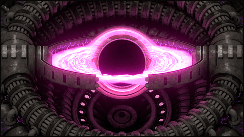
the black hole has some nice symbolism about the effect on one's time if one submits to the mod portal on top of the base game content
Also could go with something iconic
I do think if it got cleaned up it would look really cool
Bobs has some iconic things like the gray belts
Steam pipes or inserters from IR
There’s the crazy shape tech packs from EI
I like the look of py tech packs a lot
Yeah

Im thinking what if you stack a K2 card, an EI science pack, and a pyanodons tech pack
I thought of the gray belts but figured no one would really want that despite the appropriateness in some sense
especially given the other belt balancer one :p
They are bland
belt expert would be too similar I feel
yeah
the black hole seems more and more appealing tbh
I would be rooting for blending a couple icons together
SE definitely has a lot of nice juicy fitting icons but if any one modpack is to be favored I'd want it to be K2, it's a good scale for a first overhaul
role icons are static image?
I think the implication is blending in a static form
Could also pick something non-iconic from pyanodons
So that people go, oh that looks modded
Yeah

What’s the red stuff you get from tar processing

 is also good
just making sure
Possibly something from planetfall BZ extensions?
could also just go with  lol
lol

I rather have ong
yeah I don't like
Without vanilla context it’s an oscilloscope
the reason we have polls is to gather the opinion of everyone equally, it looks like it's going to be RCU and I'm sorry that it's not your guys' favorite, but if that's what the majority of people say they like then that's what we're going to go with
debating means it's more than "meh I don't like it"
tbf we haven't seen a cleaned up version of the current one and it was a late addition to the poll
oh well
I mean is it wrong to say opinions?
no
I'm saying that despite RCU being my suggestion lol
I'm well aware, I just didn't want the conversation to turn into a negative spiral
which it seems to be doing anyway
fair
not that badly, but also I'd prefer to know if something was really polarizing in a bad way, the approval poll doesn't capture the negative weights
I think RCU fits decently well as it's an easily recognizable item that doesn't have bias for any mod and is a complex late game recipe, representing the not uncommon complexity of overhaul mods
"complex" lol
I didn't like it at first but I'm imagining it next to the names and I think it'll look good
idve prefered kovarex but rcu is also good
complex in terms of the recipe chain, not by itself
kovarex enrichment was and will continue to be emblematic of a distinctly vanilla thing
the RCU icon will be legacy and possibly repurposed by mods going forward
I mean it is kind of a glorified processing unit, but that's still a decently complex recipe in and of itself
some mods already use RCU but recolored
🤔 makes a horrifying color-negative RCU icon
that's actually not horrifying o_o

well granted I rotated the hue rather than doing a total negative
thats pretty cool actually
when the control unit rockets
I do like this more than total negative
or normal rcu
maybe we should do a poll between normal rcu and that
I'd prefer to either have the normal RCU or the cleaned up K2 singularity though

throw in the old (but not old old) engine graphic for funsies
yeah we could just do the most popular as one poll
one poll to bring them all, and in the darkness bind them
I'd like to point out that this poll let people pick multiple icons so the most popular ones are already people's favorites
I guess the numbers might be slightly different if they were forced to choose but eh
@amber onyx did you apparently say "that's not horrifying actually"
because tts played it
??
what
as part of the image embed message
okay tts randomly played that message I suppose
you're not copying that version are you? the raw file doesn't have the checkerboard
no
kk

this is making me want to see what the K2 artists used for source to render it D:
do you think we could actually ask for them to just render it alone
oh raiguard made k2
IIRC K2 devs are. . . .in a bad place due to world events
no, raiguard maintains it
☹️
Raiguard has no such graphic skills lol
it looks like the black hole tutorial that i saw for blender once
just with a few extra bits on top
its not that hard to make soemthing that looks like a black hole
I would be offended, if it wasn't true
I have the blender file for the intergalactic transceiver, which includes this black hole thing.
blender file would be even crisper :D
i think it might be really easy, but id also need to have my hands on it
like, i think you can just tell blender to not put anything but the black hole into the final render, but itll still use the other things
i think thats how rendering shadows works for factorio sprites. cuz you want to take a picture of the shadow only, and it needs to interact with the thing its making a shadow of
source image?
Case study of doing it without the model:

a mod emblematic of the divide between people who want to keep or destroy the wreckage (I'm in the keep camp) </risking a thread within a thread>
i c
Behold:

No idea how this is turned into the final product though 🤷♂️
wao
I like your funny UI magic man

wait are you getting into blender
No, this is one of the Krastorio source files that Krastor sent to me when I took over the mod
he got into blender only in the most literal of senses
I have NO IDEA how to use blender
Literally an infant
I'm just clicking buttons and now it looks poop brown

there actually is a poop icon in K2; I know becuase I found it and now everyone else has to know too
You’re in material view, not render view or render
"material"
"view"
You assume I know what these words mean!
Hold Z then swipe up
(except make sure the cursor is over the 3d bit)
Pog

paaaatience
CPU is dying
Do I need an NVIDIA GPU?
no
Good
you need to tell blender to use your gpu
Dear lord lol
i'm dying lol
"Well you found me, congratulations, was it worth it..." playing in my head

okay go to the preferences and then System and you won't have CUDA but
you should have something for your card
(I have never done it? so whee fun adventure)

Veterans remember when that was experimental feature for like a decade
Then go to the properties pane and hit Cycles and set the device to GPU Compute
I am, alas, not cool enough to be numbered among them 😦 I was a late bloomenderer
I started in 2014. Easy to remember since it was freshman year 
No bueno, it doesn't "just work" so I need to do googling to figure it out
Welcome to Blender
HIP isn't detecting my GPU even though I have both requirements satisfied (I think)

Hold on, maybe I'll try the non-flatpak version
oh lol
(also hopefully this isn't pinging the everloving heck out of the mods)
threads have separable notification settings
ok good, time to post smooth garak
Wooooow Fedora's mirrors are so much slower than flathub's
It is but only on my computer at home which I’m not at currently
rai uses linux, so decent chance its just linux being linux >.>
Hopefully partner isn’t there
No, Google to figure shit out is a universal Blender experience
Google to figure shit out is a universal Blender experience
Installing non-flatpak solved it, because it also installed many system libraries that I was missing
Blender just spins for a while and crashes. FFS.
Oh well
do you want me to iconify it
That would be waaaaaaaaaaaay easier than you baby-talking me through every step of the way 😄
I'll PM you
okie
Yep, when I try to use GPU compute it just segfaults
The process was killed by SIGSEGV: Segmentation fault
Smells like Linux GPU shenanigans
Gonna see if a system update and restart fixes it
"AMD on Linux is easy" they said!
"You never have to worry about GPU drivers" they said!
Well, Blender doesn't work, nor does GPU encoding for livestreaming. It looks like trash.
are you using the official amd drivers or-
~~well there’s your problem ~~
AMD does make closed-source drivers for Linux but they have all sorts of problems
99% of the time AMD just works™️ without any fuss
30% of the time it works all of the time
Heh, I CAN use my CPU's integrated GPU to render though... it's slightly faster than straight CPU but not much.

There we go
Without cutting off the glow:

wom wom wom
Now I know a LITTLE about how to use blender 😄
Enough to be dangerous...and fun!
you know how to crash it. that literally upgrades you to Experienced User
Krastor must have done some photoshop work to this as well because this doesn't look quite right
undoubtedly
I still can't work out why everything's pink -- the files are here
asdf
anyway, it's did
If there’s one thing I’m good at doing, it’s crashing programs by doing things that seem totally normal
still proud of the reproducible crash bug we found live on stream in 4.2 that I reported and instantly got a "HIGH PRIORITY" rating
and is now fixed
by someone smarter than me
Anyway, is that gonna be the icon? 🙂
so sexxy
Just needs a black drop shadow
blur + set alpha to value of the blur and value to 0 + overlay original image on that
Sorry, must play Py now

there was a glare node used in the compositor, and i just cranked the poo out of it
oh neat
you almost cant see the fact that the triangles are a little too big on that disk
they
are so smol

i actually have no idea what in god's name this topo is but it sure do look pretty
anywaho
huh
i guess its just a perception skill issue cuz in this one they look pretty big
excellent call, I forgot to ask about that haha
So beautiful
I can see that
Overhaul Enthusiast
there, now the poll doesn't look like absolute garbage in the pins
not sure why the emotes weren't used themselves instead of links to them lmao
Because some of them weren't
consistency :D
Some of them were image
What icon size do we want?


4k
I would say this one
honestly it's gonna be so small I'd rather have the item icon that actually fills up more of the image
also omits the shadow come to think of it
I'm still trying to figure out what you meant here about cutting off the glow; was there some sort of edit in post affecting the current version by contrast?
or was that vs. the prior image you posted?
Previous image seems slightly cut off at the top and bottom
can we try one of them as the current icon?
oh, the angled one, neat
I think that "cranked the poo out of it" glare thing means it lost detail though
Slightly more cropped version now
^
I like it 
it completely lost the separation of two parts above/below the accretion disc
Horizontal?
Horizontal is more "recognizable" but I think the angled one looks more visually appealing
I don't get it, how was the original so crisp D:
By not being scaled down to 10x10
nono the one you were using temporarily
Dark background?
it's as if it had a different angle meant for an item icon rather than being in the world
angled is cooler
lol
wow it looks so good
I don't think that's unique to this icon


the other ones look fine because they're all not really light colors
My yellow name doesn't do too well either lol
yeah
my discord monitors colors are bad too so everything gets worse
like your yellow name on my good color monitor is 👌

The contrast does work a lot better for light mode
On dark the ring is barely visible
reflection off the frame also gives the back part of the disc more body
Angled?

Hmmmm, yes
I like
It's way pinker, it looks great
My raw export from blender was too light, not neon enough!
lol
It's not any more pink, just less transparent
this is 0th choice
how does it work scaled down through disc?

the framed one
That is the framed one
okay, I was not looking closely enough 😂
Gotta switch to light mode :P
it's very apparent on light mode

impressive just how much that makes it actually have defined shape by comparison, goodness
That looks great
Note the difference in transparency, that's what makes the difference here especially on dark mode


now I gotta whip up a version of it with a faint ghost of the RCU being sucked into the singularity
lol
that detail would be totally lost in the shrink though hehe
only one way to find out
it's just gonna be like one pixel
one faintly green pixel

I mean RCU won, no?
The vote was rigged!
sorry, rcu winning over black holes doesnt fit in my worldview
I think if we created a new poll now blackhole would win
that's not an opinion, you're just rejecting data
real
also, wait, the blak hole isnt even on the pole?
I personally don't think the singularity fits the server, regardless of it looking cool
oh
It was added a day late lol
so close to a tie
was it really a day
someone else please vote for black hole
wow time is weird
technically if I removed my reactions I could vote
because I can't vote
it's also like... the K2 icon, which is incredibly biased
fair
but it looks so good thoguh
like at that point just use the SE thumbnail if we're gonna do that
that's not even the SE thumbnail
👾
what do you mean by the SE thumbnail, like, the mod portal image?
I was being facetious, it doesn't matter
yeah lets have that
🤭
thank you greencode very cool
like I really don't think we should be singling out a specific overhaul's art to represent the rest of them
Shall we take Iron's suggestion and replace it every few days?
zoom out

Waifu
?
so true speckled
regardless it's still very obviously associated with K2 and that I don't like
let the poll decide I say
ill vote for 2 and 9 so you can vote for the black hole
it's not a conspiracy guys
black hole 2024
I like it, but I am very obviously biased
1️⃣ RCU
2️⃣ K2 singularity

pin that too, maybe?
i love democracy
I'm wondering why we didn't allow poll permissions for moderators
weird
easier to just turn it off for everyone, i suppose
dont get anybody whining that mods can do it but not normies, either
if they whine just say "shut up I'm mod L + ratio"
Hmmm, if I had to find an example of prime mod crazyness it would probably be waterfill
oh god the "water fill your house" 🤕
it would be annoying af from all the martincitopants brain rot
lol
not lol, it was hell in this server for three months
that phrase instantly makes me dislike a person
even if they say it ironically?
yes
I think it perfectly captures the "too many mods for your own good" idea
it's still annoying
i guess i should keep my mouth closed then
taking a shit on someone's front step ironically still isn't appreciated
Do you want an actual poll though?
it's already good enough
I do think waterfill was a fun meme because it represents an unusual destructive action with no otherwise negative connotation
no
If they said ^shoots you with a gun* that has inherent negative connotation
I like multiple reactions and I can't remembre if normal polls have that
only having two choices kind of defeats that purpose though
yeah which is why we had the other poll
also pretty sure you can have checkbox polls
and this is why we make the role before the icon image
don't like bikeshedding :(
I mean I had an entire server of just me and my friends bikeshedding
fun for me
it's great fun
What is bike shedding
I wish we actually tried out both icons instead of choosing one arbitrarily
nitpicking over the minor details you actually have a opinion on
Dedicating all your time to the design of the bike shed when you are supposed to design an entire building
giving disproportionate attention to minute details
I'd rather debate the significance of a role icon I won't use than figure out why the blue line is going past the red circle

Well that train is in the way isn’t it
this is a scripting thing
not a train behavior thing
I'm rendering that stuff
aka debugging (ew)
okay set it as rcu you then
Oh it’s a graphic display issue
it's not a graphic display issue, the graphics are rendering what the code is doing fine
it's a rail tracing issue
my favorite is "why isnt this working" but not saying what its supposed to do
something that is really annoying in the api
I don’t love encouraging SE as the “default overhaul mod”
i feel like SE is gonna keep the RCU for sure
Saw it somewhere in here in notifications… hold on
how would RCU imply SE
sure it uses a modified version of it for satellite telemetry but it's different, RCU is still a vanilla item
I suppose I'm also biased away from SE/K2 because I'm sick and tired of seeing it everywhere
there are other overhauls
I guess I can just css edit and hide role icons
i ahve the perfect solution
just rotate the role icon every week fr
:D

bruh waht
just ask preylezero for whatever they used to get that black hole ish thing
248k isn't even played by itself, 99% of the time it's with SE and K2
yeah so no one knows the icon
so my facetious was accidentally double facetious
people know the icon
I didn't know it
you do now
I play "real" overhauls fr
clearly at least one of us did kekw
L take, I'm out
😭
what about seablock?
haha
maybe you could use one of the buildings from AAI programmable structures
radar thing looks cools

I do think we should try the RCU for fairness
unplugs keyboard
tries to write reaction message
Why can't I type???

me core
Okay it was me missing this comment, carry on
Oscilloscope fans assemble!
it was temporary
it was such an L take I had to pretend it didn't exist for a little bit
don't worry I don't actually believe that 😭
Arcosphere would be best
what the hell is arcosphere

What if I do it unironically
well….
I would applaud you for the commitment
#mod-dev-graphics message Take your pick
The plebian one
whaaa what is with people attributing things to me that others said, this is the second or third time this week 😆
so true maxreader
You were there
I can't believe you would suggest arcospheres iron
didnt iron say not to trust everything you read on the internet? i think that applies here too
I can’t believe Iron told me to shit on his front step
KFC arcosphere you say? Can do...
man icon that e=mc^2 thing you came up with was really genius
I thought iron told me to trust everything
I dare you
no please don't
kentucky fried codegreen
oof ouch owie
?
Oh derp I didn’t see the other link
iron, voting for both is like voting for neither
I mean at least bro likes both
I either made or suggested both of them, don't make me pick XD
can I have your vote then
Fey deals be like
speckled go to bed lol
the RCU fits the server more, the black hole fits the role's idea of "excess" more
iron gets it
So this one it is
that was the one used previously yeah
hm? I didn't see the one with the black hole eating the RCU
I think
oh wait yeah wrong one
the choices (singularity would have transparent background)


what is this even supposed to be
pin the comparison too lol
check the pins
my brain shortcircuited, carry on
I saw that and then got thrown off by the relativity thing XD
excerpts from a (real!) pepsi logo redesign presentation
these people are paid too much money if they can get away with that shit
soda can labels now holographic, green up day made 10% easier
damn y'all have been busy
RCU has 22 votes, almost half the total votes
They did go against the vote though lol but I don’t have any investment
Because IronCartographer suggested to rotate the icons.

serioiusly not cool running with a joke (referentially after the fact when it's not clear (especially lacking tone as text does) it's a joke) when it's actual misinformation
I rotated the hue in an image, and I think the original discussion [wasn't even intended to be about animation or cycling through them](#1275127307907891376 message)
sorry, I won't do it again
I won’t contest this anymore because I think it’s not as bad as the roles with icons  and
and 
If anything needs attention it’s those
pretty sure codegreen wanted to make sure that the RCU was at least tested and nothing's finalized
that's another bikeshed issue not for this thread please create the "bikeshed the bikeshedding of icons" thread to have your recommendation bikeshedded
oh yeah black hole is winning on both polls now
Black hole has been winning on both poles for a while now
And here's the thing with black holes: K2 and 248k have them, PySEx will have them, and I'm not sure but I think SE and EI have them.
so change the icon to black hole?
I think that codegreen has made up his mind
nothing more permanent than a temp fix
Too real
I'd like that, and looks like the majority of people here like it as well
I'm good with blcak hole
What’s a blcak hole?