1 messages · Page 1 of 1 (latest)
 timid urchin
pick up big u
 static wadi
@keen shadow
static wadi
timid urchin
pick up big u

 limber drift
Sorry for building in your game bro
static wadi
limber drift
Sorry for building in your game bro
limber drift
 static wadi
 radiant breach
not your best work
radiant breach
not your best work
the picture I put for this was a bit mid. I'll get better ones later
static wadi
radiant breach
not your best work
tell me why it's decent, pretty please with a cherry on top
static wadi
radiant breach
the areas on the walls where’s there’s just red seems too bland, maybe add some props that fit the area on the ground level, connect the bottom area to the top area on the second floor, or add windows.
There’s just not much happening
Which makes the build overall somewhat bland
static wadi
radiant breach
the areas on the walls where’s there’s just red seems too bland, maybe add some ...
gotcha
 umbral fractal
Holy bob + bsdn combo
 hexed estuary
static wadi
gotcha
hexed estuary
static wadi
gotcha
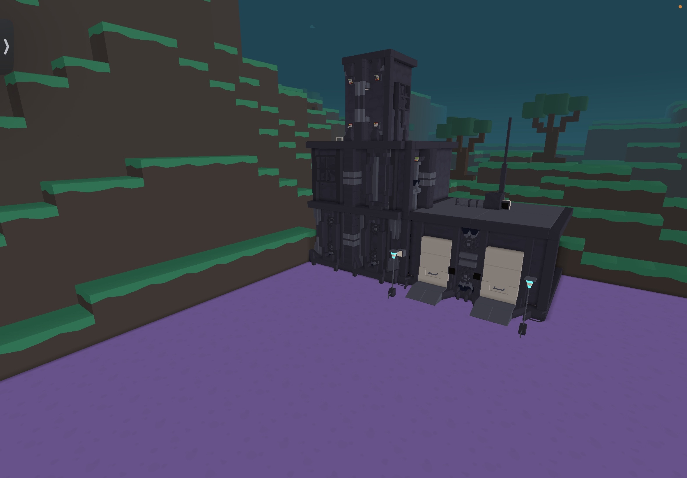
If I can help is in the pic you can add a little bit of props and make it alive and please fill in those gaps please Urbany by ManyAlts 
And please givey me advice 


 pearl bolt
hexed estuary
And please givey me advice <:bam:1250894997616590919> <:bam:1250894997616590919...
pearl bolt
hexed estuary
And please givey me advice <:bam:1250894997616590919> <:bam:1250894997616590919...
props are not architecture
static wadi
hexed estuary
If I can help is in the pic you can add a little bit of props and make it alive ...
props are not architecture, I agree
static wadi
umbral fractal
Holy bob + bsdn combo
it's just plain architecture, nothing out of the ordinary

the whole thing
ignore that Green building, I was trying to teach one of my friends architecture
@radiant breach
0
radiant breach
I think it could use a splash of color on the right/red side
static wadi
radiant breach
I think it could use a splash of color on the right/red side
what do you mean?
radiant breach
I think that grey color for the outlines and the red makes the red look dark and not colorful
I lowk can’t tell if that’s maroon or red
static wadi
radiant breach
I think that grey color for the outlines and the red makes the red look dark and...
it's supposed to be dull, to fit the light blue bottom
and red is really bright
radiant breach
Then it looks good then
static wadi
radiant breach
Then it looks good then
coolio
 uncut mountain
Ummm
The colors don’t match very well imo
And the architecture isn’t bad, it’s just very simple
static wadi
uncut mountain
The colors don’t match very well imo
what do you mean?
static wadi
uncut mountain
And the architecture isn’t bad, it’s just very simple
I didn't wanna do anything crazy
@uncut mountain
uncut mountain
static wadi
what do you mean?
The light grey and matron don’t compliment each other very well
*maroon
They kinda contrast too much, maybe if the supports were dark blue it would match more
Or if the walls were just normal red
static wadi
uncut mountain
Or if the walls were just normal red
the colors on the building are supposed to be dull
static wadi
uncut mountain
The light grey and matron don’t compliment each other very well
and also, there's no light gray paint in the game currently
uncut mountain
static wadi
and also, there's no light gray paint in the game currently
I mean gray
Just the normal gray
The color you painted the frame
static wadi
uncut mountain
I mean gray
yeah, I see what you're getting here, but, overall, is this still good besides that
static wadi
but, I'm curious is there a yeep color wheel? It would be really helpful.
@uncut mountain
uncut mountain
static wadi
but, I'm curious is there a yeep color wheel? It would be really helpful.
No I don’t think so