
1 messages · Page 1 of 1 (latest)
 wise belfry
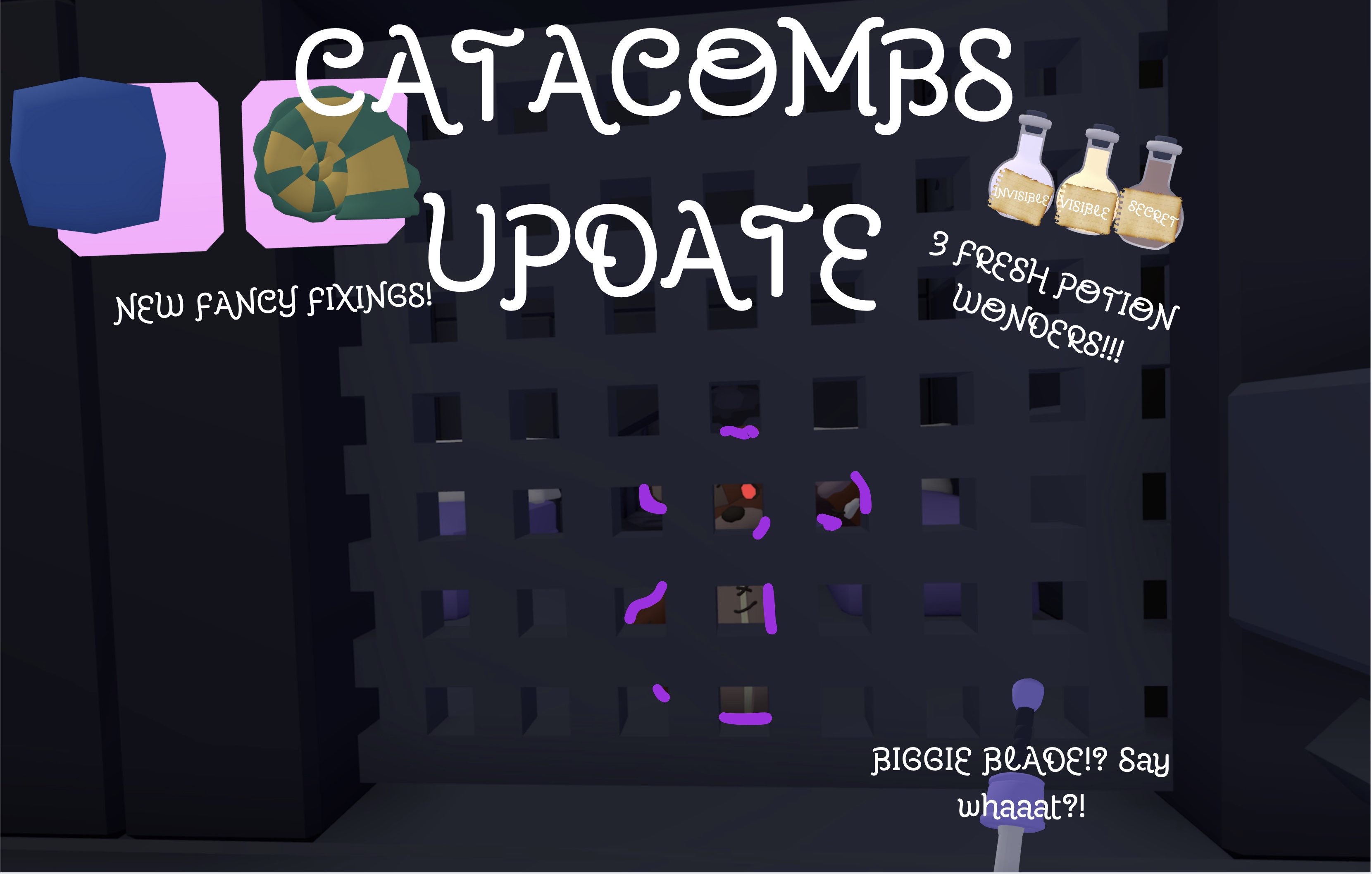
I will try and help your improve your yeeps thumbnails
 obtuse abyss
I don't have any rn but fire thumbnails
wise belfry
obtuse abyss
I don't have any rn but fire thumbnails
ty
 fossil hollow
Thoughts?

 native summit
tip: ||dont use blender for thumbnails. (my opinion)||
wise belfry
native summit
tip: ||dont use blender for thumbnails. (my opinion)||
show me ur thumbnails?
native summit
wise belfry
show me ur thumbnails?
…touché
 umbral basalt
 wise belfry
umbral basalt
wise belfry
umbral basalt
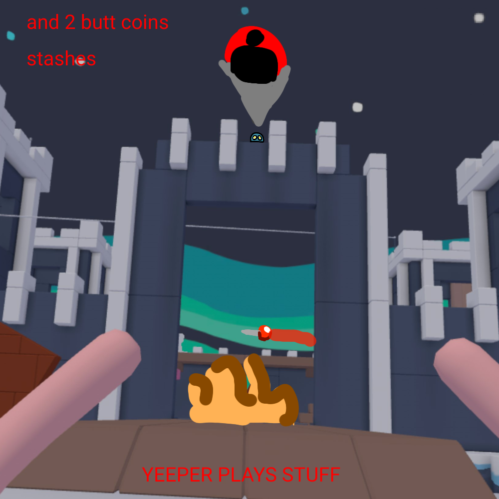
I think its good, the things i would comment on is, A thumbnail size is 1920x1080, thats 512x512. And make the text more visible, Great job
umbral basalt
Thank you
wise belfry
np
fossil hollow
umbral basalt
1/10
 vernal wigeon

 peak sorrel
can someone make me the new animal company thumbnaio like you @exotic silo
 exotic silo
peak sorrel
can someone make me the new animal company thumbnaio like you <@7341146350613955...
exotic silo
peak sorrel
can someone make me the new animal company thumbnaio like you <@7341146350613955...
If you could provide screenshot/photos
peak sorrel
@exotic silo could i use that thumbnail or can u make me one of the new aimal comoany updtae
idk how to sned you screenshots
exotic silo
Nah you can’t use it, but if you want I could make you one, continue in DMs
native summit
vernal wigeon
looks cool! but it feels too empty and also flat
maybe instead of moving around text in blender, you could do that on photoshop (or photopea)
 worn flume
native summit
tip: ||dont use blender for thumbnails. (my opinion)||
worn flume
native summit
tip: ||dont use blender for thumbnails. (my opinion)||
why not?
native summit
worn flume
why not?
the yeep model in blender looks too unrealistic to what it looks like in the game, and the lighting just makes it worse.
not only that, but you can barely pose the model at all, so making specific poses is almost impossible
but don't let my words discourage you from using blender its still really good
worn flume
native summit
the yeep model in blender looks too unrealistic to what it looks like in the gam...
the yeep model DOES look badass in blender
native summit
worn flume
the yeep model DOES look badass in blender
thats just my opinion
worn flume
native summit
thats just my opinion
ok
 chilly wave
How bout this one? I made it for a friend...
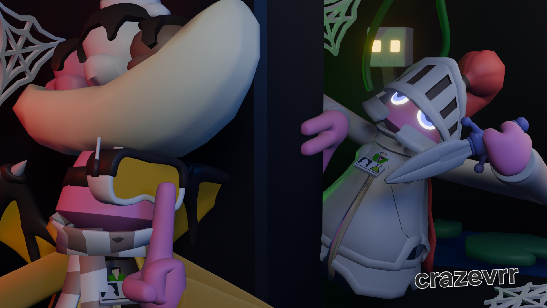
Title: the catacombs update is insane!
I only used blender and just pretend like the watermark isn't their lol
native summit
chilly wave
maybe adding more effects could make it more appealing idk
wise belfry
vernal wigeon
I would work more on the backround but great work. I like the posing really nice
wise belfry
chilly wave
Amazing work. It almost doesnt feel like a thumbnail lol. Make it pop out more other than that. Amazing
fossil hollow
chilly wave
Add some letters
chilly wave
native summit
maybe adding more effects could make it more appealing idk
Like what?
native summit
chilly wave
Like what?
speed lines, brighter parts, etc
chilly wave
wise belfry
Amazing work. It almost doesnt feel like a thumbnail lol. Make it pop out more o...
Thanks! I've been trying to build out worlds in my thumbnails rather that just making a pose and calling it a day.
wise belfry
chilly wave
Thanks! I've been trying to build out worlds in my thumbnails rather that just m...
You did an amazing job ngl
Just try to make it pop a lil more and make the main objects stand out ig
chilly wave
wise belfry
Just try to make it pop a lil more and make the main objects stand out ig
Ahh okay. I know that you are supposed to make the whole image brighter with thumbnails since most people use youtube on dark mode. I could probably have made the lighting a little better to make them pop too...
wise belfry
chilly wave
Ahh okay. I know that you are supposed to make the whole image brighter with thu...
yh, But great work! The posing is good same with the backround and allat
 granite mica
I drew my thumbnails
 fierce copper
wise belfry
I will try and help your improve your yeeps thumbnails
fierce copper
wise belfry
I will try and help your improve your yeeps thumbnails
Any thing I should add?
 vernal wigeon
fierce copper
vernal wigeon
fierce copper
i think make the yeeps text white instead of orange and make the bg the CW
just my advice
obtuse abyss
Tips
 vernal wigeon
obtuse abyss
Tips
vernal wigeon
obtuse abyss
Tips
tip: make it less saturated
chilly wave
obtuse abyss
Tips
Usually darker thumbnails don't do good, and the lighting on the yeep is a little hard to see. I may have also done a more surprised pose. Other that that it has a very good composition!
chilly wave
fossil hollow
For this style I would have took the pie at a diffrent angle to make the thumbnail more interesting. I may also have done some colour correction so it matches the background
 past axle
chilly wave
past axle
chilly wave
Holy this is good
 teal moss
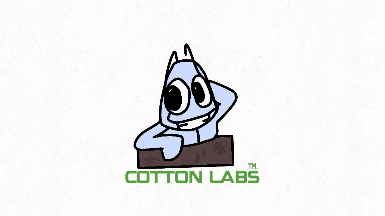
I like to draw out stuff
When I make thumbnails
This is just a part of one, it’s part of a VHS of this horror yeeps show I’m making called something watching, the lab who made to thing on the show is called cotton labs
 peak sorrel
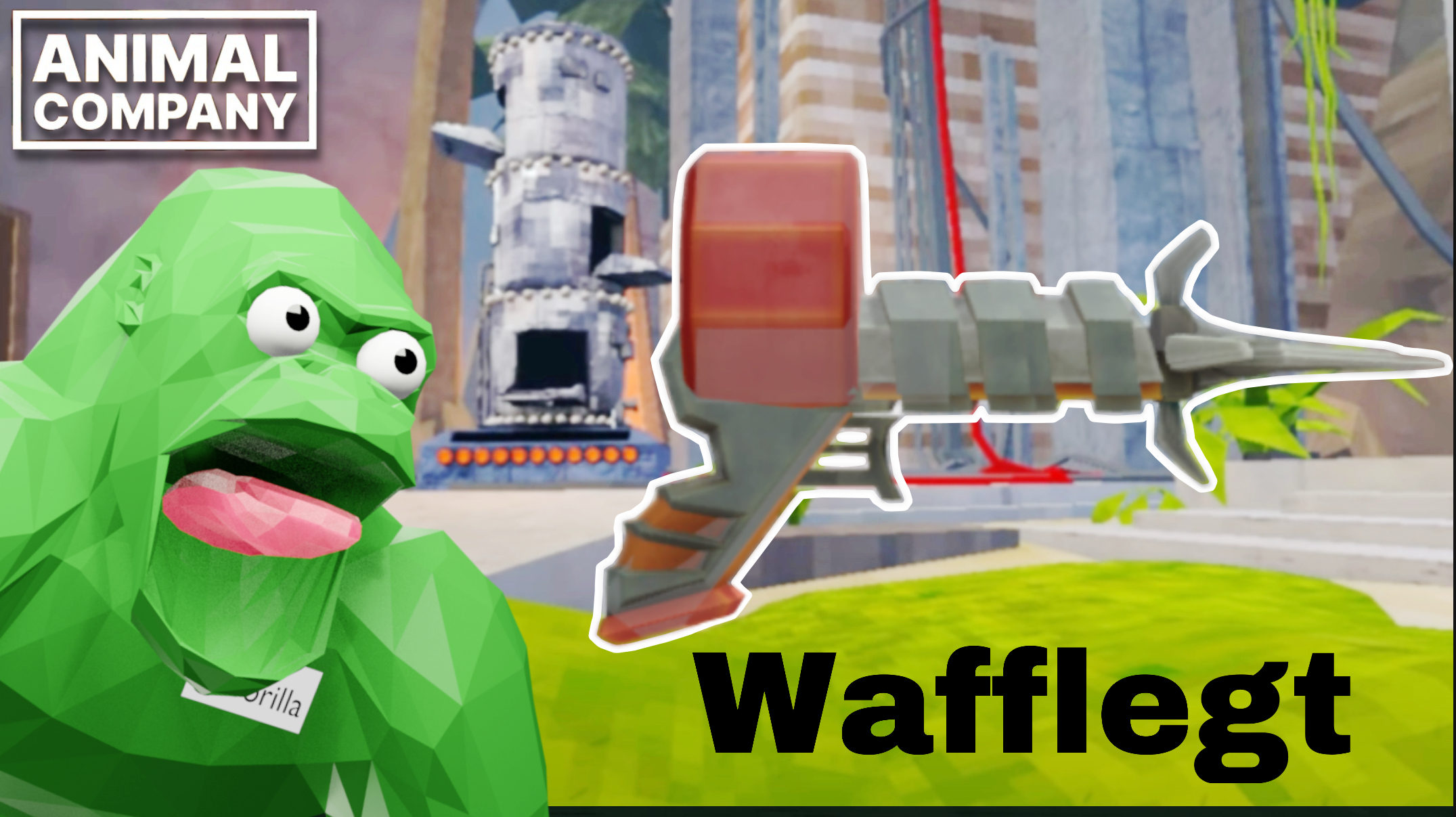
what should i add ik its animal company sry i put my name so people dont steal
 chilly wave
past axle
Holy this is good
chilly wave
past axle
Holy this is good
GLAZE
vernal wigeon
chilly wave
i love the lighting, the only things that should be added are some speed lines and some text saying smth like catacombs update
chilly wave
vernal wigeon
i love the lighting, the only things that should be added are some speed lines a...
The only reason I didn't add text was because it would distract from the world and overall thumbnail. Text is for the title in my opinion.
vernal wigeon
chilly wave
The only reason I didn't add text was because it would distract from the world a...
yeah thats a good point, but imo the speed lines would add a lot especially if they weren't in the way or a bit transparent
chilly wave
vernal wigeon
yeah thats a good point, but imo the speed lines would add a lot especially if t...
yeah true
vernal wigeon
chilly wave
yeah true
i added the speed lines and i looks fire
 chilly wave
oh yeah okay
obtuse abyss
vernal wigeon
i added the speed lines and i looks fire
Can you send me the speed lines
vernal wigeon
obtuse abyss
Can you send me the speed lines
 obtuse abyss
Ty
peak sorrel
 fossil hollow
@wise belfry , @peak sorrel stole one of your thumbnails

@peak sorrel Stop stealing others thumbnails
peak sorrel
he let me use it
fossil hollow
peak sorrel
he let me use it
umm no proof
peak sorrel
thr animal comapny one i made
wise belfry
peak sorrel
he let me use it
I didnt?
wise belfry
fossil hollow
<@879746421203550268> , <@1345896184400842762> stole one of your thumbnails
Im not mad abt it but he shouldve asked first
I recommend yall use 3Dperspective’s model if u arent, just a suggestion
 nimble verge
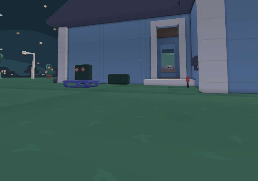
I don’t need help but does any body have blue house
vernal wigeon
nimble verge
I don’t need help but does any body have blue house
an image of blue house?
obtuse abyss
vernal wigeon
an image of blue house?
 chilly wave
 sand gorge
It's good, but you want to keep you'r thumbnails to a minimum of 3ish objects so it doesn't get too busy. I also can't really see the monster. Other than that it's good!
 low spindle
 vernal wigeon
low spindle
vernal wigeon
low spindle
Good I like the jman review lol
low spindle
vernal wigeon
Good I like the jman review lol
Thanks
nimble verge
vernal wigeon
an image of blue house?
no in blender
vernal wigeon
nimble verge
no in blender
Ok I have it but I can't send it rn next week I can send them
nimble verge
okl
chilly wave
worn flume
I like it but I needs to be a little brighter ✨️ that's really it tho
wise belfry
chilly wave
I like it but I needs to be a little brighter ✨️ that's really it tho
I agree
 frigid magnet
wise belfry
I will try and help your improve your yeeps thumbnails
frigid magnet
wise belfry
I will try and help your improve your yeeps thumbnails
What you think of my thumbnails

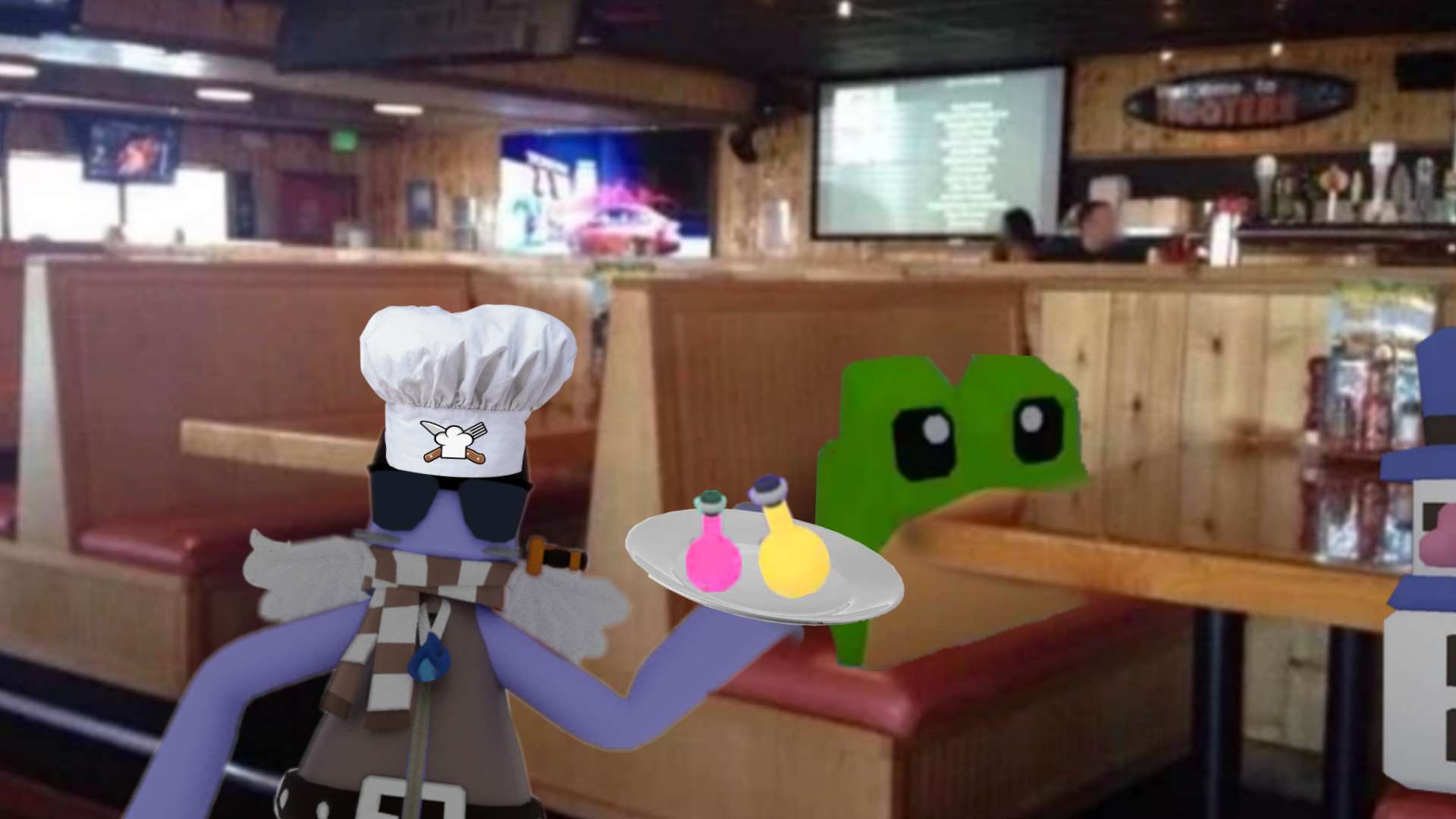
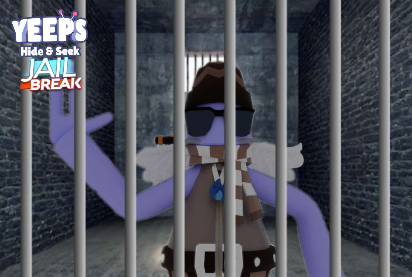
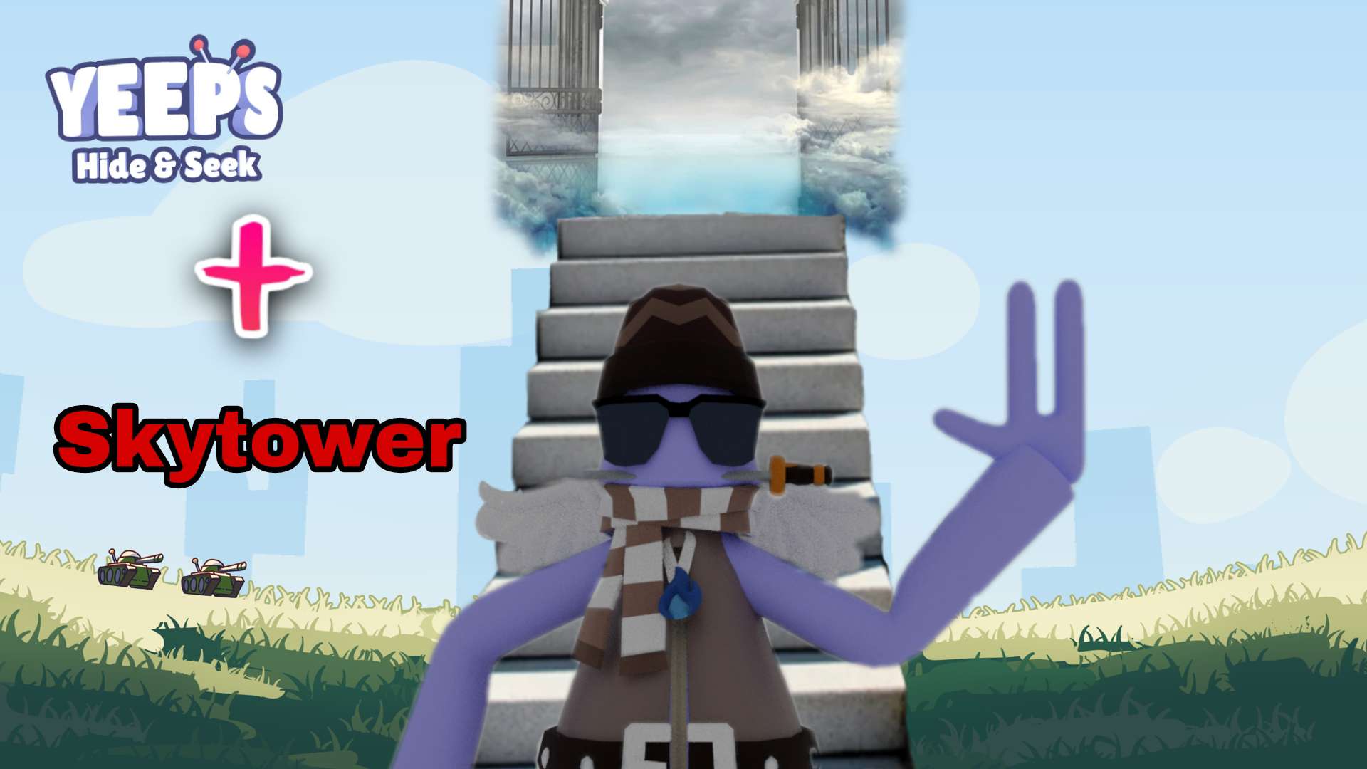

Pretty trash
wise belfry
frigid magnet
What you think of my thumbnails
Its good, I would focus on trying to blend in the character more to the backround and find the reason the characters are a lil blurry and weirdly cut, I would also try to use as little images from google as possible, and try to add shadows, for example that cooking hat, Greatly done
frigid magnet
wise belfry
Its good, I would focus on trying to blend in the character more to the backroun...
I might do shading
wise belfry
frigid magnet
I might do shading
Im not really the best shader but thiss is prob the most ive done on a thumbnail
 frigid magnet
Ok
wise belfry
it was a while ago tho so it aint that good
wise belfry
frigid magnet
Ok
and i would recommend adding a shadow under some text, it makes it stand out even more
chilly wave
frigid magnet
What you think of my thumbnails
I would scale up the jailbreak logo and move the yeeps logo to the other side too
frigid magnet
wise belfry
and i would recommend adding a shadow under some text, it makes it stand out eve...
Oh yeah
frigid magnet
chilly wave
I would scale up the jailbreak logo and move the yeeps logo to the other side to...
Ty
chilly wave
Np!
frigid magnet
What abt now?? @wise belfry

 steady tinsel
Thoughts
 fossil hollow
frigid magnet
What abt now?? <@879746421203550268>
fossil hollow
frigid magnet
What abt now?? <@879746421203550268>
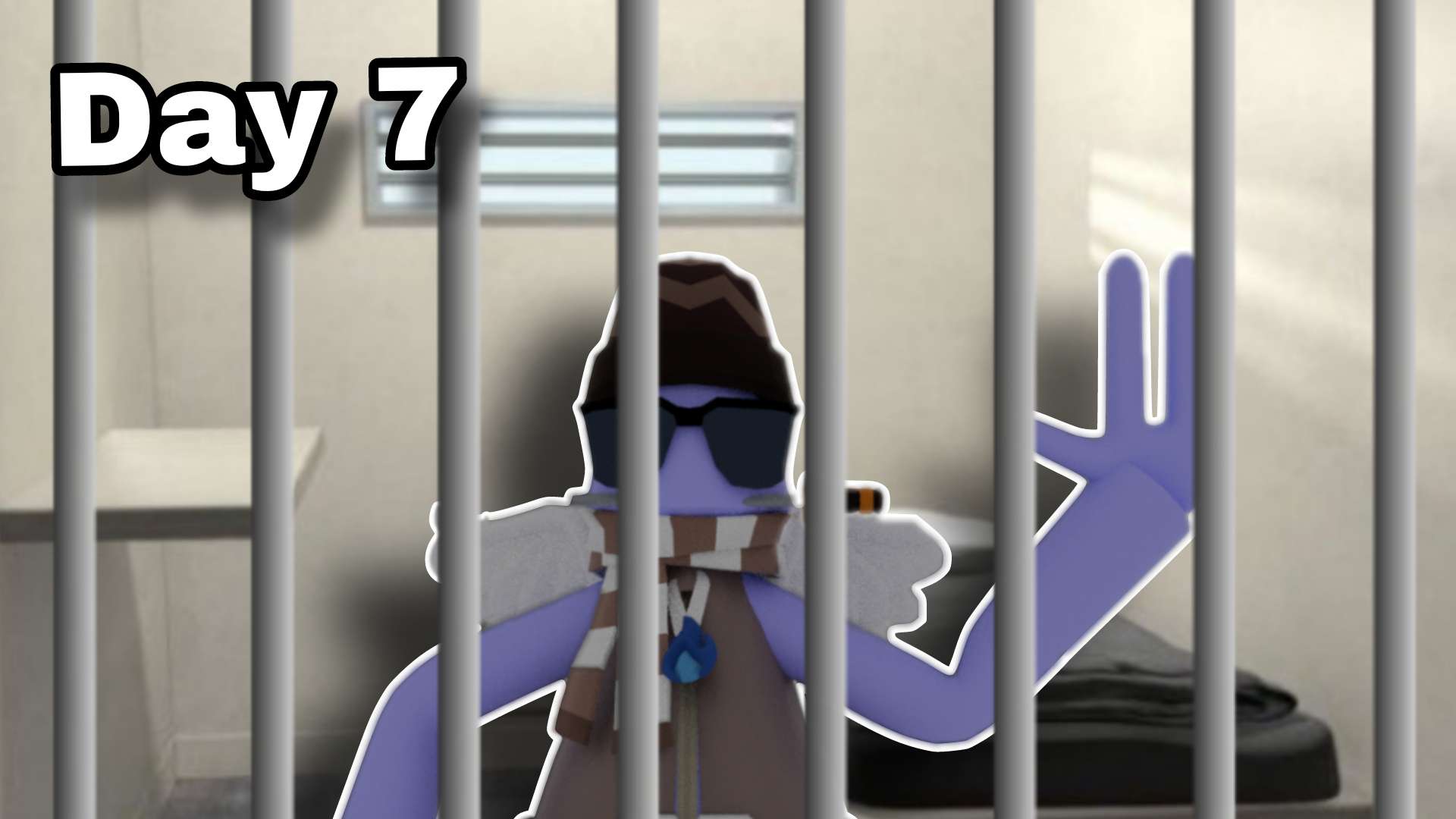
Use better font
Outline for yeep
fossil hollow
frigid magnet
Yeah I will
ok
frigid magnet
fossil hollow
ok
Better??
 vernal wigeon
Thoughts on this really old thumbnail I never used?
 chilly wave
steady tinsel
Thoughts
chilly wave
steady tinsel
Thoughts
I think the background is too blurry and the yeeps isn't all that bright. Other that that it's purrdy good
fossil hollow
vernal wigeon
Thoughts on this really old thumbnail I never used?
Brighter yeep better font
vernal wigeon
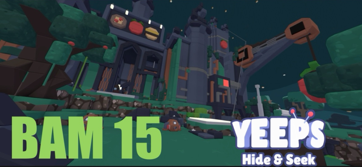
feedback on this?

 digital harbor
 brisk cave
 vernal wigeon
digital harbor
vernal wigeon
digital harbor
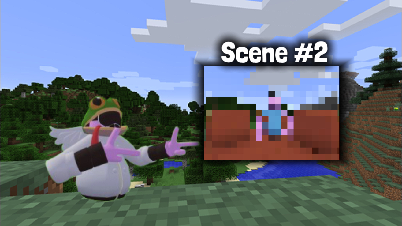
looks nice i just think that some speed lines would look good
digital harbor
vernal wigeon
looks nice i just think that some speed lines would look good
Where do you get them?
obtuse abyss
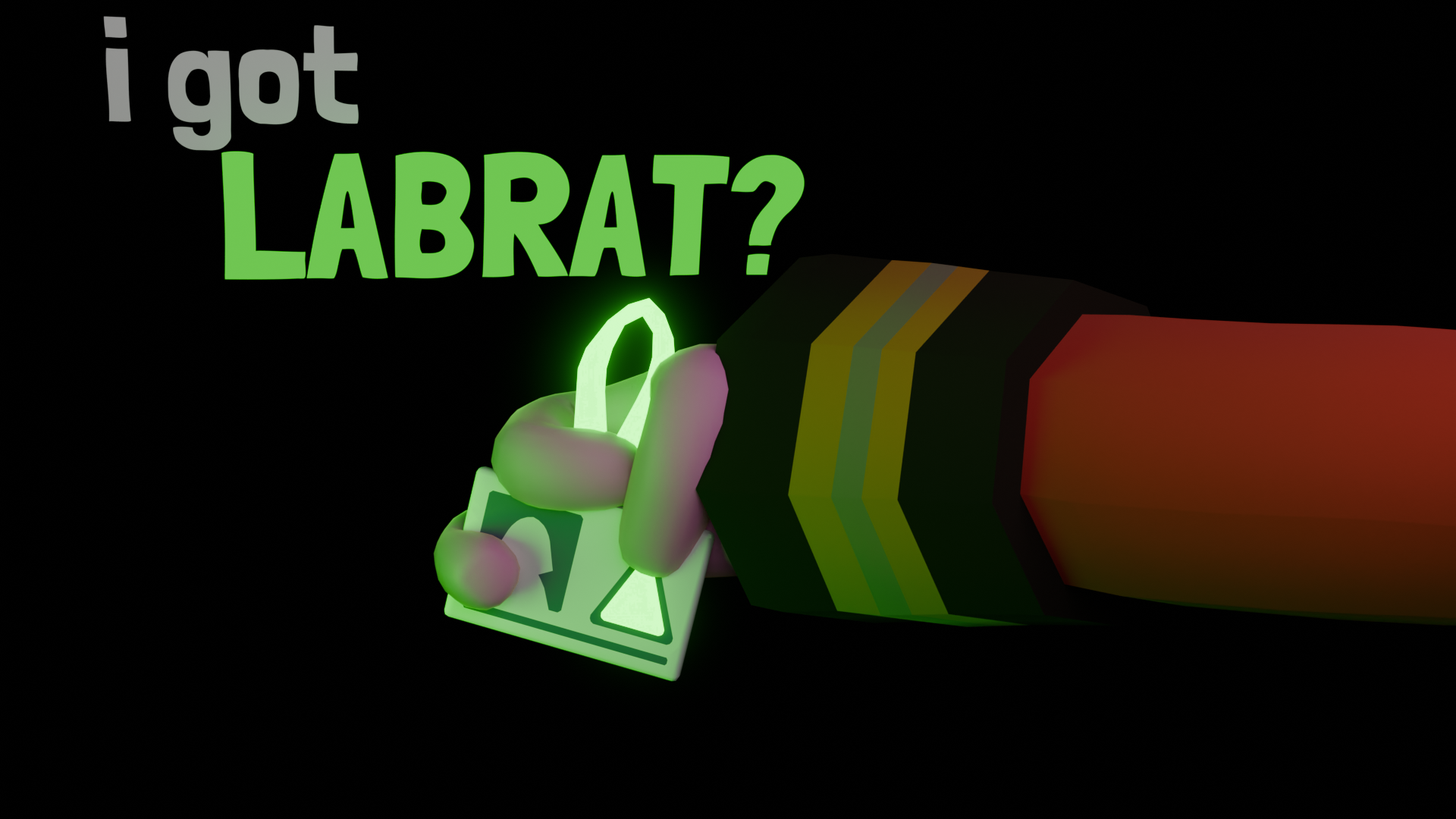
@vernal wigeon rate this one lol
 vernal wigeon
digital harbor
Where do you get them?
vernal wigeon
digital harbor
Where do you get them?
these are the ones i use
 digital harbor
vernal wigeon
these are the ones i use
digital harbor
vernal wigeon
these are the ones i use
Ty