#(DEMO) FEEDBACK

5 messages · Page 1 of 1 (latest)

reef meteor
#

COHESIVE APPROACH!

Items need a broken animation to make the gameplay feel more dynamic and realistic. (Optional) You can use Breath of the Wild as a reference for how broken item animations are handled, especially since magic also exists in this game.

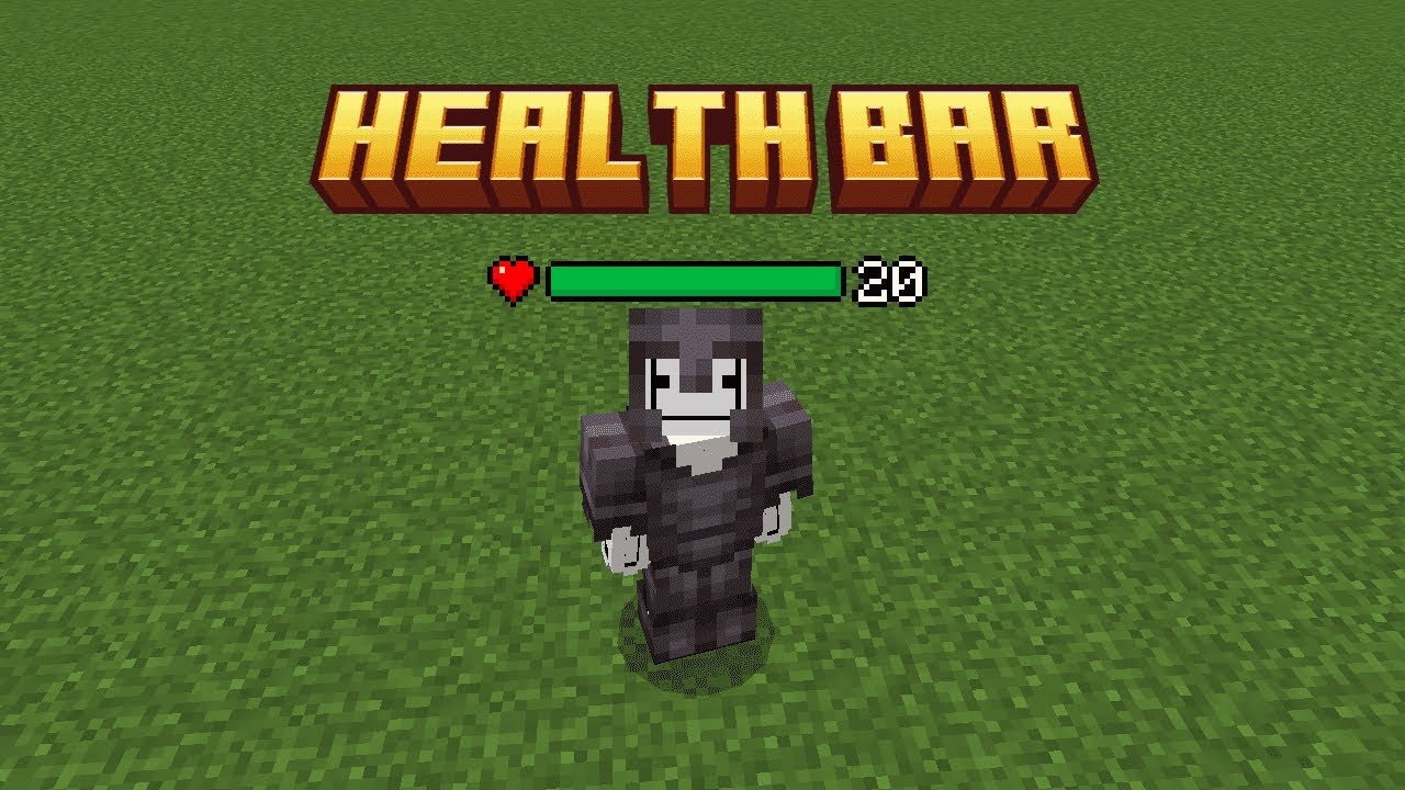
The Skeleton Executioner — (I’ve seen a smaller one — maybe it’s a bug? That’s probably why the design feels a bit off to me. The normal one looks good though.)

The Emerald Golem really needs a redesign.

Everwind has a lot of untapped potential underwater, especially since players constantly use boats at ground level. A deep-sea or aquatic update is a must — adding creatures that can destroy your boat while traveling between islands would make the boat crafting system more meaningful.

An underwater combat update is also essential, introducing aquatic enemies that can challenge players and prevent them from easily retrieving treasures from shipwrecks.
https://streamable.com/juysba

The Skeleton King should be seated on his throne, not lying awkwardly on the floor. The room should also be larger and filled with more enemies, and the Skeleton King should have a much bigger health bar.

I’m also a bit skeptical about enemies dropping coins — It would be better if coins were rare and could only be found in chests, large dungeons, or especially treasure chests — which is where the shipwreck and aquatic update could come into play.

In the future, please don’t make enemies or mobs drop them — it breaks immersion. This is also where armored enemy drops could come into play, adding more variety and depth to mob drops.

The game currently lacks a hunger system, even though it would make sense for it to be included.

https://streamable.com/u33240

Watch "NEED UNDERWATER UPDATE" on Streamable.

▶ Play video

Watch "Wrong axe animation" on Streamable.

▶ Play video
reef meteor
# reef meteor COHESIVE APPROACH! Items need a broken animation to make the gameplay feel more...

The UI is bad — there, I said it. Maybe some people are fine with it, but I’m not. It feels like they settled for less, even though the game has the potential to look so much better. It’s still a demo, not the final version, so the full release should be a visual treat for the eyes.

Don’t get me wrong — the current UI gets the job done, but it’s not visually appealing. God, it’s so barebones. It could be fleshed out so much more.

This is just an idea — feel free to innovate or change some things as you see fit.

2D HUD element with a fake 3D tilt — achieved using a simple 2D transform or slanted background graphic.

https://postimg.cc/TKKqGmkV
https://postimg.cc/F7B3Pz9K

Same goes for the TITLE SCREEN!
https://postimg.cc/hhhG2rhd

: slightly tilted, rather than perfectly flat on the screen.

: 3D rotation (CSS transform example) — in web terms, this would be like:

transform: perspective(500px) rotateY(15deg);

I think this wouldn't be to hard to implement in Everwind's UI, right?

Other UI ideas: that will give the interface a more thematic and stylized look — something that reflects Everwind’s magical world: https://postimg.cc/rddhh76J
https://postimg.cc/bDg3dP12
https://postimg.cc/GTBGrnQS
https://postimg.cc/crnwbZ6C
https://postimg.cc/30D4VCrN

INVENTORY
https://postimg.cc/gnFnrhkc

(Optional: a more cartoonish style could also work.) https://postimg.cc/PLRqHpRq

reef meteor
# reef meteor The UI is bad — there, I said it. Maybe some people are fine with it, but I’m no...

NOW, FOR THE HEALTH BAR UI!

The UI would be more immersive if it were transparent and floated above the enemy’s head, only appearing when they are hit. It should then fade out once the player moves beyond a 5-block radius or stops pursuing the enemy. The health bar should only reappear when the player is back within that 5-block range.

https://ibb.co/HpqzHh3B

https://share.google/koU7fl0XQYBU3BSdy

https://share.google/A5O4172aPnGcQq5qk

This is just a reference idea—developers can improvise—but, It would also be great to have an option to completely disable the health bar HUD for maximum immersion. I’m looking forward to seeing this improvement in the future.

This health bar is better transparent. https://ibb.co/bjxGq8X7

Other Health bar UI idea:
https://postimg.cc/DJ3wmk7f

sharp valley
#

🔥