#User Area Redesigned
1 messages · Page 1 of 1 (latest)

wait your name is very offset ?
i would guess if you have another theme it could set a margin or smth like that maybe ?
oh wait no is it just aligned to the right ?
how ?
[class^=avatarWrapper] /* Change the user box /
{
margin-right: 120px !important; / Useless /
margin-left: unset !important; / Useless /
padding-left: 4px !important; / Make it slightly bigger for consistency with the right side */
}
set margin-right to 120px
WA ?!?
wht
i mean i wouldn't have gone for that, but if it works for you
😂
maybe if you apply enough force on the right it push it to the left
and the hover thing look correct with that ?
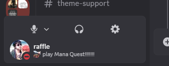
this thing

the white rectangle around it?
yeah it appear when you hover the name or the icons
it looks fine
i can send a ss for u to see
oh wait
just realised it doesnt show the full username

srry for quality
yeah the margin is breaking it
try to set margin right and margin left to 0px instead of unset
it looks like this again
anyways i have to go
probably due to another CSS thing editing one of the attributes
if you find a way to ubreak it tell me
yep it is
now i have to find which
looks really good. I have something similar, but instead of moving the buttons up, I slide them over to the right and move the settings button to cover the profile picture.
You can still open the user popout by clicking anywhere else in the User Area, but clicking on the icon itself now opens settings.
div[class^="avatarWrapper_"] {
  min-width: 150px;
}
div[class*="container_"] > div[class*="buttons_"] > button:last-child {
  right: 222px;
  opacity: 0;
}

nice
Interesting
Good idea too
Wonder how it would work with the additional game activity toggle button, cause i think space is still a bit too short there
||(so you make cool MC mods and also cool discord stuff)||
so like i’m confused on how to add this to my discord
this is my first time doing this specific thing and i’m not sure how to add this to my discord. so if someone can walk me through it it would be greatly appreciated :)
open quickcss and copy and paste the snippet in there

copy the snippet either in openasar theming or in Vencord Quick CSS
this is a plugin 🙂
?
@stone flame
click edit quickcss here, enable custom CSS and paste it in the window
or in openasar settings that you access by clicking the openasar text at the bottom of the settings, you go on theming, paste it, and restart


what is openasar
don't worry about that way then and use the quickcss method
it's a thing that can be installed alongside vencord (you have the option on the installer) that enhance discord perf and cleanness
oh yeah i remembeber seeing that in vencord installer now
wdym by this though
ouuu okok
thanks for the help ❤️
it's not enabled by default
it's an optional plugin that you installed that enable that quick menu and the other user might not have it
oh I didn't realize that was a plugin oops
but it is built into vencord. it isn't a third party one that I installed
yeah indeed, but still optional
this was made by ChatGPT but it still works great for me, if you have a long display name it might not be for you. this rearranges the display name and the status and puts a line between them.

/* Center the profile container and align items horizontally */
.avatarWrapper_b2ca13 {
    display: flex;             /* Use flexbox for alignment */
    align-items: center;       /* Vertically center items */
    justify-content: center;   /* Horizontally center items */
}

/* Ensure the avatar icon is displayed correctly */
.wrapper_c51b4e {
    margin-right: 6px;        /* Space between avatar and text */
}

/* Container for profile text with separator */
.nameTag_b2ca13 {
    display: flex;             /* Use flexbox for horizontal layout */
    align-items: center;       /* Vertically center text */
}

/* Profile text elements with a separator line between them */
.panelTitleContainer_b2ca13 {
    margin-right: 8px;         /* Space between title and separator */
    display: flex;             /* Ensure title container is a flexbox item */
    align-items: center;       /* Vertically center title text */
    font-size: 1.2em;          /* Increase the font size for title */
}

.panelSubtextContainer_b2ca13 {
    margin-left: 4px;          /* Space between separator and subtext */
    display: flex;             /* Ensure subtext container is a flexbox item */
    align-items: center;       /* Vertically center subtext text */
    font-size: 1.2em;          /* Increase the font size for subtext */
    max-width: 100%;           /* Ensure it doesn't exceed container width */
    overflow: hidden;          /* Hide overflow */
    text-overflow: ellipsis;   /* Add ellipsis for overflowing text */
    white-space: nowrap;       /* Prevent line breaks */
}

/* Separator line between text elements */
.panelTitleContainer_b2ca13::after {
    content: "";
    display: inline-block;
    width: 1px;                /* Width of the separator line */
    height: 20px;              /* Height of the separator line */
    background-color: #454545; /* Match the background color of the chat */
    margin-left: 10px;          /* Space between title and separator */
}
you can adjust the px-s for whatever fits your name/status length requirements :)
you should use a variable for this

maybe var(--background-modifier-accent)? (the color of seperators in the channel list)
not bad but a little bit more space between the bottom and a cenered avater and text will be the better and peak way
also it isnt line up with the server scroller

more space at the bottom can be done easily
centred avatar and text is not smth i wanted, bu i think it still stay simple to add
lining up with the discovery stuff is straight up impossible unless you scale down avatar + icons + text down
ythis works
because
wait couldnt you just change discovery height instead..?
hmm i think it'd be a bit too cramped with anything else and heightened discovery would look weird
nvm !!
I mean technically yes but it would suck
Rip
What a feedback
That happen

i see now, i'll fix
alr it's fixed, you can copy the new stuff and it should now work as intended !
sick i despaired when i saw it broke
don't worry
when i posts snippets, it's things i use that i will maintain for myself and by consequence, for others too
also i am on stable and slightly behind vencord, so i might or might not be slower to update
i updated it again to use nested CSS functionality
they broke it again 
It's a joke right... 

Welp guess i know what i'll do on my lunch break
Wait
Maybe they did just revert
:cope:
are you on canary ? cause i'm on stable and it's still working
here's what you need (only works on canary)
they flattened content again
[class^=panels] > [class^=container] /* User area redesign */
{
    height: unset !important; /* Height being dynamic is fine */
    align-items: unset !important; /* Don't need that */
    padding: 6px 8px !important; /* Let those boxes breathe */
    flex-direction: column-reverse !important; /* Instead of going one next to the other, go stacked */
    gap: 2px !important; /* Again let them breathe */
    > [class^=avatarWrapper] /* Change the user box */
    {
        margin-right: unset !important; /* Useless */
        margin-left: unset !important; /* Useless */
        padding-left: 4px !important; /* Make it slightly bigger for consistency with the right side */
        ~ [class^=flex] /* Change the quick settings */
        {
            justify-content: space-evenly !important; /* Let them breathe */
        }
    }
}
ignore, was bad
oh
the duplication is ugly, but it's the price of nested CSS
does this work on visual refresh
no idea, i hate visual refresh so i don't use it
it does thanks

alright i fixed it and made it work both on stable and canary
[class^=panels] > [class^=container] /* User area redesign */
{
    height: unset !important; /* Height being dynamic is fine */
    > [class^=content], &:not(:has(> [class^=content])) /* User area redesign */
    {
        align-items: unset !important; /* Don't need that */
        padding: 6px 8px !important; /* Let those boxes breathe */
        flex-direction: column-reverse !important; /* Instead of going one next to the other, go stacked */
        gap: 2px !important; /* Again let them breathe */
        > [class^=avatarWrapper] /* Change the user box */
        {
            margin-right: unset !important; /* Useless */
            margin-left: unset !important; /* Useless */
            padding-left: 4px !important; /* Make it slightly bigger for consistency with the right side */
            ~ [class^=flex] /* Change the quick settings */
            {
                justify-content: space-evenly !important; /* Let them breathe */
            }
        }
    }
}
like there's big empty space
wait what'
also since there is the space next to the name, it's not really useful
oh yeah
like i did this snippet cause without visual refresh, the name and status get cut off
oh
i mean you can use it if you like it, but imo it looks kinda bad
nah its ok
Works
Thank you
back to normal 🙏

i originally started using this so i could see my own status without it being cut off lol
personally i don't like the experiment that add the useless icon thing, you can turn it off
also ig maybe i could make the status like wrap around and make the shit bigger
i'll maybe look at that, no promises


updated snippet, misplaced game activity icon needs vencord update to fix
[class^=panels] > [class^=container] /* User area redesign */
{
    height: unset !important; /* Height being dynamic is fine */
    align-items: unset !important; /* Don't need that */
    padding: 6px 8px !important; /* Let those boxes breathe */
    flex-direction: column-reverse !important; /* Instead of going one next to the other, go stacked */
    gap: 2px !important; /* Again let them breathe */
    > [class^=avatarWrapper] /* Change the user box */
    {
        margin-right: unset !important; /* Useless */
        margin-left: unset !important; /* Useless */
        padding-left: 4px !important; /* Make it slightly bigger for consistency with the right side */
        + [class^=buttons] /* Change the quick settings */
        {
            justify-content: space-evenly !important; /* Let them breathe */
        }
    }
}
oooh they pushed it to live for me, didn't know it was an experiment
yeah
tysm!!
😭 Discord done broke again

i'll look into it tmr
does anyone have the most recent css snippet for radical status here?
like the full thing u put into the themes folder
thanks a lot! it's only a picture?
they mean ask in that channel
so we're past tmr
and i forgor
i'll do it now
it doesn't seem to be broken for me on any version
you have this version right ?
[class^=panels] > [class^=container] /* User area redesign */
{
    height: unset !important; /* Height being dynamic is fine */
    align-items: unset !important; /* Don't need that */
    padding: 6px 8px !important; /* Let those boxes breathe */
    flex-direction: column-reverse !important; /* Instead of going one next to the other, go stacked */
    gap: 2px !important; /* Again let them breathe */
    > [class^=avatarWrapper] /* Change the user box */
    {
        margin-right: unset !important; /* Useless */
        margin-left: unset !important; /* Useless */
        padding-left: 4px !important; /* Make it slightly bigger for consistency with the right side */
        + [class^=buttons] /* Change the quick settings */
        {
            justify-content: space-evenly !important; /* Let them breathe */
        }
    }
}
Yeah seems fine now...
Idk what happened then
what's funni is the snipper nearly work perfectly on Visual Refresh
Paired with mine, make a account panel perfect

using this one and it looks like this to me lmao
yeah
i'm maybe gonna slightly edit it on refresh at some point, but not now
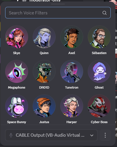
also what's the experiment to enable voice filters and stuff again ?
looks like this https://i.imgur.com/MwmbV5F.png
its alright, doesnt sound too bad actually
no idea how i have tho i just logged in one day and had it
2024-10_flamingo
you got a lucky snowflake
thanks i'll be able to make sure it looks fine with the arrow next to the mute
@tender smelt @pastel perch Is there currently a bug with the voice filter experiment? When I enable flamingo it shows the voice filter drop down however it then displays "something went wrong" "try again or restart discord" and it won't show any of the voice filters

Its API gated, enabling the experiment won’t actually give you access to the filters.
That's what I thought just wanted to confirm, thank you!
Im going insane

Lmao
Alright i'll look at it and hope i can catch it
I can't look this whole morning, but this afternoon for sure it won't have changed
I swear to God you’re gonna look at the file and everything’s gonna be perfectly fine
...
how'd you guess ?

do you have specific experiments flags or smth enabled ?
can you send me the panels element like this ?
Honestly idk
Im not at my computer rn
I’ll look later
Also discord just hates me soo thats prolly it
this is on canary btw
Bruh I main canary
i think what worked for me was just disabling and reenabling 😭
this is currently my layout btw

broken again, will fix
is it broken again? its not working for me
it should still be working, but if you are on an outdated Vencord version, stuff like game activity toggle can be missing

i just updated vencord and its still broken

there are no updates and i even just tried to reinstall it with a new installer from their site and its still broken
yeah same here it just looks like this
Are you guys on stable or canary ?
Same, I'm on stable
ive noticed discord updating some of their icons and UI stuff and idk if its out for everyone maybe it just hasnt updated for you yet?
stuff like this and other shit

thats prob why

it's been a very long time i didn't update
i'm gonna make it a new snippet probably
It’s been working for me. Just fine until now.
well discord does a lot of changes
Ik
i'll probably split the part of special 2 bar design with the part where the more global user area is edited so it's inside of the channel stack
I like the idea
wait i know why it broke
my god
they played with it YET AGAIN
at least i have a diff screenshot so finding out the values should be easy enough

wait they just renamed avatarWrapper into accountPopoutButtonWrapper
WHY
so yeah
s/avatarWrapper/accountPopoutButtonWrapper/