#🎨-theme-development
1 messages · Page 62 of 1
why specify .visual-refresh?
which came first, the themedev or the theme?
figured you'd know since.. well
nesting seems to be your specialty
i took my own jab at it
/* Button hub on the chatbar */
.buttons__74017{
    > div:has( > button), /* Vencord buttons */
    > div:has( > .button__74017), /* Most discord buttons */
    > .button__74017, /* Special treatment 3:< for the gift button */
    > .channelAppLauncher_e6e74f /* Special treatment 3:< for the game launcher button */ {
        transform: scale(1.5); /* Change scale here */
    }
}

the theme ofc
God set background-color: white; and said "let there be light"
very wise
also- does anybody know how to do.. none of this? i just want a shadow that also affects the inside but have to emulate it apparently

This will take your performance and throw it in the garbage bin with those :has()
i dont believe so, there's only 2 of them and they're direct
yea i asked chatgpt and it says its fine
I asked my potato pc and it bluescreened
Didn't quite get what you want
uhhh
i feel like the duplicated shadows are weird
and how- i cant make box shadows affect the inside
box-shadows are applied externally
ya that's the issue
can i do that like- except not only external
i want like a little
blurry splat in the background
add inset to the shadow attributes
ive heard you can use inset box shadow but like- then that makes the stacking problem worse

^i no no wanna
Why are you stacking that many shadows?
bc one isnt cutting it
Increase the strength then (?)
Open devtools, go to the box-shadow property and mess around with the quick editor until you get what you like
sis what the hell 😭
Or you can just
Use a 2nd one with larger blur and less/more opacity
Depending on the opacity you gave to the first one
it's fully black
Tell us more, church of CSS preacher
how is that any different than just duping it again
It'll take up more space and the difference between shadow and no shadow will be less obvious
by increase the strength I thought you implied there's a strength arg
I don't want that lmao
I just want the actual shadow part to be darker
I believe you’d do that through the colour
the color is already opaque though
100% black 0% transparent
Idk then, I'd have to check on pc later
😭
Can't get my head around it on mobile rn
He also set background-color: black; and said "fuck light theme users lmao"

Technically there is
It's the 3rd specified value you set
that's blur
Which is the blur radius
He truly blessed those with oled
The smaller the number, the stronger the shadow
But it also makes the shadow smaller
Because it's less spread out
that's not what i wanted though 😭
You just said you wanted a darker shadow wdym
this is like going to a resteraunt, asking for fries, and you handing me a box of pickles
I’m going to say that you ordered something that sounds like pickles here
I want to reduce the stacking but keep the look the same
reply to the message
Here you asked how to get an inner shadow
Here too
Idk what you meant with this
I had 2 issues, you were addressing one of them, and now you're going back to the one you ignored claiming that's not what I asked for
i asked for fries and a drink, you handed me a box of pickles and when I said that's not what I wanted you pointed at the transcript of me saying I wanted a drink
We did talk about stacking shadows, but I didn't get you wanted to reduce them
My bad
Short answer then is "I don't think you can"
like uhh-
like text shadow except in the background of transparent elements
kind of like such

that's not very in the background but I mean like- including the background
no need for :has() shenanigans
.buttons__74017 {
  & > .expression-picker-chat-input-button, /*pretty much any button*/
  & > div[aria-disabled="false"], /*gifts*/
  & > .channelAppLauncher_e6e74f { /*the name says it all*/
    transform: scale(1.5); /*edit size*/
  }
}```you don't need & for those
I didn't use expression picker chat input button because it's exclusive to the expression picker buttons
guess 2 wrongs does make a right
just bc vencord uses it doesn't mean they should

fair enough
and I also avoided aria stuff bc I've been told it's also volatile
aria-labels are
since they change with languages
aria states are a bit more resilient
and it's the only thing affected by that selector anyway so
it's also specific enough to work
yea other than that it works
and to be fair
you could also just
.buttons__74017 {
  & > div { /*lmao*/
    transform: scale(1.5); /*edit size*/
  }
}```
mhm
add some more unnecessary nesting
not enough
I can't with such simple snippets smh
/* VC tweaks */
.list_c3cd7d {
  /* fix ugly spacing */
  padding: 0 10px 10px;

  & > .draggable__55bab > .voiceUser__07f91 {
    &:hover {
      /* only show "options" button on hover */
      .content__07f91 > .icons__07f91 {
        display: none;
      }
    }

    & > .content__07f91 {
      padding: 4px 8px;

      /* hide clan tag */
      & > .container__394db > .chipletParent__394db {
        display: none;
      }

      /* set "LIVE" as first */
      & > .icons__07f91 > .iconGroup__07f91 > .live_a7acae {
        order: -1;
      }
    }
  }
}```have some
at the very least wrap it .visual-refresh
lovely
.visual-refresh {
div {
.buttons__74017 {
  & > div { /*lmao*/
    transform: scale(1.5); /*edit size*/
  }}}} /*lmao*/
also atp
going back to this, I have no idea what you want to do
like genuinely lol
.buttons__74017 > div {
    transform: scale(1.5); /*edit size*/
}```adding a backdrop blur to a transparent element?
I don't want you to do anything lmao, I was asking if something like that exists
it's the behaviour of box shadow but it starts inside of the element
and doesn't clip the middle
let's say
for example the typing indicator
nevermind I won't make you struggle with thay
let's do the actual header element in the emoji menu from categories
not the point, I need some ideas on what to do with it
that's what I was doing when I asked
oh god
I just noticed something in that menu
what?
EW
oh yeah I thought I messed that up :3
you sure it's not your theme?
I don't have a theme for the emoji panel
also notice how the background of the categories is used to cover up the emojis when you scroll into another category
that's what I'm trying to fix with that actually
what theme do you use?
a personally tweaked version of nvhhr's actuallybasicbackground
it's the same in the roles menu
I'm currently working on a commit to naat which is basically the same thing, but it affects all elements
so .wrapper__14245
let me see
yeah you set its background to transparent
no
yes

the text component, okay
and you want to do
a box shadow on it that also affects the inside
and makes it look not ugly
set your wrapper to transparent and make it look okay
you can't do them separately because then the 2 shadows overlay eachother
I did
.wrapper__14245 {
  background-color: transparent;

  > .header__14245 {
    box-shadow: inset 0 0 20px 0 black;
  }
}```I did, nothing changed
oh yea cus your shadow is inset
yeah
the goal was to also have outset shadows
to make it look like the example I sketched up
.wrapper__14245 {
  background-color: transparent;
  overflow: visible;

  & > .header__14245 {
    border-radius: 8px;
    overflow: visible;
    background-color: white;
    border: solid 2px var(--background-mod-subtle);
    box-shadow:
      inset 0 0 20px 0 black,
      0 0 10px 0 white;
  }
}```and that's effectively my solution lmao
with overflow visible you can set border radius to an absurd amount
meaning less mismatching color
less noticible
nothing I was kinda curious if you could come up with something better
maybe
hm, this doesn't look too bad
add border: solid 2px var(--background-mod-subtle); to the header
hmm
the border in my example was to show the bounds of the element, I was moreso hoping to give it a faint background that fades out into nothing
basically strictly for accessibility
that indeed doesn't look awful
or, even better
.wrapper__14245 {
  background-color: transparent;
  overflow: visible;

  & > .header__14245 {
    border-radius: 8px;
    overflow: visible;
    background-color: white;
    border: solid 2px var(--background-mod-subtle);
    box-shadow:
      inset 0 0 20px 0 black,
      0 0 10px 0 white;

    & > .headerLabel__14245 {
      text-shadow: 0 0 5px black;
    }
  }
}```
kind of seems like it'd be distracting a little tho
depends, it's more of a neon-ish design for sure
mhm
I like it
would be cool if you could make a custom like- led like stripe with borders

you could make a pseudo element and have a dotted border
erm
it wouldn't be hard
did you know that you can already do dotted borders?
then why have it on a pseudo
to overlay it over the uhh
solid border
then you can set the opacity down or apply a blur filter to make it seem like there's individual LEDs on the strip
that sounds cool I wanna do that now
I think I'm satisfied with this final version
i would add a bit of padding on the right, otherwise pretty good
not exactly fries tho
Anybody know the new container for the chat box?:
/* Aligned Chat Box and Typing indicator */
.container_c48ade {
  --custom-chat-input-margin-bottom: 22px;
}```
no longer appears to workGlowy permission buttons for anyone who wants it, i would post in css snippets but i dont have the role(made a submission 2 days ago)
/* Permission buttons */
/* Base button*/
.item__344e6 {
    background-color: var(--overlay-background);
    /* Selected variant*/
    &.selected__344e6 {
        &.deny__344e6
        {box-shadow: var(--status-danger) 0 0 10px;}
        &.passthrough__344e6 {
            background-color: var(--darker-overlay-background);
            border: solid rgba(255, 255, 255, 0.1) 1px;
            box-shadow: rgba(255, 255, 255, 0.3) 0 0 10px;
        }
        &.allow__344e6
        {box-shadow: var(--status-positive) 0 0 10px;}
    }
}

what version of discord are you on?
Ah nevermind it's way more then that CSS
stable 443854 (94a5adb) Host 0.0.109 x64 Build Override: N/A Linux 64-bit (6.1.0-39-amd64)
what's the full snippet?
I just have this empty space in my chat box and it's annoying
/* Aligned Chat Box and Typing indicator */
.container_c48ade {
  --custom-chat-input-margin-bottom: 22px;
}
:root {
  --custom-channel-textarea-text-area-height: 42px;
}
.visual-refresh .base_b88801 {
  font-size: 13.5px;
  height: 22px;
  display: flex !important;
  align-items: center !important;
}```
what's the intended look?
you could remove the entire snippet if it doesnt matter to you what it does
Ah hmm all the snippet does is move the buttons and text up within the text box...
this is what it looks like without it

mhm
Probably remnents from when I was using this quickCSS on my 5:4 monitor...

I think it's probably just fine without the snippet and my brain didn't realize it was broken looking when it isn't squished on a 5:4 aspect ratio monitor
lol okay
Though the other broken CSS I have is the activity showing up again:
/*Remove Activity from server list*/
[class*='membersGroup']:has([role=button]),
[class*='member'] [class*='container']:has([class*='badges']) {
  display: none;
}```what is this one supposed to do?
this is awful for performance
It's not too bad from my experience, but it's supposed to get rid of the activity showing up
it used to work but now it only hides the members and not the activity itself

It's only in small servers
Only collapse it as far as I know
It's this if that helps

h3.container__13cf1{display: none;}
That hides all the roles on the member list
okay can you expand that and take another screenshot?


i actually have a server older than me running a couple minecraft servers
i recommend
okay i see
h3.container__13cf1:has( > .headerContainer__095fe) {display: none;}
nope
there you go
my bad
that appears to do nothing
hmm
you sure you coppied the updated one?
Yup
Sure
stream?
I don't have permission in this channel
@pure cairn i think this is what would help achieve what i meant https://developer.mozilla.org/en-US/docs/Web/CSS/gradient/radial-gradient
MDN Web Docs
The radial-gradient() CSS function creates an image consisting of a progressive transition between two or more colors that radiate from an origin. Its shape may be a circle or an ellipse. The function's result is an object of the <gradient> data type, which is a special kind of <image>.
just found it

that looks pretty good i think

will probably not use it though
.header__14245 {
    position: relative;
    &::before {
        content: "";
        position: absolute;
        inset: -100%;
        z-index: -1;
        background: radial-gradient(ellipse closest-side at center, rgba(0, 0, 0, 0.7), transparent 50%);
    }
}
it acts weird
hooolyyy crap that looks amazing

sorry the i cant screeenshot rn but is anyone able to help me with changing the text color that is shown when you hover over a server? (also with over texts like Show All or any pop up text)
tooltips?
I think
/* Apply tooltip color param */
.tooltip__382e7, .tooltipContent__4e35b > .defaultColor__4bd52, .guildNameText_b1f768 {
    color: yellow !important;
}
actually give me a second
that should cut it

@vagrant path
it changes all tooltip text tho

there we go
do you want it to only affect the server bar?
uhh
i did want it to change everything but i think it only changes the server bar actually
cus when you hover over the discord icon
it didnt change

ya
the earlier one didnt affect actual servers, only server folders and user profile tooltip texts
the thing i sent should affect like- everything

the what
oh help
hold on
now im confused because no matter which one you copied that one should be affected
try setting it as important
^
nah it didnt work

that's wierd..
you said you cant screenshot, could you screenshare?
it is that also not possible
no i could screenshot it was just when i did it stopped hovering over the server so i couldnt show you
oh
what do you need me to screenshot?
i would guide you through to access the tooltip
you need to enable the f8break plugin
then when you enable devtools it would let you press f8 on discord and stop js
then you could find the tooltip inside of the layer container
find the text element and see what's overriding the color
@pure cairn ^
alr so i have dev tools on and i installed the plugin but f8 aint doing anything
do you have discord in focus?
click on the top bar and try f8 again
i dont believe so, i think ven uses linux
@vagrant path did you figure it out?
sure
do i dm or just here
i dont believe it matters
i see what's wrong
is there two of the same thing???😭
yeaaa
your theme looks
uh
like it already has options for that
give me a sec
also what the hell
you do have- 2 configs and 2 theme imports
one doesnt even work lmao

XD
me
is there a reason to why themes never change the user profile? every theme ive used so far change everything except for the user profile making it look abhorent, is it bc of smth or its just like that
im not sure, i suppose its because there was recently a change to them?
im p sure there's some snippets people have done
someone has made theirs look like an envelope
does it rlly change much abt em tho
laziness + fuck profile modals v2 AUUUGGGHHH I WANTY TO FUCKING KILL IT WITH HAMMERS
ok fair
anyway how do i add a panel label to the user profile like the ones on system 24
like dis

recent change & there's a separate (old) profile modal for bots, which I personally do not want to do
whar
whyd there be a separate profile modal for bots
¯_(ツ)_/¯
fckin claude is so sigma he got an entire modal for himself
bots still retain discrims, so go ask discord
whats a discrim now
username#0000
^^^^^^^ discrim
so like
soace
space*
or whar
or u mean the numbers

yeah

what?
you're right wth


any1 know what the notification number color is called:)))
yeah bots are always behind on profile changes
--status-danger
but its used for a bunch of stuff, i dont recommend changing that on its own
ty
if you want to change ping color uh
it just looks like theres a few things that are black like the notification, and the NEW text above your text
.numberBadge__2b1f5 {
  background-color: yellow !important;
}
see that idk
dehydrated peeng indicator

😭 ty
yo whats that theme
emm,,
realistically you can get that look with anything
im too lazy icl
uhh im working on a pr for not another anime theme, its the theme i have applied rn
il send it to you if you promise to msg about any part that i forgot to fix :3
alr alr!!
is there a way to like add html to discord
i wanna add a small panel for ascii art below user profile but idk how to do it without making a div
::after or ::before pseudoelements, can't make stuff that's too complicated tho
otherwise you'll have to make a plugin if you end up having to add actual elements to the HTML tree
whats a pseudoelement
MDN Web Docs
A CSS pseudo-element is a keyword added to a selector that lets you style a specific part of the selected element(s).
check the ::before and ::after sections
So like
It adds html to a class?
no, it adds a fake children element that depends on the parent
if you open someone's profile and see the bubbles in their status element, the small circles are made with pseudo elements
and rely on the bigger one which contains the actual status
that's the easiest way I can explain it
so uh
turns out the pop ups and the user profiles in dms are the same class and changing one changes the other, is there a way to like only change one
I remember having a selector for that somewhere, hold on
which one do you want to change?
.content_f75fb0 .outer_c0bea0:not(:is(.custom-user-profile-theme)), /*dms profiles*/
.content_f75fb0 .outer_c0bea0:is(.custom-user-profile-theme) /*regular popouts*/```the one in dms
so do i just replace that one instead of the .outer_c0bea0

oh it works yippee
theres a problem it doesnt apply at all to profiles with gradients
i could just about understand basic css, what u just said sounds like a made up language to me
Real
omg fres hater its a honour to meet you
Thanks you ❤️
Oh right, I forgot I made it just so that non-nitro profiles had their backgrounds transparent
I'll send a working version in a bit
As if any programming language wasn't made up in the first place

MOO
MOo
[[ anything in here happens "current" number of times ]]
moo
That's amazing
aside[aria-labelledby^="user-profile-sidebar-heading-"] > .outer_c0bea0
will work with all languages btw, it's not a regular aria-label
Obviously, aria-labelledby is not aria-label
Ty

Also how do i use them i cant get em working at all
For ::before and ::after pseudo elements to work properly, you have to specify
- the content, which is usually just left empty with
""if you only want to add an image/coloured background, otherwise the text goes here - a position, which can be
absoluteorrelative - left/top/right/bottom values to adjust its position (most useful when the position is absolute)
and I guess width and height values too, I don't remember if they get inherited from the parent element
if you set top right bottom left values, you don't need to set height and width when you are using position absolute
Whar
So i can only add text in the content
Correct
no, you can add much more than just text
MDN Web Docs
The content CSS property replaces content with a generated value. It can be used to define what is rendered inside an element or pseudo-element. For elements, the content property specifies whether the element renders normally (normal or none) or is replaced with an image (and associated "alt" text). For pseudo-elements and margin boxes, content...
/* Keywords that cannot be combined with other values */
content: normal;
content: none;

/* <content-replacement>: <image> values */
content: url("http://www.example.com/test.png");
content: linear-gradient(#e66465, #9198e5);
content: image-set("image1x.png" 1x, "image2x.png" 2x);

/* speech output: alternative text after a "/"  */
content: url("../img/test.png") / "This is the alt text";

/* <string> value */
content: "unparsed text";

/* <counter> values, optionally with <list-style-type> */
content: counter(chapter_counter);
content: counter(chapter_counter, upper-roman);
content: counters(section_counter, ".");
content: counters(section_counter, ".", decimal-leading-zero);

/* attr() value linked to the HTML attribute value */
content: attr(href);

/* <quote> values */
content: open-quote;
content: close-quote;
content: no-open-quote;
content: no-close-quote;

/* <content-list>: a list of content values.
Several values can be used simultaneously */
content: "prefix" url("http://www.example.com/test.png");
content: "prefix" url("/img/test.png") "suffix" / "Alt text";
content: open-quote counter(chapter_counter);
Dont scare me
what exactly do you want
Money preferably
SAME
Anyway like idk to just put an image
content: url("path/to/image")
For an image you can use both content and background
Ok
maybe, but it wont work if you want position relative
how do i add a border to the pseudoelement

it simply doesnt work
for some reason adding css to the pseudoelement changes the view full profile
uh same way as you normally do
have you tried
border: solid 1px white;


Your height is set to 0
yeah i set that cuz before when i changed it it would change the button for some reason
i would just do inset: 0;
instead of height settings and stuff
works great
    position: relative;
    &::before {
        content: "";
        position: absolute;
        inset: 0;
    }
Scary
how do i apply the gradients of a profile to smth
--profile-gradient-primary-color and --profile-gradient-secondary-color works but its not the exact same colors
hmmmmmmmmmm

why can't i fix it
no matter what i do it keeps pushing up whenever one of the bars on top are present
they are inviting you to use :has 
idk, tried absolute, didn't work
a fixed position works but it completely launches the indicator at the top corner
actually... i am pretty sure using :has is the only way to fix it
i'll just use :has for now, maybe someone else will find an actual solution for it cuz i give up
i was wondering whether you can use a flex box with flex set to column reverse on the parent element
@crimson skiff im gonna create a css snippet which makes the new ui even worser
have fun
Thanks
np
i tried something similar to this, couldn't get it to work
like what
what are you trying to do
make the gradients carry over to the lil panel i made below

bc otherwise it looks stinky
hmm.. meow eow meow
sorry
uh
you should send me the css snippet
oh shi lemme try that
this abomination

what thingy
is it something ike a notes box for every user profile?
or do you want to give it to a specific persson
the- huh interesting
no its just i wanted to put ascii art in there bc pretty but lowk didnt find any so js decided to write some text there
not related to the profile itself
ya
peculiar
okay
@spring pewter

i did something like this
.inner_c0bea0 {
    &::after {
        content: "Cat ascii goes here";
        inset: 0;
        height: 100px;
        color: white;
        margin: 10px;
        margin-top: 0px;
        background: gray;
        border-radius: 30px;
        text-align: center;
    }
}
and to make background colors okay you just uh
actually let me test that
gray seems to work okay in most places

lowk thought this was mobile
.?
vro i dont just want a fitting color i want the gradient from the profile carry over to the box
i dont understand exactly what your uh- intended look is- it cant just continue because thats the end of the gradient
unless you want to- figure out what the gradient would look like if it continued going

the reason i did it like that is bc the gradient goes from one color to another, if you want it to continue you need a magic third color
the gradient would just repeat
uh- color mixing i guess
first pic is gradient on the server list popout second in the dms


wats color mixing
uhh color-mix(colorspace, color percentage, color)
thats weird, i dont think thats default discord behaviour
oh- it uh
is
:3
it is
always been
annoying
i think i figured it out


i just- coppied the values from the inner profile and put them into the pseudoelement

can u show which
couldn't you just use the vars for it
il send you the snippet after
yap = explode
vars are localized, the vars nessesary are located inside of the inner profile element
so to fix that you just recalculate those on the pseudoelement
.outer_c0bea0::after {
    --profile-gradient-start:  color-mix(in oklab, var(--profile-gradient-overlay-color) 100%, var(--profile-gradient-primary-color));
    --profile-gradient-end:  color-mix(in oklab, var(--profile-gradient-overlay-color) 100%, var(--profile-gradient-secondary-color));

    content: "Cat ascii goes here";
    inset: 0;
    height: 100px;
    color: white;
    margin: 1px;
    margin-top: 5px;
    background: linear-gradient(var(--profile-gradient-start), var(--profile-gradient-start) var(--custom-user-profile-banner-height), var(--profile-gradient-end));
    border-radius: 25px;
    text-align: center;
}
uhhh dms are still broken because of the margins and the border radius
but in your theme you dont have those so you could just remove them
doesnt work
im very confused

hmm
- have you tried it without your theme
ohhh that might be my fault
i havent tried it without my theme
im making it for system24 tho
- have you disabled your ascii
i wanna make it fit
im not suggesting you dont use your theme im just testing
if it works without you can make it work with
still works.. kind of


seems fine for me
yeah my school computer is not enjoying this
i guess thats my fault
BAHAHAHAH
WHY R U USING VENCORD ON UR SCHOOL COMPUTER
my computer brok :<
😭
also its working literally just fine lmao


actually im running vesktop locally
all on my usb
ah
- my school doesnt have bad per-user security
it has bad security in general but thats besides the point uwu
they forgot to enable the execution policy for usb drives, thats how im able to do this in the first place
uhhh- i read "drive 55% usage" and im like- ah my usb is being slow but no- its the built in drive, lovely

91 cpu
insane
yep
unironically

back on topic, @spring pewter it worked just fine, are you sure you did it right?
idk
i js copied those and pasted em
i lowk already deleted what i pasted
i js put it at the top
above content
you're on your own im sorry-
i sent you a snippet and you said it doesnt work, i test it and it works fine, turns out you didnt even use my snippet but spliced your theme to include some elements of mine and told me it doesnt work
pain
cuz ur snippet was like different and to every profile unlike mine
so i just took the gradients
could have mentioned that
mb

so was yur intention to just change the sidebar?
the panel is only in the dms
what panel?
the asciiiiii
😭
man
actually i think the bigger issue is that im not sure if you can put line breaks in content
oh fuck
youre right
nevmrind
how

what
content: "new\aline";
what


what css are you using? I think newline has always been kinda buggy for me
.user-profile-sidebar::after {
    --profile-gradient-start:  color-mix(in oklab, var(--profile-gradient-overlay-color) 100%, var(--profile-gradient-primary-color));
    --profile-gradient-end:  color-mix(in oklab, var(--profile-gradient-overlay-color) 100%, var(--profile-gradient-secondary-color));

    content:
"                       (`.-,')\a"
"                    .-'     ; \a"
"                _.-'   , `,-  \a"
"          _ _.-'     .'  /._  \a"
"        .' `  _.-.  /  ,'._;) \a"
"       (       .  )-| (       \a"
"        )`,_ ,'_,'  \\_;)      \a"
"('_  _,'.'  (___,))           \a"
" `-:;.-'                      \a";
    white-space: pre;
    inset: 0;
    padding: 20px;
    color: white;
    background: linear-gradient(var(--profile-gradient-start), var(--profile-gradient-start) var(--custom-user-profile-banner-height), var(--profile-gradient-end));
    text-align: center;
}
you need white-space: pre;
uh watch out for any \ characters
ah lol
you need to do \\\a if you want to do \(newline)
yeah
the more you know
that's how backslash normally works
@spring pewter should work for you
idk why newline in css is \a though
il try later
\n isn't just windows though
yeah it works in most enviorments
but \r\n is like- more specifically macos and linux i believe other way
either this friday or this thursday
historically at least
I thought \n did both now though
\r is carriage return
like a typewriter
nevermind i was totally wrong
kind of?
\n is indeed newline
but on windows i believe its \r\n
crlf vs lf
too confusing it doesnt rly matter
i mean when i use python, \n just goes to the new line, and \r goes to the start of the current line
yeah
I think historically, you had to do both, but now \n just does both
oh wait maybe windows uses \r\n
just most of the time it's taken care of for you
but on the typewriter, \r moves the carriage to the beginning of the line, and \n moves the paper up so you're on a new line
are there any existing css snippets to remove the new user leaf entirely?
easy enough
[class="newMemberBadge_f80704"]{display: none;}
why are you using attribute selector if you're using the whole class name
you can just do .newMemberBadge_f80704
easier to type, and should be more efficient too
more stable too
even if they add another class to the element its going to break that selector
.newMemberBadge_f80704{display: none;}
have to keep everyone who uses a typewriter for modern operating systems in mind MenheraPray

yeah that too
i thought maintaining discordrn themes was a pain, desktop isnt any better  my theme is half broken
is there any color text plugins?

.chatGradientBase__36d07 { display: none; }
thank you so much
I have a better one that makes the typing indicator easier to read
/* Chat gradient */
.chatGradientBase__36d07 { display: none; }

/* Temporary probably, fixes discord bottom aligned chat experiment */
.align-chat-input .scrollerSpacer__36d07 {
    height: 30px;
}

/* Make typing dots have text shadow */
.typingDots_b88801 {
    /* For performance and unique name reasons */ --catmeowshadow: 0 0 30px black, 0 0 10px black, 0 0 10px black;
    overflow: visible !important;
    /* The people text*/
    .text_b88801 {
        overflow: visible !important;
        text-shadow: var(--catmeowshadow), var(--catmeowshadow);
    }

    /* the Actual typing dots */
    .dots__5ad89 {
        background: rgba(0, 0, 0, 0.65);
        box-shadow: var(--catmeowshadow);
        border-radius: 100%;
        overflow: visible;
    }
}
I would make it more stable but idh access to a PC at this moment
whats bad abt the current typing indicator
uhh if you scroll up, profile pictures and text gets in the way pretty easily
that's just my way of making it look not as ugly
nah

why isn't it working
    display: none;
}
div[class*="lineClamp1__4bd52 text-xs/medium_cf4812"] > p > span {
    display: flexbox !important;
}```I wanna hide the connected for text without hiding the numbers in the span

is the p the span's parent?
p:not(span) makes no sense
idk about the rest of it but that immediately caught my eye
so this experiment seems to have completely stopped working. Anyone got a fix?


yeah that too
.rtcConnectionStatus__06d62 p {
  font-size: 0;
  >span {
    font-size: 12px;
  }
}
I think the aligned chat bar experiment broke it
yes
it should be excluding the span and it kinda works
if you display: none the parent, the children will also be display: none'd
a p can't be a span, so the not is useless there
do this
yea seems like it. well too bad I've already almost finished making a janky fix xD

It's perfect TYSM
the folders are still misaligned but otherwise it looks fine so far. I wont be sharing my css because I have my entire theme in one file with 4k lines of jankiest css known to man
good enough™

briish server
cotton candy nitro theme if it was even more pretty
I may have committed crimes against the Geneva convention of css with this one

this snippet is a joke spoken in css
iirc an early version of visual refresh was actually like this
yeah, I'm trying to recreate it but it's really duct taped with hopes and dreams
i thought it was nicer
channel list feels less bloated
For now that's manually aligned, tomorrow I'll look for ways to have the buttons fit the row by themselves
can i see
hi im new are there any demon slayer themes by any chance?
see if you can find something on betterdiscord themes
they're compatible with vencord
if you cant just get a random theme with an image and change the background
its unlikely for stuff to be themed to niches, if you want something you usually have to make it yourself
best niche theme i know is probably "NieR: Automata - YoRHA-UI-BetterDiscord"
Wrong, the right question is "do I want to see"

I'll send the snippet when I get back home from work
i do want to see (:
i would not be against this
.content__99f8c {

  & > .containerWithMargin__0d0f9 {
    margin: 12px 8px;
  }

  & > li:not([class]) {
    width: 20%;

    & > .wrapper__2ea32 > .basicChannelRowLink__2ea32 > .content__65844 > .name__2ea32 {
      display: none;
    }

    &:nth-of-type(1) {
      position: absolute;
    }

    &:nth-of-type(2) {
      position: absolute;
      left: calc(48.2px*1);
    }

    &:nth-of-type(3) {
      position: absolute;
      left: calc(48.2px*2);
    }

    &:nth-of-type(4) {
      position: absolute;
      left: calc(48.2px*4);
    }
  }

  & > div:not([class], div:nth-of-type(1), div:nth-of-type(2)) {
    width: 20%;

  & > li:not([class]) > .wrapper__2ea32 > .basicChannelRowLink__2ea32 > .content__65844 > .name__2ea32 {
      display: none;
    }

    &:nth-of-type(4) {
      position: absolute;
      left: calc(48.2px*3);
    }
  }

  & > .sectionDivider__629e4 {
    margin-top: 55px;
  }
}```
there you goof course it only works properly when all 5 buttons are present for now
but now I want to try a less cursed version
okay, I've managed to make it better, still have to manually set the buttons amount tho which sucks
:root {
  --buttons-amount: 5
}
.scroller__629e4 > .content__99f8c {
  display: flex;
  flex-direction: row;
  flex-wrap: wrap;
  align-content: flex-start;

  & > .containerWithMargin__0d0f9 { /* boosts bar */
    margin: 12px 8px;
    width: 100%;
  }

  & > li:not([class]) {
    width: calc(100%/var(--buttons-amount));

    & > .wrapper__2ea32 > .basicChannelRowLink__2ea32 > .content__65844 > .name__2ea32 {
      display: none;
    }
  }

  & > div:not([class], div:nth-of-type(1), div:nth-of-type(2)) {
    width: calc(100%/var(--buttons-amount));

    & > li:not([class]) > .wrapper__2ea32 > .basicChannelRowLink__2ea32 > .content__65844 > .name__2ea32 {
      display: none;
    }
  }

  & > .sectionDivider__629e4 { /* divider */
    width: 100%;
    margin: 20px 15px;
  }

  & > .containerDefault__29444,
  & > .containerDefault_c69b6d,
  & > .container__5b40b { /* fix categories and channels */
    width: 100%;
  }
}```and yes, I did reinvent the channel scroller just for this
good
fucking
luck
afaik the only way to do this is like 10 :has or very bad use of + maybe
what the fuck
ooh i havent sent the gospel here
https://lyra.horse/blog/2025/08/you-dont-need-js/
my days as a warlord are mostly over, i now make nice, sensible themes
||(DO NOT LOOK AT GORD)||
good stuff
you were right
you could maybe use :has(>:nth-child(5)) { --button-amount: 5; }
and repeat for other amounts
you might need to do :has(>nth-child(4)):not(:has(>nth-child(5))
I'm sorry for my crimes against humanity please forgive me
what do you mean you can't autokey between a bunch of values?
what do you mean you can't store selectors?
that
while yes you could argue that's what CSS post processors are for I disagree fully
they're inconvenient for redistributing snippets
Is that even a thing
what the hell did I just read
Well I guess it is
you should be put in css jail
I'm not
they were talking about my complaints
Yop

I would also like to be able to add more than 2 pseudo elements to a single element
this is true
Imagine the amount of things you could do
you can
I think
there's other types of pseudo elements
Multiple ::before and ::after pseudos?
I don't think they're as flexible as before and after
no
Yeah I was mainly talking about these two
oh yeah I was gonna mention that but I fear that'll get very complicated
why did you say this?
was it about hue or something else
I want to be able to get the parent of a matched selector without doing :has(>{{SELECTOR}})
oh I've just seen you around
thought I'd say hi
you write good CSS and you seemed nice
is this included in my good css (:
huh
has is pretty expensive last I checked
too much and it's bad
it is
too little and it sucks
no
you need to season stuff
what does that even mean lol
Not necessarily
add some sprinkle of joy
instead of doing gross hacks
waiter waiter, too little expensive functions
Waiter, more rendering time please!
I feel like has is way slower in discord than other things
has can be fine when very targeted
if it happen on a single element, it can be less costly than a bad hack
has isn't related to rendering
it's only awful on discord, which is awful on its own already
ill still husk it though
tbh yeah discord is more the issue than has
#when csscord
a version of discord where css doesn't suck
nobody would use that 🙏
we got our solution
just commit to vesktop easy
I would use it on a daily basis
I do already do that, partially because I need to
but also because it's much better for CSS performance
as is
you think so
But I would have to swap to regular discord when I want to screenshare something
So I just
Cba to
yeah to target CSS devs as a demographic is weird
don't you want users to use it?
we should just all return to IRC
yes please
I use multiple :has in my theme, and it's not bad yet, but I don't do anything really specific with it, so maybe that's why
no, the default CSS would be better thus better perf thus everyone want to use it

having discord use 60% of my weak CPU is not nice
ohhhh csscord as in a CSS replacement to discords
I'm down
Could have it integrate ThemeAttributes (with extentions too) by default
Which would be nice
Simple as adding a status-related class to the body so that one can easily know if the user is in streamer mode
i disable rabbits, yes
I feel like it should be a plugin to just disable discord CSS
that way anyone could create themes for discord
yeah, and then write our own
inf perf profit
I feel like it would be too drastic
i have tried it once before
Maintenance wise too
you'd be doing that anyways, no?
Meh, kinda
I did rewrite the server channels scroller and somehow made it better while I was working on this latest snippet of mine so

this way it would just open the doors to more people and easier, to not have to contribute to vencord itself to work with it
Who would've thought that having it set to flex-direction: row, flex-wrap: wrap and setting the elements' width would be better than before
I hate scrollers
changing the background of any scroller to transparent makes discord re-render all of the elements inside it every frame
when you scroll
horrible for perf
Most optimised discord element
like, removes unseen elements and adds new ones ?
nop
it repaints all the elements every frame that you scroll
it's worse with smooth scrolling
kill smooth scrolling
what the hell
What's smooth scrolling?
an animation that tweens your scroller when a new scroll value is- uhh set
basically makes scrolling smoother
Gross
everything has it
I just disable it because I have a mouse with an unlocked mouse wheel
scroll like that
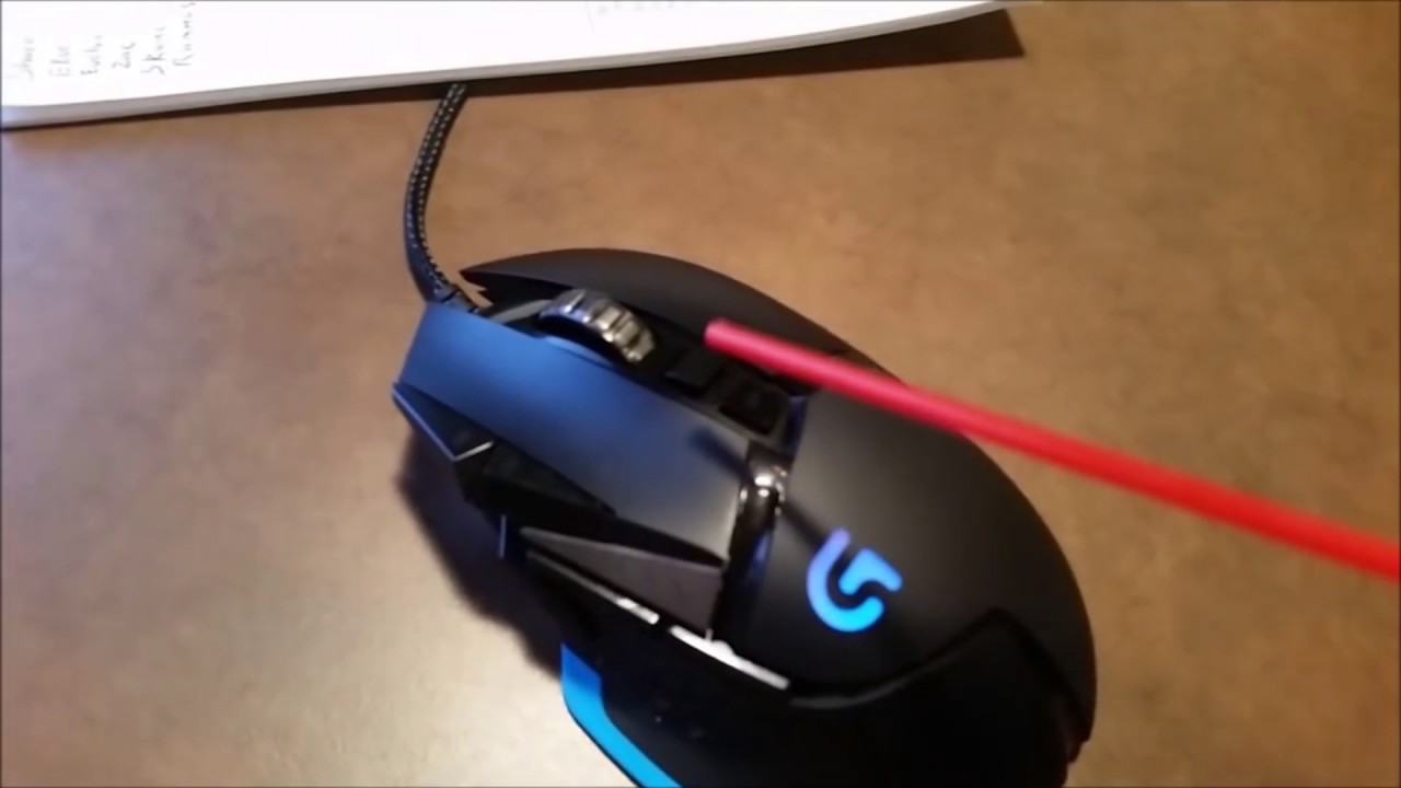
oh, like the g502's?
precisely
is it a good mouse?
I was planning on getting it for the tons of buttons on it (which I would regularly use)
it's okay

it does mouse things, it's unusual to any other mouse, might take time to get used to a little
it comes with weights if you like that
and it is a little heavy on its own
oh that's cool
yeah I also love the buttons on the face of the mouse
I use both for autoclicking
speaking of, ghub let's you set up macros for autoclicking using the mouse buttons
actually best unintentional feature ever
yeah one of my friends set theirs up to specifically under hypixels autoclicking detection speed
they're also enjoying it lmao
lmao
unfortunately you can't rebind scroll up and scroll down
that'd be amazing for autoclicking
with gswap, gswitch idfk you could switch to another profile and just spin the wheel at however fast you wanna click
that'd be amazing
if you need another mouse I recommend it, it's pretty good
why clicking when compressed air cans exist
https://youtu.be/aANF2OOVX40
Interstellar Docking Scene but instead of Matthew Mahogany it's some kid and instead of a space ship it's a gaming mouse
Music is; Hans Zimmer's No Time For Caution
Mouse video; https://youtu.be/dap5lEuS5uM
Give traffic to my other video if you like poorly constructed memes : https://www.youtube.com/watch?v=77fojojHezo
Join this : https://d...
will probably get it once this one breaks
oh yeah awful thing about vesktop, il never get it, why is it so awful for streaming
discord browser is like that
it was supposed to be better on Linux, how hard is it to make it okay on windows?
sadly
ahh damn it
no global keybinds yeah
how'd it go?
a classic
i need time
a lot of time