#WIP – Restyling Renewed Banking

1 messages · Page 1 of 1 (latest)

woeful quest
#

Hi everyone,

Working on a fresh restyle of renewed-banking, just doing it for fun and to give something back to the community. Planning to drop it for free once it’s done, but wanted to share some progress and get some early thoughts on the design.

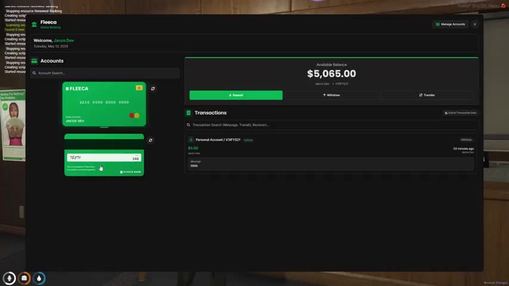
Here’s what I’ve done so far:
• Restyled UI using TailwindCSS
• Card system with flip animations and Font Awesome icons
• Platinum cards show when balance is over 50k (will be configurable)
• Still fixing some CSS stuff, not perfect yet
• Proper account creation & management fully in the UI (no more ox_lib menu stuff)

Planning to add:
• Category system for selecting account types (e.g. job, org, personal)
• Personal view isn’t there yet, working on structuring that in

Still very much WIP, but any feedback, ideas or even nitpicks are welcome! Appreciate all input while I wrap it up.

vapid rock
#

nice

polar barn
#

nice

woeful quest
# sour narwhal When You are launching it

Currently working on it, tomorrow I’m starting on the management options in the UI itself. Just using this post to drop updates as I go. I’ll post again when there’s more progress!

Once everything I’ve got planned is done, I’ll release it for free.

hoary crescent
# woeful quest Hi everyone, Working on a fresh restyle of renewed-banking, just doing it for f...

I would recommend a larger title top left. Perhaps a header of the bank name, and some under-title like "Welcome, FirstName Lastname.". Maybe also a header color of some sort? Either some green or just a lighter/darker of your content background color to divide them a bit.

The card menu could be more slimmed, there's a lot of empty space on each side of them.

For the selection on the right, I quite like a segmented control like this: https://v6.mantine.dev/core/segmented-control/.

A linear set of two or more segments

woeful quest
hoary crescent
woeful quest
hoary crescent
# woeful quest Hmm its hard to fill up Tho, Maybe make the overall panel. A little smaller ?

If I was designing this I would have the same issue of how to actually shrink that down. Maybe have something additional on the right side to take up some of the space which would natually shrink that main portion? I am not aware of the core functionality of the script so I got no clue if there's something you can add in there easily without adding new functionality or just adding nonsense.

If not, the design is still good. It was more of a "if you got nothing else to do", it would be nice to see it slimmed down.

#

A lot of sites with tons of content, like GitHub, would just leave a lot of whitespace on each side and center the content and fit it to a decent size. But I am not sure if that would look good in a non-full screen application like yours.

woeful quest
#

Thanks 🙂

hoary crescent
# woeful quest Thanks 🙂

Perhaps a small profile with a name, a total of your savings overall, maybe a 7d green/red trend of your economy? Could also be a few boxes with just charts of some data/trends, two or three would fill it up decently even if there would be some whitespace at the bottom. On the right. Just to try and make up some space.

hard crag
#

Cute

long jackal
#

Looks so good! 🔥🔥🔥

woeful quest
#
  • Changelog:
  • Ditched the OX_LIB menu entirely
  • Swapped in a clean custom NUI-based interface
  • Refined internal function management
  • Added support for account creation & renaming through the new UI
woeful quest
keen sail
#

damn

thorny nymph
#

nice broo

woeful quest
#
  • Changelog:
  • Hot reload, for management functions
  • Platinum Cards are now, configurable in config.lua.
  • Error/Succes messages correctly places.
  • Ditched OX_LIB Notifications
  • Cleaned up some code
woeful quest
#

way cleaner

#

@hoary crescent

hoary crescent
#

Looking good, just remove the box shadow that is created around the number.