#📂┇the-finals-wiki
1 messages · Page 8 of 1
 shell mauve
 heavy gale
there is a bit on the wiki that does say "The content of the wiki is subject to change as the game is not currently released, the current content is based off of the various playtests conducted throughout the last year."
shell mauve
I know, but shouldn’t it be one of the first things we see? 🙂
Anyway, food for thought!

 manic reef
could always just make it more obvious somehow
shell mauve
I mean really on top top
And disclaimer above it to clarify it is information regarding everything below and beyond it
shell mauve
 lone monolith
It's been at the top since I rewrote it
lone monolith
It's been at the top since I rewrote it
Sorry I didn’t see it.. it came up while I was working on something at work haha
But my point is still somewhat relevant, be it making me look a little less inventive haha
lone monolith
Considering the main point of the wiki is that it's a community effort, I feel like it's more important to establish what THE FINALS is, the goal of the wiki, and how to contribute, than to establish some of the content might be incorrect by release.

 vagrant compass
How about just highlighting that paragraph in italics so that it stands out more?
Kind of like wikipedia does 'warning this page is a stub'
So the first paragraph would serve as more of a header, and the second one would be highlighted as separate but notable
lone monolith
It's already in Italics 
vagrant compass
 Feel free to ignore me, this is your effort and I think it looks perfect as is. But I do think making both of these paragraphs stand out more would be a good compromise and ensure no one misses a thing
(It may just be my flair for dramatics though)
lone monolith
Sooo in the meantime while we wait for the wiki peeps, we've introduced a stop-gap solution to your eyes being burnt out from the light mode.


 dusty quail
heavy gale
but it's temporary until the wiki people do their thing
dusty quail
heavy gale
but it's temporary until the wiki people do their thing
there are wiki people?
 sweet locust
heavy gale
it has some problems
sweet locust
heavy gale
it has some problems
i call that more than a problem luke
its like a crime
heavy gale
it's better than a blinding white wiki
dusty quail
sweet locust
i might take the blinding white over this
Jag why are you here
lone monolith
 sweet locust
its scuttlecrab
sweet locust
i might just change it to jag 
heavy gale
happy now @sweet locust xD
 sweet locust
no
heavy gale
what you mean no?
dusty quail
heavy gale
what you mean no?
ignore him

forgot to remove this dropshadow
it definitely looks better without
 knotty rune
The COTHH page looks better now in Dark mode
sweet locust
i think its negative happiness
dusty quail
heavy gale
happy now <@318648517453283330> xD
that's brilliant
dusty quail
sweet locust
i think its negative happiness
actual troll
sweet locust
dusty quail
actual troll
killer fish stick from san diego
 sweet locust
 dusty quail
lone monolith
dusty quail
lone monolith
yessss
dusty quail
The sniper page is taking FOREVER to update
heavy gale
the image?
dusty quail
heavy gale
the image?
yeah
it's updated but the image file's page shows the old image
lone monolith
Is it loaded now
dusty quail
but when you click on it the one that opens up is the updated one
lone monolith
You named the image sniper infobox not sniper_infobox so it wasn't showing up
dusty quail
lone monolith
You named the image sniper infobox not sniper_infobox so it wasn't showing up
 lone monolith
Yeah
dusty quail
look the embed shows the right image
 heavy gale
the cache for the wiki is weird, if you upload an image and use the same syntax within the image even though it's the same image
it takes up to an hour to update
unless you edit the page
sweet locust
kyne just hit him with the 🤓
dusty quail
how do I refresh my browser again
sweet locust
f5
heavy gale
or ctrl + f5 a couple of times
lone monolith
btw I fixed all the redirects for the renamed weapons
So now it doesn't show redirected from Sawn Off when you click on the SH1900
heavy gale

knotty rune
@lone monolith not sure if it was on purpose, but the "...6 Embarkers on the 6th floor for 6 months..." is missing now
 lone monolith
knotty rune
<@456226577798135808> not sure if it was on purpose, but the "...6 Embarkers on ...
lone monolith
knotty rune
<@456226577798135808> not sure if it was on purpose, but the "...6 Embarkers on ...
I didn't feel like it fit with the intro now, but I have no clue where else to put it
Maybe the church of the holy hunters?
dusty quail
lone monolith
I didn't feel like it fit with the intro now, but I have no clue where else to p...
We'd need a page about the development of the game
right
lone monolith
I'm planning on moving it to a pre-release section along with the betas when the game comes out
sweet locust
i agree with kyne
dusty quail
a page talking about how the game was conceived, mentioning some of the devs, Embark's history, etc. and then about the development of THE FINALS as it went on
we'll have one eventually right
heavy gale
could just have a page for "Embark" which details all that
basically what fish said, yeah
knotty rune
lone monolith
Maybe the church of the holy hunters?
Not sure it fits there either. I agree with fish, a dedicated page for the development of the game would be cool, and that info would fit there
dusty quail
heavy gale
could just have a page for "Embark" which details all that
thefinals.wiki/wiki/Embark_Studios
sweet locust
i see fish volunteered to write that gl 🫡
dusty quail
sweet locust
i see fish volunteered to write that gl 🫡
we can all chip in
we only need the page done by, like, whenever the game releases
which could be tomorrow to be fair
sweet locust
sorry i left my water running bye fish
dusty quail
sweet locust
sorry i left my water running bye fish
that was me mb
knotty rune
@dusty quail if you want to write things on the wiki, you can catch up on the hunt section 😂
dusty quail
knotty rune
<@485406144903512084> if you want to write things on the wiki, you can catch up ...
😭
even I don't understand half the things people theorise in that chat
they've covered all of norse mythology and all of greek and roman too
knotty rune
We just need the TL;DR of the tiers on the wiki
dusty quail
all of the primordial beginning-of-the-world stuff as well
lone monolith
knotty rune
Not sure it fits there either. I agree with fish, a dedicated page for the devel...
I might be working on it rn

heavy gale
knotty rune
We just need the TL;DR of the tiers on the wiki
TL;DR: I still don't understand but it works 
dusty quail
lone monolith
I might be working on it rn
good luck!
Rockhound's vids have some good quotes
and so does the MTM
I remember my question was literally about how they conceived the idea for the virtual gameshow
@lone monolith can you tell me where I went wrong with the uploading before
sweet locust
u didnt add the _
dusty quail
what should I call it, and where do I call it that
dusty quail
sweet locust
u didnt add the _
in which part of the process tho, which page, the upload page, the image file page, or the Sniper page
sweet locust
all of the above
lone monolith

I think you renamed the image when you uploaded it from Sniper Infobox to Sniper_Infobox so the infobox wasn't working anymore
 lapis kindle
mm juicy dark mode. kudos Luke
lone monolith
Luke is actually the final boss of the Wiki
I'm the content guy, he's the guy crying because the CSS keeps breaking 
sweet locust
i just live here
heavy gale
lone monolith
Mama Mia, I never know edit mode actually allowed a visual view of the infobox properties, I just always edited the page source.
sweet locust
im sorry what
sweet locust
idk if i should be disappointed in luke or not
lapis kindle
you shouldn't. that's a back-end type of thing 
heavy gale
Also if anyone has any ideas of what else could be added to the weapons infobox
we can always add more properties
sweet locust
heavy gale
Also if anyone has any ideas of what else could be added to the weapons infobox
i dont think theirs anything else to add
knotty rune
heavy gale
we can always add more properties
reload time? 🤔
sweet locust
do we have that info
knotty rune
🤷🏻♂️
heavy gale
knotty rune
reload time? 🤔
could be useful
lapis kindle
we have the animation videos, but you'd have to count the seconds for all of them
lone monolith
Alright so in the meantime before we have more things to group it up with
Meet the newest member of Game Elements

 grave owl
Ooooo
lone monolith
And our youtube buddy has taken a hike up there and is now being filled in by telescope buddy
 heavy gale
promoted from construction to telescope egg
lone monolith
We love to see progress for our Namas
@dusty quail https://www.thefinals.wiki/wiki/Pre-Release
 compact talon
lone monolith
Meet the newest member of Game Elements
compact talon
lone monolith
Meet the newest member of Game Elements
MAN I SAW THIS AND THOUGHT IT WAS NEW MAPS
 sour laurel
aint gonna lie the black background is ugly on wiki
lone monolith
In the interest of not binding people
 dusty quail
 knotty rune
Red to match the colors of the game /j 😂

 lone monolith
Oh no
dusty quail
knotty rune
Red to match the colors of the game /j 😂
YES
I'm sorry but that looks TOO cool
also
 manic reef
lil stubby
lone monolith
Still working on the colors but here's what we got at the moment

 cobalt dust
lone monolith
I'm the content guy, he's the guy crying because the CSS keeps breaking <:kekCry...
cobalt dust
lone monolith
I'm the content guy, he's the guy crying because the CSS keeps breaking <:kekCry...
counter strike source?
sour laurel
Cascading Style Sheets 🤓
 signal remnant
lone monolith
Still working on the colors but here's what we got at the moment
signal remnant
lone monolith
Still working on the colors but here's what we got at the moment
No way kyne WWW
 clear lily
Any BAGUETTE 🥖 or CROISSANT 🥐 mele weapon leak?
 static light
wiki is looking mighty fine today 
 heavy gale
Kyne doing the cooking
lone monolith
@real stirrup https://www.thefinals.wiki/wiki/Playtests
Embark Studios has hosted a number of playtests for THE FINALS during the game's development. The main purpose of these playtests is to get feedback from players so that developers can stay on track and in touch with the community. These playtests also generate awareness for the game and the studio developing it, attracting more players and medi...
I'm gonna merge it with the pre-release section here in a bit
 real stirrup
coolio
lone monolith
static light
wiki is looking mighty fine today <:TFcoin:1013802567450501120>
I merged your playtest page into the pre-release page
 static light
lone monolith
I merged your playtest page into the pre-release page <:hug_friend:1040603889872...
static light
lone monolith
I merged your playtest page into the pre-release page <:hug_friend:1040603889872...
Very nice
lone monolith
@knotty rune The 6 Embarkers quote now has a rightful home again 
 knotty rune
lone monolith
<@359854181915426817> The 6 Embarkers quote now has a rightful home again <:Mate...
knotty rune
lone monolith
<@359854181915426817> The 6 Embarkers quote now has a rightful home again <:Mate...
Perfect! 💪🏻
knotty rune
lone monolith
<@359854181915426817> The 6 Embarkers quote now has a rightful home again <:Mate...
I see you've been working on the EE pages as well, thanks! 💪🏻
lone monolith
knotty rune
I see you've been working on the EE pages as well, thanks! 💪🏻
I've been cooking a lot today
I redid the teaser trailer EEs
 sweet locust
Can we make the text teal?
heavy gale
why?
sweet locust
I wanna see how it would look 
I wanna see how the teal would look instead of orange
heavy gale
oh you're talking about the links
sweet locust
Yeah
I would do it but I A, don't know how to do it and B, don't even know if I can do it
lone monolith
I don't even know how to do it
Luke just sends me a 600 line file to put into the wiki
 quartz salmon
Excuse me, guys, I was trying to reach out to someone on the chat, and nobody online could help. Does anyone know how well is this game optimized for multi-core/multi-threading? CPUs and Mobos are hella expensive where I live, and I was thinking about getting an upgrade to a Xeon E5 2690 V4.
lone monolith
What do you guys think of this reworked page? I wanna make sure we emphasize gameplay interactions between gadgets and the environment considering how important Dynamism is to the game.
dusty quail
lone monolith
What do you guys think of this reworked page? I wanna make sure we emphasize gam...
We definitely need this in the wiki
Even though there are a few gadgets which emit the same stuff, it can't hurt to have the same thing written on each of their pages
also the use cases might be different for each version of the gadget (mine, grenade, etc.)
 placid knot
Glad to see a wiki come to life was wondering about gun stats
shell mauve
lone monolith
What do you guys think of this reworked page? I wanna make sure we emphasize gam...
Great idea!
dusty quail
Oh by the way, random inquiry


Will it be tough to change the scrollbar into a custom one?
dusty quail
and would we have to wait until the 'reskin'
heavy gale
try now @dusty quail
dusty quail
heavy gale
try now <@485406144903512084>
Luke
where were you all this time
you legend
static light
forget waiting for the reskin, we can just make luke do it for us 😂
 vestal knot
lone monolith
Still working on the colors but here's what we got at the moment
vestal knot
lone monolith
Still working on the colors but here's what we got at the moment
I been adding to that forever
lone monolith
vestal knot
I been adding to that forever
It is appreciated 
vestal knot
lone monolith
It is appreciated <a:eggpet:1013887912233943130>
I have over 500 edits on there, My life has been corrupted 😢
vestal knot
sweet locust
no shot
I spent about 2 weeks just adding and writing details on it when the finals play test ended
I was obsessed, haven’t added to it for quite a while now
sweet locust
hmmmmmmmmmmmmmmm
vestal knot
Don’t believe it if you don’t want to but it’s true
lone monolith
What's your name on the wiki
sweet locust
ill believe it when you can tell me namatama's last name?
vestal knot
I used the guest account for a lot of my edits, I’ll have to get my google account name
lone monolith
We've had people editing the fandom wiki thinking it's ours 
vestal knot
Not signed in on my phone and I’m at the gym rn lol
vestal knot
lone monolith
We've had people editing the fandom wiki thinking it's ours <:sad_friend:1012381...
There’s 2 wikis?
lone monolith
Yes
sweet locust
ours is the official one
lone monolith

Welcome to THE FINALS Community Wiki! THE FINALS is a Free to Play, Live Service, first person shooter, developed by Embark Studios scheduled to release in 2023 for PC, and next-gen consoles. This is a collaborative effort that anyone is welcome to contribute to. Wikis like ours depend on readers getting involved and adding content. Click the "E...
This is the official one
vestal knot
I just have the link to whatever wiki was posted in here
Yea that one
I added this

In the comments on the main page
Not a lot of people add comments to pages, but they are like forums, very helpful
vestal knot
sweet locust
I'm sorry I believe u
I know you do, I’m just too cool to lie
sweet locust
Well that's not true
vestal knot
I’m jsut too cool to lie mostly
compact talon
vestal knot
Not signed in on my phone and I’m at the gym rn lol
GRIND
vestal knot
compact talon
GRIND
shoulders and lower back >:)
compact talon
goat. today is push for me
vestal knot
compact talon
goat. today is push for me
W
real stirrup
@lone monolith hey, do you know where the original of this image is from? Or do you have a copy of it?
 lone monolith
real stirrup
<@456226577798135808> hey, do you know where the original of this image is from?...
real stirrup
lone monolith
https://discord.com/channels/1008696016318513243/1118247079647662212/11185581964...
lone monolith
real stirrup
<@456226577798135808> hey, do you know where the original of this image is from?...
real stirrup
lone monolith
https://discord.com/channels/1008696016318513243/1118247079647662212/11185581964...
Thanks!!
lone monolith
Np
 final token
real stirrup
<@456226577798135808> hey, do you know where the original of this image is from?...
final token
real stirrup
<@456226577798135808> hey, do you know where the original of this image is from?...
The ones posted on Twitter are higher quality!

We're about to host the 1st episode of MEET THE MAKERS on Discord: a daily show during beta where we dive into different areas of THE FINALS. Today we're talking to level designer Midas and environment artist Joakim about locations, maps, and level design! https://t.co/BfMLKiOkDE
Likes
521
 Twitter
·
Twitter
·

More pixels
real stirrup
final token
The ones posted on Twitter are higher quality!
Ah, thanks. I’ve already used the other one - they should be fine
final token
Not sure why the ones posted here were so low res
manic reef
Wut
dusty quail
final token
Not sure why the ones posted here were so low res
compression, wrong version, idk
heavy gale
mediawiki has been updated to 1.39, one step closer to new skins wooo
mobile view is currently a bit borked but that's a future thing
 stiff dove

vagrant compass
heavy gale
if you find anything that is completely screwed up due to the 1.39 upgrade, please tell us

 quasi echo
 shell mauve

 heavy gale
there isn't a SC skin yet
vagrant compass
Do not be alarmed by the wiki being broken atm, it's being fought for valiantly
dusty quail
vagrant compass
Do not be alarmed by the wiki being broken atm, it's being fought for valiantly
👀
IS THIS IT?
 dusty quail
YESS
vagrant compass
It seems unborked now!
dusty quail
I wanna help
dusty quail
can we change the default
heavy gale
I'll see to that next week
dusty quail
heavy gale
I'll see to that next week
❤️ no rush
you're a legend, luke
yeah I reckon at some point we can aim for making it look visually distinct from the Star Citizen one
heavy gale
we can easily change the colours of the accent and background and text with like one variable which is neat
it's just the whole like main page will need redesiging to make it fit more as atm with the skin it's a bit clamped looking
we also need a logo for the wiki, maybe something like  with "wiki" under it....I don't know, I suck at logo design
dusty quail
heavy gale
we also need a logo for the wiki, maybe something like <:thefinals:1108025386081...
on it!
(just going to try something)
shell mauve
The fonts looks pretty good, so unless we can have Saira as an option
heavy gale
I tried Saira in the past, it doesn't look the best
shell mauve
I think the current fonts are looknig good
I think links should be yellow
and the rest is probably fine
vagrant compass
Noto Sans maybe
shell mauve
and probably fix this 😉
 vagrant compass
I believe that's the official font for asian languages
heavy gale
shell mauve
and probably fix this 😉
that's why we need a logo
shell mauve
I can't wait when we move on to localization.. so I can write ATTEND YOUR ENGLISH CLASSES for the Dutch one
dusty quail
heavy gale
that's why we need a logo
I made one
but I looked at it too long
now the word WIKI makes no sense to me
shell mauve
you made a logo? Kappa
dusty quail
I was literally gonna finish it off and post it
but I need to avoid looking at the word for 5 minutes
😭
shell mauve
isn't the logo in the media kit?
 heavy gale
not white
shell mauve
just need a solution for the light mode
lone monolith
It's red on here specifically because it works on both
dusty quail
anyway
I was just gonna say that
there are plenty of good fonts
and the only real reason I was gonna suggest changing it is for our wiki to be its own thing
shell mauve
I wouldn't mind seeing the Saira font (or Noto) for the titles/headers at the top of the page
but besides that I wouldn't change more than needed because it looks very refined already
dusty quail
sure, but there are no issues changing a font
lone monolith
Hello Yolks!
We've had a couple of wiki updates that we think you'll enjoy! First of all, we have a new default skin for the wiki. We'll be working on updating all the pages to look their best with the new skin. We'll also be working on the styling, so it feels like a slice of THE FINALS. Secondly, we have a Tabber. It'll make navigating the wiki significantly easier once we have it set up completely, (especially for you EE hunters.!).
Thank you for contributing to the wiki in the meantime, we've been working on this for a bit!
shell mauve
I beg to differ but I was only a graphic designer for 10 years hahahah
but experimenting can't hurt (I hope, I assume Luke knows how burdensome it can be)
knotty rune
The new skin looks really good! Thanks to everyone here working on the wiki! Kudos to everyone! 💪🏻

 lone monolith
knotty rune
The new skin looks really good! Thanks to everyone here working on the wiki! Kud...
lone monolith
knotty rune
The new skin looks really good! Thanks to everyone here working on the wiki! Kud...
THE FINALS
dusty quail
heavy gale
<:thefinals:1108025386081714196>
will use this colour
 knotty rune
lone monolith
https://www.thefinals.wiki/wiki/THE_FINALS_Easter_Egg_Hunt psst
knotty rune
lone monolith
https://www.thefinals.wiki/wiki/THE_FINALS_Easter_Egg_Hunt psst
WOOOOOOOW!!! The tabs look REALLY good!! AMAZING guys!! 💪🏻
heavy gale
sorry
knotty rune
I can't wait to see all the tiers there, it'll look SO good
dusty quail
heavy gale
sorry <:kekw:875083074956820540>
a bit strong right
 shell mauve
looks good!
lone monolith
knotty rune
I can't wait to see all the tiers there, it'll look SO good
Thinking of Seperating them out every 3 tiers
knotty rune
knotty rune
I can't wait to see all the tiers there, it'll look SO good
Hmmm, maybe having the tabs per level? There might end up being too many tabs in the future 😅
knotty rune
lone monolith
Thinking of Seperating them out every 3 tiers
Oh, that could work too
shell mauve
knotty rune
Hmmm, ~~maybe having the tabs per level?~~ There might end up being too many tab...
YOU THINK!?
lone monolith
 shell mauve
Nearly 100k messages
knotty rune
knotty rune
Hmmm, ~~maybe having the tabs per level?~~ There might end up being too many tab...
mb, I didn't express myself correctly. I meant having each page being the level, and then inside the tabs with the tiers
Hmmm, are sub-tabs possible? tabception?


 heavy gale
tabception is possible
dusty quail
luuuuke comment on the logoo
heavy gale
dusty quail
luuuuke comment on the logoo
 give me a sec
dusty quail
shell mauve
we need hover-over pop-ups soon (for skin pop-ups)
tooltips right
shell mauve
or like details for guns that inspired something without people having to go off the wiki

 heavy gale
 shell mauve
I mean I would say, take the red one and call it a day
heavy gale
it's not on the wiki yet
shell mauve
remove the background and make it as big as possible (so cut it to the edge
dusty quail
I'm gonna do something else too
dusty quail
shell mauve
remove the background and make it as big as possible (so cut it to the edge
gotcha

 knotty rune
😂
 heavy gale
 shell mauve
yeaah that looks good!
lone monolith
knotty rune
😂
heavy gale
 manic reef
heavy gale
<:kekw:875083074956820540>
manic reef
heavy gale
<:kekw:875083074956820540>
bruh
shell mauve
red is good
heavy gale
dusty quail
either that or white
is there anyway to make it more square? so it doesn't look "stretched" on the small version in top left
shell mauve
I think you just need to have some transparant space on left and right
otherwise it gets too small
or make the Finals logo a little small
dusty quail
heavy gale
is there anyway to make it more square? so it doesn't look "stretched" on the sm...
yep
lone monolith
knotty rune
😂
Should I do it

 heavy gale
yeah, try it
dusty quail
 shell mauve
perfect
heavy gale
 vagrant compass
heavy gale
<:kekw:875083074956820540>
vagrant compass
heavy gale
<:kekw:875083074956820540>
Wait can you flip the logo horizontally too
manic reef
stop
vagrant compass
knotty rune
lone monolith
Should I do it <:lulz:722903371689885697>
😂😂😂😂
vagrant compass
We read from left to right so it should actually look better
 shell mauve
I know this is no fun.. but I think we should consider making the logo smaller and have the wiki logotype go full width
the spacing between the I and the K is too tight
dusty quail
shell mauve
the spacing between the I and the K is too tight
it's as close as it is in the regular logo..

I guess I could space it out more though
vagrant compass
Vertical letters will always look closer
dusty quail
shell mauve
that is why I recommend making the WIKI bigger
I'll try something
shell mauve
and make the logo smaller.. but tastefully
dusty quail
in the meantime tried a banner out

 heavy gale
dusty quail
in the meantime tried a banner out
heavy gale
dusty quail
in the meantime tried a banner out
I like that ngl
logo on the site now
does look kinda cramped though
 shell mauve
its at an awkward size
lone monolith
Hmm
shell mauve
so its mushing pixels together to try getting more detail
lone monolith
This is just a suggestion but maybe just use the red version of the logo
I can check if that would be alright
shell mauve
that is always an option yes
heavy gale
lone monolith
I can check if that would be alright

also who knew that all we had to do was upload a file called Wiki.png to have a logo on our wiki
shell mauve
Luke, can we try to use Saira for the headers? (up to H1)
 vagrant compass
The one fish posted is saira, no?
shell mauve
vagrant compass
The one fish posted is saira, no?
yeah all of it afaik
vagrant compass
dusty quail
What if the space outside the logo was blanked out entirely
let's make this as unreadable as possible just for fun
shell mauve
vagrant compass
What if the space outside the logo was blanked out entirely
oh boy..
I wonder if y5ou can see either the logo or the Wiki text.. that said it should be readable
heavy gale
dusty quail
that took me a while to under it was the red logo inside the text
vagrant compass
the word wiki doesn't lend itself to graphic design
shell mauve
can we not just call it IKI xD
vagrant compass
red logo+white text maybe
shell mauve
nah won't work because light mode
 vagrant compass
shell mauve
nah won't work because light mode
vagrant compass
shell mauve
nah won't work because light mode
outer shadow
shadows always look better
heavy gale
I do wonder actually ifffff
vagrant compass
Could there be a TF-red banner on top with everything else in white, like the official website?
lone monolith
dusty quail
in the meantime tried a banner out
Thinking about switching the banner out for this one
shell mauve
vagrant compass
shadows always look better
they often do but it also means you have to scale down the size to allow the shadow bleed :3
lone monolith
@dusty quail Could you get a version of THE FINALS red logo as a ICO and send it here?
heavy gale
lone monolith
Thinking about switching the banner out for this one
I think that one would work very well
dusty quail
🧠
 shell mauve
 dusty quail
lone monolith
<@485406144903512084> Could you get a version of THE FINALS red logo as a ICO an...
dusty quail
lone monolith
<@485406144903512084> Could you get a version of THE FINALS red logo as a ICO an...
just the symbol?
lone monolith
Mhmm
shell mauve
I just noticed that on 1080p, the official site's logotype is also very tight

so its cannon? 😮
 lone monolith
 heavy gale
lone monolith
heavy gale
lone monolith
that looks good
lone monolith
dusty quail
Thank you
shell mauve
your W?
heavy gale
we now have a favicon 
lone monolith

 shell mauve
looks good!
vagrant compass
shell mauve
Love it
dusty quail
not a fan of the zooming in when you hover over this one
 lone monolith
dusty quail
lone monolith
I like the logo
which??
 vagrant compass
Yeah, no one outside this place will think twice about it
dusty quail
might need to change this title though...
 lone monolith
dusty quail
might need to change this title though...
lone monolith
dusty quail
might need to change this title though...
It's because we can't change the main page title
dusty quail
lone monolith
It's because we can't change the main page title
Who can?
shell mauve
so the logo is slightly bigger? or make the container fit the original rectangle ratio?
lone monolith
dusty quail
Who can?
Well anyone can but we need to change the display name and we have to have the wiki people set a flag on the local file to let us do that
dusty quail
lone monolith
Well anyone can but we need to change the *display* name and we have to have the...
Gotcha :)
at least put it on the 'list' though
lone monolith


 lone monolith
When it gets flipped off the main page will get renamed to THE FINALS Community Wiki
shell mauve
heavy gale
<a:NOPERS:837411690828136489>
really? we can't change the CSS to allow it to be like.. 75x90 px?
dusty quail
lone monolith
When it gets flipped off the main page will get renamed to THE FINALS Community ...
too big 😭 (wait nvm it might fit)

ignore the sketchy one on the left
vagrant compass
Looks like a suspicious and possibly illegal website
lapis kindle
what’s going on here 

 lone monolith
lapis kindle
what’s going on here <:spear_sip:851569582391951370>
lone monolith
lapis kindle
what’s going on here <:spear_sip:851569582391951370>
We got the wiki updated and most of the plugins we were wanting
shell mauve
if we could make it 39x32 insead of 32x32
lone monolith
Now we are absolutely killing the wiki with changes to the style
vagrant compass
I can't even see what you're doing Povich

 vagrant compass
Either one looks fine to me. Remember the average user will look at this for 0.5sec
shell mauve
I know but see the difference
dusty quail
shell mauve
I know but see the difference
I see, I will try and fix
shell mauve
no fish
thats not on your end
its the container of the wiki
the container is 32x32
dusty quail
shell mauve
thats not on your end
I mean I can manually add space to the tiny version of the logo lol
shell mauve
no don't
that's blasphemy
D:
there needs to be a way to change the CSS to make the image 39x32
dusty quail
shell mauve
the container is 32x32
so you're suggesting we bump it up
shell mauve
yes..
shell mauve
but i think only Luke and Kyne can go that deep
shell mauve
shell mauve
that's blasphemy
^
dusty quail
also wouldn't work
because when you click the menu thingy a larger version of the logo comes up

@heavy gale could you possibly use this version and see if it looks any better?
 lone monolith
dusty quail
<@263462052704681985> could you possibly use this version and see if it looks an...
lone monolith
dusty quail
<@263462052704681985> could you possibly use this version and see if it looks an...
Updated
shell mauve
not bad!
lone monolith

 stiff dove
ohh yeah the wiki looking fresh already! that was quick
stiff dove
ikr
static light
Wiki looking tight 
dusty quail
At some point I think it would be really neat if we made the weapons page like an image catalogue of weapons

sorta like these

but for each weapon
lone monolith
~~and then the dataminers can have fun figuring out the exact stats of everything ~~ 
shell mauve
Haha I mean sharing in caring in that case
vestal knot
dusty quail
At some point I think it would be really neat if we made the weapons page like a...
Next finals release I’m on it
dusty quail
vestal knot
Next finals release I’m on it
haha we have the images I think
just use the same side-views
vestal knot
Where?????
dusty quail
the same ones that are on the pages haha
vestal knot
Listen alright, you know how people can have videos and stuff on fandom pages?
Or webcomic pages?
I’m gonna take a video of the weapon in its base form rotating and put it on the weapons page
So you get a full view of it
And later when I have enough experience, I could put a selection of the skins on the gun and you could see how each skin looks on the gun
lone monolith
I'm currently working on hashing out what the design for the wiki is gonna be
So I'd wait until that's done to start deciding to add new things
dusty quail
lone monolith
I'm currently working on hashing out what the design for the wiki is gonna be
oooh can't wait to see that
it's redesign era 🙏
stiff dove

shell mauve
I like the banner zoom when you hover over it, but I would make it a little less if possible as its going out of frame


 dusty quail
shell mauve
I like the banner zoom when you hover over it, but I would make it a little less...
dusty quail
shell mauve
I like the banner zoom when you hover over it, but I would make it a little less...
done!
dusty quail
trying the iseul-t version for a second
lone monolith
We're gonna work on the image zooming since we can disable that, just takes a bit of effort.
heavy gale
Hey guys,
I love all the work that you're putting in. However, could you please speak to me or Kyne before making any changes to the main page and MP assets? We are currently working on the overall layout and planning to modify some elements (such as zoom)
also fixed the zoom
lone monolith
heavy gale
Hey guys,
I love all the work that you're putting in. However, could you please...
 plain acorn
dusty quail
heavy gale
Hey guys,
I love all the work that you're putting in. However, could you please...
plain acorn
dusty quail
heavy gale
Hey guys,
I love all the work that you're putting in. However, could you please...
no problem haha my bad
maybe adding a pinch of zoom to these would be cool also

awesome work btw
lone monolith
dusty quail
maybe adding a pinch of zoom to these would be cool also
Thoise are galleries so we might have to look if that's possible
vagrant compass
dusty quail
I really like this color scheme, I assume it's not going to be a main page banner but could be used somewhere else
stiff dove
I love blu
 strange mantle
Blu nice
static light
thoughts on this type of layout? i like the bullets better than just solid text
 stiff dove
static light
thoughts on this type of layout? i like the bullets better than just solid text
stiff dove
static light
thoughts on this type of layout? i like the bullets better than just solid text
I agree
 serene bramble
this is kinda random but was this confirmed anywhere or just kinda assumed

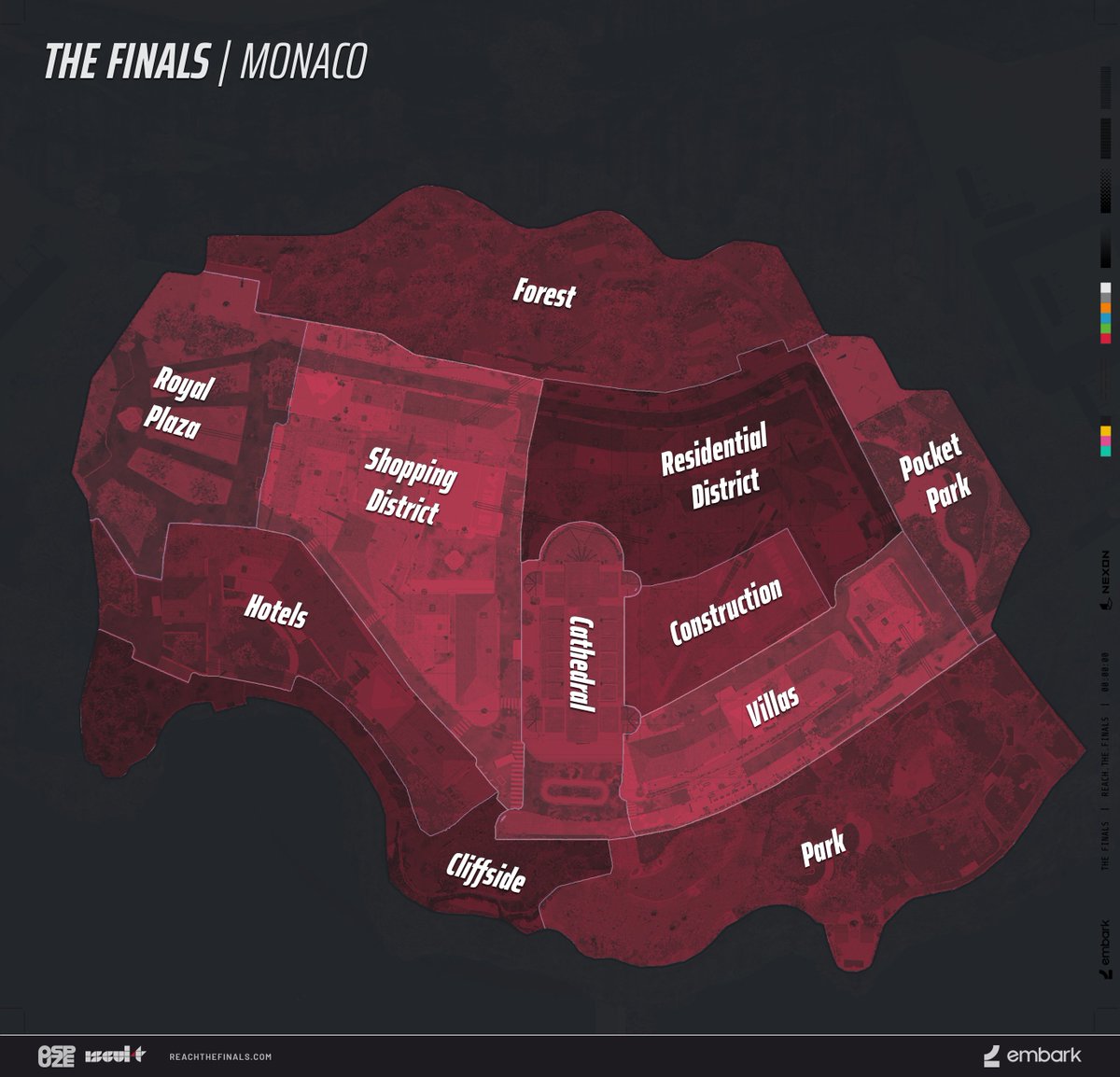
cuz i found this area that looks kinda like the map which is relatively close to the French embassy, but like not really, it's just under a mile from it
obviously the map isn't a perfect recreation of anywhere in particular but it was just smth i noticed
 lone monolith
static light
thoughts on this type of layout? i like the bullets better than just solid text
lone monolith
static light
thoughts on this type of layout? i like the bullets better than just solid text
Bulletins are very good for ease of reading for people with autism and dyslexia alike so i very much support this writing style
lapis kindle
serene bramble
cuz i found this area that looks kinda like the map which is relatively close to...
#📂┇the-finals-wiki message this is what i found last time
the French Embassy was just a guess. think we should change it since it’s not confirmed
 tepid knoll
serene bramble
cuz i found this area that looks kinda like the map which is relatively close to...
tepid knoll
serene bramble
cuz i found this area that looks kinda like the map which is relatively close to...
damn im amazed how similar it looks
serene bramble
tbh it's not rlly similar lol
I just noticed the sky bridge
i think the map is a conglomeration of different buildings and features from the city and not based off one particular area
i looked all over Seoul and that is the best i could find
tepid knoll
serene bramble
I just noticed the sky bridge
I did too, it seems like a lot of insiration of colours and even rough ideas for hospital roof was derived from it\
serene bramble
yeah
tepid knoll
even in the corner it has the almost floating building that you cant get to
large buildfing similar to construction
and another where the top looks like data center
serene bramble
but also in the game you appear to be way higher up in the air
the sky bridge in that pic is actually really close to the ground
tepid knoll
true but as inspiration I almost recon they looked at that place
serene bramble
100%
tepid knoll
W find lol
I would ping one of the embark crew to try to confirm but im scared lool, and I dont know who the texture and level designers are
serene bramble
lapis kindle
https://discord.com/channels/1008696016318513243/1089902659911295006/10960924598...
oh wait yeah we totally found the exact same spot, lol. didn't realize it till now. that hill with the towers in the background gives it away
so yeah it should prob be fixed
static light
i added some more to the in-game EE page, like the S Lies message and SR Monaco sprays
lone monolith
static light
i added some more to the in-game EE page, like the S Lies message and SR Monaco ...
Nice!
I reorganized it a little bit so we have the CB1 discoveries and the CB2 discoveries
knotty rune
Nice work! With each new addition, the EE pages are closer to completion! 💪🏻
 brisk yew
plain acorn
brisk yew
plain acorn
 faint smelt
Did you know: The AKM in the Finals is a real gun?
shell mauve
I do I do
sweet locust
faint smelt
Did you know: The AKM in the Finals is a real gun?
theres no way you just asked that
 cyan tendon
guys correct me if im wrong. is the suspended structures is located on three locations: Royal Plaza, Park, and the forest. also im making it sure if i can call them sectors instead of points of interest, its too long. Thanks in advance.
lone monolith
I don't know what the actual term for it is
cyan tendon
maybe im kinda right with the three locations where the suspended structures are.
cyan tendon
ohhh i forgot that pocket park has those.
cyan tendon
wait can you move the cannons in different angles?
lone monolith
In the Closed ALpha you could
cyan tendon
"one last question" are there raisable barriers if there is a suspended structure on the royal plaza?
manic reef
cyan tendon
"one last question" are there raisable barriers if there is a suspended structur...
If you're talking about the yellow walls that are slightly taller than the heavy build they're there regardless
cyan tendon
yeah the yellow walls. thanks im trying to make it sure dont wanna piss off people here LUL
manic reef
They did get changed in cb2 though
 obsidian venture
lone monolith
In the Closed ALpha you could
obsidian venture
lone monolith
In the Closed ALpha you could
NDA BROKEN YOU WILL BE DETAINED IN 62 HOURS
quasi echo
Media is under NDA, talking about CA is not
shell mauve
We can talk about it, just not show you any of it
cyan tendon
obsidian venture
NDA BROKEN YOU WILL BE DETAINED IN 62 HOURS
LMAOOOOOOOOOOOOOO 💀
lone monolith

shell mauve
 cyan tendon
what is the most open area in seoul arena, is it the Petronelle Plaza's garden?
lone monolith
cyan tendon
what is the most open area in seoul arena, is it the Petronelle Plaza's garden?
Maybe? It's between the Data Center's Garden and the area between the Hospitals
shell mauve
I would say the permanent “bridge” between the hospital sections yeah
 velvet crater
to determine better exact location of the players, is the community thinking of naming every map's main spots like for example CS:GO for better communicaton or are the maps too much complex?
dusty quail
velvet crater
to determine better exact location of the players, is the community thinking of ...
The main spots have names already I think
lone monolith
For the most part we've been using this, Data, Mall, Tower, Apartments, on Seoul at least
Not sure what we're calling the hospital since there's 2 sections to it
I've been doing Infirmary and Hospital
quasi echo
Hospital and Mall is the only thing i used in CB2
dusty quail
I've been saying 'near Hospital' and 'far Hospital'
shell mauve
lone monolith
I've been doing Infirmary and Hospital
Alleyway (the part between apartments and Construction that comes from hospital to Mall)
Courtyard (the open space next to apartments)
Server room (the low part)
Data Center (high part)
cyan tendon
is the crane really interactable like swinging the wrecking ball.
sour laurel
It was in the alpha
cyan tendon
oh thats why. i was finding a clip for it but i bet its not necessary
shell mauve
You shouldn’t be able to find a clip of it since the alpha was under NDA
So anyone sharing that would be breaking said NDA
sweet locust
We love breaking nda
 oblique wagon
We love breaking nda
quasi echo
Repair the nda
cyan tendon
shell mauve
So anyone sharing that would be breaking said NDA
icy icy
what are the rules to avoid breaking nda? cuz im making a video about the game.
manic reef
no alpha game play footage
cyan tendon
so the beta footage is okay?
quasi echo
yes
cyan tendon
sure sure that will be okay. but why shroud's video about the game is not shut downed?
like thats alpha footage right?
vagrant compass
cyan tendon
like thats alpha footage right?
Can you send us an eggmail to check? #📧┇contact-us
quasi echo
cyan tendon
sure sure that will be okay. but why shroud's video about the game is not shut d...
im pretty sure thats beta
cyan tendon
oh right yea....
shell mauve
Content creators had a special session before CB1
cyan tendon
yo mods i can improve the description of the hospital if you wanted too.
lone monolith
If you want to
cyan tendon
yo guys can someone recall that does the apartment have 3 staircases or 4?
lone monolith
2 I think
cyan tendon
i notice that the drawbridges doesn't include here. would you mind if i can add it?
i already added it btw.
 rare widget
cyan tendon
is the crane really interactable like swinging the wrecking ball.
rare widget
cyan tendon
is the crane really interactable like swinging the wrecking ball.
You were able to move it in cb2, idk about prior. In fact one of my absolute favourite strats was using the crane to get on top of the hospital in Seoul
People would break the skybridge, and camp the crossing, but they wouldn't pay attention to the crane arm swinging up above them
manic reef
rare widget
You were able to move it in cb2, idk about prior. In fact one of my absolute fav...
you were always able to move it
just that we don't have the wrecking ball anymore
rare widget
Oh I gotcha
I love the crane so much, I hope we get other interactive stuff
Stationary demo equipment with a moveable arm or something
Or other variations of the cannons
 supple nimbus
rare widget
You were able to move it in cb2, idk about prior. In fact one of my absolute fav...
supple nimbus
rare widget
You were able to move it in cb2, idk about prior. In fact one of my absolute fav...
You could during CB1 & CB2
shell mauve
CA had wrecking ball and fully rotatable cannons
 shell mauve
Ah no
lone monolith
static light
https://tenor.com/view/f-bi-raid-swat-gif-11500735
Closed Alpha had a media NDA, not Impression NDA.
It's why we occasionally talk about it
strange mantle
There were guns in the alpha 🤐🤐🤐
 stone river
arrest him
lone monolith
Hey does anyone have the in game descriptions for the XP-54, FCAR, and Lewis Gun?
stiff dove
like for the skins? for the Lewis Gun it's there already in the table (under Descriptions) but I also still have images of it if you need
 stiff dove
ahh okay, I found it for the Lewis Gun: Pan magazine-fed light machine gun
 lone monolith
Goated
 void leaf
Ror
cyan tendon
I need assistance. How many seconds is the cool down of the evasive dash>
heavy gale
cyan tendon
I need assistance. How many seconds is the cool down of the evasive dash>
Great question
lone monolith
Whenever the next oppertunity to play the game is I'll make a list of the things we need for the Wiki and assign it out to peeps that want to help
static light
i know that we still need a lot of damage and cooldown values for gadgets and specializations
stiff dove
also all of the skins for the gadgets, and in general you could also put in all character skins/accessoires/etc. that would be a lot of work (especially in the future I think) though. maybe limit it to bundles then. idk :D
lone monolith
The next on the list for the wiki besides the Main Page, (which is largely done now) will be the weapons.
lone monolith
stiff dove
also all of the skins for the gadgets, and in general you could also put in all ...
Yeah I think I forgot about player cosmetics for some reason. That will not be the case whenever we get our hands on the game again lol
stiff dove
yeah all good, I think the stuff there is now had more of a priority
lone monolith
We'll be doing weapon skins a bit differently
 stiff dove
yeah that might look better/more clear noice
stiff dove
lone monolith
We'll be doing weapon skins a bit differently
here are the colors for epic/rare/common if you need them btw


 cyan tendon
heavy gale
Great question
cyan tendon
heavy gale
Great question
i bet im gonna do the research since i have a lot of vods about this game.
manic reef
cyan tendon
i bet im gonna do the research since i have a lot of vods about this game.
it's like 5 or 6 seconds
probably still 5
just briefly looked at one of my recordings
 heavy gale
that'll be sorted at some point
dusty quail
heavy gale
that'll be sorted at some point
great work tho, can't wait to see what you guys have cooked BTS
dusty quail
heavy gale
that'll be sorted at some point
I see
knotty rune
I just added a thing we were missing from the COTHH page... https://www.thefinals.wiki/wiki/Church_Of_The_Holy_Hunters

THE FINALS
dusty quail
I love the new font!
lone monolith
dusty quail
I love the new font!
dusty quail
the header font is a bit chonky
 shell mauve
luv it 😄
lone monolith
For the record we just changed the font moving forward, we've got style guides we'll be using for pages.
shell mauve
I assumed so
(that you would use style guides)
personally I don't see an issue with the headers being so different, makes sense to me
lone monolith
Well the headers are gonna be in all caps
shell mauve
nice nice
 dusty quail
lone monolith
It'll look like this <:soontm:1110877244290777088>
dusty quail
lone monolith
It'll look like this <:soontm:1110877244290777088>
Upon further review it looks great
lone monolith
lone monolith
It'll look like this <:soontm:1110877244290777088>
Can we replace it with impact font for april fools

shell mauve
ohh I like the pros and cons instead of strengths and weaknesses
lone monolith
lone monolith
It'll look like this <:soontm:1110877244290777088>
wouldn't it be "and also allows" since it isnt a contradiction to the first statement? 
But implies a contradiction
Also question 
lone monolith
lone monolith
wouldn't it be "and also allows" since it isnt a contradiction to the first stat...
idk I didn't write the content in it 
Will the Wiki eventually be linked within the game itself?
I think it'd help a lot for finding it
considering how much SEO Fandom has 
lone monolith
lone monolith
idk I didn't write the content in it <a:2043_MemeGif_Kek_Nuke:112228711443702169...
teehee
dusty quail
lone monolith
Will the Wiki eventually be linked within the game itself?
I think it'd help a l...
That would be really helpful
lone monolith
Could even market it as a "Player Handbook" within the game itself
that'd be cute
Contestant handbook yeah :)
shell mauve
lone monolith
wouldn't it be "and also allows" since it isnt a contradiction to the first stat...
It's but because it technically contradicts it only being effective at medium range
lone monolith
shell mauve
It's but because it technically contradicts it only being effective at medium ra...
hmm hmm
alright thnak you :)
shell mauve
but if it bothers you we can always change it
dusty quail
shell mauve
but if it bothers you we can always change it
Going to edit that paragraph
shell mauve
why?
dusty quail
shell mauve
why?
it has things I'd change, repeated words, etc. Just doing this for flow
shell mauve
there are next to no repeated words..
only notable one is enemy enemies
but fair enough, If you can improve the flow than I'm all for it 
dusty quail
gave it a little bit more meat 🥙
also shifted around some 'opinion' words or whatever they're called
shell mauve
I mean if it makes an interesting read and doesn't undermine the objective traits I don't see why not keep it lively
dusty quail
shell mauve
I mean if it makes an interesting read and doesn't undermine the objective trait...
yep! when reading this stuff I always imagine the Gunsmiths in John Wick laying out the weapon like it's something in a shopping catalogue haha
shell mauve
I'll read it when I'm done with my videogame
dusty quail
gah it hasn't even been judged yet
 cosmic rover
any plans to show off all the skins on the wiki? Id really love to be able to browse the sword skins, also being able to view the item shop from it would be cool once game is launched.
heavy gale
Atm, most skins are on the wiki minus sword due to not being able to screenshot the whole sword without it being cut off which we hope to sort soon
in terms of the items store, we'll see what happens
cosmic rover
ah figures lol
found an error for yall btw. the LH1 page says its a medium weapon while it is actually a light weapon.
oh is the fandom wiki not yall?
heavy gale
this one https://www.thefinals.wiki/wiki/Main_Page is ours
THE FINALS Community Wiki
Welcome to THE FINALS Community Wiki! THE FINALS is a Free to Play, Live Service, first person shooter, developed by Embark Studios scheduled to release in 2023 for PC, and next-gen consoles. This is a collaborative effort that anyone is welcome to contribute to. Wikis like ours depend on readers getting involved and adding content. Click the "E...
heavy gale
it happens
cosmic rover
heavy gale
Atm, most skins are on the wiki minus sword due to not being able to screenshot ...
i really hope this gets sorted!
ah here we go i found an error this time for realsy. The baseball bat skin is missing on the sword page, i dont mean image either i know yall are working on that but its not even listed.
heavy gale
cosmic rover
i really hope this gets sorted!
we'll get it sorted 
cosmic rover
heavy gale
we'll get it sorted <:soontm:1110877244290777088>
also, would the katana be a separate weapon from the sword? or would it just be a skin?0 yall just playing it safe i assume?
heavy gale
cosmic rover
also, would the katana be a separate weapon from the sword? or would it just be ...
just playing it safe atm
 lone monolith
shell mauve
lone monolith
shell mauve
ah yes... "damage drop-off"
can't wait to see someone calling the zipline a bad option for close range encounters
shell mauve
Healing Beam has terrible DPS
lone monolith
shell mauve
Healing Beam has terrible DPS
It has negative DPS
serene bramble
shell mauve
new alt attack for the sword: throw
but you have to go and pick it up
lone monolith
serene bramble
new alt attack for the sword: throw
but you have to go and pick it up
that'd be funny
lone monolith
manic reef
<#1090264959956566048>
If you toss the sword you're left with your fists pfshw
Rule 1 of Sword Club: use your fists.
 meager ice
Wikipedia
cyan tendon
yo much health is the light class again? cant see in the video since its block. dont ask why tho LUL
nvm its 150 health i might find it on youtube for medium and heavy
shell mauve
Is it not on the wiki?
 cyan tendon
im actually make a demonstration of the game for my script i might add some help here while im writing it.
i might add some Pros and cons of each build/contestants.
lone monolith

THE FINALS
stiff dove
yoooo
looking good, nice work
I'm not sure if seeing the Legendary skins first would be maybe cooler? so sorting the table right around the other way? so: Legendary, Epic, Rare, Common. not really sure though

- can you make the mouse-hover effect in the same according color? currently it's always blue when you hover over it (here I am hovering over Legendary)
 heavy gale

shell mauve

lone monolith
stiff dove
+ can you make the mouse-hover effect in the same according color? currently it'...
golden legendary blue rare purple epic green common?
as per standard?
stiff dove
yes, it's already that way but the hover-effect isn't behaving like that currently
lone monolith
ahhhhhhhh
dusty quail
looks so sick!
stone river
lone monolith
https://www.thefinals.wiki/wiki/AKM
this is absolutely fire
meager ice
Wikipedia
cyan tendon
guys what're your opinions about fighting up close with the mp5? i notice that firing rate is very slow and fighting up close could be fatal.
manic reef
cyan tendon
guys what're your opinions about fighting up close with the mp5? i notice that f...
It has lower ttk though
cyan tendon
ttk?
manic reef
Kills faster than m11
cyan tendon
what's that
manic reef
Time to kill
manic reef
Fighting up close as the lowest hp class is always potentially fatal either way
cyan tendon
make sense. thanks for the info.
cyan tendon
Mp5 recoil

mac 11 recoil:

hope this helps for the wiki sorry for the low res. photoshop is fucky rn
shell mauve
Its useful but for how long is my worry
It will likely change (significantly) between now and the next beta

 heavy gale
Yes Kyne the boss man 
stiff dove
nice work! looks clean
shell mauve
It does look brilliant!
lapis kindle
thank you, we've been at it for quite some time. now we can keep adding to it
knotty rune
Nice work! Looks really good! Kudos! 💪🏻
heavy gale
Make sure to check out the weapon pages
And also the arena pages
Also other reworks are in the pipeline
knotty rune
heavy gale
Also other reworks are in the pipeline
Like making the Church Of The Holy Hunters page the main one? I'm sure that's one of the things you guys have in mind...😛
lone monolith
We are actually gonna be renaming it to the Embark Asylum
Or naming the section it's in the Embark Asylum
cosmic rover
hey guys the sword page is missing the baseball bat skin. just wanted to let yall know
knotty rune
lone monolith
We are actually gonna be renaming it to the Embark Asylum
I like the "Church Of The Holy Hunters" name. You came up with it, right? I think it fits the theme of the meme really well 😂
lone monolith
Yeah
lone monolith
cosmic rover
hey guys the sword page is missing the baseball bat skin. just wanted to let yal...
I'll get Bobby fired for this i stg
cosmic rover
lol
knotty rune
lone monolith
I'll get Bobby fired for this i stg
Little Bobby Tables? 😂
lapis kindle
knotty rune
I like the "Church Of The Holy Hunters" name. You came up with it, right? I thin...
ye the idea for renaming was for it to be a bit more approachable for users that have no idea about the EE server lore
rare widget
https://www.youtube.com/watch?v=c9ySnludT6A
Just want to mention, to anyone else who might be adding in missing stats to the weapons pages
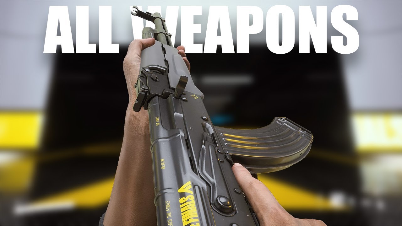
0:00 intro
0:40 V95
0:59 R.357
1:20 SAWED-OFF SHOTGUN
1:37 M11
2:02 AKM
2:31 REPEATER
3:08 SA1216
3:47 LH1
4:14 .30-06 SNIPER
4:53 M60
5:38 PUMP-ACTION GL
6:04 M32 GL
6:27 RPG-7
6:31 FLAMETHROWER
7:02 GOO GUN
7:16 TRACKING DART
7:22 STUN GUN
7:26 ASSASSIN'S DAGGER
7:40 SWORD
7:50 SLEDGEHAMMER
7:59 DEFIBRILLATOR
#4k #allweapon #reload #animation...
this is a good resource, the creater does full mag dumps of most of the weapons which lets you calculate the firerate, as well as showing full reloads
better then most of the weapons showcase videos where the creaters just randomly tapfire through the magazines
It's older though and doesn't have certain weapons like the FCAR so bear that in mind
lone monolith
We're gonna wait to update all the things until whenever the next playtest is.
rare widget
I feel motivated rn so I'm going through a couple weapons that have incomplete pages and fleshing them out
https://www.thefinals.wiki/wiki/FCAR here is the new FCAR page
THE FINALS
dusty quail
Love how the wiki looks!
knotty rune
lapis kindle
ye the idea for renaming was for it to be a bit more approachable for users that...
Oh, I see. Makes sense 😂
rare widget
THE FINALS
THE FINALS
updated the pages for both
they now have their reload times, and firerates displayed, I also revamped the information sections and standardized section headers with the the rest of the weapons
 proud girder
rare widget
https://www.youtube.com/watch?v=c9ySnludT6A
Just want to mention, to anyone els...
proud girder
rare widget
https://www.youtube.com/watch?v=c9ySnludT6A
Just want to mention, to anyone els...
Okay, can we talk about how smooth those model 1887 animations are?
I might have to give it some use just to watch them
rare widget
proud girder
Okay, can we talk about how smooth those model 1887 animations are?
I would love to see the animator(s) responsible for it, talk about their design process, because it's immaculate I agree
The animations in general for this game are amazing, but that 1887 especially just looks and feels so dang good and realistic
 tall lintel
(dagger equip anim also looks beautiful)
rare widget
alrighty
All of the medium weapons have been updated
I am now tired, and demotivated
Will leave Light and Heavy to some other time
manic reef
rare widget
https://www.youtube.com/watch?v=c9ySnludT6A
Just want to mention, to anyone els...
cb1 though
rare widget
rare widget
It's older though and doesn't have certain weapons like the FCAR so bear that in...
addressed this ^
signal remnant
kyne luke spear & smashel, i just looked at the page due to the announce, just wanted to say it looks absolutely beautiful
church of the holy hunters has me crying
THE TAKE A SCREENSHOT??!?!?!
knotty rune
signal remnant
THE TAKE A SCREENSHOT??!?!?!
Yeah, Duhmeister created that gif a while ago 😂
signal remnant
I love yall so much lol
knotty rune
(And also that poem at the bottom)
signal remnant
The depth this community has will not go unnoticed
real stirrup
The updates look awesome!!
This is Polish painter Jan Matejko

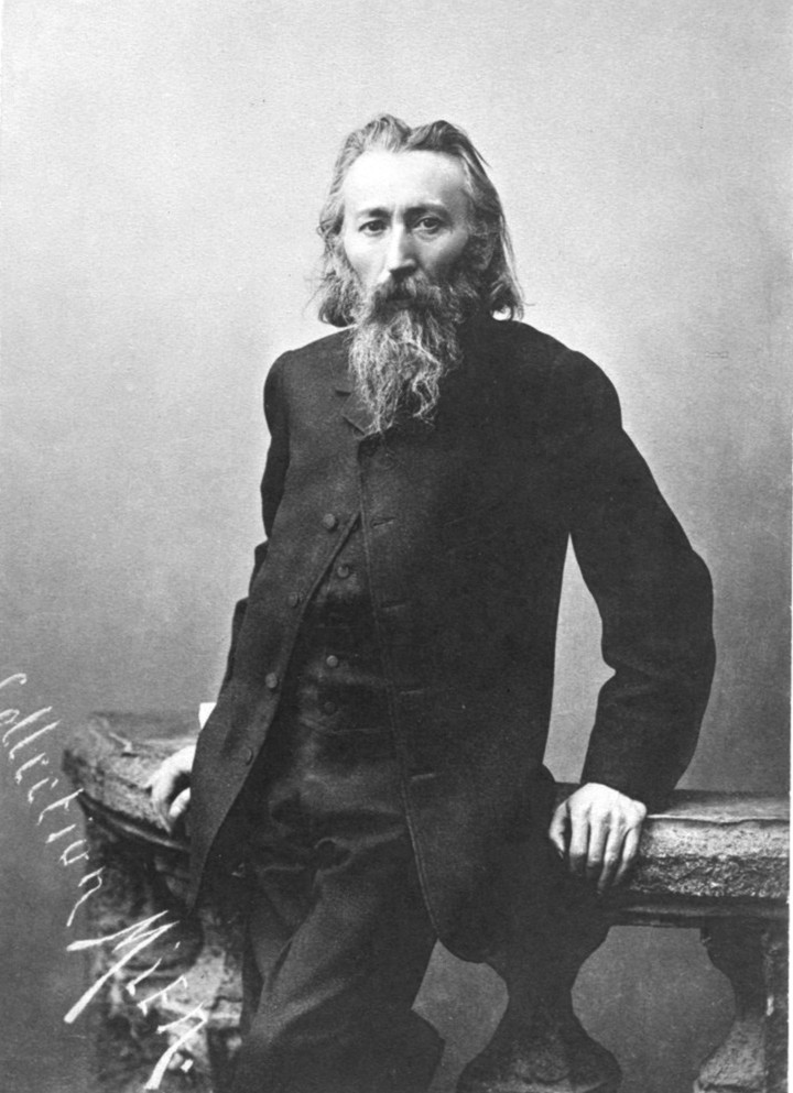
Jan Alojzy Matejko (Polish pronunciation: [ˈjan aˈlɔjzɨ maˈtɛjkɔ] ; also known as Jan Mateyko; 24 June 1838 – 1 November 1893) was a Polish painter, a leading 19th-century exponent of history painting, known for depicting nodal events from Polish history. His works include large scale oil paintings such as Rejtan (1866), the Union of Lublin (186...
static light
real stirrup
This is Polish painter Jan Matejko
added ✅
 thick crystal
rare widget
https://www.youtube.com/watch?v=c9ySnludT6A
Just want to mention, to anyone els...
thick crystal
rare widget
https://www.youtube.com/watch?v=c9ySnludT6A
Just want to mention, to anyone els...
does using right click aim actually reduce recoil or anything? is there any point to using it other than just zoom in?
rare widget
thick crystal
does using right click aim actually reduce recoil or anything? is there any poin...
It's not reducing recoil, It's reducing bullet spread due to rifle sway
static light
rare widget
I feel motivated rn so I'm going through a couple weapons that have incomplete p...
Make sure the writing leans more towards "informative and concise," sometimes it's hard to extract information when there's a lot of "fluff" involved. Once it's slimmed down I think there's still a lot of good information in these pages.
rare widget
static light
Make sure the writing leans more towards "informative and concise," sometimes it...
Thank you for the tips, I mentioned in the Fcar one I think, I tend to go big or go home

 shell mauve
rare widget
Thank you for the tips, I mentioned in the Fcar one I think, I tend to go big or...
shell mauve
rare widget
Thank you for the tips, I mentioned in the Fcar one I think, I tend to go big or...
Well it doesn’t have to be boring
Look at the pros and cons of the AKM
Its nice and fluffy but not inaccurate or overstated
Having a little humor in the undertone can also make reading it more interesting, but you really want to avoid making it an opinion piece by calling a weapon bad
We had a few early concepts that were very simple summaries of “its shit”
shell mauve
static light
I’ll write a page for Moolah, I have seen it’s journey and I know its essence.
Just need a logical place to link him in, since he’s not officially a mascotte
dusty quail
shell mauve
 gleaming shoal
dont know if its a new find (didnt find others per discord search) but there are some Lewis skins under the M60s epic skins tab. Maybe they are space holders as noone took one of the M60 but the same pattern exists for both, i dont know. Just wanted to point that out.
heavy gale
gleaming shoal
dont know if its a new find (didnt find others per discord search) but there ar...
Thanks for pointing it out , I've removed it for now as we don't have any pictures of the m60 version as far as I'm aware
shell mauve
Gonna write something on Moolah here https://www.thefinals.wiki/wiki/Lore
THE FINALS
THE FINALS takes place about 75 years in the future, roughly around the year 2100. It is the greatest virtual game show on the planet, with a large, global fan base, and considered a window to a bigger world outside of the real one - known as the Meatspace. But most people spend their time in the Virtual World. Contestants join through VR-techno...
But since they’re not the official mascot I will just write a short (temporary) intro to Namatama.
heavy gale
we do have a nama tama page here https://www.thefinals.wiki/wiki/Nama_Tama
THE FINALS
shell mauve
How does thatl ink back to the main page?
https://www.thefinals.wiki/wiki/Lore @heavy gale My inability made the lowout a little messy D:
THE FINALS
THE FINALS takes place about 75 years in the future, roughly around the year 2100. It is the greatest virtual game show on the planet, with a large, global fan base, and considered a window to a bigger world outside of the real one - known as the Meatspace. But most people spend their time in the Virtual World. Contestants join through VR-techno...
but all the content is there
It was supposed to be below it :c
dusty quail
@shell mauve should we assume Moolah is a cow?
shell mauve
yes
dusty quail
shell mauve
yes
Then it would be the first 'he' cow I've seen 💀
shell mauve
... Why do you have to give Moolah a gender?
heavy gale
shell mauve
https://www.thefinals.wiki/wiki/Lore <@263462052704681985> My inability made the...
it's all fixed I'll make it so that it's a lot more user friendly asap
as atm it fucked with the visual editor with how mediawiki styling is
shell mauve
Yeah I couldn't see the template so I thoguht it would just copy paste whatever I see on the edit screen D:
shell mauve
static light
THE FINALS
Moolah is a cute plushie cow that can be found in-game as an accessory for the lower back and as a badge as a part of the cosmetic options for The Finals contestants. It first appeared as a part of a bundle of cosmetics and slowly grew in popularity due to it being one of the only named entities besides Nama Tama.
its WIP
dusty quail
shell mauve
But since they’re not the official mascot I will just write a short (temporary) ...
I didn't...
cough cough
🤓
shell mauve
?
knotty rune
Cows are female, it would de a bull otherwise 😅


