#Work-In-Progress Paint Jobs
1 messages · Page 2 of 1
Mhm!
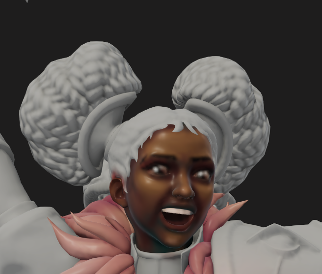
hello everyone, this is my son Extillior

is the pink too garish?
he's at least fully covered in paint so he's doing better than IRL projects lol
@feral oxide looks good to me
sick!
I'm a fan
I like him
Only thing I'd say unless it's intentional is get the cloth on the bottom to match the top
Muzzle burn 😍
Ziggs inspired Detonia, haven't painted skulls on yet until I feel like everything else feels right


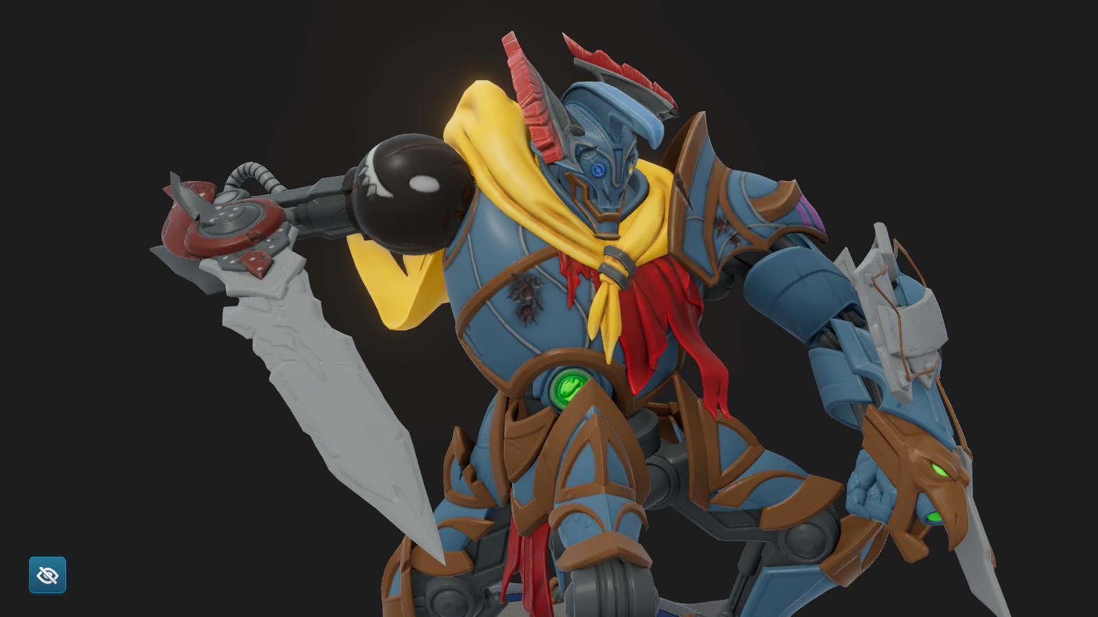
an OG megazord inspired Extil 🙂 i need more paints for the vibes, give tips!


Assemble the 5 lions
If youve unlocked metallics you can wash with like 30% opacity to make it look metal
not sold on it yet but mucking about with something like this

Oh hell yeah!
I see what you're going for, and I think it'll look awesome if you can figure out how to do it!!
gonna discard the change for now and get the rest of the model painted then give it a crack with the time to try to flesh it out later
gonna be real hard to pull off but definately will look cool
Agreed! But regardless, I hope you've been having fun with it!
I'm loving the engine either way its just taken my miniature painting problem digital
My first real paint job. Supper Proud of it so far.


Hey Gues Im trying out a new style for an army. I know it looks a little bit more Abstract but how do you like the style of it?
https://www.moonbreaker.com/en/paint-jobs/Thotorias/2af5e438477e459aabc9bae4c98938fa
https://www.moonbreaker.com/en/paint-jobs/Thotorias/2fde087ed69d42c09d5d5fbbd31d3e5e
https://www.moonbreaker.com/en/paint-jobs/Thotorias/44a67f7e06ed4f6c933559d64508a680
https://www.moonbreaker.com/en/paint-jobs/Thotorias/e927f91f528d45978a5017cf95d18170
(Most proud of the 3rd one down)
So yea what do you guys think? How would you feel seein it in game
V. dramatic! and I like the theme. My favorite is Torian of these. I think the heavy black wash just makes him SO moody


I wonder if I should do this to the plants...


Leg

nice, very frank miller
Frank Miller used to go so hard
And then idk, guess he got old and isn't really all there anymore
Daredevil, Sin City, The Dark Knight, etc. Were some of the best comics
But most recently I've seen a lot of people just making fun of his Marvel covers
And there's the sequel to the Dark Knight that people say looks like MS Paint
Those are too cool
That leg looks so realistic oml
Dang how did you get it to look so realistic
I was trying to highlight (used airbrush) and then blend it out with stippling but there was too much contrast so I airbrushed it down and tried again on a lower opacity, also used a wash
wait you can blend with the stipple brush?!
In traditional pen and ink you can use it to make a bunch of dots to create differing degrees of grey tones depending on how spaced out the dots are so that if they're more condensed they're be darker and then that's how you get a midtone between black and white. With that I'm assuming the same applies in color and I just like that it makes things not just be smooth
I love this thank you for the info im gunna be looking for a pen pad for this game soon
now tu see if this can be seen, fingers crossed


Love that its halarious
sweet. now for 2 more pirate themed phrases as i need to trpeat this on zax main also

Don't use a drawing tablet personally but honestly something I wanna try is adding in some crosshatching on minis and I'm not doing that with a mouse lol
I have, it's why the metal on my Aria's leg looks so good
I wish drawing tablets were a bit cheaper but it is what it is
Anyone recommend a brand of drawing tablet?
@sacred dirgeyou can def shade and blend with a stipple

i pray i finish this today
i have a wacom but i have some decent art skills so i didnt mind spending a bit more, also got it refurbished so saved a good penny
That's what I use
How do you like it?
It's pretty good
Uhh, you have your plug in, your HDMI, USB, and USB type C that plugs into the tablet
gotcha thank you
one more stripped panel down, one to go but after some food

How r u making those lines so straight?
hand drawing them with a stylus
I see
But looking sharp
you need to cut back into all the corners to keep them crisp
Before I continue my Shadow Weaver paint, I took a detour and decided to give Jailbreak some love.


I definitely want to fancy up the scales and tentacles, but I am very happy with it overall!
Already compared to my first job, this feels like a nice progression/step up.
And of course, I do want to go the extra step and do proper shading sometime. But I'm not really sure how to approach that just yet.
Y'all have no idea how much of a pain in the ass that emblem on the pants was. 🤣
i love fiddiling with all the blast and smoke clouds

Casino Zax work


update on my zax wip

pre-explosion effect because enough is never enough

This is the most beautiful lens that i`ve ever painted xd

can i get some cc on the painted on holograms on the face?


Bleach as in the anime and antios is an arrancar?!
he gots them hollow eyes
Beatris in progress

That energy effect is just 🤌
happy with my pre-explosion detail


i didnt fight against the odd texture on the solo mine i flowed with it


Give them a tounge piercing also
this wet look is ginna take some time


is that FORG
Got the major colors and themes mapped, might swap some things around, but why do I despise painting the smoke and fire?

@sacred dirge yes its furgs back right foot
Hello! This is my WIP Aria, I have the idea of making a roster with the same palette and this model has it all (armor, skin, different clothing, etc) and seemed like a good place to start, hope you all like it! 😄


Zax looking like he blew himself up ahahaha
Who are the really black guys in Warhammer?
Salamanders?
And I've seen them have very red eyes
Im trying to make a paint job based on the final fantasy phoenix and im not sure how to make the more vibrant colors both blend and pop for lack of a better term. would you folks have any tips?


sounds like a rough dilema
blend and pop sound to me like opposing ideals in my imagination
however, I do think maybe if you bring down some areas that the other areas will naturally stand out more
like the way the blades are is pretty solid
yea i see what you mean
This is what I have for Astra so far! Let me know what you think!👍


going peacocking with torian

Trying new things with the feathers. 🫣

Oh god eco goin ham on torian cant wait to see how that turns out
@sacred dirge i already have one mostly done but i have been wanting to redo it so i started yet another paint job
First one was more of a test
lol

yet another fine mess i have gotten myself into

yaaaas, it can still be seen. another way too long paint job ahead

I'm working on a Jade Hammer Hittenruhn


so far i'm just having fun trying to get a crystal texture on the hammer, the rest is super barebones
Looks like a good start@viral cedar
Super sick jade texturing
Thanks!
Ive decided I'm going to do jade paneling on the side too! Trying to freehand strata is hard tho
Just remember cutting back in is the best way to get clean crips thin lines@viral cedar
Thats what I've been doing, but its tricky for some parts unless i plan ahead (hard)

Here for example i had to redo a lot

Brand new to painting, still unsure of what colors would work well for the center 3 pieces of the flower but I really like the outer petals

Yellow/orange and white are both naturally occuring with with purples and pinks in flowers on earth@dull lance
Try to give jailbreak different looks, can anyone give me color sugestion for jailbreak main body, i dont plant to change the gauntlet from it's original color


Zebra pattern skin@delicate swan
isnt the cleanest thing in the world but nice to see effort pan out

noice
sick kicks


feeling pleased with what i've come up with so far for my first paint job!

nice pallet, looks good
because i dont have enough detail work already


LMAO nice
if the game ever gets big enough for tourneys with big sponsors do you think well have to get some ads on the minis
I'm really enjoying the implementation of miniature painting in the game.


i can do 5 clean macaroni per half hour....

WIP Beatris, gonna take me a hot minute to get all the detailing down on the armor plates and clothes

God bless the Gold Paint though
the devil is in the details@dull lance and im all red
You could make like 300 pots of Mac and Cheese with how long you're making the Macaroni Thicket
But I respect the grind
And also it looks 10/10
thanks, it does make me hungry working on it, sad thing is its my base coat
just finished the cloak on vengeance 👍
time for the rest of the model lol

Right Said Vengeance, good start
Bruh Im jealous of your blending skills. That cloak looks so good
well i ate least finished my meatballs

Mac and Meatballs
got his red sauce inside

for as insane of a concept this is it is really pulling together
@timber dragon yes the meat and parm were stippled in at different brush sizes. They turned out really good. I actually surprised myself that it looks this good already
The base colors I'm gonna go with for Aria

The punchy man is slowly coming together


I haven't even gotten to play yet, I'm just immediately obsessed with doing every little detail I can

cheese flower


Nice cape

HAVE A ROTTEN DAY


Wario top tier
@rain quail Noice,
time to make it rain Moneymus!


garlic wario power and working on piranha scattervine
yeach each mouth is a different piranha plant variant
Nice. Glad your gonna fully run with the theme
I wanted to do that with the healing one
Current progress on my first paintjob! https://i.imgur.com/ZzvT70q.png
im going to be doing one of these traditional japanese wave patterns on the arms dealers clothing and im thinking the first will read better on the battle maps


Will you be ok afterwards
first one i should be able to knock out pretty quick as its like my snareling scales
@timber dragonthe trick answer is im already not ok,,,, hence me doing this kind of thing

im going to have fun doing the lighting that is going to come from the underside of the hat
you can paint this just by painting overlapping circles. Time consuming, but not too difficult
@limpid kitethat is one way of doing it, yes. not how i went about it though
lights on the underside of the hat because its an easily seen area lol, i had to resize them to get the bright spots in a bit cleaner

doing this back side is going to take forever


Feeling really lazy in terms of painting so not gonna detail anything. Just getting a base coat and wash on every remaining Methedori


Buuuuut that means that all of my Methedori have their base palettes done!
Except for the captains, that level 50 Extilior skin is taunting me at the end

slime bomb 💚

you can paint the bombs too?
yes@halcyon elk

Very cool!
There's a few models that have separate parts to paint
I imagine that Gardener Xo will have his plants paintable with his new model
and probably Xuna and her Toltacan
Yep
Can confirm
Seeing as you can paint in experimental so Xuna has her new model and I do believe the dog is paintable
Xo doesn't yet tho so who knows
Trying to do anything detailed takes so long I did not foresee this

Epic
@timber dragon if your doing that scale look all over, good luck. I speak from experience


wip


a small snack

The creature
Just eating a little cosmic bomb as a snacc
Its getting there, slowly but surely

This gunna be a mastapiece

Going for the grimdark look

that face looks so good
Its a base for it Im not sure what im going to do for the accents or how I wanna go forward but I think its a good start
I'm trying something with Zax. It's not done yet, but I feel like there's a good start here.


I'm sure everyone and their mother has done a Joker version of something or other, but wanted to try my own take cause it was fun. 🙂
Hey its nice to see all the different takes on it
Library of Ruina spoilers just in case, but managed to get pretty far with the meme, just gotta actually get details on right side and clean up the lines, the devs gave us too much detailing power


i would be happy if they doubled it,,,,
when you work on painting for 2 hours and it still looks like nothing got done,,,,

It still looks amazing tho
doing the macaroni is a fun puzzle , just really time consuming
wiiipppp

A very gender inclusive color scheme
Jazzercise Jailbreak


PINK
mhhh that looks great !
based and zebra jazz pilled

Looks more like the bright side. Looks good whatever you are calling it
You can be evil/fallen, but still look good while doing it.
shirt text layout done


Loving it
I wish we would have accessories we could add
Just think star shsped sunglasses on him
yeah, i reall want my snareling to be flaing her purse around
@slow carbon i was going for gold velour and it turned out great thanks to the glitterati paints
I think ill actually get this guy finished this weekend
got him to this point

he has actual zebra stripes now and is lookin crazy in a good way


oh hey i play this setlist, its great !
had to go with Vans

uncessary detailing


NMM

Shading is giga clean nice
Im assuming you're doing darker based layer, paint highlight, spray with low opacity darker color to blend highlight in then stipple on edge to simulate metal?
@timber dragon you know what happens when you assume....
?
It was the first gif in my favorites folder, pray I don't go any further
love this
Took a bit of experimenting but its extremely dark color version of desired color plus low opacity dry brush, no stippling required, kept trying to do hard way when simple way works

so many noodles left...


I LOVE GLITTERS


That gentleman is looking exquisite !


Going to wait for glow paints to get a few spots in and gotta clean up some areas but really happy for the lad

awesome dragon theme
🤝


finally getting around to adding more bowling ball look to hits head

That glitter paint on the face?
@merry zinc yes. Im going to try to get it to look like a bowling ball
Its going to take a bit of time with how the glitter works
wip

Probably the paint job I'll be most happy with when it's finished


@merry zinclookin great

wait, mine doenst have those legs

! awesome
mine doesnt turned out that good, first time painting mini on a game haha
didnt*
dont worry about it
it takes tinme 🙂 I've painted minis 8 years irl so it helps a bit, but i'm still not good with ingame painting

YES! love them skelly bois
check off topic media


Love the weathering

Nice start
Ill have this weekend off and hopefully have time to get some quality painting time in


Nice colors, I tried painting chuck a couple times and it always turned into a mess. The middle robot part is basically just a big block
Going to farm to get those glow paints, the let you do really cool effects


For the Paint Challenge


New units are so cool

totally diggin the new figs also

I like what you did with the those rocks. Here, take this bread.
Still has a long way to go.

some progress on my Xuna


lot of weird stuff and untouched parts but i think the face ended up okay
more progress


That's cool
totally leaning into the flashlight look for obvious reasons on this one

i might have a seizure working on this thing lol


brick


my WIP for the free weekend competition; I'm pretty proud of this gradient, the first one I've done that's this smooth

That looks really nice@chilly coral
Gradient is top tier
not sure how to finish this guy off, but happy with what i've got so far, might actually play the game and try unlock some more paints to work with

@cold bluff def go for the glow at some point as they can do really awesome things with the built in bloom

i can totally get this done by tuesday evening

I'm feeling good with my progress today, but I have a suspicion that this time tomorrow I'ma be sweating
I’m really looking forward to the submissions tomorrow or Wednesday; in theory their going to have to most time in them, and they’ll look good regardless
Well im still debating on what to enter. My new model that i just recently started or my snarling that easily has about 50 hrs on her. More than likely I'll enter the new model as opposed to entering one i have worked on for months because that seems unfair


I love his little face
🧿 M 🧿
I really like the bright vibrant color scheme here. Gives it sunny vibes
these solar panels are gonna chew up some time to get right


im methodical for sure


Really liking the osl on this. The panels are gonna look rad too
Some fun color transitions
main flashlight work done, now to finish off all the other odds and ends


i did research by staring directly into a few flashlights turned on
That sounds safe
Finally got working on to the pets, going for a moving statue esque look for them

i got mine finished, but the 3d link is being all wonky for me


Wished it was 1.21 gigawatts of power in this baby, but it looks great man
i didnt want to treat into copyright areas but i did think about it @vital parrot
Oh you're right, good thinking. I didn't even think about tm
the share links generally don't work for new units
i heard, good thing i took nice pics
Took me about 2 hours of fiddling but really proud of the metal chest piece , now for every other part of the model (Pain)


lookin' good
Did some more work on this guy

Love the colors, lime scented
Few days of working on and off, this is taking quite a bit

Looking awesome!
🤝
For the early stages of my first ever paint, I think I've got something goin here

the gradients are very nice 👍
Thanks! Admittedly took about 3 re-takes to do the piping due to bad memory XD
Just need to figure out appropriate colours for the body and clothes, been stumped for ages.
Can always duplicate at least and I don't think you're super locked in on options either
I'll settle with this for now^^ Might add a bit of scorched metal on the flamethrower's muzzle later

I already know Stitchy is gonna be a target in MP so I thought I'd make fitting XD

I’m not sure if it’s just me or that the image isn’t loading at all :c
Not sure which unit this is, but the share link doesn't work for most of the newer units
Ah, that’s unfortunate
So screenshots are the best way to share then ?
Seems to be that way, yeah
Stopping here for the night, got plans to change the fabric to a lighter grey, with some metal paints for some joints


love it when i get the lettering right in one pass


@teal pulsar if you have any objections to Egyptian styled tats let me know


No objections at all. I really love it 🙂
Nice! 🙌
Looks so spooky! Very nice!
Looked much worse from the other side
I only saw the first image and thought she got punched in the face, but much different and cooler knowing it's a tattoo
Unrelated but gives me an idea for later

Thanks guys!!
Stumped on fitting colours for the cloak and helmet, any ideas?
Kinda themed this one on the particle effect he spawns with (Fleetfooted I think)


^^^ This effect
looks great
Thanks! After thinking on it for a bit I think I'll keep the cloak and helm as is
All the stone done! Now I have to make it mossy haha, I'm very happy how it looks in game so far!


NMM is so fun in this program!!!!

currently

Very relaxing listening to music and painting in this program, worked on the metal for the legs not sure if the sheen is realistic but its fun none the less.

working on my own exilitor, couldnt be farther from yours

Hes on daycare duty today
big armor pieces are fun to paint
Want to do a bit of highlight stuff with glow paints but this will be all for now

Getting closer to the end on this sucker

Wasn't able to figure out a quicker way to texture the cloth, tried some stippling technique but I'm not settled on it.

Yeah, the technique isn't even visible from this close a distance, hmm that's sad. Eh well. I'll have to think about what to do.
I think the folds in the material convey it as cloth. I wouldn't worry too much about the texture
I had brought that up before about stippling not being seen from a distance
Although in my mind it was kinda like that's not really a bad thing either but idk
I've used it before and it makes things all nice fun and textured
But to me I think far away looks better so that you aren't seeing all these little dots
Should be able to feel it tho
Like you know they're there and it looks more rough compared to airbrushy
On the official paintjobs there are some parts that I think stipple must've been used but it's just rough and blobby which is I think something that works well for beat up metal
But I also just come at it from an art perspective because in drawing people doing all those little dots is a way to add varying gray tones and so in that case it works but here where you also want to prioritize a far away read it's not the same
Idk if just like color choice matters because contrast or something
This is where I have it now, but yes, its an interesting problem to add enough contrast to make it look visibile from a normal viewing distance but also pleasantly cohesive and such.


Absolutely awesome!
@timber dragon I wonder if you would be inspired by this technique someone shared in a group I was on in facebook. The fact that it looks this insane is such a testimate to the artist.

🤝 thanks and wow that looks insanely sick, could be emulated with wash maybe? Looks insane
Its definitely a mixture of techniques I wonder if they even used an airbrush
I think it might be something to try on Dr. Feelbad I think he would be a good one to practice that on, and I think that's what I'm going to shoot for if I try bioluminecence on a model first.
part of the reason it looks so bright, is the rest of the model is so dark.
Which is another lesson it can teach yep
Do feel like that's one of the most important things irl is knowing how light/dark to make things relative to eachother
as far as traditional painters/artists
The mind does do strange things part of the fun though.


very cool theme
would say it would be fun to try myself because I have my own idea for how I'd tackle that to some extent although not sure I want to repaint the same model too many times
but it is well done and sometimes seeing how other people paint gives me inspiration
of course it's painted with forbidden black so looks even extra dark I guess
Oh is that the color picker one from the funky robot?
Are there any more of those forbidden colors?
What funky robot? 🤔
I think Corelar just meant that the older colors got changed in the newer update and so black isn't as dark because I guess it was causing issues by being that black and there's no way to make it so it's just like if you already have it saved somewhere then it's fine but otherwise you can't use it although I don't think any other colors are just totally off-limits but I mean... idk the situation
yeah. It's as RoboKy says. Forbidden black is the old black and it's too dark and isn't "PBR-safe" which has something to do with textures and lighting I believe
Other forbidden colors I think would be colors mixed from forbidden black that are still darker than the new black
white didn't change with the last update, and a lot of the other colors (especially the mixing palette) got brighter and more saturated I believe so there should be theoretically more possible colors now than before
We edited the default palettes to make them more vibrant and to widen the colour scale. Mixing palette's colours have been changed to "pure" colours (so for example red is pure RGB red etc.). This makes mixing easier, as colours stay vibrant throughout multiple steps of mixing.
- of course, Mixing palette is now PBR compliant, so paint jobs look good on maps
I'm curious if there's a palette somewhere that you can mix on without having to paint on the miniature tbh I haven't looked too hard for it if its there.
Are you talking about mixing panel underneath the palettes?
that might be a thing dunno
generally I mess with opacity on the miniature and mix colors by varying opacity and stuff so that the tone matches other parts of the model.
If there was a palette where I could do that it might be pretty nice
So yeah, there's a mixing panel (that grey rectangle underneath the Palettes)

that's extra forbidden
gosh I feel like its vanta black all over again hahaha
when paintjob sharing becomes a thing there's gonna become a forbidden colors black market
You might not even be able to share models with forbidden colors just so the devs stay sane
I will not share the secret so we can build up a market, what character has the most surface area?
probably ferg zax
Just in case heres the source of it, really nice to mix with base coat stuff to make dry brushing pop out

I thought they took it out of the game?
You can still use the color picker tool to take it from units that already had it/ if your pallette has it
Glad i added base white/black to every pallet i have made for the last year then
I think its nice but its not to the point that I'm too jealous, after all I find that shadow colors with hues in them are actually very nice, I used purple to shade a lot of the model I've been sharing.
Worked pretty hard on getting it to this point, still need to work on the shield, and then I need to consider the yellow arm, and if I want to do any more to the green armor panels. The head I also need to make a little more interesting.

Did you get it before the last update? I'm color-picking it as 030301. Still darker than anything I have, but no 000000


ended up finding that I had a Taria paintjob that was just there and not really messed with
so I just washed the face in red, re-added the highlights and did some other stuff
I find her face just really not appealing, and makes me work hard on her face only to still never feel satsified with it.
Absolutely love that face, very good contrast
This is where I'm at currently on this bugger. Still more to do it seems I love this character so much that I keep finding reasons to add more. Its gonna be bad if I screw around and add so much that it throws the piece in a poor direction.

Thanks for your helpful advice I was able to nab that forbidden black haha! Well I was a little curious, but it is very dark after all. Put it on the race stripes shadow and its definitely a very punchy black.
@upbeat helm ps make a copy and keep it before you add more. I generally have around 4 save files for one mini untill im done with it then i delete the unneeded ones
yeah I copied a lot of this model but I almost let loose when I thought the same bug deleted the current version instead of a duplicate that wasn't needed.
noticed how on the different color rows some of them had the brightest color in the middle so this was originally started by just messing around with that


also thinking I want to try doing a model with a more limited color range but then even if I do have the same colors I can edge highlight them differently so that the midtones are the same but the other stuff maybe isn't
or also messed with different shadow colors is always fun
Copper + Patina


Been working on the shield arm.

I like the racing strips, looks really hard to pull off.
nah not really
I used arrow keys for the straighter lines on top and on the bottom I just did my best to match em up and if they didn't meet some slight line work fixes.
Took a while but not really hard, digital really lets you get away with a lot
first part of Protoss-inspired Extilior done (I think), now to do the details and try to get the skincolour to be blue-gray-ish and not green

Awesome
I was inspired by my result with the stipple tool, decided to be ambitious and I thought Astra's frog would be the perfect critter to try it out on. Gonna take a long freaking time haha! The more complex the geometry the harder it gets but its also hard to get soft edges more definition. Gonna be a fun challenge.

Honestly it's the least universally applicable tool imo but it is an amazing tool
It is a really hard tool to work with, because it takes a lot of different elements to bring it together. The scaling of the dots with camera zoom and width of brush, there are just a lot of variables that are hard to understand. That being said, its a beautiful fun look.
Coming together a little quicker then I thought but yeah, its really growing on me.

Camera zoom matters?
Yep size of the dots is adjusted by zoom as well as by the size of the brush, which gets adjusted as you zoom out.
Extilior the Abysswalker will soon be real

Looks like a good start to a cool idea. Also, looks like a ton of work
It will be fun 
Always nice when people add extra details


keep going bud looks good 🙂


I'm new to painting minis - only 4.5 hours in the game total, incl. gameplay, and ive never painted minis before in my life. Learned some basics, and tonight I was experimenting with dust - my friend ended up teaching me about some weathering and battle damage

Usually a pretty fun process dealing with damaged things
The start of my Sand Plants. :3


It's a bit odd. It's hard to get the model to look really good in painter compared to in gmae.
Like I went over board for the white on the tips to show up, Next will be seeing about how much I can draw back to get it right.
Feeling un-inspired but getting the arms okay. Only doing base coat atm to see what strikes my fancy for getting this guy to come to life


I'm in the process of like, re-painting the vials blue. Idea of like, blue healthy healing juice flowing through those tubes

This one is really cool, I started trying this on Florgg and looking at this picture again I think I need to redo a lot of it. Those blues are super dark and I just went with a dark one.


@drowsy pulsar Yes that piece was very well composed the finished model I haven't seen yet, but given just how excellent that artist did the bioluminecense(Sp I can never spell when I need to it seems) anyway I hope we see a piece inspired by it from one among the community.
Its getting there.

Wanted to try the Earth Sky thing

I like it, my biggest issue with painting fate twister is that the basic paint job for it is super cool. Especially with the colors on the cloth and stuff.
Less a work-in-progress and more my active experimentation with techniques
Tried the NMM technique from Marta as well as some weathering, and think I got some decent results?

I'd agree, looks like good results so far
Thanks!


Manly face
@merry zinc I do not think the face is bad, you have to remember that the viewer is going to have to see it within the engine and there are some elements where you have a fixed viewing distance. The painter zooming in at this level might not be as flattering as it is from those specific distances. That being said, I think the head needs a little more flushed I think the face is one of those things thats hard to do right but I think maybe a very low opacity bit of red on the cheeks might make her feel a little more alive. Also think about green, there is a way to subtly use green in skin tones to make them feel vivid. I just don't have the resources on hand yet to bring that advice out in full.
I just did a face, but I would like some advice. I've never painted dark skin tones before, I can 100% tell the problems you're dealing with when it comes to faces, and making them look good in the engine.

This should help! https://peachdeluxe.tumblr.com/post/171230593878/i-get-asked-a-lot-for-tips-with-coloring-black

I get asked a lot for tips with coloring black people, so i put together a little tutorial! (and bumps my kofi if you found this helpful)
I think Astra is one of the older models and the resolution isn't great on it. Basically, it's way harder to paint a Astra face right now than some of the newer models. Example, most new models have eye brows.
That makes me feel better, I hope I can tune it a little more given the limitations.
Aye. I am not black so I can't say certain, but right now the lips on your paintjob there do seem to come across a bit like the negative stereotype, so I would change that at least
I know that's not your intent, of course
I have kin that are, and I have looked into it for miniature painting but your advice wasn't bad brython they did have a helpful bit of color coordinated advice
Its also a little difficult due to the engine, the light value of the model changes it feels when its in preview vrs in paint mode.
yeeahhhh
I think in the engine the skin was just too dark, so I got it to here, but I'm still not happy...I think astra's face really is just not cooperating, if you ever paint her face you gotta remember that resolution feeling different.

I guess I have to accept my advice about proper limitations to viewing distance for observering minis in the game so far.

Nice frog
Yeah, I was kind of sad about it when I found out. I spent a bunch of time painting Florgg and then I went to finish up with Astra and it basically always looks weird. I did restart and I have just been using the Masking tool paint Florgg and avoid Astra. I think it's fine since the frog is most of the model anyway.
Yeah the frog is a pretty big focus, which makes me feel a little less bad about it...shame you had to restart your frog. @vocal lance thanks its a lot of work to do this much of a model via stippling and its far from over, but at least for the frog's skin, I'm gonna keep at it.
Yeah, Astra is a huge unit and has lots of tiny parts, so the resolution is not great. Later on we improved how we created units, but Season 1 units have some issues.
As for painting skin, you can try using the second row of Flora palette. Of course you have to figure out the proportions of dark to bright shades yourself, depending on the effect you want to achieve. You may want to add other colours, as they're not very dark, but maybe the overall "colour family" is going to be helpful to begin with.

been my go-to palette for skin and especially seeing the tutorial from Robbobin

I have a friend from school that had really beautiful skin, I might try seeing if I can't find her on facebook and see if I can repilicate that.
Thanks for the palate suggestion.
Currently the face feels like the shadows are too distinct but I also think that the contrast is important to keep in the piece because of how small her face is.
contrast is the number 1 rule of minipainting and arguably art in general
which is weird because it's like people love subtle blends
I think the skin under the eyebrow is what's bothering me at the moment
Gonna pop in and work on her some more, get some water and fiddle around with the frog skin after.
Need to apply some weathering after this in spots, but I'm glad the work feels so effortless. Airbrush tool is miles more comfortable then stippling atm : / most of the work is on the pants atm.

Hmm might shift the tone a bit, feels like it needs it.
hue? eh well the hue then
yeah a filter might make it feel more appropriate
maybe just the boots?
Hmm somethings wrong with it oh well I'll do something else for now
It is a lot of green.
I do agree, I think the boots also feel out of character if I do a polished look
The goal is to have teal and orange sort of marry like in movie posters but its not like I can't shift the hues to make it slightly more varied.
I think this is making me feel better

That does look better, I recently stole the Gloomside color pallet from one of the alt paint jobs for Extilior and have been using it for all of my Methadori units.
That's pretty clever tbh
To be fair, I got the idea from a Cross hair paint job I saw a very long time ago. It just took me forever to figure out how they got the colors.
Randomly noticed, the bottom bit, and it turned out to look like metal, really fun idea I had but I dunno...it feels sort of like scrap but also like it could be legit some other material...

Did a bit more work on the cloth... I can definitely tell the sweat the team put into doing all those billowing clothes hah!


going to just do that paint job I wanted to do on Xuna but instead on Astra
saw someone do it on a Space Marine and the Astra Robot has closer shoulder things to that
although with the extra complication of plant holders
That's very fitting tbh, I think painting it like a space marine would be fun now that you bring it up. Although I don't think I'm going to play that model much, as I like frogs. The chrome shoulder is well done bud.
honestly same, I mean... I prefer most of the default models, but I'll probably just paint everything eventually lol. I do still want to paint the alternate Extilior even if I mainly use the normal one
Chrome is pretty demanding to paint, so even getting to the point where you got is pretty good
thx, tbh I have a hard time finding a really good tutorial on it but I think I get the basics
have the stuff that faces up blue, lower stuff can be green or brown depending on environment, the wavy black and white line between
Can I steer you towards a reference? There's professional photography specifically of chrome objects explicitly because of its dificulty to paint.
tbh I do might want to start using more references when painting but I never think about it
For that shoulder I would recommend a chrome cone or a chrome cylinder
As the search result you're aiming at, I think chrome cone might actually fit better


Looks nice!!

noice
Thanks!
nice bud
Someone asked about wood grain... here I tried winging it. Looks alright.


3 colors, the brown you see below, the sort of warm yellow brown you see above, and then black and forbidden black.
Then vary the opacity a bit and draw lines of varying shapes.
Forbidden black defines the lines between wood planks.
I'm gonna have to try that out sometime, looks good


Cute
finally getting back around to all my zax touch ups


I really dig your hologram bud, looks awesome. The face looks really iconic.
My experience on extilior made the metals on this really quick to get here... I think blocking this in was really fun

Progress on making a Hittenruhn for the new Zax roster i'm using (thanks again yall)


proud of the highlighting towards the centre that im doing, as well as the "X" custom decals I did
The x's remind me of the random hit markers you see on enemies, that's fun.
ooo yeah
I was thinking kiiinda like stitches but not really?
Kinda like.... half stitches half war paint
I think if you draw a line under them it might look legit like a cleft in the metal? Can always paint detail where there isn't any.
oooo, yeah
and ye said x's are that sort of detail
actually yeah give me a few minutes
OH. @upbeat helm This absolutely works, thanks!

perfect. Now off to bed.

🙂
Yknow, I dunno why I never considered custom scratches lmao
This is how I'm starting off the vials on Doctor Strange Love here. This is based off of a games workshop reference, but the colors are just my pick. Gonna see if I dig my direction or not

Next step bubbles

minor blending on the top
Here's a bubble at the liquid's top level, need to work on it more but you get it I bet. Probably gonna mix in some floating spirtz.

You can set the bubbles further into the liquid by using lower opacity, just keep a highlight on em, as that would be the thing that shines through over detail.

Here's how it looks at an estimated default view distance.

The gw reference is the death guard biologus putrifier
What that heavy metal team did at such a scale is so wicked
Refined the bubble surfacing a bit

feels like realism took it a step back tbh

I like the more comic appearance : / bummer
plus it will make the next steps convoluted.
Gonna keep it in, because I'm lazy.
Forgot another thing might as well get it as real as I can render as an education.

forgot that the bubble would have less effect from atmosphere in the background, tried to see if I could make it better don't know where its at now.

...to the point now that I like it more then the comic style...hah...
There are some cracks, don't know if the bubble helps bring it out or not


Cataracts for the doc, like he's not got enough problems hah

The cleft you've made could probably due with a dark underline on one side, this will help create depth, as well as create contrast that makes the mark more distinct, you don't nessecarily have to do this with black, you could use yellows or oranges as your shadow color.
Thanks, I thought it was clear enough but guess it wasnt
I think its worth saving a duplicate of it, and looking and comparing, you might feel better about it yourself if you can compare it, and you can ignore my advice if you like it still. Advice is like that. You gotta grow the stomach to completely ignore it, when you are dead set.
?? nah no worries
If anything I feel an absence of caution when offering criticism. I act like I'm absolutely correct. Its clear that's not the case when you see the professional works. I'm just a long fan of art with an opinion...well we all know where people pull those from eh?
Oh ye, ofc
Eyes are good enough to take a break now, love this guy so much.

my first paint job in progress (ive definitely lost track of time)


I find that the more challenging, yet achievable result you can get, that it compels you to be faster and even more effective in painting later. The success inspires pride and the pride generates an engine that starts running well on its own.
It do be like that sometimes
Anything you do to challenge yourself and ideally if you have success will make it so that the successful people keep getting successful
Nice and simple. Very nice.
the devs can't stop me

That's impressive!
What do you mean by devs not stopping you though?
I will put anime girls on the capes, it will not be lore compliant
The immersion will be shattered
As long as it's not anything lewd then honestly good for you
Seems like a fun thing to do and looks impressive
Im pretty much done, but need to learn how to add some more detail in textures and stuff. Im happy to stop here for now, being this is my first full paint lol. Definitely would appreciate some constructive criticism if anything in particular looks off


@timber dragon That's wonderful, I know its a lot of work just looking at it, yeah there's likely only a slight problem of if you recreate a character thats not original work. Given your talent I think you could easily design one yourself if this isn't an original.
Been making progress on this guy, but I'm also working on trying to brush up on my painting skills in traditional medium.

Trying to pump the contrast on his skin

||Contrast is #1||
Any tips on how to improve this? I want the skin to pop from a distance, and my skin is getting there, but the original had a lot of nuance and information and I think I'm losing that

Try adding a bit of dark red wash real light opacity over the green. It will darken it without going black
Interesting idea... I'm curious how that turns out
I went with this without seeing your suggestion Ecoclone

I'll copy a duplicate of this and try out your suggestion
That dark purple over the green is a nice color combo
Green is well shadowed with purple, then highlights well with yellow, I think its a fun thing I learned from Orks. Games Workshop those blokes have made purple on orks very hard to do within the lore styled schemes which for orks I find lore to be great fun.

Metallic stuff 🤷♂️

The blade is looking slick, that's pretty slick bud Especially the gradients of the brown/purple to yellow, just great.
All thats left seems to be finishing up the purple patches on the cloth, the orbs with juice, the tubes with juice, and then the growths....I'm seeing daylight!

My bubbles were easy enough to adjust to be more reaslitic, but I didn't think it'd be that simple...just a glaze over my cartoony bubbles and boom they're kinda decent?

Progress

WIP of Charger inspired by Destiny 2's Vex; a faction of.. effectively Conway's Game of Life in the living world

Starting one of those metallic scarf things, figured it would be fun to do seeing as I like the Dr so much 😛

Finall done blocking in, now I gotta figure out the pattern size


Probably going to change some things but my idea was after seeing how someone painted their tyranids off of coconut crab and all kinds of other stuff I wanted to base my schemes for moonbreaker animals off of real animals and like the yellow frogs with black spots
also wanted to try using an extended analagous scheme
I recommend using the opportunity presented by the carapace on this guy to try applying a different effect from an animal or insect. I'm strongly considering doing some more for mine now that I look at it.
I tried letting it be and it bothered me so I thought maybe it looking like a monster got to Frogge would put me at ease but I think its kind of a shame to keep it just as flat as I've got mine. I'm thinking about figuring out where I'm gonna take it.


Got his scarf done, now I'm working on the leather like collar

Kept working on em, theres more I could do for the fruit, but I'm kind of dreading trying to do anything more comlex if I'm being honest. So I think I'll try to keep em simple for now, until I get back to it.

Like that white spot on the glass part
Reflections on the globe part are pretty conceptually hard for me, because its a miniature with no fixed viewing angle. I think the dev painters were incredibly well ahead of this problem with their concept.
I was trying to noodle with curved reflections/ light but it always became a problem... hah, well I can say its out of my hands now, I've saved this version.
What you mean by fixed viewing angle?
Like a golden angle
Or just the whole thing about how models move so when you paint things like NMM it doesn't universally match the light source
A gaming miniature has no set viewing angle...so you have to compromise and make an unrealistic choice. Its the challenge that comes with painting reflective things on miniatures, as you have to create new information and have that illusion hold up. If you paint chrome, you have to paint an illusion of it reflecting a background image, for the chrome effect to work. So I guess what I'm saying is, that I'm failing to create that reflected environmental lighting in the glass. The challenge in NMM is lessened because the information is much less sharp.
*** at the moment all of my pieces have been painted with a mouse, I wonder if stylus would help me with the line work tbh. Curves are much easier in that regard as you can use stencils and other things. That might be why I'm feeling behind on getting consistent curved lines.
Yes a stylus will change everything @upbeat helm
This shows, the problem I'm having. At an almost eye level with the liquid it looks pretty good, but as you go up and at the normal eye height of a person viewing a miniature, this liquid line looks more and more offf


Now I gotta figure out how to do the atmoshpere inside the glass, as well as figure out if I can even afford to do a background color.

Think conceptually I might be willing to abandon the work I've done on these globes, but I think it'd be a shame to just throw it out, I'm gonna duplicate the model and try a new approach. The devs really did have a clever decision in theirs, and I think its worth trying to go with that approach. This sort of realism is really not going to be felt at anything other than this close level, so its kind of a wasted effort regardless.
Seems much better in the work flow of it.


Seems like I've got it pretty down, gonna take some food and then get the other going.
Almost like the new one better
Want to take a drink of it
Bet it tastes like grape soda
The new one took at lot less time, but I also got a lot of how to figure it out done via the first attempts so its not all bad.
Here is a work in progress on a paint inspired by Shockwave from transformers

Gonna have to study how the devs did their growths...to me they must have spent so long on this bugger, but if they're going to set the standard to which others are going to be compared... I gotta step up and try too eh!

Honestly that's something I'd love to know more about is how long they take


cool trims on the coat
You're really getting that authentic moonbreaker look on your highlights bud
Know my pain! Those darn dev artists! why does every globual have to be on par with a sparkling piece of jewelry??? BECAUSE the devs are sadists that made every single one of their fruit growth pollups a piece of art GAh! My kidneys they're shutting down! This eye candy is all their fault!

yep everything has some hints of a texture or some sort of light and little details and its alot, zooming in on every part has something in there
worked a bit on fixer's weapon, want to see how the metalic coats will work on it once thats out

looks great
Weirdly one of the features that'd most excite me
I think this is gonna be how I do the in-between on these blob fruit growths.

At the normal viewing distance the contrast between light and dark is good, but its not exactl vivid, I'm thinking of doing sheen highlights on the more gem like purples. Its annoying though. They're conceptually hard to nail down and look right. Their ambiguous shape leads to a lot of trial and error.
Had to boost the contrast, to really make it pop. At about the normal viewing angle I think it looks decent...I think I still gotta do a sheen highlight, but maybe I can skip it and keep the focus on the shoulders, and maybe emphasize a difference in textures.


Those lower wires are a bit bright.
Have you considered reducing it so it's A visible. or B using the glow as a highlight and not core? I think it'd add more being used lightly than fully. If you wanna full on for the firing mechanism when a weapon is firing it's good but like lines I feel are a bit skuff.
That's good feedback


Hah, you guys are making some sweet stuff!
spooky
cant wait to give a bit of glow to this and enhance the mentals with tiny bit of shine

That is a nice color scheme
that forearm with the seed, is legitimately great, and would rival any of the devs work when you finish it all I'm sure.
I didn't think I would get this proficient at painting purple fungi fruit pollup growths.

Seriously how am I getting so fast at this?

Its sad how long I struggled at the start and how easy it is now...its really frustrating how knowledge is incorporated... I freaking do not understand.


I bet they'd look good with red and white although probably on a different palette so I'd have to try that out
If I had a different style of model I'd do it, but I want to keep the purples. If anything highlighting them with a white sheen highlight might be a thing I go back for, but its not something I'm stressing about.
I could also imagine some OSL effects for the gun and try that for a cast light and then have the over head, but I'm seriously making excuses to leave this thing alone haha
@upbeat helm i would suggest a few lower opacity passes of stipple in the orange up to yellow range to give them a really pollen look
Let me show you the finished one and see if you still like that. I don't really think it looks that bad

I think speckacls could be a decent way to liven them up, but ultimately I think sheen highlights are where I'd go next
Looks great. Im really wanting the update to go live so i can get back into painting as i dontvlike to redo things. I could work on my Macaroni thicket i suppose
yeah the pain of seeing these really cool new captains/units and not getting to paint them is rough. I really wanna have a go at the new Gardner Xo
This doll was a challenge. The things behind it I have no clue fish? root vegtables?

I assume some kind of fruit
bah looking at the doll here, I feel like my stress about it was a little too fiddly I might be able to get even better results if I'm a bit more daring with line work, and shadows.
Not thrilled with this copper because I'm not geting consistent results replicating it. Any advice?

better?

Getting there

dude got drop shadows on his paint job
Painting light is part of an interesting paintjob, but painting the shadow is also important.
I think the piece I saw really taught me a lot, let me go find it
Someone painted the cast shadow of a forest canopy on their miniature, so you knew the environment without any basing element added... but I can't seem to find it just yet
Bummer I can't find the gallery or even recall what the site's name was
I found it! Sergio Calvo Miniatures' their 500+ hours version of Rocco https://www.youtube.com/watch?app=desktop&v=xYN-_gMQL0s
This Videotutorial and Painting Guide:
👉❤️ PATREON www.patreon.com/sergiocalvominiatures
👉 ✨ WEB www.sergiocalvominiatures.com
👉 🎨 ETSY https://www.etsy.com/es/shop/SergioCalvoMinis
👉⭐ MINIATURE Rocco - Figone
Come on, cheer up, give us a hand to keep building our community, click on the link and subscribe 🥰 And don'...

i got a week of vacation so maybe i can get one of these many i have started actually finished

Too good of a mini painter
Sergio Calvo would make anyone jealous, but darn doesn't it really make you wanna give it a go? We have masking tools soon, its digital, all that makes it so much more achievable.
Probably the first and last go of this temp model.

Maybe a legitimate use case for an easy dunk with stippling.

What model is that?
That's rickety's scrap bucket
Wanna try out one of those space paintjobs with the stars and stuff that people do whenever this model comes out


This model is seemingly intimidating but its actually not too bad, if you want to do a glow effect on the items, just air brush above once you've got em, then wash with your light source. Not bad stuff that

Slight confusion. Do you mean airbrush the glow color or the colors of the objects?
Ah sorry I mis-remembered the steps, I washed it, then painted with an airbrush with the mask function on for the object's color.
this is in the live version
My astra is looking pretty good in game, but I saw my Arm's dealer and the face was missing a lot of detail, well it can't be helped too much.


Wanted to do the thing people do where they check contrast on their paint jobs although makes me curious to see it on actual finished models


Gonna try it on the defaults
Oh how do you do that? I have a program called Krita I use, its free open source so I wonder if I can grey scale in it
I just used my phone so I wouldn't know about Krita and stuff
Really gotta get going eh!

Bugger gotta throw it out, not the effect I need
Much better

Gonna go murder some skrag gunners in darktide and come back, I'm digging it tho
Xo but from Steven King movie or something 💀
the big smooth plates on his body makes me want to give him a nice titan paintjob with freehand details in them, just havent bothered since experimental doesnt carry over 

Might be changing so could be worth a try
#moonbreaker-chat message
Oh thats huge
The fun part is yet to come hah. Getting material properties aligned will let me do my big badda boom OSL highlight like in the test piece, but really make it sing.

Seeing the sheen qualities differ based on the grim I think will make this really fun.
Dunno what I'm going to do next, maybe a Shadow? Dunno

Appealing plant scheme
I dunno, looking at it, I feel a little neutral, I did it sure, but I kind of warm a little closer to the old scheme tbh.
Ovix is hilariously fun tho I think I'm going to be happy to put in time on them.

Sometimes you get closer to the point the first go. This was a new attempt, and I feel like the first one is "rooted" in my head haha..hah...ugh.
Ovix is definitely the "learn the brush size hotkey" model.
I think for me I just enjoy green + magenta combo
Like that one Xuna someone posted
That was like a fairytale thing or something
Hmm is it in the finished section or did someone only manage to get some bit of time in on it and post it here?
Was on steam by Shikami. Xuna goes elf mode
Ah!
I saw that one
This hair is like the golden ratio, enough subtle texture to make you feel smart playing with it and noticing, but also a decent amount of if you thought you saw it and put it in anyway, who's gonna mind?

Slow going but I'm pacing myself between chapters of a web novel

Getting to the point I'm thinking I'm nutty for trying to do NMM gold wool, but in for a penny in for a pound.

Shame I can't get a sense of the final look with the dry brush

The sculptor got me on this one, this is just really fun, and it looks great with just two different coats, but for NMM this is literally only the middle of step 2 and its going to be a fun challenge.

Only frustrating thing is I can't muck about in live while I do this and swap as much as I like...when they start matching I wonder if I'll still need a complete re-install or if it will be less painful.
well the unit painter seems even better now somehow now that im back in experimental. all the new units are really nice and i decided to work on adding more animals to the animals


Its a good start, but I find stippling can start to hide form, I would try an airbrush to try to bring back the volumes.
I think a little exaggeration is kind of nessecary.
@upbeat helm its just a basic layout and i stippled to not have to simulate random dots. Half will get removed.
No worries just thought it might be something you wanted to consider it seems like it would be an interesting scheem
Im pretty sure i have it under control
I didn't imply it with that sort of authority my bad.
Its hard to give advice, and then look at how that could be received and still give it, so I try to ignore it entirely and just be ignorant of how it looks, and hope for mercy.
Some need advice and don't ask, and some don't need it and will tell you quite frankly, and there is no graceful way to manage that in my opinion so looking arrogant or awkward is just something I'm comfortable with.
Apologies on that front however are still needed, my bad bud.
I'm sorta 'that' guy, especially with art, but I can't exactly change a character flaw this large so rolling with it and settling in is kind of the only way forward.
Cool to see all your color mixing
@upbeat helm its all good.
@@merry zinc i try to get all my bases covered for my primary color pallet all sorted in one mix about. The top is more red and the bottom is more orange and then ill normally grab 3 or 4 of those to get a cohesive varied range
I will say everything looks fantastic in the new unit painter set-up and the ui is nice, still could use a brush hardness slider
Yeah. I agree on the hardness slider. Only because it's such a forgettable feature but could be so useful
And without knowing where it is I'd either over do it or something which tbf could be fine
Just hit the thing multiple times for safety and do some testing
Also would help on ranges as im not sure how much adjustment it actually has which is exactly what you just alsobpointed out
Also not sure about masking as i have only fiddled a tiny bit with it but i have had it blow through the opposite side like its a paint bucket but it would work better i feel of it applied more like the airbrush which would give much cleaner lines based off of viewing /spraying angles
Is there a reason against applying it with the airbrush? Since you're saying it should work like airbrush
Because I thought you could dry brush and wash with the tool or even stipple with it
Since it's basically a paint
I think what I find difficult is its hard to understand how softness adjusts in quality when the model is simplified for in game use in matches, if a sharper image is needed for it to translate more accurately, then you have to take that into consideration deeper into the process, so its difficult to ignore.
@merry zinc i didn't think it was tied to the tools but i could be wrong, i just selected the mask and didnt try picking an application method
Ill fool around a lot more with it now that experimental is redownloded for the next few days
What i really want is all the effect shaders ie gloss,metalic and so on. Thats when ill get really nuts
Same. Was honestly wondering about those
Like if they'd be a pass reward or what the case would be if they're coming in thr next update
Had a chat about a sort of similar genre of thing, and the problem was they have a very clear vision of trying to make the painting program feel approachable, and I think that's valuable, because I saw it happen myself with my own willingness to get stuck in and now I'm talking about mask properties and shenanigans. Like the program really gave me a good head start in digital and confidence.

honing in on the leopard pattern ( gonna take time to nail that )

at least the rest of the colour scheme is worked out which is influenced by a bunch of ancient Hindu art

I gotta look into some of thst


Cursed
@timber dragon whats cursed?
Its staring into my soul
Its pretty amazing how the most outlandish ideas i have come up with end up pulling together so cohesively which is a testament to how great the models and the painting tools are

using dry brush with glow paints to highlight feels like cheating

i got side tracked again....


To highlight what glows or for OSL too?
both 


Roboky that is an awesome paint job, you've gotten a great start to it too, I agree with DroidsDroids...was that character an inspiration? I never played the game but I've seen memes a couple of times.
I just wanted to make the face white like a skull but I don't want the whole thing to be white so blue was more of just a random choice
Tried same thing before on the younger one


looks great
its a great go of it so far, the colors feel great, that tongue really lands well with the scheme if you ask me.
Honestly I was concerned about it because the pink isn't anywhere else on the model to match the tongue but it just seemed like a normal tongue color to go for
I think you can go a lot of routes, just where you landed now I see a path that's appealing.


Oh I like that gardner, I might have an idea for how to use that! I wanted to make an Aquarium Gardner.
Methedori Turncoat

Here's a first pass for what I might do with the horns. Probably won't use it.

Don't have glow paints in experimental but was thinking maybe of doing that for the runic like cracks in the horns.
The spiralling horns I'm a little concerned about hmm.
...Honestly lookin at the spiral horns I think of bread. It feels like they're soft, I'm trying to decide if I go all in on this guy, and make them look like they're curling smoke.
given that I can
Blend-Free Zone


Honestly I feel like I need to paint like this more but it's usually just easier to dry brush vs paint and blend
But it is a matter of dry brush being more repetitive but less harsh feeling vs something with more power
yeah that looks really smooth
dry brush has these lil bits of noise in certain parts that you can notice if you look really close


Mixing up Gold recipe by using Green Shadows

🤔 doesnt look unatural


hoping the porting actually works from experimental 

Actual insanity
Trying Out Palette Ideas


Actually have another idea and wanna try something more earthy
Sol, Guardian of the Forest

Oh making his body have a wooden texture is so cool
This captain is one I'm going to have to work on! I really hope I can do it justice.
A 5 minute test that I likely won't continue, but gotta say I adore the new painting UI and additions

Oh thats some nice color
these new models go INSANE


seems like the updated studio painter is even better now, all theses guys updated with minor artificing


colors seem really rich and saturated so thumbs up from me. now i just need to wait till monday so i wont have any lag from my stylus du to a temp pc i have been using
(Copying my paintjobs from Experimental so that I can import them into live later)

Check out my cool @moonbreaker paint job!


Check out my cool @moonbreaker paint job!


Check out my cool @moonbreaker paint job!


Check out my cool @moonbreaker paint job!

Check out my cool @moonbreaker paint job!
Check out my cool @moonbreaker paint job!
got his head done so far. trying to make it look like he collects a bunch of different rocks

Geomancy
I'm finding myself disappointed with the ice direction I went for my green n copper skin, it really is a more fun interpretation to go with stone.
🥶

That's a good idea with the Scorpion thing lmao
finished my rock collector man. took a couple hours

Getting better isn't it?

is the orange/brown supposed to be copper?
Its supposed to get there in the end yes
if you want it to look like its getting greener like the statue of liberty, you might need a bluer shade of green
The green is an osl effect, that's why verigree is kind of counter productive
this is the wip section, I gotta re-inform the lighting once I get this shadow scrubbed in
looks good so far though. keep it up
I see I'm not the only one that thought black and purple

I was wanting to go there doing something inspired by Monster Sanctuary or like Alien X from Ben 10 or going for a galaxy sort of thing and have planets painted onto it and this was before the model was even finished because there was a temp one in experimental
Although honestly just never got to it and that is pretty awesome how yours is
Even if I did paint it it'd be less dark/vibrant

I'm sure it could be a lot more indepth than that. That one I threw together in 10 minutes
Monster Sanctuary stuff is a neat choice though
got this one I'm working on too

Going back through a lot of my older ones to see what I can update with these newer effects tools
Here's where he's at now.

right?
Its a good palette for em
In my opinion the hardest miniature to paint in the game. GJ so far bud
I'd say I disagree but I do think there is some annoying stuff with painting Tipu
Roboky who's your vote for hardest? @merry zinc
I would've thought one of the plants, but I just conquered the giant poison one and thought of a rather charming way to do it again and get a better result.

The bioluminence route really does solve a lot of the complexity of the geometry here.
You can tone it down 90% and still get that value.
My try 😄

I haven't gotten it tuned 100% yet but its close, some tinting and I think we'll get more color harmony.

Love the purple man, really nice